#Visual Effects Society
Explore tagged Tumblr posts
Text
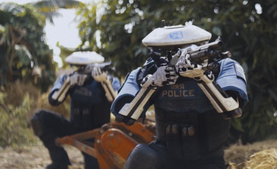
Visual Effects Society (VES) Nominations: 'The Creator,' 'Spider-Man: Across the Spider-Verse' Lead
View On WordPress
#guardians of the galaxy vol 3#spider-man: across the spider-verse#the creator#The Last of Us#ves awards#visual effects society
2 notes
·
View notes
Text
Visual Effects Society Announces Nominees for 22nd Annual VES Awards
Los Angeles (January 16, 2024) – Today, the Visual Effects Society (VES), the industry’s professional global honorary society, announced the nominees for the 22nd Annual VES Awards, the prestigious yearly celebration that recognizes outstanding visual effects artistry and innovation in features, animation, television, commercials and video games and the VFX Supervisors, VFX Producers and hands-on…

View On WordPress
0 notes
Text
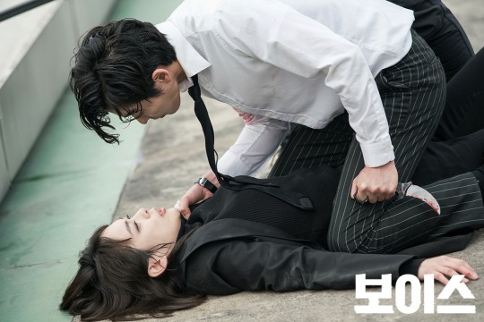
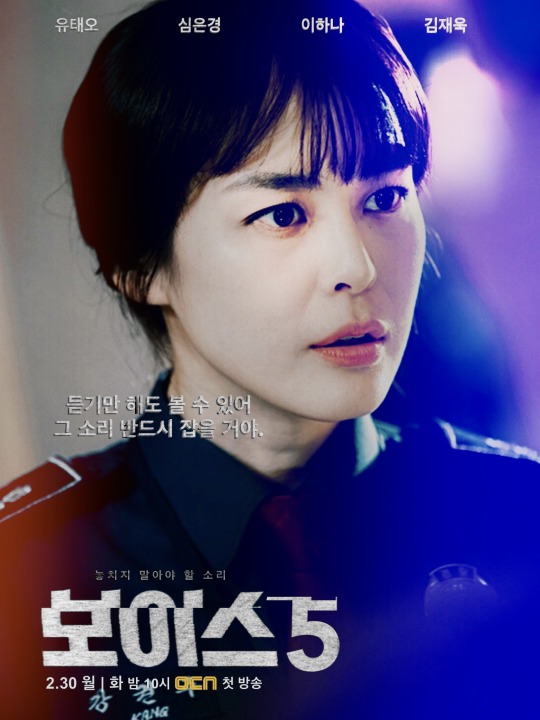
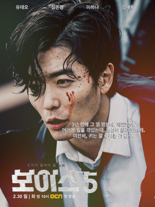
#kdrama#VOICE S1#rarepair#Kang Kwon Joo#Lee Ha Na#Mo Tae Gu#Mo Tae Goo#Kim Jae Uck#Kang Kwon Joo/Mo Tae Gu#ah the visuals 😍🤩🤤#they slayed#also apparent the PD and crew/artists knew the effect KJU as MTG had#but as a character he irked me to no end#MTG represents everything wrong with men of a certain segment of society for me#but he is fictional so am just going to lean in on the shipper feels#🤩😍🤤🥵#reliving the feels#love/hate relationship with a fictional character is SO weird#one reason MTG gets on my nerves#I am a simple shipper#I like my ships easy and without complications#AUs AUs AUs#manifesting AUs HEAs
25 notes
·
View notes
Text
re: my last post
... also this now makes me completely unfuckable (as I should be) because imagine this: you're a normie, you see me, I have a phone case that's dedicated to 'green man', you're like "neat, a lot of people have cute anime man phonecases", you see my screen saver, it's Buck-Tick (this synergizes the unfuckable energy because the hottest thing a guy can do is listen to Bucktick...), and then because of this confusing counter-signals you agree to come hang out with me, but low and behold my university ipad is dedicated to 'ominous jester man' (Kozi), and then my computer is also dedicated to that same 'green man' (thank fuck no one sees my tumblr hm) anyways what i'm saying is that i'm hot but I have been putting up barriers to prevent others from wanting me.
#also my backpack has sonic the hedgehog as a keychain#and also the outside of my pencil case is Kuro and hello kitty and-#the inside of my pencil case is Tsumugi Aoba hm#what i'm saying is that i do this on purpose because otherwise my irresistable fuckable charm would be too heavy to handle#and i'd get too many bitches#society would collapse#you should all thank me actually#(i'm being sarcastic for comedic effect in this post)#enstars#ensemble stars#ensemble stars music#akatsuki#buck tick#visual kei
5 notes
·
View notes
Text
Sometimes Andromeda is a phenomenal game and sometimes it's a slog and a bore and often it's very visually impressive and the dungeons are fun and sometimes WHY IS THIS DESERT LANDSCAPE SO FUCKING BIG THEY DID THIS IN INQUISITION AND NOW THEY'VE DONE IT HERE EVEN IN THE GODDAMN CAR IT TAKES FOREVER and sometimes it's just sort of. A game.
Also every single menu sucks and I'm constantly astounded every time I boot the game up at just how bad the UI is.
#I often think about how visually impressive the remnant vaults are like the first time you go in one and by the second or third it's.#It's just a dungeon now. Good dungeons for the most part. But you know. It's not building up to anything. Just a thing you do.#...because it's an optional dungeon.#Meridian doesn't really hit because it's just. More of that same architecture and visuals.#The main plot is nothing to write home about. The villain sure is a villain.#IF you do side content the Kett become a lot more interesting but that's a big if over a large period of the game#and a lot requires you reading extremely inaccessible small text#like the way the kett have a society and view exaltation as a gift and the process is practically religious#Like mass effect 1 was no stranger to reusing assets and visuals at all but it looked neat where it needed to look neat
1 note
·
View note
Text
anyone got any tips on getting art industry jobs w/o a college degree bc holy fuck this shit is horrendous /oAo;\
#nebbles talks#s.struggling to. survive working full time and still trying to get an illustration degree..#wish i. couldve taken the semesters off for work again like i did last year#but. unfortunately. since someone decided to change lanes w/o checking for. yknow. traffic in that lane. i now have an extra $200/month#to pay in bills. :)))))#not to mention the horrendous interest rate i got fucked over with :)))))))))#not even looking at the terrible financial stress the stress of these classes themselves is INSANE#like. one prof says hes ''simulating working with real clients'' with how he formats the class#which to him just means 'im going to assign you three major projects at once'#each of which have overlapping and hard set due dates for an asinine amount of preliminary work that can take up to 6 hours EACH#plus you have to submit at least 2 pages for all your preliminary work describing WHY you chose your colors or shapes#and HOW the colors and shapes are effective visual elements#and then you also have to submit a mini essay that describes how your art might fair against other real businesses art and illustrations#like. my guy. i have to work 35 hours a week. and do homework for 4 other classes.#i cannot physically keep up. with that kind of a pace. without killing myself in the process with self-neglect#just. do not understand why i have to run myself ragged and to the brink of total collapse and failure.#just so i MIGHT get improved odds of getting a decent job that wont even help me get above the poverty line#like. i wanna be able to make art for a living and be able to live comfortably#but that just doesn't seem like its possible in the society thats currently set up rn#just. AUHG#;w;
0 notes
Text
releasing limiting beliefs 📜


releasing limiting beliefs is incredibly empowering and important for mental clarity and wellbeing. getting rid of limiting beliefs also create more positive opportunities to attract success and become a better version of yourself. here are some steps to releasing limited beliefs:
identify your beliefs. it’s good to start by recognizing the beliefs that limit you. the first step is to finding the cause for that belief and being mindful. is this belief tied to a past experience? has this belief been told to me by someone else therefore changing my perception? what evidence do i have that truly supports this belief? remember, past circumstances and the events of other peoples lives do NOT define you or who you are. each situation has happened to strengthen you and help you grow. you are good enough and you will succeed. pick up the mindset that each day is a new day to start fresh, that’s why we are given new mornings and fresh starts.
challenge any negative beliefs and replace them with positive ones. instead of thinking thoughts like “i am not capable, how would i possibly be able to do this?”, transform those thoughts into “i am capable of achieving great things because i am me.” so many people in today’s society don’t realize that being yourself is just enough. that’s the reason why no two people are the same, we are all meant to bring our own individuality to the table. it’s helpful to drown those negative beliefs with positive ones by using affirmations as well. regularly repeating positive affirmations can and will reprogram a new set of beliefs.
visualize success. visualize! visualize! visualize! imagine yourself succeeding and living in your accomplishments daily. this helps to keep you motivated and help reinforce positive beliefs towards yourself and others. visualization gives you confidence and make you eager to conquer whatever is in your way to get to where you desire to be.
take action. begin to act as if your new beliefs are true. you are accomplishing every goal. you are radiant. you are healthy. the more you practice and act like your new self, the sooner it’ll become reality. surround yourself with positivity while on the journey, such as having a positive social media, reading new books, creating a vision board, and having healthy relationships. these are all positive influences in the right direction which can reinforce your new beliefs effectively.
daily gratitude practices. regularly practicing being thankful can shift your focus from limitations to abundance. this shift in mindset can help weaken limiting beliefs and reinforce positive ones by creating an abundant outlook on life. be thankful for things like your ability to wake up each day, your willingness to become a better person, or the cup of coffee you drank this morning. this opens your mind to finding more opportunities to be grateful.
take risks and embrace failures. stepping outside of your comfort zone and taking risks help you to realize that failures are a natural part of growth. taking risks may look like having that hard conversation you’ve been putting off, posting that content, praying instead of complaining in hard times, or even small risks like choosing to eat a salad instead of that greasy burger you may really want. these are all steps you can take that’ll produce a positive result. also, failures build character and help you to gain experience. if you fail, at least you know what to do right the next time.
remember, releasing limited beliefs is a journey that takes time and dedication. it’s like unclogging a drain— it frees up your mind to achieve its full potential. be patient and intentional with yourself and celebrate any progress you make along the way. cheers to a healthy mindset and better thoughts! ✉️
#it girl#it girl mentality#it girl mindset#it girl moodboard#law of manifestation#law of abundance#law of attraction#law of assumption#law of the universe#girlblogging#girlblogger#self concept#self care#self love#self improvement#wellness queen#holisticwellness#holistichealth#becoming the best version of yourself#becoming her#clean girl#clean moodboard#thewizardliz#wonyoung#pinkcore#pink pilates girl#pink pilates princess#pink academia#margecouture
364 notes
·
View notes
Text
Word List: Psychology

more psychological concepts as reference for your poem/story
Telepathic dream - a dream in which one appears to gain insight or information about a person or event despite not having access to the relevant information in waking life; described by Sigmund Freud.
Thought echoing - (or écho des pensées) an auditory hallucination in which an individual hears their own thoughts repeated in spoken form.
Trait rumination - a tendency to focus attention on negative thoughts and emotions, which is associated with longer and more severe episodes of depression or anxiety.
Twilight state - a state of clouded consciousness in which the individual is temporarily unaware of their surroundings, experiences fleeting auditory or visual hallucinations, and responds to them by performing irrational acts, such as undressing in public, running away, or committing violence. The disturbance occurs primarily in temporal lobe epilepsy, dissociative reactions, and alcohol intoxication. On regaining normal consciousness, individuals usually report that they felt they were dreaming and have little or no recollection of their actual behavior.
Universality of emotions - the finding that certain emotional expressions, appraisals, and manifestations are the same or highly similar across cultures and societies.
Waking dream - an episode of dreamlike visual imagery experienced when one is not asleep. The term is sometimes applied to hallucinations, religious visions, and the like.
Windmill illusion - an illusion of motion of rotating objects, such as windmills and automobile wheels, which appear to reverse direction intermittently.
Xenoglossy - in parapsychology, the ostensible ability of a person to speak or write in a language that is entirely unknown to them.
Yantra - a visual pattern on which attention is focused during concentrative meditation.
Zeigarnik effect - the tendency for interrupted, uncompleted tasks to be better remembered than completed tasks. Some theorists relate this phenomenon to certain gestalt principles of organization but at the level of higher mental processing (e.g., memory), rather than at the level of pure perception; described in 1927 by Bluma Zeigarnik.
Source ⚜ More: References ⚜ Part 1 2 3 4 5 ⚜ Writing Resources PDFs
#writing notes#psychology#character development#writeblr#dark academia#spilled ink#literature#writers on tumblr#writing reference#writing prompt#poets on tumblr#poetry#creative writing#novel#lit#light academia#writing ideas#writing inspiration#character building#dante gabriel rossetti#writing resources
395 notes
·
View notes
Note
Since you're Australian, why are so many of the posts from the US? Did you start with Australia and then move onto other countries once you'd felt like you exhausted it? Or is the US particularly interesting for your purposes?
A big part of the reason is the enormous difference in scale. Australia has about 25 million people, versus 300 or so million in the US. Each of the 50 states has at least one or two major cities, most have many more than that. In addition to the volume of real estate imagery produced by this market, there are a few things about the US in this context which draw me in from an Australian perspective. One is how real estate listings weirdly embody how much more visually apparent the harmful economic forces of the past 50 years are in American society than they are here or elsewhere. Australia's welfare state was developed roughly during the same time as in the US, and has similarly been cut back since the 1970s. But it was always much weaker in the US than in Australia or Western Europe, and correspondingly the effects of its deterioration - along with other economic trends - have been much more visible than they are here. The way this is played out in terms of localised funding for public services means that many American cities have pockets (of varying sizes) where poverty and other forms of systemic oppression are concentrated and left open to the elements. The sort of stuff Jacob Holdt documented in his photos in the 70s, or that you see in a lot crime films and thrillers with location shooting. Gentrification and other forces since then have pushed these pockets into other areas and made some places seem less grim, but from what I've heard it seems like it would be hard for the average person in the US to ignore that these large, systemic problems exist. Conversely, in Australia, this kind of intense poverty has been pushed into the margins of society during the same time period - to remote communities (where people suffer from chronic diseases that have been eradicated in most other wealthy countries), country towns with shrinking economies, or to the fringes of larger cities (where people sleep in their cars in parking lots, or multiple families form sharehouses to afford $400-500+ pw rents). Though as things have gotten worse, particularly since COVID, it's getting harder to ignore. But still there's a substantial part of the population here who have grown up in ignorance of any of the larger, percolating structural problems in Australian society, and who proactively retain that ignorance into adulthood.
I think you can see these different perspectives play in out in real estate listings. In most American states, even in most of the towns I've looked at, you can see a broad spectrum of living conditions (and commercial interpretations of ideal living conditions) - from burnt out trailers, to overpriced renovated shitty older houses with cheap grey vinyl flooring and white walls, to clearly lived-in time capsules to McMansions to actual mansions. Some photographs are clearly shot by owners, others by real estate agents with a great variety of care and attention to detail (from elaborate staging to crime scenes). Rightly or wrongly, I feel like I get a broader, more honest (or at least more direct) feel for the housing crisis. It's a more honest horror film.
Australian listings, I think in part due to concentrations in corporate power in the real estate industry (similar to other monopolies that have formed in our economy), tend to more heavily adhere to the visual language of advertising and are more heavily regulated by agencies. The problems still exist, the housing market here is among the worst in the world and little effort is being made to address the underlying structural issues, but you can see the lack of will to acknowledge these issues in the level of gloss that's applied. You can look at a listing of an older house in Western Australia, for instance, and know for a fact that it's riddled with asbestos and probably has several other structural issues, but most likely enough time and effort will have been spent on staging and lighting and maybe surface-level renovations that it will seem otherwise fine. Lots of turds that have been polished successfully enough that you need insider knowledge to properly identify them as dogshit. Incidentally, I spent part of my childhood in a house built in the 1960s that had asbestos in the walls and ceiling.
I'm still interested in images from Australian listings (and other sources) though, I just look for other things that are interesting. Anything that runs contrary to the artificially positive, limited world view that advertising promotes. Even if its a poorly-lit time capsule that is directly aesthetically opposite to the ideal of house-beauty at the moment, or an obviously run-down house that has had every realtor photography trick in the playbook thrown at it until it becomes deeply uncanny. And it's always interesting to see what other people find interesting; I genuinely think the housing crisis underwrites every other political issue we have to contend with, its tendrils extend in many different directions, and I think this also means imagery like this can reach people in a diversity of ways. Aesthetically, nostalgically, inspiring fear and self-loathing and horror. All good sources of inspiration for creativity.
#anon feedback#Australia#enormous self-indulgent essay answers#that don't really address the point#written feedback#writing
382 notes
·
View notes
Text
23rd Visual Effects Society (VES) Awards: 'Kingdom of the Planet of the Apes' Take Top Prize; 'Dune: Part Two,' 'The Wild Robot' Nab Most Wins
#dune: part two#kingdom of the planet of the apes#shogun#the penguin#the wild robot#ves awards#visual effects society
0 notes
Text
SPRUNKI ISLAND AU
Okay its less of an Au and more of Fanlore I added but Idc


All sprunkis live on a place called Sprunki Island
Sprunkis all a unique color, shades, tints and hues and They all communicate through making music, singing, and beat boxing noises, Each Sprunki's Color and Sounds is as unique as a Fingerprint/Personality
Instead of reproducing through fornication, they all come from a factory, when two Sprunkis love each other they go to the factory and extract dna from both parents and they mix it in a egg
Unfortunately, some sprunkis are born without the ability to create music properly and need instruments to help make music (Vineria, Gray, Garnold)
sprunkis are born without the ability to create music properly are looked down on in Sprunki society, this is called Resonance Deficiency Syndrome (RDS)
RDS:
Sprunkis possess a unique biological phenomenon called Chromasymphonic Energy, a fusion of sound and light within their bodies. This energy is responsible for both their vibrant colors and their ability to produce music.
The frequency of a Sprunki’s "voice" directly affects the pigments in their skin. Higher frequencies create brighter, lighter hues, while lower frequencies result in deeper, richer colors. When a Sprunki is actively creating music, their color pulses or shifts slightly in intensity, creating a mesmerizing visual effect.
For example, during a lively group performance, the entire community might light up in a dazzling array of colors that dance in sync with their music.
Harmonic Resonance:
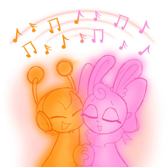
When two or more Sprunkis harmonize, their colors subtly blend, creating gradients or entirely new shades between them. This is especially prominent when Sprunkis collaborate creatively or emotionally bond, such as when two Sprunkis fall in love or form deep friendships.
For example, when Oren and Pinki harmonize, their orange and pink hues merge into a soft coral glow.
Healing and Energy Regulation:
Chromasymphonic Energy isn’t just for communication—it sustains their physical health. Creating music helps regulate their energy levels, while prolonged silence can cause them to feel sluggish or unwell. Similarly, vibrant colors indicate good health, while dull or faded hues can signal illness or stress.
Music therapy sessions, where Sprunkis perform gentle, harmonic melodies together, are a common form of healing.
Music as a Marker of Growth:
As Sprunkis grow and evolve, their music changes to reflect their experiences. A young Sprunki might produce chaotic, energetic rhythms, while an older, wiser one might create more intricate and deliberate melodies. This evolution is seen as a journey of self-discovery.
___________________________________________
RDS
RDS is a condition where a Sprunki’s Chromasymphonic Energy is imbalanced, making it difficult for them to synchronize with instruments or external sound sources. While they may have the desire to make music, their internal frequencies fail to align, resulting in disjointed or inaudible output. RDS is caused by Sprunkis whos Music are not 100% compatible with eachother

Symptoms:
Difficulty producing harmonious sounds, even with tools.
Faded or unstable coloration, as their body struggles to channel energy properly.
Feelings of frustration, isolation, or low energy due to the inability to fully express themselves.
Cultural Perspective:
Sprunki's see those with RDS are weaker and need to be fixed
Potential Treatments:
Instrument Tuning Therapy: Custom instruments are crafted to better match the individual's unique frequency.
Harmonic Resonance Groups:
Other Sprunkis harmonize with the affected individual to "retrain" their Chromasymphonic Energy.
Emotional Sound Counseling: Since emotional well-being is tied to musical output, counseling sessions often involve music to address internal imbalances.
Symptoms of RDS:
Sprunkis with RDS are usually lethargic and have lower energy than most Sprunkis, Low saturation in color and Quieter Music
Their are many Different Levels of RDS and no Sprunki with RDS looks the Same
Sprunkis with RDS:
Vineria:
Vineria has Mild RDS but still needs her Vine Wig to make Music
Garnold:
Without his Robotic Suit, Garnold can only make a short, sharp Beeping noises which makes him insecure about himself
Gray:
Gray can Only Make A low rhythmic humming Noise
#sprunki#Au#fanlore#lore#raddy#oren#garnold#yellow#OWACXK#Vineria#Sky#Jevin#Durple#Lovfy#Pinki#Tunner#brud#clunkr#funbot#mr. fun computer#gray#wenda#incredibox#Sprunki island au#ramblings
340 notes
·
View notes
Note
not the same anon who asked about "pale" skin, but I've been considering the semantics of that issue as well - Ice, can you explain why and how precisely pale/blanched/ashen read different to Black people? I understand culture/society and language and how someone grew up have an influence on this, so I'm not expecting a universal answer, but I'm genuinely curious about the specific connotations attached
I can see why you take issue with the word "pale" in that ask, so I guess my question is more why does one specifically read worse than the other? as in what's the framework, what's the toolbox I'm working with as a writer? - how does blanche win over pale in this context when blanche is the French word for the colour white? how do pallid, deathly pallor, sallow-faced and wan factor into this, when they're all variations of a similar thing? so which ones get a pass in a metaphorical sense, are there any? how does context factor into picking the right words? (for the sake of an example: pale skin vs pale brown skin) and which words do Black readers want to see if not the above? is it best practice to default to what's actually going on (e.g. they're in shock, they're cold, they suffer from blood loss and it shows)?
I'm an ESL writer so being able to navigate my dictionaries well is an important skill to me, and being able to contexualise these things always helps a lot in making better word choices (essentially - what are the tools I apply to get the result I need? is a simple definiton enough or do I also need cultural understanding and etimology? I write fantasy, so I do occasionally think these things to pieces)
It took me some time to answer this because- I have to be honest- I was quite offended at something you implied here 😅 I'm giving you the benefit of the doubt, bc I don't think you meant to, but I will absolutely need you to reframe your thinking after this. I'm probably not gonna answer all your questions either, sorry.
They don't read different to Black people, they read different to y'all!
You must understand that, from some of the questions I've received, and from the things that many a Black reader has read by nonblack (usually white) authors, it is often clear that some of you do not understand how we function or even look as human beings. It's as though we're another species, sometimes.
And that is not brand new! The history of antiblackness in medicine and physiology is as old as racism itself! Thinking that we do not blush- even though blushing is a physiological, human reaction. "Paler", as though that itself is not a word used from a eurocentric perspective to describe blood leaving a pale face. Blanche is also a verb describing blood leaving the face, which happens to everyone, but like you said... Rooted in literal whiteness.
We use physiological descriptions for Black people because if we don't, y'all do not understand how these words- and thus the reactions- apply to us! Because sure, we could use "paled"- if yall understood that it doesn't mean we get lighter skinned. Sure, we could use "blushed pink"- if you understood that it doesn't mean our brown cheeks turn a whole different color. Sure, we could say "pallid as death"- the one time being grey would make sense on our skin, as it is dry- but y'all don't understand that that doesn't mean getting lighter skinned.
You do not understand me; you do not understand how I as a human being function, even though I know enough about you to write you up entirely! I don't think 'oh well when pale folk blush and the writing says "cheeks darkened", they must mean that they're getting more melanin in their cheeks!' That sounds silly, right? And yet!
We use this language because it better allows us to be a part of a conversation that doesn't happen when the language and thus the visuals obtained still default to whiteness. And this has an effect from storytelling to having illnesses diagnosed. We're literally dying out here because doctors don't know what to look for on our skin or in our bodies; doctors that think having melanin makes your skin thicker and that being Black makes you less susceptible to pain somehow, that Black women bear childbirth pain better (despite dying more often) or that being Black is a pre-existing condition.
These are not words I'd have to lean on, if I knew that you understood how my body works the way you understood your own (and hell, y'all don't always understand that either 😅). Alas. Hope this made sense 👍🏾
95 notes
·
View notes
Text
SPIRITUAL NOTES BY NOV ༉‧₊˚.༄

As I’ve talked about before, colors have vibrational energy. Certain colors are better for certain energies. For example, 1 life paths should avoid wearing red. 1’s are the biggest targets for corruption and lust so wearing red will only enhance that even more. Too much lust can be damaging to your root chakra
Wearing orange projects confidence (can make you come off more confident which is attractive to most people). Orange can also be a good color for home decor (orange lighting, lamps, etc)
Purple is a good color for protection (especially spiritual protection). You could simply visualize a purple aura/energy around you for protection if you feel you need it. Visualizing this color can also help you solve problems if you’re currently facing any
Eating pomegranates cleans your pineal gland and can help purify it. Thus, helping you become more spiritually connected and giving you more vivid dreams. Sleeping in complete darkness and Vitamin D are also a good way to wake up your pineal gland
5-9 minutes before your enemy hour in vietnamese astrology you have extreme luck. If you don’t know what your enemy hours in viet astro are then you can look at my post about them here
In my personal opinion focusing on numerology is way more powerful than moon phases will ever be. Both are important and powerful tools though
Blue is the matrix’s favorite color and intertwined with the matrix. Blue often puts people at ease and comfort which is why it’s often everyone’s favorite color. If you’re about to go into an intense environment where you’re not sure if others are that trusting of you, wear blue. “Feeling blue” actually isn’t a negative thing. It represents your return to nature spiritually (especially the ocean, rivers, lakes, etc). Staring up at a clear blue sky can make you feel better
In numerology things are pillar to pillar when it comes to compatibility. To check if you’re compatible with someone you go life path number to life path number, day number to day number, month number to month number, year number to year number, attitude number to attitude number, etc. In other words life path is not the only thing that can show enemy energy or friend energy, but is most important when it comes to compatibility
11 has a lot of good attributes, but a negative trait of the numerical energy is terror. Scary things can happen under 11 energy. I don’t recommend going on roller coasters, flying, going on a cruise, etc under this energy
Red is not the color of love like people make it seem. It’s actually the color of lust. Hence the root chakra being red and the heart chakra being green. The people higher up just want us at a lower vibration, so they can have power over us and when someone is overly lustful they will be
Wearing red a lot has its ups and downs. It can make you come off sexually attractive to people and make them lust over you and it can make people addicted to you, but wearing it too often can actually attract conflict or aggressive energy to your life. We often see red used negatively in society like in hospital logos, police sirens, etc but often when you see red a lot it’s more so a sign from the matrix to pause and analyze the situation around you carefully. Note: Even when people are attracted to you when you wear red it isn’t a long lasting effect (just like lust in general is temporary, the opposite of love)
Master numbers are usually smart and very spiritually connected, but the one’s that aren’t can be dangerous to be around. They may drain your energy
Our energy can be drained in this matrix. We are like the batteries for the simulation. You have to be careful who you surround yourself with because of this
DO NOT READ IF YOU’RE UNDER 18 - A lot of the traps to take our energy in the matrix are sex related since sex is a gateway to earth (through women). You must be careful. P*rn is one of them. When men finish through masturbation to p*rn their energy can be taken by negative entities. When women finish to p*rn they can absorb the negative energy of negative entities during that time. Women absorb energy and men push out sexual energy. These negative energy vampires only come around during this time (they’re obviously not visible to the human eye). P*rn is really bad for you spiritually because of this. Masturbation is not though and is healthy for you spiritually if it is something you do about 5 times a month. Doing it too much can be bad though. Semen retention doesn’t actually do anything spirituality that’s the placebo affect doing its work. Shows how powerful our minds and thoughts are. Anyway, if you’re not someone who’s spiritual there’s also many studies done that talk about p*rn being horrible for your mind
Green is the most important color to earth. Snakes have green eyes which is why they can see a lot of things others can’t (people with the viet sign). This applies to people with green eyes in general as well

#spirituality blog#spiritual realm#spirituality#numerology#numerology blog#life path number#astrology#astrology blog#astrology chart#birth chart#astrology community#astro community#matrix#vietnamese astrology#viet astro
398 notes
·
View notes
Text
academia is often used as the forefront of much of the violence inflicted on palestinians — for example in the library of congress, there is a collection called "the american colony of jerusalem" with racist photography and items that help visually perpetuate the "people without a land, land without a people" part of herzel's ideology, which itself is the forefront of much of zionist ideology. pointing out the systematic harm in academia is often considered "irrelevant" by zionists.... denies the origins of zionism as a political and academic ideology with physical consequences.
much of palestinian history throughout the last century has to do with erasure and silencing — that is how we got to this point. when i say no one listened to palestinians i mean NO ONE listened. they were ignored. all their demands were unreasonable. instead they get blamed for much of the world's unwillingness to listen. even my family members — i have stories of their work in academic resistance since '48. and some of them are well known contributions throughout euro-american and swana society. yet they're still ignored because of their palestinian origin.
"if you were just more reasonable" or "if you took the time to listen with compassion" or "you have to appeal to people's sense of reason" ignores the fact of the matter — this ideology's founding principals were built on "a people without a land for a land without a people." you cannot and should not ignore that. in order to complete the zionist ideology, you must remove the native population. therefore any subscribers to the idea of zionism are violent, whether they intend it or not.
and if it were true, that academia were irrelevant.... then that doesn't explain the systematic torture and imprisonment of writers and scholars, the exile of my family members who were journalists and activists, the captivity of friends for no other reason than they were deemed a threat by some list or the other.
oftentimes zionists, or zionist sympathizers, ignore our (diaspora's) material ties to the occupation and dismiss us as being "disconnected" from the "situation" in Palestine and "misunderstanding" or "misconstruing" israeli society. what am i misunderstanding exactly? that the origins of this "country" relies on violent displacement and exile? that for the past 75 years, that violence has not stopped once? that no matter what we say about the violence of zionism as an intrinsic aspect, it takes a secondary seat to the imagined realities of zionism?
therefore, anti-zionism is the logical conclusion for valuing palestinian lives. but what are the arguments against anti-zionism? that arab governments expelled jews from SWANA? do you think that's a result of anti-zionism? then you must not understand that palestinians are often treated poorly by the same governments that claim to have done this in the name of "anti-zionism," living in poverty in refugee camps, tortured and arrested, even in some cases exiled by governments. this also neglects to mention zionist collaboration with said governments to exile the jews of their lands.
so then, what?
if anti-zionism is the rejection of the settler colonial state of israel, which you must admit to be truly anti-zionist, then it is an exclamation of palestinian sovereignty and identity. so when you say anti-zionism and antisemitism are linked.... do you realize what you are implying? do you realize that zionism, the root cause of palestinian suffering, is the reason for our expulsion and displacement? so then when you write academic thinkpieces about the "complexity" of zionism, do you realize the harm you're doing? do you realize that this, in fact, is not a new or useful argument? that i've seen iterations of it for years and years? that at the core, the zionist ideology relies on this muddying of the waters for you to not do anything?
to be frank, your constant reminding of the complexity of zionism when people in palestine are suffering from the material effects of it only scream, to me, utter contempt and selfishness. zionism is violence, to me and my family. it is violence for every palestinian in this world. you must admit that to be a sincere advocate for palestinians, otherwise your words ring hollow. the present reality outweighs any possibilities.
719 notes
·
View notes
Note
So, what's the hat situation like in these societies? Are there ceremonial hats? Fashion hats?
In order to give this a detailed and specific answer with lots of examples and lore instead of just saying 'yeah', I'm just defaulting to the Wardi context. Here's a rundown on most of the headgear you've seen so far, and a few new ones.
The exact styles of each type of hat vary by tradition across the region, but there are basic commonalities across the Imperial Wardi cultural sphere.

Conical wide brimmed hats, mostly worn by women
The most common hat style is wide brimmed hats with projecting conical tips. Straw hats in this shape are worn unisex by laborers for sun protection, while decorative fabric based hats of this nature are an aspect of women's traditional dress, usually worn over a veil. Similar hats are sometimes (though less commonly) worn by men- it's a component of women's dress but not generally considered outright effeminate or inappropriate for men to wear.
The shape of the cone and width of the brim varies. The body of the hat is usually patterned, the cone may be wrapped with beads or ribbens, and the tip is often decorated with fur, feathers, or tassels. Some variants also include a built in veil lining the interior.

Men's decorative hats
The distinctly masculine style of decorative hat has no protective function (aside from securing some hairstyles) and is a small, flat topped cap. The northwestern style is unique in typically having a taller, projecting top, but most variants rest close to the scalp.
These hats are usually patterned, and often decorated with khaitsmane, feathers, fabric drapes, tassels, and beads.

Cold weather hats
The climate is overall hot, but does experience a winter in which daytime temperatures can occasionally drop below freezing. Warm headgear usually comes in the form of the headscarf/veil, but there are a few regionally distinct traditional styles of knit woolen cold weather hats.
---
There are a couple established hats that play into dances and festivals:

Dancer's hat
One traditional partnered dance is partly choreographed around the use of a flat topped wide brimmed hat, worn by the female dancer and flapped, tossed, and spun between the two partners. This has tassels around the brim (sometimes long enough to fully obstruct the vision) and brightly patterned concentric circles, curves, and spirals decorating both the interior and exterior, which create striking visual effects in tandem with the movement.

New year's festival dancer with his head bent downwards, displaying the visage of an evil spirit on the top of the hat
A costume worn by dancers at new years festivals includes another flat wide brimmed hat that doubles as a mask. It is strapped tightly around the head of the dancer, who changes between the form of a human and evil spirit by alternating between dancing upright and dancing with the head down. The top of the hat is decorated with grotesque, frightening faces (humans, skulls, predatory animals, monsters), and the dancer is nude under a costume of brightly colored ribbons.
This dance is a part of new years celebrations, and is performed in the towns and cities during the festivities. Its functions are partly apotropaic in nature- by taking the visage of an evil spirit, the dancers frighten off actual malicious spirits and bad luck that threaten to jinx a new year. Dancers will attempt to startle passerby by leaping forward and revealing the frightening face atop their hats (which benefits the 'victim' by scaring off their bad luck as well). Their public nudity (the ribbons don't consistently hide everything) is one of the instances in which a fully exposed body is socially acceptable, as a highly directed exposure of the actual phallus (rather than representations such as amulets) to utilize its protective apotropaic qualities.
In addition to these loftier protective goals, the dancers are a key part of the milieu of entertainment at the festivities. New year's festivals are characterized by a relaxation of some social norms and letting down one's guard, shedding the baggage of a previous year and welcoming in the new, and these dancers epitomize this atmosphere. People tend to find this tradition of being harmlessly startled to be quite fun, with the notable exception being most small children.
---
The other central component of everyday headgear is the veil:

Four styles of veils. Some styles are intermediaries between these, or combinations.
Veils are worn unisex for sun protection while laboring outdoors, and are an expected part of feminine public dress in general. They come in a variety of styles, both in the form of scarfs and fitted sheets with openings for the face and neck. Unisex veils typically fall into the 'protective' and 'hooped' styles, while the 'draped' and 'formal' styles are considered distinctly feminine. Women's veils are typically accompanied with headbands, which secure some styles in place and otherwise serve decorative functions. Most veils are worn loose, the tightly wrapped 'formal' style tends to be reserved for solemn occasions (funerals and certain religious rites) and is more spiritually protective to the wearer.
Conventions of feminine dress and behavior expect women and akoshos to wear veils when outdoors and in general public spaces. They are removed in semi-privacy (indoors with familiar company) and within the home. This is a standard of propriety and feminine behavior and is socially enforced, but not mandated. Similarly to not wearing braids, a woman/akoshos neglecting the public veil will often be interpreted as loose and sloppy, inappropriately masculinized, and/or impoverished or foreign.
Their chief functional purpose is sun protection rather than to cover the skin. By design, they will usually reveal parts of the hair and most of the neck (allowing for display of braids and jewelry). Veiling is not culturally framed as a form of modesty (modesty standards at their core only mandate the covering of genitals, and highly expect the public covering of breasts and buttocks). However, this practice (and the more skin-covering nature of conventional feminine dress in general) additionally seeks to protect the female body from the Gaze (both the evil eye in general, and the gaze of men, which is seen as more effective upon female metaphysical vulnerability).
This practice also has roots in an intense cultural focus on separation between the public and private familial sphere. A woman following standards of public dress (the veil and braided hair most significantly) effectively privileges her male relations (particularly the husband/father) who will typically be the only men that see her body in the private context (note that the private context overlaps with, but is not the same concept as, the sexual context). This delineation in public/private dress and behavior (which applies to men as well, though often in less visible, display based ways) reinforces the boundaries and privileged status of the familial sphere. Women not following clearly delineated public/private dress standards can be interpreted as disrespecting a husband or father's authority over his household and the sanctity of the family as a whole.
The standardized dress of Odonii priestesses includes a 'hooped' type veil (which is likened to the mane of a lion), and a headband tipped with sacred lionsmane (taken from the body of a sacrificed lion, whose corpse has become divine in this rite).
The Odomache wears an entirely unique form of veil that completely obscures the hair, neck, and most facial features (the rest of the body (with the exception of the hands and feet) is also covered). This has separate functions from other forms of veiling- the Odomache is a Face of God Itself incarnated into a human body, and her bodily integrity is tantamount to the integrity of the state, military, and God's connection to the world. She is completely secured from the Gaze, and her body is physically obscured to maintain a sense of separation from bodily humanity and disassociation with her former human identity. Under typical circumstances, only other Odonii (and some attendants) will ever see her face after she is fully incarnated.

The previous Odomache in everyday public vestment, with a two layer veil (one obscuring the head and face, the other draping over the chest in a decorative 'mane')
119 notes
·
View notes
Text
The Boy Wonder #3 by Juni Ba rambling about how cool this series would be to read in a single sitting...it's all so connected!!

rambles for issue #1 and issue #2!
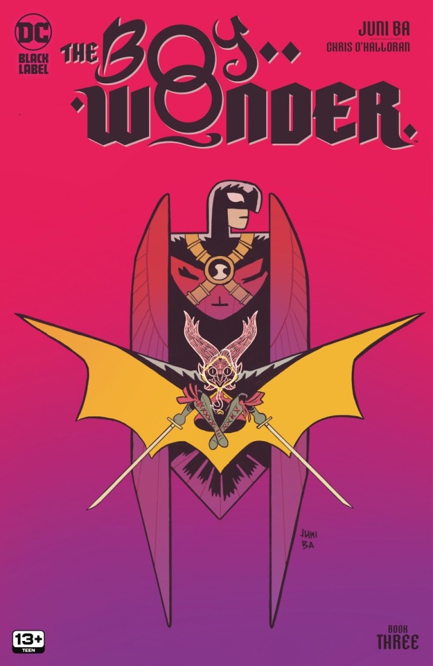
i don't have as much personal interpretation for this cover besides it being a solid piece of art in shapes and silhouette! ALSO. bi bg lighting lol. Damian's "X" posing of his cape and swords parallels with Tim's "X" chest straps + the Robin emblem in the center. Tim's closed Red Robin wings frames Robin's own outstretched cape wings; and on top of that, the shadows cast inside the wings nicely frames Damian's demon mask.

Joe and Merle's dynamic has been so fun, especially with the mutual enthusiasm over the storytelling 🥺 Joe also opens up about his circumstances that led him to this moment, which perfectly sets up the setting of this issue! Even his very first introduction becomes a relevant detail when a fancy rich couple drops a champagne glass, uncaring of the people literally below them, saying “some poor sap down there’ll appreciate it” when it bonks Joe’s head.

it all comes around!! and tbh this issue proves how much this series would slap to read in a single sitting (GET THE COLLECTED EDITION)
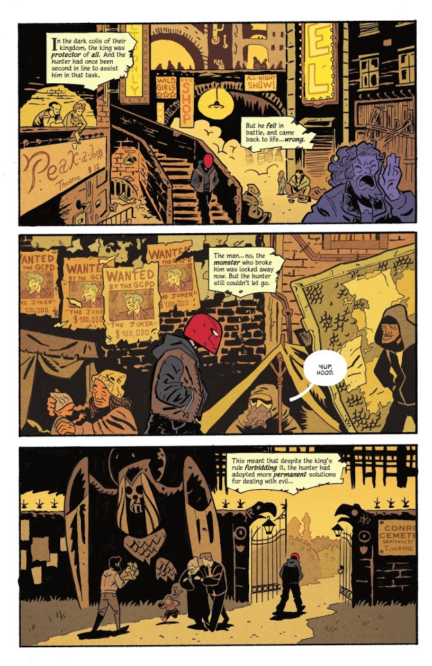

Going beyond first impressions seems to apply to the color palette in this series. From #1 in the first page of Gotham, we see the gold of upper society to the blue of the downtrodden → from issues #2 and #3, it’s the warm gold of inner Gotham to the cold blue of the rich. there’s a sense of community displayed among the poor - even part of Jason’s intro avenging Bill, a generous man mourned on panel by many. The rich gives off a sense of individualism, celebrating themselves and their excess.

With the change in scenery, this issue steps into the more civilian side of things through a spy theme - fancy suits and lil gadget intros! Going down the civilian route with Tim feels very fitting since it's what makes Tim's run as Robin so charming!

i love that Talia’s taught Damian to be conscious of the rich’s effects on society, especially in the following page of small panels zoning in on the details of wealth and overindulgence. but also LIL DAMIAN. HIS LIL ROUND EYES AND HANDS 🥺

Damian’s aware of the facts, and his disgust is clearer after having just been through lower Gotham and seeing firsthand the poverty directly caused by the wealthy (also not sure if that old lady is the same one from #1 with similar hair and clothes, but pls she can't a break…)


i mentioned Damian’s “inciting incident” for this journey to be the intro of a demon for Damian to prove his worth but i’m correcting the use of that term!! the intro of the demon is more the beginning of plot, whereas the actual inciting incident is beheading the thief!! it’s the main reason he’s in this situation where he felt the need to prove himself, and atone. Most notably is that the beheaded thief is a consistent character that quite literally haunts Damian every step of the way.


The statue of Batman’s head being popped off becomes a significant visual, because while Damian started this journey to prove something to Bruce, the only one that really seems to have (quite literal) eyes for Damian’s journey is the thief. Why does he make more of an appearance than the actual Bat? Even his statue’s head doesn’t make a figurative presence; whereas the only one looming over Damian is the thief. Guilt over killing him may be driving him just as much as his desire to be worthy. Alternatively, it could be that Damian needs to reexamine his motivations since the thief is really getting in Damian's face now.


Damian is proud to be a positive influence on Tim, but the moment is short-lived. It’s an ironic moment to me because Damian doesn't even know the impact he's had on Jason just in the previous issue!! 😭
Damian's so desperate to prove his worth, yet he's been making choices in every issue to help others!! Helping the old woman up in #1, being vulnerable with Jason in #2, and now sacrificing himself for Tim!

The Ra’s "Weakness" panel has been reoccurring since #1, but it's the first time Talia has been included. Being great figures in his life and mind, their silhouettes consume Damian's, similar to a few of Batman's appearances below. This latest disappointment was such a blow to Damian, that Talia (who he might have the most respect for) becomes an added voice in his head.


Final thoughts!!

Like Rok, does the thief actually have a connection to the al Ghuls or is this beard just in fashion at the moment.

Lex is clearly referencing one of the Underwell warehouses that Joe and Merle are presently, so wondering if whatever he and Tim discuss here will be affecting them later.
Ending with Talia’s cover for extra hype!! i’ll probably go back to this for the next ramble, but i’m already gearing myself up to wail about Talia just based on this cover. The Mary and Jesus imagery (more prominent with Damian’s lil crown as a “prince”) but most importantly Talia weathering the flames for Damian…her own shroud/shawl wrapped around Damian and burning… oh boy

#rambling#i had a lot to say about Damian's sense of self worth and sacrificial tendencies but#i'm trying to avoid referencing comics outside of this series as it's a very dedicated world of its own#andi don’t want to divert attention away from the story Ba is telling#but yeah. Damian constantly under the shadow of the Bat and Demon would certainly mess with his perception of himself!!#anyway seeing more of the visual and storytelling elements call back to previous issues GEEZ this NEEDS to be reread as a whole#the boy wonder
169 notes
·
View notes