#using art tutorials actually works
Explore tagged Tumblr posts
Photo

uhhhhhh i was drawing noah and got carried away, i wanted to see him in a tact vest and it kinda evolved into a zombie apocalypse type thing maybe i’ll continue it??? who knows, def not me
#tdi noah#tdi alejandro#alejandro burromuerto#alenoah#probably#zombie apocolypse au#total drama#total drama all stars#total drama world tour#total drama island#using art tutorials actually works#i did perspective??#somehow??#anyway can you tell i hate drawing faces
44 notes
·
View notes
Text
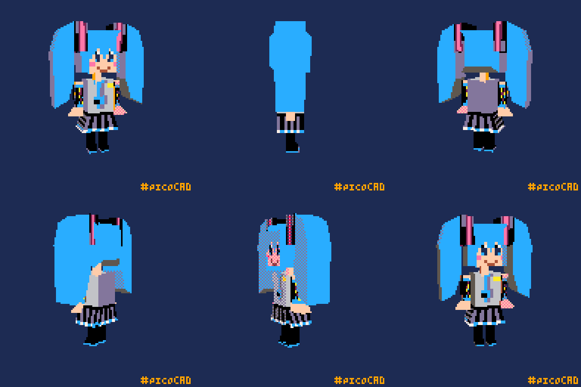
So I tried picoCAD for the first time!! :D for 5 euro on steam how could I say no! And of course I had to make a lil Miku hehe she seems to be my go to whenever I try new things 🩵
I had such a fun time figuring it out omg I LOVE 3D!! Making the textures on pixquare on my ipad was really nice too! I gotta buy the full version eventually I've been meaning to :') I feel the urge to try pick up blender again now, I wanna do more 3D stuff in the future ╰(*´︶`*)╯♡ I can't wait to get better at picoCAD too 🩷
#picoCAD being so simple was really good for me omg#and tutorials A BLESSING REALLY cuz my main issue with 3D is picking the right shapes to use and what to do with said shapes lmao#just learning *extrude cube to get longer cube* opened up a whole part of my brain I didn't know was there LOL#I think playing with picoCAD more will hopefully give me that instinct to use my shapes better in blender#I hope so anyway haha#btw I did try to make a miku green with dithering but it just looked wonky and cluttered lmao#BUT I TRIED TO MAKE IT WORK I REALLY DID#the blue actually looks really good so I'm not even mad about it haha#artists on tumblr#art#cute art#digital art#teacolouredart#picocad#3d artwork#3d art#low poly#hatsune miku fanart#hatsune miku#vocaloid#vocaloid fanart
40 notes
·
View notes
Text
i think one of my biggest (and only) gripes with procreate is that they dont have like. a masterlist of features their app has to offer. a full thorough ui navigation. because ive been using procreate for a couple years now and im still discovering preexisting features because they just. dont mention it anywhere
#like being able to drag and drop an image into the color pallette area to create a unique pallette from that image?#had to find that out through an instagram reel#procreate has a habit of compressing things almost Too much to make it less visually busy and more “beginner friendly”#which definitely works to an extent. its the easiest art program I've used to date. and that includes ibispaint#but they have an annoying habit of simply not Labeling Things#so they will have a lot of super cool and useful features that you wont even know exist because they dont tell you about it#and their app tutorials are very vague and don't actually seem to show you have to navigate the app.#they feel more like an ad than a tutorial#this is why procreate dreams has gotten flamed so bad i think#its not even that bad is the thing. its got tons of good features. but the ui is simply TOO simplified#everything is hidden in a dropdown of some kind#to the point that its not beginner friendly OR professional quality#because its equally unnavigatable for both#ANYWAYS im just yapping for the sake of yapping#i love procreate. its affordable and user friendly. theres just some very small inconveniences with its ui#i know nothing about developing and do not know what im talking about. for the record.#this is simply the ramblings of a humble artist who loves nothing more than to complain ❤️
9 notes
·
View notes
Text
.
#the really cool thing about art classes in college was that once i finished the actual work i could kind of just do whatever#so they had these sample images that were loaded onto every computer in the lab for art students#and one of them was a bear peeking from behind a tree#and one day i finished up the work and opened up that picture of a bear in photoshop#and i was like 'by god i will make this bear green'#and i did. the teacher hadnt really taught us that yet but through the power of internet tutorials and experimentation i did it#the professor comes over halfway through and looks over my shoulder 'what are you doing'#me: 'making a green bear'#him: 'did you do the work?'#me: 'yeah here' and i pulled it up#he was like 'oh cool. nice bear'#anyway sadly i do not have my green bear anymore#but man i was so proud of that#it was so good too no artifacting or anything i did such a good job on it#i mean i could recreate it probably but it wouldnt be the original
6 notes
·
View notes
Text
there's an inherently fun thing about old digital art that didn't need to follow certain "rules" and it still was bottomline good. airbrush, shading with the same color but darker, mixing in real images and textures, using shit small canvases, etc.
people had fun fooling around with their wacom bamboos and their cracked photoshop cs3s, and somehow we let mr. shit who called art made by 12-year-olds on deviantart cringe change our perception of that.
#goat posts#like i'm not insane right? people aren't learning actual art techniques; they're just learning tips that may or may not work for them#“oh you gotta shade with purple in a multiply layer!!!” “don't forget about what's accurate!” “don't you dare use more than three colors!!!#there are SOOOO many bad art advice flying around on the internet and i'm glad that people have learned a lot from it when they were novice#but i can't say that it didn't make a lot of damage to what's good art and what isn't y'know?#because if there's art made in 2004 that wasn't touched by pinterest painting tutorials and it was still great#then what is it that makes an art piece good?
4 notes
·
View notes
Text
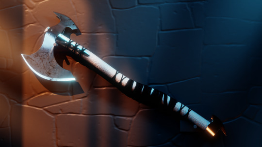
Month 11, day 27
And now for something completely different: an axe!
#the great artscapade of 2024#art#my art#blender#blender render#blender 3d#cycles render#cg fast track#really wish my Mac was compatible with EEVEE on the current Blender build#...or rather the previous Blender build since 4.3 was released and I'm still on 4.2#the tutorial series has all been in EEVEE which does things totally different from Cycles#(for the non-Blender folks: Cycles and EEVEE are the two primary rendering engines that Blender uses)#(Cycles does physics-based ray tracing whereas EEVEE is a real-time render engine CAPABLE of ray tracing that mimics game engine rendering)#(because they work totally different I don't get the same results as the tutorial I'm following even if I was to follow exactly)#(which on one hand is kind of annoying but on the other hand it means I really have to FOCUS and actually learn instead of just copying)#(so while I am TOTALLY complaining it's mostly bc complaining is a hobby of mine :P)
4 notes
·
View notes
Text
the next thing i want to concentrate on in my art is space and composition, which is gonna be soooooooo annooyiinggg without a formal education. im gonna have to watch tutorials and stuff uugghh
#good thing i love art so much nd its the only thing i will never abandon#i change and change but it will always be there for me#if any of you draw and have some tutorials you like lmk. i never even watched speedpaints. self-taught to a fault lol#my sister uses the same program as me and she keeps teaching me how to use it. i only use 2 brushes and the blend feature occassionally#im quite happy with my lines right now#i used to think of it in terms of 'i need to work on x aspect of the human form'#(hair. clothes. faces. anatomy. a few of which i could stand to revisit actually. hair especially hair is horrible)#but a few years ago i dedicated myself to composition and pose a little more#best decision ive made i think my stuff is so much better than it has been#but it is 2d. i need planes#and as anyone who specialises in only figures will tell u ppl who do backgrounds are ur greatest envy#they say progress isnt linear... but i disagree.. i am better every year :)
3 notes
·
View notes
Text
I hate how binding isn't ever really safe even with proper binders.
#like you cna bind perfectly safely and follow all the rules and stuff and still end up with fat necrosis with can keep you from getting#top surgery done#which is really annoying and stupid#and i want everyone to be able to bind as safe as possible#but i keep hearing people use things that are unsafe like ace bandages#if you want something that is fairly easy to get and it doesn't actually compress youe chest get kinesthetic tape.#please.#it's super cheap#and a lot of people use it for bad joints#and if you have transphobic or are not out to ur parents you can disguise it as something for an art project#or maybe like idk maybe tape for some sort of thing that needs to be flexable#like I'm sure there's other things you could say you need it for#then once you have it just look up trans tape tutorials and use those#make sure to have some oils to take off the tape tho#and don't take it off with water#that won't work and with damage your skin
5 notes
·
View notes
Text
not to be a pretentious art grad student, bc I know most of the art tutorials that circulate the interwebs were made in good faith by self-taught artists, but nothing changed my perspective and use of color the same way reading "not all blues are cool, and not all yellows are warm" (that is, there are cool and warm colors, but every possible hue has a warm and cool variant), which I read in Drawing & Painting Fantasy Landscapes & Cityscapes by Rob Alexander. the book did not actually help me with drawing or painting landscapes or cityscapes, but it was packed full of the best breakdown of art basics that I've ever come across anywhere and still made me a better artist as a result
#being self-taught is tough bc there are a million different art books out there but like#some of them are actually good I promise#I know using online tutorials is easier and cheaper but sometimes an actual published book offers better advice#like it's a stupid pet peeve but I promise if you stop thinking of red-orange-yellow as warm and green-blue-purple as cool#color theory becomes so much easier#there's also a really great book about the science and cultural history of color called#The Secret Language of Color by Eckstut and Eckstut and this book is also super useful#like sure it's not aimed at artists but if you understand how light and color work on a scientific level it makes art easier#oracle of lore
5 notes
·
View notes
Text
...
#for some reason it never occured to me that i could just like. take an art class if i wanted?#idk if id enjoy it. i probably would bc i like prompts so much but idk ive just not had much formal art training#i mean i took a lot of art classes in hs but my art teacher just made us paint realistically and i HATED that#so idk. i think i just wanna b better at framing/composition idk#idk y that never occured to me. i prob wont do it bc like with what fucking time. it would distract from my narut0 drawing lol#but its a nice thought. i just really need to memorize the cloud species bc im very Normal than u v much#while im being a slacker. i say on my day off where i spent 8-1.30 in the lab. sigh...#ugh but i wanna finish drawing a thing. ugh. also i need to work on a paper. ugh. im tired#maybe i could find tutorials online or something. ugh no i would need a class to hold me to actually trying what they recommend lol#unrelated#one of my lab mates took an art class. she does art stuff too. from what ive seen i think im better than her#i say bc im a competitive bitch. but she has way more confidence in her stuff bc she sells it and stuff#i tend to be more. oh u like want to buy my stuff? uh thanks but cringe. like come back in a month and i could do the same thing better#u just dont understand how bad this is in comparison to what i could do in the future. which is slightly baffling lmao#not only am i competitive. im self competitive
11 notes
·
View notes
Text
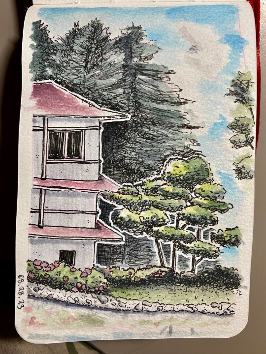
the background trees still got away from me a bit, but i think this one turned out really well!! <3
#art#personal#i was looking at some pinterest tutorials that said to think of groupings of leaves as separate shapes and that really worked for me#also when i was younger i always used really cheap crappy like artist loft watercolors that were super chalky#but i’ve since bought actual art quality watercolors that are actually transparent and you can paint over lineart and everything#it’s life changing#watercolor
4 notes
·
View notes
Text
Listen not to toot my own horn (I am, honk honk!) but realizing I can knit and crochet the most intricate shit fitted Exactly to my body to my exact desires of over the top, extravagance just for the cost of my time and some good quality cotton has been the best thing ever. Pandemic yarnfluencers w their hope macauley roving purses and blanket yarn bee tubes WISH they were me like, lookatthisshit
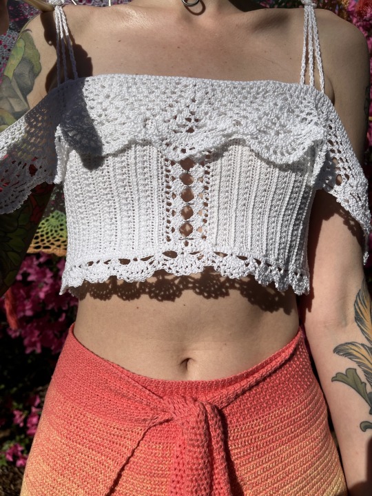
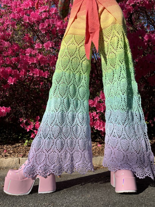
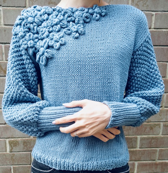
yee fucking haw babeyyy!
Got to try out embroidery and weaving on a loom today and not only is it soooooo much fun but i got hit with powerful informations about what a strong pillar of human wisdom, artistry, and daily existence the making of textiles formed for most of history.
Clothes are so worthless and made mostly of polyester and nylon type material now. They are ill-fitting, shoddily made, meant to fall apart and become utterly useless rags within a few years.
Not only wasteful, but repulsive affront to the thoughtful and highly advanced craftsmanship of thousands of years of our past, the careful procurement and refining of natural dyes and fibers, the hundreds of hours of labor and skill absorbed into a cherished, sturdy, well-made and beautiful item.
The high advancement and sophisticated techniques have been sadly degraded because the artists were often women.
But! Imagine! Imagine! Imagine! Clothes made from sustainably harvested materials that come from the natural world around you, sturdy and meant to endure, fitted to your body exactly, dyed, decorated and made beautiful through the creative skill of a thoughtful artist, in small numbers in your wardrobe rather than having dozens of dirt-cheap, shoddily made clothes that will be garbage within 3 years
#i am demanding you get into textiles now everypony DO IT and id ont mean trash trendy shit i mean LEARN the art of the craft#its so rewarding and you will make yourself such beautiful things#i do not subscribe to the idea that the pandemic was a good thing for fiber arts all it did was create a new breed of#clout hungry people who make 2 day projects to hit the algorithm that will never be used/worn again but they somehow#expect the same adulation as yk *gestures above* like... im sorry but lmao no actually Engage with your craft you are nothing 2 me <3#none of these people work with quality yarn none of them know how to actually read patterns theyre not preserving or improving the crafts#theyre exploiting them for views like just.. stop. please stop please learn to read charts#learn to use something other than bulky acrylic#im on my hands and knees BEGGING#please actually appreciate textile arts they are worth so much more than a 5 second tiktok#and stop fucking demanding tutorials for the kind of work above lmao.... learn to read a goddamn pattern#sorry i have Opinions <3
2K notes
·
View notes
Text
Can't afford art school?
After seeing post like this 👇

And this gem 👇
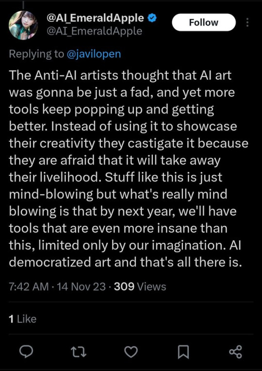
As well as countless of others from the AI generator community. Just talking about how "inaccessible art" is, I decided why not show how wrong these guys are while also helping anyone who actually wants to learn.
Here is the first one ART TEACHERS! There are plenty online and in places like youtube.
📺Here is my list:
Proko (Free, mostly teaches anatomy and how to draw people. But does have art talks and teaches the basics.)
Marc Brunet (Free but he does have other classes for a cheap price. Use to work for Blizzard and teaches you everything)
Aaron Rutten (free, tips about art, talks about art programs and the best products for digital art)
BoroCG (free, teaches a verity of art mediums from 3D modeling to digital painting. As well as some tips that can be used across styles)
Jesse J. Jones (free, talks about animating)
Jesus Conde (free, teaches digital painting and has classes in Spanish)
Mohammed Agbadi (free, he gives some advice in some videos and talks about art)
Ross Draws (free, he does have other classes for a good price. Mostly teaching character designs and simple backgrounds.)
SamDoesArts (free, gives good advice and critiques)
Drawfee Show (free, they do give some good advice and great inspiration)
The Art of Aaron Blaise ( useful tips for digital art and animation. Was an animator for Disney. Mostly nature art)
Bobby Chiu ( useful tips and interviews with artist who are in the industry or making a living as artist)
Sinix Design (has some tips on drawing people)
Winged canvas (art school for free on a verity of mediums)
Bob Ross (just a good time, learn how to paint, as well as how too relax when doing art. "there are no mistakes only happy accidents", this channel also provides tips from another artist)
Scott Christian Sava (Inspiration and provides tips and advice)
Pikat (art advice and critiques)
Drawbox (a suggested cheap online art school, made of a community of artist)
Skillshare (A cheap learning site that has art classes ranging from traditional to digital. As well as Animation and tutorials on art programs. All under one price, in the USA it's around $34 a month)
Human anatomy for artist (not a video or teacher but the site is full of awesome refs to practice and get better at anatomy)
Second part BOOKS, I have collected some books that have helped me and might help others.
📚Here is my list:
The "how to draw manga" series produced by Graphic-sha. These are for manga artist but they give great advice and information.
"Creating characters with personality" by Tom Bancroft. A great book that can help not just people who draw cartoons but also realistic ones. As it helps you with facial ques and how to make a character interesting.
"Albinus on anatomy" by Robert Beverly Hale and Terence Coyle. Great book to help someone learn basic anatomy.
"Artistic Anatomy" by Dr. Paul Richer and Robert Beverly Hale. A good book if you want to go further in-depth with anatomy.
"Directing the story" by Francis Glebas. A good book if you want to Story board or make comics.
"Animal Anatomy for Artists" by Eliot Goldfinger. A good book for if you want to draw animals or creatures.
"Constructive Anatomy: with almost 500 illustrations" by George B. Bridgman. A great book to help you block out shadows in your figures and see them in a more 3 diamantine way.
"Dynamic Anatomy: Revised and expand" by Burne Hogarth. A book that shows how to block out shapes and easily understand what you are looking out. When it comes to human subjects.
"An Atlas of animal anatomy for artist" by W. Ellenberger and H. Dittrich and H. Baum. This is another good one for people who want to draw animals or creatures.
Etherington Brothers, they make books and have a free blog with art tips.
📝As for Supplies, I recommend starting out cheap, buying Pencils and art paper at dollar tree or 5 below. If you want to go fancy Michaels is always a good place for traditional supplies. They also get in some good sales and discounts. For digital art, I recommend not starting with a screen art drawing tablet as they are usually more expensive.
For the Best art Tablet I recommend either Xp-pen, Bamboo or Huion. Some can range from about 40$ to the thousands.
💻As for art programs here is a list of Free to pay.
Clip Studio paint ( you can choose to pay once or sub and get updates. Galaxy, Windows, macOS, iPad, iPhone, Android, or Chromebook device. )
Procreate ( pay once for $9.99 usd, IPAD & IPHONE ONLY)
Blender (for 3D modules/sculpting, animation and more. Free)
PaintTool SAI (pay but has a 31 day free trail)
Krita (Free)
mypaint (free)
FireAlpaca (free)
Aseprite ($19.99 usd but has a free trail, for pixel art Windows & macOS)
Drawpile (free and for if you want to draw with others)
IbisPaint (free, phone app ONLY)
Medibang (free, IPAD, Android and PC)
NOTE: Some of these can work on almost any computer like Clip and Sai but others will require a bit stronger computer like Blender. Please check their sites for if your computer is compatible.
So do with this information as you will but as you can tell there are ways to learn how to become an artist, without breaking the bank. The only thing that might be stopping YOU from using any of these things, is YOU.
I have made time to learn to draw and many artist have too. Either in-between working two jobs or taking care of your family and a job or regular school and chores. YOU just have to take the time or use some time management, it really doesn't take long to practice for like an hour or less. YOU also don't have to do it every day, just once or three times a week is fine.
Hope this was helpful and have a great day.
"also apologies for any spelling or grammar errors, I have Dyslexia and it makes my brain go XP when it comes to speech or writing"
85K notes
·
View notes
Text
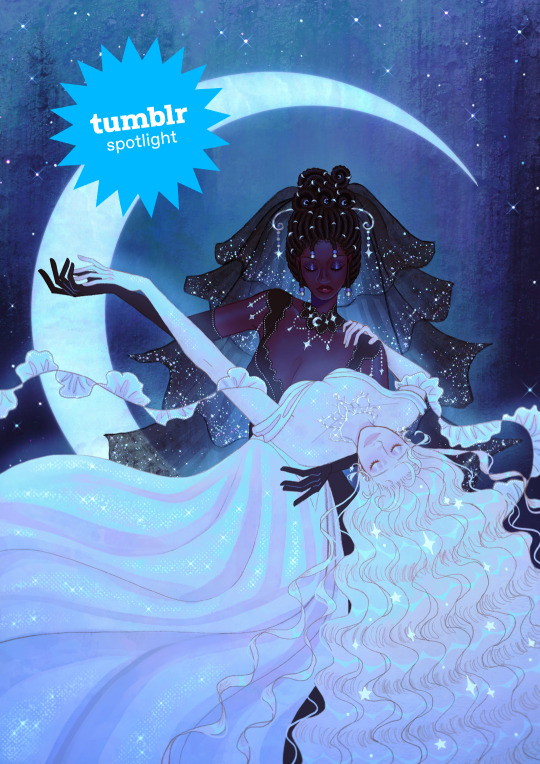
Creator Spotlight: @mimimar
Hi! I’m Michelle (Mimimar), an illustrator born and raised in Venezuela, currently based in Italy. I enjoy making colorful illustrations that reflect the things I love: fairy tales, fantasy, tenderness and queer (especially sapphic) stories. Occasionally, I also make paper dolls, comics and animatics. I have a lot of interest in book illustration and I’m currently developing my own stories that I hope to share as an author-illustrator someday!
Check out our interview with Michelle below!
Did you originally have a background in art? If not, how did you start?
I always enjoyed drawing when I was a kid, but it only became a hobby that I did almost every day when I was around 11. At first I only used traditional mediums, but I decided to make a serious effort to learn how to draw digitally when I was 15, and once I got the hang of it I never stopped!
I didn’t go to art school so all of my learning was done through studying the tutorials and resources that other artists generously share on the internet and lots of practice / trial and error.
How do you want to evolve as a creator?
I want to do many things but what I want to do the most right now is work on books! I want to make art for other authors’ stories and also my own stories as an author-illustrator. I want to grow as a storyteller and create art and stories that will really resonate with people emotionally. I’m always striving to improve my skills as well.
I also really love dolls, so working on doll box art or as a doll designer is something I would love to do someday. I actually have been designing paper dolls on my Patreon for the past few months, it’s been a fun project that is still ongoing right now!
What is one habit you find yourself doing a lot as an artist?
Probably using a lot of purple! It’s my favorite color so I find myself using it a lot. If I can find a way to sneak a little bit of purple into an illustration or a character design then I will.
Congratulations on finishing your Ivy Comic! Did the outcome turn out like how you expected or were there some unexpected bumps along the way?
Thank you! It’s a project that I worked on very slowly in between other art because I wanted to really take my time with every spread and make each of them a fully detailed illustration. I thumbnailed the full comic before starting but I kept changing the sketch for the final spread until the very end! Overall I’m really proud of the end result. I sprinkled a lot of hidden details in every page that I hope some of the readers will notice. For example: the meanings of the flowers in each page represent what the characters are feeling in that moment, and the colors of their wardrobe become gradually lighter as the story progresses to represent their emotions, as well as the changing of seasons.
We’ve noticed that you have created some amazing cover art for TGCF. Is there another series you would like to do something similar with?
That was another passion project that took some time to complete. Initially, I didn’t intend for them to be specifically covers, it was just a series of illustrations based on the 5 books/main arcs of TGCF. But since they were well-received and I had people telling me they wish they could use them as covers for their books, I decided to rework them into dust jackets for the english translation of TGCF!
I haven’t thought of any other specific series but I love doing cover art so maybe I’ll do something similar again in the future!
What’s your favorite part of your style? Why?
I’ve heard from other people that there’s a delicate quality to my art, this is something that I like a lot! I like pretty things, fairytales and vibrant colors. I think all of these things probably reflect in the art I make as well.
If there is one thing you want your audience to remember about your work, what would it be?
I hope that they remember how it made them feel. Feelings and colors are the two things I give priority to in my work. Most of the time I like depicting tenderness, softness and emotional intimacy. If that could reach the viewer and stay with them it would make me very happy.
I make a lot of art with queer (mainly sapphic) themes because they’re the kind of stories I personally like and want to see more of, so whenever people tell me that my art has helped them in their journey to discover and accept themselves, or that they see themselves and their partner in my art, it is always extremely meaningful to me. When art that I made to give myself comfort can provide comfort for others, no matter how small, it reminds me once again that despite any hardships art is genuinely worth pursuing.
Who on Tumblr inspires you and why?
So many artists! To name a few: I love @sakizo’s amazing eye for fashion and detail, @paneeps’ gorgeous style and striking colors, the sweetness of @bevsi’s art, @vickisigh’s pretty colors and concepts, @idledee’s warm and heartfelt art, @littlestpersimmon’s dreamy wonderful art, and @loish has been an inspiration for as long as I can remember.
Thank you so much for stopping by and sharing, Michelle! Be sure to check out their Tumblr blog over at @mimimar.
2K notes
·
View notes
Note
How did you learn to draw fat bodies but still keep it cartoony? I love how you draw different types of bodies and make them all seem normal instead of certain body types sticking out like a sore thumb next to others. I struggle to draw fat bodies without it looking weird with the rest of my art. Do you have a specific tutorial you followed or something?
This is a really good question! I'm glad you like my depictions of different body types, i worked really hard to get better at that so im happy folks enjoy em!! I didn't actually learn from a book or tutorial, it was mostly looking at fat bodies IRL and learning to incorporate those features onto what I already drew. As it turns out, we're all human, so if you understand the anatomy enough to draw a skinny person, you have the tools to understand the anatomy of a fat person.
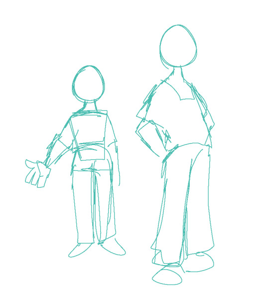
So, like, here, this is my sketch of someone with a very average build. If I were to draw a fat body, I would still use all the basic principles I use here. One mistake I think folks run into is "isolating" parts, which can lead to things like this
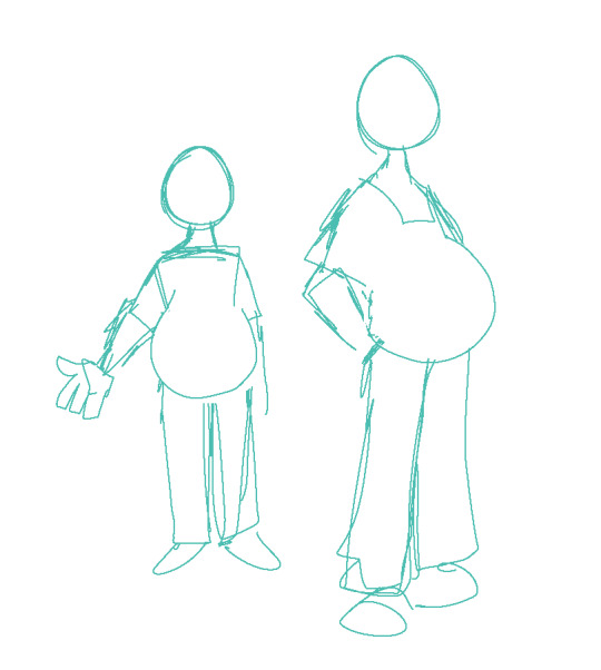
which isn't necessarily bad, but if its not what you're going for, the issue is pretty apparent. Weight affects ALL of the body, not just the stomach or the face or the limbs. If you think about how that weight affects everything in tandem then you can start drawing fat bodies that work more in your style.

for this, this is the same quick sketch using the same pose and principles as the first one. but! I allowed the weight to be distributed across the body. Notice how the legs, belly, arms, etc all got thicker? The key to drawing fat bodies and making them look like they fit is allowing that weight to affect everything. without it, it just looks like you're adding on features to someone rather than considering everything at once.
my other tip is: don't be scared! things like fat arms or chins or bellies or stretch lines are not something that's bad to depict. if you want to draw fat bodies, you gotta not be scared to draw things the way they are. someone having a fat body is not bad, and you drawing that fat body is not bad either. Experiment! To me, art is about representing ideas, and the only way to get better is to experiment with how you represent those ideas. I'm by no means an expert, and I think you can also get a ton done by looking for resources aside from me, but I hope this helps, and have fun!!
5K notes
·
View notes
Text


(you worked yourself to death.)
yeah i wasn’t kidding when i said these would be coming soon. <- haha funny joke marshall. so!! remember when i said that this post would be coming out last weekend? guess whose tablet broke a few days after saying that! so sorry for the delay!! this is long overdue. here’s a link to the drive, as always! everything in this part of the update should be in the miscellaneous folder (outside of the menu icons, which are in the menu folder. wauaua).
unedited versions below the cut, plus some notes. fair warning 90% of this is just ui stuff lol
so! all of this was already done by the time i posted the enemies. the delay isn’t *entirely* because of the tablet issues, i just managed to get distracted by making: even more redraws! i’d say new update soon but after what happened last time i shouldn’t jinx myself. but! almost All of the art for the initial mod release is done!!!! exciting!!!!!!
please be nice to me (silly) this is my first time doing frame by frame animation in… give or take 5 years? i followed the original animations pretty closely, so they don’t look Awful but i am Aware of the jank. i’m not an animator!!! they’re Good Enough for my purposes.
hey did you know that the original teleport map is slightly off center. did you know that. that’s not the case for the redraw for the record but it did make things a little harder. despite that, i think you can tell i was having fun with the dormont part of the map. i would’ve put more detail into the house, but we never really get a more detailed look at it??? and i didn’t want to make assumptions. so that part’s just traced from the original 👍. anyways shoutout to the clocktower being Curved for whatever reason
outside of those, all of the added art is actually just spritework. i didn’t know this at first, but there’s a TON of copies of sprites from the icon set. Basically Everywhere. so those are added now! and should work properly! also added a few sprites that were Missing from my original batch. not going to put them all here, but a few Important ones (which i actually had to make new art for) are the rock paper scissors cheatsheet, the Larger versions of the craft signs (used in the calamité fight and. probably somewhere else idk), and the craft signs for the tutorial kid fight!


aaaand i think that’s it! for stuff from this update. yeah no there’s more coming buddy. my tablet already broke one time this week there’s no way it’s happening twice. i’m not working on portraits Just Yet (though the temptation has been There), but i’ve got the title screens, a few backgrounds, and the ending cgs done! along with a few other assorted cgs sketched out. because im out of my fucking mind. so, uh, see you soon!! enjoy!!


#marshdoodles#isat#in stars and time#huh. wait is this the first spoiler free update????#i should. prolly tag it anyways there are spoilers in the drive#isat spoilers#AGAIN SO SORRY THIS TOOK SO LONG#my charging port on my ipad fucking Rusted#and apparently i’ve been using this thing so much that the pins in one side of the port are completely dshot#so! prolly gonna have to get a new one Soon but it still functions and that’s good enough for me#anyways!! the title screens are actually already in the drive. they’re just getting their own seperate post#also uh. as an aside. thank you guys again for all the support???#seeing people actually Mod my art into the game and make layouts genuinely made my day#what do you mean people like my art. thats insane to me#(also super sorry about the drive being so disorganized. i promise ill make a version that matches the ingame img folder eventually)#isat redraw project#<- I FORGOT TO TAG THIS. OOPS. KNEW I WAS FORGETTING SOMETHING.
478 notes
·
View notes