#and i chose a blue orange color scheme
Explore tagged Tumblr posts
Visit Tumblr Blog
Explore Tumblr blogs with no restrictions, modern design and the best experience.
Last Seen Tumblr Blogs


Fun Fact
Tumblr Inc. is using 66 technologies for its website.
Text


Sage & Magnolia
hi guys is it bad that i looked at a candle in my house and was like: wow, that would be so cute as a pair of hairs for the sims 4!!!! yeah my life is just not real atp. but anyway they are a little shitty so i apologize.
bgc
teen to elder
female only
24 swatches
disabled for random
not hat compatible
T.O.U:
don’t steal/claim this as your own, and do not put this or any of my content behind a paywall. Other than that, feel free to use this however you like! tag me in your posts :))
Download - free on patreon
Download - dropbox
#ts4#ts4cc#also ik sage is technically a shade of green#and i chose a blue orange color scheme#just dont perceive me#ts4 hair#g#sims 4 cc#download
1K notes
·
View notes
Note
Might i humbly request the jelly!neil au??
I really like neil's design as a jelly fish (also have you ever considered giving him other colors outside of orange for his jellyfish-ness??)
Well I have NOW, this was perfect to doodle after a long day
I also learned while doing these that Portuguese man o’ war are not technically jellyfish but we included him anyway 💕

Also mentioned was a species swap (thank you @jtl-fics ) so I have shark Neil and jelly Andrew too :D
#I did realize too late all the ones I chose had nice purple/blue color schemes#but hey#its not orange so technically all boxes are ticked here#fan art#my art#aftg#all for the game#mer au#neil josten#andrew minyard#jellyneil#jellyfish#sketchbook#traditional sketch digital color#I had no idea what to do color- or species-wise for jelly drew lmao#jellyNeil has…. no bones#man o war are like see through#ain’t nothing in there#requests
336 notes
·
View notes
Text
RANT
- Anubis without his head piece took me by surprise, but his hair looks pretty much like I imagined. Long hair but short on top. One of my favorite anime hairstyle. No idea what it’s called but I’ll call it the twink cut. I really like that his suit is by far one of the brightest, and gold is definitely his color. I like his skin tone and his piercings are seriously unique compared to the other characters.
- the Greeks make a reappearance. Keep Zeus the fuck away from me.
- I don’t care for Lu Bu at all.
- hades looks fantastic as ever. I would’ve been disappointed if his suit wasn’t silver. It’s just his color.
- I’m not gonna lie, I don’t care for Leonidas at all, but I do like how his suit fits his style very well.
- Odin not even bothering to face forward is hilarious. I’ll never stop being upset that the anime gave him black hair when it’s actually white.
- Apollo actually looks so good. I’m not the biggest fan of his character, but I gotta admit he is EATING. His suit is super flashy and has a nice style.
- QIN MY SHAYLA AHHHHHHHH I love that man with feral energy. I’m a lil disappointed that we can’t see his eyes, but hey after Qin being in a coma for years I don’t even care.
- Jack looks nice in pink. Very cute.
- why is Adam wearing clothes so dystopian- He looks great in that shade of green.
- I don’t even like Thor, but I have to admit he looks FANTASTIC. MAJESTIC.
- LOKIIIIIII HE LOOKS BEAUTIFUL. THE GLOVES. His color scheme is perfect. I also like how Loki is sitting behind Thor rather than near Odin.
- Adamas is meh- I just don’t care for him much.
- I don’t like how much Tesla’s color scheme here clashes. Who chose that? Purple on orange with a gold jacket? Absolutely not. His pigeon being there was silly though. It’s a requirement.
- Heimdall is as extra as ever and I love it
- always nice to see Beelzebae. The little Hajun seed plush is DIABOLICAL.
- Simo hiding behind his dog is so canon. He would actually do that. I also like how he’s the only one with a top hat. He absolutely needs a hat at all times it seems.
- I’m actually really happy to see Zerofuku again. Trips me out how long it’s been since his round. He looks amazing
- Shiva serving all that cunt. I like the blue.
- Buddha looks beautiful. I really love him in gold. Not the best color scheme, but hey it’s Buddha.
- Kintoki looks great. I love his colors and overall a good look.
- I love Susanoo’s color scheme. Very nice
- I don’t exactly like Raiden, but he looks very good. Him in a suit is surreal-
- okita and Simo looking so small is sending me. Short kings. Okita always looks so adorable and friendly.
- #morekondoulove. Kondou looks so chill
- I love Sasaki’s look!!! The gold with maroon is such a slay.
#record of ragnarok#shuumatsu no valkyrie#snv loki#ror loki#ror simo#snv simo#simo hayha#ror adamas#snv tesla#ror beelzebub#ror qin shi huang#qin shi huang#snv okita#ror hades#poseidon#ror anubis#snv jack#ror apollo#loki record of ragnarok#loki ror#snv thor#snv buddha#zerofuku#snv shiva#sakata kintoki
86 notes
·
View notes
Note
You've probably been asked this a million times, but how do you render? Or I guess a better question is how do you decide where to put colors because it's always so masterfully done!!!
For rendering, firstly: what is the mood I’m going for? For my Hero’s Shade piece, I kept the rendering rough, relying on rough brushstrokes and brushes with color jitter to create colored texture, and then leaving it alone before it becomes too refined. For my Zelda illustration, I kept it clean and dewy. I render based on intent, mood, and characterization.


To master rendering, I would suggest doing in depth texture studies. Below is an example of my student’s work where she’s in the process of doing this:

Mastering how to render different textures by doing exact studies from photographs of things such as: metal, fabrics, rocks, wood, etc will excel your rendering abilities.
BUT AND THIS IS SUPER IMPORTANT: the thing I notice about most artists with like godly rendering skills is that their rendering sometimes excels beyond their drawing abilities. Then they use their rendering as a crutch to carry their poor drawing skills: the drawing is like the bones, the architecture. If you have a poor drawing with excellent rendering, the piece will look good to the average enjoyer, but it will unfortunately fall flat to artistic peers.
In saying all of this: it’s super duper important to note that, when trying to make objectively appealing art, it has hierarchies of importance and I’ll tell you the order:
Perspective placement and proportion are the first part. It’s basically the drawing part! The architecture and bones of the artwork. The anatomy, the form, the silhouette, negative space, and overall design of the sketch, composition, lineart, etc, they all sort of fall under this.
Value is below this, and to master value I suggest master shading the sphere.

Highlight, direct light, core shadow, reflective tone, cast shadow, etc.
Color is below all of this. You can be wrong with color but not wrong with value is what’s usually said.
As for coloring, it’s a lot harder for me to explain other than to refer to how I use grays a lot. Color is a lot less step by step to explain you see, so I’ll try to explain, but I’m sorry if it lacks much sense! The reason why I’m able to get away with using strong/bold saturations without it being overwhelming is that I use the grays to carry the strong saturations. It’s important to remember that the human eye can get tired; it’s why we blink even when our eyes don’t feel dry. It’s a moment of pause, a moment lacking in stimulation. You have to have areas of high stimulation (high saturation, texture in rendering, sharp edges) paired with areas of low stimulation (low saturation, smooth rendering without detail, and lost or fuzzy edges). This is why I argue that art does indeed have rules, but only so much as our own brain and eyes have rules; it’s our brain and eyes that perceives the art, and our brains have a very broad and universal mode of operation. Same with art. That’s why art is objective and yet also subjective! But this is a tangent.
As for color, it’s again with mood, but I usually rely on contrasting colors more than anything: warm or cool for light or shadows, one is super saturated while the other is typically desaturated. Hope that makes sense! It’s all about balance: one element/color must have a foil to counter it. And when you chose your main colors, if you wish to add a few extra colors for dynamism, it’s your best bet to chose the colors right next to the main color you’re using on the color wheel. For instance, if you choose red and green as your color scheme, and you need more details in the green shadows as an example, use a combo of blue-gray variations to add more color and saturation variation. In contrast, for your red lighted areas, maybe I would use a light gray orange to introduce new colors in.
Idk if any of that makes sense, I’m not exactly the most gifted teacher when it comes to trying to break everything down, which is why I’m trying to learn how to teach 🤣 I’ll get the hang of it one day maybe 😆 Hope some of this helps answer how I personally approach it, and mind you it’s important to learn from actual masters who have been doing this for decades!
93 notes
·
View notes
Note
If you wouldn’t mind sharing your secrets, can you drop a quick tutorial for the hades art style? You seem to capture it very well!
Hey anon! Thanks so much, I’m flattered you think so!
To be honest there's really no secret, just a lot of trial and error. I am an amateur, but I’ll point out a few of my observations of the amazing Hades team’s work that I attempted to incorporate into this Astarion drawing, especially SuperGiant Games art director Jen Zee. Everything below is just my layman’s observation of her much, MUCH better work. You should check her out yourself!
First off, here’s a simple split out of the whole process (this will be long, more below the cut:)
POSE & PERSONALITY
Hades art is full of personality so the first challenge was to pick a pose that illustrates just one or two aspects of the character. For example, Dionysus from Hades 1 below has a languid, draping pose that reflects his chill-guy party vibes. Just looking at him you get an immediate idea of his personality.
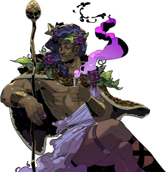
And as much as I love the later wet-cat version of Astarion as he matures as a person, for the purposes of illustration in this style I chose a pose and expression that leaned into his early, less complex, more wily self. The dagger, wink, jaunty hips and head tilt are meant to communicate, without additional context, that he’s both trying to be appealing and is not trustworthy.
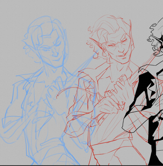
LINEWORK & SHADING
Next is the linework and blocking! The Hades art team tends to use a combination of near-mono-thickness black lines, where exterior lines are thicker and interior lines are thinner or have no lines at all. They will often forgo an interior line to communicate form via color blocking instead. The style also makes heavy use of absolute black for the deepest shades, especially on more sinister characters or spooky aspects of a characters design. (See: Zagreus’ three dog head skulls and his red eye perpetually cast in deep shadow.)
It took some back and forth to find the right balance of black shading for Astarion. Too much and he looked too sinister and not approachable enough. Too little and he looked too innocent.
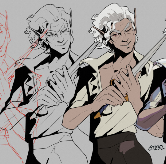
Picking a strong light source helped with determining the direction and placement of the shadows so that just enough was obscured/revealed. It also helps in differentiating forms from each other so that, for example, the arm doesn’t disappear into the chest and become unreadable.
Using heavy black shading was a particularly useful trick in Astarion’s case, because his camp clothes color palette is fairly monochromatic between his light hair, pale skin, and white/cream shirt. That much light color can easily blend in too much and become boring: the flats I used were slight variations of white, from a warm reddish-peach to a yellowy cream to a cool light gray for the dagger.
COLOR & LIGHTING
Last is color! In Hades 1 and even more so in Hades 2, the lighting schemes are deceptively complex. There are often multiple light sources and use of bounce lighting to add a lot of visual interest. For example, check out this lighting on Polyphemus from Hades 2:
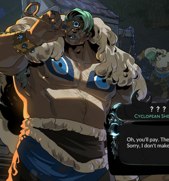
Not only does he have a cool moonlight hitting him from above, he also has a warm orange rimlight lighting him from the left, AND cool lavender bounce light bouncing off the ground and hitting him from below. All these combine and layer on top of one another to help emphasize the forms of the cyclop’s musculature and the textures of his sheep wool coat.
I don’t think I was as successful in my own lighting scheme, because I’m an amateur, but I determined that the scene in which I was placing Astarion has a high sun and was outdoors. This means that the light hitting him from above would be a light, warm yellow and the bounce light hitting him from the left would reflect the nearby water and blue sky of the environment.
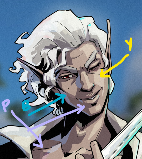

To achieve this, I made use of different layer modes in my art program (Clip Studio Paint) to apply purple shadows (via the Multiply layer mode) and highlights (via the Soft Light layer mode) in a light sky blue and a light yellow for the primary and secondary light sources.
I ran into trouble with the blade, because it was also a light metal in an already light-color-heavy color scheme. At first, it was blending in too much and hard to read. So I decided to give it a bit of a magic teal glow to help it stand out, which meant adding a few specks of magic light reflecting back onto the face and clothes as well.
INTEREST & DETAILS
Speaking of, Hades style art makes extensive use of adding little speckles of high-saturation color to add visual interest and cohesion. See this Zagreus portrait which is primarily made of grays, a tan bone-color, and reds:
But sprinkled in are neon teal and magenta that don’t relate to the lighting at all. It’s just there to break up the blocks of color, bring unique colors like his green eye into the rest of the portrait, and direct the viewer’s eye. These highlights are slightly less bright in Hades 2, but still there, such as in this depiction of Apollo, who mostly glows with a warm sunlight but also has random pops of sky blue and green flecking his armor and hair.
The pops of color are often placed more centrally on the figure to keep your eye on the important parts of the portrait, like near Apollo’s face and on his armor. The color pops aren’t as frequent at the extremities; too much on the arm and your eye would be drawn away from his face.
I took a similar approach where I grabbed some of the brighter colors (like Astarion’s red eye, and the teal glow of the dagger), to add dabs of color that normally would not “make sense” from a lighting perspective, but add a little visual interest:
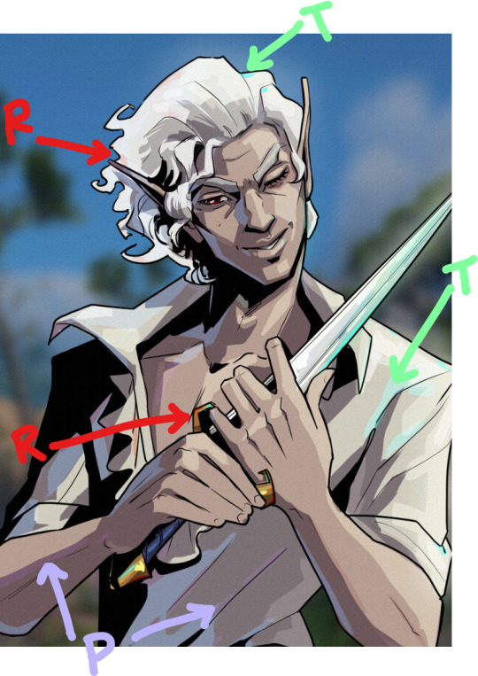
Also I totally studied their approach to Apollo’s curly hair to create the impression of Astarion’s curls!
Anyway, I think that's all I got for now, I hope this helps! There's more but this is already REALLY long so I'll stop here. In the end, it's really just a process of observation and replication of things you love in artwork you admire. Give it a try, it's a lot of fun :)
146 notes
·
View notes
Text
So just a bit of Rumiko's originally planned color scheme i have never seen anyone comment on.

Ryoga's entire assemble was originally supposed to be very glaring pink, whoch has several meaning in Japanese, as it's speciffically a very masculine color... But with a twist.
In Japanese, Pink is the color of Sakura, and in terms of masculinity, is used to symbolize Samurai who died before their time, in the prime of their lives.
Which you could easily connect to Ryoga's feelings that his life effectively came to a premature end at Jusenkyo.

Meanwhile, Shampoo's most notable different feature is that she was originally meant to have scarlet hair.
Now this is of course a reference to the fact that Shampoo, more than any of the other of Ranma's love interests represents war, fighting, ruthlessnes and martial arts.
In the context of Japan, it also is the color of authority, happiness and strength.

It is also meant to be a clear cut contrast to Lum, the Heroine of Rumiko's first hit series, from whom Rumiko took a lot of inspiration, but ultimately made her a mirror of, as defined by Shampoo's red, to Lum's generally green.

As for Ranma's design, while there is of course the more notable fact that Manga ranma always had black hair regardless of form, there is also the original color of Ranma's famous amrtial arts uniform, which rather than the familiar red and black/blue se all know and love, was instead a very distinct orangish yellow.

Rather than any symbolism, thia is instead a reference to one of Ranma's contemporaries/predessecors, Dragon ball, as Manga Goku's Kame Gi as shown on the cover above, is almost the exact same shade, much brighter than it's animated counterpart.
Overall, Rumiko just loved this color scheme in general, as a lot of art has ranma in orange duds.

Its even the main color on the final volumes of the series.

Similar to Shampoo, Ukyo also has an element of red that was dropped in the anime, in the form of her ribbon, the trim of her short, but also her lipstick and Eyeliner.
It also symbolizes strength, power and war... But in a much more subdued manner, as while Ukyo is just as monstrously strong as Shampoo(With word of god estimating her raw, brute strength on the level of Ryoga, though lacking his monstrous durability), she lacks Shampoo's comfortable with violence, nudity and such, with her loss against Ranma in large part due to feelings of personal emberassment at her own nudity that Shampoo has never shown.
She also in general just lacls Shampoo's comfortable with true, murderous violence as the go to answer to her problems.
Hence while it was meant to be a defining color on Shampoo, on Ukyo it was meant to be a very small yet noticable aspect of her coloring.
It is also the color of sacrifice, and more than anyone of Ranma's finacee's, Ukyo is willing to change herself if it means winning Ranma's heart.

Later down the line, this red color would also link her to her introduced at the last minute love interest Konatsu, who wore red in general.

Also, speaking of character who never got the animated treatment in the original series, Ryo Kumon stands out as not only was he given a color scheme by Rumiko, but his color scheme was speciffically influenced by the Animated color scheme of Nodoka as having purple hair, in order to contrast him with Ranma as looking far more similar to Nodoka than her flesh and blood son.

Its an interesting choice as manga Nodoka had black hair, which meant Rumiko specifficaly chose this color design to make the similarity between him and Nodoka much more obvious for when the arc was adapted for the screen(Which didn't end up happening in the first anime).
#ranma 1/2#ranma saotome#ryoga hibiki#son goku#ukyo kuonji#shampoo#ryu kumon#konatsu#color scheme#anime#manga#rumiko takahashi#symbolism
45 notes
·
View notes
Text


{ Twoset Art Roundup Part 1 }
calling this grouping my "weird color series". these are all from 3-4 years ago when i was still feeling out my painting process/style and starting to work more intentionally with limited palettes.
extra yapping is, as always, under the cut:
from left to right (and oldest to newest):
1.this one is done from a screenshot from the video where Eddy is talking about his new violin. i was having a hard time settling on the level of realism, and i had a Vision(tm) for the color scheme that only partially panned out, but that violin is one of the things i'm most proud of painting ever. i think she's beautiful even if i got some of the details wrong (Eddy's fine-tuner is black, not gold) and all the strings are the same thickness. i could almost certainly paint a better one now, but this was four years ago. so
also: hands
2. Brett portrait done from video screenshots and using colors pulled from the promo material for their 70s-themed merch drop. i remember my process for this was WEIRD and i was really struggling with the palette lmao but i made it through! and i'm pretty happy with the result.
3. what was meant to be a sketch from their CAFE video that spiralled into something fully-rendered. it was done almost entirely using the 2B pencil brush (my preferred sketching brush, these days). i'm not sure where i got the palette from, if it was something video-based or i just chose it arbitrarily--i do really love blue/orange color schemes. i will say that i always associated Brett with blue and Eddy with red (this is because of my grapheme-color synesthesia, but it later got canonized with their concert colors from tour, which i think is funny). so this could be a play on/inversion of that (Brett in warm tones, Eddy companion piece in cool tones)
4. matching CAFE Eddy for the CAFE Brett that never got finished. it was shaping up to probably turn out better than the Brett one lmao, because i was doing it more intentionally, but the fact that it was A Real Piece and not "just a sketch" is probably also why it never got finished. the WIP is still cute tho
16 notes
·
View notes
Text
Color study: Orange
I painted these minis two years apart; both were studies in using monochromatic orange scheme.


Samson, from the Zombicide: Black Plague boxed game by CMON miniatures.


An mildly converted Escher from the Necromunda game by G*mes W*rkshop, now for use as a Reb leader in Mantic's Firefight and Deadzone.
Differentiating orange and red can be a bit tricky, since it's tempting to highlight red with orange. Ditto for orange and yellow: push too hard into yellow and suddenly nothing is orange.
The bronze was achieved by mixing together two complementary colors: orange and blue. The two hues oppose each other so you don't need to pick a dark blue, just something really saturated. Together they make the dark brown base, and then by adding progressively more orange I highlighted upwards. This is one of my new favorite ways to paint NMM because you can be so intentional with your colors.
Other than that, I'd say Escher #2 came out pretty well. The skin and latex are slightly more practiced (that's a custom, greenstuff butt btw), the weapons are evocative and pop well. But frankly my favorite part of the model was an afterthought: the dirty cloth and feathers. I almost chose not to distinguish the feathers at all, as they're kind of a low-value detail. But I'm glad I did, they draw attention to the dirty cloth which illustrates my "sketch style" method.
Hey, thanks for checking out my art and reading what I have to say. If you have any questions about the models, the paintjobs, or the games I use them in, don't hesitate to ask.
#miniature brainrot#mini painting#miniature painting#miniature wargaming#miniature wargames#tabletop wargames#tabletop wargaming#color theory#warpath firefight#warpath deadzone#deadzone#mantic games#my art
13 notes
·
View notes
Text
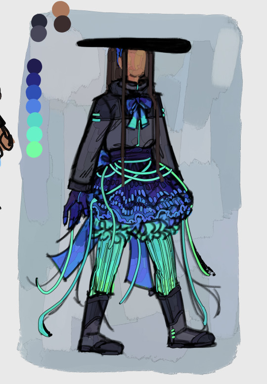
Baron Draxum’s Design for My Order 66 AU

Like in the franchise, his identity is split in two, so I’ll put them in different columns
“The Baron”
I’m leaning towards color scheme 1, though I wanted to display 2 with the gargoyles
Sidious’ whole thing is black clothes, but I knew Draxum looks good in blue and wanted to incorporate some red (like in Palpatine’s ROTS outfit)
Something that was very important to me was covering up Draxum’s legs. As Sidious was someone very secretive, covering up everything except the lower part of his face, I knew that I had to cover up one of his most recognizable features. So I kinda reversed how it was in the show.
^ It is also why his hair is tucked away
His gloves are larger than his actual hands. This doesn’t mean that it’s too big for him to fit in, just that it makes his hands look bigger
Armored chest helps hide actual chest shape
Voice modulator in mask makes him sound like season 1 Baron Draxum
Couldn’t figure out how to do his belt thing without making it look weird… looks a little plain but it’s better than the alternative
One of the reason I changed Lou Jitsu’s belt buckle to silver was because gold kinda represents evil in my au (Big Mama will also have some gold). (Ok it was mostly so it would match his sword, but the symbolism ended up working out.)
Draxum
I explained why I revealed his legs in the Baron’s section, but it also makes him seem more exposed/open. Since I couldn’t find a moment in the show where his legs were exposed without the bodysuit, I made up my own color (tried same color I used for the upper half, but it just looked weird 😭)
It’s also why his hair is down. It also kinda reminds me of something like Mufasa’s mane, and he’s practically the paragon of goodness/kingliness
But shape language! Usually don’t do it, and it was mostly by accident/following his show design, but we got triangles, which resemble evil/strength.
The outfit color scheme is largely based off his show’s, though I added some orange to match his schlera. I think it’s a pretty color combo
Draxum is never seen with the gargoyles, only the Baron is
The explosion in his lab left him with some scars. Namely, the one on his arm, which is the worst since he used it to block the blow. (This is my first time drawing burns, so kindly lmk if there’s anything I can do to improve <3). It was important to me for there to be some remainder of the fire, as burn scars usually don’t go away and idk how they got out of it peachy fine (esp Lou, like he was in the middle of it…). After the explosion tho he teleported away, so his burns aren’t too terribly severe.
Naturally sounds like season 2 Draxum
Can we call him a wolf in sheep’s clothing? (Ik he’s a goat but still)
I can’t decide if I still want his irises to be orange, or if I leave that solely for the Baron and his eyes change color like the Sith. Either way, I chose to just draw his eyes like I did for everyone else—just black dots. I will say, it helps make him look friendlier and in place.
#rottmnt#rottmnt x star wars#rottmnt order 66 au#order 66 au#66!baron draxum#checkeredblueskirt art 💠#rise of the teenage mutant ninja turtles#my art#my artwork#character design#character reference#character redesign#reference#rise of the tmnt#rottmnt au#save rottmnt#unpause rottmnt#save rise of the tmnt
11 notes
·
View notes
Text
an analysis of clothes in st - the meaning of yellow within the party
so, this analysis is one that has been in the making since before s4 came out - i literally had to dig through old discord messages to look for what i was talking about two years ago. i'm hoping to make this into a series because i loved analyzing the outfits back then and i wanted to share what i thought about them! the costume designers put so much thought and effort into all the clothes and i'd love to try to understand why they chose what they did for specific moments. heads up! - this analysis series will mainly cover the party members. outfits are important within the entire context of the show as well, so i may include other group members from time to time. however, my primary focus on st has always been the party members, so i'm gonna be giving them the main focus in all of the posts.
--
let's start with my favorite meaning for the clothes: yellow.
when party members wear yellow, they tend to be in situations where they are trying to fit in or act normal, typically when regarding relationships, but could also be within society, a situation, or in general. i have four examples of yellow being used as a signal that these characters are put in situations where they're trying to fit in / act normal - one of max, one of the entire party, and two of mike. let's start with max!
------
example one: in s2e3, we watch max trying her best to fit in with the boys when dustin is showing them dart. despite her attitude when they first meet her, she obviously does want to be friends with these guys regardless. in this episode, max wears a yellow hoodie while all the boys wear variants of the same neutral grays/whites, dark blues and reds, showing the difference between max and the other party members. she has not "earned" her keep yet, and she's trying to fit in but she is not yet in the know of the upside down.


even el is wearing similar colors to the rest of the boys, another clear sign that she is "in" the party too, despite being away from them. they did something similar in the previous episode as well, where the boys + el wore matching costumes (boys were ghostbusters and el was a ghost), while max wore a costume that didn't have her fit in (michael myers).
all of the current party members have the colors gray, red and/or blue that tie them all together in that scene, so max's yellow hoodie makes her stick out like a sore thumb. a side note is that mike and will are the only members to have all three colors on them, and matching color outfits between couples tend to be common in the show.
--
example two: in s3e1, the opposite happens. everyone in the party except dustin is wearing a combination of blue and/or yellow. dustin is wearing primarily green, which i will explain the meaning of in another post. all i'll say about it now is that the color green most likely has to do with being comfortable or confident in your own identity.


will, however, is a special case, because he was actually not wearing yellow in that scene, only blue and a stripe of red. personally, i thought it was to set up how will's growth that season wasn't completely about societal expectations regarding romantic relationships like the rest of his season group. his character arc was much more about having to grow up and understand change when he doesn't want to because of the trauma he'd experienced the previous seasons. this is actually also reflected in his clothes - will is the only one that season to not wear any new colors (he only wears the three primary colors -> red, blue and yellow) while the rest of the party got to wear both secondary and primary colors (mike wore teal, el and max wore many different colors, lucas wore purple, and dustin wore green + orange).
back to the party - in that scene, the couples also match each others outfits. mike and el's have the same color scheme, being mainly blues with a small hint of yellow, and lumax having the perfect blend of yellow and blue together. this may be a stretch, but its a possible hint to show that lumax fit together, while mike and el don't.
the party members that were dating each other wearing yellow that season was to show their attempts to act normal via relationships. season 3 was also the one that the duffers kept referencing as the summer of love, despite all the couples that season being dysfunctional.
--
examples three and four: now, we're at the section of mike wheeler, my favorite closet case. he is the main reason as to why i noticed that there was a small pattern with the color yellow being used in the party's wardrobe.
i think we've all noticed that mike has a tendency to act very... straight when he's wearing the color yellow as his main color. this can be seen in both s3 and s4, especially during the episodes where mike is hyperfocused on his relationship with el.


when mike was wearing the first outfit in s3, he was searching for a way to make it up to el because he lied to her. though he was trying to act normal or learn to be normal for their relationship, he wasn't doing a great job of it. during that entire section, mike was going through the motions of learning how a straight man is supposed to act, with lucas by his side giving constant straight man advice. he was also not getting it.
now, onto what is possibly my favorite outfit in the entire series - mike's s4e2 outfit. first of all, he's wearing a yellow shirt over a purple undershirt, presumably for el because that's her favorite colors apparently. obviously, mike is not himself in this outfit, but he's trying to fit into this california tourist look for his girlfriend.
in this outfit, mike was trying extremely hard to only focus on being el's boyfriend and not will's best friend. we know how that went, and this outfit helped us realize how badly mike was doing trying to follow that mindset.
before s4, we were never given any indication that mike's style would be like this. michael wheeler should not be wearing an outfit that has a yellow hawaiian shirt, the color purple, a visor and sunglasses, and flip flops to top it all off. it doesn't fit his normal style that he's normally been shown wearing throughout the show, being button ups, polos, and for that season, black jeans and chuck taylors.
he was intentionally put in an outfit that did not follow his true identity. the shirt, thus the outfit and the het identity that mike was attempting to fit into, was literally called a "shitty knockoff" by argyle.
------
i'm positive there are way more examples that can be used, but these are the ones that stuck out to me the most. i'll leave off with some ending thoughts:
we as bylers have always considered will's main color to be yellow, but from what i've noticed in each season, the majority of his outfits have blue, same as mike (matching couple's colors)! in fact, s4 was the first time where the majority of the season had will wearing yellow, probably because of how he was dealing with his crush on mike at the time. i'd like to point out that the main colors that lucas and max wear are also the same, being red.
i'd love to do another one of these, the next one probably being about the color green because i think i have a grasp on the reasoning behind that color. other than that, i still really need to analyze the colors of their outfits again because i think the party's clothes specifically are most indicative of their behavior. since they are the youngest group, they are the ones who are the most volatile and it's reflected in everything, especially their clothes!
#stranger things#the party#byler#<- target audience#this analysis is for the byler nation#byler theory#byler analysis#st analysis#byler proof#i'd love to do more of these honestly#it's fun as hell#not art#sammi's brain was used
82 notes
·
View notes
Text
Carnevale - A night to Remember
@inmemcrum closed starter for Ezio and Leonardo

Tonight was finally the night of Carnevale, one that the great artist Leonardo had been looking forward to and planning for months. Not only had he finished three paintings to be displayed in the artist district of the carnival but also his costume. A fantastic achievement for the man that would constant procrastinate and take a year to finish one painting. He'd had some good motivation from his dearest friend Ezio who had gifted some funds to get better supplies for his workshop. Leonardo had helped him quite a bit with whatever he'd ask but truly he only did so because he cared for the assassino and not to get paid for his help. Though of course he'd never turn down a gift.
Even with all the progress made he was still working until the last second on the finishing touch on a pendant for the fabric choker to go with his outfit. He was no jeweler but Leo was a man of many talents. Nor was he an assassin, but for years Ezio's parents had been dear friends when he had no others and Ezio himself had been there when he needed most. Whether it was to test out his inventions or kill Borgia guards that's been harassing him. This symbol for the assassins to him belonged to the people he cared for most in this world, not the family by blood but the family that chose him. Once finished engraving the last flourishes into the silver he sewed it to the teal fabric choker that was trimmed with gold lace and pearls.
Leonardo caressed the metal and smiled fondly down at his work. "I wonder if Ezio will attend..." He whispers to himself. His friend wouldn't recognize him, no one will, but maybe he'd be lucky to steal a dance with Ezio.
The artist pocketed his necklace and went to make sure his assistant had his paintings ready to be taken to the street gallery. There was still a few hours before dusk and his paintings needed to get there to have their spots if he hoped to sell them. With that arranged with his assistant it was off to get himself ready. He would leave his workshop to meet with Paola and her courtesans where they would help him get into costume. An outfit like this he couldn't have in the workshop. For this carnevale he wanted to indulge in his more feminine side, he wanted to feel beautiful and desired and he chose a dress and mask that reflected his own tastes then added his own flare. Beautiful teal with gold much like what he usually wore, he had added the golden lace patters and sewn in pears for that extra twinkle. Then the mask he got was elegant white porcine with gold painted designs and more pears. Though what had been originally a full mask he had altered it to cover only the lower half of his face.
His costume was quite snug, the courtesans putting him in a corset first to help give him a more of an hourglass waist. But once on it fit him perfectly, a lovely flowing gown that was perfect for twirling and dancing. The woman did his hair next, weaving and braiding in curly extensions to give him long wheat gold locks. They offered to use makeup on what skin was exposed but Leonardo liked his freckles over his collar bone and face so they were left natural with only a bit of eyeliner and brow details to make his blue eyes pop. Mask secured, he pulled on golden silk gloves then finally put on the choker with the silver pendant. All set for the carnival he thanked the courtesans and Paola wished him luck on the way out.
The sun was setting and the sky was darkening. The lanterns were being lit and people in costumes were already starting to flood the streets. Tassels, ribbons and flags hung between buildings, Venice was decorated in shades of vibrant pastels of pinks, purples, yellow and orange with party goers of similar color schemes. Though Leonardo stood out with his bright teal dress, but in the best of ways. It was not as extravagant as some women who went the gaudy route, his was dripping with elegance and with the pearls and gold had the air of wealth and fine taste. Nearing one of the main squares it took no time at all to have men wishing to escort him through Carnevale, asking to dance and wanting his attention. He chose one of the men wearing a fox mask for his first dance and they went among the others dancing in the streets before the stage with the musicians playing. This was exactly what Leonardo had been wanting, to feel free and have some fun with masked strangers at Carnevale. Though in his eyes often wandered, glancing around and hoping to spot the one he wanted to spend this night with more than anyone.

#inmemcrum#{muse} leo davinci#apologies that its so ridiculously long#i got carried away with how excited i am for this#also took so long finding the references I wanted lol
17 notes
·
View notes
Text

Maximus
So, I like Maximus. I think he's super interesting for a variety of reasons. I like that he's this super naïve, virginal character. In a bunch of ways. He's cautious but hungry. He wants glory SO bad, he's not only willing to kill for it, but unable to convince anyone that he didn't maim his best friend for it.
The fact that we were led to believe that HE MIGHT HAVE HURT DANE until the very last moment when THEY confirmed that he didn't, was so cool. We didn't know because he didn't. He might have gone that far to get what he wanted. He didn't, but because he would have, he had a hard time convincing anyone that he didn't.
So, obviously, his soap will have the characteristic color scheme of the Brotherhood of Steel. I think he may decide to abandon that organization in the next season, but he's still at the beginning of his arc and needs them, and his Power Armor.
So, his soap will be red and silver. Not entirely sure yet what design or how I'll pour it, but those will be the colors. If I were more talented, a little blue heart running through it for Lucy would be cute, but melt and pour soap is so MELTY.
And for the smell, I wanted it to be sweet. Because he's sweet. Sweet and a little childish in his demeanor. He's not a baby, and he's not innocent by any means, but he's just.. he's not spicy. Not yet. So, his scent is sweet. Pistachio and almond, vanilla, and salted caramel. But not JUST sweet, because he IS a Wastelander. The middle notes will include heliotrope and jasmine. Heliotrope is just a fancy flower haha.
So, the flowers and sandalwood are what ties Maximus to Lucy in regard to soap.
I think this might end up being my favorite scent, but we'll see. I love sweet smells, but I also love the idea of an orange patchouli like what I chose for The Ghoul.
NEXT UP: The Vaults
#soap#artists on etsy#etsyseller#handmade#handmade soap#small business#fallout#ghoulcy#maximus fallout#vault tec#the vaults#brotherhood of steel#power armor#the ghoul#cooper howard#lucy maclean#lucy#goosey maclean
27 notes
·
View notes
Note
HI HIIII I absolutely adored the red guy aromantic board u made !!! Could you do an arty Wally Darling one? I like his red orange yellow blue color Scheme ❤️🧡💛💙


This was so fun to make! Funny enough 3 out of the 4 multicolored gifs I chose ended up having eyes in them by complete coincidence and I only realized it as I put the board together, but Wally’s a spooky guy he gets some eye motifs as a treat. Happy holidays! :]
Center gif is by @cutepotatook !
🖌️ 🍎 🖌️ / 🍎 🖌️ 🍎 / 🖌️ 🍎 🖌️

#red#orange#yellow#blue#eye#painting#art#welcome home#welcome home arg#drawing#makeup#shoe#marker#Wally darling#stim#stimboard#request#fav
64 notes
·
View notes
Text
【KHR AU】 XanLena Chibi Commission by Hika ❤️💜🔥🪷


XanLena (Xanxus/Selena) Chibi Icon Commission by Hika (@/onigiwi2namayo)
Hika's Twitter: (X)
Hika's VGen: (X)
In accordance with Hika's Terms of Service (TOS), editing, using, or reposting these arts, in any way, is prohibited without explicit permission from Hika, and me, the commissioner.
Intro
I commissioned Hika to draw my beloved XanLena ❤️💜🔥🪷
Selena is my beloved KHR OC and wife 💜🪷
Her name is Nguyễn Selena, and her Vietnamese name is Nguyễn Nguyệt Vân Liên. Her Viet name, Liên, means "lotus" in Sino-Viet 🪷
She is a Viet NB assassin with a calm and aloof personality, who's reserved and mainly keeps to herself, but cheerful around people she's close to. Her design is NB flag colours 💜🖤🤍💛
She has an interest in gardening (collecting flowers, plants, learning about different types of poisons), and fashion (collecting clothes, including traditional clothes) 💐👗
Xanxus/Selena matching cheebs ❤️💜 The little Xanxus and Selena... I'm SOOOO happy!!!
My friend Snow and I used Hika's XanLena chibi icons as matching PFPs on Discord for a bit 🥰 They're just that cute 💘
Rambles
WAHHHH THE XANLENA CHIBI ICONS ❤️💜🫶 OH MY GOD THEY'RE SO CUTEEE MY BABIES!!! 🥺💗
THEY'RE SO CUTE IN HIKA'S STYLE… REALLY ADORABLE OMG I LOVE THEIR EXPRESSIONS 🥰💞💘🫶
Selena's smiley :D and Xanxus' grumpy pouty >:|
The round lines and shapes... OMGGG ✨ I love the colours too!
I love how Hika drew Selena's eyelashes and underlashes with the dots...
I asked Hika to draw TYL Xanxus' design since I felt like his TYL (Ten Years Later) design would be easier to draw.
Hika originally chose a dark blue BG colour for the both of them, but changed it to yellow and red respectively to make them stand out more!
The blue ones were nice, but omg the final versions Hika went with, do reflect their actual colours better. These fit them better! Matching eye colors (plus it makes their hair stand out from the BG more)
Since Selena and Xanxus are toned with blue/purple in Hika's colours, the new BGs have more visual contrast!
Hika was very accommodating with minor colour edits and revisions as well! 🙏
I wanna commission Hika to draw JuAli and IdaTatsu with my headcanon designs of them in the future 🥰💘✨
My Message
This was the message I left for Hika!
The finished commission arts are wonderful! Selena and Xanxus look so cute in your art style ❤️💜🥺 Really adorable~ I'm very happy with how it turned out!
I love their expressions 🥰🫶 The thick round lines and shapes in your chibi style are great. I love how you draw dot eyelashes in your chibi style!
The colours are amazing! The orange~ish red and blue tones you chose for Xanxus has such nice visual contrast!
I love how the background colours you chose match their eye colours too~ It really brings out their designs' overall colour schemes and hair ❤️💛
Thank you for being very quick and accommodating with colour revisions as well! I look forward to commissioning you again sometime in the future! 🙏 👍
Read more under the cut if you're curious!
Misc Rambles


XanLena doodles by Sen (@/stepswordsen)
I feel like the KHR ani style goes for a much more generic art style, compared to Amano's unique art style.
For Xanxus' late manga design (Rainbow arc Xanxus), Amano improves the shape of his hair and makes it more wavy and easier to draw.
Amano has an amazing art style, and really detailed lineart and inking. She's one of the biggest inspirations for me. Her style was honestly very inspirational for me...
I started drawing everyday as a kid (at 11) BECAUSE of KHR, so KHR is very important and personal to me. I first watched KHR and read the manga at 11.
Amano's style is honestly defining to my style - It shows in the way I draw faces and eyes.
I'm not big on the KHR ani's art style, but I do appreciate what it gave us with the chibi interviews, character songs, etc. It's also cuz of the KHR ani that we (somehow) get endless KHR merch.
I prefer the manga designs, but I prefer the ani's colours for the charas because the KHR ani generally gave the KHR cast more skintone variety (when everyone was pasty in the original manga)
The KHR ani did such a great job by giving the KHR charas more skintone variety... Even pale charas in the KHR ani have different skin tones from each other.


Original vs. My Edit
I headcanon Xanxus to have tanner/warmer skin.
Xanxus with darker skin (olive skin in the KHR ani, and either olive or tan skin in certain KHR ani merch arts), literally just looks better from a character design perspective, imo. That's just facts 📠
His design has much better colour contrast with the ani colours. Like the black and red colours in his design contrast better with darker skin. Also against his blood/wine red eyes. It has more colour harmony and cohesiveness in terms of the colours
Xanxus with pale skin has less cohesiveness in terms of the colours
Xanxus, Yamamoto, and Ryouhei's designs just look so much more boring, pale, imo.
For KHR, I go manga design + ani colours + my own take on the ani colours.
Since I have a tendency to saturate colours with my own arts.
As a personal HC, I think Xanxus has a very mixed ethnicity.
My Italian American friend Feuri said Southern Italy and namely Sicily has a more mixed population.
The ani colours provide a good base for me to work off of for me to improve the colours :3
I do colour edits for fun. I like playing around with colours (editing official arts to see how the colours work together) to help guide my arts. I either do colour edits first or just immediately start picking colours for my arts
...
I usually hand artists a Drive folder filled with XanLena's art refs (including my own doodles) and write some notes on their design details since this makes things easier for the artists I'm commissioning.
Selena is Vietnamese/SEAsian with light tanned skin. She has black hair with a long ponytail that goes down to around the same length as her long front hair strands, and wears a white blouse with frills and a black seam with white buttons. She wears a black pleated skirt with a white line near the ends, and black thigh highs with horizontal white diamonds, and black doll-like shoes.
Since Xanxus wears a brown fluffy accessory, red feathers (that may be dyed red -> orange -> yellow), green strings with red beads, I don't mind if the artists I comm simplify these details.
So, whenever I commission artists, I ask for them to draw my HC versions! I'm very glad that all the artists I've commissioned have been very accommodating! 🙏💖
The XanLena chibis Hika made are being used for Hika's Chibi Icon samples 🥺 Wahhhh
...
The modern remakes of old 90s - 2000s animes have such boring and bland dull colours to me.
I seriously fear that if they ever do a KHR remake or reboot, that they're gonna take away the OG KHR ani's better colours and make everyone look pasty pale (just like in the manga) just for "manga authenticity" and "loyalty to the source material" even though everyone looks so much more boring pasty pale!!! 🧍
#khr#katekyo hitman reborn#katekyo home tutor#xanxus#khr oc#khr au#khr au oc#selena#nguyen selena#nguyen nguyet van lien#xanxus x selena#xanlena#xanlien#xanxus x lien#nguyễn selena#nguyễn nguyệt vân liên#xanliên#stepswordsen khr au#canon x oc#oc x canon#yume#yumeship#yumejin#yumejoshi#stepswordsen varia au#commission#commission art#other people's art#stepswordsen oc#oc
12 notes
·
View notes
Note
how do you choose color schemes for your art cos they're always so good, also i looove your horror magical girls <3
<3 receiving this ask made me SO excited i love talking about processes and techniques. anon i hope you enjoy the essay
note: for anyone wondering how i get the different color strokes in my art, that's color jitter! I can answer a different question on that, but it's just a brush setting that changes the color for each stroke. This answers how I choose the base colors :)
GENERAL RULES
I think the first thing to know about my process is that I'm weirdly strict with the colors I use? I see people who color pick and wiggle the color around a bit each time and it's really cool! But my brain doesn't like me doing that, so it makes most of my color palettes a pretty closed ecosystem.
As a overview, I have 3-4 "types" of colors with their own color gradients. Be aware of tone! Don't make the types of colors the same tone. Additional colors are made from combining the types. I use 25-75% opacity for new colors instead of blending them.
This is a good example of the closed ecosystem concept:

My 3 types of color are brown, green, and pink. The circles of colors are the ones I manually picked from the color wheel. The rectangular blocks of color are the new, in-between colors.

Something to note is that my new colors aren't 25% opacity, then 50% opacity, then 75% opacity. I draw a rectangular strip of the base color and draw over it with a 25% opacity brush. Then, I draw over half of that again with the 25% opacity brush. I keep doing this until I'm satisfied with my colors.
This character is a dryad and I wanted to add more interest to the bark skin, so I used the pink for some highlights. The brown and pink are both warm colors and it made the most sense to use them together. This is how it looks without the pink accent:

It ties the brown and pink together pretty nicely, right? I usually do this because I don't really like having two types of colors that are very similar in hue. If I have a pink-red color, then all pink-reds in the piece should be a color from its gradient (or a new color made from it). This makes sure all colors in the piece have a distinct relationship to each other.

(If I'm drawing something that's predominantly one or two hues, the threshold for merging colors is higher)
If that's not the case, then I prefer to manually include a gradient relationship. This particular instance was a little weird, where the brown seems more red than it is. It's actually an orange, but because I never used a medium or light toned variant of the color it just seems red. Changing its hue to pink would be pretty noticeable, so I chose to use the gradient method here.

Here's some other examples with the types explicitly added


and some with just the swatches


As a rule of thumb, there are usually at least 3 types of colors: skin, hair, and clothing base colors. Skin and hair are generally unique, but not always.
CHOOSING GRADIENT/SHADING COLORS
This might change in the future (i want to experiment), but most of the time* when choosing my shading colors I move counterclockwise from lightest to darkest.

I originally started doing this because I use the same color for skin shading as the blush, which was tinted red. In general, this works pretty well because when moving counterclockwise from yellow the average tone of the color decreases. Purple has the darkest tone, so red/blue/purple are often my darkest colors.
*There are exceptions to this, particularly when I'm using green or blue-green. If that's the case, then I do the same thing but clockwise. Purple is still my darkest value.
It's a personal preference, but I very rarely use a yellow as the light color in a shading gradient moving towards green. You'll usually see me use yellow and then move towards orange/red OR use a yellowish green and move towards blue/purple. I'm not the biggest fan of yellow-green and use it extremely sparingly. Consequentially, this does pretty distinctly separate my warm and cool colors. It's not intentional lol
HUE RELATIONSHIPS
To be honest, I usually have two types of color schemes: Boldly different colors or similar colors with a bold accent.
If anyone has seem my art then they know i LOVE a good contrasting color scheme. I know there's actual contrasting colors-- yellow-purple, orange-blue, red-green-- but in this context I'll be using "contrasting color" to refer to the actual contrasting color and it's immediate neighbors. For example, red and blue would be contrasting in this context. Red and purple would not.
The reason I want to make this definition is because I think that you can get the same visual impact of actual contrasting colors as long as a color is the opposite mood (warm/cool) AND not next to the base color. Using the same example, red would be a warm color with green as its actual contrasting color. Yellow is also warm, so we can't use that despite it being green's neighbor. Blue works. Purple is red's neighbor, so we can't use that despite it being a cool color.
Here's some examples of color schemes with really prominent contrasting colors:
For purple/orange

For red/blue


For pink/green

As for the other type of color scheme, it's 2 or 3 neighboring colors and a contrasting color (which is usually very saturated)


In some cases, the "contrasting color" is just a very light grey/white


In both cases, you just need a color that pops from the rest! Because my color palette is so limited, this accent color ends up being used for jewelry, trimmings, embroidery, etc. It helps tie everything together.
FINAL NOTES
I can (and will!) break the rules established here. I experiment, I make the objectively bad decision, I want to try other things. That's art. If you find something here that's interesting, try it out! Make it your own! (maybe tag or dm me, id love to see it)
If anyone has any questions, please let me know! I love answering these and it's really cool knowing someone might take inspiration from this :)
#sketchmre tutorial#sketchmre answers#tutorial#art tutorial#color tutorial#idk how else to tag this lmao
6 notes
·
View notes
Text
Week 6: Color Scheme
Finally working with colors in 2-D Design
This week I had to go back and choose 3 of my old pieces I made in class, then re do them and apply a type of color scheme!
I used colored pencil for all of them, but a combo of alcohol markers and colored pencil for the first one ↓

Tetradic: 4 colors on the color wheel selected in a rectangle so there is 2 sets of complimentary colors and it creates a vibrant and balanced color pallette (I chose Lime Green and Red-Orange, then Magenta and Blue)

Analogus: 4 colors on a color wheel that are directly next to each other (Mine are Yellow, Green, Teal, and Blue)

Monochromatic: A color pallette where you choose one color but you use a tint (main color + white), shade (main color + black), and/or tone (main color + grey), to add variation. I tried to go for a sepia filter (the kind you use on photos) color scheme with a reddish brown.
#art#artists on tumblr#small artist#artwork#original art#2d design#college#traditional art#colorful#colors#colored pencil#markers#alchohol markers#redesign#color palette#color scheme
3 notes
·
View notes