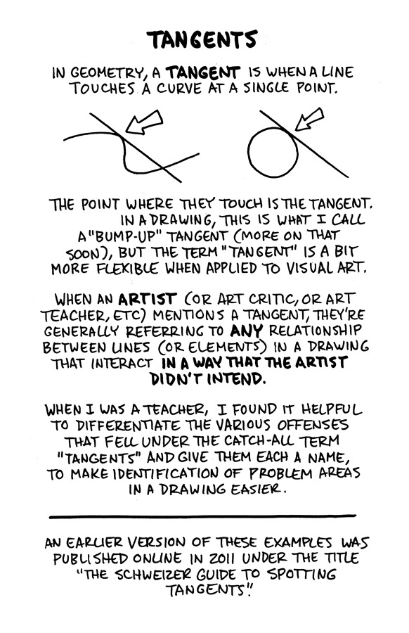
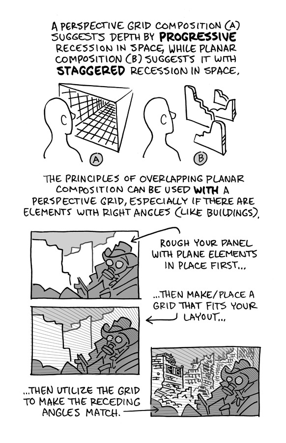
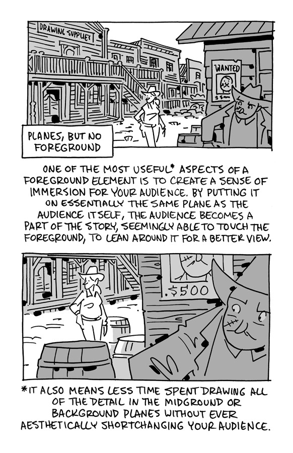
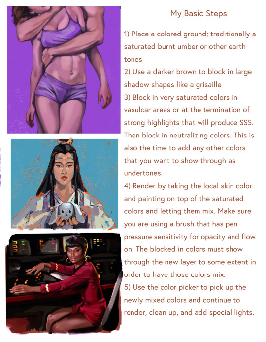
#process tutorial
Explore tagged Tumblr posts
Visit Tumblr Blog
Explore Tumblr blogs with no restrictions, modern design and the best experience.
Last Seen Tumblr Blogs


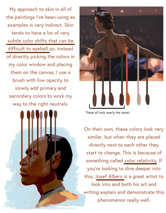
Fun Fact
Tumblr is used by 21% of adults online aged 18-29 years.
Note
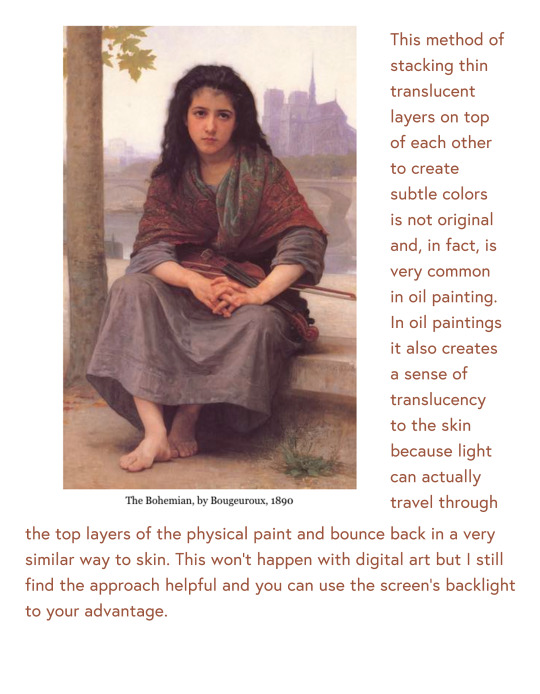
If you wouldn’t mind sharing your secrets, can you drop a quick tutorial for the hades art style? You seem to capture it very well!
Hey anon! Thanks so much, I’m flattered you think so!
To be honest there's really no secret, just a lot of trial and error. I am an amateur, but I’ll point out a few of my observations of the amazing Hades team’s work that I attempted to incorporate into this Astarion drawing, especially SuperGiant Games art director Jen Zee. Everything below is just my layman’s observation of her much, MUCH better work. You should check her out yourself!
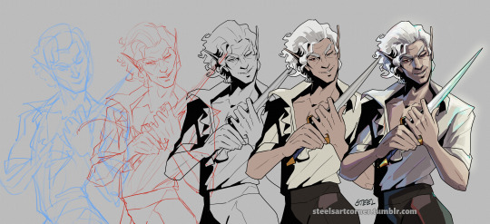
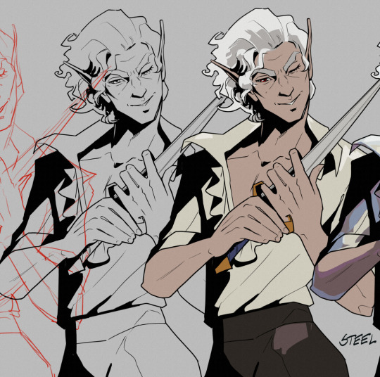
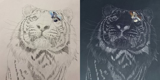
First off, here’s a simple split out of the whole process (this will be long, more below the cut:)
POSE & PERSONALITY
Hades art is full of personality so the first challenge was to pick a pose that illustrates just one or two aspects of the character. For example, Dionysus from Hades 1 below has a languid, draping pose that reflects his chill-guy party vibes. Just looking at him you get an immediate idea of his personality.
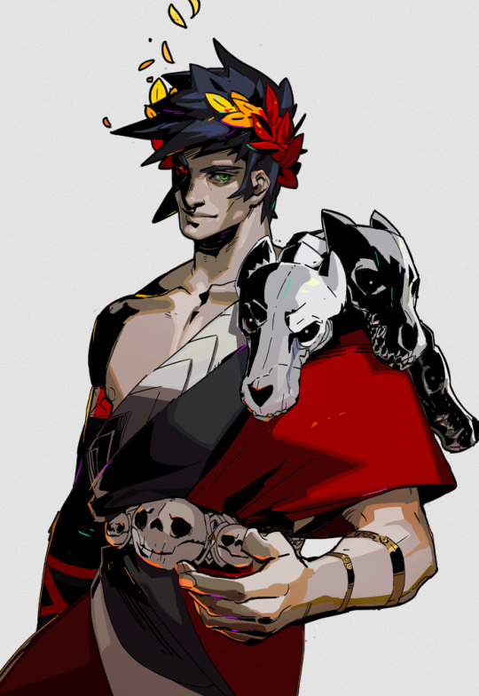
And as much as I love the later wet-cat version of Astarion as he matures as a person, for the purposes of illustration in this style I chose a pose and expression that leaned into his early, less complex, more wily self. The dagger, wink, jaunty hips and head tilt are meant to communicate, without additional context, that he’s both trying to be appealing and is not trustworthy.
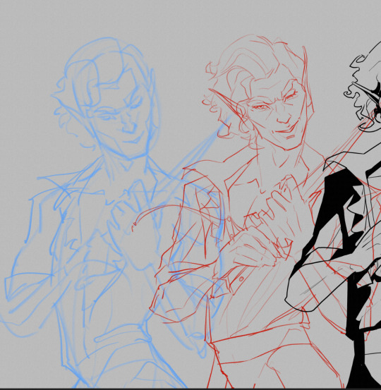
LINEWORK & SHADING
Next is the linework and blocking! The Hades art team tends to use a combination of near-mono-thickness black lines, where exterior lines are thicker and interior lines are thinner or have no lines at all. They will often forgo an interior line to communicate form via color blocking instead. The style also makes heavy use of absolute black for the deepest shades, especially on more sinister characters or spooky aspects of a characters design. (See: Zagreus’ three dog head skulls and his red eye perpetually cast in deep shadow.)
It took some back and forth to find the right balance of black shading for Astarion. Too much and he looked too sinister and not approachable enough. Too little and he looked too innocent.
Picking a strong light source helped with determining the direction and placement of the shadows so that just enough was obscured/revealed. It also helps in differentiating forms from each other so that, for example, the arm doesn’t disappear into the chest and become unreadable.
Using heavy black shading was a particularly useful trick in Astarion’s case, because his camp clothes color palette is fairly monochromatic between his light hair, pale skin, and white/cream shirt. That much light color can easily blend in too much and become boring: the flats I used were slight variations of white, from a warm reddish-peach to a yellowy cream to a cool light gray for the dagger.
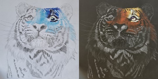
COLOR & LIGHTING
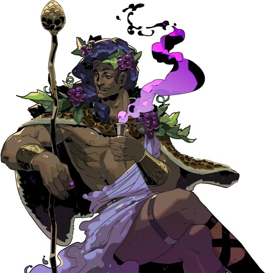
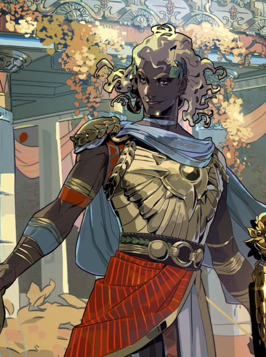
Last is color! In Hades 1 and even more so in Hades 2, the lighting schemes are deceptively complex. There are often multiple light sources and use of bounce lighting to add a lot of visual interest. For example, check out this lighting on Polyphemus from Hades 2:
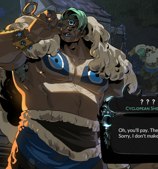
Not only does he have a cool moonlight hitting him from above, he also has a warm orange rimlight lighting him from the left, AND cool lavender bounce light bouncing off the ground and hitting him from below. All these combine and layer on top of one another to help emphasize the forms of the cyclop’s musculature and the textures of his sheep wool coat.
I don’t think I was as successful in my own lighting scheme, because I’m an amateur, but I determined that the scene in which I was placing Astarion has a high sun and was outdoors. This means that the light hitting him from above would be a light, warm yellow and the bounce light hitting him from the left would reflect the nearby water and blue sky of the environment.

To achieve this, I made use of different layer modes in my art program (Clip Studio Paint) to apply purple shadows (via the Multiply layer mode) and highlights (via the Soft Light layer mode) in a light sky blue and a light yellow for the primary and secondary light sources.
I ran into trouble with the blade, because it was also a light metal in an already light-color-heavy color scheme. At first, it was blending in too much and hard to read. So I decided to give it a bit of a magic teal glow to help it stand out, which meant adding a few specks of magic light reflecting back onto the face and clothes as well.
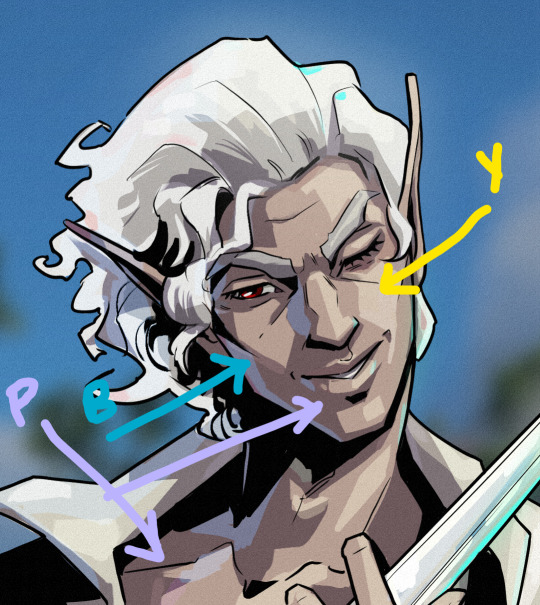
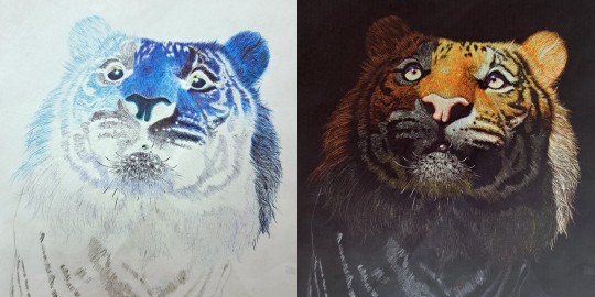
INTEREST & DETAILS
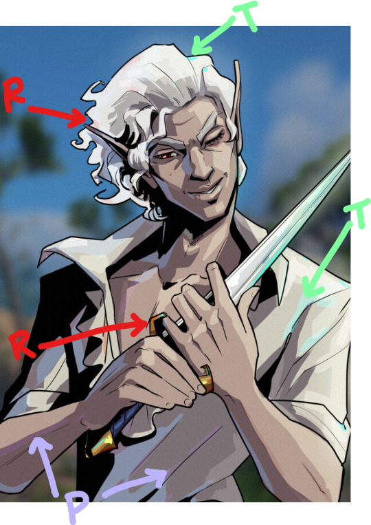
Speaking of, Hades style art makes extensive use of adding little speckles of high-saturation color to add visual interest and cohesion. See this Zagreus portrait which is primarily made of grays, a tan bone-color, and reds:
But sprinkled in are neon teal and magenta that don’t relate to the lighting at all. It’s just there to break up the blocks of color, bring unique colors like his green eye into the rest of the portrait, and direct the viewer’s eye. These highlights are slightly less bright in Hades 2, but still there, such as in this depiction of Apollo, who mostly glows with a warm sunlight but also has random pops of sky blue and green flecking his armor and hair.
The pops of color are often placed more centrally on the figure to keep your eye on the important parts of the portrait, like near Apollo’s face and on his armor. The color pops aren’t as frequent at the extremities; too much on the arm and your eye would be drawn away from his face.
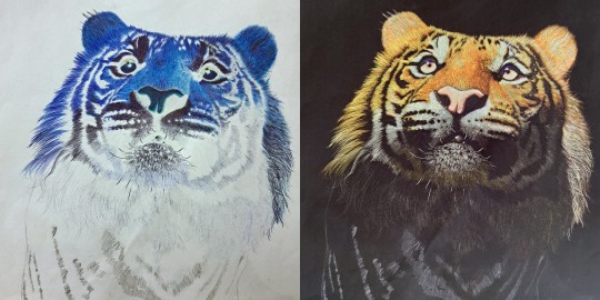
I took a similar approach where I grabbed some of the brighter colors (like Astarion’s red eye, and the teal glow of the dagger), to add dabs of color that normally would not “make sense” from a lighting perspective, but add a little visual interest:
Also I totally studied their approach to Apollo’s curly hair to create the impression of Astarion’s curls!
Anyway, I think that's all I got for now, I hope this helps! There's more but this is already REALLY long so I'll stop here. In the end, it's really just a process of observation and replication of things you love in artwork you admire. Give it a try, it's a lot of fun :)
137 notes
·
View notes
Text
Here’s a video on why I only use a pen to sketch ✅ Hope you try it out, it has helped me tremendously to streamline my process and improve faster ☺️💕
18K notes
·
View notes
Text
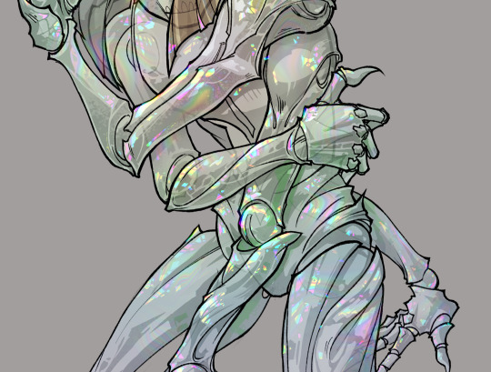
gonna show u guys a little opalescent highlight hack i threw together today
rainbow gradient above your main figure (i usually have all my main figure folders/layers in one big folder, so i can clip gradient maps + adjustments to it!). liquify tool to push the colors around a bit. STAY WITH ME I KNOW IT LOOKS STUPID RN I'M GOING SOMEWHERE WITH THIS
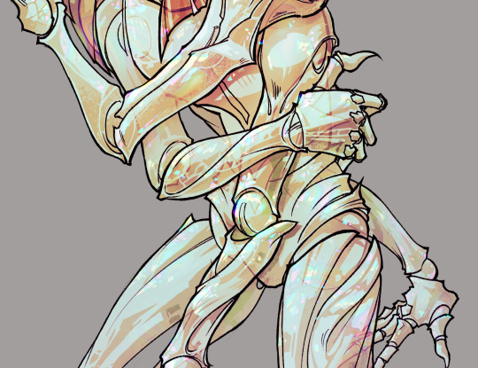
THEN: set it to add/glow (or the equivalent in ur drawing program), lower the opacity a bit, and apply a layer mask. then u can edit the mask with whatever tools you like to create rainbow highlights!!
in this case i'm mostly using the lasso fill tool to chip out little facets, but i've also done some soft airbrushing to bring in larger rainbow swirls in some areas. it's pretty subtle here, but you can see it better when i remove the gradient map that's above everything, since below i'm working in greyscale:
more granular rambling beneath the cut!
u could also just do this with a brush that has color jitter, but what i like about using layer masks for highlight/shading layers is how simple and reversible it makes everything. i can use whatever brushes i want, and erasing/redoing things is super low stakes, which is great when i often approach this stuff with a super trial-and-error approach.
example: have u ever thrown a gradient w multiple colors over an entire piece, set it to multiply etc, and then tried to erase it away to carve out shadows/highlights? it's super frustrating, bc it looks really good, but if u erase something and then change ur mind later, u basically would have to like. recreate the gradient in the area u want to cover up again. that's how i used to do things before figuring out layer masks!! but masking basically creates a version of this with INFINITE undo bc u can erase/re-place the base layer whenever u want.
anyway, back to rambling about this specific method:
i actually have TWO of these layers on this piece (one with the liquified swirls shown above, and another that's just a normal concentric circle gradient with much broader stripes) so i can vary the highlights easily as needed.
since i've basically hidden the rainbow pattern from myself, the colors in each brushstroke i make will kind of be a surprise, which isn't always great -- but easily fixable! for example, if i carve out a highlight and it turns out the rainbow pattern in that area is way too stripey, i can just switch from editing the mask to editing the main layer and blur that spot a bit.
also, this isn't a full explanation of the overall transparency effect in these screencaps! there's other layer stuff happening below the rainbow highlights, but the short version is i have all this character's body parts in different folders, each with their own lineart and background fill, and then the fill opacity is lowered and there's multiply layers clipped to that -- blah blah it's a whole thing. maybe i'll have a whole rundown on this on patreon later. uhhh i think that's it tho! i hope u get something useful out of this extremely specific thing i did lmao
12K notes
·
View notes
Text
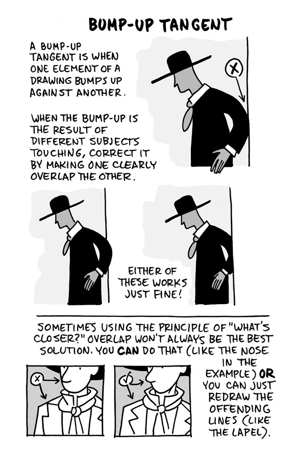
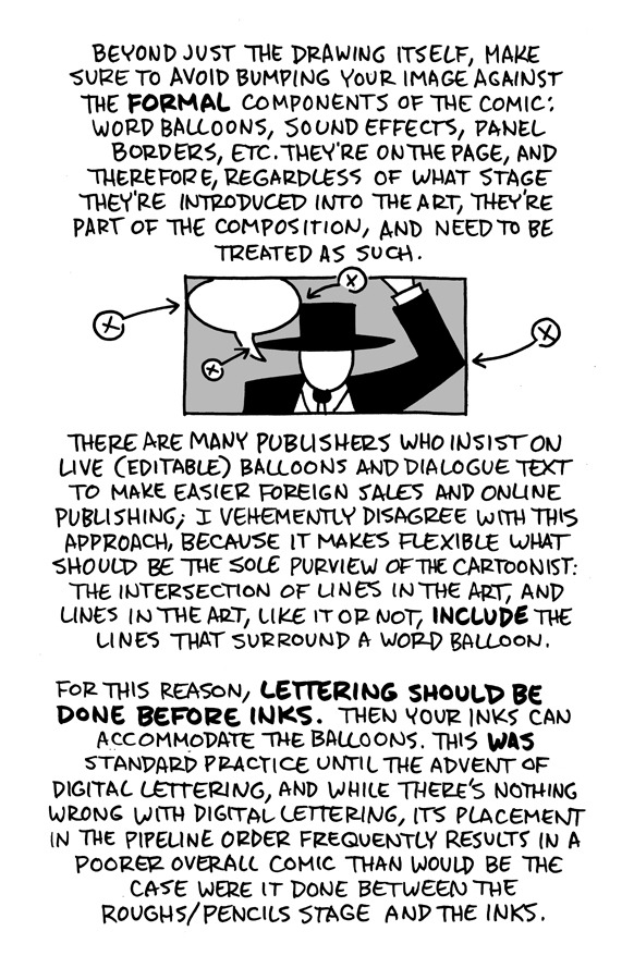
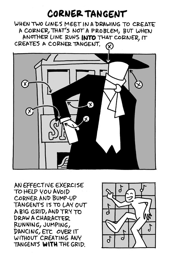
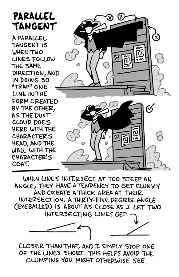
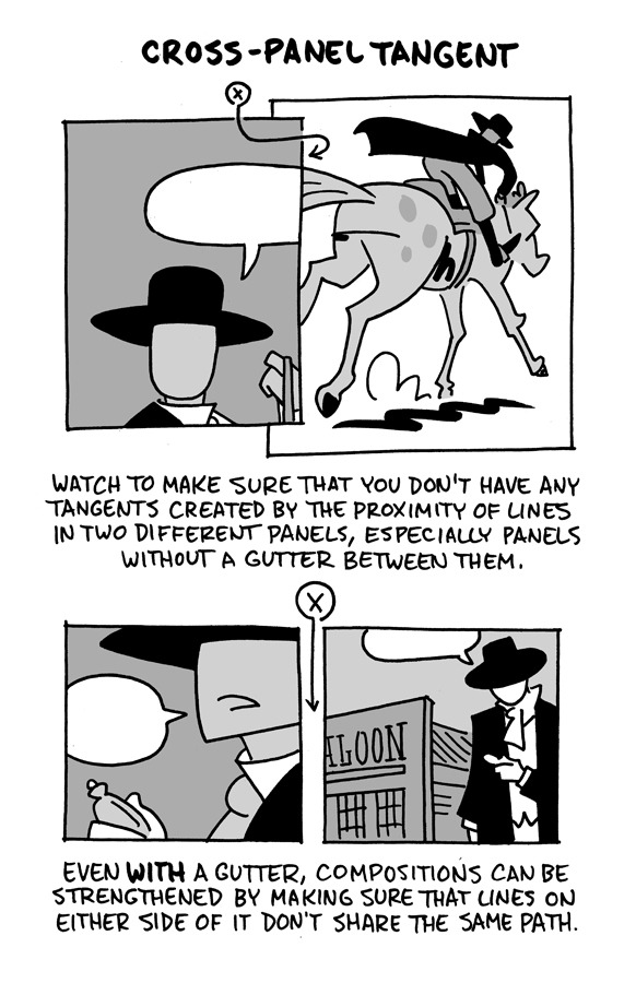
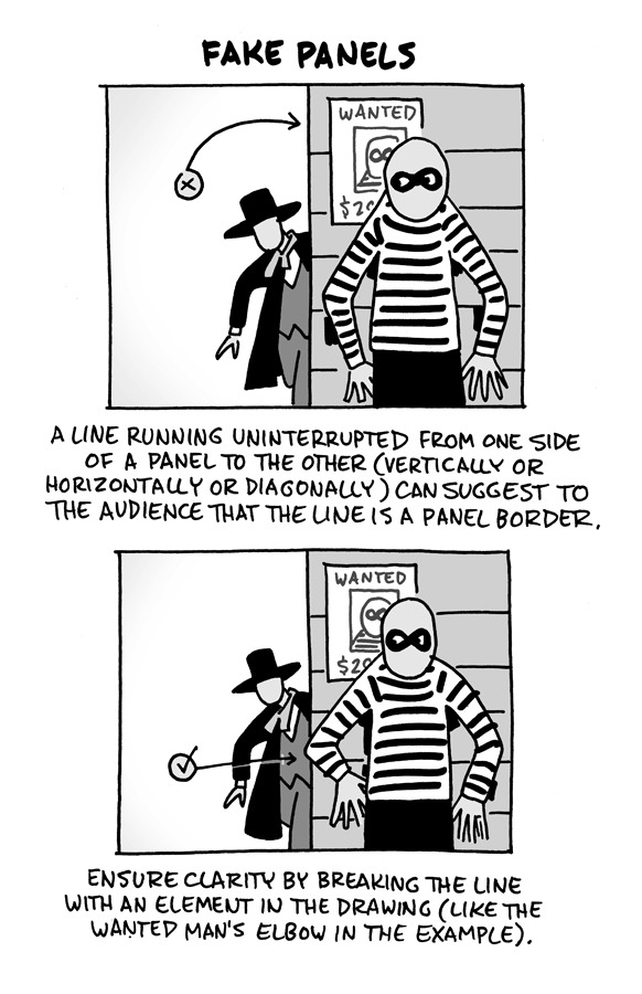
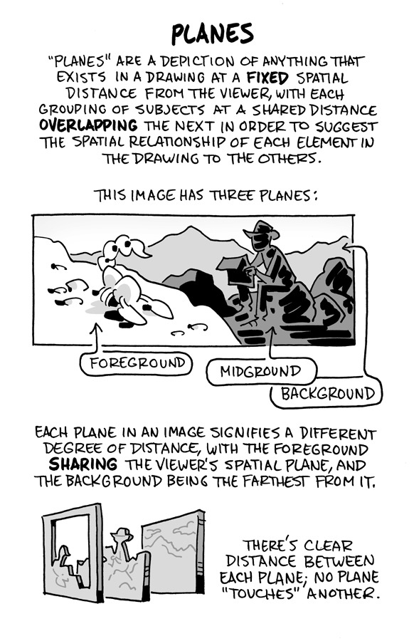
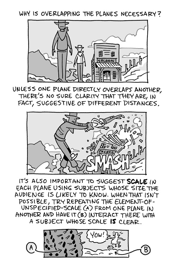
Hello, friends!
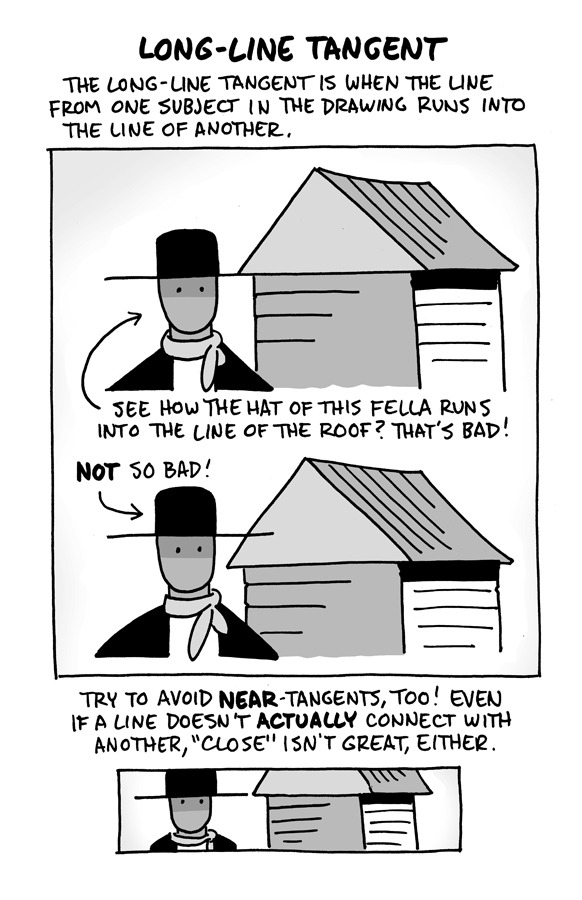
I reworked the ol' "Schweizer Guide to Spotting Tangents" lecture from my comics-teaching days, figured I'd share it here. If you want a free, printable PDF for yourself or to share (especially if you're an educator), you can find it at the bottom of this same lesson on my website.
-Chris
1K notes
·
View notes
Note
Do you have any tips on drawing the neck? Also I hope you have a good day :)
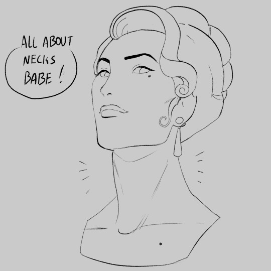


these are some of my personal "rules" when it comes to necks so I hope this helps!
#art#threeface speaks#artists on tumblr#artist#artists#oc#ocs#oc - charles bonnet#oc - claire corielle#oc - sebastian cunningham#oc - joe berlioz#tutorial#art process#art study#artwork#my art#digital art#lineart#art tutorial#reference#neck
2K notes
·
View notes
Text
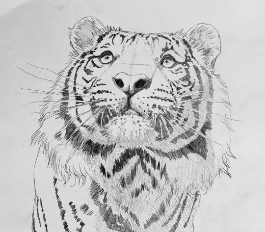
Wow first of all I'd just like to say thank you for all the love I got on this inverted ballpoint pen piece in the last few days!! 🥺

I got the inevitable wave of people asking me how I made it and lucky for y'all I had to take a lot of progress pictures to make this so I'm making a post about how I drew this!
See more under the cut!
Starting off of course we have the sketch of our subject in pencil
Then, following the inverted version of my reference image I slowly start building up layers of inverted colour. What I'm drawing irl is on the left, and the inverted version of that is on the right.
You can tell I was nervous at first not wanting to mess it up lol
This piece really helped me grasp the importance of undertones in a way I never have before
Here I started getting Really excited about how it was gonna turn out I couldn't believe I was making this with my own 2 hands
Believe it or not working in inverted colours with ballpoint pen is actually 10x easier than working in normal colours because with ballpoint pen once you've added too much ink you can't undo it you can't make it any lighter, but when you're going to invert the image at the end it's a lot more forgiving because the dark areas become the bright areas when it's inverted!
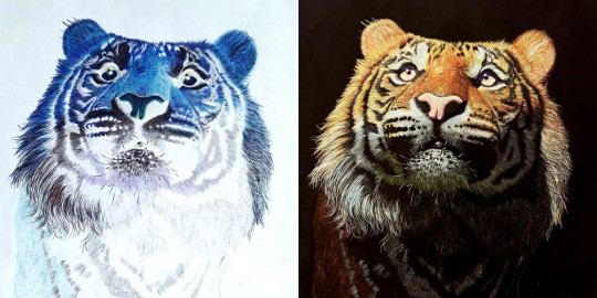
Don't get me wrong though it took a lot of focus and like brain power to draw in inverted colours, it was like learning how to ride a backwards bicycle, it took all my concentration to not follow my brains natural instincts and muscle memory when it came to creating the colours I wanted to create 😵💫

Nearly finished at this point, just needed some colour adjustments
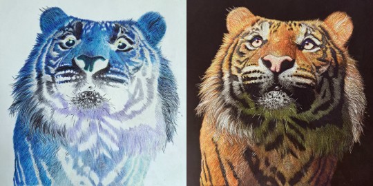
The final check for the colours before I added the finishing touches and scanned the final piece and voila!!
You have an inverted ballpoint pen tiger 🤯 It's really not as hard as it looks, it's just a lot of layering and a lot of patience 🙏🙏
I had like 15 more progress pictures but unfortunately I can only upload 10 pictures in a post so I tried to order them in a way that showed the most key points in my process 😅 If you have any questions feel free to ask I love helping out fellow artists learn new skills!!
#artists of tumblr#artist#ballpoint pen#ballpoint pen art#traditional art#tiger#drawing#pen art#art process#my art#how I drew this#art tutorial#kind of#darkmasterofdragons#wild cat#big cat#panthera tigris#inverted art
719 notes
·
View notes
Text
Here are some of process snapshots of this piece of Astarion in Baldur's Gate.

I am a messy painter and I often adjust and change the designs as I paint. (Mostly because I don't have the patience to do proper line art haha)
I start out with a rough sketch, I usually sketch ideas out on my ipad and move to my cintiq to work with colors.

Next I block in rough color thumbnail. I keep this part messy as I just want to figure out the value structure and the overall mood.
At this point, I have collected a myriad of screenshots and reference images from the game, pinterest, and also from artists work that inspires me.
With the references on one screen, I start to paint the details, I work from foreground to midground to background. (Sometimes I'll bounce between the depth when I get bored from painting one thing for too long)
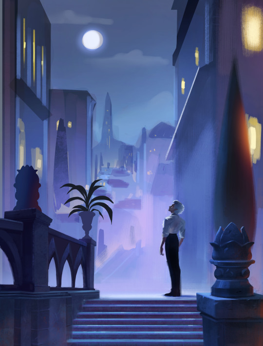
Sometimes after I block in the colors I'll make adjustments. I didn't like how warped the perspective was getting on the building on the screen right side, so I adjusted the vanishing point and added more tiers to the design. I went back into the game and looked at more how the stairs were designed and figured it out more thoroughly with a sketch on on top.
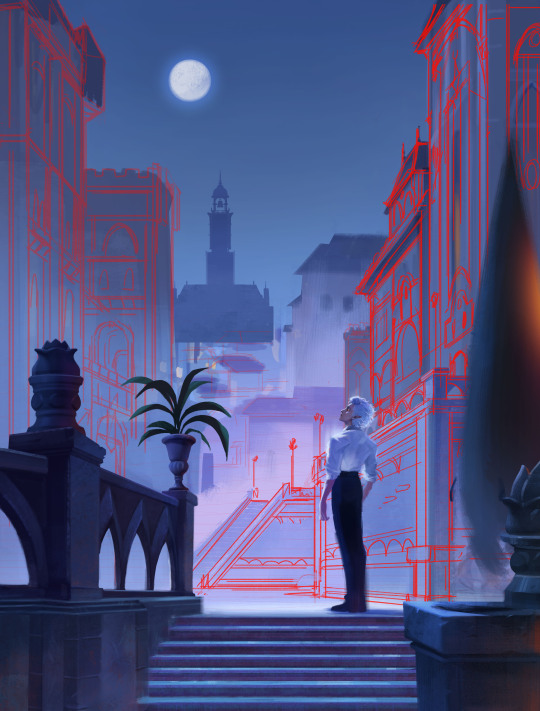
I think sitting down and doing the details is the most time consuming part. I still want the focus to be on the character despite all the detail going on the background. At this point I'm toggling on black & white filters constantly to check the value, grouping everything in the background together, making sure the lighting frames the subject in focus. At this point I realized, I forgot to paint Astarion's hair LOL, and that the bg was getting a bit too detailed, so I used a more textured brush and painted away some of the edge details of bg buildings.

Last, I make final adjustments, and I make a overall lighting/fx adjustment folder. Adding in some noise, adjusting the contrast, color balance, and lighting over all and call it done!
Link to Print shop!
#astarion#astarionfanart#bg3#baldurs gate astarion#baldur's gate 3#artprocesses#art tutorial#astarionpainting#bg3art#bg3fanart#art process#artists on tumblr
8K notes
·
View notes
Note
i love how you draw the sans Aus so much
genuinely i want to draw them like you (not exactly the same but i hope you get what i mean)
(sorry if this was submitted twice, my computer was acting weird)
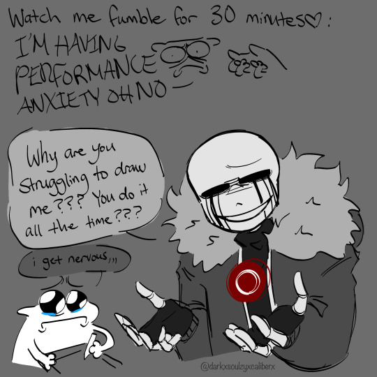
I recorded my process of how I sorta draw them ofshdjchsxuvhfneld
#darkzyx#undertale au#undertale fandom#utmv#killer sans#utmv fandom#tutorial except not because I just scribble for a brief amount of time#and just hope for the best#whenever people ask me about my process#I honestly just pray it works and fucking scribble man#like the amount of me using the transform tool should be illegal
696 notes
·
View notes
Text
My Favorite Cheap Art Trick: Gradient Maps and Blending Modes
i get questions on occasion regarding my coloring process, so i thought i would do a bit of a write up on my "secret technique." i don't think it really is that much of a secret, but i hope it can be helpful to someone. to that end:

this is one of my favorite tags ive ever gotten on my art. i think of it often. the pieces in question are all monochrome - sort of.

the left version is the final version, the right version is technically the original. in the final version, to me, the blues are pretty stark, while the greens and magentas are less so. there is some color theory thing going on here that i dont have a good cerebral understanding of and i wont pretend otherwise. i think i watched a youtube video on it once but it went in one ear and out the other. i just pick whatever colors look nicest based on whatever vibe im going for.

this one is more subtle, i think. can you tell the difference? there's nothing wrong with 100% greyscale art, but i like the depth that adding just a hint of color can bring.
i'll note that the examples i'll be using in this post all began as purely greyscale, but this is a process i use for just about every piece of art i make, including the full color ones. i'll use the recent mithrun art i made to demonstrate. additionally, i use clip studio paint, but the general concept should be transferable to other art programs.


for fun let's just start with Making The Picture. i've been thinking of making this writeup for a while and had it in mind while drawing this piece. beyond that, i didn't really have much of a plan for this outside of "mithrun looks down and hair goes woosh." i also really like all of the vertical lines in the canary uniform so i wanted to include those too but like. gone a little hog wild. that is the extent of my "concept." i do not remember why i had the thought of integrating a shattered mirror type of theme. i think i wanted to distract a bit from the awkward pose and cover it up some LOL but anyway. this lack of planning or thought will come into play later.
note 1: the textured marker brush i specifically use is the "bordered light marker" from daub. it is one of my favorite brushes in the history of forever and the daub mega brush pack is one of the best purchases ive ever made. highly recommend!!!
note 2: "what do you mean by exclusion and difference?" they are layer blending modes and not important to the overall lesson of this post but for transparency i wanted to say how i got these "effects." anyway!
with the background figured out, this is the point at which i generally merge all of my layers, duplicate said merged layer, and Then i begin experimenting with gradient maps. what are gradient maps?
the basic gist is that gradient maps replace the colors of an image based on their value.

so, with this particular gradient map, black will be replaced with that orangey red tone, white will be replaced with the seafoamy green tone, etc. this particular gradient map i'm using as an example is very bright and saturated, but the colors can be literally anything.

these two sets are the ones i use most. they can be downloaded for free here and here if you have csp. there are many gradient map sets out there. and you can make your own!
you can apply a gradient map directly onto a specific layer in csp by going to edit>tonal correction>gradient map. to apply one indirectly, you can use a correction layer through layer>new correction layer>gradient map. honestly, correction layers are probably the better way to go, because you can adjust your gradient map whenever you want after creating the layer, whereas if you directly apply a gradient map to a layer thats like. it. it's done. if you want to make changes to the applied gradient map, you have to undo it and then reapply it. i don't use correction layers because i am old and stuck in my ways, but it's good to know what your options are.

this is what a correction layer looks like. it sits on top and applies the gradient map to the layers underneath it, so you can also change the layers beneath however and whenever you want. you can adjust the gradient map by double clicking the layer. there are also correction layers for tone curves, brightness/contrast, etc. many such useful things in this program.
let's see how mithrun looks when we apply that first gradient map we looked at.

gadzooks. apologies for eyestrain. we have turned mithrun into a neon hellscape, which might work for some pieces, but not this one. we can fix that by changing the layer blending mode, aka this laundry list of words:

some of them are self explanatory, like darken and lighten, while some of them i genuinely don't understand how they are meant to work and couldn't explain them to you, even if i do use them. i'm sure someone out there has written out an explanation for each and every one of them, but i've learned primarily by clicking on them to see what they do.
for the topic of this post, the blending mode of interest is soft light. so let's take hotline miamithrun and change the layer blending mode to soft light.

here it is at 100% opacity. this is the point at which i'd like to explain why i like using textured brushes so much - it makes it very easy to get subtle color variation when i use this Secret Technique. look at the striation in the upper right background! so tasty. however, to me, these colors are still a bit "much." so let's lower the opacity.

i think thats a lot nicer to look at, personally, but i dont really like these colors together. how about we try some other ones?

i like both of these a lot more. the palettes give the piece different vibes, at which point i have to ask myself: What Are The Vibes, Actually? well, to be honest i didn't really have a great answer because again, i didn't plan this out very much at all. however. i knew in my heart that there was too much color contrast going on and it was detracting from the two other contrasts in here: the light and dark values and the sharp and soft shapes. i wanted mithrun's head to be the main focal point. for a different illustration, colors like this might work great, but this is not that hypothetical illustration, so let's bring the opacity down again.

yippee!! that's getting closer to what my heart wants. for fun, let's see what this looks like if we change the blending mode to color.

i do like how these look but in the end they do not align with my heart. oh well. fun to experiment with though! good to keep in mind for a different piece, maybe! i often change blending modes just to see what happens, and sometimes it works, sometimes it doesn't. i very much cannot stress enough that much of my artistic process is clicking buttons i only sort of understand. for fun.
i ended up choosing the gradient map on the right because i liked that it was close to the actual canary uniform colors (sorta). it's at an even lower opacity though because there was Still too much color for my dear heart.

the actual process for this looks like me setting my merged layer to soft light at around 20% opacity and then clicking every single gradient map in my collection and seeing which one Works. sometimes i will do this multiple times and have multiple soft light and/or color layers combined.
typically at this point i merge everything again and do minor contrast adjustments using tone curves, which is another tool i find very fun to play around with. then for this piece in particular i did some finishing touches and decided that the white border was distracting so i cropped it. and then it's done!!! yay!!!!!
this process is a very simple and "fast" way to add more depth and visual interest to a piece without being overbearing. well, it's fast if you aren't indecisive like me, or if you are better at planning.

let's do another comparison. personally i feel that the hint of color on the left version makes mithrun look just a bit more unwell (this is a positive thing) and it makes the contrast on his arm a lot more pleasing to look at. someone who understands color theory better than i do might have more to say on the specifics, but that's honestly all i got.

just dont look at my layers too hard. ok?
2K notes
·
View notes
Text
I always find it comforting when I see other artists show their early drafts and it (often) looks just as rough as my first passes.
So in the spirit of sharing, here are the process screens showing how really, really hideous my early drafts are:

nobody took my pen away so the hades-crossover-fever continues. i’m ill
others: astarion, kotallo
14K notes
·
View notes
Text
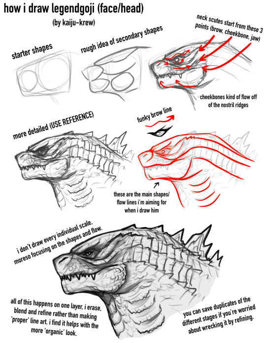
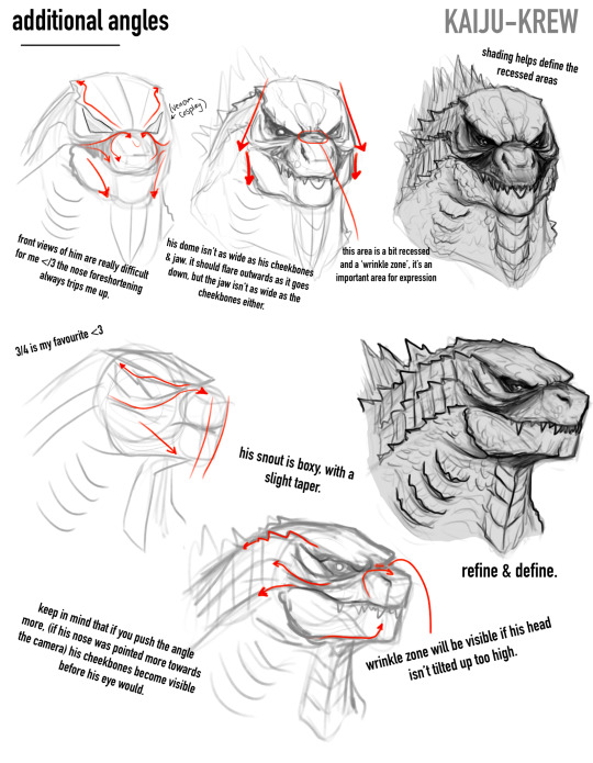
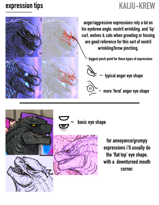
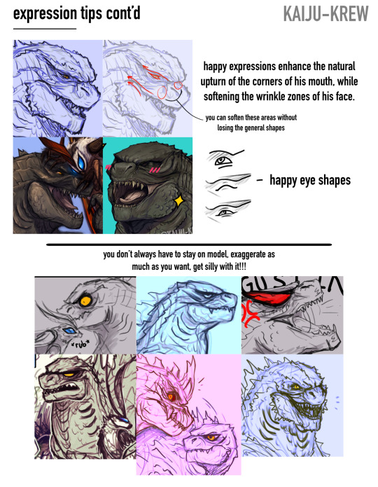
draw lizard✏️
-
i hope this isn’t too Draw The Rest Of The Fucking Owl 😭 i feel like i’m awful at explaining these kinda things but i hope this might help someone a lil bit. i’m working on one for his full body too, but wanted to cover expressions here since i get asked about them a lot!
#also yes im still working on the video tutorial too if this is too simple#it’ll show the whole process back to back#it’ll just take me longer unfortunately :(((#godzilla#kaiju#my art#drawing tutorial#art tips
1K notes
·
View notes
Text
Process of last night's drawing! I also posted a more in-depth guide for it on Patreon for those interested.
1K notes
·
View notes
Note
Hullo! I’ve been watching a bunch of your Timelapses and I was wondering how do you always come up with the colours for your pieces? They’re always so cohesive and pleasing to look at (I almost exclusively work in greyscale so if I’m using colour it’s always a lucky guess and it never looks quite right)
Hey there!
I have to be honest that most of the time I don't actually know what I'm doing and that I have no idea how most of my pieces are gonna turn out. My work process is usually based on "Fuck around and find out", haha. I'm happy to know that it apparently doesn't come across that way, though.
A lot of it comes very naturally to me simply because I've been drawing non-stop for so long, but I can give you some small tips that really help me:
1. Have as many references as possible!
Here's what my reference sheet looked like for the Jayvik piece:

It helped me a lot to understand the overall color scheme I wanted to convey. Lots of very cold tones, pinks and very light blues and greens. These colours sorround Jayce and Viktor throughout all of season 2 and I wanted to keep them, especially since in my piece they are lying in the glowing hexcore.
Don't shy away from using references, get as many as you possibly can! Look at other poeple's art too and try to understand how they work with colours.
2. Work with complementary colours!
Since I paint a lot of romantic illustrations I want them to look pleasing and comforting, which I can accomplish by using complementary colours! You see this a lot with couples that are blue and red coded, for example. And I wanted to do the same thing in the Jayvik piece! For that I used the highlights in their hair!


Viktor's highlights are a soft pink hue.


While Jayce's are a soft blue hue.
The colour wheel works perfect for figuring out if two colors compliment each other because they are literally right across from one another!
3. It doesn't have to be true to life.
Pretty self-explanatory, but I thought I'd add it in here anyways. It's important to understand how colour and light works, but you don't always have to follow the rules. Does the rim light look cool but it makes zero sense? Who cares! Keep the cool rim light! Just have fun and fuck around.
4. A little trick to make your life easier!
I'm not excatly the best at colour theory, I still struggle with it quite a bit, but here's a little trick I like to use from time to time:
If you want all your colours to look coherent, take one specific color as your flat colour. Choose a hue that you would like your piece to have. Like this:

Now you choose whatever colours your characters have and paint them in. For example, here are the skin colours I chose for Jayce and Viktor:

Looks off, right? These colours don't fit the overall piece at all. So what do we do?
Turn down the opacity! It's that easy, wahoo!

I went from 100 Opacity to 72 for this specific illustration. And look at that!

It's so much nicer already! Now you know what colours to use as your actual flats! Just repeat this with every other part of your illustration and you'll have a great starting point. :)
I really hope this was helpful! I'm not an actual teacher and I don't have a proper illustration degree, so some things might not be completely accurate, but I thought I'd try my hand at this anyways!
#teacher han is at it again#if I talked bullshit forgive me#I just hope I was able to help at least a little bit haha#I'm always happy to give some tips!#art process#art tutorial#color tutorial#colouring#illustration#tips#my art#arcane#jayvik#tutorial#anon#ask
771 notes
·
View notes
Text
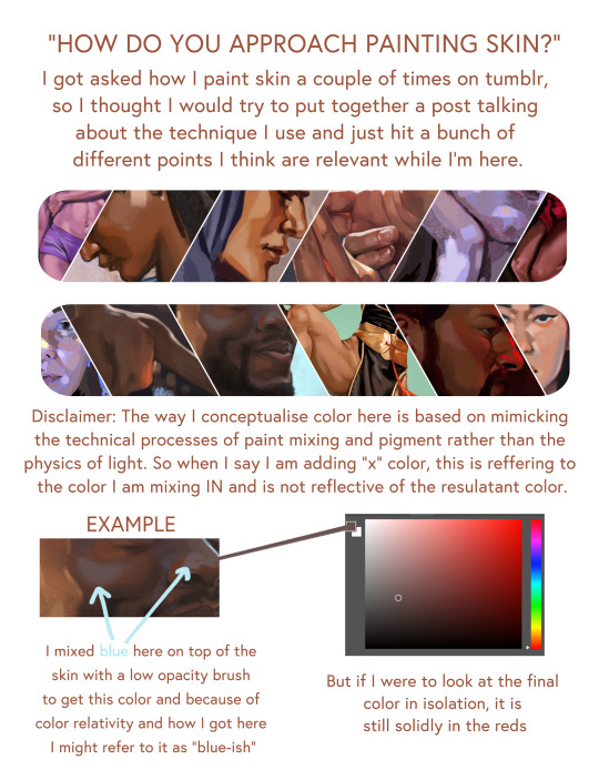
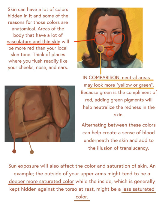
Artist: RaeGunBlast
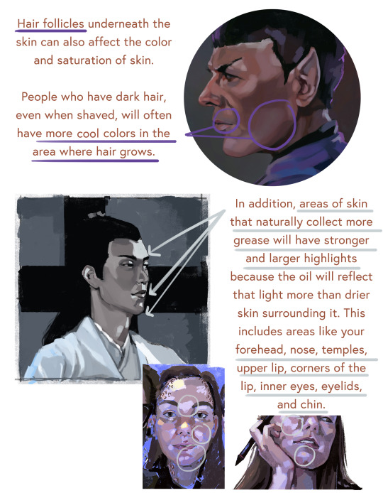
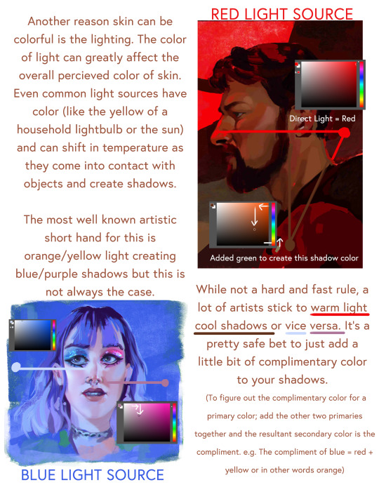
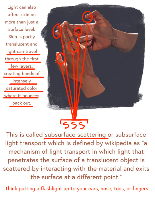
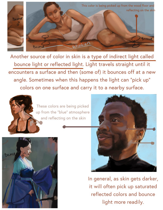
#raegunblast#art#2d#painting#artists on tumblr#art help#art reference#art resources#art information#art process#how to paint skin#art tutorial#artist#art practice
3K notes
·
View notes
Note
Hi tofupixel!
how do you make big pieces look so easy, what is the technique/method?
I had my first times even if I have been pixeling for 3 years which seems long but not that much experience.
The proportions doesnt even look right even shading with big pieces, it sometimes needs a lot more which kinda pillow-shaded
hi daniel, thank you
i found this from 2021(!!!) of my process when i was doing a ghibli study (arrietty scene)

you can see i start very loose with just general shapes in the beginning and i dont worry about the details at all. and if the colours are wrong i dont care because i can change them very easily. i just get the big things in place and gradually increase my level of detail
and 3 years you are still a baby really, i have been doing it 8+ years and there are people doing it since before we were even born.
GL 👍 bibi
398 notes
·
View notes
Text

was going through my files and found this mini process thing I made for someone about my general grass painting process
posting it here to show everyone so it may possibly be helpful
*the round brush used is pretty much the default basic round brush you'd find in every art program
edit: whoops forgot to put this in original post, here's a note I made about drawing the grass tufts

#my art#original#background art#grass#art tutorial#art process#btw don’t take the grass tuft thing as like a hard rule#you def can space it out if you want if it looks better for your style
308 notes
·
View notes