#2d design
Explore tagged Tumblr posts
Text
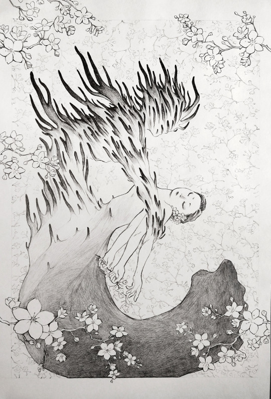
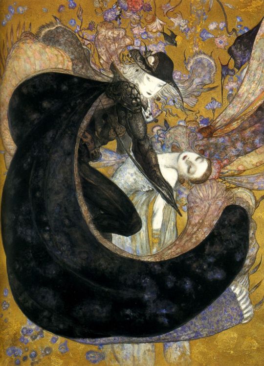
The Embrace - Graphite pencil on paper
I'm taking 2D Design this semester, and our first project was to mech together a variety of elements based on an existing art piece. Mine is based on this Piece by Yoshitaka Amano. Cordyceps live rent free in my head (if you know, you know) and it was an interesting project to work on. I haven't done a finished illustration with pencil in so long it was a bit of a challenge.
30 notes
·
View notes
Text
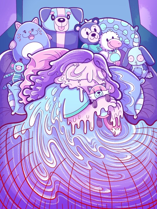
Melting sleep💜
I CRAVED naps like this during my senior year omg😭
#illustration#digital illustration#artists on tumblr#art#artist#drawing#cartoon#digital art#artwork#portfolio#concept art#adobe photoshop#illustrator#2d illustration#2d art#2d design#plushies#sleepy#sleeping#relaxation#my art#character designer#art student#2d animator#digital paint#digital artist#digital#design#artist support#artisrs on tumblr
21 notes
·
View notes
Text
OC dump bc I will get over my fear and shove my ocs down everyone's throats one spoonful at a time RAAA

My OC sanyin. Comp + pose inspired by the thumbnail of virtual angel
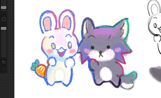
Style test for my oc comic. Yes the little animals are plot relevant
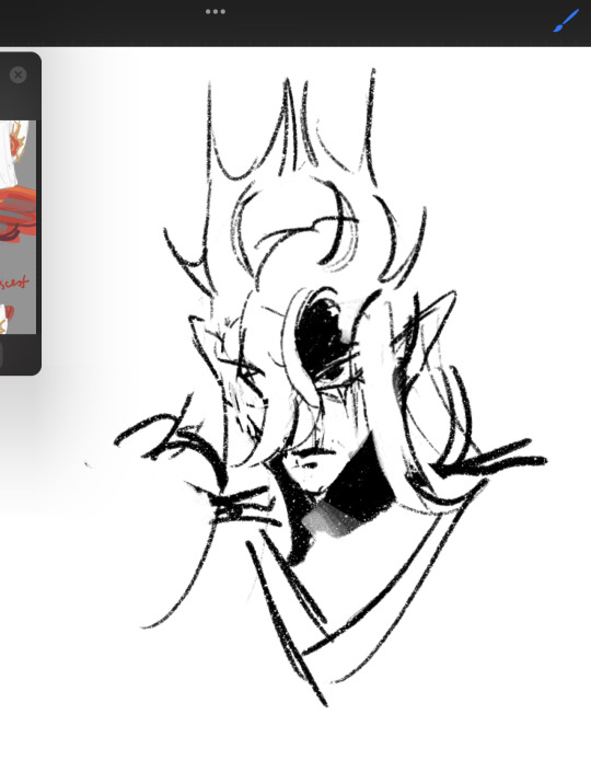
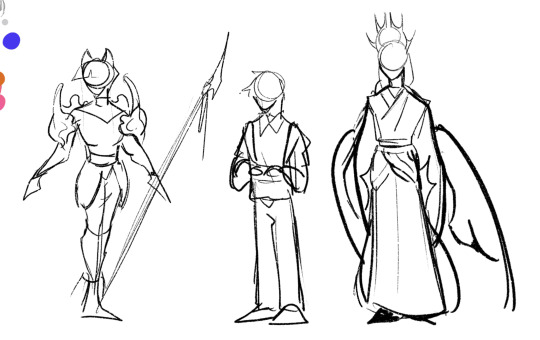
Qy portrait and in order: jian hong, tang jing, qiu ying
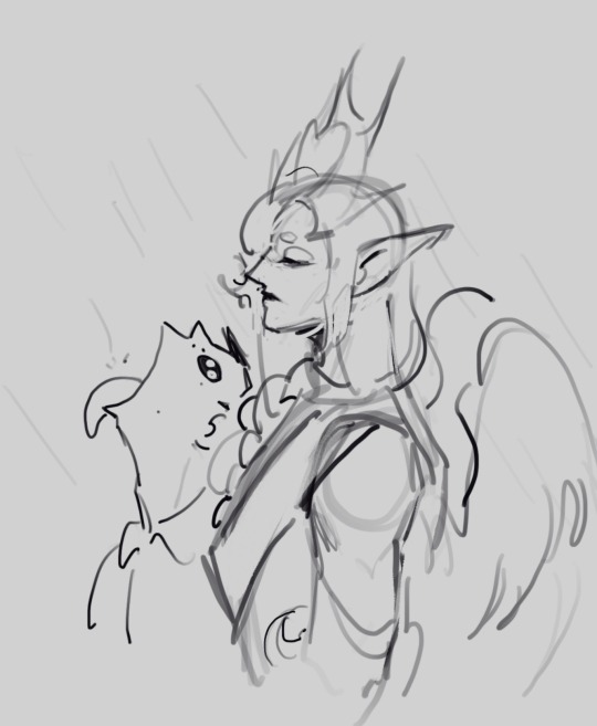
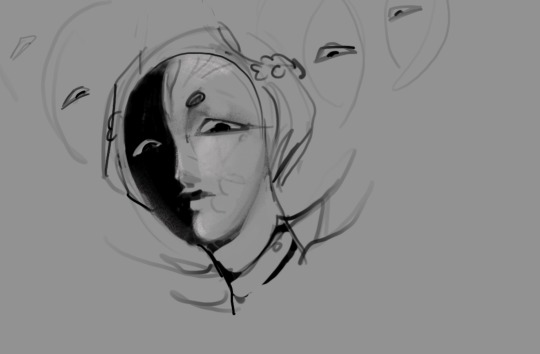
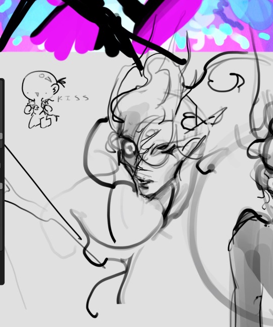
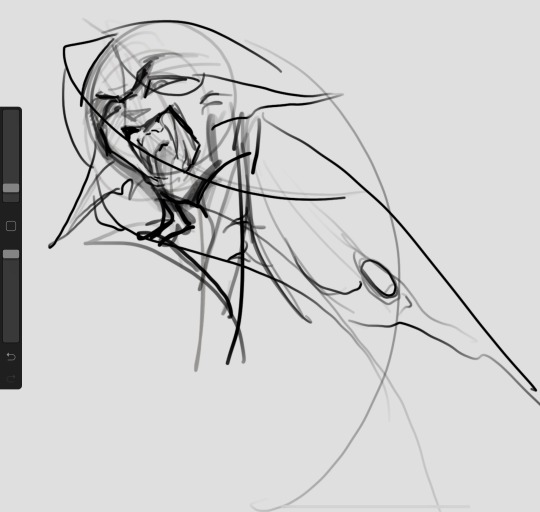
Tj and qy as that goku shitpost meme, father, qy, zjy
#art#artists on tumblr#digital art#oc#original character#jt2w oc#character design#concept art#2d design#indie comics#webtoon#webcomic
25 notes
·
View notes
Text

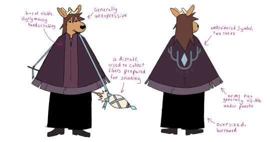
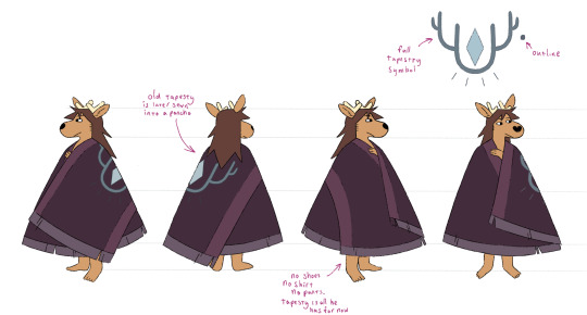
I really, really wanted to do some character design.
351 notes
·
View notes
Text
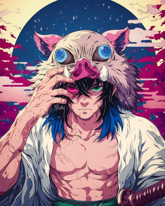
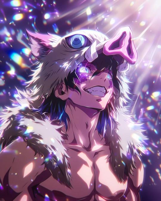
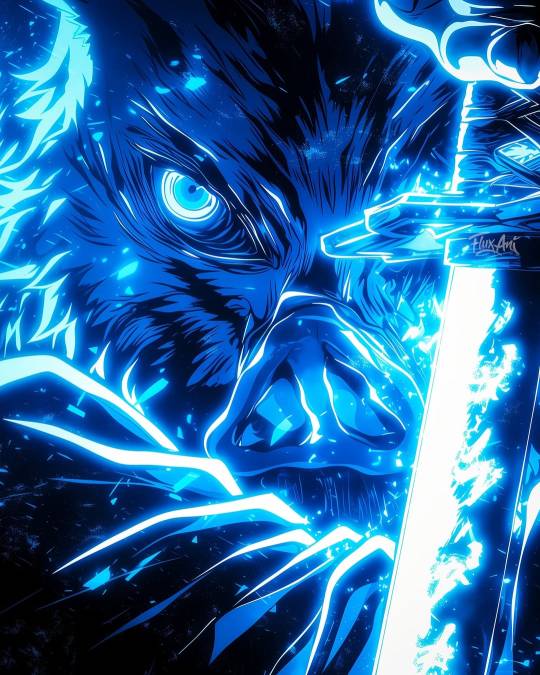
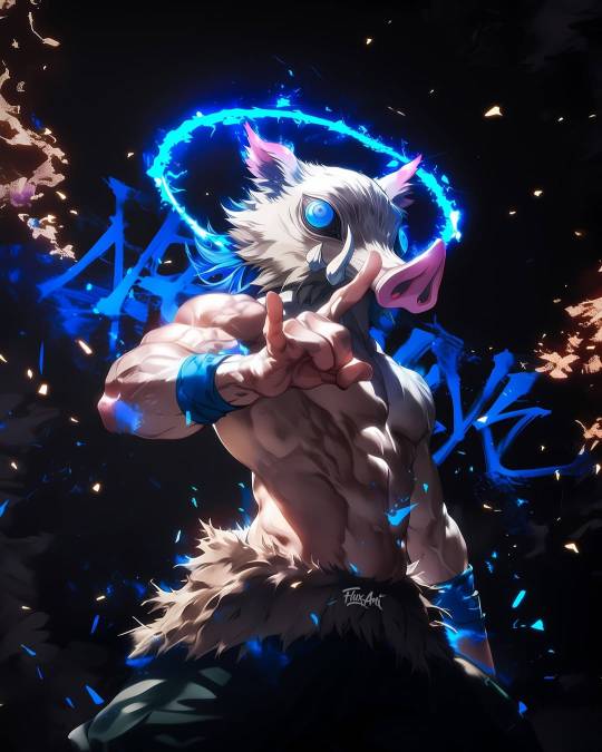
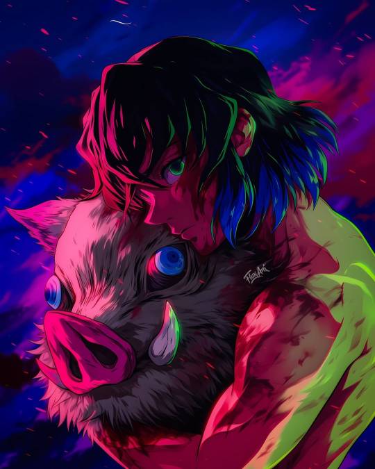
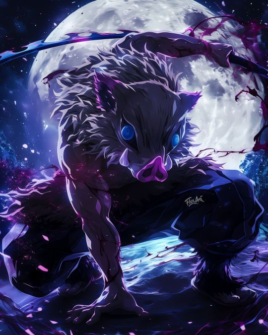
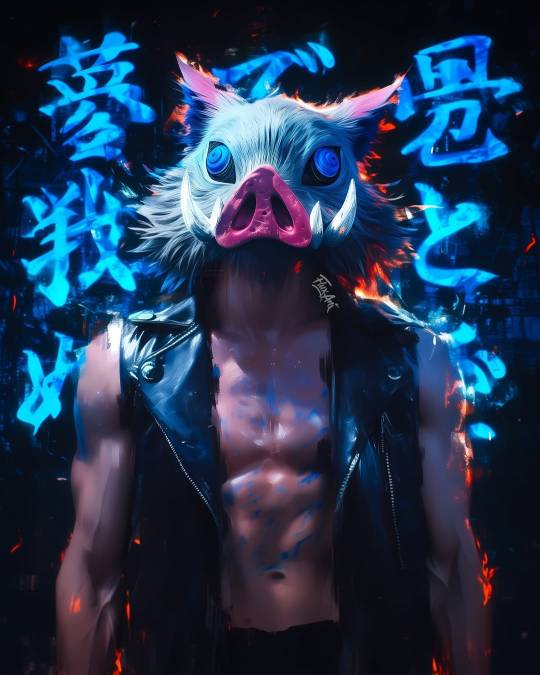
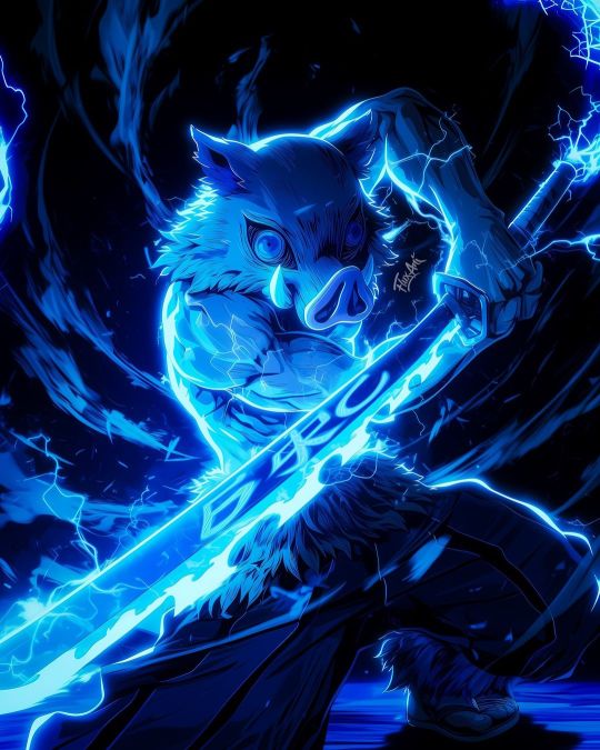
#artwork#digital art#art history#architecture#art#my art#artists on tumblr#3d artwork#demon slayer#grandmaster of demonic cultivation#2d findom#2dartist#2d design#2d art#2d animation
10 notes
·
View notes
Text
Have like all of fall semester cause I’m tired and suck at posting


#art is hard#art student#trans#trans artist#art school#school work#fall semester#art#ceramics#traditional art#2d design
5 notes
·
View notes
Text
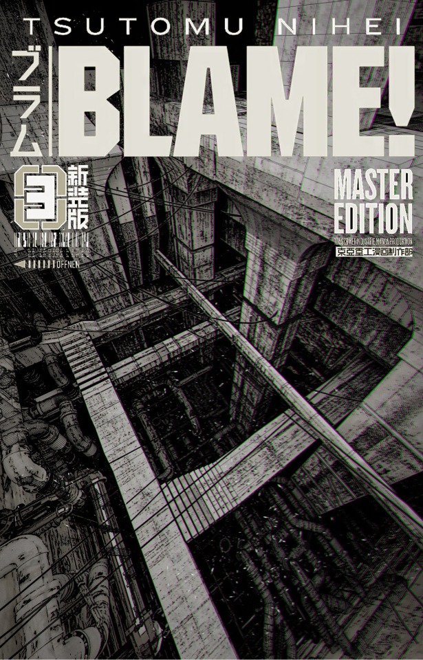
Made some Blame! Fanart after some suggestions from other ppl!!
#art#artistsupport#concept art#blender#design#3d artwork#artists on tumblr#conceptual#2d design#anime#manga aesthetic#cyberpunk#anime and manga#90s anime
141 notes
·
View notes
Text
Week 6: Color Scheme
Finally working with colors in 2-D Design
This week I had to go back and choose 3 of my old pieces I made in class, then re do them and apply a type of color scheme!
I used colored pencil for all of them, but a combo of alcohol markers and colored pencil for the first one ↓

Tetradic: 4 colors on the color wheel selected in a rectangle so there is 2 sets of complimentary colors and it creates a vibrant and balanced color pallette (I chose Lime Green and Red-Orange, then Magenta and Blue)

Analogus: 4 colors on a color wheel that are directly next to each other (Mine are Yellow, Green, Teal, and Blue)

Monochromatic: A color pallette where you choose one color but you use a tint (main color + white), shade (main color + black), and/or tone (main color + grey), to add variation. I tried to go for a sepia filter (the kind you use on photos) color scheme with a reddish brown.
#art#artists on tumblr#small artist#artwork#original art#2d design#college#traditional art#colorful#colors#colored pencil#markers#alchohol markers#redesign#color palette#color scheme
3 notes
·
View notes
Text
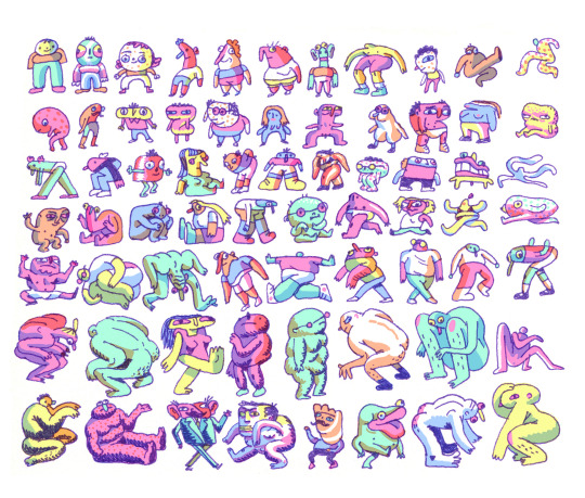
humans
#drawings#illustration#character design#characters#2d characters#2d character design#noam sussman#animation#animator#2d design
54 notes
·
View notes
Text
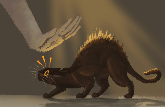
Hand-Shy
My final project for 2D Design from a few semesters ago. We were instructed to include color theory (I used a monochromatic yellow-orange color scheme here), value focal points (the out-of-focus hand having low contrast from the background and the black cat being the main focus), and extreme shapes telling emotion (the cat taking an exaggerated dip resulting in a huge back arch, in which said arch is accentuated with extremely raised hackles). Looking back, this is a pretty rough painting, and a very empty background. It could've used a little more of an established environment to give the scene a little more natural life tbh. Completed May 25th, 2023.
Info on the painting below:
A slightly abstracted caricature of Silhouette, an outdoor cat who briefly resided in my backyard before moving on elsewhere. He, unlike his brother Shadow, was far more feral at heart, and was afraid of being pet, and preferred to hunt his food rather than have the processed stuff handed to him. Because we were renting this house, I could only feed and care for them outside, so I wasn't able to get them fixed or anything, which may explain why they and their mother Luna (who had them in one of my bushes), have all eventually moved on. Even Shadow, now, who stayed with us about two years after his mom and brother went their separate ways.
Shadow, by the way, hasn't come back since Halloween (a scary time to be a black cat because there's some cult out there who sacrifices black cats on that day). A month later, we saw on the neighborhood watch's Facebook that someone had taken in a black cat, who I strongly believe was him since it looked a lot like him. If that's so, I'm relieved that Shadow finally got the warmth and safety and cushy life of a housecat that he'd always wanted. It was hard caring for a cat I was unable to let in my house or get fixed. I really hope our neighbor knows what to do for him.
24 notes
·
View notes
Text
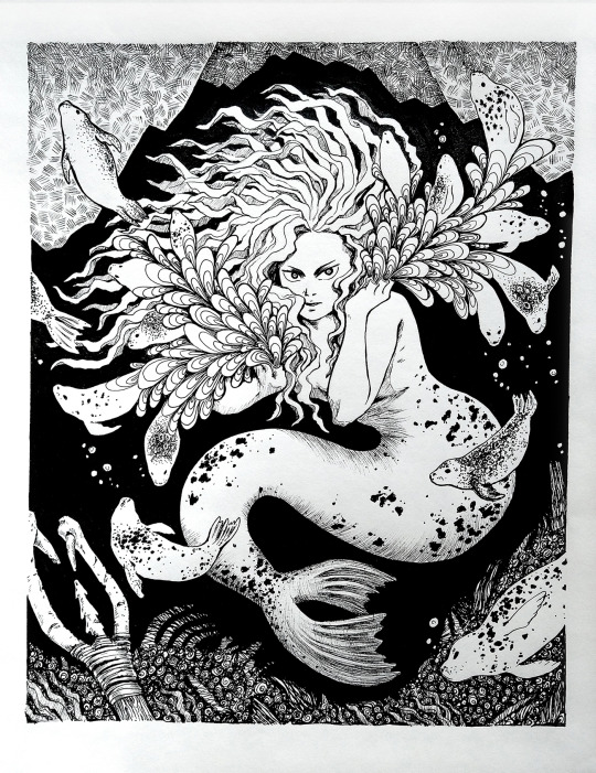
Sedna - Technical pen on paper
This is based on the Inuit mythology of Sedna, the Mother of the Sea. Cast into the frigid waters by having her fingers severed as she clung to the side of her father's boat, her fingers turned into all the seals of the sea, and she the ruler of the deep. Sedna is to be feared and respected.
One of my favorite Illustrations I've done, I absolutely love working with ink. Another project for my 2D design class.
26 notes
·
View notes
Text
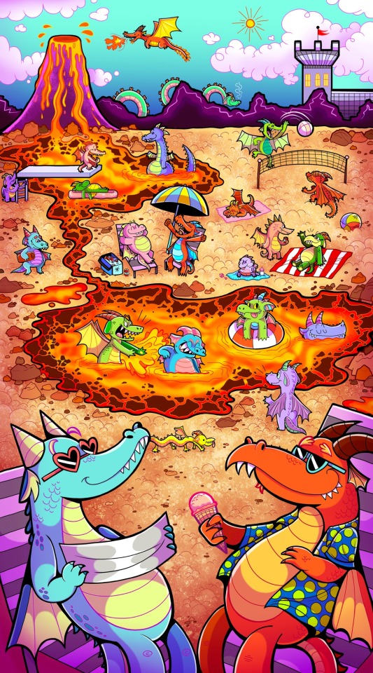
Dragon’s Playground!
One of my all time favorite pieces I did in 2024, omg it was such a fun assignment. Combining Highlights inspired illustrated spreads with goofy dragons felt great from start to finish.
#digital illustration#dragon#children’s illustration#artists on tumblr#art#artist#drawing#cartoon#concept art#character design#art student#illustration#digital artwork#digital drawing#dragon drawing#cartoon drawing#dragons#colorful illustration#portfolio#2d drawing#design#2d design#comic book#illustration project#2d illustration#dragon art#adobe photoshop#artist support#my artwork#illustrator
18 notes
·
View notes
Text
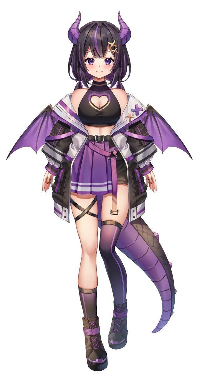
#2d vtuber model#vtuber model#vtuber#2d art#art#live2d rigging#live2d#2d animation#vtuber design#2d design
4 notes
·
View notes
Text
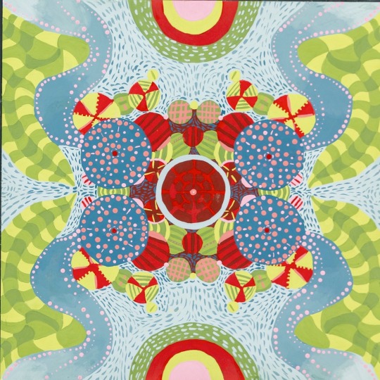
Final PT. 2 not my favorite but it made everyone crazy
#captainwaffles#2d design#abstract painting#college art#art college#radial symmetry#artist on tumblr#beginner artist#original art
3 notes
·
View notes
Text
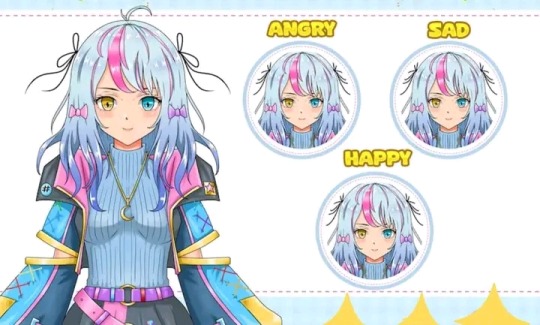
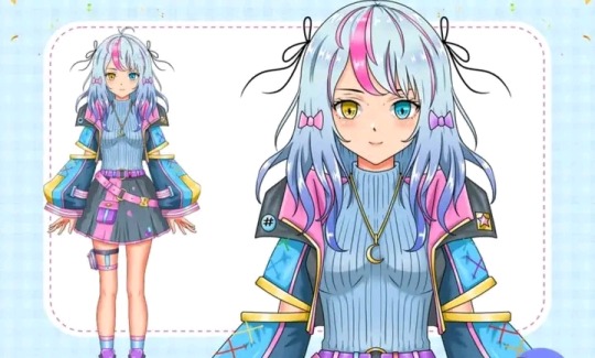
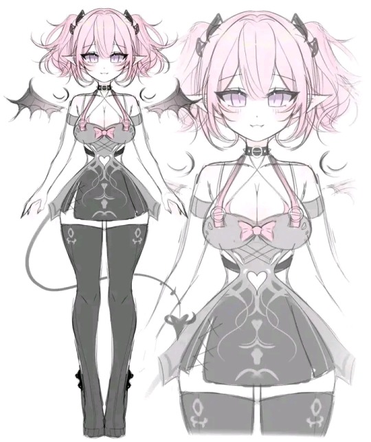
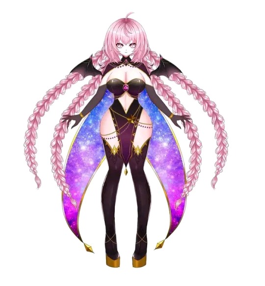
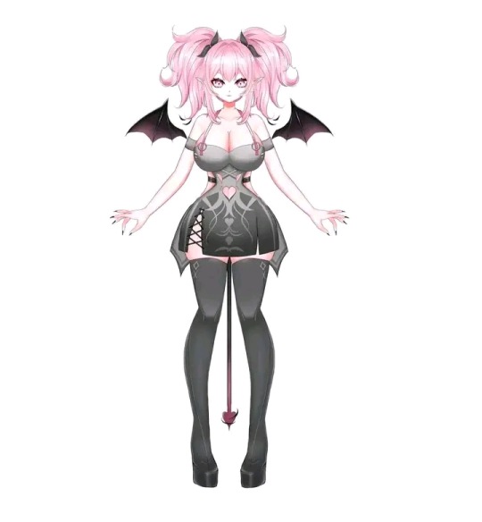
Amazing vtuber design work
#2d vtuber#2d design#2d art#vrchat#character design#2dartist#vtuber model#vtuber#vtube model#vtubesona#vtubr#anime#anime art#anime and manga#vroid#vtublr#art history
9 notes
·
View notes
Text
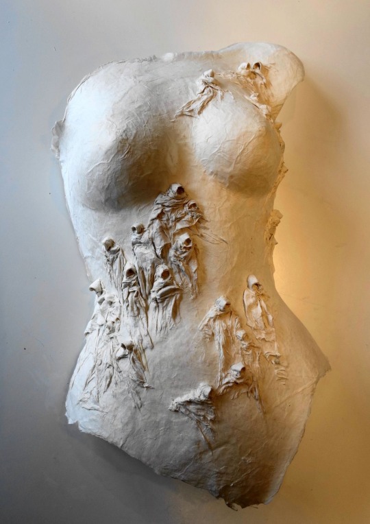
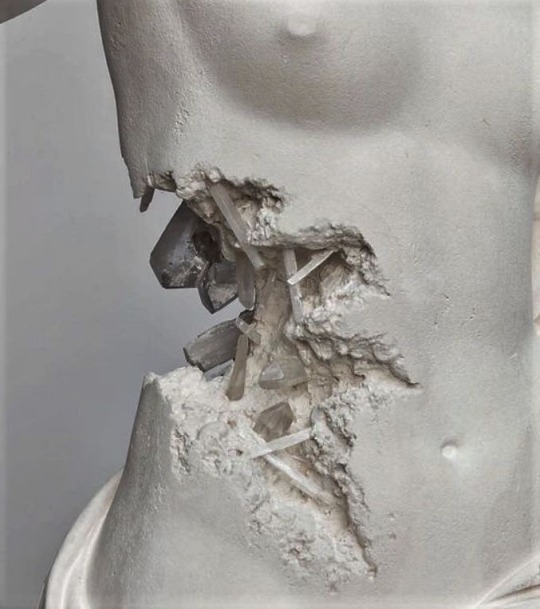
‘Self’ Plaster Sculpture Concept Images
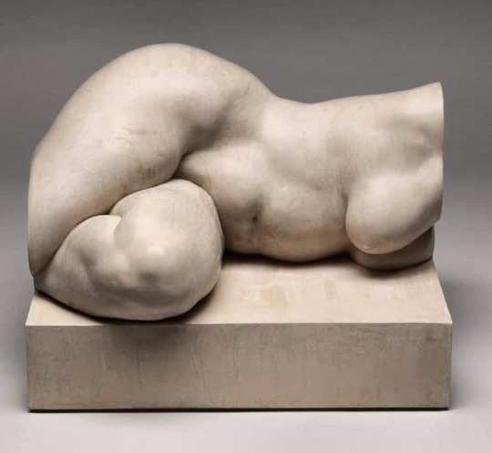
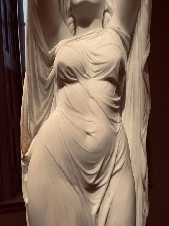
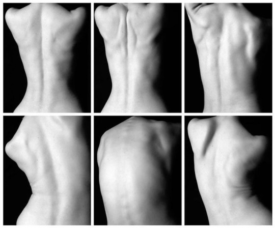
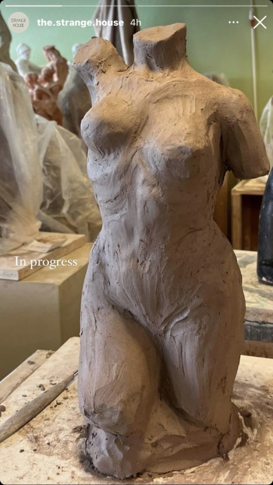
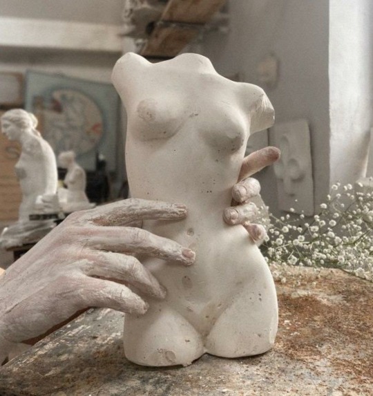
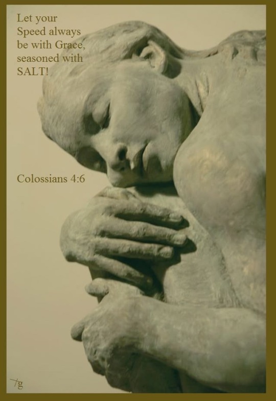
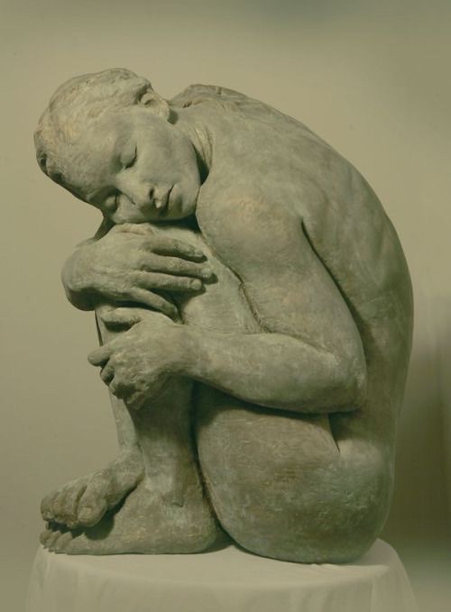
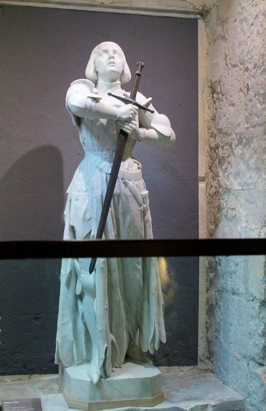
@2ddimensionsstudiofall2024am
3 notes
·
View notes