#color theory
Explore tagged Tumblr posts
Visit Tumblr Blog
Explore Tumblr blogs with no restrictions, modern design and the best experience.
Last Seen Tumblr Blogs


Fun Fact
Tumblr has been banned in Indonesia for providing people with access to pornographic content.
Note
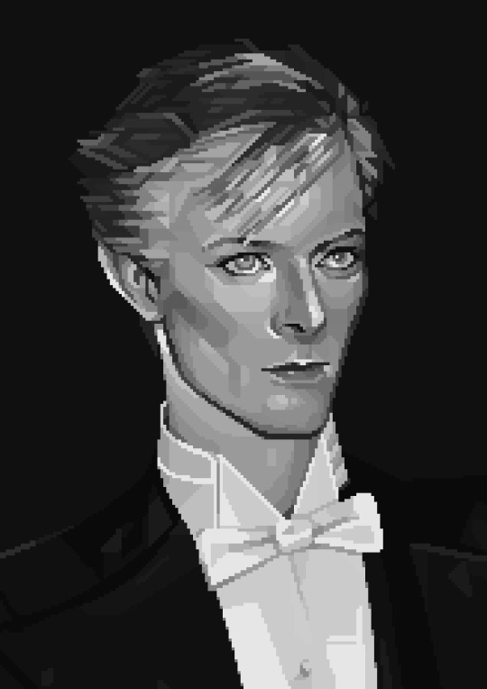
thank you other person for asking about color theory because it reminded me... I really love your blue/red parenting meta. do you think theres any significance to how in their last scene maddie is surrounded by blue/red (the spray oil, the flour, the clothes, the flowers, the backsplash, the containers/dishes on the counter, the shirt being a similar color to the 7x05 scene. its like overwhelming how much stuff shes surrounded by) while the shots of buck are mostly white (blank canvas?) with occasionally the queer rainbow fridge or some blue behind him where the oven vent is in the shot (specifically when he talks about pining and says eddie and chris arent coming back, and then they talk about calling tommy/buck being alone)
Okay, this one took me a minute because I needed to check something but then I got distracted, but yeah, I think it does have some relevance here. Madney's house has gotten more blue and red props overall since the pregnancy announcement but I was rewatching buck begins and I noticed the way Maddie tends to have red on her a lot, while their parents don't have the blue and red combo. They have scenes where they are both blue and they are both red, but never both.


And that led me to 611 and the way that the parents are once again not in the combo but Maddie is in a blue and red outfit.


So, Maddie is put in this parenting position when it comes to Buck, we know that, but colors.
So, yeah, I do believe this was intentional here. Maddie is acting a parent, but I feel like it is there an element of her being the one safe space Buck has at that moment.

But about the background behind Buck. Credits to this person, but even the choice of colors for the letters is fun here, since green is the color most of us associate with Eddie and the blue and yellow queer connotations I have been discussing for a year now.

But also, the rainbow drawing in the fridge.

But yeah, Buck is mostly a blank canvas here, the white shirt, the white cabinets, yet another apron that happens to be a neutral color., except for the subtle queer add-ons to the background.


I feel like it even comes back to the 705 talk with Maddie when he comes back, because he still isn't ready to face his feelings, but he can't hide from them forever.
But I think this is a scene we will come back to and find more stuff once this arc is done.
42 notes
·
View notes
Text
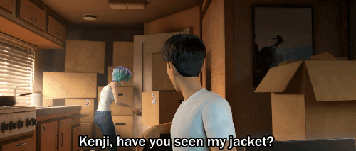
So, Kenji's red-green colorblind.
That's neat.
#on that note goodnight#I have done my research#I'm gonna assume Brooklynn got back late at night when Kenji was asleep and basically just stumbled into bed with him#then left in the morning to do her stuff while he mapped out the hike#didn't notice her jacket tangled in the blanket#kenji kon#brooklynn#jurassic world: chaos theory#jurassic world: color theory#chaos theory#color theory#jwct#it's all connected#kenlynn#samlynn#where did that come from who said that#goodnight
21 notes
·
View notes
Text
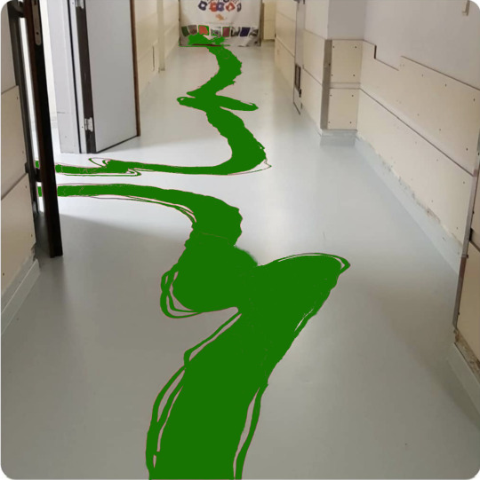
The Vulcan children's hospital recently redecorated. I'm not convinced they chose the most logical option
14K notes
·
View notes
Text
4. childrens hospital hallway
top 3 places to bleed out:
1. the snow
2. your lover/best friend/homoerotic comrade’s arms
3. bathroom floor
81K notes
·
View notes
Text
Free resource for artists and designers!!
I made a website where artists and designers can get color palette inspo from fire hydrants I've 3D scanned all over the US
Some of my favorites:
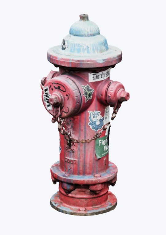
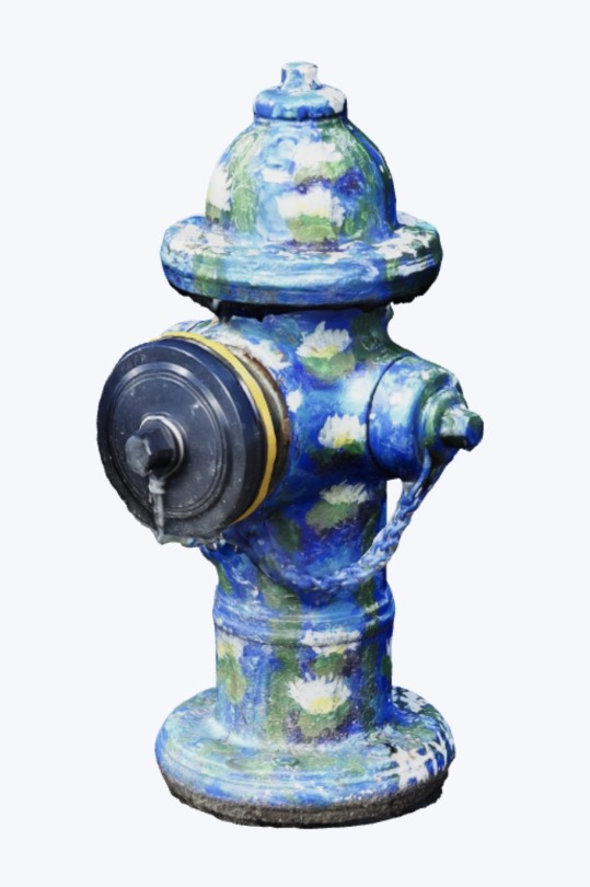
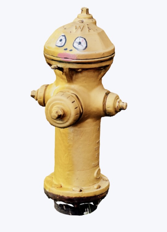
There are about 100 hydrants so far and I'm continuing to add more all the time
Public infrastructure is sexy, baby!!!!!! Pass it on!!
dayroselane.com/hydrants
38K notes
·
View notes
Text
🎨color study note
17K notes
·
View notes
Text

#oh no#i know a lot of audio engineers#it's like a hallucination#dare i say it#because color theory#children's hospital#hotel carpet patterns#color theory#heavy sigh
91K notes
·
View notes
Text
this a just a grown-up variation on the color theory/children's hospital meme
hey we wanna re-think this at all or
10K notes
·
View notes
Text
for all the artists out there, here are my favorite resources i use to learn!
Files
The Complete Famous Artist Course
Art Books and Resources
Art, Anatomy, and Color Books
PDF Files of Art Books
Internet Archive
YouTube
My YouTube Playlist of Tutorials
How to Draw Facial Features
Drawing and Art Advice
Drawing Lessons
Art Fundamentals
Anatomy of the Human Body
2D Animation
Perspective Drawing
Websites
Pinterest Board for Poses
Another Pinterest Board for Poses
Pinterest Boards for References
Reference Angle
AdorkaStock
Figurosity
Line of Action
Human Anatomy
Animal Photo References
Humanae - Angélica Dass
Fine Art - Jimmy Nelson
Character Design References
CDR's Twitter Account
iamagco's Twitter Account
taco1704's Twitter Account
takuya_kakikata's Twitter Account
EtheringtonBro's Twitter Account
Drawabox
Color Wheel
Color Palette Cinema
Free Images and Pictures
Free Stock Photos
FILMGRAB
Screen Musings
William Nguyen Light Reference Tool
SketchFab - 3D Skeleton Model
Animation References - sakugabooru
Animation Screen Caps
Animation References - Bodies in Motion
#art#art resources#art books#anatomy#composition#painting#art tips#art help#art tutorial#perspective#color theory#art reference
36K notes
·
View notes
Text
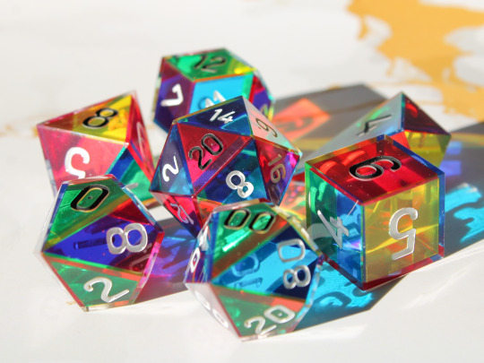

CMYK Rainbow Dice
A dice set made with only the colours cyan, magenta and yellow which combine as you look through the dice to form a full rainbow spectrum.
Plus they cast super colourful shadows!
#dice#handmade dice#handmadedice#dnd#ttrpg#resin dice#transmutationdice#dungeons and dragons#resin#d20#rainbow#cmy dice#cmyk#cmy#color theory
7K notes
·
View notes
Text
⭐ Pixel Art Fundamentals - Hue Shifting
This technique is not uniquely specific to pixel art, but it's a very common term to hear when starting out watching those "dos and don'ts" videos. So what is hue shifting?
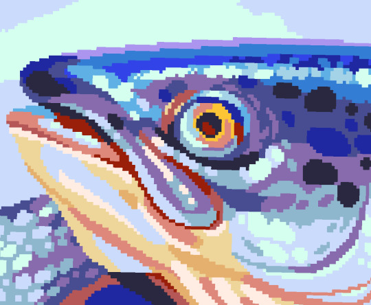
Hue shifting basically means to change the hue when making your shade darker or lighter. In this context, 'hue' = colour!
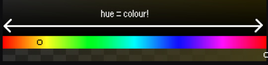
You may hear 'you need to hue shift more' when getting feedback on your art, but what does that mean really? Here are some examples:
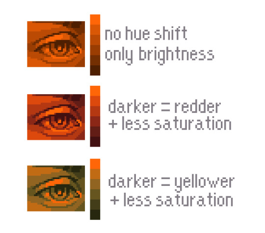
We can see even with just a bit of hue shifting, we have quite a different vibe for each drawing. In warm / daylight settings, no hue shifting can sometimes look a bit muddy or grey.
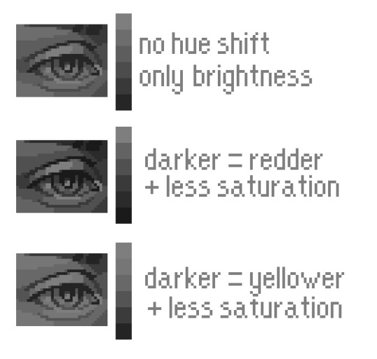
If we swap the image to grayscale, you can see that they look much the same:
As long as the hue shifted colours have a brightness that makes sense, they usually will work. You can get quite wacky with it.

But is hue shifting always good? Not necessarily.
Below is some of my art where I intentionally didn't hue-shift at all. You can see it gives them an uncanny, digital, or photographic kind of look. As always, techniques are about your intention, or personal style.
I recommend trying different hue shifting methods! I especially love to use a cool blue or teal for the lighter shades.
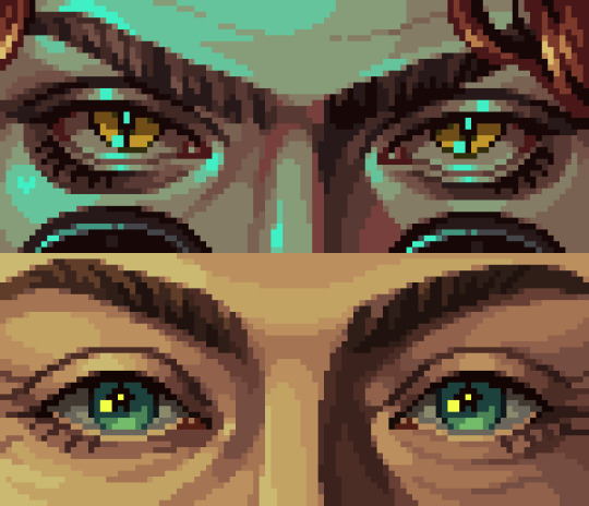
Thanks for reading and I hope this helped a little! Have fun with it!!
⭐ Read my full pixel art guide here!
#pixel#pixelart#pixel art#pixel art tutorial#tutorial#art tutorial#colour theory#color theory#hue shifting#art#illustration#pixel illustration
5K notes
·
View notes
Text
moonlight isn't blue.
3K notes
·
View notes
Text


So I’m spreading this around because it’s become my new favorite way to color.
I got this while watching a tutorial on background art, and the artist would start with a base color, then use the lasso tool and the hue/brightness/saturation sliders to come up with the other colors. From what they’ve said, it’s a common practice, so I wouldn’t be surprised if some of yall do this already. But if you don’t, and it’s new to yall, I RECOMMEND IT.

How it started 👆

Lasso tooling different sections and adjusting the hues with the color sliders

What I get


#artist tip#color theory#Jesus does it take the mental work out of lighting a scene too#at least for me
552 notes
·
View notes
Text
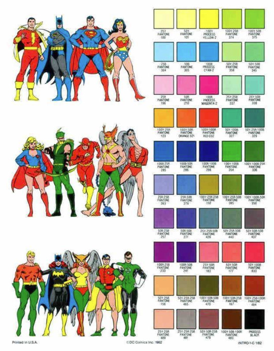
Color Like a Classic Comic Book
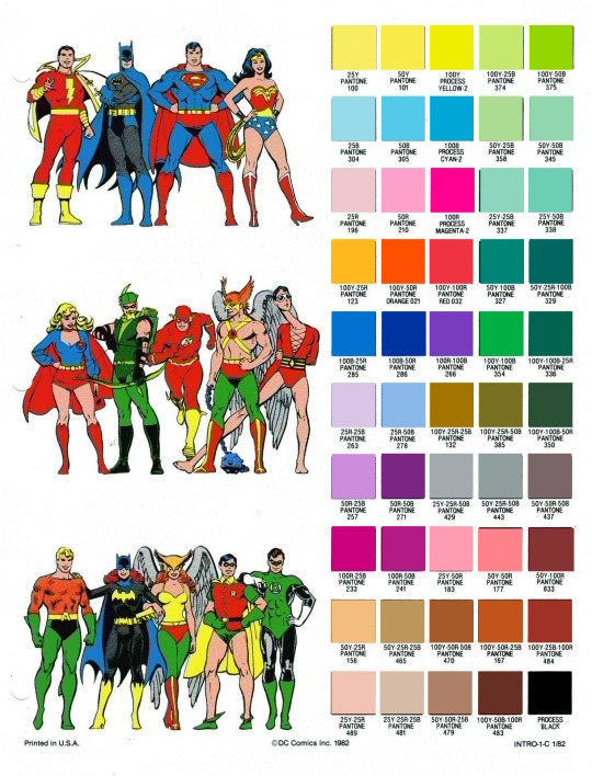
I'm doing some tinkering on Fauxstalgia stuff, and since I believe in sharing resources, here's an RGB PNG version of the official DC pantone guide, with the swatches re-sampled from current pantone standards. This set is from 1982, but should be generally believable for most stuff post-WWII.
The versions floating around online (two of which are under the fold) are scans of prints and are not accurate for color-picking.
Now, these colors would also be altered by the printing process, but for clean, pre-print versions, here's some authenticity.

5K notes
·
View notes
Text
I want to believe he did
colors
83K notes
·
View notes
Text
Jason's helmet is red not because he's Red Hood but because he works with children and according to color theory—
#jason todd#red hood#batman#batfamily#batfam#batboys#batbros#batkids#batsiblings#batman family#dc comics#headcanon#crack#batposting#shitpost#color theory
2K notes
·
View notes