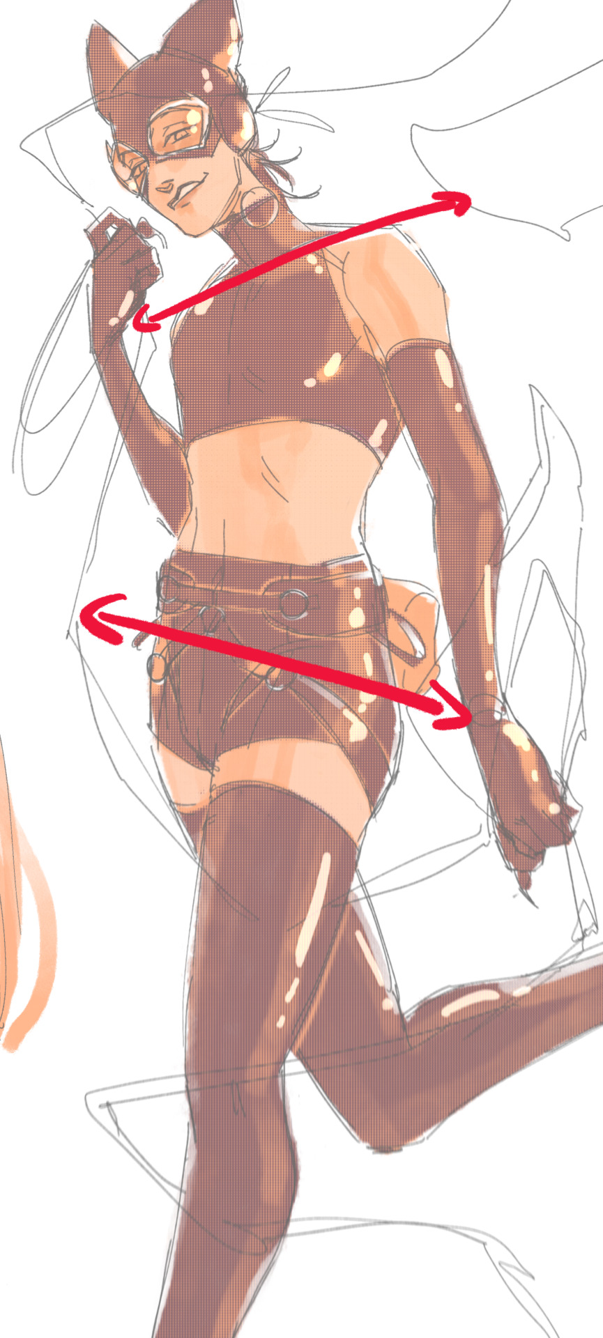
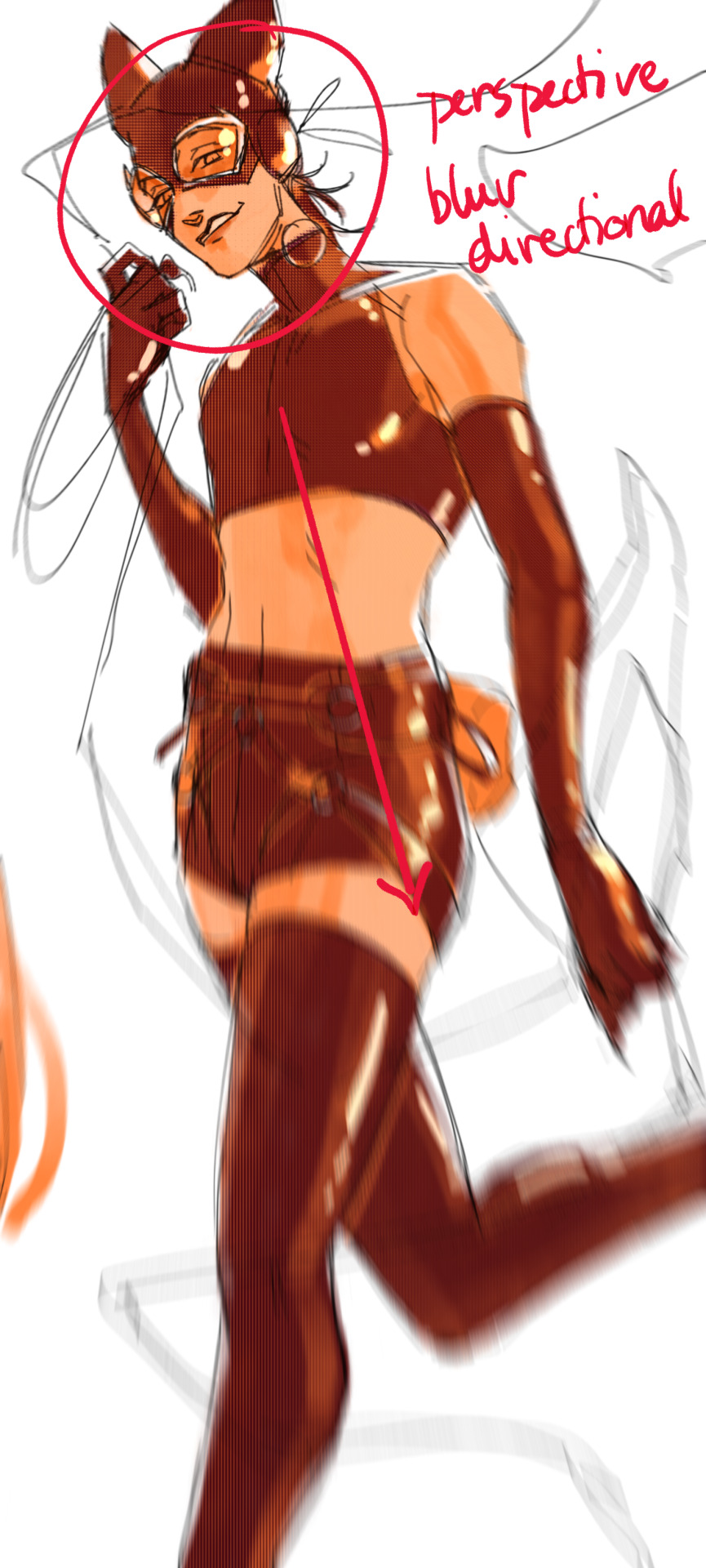
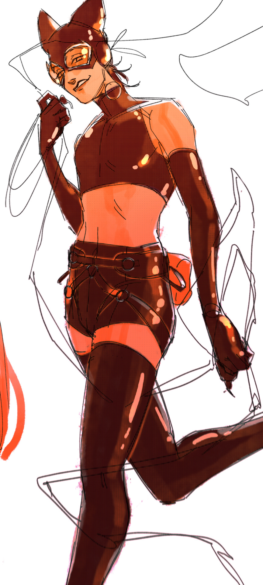
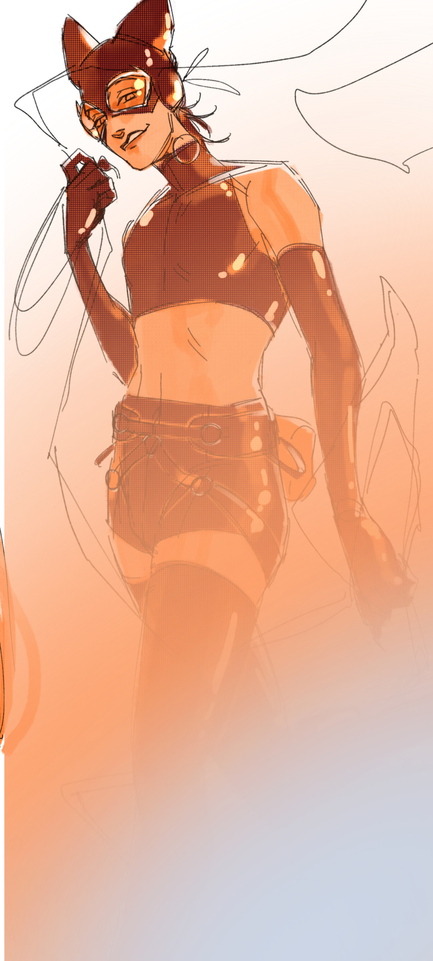
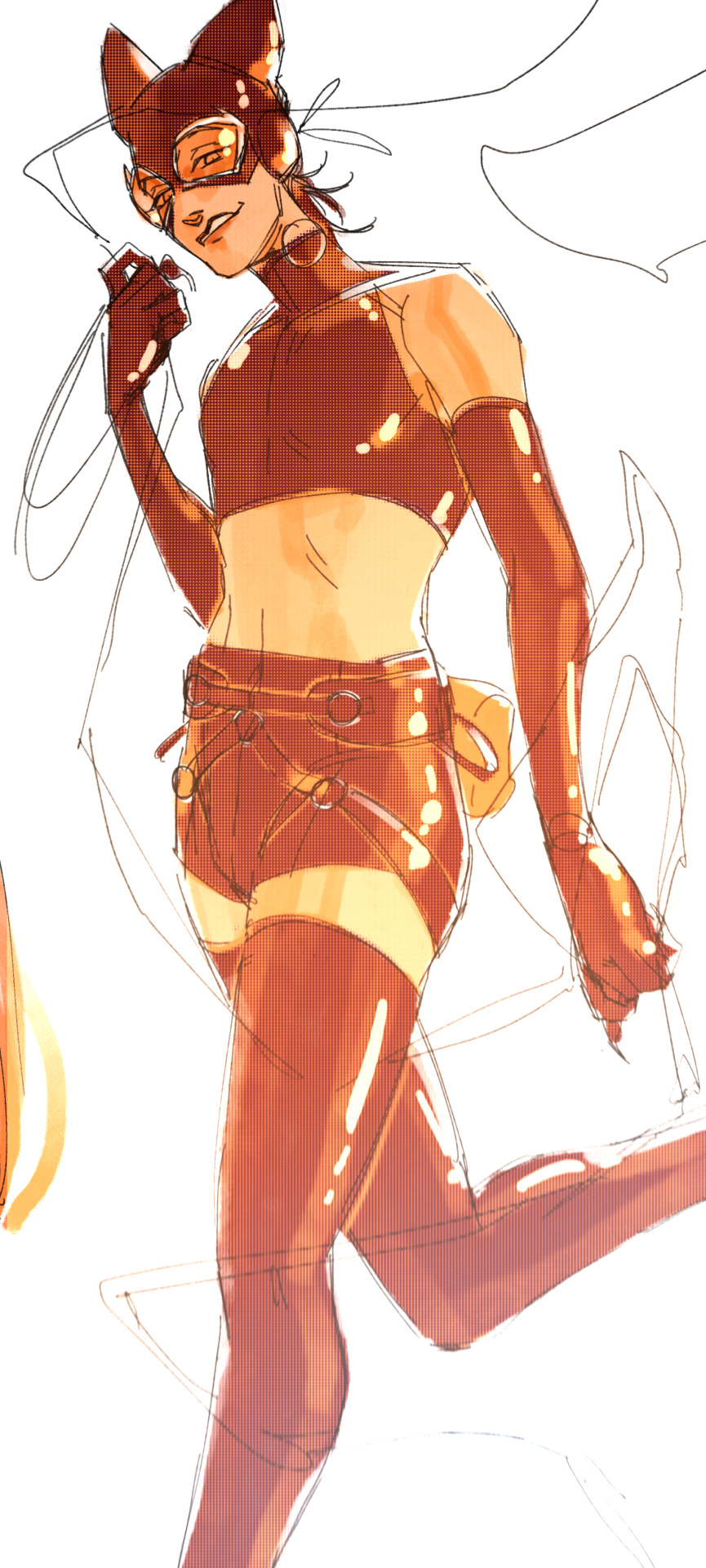
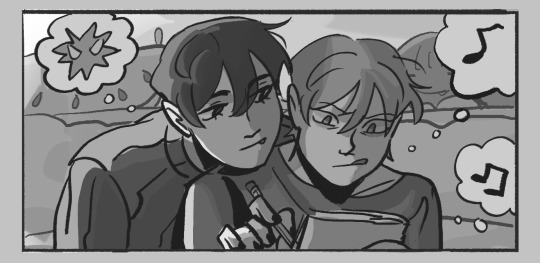
#and I actually did highlights on this one?? and added shadows and highlights to the hair???
Explore tagged Tumblr posts
Visit Tumblr Blog
Explore Tumblr blogs with no restrictions, modern design and the best experience.
Last Seen Tumblr Blogs


Fun Fact
Tumblr.com is the 103rd most visited website in the world.
Text
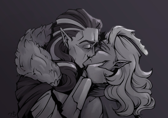
I got to participate in the Secret Strahd/Santa on the Misthoppers Discord Server! (:
I was lucky enough to draw @irishandrogyne's Caspian! A reincarnation of Alek!
This was super fun to be a part of; Irishandrogyne, I hope you like it! (:
#shrimp divorce!!#< the misthoppers tag (:#ok rambling time (:#I got so excited seeing that I was drawing caspian and strahd omg#*and* to mess with my Strahd design and give him fluffy hair#i may have change my usual design for him a bit actually.#it was really fun to draw (:#Caspian's outfit is his masquerade one (: I wasn't sure why he was missing his horns (horn? antler(s?)?) in the piece i saw so i hope i did#the right thing adding them#I decided to experiment with some shading this time (:#the black shadows mainly#but that brush i used for the highlights was a new one#i downloaded it the week i started on the first draft of this#then didnt use it for... over a month? idk the last few weeks have been a blur oops#ok normal tag time#digital art#dungeons and dragons#character art#dnd#curse of strahd#alek gwilym#Caspian - other's PC#other's ocs#strahd von zarovich#strahd cos#described art#if/when the piece i got is posted#i'll be sure to reblog/share it here (:
63 notes
·
View notes
Text

broken vows, broken horns
"Leave, and never come back. If you ever set foot in this city again, you're dead, you hear me?" He spits in Val's direction before turning away, muttering under his breath, "Traitorous little devil."
This is a little glimpse into Val's past, back when they were 17.
When I made Val's tattoos, one of the other players said that the snake motif reminded them of gang tattoos where the symbol of the gang is repeated across the body. That planted the seed for Val's backstory in my head. And even more perfectly, I had already decided weeks ago that the reason Val is never seen without their captain's hat is that their horns had been broken many years ago.
But why would breaking of horns matter? Oh, of course. It's an all-tiefling gang! And broken horns is a sign to anyone who knows the gang/criminal underworld that "this person is not to be trusted, do not let them join your crew".
So I ended up with a tiefling gang called the Horned Serpents, and decided to place them in the port city of Xen, where Val will be taking the party after rescuing Rook. This would explain why Val hadn't been there in years (15 to be precise), and thus allow the DM to surprise me with whatever is going on there.
Unbeknownst to me, Xen and the surrounding area has a... complicated history with the Hells, and already is wary of tieflings. So it makes perfect sense that the tieflings there would band together, especially if they were already ostracized. (Yay for accidental mind-reading!)
Val was basically raised by the Serpents, but they are too kind, too good a person to be complicit in gang violence for long. So when they were offered the chance, they became an informer, leading to the gang's dismantling and downfall. But some of the surviving/escaped members discovered Val's treachery and came after them, beating them and breaking off their horns. And, of course, delivering the warning to never return to Xen.
Val fled and never looked back. For 15 years they've sailed all around the continent, but never docked in Xen. But if returning there is what it takes to save the life of one of their passengers, they'll do it.
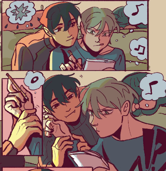
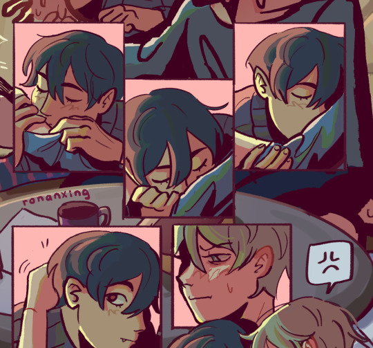
#ts4#ts4 edit#the sims 4#sims 4 edit#my edits#ts4 render#sims 4 render#my renders#dnd edits#oc: Val#oc: Kyron Valris#bruises tw#tw bruises#gang violence tw#(only discussed under the cut)#be proud of me! I drew on Val's tears (that you can't ever see) because my tear overlay did NOT show up in blender at all for some reason.#and I actually did highlights on this one?? and added shadows and highlights to the hair???#I never do that shit.#super simple set for this one but I'm still happy with how it turned out. The focus is on Val not the location.#and it's a nice break after and contrast from Dr. Purity's lab for my Temperance render.
28 notes
·
View notes
Text
Accidental Cuddles

Ryomen Sukuna x Black plus size reader
It had been a long day full of errands, cooking, cleaning, and your usual flair for making even the most mundane tasks a little more fun. But now, as the chill of the evening set in, you found yourself naturally drawn to Sukuna, who was already slouched on the couch with a book in his hands.
The warm firelight illuminated his sharp, brooding features, casting shadows across his crimson eyes and the black markings etched into his skin. He looked as intimidating as ever, but that had never stopped you from invading his space.
“Hey, grouch,” you greeted with a bright smile, dropping onto the couch beside him with zero hesitation.
Sukuna didn’t even glance up. “What do you want now?”
“To annoy you, obviously,” you teased, kicking off your slippers and tucking your legs beneath you. “And maybe tell you about my day.”
“Great,” he deadpanned, still not looking at you.
But you didn’t need his permission. You launched right into it, recounting every little detail with your signature energy. “So, while I was out, this lady stopped me to compliment my hair, she said she loved my boho braids!” You ran your fingers through the mix of neatly braided strands and loose, soft curls that cascaded down your back. The tiny, colorful beads you’d woven into some of the braids clicked softly with your movements. “She couldn’t believe I did them myself!”
Sukuna flicked his eyes toward you for a moment, taking in the intricate style. The firelight caught on the beads, creating a subtle shimmer. But he quickly returned his gaze to his book, muttering, “She’s not wrong. They’re decent.”
“Decent?” you repeated, feigning offense. “These are gorgeous, thank you very much.”
“Sure,” he replied dryly.
You leaned closer, letting your curves press against his side. “You’re just mad you can’t braid.”
He grunted, flipping a page. “As if I’d want to.”
You laughed, the sound bright and melodic, filling the otherwise quiet room. For all his grumpiness, you knew Sukuna didn’t actually mind your chatter. You could tell by the way he hadn’t told you to leave not yet, anyway.
As the minutes passed, the warmth of the fire and the soothing rhythm of your own voice began to lull you into a state of drowsiness. Sukuna didn’t seem to notice when you leaned against him fully, your soft, plush body resting against his firm side.
“It’s so cold,” you murmured, pulling your oversized lavender sweater tighter around yourself. The soft fabric clung gently to your curves, but it wasn’t enough to fight the chill in the air.
Sukuna stiffened slightly, his crimson eyes flicking down to you. “I’m not your heater, you know.”
“Mm, but you’re warm,” you mumbled sleepily, resting your head against his shoulder.
He sighed, but didn’t shove you off. Instead, he continued to read, his free hand resting on the arm of the couch as if to keep up the pretense that he wasn’t affected by your closeness.
Soon enough, your rambling stopped, replaced by the soft, even rhythm of your breathing. Sukuna glanced down, his book forgotten as he took in the sight of you.
Your features were relaxed, the light from the fire highlighting the rich, warm undertones of your brown skin. Your braids framed your face, a few loose curls spilling forward onto your cheek. The beads in your hair glimmered faintly, adding a whimsical touch to your already striking beauty.
“Tch,” he muttered, setting his book aside. “Ridiculous woman.”
Careful not to disturb you, Sukuna reached for the blanket draped over the back of the couch. With surprising gentleness, he shook it out and draped it over your shoulders, tucking the edges around you. His large hand lingered for a moment, hovering over your face. One of your braids had slipped across your lips, and he brushed it aside, his fingers grazing your soft skin.
“Don’t get used to this,” he grumbled, though there was no one around to hear him.
You sighed in your sleep, leaning even closer to him, and for a moment, Sukuna allowed himself to relax. His arm settled around you, his hand resting lightly on your hip.
As much as he pretended to be annoyed by your boundless energy and constant affection, there was something comforting about the way you fit against him. Your warmth, your softness, it melted the icy edges of his demeanor, leaving him with a quiet contentment he would never admit out loud.
“Stupid woman,” he muttered again, though his tone lacked any real bite.
The fire crackled softly in the background as Sukuna closed his eyes, his gruff expression softening as he held you closer.
#jujutsu kaisen#jjk x reader#jjk x y/n#jjk x black y/n#x black reader#x black plus size reader#x black fem reader#jjk drabbles#jjk fic#jjk fluff#sukuna ryomen#ryomen sukuna#jjk ryomen#sukuna x reader#sukuna x you#sukuna x y/n#sukuna x black reader#ryomen x reader#ryomen x you#ryomen x y/n#ryomen x black reader#sukuna ryomen x reader#sukuna ryomen x you#sukuna ryomen x black reader#sukuna ryomen fluff#ryomen sukuna x reader#ryomen sukuna x you#ryomen sukuna x black reader#sukuna x chubby reader#jjk x black reader
174 notes
·
View notes
Text
In light of Hades 2 adding new designs and MORE Nyxblings, here's a little face study I did of Chaos, Nyx, and their family. Someone once mentioned that Nyx's children who's got features she doesn't have actually have Chaos' features instead, and I wanted to compare and see which child resembles who more.
Additionally, shoutout to @blood-starved-beast for their post about the age order of Nyx's children because it has helped immensely with the brainrot.
Detailed analysis under the cut.
Firstly, the parents:
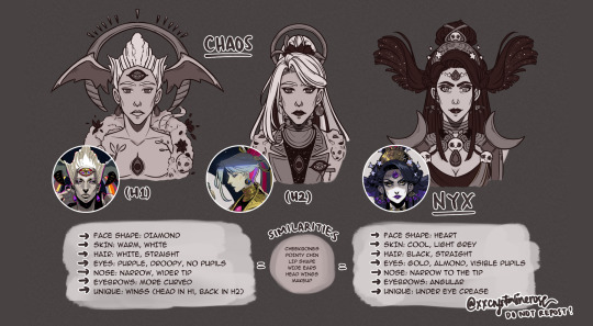
For parent and daughter, Chaos and Nyx don't really look the same. However, the cheekbones and jawline that could cut glass is hereditary lol. I wonder if there are other children of Chaos who look more similar to them?
I also like how Chaos' Hades 2 appearance could be a nod to them reconnecting with Nyx and probably wanting to look more "normal" (or as normal as they could get) for the family reunions. The exact same makeup style is cute.
Next up, we have the older children (excluding the Fates, whom we haven't seen yet):
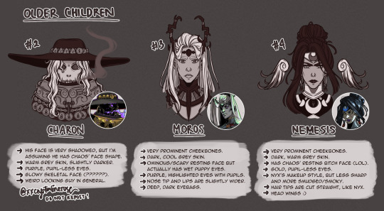
Charon is a tough nut to crack because his portrait is so heavily shadowed and he also wears a bigass hat, so I don't really know his facial structure, but from what I could see, it's more like Chaos'.
Moros' eye shape is weirdly different from the rest of the siblings, but they appear to be downturned and large, which is closer to Nyx's eye shape. While his facial structure is more like Chaos', his eyes in particular make him look softer.
Nemesis actually has a different face structure from Nyx. Her coloring is the exact same (sans skin tone), but not the face. However, her hairstyle is similar, including the updo.
Lastly, the younger children:
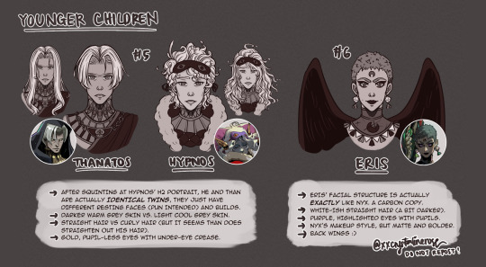
It's probably because Hypnos' expression was drawn more comically, but as soon as I take a good look at his new portrait it's made greatly apparent that he and Thanatos are actually identical in terms of facial features. What makes them appear even more different is the hairstyle; Than's go straight down, Hypnos' is fluffy and piled high on his head. They also have similar face shape as Nyx, but with a squarer jawline.
You'd think their hairstyles are radically different. However, this official art of long-haired Than shows that his hair curls at the ends. His hair is straight now, but I'd like to think he straightens it out, because otherwise it would look a bit wavy still.
As for Eris, people keep saying that Nem looks like Nyx the most, but Eris looks astonishingly similar to Nyx. Oh, the irony of looking like the parent you detest.
Summary (and some thoughts):
Face structure-wise, the older children look more like Chaos, while the younger children look more like Nyx.
Of all Nyxblings we've known, only Nemesis has black hair.
Except for Charon, the children's eye art style is reversed between Chaos' and Nyx's (the ones with purple eyes have visible pupils and highlights, while the gold-eyed ones have no visible pupil or highlight).
Where did the curly hair genes come from? The twins are explicitly stated to be fatherless, too. Maybe some other children of Chaos have curly hair? Maybe Gaia, as she was mentioned in Hades 2?
I have a theory that the older children look more eldritch (more similar to Chaos), and only started to look "normal" during Nyx's separation from Chaos, and the cutoff point is Moros, unless Momus is older than him. Would be cool if the Fates are an amalgam of three bodies, because they're triplets and older than Charon.
Thanatos cutting his hair was actually a smart decision because his new hairstyle flatters his face shape more. I'm sorry darling but you don't have game in styling long hair. Too bad he and Moros don't know each other, big brother could've given him tips.
The entire family is hot. Nuff said.
#ksadraws#ksatalks#i love the variety and slight differences between the nyxblings so much :))#hades 2#hades game#hades 2 fanart#hades fanart#chaos hades#nyx hades#charon hades#moros hades#nemesis hades#thanatos hades#hypnos hades#eris hades
403 notes
·
View notes
Text
The Sworn Partners for God's Sake
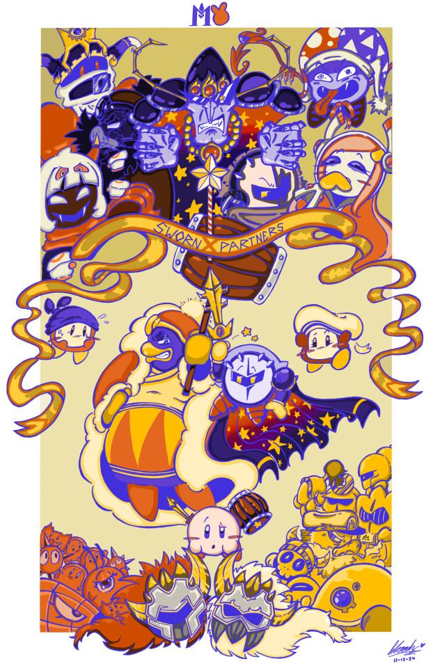
i am SOOOO ecstatic w/ how this came out! i decided to participate in @das-a-kirby-blog 's DTIYS since i needed some fun artistic challenge in my life. i will put all my thoughts below the cut because i need to yap but please look at this image for atleast 5 seconds since i spent like 25 hours on it <3
sketching this alone took some thought since i had to adjust the canvas multiple times to make sure everything fit properly. i've never drawn alot of these characters ngl, so i was a bit nervous going in so suddenly. i wanted to make all the past villians more, well, villainous looking so i just added some crazed expression and dynamic poses. i especially like how i did susie ngl. like shes giggling so wickedly i love. i gave kirby a more confused expression while bandee is in his usual worried state of mind. i also decided to make meta and dedede make sexual eye contact as lovers sworn partners. however... i decided to take dark crafter and yinyarn out back before telling them to close their eyes because, tbh, i really dont give a fuck about either of them. marx and magolor felt like much more fitting choices in the section of past kirby antagonist as i would consider them far more impactful (and fun to draw) than the ladder pair. also added blade knight cuz sword knight was there and he wasnt?? smh. oh and vul is smoking lmao.
the hardest thing in this entire piece was the line art. originally i did all my lines in black just because it's easier on the eyes when crafting all the pieces together before i layer a blue merge layer on top. i questioned whether or not to use the lineart as both eye-black and metal highlight/shadow but im incredibly happy with the result.
coloring became a tricky subject since my art utilizes very bright, vibrant colors with high chroma. i wanted to stay true to the og by only using the base colors but just... tweaking them a lil bit. i cant resist a good highlight in my art. when it came to nightmare and meta's cape, i am a longtime subscriber to the hc that meta is like his "son" in a way so i wanted to make a nod to that by making the gradient and star-design pattern of their cloaks the same.
to be honest, this was so much fun. but holy SHIT my back is on fire. shoutout to anyone who actually read this monstrosity of an artist's explanation, ur a real one. thank you guys so much for ur support and ill see yall eventually with another dumb kirby post <3.
256 notes
·
View notes
Text
Lemurian Fairytale
A/N: Idk, I just had this floating around in my head so here you go.
“How do Lemurians punish?”
At first, he didn’t know how to respond.
Your voice was low when you asked. You mind far into another world. Sirens shrilled to Rafayel. Was this it? Were you showing your true colours? Maybe Amund was right. He could not betray his steadfast devotees.
“And why is a ruler concerned over such matters?” the Abysswalker asked you as he flicked his dagger between his fingers.
You were jealous of his dexterity. Actually, there was a lot about this Abysswalker named Rafayel that set you off. You thought yourself a fool to run after him, heart in hand. It was unbecoming. Unlike you. Unexpected. Undesired. Yet there you stood, a fool for what you were about to do.
“You,” you paused, mulling over your words, “enlightened me on how Lemurians love”.
Your heart warbled and stung. You clenched your palms.
“Now, I must understand how Lemurians punish,” you ordered.
Rafayel stared at you with a calculating look and his eyes darkened as a voice sullen and laced with anguish obliged you with an answer.
“We make them live without love,” his voice whispered. Then he sighed before adding, “in all the forms such a punishment entails. Year after year”.
“Until?”
You couldn’t help your curiosity, but the Abysswalker just shrugged. Either he didn’t know, or he didn’t care.
A sudden burst of the setting sun’s last golden rays illuminated Rafayel’s figure. As if to acknowledge the sun’s oblations, the Abysswalker raised his head and gazed out the window. The light climbed up your walls, highlighting the room’s opulence. Gems glittered and gold gleamed. Fabrics that circumvented the room fluttered to life. The myriads of patterns etched on them flanked the solitary man who silently sat. Watching him, the scene felt too familiar, and you couldn’t help but think that Rafayel would forever endure and would always have brilliance cushion his every step.
The Abysswalker’s eyes snapped towards your shadowy figure. His dichromatic eyes invited you towards him, but his hands continued to play with the dagger.
“What happens to those who love the punished one?” you whisper.
“My,” Rafayel drawled. “Our ruler certainly delights in morbid topics”.
When you deigned to bite back the Abysswalker sighed and looked away. After some time he spoke, “I suppose they suffer in their own way as well. To exist knowing their love can never be”.
But they live, you thought, though your words were immediately rebutted by memories of words worshiped onto skin on how Lemurians live for love.
But you supposed anyone can endure any agony in the name of love. Let him call you a fool. Let them call you a betrayer. Faced with no other option, you knew what your heart would choose again and again. And in finally embracing your emotions for once in your life, a cool relief washed over you, as if the ocean waves cocooned themselves around you. You would need them for the crucible that awaited you.
It was a relief that burned the Abysswalker. He felt every move your heart made as it danced you through a whirl of emotions for the past few weeks. He knew you were up to something, so he observed everything. He saw the increased guards near the kingdom’s walls. The long shadows in the palace and whispers that traversed the sands and ended in blood. He picked up the chard remains of inscribed secrets and the sudden changes in alliances. And today, Rafayel saw the last warning that confirmed what he knew. The kingdom’s gate closed before sunset. The palace was silent as it anticipated for the bloodshed that was about to occur. And here you both waited. A ruler and the sole Lemurian left in the kingdom. The only ease Rafayel felt was in knowing that his people were currently in the care of Amund, far away. The elder was furious that Rafayel planned on returning to you despite everything you did. Your dip into freedom may have initiated the cascading backlash, but there was a hand that guided you into the deep and despite everything, it still refused to let go.
Dusk fell and it dawned on Rafayel that your room was probably the darkest in the palace. He could barely see anything and the objects that decorated your room now alerted you to anyone’s presence as they inevitably stumbled in the dark causing a tinkles, jingles, and rustles. As he tried to make his way to you, he noticed your room was too silent. Then, from a distance drums started to beat. Rafayel expected to hear the sounds of insurrection, but when he heard the beats of an execution, his heart screamed as observations finally settled into place. He snapped his fingers and instantly, fire lit up the room. Its flames emblazed your presence near the door. As he drew near, he saw the corners of your eyes turn red and the stiffness in your body as you braced yourself. Yet you still had the audacity to smile.
“I order you to not stop me,” you started, speaking before he could. “And I order you to survive”.
“Anything else?” Rafayel snarled.
His hand still held the flame, and as your felt its warmth, you found yourself bringing the hand to your heart. Rafayel immediately extinguished his flame, but his hand remained warm firmly enmeshed within yours.
“See you soon?” you asked, then let out a last laugh.
The laugh would haunt him as he was forced to wait in the pitch dark of your room. A laugh that would comfort him as he felt your agony, pearls littering the floor. A laugh that would protect him as he made his way away from the palace and towards an unknown future where your story would unfurl once again.
#writing#lads rafayel#love and deepspace#lads#rafayel love and deepspace#love and deepspace rafayel#love and deep space#rafayel x reader#lnds rafayel#rafayel#lads rafayel x reader#rafayel x you#loveanddeepspace#LaDS#lads mc#lads x reader
101 notes
·
View notes
Text
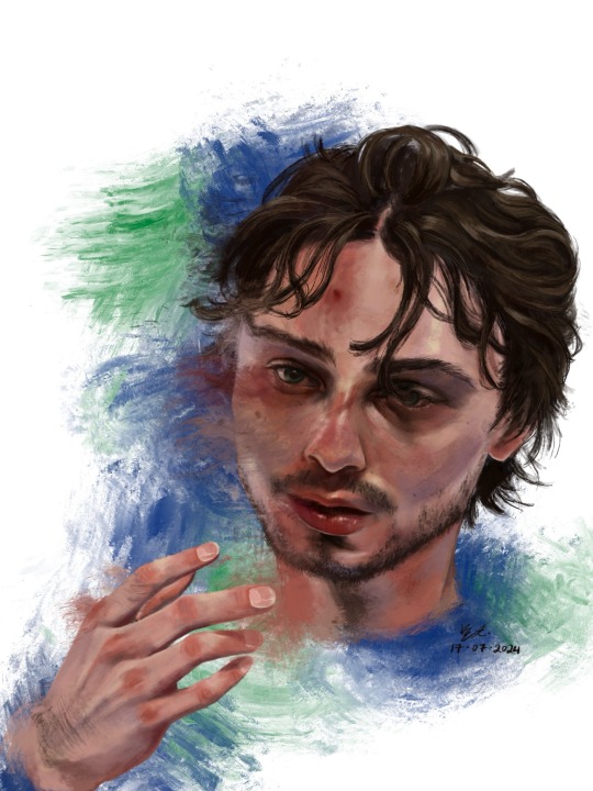
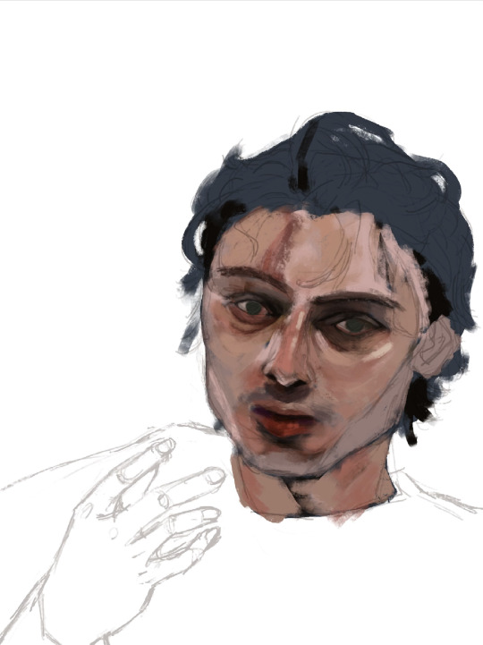
who is #43?
Hello !! First off thank u for visiting. If you clicked read more by accident rip sorry it’s a lot of text. ENJOY!!! <3
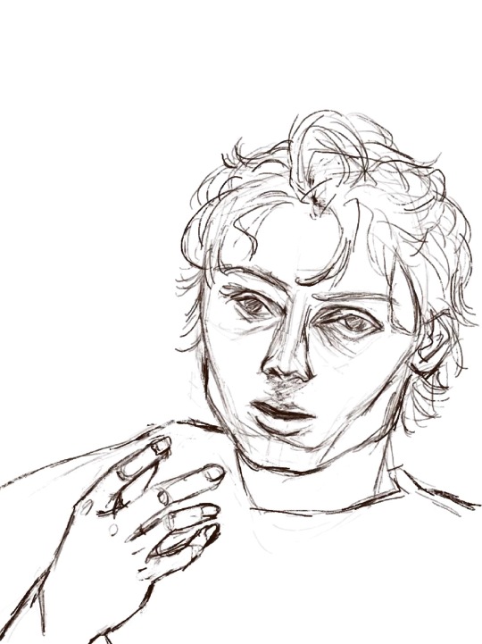
1. This was the photo reference I used. I really did mean it when i said he photographs well!! I really like how scrungly he looks at times lol. v paintable

2. here’s a timelapse for your viewing pleasure in video + gif form <3

3. Process breakdown below. I am not formally trained, so don’t take any of this as professional advice!! The way i paint has been compared to channeling some evil contract with a demon also. So um . Im saying that i dont remotely think that this is efficient or correct, its just whats comfortable for me <3
3a) the dreaded lining phase. I have 2 modes of operation when it comes to painting - either i go full-dick with fancy inking/sketching + cel shading (rare, unrefined, haven’t figured out a nice workflow yet) OR i do a very very basic chicken scratch set of lines like so:
It’s less about being realistic here and more about laying down some guide lines for the chaos ahead. If i thought i could get away with it, I would start every rendered painting i do with laying down colours — but unfortchh ive tried that before and it usually ends in really weird proportions. Even with the lines i still need to make adjustments. This is something no people except me would notice but look at the above sketch; the eyes are too big and slightly too far apart, the forehead is too small and thus the hair is also not quite big enough… I have a bad habit of drawing eyes too big on faces, they’re my favourite facial feature to draw.. i barely resisted giving him big cow eyelashes (I love big cow eyelashes… all of my OC’s and most of my more stylised fan art of characters get big cow eyelashes… god…. Big cow eyelashes SAVE ME……….)
Anyway. Structure of the face + hand somewhat established. <3
3b) Underpainting!! Okay stay with me here . Ever since i figured out i dont have to paint in 03925893853 different layers, I’ve joyfully painted on 1 layer as much as possible. I dont have the brain power all the time to be managing layers so I simply dont work with that many layers. For this painting, the skin in its entirety was painted on one layer, the hair on another layer, and the effects on the last layer. There was a placeholder background off-white/grey colour for a while there, and I duplicated the line layer — one for figuring out where to lay colours, and one hidden for later so i could check back to see how accurate to the sketch/proportions were to the actual painting. 6 layers, 2 of which i painted the bulk of the piece on, 1 more at the end.
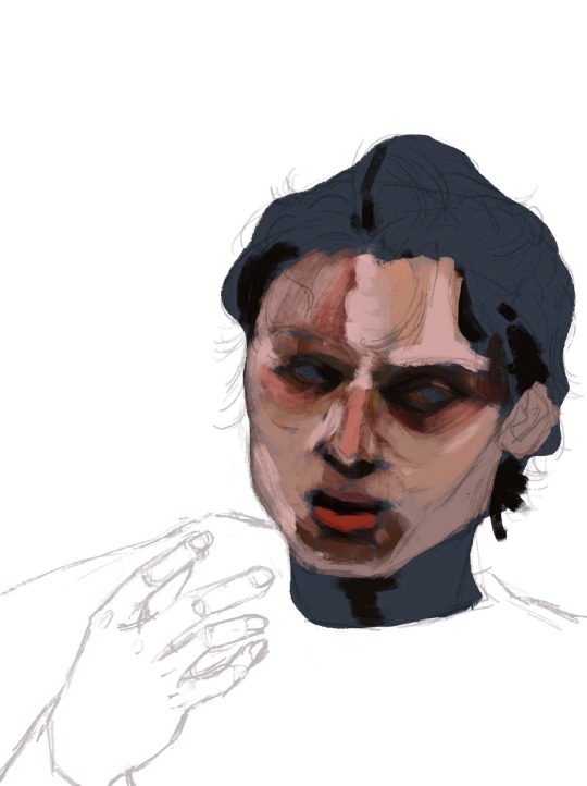
3c) here’s where I started carving out features. I think about objects in terms of volumes and light rather than lines. i love painting and sculpting because of this!! Here you see where I’ve begun to define his features — his eyelids, his bags, his nostrils. Just refining what was there before. The suggestion of facial hair before i gave it up and left it for later (his face is so naked the WHOLE time)
3d) nose bridge highlight, suggesting his eyebrows, a cheek highlight. A touch more coral red and muted yellow pull away from the grey/blue underpainting. Strategically leaving some of it peeking through.
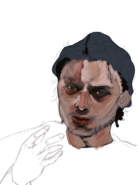
3e) i truly start messing with the fidelity of his features here. Red lipstick <3 and some violet/blue for shadows on the right side of his face.

3f) the part where it starts looking like q.hughes to me (though, my friend said i got his vibe pretty early on which is such a compliment.. waaaaa…..) I love this part of every painting i do. I know it’s definitely not the Correct order since other parts of the entire painting are simply Not Rendered or Done, but whos gonna stop me?? :3
I love love loveeee painting faces. Adding the little shinies to his eyes + lips + upper lip + nose … you don’t know how much of a difference it makes until you do it. Also i snatched his eyebrows
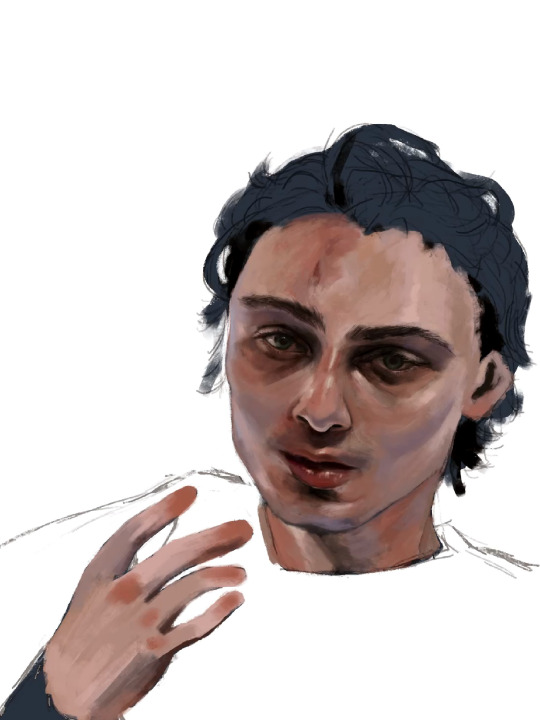
3g) i really pushed the red/coral/ochre/orange here. Note the yellow highlights on his cheekbones, the forehead, and the thin thin line of pink right between where his bottom lip ends and his chin shadow starts <- very important . To ME!!!!!!! Also highlighting his waterline and adding his lashes was so so fun <3
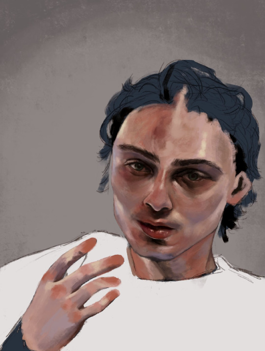
3h) FACIAL HAIR!!! And I started rendering his hand. Some micro adjustments made to his face for proportion check.

3i) i start painting his hair in earnest and realise his forehead is too small so i make the adjustment. I really love how it falls into his eyes in this photo. <3
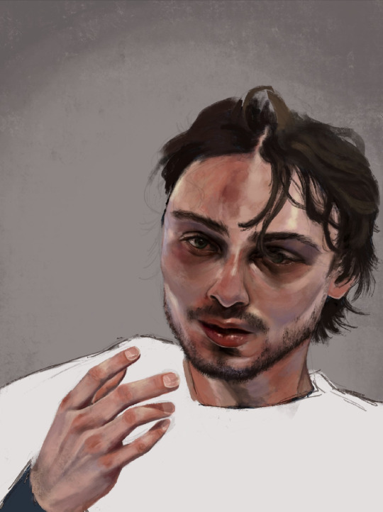
3j) i make some final adjustments to his eyes — a bit smaller, closer together. And i refine the outline of his jaw, push the stylisation of it just a little.
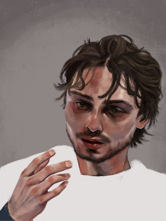
3k) Finishing details; his flyaway hairs, his moles, a bit of texture on his face, shadows cast by his hair, his little forehead cut <3
3l) i adjusted his hand here, added more texture to his skin, refined his hair a tiny bit more, and made the decision not to fuck around painting his jersey because i wanted the focus to be his face <3

3m) Canucks blue and green. Captain at 23. His form bleeds into the background. He is the franchise.

theee most fun ive had painting anything. and i finally feel... warmed up? if that makes sense. art for me is like. if i dont do it in a while it feels like nothing goes right when i come back to it. i hate that feeling, and the most difficult hurdle to clear is letting myself feel that until i get back into my Zone. after all this time i feel like im BACK !!!!!!!
i loved painting this fella. hes SO Shaped. <3
Apologies i simply do Not have the energy to write the alt text for all of these so i hope the little blurbs are okay aslkjasdklj. i gotta post and go to bed . if u made it this far, thank you for reading!!
#details and process under the cut ….!#god… it really is like . they let anybody be in their mid 20s these days??? (<- guy in his mid 20s)#quinn hughes#vancouver canucks#hockey art#puckpainting#<- abandoned wet rat of a tag. rarely used
153 notes
·
View notes
Text
okay okay okay, but we need to talk about the name etymologies of the four central characters of haikyuu!! because it is literally impossible to talk about it too much. first let's break down all the kanji in their family names!
(sidenote: all of the translations were pulled from wikitionary, so if any of the meanings are actually egregiously incorrect, pls lmk!!)
影 kage - shadow 山 yama - mountain 口 guchi - mouth 月 tsuki - moon 島 shima - island 日 hi - sun 向 nata - direction
adding a readmore because this got so much longer than i intended it to be
so some of these are talked more about in the fandom than others. i think it's practically common knowledge (if it isn't, well now you know) that the first kanji of hinata's name (日) means "sun" and the first kanji of tsukki's name (月) means "moon," and that this was done on purpose to highlight their roles in the story as foils and as a sun and moon analogy. tsukki and hinata are quite literally polar opposites in their approach to volleyball (they are, one might say, like night and day). tsukishima with his physical advantage yet reluctance to try too hard compared with hinata's overwhelming physical disadvantage and his willingness to go above and beyond, to the point that he can't even fathom how not to give 110% at all times. (there's so much more to say about this symbolism but i'll leave it there, gotta stay focused rip).
the first kanji in kageyama's name (影) meaning "shadow" i feel like most people are aware of as well, this symbolises his general mood (sorta a comparison with tsukishima too imo, darkness and the moon etc., but that's quite subtle), and again this furthers his parallel with hinata, juxtaposing light and darkness, but the kanji for yama (山) which we find in both kageyama and yamaguchi's name, means mountain, which represents both reliability and strength. this works for both kageyama and yamaguchi in different ways. from day one at karasuno, all of the team members can count on kageyama to perform, be it setting, serving, receiving, he is all around the uncontested best player on the team, and serves as the base for nearly all of their strategies. yamaguchi doesn't have the same dependability in terms of athletic performance (at the start of the series), but in a lot of ways he is a grounding force in among the first years, and in his relationship with tsukki he is very much a needed support, tsukishima depends on yamaguchi for... god for so much actually.
and then there's the second kanji in tsukishima's name (島)... meaning "island," it is very clearly meant to represent the isolation tsukki both feels and imposes on himself at the start of the series. i also think it's of note that an island is opposed to a mountain - both are large(-ish) landmasses but the mountain is connected to the rest of the land while an island is all alone...
the individual kanji all have a lot of symbolism going on but when you put some of them together, i think you get a new significance...
日向 hinata - the direction sun in shining 影山 kageyama - the dark side of the mountain 山口 yamaguchi - the mountain’s opening (or mouth maybe cave?) 月島 tsukishima - moon island
to get them out of the way, the compound meanings of tsukishima and yamaguchi don't seem very narratively significant, but i am more than open to analyses you might have that i didn't think of! :)
however hinata and kageyama seem poetic to me in a way that i don't think is accidental. i did take some liberties with the phrasing (kageyama could also be written as "the mountain's shadow"), but it doesn't change the overwhelming symbolism. the dark side of the mountain is obviously juxtaposed with the light side, but how do you create a shadow? well the sun has to shine on something... the direction of hinata's sun shining on the kageyama's mountain making the shadow... i admit i might be reaching with this one. but i like it.
initially, i had only planned to look into their family names, but after finding so much symbolism, i though why not look into their given names and boy oh boy am i glad that i did~
飛 tobi - flight, fast, high 雄 o - something large powerful and masculine (yang) 翔 sho - soar 陽 yo - alt. the sun, positive, (yang!!!!) 蛍 kei - derived from firefly 忠 tadashi - loyal, devoted, faithful
where do i even begin i legit have tears in my eyes okay, first things first, kei has always been my favourite name in all of haikyuu, i just like how it sounds, i think it's so pretty, and in looking up the meaning of the kanji i've grown to love it even more. as a masculine name, 蛍 is pretty rare, it's more commonly used for female names and the most common reading isn't kei it's hotaru. i like that tsukishima has a relatively unique first name, but what really gets me is the etymology. the kanji 蛍 is the same kanji for firefly, and when the kei pronunciation is used, it means fluorescent. i absolutely love this for tsukishima, because we are being given two different messages with his family name and his given name. on the one hand, his family name would have us believe that tsukki is like the moon, only able to be seen at night and only capable of reflecting the lights of others, but his given name tells us that, while it might be a soft glow, tsukki does have a light of his own, he is in fact able to shine by himself.
compared to 蛍, 忠 is a much more common given name, meaning loyal or devoted. i think sometimes people misunderstand the dynamics between tsukishima and yamaguchi, so please don't take this as me saying something i'm not, but tadashi really is loyal to kei in a very special way, and this is clearly something that furudate wanted to highlight, as this is not the only time he's made reference or used symbolism for tadashi's loyalty to kei. i do think that this devotion extends past tsukki too, and tadashi's loyalty is another part of what makes him such an important part of karasuno (and eventual team captain).
now. for the big ones. i really hope people are still reading because i saved the best for last just because i know i'll collapse into a puddle of tears once i finish typing this section out
if you look at tobio and shouyou's names individually, they do fit them very well; 飛 (tobi) being the kanji for flight ties kags to the sport of volleyball, and the alt meaning of height i think references how high he is going to aim for and eventually reach, and 雄 (o) symbolising something powerful and masculine i think does fit kags' vibe. likewise, 翔 (sho) forshadows hinata's jumping abilities and his bird-like nature, and 陽 (yo), a kanji that has sooo many potential meanings, among which are sun and positivity, further underscores hinata's sun symbolism and his optimistic outlook. astute readers might have already noticed, the first kanji of tobio's name (飛) and the first kanji of shouyou's name (翔) have very similar meanings, one might even go as far to say that they are synonyms. both kags and hinata learn to fly at karasuno together, and they both aspire to the same upwards trajectory, literally in the game for hinata, and figuratively in their careers as pro volleyball players, and this similarity is underscored by the similarity in the meanings of the first kanji of their given name. but the kicker, the last kanji of their given names, 雄 (o) and 陽 (yo) not only sound similar, but they both are kanji that can be used to write yang as is yang, the opposite of yin! shouyou and tobio's names are literally synonyms of one another!! for all the differences apparent in their family names, their given names are literally the same name just a different font and i absolutely love it so much, because we spend so much time talking about how different hinata and kageyama are but part of the reason that they click and clash the way that they do is that they are so similar to one another in ways that they aren't like anyone else, it's what makes their rivalry and their partnership as strong as they are and it's so so so important to remember that these boys are always on the same wavelength!! clearly we're meant to think like this, since furudate chose these as their names...
one last little note, it might be hard to tell if (like me) you aren't used to reading caligraphy, but the same kanji in tobio's name is the kanji on karasuno's banner: 飛
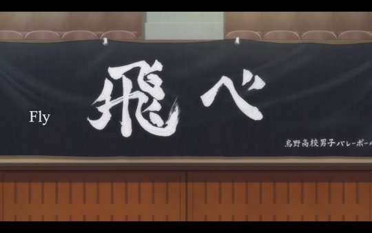
so just in case there was any doubt as to where tobio belongs. his name is literally on karasuno's banner i can't i can't i can't
#thank you for coming to my ted talk#crying uncontrollably at all the symbolism i love this series so fucking much#haikyuu#hinata shouyou#kageyama tobio#tsukishima kei#yamaguchi tadashi#kagehina#tsukkiyama
336 notes
·
View notes
Note
hi im so sorry if youve already answered this but how do u go about selecting the colors you use for your works!
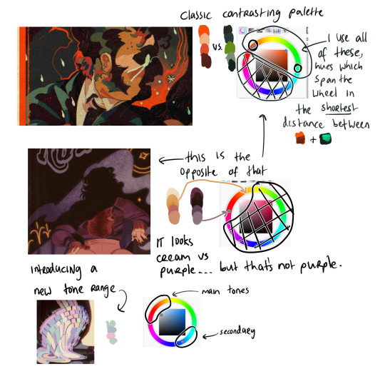
hi! i've had this question a few times and every time i've only been able to answer with a vague sort of 'ehhh i just pick them'. but i think i'll actually talk some more about it now since a lot of my art actually takes a lot of beating before i decide on a final palette. but with a lot of them admittedly i already know what palette i'm using, and i organise the whole composition around those colours.
i use like two main palette methods and here they are (once you see it in my art, you won't unsee it). It mainly involves picking one main hue, and then a contrasting secondary colour.

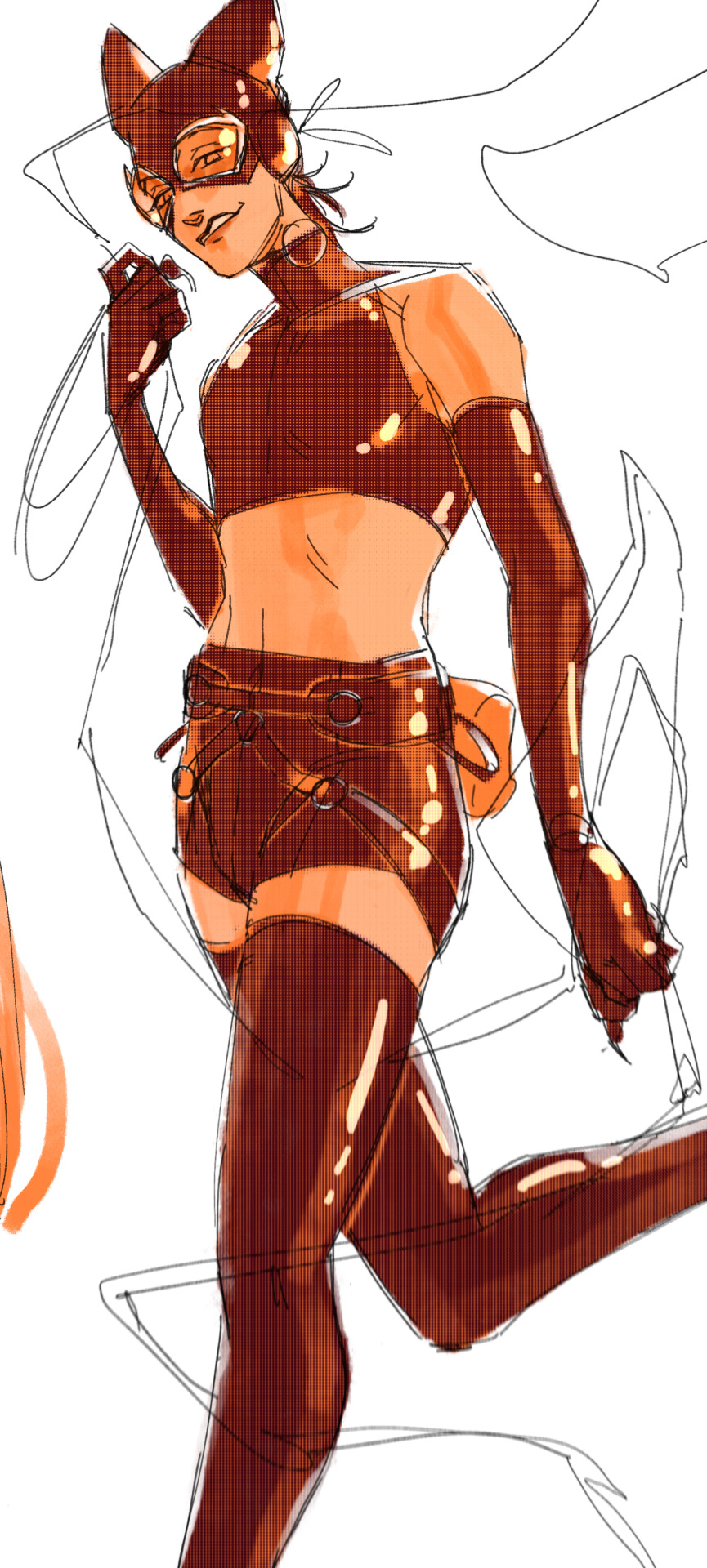
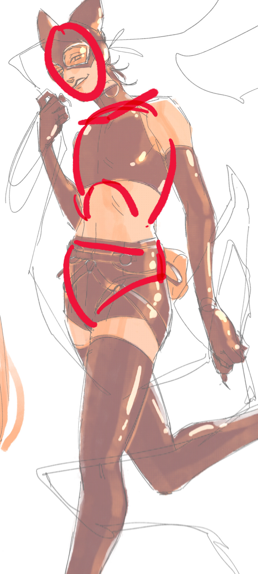
So the most basic is to have a drawing be mostly a small range of hues, in this case the reds and oranges, and adding a single contrasting shade. Here it is the bounce light on the metallic metal parts, and doesn't appear anywhere else. It looks blue but it isn't - if I used actual blue, it would be too jarring and the colours would not appear unified. This is a warm and nice scene. So instead I pick that strong blue and blend it into a small swatch of the base colour. Then I pick from the blended portion, and what I get will be more blue than the base, but not actually blue. In fact it is yellow-orange :) The entire drawing looks warm as a result.
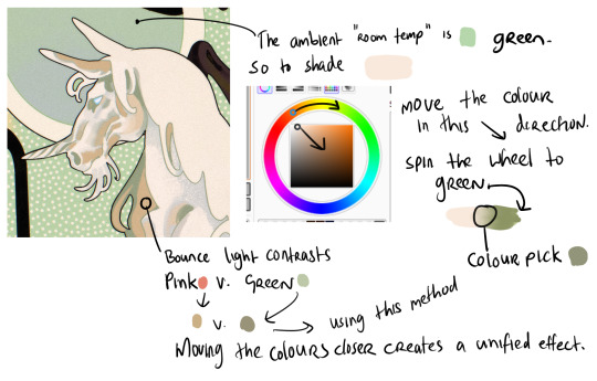
When working with marginally stronger contrast, here I have a cream unicorn on a green background. The main shadows on the unicorn will be the colour of that ambient room temperature bg - green. So I use the same test swatch method to pick a shadow colour which LOOKS green without being too disruptive of the cream unicorn. I increase the saturation and darken the value (moving the colour dot diagonally to the lower right hand corner of the box) and also spin the whole wheel towards green just a bit. Then I blend into the cream and colour pick a shade in the middle. But for the bounce light, I chose to use a common contrast of green - pink. It looks like pink in the drawing but in fact it is a low saturation orange! Using that real pink would be disharmonious. I do the exact same thing - I blend the pink into the bg colour and come up with that orange shade. It looks harmonious.
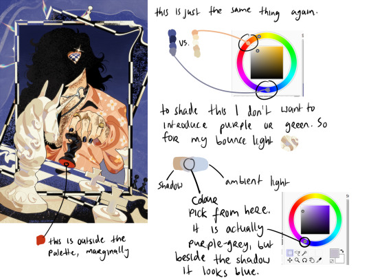
Now (top example) I am using two contrasting hues side by side. I decide the shadows will be warm, and the highlights in that contrasting zone. That means that for every colour i pick - Islin's skin, hair, his glasses, his shirt collar, his coat - every colour gets slid around the colour wheel until it falls inside that narrow band. And when I am highlighting his skin, I turn the wheel towards green. When I am shading his skin, I turn the wheel more red. I do this for every single element in the drawing.
It's the same for the Rua cover but this time I am not using such a wide band of available hues on the colour wheel, it's much tighter. I did this to replicate the look of a faded print, intentionally lowering the available contrast I had to work with by removing black as tool. It's all in that small cream to red window but it LOOKS purple - it looks like Pascal wears a purple shirt and that the smoke in the bg is lilac. Well, it isn't. That's all red and orange. I pick those colours by, again, choosing my goal "look" - a low-saturation purple, and then turning the wheel into the red range.
Okay so! for this it's just... the exact same thing again. Literally it always is. But since this one is recent I still have the process fresh in my mind. I envisioned it in the car, and I wanted this empty sort of desolate blue bg and a cold, distant overall tone. I ended up making the white on the chessboard & white pieces warmer, cream instead of white-grey, which worked out great. I wanted the blue, I wanted the pale cream/white, and the black of the chessboard. I didn't envision a colour for Pascal's shirt. but when the time came it was an obvious choice. It has to contrast with the bg both in value and hue, without falling outside the cream range already established by the chess pieces. So it's shiny salmon pink :) or orange, whatever you think it is. The only disharmonious part of this palette is the red velvet under the black knight piece - it works, but if I'd taken more care I might have spun the wheel more into orange and it would stand out less. But I don't mind.
607 notes
·
View notes
Text
Should have picked a different Apartment
Contains Unwilling M/M vore with implied digestion
Going into the apartment that gave the thief bad vibes in the first place was the thief’s first mistake knocking over a vase was the second.
“Hell” cursed the thief hopping against hope, that no one had heard the crash of the vase.
Unfortunately for him the owner of the apartment had heard it, and very casually walked into the kitchen from the bedroom. “Can I help you” he asked in a polite manner that never the less held a threat.
“Oh hell”
“Indeed”
“Stay back I’m armed” warned the thief
“I quiver with fear” replied the owner a shark toothed grin spreading over his face
The thief swallowed, he hadn’t considered how big this guy really was when he’d made that threat but, taking him all in - he was about twice as wide as he was, and nearly a foot taller.
“Don’t even think about calling the cops!” He said attempting to gain some kind of control over the situation.
“Goodness me no” said the owner “I would never drag law enforcement here to deal with something so trivial”
“I’m trivial?” Asked the thief angrily in spite of his fear, yes he did have a reputation to uphold, in spite of the fact that he was currently frozen in fear.
“Yes” replied the owner “In a few hours, maybe a bit longer, you won’t be here” he considered something “Unless you want to get out right now that is, and save me the trouble”
“Hey! I think you’ve gotten mixed up with who is making the demands here!” snapped the thief. Less angry and more… huffy.
“Oh you are quite correct” replied the owner still smiling all the while - the same shark toothed calm smile.
“So, are you gonna give me all your money?” said the thief. It wasn’t actually a demand, it was a question. He really would have preferred to just get out of here, but his pride demanded that he at least make the attempt to leave here with some kind of valuables to put in his bag on the Balcony.
The owner stepped from the shadows, into an area that was bathed in moonlight and, shit thought the thief he really was Big, not big with a small b, but Big with a big B. He had short brownish hair which sat in a quiff, blue eyes, very lightly tanned skin, and it was impossible to not note his physique - he was positively herculean - the dressing gown he was wearing was only highlighting the thick round of his pecs which were visible at the top, and each of his thighs were as thick as a tree trunk - well maybe not literally but metaphorically yes!
“Is this a hold up?” he asked inquisitively still smiling “If it is, I feel the need of introductions, since we might be here a while - my name is Cecil”
“I won’t tell you mine!” replied the thief
“Very well” replied Cecil and thief could have sworn he added under his breath “It’s not as though food needs a name”
“Well I was just going to - ” quick as it had been said Cecil had moved forward at speed closing the distance between them, looming over the thief who gulped in fear again - he really didn’t want to see what this guy was going to do to him.
“Go?”
“Um”
“I wouldn’t like you to come all this way for nothing”
“No no, I want you to let me go”
“You know, I realised you looked familiar - though granted with those balaclavas every thief looks similar, but your build well that’s very distinctive - you robbed this building before didn’t you” his voice suddenly became very dangerous
The thief did remember it had been a few nights ago - an old lady’s apartment she had gotten up tried to take him, and he’d pushed her to the ground then he’d robbed her apartment. Not that there had been that much to take, only an antique necklace with a locket, it had been a waste though - too distinctive to get anything for it.
“Your silence, whether of fear or guilt is very confirming” said Cecil “Luckily for you, she isn’t dead” not thought Cecil that that’ll change your fate “But you did steal something of great sentimental value to her, a necklace, with a locket, made of gold?”
His and his boyfriend’s neighbour was an old, old lady who had once had to flee her home - the only treasure she had from it was in a necklace her parents gave to her as a child it contained a locket inside of which was a series of small locks of hair from her siblings. “Uh yeah” said the thief nervously, really regretting shoving that old lady now.
“Where is it?”
“In my bag”
“Which is where?”
“Oh the balcony”
Cecil moved to look at the dark balcony and saw the idiot thief attempting to lunge at him with a heavy lamp.
A few things happened in quick succession: first, Cecil dodged the swing, second the thief stumbled backwards losing his footing and finally third Cecil lunging forward like a python wrapped his huge arms around the thief opened his mouth wider than should have ben possible and shoved him headfirst into his mouth.
The thief shrieked in surprise and started kicking his legs trying to get out, but he was doomed Cecil slurped trying to see if any flavour came off of his meal. He disliked eating people like this he could never be sure that they were really clean, but oh well he was doing his part to keep crime off the street, and only part of his muscle came from the cheat of devouring people There was also the issue that clothes stood in the way of tasting the guy properly, there wasn’t much meat on him anyway. Sometimes - infact most of the time he preferred them this way - lean and mean easy to subdue though they still kicked up a storm in his gut speaking of which.
Angling his head back to help gravity do the rest he grabbed the socks and shoes off of the thief's feet and tossed them to the one side. In a few seconds the thief was curled in the stomach of Cecil whose dressing gown came loose exposing his tan thief filled gut and who let out a loud deep belch and moaned.
“you ate me, you actually ate me!!” Yelled the thief
“You tried to kill me with a lamp buddy” said Cecil
There were footsteps and in stepped Blake who merely sighed at Cecil’s gut. Whilst Cecil sat down on the sofa and spread his legs - the better to accommodate the expanse with.
“hey darling, said Cecil grinng at Blake who walked into the room and sat beside him
“it’s the middle of the night” replied Blake grumpily
“hey I didn’t choose what time this ruffian decided to perform home invasion!” Said Cecil cheerily
“you are way too upbeat at all times” grumbled Blake as he reached out with one hand and began rubbing Cecil’s stomach coaxing up another belch
“You are way too good at this” sighed Cecil dropping his head back and wrapping an arm around Blake’s torso pulling him against the dome of flesh that bulged occasionally with the struggles of its unwilling occupant in spite of himself Blake grinned and began rubbing with both hands as he shifted himself to straddle Cecil earning him a grunt of surprise and a belch as Cecil placed a hand on either side of Blake to keep him there. Blake leaned forward and tenderly kissed Cecil on his lips Cecil responded by wrapping his arms more firmly about Blake and giving a small moan of pleasure as Blake’s hands continued to massage him feeling as though he had found a good sized pocket of air Blake leaned away from Cecil as a gurgle starting in his stomach rapidly made it’s way up and out of Cecil’s mouth who had been sitting there eyes slightly heavy lidded
“Bouarrrrrrp” he moaned and Blake immediately fell back upon him “You are so so hot when you are like this” he whispered in Cecil’s ear “all full and belching” Cecil loved the praise from his gorgeous Boyfriend but…
“I’m hardly full” he replied “in fact I could scarf down 2, 3 more of these guys no problem” he whispered in Blakes ear he belched again smaller this time yet he chuckled as he saw Blake blush and giggle “in fact I still could do with another snack” he bit gently on Blakes ear relishing how it made Blake tingle all over “For some reason whenever I eat you - I feel at my fullest, my belly stretched to the max like I’ve eaten a full buffet plus some assholes that bother us on the way home - all of that just from you stretching me out” his voice was filled with desire, but it softened to gentle tenderness “all that from just you - my favourite 5 star meal”
“Cecil…” said Blake his hands moving from Cecil’s gut to his face “you are the most beautiful man” he kissed him moaning as Cecil’s hands began to grip his body until they were interrupted by a voice from Cecil’s gut
“Ewww, excuse me if you are going to, engage in activities then show me some respect and let me out”
“How are you still alive?” asked a gobsmacked Blake to Cecil’s gut “That last belch should have taken you to the Flats in the sky” he looked at Cecil who was similarly surprised
“Wait what the hell?” Yelled the thief
“Hey buddy good food shouldn’t talk” snapped Cecil annoyed that his time with Blake was being taken up by this asshat.
“I’m not food” shrieked the thief shoving violently against Cecil’s stomach walls
“Stop speaking and squirming” Said Cecil “Squirming’s all well and good at the start really gets me going - but after a while it’s just like shut up accept your fate and digest”
“You’re going to digest me?!!!” Shrieked the thief kicking again more violently
“Stop that” groaned Cecil grasping his stomach and belching again Blake slid off of his lap and onto the floor. It was surprisingly painful getting kicked - usually it didn’t hurt this much
“Hell no, Let me out - you can’t do this”
“You shouldn’t have broken into our Flat buddy”
“I am not your Buddy” yelled the thief shoving again at Cecils stomach walls this time actually hurting him more than quite a bit, damn it felt like getting stabbed - please tell me he didn’t actually have a weapon he thought to himself
“Ow” he whined “stop”
“Ha ha ha ha” not so confident now are you - you stupid greedy musclebound glutton”
“Stop hurting him” snapped Blake getting off the floor and ramming both hands onto the squirming mass Blake may not have had the ability to devour people and turn them to mush - but he certainly had the power to deliver a fierce push the thief yelped as we felt the shove and Cecil let out a loud rumbling belch. “BOUARRRRRRRRRRRRRRRP Damn” ,he said “I must have gulped down a lot of air with that guy”. His hands returned to a much less engorged stomach.
“Would explain why he lasted so long and how despite being so scrawny he was able to give you such a bloat” said Blake whose own hands were on each of Cecil’s broad shoulders and were tracing down each of his biceps.
“Yeah” sighed Cecil “I mean he wasn’t so much scrawny as lean and thin”
“How did he taste” asked Blake
“Not of too much” replied Cecil “I was more eager to get him down than to taste him” Blake’s hand returned to and rubbed Cecil’s stomach feeling the lumps were moving weakly but not for much longer he thought
“Blake” asked Cecil
“Yes”
“Can you check the balcony please? This guy said he left his bag with Miss Olgania’s Locket in it”
“I will do that once I’m sure he can never rob Miss Olgania or us or anyone ever again” said Blake leaning forward and kissing Cecil
“Mmmmm” moaned Cecil moving forwards “My gut, my muscles - the most secure prison”
”Just right” Replied Blake smiling as his hands returned to his stomach.
Miss Valecia Olgania was aged somewhere in her seventies though she would never admit it insisting that she stopped aging at 39! She had grey hair pulled into a bun at the back of her head and wore a patterned black and white skirt and a pink top.
Upon hearing a knock at her door she moved over to it and after checking the spy-hole and seeing that it was her downstairs neighbours Cecil and Blake she unlocked, unchained and opened the door with a smile.
“Miss Olgania, it is our pleasure to return to you the locket that was stolen by the thief” said Cecil presenting the locket which was indeed within the black bag that the thief had said it was in, alongside several other presumably stolen goods which they had handed over the the police.
“Oh you really both are the kindest gentlemen!” Said Miss Olgania gladly taking the locket in her hands and holding it to her chest
“We just do our part for the community” Said Cecil
“and you are a part of it Miss Olgania” added Blake smiling
“But how did you get it back?!” Said Miss Olgania slightly puzzled - but only slightly.
Cecil laid a hand over the slight increase in thickness in his abs that was the only indication of his meal “let’s just say that he won’t be bothering you or us again any time soon.”
Miss Olgania simply smiled and laughed “Well all I can say is thank you my dears, and an invitation to my humble abode for a most ordinary meal is most certainly in order!” She invited them in and closed the door bustling over to where her calendar hung on a small hook and pulling it off, shall we say Friday night between 5 and 6?”
“That sounds wonderful said Cecil”
“Concurred” said Blake grinning
“And while we’re here why not have a cup of tea?”
“why not indeed” they chorused - after all who would refuse a cup of tea from such a nice lady?
Well I know someone who might but since he’s now part of someone who would never do so - I think we can leave him out!
Thank you so much for reading if you’ve made it this far
I very much hope you enjoyed this as much as I enjoyed writing it. Comments about grammar and spelling and punctuation would be very very welcome - I would much rather know if I’ve made a stupid mistake than not know!
#male pred#vore digestion#vore belly#implied digestion#same size vore#m/m vore#unwilling prey#Blake and Cecil
142 notes
·
View notes
Note
hey!! i Love the way you draw cats!! i've been trying to get into digital art myself and trying to capture all the colours a cat can have can be so difficult without making it look kinda sloppy and patchworky. Do you have any tips and tricks how you manage to portray to actually look like fur or do you have a good point to start to find info on that so I can practice drawing my little menace without her looking like patches of colour rather than fur?
Hmm, a lot of it is an unconscious collective of my years of digital painting experience, so it's a bit difficult to put into words but if I had to say,
1.) Get a good reference image. I do all of my paintings from photo reference so I don't usually invent light sources, just reinterpret what's already in the photo. I find the most effective ones to be pictures with strong directional lighting with distinct shadow shapes
2.) Learn the underlying anatomy of cats. Understanding the actual shapes that make up a cat allows you to recognize the how and why the shadows and highlights in the reference image work the way they do. 3.) The way I do fur is I get all of my colors and shading down and as final step go over certain areas with a textured blending brush, following the contour of the fur. (I use my own custom brushes in Rebelle 7 but I believe other programs have similar 'mixer brush'-like tools)


I also recommend petting your cat to get a tactile feeling of the planes of her face, what direction the fur goes in where. What kind of movements would disrupt the direction?
As for color-picking I usually go into photoshop and mess with the lighting and color adjustments until I get something similar that I'd like in the final painting. Then I filter > noise > median to get rid of a lot of the details so I'm left with mostly blocks of color and color pick from there. idk if other programs have this specific blur type, but your standard gaussian blur works just as well

In my experience, when you do a lot of painting you eventually are able to see colors in areas of photos that aren't technically captured by the camera but could be perceived by the eye in real life. For starters you can focus on adding more saturated colors in areas of shadow or plane changes.
If you add a color in one part of the fur try and have it, or a similar color, in at least another part of the fur so it looks like more of a cohesive image.
As for other resources I never really did any specific studying for drawing cats in-particular, it was just something I started for fun and honestly haven't really been able to find many resources on it I found super useful.
This video on reflected light did completely rewire my brain when it came to coloring though
If you (or anyone!) has any pieces they'd like me to look over and give direct feedback on I'd be happy to help! Might be a bit more useful then trying to verbalize the specific painting neurons that possess me whenever I'm working on a piece. :)
42 notes
·
View notes
Text
Thoughts on Sonic 3

So I just got back from seeing the 3rd Sonic movie and Omg, this movie was Absolutely fantastic, and in my opinion, I think out of all the films in the trilogy THIS 1 was the best, Definitely better than the last one for sure.

This had everything I ever wanted in the sonic movies, more sonic, more eggman, more character development, more EVERYTHING! The comedy was golden, Jim Carey's performance was amazing, the Shadow design was PERFECT, Keanu absolutely KILLED IT, this movie was just Better in SO many ways and in my opinion, Is the SUPERIOR Sonic film.

I'm actually so glad that we got to ACTUALLY focus on sonic and friends in this film other than the effing damn humans this time, and Jim Carey playing both Robotniks was absolutely genius and in my opinion the Highlight of the film, especially with his comedy, I tell you I have Never laughed so many times as I did with this one and once again I am SOOO glad that they didn't Nerf Shadow and actually stayed true to his origins Even though this was PG13, and while they did change some things like the stuff with Maria's illness and the Space colony Ark incident, they still delivered on their part and kept relatively things the same. ^^


Another thing I loved was the action sequences, OMG from beginning to end the action was just IMPECCABLE and the ending was absolutely Beautiful ESPECIALLY with that post credit scene omg! 😆 Another thing I loved was the fan service, I tell ya as a HUGE Sonic fan, everytime I see video game, cartoon or comic book references, I cant help but just get HYPED, and the same can be said with this movie, bruh the amount the references this time was just absolutely insane, the ONLY problem I have with this film is that I wish the story could've been a BIT longer and less predictable at times, THAT and that I wish Keanu sounded a bit more edgy as Shadow at times, I feel like if he added just a bit more BASS in his voice at certain scenes and didn't sound like he was just talking as himself, he would've been an absolute PERFECT Shadow, other than that, yeah this was absolutely incredible 10/10 for sure, TOTALLY can't wait for the next one, Our girl is FINALLY HERE, see y'all in 3 years, alright I'm outta here ^w^
#anime#kawaii#sonic the hedgehog#sonic wachowski#sonic movie 3#shadow the hedgehog#sonic 3#sonic movie 3 spoilers#knuckles the echidna#tails the fox#sonic movie#dr eggman#amy rose#Sonic#miimo96
21 notes
·
View notes
Text
My (spoiler free) Sonic 3 review!

Just got back from seeing this movie, and OMFG it was absolutely amazing!! :D
This is definitely the best of the three movies, easily!
The story was great, the visuals were stunning, and the action was fantastic!!
Keanu Reeves effin KILLED IT as Shadow! He did a fantastic job! And they did not pull any punches with his story! I legitimately teared up in several scenes! Much like Knuckles in the second movie, they really did Shadow justice and knew exactly what makes him such a great character!
Jim Carrey as both Eggman and Gerald was definitely another big highlight of the movie! I will say though that Gerald's depiction was a bit sillier than I would expect, but it makes enough sense considering the circumstances, and it's such a fun performance! It was a blast seeing Jim Carrey actually acting against himself in the movie, and at times I forgot I wasn't looking at two different people because of how seamless the performances and editing were pulled off! And I was surprised to see Eggman actually get some added depth and emotional complexity in this movie, which was very satisfying!
And of course Sonic, Tails, and Knuckles were as fun and charming as ever! Bless their little hearts!♥️
Overall, I had an absolute BLAST with this movie, and I highly recommend it! If you're on the fence about seeing this movie, just go see it! You'll have a great time!
Oh! And don't forget to stay for the mid credits scene! There's one at the very end too! Don't miss em!
#sonic the movie 3#sonic movie 3#sonic 3#sonic the movie#sonic the hedgehog#shadow the hedgehog#sonic team#sth#sonic
22 notes
·
View notes
Note
do you have any tips for drawing dynamic poses? i always love the way you draw bodies!!
i know this has been said a million times but the way i draw bodies significantly improved after i started drawing more frequently from reference. if i cant find a reference for a pose on the internet, i'll just use myself or a friend. i spend an unfortunate amount of time just standing in front of my mirror looking at my own joints. pay attention to where your body curves!!
other than that though—honestly my anatomy/pose knowledge is a whack amalgamation of art tips i've accumulated over the years (i miss old school deviantart/tumblr style art tutorials). i also like to look at how artists i admire draw bodies—what details to they include, what anatomical short-hands etc
i think i'm still figuring out how to draw dynamic poses, but here are some cheats i've picked up (under the cut coz this got long again):
gonna use this stray!tim as a base
the easiest way for make up a pose is to start roughly with the head, collarbones, ribcage, and pelvis — you can build everything from there
here's a couple more of what i mean by the ribcage-pelvis deconstruction:
2. push your perspective a little!! imo things look more dynamic if you move your sight-line up or down—the horizontal orange line here. if you look at the panels above, the sight lines tend to be a little low, at around the character's torso or waist. i did the same below with stray!tim
to do this i usually try to get a sense of the space im working in by putting in some sloppy perspective grids
3. S curves!!! exaggerate the lines of the body. the body naturally has parallel horizontal lines—an easy way to get a body to look less rigid is to tilt those horizontal lines which in turn curves the vertical line of the body
this is what a mean by horizontal lines—usually i use the eyes, shoulders, and hips:
i'm gonna use caterina as a better example—usually you want the horizontal lines to sort of zigzag:
i've also picked up a couple visual tricks that don't exactly add dynamism to a pose? but they do give a static pose a little more oomph. a lot of this is done by visually highlighting one specific point of the body
for our purposes, i'm gonna make the focal point tim's face
motion blur! there are a couple ways to do this. i actually dont like working with traditional motion blur because you have to mess around with selections, so i usually fake motion blur using postional perspective blur:


2. gradient lighting—you can add a lot of depth this way. usually i like setting the gradient in the direction of the focal point, e.g. tim's face
below, i added a layer above the base drawing, used an airbrush to get this gradient, and then set the layer to color burn and lowered the opacity. you can also clip the lighting layer to the base drawing and set it to multiply

below, i did the opposite—instead of adding a gradient shadow, i added gradient light. i set the layer to add this time (instead of color burn) and then lowered the opacity again.
this kinda serves to desaturate the parts of the piece that are less important (ish i was kinda sloppy here), driving the eye to face—the most saturated. the motion blur does a similar thing, where the only thing "in focus" is tim's face
the gradient also sort of adds a directionality to the piece—it starts at the bottom right corner and goes up towards the upper left, causing your eye to follow that same path, which drags your gaze up tim's body
here's what it looks like when i combine 1 and 2:

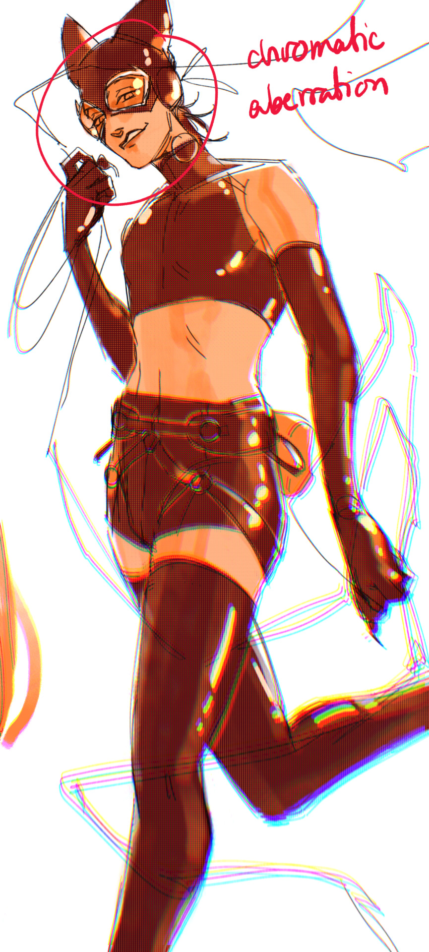
3. chromatic aberration's been pretty popular recently. it does a similar thing as perspective blur but with more eyestrain (although i went with a really exaggerated version below just to show you what it does) but it looks cool!
bonus cryptid tim as a reward for getting to the end :-)
#red talks#sart#art tutorial#YeAH UH this got long lmaooo i was on the bus for a Sec plotting this out so#also i am neck deep in a reincarnation/regression manhwa stress hyperfixation so i havent had the brain space to draw#so you get this instead!#if anyone wants recs lemme know lol#thank you anon :)))
68 notes
·
View notes
Note
please how do you pick colors 😭 I'm trying to learn how to color and I am obsessed with your comics (like your ivantill ones lol) and how do you pick such a cohesive color palette and choose where to put what????
Your art is amazing like actually :) happy holidays!!
😭 tysm anon and happy holidays to you!! i did my best to explain some of the process behind my color picking and choices for the ivantill comics under the cut, i hope its coherent cuz quite frankly it also takes me a long time to decide what colors to use
a little disclaimer: i tend to just put base colors, before i start adding shading or lighting. i also dont usually start off with a fixed color palette in mind, because my process is pretty much figuring out as i go along, and playing with all sorts of colors; however whenever i do end up with a fixed idea on the color palette the process is still applicable anyways so hopefully its helpful for u too :’]
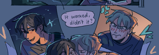
ok so i usually decide colors by asking what kind of mood or tone im going for. for example, the recent ivti comic i did
the comic imo is pretty playful - theres a romantic element ofc but i think the focus is rly on how ivans being kulit / annoying as usual so i thought a spunky, albeit warm color would rly fit. theyre also chilling in tills house so i thought a home-y, comfy feeling would be good
i was still playing around, so for the first attempt at realizing that tone, i added a hot pink multiply layer to see how it looked
(first attempt vs final colors) (also im sorry for the low quality procreates timelapse is wack)
ironically enough it actually created a really cool looking color palette which was not what i was going for. so i kept testing colors for a bit; the shadow is hot pink, and i ended up going for a bit of a desaturated green as a base / overlay because it mellowed out the pinkness. i also put both the base and the shadow on a darken (50%) layer so that the og colors peek through a bit more compared to a multiply layer. in the end tho, i ditched pink and went for a saturated red
the green also makes for a nice complimentary color to the red, and it overall has that home-y, warm but playful feeling i wanted to include ⬇️
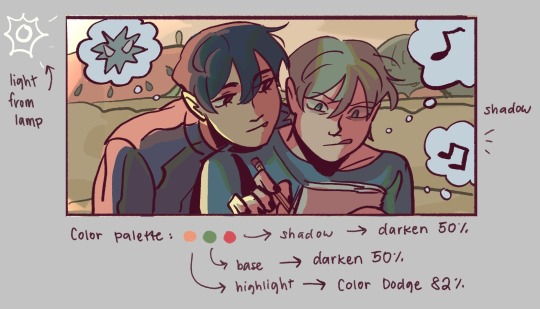
i added a highlight layer (color dodge, 82%) so that it pops a bit more, and also bc i knew i was gonna draw a big lamp on their right in the bg. speaking of the bg i made it a green/yellow hue so that the base for green on ivan n till make sense, and it ended up working for the best cuz the red acts as a nice contrast
(admittedly i think if the lighting of the room is green the shadow should also be green, but tbh i tend prioritize contrast as much as possible regardless cuz it looks nice 🤡 even if it fails to make sense realistically its for the vibes)
^ i ended up remedying this a little bit by adding bits of green to the shadows on ivan n tills hair and clothes, and also because its fairly complementary to the pink palette i have going in for the shadows and even the highlights (esp on ivan)
i also decided to shade in dark parts in the lineart so that it pops a little more
looking at the values also really help! esp in comics, where each panel can have its own lighting depending on what angle ure drawing. u can do this easily by adding a pure black layer above the entire piece, and setting it to color (100%)
for me the values actually made me realize things that may look too similar, which usually leads to me changing the color. for example, the couch and stuffed animals behind ivan and till were actually a lot darker before i changed it. bc it kinda blended into ivti a bit, it also got the eyes’ attention away from them. i ended up adjusting their hue and values so that it matches the bg, and ivan and till stick out more (alongside other color adjustments) ⬇️
changing the lineart also helps quite a bit! i made the lineart for ivan and till a little darker, while the bg elements got a darker green instead so that the bg elements dont take as much attention
looking at b&w values also helped me realize that the og pink i was using for the panels was a little too dark, so i made it significantly lighter so that the panels stick out more (esp bc they take huge precedence in the second page)
(og panel color vs final)
and finally when i pick all the colors and am satisfied with them, i merge everything into one final color layer for easier rendering :> procreate (and im sure other programs) allows for color / hue adjustments so you can def play around with those!
as for the harana / first ivantill comic i made, it had all the similar steps of the recent comic so ill just talk a little bit about the palette
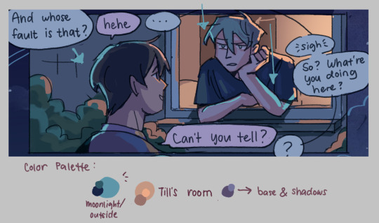
so im ngl this comic was a bit of a struggle to color for me,, cuz i wanted it to be romantic but it was set at night. usually that dictates cooler tones and colors, but i was aiming for something warm. thats when i figured i could just let tills room wash an orange color, which would help with making warm lighting but also help till and ivan stick out again from the surrounding darkness / blues
i went with a purple base, cuz i thought it was a nice warm ish color at night and it makes blue and orange pop. i also figured that i could make the base both purple since the highlights are the most attention grabbing / contrasting colors
also used the moonlight as rim lighting so that ivan sticks out a little more,, i also figured that tills room would be projecting harsher lighting over the moonlight
lighting it this way also allows for nice color contrast regardless of what character is in the center: ivans outside but awashed in orange lighting (from tills room), and tills inside but hes sticking his head out a little so hes noticeably purple. it allows for characters to stand out while also being pleasing to the eye
and im ngl i cheated a bit again 😅 i think till shouldve projected a shadow on ivan a couple of times and the highlights might be too harsh but again i just prioritized making their facial expressions seen LOL
for this one i didnt use any layer modes aside from (if i remember correctly) a purple multiply layer and overlay for shadows and base respectively
and thats pretty much my process for figuring out the colors !!
TLDR; i look for the mood or tone im going for, try to make interesting contrasts / complimentary colors and i also double check if each character sticks out by checking values :> it really helps me too to play around a LOT, i think it takes me like an hour or just 30 mins to figure out what colors to use and also adjusting it significantly when i merge everything together
#asks#im sorry this is so long 🫡#hope i was able to help u anon#but ty for the ask it means a lot to me !!#esp cuz i also still struggle with colors
14 notes
·
View notes
Text
Farming content James Somerton style
Edited: I cleaned up sentences, removed typos and added some links
You've probably seen the latest hbomberguy video that highlights plagiarism problem on youtube. He gives several examples many I never heard about but I've been recommended iilluminaughtii before and watched some of her stuff before getting tired of seemingly endless volume (now I know why). But then he gets to the real subject of the video and I did watch a lot of James Somerton videos. And I liked many of them. I liked them a lot.
I didn't give him any money and, as much as it came as relief, I kept thinking how this must feel so much worse for people who did. I thought about supporting him for a moment when he posted (in April this year!) how his videos are getting less views because youtube algorithm and demonetisation of gay creators (it's a real thing so it was easy to believe) and he will be forced to stop creating if people don't sign up to his patreon. But I was casual viewer and he seemed big enough so I didn't. It must feel like such a betrayal to those who created a real community around him. Just like his film production company it's clear now it was another of his scams. It's infuriating how well it worked.
Somerton deleted his patreon now (along with his twitter and discord server) so there is probably no recourse for those affected. The only good thing is that someone big enough highlighted what he did (and brought receipts) so he had to stop. When smaller creators called him out it either went unnoticed or he managed to make himself a victim (and send his fans after them). He actually did what Anita Sarkeesian was accused of and gaslighted his followers about it. His misogyny just adds an extra bitter taste to this.
youtube
At the end hbomberguy talks about how if Somerton was open about what he was doing this could've been his niche. He said it just as I was thinking basically the same thing. I'm sure there is a market for field review type of videos. Not review like movie or book review but in academic sense when you take other people articles on the subject and compare to show the state of research on the subject on at the moment.
youtube
This kind of reviews doesn't need any original research. The value is in giving people overview of where the field is at and pointing them to the actual research so they can read more in depth about the results. If you already did the search for all the sources this is a perfect format to use them. Most people don't have time or resources to comb through all the resources themselves but they like to learn about it and this is why videos like that are popular. That's why iilluminaughtii, Somerton and al. were able to cash in on it.
But of course this kind of things have to properly cited. And they cannot be just all quotes. You have to make coherent points not just make stuff up for the transitions (lies that actually made Todd in the Shadows make a video not about music). I suppose that's too much work. Too much effort when you need to crank out content to satisfy all the sponsors.
youtube
I was glad to find out I already watch most of the queer creators recommended in the hbomberguy's video (and put on this watch list) as an alternative (I would add Caelan Conrad to it - funnily enough I found them through their video about antivax movement). I trained my youtube recommendations well in which way it skews but it's easier to kick out all the obviously awful when you know what talking points to avoid. It's much harder to spot grift when it pretends to care about the same things you care about. Somerton was saying all the right things. It just wasn't his words.
Did he even believe any of it? I bet he'll insist on yes but the laziness says otherwise. It seems like it was all just for the money and fans this angle gave him. That he enjoyed being cool to the audience he built and the stuff it bought him. Be gay do crime for real. Only he didn't write that one either.
#hbomberguy#james somerton#youtube drama#youtube plagiarism#todd in the shadows#archeology tube#james somerton conman#james somerton scam#youtube#plagiarism
86 notes
·
View notes