#I need the presentation to refer to this video
Explore tagged Tumblr posts
Note
I think you’re fantastic at slideshows! I do not think you overcharge your slideshows with information at all personally. But I am curious what skills you find most transferable between making slideshows for Detail Diatribes and the more general video production process
It's an interesting jump! Honestly making slideshows basically just feels like writing a video script with extra steps. It's got a similar rhythm of information jokingly presented intercut with disruptive Big Jokes to break up the pacing. The main focus on the first pass of the slideshow is just getting down All The Context I think needs to be understood for a theoretical blank-slate audience to understand what I'm getting at. The goal is to focus on broad strokes and key information and not get too bogged down in the details on the actual slide, because if I want to get specific or bring up an example off-slide, I can just do that in the discussion, because the Detail Diatribes are fundamentally unscripted. Making a slideshow for one is basically building something for Blue and I to talk about and react to together. I know what's coming and he doesn't, so I put more focus on big goofs I think he'll enjoy being blindsided by, and if our discussion organically snags on a specific slide, I might fill out the contextualizing with more little details pertinent to the conversation.
This is kind of like the part of the scripting process where I want to summarize a plot point or idea fairly quickly in the narration, but I might reference fun little extra details from the original story in the illustration that goes onscreen. There's space for many different layers of information to be communicated, depending on if people are just listening, listening and watching, or pausing to read everything onscreen.
162 notes
·
View notes
Text
Julian Brandt on Maxi Beier: "I hope he still has my jersey too. I haven’t yet had the pleasure of playing with him in the national team. But I can judge how he played against us, and he really gave us a hard time. But I’m happy with any player who joins us."
📹 tsghoffenheim.
#julian brandt#maxi beier#bvb#bvb09#borussia dortmund#season 23/24#bundesliga#I need the presentation to refer to this video#@ BVB can you do something really funny?#hoffenheim
21 notes
·
View notes
Text
The Exotic Animal Photo Reference Repository is live!
You can find it at: https://www.animal-photo-references.com!
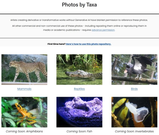
Here's how this repository works: all photos were taken by me, a human, at zoos, aquariums, sanctuaries, and other facilities with animals in human care. There is no AI involved in the photo editing or creation and there never will be. Right now there's 56 species on the site; my catalog has over 300 and I will be uploading the rest of them as fast as I can.
Artists creating derivative or transformative works (without AI) have blanket permission to use these references. Yes, even for work you're going to sell.
All other usage/reproduction requires permission, but assume I'm friendly and please do ask! That's educators, researchers, the media, people who need images for a school presentation, etc. This is just to retain copyright/control in case they're scraped/reused unethically - it doesn't meant I don't want folk to have access! So please do reach out via the contact form on the repository website, I don't bite and I'm most likely going to say yes.
Please don't repost the repository photos to your own blogs: I've created @animalphotorefs as a dedicated blog to share photos from the site, and of course I'll reblog a lot of it here! That again just helps with retaining copyright and sourcing of the images. If you really want to repost some for a specific purpose, please just ask me first!
Also, folks, this project has no funding. It's just me and my camera.
There will never be a paywall on the site - I believe resources like this absolutely must be free for everyone to access. So please, please, please support the repository if you use it. Want sneak peeks at photos, cute videos I take, or to help choose what I photograph and what gets posted first? You can do that through Patreon (and there's a free trial on the most interactive tier!) If you'd like to just drop a tip, I've also set up a Ko-Fi.
I can't wait to hear what everyone thinks of the repository.
To whet your thirst for cute photos, here's an Indian rhinoceros contemplating a goose.

#exotic animal photo reference repository#project launch#free art references#art references#anti AI#my photography#crowdfunding#animal photos#thank you so much to everyone who helped crowdfund one of the lenses that took so many of the newer photos on the site#aaaaa so excited
11K notes
·
View notes
Text
⋆˚࿔ a new canvas means a new you 𝜗𝜚˚⋆
a mini series on the art of becoming a better you
previous chapter
chapter two — THE ART OF SELF CONFIDENCE
i’ve touched on this topic before, but i wanted to do more of an in-depth deep dive into it! self confidence isn’t just about how you feel about your physical self, but it’s also about how you feel about your mental and emotional self; how you feel about your soul and the aura that surrounds you. self confidence can start at your physical self, like your looks, your style, etc. but reaching a true, deeper meaning of having confidence you have to dig deeper into your mind, heart, and soul.
references on self confidence:
“a guide to building confidence” - by me!
“study yourself to become confident” - thewizardliz
“the ultimate guide to becoming confident” - alessya farrugia
“rewiring your subconscious: guide to becoming your dreamiest self” - @glowettee
“building confidence” - @goddessinnerglow
ᥫ᭡. different types of confidence
in alessya farrguia’s youtube video, she discusses the 3 different types of self confidence: physical, social, and authentic confidence. i highly recommend watching her video! she makes really phenomenal points in her discussion!
i’d like to highlight some key points she made in her video:
physical confidence: “stop comparing your behind the scenes to everyone else’s highlights.”
social confidence: “confidence isn’t thinking ‘i know someone will like me’, it’s ‘i know it won’t bother me if they don’t’.”
authentic confidence: “true confidence means trusting yourself”
but i’d like to add mental & emotional confidence. the mentality that you have and how you feel about yourself plays a huge role in self confidence. having a mindset that makes you feel secure and having emotions toward yourself that are positive will help you become more confident. it also helps, immensely, to be in a headspace that makes you feel comfortable being you, that brings you joy, and that brings you peace. being able to have a good relationship with your own emotions can uplift you!
mental confidence:
destress & decompress — when your mind is weighed down by stress, you start to feel overwhelmed. that overwhelming feeling can cause your mind to break down and make you think that you won’t be capable of recovering from that stress. it’s important to manage your stress and remind yourself that you are capable of overcoming anything that’s causing you those feelings! stress is one of those things that make you feel like everything is impossible, but that’s only a feeling. it’s like having a bad dream, while you’re experiencing that dream it might feel too real and sometimes it may even be scary, but then you wake up and you realize that you’re safe. think of stress as just a bad dream, the feeling is only ever temporary and as soon as you manage it/overcome it you’ll be safe again. and, as a bonus, once you overcome that stress, you feel more secure within yourself and you’re reminded that, yes, everything is going to be okay and you are more than capable of overcoming those feelings!
practice mindfulness within yourself — “mindfulness is the practice of paying attention to the present moment without judgement.” with that being said, practice paying attention to yourself without any judgement. focus on how you’re feeling, what your current thoughts are; focus on you without judging yourself. learn to accept yourself as you are within that present moment and try to steer away from making quick, negative judgements about yourself. yes, you can judge yourself, but do so in a way that’s productive! judge your mental and emotional state, are you in a headspace that is ideal to you? judge your health, do you feel like there needs to be any changes in your lifestyle, diet, or activity level to better your body in a healthy manner? judge yourself, is there anything about yourself that you still need to work on or are there characteristics of yourself that you take pride in?
emotional confidence:
emotional intelligence — this is key to gaining emotional confidence. i recommend this video by The Glow Up Secrets Podcast on youtube! the host brings up so many wonderful and insightful points on becoming emotionally intelligent! being able to self-regulate and to understand exactly what you’re feeling can help you gain confidence in yourself. people will always pride themselves in their intelligence, so let being emotionally intelligent be the intelligence you pride yourself in!
ᥫ᭡. self-acceptance
people have this idea that self-acceptance is just settling for who you are, and well, that’s not really the case— at least in my eyes. learning to accept yourself as you are now will make it easier for you in your self improvement journey. we all want to become the “it-girl/person”, but a lot of us will look for quick fixes or even go towards trying unhealthy habits. allowing yourself to accept who you are right in this moment can be a first step towards becoming the person you strive to be.
accept your insecurities. accept your failures. accept your body as it is right now. accept your faults. then take all of that acceptance and turn it into a learning experience for yourself. learn that your insecurities only become insecurities because of that negative self-talk. learn that you cannot grow without any failures. learn what exactly it is that your body needs to become healthier and better for yourself.
accept yourself, then learn from yourself.
ᥫ᭡. manifestations & affirmations
we can make our dream selves become the reality. there’s so many amazing posts here on tumblr about manifesting, so go look into them! if we believe it, we can have it. you have to believe that you have confidence. you have to affirm yourself that you are confident. people, myself included, talk about “faking it til you make it”, but when you really think about it, the more you repeat these manifestations and affirmations the more it starts to feel true and real to yourself.
this also ties into positive self-talk. we have to speak to ourselves kindly, we have to uplift ourselves in a world that brings us down. talk to yourself with grace, gratitude, and genuine appreciation. you have gotten yourself through countless hardships. sure, there were probably people who helped you out on the way, but at the end of it, it was mostly your own doing that got you to a better place. so appreciate and love that about yourself!
grab a journal and write down all your manifestations and affirmations daily. writing it all down is like setting it in stone. be consistent, and soon enough all that you want for yourself— including self confidence— will come into fruition.
ᥫ᭡. take pride
think of it this way: no one can be you. people can try to imitate you, but they can never truly be you. take pride in how you look because no one has features like yours, take pride in your work because no one worked the way you did, take pride in your accomplishments because no one worked in the same way that you did to achieve those things; take pride in yourself. as cheesy and cliché as it all sounds, there’s literally no one else who is like you.
ᥫ᭡. find a deeper understanding for yourself
this point is heavily inspired by thewizardliz’s video “study yourself to become confident” (linked in the beginning of the chapter). i just want to reiterate her points and expand on them a little bit! her beginning statement includes: “once you know who you are, no one can tell you anything”.
i feel like we all understand ourselves to a certain degree. but understanding yourself on a deeper, more personal level will allow you to truly feel confident. in her video, liz talks about understanding and even studying ourselves to understand what we like/dislike, what we accept/don’t accept, etc. and i genuinely feel like she brings up a really great point in doing so!
we, as humans, feel like we know what we want for ourselves rather than actually knowing what we want for ourselves. we feel like certain people bring us joy, we feel like certain hobbies make us happy, we feel like we understand ourselves. but, in reality, most times we don’t actually know those things about ourselves.
people we surround ourselves with
we think that certain friends/partners bring us joy because we’re taught, sometimes unintentionally, to allow people to make us feel like we have to conform to them and their wants and needs. we don’t know that some of these people in our lives might actually be bringing us and our confidence down.
hobbies people partake in
we think that doing certain things, like drinking or hook-up culture, make us feel happy or satisfied with ourselves. but we don’t know or we’re not aware of how those hobbies, or even habits, might be destroying us physically, mentally, and even emotionally.
behaviors we accept
we think that if we accept certain behaviors that we’ll get more people to like us or get brownie points with a specific person, but we don’t know that accepting bad/poor behavior diminishes our strength and respect for ourself.
this all takes us back to chapter one: THE ART OF LETTING GO. the toxic people we surround ourselves with unknowingly, the hobbies we take part in unknowingly, the behaviors we accept unknowingly; that all needs to be let go of!
we have to truly understand ourselves and truly know exactly what we want for ourselves to gain the confidence we long for. without knowing yourself, you won’t understand how to find and feel genuine self confidence.
ᥫ᭡. final notes
at a certain point, confidence should feel like it comes naturally, but to even get to that point there’s a lot of work that needs to be put into ourselves. especially when a lot of us start off with almost no confidence at all, it can be extremely challenging to even wake up in the morning and think, “i can do this”. you have to be willing to put in the work for yourself. you have to be willing to have patience with yourself. you have to be willing to advocate for yourself. you have to be willing to do all of this for you, and you alone. you can be confident— and confidence will come to you! you’re more than capable of doing so, babe. believe in yourself like you would believe in someone you love and care for.
with lots of love, juno 🌷
#milkoomis#girlblogger#girlblogging#it girl#that girl#girl blog aesthetic#aesthetic#self care#self care blog#self confidence#self love tips#self care tips#self improvement tips#self improvement#self image#personal growth tips#personal growth#building confidence#becoming her#becoming that girl#be confident#confidence tips#level up#leveling up#level up tips
519 notes
·
View notes
Text
I'm going to say something about the new unification short film that I haven't seen anyone here say yet.
I love the handholding scene. massively impactful. I love the echo of "this simple feeling" from the motion picture and the genesis reference and the idea that spock did not die alone or among strangers. it's just so satisfying after all this time to know that even shatner knew it was wrong and needed to be approached with more compassion for nimoy and the fans who loved these characters and knew they should be together at the end, whatever that looked like.
but you know what really got me?
this minute or so. kirk confronting his old selves. because that's obviously original series kirk right there in the gold uniform.
and the other? THAT'S HIM!!
(I'm linking it this way because you apparently can't add more than one video to a post and I need it here for demonstration.)
so we have present kirk walking down a dark hallway. at the end is spock, but at the end is also spock's death. how can he step forward and face that? what happened to the way he used to think about death?
yellow shirt is TOS kirk, who had always found a way around the problem and never (if the movies are to be believed) had to face death straight on. he's looking forward with confidence. there's no way spock is dying. there's a way out of this somehow, if only he can find it.
TOS kirk looks back the way he came, because he believes he can go back. he can always go back. the series always resets to the same characters who can be depended on to take similar actions, because that's what a serial is, and that's who he is. things have taken their toll on him, but he knows he can take the hit and keep moving.
but he stops when he's faces with WOK kirk. the one in the red dress uniform, who has lost spock and knows what it is to live without him. who has faced death in a way he had never had to before, because the constraints of the series never allowed it. he has been changed because of it.
TOS kirk sees that, and does that sort of posturing that he always does in front of someone who's threatening him. but WOK kirk isn't threatening him. he's just living through something TOS kirk hasn't had to face yet. it's him staring his past self in the face and telling him, kindly and firmly, you know nothing about how it will feel. you will never be the same without him.
and TOS kirk looks back again, and there's a present kirk, wearing his generations uniform. this is kirk having turned that grief to a desperate search for the most important person in his life, and emerged with spock by his side. he's not the same, but he's made it through. of course TOS kirk would look to that.
and as our kirk looks at these people he used to be, they vanish in front of him. he remembers the way he used to think about losing spock. the fear, the grief, the hope. there's no hope left. when he reaches the end, spock will be there, and it will be their last time together.
but he puts the pin back on, and reminds himself of his duty not just to a fellow officer, but to a friend, to the most important person in his life, and to himself. spock should not be alone, and he never got to say goodbye properly before. doing it now is the least he can do.
that's his ultimate responsibility in that moment: being there for spock. that's been his ultimate responsibility from the beginning. and this is shatner acknowledging that they deserved an ending that fit that truth.
#unification#star trek unification#william shatner#leonard nimoy#spirk#james t kirk#jim kirk#spock#s'chn t'gai spock#the wrath of khan#the search for spock#tos movies#analysis#meta#i have not seem the movie generations so i cant make a detailed comment about it but i have a vague idea of what happens#and i know nimoy refused to be in it
1K notes
·
View notes
Text
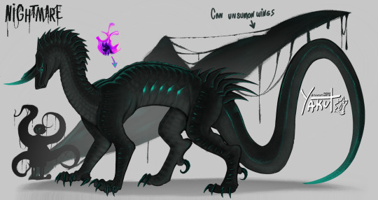

Nightmare and Dream but feral, non-skeletal body!
For the love of god PLEASE click on the image for better quality + close ups and clothed version under the cut!!

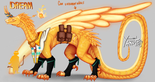

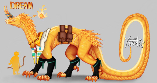
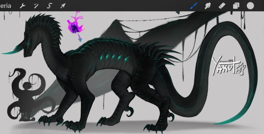
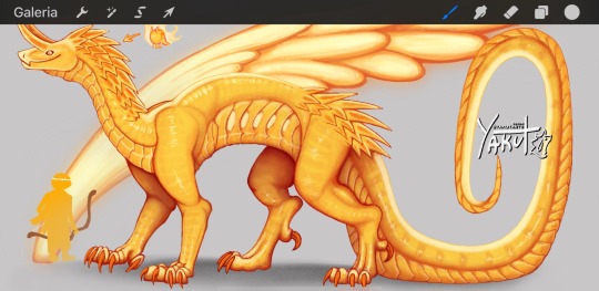
Would you kiss them?
Video process:
I made these using a specific context
A while ages ago I drew and posted a drawing of Nightmare and Dream on their light ball form but with some alterations/personal headcanons.
On the post, I expressed my desire to draw the twins in a universe were Nim didn’t need to give them bodies, and just let them grow naturally. And specifically give them an animalistic appearance, instead of a humanoid one like most artist do.
You can see on the process video that it took me 1000 sketches to make something that looked good and I was happy with, the video is obviously sped up, the total time it took me to make this was 28 hours and 15 minutes.
Now explaining some things:
Why are they so big?
I read on a post made by Joku that Nim, before giving them skeleton bodies, tried to make them human ones, but the pure amount of magic and power the twins had made the human bodies explode or some shit. So she picked skeletons since the magic could flow freely through the bones without being confined by muscle and flesh. That made me think if their power had physical forms, it would be gigantic. So I gave them gigantic forms to better represent their status of strength and power, beings made from raw magic to serve as guardians of all emotions throughout the multiverse, of course I needed to make them big and intimidating!
Why the horns?
Artistic design choice, I gave them little horns and a chubby tail in their light ball form to purposefully make them more animalistic, wanted to keep it while making these. Also just giving them a smooth head with nothing much going on looked weird and boring.
Why the draconian look?
Dragons had been created and depicted as symbols of pure power above humanity and worshipped as deities throughout several cultures around the world, different depictions of dragons has been one of the only things present among almost all cultures, like a default folklore creature. While I tried to incorporate other mythical creatures in the design, the draconic body plan felt more right due to the influence of dragons on human beliefs, and their representation as magical and powerful beings beyond human comprehension. Plus I just really love drawing dragons.
Why the clothing choice? Also why is Dream half naked while Nightmare has everything covered?
While designing the clothes for Nightmare, I used as reference clothing that usually royalty would wear, Nightmare has a really big ego and sees himself as a king, so he uses fancy, expensive clothing and jewelry, adapted and designed for his anatomy. Not practical for battle, but his corruption can go through the fabric without damaging it, and most people and monsters just run when they see him, so he doesn’t worry about it getting dirty or tearing, Nightmare just expects every soul to instantly submit when they see him, so he never worries about getting into a battle and getting dirty he has that big of an ego.
Dream is the opposite, his style of clothing much more practical for running, jumping, flying, fighting and general exercise. He has 4 bags in total, 2 on each side, inside them he keeps several items, be it healing food, magical artifacts, first aid kit, gifts he receives, stuff he buys or random things he finds and wants to take home with him. Dream’s crown is now a colar couldn’t figure out how to make it work with the head shape and horns, his cape is from his official design, but changed to white, was planning to make it yellow but when I looked at it my eyes hurt because there was too much yellow everywhere. I made Dream’s clothes with the intent to match his official design, I didn’t to the same for nightmare because a turtle neck with a hoodie on a dragon would make him more huggable than intimidating. Plus I like to think that the leg warmers was a gift from Blue, and the ring on his horn a gift from Ink. Didn’t add more stuff on him because I couldn’t think of something that would look good and match Dream’s vibe, the rest of his clothes on his official design didn’t translate well here. Oh, while I was drawing this, I drew the colar and the leg warmers first, without the cape, Dream looked like a twink with a pet play kink.
Side note; neither Nightmare or Dream see the use of clothes as a necessity or as decency. For them clothes are nothing but pure decoration and to show off status for Nightmare, they can wear full body suits, partial clothing, just jewelry, or nothing at all, which is what they usually go for when at home, wearing or not wearing stuff doesn’t make that much of a difference to them at all.
Do they act as animals or do they have human intelligence?
Despite me using the word “feral” all the time to describe them, they do not actually act as animals. I’m only using “feral” to describe their body/anatomy, Nightmare and Dream are fully sentient and have human level intelligence/awareness. They are capable of speech and have opposable thumbs on their front paws, they can grab, write, hold… do anything a human can do with their hands with dexterity. But they do have to use only hand one at a time, and balance themselves with the other. To use both hands, they have to be sitting, or be supported by something, they can balance themselves on their wings if they have to.
And now contradicting what I just said, they have some animalistic behaviors. The twins can growl, purr and roar. Despite Nightmare being able to use his tentacles and Dream being able to shoot magic arrows out of his wings, they to also scratch and bite while fighting. Since they are big and heavy, they can easily crush bone under their weight and their bite force is strong enough to split someone in half. If you need a reference, just use Smaug from The Hobbit, he has more or less the balance of animal behavior and human intelligence I’m looking for.
Expanding more on this, the twins stretch just like felines, and often sleep in positions usually cats sleep in (they don’t actually need to sleep but do anyway). Dream likes to go fishing, and by fishing I mean jumping in a lake and chasing the fish underwater. He finds it more fun than sitting around and waiting for the fish to come to you instead.
I guess you count their lack of necessity to wear clothes as animal logic too?
_________________
If you have any more questions about them, I will be happy to answer!
And yes, I do plan on making more drawings of Nightmare and Dream on this form!
Dreamtale belongs to @jokublog
Feral concept/design by @yakutarts (me)
#artists on tumblr#art#artwork#drawing#digital art#digital artwork#furryart#design#furry#sfw furry#undertale#dreamtale#undertale multiverse#UTMV#sans#dream sans#nightmare sans#dream#nightmare#underverse#utmv sans#utmv fanart#dreamtale fanart#dream!sans#nightmare!sans#yakut arts#yakutarts#yakut art#Yakut#dragon
735 notes
·
View notes
Text
youtube
Academic History YouTuber Premodernist released video recently on "State Flag" discourse, and flag discourse more wildly, that I thought was pretty good! I agreed with 50% of it. For those who don't know, there is a longstanding movement in the vexillology community to push for more simplified flag designs, and they hate the state flags of the US as their antithesis; a movement that catapulted into the internet mainstream when YouTuber CGPGrey released a video riffing on that debate and grading all the state flag designs.
That video is great by the way (it's hilarious, CGP Grey is just very talented as a performer), and the biggest thing Premodernist is wrong about is that the state flags do suck. But what he gets right is that the so-called "principles" briefly referred to in the video are themselves pretty weak; some are fine but others do not hold up to much scrutiny. The state flags largely suck for the boring reason that they just suck; they are shitty designs and often repeat each other in a domain where "standing out" is the point. Like what the fuck Montana:

This is something a 5th grader whips up in PowerPoint for a class presentation. Helvetica Bold?? "Mandated by law in 1985" yeah I didn't need Wikipedia tell me this decision dates to the 80's.
But that is boring and subjective, right? You can't just say they suck. So you had to make a theory about it - and I won't go into too much detail but it generally boils down to:
Make it simple, "something a child could draw"
Make it "distinct at a distance", since it is a flag you are supposed to see it at a distance
Three colors or fewer
No words on flags
Which I think you can get the philosophy for. These principles, which CGP Grey outlines, actually come from the work of Ted Kaye, who is a big figure in the aforementioned flag reform movement and the focus of most of the video. As part of the original CGP Grey video I just rolled with that, but I did remember him showing Utah's newly designed flag at the end which embodied these principles, and uh:

This is kind of mid? Like it doesn't suck, but it looks like a corporate redesign of a hockey team logo or something. A bit of a red flag (hah) if your front-and-center case is weak.
Anyway this is what Premodernist digs into in the video. The stuff I agreed with the most are the parts where he just ???? at some of these rules. "No finicky bits", a "child must draw it", "distinct at a distance"? None of these actually track for say this one:

A child drawing the US flag does not draw 50 stars and 13 stripes unless they are a budding librarian; you absolutely cannot tell if this flag has 50 stars on it from a distance, and that level of detail is clearly some kind of finicky. Of course your response is "okay sure but still, I can tell what the flag is from a distance, I can't count the 50 stars but I get the gist". But that is true for almost all flags!
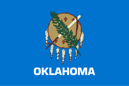
It's a fern and a peace pipe and a brown thing and the word "Oklahoma" below it, you absolutely, 100%, will be able to tell what this flag is at a distance. You don't need to count the leaves to get the general shape, and when you think about it, it is actually kind of silly anyone would claim otherwise. There just isn't any need to appreciate the tiny details on a flag to understand whose flag it is. (the only valid critique here is that everything should be bigger - too much dead space)
Not to mention the "see from a distance" thing even being a metric. That isn't how you encounter flags most often today? Maybe in the 19th century on a battlefield that was (and even then you had battle standards), but it isn't now. You see it in textbooks, on your computer screen, as an icon for a football game team, right next to you in a government office. Why privilege distance? You just made that up as a value. 99% of "flag consumption" is not seeing it at a distance.
The "only use ~3 colors thing" is the funniest, you can just argue this with...no? No you don't. You don't. What? No. You can...you can just use more colors? Here is an example from the "manual" Ted Kaye wrote on the subject:

And the 5 bands on the chinese flag are fine! They are not "hard to look at" or whatever. Also, I am screenshotting a tiny corner of a youtube video, this image is like 240p, and I can tell its a dragon - and that isn't even the color point it is trying to make, dude just deviates off into another critique. Meanwhile the Amsterdam flag looks like a traffic warning sign. Chinese flag needs to not have the white stripe connect into the white seal background, that is an error, but otherwise I prefer it.
It is annoying how many of the state flags are a blue banners with a round seal in the middle. That does make them hard to distinguish from each other. But that isn't a problem with seal-on-blue, that is just a collective action problem! Flag-reform-favourite the tricolor can run into this too - here are the flags of the Netherlands and Luxembourg:
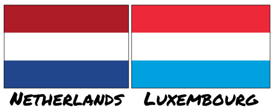
Like one of your needs to go home and change, that is ridiculous. Though if you had a complex seal in the middle that might avoid this problem! Funny that.
Even the "no words on a flag" argument, which I am more sympathetic to, doesn't hold up too well because too often you find yourself going "unless it is good" which just isn't a rule. The Iranian flag is the stand-out he mentions:

The middle crest is a stylized rendition of the name Allah, and the cursive lining on the tricolor bands are text as well - God Is Great, 22 times, marking the anniversary date of the Islamic Revolution. Stylistically beautiful, also words on a flag. The state flags just didn't try to do anything artistic.
I think the best point Premodernism mentions is a sort of stylistic unity Kaye & Co are pursuing above all else - everything sacrificed for corporate minimalism. Kaye's book will say it respects history and symbols should be meaningful, but then hates any symbols that require complexity. He singles out Turkmenistan as an ugly flag for example:

And as I said I only 50% disagree sometimes, I do think there is a complexity limit, and this flag goes over it, that is too detailed. Though the main reason this flag is bad is the weird choice to not put the banner at the edge, and have the crescent just...float off center? If it was this:

Two seconds in paint, already better, you can play with it. But anyway, you can say the symbols are too complex, but if you also say you care about historical meaning? Turkmenistan is a nation of traditional semi-nomadic tribes, who populated the Silk Road and made textiles as their ultimate expression of art. These carpet guls are traditional symbols used in those carpets that represent the five major tribes that compose the country. You can't just invent new symbols that have equal meaning to these, right? Like you can try if you want, sure, new symbols become meaningful all the time. But a rule that says "all art from before 1950 is tossed in the dumpster because it wouldn't pass muster as a Pepsi logo" is a weird rule to adopt if you say you value historical meaning. Turkmenistan does not have to look like France, and it is weird to want every national symbol to be aesthetically coherent to each other. Let 100 flags bloom! It is certainly "distinct at a distance" lol.
Anyway that is enough summarizing of a YouTube video - as I mentioned, he actually likes the state flags, I don't, I do think you have to balance a lot of this with just "general design principles". Never have your name on a flag in Helvetica Bold, amazing I had to write that one down for you. But a lot of these flag-specific rules derived from Kaye's work I often see bandied about are silly, and I was glad to see someone point that out.
452 notes
·
View notes
Note
we need more tom and y/n interviews! and if you can and want, can you write an interview where they're answering fan questions? ❤️
"According to fan questions..."
pairing: tom blyth x actress!reader.
summary: invited for another interview, you and Tom answer some questions that fans asked you.
word count: 1.095!

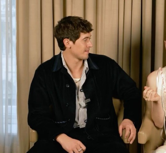
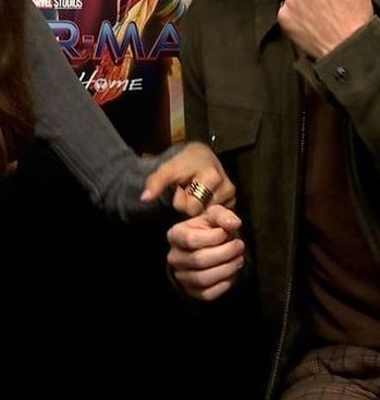
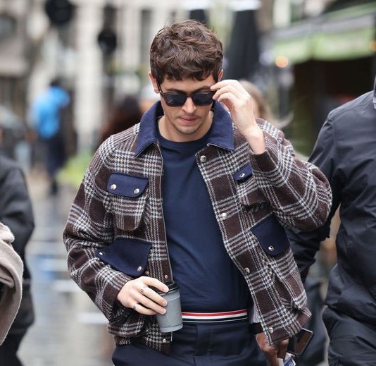
"Are we really cliché?" — Tom questioned, looking down, probably getting distracted by a fixed point, and then raised his eyes to you. "Hm, let me see…" — You crossed your legs, holding your elbow with one hand and the other rested on your chin, pretending to think of a promising answer and your boyfriend's laugh exclaimed in your ears. "Oh, yes, we are!" — Your voices rose together at the same time and more laughter settled in the decorated and comfortable room.
"Hi, i'm Tom Blyth." — Tom introduced himself, raising his eyebrows, in an inviting and dynamic way; quickly, turning his head with a shy smile in your direction for your introduction.
"And i'm Y/N!" — The brit's smile widened when your eyes met his.
"And we're here to answer some questions asked by you, the fans." — He explained, looking at the camera and, again, at you; it was, technically, impossible not to be excited about what was to come and even more so because of the suspense of the questions that would be presented.
The questions were about random topics, of course and obviously, you could expect anything. — From behind the scenes to your personal tastes, but, without going beyond the limit. — In fact, it would be fun.
During the editing of the video, frames and excerpts of the questions would probably be shown; making it more explained and organized. — For you and Tom, the people who were working behind the cameras said and repeated the questions.
The first was… — "What was the best thing about this movie?" — Referring to "The ballad of songbirds and snakes."
"The best thing about film was working with Y/N." — He responded quickly, making his british accent even stronger and moving his fingers; you laughed, feeling your cheeks burn a little.
"Ah, the best thing about this film was working with…" — You made sure to form a suspense, having fun with your boyfriend who tilted his head towards you, waiting for your enthusiastic answer. — "…Tom Blyth!"
Tom could no longer contain his bold and bright smile, even biting his lips, and poking your leg with his hand; passing your through the delicate and fascinating fabric of the clothes chosen for the interview. — You tried to pay attention and look for words to extend your answer.
"I guess i can also include how fantastic it was to work with Francis Lawrence…" — You continued. — "…and it's impossible, really, impossible to find words to describe how magnificent it was and acting in a Hunger Games movie was like a dream." — Tom listened with attention and passion, focusing on every word that came out of his mouth. — "The connection we had with the cast was something so precious, they are the best people in the world." — And it was the purest truth. — "Not to mention how intense it was to live in my character."
It was a dream, strongly, fulfilled and conquered for you; and a sentimental wave, of the purest emotion, weakens when seeing what, in fact, you has achieved and won around you. — How many incredible, sweet and important people have come into your life and will remain in it; and you had no words to explain how grateful you were.
Including having met Tom in your life. — God, you could say how grateful you were to have him for hours and hours, reaching the long duration of the video.
"Oh, yes." — Tom leaned on the back of the chair, settling in a little. — "I think playing Coriolanus was, like, really deep and steady because we're talking about a guy who has two faces and acting him being really good knowing that later he will turn into something evil." — He thought about his words. — "But, it was good working with him, on him and with the blonde wig...." — You laughed, together with the people behind the cameras.
The second question was… — "Were there many recording errors?"
"Oh yeah!" — Laughing and shaking your head in affirmation, you responded, ready to recall various behind-the-scenes moments and factors. — "There were so many that i can't name just one or two." — You said. — "But, one of my favorites, and i think they already posted it, was during the harvest scene and Tom was laughing nonstop at Peter."
"Please, everyone was laughing!" — He stuttered. - "Including you!" — You supported your hand on his arm. — "He was funny, the way his character spoke was funny, so i couldn't concentrate properly." — Tom reported looking at the camera, remembering the aforementioned moment and laughing; joining with you. — "One of my favorites was all the times you called me by my name." — He directed his head towards you, who placed a hand on his face.
Not many times, at most, just three times; garnering laughs and recordings from the cast and film crew. — Rachel had already posted two videos where you end up getting confused, a little nervous, and calling your boyfriend by his name. — A normal thing, it didn't need exaggeration or a big alert.
"Come on, it was only three times." — The softness, almost embarrassed, of your voice ran through Tom's ears; he removed your hand from your face and picked her up, giving your a brief caress and admiring the rings that were present. — "And i remember Josh and Hunter called me a loverbird."
"I ended up forgetting this fantastic little detail." — Tom commented.
The third question, — "Is it true that Y/N is going to act in 'Billy, the kid'?"
"In my dreams, yes!" — You crossed your arms, dramatically, and faked a frown for the camera. — "I've already asked a lot, and at least to be part of the supporting actors or just to appear for at least nine seconds!" — Tom laughed and you moved your shoulders, wanting to keep your face serious. — "Do you think i'm joking? I'm not!"
"You really aren't, sweetie." — The oldest confirmed. — "Please, Michael." — He mentioned the director. — "Even i'm begging for it."
And the fourth question... — "What word would you describe each other?"
"I think defining you in just one word is one of the most complicated jobs for me." — Tom's hand removed some kind of stubborn thread, which was stuck in his clothes. — "Is it really just a word?" — He turned, towards the people who worked behind the cameras, who confirmed his question. — "The word enchanting fits you easily."
Blyth leaned back on the back of the chair again, but now leaning his body towards your; facing you completely. — His deep, exuberant blue eyes meet, for the countless time, with yours in that interview. — And your lips formed into such a beautiful smile, shyly showing your teeth against his answer.
You fell in love once again with Tom Blyth, in a full interview.
"Thank you, my love." — The attempt to hide your face and an embarrassed voice failed completely. — "The first thing, word that comes to my mind that can define you is fascinating." — Tom pursed his chin, listening carefully. — "Because everything about you is fascinating and manages to leave me speechless, most of the time, and captivate me too." — Now your boyfriend's arm was holding the back of your chair. — "Everything, everything about you fascinates me and even the discreet gray strands that must be growing in your hair."
"Excuse me?" — Tom questioned, with his mouth open and not expecting your last words, and looked at the camera with a surprised look; already you were laughing at his euphoric reaction, clapping your hands on your knees and almost slouching in your chair.
#tom blyth#tom blyth x reader#coriolanus snow#coriolanus#snow#coriolanus snow x reader#coriolanus snow fanfiction#coriolanus snow imagine#coriolanus x reader#coriolanus fanfiction#coriolanus imagine#the hunger games#the hunger games x reader#the hunger games the ballad of songbirds & snakes#the ballad of songbirds and snakes#ballad of songbirds and snakes
1K notes
·
View notes
Text
Trailer Park Steve AU part 4
part 1 | part 2 | part 3
September
He doesn’t talk to the Munsons much. (Doesn’t talk to anyone, really, aside from his mom and Robin and that one older woman who keeps renting and returning Gone With The Wind as an excuse to leave her house.) He keeps his head down and his nose clean, doesn’t care to make friends with the neighbors; just wants to get by.
One day Eddie approaches their door, waving a gas bill that got mixed up in their mail, and Steve greets him pleasantly enough.
“Stab anyone today?”
“Eat glass, Harrington.”
So it goes.
Steve watches the world pass and the weather turn, lets the hours bleed into weeks and squeezes his eyes shut against the flashbacks when they threaten to overwhelm.
Things with his mom are weird.
They don’t really speak, preferring to shrug their way past each other with careful, tight-lipped nods, and his mom takes these pills the doctor gave her that keep her perfectly pleasant and calm. Silent. Physically present but not really here.
And he can’t imagine how it feels to be her: Florence Harrington, ripped from the comforts of the upper crust and left to rot in a tin can seven miles across town. She spends most of her time letting out weary little sighs as she swans from room to room, drifting like a shade on the banks of the River Styx. (He can make that reference now because Robin won’t shut up about mythology. “It’s so gay, Steve. The Greeks were literally so gay.”)
Anyway.
Shit’s weird with the kids, too. He still drives them around — lets them loiter at Family Video when it’s slow; hangs around when they need a ride to the arcade or the movies or the skating rink; and he’s still on the hook for ‘ice cream. for. life,’ so…
It’s just not the same.
Like. Not to be dramatic, but who the fuck is Steve Harrington without the house and the pool and the free-for-all fridge? Just some kid with a car and a bat and a punchable face. And he can barely afford to keep the car now, anyway, so pretty soon they won’t need him for that, either. They’ll learn to drive; they’ll get their own jobs. Maybe Lucas builds enough muscle to take over as the party tank.
Maybe it’s better if he shelfs himself now before they realize he’s become obsolete.
“Oh, my god, you’re being pathetic,” he groans to himself. His voice is muffled where he’s lying face down on the couch. Ridiculous behavior, because everything is fine; Steve is fine. In the grand scheme of things where there are monsters and melted corpses and all kinds of crazy, horrible shit?
Yeah.
He’s being obnoxious. It’s a lovely sunny Saturday afternoon with just the right Autumn breeze going — gentle but cool; long sleeve polo weather; his favorite kind — and he’s sitting inside throwing himself a pity party.
Fucking absurd.
…Five more minutes.
Just five more minutes, then he’s getting off this couch.
He gets to a minute and a half when he hears the crunch of tires against the gravel, the clanging of a little bell from the handlebar of a bike, and then:
“STEVE!!!”
And that’ll be Dustin, trying to bang the door off the hinges and piss off the whole park at the same time. Kid’s nothing if not a multitasker. Steve lets another aggrieved groan loose into the couch cushion.
His mom’s out with the car; the lights are all off. Maybe he can just play dead ‘til Dustin leaves? He loves the kid, he really does, but his left ear is full of static, and he just wants to fucking sleep. Or sulk. Or both.
“STEVEN CHRISTOPHER, I KNOW YOU’RE IN THERE.”
Jeeeeesus Christ. “Okay, chill,” Steve grumbles as he hauls himself upright and throws open the front door. His limbs feel like lead; there’s drool on his chin. “Wake the whole goddamn neighborhood, why don’t you?”
“It’s two in the afternoon.”
“Yeah, and half the people here work nights.”
“Oh-kayy,” Dustin drags out the word, “but you don’t.”
Ugh. Whatever. He’s not gonna be shamed by a toothless teenager for his depressing loser tendencies. “Did you need something?”
Steve scratches at his belly hair through his shirt, feels a muscle twinge in his shoulder and send a spark of nerve pain skittering up to the base of his skull.
Dustin either doesn’t notice or doesn’t care that Steve’s body is falling apart where he stands, because he just rolls his eyes and says, “Uh, yeah. I need to know why you’re avoiding everyone? Mom’s tried to invite you to dinner six times now.”
“I was working.”
“All six times?” Dustin glares. Steve feels a little pinned by it, feels guilt seeping through the cracks as he fidgets with his bad ear. This kid’s gonna be the scariest lawyer some day. “She’s worried.”
Goddammit.
Guilt squeezes hard behind his ribs; he knows Dustin uses his mom as a mouthpiece for the feelings he can’t express. “I’m fine,” he sighs, letting his eyes and voice go soft. “Honest.”
Dustin holds firm, gaze fierce and fists clenched. “Bullshit,” he insists.
“Man, don’t—”
“Bull. Shit.”
Suddenly, their impromptu interrogation gets interrupted by a crashing drum fill, a shriek of electric guitar as Munson’s van squeals into the lot. He’s blasting some melodramatic metal shit about wizards or whatever; Steve doesn’t know. He only knows that the skitter of nerve pain he felt is ramping up to a fullblown migraine now because this guy has to listen to his racket at full fucking volume, apparently, and isn’t this all just “fucking great.”
—
part 5
#steve harrington#eddie munson#steddie#steddie fic#trailer park steve au#steve can have a little depression as a treat#robin buckley#dustin henderson#claudia henderson#my writing#my fic
1K notes
·
View notes
Text
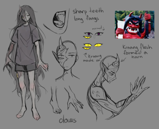
/the ref is a bit old, but the info is mostly accurate/
So, I did kinda sketch ref for my Kraang character and make her more of a person, or something, with a name and all. I'm still going to use they/them pronounce and Y/N when people will be asking something about Krangified AU.
More information about her below.
So, her name is Ana now.
About her personality before she was turned into the Kraang zombie I still can't say much at the moment (because I'm mostly focused on their interactions in the present timeline), except for her being the person who was genuinely worried about Leo and what's been going on in his head. She saw his attitude and for her it was obvious it was mostly a facade to hide his real emotions and wanted to help him, being a shoulder to lean on. I see her being the weirdo to others that found his jokes actually funny.
After Kraangification, I can describe her with one word: DEPRESSION. I mean, you've been a mindless zombie for about 10 years that practically flashed before your eyes. You wake up facing the facts that the world has been at war with the Kraang for all this time, everyone you knew grew up, your family is long gone, your boyfriend been through hell and lost his arm, and, yeah, your still kinda a zombie also facing some self-control issues. Your Kraang half is taking control over you from time to time, attacking others and even friends if provoked. Not to mention that a lot of things that used to be casual to you are now something you need to learn to be used to again, like bed or actual food. Yeah and also that little inconvenience that she has to eat people now.
She's been dozing off a lot at first, after Leo got her to their base, just staring at one point, processing the whole situation and still feeling like it's just a very long nightmare. And only Leo could snap her out of this state at least for a short amount of time.
When I've been making first sketches with her I gave her this pointed ear and horn like Kraang appendage on her forehead, and thought this kinda reminded of oni's (demons) from Japanese folklore, which kinda resonated with this whole Kraang AU concept.
I also can't stop thinking about Beauty and the Beast (original Disney animated movie) concept, only with them swapping roles in contrast to the original story.
I really like the concept of the turtles being able to make this chirping and churring sounds, and thought, why can't she make something like this? So, yeah, she can churp and purr (I don't know if there's a difference between churring and purring, still didn't understand, and this churring sound is still mostly fictional, fanon thing..? but, anyway). I like this idea of Leo and Ana being able to communicate with the language only they (and other turtles) understand.
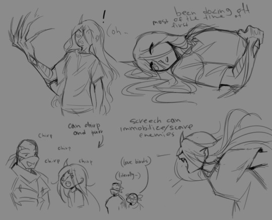
A few more sketches with her and a couple of scenes.
Her claws on the Kraang arm can extend. I thought about her being able to shapeshift her arm further, but for now it's either extended claws, or something like a sword or some other sharp pointy thing...
I've been thinking about her fighting style, and for a reference I used the The Witcher 3 again (yeah) There's a vampire species, Bruxa and Alp, and I'm thinking her fighting style would be something like of an Alp. Fast and agile, also pretty strong (tho still not strong enough to take out big enemies like the Kraang in their suits).
I have this scene in my head that I actually been sketching already, where she's fighting the Kraang hounds, and pretty much able to lift one grabbing it by it's throat and throwing it into the tree like a rag doll.
youtube
Another thing is her screech she uses to intimidate/immobilize her enemies. It's also more of an alp than bruxa, especially in this video time code 00:36, this is pretty much how I imagine it.
I also know that I've messed up her eyes when she's in her Kraang mode, because they should be turning purple, like Raph's left eye that wasn't covered by Kraang flesh, but, uuuh, I don't want to change that at this point...
I think that's it for now...? If I'll have more ideas I'll either be making other posts, or updating this one.
#my art#sketch#krangified au#oc x canon#leo x oc#future leo x oc#rise oc#rise leo#rottmnt leo#rottmnt#rottmnt oc#rottmnt au#rise leo x oc#rise of the tmnt#rise of the teenage mutant ninja turtles#riseofthetmnt#future leo#tmnt2018#tmnt 2018#Youtube
405 notes
·
View notes
Text
Okay so someone shared this link on the server for the Chronicles of Darkness game I've been running since 2020 and I looked at the link and went 'yeah right' and then I read the article and went 'hunh' and then I watched the first three episodes of 'Knuckles,' which didn't take long because each episode is about half an hour long, and actually I fucking cried my eyes out at the big fight that is referenced because like... it's ... good, actually?
The show is very silly, and a lot of the humor is very childish, which makes a lot of sense, right, because it's about a fucking video game, but, at least so far, it's an extremely sincere show.
The siblings in this show act like highly exaggerated siblings. Of course adults wouldn't act like this, but it doesn't matter, because that's not really who the show is for. The show is for kids. It's goofy. The heart of sibling rivalry is there. The heart of hurting over a parent who abandoned you is there. The heart of a parent missing a family tradition is there.
The jokes that are made are made with love for Jewishness. Whoever made the food jokes has eaten a lot of gefilte fish and matzoh ball soup. Whoever wrote the episode understands how important it is that nothing puts out the Shabbat candles. Whoever wrote the episode understands the importance of minhagim -- the traditions that are unique to your family, to your synagogue, whatever.
Clearly they're not shomer Shabbos because their traditions include watching movies after Shabbat dinner, but that's not presented as them being Bad Jews -- it's just their family tradition, and that's just how it is.
Mom's bracha for the candles has the 'Adenoy' pronunciation which is so very New York Older Ashkenazi Jewish that it made my heart ache and made me powerfully homesick for the East Coast, since so many of the older people at my old shul used that specific pronunciation.
The fact that they literally centered a pair of Shabbas candles (with what are clearly kosher candles burning!!) in the fight, and the entire fight revolves around those candles? It just hit me right in the middle of the chest.
There's a difference between a show being silly and a show being insincere, and Knuckles is silly but it's not insincere. I will fully admit that I watched the first three episodes to get to the episode entitled The Shabbat Dinner, but you know... I might just finish the series? It's got heart, and all of the actors are clearly having such a good time. It's one of those projects that I refer to as a Summer Camp Show/Movie, where everybody's getting a nice paycheck and having a very good time and not taking themselves too seriously.
Plus, Christopher Lloyd made me laugh until I choked.
#jumblr#judaism#jewish#shabbat dinner#sonic the hedgehog#knuckles the echidna#knuckles series#knuckles show
626 notes
·
View notes
Text
Just Look My Way
Can we please talk about the way the lyrics have changed from the original to showcase Stolas' growth and character development?
I was already surprised that what originally looked like it was just going to be a fan video ended up becoming canon content, but when I heard the different lines my mind exploded, you guys.

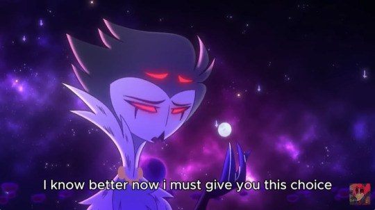
Note the difference, the major difference, in treatment!
In the original version, which released back in season 1 but before Ozzie's, Stolas' line was actually:
"Come now, my little impish plaything, we've both made our choice."
Keep in mind the original most likely included this line as a reference to what both Striker and Stolas said in regards to Blitzo's relationship with Stolas. Even our dear owl boy referred to him as just a plaything while saving him from D.O.R.K.S! Which most likely only helped cement Blitzo's internalised belief that Stolas would never see him as anything other than a cheap thrill.
Here, however, Stolas is cementing him as his dearest! A loved one! Someone he values and cares for! That is a huge difference from being just a sexual partner!
And the second line. OMG, THE SECOND LINE.
Unlike the original, where Stolas speaks of a choice that, realistically, was never there (as it usually is the case with relationships where there's a power imbalance and, moreover, were born out of transactional needs), this time he is reaffirming Blitzo's agency and independence. The implied choice is clear: Stolas will present the asmodean crystal to him so he no longer relies on his Grimoire and sleeps with him out of necessity. All that's left for Blitzo now will be to choose if he wants to remain by Stolas' side even then. And the choice is his.

As a quick aside, I also love the constant symbolism between Blitzo and the Moon.
Technically, compared to Stolas and the Earth, both are just satellites, nowhere near as important as a Goetia demon and member of Hell Royalty or a planet brimming with life and where beauty and wonder happen at every corner. And yet, without them neither can thrive. Stolas is as fascinated and dependent of Blitzo as the Earth is with the Moon. Without the Moon, there's no tides; it brings inspiration and romance to countless souls, brightening the night sky, just like Blitzo brightens Stolas' life.
Blitzo is Stolas' moon, and I just think that's beautiful.

Every word in this line in particular just oozes character development, too.
The original was:
"What's left for me in this broken house if I cannot have you?"
This is no longer about Stolas using Blitzo to escape his boring routine and his horrible marriage to Stella, it's about Stolas being deeply and hopelessly in love with Blitzo and not knowing what to do to convey that in a way that will reach him.
Once again, Blitzo has stopped being a mere plaything or boy toy and become so much more. He has become an essential part of Stolas' life he doesn't know what he'll do without but knows he'll have to let go of if that's what Blitzo wants!

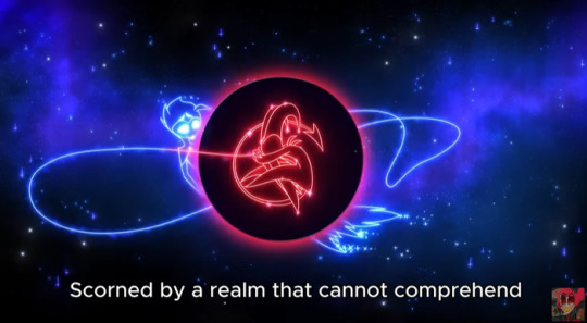
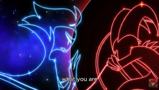

Now, I must admit I am not exactly a fan of this change in these particular verses. On the one hand, I understand it's meant to reflect Stolas is trying to understand Blitzo and see things from is point of view, but I also feel it robs the moment of the raw feeling the original conveyed:
"Is this how she'd feel? Abandoned, all alone, left to fend for herself, for a semblance of happiness that doesn't have to end?"
"She" clearly referring to Via.
I just think it would have been more powerful to keep it and allow that juxtaposition between the most important people in his life to help Stolas understand Blitzo better. After all, he loves them both dearly and unconditionally, but his actions have also hurt them both very deeply.
I just think it'd be fitting if one allowed him to understand the other better.
Nevertheless, if there is something this song has taught me, is this: we are so not ready for the next episode.
#helluva boss#helluva boss spoilers#helluva boss season 2#stolas#helluva boss analysis#stolas goetia#helluva boss stolas#helluva stolas#blitzo#helluva blitzo#helluva boss blitzo#just look my way#full moon#stolitz#octavia#octavia goetia#vivienne medrano#vivzieverse#vivziepop#vivziemind
980 notes
·
View notes
Note
yooooo!!! you’re my favorite ethan winters artist i just wanna say that first and foremost, thank you for the wholesome content of my comfort character and father figure 🥹🫶
i’m really curious bc i feel like i see a lot of people against mithan (not me personally, i’m p neutral on them!) but i’m curious to know all your thoughts on them! thoughts on their canon relationship, their fanon portrayal, the backlash against them/mia accusations, and your headcanons? i’m just really interested!!! hopefully that’s not weird :”)
have a good day!! sparkle on!!! ✨💖

i heart mithan... i think that they can be so cute...
i personally hc them t4t and i like to think that the dated in highschool before they both had fully transitioned
mia likes to bake and ethan likes to scrap book and he always likes to take pictures of mias cakes/ baked goods and has a album for them 😭
i am a multishipper so i draw a lot of ethan ships so my girl is left out sometimes and im sorry mia 😔
i actually really like their relationship, its a really complex dynamic that i like to talk about with my friends
i think the issue is that when talking about mithan or mia in general, theres just SO MUCH misinformation that its honestly a pain the butt to talk about
people still think that she was responsible for the creation of eveline, people still think that she experimented on eveline, people still use examples of her attacking ethan as if she did it on her own will instead of being mind controlled
in reality she was just someone who oversaw the transportation of evie. im not excusing her or anything because obviously she knew what she was doing, but people really try to accuse her of doing something she didnt and it bothers me alot lol
the problem with the fandom is that people either try to water her down to girlboss who did nothing wrong and fail to acknowledge the complexity/ moral grayness of her character and the other side is misogynists 😭😭😭😭
its hard to talk about her without people either going "stop trying to villainize her and make her look bad!" or people ACTUALLY villainizing her and acting like heisenberg would have treated him better 😭😭
mithan is such a sad relationship because they loved each other so much and that ended up being the reason their relationship fell apart (sort of... its not like the broke up... ethan kinda just straight up died)
i get a lot a trouble for saying this, but mia is a selfish person.
its not a bad thing! well i mean it is but it doesnt make her some evil witch who is somehow worse than the guy how made a werewolf american ninja warrior. its just a major character flaw she has! which is good! mia being a flawed person who makes mistakes and morally gray decisions make her a more interesting person!
she is selfish in the way that she wants to keep her family with her no matter the cost. even if it means lying to ethan about her job so that he wont think different of her. here is a interrogation from the re7 DLC, which is easy to miss!
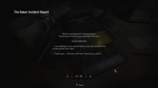
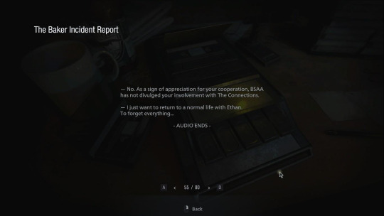
she isnt necessarily trying to apologize for the things she has done, she is more of a, "u wont need to forgive me in the first place if we just forget it all and move on"
she doesn't try to redeem herself for what she has done, she tries to move on and return to the normal life that she wants so bad. which is fine! everyone copes a different way and she has to right to move on from her trauma. the problem that lies in this is that she has a shared trauma with ethan who still has no idea what went on in dulvey and still effects him till the present (he is mold! this is a important thing to know! most people would want to know if they were a walking corpse)
she played a direct part in what happened in dulvey, and im not referring to the email, she did not send that. she never wanted ethan to come in the first place. she tried her best to send a video to him, begging him to forget about her because she wanted to protect him, BUT it didnt send.
he got involved because she was involved. its honestly a series of really really unfortunate events.
THOUGH! she did know what she was getting into. im tired of seeing the narrative that mia was innocent and didnt know what was going on or was simply a bystander. she knew what she was doing, she knew eveline was a bioweapon, she knew eveline was a child. she used a MACHINE GUN! she knows how to use weapons and was obviously trained for it.
she tried her best to keep everybody out of the mess, ex: warning the bakers not to take them in, warning ethan not to find her, sacrificing herself for ethan in the later half of re7
but again, those are the consequences of HER actions
her consequences just happen to get really big and end up hitting ethan on the head like a metal sheet 😭
their relationship is really so interesting, it makes me really sad to think about sometimes 😭they both went through something that nobody else would ever understand, in the end they really only have each other. they get moved to an entire different country and the dulvey incident gets covered up with a "gas leak"
its really tragic because their marriage definitely had some flaws and bumps. and i know im repeating myself but its because people always take this in the worst way possible but just because i say their relationship was rocky doesnt mean im saying they dont love each other!!! thats the entire basis of mias character!! saying she doesnt love ethan would destroy her entire character!
you can see in the re8 DLC how fondly ethan talks about mia! he loves her so much, though im not sure if his comments in the DLC are him narrating current (post re8) or his thoughts before everything went down and he died (pre re8)
everything mia did was because she LOVED ethan. she would never do anything to intentionally hurt him, she is not a cruel person. she hides the truth of her job from ethan pre re7 because she loves him and doesnt want her job to drive them apart. she CONTINUES to refuse to tell ethan the truth post re7 because she wants to move on a live a happy normal life with him and knows something like her being directly associated with the connections would probably cause (more) problems. she refuses to tell ethan that he is mold because again, hard to live a happy marriage with your husband after you tell him hes a bioweapon.
obviously i dont think it was right that she did this, thats what makes her selfish! she did it for herself! she did it for her family! she thought it would work out, she thought that they could move on and be happy together.
the issue is that ethan didnt want to forget. he wanted to know what happened, he wanted to know the part mia played, he wanted answers! which is reasonable! he knows to some extent that mia was partially responsible for his involvement and he was always suspcious that mia was lying to him about her job which is implied when mia says "you were right, i did lie to you"

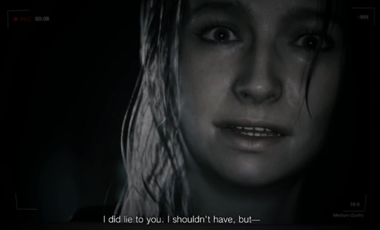
she doesnt learn, she doesnt stop lying, her lies get bigger and worse and it sucks yeah but it makes her so interesting!!! she keeps doing stupid things under the idea that this is whats best for her and her family, that if she hides this everything will work out and it will be for the better but its not!
just because telling your husband hes dead and a bioweapon is a hard subject to bring up doesnt mean you DONT bring it up. people shouldnt use that as a reason to excuse mia 😭, its a very bad excuse and honestly highlights how horrible their communication skills were. you cant just not tell your husband that he is actually infected with the mold and not tell him for the tree years between post re7 and pre re8.
im not saying these things to put mia down, or try and villanize her. these are all just actual things her character does! she isnt evil, but she isnt a knight in shining armor either. we need to be able to have talks about complex characters without crying everytime someone points out a flaw. characters have flaws! and mia just happens to have a lot of them!
im not mad at her, i dont dislike her because i think this way of her. shes a fictional character! you can like characters that are morally gray, or villains that drink blood and make corpse soldiers. they are fictional! pointing out the flaws of a character does not mean i dont like them.
i wouldnt call her "the real villain of re8" but i wouldnt treat her like a damsel in distress either. she is a competent person, she knows what shes doing, she has her reasons for doing them. she made bad descions with good intentions behind them! they can coexist and we should let them!
i like mithan! its a complex relationship because they both love each other so much but hurt each other in the process
talking about them is just a pain in the butt because talking about mia is a pain in the butt lol
i really hate how she keeps getting sidelined, its super frustrating to see mia get put in a cage in every game 😭
its even more frustrating that mia straight up just disappears???? in the shadows of rose DLC... like she just stops taking care of rose and theres nothing said about it. no reason or explanation. i dont think mia would ever ditch rosemary because she didnt care about her, but we probably will never know because capcom sucks at writing and they probably forgot the mia ever even existed.
all in all, i think the fandom is really just full of misinformation which make people either think mia is some horrible evil person, or its full of people who think that saying mia messed up is the equivalent of comparing her to wesker lol.
i really love mia, shes a incredibly fun and complex character, its just hard to enjoy her sometimes with the people in the fandom haha.
also ive got no idea what u meant by "the backlash against them/mia accusations" so sorry if i didnt answer that!
thank u for the ask! sorry for the long response!
765 notes
·
View notes
Text
pathologic 3 save & sound 2024 presentation
this is a quick attempt at a transcript of the presentation. I think I got most of it but there are some words I was unable to hear, I can't say I have a lot of practice doing this and that's on me so if any of you guys can help me I'll edit it asap

Ressa Schwarzwald: I'm Ressa from Gameowdio. Our team has been working on Pathologic 3 with Vasily Kashnikov and his apprentice Nikolai. This video will feature some of the audio stuff we've made together.
Our goal regarding audio direction was to give the real experience of being in the epicenter of an epidemic. Fully realistic, no bullshit. So we are obviously shooting this video in The Town. We realized pretty early that the game was quite different from the original Pathologic 2 because of the time travel mechanics. So for the prototype we built a time travel machine [the date November 1924 shows on screen], which appeared to be quite useful to record some source sounds, and [date changes to November 3024] make this video in just half a second using existing technology.
Let's start with the music.

Vasily Kashnikov: Hi, I'm Vasily Kashnikov, audio director of Pathologic 3 project. I'll tell you how our music is structured. We were already thinking about how the Bachelor's game would sound when we were working on Patholgic 2 and writing music for Haruspex. In Pathologic 2, the music had more ethnic and real motives (motifs?) and instruments. Since the city and its customs are familiar with Haruspex since he was a child, he is involved in the traditional way of life. In the case of Pathologic 3, this is the view of an outsider who evaluates everything from the point of view of rationality and science. Therefore, we are trying to make the Pathologic 3 soundtrack colder and more detached from the steppes and ethnicity in character. There is more synthesis, guitars at the same time, the Bachelor communicates with those in power so the soundtrack contains a large share of minimalist so-called furniture music that could sound in the beginning of the last century. Piano etudes and references to composers of that time: Satie, Debussy, etc. The soundtrack is a rather eclectic mix of dreampop, downtempo, and (?) minimalism.

In the city when the Bachelor is alone with himself, we emphasize the cold mind of the rhythm section: less emotional harmony, and sometimes electronic timbres. In the rooms where we need to separate the main character from those he interacts with, we use more expressive harmonies and more classical instruments: piano and guitar passages.
When we designed the interactive music system, we assumed that time is finite, and the music had to change depending on the amount of time the Bachelor had left. However, we later abandoned this system and now the music changes depending on the state of the Bachelor himself, who can fall into apathy or psychosis. To emphasize these states, we apply filters and effects to different layers of our tracks and get a slower, muffled sound in the case of apathy, and wired (?) nervous, glitchy in the case of psychosis. In the infected quarters, there are interactive systems that... [screen begins to distort] oh my god, Nataliya! Please stop this!
Nataliya Radina: Whoops, hehe, sorry. But yeah, basically the other system we created reflects everything you hear in the game. Such as... If we use our gun when dealing with the local thugs, the longer we aim the weapon at the people, the less sounds of the outside world we hear and the louder becomes the heartbeat. To add to the intensity, sharper tone was used along with a high pitch tinnitus sound. If the psychosis level goes to the maximum, it starts to damage Bachelor's health, which is accompanied by flashes on the screen, as well as low heartbeat and short breathing sounds.

Vasily Kashnikov: In the infected and rebel's quarters, there are also interactive systems that change the character of the music by adding or disabling instrument layers depending on the state of the world or the Bachelor's equipment to fight the plague. As a result, we have 12 tracks for each day spent in the city. they can freely switch between each other and several dozen themes for locations and characters, and all the music is subject to change depending on the state of the Bachelor.

Nataliya Radina: Since the game has a weather changing system, we also wanted to reflect that in our audio feedback as well. The game has global wetness parameter that shows how intense the rain is. The more it rains, the more squishy and muddy are the steps of the outside surfaces. Moreover, if you come closer to the window, you can hear the rain pondering on the glass. Even in the middle of the plague, we always have room for cozy moments, right? My favorite part of that system is involving cows. [cow moo]. So, when it's raining, you can actually hear very very soft sound of raindrops dropping on those bovine butts. And I personally think it's beautiful.
Artur Ramanouski: Hi, my name is Artur, and I was also involved in creating some sound assets for the game.

Probably the hardest thing to record were the footsteps. I had everything planned out: bought the equipment, got every type of surface, but...there was one small thing I overlooked: I live in a city with over 12 million people. Noise everywhere. The solution was simple and ingenious: I recorded everything on a Sunday, because in Buenos Ares, Sunday is the one day when no one does anything.

Nataliya Radina: One of the most important places in the game is the cathedral. There we have a system of ladders that control the speed and direction of time. Direction wise, we can have it flow normally, or reversed. [entire presentation is rewound very quickly so it's back to Ressa]
Ressa Schwarzwald: She is super professional.
Nataliya Radina: As for the speed, we can make it stand still, go twice as fast, or half normal speed. We created an audio system that has to (?) understand what is actually happening around (inaudible). When we reverse time, spatial effects are added to the surrounding sounds. Ambience, steps, and the mechanism itself. When time stands still, we increase the low frequencies in the ambience, and all the other sounds are muted to zero. Now lastly, when the time goes twice as fast, or half the original speed, the pitch of the surrounding sound changes accordingly.
The coolest part of this system is that it's been actually implemented into the game engine using only one parameter.
Ressa Schwarzwald: Thank you for watching. See you here, later!
173 notes
·
View notes
Text
Thinking about Disney and how we talk about Cultural Representation

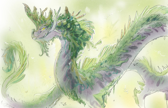
(concept art by Scott Watanabe)
Old essay originally written on Cohost in November 2023. With additions.
With all the promo stuff about Disney's upcoming animated film Wish, I can't help but think about Raya and the Last Dragon again. I spent a year intensively researching things about that movie and the discourse surrounding it for a series of videos on Xiran Jay Zhao's channel, and oh boy did that reveal a lot about the current way we talk about cultural representation in casual media criticism.
Lately we've grown a habit of looking at signifiers to culture, things like a cultural dish, a nod to a martial arts style, a piece of clothing, maybe a hairstyle, a weapon and so on, and then projecting a bunch of intentions onto the work regardless of authorial intent. I witnessed this a bunch of times in discussions surrounding Raya and the Last Dragon.
You basically get a bunch of 4d chess-style justifications for the lazy implementation of culture in Raya.
random examples cuz there's too many to name:
The movie will do something like make the leaders of the villain nation women, and people immediately assumed it was some kind of bespoke reference to Minangkabau matriarchical society.
the art book of Raya specifically stated that they purposely misplaced things as a stylistic fantasy choice "we could take something that is known and place it in an unexpected location, like coral in the desert and cacti in the snow". But when people saw a water buffalo placed in the desert they assumed it was some super clever environmental story decision.
The movie will tell you it includes things like Borobudur, Angkor wat, Keris, and most people will take their word for it without hesitation. Never mind that Southeast Asians could barely recognize these nods to our culture through how amalgamated the designs are.
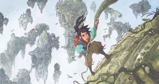
(early concept art by Scott Watanabe)
Moving forward, I think we need to talk less about "what" parts of a culture are being represented in these movies, and more about HOW they're being included, we need to ask:
What is this piece of media's relationship with the cultures it represents?
Because Raya and the Last Dragon is not a cultural movie, it's a monolith film pitched and written by white people and a Mexican director with 2 SEA writers added later in production to avoid backlash. Culture serves the purpose of aesthetic set dressing in the film, as opposed to something that informs its themes and characters.
it wasn't even initially pitched as a Southeast Asian movie. The white writers who pitched it were going for a vague East Asian sci fi fantasy story under the working title "Dragon Empire". Southeast Asian culture was an aesthetic change added much later.
This is what happens when a corporation tries to put representational value on a shallow aesthetic. Because of the way Disney constantly marketed Raya as this big authentic cultural film, it primes its audience to read cultural intention in the most benign details. And when we get lost in the details, we lose sight of the bigger picture.
Contextualizing Cultural media criticism
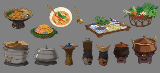
(visual development art by April Liu)
We need to start demanding more context in our analysis. The next time we see a reference to culture in media we consume, take a step back and ask what purpose it serves in the narrative. And most importantly!! What Is Its Relationship With The Culture It Represents? We shouldn't just accept things at face value.
start asking yourself,
through what lens is this cultural dish and its spicy flavors being presented to us? Are the customs surrounding the food being respected?
If martial arts or dance is represented, how is it translated in the adaptation? Are you getting generic hollywood-fu or are you seeing specific movements with purpose and motivation? Are the philosophies or spiritual contexts of these traditions present in the text?
Are the clothing, hairstyles, and presentation of the characters being de-yassified through a colonial filter? Is the non-conformity of the cultures' different framework for gender presentation being adjusted to fit a more recognizable binary?
If language is present, what role does it serve? Is it presented as other through being exclusively used by villainous beings? Is it being made a monolith as one "non-English" language?
is this temple actually a place of worship or is it just a set piece for a goddang Indiana jones booby trap action fight sequence
This way, instead of unquestionably defending a piece of media because a character wore a traditional outfit one time, or because some characters took their shoes off at a temple, or because there were Arnis sticks in that one fight scene, we can approach the text with a more nuanced and holistic understanding of how culture informs narrative.
To quote Haunani K. Trask (author of From A Native Daughter):
“Cultural people have to become political… Our culture can’t just be ornamental and recreational. That’s what Waikiki is. Our culture has to be the core of our resistance. The core of our anger. The core of our mana. That’s what culture is for.”
#ramblings#media criticism#jesncin cohost essay repost#working on the raya videos was so informative for how I approach cultural media criticism#like it really made me question what exactly I wanted from cultural representation
158 notes
·
View notes
Text
THE BEST FICTION I ENCOUNTERED IN THE SECOND HALF OF 2024!!!
A much longer follow-up to this post. (Can you imagine how much I'd need to type out if I hadn't split them up???)
Once again, I'm not listing movies, TV shows, video games, etc. I AM listing some web fiction and comics/graphic novels, because I feel much more qualified to judge and recommend those things.
____
Novels and Novellas!
Failure To Comply, by Cavar (2024): Reading Cavar’s Failure to Comply, I couldn’t help but think of the recent David Cronenberg movie Crimes of the Future. Both deal with dystopias in which bodies and their modification are strictly regulated, and people with unauthorized bodies form a vibrant, perpetually imperiled subculture on the margins. Both use this conceit to speak metaphorically about the plights of trans and disabled people, although Failure to Comply’s characters are also presented as literally, textually disabled and trans. But, although Crimes of the Future is often accused of being a “weird movie,” Failure to Comply is undeniably much, much weirder. Cronenberg is super normal compared to this.
Maej, by Dale Stromberg (2024): a doorstopper I found difficult to put down and finished inside a week; a work of very unapologetic genre fiction that’s equally unapologetic in its intelligence and dedication to doing strange, creative things with language; a high fantasy story I actually liked. The setting is the city of Sforre-Yomn, in the country of Hwoama, whose culture combines elements from across the continents of Asia and Europe. But Hwoama is matriarchal: men are subordinate to women, who dominate politics, business, the military, and nearly all other professions. As a result of this fact, almost all the major characters in the novel are female. By turns this presents a fun, simple, mischievous inversion of maleness as the unmarked default state for fictional characters, and meaty commentary on the social construction of sex, sexuality, and gender. Stromberg has cited Le Guin as an influence on Maej and, in the most complimentary way possible, this influence is evident.
Lote, by Shola von Reinhold (2020) is a gorgeous, funny, moving academic satire/mystery and love letter to Black modernism. It’s also very queer/trans and (in my personal opinion, perhaps not intentionally) very autistic. The title refers to a possibly-mythical clandestine circle of artists/magic practitioners who style themselves after the lotus eaters and seek transcendence via experiences of sensory and aesthetic pleasure. As with many novels that stand out to me, you won’t read anything else like it. I especially recommend this one if you want a completely unique, intellectually stimulating work of fiction, but are put off by the aggressively experimental and opaque style of Failure To Comply and by the SFF-ness of FTC, Maej, and Leech.
Walking Practice, by Dolki Min (trans. Victoria Caudle) (original 2022; English translation 2024) is a breezy, sexy *, gender-bending Korean novel about a poor amorphous space alien stranded on Earth after a spaceship crash. Unfortunately for us, this alien soon discovers that 1.) the most suitable food for it down here is human flesh, and 2.) with a lot of pain and effort, it can squeeze itself into the likeness of a variety of different human beings. It figures out hookup apps pretty fast, too, and then it’s off to the races. This may sound like creature horror, but it plays more as an exploration of identity and humanity, and a satire of sex, romance, and contemporary hookup culture. (*possibly less sexy if you don’t have a vore/cannibalism/consumption thing)
Love/Aggression, by June Martin (2024) is a BANANAS mundane fantasy-comedy about two trans women who are kind of best friends, and kind of enemies. Zoe (actress) is an arrogant, cartoonishly unpleasant minor celebrity who thinks she’s much more famous and popular than she actually is— but Martin manages to show how her personality is in part the sympathetic result of dysphoria and experiencing a lot of transmisogyny over the course of her life, and how she used to be a much kinder person before fame went to her head. Meanwhile, Lily (freeloader and aspiring tattoo artist) is a sweet, spacy, passive daydreamer, and a far more immediately likable character— but Martin manages to show how she is not entirely blameless in the ongoing drama with Zoe, how her passivity is sometimes the result of immaturity and selfishness, and how even when it isn’t, it’s a character flaw that keeps landing her in situations which kind of suck for all parties involved. They live in a magical Pittsburgh that is, conveniently, located right next to Los Angeles. Their friends include a BDSM cult leader and a nonbinary person whose name becomes “Dicks” in the first chapter of the story and who is never called anything else. (This character also happens to be the…owner? Custodian?…of an infinite, maze-like, reality-distorting building that is probably the most fun and least scary infinite, maze-like, reality-distorting building in all of fiction.) There’s vore in this one, too! But don’t go in expecting a particularly cohesive plot: Love/Aggression is far more about characters, relationships, and gags.
Maybe the Moon, by Armistead Maupin (1992) was inspired by the too-brief life of Maupin’s real friend Tamara De Treaux, a little person who depicted the title character in parts of the movie E.T. Her literary equivalent, Cady Roth, is a sardonic, fashionable, thirty-year-old little person who depicted a magical gnome called Mr. Woods in a beloved, albeit treacly, children’s fantasy movie of the same name. But since she played the role inside a thick rubber suit, and since the director of the movie felt it would spoil the magic to give her any credit, almost nobody knows that. Ten years later, she lives in obscurity on dwindling funds and struggles to find work…until, out of sheer desperation, she decides to take a job with a troupe of children’s birthday party entertainers. Romance, escapades, etc. ensue. Both a very funny book and a very sad one; it’s quite frank about death, about the ways Hollywood fucks people over, about the many ways that, especially if you’re marginalized and/or an artist, your life isn’t fair and isn’t ever going to be fair and “happy endings” probably aren’t what the world has in store for you. I think ultimately it’s sentimental in a good way; it has a big heart.
Leech, by Hiron Ennes (2022) is a total banger to finish out this year with! So glad I picked it up finally! Absolute genre jambalaya, this one: sci-fi, stuff that reads as fantasy despite having or probably having a “sci-fi” explanation, horror, Gothic novel (but not, crucially, a Gothic romance), mystery, medical thriller, character study, philosophical novel about ideas of consciousness, selfhood, individuality, and free will…there’s probably something in here for everyone reading this. You’ll love it, almost guaranteed, if you love the Gormenghast books. You’ll love it, almost guaranteed, if you love any Star Trek series. You’ll love it, almost guaranteed, if you love the science fiction of Peter Watts, or the horror of Gretchen Felker-Martin. You’ll love it, almost guaranteed, if you love The Thing (1982). The prose is lush, idiosyncratic, a bit purple, but it’s nothing too baroque, it’s all perfectly easy to read. The complicated, antiheroic protagonist/narrator is delightful and memorable, and I think Ennes did a great job at conveying unusual states of memory/selfhood/cognition through it/them/her. (Some of these states are not ones with which I have, or even could possibly have ever had, real experience, but some are, and I am always pleased to find those replicated in ways I can recognize and feel as “truthful.”)
Short Story Collections!
Stone Gods (2024) and Worse Than Myself (2009) by Adam Golaski contained several of the very best short stories I read this year— especially Worse Than Myself, which is also a slightly more accessible/“normal” story collection and the one I’d recommend starting with. Golaski writes eerie, dreamlike, bizarre fiction that frequently crosses over into horror— even including time-worn horror genre tropes like zombies, ghosts, and vampires. But let me tell you, Golaski’s “The Man From the Peak” (in Worse Than Myself) is a BAD time, like give-you-nightmares scary, and it feels like nothing you’ve ever read before, even though it’s about A Nosferatu. Not just a vampire, but a vampire that is explicitly described as egg-bald with big pointy ears and two sharp buck teeth. That’s the antagonist. And it fucking works. He makes it new. Please, please read Adam Golaski, you guys. It is astounding and unjust that he’s not popularly regarded as one of the 21st century’s best authors of weird short fiction. I don’t actually know if he could have/wanted to publish more than two collections over fifteen years, but I kind of feel like maybe if a lot of people and public libraries buy those two collections, he’ll have more space and incentive to write short stories, and/or more publishers will be interested in picking up another collection of his short stories?
Brave New Weird vol. 2 (2024) was a diverse, entertaining selection of stories. Some I’d read, some I hadn’t. A pretty good overview of the mostly small press horror/sci-fi/Weird fiction scene as it stands right this minute.
All Your Friends Are Here, by M. Shaw (2024) is almost the opposite of the Golaski collections, in a way: Golaski frequently deals with themes of nostalgia, the past, cycles that repeat without end, and timelessness or being outside of time. Moreover, most of his stories feel like they’d be immediately comprehensible to a person fifty years ago or fifty years from now, if not even further into the past/future (with, perhaps, a few footnotes of cultural explanation). But Shaw’s stories are, often aggressively, Of The Moment. And that’s not a bad thing, even if it means they may seem completely dated in a few decades. Shaw is interested in speaking directly to their place and time; directly to us. They’re not going to pretend we’re not all online, that we don’t all know (if against our will) what Ready Player One is— the longest piece in the collection, and one of the best, is a suitably pop-culture-reference-laden dunk/riff/spoof on, and rebuttal of, Ready Player One! These stories are angry and clever and sometimes suffused with a kind of exhausted tenderness. There’s clearly a Bizarro influence on some of Shaw’s work, but their writing is more sophisticated and restrained than what I tend to associate with Bizarro fiction proper.
Individual Short Stories (That You Can Read Right Now!)
“EGREGORE” by Samir Sirk Morató (2024) = clubbing, hallucinatory, girl on girl
“The Spindle Of Necessity” by B. Pladek (2024) = trans academic suspects dead author may have been a closeted gay trans man
“A History of the Avodion Through Five Artists” by Eric Horwitz (2024) = Borgesian, arch, Jewish
“Mad Studies” by Cavar (2024) = loneliness, cats, autism…like Failure To Comply, this is by @librarycards
“Alabama Circus Punk” by Thomas Ha (2024) = robots, the nuclear family, disintegrating language
Comics and Graphic Novels!
Tomorrow You Don't Know Me, by Raven Lyn Clemens (2024) is a subtle, moving, and unsentimental graphic novel about being a middle schooler with problems, and how sometimes those problems just kinda...persist no matter what you do or try or want, and no matter if it's fair. Even if you summon a demon to help you! Clemens is really skilled at depicting emotion visually, at communicating both the absurd goofiness and the deep, genuine pain of the outsize negative emotions her characters experience. All of her characters are at least a little wretched, and she also handles them all with great compassion, affection, and understanding. Check out her artwork at @ravenlynclemens please; it's fantastic cartooning even without any detailed narrative.
In Fair Verona, by Val Wise (2024) is a VERY gory, VERY nasty piece of lesbian Gothic fantasy horror-erotica. I love Wise's art. The bodies she draws, regardless of gender and build, are top-tier sexy and beautiful to me, which means he's often able to get me on board* with kinks and scenarios that would usually be too "extreme" for my taste. (*Genteel euphemism for arousal)
A Guest In the House, by E.M Carroll (2023) is an equally nasty and mean, but far, FAR less explicit and bizarre, lesbian Gothic horror story, told with the visual panache and inimitable art style everyone knows and loves Carroll for. It's a worthy successor to their previous material, and if it doesn't necessarily make enormous leaps from their earlier work in its writing, the drawing and coloring has gone from "already really good" to "some of these splash pages will blow your eyes out the back of your skull."
Expiry Date, by Sloane Hong (2024) is another lesbian/queer erotica comic. This one's science fiction, and is FAR more up my usual alley of kinks. Which is to say that the lovers are quite kind/polite with one another (in a lot of ways it reads as a meet-cute), but also one of them is a hired killer who dispassionately agrees to torture the fuck out of the other one David Cronenberg-style.
Once again, all my comic recs are by queer trans people! I think I made a pretty hacky joke last year about gay trans mascs specifically ruling in this field, but based on recent data, you just have to be a marginalized gender and not heterosexual to make amazing comics.
Web Fiction!
The Frenzy wiki is a fan wiki for an imagined TV series, telling the story of both Frenzy, a popular late 2000s ensemble cast drama-adventure-SFF show drawing equally from the likes of Twin Peaks and Supernatural, and how the existence of this show was mysteriously wiped from the face of our reality-- save in the troubled dreams of a select few. I would estimate it takes a couple hours to explore the whole wiki. (2022 or 2023?)
3D Workers Island is the phenomenal, if less ambitious, follow-up to Petscop. (I don't mean it's a sequel; it's just by the same guy and covers similar thematic ground.) Like its predecessor, it's more about dropping tantalizing hints than letting you in on "what's actually going on," and more about giving you a creeped out and vaguely depressed feeling than about scaring or shocking you per se. It's really smart and well-crafted in an understated way, and does a great job replicating early internet content. I would estimate it takes WELL under an hour to get through this story, although you will probably want to immediately go back and look for things you might have missed or not understood properly. (2024)
Martin's Movies is conventional, compared to the other two. It's a ghost story. But it's a very creepy, effective, well-told ghost story rendered through the unusual medium of letterboxd reviews (of course, these become increasingly diary-like and Not About The Film as the story progresses). I would estimate it takes under an hour to read the whole thing, it's like short novelette length. (2024)
145 notes
·
View notes