#type type type TYPING AWAY
Explore tagged Tumblr posts
Note
your writing is so amazing. besides the fact I'm astounded at the fact you're able to crank out those monster chapters for us on a regular basis its just an art the way they flow and read so easily. i say with the biggest compliments that those 12-20 k chapters don't feel like monsters AT ALL, and that's coming from someone whose dyslexic!!! im reading those mfs like they're a grocery receipt!!! kiss kiss
DUDDDEEEEE i need CONSTANT word count validation so thank you.
I sit down to write my silly little POVs and I go into a trance and then I come up for air and I’m like “why do I have 7k of Zuko and Sokka NOT DOING ANYTHING FOR THE PLOTTTTTT” haha but they’re snuggling though so it’s ok. Haha
Thanks buddy & I’m happy my 25(.9)k chapter doesn’t read too long…. I really do give 110% effort to not read like it’s 25k haha. Thanks anon kiss kiss cheek poke back.
#I LOVE WORD COUNT VALIDATIONNNN#THANK YOU#I seriously started writing azulas stuff a few days ago#and I went way way overboard#like there is NO NEED to add this much lore to her crusade but here I am#type type type TYPING AWAY#so thank you anon#& super jealous that your grocery store recipes are as long as my chapter haha#I’m coming to your house for food#prepare me something delicious please!!!#yum yum yum I’m hungry#& nervous to post the next chapter#cause I’m *sings* alllwaayyyssss nervousssssss#*sings* & always singingggggggggg#liab#itf#ask
22 notes
·
View notes
Text
As gen-AI becomes more normalized (Chappell Roan encouraging it, grifters on the rise, young artists using it), I wanna express how I will never turn to it because it fundamentally bores me to my core. There is no reason for me to want to use gen-AI because I will never want to give up my autonomy in creating art. I never want to become reliant on an inhuman object for expression, least of all if that object is created and controlled by tech companies. I draw not because I want a drawing but because I love the process of drawing. So even in a future where everyone’s accepted it, I’m never gonna sway on this.
#personal#im still fighting it but im also a realist so I’ve accepted that this will be our future#rant#gen ai is fucking boring#I hope this doesn’t make me sound like a ‘going against the crowd. not like the rest of society’ type (it would be depressing if it did)#but yeah even in a world where it’s considered totally fine to use ai to make art I’ll still be using my bare hands#because I like it and nobody can take that from me#if you’re a young artist interested in or already using ai. just know that the thing you rely on to make art can be taken away at any point#all of it. and there’s nothing you can do about it if they decide to. it doesn’t belong to you
40K notes
·
View notes
Text
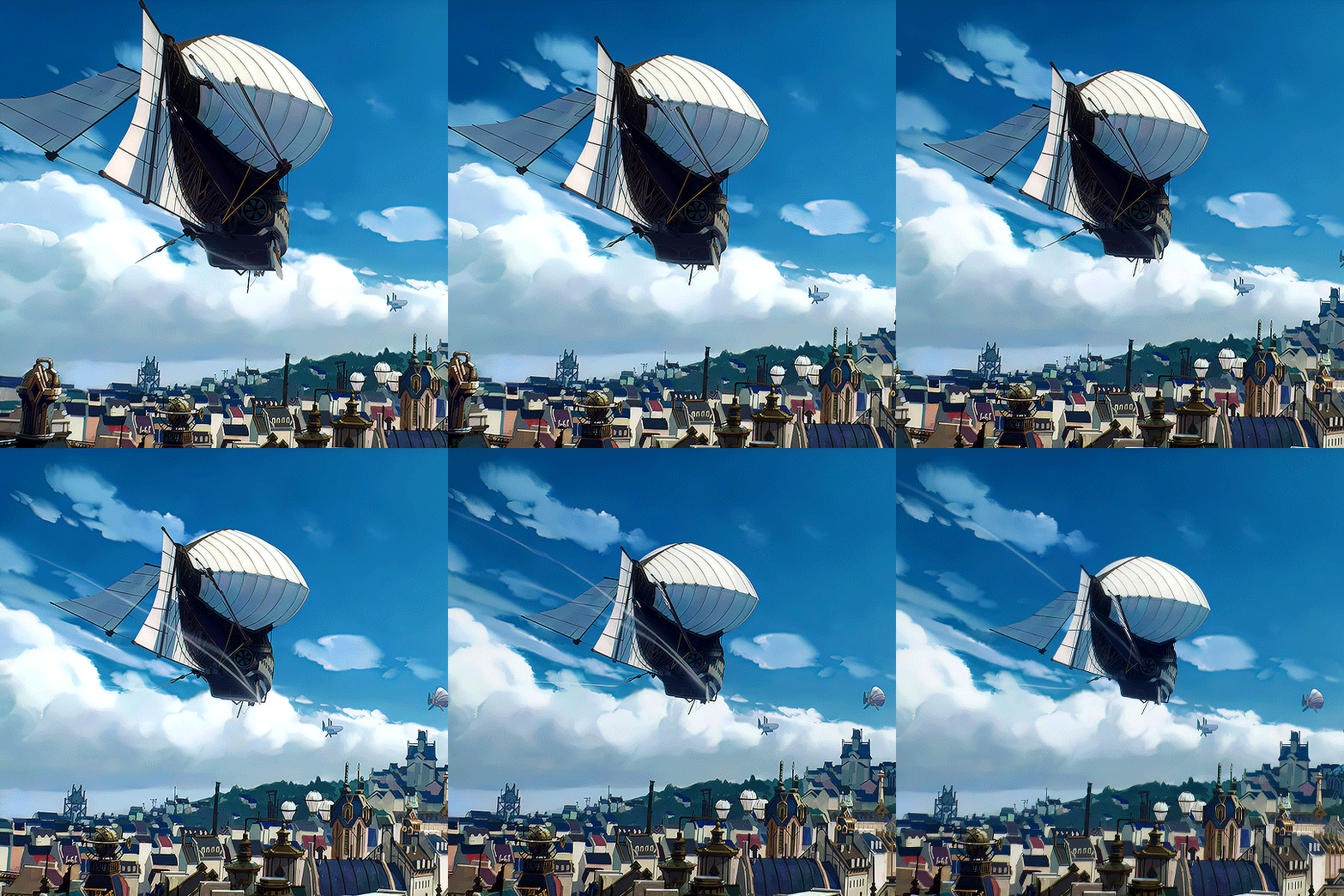
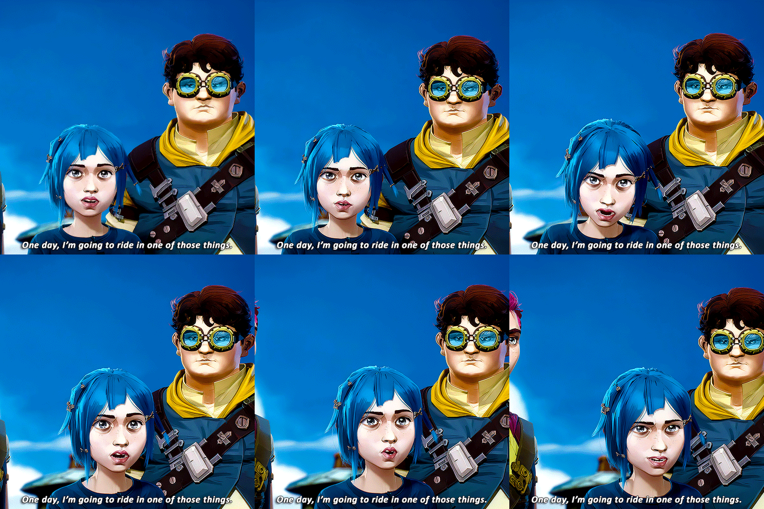

ARCANE LEAGUE OF LEGENDS S1EP1 ↔ S2EP9 (2021-2024) ↳ "I think the cycle only ends when you find the will to walk away."
#she walked away..... so that vi could move on.... gah my heart#one quick gifset this morning.... i'll see if i can make more tonight i need to rest#arcane#arcaneedit#arcane parallels#arcane league of legends#arcane season 2 spoilers#arcane season 2#arcane s2#jinx#jinx arcane#arcane jinx#powder#powder arcane#arcane powder#arcane season 2 ending#type: gif#media: arcane#s2 ep9#s1 ep1
9K notes
·
View notes
Text


The bigger they are the harder they fall 🥹🐟
#halsin#clover#bg3#cloverhoney#baldursgate 3#myart#there's a conversation going on twitter rn about the specific types of garbage Clover has eaten#and how Halsin starts tagging along on Clover's morning forages and is by turns charmed and deeply disturbed#also he's 1 willpower point away from just picking him up in his mouth
12K notes
·
View notes
Text
tim: ugh, i can’t go into the sewers to follow croc, can’t risk an infection
jason: what, are the sewers not good enough for your bristol bred sensibilities?
tim: i have no fucking spleen jason, of course i’m not gonna go into the fucking sewers - i’ll literally die
#tim seems like the type of guy to randomly drop lore about himself then walk away.#dc#robin#tim drake#red robin#jason todd#red hood#batfam#batman#bat bros#tim drakes missing spleen
10K notes
·
View notes
Note
pls pls heard me out...FIDDLESTAN! <3
ok, i got this ask ten days ago, and I've been thinking about it ever since. Because I got two other asks asking for fiddauthor, and I dON'T KNOW HOW TO LET THEM DOWN LIGHTLY BECAUSE I'M A FIDDLESTAN BITCH THROUGH AND THROUGH 😭😭😭😭 I LOVE THEM SO MUCH!!!!!!
Don't get me wrong, fiddauthor is great and makes sense and everything. But listen. Billford and fiddauthor are multidimensional ships, they are good! But FIDDLESTAN!?!? that shit is the WHAT-THE-HECK-A-HEDRON!!!!!!! Even though it's literally 100% speculation, the implications are FUCKING CRAZY!!!!!!!!! I jumped between three ships so far during this gravity falls thing, each time thinking one is better than the other. I've decided that FIDDLESTAN IS KING!!!!!! I'm sorry. I could rant about them forever. I've been listening to nothing but extended versions of disco music for the past week. (YES THEY HAD A CRAZY ROMANTIC FLING IN VEGAS NO I WILL NOT ELABORATE!!!! (yes i will. I will elaborate at some point. it will be like ten pages or text. or I will draw it. idk.))
Here is a sketchbook doodle from like a week ago. I'm gonna post another fiddlestan thing in a few moments, but my style changes like I'm a completely different artist every week without warning, so I'm gonna leave this by itself!

He comes into YOUR house, he steals YOUR identity, and he fucks YOUR research partner!!! Fuck you!!!!!!!!!!
#i've noticed lately#after we've opened our eyes to some of fords assholeyness#some people are like 'hold on guys i think were being a little too hard on ford 🥺'#NO WE ARE NOT!!!!!!!!!!!#I hail from the iz fandom where everyone knows dib is fucking awful#and we LOVE him for it!!!!#will NOT shy away from admitting how terrible he is - it's why we love him!!!!!#ok enough rant#me typing on tumblr about this shit is like opening pandoras box#gonna close that up now for everyones safety#fiddlestan#gravity falls#stan x fiddleford#gravity falls fanart#ask#answered#anon#sketchbook
4K notes
·
View notes
Text
ghost getting himself a cute, soft girl he doesn't talk about much but is clearly obsessed with and price just thinks it's nice he's finally settled down, approves of the home he's made for himself, definitely approves of the one he's taken for himself.
soap asks kyle if he's seen you and he says, "yep. lovely bird he's got tucked away in her little dollhouse. makes great food, too." soap swears there's a subtle shift in his tone when he says "lovely", a hint of something deeper that flickers in his eyes for just a moment. soap simply sucks on his teeth, letting it slide. (although he knows that kyle's always been one to appreciate the good things in life.)
interest gnaws at him, a persistent itch he can't scratch. price likes you just fine, as does kyle. well what about him? he decides to bite the bullet and goes to simon with a knot between his brows, the corners of his lips tugged downwards. they've shared clothes, bullets, beds. if the other two got to meet you, why can't he?
"ya can come over for dinner on tonight. she'd 'ave my neck if she didn't formally meet ya anyway."
soap then asks, out of genuine curiosity more than anything else, if simon would have kept you in the dark from him hadn't he brought you up himself.
"ya meet 'er when i want ya to, boy, and not a moment before." the tone he takes is unmistakeable. his words are a command, not a suggestion, and soap instantly knows to not push further.
soap nods. "ah'll be there."
"course ya will. she'd be terribly disappointed otherwise."
yeah, he'd hate to have that.
soap sits in the living room, the soft glow of the lamp casting a warm light over the cozy place. with a full stomach and an unfastened belt, nursing a glass of kentucky. he can't remember the last time he ate that well or that much.
maybe it's the alcohol that loosens his tongue, or the fact that he wishes he also had a sweet little thing to keep at his side just like simon's doing with you now, but the thoughts he's been mulling over all evening since he first saw you tumble out of his mouth.
"while ah can attest to yer taste in sweethearts, can't say much about your alcohol. bourbon, LT?" he says, chest warm.
simon's arm tightens around your hips, fingers splayed possessively over your thigh. he shrugs, completely unbothered by the backhanded compliment. "can't be perfect in everythin', can we, sergeant?"
soap's cheeks burn furiously hot when you come to his defense with a smack of your palm onto simon's chest. "be nice to johnny. he's got a face that make up for some of his other flaws."
the teasing lilt in your voice unashamedly gets his southern blood pumping. he can't help it if certain things stir when someone as pretty as you look at him like that. soap swirls the amber liquid gently in the glass while keeping his limpid eyes on you, not even trying to hide the fact that his gaze hasn't wavered since your cheeky little comment.
you then whisper something in simon's ear, your cupped hand not even half the size of his head and soap has to rearrange himself from the outside when your teeth catch your bottom lip. simon looks up at you then, eyes heavy and half lidded, and a smirk plays at the corners of his mouth.
"'m not sure, love. you'll just 'ave to ask 'im yourself. go on."
you open that sweet mouth of yours, but simon cuts you off with a decisive wave of his hand. "no. you know how to ask for things."
your reaction to that is visceral, and you're on your knees faster than his alcohol-muddled brain can comprehend. don't look down 'er shirt, don't look down 'er shirt, don't-
"johnny, will you touch my pussy?"
he splutters at your question, completely taken aback, but it seems you're not done just yet.
"hands to yourself, sergeant. tha' not all."
you pout at simon, one that earns you a look that promises consequence, but do as he says.
"will you touch my pussy, johnny? pretty please?"
#this got away from me sorry yall!!!#yeah i had so debated having ghost be like nope pricentaught ya better than that but#simon seems the type to get things done on the first time#either you learn or your arsecheeks learn#something will give soon enough#price says he's coming back for seconds tomorrow#kyle gets his on saturday#all for one strikes AGAIN i'm afraid#simon ghost riley x you#simon ghost riley x reader#x f!reader#simon ghost riley#simon riley x reader#simon riley x you#soaps shaken after in the group chat like yall uh yall got dessert too or-#simon ghost riley smut
4K notes
·
View notes
Text
Im saying this not as an opinion but as a matter of fact that hades should have never been the default villain in modern greek myths retellings,becuz dionysus had been always a better fit by leagues & i feel like writers/artists both overlook & underestimate him.Like the fucker wasnt just a silly drunk god,his whole domain tethered on the thin line between ecstasy and madness,embodying both chaos & pleasure. All of these qualities historically had made him simultaneously adored & feared within & outside of his fanatical cult,& circling back to the madness part,idk if yk this but dionysus have this lil tale in wich he caused his followers to go drunk w/ frenzy at a party they literally ripped apart the son of hypnos, i repeat hes so powerful he made a buncha humans kill A GOD! & he didnt face any repercussions fr that!!!
Now ik im skipping on other infos but all of this sounds to me that dionysus is perfect fr the charming & sinister mastermind trope

#dionysus seems like the type of charac that will do some fucked up shit & vet away w/ it#using his laidback partying personna#or he just wont be suspected at all#text.post#text.txt#greek mythology#greek gods#dionysus#story prompt#story ideas#funny#character study
5K notes
·
View notes
Text

ride the carousel!
#HES SOOOOOO CUTE CUTE CUTE!!!!! THE CUTEST PATOOTEST!!!!#i love drawing silver on trinkety objects. snow globes music boxes carousels ougghh i want him little and tiny in a big magical world. sigh#my brain chemistry goes NUTS for that type stuff its my favorite. its the customization the way they can be decorated for the char#SIGHS LOVINGLY. anyways. the bat and crocodile seats apparently do exist on some carosels! YAY! i ref'd them theyre so cyute#also wanted to give some simple riso vibes here#they go SO HARD!!!! robin owns a riso machine#id love to learn how to design for more elaborate ones someday i think itd be rly cool#twstファンアート#twst#twisted wonderland#twst silver#do the seats count. i dont quite think id get away w that here#suntails
2K notes
·
View notes
Text
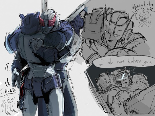
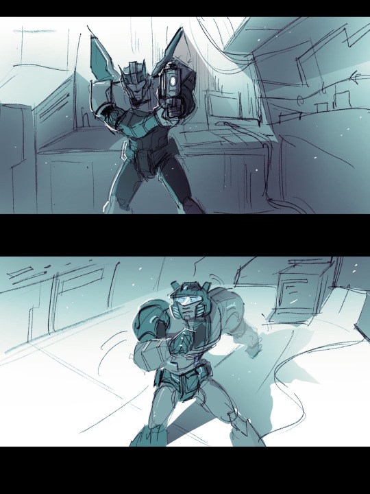
THIS FUCKING MOMENT
#maccadam#transformers#prowl#jazz#jazzprowl#momu fanart#fic fanart#LISTEN#L I S T E N#Prowl pretending to reach for a hug and Jazz immediately reaching back??#aaauuuuhhhhhhhh#the fact that Prowl hugs him and uses this peaceful little moment to snatch away the gun???#gun? Blaster? whatever you know what I mean#and listen#the fact that Jazz considered fighting Prowl for this blaster#like#correct me if I’m wrong#but I fully fucking believe that Jazz could easily just disarm Prowl there#I saw what he’s capable of#He can pull so many types of crazy shit#And Prowl is in desperate need of rest#Jazz could destroy him no problem but he chose not to#I#hmmmh
2K notes
·
View notes
Text


In the world of heavy metals, love is denser than hate!
#Poorly drawn SVSSS#SVSSS#luo bingge#luo binghe#ask#Is that right? Two different character tags? I think that is right.#I'm calling myself out with screenshotting the asks with the dates because my full ask box has become a problem I'm determined to solve.#I promise you that if I did not respond to your ask it was because I 1) *really* wanted to hold on to it to make a doodle reply#or 2) really was so touched by the message and got overwhelmed#So expect many year + old asks suddenly gaining a reappearance! I'm going to get to them ALL.#Back to Luo Binghe (both versions). You see...the substance he is made with has a chemical reaction to affection.#Like how a pokemon has multiple paths to evolution depending on it's friendship points or exposure to random stones#so to does he evolve into various forms. I feel like Bingge (Ht) would be a noble gas. Unable to form bonds#I could also see him as a Halogen-type of element! Highly reactive and only truly found in manufactured environments.#And Binghe (Lv) would be an alkaline earth metal (+2). Sturdy. Forms bond better but not freely giving them away.#this is the second time I've related characters to elements - and I am far less familar with Scum Villian so please feel free to chime in.#I could be way off base here and I am very down for someone to talk chemistry and character themes.#Thank you all for the love you have given my silly little LBH. It means a lot to me B*)#Don't...don't look too hard at the lack of mark on his forehead here. I gave up. It's just...hidden behind his bangs.
963 notes
·
View notes
Text
there's something about characters who never show any vulnerabilities, any gaps, any weaknesses, any exhaustion, being shown sleeping. there's just SOMETHING about it
#sprouts log#DO U KNOW WHAT I MEAN#this goes for so many character types too btw#when someone with an indomitable spirit who's always strong because they *have* to always be strong is shown finally resting#or a character who works harder than anyone falls asleep in the middle of their work (whether that's at their desk or mid-training etc.)#or when you get a peek of an OP badass character who's always on their guard sleeping...#when a character hides themselves away to rest where no one can see them........ 😭😭😭#it just feels SACRED bro#anyway. ummmm#this post is about yoichi hiruma from the sleeper hit football manga eyeshield 21 being shown collapsing onto a bed#without ever showing his teammates a single moment of weakness or tiredness up til that point.#and u suddenly realize. oh. he IS human. and he acts the way he does for a reason.#SO MUCH CHARACTER DEPTH IS REVEALED IN A SINGLE FRAME. LIKE WHAT#that moment has literally stuck with me for over a decade
691 notes
·
View notes
Text

I fear my hands may always be stained red
#do you guys remember the sketch to this painting#I made it April of 2023#ngl I was crying my eyeballs out when I drew it the headspace was not so great 💀#anyway I finally defeated the final boss and completed it#it’s the “i forgave you the moment you drew your sword on me’’ type beat#the “’ill take care of you’’#‘’ it’s rotten work’’#‘’not to me. not if it’s you”’’#type feel#the fact that diluc literally has red on the palms of his gloves#oh Jesus Christ#I rly wanted to convey the body language in this piece#I do hc kaeya to be taller than diluc but the way it happened diluc is bending down a bit to receive the hug#adds a bit of Sad#and the looking away despite not even being able to look at kaeya#the vulnerability and resignation#anyway#bye#diluc#Kaeya#ragbros#genshin impact
1K notes
·
View notes
Text


ARCANE LEAGUE OF LEGENDS: 2x05 - “Blisters and Bedrock” ↳ “If he found this, everything might have been different.”
#GAH THAT HAND.... where is vi is reaching for her..... but she changes her mind and detracts and moves away UGHHHHHHHHHH#arcane#arcaneedit#jinx and vi#vi and jinx#jinx#jinx arcane#arcane jinx#arcane league of legends#league of legends arcane#league of legends#media: arcane#type: gif#s2 ep5#arcane season 2#arcane s2
1K notes
·
View notes
Text
cw: john price x f!reader - older man/younger woman; 18+
john makes you feel beautiful. he dotes on you like you are his doll, splurging everything he’s got until you’re all spoiled.
“m’gonna be y’r rotten girl,” you told to him once, giggling, and john had just hummed as he gathered you in his arms, pulling you up until you’re both chest to chest. he breathed you in, his scruff tickling your jaw, his hands finding purchase along the pudge of your waist.
“i’d love you either way, baby,” john said like his words just didn’t lay waste on you.
you nodded, quiet and shy, your cheeks thrumming with warmth, and john kissed your silence away, murmuring nothings about how he could not wait to dress you up, to see you in his gifts, to fly you to spain and show you how a pretty girl should be cherished. you laughed it up, nodding to indulge him, but john always went through with his word and you found yourself in the next flight to ibiza.
it was exhilarating.
no one has ever done so much for you; no one thought you’re worth more than a 50/50 split dinner that you barely even enjoy or a quickie in a dingy parking lot because apparently a hotel was too much for a ‘casual thing.’
and sure you know you are worth more than those sucky dates, but your roster never changed and it’s like—
if they don’t like you enough, then… are you?
then john came and just. well, fuck — you know?
he’s ruined you for everyone else. he’s ruined you for anything that isn’t himself. john filled you up with fulfilled promises and went above that because he made you his sole point of focus. his priority. because somehow, you triumph over everything.
every of your whispered pleas, every quiet calls, every crooked requests — john always answered them. you are never too much for me, he said. nothing goes before you.
and who is strong enough to not fall for that? no one.
john loves vividly, and he loves you with such vastness it’s incomprehensible. john loves like this, whatever this is, was an organic sort of love; like it did not start with a messy hookup with a friend of a friend of a friend’s… dad.
(but there was something dizzying about the way your bodies clicked. how when john, apparently the mr. price, sank to his knees and flipped your skirt up, something just slotted into place.
it felt right to be there in his master’s bathroom, grasping at the hems of your skirt with shaky hands and watching on with tears in your eyes as he sucked on your clit and laid his tongue flat along your slit. it felt right to be there as he held your hips, thick fingers digging into your fat, and felt him grunting into your flesh, muffled praises slipping from his slick-sheened lips drunkenly. it felt right to beg for his fingers; to beg for more.
and god, it felt good.
so good, you were all numb in the brain, muscles shaking, satiation rolling off of you in heaps.
“shit, baby,” john murmured, cupping your jaw. “you’re so perfect.”
“mmrf?” you grunted, still nonverbal as your body caught up with the tidal waves of pleasure punched out of you.
he laughed, so soft and quiet. “yeah, you are.” he bent forward and pressed a kiss on your forehead. “might just keep you.”
he didn’t sound playful when he said this. he sounded certain, and it filled your heart up with giddiness because—
“please.”
john cooed and snuggled up beside you, pressing his bulk on your back and pulling you impossibly closer. not letting go.
not after that. not anymore.)
#john price x reader#john price#captain john price x reader#giggles and kicks my feet and runs away#oh john price you will always be special to me <3#suns#x reader#this was supposed to be out a while ago but i passed out mid-typing </3
679 notes
·
View notes
Text
tim: nah man, i stay away from drugs, last time i touched that stuff i killed someone
jason: you… killed someone?
tim: i mean, she was resuscitated after and definitely set it up so i would kill her (i think), but you know it’s the principle of the matter right?
jason: that’s an original experience i fear
#tim seems like the type of guy to randomly drop lore about himself then walk away.#we need to talk about how tim killed lady shiva more often#it was so badass#but also showed a lot about himself when he became upset afterwards#dc#robin#tim drake#red robin#jason todd#red hood#batman#batfam#bruce wayne#lady shiva#sandra woosan
5K notes
·
View notes