#this is kinda a redesign or her?? I have a redesign already but I kinda wanna redesign that redesign lolz
Explore tagged Tumblr posts
Text
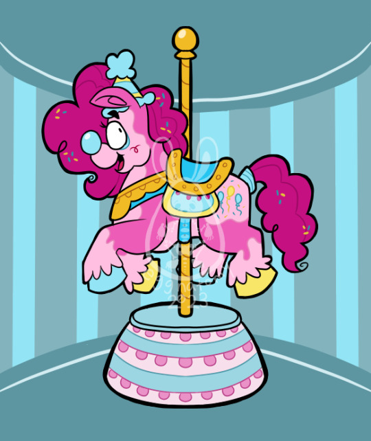
Clown month day 3: merry go round :•)
Ermmm oops it’s not the third day of this month anymore lolz, got sleepy, and my ideas weren’t turning up, so methinks some days may go out of order?? Idk, we’ll see!! Here pinkie pie, best horse 👍👍👍👍👍👍👍👍👍👍👍👍👍👍👍👍👍👍👍👍👍👍👍👍👍👍👍👍👍👍👍👍👍👍👍👍👍👍👍👍👍
#clown#clownblr#clowns#clowncore#clown month 2023#mlp fim#mlp#my little pony#my little pony friendship is magic#pinkie pie#she’s just so sillay#this is kinda a redesign or her?? I have a redesign already but I kinda wanna redesign that redesign lolz#in my fantasy land she’d be a pegasus cuz I think yellow and blue wings sounds cute :•)#I think I didn’t do well on some of the colors here#but I’m glad with pinkie herself looking like this :•)
35 notes
·
View notes
Text
Tempted to do redesigns for fun, but for what im not explaining NSNANXN
#side note#I have a few in mind actually not the current one on top of the list#I tried doing Strawberry shortcake redesigns#kinda wanna redo them (I've only posted strawberry but I had others jdskndjs)#i made her look way better after the drawing and i dont like the original redesign i did anymore JDKSJXND#uhhhh#ok maybe ill yap a little just a small bit#a certain someone has got me looking at hazbin content again#and like-#doing a lucifer redesign we be fun#i like his design already#but like#A WAY I DO IT WOULD BE FUN#uhhhhhh#I also think doing redesigns of other things I like would be cool#like maybe even madoka#love madoka magica tho how can I top that I cant#redesign my own characters need to be done too lmao#Still need to finish Herb aka Nero's love interest lmao#and redesign my oc girl band#so much to do#gotta finish art fight first#also I got class in the morning (its 2am)
3 notes
·
View notes
Text
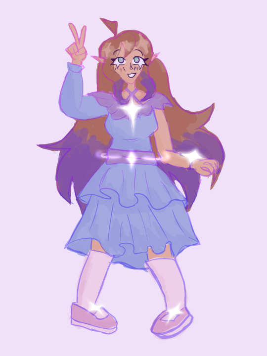
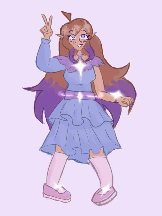
my first drawing in Clip Studio Paint!! I'm still figuring out all tools but it's so satisfying to use :3
#might have gone a lil crazy with the sparkles hehe im still working on her redesign (the old version was one with a more kimono-like dress)#kinda neutral about this one but I think he looks cute :3#also I used the bi flag colors as lineart in the first one cuz shes my favorite bisexual disaster <3#art#my art#clip studio paint#tdtwr#violet#violet evermore#not very sure about her surname either because theres already a violet EVERgarden 😭😭#the day the world restarted#we stay silly :3
3 notes
·
View notes
Text


Hey yall im not dead!
COSMIX!!! I've officially redesigned all the transformations in the Winx Club TV series hell yeah
Lore and Design notes below
So Cosmix is a rather defunct transformation in the modern era. It used to be used heavily in the age of space exploration but since teleportation and hyper speed ships became common place, the Magix dimension prefers to use those. Essentially, in order to set up a teleportation center, the caster/s need to have been to both the origin point and the target point. Witches and Mages were the primary people responsible for setting up the teleportation system, but in order to achieve the spells requirements, they would require help from a Cosmix fairy. The primary function of Cosmix is the ability to fly through space with out detrimental effects. Cosmix fairies can take 1, maybe 2, people with them while they fly in a shooting star esc trail function. Cosmix is not great for fighting unless the foe is darkness/light based. Defense is strong against cold, pressure, and friction, but not most other kinds of damage.
Cosmix is also theorized to be the Magix Dimension's version of the elementix. So like Sirenix is the transformation that grants access to the Infinite ocean, Cosmix is the one that would grant access to the Magix Dimension if fairies were in the other realms. Because humans already belong to the Magix Dimension, and the transformation isn't required to earn Nymphix, it isn't considered a true Elementix. Some fairies (mostly Solarians) do experience biological changes when using the transformation, seen here in Stella, but it's not super common. The hair takes on the magic color and drifts into nebulous star dust and galaxy clusters. Solarians are located closest to Lumenia, a tightly clustered star formation, and frequent attract Lumens due to Solaria's binary star system. They have formed fast friendships with the Lumens and many Solarians carry a Lumen's Blessing (it's similar to the elemental companions' bonds in the elementix) in their bloodline which contributes to the biological changes when using Cosmix.
I'm still hammering out how seaosn 8 works plot wise but I'll add it to my show changes masterlist eventually.
Design! The initial concept was "man i wanna draw some chunky ass boots" and i kinda ran with the cyber punk look from there. I was also adamant that Cosmix is a pants transformation, both out of practicality and spite because they made everyone so hyper feminine in season 8. I referenced the actual cosmix designs and their "space travel" oufits for the general shapes for these, but obviously there aren't a ton of similarities since I went in such a different direction haha. Also my first time drawing Aisha with twists! I almost gave her a fro cus it would mimic an astronaut's helmet (and lowkey a nod to Garnet from steven universe) but i like how the twists came out haha
Cosmix includes! Hair up and out of the way, a mesh base layer with light veins and stars, a body suit or shorts and top, a padded armor torso piece with some tubing ports, so many buckles and straps, a clear plastic portion(usually part of the torso peice, sleeves, or around the waist/hips), wrist/arm guards, and chunky chunky boots. The wings are also larger than most transformations (rivaling Butterflix/Faunix) and trail more of the fairy's magic color than usual. Simple geometric designs are standard.
#winx#winx club#winx bloom#winx aisha#winx flora#winx stella#winx musa#winx tecna#cosmix#winx cosmix#winxems#these took ages i have been working on them for several months cus i was so burnt out from finishing school#oh lmao also i graduated i guess wooooo#winx fanart
533 notes
·
View notes
Text
Even more and more of obvious shit I point out because I want an excuse to rant while not interacting with actual people in real life who also like this show because I'm masking 😍💜💜
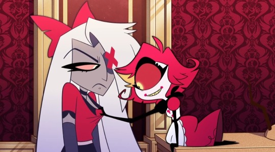
BARELY STARTED AND BRO. YOU JUST LET HER DO THAT TO YOU, ME PERSONALLY-
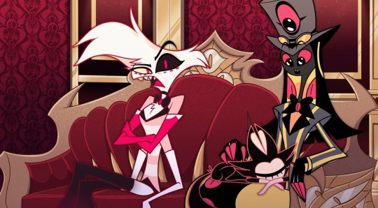
HE'S PETTING KEE-KEE I LOVE HIM SMM
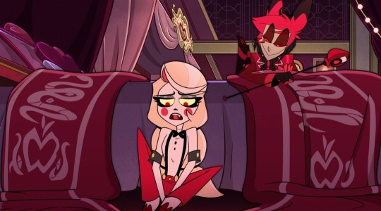
HER HOOVES. I LOVE IT. NOT LIKE THAT, IM JUST A FURRY-
*grabs pen*
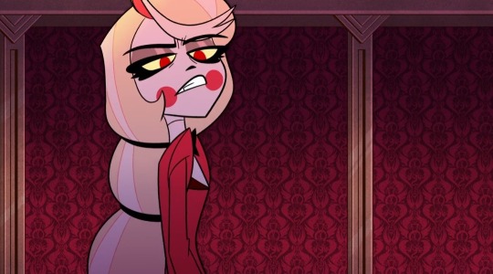
ANGRY CHARLIE FOR THE WIN. I LOVE WHEN THE HAPPY CHARACTER GETS ANGSTY (Cough. Luz. Cough).
The people writing fanfics where she gets FURIOUS. Omg. That was something I read. I LOVE MY FELLOW FANFIC WRITERS BUT OH MY- YALL REALLY HAD CHARLIE M A D.

"Uh-"
I love his reaction lmao look at his goofy face.
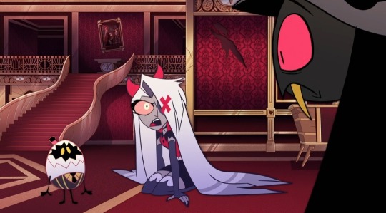
HER BOW BECAME HORNS (my "redesign" is now 100% worse)
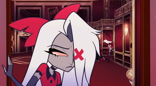
SAD VAGGIE. THE BOW. DROOPY.
Oh and the angel dust fellow back there 🤯
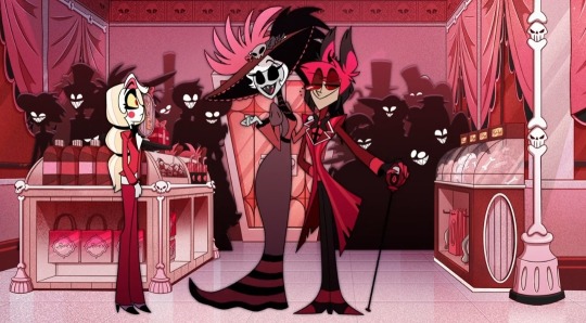
I LOVE ROSIE SO MUCH HUH
Tall.
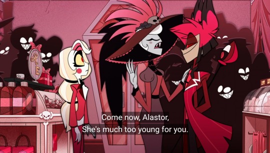
No explanation needed. <3
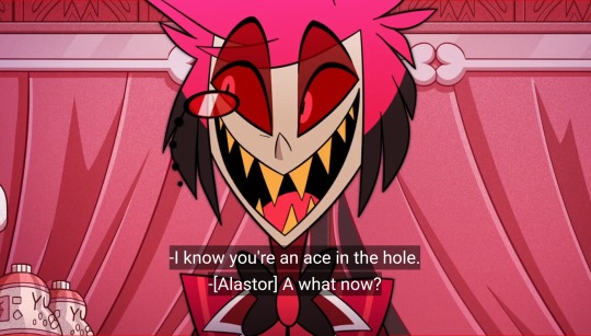
PLEASE HELP???
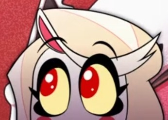
CUTIE PATOOTIE. I LOVE HER SM UGGHHH
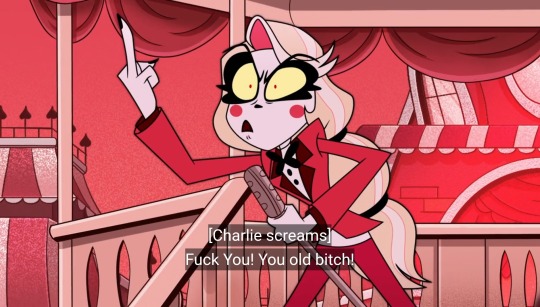
CHARLIE HATES OLD PEOPLE COMFIRMED YAY 😍😍💅💅
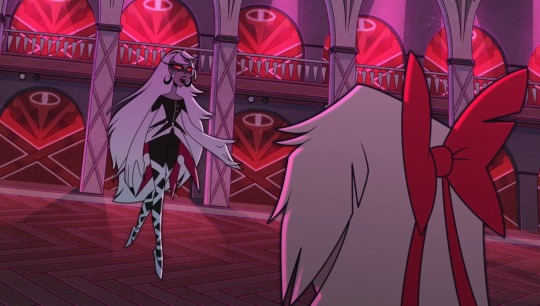
Hot
That's it.
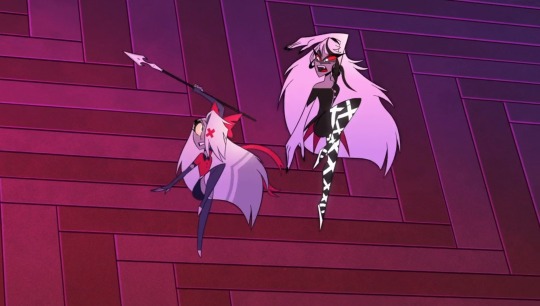
IN SYNC. I LOVE THIS SONG AND THE ENTIRE SCENE. WHY IS IT RANKED SO LOW WITH SOME OF YALL?? Okay well-
I thought this song was gonna be a Charlie and Vaggie duet- tbh I still preferred that BUT I LOVE CARMILLA SO I KINDA DONT CARE.
BUT I WAS ROBBED OF AN ACTUAL FULL CHAGGIE DUET (REPRISE DOESNT COUNT) IF H*SKERDUST GETS A FULL ONE WHY CAN'T CHAGGIE? *SOB* uhh anyway-
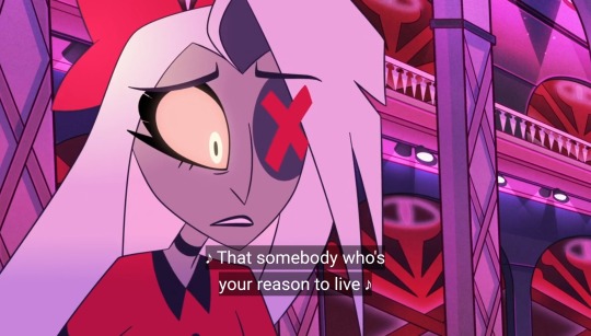
Is that. Like. How she thinks actually 😰
I know there's been a lot of the lack of Vaggie's self-worth, which I wish was explored into more. I just think the Vaggie(3rd) episode just wasn't needed at all if it didn't even have an impact. Don't get me started on that episode, it was rushed, too early to have character arcs already, and overall not needed or even should have existed periodt.
I hope they explore it next season because GOD this woman needs TO LOVE HERSELF. OR ATLEAST CARE ABOUT HERSELF LIKE????
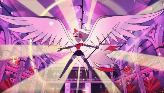
SWEET MAMA PLEASE. TAKE ME IN YOUR WINGS AAAAAAAAA
Charlie, sharing is caring <3
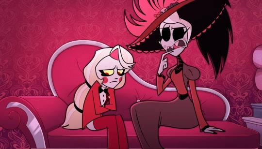
Out of all the people I thought Charlie would vent to I didn't think it would be ROSIE. It's a nice surprise tho I love her <3
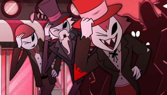
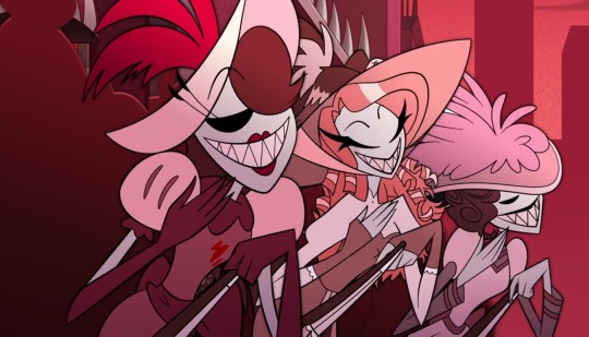
bisexuality.
That's it.
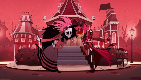
HE'S DANCING. ALASTOR IS DANCING. THEY ARE SLAYING BESTIES. THE MAN IS DANCING. HELP.
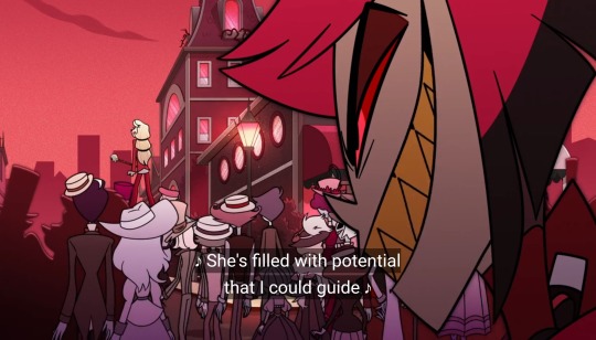
Season 2 is going to be Charlie in her villain era and Alastor's reputation era 😍
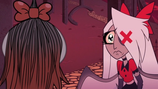
I LOVE VAGGIE'S FACE. PRECIOUS BABY UGHH... THEN THE WINGS REPLACE THE BOW AND DROOP UGGHH I HOPE IN SEASON 2 WE SEE MORE OF HER WINGS. OR CUT HER HAIR SHORT SO WE CAN HAVE IT ALL THE TIME. Also so Husk and Vaggie can bond over both having wings. Sorry I love their potential friendship so much. AND LUCIFER AND VAGGIE TOO!! BOTH BEING FALLEN ANGELS OMG. UGH THE POTENTIAL OF VAGGIE'S RELATIONSHIPS WITH NOT JUST CHARLIE ARE SO GOOD AND I HAVE BEEN ROBBED OF SEEING HER AS AN ACTUALLY MORE FLESHED OUT CHARACTER. I AM SCREAMING AAAAAAAA.
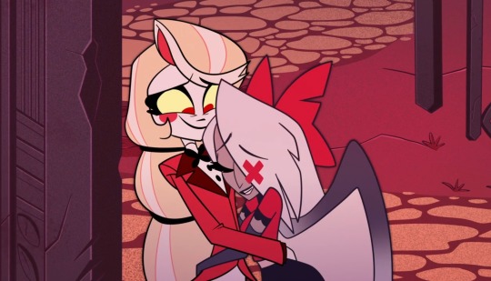
I can't say how much I love them. It's too much. I cant- yay the teaser image before the show came out <3 they are so fucking adorable. UGH SOME1 END ME
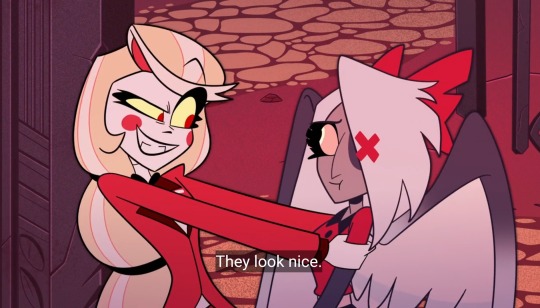
Charlie loves the wings hehehe. Vaggie looks nervous about it. It's probably a reminder to her about when she used to be an exterminator. The healing from everything will take a long time but hopefully Charlie will be there for her the entire time. And vice versa
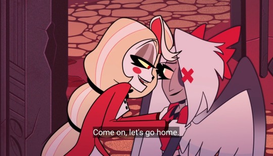
Ayo- 😰
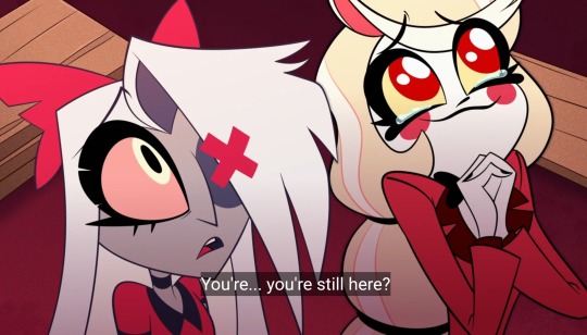
CHARLIE. T H E PRECIOUS BABY.
Uh next one tomorrow cuz yeah 🤯
#hazbin hotel charlie#hazbin hotel vaggie#hazbin charlie#hazbin vaggie#hazbin hotel#hazbin hotel sir pentious#hazbin angel dust#hazbin hotel husk#hazbin hotel angel dust#hazbin hotel alastor#hazbin hotel niffty#chaggie#rainbowmoth#varlie#vaggie x charlie#charlie x vaggie#charlie morningstar#vaggatha
1K notes
·
View notes
Text
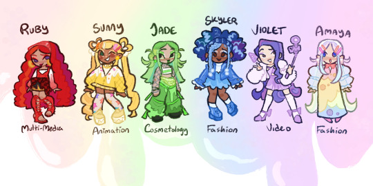
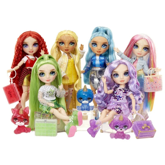
itty bitty slime girls redesign
-didn't change much on Ruby, I don't have any strong opinions on her look tbh, kinda miss her silly hat but i thought it was a fun opportunity to give her a clear plastic headband
-Sunny :) She's perfect already tbh I just wanted to give her an ice cream sweater
-I love Jade but there's something i just do not like about the one. Like give her her baggy pants back :/
-Skyler, idk I just thought it'd be fun to try and make her hair kinda cloud like, and the front braids are meant to look like rain. I thought it was cute.
-Violet's at her best when they're trying to make her look like Rarity from mlp. And I'll stand by that.
-Idk how well this design would translate to a doll but idc tbh i just hate her doll form so much, I want to think she's pretty so bad, she literally has pink hair but shes just.... and her Makeup is.... ugh
we've gotten teasers for Poppy and Bella's show designs, should I draw them too 🤔 ?
#rainbow high#rainbow world#my art#fanart#idk how noticeable it is but i tried to make them more rainbowy too#so they each got like extra colors mixed into their hair#i wanted it to be subtle#but i also think rainbow world was a missed chance for them to try and pull a rainbow rocks tbh
729 notes
·
View notes
Text
hazbin hotel redesigns wooooooooo
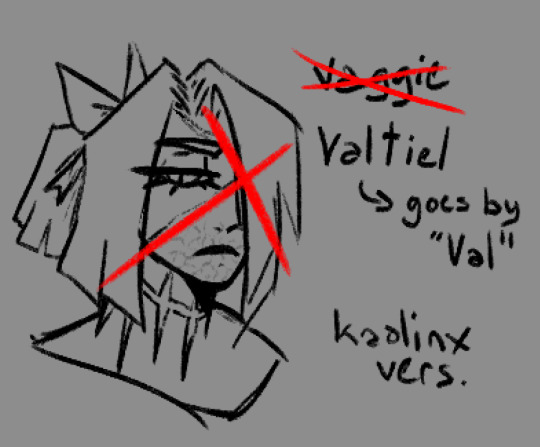
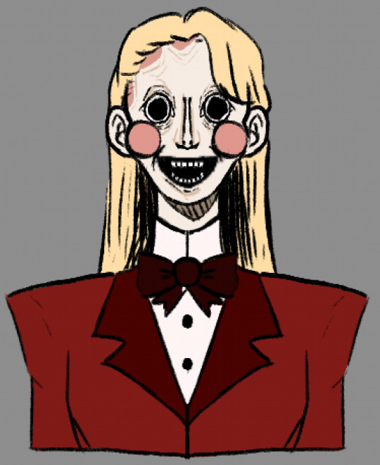
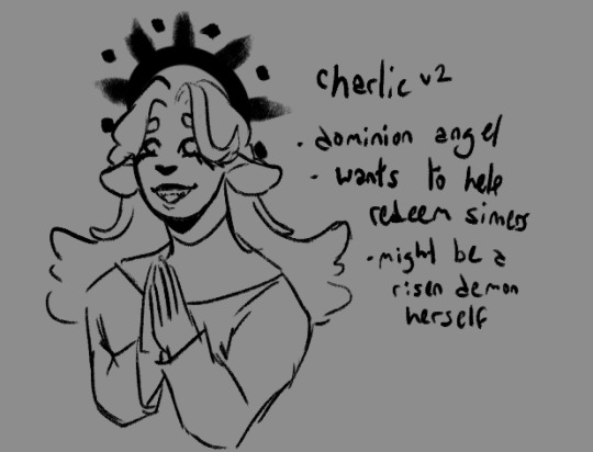
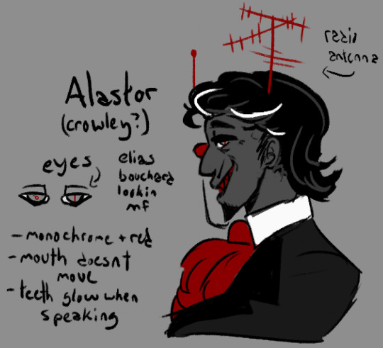
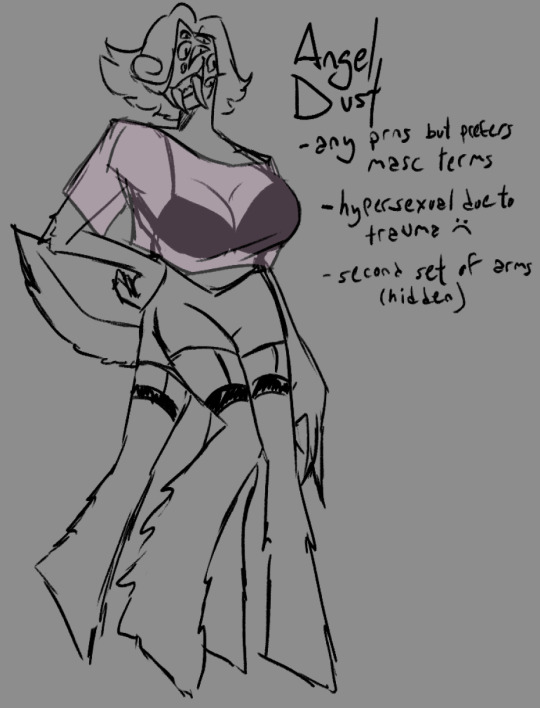
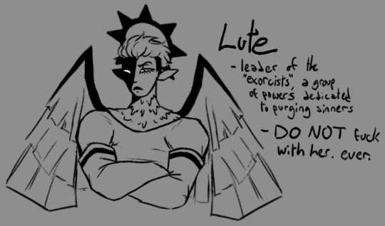
okay so. i'm gonna discuss my thoughts about them n shit, putting under a readmore bc it's gonna get long and rambley. sorry in advance for the shit formatting, i'm on mobile </3
just some general shit about how i would rewrite it. i think the premise of redeeming sinners is entertaining but is executed horribly. i also am a fan of the "heaven isn't great either" idea but again, executed horribly. i'd make the hierarchy of angels more accurate because it's cool as hell and i have autism about it. the characters from hell would swear still (albeit not as much), but the angels would outright refuse to swear or make vulgar jokes ever. this would be partially to further the gap between heaven and hell and make the differences more stark.
hell would also be more like dante's inferno (again because i think its cool). the ars goetia would get a full redesign and would be more prevalent in demonic society.
now for the characters!
---
VAGGIE VALTIEL:
starting off with vaggie, or Valtiel as i've renamed her because let's be honest her original name sucks. Valtiel (Val for short) was an aspiring power angel who wanted to be an exorcist. she looked up to lute and thought the idea of killing demons was really cool and badass. however when she actually was on the field for the first time she discovered how awful this actually was. she tried to help a few demons but lute figured it out and felled her right then and there. the rest of her story is relatively the same. personality wise she's more stoic and less prone to all-out aggression. she still get angry, sure, but it's in a quieter and more menacing way. you DO NOT want to fuck with Valtiel.
CHARLIE:
next up is charlie! i had two ideas for her. the first one (unsettling drawing) has her as a mannequin/doll type demon. lucifer and/or lilith was unable to conceive and as such they built a kid from scratch. she's overall similar to og charlie personality wise, very kind and cheerful despite her unsettling appearance. she struggles with empathy sometimes but really does mean well. her motive for rehabilitating sinners is so they get to see their family again. being able to see heaven from where they are in hell must make them sad, so she wants to help make them happy again!
the second idea for charlie has her as an angel. specifically i casted her as a dominion angel due to their reputation as holy judges. she was once a demon but has been rehabilitated and has risen into angelhood! she now wants to help her former kin do the same and redeem themselves in heaven's gaze. again, similar cheery personality, but a bit more prudish in this rendition
tangent time!
as a side tangent, valtiel and charlie would have a different relationship in this rewrite. their relationship felt shoehorned in in the original show, like it was just there for the hell of it. we didn't see much development between them and it just felt kinda bland. so in my rewrite, charlie and valtiel are amiable exes. they tried dating when valtiel first fell (when charlie was still a demon in the charlie-angel version) but realized their feelings for each other were much more platonic than romantic. they ended things off on good terms, deciding they were much better as friends. they are still besties to this day! later charlie ends up with emily (or 'ellie' as i plan to rename her)
back to the characters
Alastor:
note: i made alastor mixed-race, which could be seen as bad by some due to vivzie saying he's black. however, as many have pointed out, he has no ethnic features whatsoever and i honestly wouldn't be surprised if she said that just to get away with using voodoo symbols (a closed religion) in his imagery/design. like viv, i am incredibly white and have little to no knowledge of voodoo, and even if i did i would not use it for something like this anyways due to the stigma the religion already has and (again) it being a closed practice. as such i removed it from his concept altogether, but made him mixed race (white passing) because.. why not i guess, i forgor my actual reasoning
with that being said...
alastor is by far my favorite of the redesigns and i'm honestly tempted to turn him into a legally distinct oc. i imagine he's somewhat reserved, along the lines of norman bates albeit a bit more extroverted. during his life he was a serial killer with a day job as a radio announcer. he took pleasure in reporting about his own murders on the radio, but that is eventually what got him caught (ie accidentally letting slip info that wasn't released to the public). as a result he was sentenced to death. upon arriving in hell, he quickly rose through the ranks to borderline overlord status and is a feared presence by demons and sinners alike. why is he bothering to assist in the hotel project? who knows... his motives are a mystery, like the rest of what he does
(he isn't actually alastair crowley i just thought the naming convention was ironic. however he may have also dabbled with satanic magic in lifetime..)
Angel Dust:
TW: brief discussion of SA
this is definitely my second favorite redesign. i loooove insect themes and wanted to do more than just Extra Arms, so he now has fucked up legs and a lot of eyes too! story-wise, angel used to be a criminal mastermind, hated by both the mafia and the feds. he was a gentleman thief, arranging massive heists under the cover of night while also partaking in the occasional drag show. he ended up a cocaine addict later in life, which caused his work to become sloppier. eventually he was killed in a heist gone wrong, specifically shot by the police.
i'm not gonna go too in-depth on the SA part of his story, but he is hypersexual due to being assaulted in both his life and afterlife. it would be something he'd be working on in the rewrite. his reason for coming to the hotel in the first place may have even been for help with this trauma. underneath his sultry exterior is a broken guy who really just needs someone to care about him for who he really is and not for what his body can do.
LUTE:
so lute and adam are some of the characters i have the most gripes about. the biggest one being why viv chose adam as the leader of the exorcists in the first place. if she wants a biblical figure tied to demon killing, Archangel Michael is RIGHT THERE, aka the one destined to kill satan during the events of Revelations. if she wants the first human to die, that would be Abel, not Adam. and i kinda doubt abel would want to do the stuff that HH!adam has been doing. if she wants an angel related to torture, Dumah is her guy! an angel that rules over wicked souls and tortures sinners every day except sabbath. so many better options...
with that out of the way, Lute is still the lieutenant of the exorcist, who are a specially chosen group of powers sent to purge hell once a year. think navy seals. she's pretty much the same as in the show, albeit more muscular and visually different from other exorcists (seriously why do they all look exactly the same?????) she's a very repressed lesbian who hasn't had time to work on that due to her duties
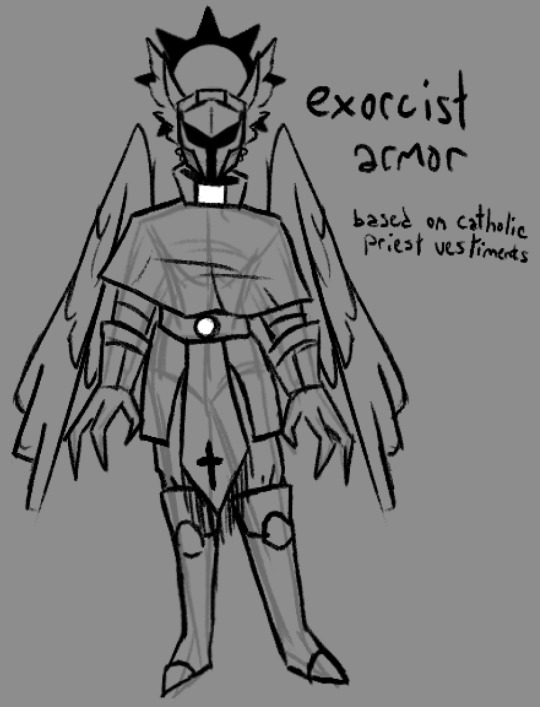
i also redesigned the exorcist uniform/armor because those LED purge masks are fugly as hell and their clothes don't even look remotely like armor.
Adam + Final Thoughts
i did start a redesign of adam but got bored of it. regardless, i think he'd be the head of C.H.E.R.U.B. instead of the exorcists. he doesn't want his children to make the same mistakes he and eve did, so together they started C.H.E.R.U.B. to help lost souls stay out of hell
final thoughts uhhhh i'm tired. show sucks, it had so much potential but viv ruined it by being a shitty writer and an even shittier person. the designs are fine i guess but they all look exactly the same and are in desperate need of variety. the humor is dogshit, saying dick and balls and penis over and over and over again doesn't make it any funnier than the first three times you made that joke. anyways that's it, i hope you liked my inane ramblings. gonna go vanish for another forty years or so, adios
#am i gonna do more? idk. we'll see#oh boy sorry about the seventy million tags#i eat bees#artist#oc artist#artists on tumblr#artist on tumblr#hazbin hotel#hazbin critical#hazbin redesign#hazbin rewrite#hazbin hotel critical#hazbin hotel criticism#hazbin hotel critique#hazbin hotel redesign#hazbin hotel rewrite#hazbin hotel vaggie#hazbin vaggie#hazbin hotel charlie#hazbin charlie#hazbin hotel alastor#hazbin alastor#hazbin hotel angel dust#hazbin angel dust#hazbin hotel lute#hazbin lute#hazbin art#hazbin hotel art
877 notes
·
View notes
Note
hello mr skyen... might i ask for opinions... for an elise thing im doing

Oh, this is interesting! I am not 100% sure what kind of opinion you're looking for - is this meant to be a skin idea or a full-scale redesign of the character? I'll give you some thoughts, with the caveat that these are off-the-dome impulsive reactions, and whatever I bring up is not meant to be prescriptive "this is wrong do it different" criticisms, they're just me bouncing ideas off of what you are presenting.
If anything I say is useful, then hooray. If it is not, or if it misses the point of what you are trying to do, please discard it without a second thought.
Bringing in some 1920s and 30s fashion energy is an interesting idea. Elise is meant to be this high society socialite who has literally been around for centuries and killing people, so there is definitely a solid idea in using an aesthetic which would be olde timey to modern eyes, but also a bit anachronistic and odd and instinctively a bit out of place in a high fantasy military state like Noxus. I think that's really interesting, and definitely more interesting than the somewhat directionless black leather lingerie her base design keeps her in.
We're playing around with gender presentation it looks like, which I think is a really solid play. Elise is generally presented as a fairly standard type busty sexy video game babe in League of Legends, with Legends of Runeterra opting to show her as a bit more spindly and flat chested. I think her general archetype definitely requires a level of sexiness, sensuality and seductiveness, she is an archetypal Black Widow character, but I don't think that means she necessarily needs to be stereotypically femme in body and presentation. Plus, the LoL universe has more than enough classic femme fatales already, anything that adds variety would be good.
I very much like the red and black fashion - she looks very credibly like an eccentric Noxian socialite, especially in the first two outfits.
I kinda feel like I'm missing something up around her collarbone and chest? A necklace? Tattoo? Cosmetic? I can see the idea of having the collar be exposed flesh for the allure of it, but I feel instinctively like it's conspicuously "empty" next to the highly made up and elaborate makeup and hair, and then the fashionable costuming.
Given that Elise is a transforming character, you could futz around a bit with her proportions? The shoes extend her legs by lengthening into points already, which is a good thing to carry over from the base design, but I think given the importance of long spindly legs to spiders, you could push it even further. think something like Bayonetta for example:

additionally, you could use something like a wrap-around collar, or a necklace, to play around with extending her neck, too, to make her even taller, and push a bit into the uncanny if you want. covering the neck up makes it easier, in my experience, to lengthen it without it looking too obviously odd.

it sort of depends on the impact you want her to have though. very tall, very slender, very long proportions are striking, and carry a vibe of the ethereal, maybe slightly mystical. height also often codes for power.
if you want her to be a more down-to-earth presence in her human form, though, especially if you want her to pretend to be harmless and/or vulnerable as part of her seduction and manipulation play, making her shorter is usually a better shortcut to achieving that vibe
hm... what else...
Well, the spider leg spikes on her arms are cool - I really like the idea of concealing them as some sort of high fashion eccentric accessory, although it's not 100% clear to me from the art here exactly how they are attached to her?
I really like the fashion design of the middle idea. I like giving her trousers and going right up to the edge of letting her have a naked upper body. It's a good way to play with the tease, I think, the allure of almost seeing what is hidden.
I'm not 100% sure about the green markings on the body. on the one hand, she DEFINITELY needs something Shadow Isles coded in her design, since that's where she draws her power from, on the other hand having it that much out in the open feels maybe a little... obvious? at least in her human form?
Of course, this again depends on the intention with the design. if you're designing this as a design to appear in League of Legends, whether as a champion update or a skin, then making her source of power obvious on her body is actually crucial, it's really important for in-game visual language. If it's for something like an appearance in Arcane, you could probably dial it back a couple of notches and make it more subtle.
Like, maybe the same idea of glowing tattoos that light up when she uses her powers, but they are subtle little spiderweb patterns on her skin that look like elaborate decoration when not in use? something like that?
anyway, that's all I can think of as a reaction just off the top of my head. this is really cool, I hope you keep working on it!
203 notes
·
View notes
Text
Hi! I'm Bunny and I'm redesigning the whole cast for hazbin hotel
{PLS READ THE WHY SECTION BELOW}
Anyway.... Onto my designs! I'll be detailing the stuff I changed/added
First is.,..!! Sir pentious! Weird right? You would think it's Charlie but uh nah, he's my favorite character and I wanted to make him similar to my tastes.
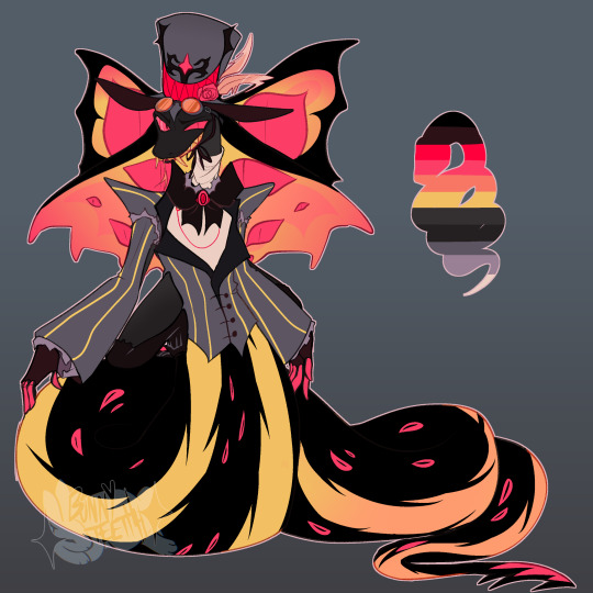
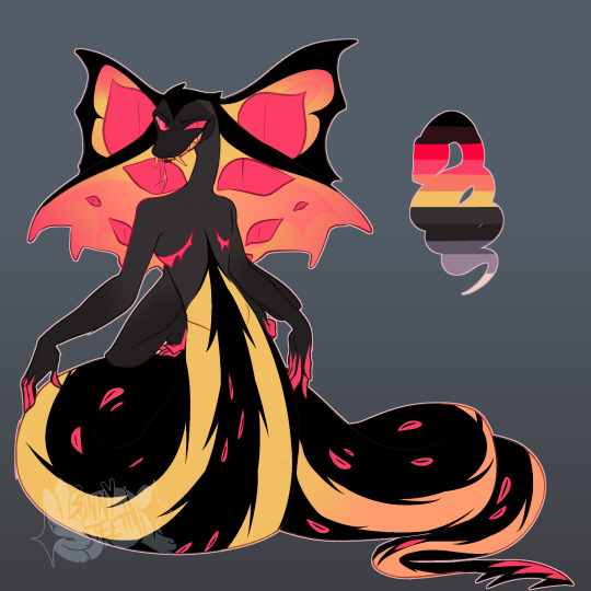
Yes he is trans! I have a small little HC that the egg boys are his boys...
And he is much longer/bigger due to this because of sexual dimorphism! But we love him for who he is now he's so silly :). He also has a barbed tail that I would say is used as a 5th hand! To grab stuff. He already has 4 arms cause why not? He needs to push himself around already..
Next is.. Angel Dust!, he doesn't have an alt version because I feel it's not needed but here he is!
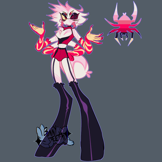
I added pedipalps, those are the mandible looking things. They are a part of spiders I think are so cool and I wanted to add them! Unfortunately they're not counted as legs and adding another set of legs to angel I couldn't figure out... But good enough!
I also changed his eyes! To include a spiderweb, I'm not entirely sure why he has that black eye, so I thought I would change it up a little bit.
A friend gave an idea that his sight from that eye is kaleidoscope-like so I'm implementing that too! And how could I forget! The spiderbutt! Without it it's kinda weird looking so I wanted to add it in cus it's so cute
Next up.... Husk! He's one of my favorite characters so.. kinda went all out on him
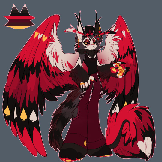
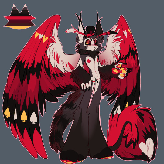
I didn't change much about him besides his patterns and colors, but generally his silhouette is the same!
I wanted to add a lot more feathers and fluff to him! And putting on the casino style bringing back the spades and hearts to his wings again!
I thought the spades were funny
Up next.. Vox!
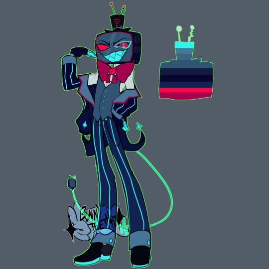
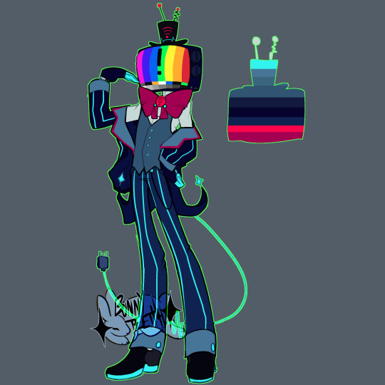
I found his design interesting that he is a flat screen TV even though he died in the 50's? So I decided to change that! Turning him into a box TV again!
And giving him a cable tail, I thought it would be clever that when sleeps he charges himself up for the day!
Next up... niffty! She's the last character I've designed so far!
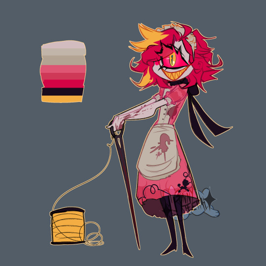
Also while looking up her historically accurate date I found out she's 22??? Weird... But yeah she did end up looking a little older here I'm glad, but I really wanted to give her a bigger needle! What's she gonna do with that small thing?
And her dress is based on 50's maid outfits! With the addition of an embroidered poodle!
.
Why?
Well first I'm crazy and second, I've been now made aware that the show itself does a certain type of representation so disgustingly that I'd rather make my own designs and fix what they couldn't do.
I don't support viv or the show.
If you want to read into it yourself I advise a trigger warning for S/A. It happens in episode 4.
#hazbin hotel#hazbin art#hazbinhotelau#hazbin angel dust#vox#niffty#husk#angel dust#sir pentious#hazbin hotel but i dont support viv or the show so i made my own designs cus ths original are kinda lackluster!!!??#hazbinredesign#charlie coming soon....#my little guys and headcanons#hazbin#hazbin husk#hazbin sir pentious#hazbin niffty#hazbin vox
571 notes
·
View notes
Text


disventure camp redesigns part twoooooo
not as good as part one tbh but i still kinda cooked
lakes design is kinda boring 2 me and i wanted her to have a sort of rebellious yet sweet type of fit
i already like gabellie and riyas designs so i was just making stuff up mostly 4 them lol
gabby beautiful tall nature queen and ellie a short lanky girl thing in love fr
#disventure camp#disventure camp all stars#disventure camp fanart#disventure camp lake#disventure camp riya#disventure camp gabby#disventure camp ellie#gabellie
208 notes
·
View notes
Text
So…. Glitz and Glam huh… y’know what that means my fellow artists and critics…
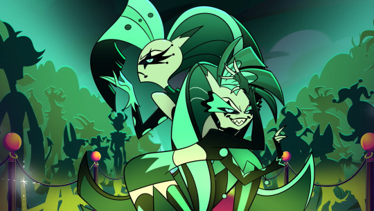
REDESIGN TIME!!!! + (A bit of critics/opinions on the characters and the og design :-] )
To start it out a lil’ positive, If I gotta be honest I actually kinda liked these two characters from the mid-season special, even though they were just the bitchy woman character your supposed to hate (as if we needed any more of those characters than we already got viv), they were still really fun as characters in my opinion!
I feel like bitchy esc kind of character very much works for these two coupled with them being very competitive towards fizz in the episode, I feel like those two things were like the bread and butter for these characters and if I wanna be honest… I kinda wanna see these two again but wouldn’t be surprised if that didn’t happened bc c’mon this helluva boss we’re talking about after all!
The only thing I would have to say negatively about these two is that they literally got crushed by a rock in the end, like I get it viv hates writing characters who are woman but COME ONNN, you had these two characters that seem really interesting and the only climax you could’a think for them in the ep was to crush them with a rock? That’s literally lame.
But other than that, I think overall these characters were alright! At least writing wise….
Now for the redesign + critic thing on the og designs

I decided to change her outfit bc although I loved the character’s personality, the outfit viv gave them not fit them at all. The jester esc outfit personally I think doesn’t really work for these two because 1. The jester theme Fizzarolli’s thing and 2. It doesn’t really work well with their personality, the song they sang in my opinion shows that.
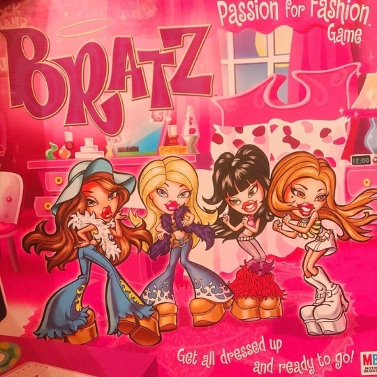
So I thought I’d base their outfits off of the bratz outfits and also any outfits similar to that, to try to fit their characters more!
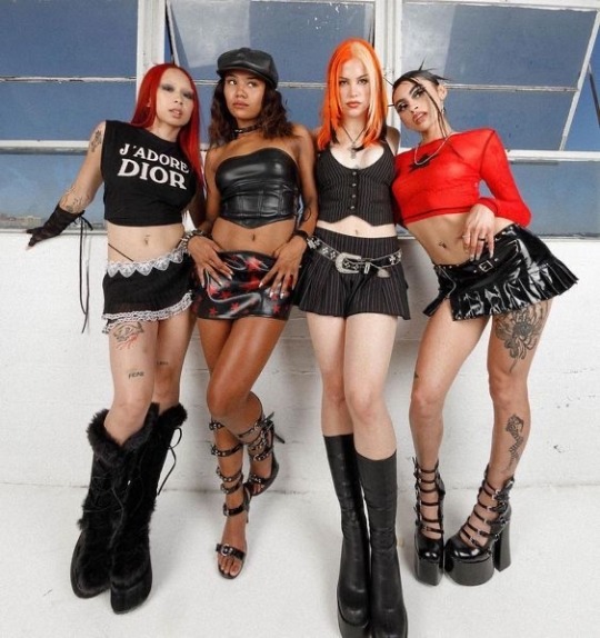
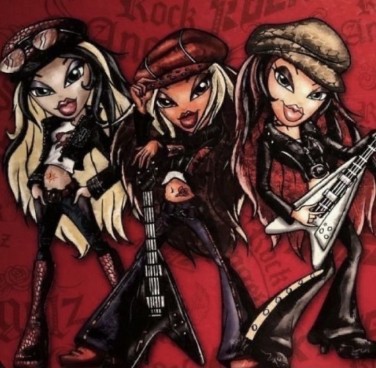
That and I’m just getting real sick and tired of the jester/clown theming that’s going on in hb because oh my god it feels so out of place, especially with the theme of greed ring being a trashy polluted city. And even if, EVEN IF viv wanted to give them clown esc themed outfits, I feel like it would’ve made more sense if she gave them outfit that were similar to mimes because technically those guys are like elegant clowns! While jesters aren’t even the same as clowns at all.
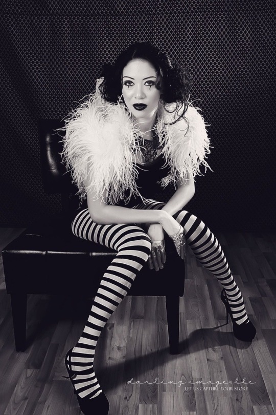
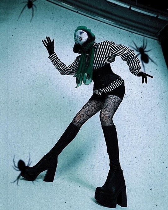
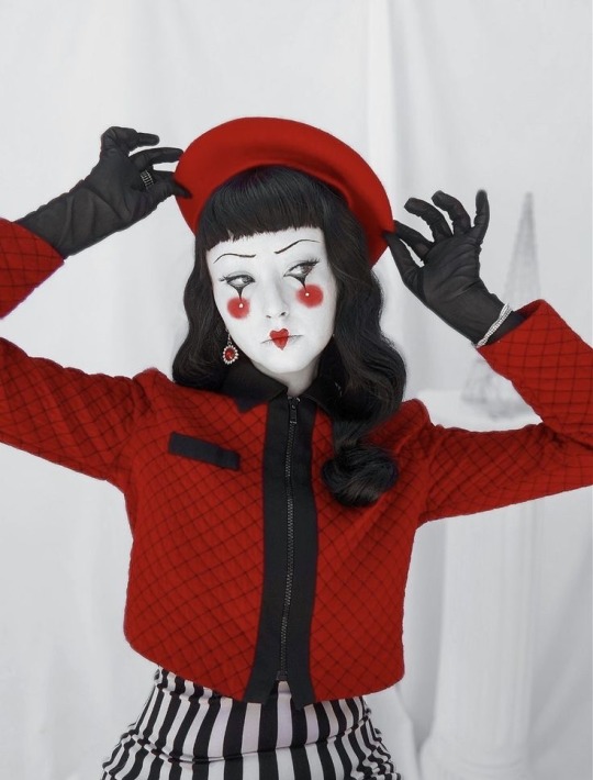
I also kept the green ish’ tones while also giving them a bit off red and purple colors to compliment the identical twin duo thing they have going on! Because like… do I even have to say why I did it? Their colors are literally just black and the same exact hues of green, it was literally hard to focus on them when watching the episode because of much they blended in with the background.
I also took inspiration from this fish when designing them because from as far as I can tell (and do correct if I’m wrong), they’re supposed to be fish demons??? So I tried to add more fish motifs for them!
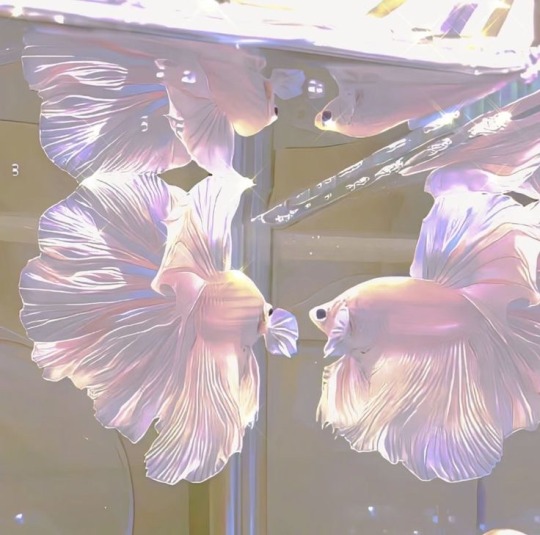
I also made them half succubus from the horns looking similar to that and also because I thought it’d be fitting for them!
I also made their hair look like fish fins because oh my god their hair in the canon design was probably the worst part about their designs, not only did it have too many details that it was too distracting when I was trying to pay attention to the characters but also I just trying to figure out how the hair works in general, because it honestly their hair kinda looked like paper instead of fish fins or even actual hair.
But other than that uhh…
TLDR: I love these guys sm, they deserved much better and uhhh I love women /hj
#anti vivziepop#vivziepop critical#helluva boss critical#helluva boss critique#helluva critical#anti helluva boss#helluva boss redesign#glitz and glam#vivziepop criticism#vivziepop critique#hazbin critical#spindlehorse critical#helluva boss#helluva boss glitz and glam#helluva boss glam#helluva boss glitz
434 notes
·
View notes
Text
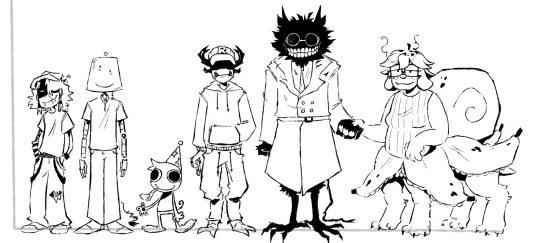

I am doing things I AM DOING THINGS I AM!
Explanations for designs and some head canons below here :3
Infected - Asian-American Autistic ADHD aroace (😈) trans. Yknow Wybie from Coraline? Yea like that but like incredibly annoying. His voice sounds like it’s coming from a shitty mic all the time
Lampert (design by @lucid-daydreaming-art )- Autistic 🇸🇪 ja aroace (😈) funny lamp guy Robots-esque probably kinda talks like baymax honestly, I mean a bit different but yknow, the general idea
(I talk about these 2 enough it’s the others turns)
Poob - I think they are a dumb little critter. They run around and their arms flail in the wind like paper. When they try to clap is makes dog toy squeaking sounds. I don’t think they abide by the rules of physics which is why they are stupid looking ❤️ they have hammer space but it is only for weed related items. The curator of the forever weed brownie, if you will. I think they sound like X from bfb. Aroace (😈)
Pest - literally hates poob because they are small and annoying. Uhhh funky legs because I think he would have funky legs. I stole his eyes because well no real reason, but I think if he was like extra pissed you would see his eyes. Since he is like thief maxxing I do not think he would be wearing anything beyond a hoodie and sweatpants, something trying to be non-assuming I guess. He has hair I think but it is very short no way would he want to deal with that. I don’t have a voice hc for him yet. Aroace (😈)
Bive - she a freakkkkk ehhh. I think she is like freakishly tall, has funny bird legs, raggedy ass scrawny tail, and is constantly covered in hair. Her teeth are kinda just floating on her hair head, so if you punched her hard enough they would just go flying out and she would have to put them back into her head silly girl. I think she is also trans hahaahhahahahaha!!! I think she kinda sounds like ENA from dream bbq, the uhh angry side I believe. Ace (😈)
Split - I gave her dog ears because I think they are cute :) she’s probably like normal ish height Bive is just weirdly tall. She looks very nice and friendly but could probably throw a boulder at you and you will die sowyyyy. Gods most chillaxxed soldier. She gives me kind older lady feelings, even if she weren’t older. I dunno she would be like one of those people who have a comically large purse full of hard candy except it would all be banana flavored. I think she has a slower voice, HAVENT gotten an exact idea for her voice yet but she seems very calm. Ace (😈)
Pilby - I didn’t really add or change their design because I already liked it a lot. I think they are very sweet and kind looking, would make a great plush too but I guess we are not ready to talk about that (YES I am still bitter about it) I think being around them is akin to looking outside a window at an apple orchard while it’s raining a bit. I think they sound a bit like raggedy Anne, based on the creators response too. Aroace (😈)
Spud! - I honestly did not have much come to me for his design, they are just a bit of a funky feller and im not sure how I would add to it honestly. Oh but I do think that they run like an ostrich and it is very scary. Also while drawing I was debating why he had a bow and decided that Gnarpy was like CONGRATZ IN ZURVIVING THE TEZTZ and now Spud! Just has a stupid little yuor did it ribbon. Honestly no clue for voice hc… aroace (😈)
Gnarpy - had a lot of fun with xis design honestly. The redesign reminded me a lot of Stitch so I kinda just shoved that into xim. I think they act a lot like Zim. Like a lot. Probably equally as stupid. I think xis second arms are retractable, like stitch, and xe uses that as a very very shitty disguise that everyone can see right through but just don’t mention because xe seems to be having a good time. I think xe sounds like Four from BFB (the earlier episodes mostly) aroace (😈)
DRRETRO - I think that her head that we see in the game is like a projection of herself, Wagstaff Don’t Starve style. Her body would be like excruciatingly normal besides her head, too. Like go to the hospital and see a nurse, that’s just what she looks like. Very normal, it’s a bit unnerving since her head is that. She’s like those overly friendly posters in a very uncomfortable place type of feeling. She doesn’t have fur either, she’s just a weird cat doctor thing. She acts exactly like Doctor Barber from Flapjack. No voice hc, but she speaks in meows so probably just meowing. Aroace (😈)
Mark - I started thinking about tf2 and Anton blast. Anyway, he is completely made from wood other than the clothes. Beard is carved in, not sure if I got that across in the drawing though. Uh yea I don’t have much I just really like engineer. He wears flannel and a construction vest just like any good law avoiding construction worker. Definitely does not so legal things on his construction sites but does not give two shits about that and also probably would try to employ Lampert when he was younger for free workers (no im not projecting what are you talking about). How on the nose would it be to say he sounds like engineer because I just drew wooden engineer with a beard. Ace (😈)
Wallter - sorry wallter fans I had no ideas while drawing him. I dunno he’s big and he’s cement, so I kept him blocky. Urrrrr he has a can of grey stuff jingle jingle. He is the cement embodiment of that one tweet that’s like “nothing better than a glass of wine, except for maybe #men. #yep #imgay! He kinda seems like one of those lowkey scary bald gay guys who are nice but are also scary and still bald. He’s bald. No idea on voice maybe concrete sliding on asphalt for 10 hours. Ace (😈)
#all of them are at least asexual#I MAKE THE RULES I WOULD KNOW!#sigh yes I understand if you have separate ideas I don’t control that don’t leave hate I am aware#I’ll tag when I finish the all of them in a separate post
282 notes
·
View notes
Text

Sloppy Arackniss Redesign (?)
Before I get into this, clarifying, I SAY SLURS IN THIS!!! I CAN RECLAIM SAID SLURS!!! That is all thank you. I kiss boys and love men. Carry on.
Arackniss’s design is bound to change drastically sometime eventually but atm this is just what im doing. My main problem is how he just looks exactly like angel but black. I know thats originally what the whole thing is and they’re opposites but it’s just kinda boring now. Angel is an entirely different character at this point now and Arackniss’s design should accommodate the changes while still being a bit similar looking. I want him to still look very similar to Angel in specific ways like that stupidass headshape but not because of a sibling thing. Honestly when the two were alive they hardly looked anything alike I’m 100% sure of that. Antonio (Arackniss) had black hair and much broader features and was relatively tall and kind of bulky while Anthony & Molly had light blonde hair and more subtle and soft round features and basically one of the only ways to tell them apart aside from personality was Anthony having polycoria and having bloodshot eyes pretty often.
Arackniss hardly looks how he did when he was alive anymore and has taken on many more features of Angel because of his deep rooted rivalry with his brother. I assume hating your middle-child brother that literally got named after you only to have him overdose and kill himself before actually doing anything with his life is enough to stir up more than a little bit of inner turmoil. These guys probably beat each other up OFTEN. Antonio was the first born son and dealt with so much shit before these other guys even were born and when they did show up, Anthony was named after him because their parents honestly just got lazy, and even though Molly didn’t have the name Molly yet, she was still treated like a golden child even though she contributed next to nothing to the family business which yeah that helped her in the long run but to Antonio that’s his number one priority in life. Appeasing his family is what keeps his brain running. And with that, seeing this random kid show up, get named after you, and be treated so much more leniently than you were AND he’s practically your problem because youre 15 hes like fucking 3 years old and your parents are busy all of the goddamn time AND when you DIE you take on the traits of this stupid fucking kid. He has a horrid case of eldest child syndrome and probably some insane identity issues.
This isn’t to say his hatred is only directed at Anthony either, he definitely has his issues with Molly as well, but she kept more to herself and even if she followed Anthony nonstop she was copying what Anthony was doing instead of what he was doing. Copying is the highest form of flattery but flattery gets annoying when everyone cares about the younger “better behaved” version of you. This is one of the biggest reasons Arackniss berates Angel now and in the past. Even though they havent spoken in years, Arackniss still holds Angel to the status of “faggot” because that was practically the only thing he was “worse” than him at. It was the biggest dirt he had on Angel possible to the point that became a genuine used name for him as Anthony “the fag” Benetti. Finding out your angel of a brother is gay during a time where it’s heavily frowned upon, especially by your own family is like a gold mine.
Arackniss is NOT a good person if you couldn’t somehow tell already. He’s homophobic, has a masculinity and classism problem, has little to no regard for other’s well being, and a bunch of other shit. For as distressed as he was over Anthony’s death, a lot of it was because it left their family even more dysfunctional. To him it was Anthony abandoning everyone because they weren’t worth enough to keep him going and then in return he continues to be praised and talked about so wonderfully as if he never did anything wrong “just because he’s dead”.
Thats just BEFORE Arackniss died too! AFTER dying shit got even worse to the extent he ended up even getting disowned! How fun!! This part delves more into Husk and his backstory as well which I think I may save for another time, but these guys know each other and have a lot of beef and also simultaneously are kind of chill in an odd way? By the way, Angel also has the big neck puff, he just shaves it because he doesn’t like the look and like association from trauma
#hazbin hotel#hazbin critical#hazbin hotel criticism#hazbin hotel critical#arackniss hazbin#arackniss hazbin hotel#arackniss#arackniss fanart#spider siblings#angel dust#hazbin angel dust#angel dust hazbin#hazbin angel#hazbin molly#hazbin hotel molly#molly hazbin hotel#molly hazbin#angel dust and molly#molly dust#anti vivziepop#hazbin hotel rework#hazbin hotel rewrite#hazbin hotel redesign#hazbin rewrite#hazbin rework#hazbin redesign
85 notes
·
View notes
Text

Original designs (Left) Revised Designs (Right)
Marinette's redesign changes are DONE and updated. I have Adrien already started to here is hoping to finishing kinda soon? After that I think I wanna fix Chloe a bit. Her design is good and didn't suffer as much from the flip tool mistakes that Marinette and Adrien had but I wanna clean up her lineart some
It's amazing how much your drawing can change just because you've changed as an artist, right? I'm much happier with the changes, though I'm sure in another year or so I'll feel I've improved again and want to change some stuff up.
Bonus that original Mari flipped

#miraculous ladybug#miraculous redesign#ladybug miraculous#marinette dupain cheng#marinette redesign#art comparison
79 notes
·
View notes
Text
Updated designs as of: 8/20/24
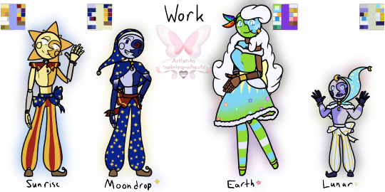


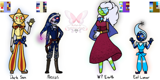
Remember when I said I was knee-deep into SAMS/LAES? Welp, I still am- so here's my (mental) designs of all the core characters (Not scaled for height)! Some notes/extra thoughts under the cut :D Added their pallets to make coloring easier!
Main 4:
Work:
I swapped Sun and Moon waist thingy; I just think they would do that since they're close. Their arm ribbons were also changed to purple to match!
Moon has a cape instead of a ruffle like Sun because... idk, I think he'd like it!
Earth and Lunar also have matching cuffs; theirs is pale/light cobalt blue.
Gave Earth's dress more Princess vibes; why? Idk, just felt like she would like it!
Sun's joints can be seen since he hasn't died and been "placed" in a new/updated body!
Casual:
Moon and Earth (kinda) have casual outfits, so I thought I'd make something for Sun and Lunar.
Sun HAS his matching friendship bracelet with Dazzle- I finally decided to draw it ^^
Sun's shirt says, "Here comes the Sun" I feel it would mostly be a gag gift, but he likes it!
I almost gave him a sweater (cause he gives me sweater vibes, tbh), but then I saw his Q&A video and went, "damn, never mind, I guess".
Lunar's hoodie was also a gag gift (cause its color scheme is similar to Gemini)- but he likes it too much, plus it's soft :D
Made Earth's sweater a bit darker, mainly cause she has a lot of light colors already (the pink comes from the sprinkle sweater!)
I also feel like the boys would take off their bells when they're not working.
It was asked how and... idk they made an interdimensional portal- I'm sure they found a way to take off the bells lmao
The other 4:
I hate how I did Ruin's rays and hat. But nothing was working for me, so... oh well...
I gave Jack the two tips for his hat because I think he'd like those- same with the arm sleeves!
Also- yes he has a friendship bracelet with Dazzle- he keeps it protected under his arm sleeve, it's identical to Sun's!
I really like how Solar came out. Specifically his boots and shirt design!
He gives me knee boot vibes, so I gave him shoes with a sun and a moon on the back (they lace up just didn't feel like adding those details)
I Like how Eclipse came out- Miiiight redesign him... depending on how the Eclipse and Puppet Show goes, but for now, I'm content :)
I never mentioned it, but I do imagine that Eclipse has a second set of arms. I would think Solar did, too, but those were taken away during his revival because of the "Eclipse sees other Eclipses as inferior" stuff!
The Evil 4:
I made Dark Sun look like Regular Sun... cause that's kinda his whole thing! But if I were to give him a different outfit- it would be Eclipse's!
Few changes to Nexus (I can't take him or his model serious tbh, I kept laughing XD), decided to give his hat a Wither shard at the tip because power (and possible corruption) go BRRRRR (Side Note: Made an AU on it :D)
I'm not sure how visible it is, but on his right cheek, you can see a virus of some kind—I really like that, so I put it on him because I really like the idea of him slowly being corrupted due to his insanity!
He has a darker shade of boots similar to Solar because... well, Solar :)
World President Earth (or WP Earth) has a lovely wine-red dress with her flag as a cape (the same flag seen in the thumbnail)!
The flag is held together by a smiley pin because why not =)
Evil Lunar (while tempting to go with Current Lunar design) has the design of the previous version because, well... that's the form he gained the power in (from my understanding)
The tip of his hat is a dying Star because that feels appropriate, in my opinion.
I MIGHT do Foxy, FC, Monty, and Puppet, but I'm not too sure, tbh, since my mental image isn't too far off from their models. Anyways, time to return to my little gremlin hole and watch the series :)
#my art#digital art#tsams#tsams sun#tsams eclipse#tsams moon#tlaes#tlaes earth#tlaes lunar#tsams Eclipse#tsams solar#tsams jack#tsams ruin#dark sun tsams#tsams dark sun#tsams Sunrise#tsams Moondrop#tsams nexus#World President Earth#tlaes eclipse#tlaes Evil Earth#tlaes Evil Lunar#So many designs!#I missed drawing like this though!#Favorite to draw was certainly Sun and Solar!#I do really like how Jack came out though!#I can't wait for more episodes!#the sun and moon show#the lunar and earth show#the eclipse and puppet show
118 notes
·
View notes
Text

Naomi Toba the celestial 🎃
Name: Naomi(直美) Toba(鳥羽)
Species: celestial
Ability: to multiply objects with the swing of her sword
Yes those are pumpkins.
She is inspired by Utsuro-Bune urban legend and Japanese fairy lore, mainly the feather robes fairytale (key word being “inspired”).
Her old design is basically her new one mainly bc why change what is already kinda nice? I came in with redesign in mind, but realised that I don’t have to do much here. Just gave her a sword and called it a day.


70 notes
·
View notes