#the coat of arms redesign
Explore tagged Tumblr posts
Text
Sexypink - Bishop takes the board.
#sexypink/Gillian Bishop#sexypink/Coat of Arms#sexypink/ public opinion#tumblr/Gillian Bishop#tumblr/redesigning the coat of arms#the coat of arms redesign#Gillian Bishop#Carlisle Chang#sexypink/Carlisle Chang
0 notes
Note
Actually scratch that I wanna see an Aegislash with a heraldic shield.

Or, a pall reversed Sable, it's center charged with three annulets of the first.
#pokemon#heraldry#aegislash#pokemon redesign#art request#request#coat of arms#sword#medieval#historical#traditional art#aquarelle
44 notes
·
View notes
Text
Another redesign of some of my country’s coat of arms...


15 notes
·
View notes
Text
eeewwWWWWWW I just realized I have to design a different tie and cross tie than I thought???
#cause a plaid tie is very anime and not very american#gdmfdi#what's next#do i need to redesign the coat of arms ffs#cie stuff#UGH
1 note
·
View note
Text
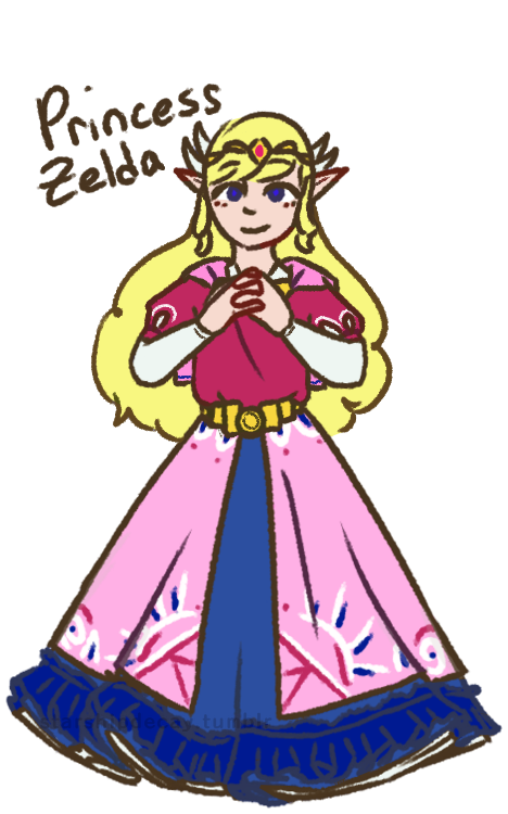

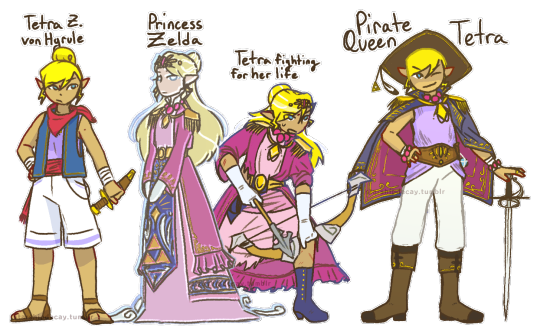
Toon Zelda redesigns! I've never been fond of the Toon Zelda design, and these girls deserve some individuality. Design notes and rambles below the cut :D
(time to turn the proper grammar off i aint capitalizing all this. warning: i am verbose)
first up, tmc zelda!
shes the one most like toon zelda, since i felt like the vibes fit the *most* (though not a lot). also, with her place on the timeline, i could justify a lot of bits, like the wings and the cape
the cape! obvs it comes from the toon zelda base design, but also it involves skyloftian fashion! i take the timeline as a challenge, and i once saw a take somewhere that the skyloftians all wear their family crests (most often birds lol) on their person. zelda here (and link too) do just that, wearing their family crests on little caplets. on the back is, of course the royal crest
i went very cutesy princess for her. tmc has such a *whimsical* vibe that i feel is very. muted? by the fact its stuck with the toon style. so i wanted to put in that vibe here. also her sprites make it look like her skirt is super poofy, so how could i not?
curly hair: i wanted something interesting, and most zeldas have straight hair. so! adds to the cuteness
i didnt draw it so well but she (and link) both have very sleepy expressions. zelda especially just has a sleepy expression in her sprite, its quite adorable.
shes not as decked out as other princesses, cuz i see tmc taking place before the royal family really starts to get *royal* as we see it. shes still of course got a tiara and some embroidery tho.
Tetra! her base design isnt all that changed from the original. her name is a fun hc of mine tho. i think "von Hyrule" sounds better as a surname than just "hyrule". shes not zelda, but shes still a descendant.
(WW) princess z (as i call her)
I went more oot zelda vibes for her, since she would be closer, temporally, to oot. i also went very warm, since ive never seen the flood as a *warm* endeavor.
shes got the shoulder danglies, as most zeldas have shoulder armor of some kind. the danglies instead of actual armor are supposed to kind of evoke a royal sea captain kind of vibe.
shes ghostly, with a fish-eyed stare. shes been dead and gone for a long time. shes also a bit taller and a few years older than tetra (as of ww). shes just some spectre the king saw in tetra, not at all a close match
tetra, being smaller than princess z, doesnt fit into the clothes. the dress is too big for her (as is in canon gd that skirt is WAY too long for her), the coat is baggy. the role of a princess *literally* does not fit her.
the ribbons! theyre my replacement for the wings, and they represent the wind in the game! since its represented by white lines, the ribbons are a perfect symbolic match. (also, a note, tetras hair is shorter and coarser than princess z's)
i mostly bullshitted the blue panel but the vague idea i gave it was 'a hope for the triforce to give good fortunes to the people' (pictured as dots, mostly behind her arms)
Pirate Queen Tetra
ph! about a year has passed, and tetra has really grown into her own! as well as literally grown!
shes still tetra, pirate and captain, but shes incorporated that royal heritage into her identity: quite literally! she made piecemeal of the original outfit (what was left of it anyway after the fight), and added bits and pieces to her new life.
she also takes full advantage of said heritage to call herself pirate queen. its great for branding. whos gonna say she CANT go by pirate queen?
the seagull feather is from Aryll. only crew member tetra wears a trinket from (who can say no to that ball of sunshine! certainly not tetra)
not many notes. yall can see whats there. (also she still wears her hair in a bun, its just in a low bun (you can almost see it) when she wears her hat)
st zelda!
first note is: shes not a princess! shes an heiress of the company tetra had made and left behind. hence her title of Lady zelda. ("new hyrule" rly just like-- the ending of ww was *literally* that hyrule is dead and thats okay. how did they miss that :sob emoji:) also calling her Lady Zelda fits with the train vibes
shes in a 1880s style bustle dress because 1) i am OBSESSED with bustle dresses. i love them. so much. 2) the more historical vibe works really well with trains! also a lot of the other outfits in the game have late victorian vibes, so shes certainly not out of place.
her hat (and gloves): any proper lady has a hat on when going about town, however, when she gets body snatched, she pulled out her hatpin to use (ineffectively) as a weapon (she IS tetras great-great-granddaughter), causing her to lose her hat *and* hairdo.
shes still got the hatpin in her ghost form, too. she uses it to threaten people for funsies
Ribbons! on the topic of hairdo, her ribbons! visually tying her to tetras design, the ribbons here instead take on the image of train tracks, with her pin (on the left side) evoking a train engine. the pin also makes her look rich and girly. when her hair comes undone, this makes the ribbons all loose, like how the train tracks disappear in game. (the hat also kinda connects her to tetra)
thanks for reading :D i hope you liked reading this as much as i liked typing it
#loz#legend of zelda#princess zelda#tetra#wind waker#minish cap#spirit tracks#phantom hourglass#zelda#zelda fanart#the legend of zelda#ww tetra#ww zelda#st zelda#minish cap zelda#the wind waker#loz ww#starship art#ive got more designs down the mental pipeline#these ones just came first cuz i dislike toon zeldas design
435 notes
·
View notes
Note
How did you go about redesigning the clothes in you remaster?
Ooh great question! I'll go into more detail below, but the gist is that I broke down each character into their vibes and general aesthetic and tried fitting it to my design biases.


I tend towards more grounded designs than the original JRPG-inspired armour and clothes, so I referenced a lot of medieval fashion for the setting. You'll usually see me covering bared skin in battle outfits or toning down extra details I struggle to draw

Then, using those references, I'd try to thumbnail basic shapes and colours to figure out which works best


(More specific character notes below)

For some characters like Iseul, I didn't feel much need to change his outfit so I mostly toned down the detail to suit my style. I shifted the colour scheme to something warmer and removed the fur and extra armour to serve his image as animal-loving and battle-avoidant. This serves as great contrast to his timeskip outfit where he then commits to being both a warrior and a prince, with more ornamentation and practical armour


I designed Helena and Alain as contrasts. They have very similar themes and designs, so I decided to smooth Alain down into the picture-perfect metal knight while Helena's wilder and asymmetric. I referenced more realistic armour for Alain but overall I wanted to keep his clothes similar.
For Helena, my design style is more practical and thematically I want to avoid Helena baring skin and vulnerability so I extended her corset into more of a chest armour and covered her other thigh. To add to her duality of magic and metal, I gave one arm armour and bared the other to show off magical scars.


August and Altea's designs are where I start to venture off into more vibes-based outfits. August is humble and traditional, a knight with proud loyalty to his Lord and family, so I gave him medieval colours to represent both on his tabard. The armour is still there, but it's less focus on metal and more on "cheaper" materials to serve as a contrast to his timeskip where he becomes a proper knight in shining armour. For that reason, I took away the cape and other unnecessary decoration.
Then Altea is flashy, wealthy, and bright. I kept the focus on light armour, with scalemail as the only obvious protection. I've mentioned before but I took inspiration from south east asian fashion (mostly cambodia and malaysia) as a grounded but ornate basis for her magical girl theme. Here the colour scheme and fabrics are what mostly connects it to the original

Similarly, Lennox is where vibes rule and the overal aesthetic changes quite a bit. He's often described with "choir boy" hair, so I wanted to combine choir robes with ornate priestly outfits to sell him as a vain cult-leader. I kept the symmetry, long coat, and lack of obvious armour, but I wanted him to look less modern and stick with less structured outfits.

One thing specific to the generals, is that I wanted to give them more of a variety to colour palettes to sell that while they're working together, they're not exactly happy about it. While they all have a focus of blue and silver to keep them cohesive, they each have a motif: Alain - silver, Helena - pale blue, Jinhai - brown, Lennox - dark blue, Magnus - turquoise
#love and legends#character design#costume design#whyyy did the image orientation all fuck up??#art#art ref#tutorial#ish#i love doing redesigns#or well converting designs to fit my biases :P
214 notes
·
View notes
Text
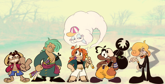
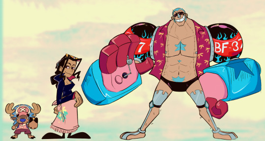
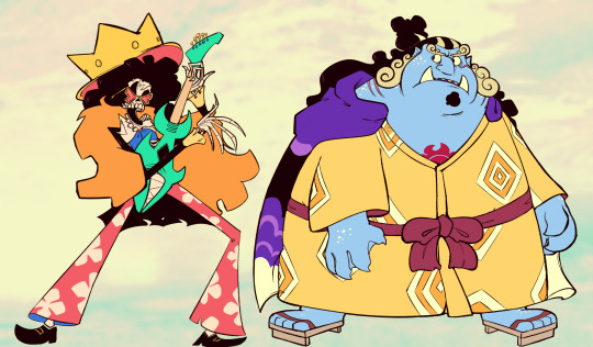
lineup but i had 2 cut it into pieces #verticalwebsite but you get the idea
[IMAGE ID, IMAGE 1: A fan lineup of Luffy, Zoro, Nami, Usopp, and Sanji, in that order, all post time skip. They are drawn in a cartoony art style and deviate quite a bit from their canon designs. Luffy is looking face forward at the viewer, smiling widely, and holding a peace sign towards in front of him. He's a little shorter with cartoonishly large eyes, ears, hands, and feet. Zoro is standing with his chest puffed out to the side, fists clenched, and glancing over at the viewer. There are no major changes to his design, though he has a mullet for some reason. Nami is smiling, mouth open, and holding her clima tact with Zeus emerging out of it and floating over her head. She's drawn to be more chubby, freckled, and has a cowlick in the shape of a stem and leaf. She's wearing a green button up, that isn't buttoned at all, exposing her black sports bra and stomach. She's wearing white jeans with a berri belt buckle and her regular sandals with heel shoes. Usopp looks a little confused, and is holding the kuro kabuto, with a small plant head attached like when he uses the grow up kabuto move. Usopp's eyes are cartoonishly large and the top of his hat covers the top of his eyes slightly, acting as a second brow. Instead of a long thin nose, he's drawn with a shorter fatter nose that connects directly to his top lip, almost as if his head was a sock puppet. His skin is colored much darker than an in the anime. Sanji looks at the viewer, annoyed, holding a cigarette in one hand, and resting his other wrist on the elbow crevice of his opposite arm. He is drawn with a short torso to make his legs look longer and more spindly, with cartoonishly large hands and feet. His hair is drawn more curly to make his eyebrow, and colored a strawberry blonde. IMAGE 2: Continuation of the lineup, this one has Chopper, Robin, and Franky. Chopper is looking at the viewer, facing forward, and holding a rumble ball in his hoof. He's been redesigned to have smaller eyes and a wider nose, thick human like eyebrows, and a tricolor fur coat of brown, darker brown, and cream for the chest. His hat remains the same, and he's wearing a pink tank top that says "Yay" on it and his magenta pre-time skip shorts. Robin is standing and a three quarters angle, glancing over at the viewer. She's been redesigned to have more jagged hair with cartoonishly large hands and feet to contrast her thin limbs. Her clothes are mostly the same as her default outfit, with the jacket redesigned to have longer sleeves and show less cleavage, the pattern on her skirt simplified, and her legs and feet are drawn as if her pants and shoes are one and the same. Franky is standing face forward, smiling widely, sunglasses on, head cocked to the side, and doing a thumbs up with one of his mini hands. Simplistic chest and stomach hair have been added, matching his hair color. The chest hair is in the shape of a star. His shoulders have been completely recolored to be black with a red stripe, white lettering, and have blue flame decals on them. He's wearing his default pre-time skip shirt and black speedos. IMAGE 3: Continuation of the lineup, this one has only Brook and Jinbe. Brook is playing his guitar, has his mouth wide open, and cocking an eye at the viewer. He's wearing his sunglasses, but they're pulled down to show the tops of his eye sockets. He's wearing his default outfit, the only changes are that the back of his suit is ragged and his pants are a bit scuffed. The floral pattern on his pants have been simplified as well. Jinbe is standing with his arms hanging down, looking to side at nothing in particular, mouth slightly agape. He's wearing yellow and white robe and purple cape from the wano arc. White spots are speckled across his cheeks, sides of his neck, backs of his hands, and tops of feet, meant to resemble the spots of a whale shark. His hands have a more paw like appearance with the fingers thicker and tiny claws sticking out. END iD]
740 notes
·
View notes
Note
Ahhhh .. I love the Someone Older couple already !! Could we maybe get a drabble, where YN takes care of JK after his accident?
Of course!

Jungkooks house is.. huge.
But it also feels a little stale almost, like an apartment you'd find on pinterest or those websites that sell furniture. Like a display home, not being lived in.
There are some traces of him here and there, but no solid proof that it's him who's made those little hints happen- there's no personality to most of the decoration or even the furniture.
You're trying your best to help, and he's grateful. Even though you have to ask a lot, mostly where what is placed, you're still taking a good amount of weight off his shoulders.
He's eating slowly, mostly because he can't move his arm very quickly due to the bruising still, but even if he could, he wants to savor this. Not even a day of you staying over, and he's already noticed the faint smell of your bodywash lingering in his main bathroom. Your sweater on his couch. Your shoes at the door.
You're filling up his empty house with something alive. Something warm to contrast the white walls.
"Are you cold?" He asks as he notices the way you keep rubbing your socked feet against one another beneath the table.
"The tiles are cold." You say, and he chuckles.
"Gotta get you some slippers then." He suggests, and you shrug.
"Maybe." You agree. Does he want to just make you comfortable, or is he hinting at something more permanent? "Where do I sleep tonight?" You wonder, watching him finish his plate as he leans back, stretching for a second- painful face to go along with it, muscles still aching badly.
"Next to me, preferably." He shrugs after he gives up trying to have his stiff muscles relax. "But you can also take the guest room, if you'd like." Jungkook tells you, giving you another option just in case.
You feel a bit conflicted.
Will he compare you to what he knew with Evelyn if you sleep in the same bed she has before? Will he remember the things they both had, the happy times when they had cuddled or made love, and start reflecting on what this is now instead? It's weird. You want to be close to him, but not in the same spot he used to love another woman.
You're so selfish.
"I uhm.." You're not sure how to properly explain your problem, involuntarily glancing over to a coat left on the hanger near the front door, and Jungkook chuckles.
"She hated this house." He says. "She never liked it. Was angry at me for months when I bought it despite her distaste for it." Jungkook explains. "I got.. rid of most of the furniture and redesigned it all after she left."
"Huh?" You wonder, surprised.
"I just didn't want her anymore. I was hurt." He shrugs. "But in every.. object so to say, I saw a glimpse of her. Mocking me." He confesses. "And I couldn't stand it."
"So you.. threw out the furniture?" You wonder, and he laughs.
"Sold it, to be more precise." He corrects gently. "But yes. That's why it now looks so.."
"Sterile." You mumble, and he nods.
"I didn't want anything like what used to be in here. A complete opposite." He says, before he looks at the coat near the front door. "That coat by the way isn't hers. It's Taehyung's wife's." He says, watching fondly how you become a bit shy at being found out like that.
"I.. oh." You simply nod a bit awkwardly, when his hand reaches out to hold yours on the table.
"She forgot it months ago, Tae never picked it up." He chuckles. "And my bedroom has.. never seen anyone ever in it but me." He further teases, making your eyes snap up to his own, a strange, boyish excitement almost in his gaze.
"I think it's time to change that, don't you think?"
#bts imagine#bts fanfic#bts fic#jungkook imagine#jeon jungkook x reader#jeon jungkook imagine#bts jungkook imagine#bts jungkook fanfic#jungkook fanfic#jeon jungkook imagines#jungkook imagines#jeon jungkook fanfic#bts jeon jungkook imagine#bts jungkook x reader#jungkook x reader
522 notes
·
View notes
Text
chip canon design masterpost
“I want Chip’s design to be always changing.”- Bizly, 2021
this is long so it all goes under the cut. if i missed anything let me know!!
EPISODE 1:
brown hair parted down the middle
Golden axe earring (based on Arlin’s axe)
White shirt
Gray striped pants
LOFFINLOT ARC:
Chipped tooth (bit a sanddollar)
Small facial scar (the bald men fight)
DESIRE ISLAND ARC:
Buzzcut
Black and red necklace from Aslana
PARAMOUNT TOURNAMENT ARC:
Hair starts growing back slightly
Loses a few teeth (lizzie smacked him in the mouth with her whip)
EDISON KINGDOM ARC:
Prosthetic pinky
Red magic bandana on his head
BLOCK ARC:
Ring from gillion (fanon is that he keeps it forever, in canon its never brought up again)
EPISODE 56:
Niklaus deal tattoo (lower back i believe?)
ALLPORT ARC 1:
No shirt
Wave tattoos on chest and arms
Oozing black wounds on chest (kuba kenta)
Permanently haunted look in his eyes. People can look at him and just *know* hes cursed
EPISODE 70:
Curse scars heal
Looks less haunted
POST-FEYWILD TRAVELLING ARC:
Wave tattoos turn to flame tattoos
Mind reading friendship bracelets (85)
debt tramp stamp that has the amount of money he owes and it magically updates as they pay it off (starts at 100k gold)
REDESIGN (episode 87)
Big red pirate captain hat with gold accents
Red pirate coat matching the hat. Has gold silver and brown accents and belts
Shoulder length hair
Bit of stubble on chin
Still no shirt!
Brown sash around waist
So many belts and sheaths
Black pants
EPISODE 93:
Black sea map on back
BLACK SEA ARC:
Patches on coat (from queen)
Studded leather armor
Pink and yellow polka dots on his skin (they mention this again maybe once but i think everyone has chosen to ignore it)
Veins on forehead (from gaining wisdom but losing intelligence)
Veins on neck (from having his heart ripped out through his throat)
#my post#jrwi riptide#chip jrwi#i cant remember what color the polka dots were... i think he turned completely pink with yellow polka dots??#but. unsure. didnt have that in my notes
159 notes
·
View notes
Text
Actually I’m gonna talk about this, controversy aside, Hazbin Hotel is so fucking lackluster. From character design, as I've previously mentioned, to animation
Vivziepop had years to work on these character designs and this is the best she could do on a LARGER animation budget?
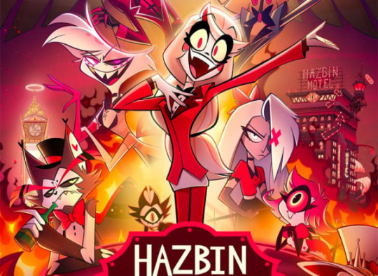
I’d hardly even call them redesigns since you couldn’t even tell they’re different than when they first debuted (save for Vaggie)
And the actual animation just looks so stiff and like it’s a fan made thing


Versus the pilot from FOUR YEARS AGO


The reasoning for the “simpler” designs is to make them easier to animate but they aren’t that complex of designs and I’m no animator I’ll admit so maybe it makes it easier for musical numbers, but part of the appeal of the pilot was the hand-drawn loose style
Plus, any interesting design choices that were there were taken away in the Amazon show
Not to mention that almost every character is supposed to be based off an animal and you can't fucking tell what animal they're supposed to be unless you fucking google it
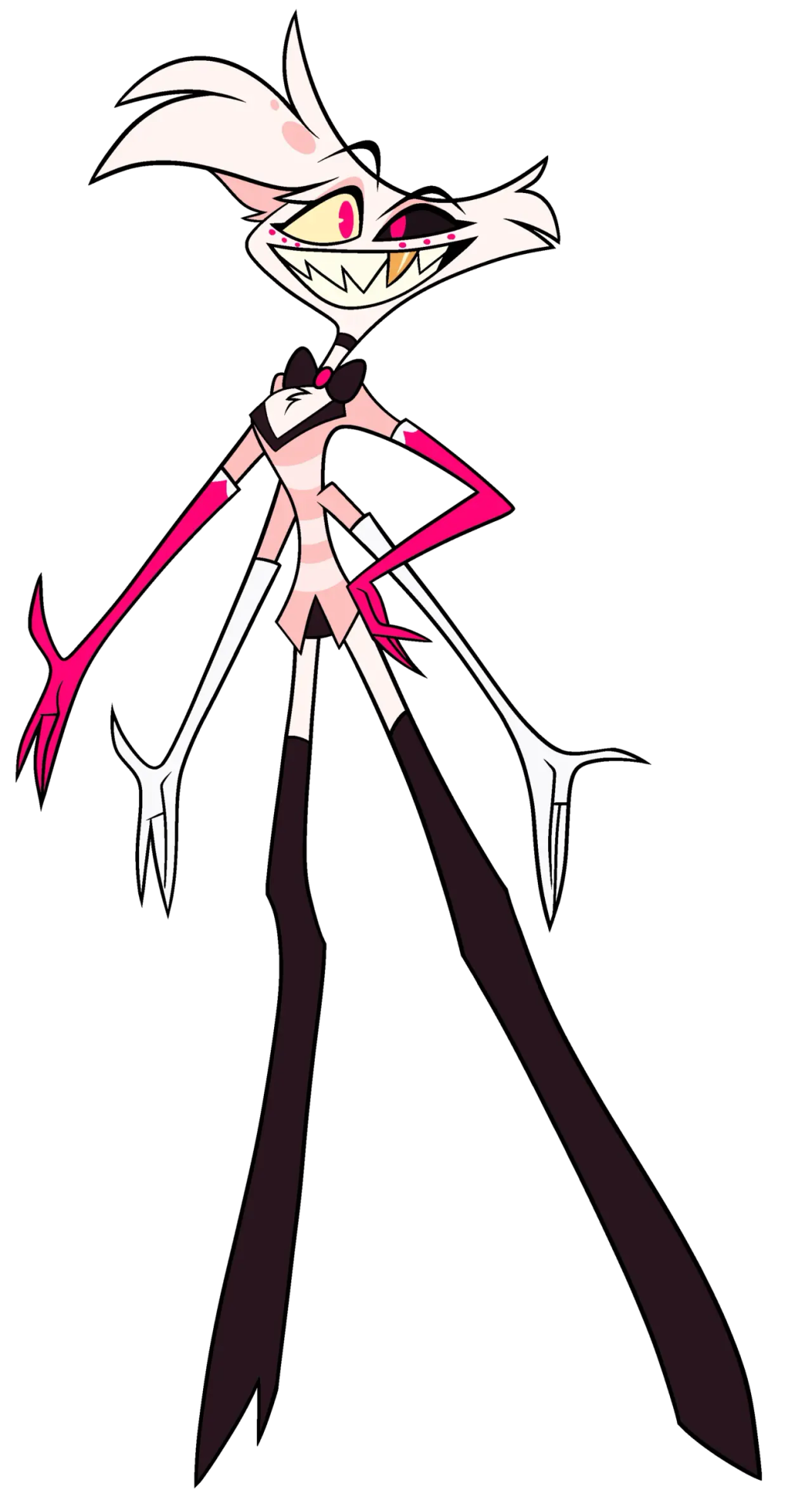
THIS is supposed to be a spider. If I didn't know who he was, i wouldn't even know that. Maybe it's not a universal opinion, but I feel like if your character is supposed to be based off of something, it should be a little more obvious than four arms and dots under his eyes which are actually another set of eyes.
He's a gay man, who's also a sex worker/porn star, which can be told by his outfit, but none of his outfit looks good together. You've got two sets of gloves, knee high boots, a mini skirt, and a blazer with a bowtie AND a choker.
It is a perfect outfit to tell you everything you need to know about him because it's a fucking mess. It looks like when your kid dresses up in your fancy clothes to take pictures in but nothing goes together because the kid is 5 and doesn't understand that just because you like the clothes doesn't mean they go together.
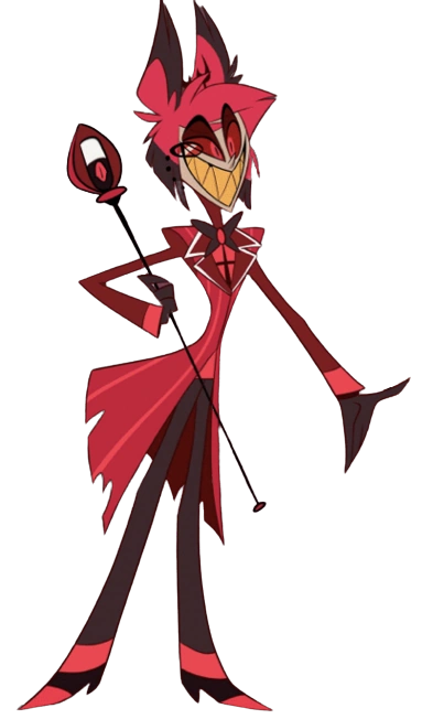
This is apparently a deer, though I've heard he's based off a w*ndigo so he wouldn't be deer-based, WHICH IS STILL BAD BTW HE'S GOT SO MANY RACIST PARTS OF HIS CHARACTER ELEMENTS BUT I'M NOT EDUCATED ENOUGH IN THOSE ASPECTS TO TALK ABOUT IT
And the outfit is just...bad. Aside from the tiny antlers that can barely be seen behind the hair, there's nothing cohesive about it. There's his coat that doesn't match the era he's from, the bob cut, the microphone which doesn't look like a microphone, the neckline that makes no sense, the random stripes on his shirt that you can't really tell what they're supposed to be (suspenders and a tie? a print on the shirt?), the actual tee shirt he appears to be wearing underneath his coat, the gloves, and again the FUCKING BOWTIE WHY DO EVERY ONE OF HER MALE CHARACTERS HAVE BOWTIES IS SHE ALLERGIC TO NECKLINES?
Not to mention the colors of the show and the characters. Vivziepop is under the impression that since they're all in Hell, they need to have a color scheme. Or at least the more important characters do. And what color scheme is that? Red and black.
But you know what else has red and black?
EVERY
SINGLE
BACKGROUND
IN THE SHOW
And he just blends in with the background. Which is not something you want a character to do if they're one of the more important characters in your show.
99 notes
·
View notes
Text

YAAAAALL IT'S ANGEL DUST!!!!! bro I'm so exited to tell u about him hehehehe he might be my fav redesign of the bunch idk
Comparison & rant!⬇️ + A bug/spider cw. I put reference images in there!
Ok guys can I be honest with you. I think. Pilot and pre-pilot Angel were peak 😔 I'M SORRY I'M BREAKING MY SILENCE


Like whaaat... WHAAAT.... I'm sorry he served here he had the BEST design idc idc you can't change my mind. These were NOT bad designs. I've got a slight preference to his oldest design but even then the pilot design was great to me.
THIS however...
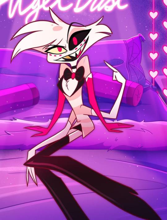
OooOOOH MY GODDDDD THEY NEUTERED HIM!!?! NO tits, three measly ugly stripes on an uglier coat, LONG GLOVES THAT ARE MISMATCHED??? ONE OF THEM HAS THESE WEIRD... WHITE FLAPS?? WHO— WHAT. WHY. AND THEY GO OVER HIS LONG SLEEVES 😭😭😭
I'm sorry but Angel will always be the most egregious case of character assassination in this show, design and character wise. He sucks now and I used to love him.

Okay enough crying let's get serious.
So yeah show Angel sucks. Removing his chunky gloves removed a lot of the fun shape in his silhouette so now he's just a gangly twink. Very little visual interest. Also hate hate hate how his new mismatched gloves are pulled over his long sleeve coat. So dumb. Hate it.
Also explain to me how he's gradually gotten less tits but has simultaneously become more femboy-ified..... So many people immediately mistake him for a girl.......
They also mistake him for. Literally anything but a spider. Once again Viv can't code or theme characters for shit. I also don't like how his face changed... I can't describe it but It's so much less appealing and charming. Something in the eyes and his little cheek bump. Idk. Really hate show Angel props to the animators for making him watchable with his bold animation ts was real nice
Okay onto my Angel! He's now a goldenrod crab spider now! Thank you @/cryptablog for this idea!! (Not tagging them bc they hate the hellaverse with a burning passion lol 💀) They can be white with pinkish markings like our og Angel but most of them are tinted yellow or completely yellow!


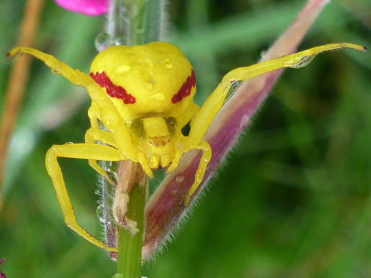
I decided to make him most similar to that mid ground mix of yellow and white with pink-er markings. 1 because I kept lust pink and I feel like that'd be a prominent sin of his (+ purple is in here a lot bc I feel like he'd also be pride aligned! Purple is now the pride color :3) and 2 because the yellow tone in his fur is kinda meant to connect him to Husk in a way... Cuz that's kinda his main color... Idk maybe I'm onto nothing with that one BUT his primary color is purple and Husk's primary color is yellow(ish)! Complimentary boyfriend's!!! Are you seeing my vision!!!!! (Also on a lesser note his colors look more similar to my fav version of Angel aka his design from the pre-pilot ref sheet I showed)
Another idea you can thank Cryptamen for is him being partially translucent in places just like real goldenrods!!!! The idea behind that was because he was in the mafia in life and he had to be really stealthy at times so now in certain environments he's harder to see... Maybe he can even turn fully invisible for a bit... There's also possible character reasons to consider tying in there as well... Ough very cool idea 10/10
Gave him 4 legs and 4 arms + the big abdomen to really make him scream spider bc yes spider boys can be hot and no Viv was not willing to CAPITALIZE on that 😒 Also lengthened his fangs... Also moved his eyes to his forehead to make them more prominent and hopefullyyyy seem more like eyes. Idk. And now he's got pointy little pedipalps as well!!!
Gave him his boobs back bc he deserves them and just generally gave his body more shape (though the second set of legs definitely helps lol). Slightly de-twinked... But not by much...
Once again looked up some common hairstyles at the time and people loooved their hairspray and curls, or swoops, or waves— they were gettin funky with it. Hard to emulate that on his nonhuman skull so I took some artistic liberties applying ideas from common styles onto him.
Didn't do much research at awl for his clothes... I mean... He's not wearing much to begin with... I kept the long gloves bc I thought they had potential to look cute and I have him rolled cuffs on short sleeves. Wanted to keep the style simple but otherwise I would've drawn button clasps keeping them in place. No notes on the thigh high heels so I kept them. Everything else is just kindaaaa whateverrrr EXCEPT THE NECKLACE. Though it was hella funny and fitting
And that's awl folks.... Do u like him do u fuck with him.... Let me knowwww....... Okay byeeee ✌🏾🧍🏾♀️
#my art#digital art#hazbin hotel#hazbin hotel redesign#hazbin hotel rewrite#Angel dust#angel dust redesign#character design
92 notes
·
View notes
Text
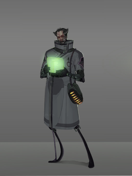
My Human AL-AN redesign!! The video is still a WIP because I got sick haha, but yk.
At first I was scared I wouldn’t see a lot of visual Improvement, since the video is only 7 months old, but I compared the two and wow, there is a huge difference and I’m very happy with it.
Also this isn’t really much of an AU(?) it’s kinda hard to explain but it’s basically just the alien designs replaced with humanoids for my personal convenience (can’t draw em very well), with some minor story altercation that doesn’t really affect the plot. I think with AL this is easier to explain as they canonically have the ability to cause visual hallucinations, so this design would probably just be an extension of that, not really how he looks. I always liked the idea of the architects being a little eldritch that way, they have a true form but it’s unphysical, the human mind can’t make it up so the individual simply chooses what to present itself as: at least that’s my personal interpretation/headcanon.
As I’ve said before in the first post about the concept design where I further explain my decisions, I gave him a burn scar over his face from the disease research facility incident wich I imagine stuck with him in a way it, in one way or another, burns itself through every body he possesses aslong as the transfer doesn’t go wrong and he remains with the memory (also obviously to resemble his face screen).
His attire is based off of those the alterrans scientists wear, the pattern is a mix of precursor architecture textures and shapes mimicking those on his body, the logo on the lab coat is inspired by the architect statues from BZ, wich i reaaaally loved.
Hair/face shaped to vaguely resemble his face plate thingy and horns.
Also gave them a bag in wich I imagine carries all the different tools that are built into their arms in the game, because I’d rather die than draw those again beyond blocking in rough shapes haha, bag coincidentally ended up having a sea dragon color palette wich I initially wanted to change but ended up really loving because it kinda symbolises his guilt haunting him a little. it’s also stacked to the brim with enzyme 42 for obvious reasons.
I also still stand by the idea that the architects would look a little uncanny when trying to resemble humans, they can mimic them to near perfection, but something is just off, the body ratio looks strange, neck a few centimetres too long, shoulders a tad bit too low, lower legs too long, face moving too monotonely, small things like that yk.
Had to rerender this because I started drawing at like 6am at wich point my brain was rotting so hard I completely forgot what brushes I use, but that doesn’t really matter since I love to render so yk lol.
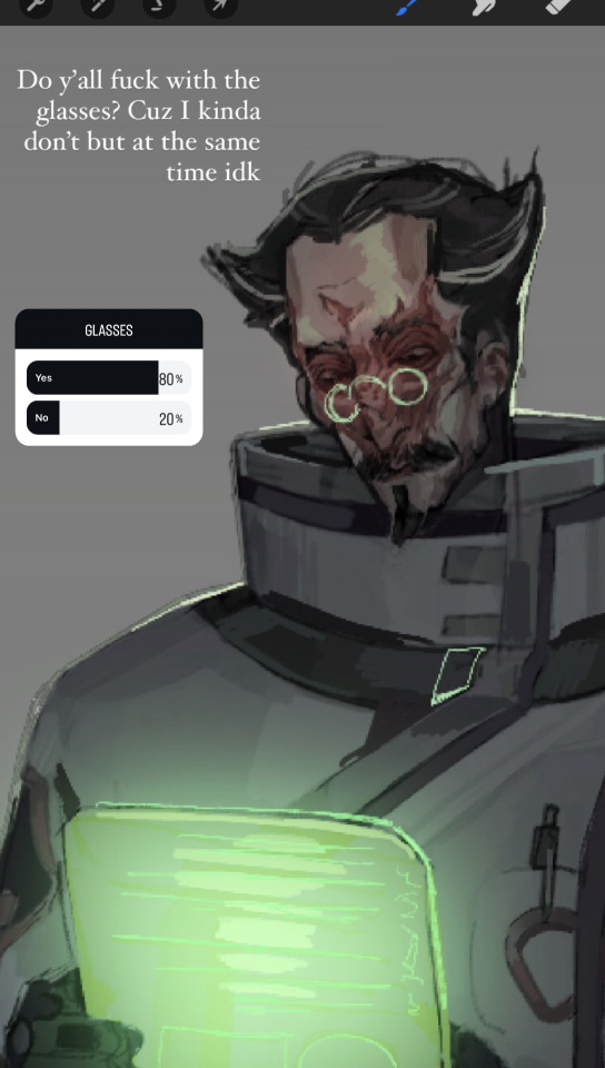
I made a poll on Instagram asking wether or not people liked the glasses, because on one hand I felt it made the colors more even whilst directing attention at and lighting the face nicely, but on the other I don’t really wanna make every „smart“ character have glasses, so I decided that these are reading glasses, wich means he does have them but he can also go without.
here is the alternative without:

#subnautica#subnautica below zero#al-an#video game fandom#al an subnautica#subnautica art#al an#subnautica fanart#video game fanart#fanart#gajinka#humanization#human al an#small artist#artists on tumblr#concept art#subnautica au#idk what else to tag#btw architects do not have set gender roles#because they’re literally digital alien ghosts lmao#like why would they#subnautica architects
52 notes
·
View notes
Text
Magic Knight Squad Robe Redesigns
A long time ago, I had the idea of redesigning the uniforms of the Magic Knight squads for the (many) next gen ocs that me and my friends have. I thought it would be fun for the squads to each have a unique article of clothing for the squads' uniforms, to make each group a little more unique beyond their colors.
With the help of my beloved friend Steph ( @cringeyvanillamilk ), that idea has now come to fruition! I commissioned her for all the art you are to see.
And modeling the redesigned uniforms are mine and my friends' next gen ocs.
Representing the Golden Dawn is @lyranova's oc, Alistar Vangeance.
For the Black Bulls is @eme-eleff's oc, Hikari Yami.
Wearing the Crimson Lion King's uniform is @thoughtfullyrainynightmare's oc, Leonidas Vermillion.
From my own collection of ocs and representing the Blue Rose Knights is Dawn Faust.
The representative for the Aqua Deers is also my oc, Merel Faust.
The Silver Eagle's uniform is worn by @koneko-pi's oc, Avalinia Silva.
Representing the Coral Peacocks is @sailor-muno's oc, Bellini Fortuna.
Showing off for the Green Praying Mantises is @faewraithsworld's oc, Sullivan Vixen.
And the model for the Purple Orcas is another of @/faewraithsworld's ocs, Zoisite Ideale.

The CLK and GPM's uniforms have different versions that can be worn by the squad members. As seen below.


Thank you to Steph for taking my commission. And thank you to all my lovely friends for allowing me to turn your next gens into some gorgeous models!
Further notes about the uniforms below the cut.
Golden Dawn: they wear full body coats that are meant to be worn open. Squad members can have tassels added to their coats so they can be tied close if they so choose.
Black Bulls: they're not wearing leather jackets. It's standard fabric, that's all. Jacket length is somewhat adjustable though longer jackets are avoided to steer clear of having the same silhouette as the Golden Dawn.
Crimson Lion Kings: the sashes are sewn so that squad members don't have to wrap the fabric over their shoulder and around their waist every time they don their uniform.
Blue Rose Knights: it's a short cape already attached to a shirt. You'd just put it on like a regular shirt and hope that you don't get the cape in your face as you put it on.
Aqua Deer: it's a scarf, plain and simple. The ends of the scarf are to be a clean cut.
Silver Eagles: this squad retains the original form that a majority of the squad robes have in canon, a short mantle with an long cape attached. For the next gen's version, the fluff of the mantle was made a smaller component so that the feathers can be the main focus, instead of being mostly equal parts fluff and feather.
Coral Peacocks: a waist sash with the end of the fabric being shaped to resemble the tail feathers of a peacock.
Green Praying Mantises: arm sleeves that can just cover the forearms or cover the upper arms too. There's also a version with a slit in the sleeves in case there are squad members who don't want to wear the form fitting sleeves.
Purple Orcas: a vest with pointed hems reminiscent of the triangular shape of the squad robe worn by the previous generation. There are buttons on the vest so they can be worn open or closed to a squad member's preferences. (And most members tend to wear a shirt under the vest. Zoisite only wears his uniform this way because he can.)
#black clover#black clover headcanons#black clover fanart#black clover oc#next gen ocs#dawn faust#merel faust#alistar vangeance#hikari yami#leonidas vermillion#avalinia silva#bellini fortuna#sullivan vixen#zoisite ideale#soda's ocs#lyra's oc#marilu's oc#laura's oc#koneko's oc#taja's oc#bel's oc#steph's art#steph the og mutual
68 notes
·
View notes
Text
OUCH
"If we were to treat the redesign of this coat of arms to represent the Sussexes in their Californian incarnation as flippantly as they have, then we have some alternative suggestions for them. Perhaps the quills could be replaced by javelins, like the ones they hurl at the Royal family from time to time? The songbird already looks predatory enough, but perhaps the Greek goddess, Apate, the goddess of deceit, might be a more appropriate supporter?"
Hugo Vickers for The Telegraph
164 notes
·
View notes
Text
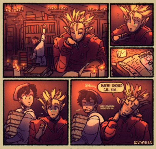
given that i've ran this blog for as many years now i think i should get much credit for this being what, only the third dick joke i've ever made here hdfkhkj
anyways. there's this point in the story where vash and wolfwood have to go their separate ways for a while, but neither of them are dealing with it particularly well
(image id below the cut since it's a longer one)
[image ID: a rough, doodley 5 panel digital comic of vash and meryl from trigun, but from my leaden skies au where they've both been lightly redesigned to fit into the setting of monster hunter. vash is a wyverian with long pointed ears, wearing a red coat with gold trim and buttons. meryl is a human wearing a beret as seen on other guild girls, but her all-white outfit is a practical two-piece blouse and shorts set. the whole comic is comprised of warm colors, orange and yellow and dark purple
panel 1: vash sitting in the foreground at a brown desk covered in candles and books, with a book opened in front of him that he flips through with a bored expression and his cheek resting against his hand. he appears to be in a library, lit by candles on dark grey chandeliers hung from the ceiling. meryl is in the background stretching up to reach a book high on a shelf, and beside her is a table which is also covered in candles and several tall stacks of books
panel 2: a closeup of vash's face as his eyes widen and his ears prick up. something in the book has apparently caught his attention
panel 3: a closeup of the page vash was looking at, an illustrated info sheet about the flying wyvern, khezu. a candle in the table brightly illuminates the colored page
panel 4: meryl has come around by vash's shoulders with a stack of books held in her arms. she quirks a brow as she looks over vash's shoulder at the book. vash has a neutral, hard to read look on his face, but his ears are still up and his eyes are still shiny and wide as he seems to consider the page for a while
panel 5: a yellow word bubble comes from vash, who huffs a long sigh and says, "maybe i should call him...". his head has tipped to the side as he rubs his neck and frowns, blushing a little with his ears drooping. meryl physically recoils from him and her face scrunches up in disgust, saying, "eww" and, "there's something wrong with you"
end ID.]
#trigun#trigun anime#trigun fanart#vash#vash the stampede#meryl stryfe#vashwood#leaden skies au#monster hunter#monster hunter fanart#monster hunter crossover#crossover#on a serious note i REALLY love putting vash in a role that emphasizes how he's a smart dude with a frankly astonishing depth of knowledge#of his specific specialties. like that aspect of him gets its moments to shine in canon but like#he is Literally just a little scientist man in leaden skies and it's very fun to work with :3#anyways i've been wanting to do this forever and lately i've been badly needing to practice new things again so it was a fun excuse lol#ALSO: for girlies in the know here. is ANYONE ELSE burdened with the knowledge of khezu's concept art#like goddd girl they really said okay we want this thing to look phallic as fuck but this is a little Too Much. tone it down 10 percent dhf#but only 10 percent. mostly they just took away the. head shape. ffsdfdssdfs
175 notes
·
View notes
Text
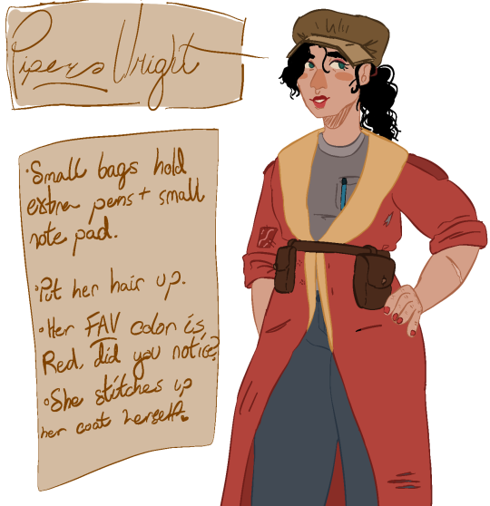
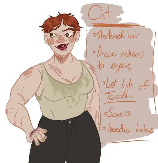
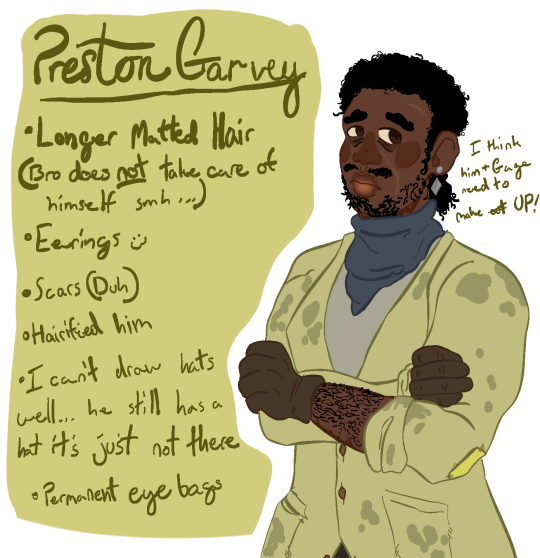
Hellooo first post
I was embarrassingly, watching back on one of my fav mlp redesigns videos and was like 'hey that would be cool... but with Fallout characters!!
Piper:
As you can see, I didn't mm change much. (Thank you Piper for your hate being easy to draw) However I assumed she's hot as fuck in all those layers and since she rarely goes out into the wastes, I thought of lessening the amount of clothing. Giving her a plain undershirt and jeans, her famous pretty jacket that has a 'closely matched' patch of cloth over one of the bigger holes in it. Also, all of her buttons are gone. So she has to have a belt to close her coat!
I also put her hair up bc I think she looks nice like that! Maid her hair a lil curly.
Gave her those belt bags to add on the 'women's clothes never have pockets' thing.
Gave her make up, since most reports before her wore it for charisma, I assume she picked that up.
Nail polish, I just think she'd like it to hide her dirty fingernails
Only does small smiles to hide her missing back teeth
Cait:
I changed a lot about her, bc honest!! I hated most of her design elements.
I forgot to put on her pit paint, so imagine this after going eirh sole survivor.
Took away her corset. Because I HATE that they would put a female cage fighter in ANOTHER unrealistic outfit. Let this woman breathe. Also, I made her tank top greasy because yes.
Made her more muscular, with more scars to show off. She's SO COOL!!!
Shortened her hair because hair is a BIG thing to grab in fights, and she's probably annoyed with how much people try to go for that. So she hacked it off! She did it herself!
I made her eyes a bit more detailed than the others to show off the drug abuse and trauma it left behind. It's not a lot, but it's a little detail, along with the needle holes in her arm.
So many missing teeth, and she's proud with a lisp.
Preston:
I love this man so much shut up.
Bethesda, let people of color have their hair! And have it be matted bc this man is too depressed to take care of himself instead of others
Made him less muscular and more on the skinnier side bc depression
Eyebags bc... depression.
I like his og coat, but again, so many layers are hard to run in, so I kept it to a minimum, like with Piper. His scarf, undershirt, slacks, and coat.
Give him more facial hair bc let that man actually look depressed bro.
Gave him earnings bc it just looks pretty on him. Small face scars he's clearly ashamed of and has tried to hide with makeup.
I mean, every word I said beside his head, they could change each other. For the better or worse
Thanks for reading! I'm gonna do a poll of other compainions to see which three I should do next :3
#fallout#fallout 4#fo4#fo4 companions#preston garvey#fo4 preston#preston fo4#piper wright#fo4 piper#piper fo4#cait fo4#fo4 cait#fallout 4 companions
52 notes
·
View notes