#same symbolism but more original design
Explore tagged Tumblr posts
Photo

I watched the new Puss in Boots movie and liked the same character everyone else liked

#during the scene like midway through where hes chasing him through the woods I heard a guy in the theater say 'this guy is cool'#he was right that guy was cool#hes also borzoi shaped#also love the weapons they gave this guy#the two sickles instead of the traditional grim reaper scythe#same symbolism but more original design#art#colored pencil#fan art#puss in boots#puss in boots the last wish#death#wolf
2K notes
·
View notes
Text

some dgr doodles i did last night
ft: the toxic yuri enogiri au i have in my head where they were dating before the killing game started. throughout the actual game, kyoko has the vaguest recollection that she has some kind of deep connection with the mastermind behind it all, and junko is both rooting for and actively sabotaging her girlfriend by dropping hints about their relationship. which leads to some intensely disconcerting inner turmoil for kyoko as she tries to figure out what the hell she's gonna do when she uncovers the mastermind's secrets, and if she really wants to do that at all
and naegami horses ig
#danganronpa#enogiri#naegami#wanna clean up the first one actually bc i. am fond of it#toxic yuri enogiri......#i originally sketched the top picture before but with my butch kyoko design#sorry i wish i could be more coherent about my enogiri idea. but. im sleepy as hell rn#naegami ponies. i like byakuya being a normal earth horse and makoto can flap around#makoto should get to be able to do a flying high jump kick on byakuya in at least one au#i mean. he probably wouldn't. but that possibility should exist#also an au where they can be on the same eye level for once lmao#byakuya cutie mark is um. the money symbol + a single star (for wealth + polaris)#makoto is a 4 leaf clover bc i couldnt be creative enough for him. sourry#my arts
30 notes
·
View notes
Text
huh, the amount of people who perceived themes other than eugenics and transhumanism in regards to evolution in phyrexia is very interesting to me
#just. Huh!#i get the aesthetic appeal dont get me wrong the entire design for phyrexia is very cool#but considering the core philosophies behind the creation of original phyrexia and how that bleeds into new phyrexia#the amount of people i see who go to great lengths to kind of. twist it into a leftist or trans symbol is fascinating#when at its core its based upon an ideology that seeks to ''perfect'' perceived ''flaws'' like being transgender#but at the same time transhumanism and the idea of changing your body to something optimal is also heavily significant#thematically when it comes to trans stories. especially when considering the perception of so many people that transitioning is somehow#a mutilation of the human body that turns someone into a monster (wrong). so i can see why other trans people#would identify with phyrexia in that vein. being seen as monsters for undergoing such a procedure#for me phyrexia and the procedure behind phyresis has always come off more as an allegory#for medical procedures done to ''perfect/fix'' the unwilling. forced reassignment for intersex people or lobotomization of the disabled#sterilization of the “undesireable”.#esp with yawgmoths (self proclaimed eugenicist though his writer was kinda confused abt what eugenics actually is)#malpractice and violence upon the masses and views on race and the reverence that phyrexia (his creations of course) hold for hi#*him#and the facets of that worship which continued to exist into new phyrexia
2 notes
·
View notes
Text
been rewatching the blg hollow knight series and it's making me feel a lot of things.
1) re-experiencing the story for the first time in a while means the emotions are hitting me hard, and now I'm thinking extra more on all my in my head story stuff. also I wanna replay (slash maybe actually finish this time) myself so bad
2) there's a billion great things about that series and one of them is all the lore reactions. and specifically I can't stop thinking about the way the 250 word lore essay part makes me feel. like the pure excitement and being so into analyzing everything is soo incredible. And it's like. I've been feeling really iffy about my rain world recordings for lots of little things, but revisiting that moment aka my biggest inspiration for wanting to do it in the first place...it helps. potentially doing that same thing for someone else would be such an honor. and even if it does end up just being for future me, it still means a lot to get back to thinking about it in this context
3) also my brain is doing the typical "lets mash together the things you're into" and thinkin about hk characters in rw and vice versa. mostly surface level design thoughts but :3
#an aquila original#for 3 the first thing that came up was like. vessels as iterators and vice versa#because even if they're not exactly analogous there's certainly some similarities. in the 'parents created us to solve their problems for#them. and then abandoned to suffer the consequences of those issues and still responsible for fixing them'#also pure vessel/hollow knight as before/after iterator versions fucks so hard with the details you can put in#pv having the hallownest/king's symbol on them. the armor with the chain loops built into their robot body.#the functioning iterator 'halo' projection being the worldsense pattern!!!!#and then with their broken down self it's definitely matching that single sprite of thk where you can see infection cracks in their 'shade'#also from what I know so far of the rot/corruption it's not narratively the same as the infection. but just for how it affects five pebbles#I think i can be justified with comparing them aesthetically. like. Lost Kin iterator with rot tendril stuff#instead of infection blobs in their head?!?!?#the iterators as vessels is harder for me design concept-wise just because at least pebbles and moon are the same shape#so translating that to vessel mask shapes you gotta be more symbolic I guess
1 note
·
View note
Text
[ID: Two images of drawings of characters from Alice by the Mechanisms. The first shows the Knave of Hearts, the Queen of Hearts, and the Caterpillar general. The second shows Alice Liddel, and Majors Hatter and Hare. The background of both is light grey. Each are labeled with their names, in all caps: "The Knave of Hearts" is in a black hand-written style font; "The Queen of Hearts" is in a red serif font, where the thick parts of the letters are open space; "Caterpillar" is in a simple, thick, blue font, which has been distorted to be wavy; "Scout Captain Alice Liddel" is in a blue typeface with reduced serifs, and which most of the letters are the same width and all are the same height; "Majors Hatter and Hare" is in another hand-written style font, this time in red.
Image One: The Queen of Hearts stands close to the middle of the frame. She is pulling the Knave of Hearts into frame from the left, by a chain attached to a bright red collar around his neck. The Queen has tan skin and long wavy red hair that is pulled up in a messy bun. She has bright blue eyes and a smirk on her face. Her head is nearly in profile, facing toward the right of the frame, but her body is mostly facing the viewer. She wears a uniform coat and trousers which are very dark in color, the coat being redder while the trousers are cooler brown. Both are splattered with black. Her coat has tails and the shoulders of it are decorated with roses. Her combat boots are the same color as her coat. She is wearing gloves colored the same as her trousers. Her coat has gold buttons and the coat, gloves, and trousers have gold piping. She is looking at the Knave.
The Knave has light skin and chin length black hair. He has cat ears atop his head which are flattened to the sides. His eyes are a very light chartreuse green color. He has a very worried look on his face and tears are streaming from his eyes. His uniform is also a dark red/black color. His coat is longer and comes down over his hips and has a wide collar. The Knave's boots are barely seen off the edge of the frame, but they are knee high. His coat is also decorated with gold piping and has flat horizontal buttons. His hands are chained together in front of him and he has light brown claws. Out from under his coat a black tail wraps around his leg. There are red lines indicating his falling into the frame and the Queen's fist tightening on his leash.
The Caterpillar general sits on the right side of the image. It is sitting backwards in a wooden chair. It has its arms resting on the back of the chair and its head in its right hand. In its left hand it holds the hose of a hookah. The hookah that the hose attaches to is sitting on the seat of the chair, in between the Caterpillar's legs. The stem of the hookah features a heart shape and all glass parts of it glow blue. It is wearing a denim blue uniform made up of a coat and trousers. The coat has a wide collar and is double breasted. The trousers are rolled up to the calves, where it can be seen that the Caterpillar's has two below-the-knee prosthetics which are blue and col grey. It wears navy combat boots. Around the chair, on the floor, are five glowing blue bottles, in various shades, and an additional hookah. The each of the hookahs have two hose ports, with only one hose attached. The Caterpillar is smiling with half-lidded, yellow eyes. It has long wavy blue hair and two antenna protruding up from its forehead and splitting its bangs. it has light blue skin with medium blue stripe-like markings.
Image Two: On the left side of the frame, Alice stands facing full on to the camera and taking a step forward. She is holding a futuristic black long gun, which is filled with a glowing pink liquid, across her body. Her uniform is blue, which consists of a V neck, with a lighter single breasted panel over it and long sleeves, under a short sleeve, high collar bolero. She has what appears to be a name tag on her right upper chest. Her trousers are nondescript, but the same mid blue color and tucked into her knee-high boots. Her uniform has coat-tails which reach her calves. Her uniform is accented with silver, in the form of piping, buttons, belts, and the high collar. She has light skin and blonde hair, which is pulled back into a low bun, and she has bangs which are V shaped in the middle and long on the outsides. Her eyes are red and she is splattered with blood, mainly concentrated on the top of her head, he right shoulder, her left ribs, her right leg, and so much on her boots that it is hard to see that they were actually blue as well. Two speech bubble style notifications come from Alice's body, between her and the Majors. They are the same black and pink as her gun. In a seven-segment display style typeface, they read "E> [heart] Access denied <3 [heart]" under a small picture of a cat head with an army cap on that has the outline of a cat head in the center. The cat's mouth is open and three excitement marks are on either side of his face.
Hatter stands in the middle of the three characters, but he is close to Hare and has his weight n the leg closer to him. Hatter has his left hand on his hip and his right one up by his chin, with his index finger and thumb stuck out in an L shape. His eyes are closed and he appears to be biting his lower lip. He has medium brown skin and long brown hair that is pulled back in a low bun. His uniform includes of a royal blue coat with gold buttons and piping. It has a high collar and on his upper sleeve is an upside down cat hat shape in light purple. He has a red sash tied around his waist and wears light beige riding breeches with black paddock boots and light brown half-chaps. A little yellow star comes out of Hatter's face between him and Hare. Hatter wears a blue cap which matches his coat and has two bunny ears sticking out from the back; it's visor is shiny and black.
Hare is mostly side to the viewer, with his body facing towards Hatter and his head turned toward the viewer. He also has his weight on the leg which is closer to Hatter. He wears and olive green siren suit with a dingy undershirt beneath it. The sleeves are long enough that they cover his hands, which are held together in front of him. He wears dark brown combat boots and his suit has a warm white rabbit tail on the back. The upper sleeve of his suit has a light pink, right side up bunny head shape on it. He has tan skin and pink eye and he is smiling with his lips closed. His hair is short and green and nearly the same color as his uniform. He wears a hat much like Hatter's except that Hare's is the same green as his suit. There are three short, pink lines denoting excitement radiating on either side of his face.
End ID
Note: In the image description and this note, the names of the characters have been color coded, such that every time "Queen of Hearts," "Queen," or "Queen's" is appears it is in red; "Knave of Hearts," "Knave" and "Knave's" are in pink; "Caterpillar," "Caterpillar general," and "Caterpillar's" are in blue; "Scout Captain Alice Liddel," "Alice Liddel," "Alice," and "Alice's" are in purple; "Majors Hatter and Hare" is split so that "Majors Hatter" yellow, the "and" is the same as the rest of the text (dependent on what mode you have tumblr in) and "Hare" is green, while the instance of just "Majors" is split so the first three letters are yellow and the last three are green; "Hatter" and "Hatter's" is yellow; and "Hare" and "Hare's" is green. Similarly, "Image One" and "Image Two" are bold and in orange. End Note]
✨mechanisms character designs!!✨

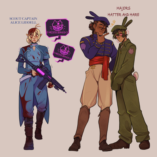
i know i posted alice and the majors™️ before but i wanted the whole Alice Squad to be together,,
(prev) (prev) (prev)
#the mechanisms#ttbt2#alice#described#the knave of hearts#the queen of hearts#general caterpillar#scout captain alice liddel#majors hatter! and hare!#i guessed which one is hatter and which is hare based on the order of their bodies and the order of their names#it was so very hard for me not to make 'hatter' green because the only difference between the words 'hatter' and 'hare' is the Ts#and Ts are green for me#im guessing based off of their uniforms that hatter was in the kings military. since that is a fancy uniform#i learned way more about horse riding gear than i needed to know when researching to write this#i like the details of the little cat/bunny head shapes on their uniform#i hope that hares is indeed meant to be a bunny#although im not sure what they mean#if hatter was on king coles side than him having what appears to be a symbol of comsat chesire makes sense#since comsat chesire was on the kings side too (now hes on his own side)#but i dont know what it would be upside down though. and i dont know how that correlates with hares#if hares is meant to be the same symbol that it could be showing how theyve switched side because they dont know wtf is going on#like hatter originally on the kings side bu now he has this anti-comsat patch and hare originally against the king but now he has this-#patch for him. could also be like when siegfried says 'i wondered if you wore my stripes would they let me stay as yours'#taking pieces of each others uniforms because if they could just be on the same side they wouldnt have to fight each other at all#i love them. if you couldnt fucking tell#blogbot q#idk someone let me know if the color coding is too much. my brain likes it better than the text being all the same color.#but it doesnt look particularly good in this case.#i tried to pick colors that went with their designs (not my synesthesia) but also the color options are limited#and alice and the caterpillar are both very blue and id likely give hatter blue if the image were of just him and hare
758 notes
·
View notes
Text
as a bi person, the bisexual flag brings me infinite joy and always puts a smile on my face, however as a person who has a Passion for Graphic Design, that undersaturated shade of purple infuriates me when it's used digitally
like, on an actual flag - which was its original purpose - it looks great!

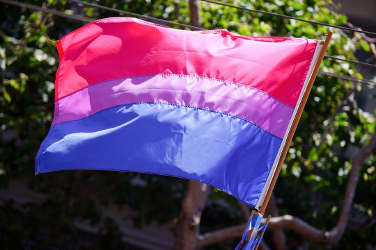
those look fine! lovely, even! with the semi-transparent fabric, the way it catches the sunlight, it looks beautiful!
but now look at how it looks digitally

the pink and blue are so vibrant compared to the sad, lonely lavender!
and let's look at this statement from Michael Page, the creator of the bi flag:

(sidenote: he created this flag in 1998, so if his takes on bisexuality is different from yours, it's okay to notice that! a lot has changed since the 90s when it comes to lived experiences and the way we describe them. but, it's also important to respect his thoughts about this and the way he presented them, even if today, we'd probably not say that bi people "blend unnoticeably into both the gay/lesbian and straight communities.")
so in pantone colors, the pink is 226 C, the blue is 286 C, and the purple of the flag is 258 C.
but...here's the deal
Michael talks here about how the key to understanding the symbolism is to know that the purple blends into both the pink and blue. and on a physical flag, I think you can see that!
but digitally, it absolutely does not blend. it clashes badly, and looks oddly separate from the other two colors.
which got me wondering...what purple do you get if you actually blend 226 C and 286 C?
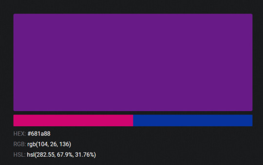
oh! oh, my god.
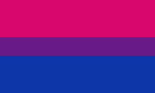
look at that! look at how nicely it fits between those colors!
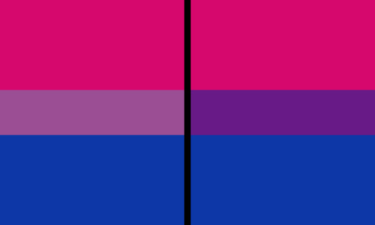
look at it next to the original color scheme! look at how much more vibrant the purple is!
and friends. this is just blending through rgb! you get even more purple variations when you use other color spaces!
let's compare all of them:
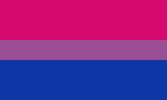




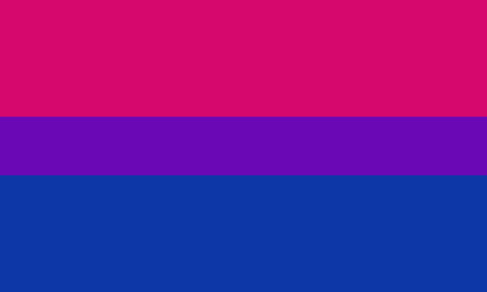
(top: original, lab. middle: lrgb, lch. bottom: rgb, hsl)
look at all of the different purple options you can get just by combining these two colors!
if you want almost too-vibrant saturation, you can go hsl, if you want something more relaxed that's closer to the original, you can go lab or lrgb. and if you want to split the difference, lch is bright and violet, while rgb is there with its saturated but darker purple.
anyway, I guess I don't really have a point here? this isn't so much an informational post as it is Me Getting Weird About Colors, but I think it is a useful lesson about how colors look very different on screens compared to how they look on objects in real life.
and sometimes, I think it's okay to compensate for that.
out of all of these, this is my favorite bi flag:

it's the one where the colors were blended in lab color space. for me, the lighter, softer purple is close enough to the original bi flag purple, while also feeling like a smoother blend of the blue and pink
but that's just me! and it might not even look the same to you, since every screen is different, because technology is a nightmare!
anyway, thank you for coming with me on this colorful journey! I will now retreat back to inkscape and make pained sounds about inkstitch gradients until something tangible pulls me back into reality
#bi#bisexual#bisexuality#bi flag#bisexual flag#sbs rambles#graphic design is my passion#id in alt text#but#the ids are probably deeply unhelpful for the different variations of flags#in the alt text of the six flags all grouped together#I just put what method the purples were blended with#and then tried to describe them more in the paragraph below#but this is an inherently visual post#so if you're reading it with a screen reader I am sorry :(
19K notes
·
View notes
Text
Reverse Falls!!


Soo this is my take on Reverse Falls!! I don't really know which are the original designs or which are the new personalities that each character adapts, so I made my own headcanons!! :3
It should be noted that there are characters who do not change personalities with anyone, but rather their personalities are more exaggerated or are opposite to the originals. Or (in the case of McGucket) their relationships are different so they change their way of being progressively.
EXPLANATION TIME:
This is quite long, I'm going to explain the personalities of each one and how they relate to various characters. Credits to: hours of daydreaming and Google Translate (TW: child abuse, emotional and physical abuse, homophobia, classism. I don't know if there's anything else, just in case)
Pacifica Northwest: Outgoing and very expressive. She didn't know Gideon very well until her parents sent her to Reverse Falls. She likes to knit, draw, and has a lot of stuffed animals. She has a lot of hair, and likes to do different hairstyles every day ("to be innovative"), cries when she has to cut it. She is very affectionate with Gideon and tries to get him out of his shell. She is a little insecure, but likes to see the positive side of things. She gets along very well with Bud, although sometimes she feels he is a little weird. Symbol: Llama (on her sweater)
Gideon Gleefull: Insecure, has little self-confidence, very skittish and anxious. Has a habit of chewing when he is thinking, like OG!Dipper (chewing on pens, his shirt, etc.). He didn't really know how to talk to Paz at first since the first time they met they were very little, what was she going to say?, was a "Hello" enough?, a handshake?, a complicated handshake?, was she going to ignore him? Paz simply gave him a big hug when she got off the bus (+ gave him a sweater she made on the way). Symbol: Telepathy star (in his hat)
Bud Gleefull: Ultimate scammer. Very friendly and funny, although sometimes a little intimidating. Bye Hawaiian shirts. Very patient with Gideon. He is basically the “cool uncle/dad”. He put Paz to work the day she arrived, although he became attached very quickly and gave her family privileges (he does the same with Gideon).
Mason “Dipper” Pines: He is still very insecure but is able to feign confidence when standing on stage with his sister. He still has a lot of passion for science, he is not very affectionate, he holds back his emotions as he does not want to look vulnerable, especially in front of Stanford. He has a lot of respect for Ford (or rather, fear), being his apprentice he sees him more as a teacher, a superior figure than as an uncle; however he has very little respect for Stan, threatening him and making fun of him. He does not usually use his amulet much, only to practice tricks or in his shows. He has a very distant relationship with his sister, similar to that of the Stan twins. They have many disagreements, but they still have each other's back, especially when Ford is aggressive with one of them. The most sincere relationship he has is with F, although he still treats him like an employee, knowing that he was one of the brilliant minds behind the portal he respects him. Sometimes he discusses theories and shares discoveries with him (although he is embarrassed to think that his only "friend" is an employee of his uncle). Once he met Gideon and Paz, he was able to show his more fragile side and be himself, although he doesn't consider them completely friends (that changes post-weirdmageddon). Symbol: Pine tree (a small pin)
Mabel Pines: A spoiled brat, basically. She's very charming and friendly on stage and with guests at the Pines' many parties, but she's very whiny and selfish behind the scenes. She's not at all affectionate, to the point that she hates physical contact, especially if it's from townspeople. She resents her brother a lot for being Ford's "favorite" (he doesn't really have favorites, he's just less strict with Dipper because he's useful to him). She's Stan's spoiled child, giving her what she wants when she wants it (they have a nice relationship actually, Stan being one of the only ones who comforts her when she's sad). Instead of knitting, she likes to design her own dresses and accessories for shows and parties (her guilty pleasure is arts & crafts, since it's a very "childish" activity for a Pines). Obsessed with Paz, but learns to respect her limits throughout the story. Symbol: Shooting Star (a small pin)
Stanley Pines: He basically swaps personalities with Bud, runs the Telepathy Tent, is very friendly, and is scared of his brother and the twins. He never gets involved in Ford's experiments, having a very tense relationship with him. He loves the twins very much but knowing the power they have with those amulets he prefers to go along with them and not question too much what they ask (he knows when to be firm but the one who really has an impact on them and can make them see reason is Ford). Symbol: Oyster(?? (on a necklace)
Stanford F. Pines: Did you think OG! Ford was a jerk? Well now he's twice as much! He doesn't have an ounce of empathy in him, he's very narcissistic and only cares about his projects and his image. He doesn't care at all about the twins, only seeing them as a way to make money, demanding the most out of them, and he doesn't hesitate to use violence if any of them get out of line. He's very distant with Stanley, speaking to him very dryly (or rather, barely speaking to him at all). He's almost a hermit, living in his laboratory, not letting the townspeople get to know him; although unlike OG! Ford, he cares a lot about how he presents himself in front of the public, taking care of his image and clothing. He's very demanding with Mabel, as he feels she's nothing more than a spoiled child, the image of the Telepathy Tent along with her brother. He is a bit kinder to Dipper, as he realizes that he has a brilliant mind for his age (though not more so than his own), so he includes him in many of his experiments and research if he proves useful; but excluding that, he is just as insensitive as he is with his twin, mistreating him if he does not comply with what is due. His relationship with McGucket is kinda weird: although they were friends in college, the power that Bill/Will offered him completely consumed him, being abusive to F, forcing him to work long nights, keeping him awake by force. He only sees him for his use: his great skill with mechanics (which Ford does not have, although he hates to mention it). Although he was in love with F while he was at Backupsmore, he currently has no romantic feelings towards him, considering him an employee, his assistant, nothing more. He has internalized homophobia (a gift from Filbrick) and classism, so he hates to remember when his relationship with F was one of equals, friends. It disgusts him to think about when he would get so emotional around him. Symbol: Six Fingered Hand (the diaries)
Fiddleford H. McGucket: He is still the brilliant mind he was in his youth, but stress eats him alive. He started to age very quickly thanks to it. He invented the memory gun to try to forget all the horrible things he witnessed or that Ford made him suffer, but his boss doesn't allow him to use it too much since it can damage his mental health and erase knowledge, making him less efficient and useful. He doesn't have a very deep relationship with Stanley, since he practically lives in the lab where Ford forces him to work, but they are able to talk whenever F has a break (almost never). He can't stand the twins too much, not only because he feels that they are very annoying, but because the simple presence of children in his day to day life reminds him a lot of Tate, with whom he no longer has contact. Everyone knows about the abusive relationship he has with Stanford, they are not indifferent to it but they try not to mention it or get involved in his affairs (practically out of fear of Ford). Throughout his stay with Stanford he started developing an emotional dependence on him: not only did he make him feel that he was useless without him, but he uses violence on him when he is not fulfilling his duty, causing F to blame himself when this happens (What did he do wrong? What can he do to improve?). This got to the point where he started to hurt himself when he did not do something right. Ex: hitting himself when he noticed that his leg was bouncing in front of his anxiety (something that bothers Ford a lot), pulling out clumps of hair in front of the stress of not being able to achieve something, biting his nails, scratching himself, hitting his head (imagine Dobby from HP). Such actions and the mixed feelings he had towards Ford, made him develop masochism, enjoying when he inflicts pain on himself and when he is the victim of Ford's physical and psychological abuse, he clearly hid this for a while since it would look very unprofessional on his part. Eventually his boss found out and used this to his advantage, being quite sadist himself (he enjoys watching or inflicting pain and/or humiliation on others, in this case, he gets sexual pleasure). So every time Ford needs to let off some steam, vent his frustrations (or is just horny), he uses Fiddleford to fulfill his fantasies, making F's wishes come true as well. He basically uses him as a sex toy, and F doesn't complain, having suffered so much emotional manipulation, he even considers himself lucky that his boss wants to be with him like this, even if it's NOT healthy. Symbol: Spectacles
Bill Cipher: I don't like the idea of changing his name, so Bill stays. He's still the same chaotic demon as in the original series, but this time he's been tricked by Ford into working for him and doing his bidding. He's also forced to do the twins' bidding. We already know that Bill can change his shape and color, so I think all of his shame and self-pity manifests itself in his appearance, turning blue over time (any strong emotion makes him change his appearance). He manipulates Gideon and Paz, making them feel sorry for him so they'll do his bidding (it doesn't work, clearly). The people he has the most contact with are Ford and Fiddleford, as they spend most of their time in the basement where he's locked up.
So that's it. I don't really know how this timeline would work, considering the portal and the journals, but I just wanted to have fun with the character designs and relationships (I feel like the weirdmageddon would happen sooner than in the original timeline). If you want me to go deeper into certain relationships or characters, let me know!!(≧▽≦) I'll see if I can go deeper into the relationship between Ford and Fiddleford that you guys liked so much (you guys really like toxic yaoi, huh??). I'm thinking of making a fanfic or smt to explain their day to day life in the lab and how Ford invited F to work with him (SPOILER: it didn't go well...).
That's it ig, LIKE AND SUSCRIBE!!!1!!1!Σ(°ロ°)
#gravity falls#fanart#digital art#reverse falls#reverse falls au#gravity falls au#mabel pines#dipper pines#stanley pines#stanford pines#fiddleford hadron mcgucket#fiddleauthor#fiddlesix#toxic yaoi#btw: the kids don't kill people#they're 12#they're still silly#just a little traumatized#thanks stanford#i didn't draw the accesories with their simbols#opps...#i forgor#just imagine they're there#i'm not good with character design....#maybe i'll change the designs as time goes on idk
1K notes
·
View notes
Text
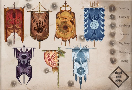
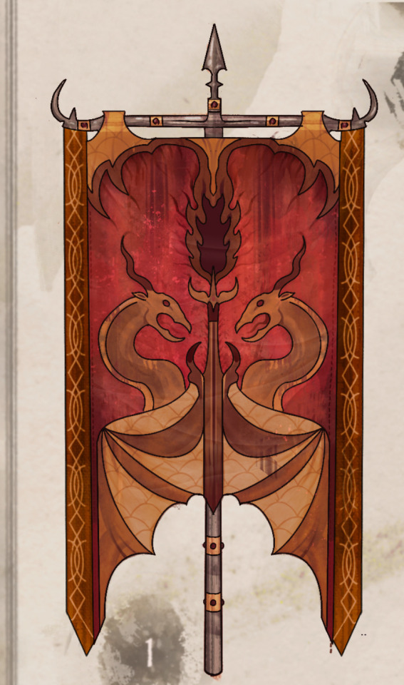
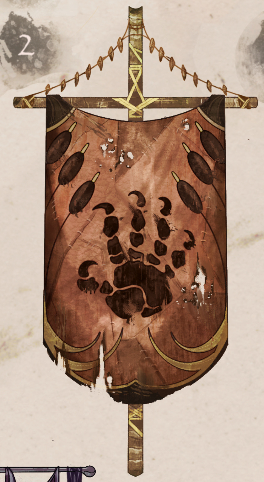
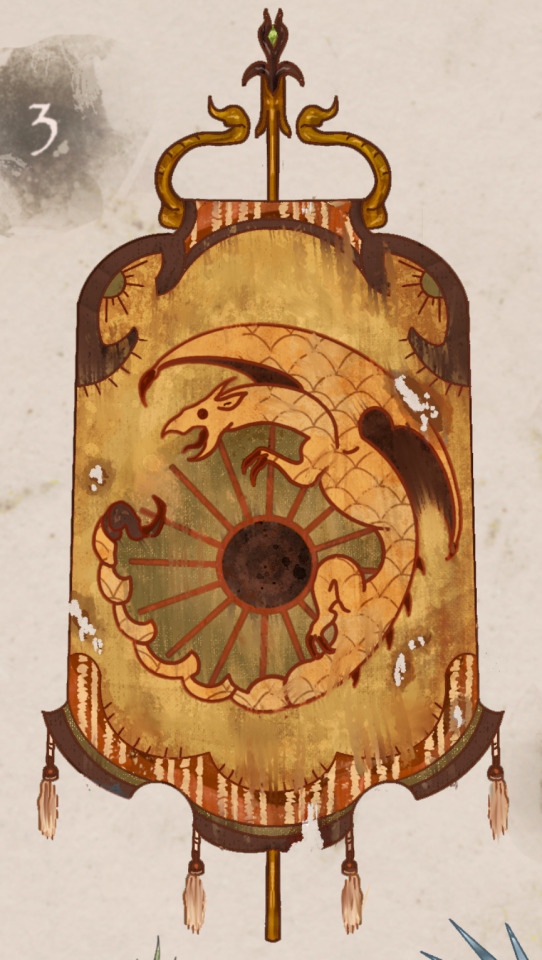
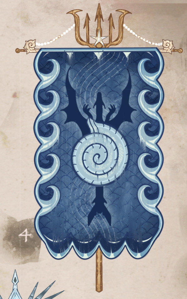
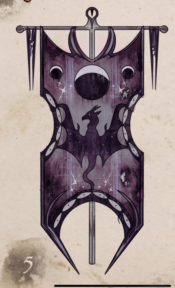
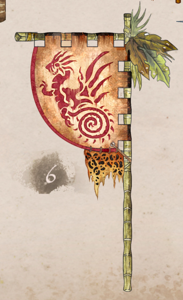
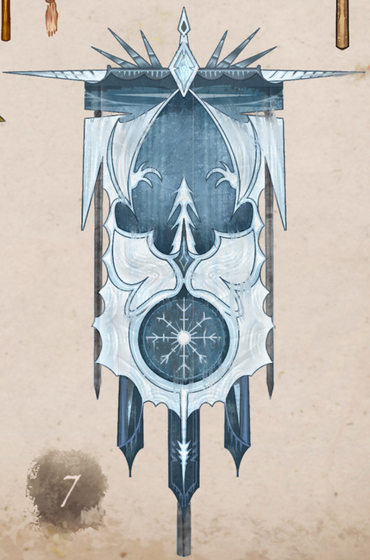

Tribe Banner concept art:
Folks seemed to enjoy my WOF WIPS, so here’s more concept art for y’all! My favorite thing about WOF is the potential for world building. I thought it’d be cool to see a tribe emblem represented on a banner/flag of sorts:
Read below for some of the thought process / headcannons behind the design choices: 👇
Skywing Banner:
Skywings pride themselves on 3 things; treasure, fire, & their enormous, soaring wingspan which steals the sky.
As such, portrayed on the banner, the fabric (often made with dyed cow or goat leathers) resembles draped dragon wings. Two Skywings embrace a goblet, which is spewing golden fire.
The banner is often held aloft with iron or gold poles, signifying to other tribes their wealth and pride.
Mudwing banner:
These banners are fashioned with leather hides from cow or crocodile skin, held aloft with bamboo, and painted with a Talon-print & Reed crest.
The talonprint symbolizes community and the strength of Mudwing sibling bonds. The reed border unifies all Mudwings regardless of their relationship to home; the swamp. Bigwings are often seen carrying these into battle, signifing their status and making it easier for a sib to locate them in the flurry of a fight.
Sandwing Banner:
Sandwing flags are made with camel skins and dyed cactus leather.
A crest shows a Sandwing coiled around a beaming sun, a reminder that despite the revered 3 moons, Sandwings are born to thrive in sunlight.
The fabric is cut in a way to mimic the swooping dunes of Sandwing territory. And the poles of the flags are equally intricate, with scorpion tails and golden ropes which frame the banner.
These flags make prominent appearances in parades, festivals, and markets, and even miniature version are often displayed in homes or as tapestries/carpets.
Seawing banner:
These banners are often seen displayed in royal quarters or councils, or above land to mark territory.
A nautilus shell crest on front echoes the swirl-pattern associated with royal Seawings: The banner’s borders resemble waves and a dragon swimming beneath their surface.
These are crafted with rich materials, strung with seashells, pearls, silver dollars, and deep oceanic color fabric. There is severe penalty for Seawings found plucking treasure from the banners, as they are a direct symbol of royalty.
Nightwing Banner:
These banners emphasize the Nightwings’ relationship to the moon, their source of power and praise. The material, a contrast of white stitching against purple velvet showcases moonlight and night, black scales against stars, magic and mystery.
They are seen decorated with 3 moons at the top and a centered dragon reaching up into the night sky.
These banners were often used during the war as secret code by spies to deliver to other tribes. Prophecy scrolls often came attached, delivering cryptic messages or secrets in the night. These banners all helped add to the secrecy of the Dragonet Prophecy, and kept tribes on their toes around Nightwings.
Rainwing banner:
Rainwing banners are not used for battle purposes like other tribes, most are mere decoration, location indicators, and have no unified design.
However, It is said back when Rainwings left the rainforest to trade pre-war, this particular banner design was often raised above Rainwing merchant tables, and showcases the coiled tail of a Rainwing with leaves, vines, and other sights from the rainforest adorning a bamboo pole. Bright color combinations accentuated the flag to entice curious customers.
Now, only one tattered version of the original Rainwing banner remains, displayed proudly in Queen Glory’s quarters, a reminder that building the Rainwings’ community is their most important goal.
Icewing Banner:
These banners reflect the same standards Icewings hold themselves to.
Like a visual of the rankings themselves, each banner is cut perfectly from an Icewing’s trained, serrated claws to resemble icicles, and crafted with fine blue stitching.
Flags are often held aloft with perfectly polished narwhal horn or bone, and can be inlaid with sapphires or diamond.
Icewing soldiers are often gifted these during ceremonies, and perform training exercises with the flags to test their stance/attentiveness. The crest showcases the swift sharpness of ice through a flying dragon, and a snowflake toward the bottom reminding Icewings that even minuscule snowflakes, small things, should be perfect in form.
#wings of fire#wof#rainwing#sandwing#icewing#mudwing#skywing#nightwing#nightwing wof#seawing#dragon art#dragon#art#concept art#bookart#wof fanart#wings of fire art#book fanart#books#illustration#dragon drawing#wof art
3K notes
·
View notes
Text


Otakon was amazing. Finally getting to wear my Azem summoning circle gown in person was so much fun. I had multiple people stopping me to gush over my costume and people from HERE telling me they saw it online and were so excited to see it in person. I haven’t been to a con since right before the pandemic and it was so nice to come back to a space I love so much. My goal of someone knowing what I was without me explaining was reached (thanks to the ffxiv photoshoot)! And I can’t wait to see the pictures of the group photo shoot. I added more details to the costume and (minus the stars which were my nemesis falling off the whole day) everything was perfect.
The gown itself took about 100 hours total. 85 originally and 15 to add finishing touches. The top is gold lamé and the chiffon overlay was ripping so I removed it. I have a whole costume breakdown under the tag for the original dress creation.

The necklace has an Azem summoning stone that my fantastic friends brought me from Fanfest which I repurposed. The most added details are the stars. I felt the black spots between the p design and the beams was a bit too big and wanted something to bridge the gap. I also considered adding my statics job symbols in the circles but they keep changing jobs XD

I added some more filigree details to the main Azem design in the front of the gown and individual rhinestones to each of the right angle v filigree and each of the small mirrored circles that make up the big circles because I’m extra along with a gold ribbon for the hem


Then I decided to add lights
Again because I’m extra

I don’t have skill with LEDs so I used individual 6ft fairy lights with tiny battery packs. I painted each battery pack black because the white shows through the skirt especially when lit up. There are about 75-90 battery packs I lost count at 2 am on Wednesday honestly ahaha. I looped them twice up and down so the effect would be less spaced out but I might edit that in the future if I figure LEDs and how to get more powerful ones because they weren’t really strong enough for 10 hours (you can faintly see them in the pictures above) and I kept turning them off when I sat. I used the same petticoat but added a hoop skirt because I was wearing tennis shoes (sadly sensible instead of fashionable) instead of my platform boots.
When people complimented me I would ask if they wanted to see my favorite part (which is spinning) and the laughs and gasps of delight were fantastic. Overall I’m so fucking proud of this costume. Thank you to all of you fab people from the FFXIV coordination who said such kind things I’m so flattered and lovingly overwhelmed. It was an amazing return to cosplay.
#azem#otakon#summoning circle#ffxiv#ffxiv cosplay#azem summoning circle#nekos cosplay saga#final fantasy xiv#final fantasy 14#final fantasy xiv cosplay#spinning#video#WOL#endwalker#shadowbringers#dawntrail#cosplay#ffxiv azem#costume#final fantasy cosplay#my face#costume breakdown#cosplay breakdown
662 notes
·
View notes
Text
Emerald Spectacles from India, c. 1620-1660 CE: the lenses of these spectacles were cut from a single 300-carat emerald, and it was believed that they possessed mystical properties
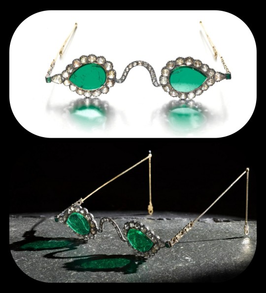
These eyeglasses are also known by the name "Astaneh-e ferdaws," meaning "Gate of Paradise," based on the symbolic associations between the color green and the concept of spiritual salvation/Paradise. That symbolism (which is rooted in Islamic tradition) was especially popular in Mughal-era India, where the spectacles were made.
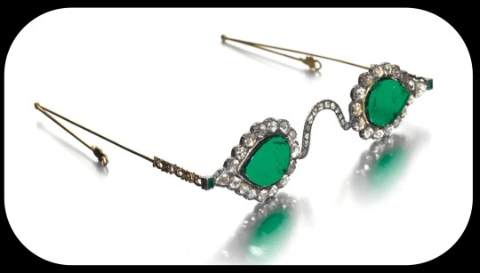
The lenses were crafted from two thin slices of the same emerald. Together, the lenses have a combined weight of about 27 carats, but given the precision, size, and shape of each lens, experts believe that the original emerald likely weighed in excess of 300 carats (more than sixty grams) before it was cleaved down in order to produce the lenses. The emerald was sourced from a mine in Muzo, Colombia, and it was then transported across the Atlantic by Spanish or Portuguese merchants.
Each lens is encircled by a series of rose-cut diamonds, which run along an ornate frame made of gold and silver. The diamond-studded frame was added in the 1890s, when the original prince-nez design was fitted with more modern frames.
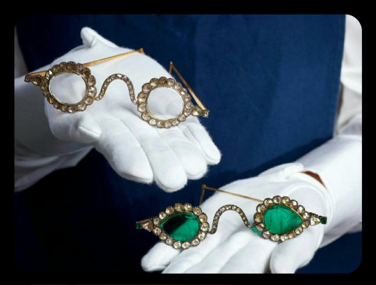
The emerald eyeglasses have long been paired with a second set of spectacles, and they were almost certainly commissioned by the same patron. This second pair is known as "Halqeh-e nur," or the "Halo of Light."
The Halo of Light features lenses that were made from slices of diamond. The diamond lenses were cleaved from a single stone, just like the emerald lenses, with the diamond itself being sourced from a mine in Southern India. It's estimated that the original, uncut diamond would have weighed about 200-300 carats, which would make it one of the largest uncut diamonds ever found.
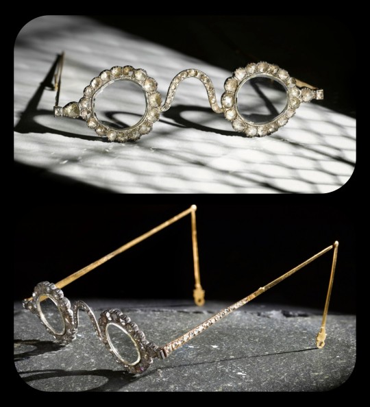
The lenses are so clear and so smoothly cut that it sometimes looks like they're not even there.
Both sets of spectacles date back to the mid-1600s, and it's generally believed that they were commissioned by a Mughal emperor or prince. The identity of that person is still a bit of a mystery, but it has been widely speculated that the patron was Shah Jahan -- the Mughal ruler who famously commissioned the Taj Mahal after the death of his wife, Mumtaz Mahal. Shah Jahan did rule as the Mughal emperor from about 1628 to 1658.
The emerald and diamond lenses may have been chosen for symbolic, sentimental, and/or cultural reasons, or they may have been chosen simply because they're pretty and extravagant; the original meaning and purpose behind the design is still unclear. Experts do believe that the eyeglasses were designed to be worn by someone, though.
At times, it was believed that the spectacles had spiritual properties, like the ability to promote healing, to ward off evil, to impart wisdom, and to bring the wearer closer to enlightenment. Those beliefs are largely based on the spiritual significance that emeralds and diamonds can have within certain Indic and Islamic traditions -- emeralds may be viewed as an emblem of Paradise, salvation, healing, cleansing, and eternal life, while diamonds are similarly associated with enlightenment, wisdom, celestial light, and mysticism.
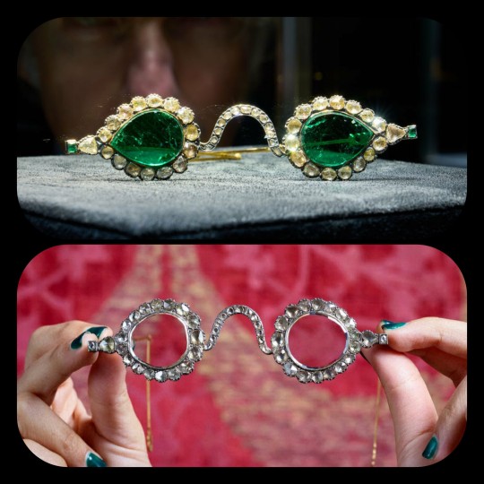
The Gate of Paradise and the Halo of Light were both kept in the collections of a wealthy Indian family until 1980, when they were sold to private collectors, and they were then put up for auction once again in 2021. They were most recently valued at about $2 million to $3.4 million per pair.
Sources & More Info:
Sotheby's: Mughal Spectacles
Architectural Digest of India: At Sotheby's auction, Mughal-era eyeglasses made of diamond and emerald create a stir
Only Natural Diamonds: Auspicious Sight & the Halqeh-e Nur Spectacles
The Royal Society Publishing: Cleaving the Halqeh-Ye Nur Diamonds
Gemological Institution of America: Two Antique Mughal Spectacles with Gemstone Lenses
Manuscript: From Satan's Crown to the Holy Grail: emeralds in myth, magic, and history
CNN: The $3.5 million Spectacles Said to Ward off Evil
BBC: Rare Mughal Era Spectacles to be Auctioned by Sotheby's
#history#archaeology#artifact#mughal#india#17th century#art#emerald#diamond#glasses#indian lore#islam#religion#mysticism#indian history#anthropology#spirituality#fashion
5K notes
·
View notes
Text
Sexism in TOS: Worst Offender, or Progressive in Retrospect in Comparison?
I see a lot of folks claim that TOS was the most sexist of the Star Trek shows by a landslide -- and while I agree that it definitely suffered from the sexism of the times, I also have other perspectives to share to give some food for thought.
I am of course not insinuating that TOS isn't sexist -- it is, but I have to ask folks to consider the breadth and depth of Berman's sexism in his run and ask yourself: Was Gene Roddenberry genuinely more sexist in his storytelling and delivery than Rick Berman?
I'm not telling you to feel one way or the other, but all I ask is that you hear me out and consider some perspectives and make your own balanced assessments. Nobody is obligated to share my opinion, but it means a lot just to have folks hear it and see their thoughts on the subject. So here is what I was originally responding to:
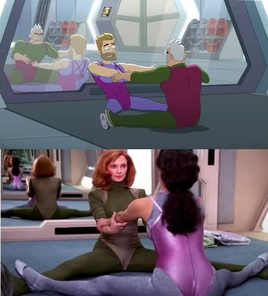
Someone's response to this photo:
"Devil's advocate. This was a part of the popular form of cardio during the production time of TNG. Yes, it was heavily sexualised by men, but so is literally every other way women work out. Men have been caught taking pictures of women while trying to do dead lifts, running on tracks and working on sled machines. They post them online to share too. The fact is, there is no way a woman can be shown working out without it going there. And yeah,t hat includes the combat forms of workout they do in Star Trek. Just look at how Dax dresses when she spars with Worf. Yes, they're dating, but still, same goes when 7 does and any other female.
Aerobics routines like this were made dirty and cringy. This was what women wore then by and large. This is how the workout was done. We make it cringy."
My response to them:
"I respect your take, but I disagree on a few fronts.
The miniskirt was chosen by the TOS female cast, not the male cast, specifically requested by Grace LW and affirmed by Nichelle and Majel who would go on to vehemently defend the miniskirt over the years as comfortable and embraced by them.
Grace said it was comfortable and seen as a symbol of female sexual empowerment during the 60s and thought it would be a progressive garment (and turns out that it was, as it was later adapted and worn by male crew as a skant on TNG) -- FYI those were designed by a gay man and Gene approved them.
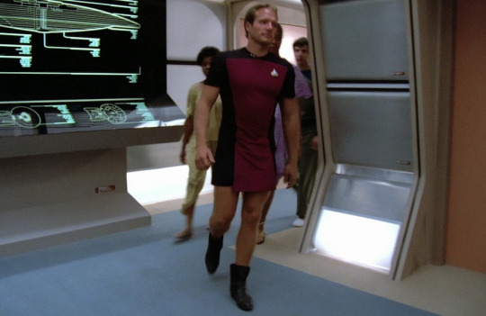
This was also supposed to be Spock's TMP outfit:
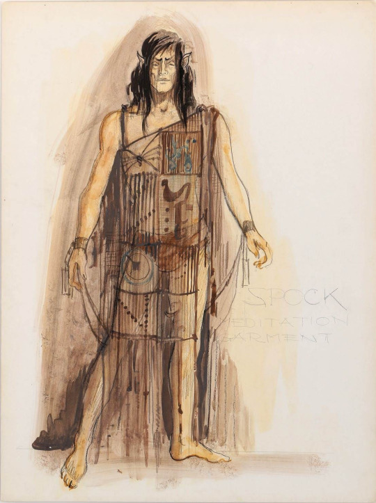
Literally lingerie.
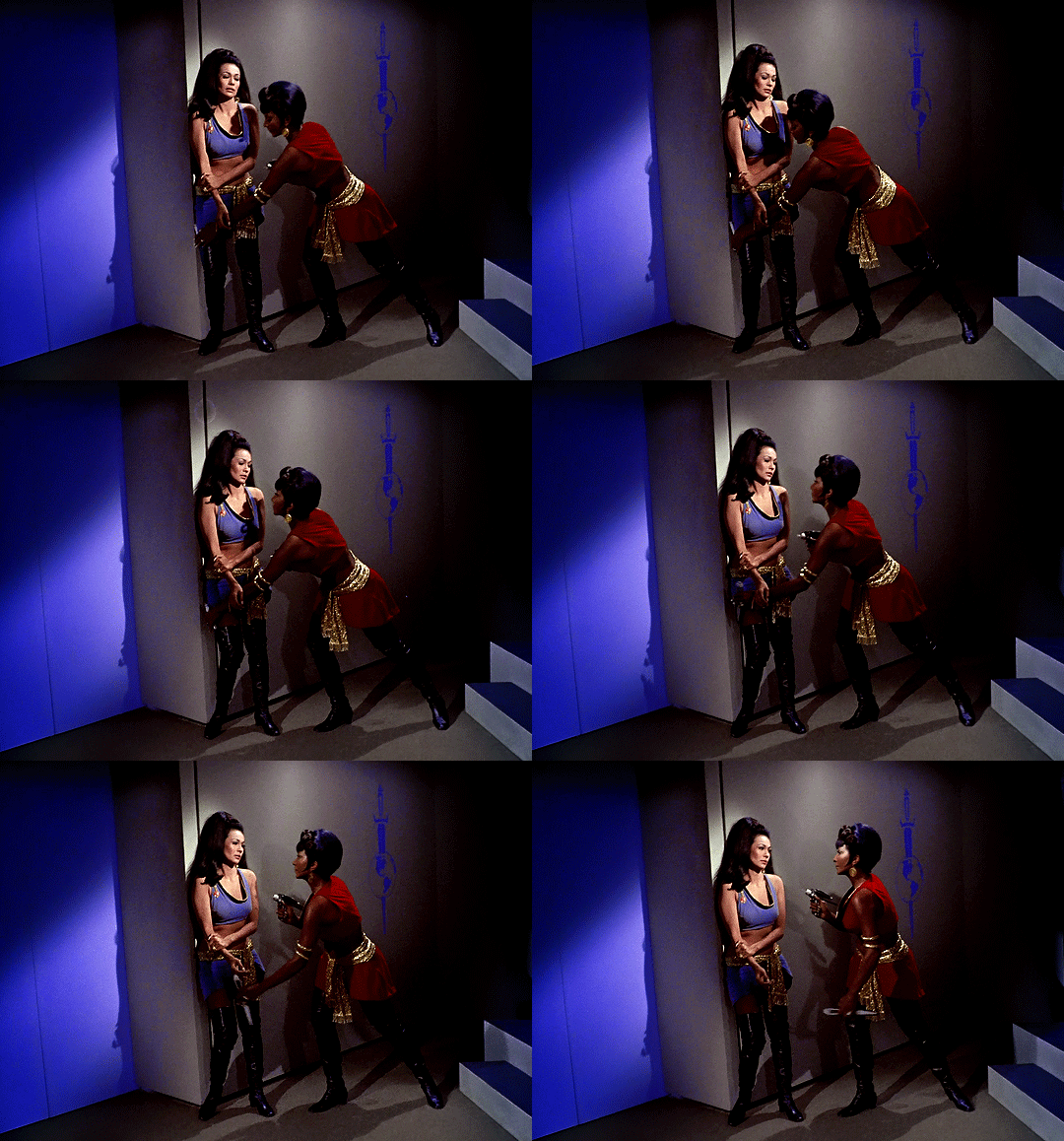
We saw both Uhura (who saves Kirk in from Marlena Mirror Mirror) and Yeoman Landon (the first to initiate combat with a classic Kirk-esque kick to help the Captain being attacked in The Apple) carry out their combat training in their Starfleet uniforms without ever being made to change into any ridiculous workout gear.

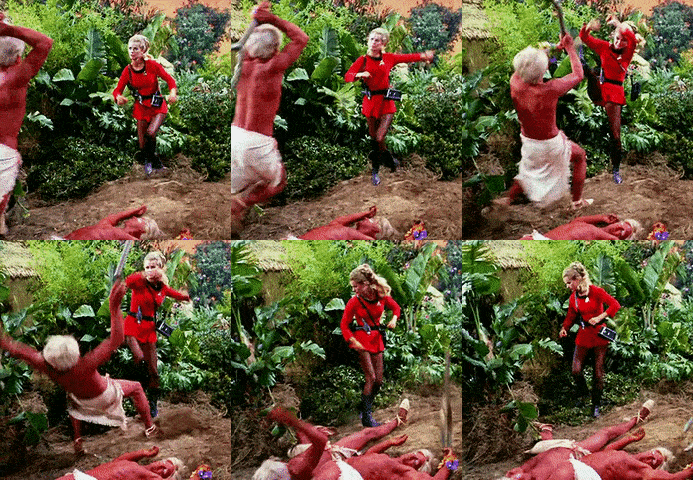
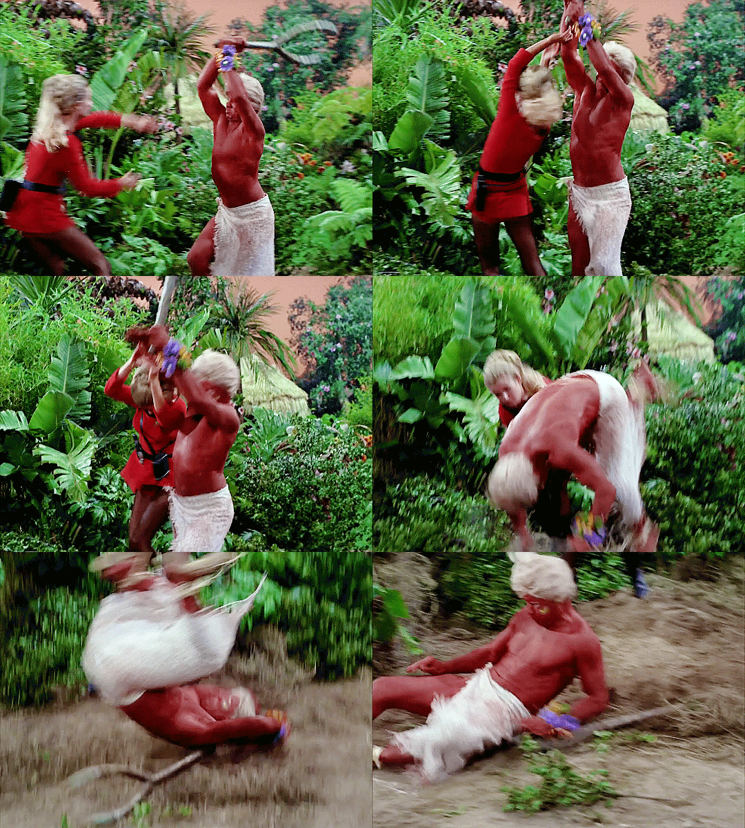
In fact, I'd argue Jim Kirk was sexualized even more than the ladies of the week on the show and I saw his naked body more than anyone else's on a fairly regular basis. He wore red yoga tights while topless in Charlie X while the women wore full length gymnastic suits that covered their entire body. If anything, it went out of its way to avoid sexualizing women practicing fitness in those scenes and instead focused on Kirk.
Gene confessed that he asked to have Shatner filmed in suggestive/provocative ways to "give something to the ladies", so he -- as he said -- liked to "film him walking away" or have him conveniently busting out of his shirts in just about every episode as it were, because Shatner apparently had great assets. LOL
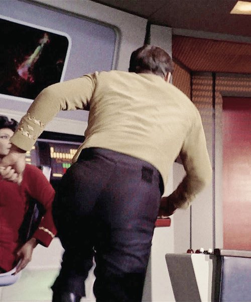
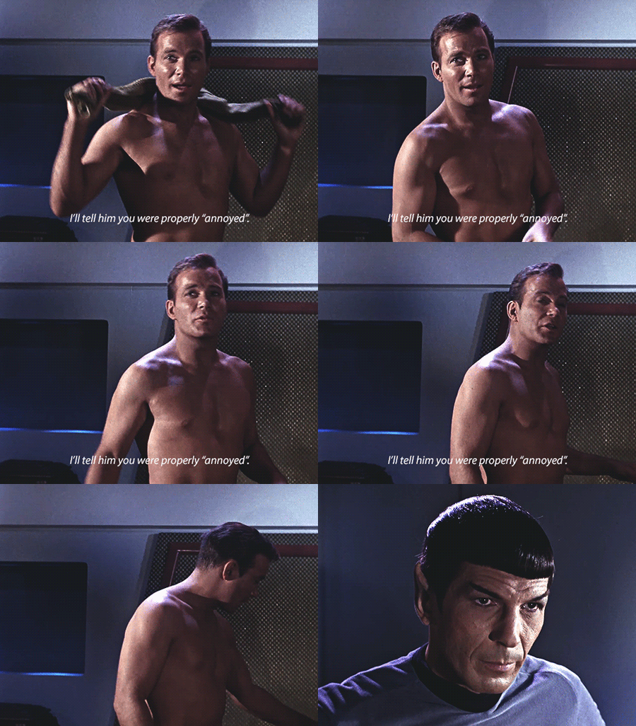
Gene made an effort to at least sexualize both if he was going to sexualize one, and he carried that attitude forward in wanting the m/m and f/f scenes in the background on Risa for TNG. He also insisted that the men and women wear skimpy outfits on THAT TNG planet. You know the one. LOL I mean the dudes even had on less than the women:
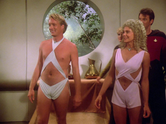
Gene also gave permission to K/S shippers to have their conventions back in the 70s when he was asked for permission. Gene and Nimoy felt with all the skimpy outfits they had the ladies wear, why not let the ladies and gay men have their fun, too? It's how we ended up with moments like this:
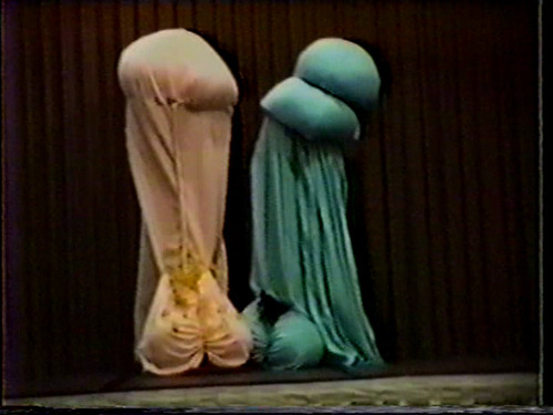
Yes, those are two people dressed up as Kirk and Spock's penises doing interpretive dance. Gene didn't give two damns. LOL
In my eyes, that was a very progressive take on Gene's part for the 60s. It was actually PARAMOUNT STUDIOS who had the big problem with K/S stories and vehemently tried to shut them down. Gene literally hired slash authors on his payroll and even had several slash stories/writers published in his official Star Trek books (The New Voyages & The New Voyages II).
I feel I saw Uhura and women in TOS engaged in more physical combat/altercations defending themselves that Troi or Bev were shown holding their own.
In fact, Kirk used to get furious when someone would "dress up" his female crew members without their consent (Trelane episode, Shore Leave episode) because like his male crew members, he wanted them to be treated professionally and to also have his male crew act professionally.
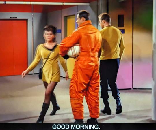
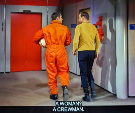
Berman brought some of his own personal biases into Star Trek that in some ways regressed it. While TOS had blatant sexism and was called on it time and again, that show was made in the 60s -- a solid 21 years before TNG. We as a modern audience understood why some of it was cringe/sexist due to the time period -- look at any other media coming out in the 60s and Star Trek was miles ahead of what other shows were doing.
Compare that to Berman who was churning sexist stuff out when women like Starbuck and Scully were simultaneously on screen on other programs airing, and we had already had Sigourney Weaver and other strong women in Holywood playing respectful roles.
In my eyes, there was no need of the sexism seen in TNG but especially VOY and ENT. There was no excuse for it when other shows were writing women far better and a number of those weren't even set in the future like Trek was, making it age even faster due to having those dated perspectives frequently highlighted.
In the Center Seat documentary as well as "The Fifty Year Mission" book you will find cast members, writers and other studio alumni who attest to this. Some discussions from "The Fifty Year Mission":
"First, Berman was supposed to have been a real sleaze ball . . . According to Terry Farrel, he would go on constantly about how her breasts weren't big enough, how she should do something about it, and how his secretary was a good example to follow as she had huge breasts. She even had to have fittings to get larger bras, and that was all done at his behest.
Later Berman and Braga developed a name for Jeri Ryan's character prior Seven of Nine. They originally called the character "perineum" which if you look it up it is the area between the anus and the scrotum. Later they floated the name "6 of 9". I mean, what does it tell you about where these two were coming from in the development of this character if they had names like that put forward in all seriousness for her?"
Gene Roddenberry also had some of his own more progressive ideas for TNG cut or watered down by Berman. Roddenberry agreed TNG should have homosexual relationships and representation at a con in the 80s and insisted on it in a meeting with his writers -- something Berman later would not honor. Gene wanted the AIDS episode, showing m/m and f/f in the Riza scenes -- these were some of Roddenberry's requests to include in TNG that Berman later stonewalled.
Berman's era was sadly dated by his own misogynist bias, IMO, to the point that it can somewhat hurt the shows he worked on through his cringe egoism and blatant disrespect toward his female cast.
There is a reason why Gene could keep female actresses working with him and Berman had a revolving door of women that he couldn't seem to keep working for him -- he was abhorrent to women, on and off set. Gene wasn't perfect at all, he had a lot of issues himself -- but Berman was a whole other level. Just look at what he did to poor Jolene Blalock, Marina Sirtis and his toxic commenting on her body weight which exacerbated her struggles with eating disorders, or how he treated and talked to Terry Farrell.
Anyway, just some food for thought. I'm not saying anyone is wrong regarding a take like that, but there are a variety of ways to look at this. Gene Roddenberry isn't a saint by any means, but it definitely bothers me how folks will tote the Berman era as if it were the lesser of two evils or the more progressive depiction of women when I felt there were far more concerning portrayals of women in his era with far less justification.
(P.S: I don't event want to go near the sheer amount of "creepy old dude/villain preys on innocent/naïve/scared young woman or little girl" stories there were in Berman's era, either. But that's a whole other can of worms I can write about in a part 2.)
#star trek#star trek tos#star trek tng#star trek voy#star trek ent#star trek ds9 was the one show that went above and beyond#1shirt2shirtredshirtdeadshirt#oc#octrekmeta#octrek#gene roddenberry#rick berman#brannon braga#kirk#spock#uhura#rand#nichelle nichols#majel barrett#grace lee whitney#tos#tng#voy#ent#marina sirtis#jolene blalock#terry farrell
4K notes
·
View notes
Text
ARCANE S2 SPOILERS!!! The Fact That the Bomb Jinx Tried to Use on Herself is a Monkey, Just Like the One That Killed Milo & Claggor…


It even shares the skull design of the original. Like… EXACTLY. If you look closely, the strokes are identical. That small scuff on the one tooth, the length of the dark inner corners of its eyes, it is a perfect copy. Which leads me suspect it is not a copy at all.

We see after the explosion that the head of the explosive is still in tact. Jinx must have gone back to the scene after everything that happened and retrieved it. Meaning she has been holding on to the remnants of the bomb that killed her family and ruined her life ever since. Just like she has clung on to her guilt. Eventually attempting to use it to punish herself in the most conclusive way possible.
The monkey bomb that killed Milo and Claggor has eyelids pointing down at the centre. An angry expression.
But the one Jinx was planning to use on herself has eyes downturned at the ends, a sadder expression.
The juxtaposition is symbolic of the circumstances surrounding the use and result of each explosive.
The first bomb was used out of determination, Powder’s intent to protect and save her family. But, evidently, it ended up killing them instead. She is devastated and furious at what happened. At how Vi left her. When she is being held by Silco at the end of the episode, she wears the same expression as the first explosive, and her eyes, for a split second, flash that same red.
The second bomb was used out of resignation. Jinx was ready to take her own life because she thought that was the best thing to do. What would help everyone. Much like her motivations for using the first. When Ekko interrupts her, she is not mad. Instead, she’s simply numb, sad, and tired. Her eyes are droopy like that of the monkey’s as she prepares to and initially sets off the explosive, and after Ekko stops her as well. The eyes of the monkey are more of a pinky-purple, much like Jinx’s after being revived using Shimmer.
Originally, I was going to make this a post about the representation of characters and Jinx’s relationship with them through the colours decorating her inventions, but then I noticed this and just had to rant.
Anyway, I think it is a devastating detail, but one that once again proves just how talented and dedicated the team behind Arcane is. I think the fandom will be uncovering parallels like this for decades and there would still be more left undiscovered.
#I have a perfectly normal and healthy relationship with this show#jinx my beloved#jinx defender til I die#arcane animators are a different breed#the hyperfixation is hyperfixating#arcane#arcane parallels#arcane league of legends#jinx#jinx arcane#arcane season two#arcane season 2#arcane details#arcane analysis#jinx analysis#powder#powder arcane#powder analysis#thank you for coming to my ted talk
221 notes
·
View notes
Text
Satan and the Nature of the Deadly Sins
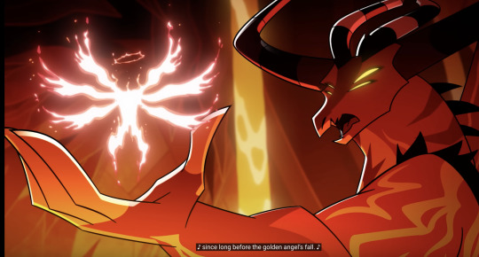
First note: Viv has confirmed that Satan is lying.
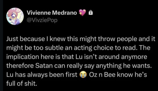
But I do have thoughts on where the lie here is, and what's being said or implied about the Sins. Because even accounting for the falsehood, I actually think this does strongly hint that the Sins aren't angels, and have been part of Hell from the start: presumably created when Eve ate the apple and humans gained free will, leading to sin, implicitly leading to "the Sins."
Note, Satan talks about an endless dark, "long before" Lucifer fell. He's making himself out to be a primordial entity that preexisted Lucifer and Hell's current system by a substantial margin. As if way, way back when, Satan was "in charge." If the Hazbin creation story is accurate, Hell existed without Lucifer for the duration of time it took him to be banished. We don't know how long this was, but presumably it wasn't that much time.
We also have Ozzie saying he knew Mammon "from the start of Hell." I've seen people theorize that this can fit the fallen angel theory, and he's referring to how they all met when Lucifer rebelled, but there's been so little indication that there was a big rebellion in heaven previously—as opposed to Lucifer getting kicked out for the sole act of the apple/trying to institute change as an individual—that there doesn't seem to be much evidence for additional angels having been punished. (In Hazbin, Sera warns Emily she might end up like Lucifer, citing him as an individual). It'd also be an awkward way to phrase it (something like "from before our Fall" would work better in that case). Ozzie's words in 2x07 imply, I'd argue, a common origin point, and that he and Mammon began at the same time in the same place. Which fits the Hazbin story (Eve -> apple -> free will -> sin/Hell -> Sins). It even matches with Bee saying Satan is like a brother. Common origin, but not technically related.
In which case, there possibly was endless darkness like Satan mentioned. But also, likely not much to rule, or much time for Satan to do so before Lucifer fell, when Lilith took over and structured Hell into what it is today. Given there would've been confusion and a lack of order, it likely would've been chaotic and undeveloped (Lilith being the as-of-now-canonical reason things shaped up). Satan, implied as the strongest, maybe would've scrounged up a semblance of power, but a) not for long, and b) not over anything substantial. Hence, this look from Ozzie and Bee:

But what really stands out to me is the way Satan refers to Lucifer, and the way Lucifer is separated out from the other Sins on the whole. Calling him "the golden angel" and referring to "his fall" as a distinct event separate from Satan himself does make it seem like Lucifer was something foreign that came crashing in. Note how Lucifer still looks like his angelic self. Notably, the very distinctive angel's wings none of the other Sins possess. Being a fallen angel is a massive part of his character, his motivations, his actions and beliefs. It dyes every part of who he is. On the door to the courtroom, Lucifer's angelic wings and nature are dominant in his symbol's design, and he's placed above the other Sins, whose designs revolve around their sin, or prominent physical features.
It could be argued that the others got over the Fall better, or were different classes of angels (so look different after being punished). But it's a factor that's so absent from their backstory or characterization that it'd almost undermine Lucifer's struggle to have something that colors his whole existence be totally irrelevant to the other fallen angels. I get the impression more so that Lucifer's angelic nature actually stands out, and might be one reason he feels so isolated, especially after his divorce. If he had six people who'd gone through the same trauma, he'd have something. If he's instead forced to brush elbows with and work alongside six demons that symbolize his ultimate failure, and who resulted directly from his actions with the apple, that's more complicated. Again, Satan calling him "the golden angel" makes it see like he's separating angels as something other. And "the angel's fall" is another separation. Satan lying about that part doesn't serve much purpose; if anything, if he was a fallen angel too, he could assert himself as the one who stepped up while Lucifer crashed and burned.
Instead, Satan attempts to distinguish himself from Lucifer in this entirely different way, by framing himself as something far, far more deeply rooted in Hell, older and better. It's not just an 'I'm the strongest' bluff, but there's an attempt to establish himself as the one who's always been here. And I'm thinking, when Viv says Lucifer has always been "first," she means in terms of hierarchy. Where it leaves room for the Sins to have been created as part of Hell, but Satan's lie comes from asserting the "a long time" and that he'd ever been in charge. It feels more natural to assume that Satan is doubling down and exaggerating his past authority, but not lying about his origin.
Final note: it is canon that Lucifer inadvertently created Hell, and was thrown into the pit he created. Also, confirmed that Ozzie has known Mammon since the "start of Hell." While there's a chance Ozzie is using hyperbole: it's framed like Hell was, in some form, around at least a short time before Lucifer showed up. And that Ozzie and Mammon were present. Unless there are wordplay shenanigans involved, discounting Satan's words to the extent it butts against that established timeline is probably throwing the baby out with the bathwater.
Summing it up: I've seen a few reactions to Viv's post about Satan implying that it doesn't make sense with previous lore or that things aren't adding up, but I think that view overestimates how much of what Satan is saying is actually false. He's bullshitting being a primordial god-like power for sure, which fits Ozzie and Bee rolling their eyes. I think if he was lying about the whole creation story altogether, they'd have been less 'shut up, wtf,' and more visibly confused. Of course future episodes could disprove all of this, but my impression is that the way Satan referred to Lucifer and his presence in Hell actually solidifies that he (and the others) aren't fallen angels, and his "for a long time before" thing being untrue is actually a mark in favor of the Hazbin creation story being at least mostly canonical (since it wasn't a long time; he probably had like two weeks to try flexing), as opposed to proof against it.
Also maybe sets up Satan having a quiet rivalry with Lucifer or at least pushing his authority? I think it might be very relevant that Satan goes the route of I've always been here when he's trying to set himself above and apart, and that he points out Lucifer falling in as an outsider. That might just be speculation, but that framing feels intentional.
#helluva boss#satan Helluva boss#Helluva Satan#helluva boss spoilers#mastermind#Mastermind Helluva Boss#Deadly Sins Helluva Boss#lucifer morningstar#helluva boss meta
325 notes
·
View notes
Text
I wasn't expecting it to take this long, but after a million distractions, I'm back to going through the LotR audio commentaries and taking note of any interesting tidbits I haven't heard before.
Please enjoy my notes on the RotK design team commentary with Richard Taylor, Tania Rodger, Grant Major, Alan Lee, John Howe, Dan Hennah, and Chris Hennah:
They had to make Deagol's ears out of waterproof gelatin rather than latex because he was going to fall in the water, and the normal latex ears would have come off. I guess they must have done the same any other time a Hobbit got submerged, but they didn't say that.
The fish that Gollum eats at the beginning is made from some kind of edible gelatin so he could actually bite into it. They also had another prop fish that wasn't edible that they gave Andy Serkis to keep at the end XD
The little stone hollow thing where Frodo and Sam are sleeping for their first scene in the movie was a set they built with a removable back wall so they could get a camera in to shoot it from the back as well as the front. Why did I never think of that before?
There were a couple of extra shots they needed of Orthanc in the background to finish up the movie, but they hadn't managed to get the footage from the miniatures (and I guess the miniatures were gone by that point? idk). So they took one of the model collectibles Weta had made and took some photos of it out in the parking lot XD
Whoooooaaaa! Okay, so Alan Lee talks about how, in legends, they say that you have to kill a wizard three times for him to stay dead. And Saruman dies "three times" - first he's stabbed, then he's impaled, then he's drowned. So Saruman is dead dead. Dare I say it? This is...I think this is a better death than the one in the book ._.
They even put carvings on the crossbeams underneath the seats of the chairs in Edoras! You are never ever going to see them, but that was their dedication to making everything feel authentic. That's what sets this apart from so many fantasy movies and shows made these days.
Red in the costumes is meant to suggest royalty. That's why Aragorn, Boromir, Theoden, and Theodred all have red in their costumes - as well as Bilbo and Frodo! You're meant to look at someone wearing red and unconsciously think, "there's something regal about them."
John Howe points out that you probably wouldn't ever reforge a sword like they do with Narsil, at least not in the sense of putting the pieces back together, because it wouldn't be as strong as it was originally. (You could melt it down and start over again, of course.) But, he reminds us, these are the Elves, and it's more of a symbolic thing anyway.
The great hall in Minas Tirith was inspired by Charlemagne's chapel (and Byzantine architecture was one of the main influences on the design of Gondor in general).
The statue of the king in Ithilien was made out of polystyrene, which you would think would be pretty light, but it was so huge it was actually very heavy. They had to transport it to the location in three pieces: the base, the body, and the head. And to lift one on top of each other, they had to rig a sort of pulley system over the limb of a tree, using a four-wheel drive truck to pull it. But they discovered that the first truck wasn't getting enough traction, so they hooked a second truck up to it, and ended up pulling the first truck up into the air along with the statue!
They created fourteen new weapons just to put in the background of the armory in the scene where the Witch-King is getting ready for battle @_@
John Howe said that his inspiration for Minas Morgul was...getting his wisdom teeth pulled??? He describes a metal clamp digging into the perfectly healthy enamel of his tooth to pull it out, and draws a parallel to the metal pieces the orcs fitted to the top of the pristine white parapets, staining and violating them. Um...thanks, I could've done without that visual, John.
I can't believe I never thought about this before, but there's a little wooden roof over the pile of wood for the beacon that Pippin lights. The reasoning behind that is you need some kind of cover to keep the wood more or less dry for when it needs to be lit in an emergency. The beacon will burn away the wooden roof, but it can be replaced easily enough, and it's worth it to be able to quickly light the beacon.
A lot of the saddles they used were ordered from the Indian military, because they had a good, old-fashioned sort of look to them. Then they would add onto the saddles with things that would make them look distinctly Rohirric, rather than Indian.
Alan Lee's daughter worked on some of the figures in the doors of Minas Tirith!
John Howe goes off on this whole tangent about how there's no religion or religious structures in Middle-Earth, and why that might be, but the whole time I was just sitting there going, "...have you never read The Silmarillion????"
Because they had to make over a hundred suits of Gondorian armor, other than the hero suits, they couldn't make each one exactly the right size for the man who would wear it, so the casting department had to only get actors within a certain range of size. They also built the suits of armor with sliding pieces, so they could be somewhat fitted to different sizes.
The horses started out as being part of the art department's responsibility, but as time went on, there were just so many horses they had to keep track of (and the various liveries they would have to be fitted out with) that they had to make a separate horse department to oversee it all.
Because so much of the movie was filmed on-location, in some very remote locations, they had to make a sort of caravan of mobile repair stations that they could take with them. They had all the tools and crew necessary on hand wherever they went so they could repair broken props or ripped costumes, reapply makeup for gore and injuries, take nicks out of the edge of weapons.... It was really like moving an army around!
For the dream where the Evenstar breaks, they made a version of it that was five times bigger than normal, out of a very brittle resin. Then they made an oversized section of the floor and dropped it from a great height so it would completely shatter in a dramatic way like that.
Anduril was John Howe's design. He based it on a sword belonging to a friend of his in Germany, which to him is the ideal sword, the most beautiful sword. He also talked a bit about how Men were taller and bigger in the First and Second Ages, so their swords would have been longer.
John Howe: "Why do people criticize Tolkien for not developing his characters sufficiently? I cannot fathom that kind of criticism. I think it's done by people who don't read between the lines."
Richard Taylor said they had a lot of fun gathering up all the skulls after each take in the Paths of the Dead to put back up at the top so they could be poured down again. Apparently Viggo liked to gather them up and try to throw them at the crew members! "Many hours of skullduggery was to be had," as Richard put it XD
Apparently, they'd made dozens of really finely detailed silicone heads to be lobbed over the wall of Minas Tirith, but then all but one of them were stolen! So they had to quickly put together some crude latex ones to use in the shoot instead (one of which the mayor of Wellington threw). They didn't talk about this, but I'm assuming the one good head that was left is the one that gets a close-up. You have to wonder who out there was sitting around with a bunch of highly realistic latex severed heads in his basement or something....
While most of the siege towers are miniatures or CG, they built the top third of one and put it on tracks so they could move it up against the wall. They built the set with breakable ramparts for when the little drawbridge thing crashes down.
They had the same trouble in Minas Tirith that they did in Helm's Deep, with the battering ram being too heavy for the stunties to lift. But they never actually explained how they got around that problem, if it was the same solution or not :/ All they said was that they had replaceable panels in the doors, in case they were damaged by the battering ram.
In order to make Shelob's webs, they had to heat up two polymers and mix them together to make the stringy, sticky material. In order to mix them, they had to be heated up to 220 degrees C, but if they got up to 228 degrees, they would burst into flame @_@ After they were heated and mixed, they would dribble the mixture on top of a vat of water, where it would cool in spiderweb-like shapes. Then they would lift it out on a frame, and they could carefully place it on the set. One time, the polymers did burst into flame, and they were running out of fire extinguishers to put it out! O.O Eventually, they did call the fire department, who said they'd done everything the fire department would have done. They got the fire put out, but it was a nerve-wracking moment, because the room where they were making the webs was connected to the studio, so it could have been disastrous D:
Bernard Shaw apparently got the idea to do that whole bit where he knocks his sword against the row of spears when he saw the collection of spears all lined up in a row in the art department.
The "oil" that Denethor pours over himself and Faramir is a mixture of glycerin and water. (I always wonder about these things, so I'm really glad they mentioned it.)
When they were filming the pyre scene, they had a silicone dummy for Faramir on the burning pyre. Apparently somebody on the crew brought "David Wenham" a cup of coffee over because they thought he'd fallen asleep on the side of the set, only to discover that it was a dummy! XD
The horse rig they made for close-up work of people on horseback got affectionately nicknamed "the Phony Pony." The first day they brought it on set, Peter Jackson got up on it and "rode" the horse, making the whole crew laugh XD
One of the ideas that Peter Jackson came up with for the mumakil in a brainstorming session (which Richard Taylor says he's still not sure if PJ was serious about or not) was that they could suck up several riders in its trunk and then fire them out like bullets. I'm...really glad they didn't go with that, whether PJ was serious or not <_<
Alan Lee says that the first time he saw the dead mumakil that Weta made for the set, the body was hollow, and some of the crew had set up a TV inside it and were watching a rugby game XD
The last miniature they built for LotR was the Minas Tirith docks where the Corsair ships come in. It kept getting put off until almost the end of the shoot, so they only had five days to put it together! @_@
All of the dead horses are fake, of course, so Weta had to make them all. They were made of lightweight material, so each day you'd see the set dressers just kind of casually carrying in a whole dead horse and then picking one up from the battlefield afterwards like it's no big deal. They had to do a lot of repairs to the dead horses, because the legs and ears kept falling off or getting bent the wrong way XD
The stone Watchers in Cirith Ungol have Maori influence in their design. I wish they'd talked about that in more detail, but it was just mentioned in passing.
They were concerned about the various copies of the One Ring being stolen, so they kept it in a lunchbox that was labeled "Screws."
The scene where Frodo and Sam join the orc convoy was filmed on location up on a mountain, so they had to deal with a whole bunch of extras in extensive prosthetics and armor, which would make them sweat while they were moving around, but then when the camera wasn't rolling, it would be a challenge to keep them warm. The way they did most of the orcs was that they wore a rubber mask and then a helmet, and they would need to take them off at regular intervals so the actors could get some air. So in between takes, after the director called, "Cut!" there would also be a cry of, "Heads off!" That meant the dressers would have to rush into the crowd and quickly take off the extras' helmets and masks XD
Because the crew was committed to not damaging any of the flora and fauna in the places where they were filming, even in the location that became the plains of Mordor that Frodo and Sam struggle across, there were little flowers and moss that they wanted to protect (and it was a national park). So they would lay down carpets on the ground for people to walk on, so they wouldn't damage the plant life. I'm sure that made for a strange sight, Frodo and Sam struggling in tattered clothing over rocks and boulders, surrounded by perfectly ordinary rugs XD
To do the decapitation of the Mouth of Sauron, they had a headless dummy sitting there, and Viggo would swipe his sword where the head should be. Then Weta Digital put in the head afterwards.
The lava in Mount Doom was mostly a miniature (except for the set where Sean and Elijah did their part), made from methyl cellulose and other things to make it look like lava. They set it up on a table that they would tilt so it would flow down around the model boulders made from urethane.
Richard Taylor said that, at that time, no one had really done a very good CG bird, so he was especially pleased at how the eagles turned out.
There were about 400 people working in the art department total, and most of them had never worked in the film industry before! @_@
Ngila Dickson's philosophy for the Elves was that none of their "crowns" or headpieces would go upwards, but would fit close around their heads and then go down. That's one of those things I've subconsciously noticed all these years, but never really thought about before.
Apparently, a little bit of the graphite used on Aragorn's armor in the coronation scene kind of puffed out when he and Arwen go in for their kiss, and got on Arwen's dress D: And some well-meaning person tried to rub it off, but only succeeded in spreading it around further, thus ruining the dress. And most of the female characters only had one copy of each costume, because all except for Eowyn don't see battle and thus don't need different versions with varying amounts of wear and tear. They're just made to wear in one or two scenes of them looking pretty and walking through a room. But alas, that lovely green dress was ruined.
They didn't have much time with Sir Ian Holm, so they only had a week to get a mold of his face and make the old-age prosthetics for the Grey Havens. But then word came down that he didn't want to have prosthetics, so they were to just make him look old with makeup. They were really disappointed, but then on the day, Ian Holm saw the prosthetics sitting off in the corner and asked what it was. When they explained, he said it wasn't true, and insisted on them putting the prosthetics on instead.
One thing that was really impressed upon me during this whole commentary (over all three movies) was just how much love and joy all of the crew had for the project. Sometimes you watch a movie or read a book that really means a lot to you, that's changed your life, and you wonder if the people who made it fully grasp what a beautiful thing they've created. These people know. They were fully aware, from start to finish, that they were making something truly great and worthy of praise. And I think that's beautiful.
254 notes
·
View notes
Text
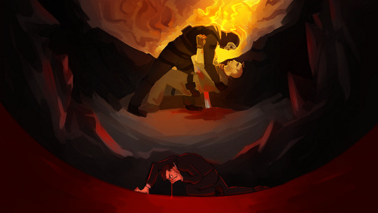
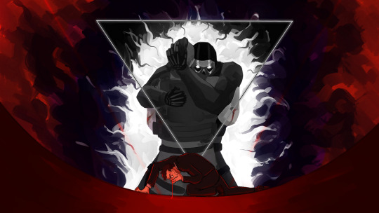
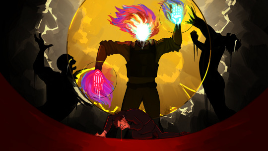
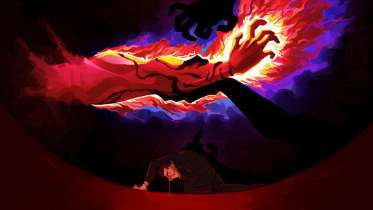
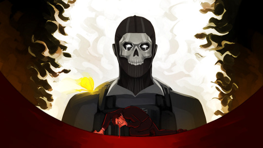
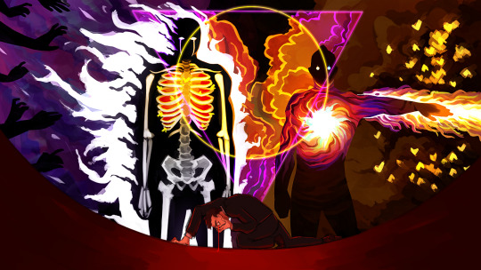
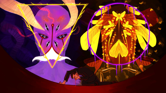
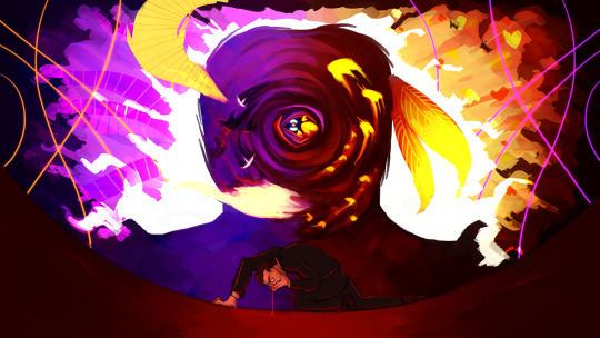
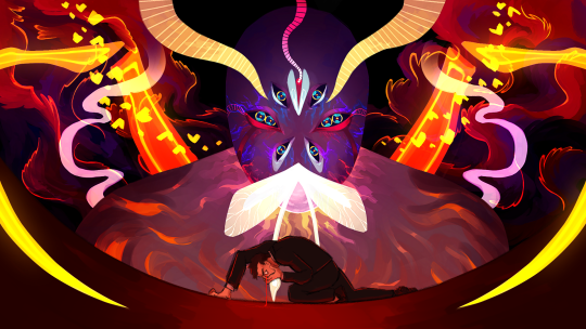
The frames of the video from the comic in the previous post. I experimented a lot with this, it was really fun to work with this chunky brush I found. Also the first time I draw the Reaper of Destruction as it was before Lumity!
More comments under the cut+a frame I ended up scrapping!
I'll go by order of appearance, because it's basically a chronological retelling of the events of part 1.
So the first frame is the least fancy because it was the first and I didn't nail down a style for this yet lol. It shows Ghost and Soap's first true meeting, in chapter 1, where Ghost helps Soap when he gets impaled by a rebar.
The second frame jumps to chapter 8, when Ghost first put Soap in Limbo. The triangle around them was a later addition, taken from the next frame. I love this scene, it's so fun to see it drawn out now :)
The third frame was the most important one to nail the style. I painted a whole frame, only to come back to it the next day and restart from almost 0.
This is the original third frame
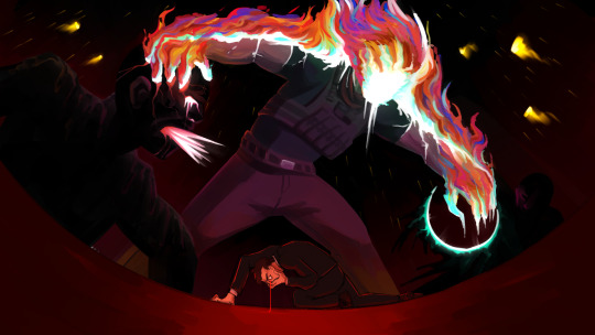
They both show the same event - chapter 21, the second time Soap is thrown into Limbo. The difference is, one shows a more literal image of what happened, and the other is more symbolic.
And by now I think you know how much I love symbolism lol
What also bothered me with the scraped painting is that the composition isn't central, and the entire pose, while more dynamic, isn't fitting the mural feel the rest has.
There's an even earlier version of the scrapped painting, with Soap's face, but nowhere else there are faces in these series, so I went wild with it and covered it with flames. He had them behind him already, as the description of this scene in the fic says Soap had a helo of fire behind him.
(also hated how Limbo's victims looked in the scrapped version like... ew lol)
There wasn't a real reason to add the circles around Soap. I just wanted to lean more heavily into the mural style. But I took that circle motif to the end, after that, and added it to Ghost as well, hence the triangle.
Soap has one skeletal hand, and one palm. That one is on purpose, to show he's hanging in between life and death.
The fourth frame is pretty self-explanatory, it shows the part in chapter 21 where Soap gets the dark marks on his forearm. If the colors look weird in that one, it's because I messed with them so much I couldn't tell if they look good anymore on not
The fifth frame shows another favorite moment of mine, the moment Ghost gets his marks, the white tear tracks, when he finally notices Soap fighting in the void.
The sixth frame is my favorite of the bunch. Soap and Ghost, the triangle and circle combined. The moment they killed Graves, Ghost in full control of his subjects, Soap with his sword of white fire and army of burning moths. They look so scary in this one I love them
The seventh frame shows Void and Destruction. Void was straight forward, I've drawn it a few times before, but I had to make a more detailed design for Destruction, and I only had the very first sketches I made for Revenant AU to go off of, as well as Lumity's design. Idk why I designed Lumity before Destruction, but that's how it is. I wanted Destruction melting, like it can't handle its own heat.
The eighth frame is of Void and Destruction combining. In the fic they had in-between states, it didn't look like this, but for the sake of the video I thought it'd be nicer to have a clear frame of them combining.
The ninth and last frame is of our beloved Lumity. Their design is a little more detailed than the drawing I made a while back. This frame is also the only one that interacts with the foreground, aka Makarov. I think he was jump-scared, don't know how much that comes across.
Damn I had a lot to write. Well, when given the opportunity to ramble...
#call of duty modern warfare 2#cod mw2#cod ghost#cod soap#john soap mactavish#simon ghost riley#call of duty modern warfare#revenant au#cod fanart#...fanart of my own au for the most part but oh well#ty for reading whoever did <3
197 notes
·
View notes
Note
Please share your thoughts on the other 5 cutie marks, I'd love to hear!
Hi everypony! I got like 20 asks for the Dogwarts cutie mark lore so I'm here to speak my truth!
Before we start, I would like to write a quick reminder that a pony's cutie mark is not always their "special talent", but can also represent who they are, their personalities, and a possible destiny. Different cutie marks have different meanings and interpretations, but they're not just about representing what you're good at.
That being said, let's start with the cutie mark design I'm proudest of!
Ren's Cutie Mark
Ren's cutie mark is of a sunrise and looks pretty simple at first glance but there was a lot of thought that went into this one.
First of all, I bet you're wondering why a sunrise? Well, in the show, it is pretty typical for unicorns with great magical abilities to have one relating to space (examples being Twilight Sparkle, Sunset Shimmer, Starlight Glimmer, and Sunburst). And I figured since I wanted Ren to fall into a similar position of potentially becoming an alicorn, I gave him a cutie mark following the same trend. And I chose a sunrise to reflect the way Ren seems to glow when he enters a room. The way he carries himself is very warm and bright it just catches your eye in a similar way the sun would.
Also, Ren wears sunglasses. So a sun-themed cutie mark seemed appropriate.
Additionally, there are a couple of smaller details I want to point out too. Like the sun rays, if you look at them for a moment you'll see they're shaped like little crowns! I of course had to put a crown in thanks to how much Ren likes to play royalty, so I snuck it in there. And then the red spots underneath could both be interpreted as the sun reflected over water or blood. (But of course, this is a kid show AU so there wouldn't be any blood in Ren's destiny, just a fun reference to the red king and his whole thing about blood dyeing the snow red)
Martyn's Cutie Mark
I explained this one in an earlier ask but I thought I'd explain it again here for anyone who didn't see it!
Martyn's cutie mark is of a chopped log and a small stick.
This one is mostly a play on the name "Littlewood" but has other meanings too. As a character, Martyn tends to travel and explore quite a bit. In the Life Series specifically, he is usually the last one to find a permanent base and even then doesn't spend a lot of time in one place. Always on the move. Additionally, he's more of a wild card compared to other characters, always trying to be as unpredictable as possible.
The smaller detail here is the little swirl on top of the log is the same as the one on his Minecraft skin's shirt.
BigB's Cutie Mark
Cookies! Cookies! Cookies! BigB's cutie mark is of 3 cookies where one is trying to eat the others. There are also a few sprinkles there made to look like action lines.
We all know BigB loves cookies so of course I had to give him a cutie mark with cookies in it. For this one, I decided to follow the cutie mark trend of "symbol/item important to the pony duplicated 3 times" (examples being Fluttershy, Applejack, Rarity, Pinkie Pie) but I added a bit more creativity to it with the top on trying to eat the others to represent just how tasty they are 😋
Additionally, rather than the first cookie trying to eat the others, you could interpret it as opening its mouth to talk. Because BigB can not keep a secret to save his life! In Double Life when he started "secret soulmates" with Grian, he didn't last a day without opening his mouth. He told Ren about it immediately because he felt bad for keeping things from him.
Also worth quickly mentioning: People pointed out in my original post that they don't think BigB would be the element of honesty because of his behaviour in Secret Life. But that's just Secret Life. I think Secret Life to BigB was like that episode of My Little Pony where Discord makes the main 6 act the opposite of their true element. BigB was just going through a weird phase of telling very obvious lies because a book told him to.
Skizz's Cutie Mark
Skizz's cutie mark is of a lightning bolt from a couple storm clouds hitting the ground.
I think this is the cutie mark with the least thought put into it, unfortunately. There was still though just not as much as the others. The big thing I thought was fun was I made the lightning bolt shaped like an "S" to stand for Skizzleman. But other than that, this cutie mark sort of has the same meaning as Rainbow Dash's cutie mark. Quick like lightning, loud, bold, dangerous, and powerful.
Impulse's Cutie Mark
Impulse's cutie mark is of a lit-up lightbulb.
I absolutely crowded this cutie mark with the letter i. If you look closely, there are 6 of them. Impulse's design also has an i-shaped pattern on the belly if you look closely enough. But that's more of a fun easter egg and doesn't exactly reflect Impulse as a character.
There are a couple of reasons I chose a lightbulb for Impulse, the first and probably most obvious is that he's a redstone guy! He's a technical guy who likes to work smarter, not harder. So I figured the My Little Pony equivalent would be a light bulb/electricity. The second reason for the lightbulb is that it's usually used as a visual representation when characters have that "eureka!" moment in cartoons. When someone has a brilliant idea a little lightbulb turns on above their head. So since Impulse is the ideas guy, I figured a lightbulb would work for his cutie mark.
Etho's Cutie Mark
Etho's cutie mark is of a snowflake with a missing branch.
I promise there is more to this cutie mark than just "Canada is cold" even if that's part of the reason I wanted to give him a winter-themed cutie mark. While it is fun to make a nod to Etho being Canadian, I thought a winter-themed cutie mark would be fun to represent how he sometimes presents himself. Cold and a bit mysterious. I think deep down once you get to know him, those attributes melt away, but for people who have never met him, he may be intimidating that way.
I'll be honest, I don't watch a lot of Etho content, but I do have a few friends who identify as Etho girlies so I did my research. I was told in his Minecraft Let's Play World, that he has a snowflake build somewhere. I believe they said it was an iron golem farm? (Please correct me if I'm wrong) but I thought that was perfect for the cutie mark. And if you're wondering why there's a branch missing, it's because one of my friends said he was incapable of finishing builds sometimes so I thought that would be fun to include.
-=+=-
Alright. Rant over. To celebrate, here are a few pony doodles so I can put this post in my art tag.
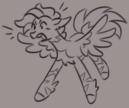
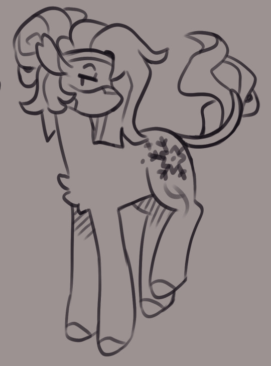
#cherri.speaks#cherri.draws#trafficblr#my little pony au#renthedog#inthelittlewood#bigbst4tz2#skizzleman#impulsesv#ethoslab#Third Life x MLP#mclp
726 notes
·
View notes