#photoshop elements 7
Explore tagged Tumblr posts
Visit Tumblr Blog
Explore Tumblr blogs with no restrictions, modern design and the best experience.
Last Seen Tumblr Blogs


Fun Fact
Tumblr.com is the 103rd most visited website in the world.
Photo
Also don't forget White Rabbit (Photoshop CS5) and Photopea (online Photoshop.)
Also also, Aggie.io for sketches.
Or if you really don't care- there's Microsoft Paint on Windows PCs that comes preinstalled.
#honestly at this point I just use a really old copy of Photoshop elements 7#and never register#or I use Clip Studio#(Yeah you gotta pay for a license but i like the resources you get with it.)#i also have Rebelle for more painterly digital art.#got that when they had their sale a while back.#$10 for a set of their programs#permanently.
191K notes
·
View notes
Text
Pj party for the gang <3

[BG3 PRINTS] - [COMMISSIONS]


(Please don't spoil me act 3, I've still not got around to play it-)
Everytime I go to camp to clock in for the night, and a good 4 out of 6 of these fuckers go to sleep wearing *leather* outfits- I understand it from a 'this is a video game of course they don't change clothes to go sleeping' perspective..... But on the other hand I slept once in leather pants and that was one of the worst experiences of my life, so to think these people do it voluntarily everynight- freaks. All of them.
So I gave them pyjamas :D that was a lot of fun ! Also I like when characters have a more diverse builds and sizes, so I killed two birds w one stone and drew what the gang looks like in my heart <3 and of course I made a quick little line up !

A lot of yapping about the pj choices and process below vvv
Gale : fancy depressed wizard gets a fancy bathrobe type get up ! I don't think this man was getting dressed a lot in that sad year post his breakup, so why not invest in a comfy cool pj he can slip on in the morning feeling like it kinda counts as dressing up ! And I get that they didn't exactly pack before getting kidnapped by aliens, but Gale is a wizard I'm sure he can just reach into a pocket dimension where he stores some of his belongings (ala my tes mage !) or something
Astarion : I don't think astarion owns many clothes. He isn't wealthy, and well.... Let's not talk about Cazador in the fun pyjama party post- so his ruffled shirt untucked from a pair of looser cotton or silk pants it is ! Also I learned that elves are typically shorter on average in dnd and that's great, that's perfect, that's so funny, I can just picture him insisting this is true (which it is).... And then enters Halsin fjdjdk anyway
Halsin : I just know in my heart that man sleep in his bear form. It's when he's most comfortable, and he doesn't need to talk to other people when sleeping so why not. Also comfy bed mate :) ! Other option is completely nude (yes I forgot to include him in the lineup, sue me but I'm too tired to re open photoshop rn-)
Shadowheart : this is my art, and if I want the resident goth girly to be in a cute little nightgown I can >:( she gets lace and everything let me be a lesbian !!! Also she small and sturdy
Wyll : a slight variation of his canon camp clothes :) made his top less skintight, and once again changed the texture from leather to something less terrible to sleep in seriously why are all these people committed to this lifestyle-
Lae'zel : no pjs, a githyanki must be ready for battle 24/7 only the weak wear comfy clothes and don't commit to sleeping in leather pants and leather underwear. She's a freak and I love her dearly
Karlach : she deserves the best pyjamas of them all : topless in underwear. Nothing comfier than that and it's not like she'll get cold :) also she wears it very well what can I say fjdjdkd


I started working on the lineart like a month ago alongside a commission that I really didn't like working on- so anytime I got work done for the commission (btw not from someone online so it's none of you tumblrinas), I would reward myself with adding more shit to the bg3 drawing djdjdkk which resulted in a lot of details and clutter, that I didn't want to start coloring because that would be a nightmare to figure out and very long to do, so I would continue adding shit instead of starting colors- and the circle kept turning. Also 10 hands..... So this took a while to get right fjdjdk
But on the bright side, it's the most detailed illustrations I've done yet and I'm really proud of it (especially all the little story elements I could include <3)
#it's currently 4:30 am and today I spent 12+ hours straight coloring jgkfj hopefully I'll still like it tomorrow :)#wyllstarion#shadowzel#if you squint#(and I want you to squint)#shadowheart#lae'zel#gale dekarios#astarion ancunin#wyll ravengard#halsin#karlach cliffgate#baldur's gate 3#bg3#bg3 fanart#bg3 wyll#bg3 astarion#bg3 shadowheart#bg3 lae'zel#bg3 gale#bg3 halsin#bg3 karlach#bg3 scratch#bg3 owlbear#bloodpact#cw alcohol#cw weed#cw smoking#my art#digital art
2K notes
·
View notes
Text


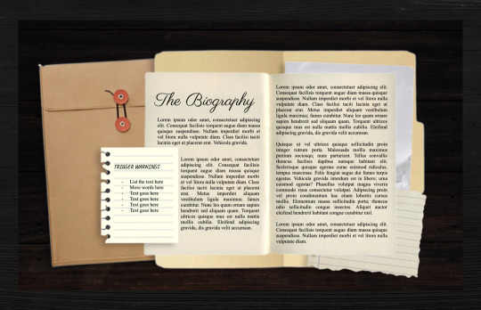

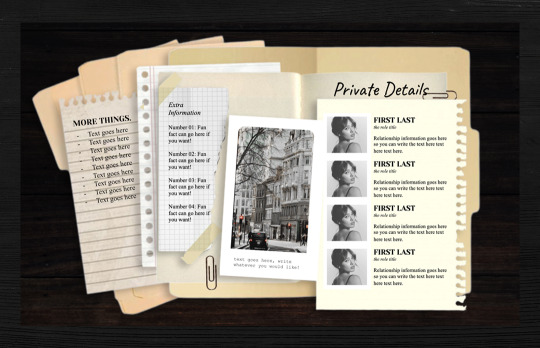
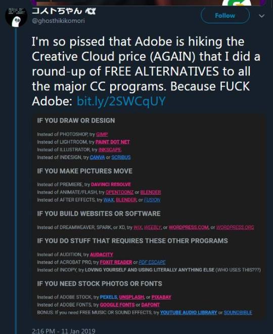
✧ ( 08. 𝐄𝐗𝐇𝐈𝐁𝐈𝐓 𝐀) ── // LINK a single muse google doc.
─── 𝒅𝒆𝒔𝒄𝒓𝒊𝒑𝒕𝒊𝒐𝒏.
this is a premium single muse google doc that's inspired by true crime, journaling and polaroid images. this one is pretty heavy on the photoshop background and has a lot of drawing assets utilized. there's a lot of space for the written biography sections. this google doc layout also looks best on desktop! includes: 7 unique custom google doc templates + bg pngs + an additional instruction document that explains the terms of use & further guidelines. disclaimer: ✺ images do not belong to me and are credited to their rightful owners.
─── 𝒕𝒆𝒓𝒎𝒔 𝒐𝒇 𝒖𝒔𝒆.
PERMITTED
customizing the templates, including changing colors, adding or removing elements, replacing images, and more.
mixing and matching pages from other notoriousaesthetic only templates to personalize design.
NOT PERMITTED
removing or obscuring the credit; it must remain intact and visible on all templates.
using the templates in illegal, defamatory, or otherwise harmful projects.
copying, selling, or redistributing the templates, whether in their original form, partially (e.g., individual pages), or remixed (e.g., modified versions).
── ✧ THANK YOU!
please ▸ ( like/reblog) ◂ this if you found this useful and intend to use the google doc! for any further questions, please contact me via tumblr or join my discord for additional assistance!
#google docs#rp doc template#rp resource#google doc template#muse template#muse doc#gdocs#gdocs template#rpc#my docs#paid docs
193 notes
·
View notes
Text
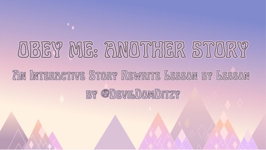

Welcome Exchange Students, to Obey Me! Another Story.
An Interactive rewrite lesson by lesson by @devildomditzy
This is a playable rewrite of the original Obey Me! game’s story, using clickable dialogue options to progress the story.
Please read the Quick Start Guide below to learn how to begin your journey to the Devildom.
Obey Me!, its characters, story, content, assets, etc., belong to NTT Solmare. This blog has no affiliation. This is purely a free-to-access fan work.
If you like what I do, I have a ko-fi - any contributions will go towards funding my mammon card gambling addiction 😌
Obey Me! Another Story is a rewrite of the original Obey Me! game’s story. As such, it will contain elements, dialogue options, plot points, etc. from the game.
If you have not played the original Obey Me! Game, only Obey Me! Nightbringer, it is highly recommended that you finish the original game in app or read the entire story through Obey Me! Nightbringer’s time chronicles function.
The first few lessons will heavily lean on the in-game writing and dialogue.This will change as we move away from the first few lessons/set up of the story, though this entire experience will follow the plot of the game.
I will be posting this lesson by lesson. The beginning of each lesson will have a post labeled “START STORY HERE”. Please begin there for each lesson. Ignore the additional posts, as the linked dialogue options on the initial post will bring you to the next part of the story.
The last post of the lesson (for all dialogue options) will be labeled ‘LESSON END”. If that post does not have an additional link that takes you to the next lesson, that means the next lesson is not out yet.
To begin, please click the link in the “Lessons” tab below of the lesson you’d like to read. Of course, if you are just starting please begin at lesson one. The posts will take you through to the next lesson if available.
If you are following along as I am uploading this rewrite and caught up to the posted content during one of your read throughs, please access the next lesson you need via the “Lessons” tab below, like a chapter book. The lessons will be organized exactly like the game (lesson 1-1, 1-2,1-3, etc.).
If you are currently reading and a dialogue option does not have a link attached, I am most likely currently uploading and editing that chapter. If you believe you have found a genuine broken or missing link, please send me an ask on @devildomditzy.
For all questions and inquiries, please inbox me @devildomditzy.
If for any reason this blog becomes inactive, it will be stated in the description.
THE DIALOGUE IS FORMATTED AS FOLLOWS:
You are MC.
Your thoughts look like this.
(Your actions look like this)
MC: Your dialogue looks like this.
Other character's actions look like this.
Character: Other character's dialogue looks like this.

Once lessons are fully uploaded and ready to go, their starting page link will appear here!
-----CHATPER 1 ------
LESSON 1-1
LESSON 1-2
LESSON 1-3
LESSON 1-5
LESSON 1-7
LESSON 1-10
LESSON 1-13
LESSON 1-15
-----CHAPTER 2-----
LESSON 2-2
LESSON 2-4
LESSON 2-6
LESSON 2-8

Who else works on this project?
This is a solo project and a labor of love. As such, uploads may be slow.
What is the upload schedule?
As of right now, it is whenever I can. I am a full time university student with a full time job. As such, uploads may be slow.
How long will this run for?
As long as I can do it without burning out, it will continue through the entire story. Also if this gets like no traction, I probably won’t complete it. The project might get cancelled if that is the case, since this is such a big undertaking.
You said you were going to edit screenshots of the game in photoshop to go with the story. Where are they?
I decided I really don’t think I’d like getting sued.
You really like Mammon. Is the story going to be Mammon x MC centric?
No, I will be fleshing out all options (including romantic options) for all brothers and dateables so you can pick your favorite!
I have a question. Where can I contact you?
Please send me an ask on my main blog, @devildomditzy.
I don’t like the way you wrote ‘such and such’!
The great thing about fanworks is you can go make your own and it can be however you’d like! However, this is mine. So if you don’t like it, don’t read it!
Have fun be safe love you!
130 notes
·
View notes
Text
𓈒༷♪˚.✧ How to make a mockup like this for smaus, ocs, etc. (step-by-step tutorial ☆ no Photoshop, easy, free) (requested by @lovebittenbyevans) ✿
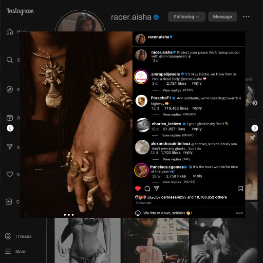
guys this took me two hours to make and you could probably get this done in like, 30 minutes :) I hope this is coherent <3 Please look back this image for comparisons, if my explanation is not well explained, etc.
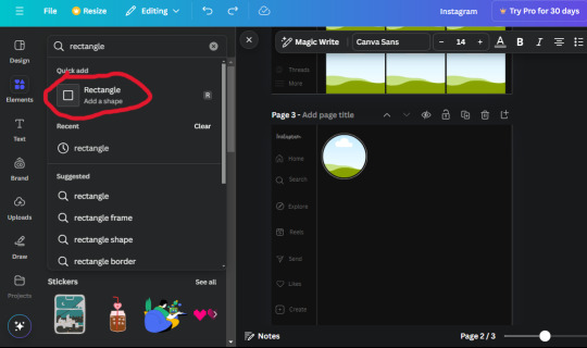
first of all, if you dont already have one, make a free canva acount. once you're signed in, hit the purple "create design" button on the sidebar. A pop-up will appear with different design template options. For this design, we want the dimentions to be 1080 x 1080, so you can either make a custom size or choose the instagram post (square) template by either searching or scrolling through the list.

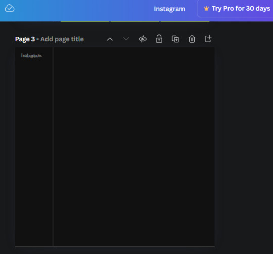
2. Now you have a blank page. Zoom in with the slider at the bottom of the page if you need to (Mine is currently zoomed in 41%). Click on the page and change the color to an off black (hex code #111111).
3. Now that the color is changed, click the "elements" tab and search "line". Click the shape and it will add it to the page automatically. These line are particularly hard to navigate and hard to get it at the right angle and length so this part might take a little longer than the rest.
4. stretch it from top to button and turn in a 90 angle so its straight on the left side of the page. Change the color of this as well to a grey tone (hex code #2F2F2F).
5. Now we'll add the Instagram logo. Click the "text" tab then click the purple "add text box" button. Write "Instagram" in the box and change the font to "apricots". This is the closest font I could find that resembled the logo font but if you find a better one, feel free to use that instead. Make the font size 19.3 (you can do this manually or do it in the text options). Change the color to grey color (hex code #707070). Add it to the upper left corner of the page like this:
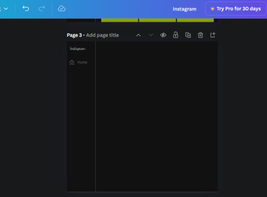
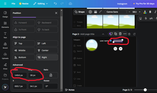
6. now we're adding icons and a menu inside the border we just made. Click the "elements" tab again and search for "instagram home icon" and add the element by sketchify to the page. Click the home icon, an options icon with pop-up above the page. Look for the "Position" button and click it. Scroll to find the advanced options and you can manually type in the width and height at 26.6 and 28.7.
Move it inside the border, under the logo (photo below). Change the color again (the hex code is #707070).
7. Open the text tab and add a text box. Change the font to Canva Sans and write "Home" in the box. Change the font size to 18.1 and align with with the house icon. It will look something like this,
8. Go into the elements tab again and search "instagram search icon". Scroll until you find the one by sketchify and add it to the page.
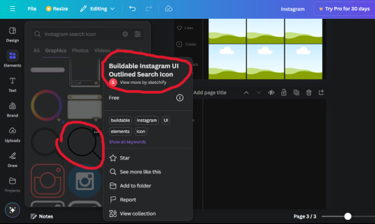
9. Shrink it so the W and H is at 36.6 and 31.3. Move it below the home icon until a purple "67" pop ups and aligns under it. Change it to the same color as the Home text and icon (#707070). Go ahead and Duplicate the the "Home" text box and clicking it and a pop-up will show up then edit the text so it says "Search" and align with the searcch icon we just added.
10. You know the drill. We are continuing to search up more icons in the "elements" tab. Search "instagram compass icon" and choose the one by sketchify (are u seeing the pattern?). Add it to the page and change the width and heigth to 33.1. align it under the search icon just like how we did before and change it to the say colors as the other icons.
11. Do the same as before and write "Explore" in a text box and align it with the icon. We're doing the same thing for all of these.
We'll be using the same search prompt for all of these icons so just change the type of icon you're looking for like we've done before hand. Next look for the Instagram reel icon and add the outlined one by sketchify and change the W and H to 31.2 x 30.9. Change the color to the ones we've used before, align it underneath the icons above and add your text ("Reels").
12. The next icon is an outlined, "sent" one. W and H is 31.1 x 27. The text will say "Send". Then an heart outline by sketchify; W and H is 34.2 x 29.1 and the text is "Likes". Next is the "create" outline icon by sketchify, W and H is 36.8.
(p.s if you are struggling to align the icons and text correctly, shoot me a message and I'll send you the X and Y positions ;D)
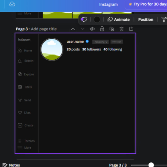
If you followed it through, it should look like this,
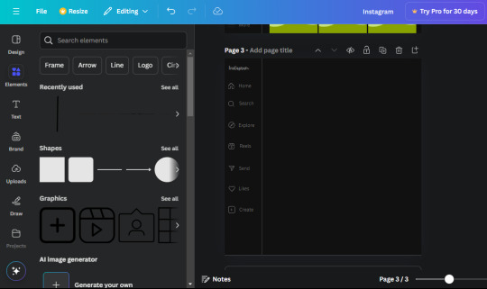
13. Now onto step 13, we'll be adding the Threads logo. You don't have to add this but to make it look more like the actual website, I will be adding it. Open the "text" tab and add a text box. Write an "@" symbol in the box and change the font to Nanum Sqaure and the size to 24.9. Add in the bottom corner below all the icons we just added to our page. We need another text box now (Color is still #707070), write "Threads" and align it to the "@" symbol.
14. We're adding another icon now. Search "Instagram menu icon" and find a wireframe menu icon by sketchify. the W and H are 42.5 x 24.6. Add a text box that says "More". It will look like this:
We are a quarter way done now :D
15. Search in the elements tab "circle frame" and look for the one with a little border around it.
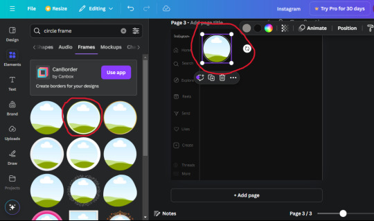
At first, the circle will be green and inside the circle will be white. Change the white to color of the background of the page (hex code #111111) then change the green to a grey color (#8D8986).
16. Add a new text box, change the font to Canva Sans and the size to 22.8 and the color is white. I just wrote "user.name" in the box. the W and H will be 153.3 x 35.7.
Enter the "elements" tab and search for a blue checkmark and find the icon by Victor Aguiar. The W and H is 28.1 by 28.
17. Search in the search box for a rectangular shape and add it to the page. Place it next to your username and checkmark icon and make the W and H to 149.6 x 38. Add another and place it next to the other rectangle shape. the W x H is 111.4 x 36.7.
Change the color of both boxes to #2F2F2F. Add a text box and write "following" then change the W and H to 82.6 x 21.8 and fit it inside the first box. Add a second text box and write "message" in it then change the W and H to 77.8 x 21.8. Change both text colors to #7A7A7A

18. Add another text box. Write "<" and turn it upside down and place it beside the "following" text inside the rectangle. Adjust the size as you need to. I also like the round the corners to around 8 so its not so pointy and square.
19. Add 3 new text boxes. Write the amount of posts, the amount of accounts you're following and the amount of followers your have. Write "20 posts", "30 following" "40 followers". Bold the numbers and change the text W and H to 116.4 x 32.7. These are just place holders that I use.
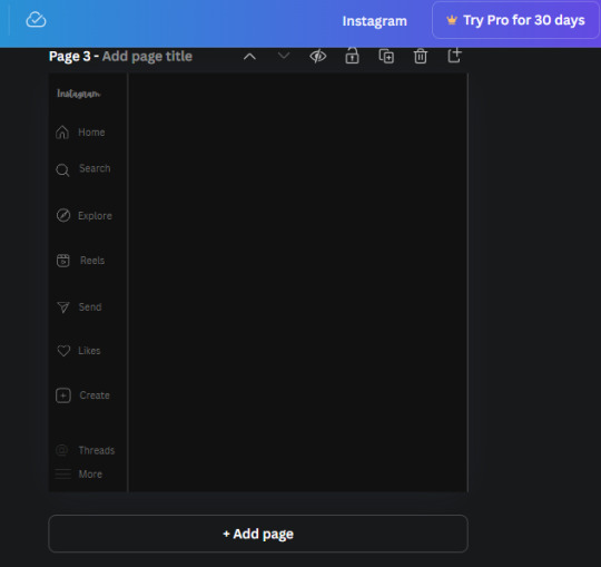
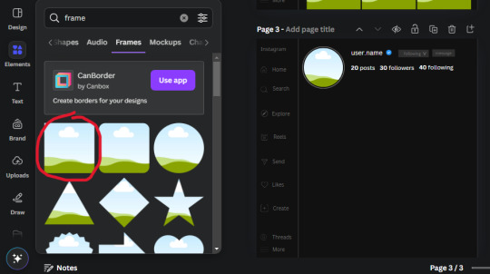
20. Open the "elements" tab again and search "frame". Choose the first one.
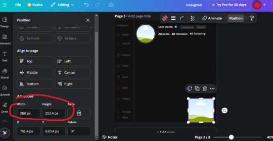
We want the height and width to be 268 x 252.4. Place it at the bottom of the page but we want some space between the frame and the page.
Now we'll duplicate the frame we just placed (the icon between the comment and trash can on the pop up above the frame). Place it next to the previous frame but we want to leave a bit of space between them like this:
If its a little wonky, don't worry. You can always adjust it so it looks right.
Duplicate the frame again and place it next the second frame you just placed, same distance between. Make sure they're even. Now we have a row.
Select all three frames and duplicate them. Move them above our original frames but leave a little space between them.
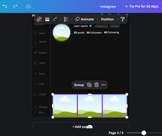
Again, if they're uneven, adjust them as you need to.
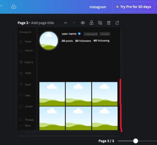
21. Select the line again from the elements tab. Stretch starting from the top frame to the last frame and make the color grey (#2F2F2F).
Because the line is stupid hard to navigate, use something like a text box to mark where you want it to end like this:


Delete the text box and the line with be where we want it.
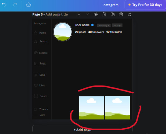
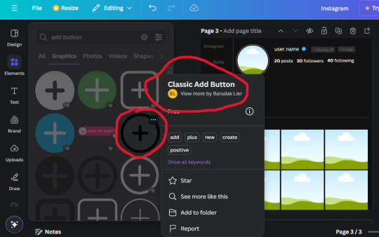
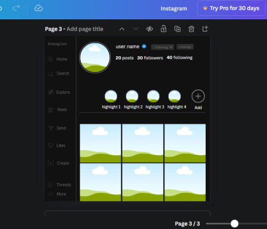
22. On to the highlight reels. Seach for "add button" and find the one by Barudak Lier.
Change the heigh and width to 81.1 and move it above the border.
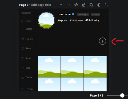
Search for circle frames now and add this one to the page (The same one we used for the pfp), change the width and height to 85.4 and move it next to the add button. Since this is a generic, blank template, I add about 4 of these highlight frames but you can do however many you want. You can change the border color to a gradient or leave it grey.
Add a text box now. The font will be Canva Sans, the size will be 18.1 and the color will be white. Change the text to "Add" and place it under our add button. Make more of these text boxes to place under the circle frames. Depending on which frame its under, write "Highlight 1", "Highlight 2", etc. etc. or you can give them different names and such.
23. Add another text box, write "name" and bold it, change the size to 19.1 and the W and H to 69.2 x 28.8. The font will be Canva Sans and the color will be white. It will go under the amount of posts, followings and followers.
Add another box. The font is Canva Sans, font size to 20.1, the W and H is 40.8 x 31.3 and the color is white as well. This is our "bio". Place it under "name".
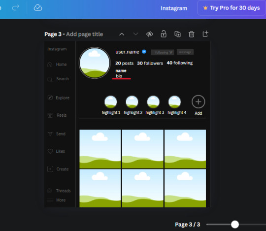
Yay!🎉🎉🎉 You're halfway done!
24. Search for a shape in the elements. Look for the rectangle again and add it. Change the width and height to 460 x 760.4 and the color to an off black/grey color (#191919), placing it like this:
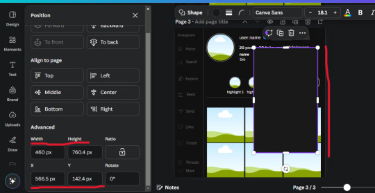
Get the same kind of square frame we used before to make the profile grid and make it the same size as the rectangle we just added. Place right up against the rectangle like it's its other half. Add another line like before and span across the upper half of the black rectangle as a border then add a circle frame inside the border.
Add a text box, "user.name" and align it with the frame. The text is white and the W and H is 111.5 x 25.9
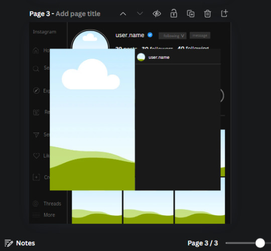
25. Add more circle frame along the inside of the rectangle to resemble the comment section. Make sure the W and H of the frames are 46.1.
Add more text boxes that align with the frames you just made and write "username" again and bold them. Add even more text boxes that align with the usernames and write "comment". These are place holders for when you decide to use this template.
Add another rectangle on the lower part of the rectangle and make the color black. and search for "instagram heart icon", "instagram comment icon" and "instagram send icon". Make sure the lines are thick. Find the heart icon by sketchify, and the the comment and send icon are by Mirazz Creations. Make the lines white and make sure the W and H are the following:
Heart icon: 38.7 x 32.9
Comment icon: 35.2 x 35. 8
Send icon: 35 x 32
Next, look for "instagram bookmark icon" and find the one by Adricreative. Change the color to white and the W and H to 29.7 x 40.2. Move it to the other end of the rectangle.
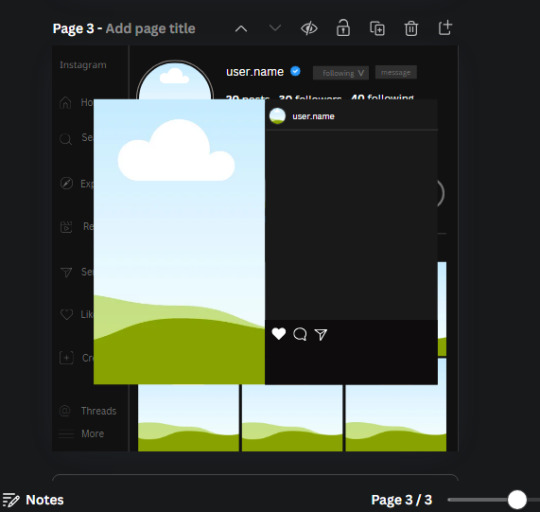
26. Now add three circles frames and change the W and H to 37.2. Move them below the heart icon and have them overlap each other some. Then, add a text box and write "liked by username and 1000 others". Change the font size to 13.6 and change the font to Canva sans. the color will be white. Align this with the three overlapped frames.
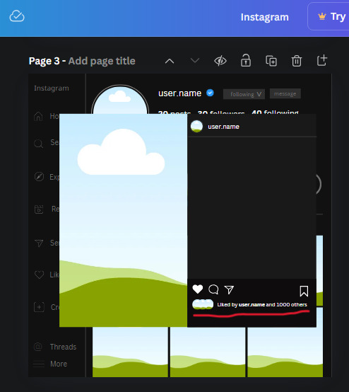
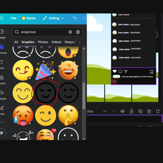
27. Look in the elements tab for an emoji icon and choose the one by Soni Soukell from Noun Project. The W and H will be 32.8 and the color is white.
Now add a another text box and write "Write a comment". The color will be white, the font size will be 14.2 and align with the emoji icon you just placed.
Search for "next arrow button" by Pixeden and make the W and H 42.8 then add it to both sides of the post.
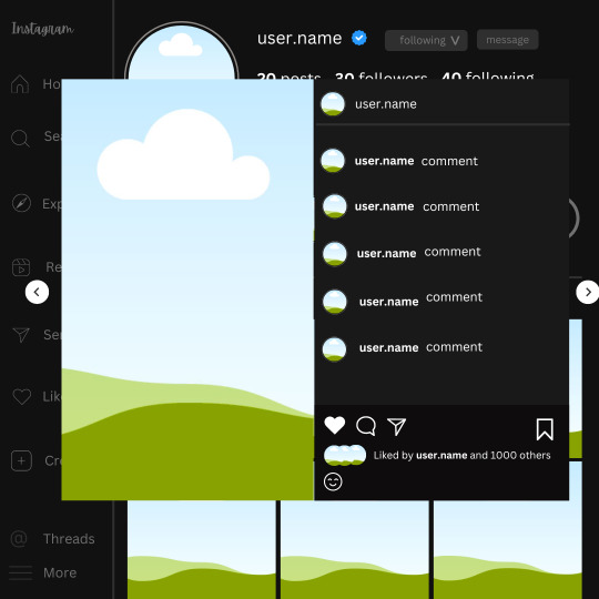
And you're all done with your template! All that is left to do is fill it but before doing that, duplicate the page so you always have an extra blank mockup if you want to use it again.
To fill the frames, upload an image (or use a Canva stock photo), drag and hover it over the frame and it will fill the frame.
Hope this was helpful and you you successfully made one :D <3
#requests#text#smau#template#mockup#moodboard#instagram#instagram moodboard#instagram mockup#graphic design#canva#psd#free tutorial#tutorial#instagram au#social media au#free psd#photoshop#resources#fanfiction resources#graphic design resources#graphic design tutorial#psd tutorial#photoshop tutorial#au#au ideas#mockups#digital design#digital design tutorial
128 notes
·
View notes
Text

Dave Johnson : "Blah,biddy,blah,blah,blah. What's there to say ? I did design the new Punisher logo. Pretty happy with it. The cover itself is OK. Not my favorite by any means. But then they can't be all my favorites."

Dave Johnson : "Tried to get that quiet mean vibe. The 'he's so bad, he doesn't need a million guns to kill you' look. And yes, after doing it I realized the Venture Bros. skull thing going on. Wasn't my intent. But what are you gonna do? It was bound to happen.
100% real paint on rough watercolor paper."

Dave Johnson : "Half traditional/ half photoshop."

Dave Johnson : "This one feels a bit like Steranko. I guess I could have sealed the deal by adding a swirling , hypno graphic to one of the backgrounds to really drive it home, but that really wasn't what I set out to do. I'm really enjoying the fact that since I re-designed the logo, I can now use it in the overall design as opposed to letting it just sit there on top of the page getting in my way like most comic cover trade dress. Too bad I still have to deal with the horrible scourge called the UPC box. I mean, seriously !?! Does it have to be so freaking BIG ! Not at all. But nobody wants to rock the boat in the name of beauty."

Dave Johnson : "Red, red, red. Why do I love that color so much? It dominates my work like skulls dominate Mignola's work. My chair is red, I got 2 cars that are red. Devilpig is red. My homemade Samurai armor is red.
Oh well, why fight it. We all like what we like. It's just that simple.
Damn Equis !
*note* X-Ray is a photo that was manipulated to show all the broken bones. Except the pinky. Because Punisher can kill you with just his pinky. He's just that bad ass."

Dave Johnson : "Ahhhh, Bullseye. You really know your way to my heart."

Dave Johnson : "What a crazy cover. To me, it just screams "insane" ! Maybe I was inspired by a certain DA member that entered into my life recently. Even though I did it before he started sending me death threats (haha) I guess I had an episode of fore sight."

Dave Johnson : "Even though I haven't posted the cover to no.7 yet (because I still need to finish it) I'm posting this. It's a 5 issue story arc involving the character Bullseye. So, I'm trying to do 2 things.
To have every cover involve a bullseye graphic element (so far, so good)
To do all the covers using a blue color palette to reference the original costume of Bullseye (even though the character in this story never dons the outfit)
Also, I realize this cover is kind of a book end cover to an earlier Punisher cover. This one… [link]
But hey, it just worked out that way. If I'd have know that Bullseye was coming up in my future I might have not done the earlier cover. But that said, I wasn't about to NOT do this cover because of that. It fits to well with the story.
But maybe I'm thinking about it too much because the reality is, that it's a stupid comic book cover and the world will go on as is, no matter what I do, haha."

Dave Johnson : "I really had a good time on this one. Bullseye looks like he's really lost it and has become obsessed with getting into Punisher's head.
I gotta say, in some ways this cover assignment has been more fun than 100 Bullets covers. And that's saying a lot. Plus, about a week ago, I was talking to Tim Bradstreet. He said that if I ever needed a fill-in he'd be happy to do so. I told him 'he's have to pry it from my cold, dead hands'. Hahaha."

Dave Johnson : "Ahhh, the Bullseye motif is in effect for one more cover. Actually, I have one more to do with this story line. The writer (Jason Aaron) said that Frank wears a gas mask in this issue. Which is crazy timing because I had started to write back and forth with this guy :icondarkasylumxxx: about a trade. Art for a gas mask. He had asked if I could use his gas mask design on a cover, and I told him that kind of stuff was in the writers hands not mine.
Crazy how the universe works like that."

Dave Johnson : "Hot of the presses. The last cover for the "Bullseye" story line. The bullseye motif was fun to play with. And I can't wait to see what comes next for ol' Punisher. I'm willing to money on the fact that whatever happens, it'll be mondo violent."

Dave Johnson : "Man, this cover fought me all night. I started around 11pm with a basic idea of Punisher holding prison bars so tight that blood was coming outta his hands. But the execution eluded me until 4:30am. The angle I liked, but how to make it say 'Punisher' ? Then the idea of the key brought it all home. Finished it up by 6am and off to Marvel on the East coast just in time for them to get it when they open up the doors. Yeah me!
I think this is my favorite Punisher cover so far. Not sure what you'll think, but I'm sure you're tell me, haha.
Going to go to bed now. I feel like a vampire.
Update Got this response from :iconprimeless: "I'm nobody, so I guess my words will mean nothing to you. Also, my art won't ever be as good as yours. I love this cover as I'm fan of your work, but I continue thinking that your work for 100 bullets is the best you ever did.
The reason is that i find that the Key is saying that "Punisher got somebody into jail" not that "punisher is in the jail".
Sorry. My english is not very nice."
And here's my response: "The cover is not meant to be taken as a literal statement. It's main purpose is to tell you 1. It's a Punisher book 2. It takes place in prison. Obviously, the key isn't a real key. It's a story telling device. Whether or not you personally see it "Punisher got somebody into jail" or "punisher is in the jail". Without the key, it's just a guy holding onto prison bars. With it, it's a guy who, may or may not be Punisher. The goal is to make you pick up the book and find out."
Posting this because I thought it would clarify any future questions. Thanks"


Dave Johnson : "It's a simple cover with a simple idea. Punisher is prison, prisoners not happy about it. Rinse, repeat. Call me in the morning."

Dave Johnson : "You know what sucks ? The way I work. I agonize for 2 weeks to come up with a cover design that I don't hate, and then it only takes me 1 day to do it from start to finish. Imagine if that were the other way around? I'd probably be over rendering and adding so much detail it would make your eyes bleed. But instead I wait until one day before the deadline to force me into doing something.
Bah! I guess it is what it is.
This one was hard because I've already done a Punisher cover dealing with Frank's origin story. Seen here [link]"


Dave Johnson : "Mmmmm, Electra vs. Punisher. Sure, why not."

Dave Johnson : "This cover kind of turned out to be a little partridge family bus art style or if you please the art that inspired that art style on the bus [link]
Well, it's not my best cover, but it's not my worst. I really dig how Punisher's face turned out though. But maybe you hate it.
Discuss."

Dave Johnson : "Punisher cover time. Mostly photoshop if you're wondering. No real paint was harmed in the making of this cover."

Dave Johnson : "Another Punny cover. Enjoy.
*note* if you notice, no blood on Frank in the photo. It's the little things."

Dave Johnson : "Sadness."
Dave Johnson's cover run (+ commentaries for nearly each of them) on Aaron/Dillon's Punisher Max Vol.1 #1-22 (2009-2012). Source
#Punisher Max#Dave Johnson#cover run#marvel comics#marvel#comics#cover#cool cover art#art#covers#comic covers#Frank Castle#Kingpin#Wilson Fisk#Bullseye#Elektra#cool comic art#the punisher#punisher comics#comic books#cover art#00s#10s#so talented#great run#cover artist#Jason Aaron#punishermax#max imprint#comic cover art
33 notes
·
View notes
Text

hiiii lovelies! i always use photoshop so i'm not sure about a similar software that can give the same results... and i'm sure i saw a tutorial somewhere but i don't remember which one, so i'll just try my best to show you how i do it!
after i've edited my screenshot i just choose whichever one i want, i select the necessary elements for that specific template and copy + paste it to my screenshot.
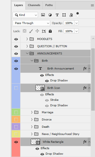
2. after i've edited the text i amend the blending options of the 'white rectangle' i've added screenshots of the specifics below, but this can change per screenshot


3. sometimes i also like to add an icon, i usually use these ones from @deathbypufferfish and i apply the same blending options to the icon.

that's it!
hi, i've just updated my resources page to include the skinoverlays i use for all life stages.

hi! it's from darte77's july 2023 cc pack.

hiii, you're SO kind! thank you!! i honestly let the game run it's course! i always randomize my sims' traits and kimi turned out to be mean, so then i just build up on that. and gameplay mods SAVE this game and that's what keeps my gameplay interesting. i just checked and i started posting on tumblr in march 2018 (omg that's 7 years ago 😭) and this was one of my first posts 💀. the main reason i started posting my gameplay pics is because of @ridgeport, ridgeport was THAT simblr back then 🤩
15 notes
·
View notes
Note
Thank you so much for answering my question. The animations like the ones you have in your Ben Barnes gallery catch my eye (that would be the third avatar). The animations of Lee Dong Wook's avatars too. The first one above is beautiful. Have an excellent day <3
Hello again dear anonymous person!
Well, it's nothing fancy, but I made a short video. I recorded the steps to make this kind of animation! I hope it helps you! Unfortunately, my Photoshop is in French. But here are the steps will be available bellow the video :
1) You have to open your avatar (jpg or png) in Photoshop. > I like to use one that is already styled. I just need to add the animation.
2) Create a folder (I named it ANIM) in your layers panel. > This step is optional, but I like to do it to keep everything clean and easy to find.
3) Create your first empty layer in the folder, name it clearly. > I choose 1 because it'll be my animation's first frame.
4) Draw the elements you want in your animation with the pen tool in the color of your choice. > Here I choose the rough shapes of the flowers
5) Create a new layer in your anim folder and draw the second frame of your animation. > In this step I like to keep the old layer visible so I can see where I put my first animation layer. This is optional.
6) Repeat step 5 and create a third layer for the animation. > I like to do 3 to 5 layers, depending on the animation I decided to do, but nothing more to make them really light.
7) When all your layers are done with drawing, hide them all with the little eye in the layer panel.
8) Open the Timeline window. > If it's not already open, you can find it in the "Window" menu of your Photoshop) and make sure you have the "Frames" selected (if you see a timeline, you're not in the right mode, you can easily change it by selecting the 3 little squares at the bottom of the window).
9) You should have an existing frame once you are in the timeline mode. If not, click on "create frame animation".
10) Then click on the little [+] button at the bottom to add a frame near the trash. If you have 3 layers, make sure you have 3 frames
11) Select all 3, then click on the 0s and choose 0.1s (this will control the duration of the frame animation)
12) Select your first frame > then make your layer 1 visible. // Select your second frame > then hide your layer 1 and make your layer 2 visible. // Select your third frame > then hide your layer 2 and make your layer 3 visible.
13) Then you can "save for web" and play your gif to see if you like it!
Again I hope this helps! Enjoy your creation time! May you make a lot of nice things that makes you happy!
#tutorial#short tutorial#animation diy#avatar#gif avatar#a devious route explain#ressources#rpg ressources#a devious route
84 notes
·
View notes
Text
AAAAAYYYYY WE FINALLY MADE IT!!!!!
Six years later, and Lost Souls is in it's final chapter (and will be completed before the year ends YIPPEEE!!!) and I realized that I hadn't made good on something I said I would do: frequent comparisons between appearances of the characters to show how my art has changed and improved throughout the comic's run. Completely forgot. Oops...
So I figured what better way to celebrate how far we've come than to visually SHOW how different the start and the end are! Here we go! (LONG POST AHEAD!)
PROLOGUE
Not much to say about the first chapter--other than it shows its age. 💀 At the time I really struggled with contrast and color theory, because everything is muddy and blends together.
I found all the Fazbears challenging to draw, but I especially remember struggling with Chica the most SOLEY because of her beak--I was having difficulty wrapping my head around making it look the way I wanted it to. Once I let myself treat Chica's beak less like an actual beak and more like a pair of extra thick lips she became one of the easier characters to draw.
CHAPTER ONE
Its so weird seeing where my blood children started and where they ended up design-wise. Cody's hair is a lot more tamer in style in these first chapters, and it took a while to get the hang of how I wanted to depict Bridget's wavy hair.
CHAPTER TWO
UGGHH MORE MUDDY COLORS GET IT AWAY GET IT AWAY
Back during this chapter the fog looked more like actual fog than a manifestation of all the animal souls Gold had collected and tenuously tied together with sheer force of will. All I can say is I guess I was still figuring out the art direction I was going.
CHAPTER THREE
I was REALLY proud how I subverted expectations by not letting Cody or Bridget faint upon meeting the Fazbears. XD
I also did this dumb thing where I would block the farther limbs in shadow to try and save time (you can see it most notably on Halo and Bonnie's ears.)
This did not in fact save much time and ended up looking kinda dumb and making people think characters were missing limbs. >_<
CHAPTER FOUR
Character designs are notably more consistent.
Here was where I dropped using Photoshop Elements 7 for my drawing and used Krita. I still used Photoshop for finishing details etc.
CHAPTER FIVE & SIX
If I had to pin a chapter in which character designs were pretty much solidified, it would be these chapters.
CHAPTER SEVEN
The only major characters here are Cody and Regan.
I made this chapter during the height of 2020. So naturally I was in the throws of a MAJOR depressive episode.
I took a lot of short cuts in an attempt to just get this chapter DONE. Don't know if it's noticeable or not, but yeah it was rough.
I didn't include the Bidibabs and Minireenas because there's too darn many if them, and they're not always grouped together for the most effective comparison shots.
CHAPTER EIGHT & NINE
Grouped because eight wasn't particularly noteworthy.
Other than it's where I made the switch to Clip Studio Paint.
I had experimented with it when I made the prior Crybaby chapters and fell in love with the program before I even finished the free trial.
CHAPTER TEN
Ooh I was SO anxious for this chapter, because here was when the story would reach the point of no return--it was literally all downhill from here and I wouldn't be able to just drop the comic if I lost interest.
(But I didn't! )
Point being, lots of anxiety surrounding this chapter.
CHAPTER ELEVEN
Here is officially past the event horizon. At this point I had no idea how much farther I had to go in spite of the fact it was the start of the final night.
CHAPTER TWELVE
We officially enter the labyrinth here, and it is here where I officially decided I HATE the color green.
I really don't know what it was, but there wasn't many things I could do to make the characters stand out from the sheer GREEN of the vicinity, and it muddied up a lot of the colors of the characters.
Thankfully I had more experience under my belt to balance it all out (I hope 😬)
CHAPTER THIRTEEN
More green.
So much green.
CHAPTER FOURTEEN
Which is why when Cody's group went into the mirror maze I switched it up and went more aquamarine/turquoise to make it more bearable for me.
Making the light emit from the glow-in-the-dark floor panels was a happy accident--I wad playing around with layer modes and the Add Dodge (Glow) layer mode in CSP caused an interesting effect that I took and ran.
Markiplier cameos here. (And dies. Sorry Mark.)
CHAPTER FIFTEEN
The double uploads started here and OH MY GOD I can't believe I managed to survive it. I really put my pedal to the metal here, and I came out on top!
(It was a race against myself really but HOT DAMN I WAS ON FIYA.)
Side note: this chapter went through SO MANY rough drafts guys it's not even funny.
The vibes weren't jiving, the pacing was all skiddly-wompus, and at one point the chapter was FIFTY PAGES LARGE (HELL NAW)
Its a miracle I'm alive man
Do your stinkin thumbnails guys--they saved my life
CHAPTER SIXTEEN
This was the hardest chapter to finish, if you can believe it.
It took the longest production-wise, because after SIX YEARS of non-stop comic work I was definitely burned out. Thank god I had already solidified the script and thumbnails beforehand because with that guide rail in place I could drag myself across the finish line by my fingernails because if there was ONE THING I DIDN'T WANT IT WAS A FRICKIN RUSHED ENDING. >:[
(Burned by too many unsatisfying webtoon/webcomic endings that basically went "and we lived happily ever after 😌")
Visually this is my favorite chapter. I love how the colors turned out, and all the characters felt truly "mine."
And that's that!
Man I started writing a whole paragraph and I realized that I should PROBABLY save it for the Afterword, when the comic is well and truly finished. So I'll hold off on that big ol' schpiel until then, but I will say:
THANK YOU FOR STICKING WITH US THIS FAR!
💖💕😘💕💖
#ChiwwysComics#FNaFLostSouls#ChiwwysFanart#FNaF#comics#fanart#fan comic#fnaf#fnaf fanart#fnaf fancomic
45 notes
·
View notes
Text
I'm not late for my digital art challenge, time is actually extremely early. Also my sister allowed me to use her photoshop and I am just confused because I can't adapt after looking at the same one software for four years. Also I hurt myself in Paris subway and I'm unhappy.

Don't look at the colour palet thingy, it's 5:00 am and I don't know what I'm doing.
So I decided to use this challenge to develop my dumb au ideas without taking any time to introduce you to it 😈
But because I feel like I should give some context, I'm still gonna yap about it😈😈😈
So actually, Jay isn't the one I should start with, but I'm chaotic so here you go 🫠
But it originally started when I realised that Ninjago gave Cole so little screen time that I started to make my own Cole lore in my head (sometime my brain does this on its own). And basically, I went from "what if Cole had a backstory?" to "what if I gave Cole my childhood trauma because I relate to him way too much?"to "what if Jay had siblings?" to "what if Zane was the only one with a perfect childhood?". And before I knew it an alternate timeline came tickling my circuits at night.
This then became me being mad at season 7 for bringing back Kai and Nya's parents, and decided to give (almost) all the ninjas childhood traumas based on what I understood of their character.
So in this au, Jay doesn't really have any "childhood trauma", but I kinda designed his family to be problematic in a way that he would grow with many insecurities because he lacked parental attention. And this despite his parents being awfully nice and caring to him and his siblings. It's just something that can happen, especially in large families or when the parents are so invested in their work/hobby that they tend to unintentionally neglect their kids, and I think that both are happening in Jay's family.
I'm also thinking that his parents would have difficulties understanding most of their children exposing neurodivergent symptoms. I strongly believe that Jay is on the ADHD spectrum, and as a person with ADHD symptoms as well, I'm using my personal experience to explain how he could've grown with it. (I'm not very good when talking about neurodivergence, just know that I based most of Jay's childhood problems on this video, which I think explains very well how parents can have the best intentions but still hurt their children because they don't understand them)
So of course, the final personalities of the ninjas are a bit different from canon, but I did try to make them similar at best, or close from what I understand of them, which might not be correct X). In this au, Jay is very insecure about his abilities, which results in him hiding most of the time to build/model/create/whatever artistic stuff he said he did, but also in him having more difficulties to unlock some of his powers (like the elemental dragon). After spending some time with him, the other ninjas learn how to properly encourage him to open up and make him gain some self-confidence. When he is not in a stressing situation, Jay acts rather childishly, because he was used to be mothered by his parents and his older siblings, and he is more open about his emotions than others can be, he even has trouble hiding them when necessary.
#If you ever go to Paris because of the Olympics tell me lol#my art#digital art#ninjago au#childhood trauma au#ninjago jay#ninjago
26 notes
·
View notes
Text
Yvette Heiser - Enhance Your Photography with These Pro-Level Photo Editing Techniques
Photography is more than just capturing a moment—it’s about storytelling, emotion, and creativity. However, even the most well-composed shots can benefit from post-processing. Yvette Heiser Painting with Pixels: A Guide to Advanced Photo Editing Techniques explores how professional editing can elevate an ordinary image into a visually stunning masterpiece. Whether you're a beginner or an experienced photographer, mastering these pro-level editing skills will help you refine your photos and bring out their full potential.

1. Start with RAW Editing for Maximum Control
Shooting in RAW format instead of JPEG gives you more flexibility during editing. RAW files retain all the image data, allowing you to adjust exposure, color, and details without losing quality. Most professional photographers use software like Adobe Lightroom, Capture One, or Photoshop to process RAW images.
Quick Tip:
Adjust the white balance first to ensure accurate colors before making other edits.
2. Perfect the Exposure and Contrast
Even with careful shooting, exposure may need fine-tuning. Adjusting brightness, highlights, and shadows can balance an image and add depth. Contrast adjustments help differentiate between light and dark areas, making your photos pop.
Pro Tip:
Use the histogram in your editing software to ensure a well-balanced exposure without losing details in highlights or shadows.
3. Enhance Colors with Precision
Color correction and grading can completely transform the mood of an image. HSL (Hue, Saturation, and Luminance) adjustments allow you to control specific colors, making them richer or more subdued.
Best Practices:
Use split toning to add artistic color effects to highlights and shadows.
Adjust the vibrance instead of saturation for a more natural color boost.
4. Sharpen and Add Clarity for Crisp Details
Clarity and sharpness adjustments enhance textures and bring out intricate details, making your subject stand out. However, excessive sharpening can create an unnatural look, so it’s essential to find the right balance.
Quick Tip:
Use the "masking" feature in Lightroom when sharpening to apply it selectively, avoiding unnecessary noise in smooth areas like skies.
5. Remove Unwanted Elements with Retouching
Even the best photos may have distractions, such as dust spots, stray hairs, or background clutter. Tools like Clone Stamp, Healing Brush, and Content-Aware Fill in Photoshop can seamlessly remove unwanted elements without affecting the overall quality.
Pro Tip:
Use a low-opacity healing brush for subtle and natural-looking touch-ups.
6. Apply Dodging and Burning for Depth
Dodging (lightening) and burning (darkening) are classic darkroom techniques adapted to digital editing. These adjustments help shape the lighting in an image, drawing attention to important areas while adding dimension.
How to Use It:
Dodge the highlights on faces to create a soft glow.
Burn background elements to add depth and guide the viewer’s focus.
7. Use Gradient and Radial Filters for Dramatic Effects
Filters like gradients and radial adjustments help enhance specific parts of an image while keeping the rest untouched. These are particularly useful for improving skies, adding vignettes, or drawing focus to the subject.
Best Use Cases:
Apply a linear gradient to darken overexposed skies naturally.
Use a radial filter to subtly brighten the subject while keeping the edges darker.
8. Final Touch: Add a Signature Style with Presets and LUTs
Professional photographers often develop a signature look using presets (Lightroom) or LUTs (Look-Up Tables for video and photo editing). These tools speed up editing by applying predefined color and tone adjustments.
Pro Tip:
Customize presets to fit each image rather than applying them universally.
Final Thoughts
Editing is an essential part of modern photography, allowing you to refine your images and bring out their full artistic potential. Yvette Heiser, investigating the Transformative Power of Photography, highlights how post-processing can turn ordinary shots into breathtaking visual narratives. By mastering these professional-level editing techniques, you can transform your raw captures into visually stunning works of art. Whether you’re adjusting colors, enhancing sharpness, or removing distractions, the key is to maintain a natural and polished look.
Experiment with these tips and elevate your photography to the next level! Would you like any additional insights or software recommendations?
#wedding#camera#moments#pictures#childphotography#photographer#photography#yvette heiser#photographytips#events
10 notes
·
View notes
Note
At first I thought I wanted to start a path in animation, but then looking at your Elemental art and storyboards makes me want to try my hand there too! (Yes, I love Elemental that much, watched it 7 times).
Not sure if you’ve been asked this a lot, but where does one start on the path to becoming a storyboard artist (or anything relevant to the animation industry)?
I’m a vocational nurse who is hoping to use her free time to slowly go on that journey of “animation aspiration”. Someone told me that the best way to start would be getting a wacom if I want to try more animation.
Does that also apply to storyboards? Like what technology and apps do I need?
How do I put myself out there like you did?
Apologies if this question has been asked too many times. I just feel so inspired after seeing your work!
- Abigail
Apologies for answering this a million years later 🥲
You should absolutely go for it!!
If you want to do anything within the animation industry, my general advice would be
1. Watch loads of movies and shows! Animated and live action. Make a note of shows you like and are inspired by
2. Draw a lot. Get a sketchbook (I like to call them shitbooks) and just draw any and everything, no matter how ugly. Just get used to drawing whatever on paper and when you’re ready, move to a digital medium like an IPad or any other small drawing pad that you can comfortably draw on
3. Study story structure! Knowing how to properly tell a story is really vital, especially if you want to be involved in a show or a movie. YouTube has a BUNCH of resources. Also read books!!
4. Learn how to visually tell a story! When you watch movies/shows, pay attention to how the scenes play out and what shots the director used to get the idea across. Make a list of shots/scenes you really like and study what makes them work
5. When you’re ready, invest in a desktop setup! Tablet, PC, monitor, all of that. Most animation professionals use ToonBoom, Storyboard Pro, Photoshop, Blender etc. There are cheaper alternatives to all of these too
6. Just make stuff and put it out there. Whatever interests you, whatever gets you pumped, just draw and post it. Post into the ether and eventually people will see it and want to know more about you.
Starting and putting yourself out there is scary and hard (I still lowkey hate it lol) BUT part of living is sharing yourself with others! Because I faced my fears and put myself out there, eventually I inspired you! 🧡
All in all, go for it! If you have any other questions, you can DM me!
Edit: I just looked at your page and saw that you already draw a lot and draw digitally which is GREAT
I’d say def focus more on your own stories and post that stuff separately from your fandom stuff! You’re already putting yourself out there and allowing people to get a peek into your personality, now just sort of direct that to your own characters, stories and other stuff that interests you!
13 notes
·
View notes
Note
do you have a favorite piece of venture maidens fanart you've drawn???
This is a great question! Honestly, I've been wanting to make a environmental piece with whimsy, food, and fashion, for like.. 2 years? when thats done it will probably be my favorite piece LMAO but for the time being? let me go through my venture maidens folder
read more break because im going to be going on and on
This applies to most aspects of my life, but I don't really have a top "favorite" thing in most areas! I mean, Madoka Magica Rebellion is my favorite movie (very closely rivaled by Coraline), but that's an outlier. In every other case, I have a collection of my favorites with one coming out on top depending on how I'm feeling that day.
It's also influenced by eras, I think. I don't want to compare my most recent art to my venture maiden 2020 art, because I've improved and will prefer my newer style. However, there's still a sense of nostalgia and homeliness to some of my old art that can bring it above the rest, you know?
Going through my venture maiden campaign 1 folder, here's probably my favorites:


These two are from 9/3/20 ("sawYEAH.png") and 11/23/22 ("arent you tired of being nice.png"). I think Sawyeh's relatively simple design has always lend itself well to gesture drawing, especially with the relatively simple silhouette shape. Theyre just fun :) I like them a lot.
I don't know if I'd rank a lot of my campaign 1 art among my favorites, not because I think less of the campaign but because a lot of that time period was me feeling my way into an art style. I see it as the time period after I started feeling confident in my art, but before I kind of became the "unique facial features and color jitter" artist.
For fun (and food), here's some of my unposted campaign 1 stuff.


10/23/20 and 10/27/20 (gidget and vlad, back when i was drawing in paint tool sai!)


1/2/21, 1/5/21, 6/18/21 || 1/6/21 (put out of order because i like this image composition more).
Here's some 2020 (and 2019, apparently?) photoshop files! I like some more than others. None of them have previews since they're photoshop files, so I'm opening them blind in krita. Note the layers/colors may seem off, it's probably because the clipping masks and editing layers break between programs.


8/12/19, 8/21/20, 8/31/20 || 9/5/20 || 10/23/20, 10/23/20, 10/28/20 || 11/4/20

From 10/21/20, technically in 2020 but close to 2021. I think it's unique because it starts to show a shift to more.. unique concepts, I guess? It was of a water elemental who uses an ice mask to mimic having a face. It's cool, I should revisit it.


3/17/21, 3/18/21
I think that's pretty much it for the art while campaign 1 was going on. Here's some post-campaign 1 stuff from 2023 that maybeee got put on the discord?


8/16/23, 8/25/23.
GREAT now I'm moving on to campaign 2.
My favorite? My favorite piece of artwork so far? It's of a one-off npc, the garlic princess. I was studying old strawberry shortcake designs for her. It was a lot of fun.

9/10/23
My other favorites? Probably any art of Tandy


1/2/23 || 1/2/23
I also really enjoy these unfinished sketches: the first being a wildes-influenced lu, inspired by butterflies and gemstones; the second being Toni and a Wyrd sister ("thats no angel.png"); the third being halloween outfit designs; and the fourth being aoife and toni going clubbing in the wildes;


7/11/21, 10/11/22, 9/2/23 || 1/26/24
As for unposted sketches? Oh boy, I've got a lot more for this campaign. So much that I have reached the image limit per post, whoops. I'll add them in a reblog.
#sketchmre answers#the venture maidens#venture maidens#the venture maidens campaign 2#the venture maidens campaign 1#idk what else to tag this as#enjoy your food anon i havent cracked a lot of these files open in months or years#my art
9 notes
·
View notes
Note
how do you make your graphics? your style is so unique and beautiful!
Hi, thanks so much, that’s very kind of you! And I use Photoshop. If I’m being honest it’s not a super elaborate nor elegant process, I’m still learning and I mostly figured out what I like to do by just going in there blind and clicking around a bunch. I’ll put the more detailed steps under the cut if you’re interested, though!
Okay so generally speaking, these are usually the steps:
1. I take screenshots through either Premiere or the built-in Windows screenshot tool (but preferably Premiere). I try to use 4K remasters of the movies where I can these days, because it allows me to—
2. zoom in and crop the hell out of them and reframe them how I see fit without losing out too much on the quality. (these movies needed more close-ups, goddamn it) If there’s blank space left at the edges, I might duplicate the nearest edge area of the layer and try to blur it out + darken it with a gradient to fill that gap and still get the framing I want.
3. Then I adjust basics like exposure and contrast using the Curves function + boost saturation and vibrance—I try not to overdo it with the latter two because that step gets repeated later on, but I do need to do it at the start to even properly see what colors are in there since the MCU is so fucking bleak when it comes to color grading, and the 4k remasters tend to be even flatter. I also add Sharpen and Sharpen Edges filters here.
4. This is the fun part: go in and mess around with color. I usually use the Selective Color tool to figure out which parts I want to bring into focus by boosting like 2-3 colors and tweaking/evening out the rest of the tones to get some contrast. Hue/Saturation and Color Balance come in handy here, too. I’ll also sometimes use the Match & Replace Color tools to either neutralize, lighten/darken or entirely remove certain colors, and add Photo Filters to warm up/cool down the whole thing or certain areas.
5. When I have a decent idea of what I’m doing with color, I move to masking out what I don’t need—usually over-saturation in the skin tones, teeth, whites of the eyes, weirdly saturated pixel clusters, etc, and blurring out areas that might be too textured.
6. I’d say this is an optional step depending on the edit, where I might add any “special elements”—this is not the best quality example, but it has multiple:

I take the rectangle select tool—or Lasso or whatever select tool, depending on the shape—and then use Invert on that area (which I do a lot, lol. Big fan of my buddy the Invert tool). Here I also used a B&W adjustment layer, but if the inverted area’s in color I go in again with Selective Color or any of the other previous adjustment tools to futz around with the colors some more, such as here:
I kind of suck at remembering to use different layers for different adjustments, but if I’m adding any shapes or patterns with the Brush tool—such as the dots or the blood spatter on those BW posters—I make sure to always do that on a new layer. I do the same if I’m adding a duplicated area at a lower opacity to create that “ghost” effect at the edges of an object, like in this Sam edit here:
or if I’m adding a directional blur like in these:

7. On a new layer, I add in color gradients at a very low opacity and then layer them up until I like what I’m seeing, usually radiating out towards the edges of the image or in spots that I feel might need a color change or boost. The red and cyan here are some of the more noticeable examples:
or the sepia-esque bleed through in these:


And I might do the same thing with a dark grey to darken the corners and edges a bit.
8. I add a text layer, write whatever it is I want on there and set font and size, pick a base color for it that is complimentary with the colors of the image, and then I go into Layer Style to adjust the opacity and blending mode. I usually use Difference or Exclusion for the latter if I’m trying to get that colorful text, and I might also throw in a lower opacity Gradient Overlay if I’m not a 100% satisfied with the colors that produces.
I might also mask the text so that I can make it appear to be behind an object, like in this:

9. Texture! I used to just add a noise filter directly to the base image but have since learned that’s not really the best way, so instead I:
i. create a new layer;
ii. set the mode to Overlay, and check “Fill with Overlay-neutral color (50% gray)”—you can also do this by just using the Bucket tool to fill this new layer with a neutral-looking gray color and then tweak the opacity;
iii. convert the layer to a Smart Object so I can go back in and re-edit;
iv. finally add a Noise Filter (set to gaussian and monochromatic) at around 3%-15%, depending on the image size and quality. I might also add a Gaussian Blur on top to make the noise a bit softer.
10. Final checks—this is where I might up the exposure, contrast, and saturation/vibrance again, or add another layer with gradients (always under the texture layer). I usually also export a test version to see how it translates online after it’s been compressed on upload, and then use that as a reference for whatever needs fixing or tweaking.
And that’s more or less it! Thanks for the ask—I never really thought too systematically about what it is I exactly do with these, so this was an interesting exercise. <3
4 notes
·
View notes
Text
The UI Inspiration Factor
After Apple spent the mid-90s slowly circling the drain, the return of Steve Jobs and the popularity of the iMac were starting to reverse the company's fortunes by the end of the decade. Their "Think Different" ad campaign tried to position the Mac as the computer of dreamers and visionaries, and white Mac OS did have more visual "fit and finish" than Windows . . .
. . . it was getting harder to ignore its underpinnings as a single-tasking system from the Bronze Age of personal computing. Apple's inability to create a more modern Mac OS was big reason why the company almost went out of business, and they'd acquired Steve Jobs' NeXT corporation specifically to adapt their super-advanced OS to the Mac.
The earliest developer builds of the new Mac OS, called OS X, basically looked like NeXTStep reskinned to look like Mac OS 9.
It was a very conservative approach that mirrored what Microsoft had done with the Windows NT family: upgrade the tech under the hood, but retain the familiar UI with basically no changes. But by the turn of the millennium, even Microsoft realized that their newest Windows version needed a bold new look to commemorate the consumer release's move to the NT platform:

The plasticky "Fisher Price" look of Windows XP was only a light coat of paint on Windows 2000, though, and it didn't take much digging before you ran into UI elements that were untouched since Windows 3.x. It was even possible to turn off the new UI altogether and make Windows XP look exactly like Windows 2000.
With OS X, Apple went in an entirely different direction:

The new Macintosh UI didn't just wow people, it inspired them. Back then, popular apps were a lot less platform-agnostic than they are today. About the only mainstream application suite that ran on the Mac was Microsoft Office. Adobe had yet to create a version of Photoshop for Mac OS X, almost none of the other popular games and applications from the Windows world had Mac versions, and Apple's one-button mouse interface didn't even have a right-click option. You had to hold down the CTRL key on the keyboard and click the mouse to bring up a context menu. And yet it's hard to explain to folks who weren't there how much everyone who saw OS X needed to have it.
Much as the iMac looked totally different and more futuristic than everyone else's beige boxes, OS X looked like a user interface that really was from the future. Even though it wouldn't really be mature and feature-complete for a few more years, OS X made you feel like you could sit down and create something amazing with it. That feeling was an impossible thing to quantify, and it was something that Microsoft's creatively-blind culture was totally incapable of understanding or even believing in.
Sadly, by the time I was finally able to make the jump to Mac, the Aqua visual style had given way to the flat UI that was inspired by Jony Ive's iOS 7 design. I still like it better than Windows, but there was something inspiring about those perfectly glassy buttons and scroll bars and those big, hyper-detailed icons that was lost in the move to "modern" flat design. I hope the pendulum swings the other way eventually.
6 notes
·
View notes
Text
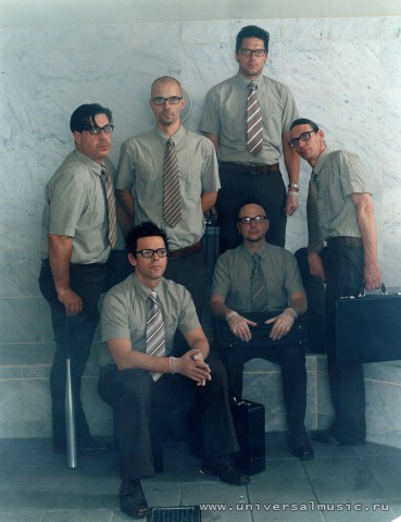
31 Days Idol Challenge - Oliver Riedel
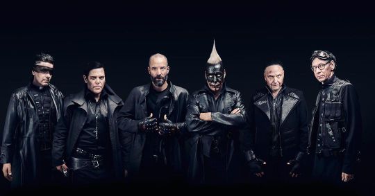
Day 10 - Favourite Look in a Group Photo
When I made this challenge before this year's tour, I was not sure which photo I would go for. As soon as this Adieu photo by Jens Koch was published, it became easy.
Of course, it is separate shots put together, but it's still presented as a group photo - and Oliver looks fabulous. I like how he has a prominent placement, how his posture and facial expression is so different from how we normally see him in photos, and how he looks hands on and ready to go. It totally fits the character he had in the Adieu music video, where he totally rocked that mini-gun.
Seeing this photo blown up and used for Rammstein's merch booths this tour, was amazing. The details were mind-blowing. I actually took photos of one of those banners, and while my angle and lighting was not perfect, I have tried to adjust the colour balance and aspect to resemble the original. The spots on the photo are spots that were on the actual banner I photographed.
Since this photo is photoshopped and not accurate, please do not circulate it. I put a disclaimer on it as well, so no one will think of it as the original photo. While it is not perfect, it does show a little bit of the crazy detail in this fantastic photo.
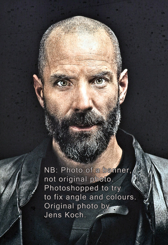
Bonus material: 1) Dreamy young Oliver with hair, by Fritz Brinckmann 1995. 2) Pile of Rammstein where Oliver has more hair than Schneider, by Joachim Gern 1995. 3) Barefoot Oliver front and centre, by Jan Hinrich Hoffmann 1995. 4) Photo where you can really see that Oliver is younger than the rest of Rammstein, by Frank Lothar Lange 1997. 5) Oliver and Richard sharing a moment, by Ross Halfin 2001. 6) Shaved Oliver with glasses, by Olaf Heine 2004. 7) The Rosenrot photoshoot, by Kasskara Agentur (Mat Hennek and Felix Broede), 2005. Oliver looked confident and proud, perhaps because the band was dressed up by his wife? 8) The German Conference, Sonoma 2008, by Olaf Heine. I like how the others are listening to Oliver (well, apart from Richard, who is posing for the camera). 9) In LIFAD costume, by Paul Harries 2010. This was a really good look for Oliver. 10) Oliver in his element, by Frédéric Batier for Mein Land 2011. 11) Smiling Oliver on the photo shoot for the Untitled album, photo by Jes Larsen 2019.


--
Others doing this challenge:
Till: @endlich-allein Flake: @anwiel13
#Rammstein 31 Days Idol Challenge#Oliver Riedel#Rammstein#Oliver in a Group Photo#Rammstein 31 Days Idol Challenge - Oliver#My photoshopped photo#Till Lindemann#Richard Z. Kruspe#Paul Landers#Flake Lorenz#Christoph Schneider#Jens Koch#Rammstein Photographers
36 notes
·
View notes