#mid 16th century -19th century
Explore tagged Tumblr posts
Text
Sea Shanties and Shipboard Music aboard Warships
Traditionally, sea shanties were sung on board both warships and merchant ships to help light the work involved in sailing the ship. They are usually divided into two main groups - capstan shanties, designed to accompany the hard effort involved in heaving on the bars of the ship's capstan, and halyard shanties, where either the rhythm or the words were designed to help the men pull together, for instance when raising a sail pr raising up a new spar to the masthead.
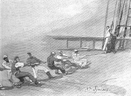
Most shanties follow the same pattern, with short versesand boisterous but repetitive choruses. Sometimes the lyrics were either made up aas the seamen went along, or else improvised or repeated, especially if the task proved longer than the shanty. The words were often less important than the rhythm of the song, although some shanties such Shenandoah or Blow the Man Down have become famous as songs in their own right. Oh and by the way the first known shanties date from the mid-16th century, recorded in the Complaynt of Scotland (1549), but their origins probably lie much further back than that.
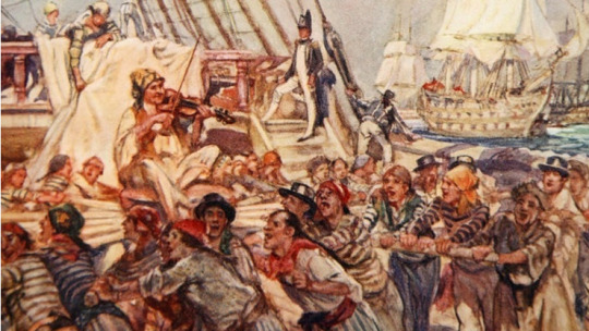
It has been argued that sea shanties were much more commonplace on merchant vessels than on warships, as the later were comparatively well manned, so the labour involved in sailing the ship was less arduous. This theory isn't borne out by what we know about life in the sailing navies of the world. While shanties might have been less commonly used as working songs, they were widdely sung as a means of recreation. Music was important on board a sailing man o'war, and instruments such as fiddles, fifes and flutes were often played when sailors were off-duty. And the sailors loved singing on board until ordered to their hammocks at pipe down, these shanties are known as fo'c's'le songs or forebitters. Dancing was also popular, and many captains encouraged it, as a way of keeping spirits high and of providing exercise.

Popular songs in the Royal Navy during the Napoleonic Wars were Nancy Dawson, Spanish Ladies and Drops of Brandy and some ships carried an official band, and during the approach of the British Fleet to the enemy at the Battle of Trafalgar, many ships played Rule Britannia, Hearts of Oak or Britons Strike Home.
Shanties during work on board depended on the captain, because not everyone wanted music. It was more like silence aboard a warship so that the men could hear the orders better and not get lost in the singing. But it also happened that there was singing or a flute was played when the anchor was being aweight but that mostly depending on the situation on the ship.
Well the truth was, music such as sea shanties made the work appear easier, whether on board a merchant vessel or a warship. But the shanties went out of favour with the coming of steam. With no sails to raise, and with steam powered capstans there was little need to sing during work. By the later 19th century they had lost their original workmanlike purpose, and shanties became something that were sung for fun and get mixed with the so called sailors songs, rather than as a song of work.
#naval history#sea shanties#mid 16th century -19th century#age of discovery#age of sail#age of steam
303 notes
·
View notes
Text
15th century (Houppelande the Ritz)

Early 16th century (God please, not the codpiece)

Late 16th/early 17th centuries (That's ruff, buddy)

Mid-17th/early 18th century (If it ain't Baroque, fix it)

Mid-18th century (Big tent party)

Late 18th/early 19th century (Empire state of mind)

Mid-19th century (Hoop springs eternal)

Late 19th-early 20th century (Hustle and bustle)

1910-20s (Ankles aweigh)

#yes the divisions are wonky don't @ me#as for the puns I can only apologize#fashion history#hot takes
1K notes
·
View notes
Text
MCU Timeline: Avengers: Age of Ultron
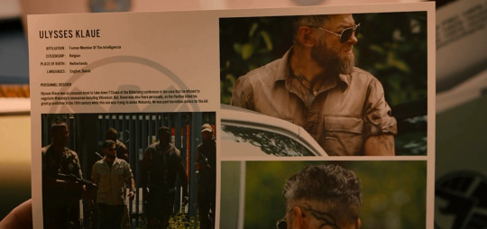
19th century - Black Panther kills Ulysses Klaue's great-grandfather during his attempt to annex Wakanda.
1990s - Wanda and Pietro Maximoff are born (12 minutes apart).
Between 1992 and 2008 - Tony meets Ulysses Klaue at an arms convention, before Klaue got his tattoos and branding.
~2000 - the Maximoff twins become orphans. They remain trapped with the unexploded shell for 2 days.


May 4/5, 2012 - STRIKE hands the Scepter over to Dr. List.
Early 2014 - Maximoffs volunteer for Hydra's experiments and become mutants.
Spring 2014 - Spring 2015:
The Avengers become Tony's private paramilitary organization under Cap's command.
The team moves in the Avengers Tower.
September/October 2014 - Clint is on vacation.
Tony creates the Iron Legion.
Tony and Bruce create Veronica and Hulkbuster.
The Avengers raid Hydra bases in search of the Scepter.


The main events take place in early or mid-April 2015.
Day 1 (Thursday), April 2nd or 9th:
Afternoon in Sokovia - The Avengers attack the local Hydra base.

3 pm in NY (several hours later) - they return to Avengers Tower. Clint is being treated by Dr. Cho.

Evening - Tony convinces Bruce to use the Scepter to try to create a global peacekeeping AI, Ulton.
Day 1-3 (Thursday-Saturday), April 2-4 or 9-11 - Tony and Bruce work on Project Ultron.

Day 3 (Saturday), April 4th or 11th:
Evening - the birth of Ultron.
The farewell party.


Night - Ultron's attack on Avengers Tower.
Day 4 (Sunday), April 5th or 12th:
Early morning in Sokovia - Ultron takes the Scepter, goes online, and, after connecting to Strucker's castle in Sokovia, begins creating a new body and many Ultron Juniors.
The Avengers discuss the situation.
Days 4-8, April 5-9 or 12-16:
Ultron builds his body.
Maximoff twins join him.
Ultron and the twins are emptying laboratories and weapon facilities.
Ultron tries to get his hands on the nuclear codes, but J.A.R.V.I.S. holds the line.
The Avengers try to find him and find out his plans.
Rhodey returns to his duties in the Air Force.
Thor tries to reach Heimdall, to no avail.
Ultron kills Strucker.
Day 8 (Thursday), April 9th or 16th:
3:30 - 5:40 pm - the Avengers learn of Strucker's death and finally track down Ultron, which leads them to Ulysses Klaue.

Note: It's always Thursday on computers in this movie. It's highly doubtful that this is true for all of them, and is most likely just a result of the laziness of whoever was in charge of the screens. I'll accept this as true for the first appearance only, since it also makes sense for the number of days that have passed.
Rhodey heads to the Middle East. Tony updates War Machine's encryption against Ultron's cyber attacks.
~Day 9 (Friday), April 10th or 17th:
Afternoon in South Africa - The Battle at the Salvage Yard.
Evening in Africa/Morning in the US - The Duel of Johannesburg.

Night in Africa/Day in the US - the team is on their way to Barton's farm.

Afternoon - team arrives at Barton's farm. Thor departs to London. Fury sits in ambush in Clint's barn.
Evening - Bartons and Co are having dinner. Fury gives the Avengers a pep talk.
~Day 10 (Saturday), April 11th or 18th:
8 pm in Korea/6 am in the US - Ultron takes control of Helen Cho and her Cradle in Seoul.

6 am in the US - the Farmers Avengers split up: Tony heads to the Nexus facility in Oslo; Rogers, Barton, and Romanoff head to Seoul; Fury drops Banner off at the Tower, picks up Hill and Rhodes, and then goes to dust off the original Helicarrier.

Night in Korea/Morning in the US - Ultron and Doctor Cho work on Ultron's new vibranium-organic body.
Afternoon in Oslo/Morning in the US - Tony retrieves what's left of JARVIS from the net.
Afternoon in London/Morning in the US - at the University of London, Thor picks up Erik Selvig and takes him to the Water of Sight.
Afternoon in the US - Tony restores JARVIS.
Morning in Seoul/Evening in the US - Ultron begins uploading himself into the new body. The twins learn of his plan, remove his control from Dr. Cho, and escape.
The Battle of Seoul.
The twins join the Avengers. Ultron takes Natasha to his castle in Sokovia. Clint brings the Cradle to Tony and Bruce.
Night in NY - Natasha wakes up in the castle. Ultron creates a new body out of vibranium. Tony and Bruce work on Vision. Clint connects with Nat.

Note: on this computer screen it's Thursday (again) and 3:28 PM, which obviously doesn't match the time in the movie. It's night there, so we have to ignore this unreliable evidence for both the day of the week and the time.
The birth of Vision.

The Avengers prepare to battle Ultron. Tony chooses FRIDAY as his new main AI.

~Day 11 (Sunday), April 12th or 19th:
6 am (local) - the Avengers arrive in Sokovia and evacuate the city.
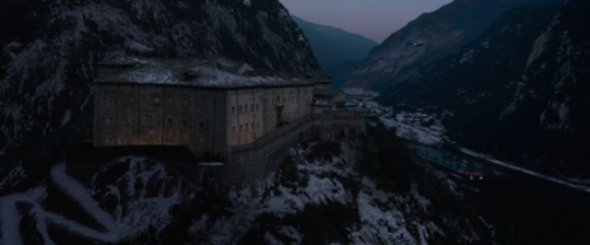
7 am - the Battle of Sokovia.
Tony and Thor save Earth from the artificial meteorite. Pietro dies saving Clint. Vision kills Ultron. Hulk takes the Quinjet and leaves the planet.

Evening in the US - Clint comes home.
April - September 2015:
Barton retires.
Tony builds a new Avengers Compound in upstate New York.
~June 2015 - Nathaniel Pietro Barton is born.

Note: babies usually start giggling around 4 months of age. At the time of the main events, he was about 2 months away from being born, then add about 4 months to that Compound scene.
September 2015:
The new team has been assembled, now including Wanda, Rhodey, Sam and Vision.
Fury, Hill, Cho and Selvig work at the Avengers Compound.
After making sure that the team is assembled, the Compound is built and everything is ok, Tony tries to retire. Again.
Thor goes to investigate the situation with the Infinity Stones.

Note: I take it the makeup artists thought this scene took place right after the Battle of Sokovia? That's why Thor still has scratches on his face. But as practice shows, children are not born and do not grow up so quickly (see the previous note), so we will have to accept the fact that Thor has already managed to fight with someone again.
Forever - Clint Barton lives.

MCU Phase One Timelines Iron Man 3 Timeline Thor: The Dark World Timeline CA:TWS Timeline GotG Timeline
#marvel#mcu#tony stark#iron man#avengers#avengers age of ultron#steve rogers#captain america#mcu timeline#clint barton#hawkeye#natasha romanoff#black widow#thor#hulk#bruce banner#wanda maximoff#pietro maximoff#ultron
84 notes
·
View notes
Text
Beetlejuice's Backstory and the Black Plague 💚🕷️🥀💀 PART 3
Good evening! As promised, here’s Part 3 of my series on Beetlejuice’s past and movieverse. Today, we dive deeper into historical fashion, analyzing the outfits of Beetlejuice and Delores to uncover their personal stories.
If you missed the earlier parts, check out PART 1 and PART 2.
Warning: This post contains SPOILERS for ‘Beetlejuice Beetlejuice’ (2024)... and many, MANY speculations.
Quick recap: In Part 1, we discussed the Plague. In Part 2, we delved into Beetlejuice’s past, questioning the claim that he died over 600 years ago.
I wondered: is that really true? Why does his clothing reflect the Baroque style, then?
That's right! In Part 3, I confirm my previous point: there are several clues suggesting that Beetlejuice most likely lived during the Baroque era - a cultural movement that began in Rome at the end of the 16th century and faded around 1750. Here is the list of the clues I noticed:
The lace neckband around BJ's neck.
His three-piece wedding suit.
Delores off-the-shoulder neckline and puffed sleeves.
The bird masks used by Delores and the undertakers.
AliveBeetlejuice first outfit (when he's stealing from corpses): specifically, the pirate shirt and the type of shoes.
Keep in mind that most of these elements were revolutionary novelties of the 16th-17th century. Here is proof for every. single. one of them.
The Lace Cravat
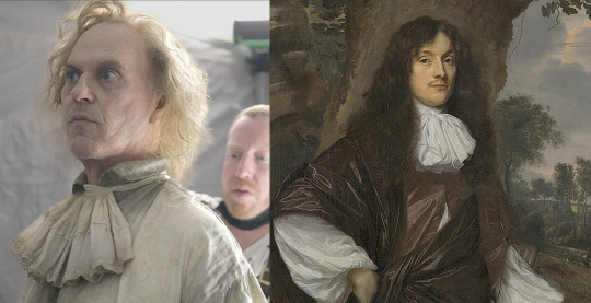
A behind the scenes still of Michael Keaton in 'Beetlejuice Beetlejuice' vs. the portrait of Jacob de Witte, Lord of Haamstede (Netherlands). The artwork was made by Jan Mijtens in 1660.
The first cravat, the predecessor of modern neckties and bow ties, originated in France during Louis XIV’s reign as a political and fashion statement. (Although the early idea comes from the Ancient Roman focale, used around 200 CE). The King was inspired by a particularly eye-catching necktie wore by Croatian mercenaries as part of their uniform. The new article of clothing quickly became a fashion staple for high-ranking men across Europe.
In its use, it represented the evolution of the common handkerchief, already popular in the 1500s as a practical tool, a flirty decoration, and a status symbol. I believe the variant Beetlejuice is wearing in the picture is called ‘jabot,’ and is one of the older, simpler versions.
Lace, often used in cravats, highlighted the wearer’s wealth. Italian lace, especially from Venice, was highly sought after by the European elite since the 15th century, when ruffs and collars were in vogue.
This detail suggests two possibilities:
Beetlejuice might have been an impoverished aristocrat (or a rich merchant) clinging to his title until the end. This could also explain the ring on his index finger, symbolizing power or family ties. Or both.
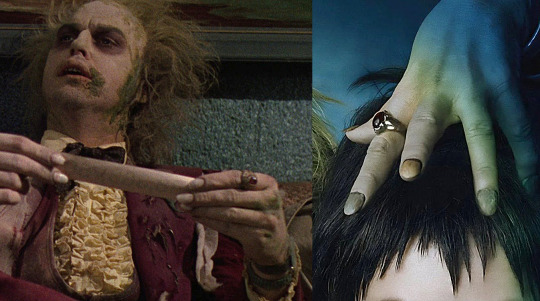
Alternatively, he may have been someone who strongly wished to be part of the elite.
Jacket and Breeches
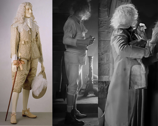
Aristocratic fashion, 1630 (Victoria & Albert collection) vs. What Beetlejuice wore in the wedding scene.
Another standout innovation of the Baroque period was the introduction of the three-piece men’s suit, known as the ‘Habit à la française.’
This ensemble included a tailcoat (a calf-length jacket), a coat (a long waistcoat), and knee-length breeches. Like the cravat, this fashion was adopted across Europe. As you can see, Beetlejuice is perfectly embodying this fashion, which evolved and remained popular until the 19th century. Interestingly, one shoe is missing.
Pirate Shirt
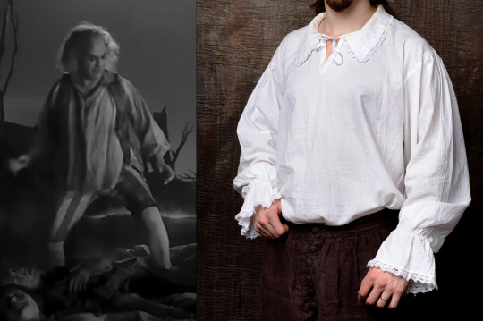
Originating in the 16th-17th century, the ‘poet shirt’ or ‘poet blouse’ remained popular through the Romantic era. These multi-purpose shirts served as both underwear and nightwear, featuring long tails that reached mid-thigh or knee. The body and sleeves were gathered at the collar and cuffs, creating a full, loose fit.
Delores' Outfit
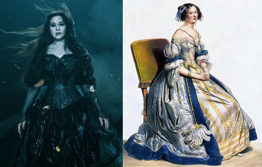
For comparison, I’ve included an illustration of noblewomen’s fashion at the court of Louis XIII (died 1643). His successor, Louis XIV, made France a cultural and fashion beacon for the next two centuries.
In the movie, Delores wears two nearly identical outfits: long dresses with puffed sleeves ending just below the elbow, a corset, and an off-the-shoulder neckline. This style aligns with 17th-century trends when fashion became more comfortable and relaxed.
The black color suits her character’s personality and role in the film, possibly hinting at a connection to the late Renaissance and the Spanish Court.
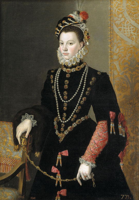
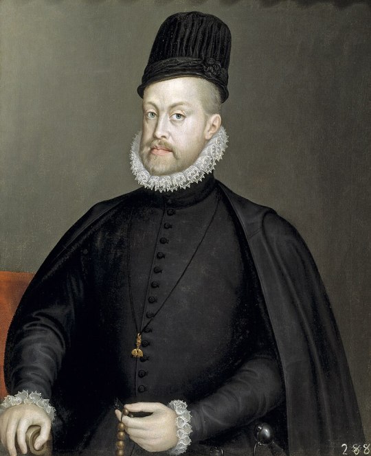
In fact, during the reign of Charles V (1500-1558) and his son Philip II (1527-1598), Spanish aristocracy particularly favored the black color, as it represented austerity and power for both men and women. Additionally, a deep shade of black was particularly difficult to achieve with the dyeing methods of the time, making those fabrics quite expensive to make.
However, The Spanish style was quite the opposite to what France later proposed: it consisted in a severe and somber luxury, which increased in opulence as the time passed. As Spain happened to be the beacon of fashion before Louis XIV came along, it's only natural that black rapidly became quite popular all around Europe as well. The color was particularly appreciated by the members of the middle class in Protestant nations and, apparently, in Italy as well.
Finally, keep in mind that 'Delores' is a variant of the more common 'Dolores'. Both names have Spanish origins and means 'sorrows'.
So what do we think? Was Beetlejuice from a rich family? Was Delores a Spanish witch?
Who knows! But I’m willing to dream and speculate!
Until the big reveal from Tim Burton himself in the now teased but not confirmed yet sequel, have a fantastic week!✨
#beetlejuice movie#tim burton#michael keaton#film theory#film analysis#film stills#cinema#film#movie#beetlejuice#betelgeuse#beetlejuice sequel#beetlejuice beetlejuice#europe#italy#beetlebabes#italian#dark#plaguecore#baroque#17th century#history#renaissance#historical fashion#delores#beetlejuice 2024#black plague#beetlejuice 2#beetlejuice & lydia
73 notes
·
View notes
Text
Word List: Fashion History
to try to include in your poem/story (pt. 3/3)
Pelete Bite - a fabric created by the Kalabari Ijo peoples of the Niger Delta region by cutting threads out of imported cloth to create motifs
Pelisse - a woman’s long coat with long sleeves and a front opening, used throughout the 19th century; can also refer to men’s military jackets and women’s sleeved mantles
Peplos - a draped, outer garment made of a single piece of cloth that was worn by women in ancient Greece; loose-fitting and held up with pins at the shoulder, its top edge was folded over to create a flap and it was often worn belted
Pillow/Bobbin Lace - textile lace made by braiding and twisting thread on a pillow
Pinafore - a decorative, apron-like garment pinned to the front of dresses for both function and style
Poke Bonnet - a nineteenth-century women’s hat that featured a large brim which extended beyond the wearer’s face
Polonaise - a style of dress popular in the 1770s-80s, with a bodice cut all in one and often with the skirts looped up; it also came back into fashion during the 1870s
Pomander - a small metal ball filled with perfumed items worn in the 16th & 17th centuries to create a pleasant aroma
Poulaine - a shoe or boot with an extremely elongated, pointed toe, worn in the 14th and 15th centuries
Raffia Cloth - a type of textile woven from palm leaves and used for garments, bags and mats
Rebato - a large standing lace collar supported by wire, worn by both men and women in the late 16th and early 17th century
Robe à L’anglaise - the 18th-century robe à l’anglaise consisted of a fitted bodice cut in one piece with an overskirt that was often parted in front to reveal the petticoat
Robe à la Française - an elite 18th-century gown consisting of a decorative stomacher, petticoat, and two wide box pleats falling from shoulders to the floor
Robe en Chemise - a dress fashionable in the 1780s, constructed out of muslin with a straight cut gathered with a sash or drawstring
Robe Volante - a dress originating in 18th-century France which was pleated at the shoulder and hung loose down, worn over hoops
Roses / Rosettes - a decorative rose element usually found on shoes in the 17th century as fashion statement
Ruff - decorative removable pleated collar popular during the mid to late 16th and 17th century
Schenti - an ancient Egyptian wrap skirt worn by men
Shirtwaist - also known as waist; a woman’s blouse that resembles a man’s shirt
Skeleton Suit - late 18th & early 19th-century play wear for boys that consists of two pieces–a fitted jacket and trousers–that button together
Slashing - a decorative technique of cutting slits in the outer layer of a garment or accessory in order to expose the fabric underneath
Spanish Cape - an outer wrap often cut in a three-quarter circle originating from Spain
Spanish Farthingale - a skirt made with a series of hoops that widened toward the feet to create a triangular or conical silhouette, created in the late 15th century
Spencer Jacket - a short waist- or bust-length jacket worn in the late 18th and early 19th centuries
Stomacher - a decorated triangular-shaped panel that fills in the front opening of a women’s gown or bodice during the late 15th century to the late 18th century
Tablion - a rectangular panel, often ornamented with embroidery or jewels, attached to the front of a cloak; worn as a sign of status by Byzantine emperors and other important officials
Toga - the large draped garment of white, undyed cloth worn by Roman men as a sign of citizenship
Toga Picta - a type of toga worn by an elite few in Ancient Rome and the Byzantine Empire that was richly embroidered, patterned and dyed solid purple
Tricorne Hat - a 3-cornered hat with a standing brim, which was popular in 18th century
Tupu - a long pin used to secure a garment worn across the shoulders. It was typically worn by Andean women in South America
Vest/Waistcoat - a close-fitting inner garment, usually worn between jacket and shirt
Wampum - are shell beads strung together by American Indians to create images and patterns on accessories such as headbands and belts that can also be used as currency for trading
Wellington Boot - a popular and practical knee- or calf-length boot worn in the 19th century
If any of these words make their way into your next poem/story, please tag me, or leave a link in the replies. I would love to read them!
More: Fashion History ⚜ Word Lists
#word list#fashion history#writeblr#dark academia#terminology#spilled ink#writing prompt#writers on tumblr#poets on tumblr#poetry#literature#light academia#fashion#lit#studyblr#langblr#words#linguistics#history#culture#creative writing#worldbuilding#writing reference#writing resources
130 notes
·
View notes
Text


In October, I decided to challenge myself to produce a miniature illustrated painting each day of the month inspired by the Tudor court and the medium of portrait miniatures.
Lucas Horenbout was a Flemish artist and founding artist of the tradition of painting miniatures. He moved to England in the mid-1520s and worked as the court miniaturist to King Henry VIII from 1525 until Horenbout's death. He captured many of the iconic figures of the era and also taught the art of illumination to Hans Holbein, who would go on to eclipse him as the most famous court artist of that era.
A portrait miniature is a miniature portrait painting, usually undertaken in gouache, watercolour, or enamel. Portrait miniatures evolved out of the techniques required to craft the intricate illustrations and borders of illuminated manuscripts, and became popular among 16th century elites. From the middle of the 18th century, the trend spread across the rest of Europe remaining highly popular until the development of photography in the mid 19th century.
For my challenge, I used black ink, water colours, and 300gsm textured watercolour paper. I bought and thrifted some amazing vintage frames, mostly 2 or 3 inches high. Some are over fifty years old, so consequently there are marks and scratches on them but I think it adds to the charm and overall feel of the pieces as historic miniatures.
I'm really proud that I completed the challenge - and all 31 paintings - and wanted to share a few with you here!
You can see them all over on my website 🖤
#tudor history#the tudors#tudor queens#anne boleyn#henry viii#thomas cromwell#jane seymour#katherine howard#katherine parr#anne of cleves#katherine of aragon#elizabeth i#lady jane grey#mary i#george boleyn#thomas wyatt#jane rochford#tudor art#wolf hall#becoming elizabeth#my lady jane
59 notes
·
View notes
Text

Daisho attributed to Shitahara Hiroshige/Takada Munekage Hello, world! Thank you for checking our daily post. Today, we are excited to show you another newly acquired antique Daisho. This Katana blade is attributed to Shitahara Hiroshige (下原広重) during the Kanbun era (1661-1673: early Edo period). Shitahara is the name of the area in Hachioji city in Tokyo area today where he created blades. According to NTHK that authenticated this blade, it was forged approximately in the early Edo period (Early-Mid 17th century). Hiroshige belonged to the Bushu Shitahara school, located in today’s Tokyo (Hachioji city). It is said that Yamamoto Norishige founded the school, and it thrived from the end of the Muromachi period to the late Edo period (Late 16th century to Late 19th century). This Wakizashi blade is attributed to Bungo Takada Munekage (豊後高田統景), who belonged to a prestigious school named Takada (高田). He was active during the Tensho era (1573-1592: late Muromachi period). Takada school was founded by Takada Tomoyuki in Takada village, Bungo domain (today’s Oita prefecture), during the Nanbokucho period (1334-1338 A.D). Takada Tomoyuki went to Bizen province (today’s Okayama prefecture) to master the sword-forging techniques of BIZEN and returned to the village and trained his apprentices. That is how Takada school started.
54 notes
·
View notes
Note
What is the origin (and meaning) of the flag adopted by the Second Spanish Republic? The choice of colors seems rather unconventional to me...

The purple stripe was adopted officially by the second republic as a nod to Castille, a big region in the middle of Spain:
Hoy se pliega la bandera adoptada como nacional a mediados del siglo XIX. De ella se conservan los dos colores y se le añade un tercero, que la tradición admite por insignia de una región ilustre, nervio de la nacionalidad, con lo que el emblema de la República, así formado, resume más acertadamente la armonía de una gran España
Translation:
Today the flag adopted as the national one towards the mid 19th century is folded. From it, the two colors remain and a third one is added, which tradition takes as the insignia of an illustrious region, nerve of nationality, and therefore the Republic's emblem, thus formed, contains more accurately the harmony of a great Spain.
The purple as a symbol of Castille comes from a misunderstanding of what the 1520 revolt of Comuneros used as a symbol. The color of Castille has always been described as crimson, which is sometimes confused to have a more purplish hue. While it has been shown the Comuneros used a red cross as opposition to the imperial white cross, popular wisdom was that they used purple, and it gradually became an actual color used by Castillian regionalists.
Note on the Comuneros, Castillian regionalism, and some trivia about the Republic's coat of arms under the cut:
The revolt of 1520 happened in the context of emperor Carlos 1st (5th of the HRE) barely speaking the language, favoring politically and financially the Flemish court with the wealth extracted from the Americas, and also funding very expensive wars that didn't even have anything to do with the Crown of Spain. He was also a corrupt monarch who raised taxes. Both the nobility, which wanted more participation in governing, and the merchant/middle strata (including an embryonic bourgeoisie!), which were being overburdened with taxes, revolted against the king. The focus of the revolt and where they had more strength was in Castille, and one of the forms of territorial organization of the Crown of Castille was the Communities, which is where the name comes from. The people who participated in the revolt as well as the modern political movements that claim to descend from them (more on that later) are known as Comuneros, which I'd translate as Communards.
I won't go into very much detail, and this is still a debated topic. The character of the revolt had many axes, one of which was the more popular elements (peasants, bourgeoisie, artesans, merchants, etc), to the point that it is considered by some to be some of the first if not the first attempt at a bourgeois revolution in Modern Spain, another was the more opportunistic axis (fiscal reform, the nobility, etc.). What matters is that a very strong narrative has grown around the 1520 revolt, beginning in the Golden Era of the 17th century and its literature, that of a popular revolt and of a relatively old and legitimizing ancestor for the popular movements in Castille.

This is the Comunero flag nowadays, notice the purple field as a reclamation of this color as a Castillian symbol. What's of more interest to me is the following flag:

This flag and the movement it represents, Izquierda Castellana (Castillian Left) emerged after the end of the dictatorship, not as a separatist kind of regionalism, but as one that appreciates the history and culture of Castille. The red star is a very overt influence from communists and socialists, which are, as far as I'm aware, quite present in Izquierda Castellana.
So purple in Spanish politics has been, ever since the ~16th/17th century, associated with the popular movements and tendencies of Spain, particularly those in the peninsula's center. It became even more cemented in this role after the Second Republic adopted it, sort of hitchhiking the much bigger Republican tendencies.
The Second Republic's coat of arms subtitutes the monarchich crown for a castle in the shape of a crown, both as another nod to Castillianism and to symbolize the replacement of the monarchy for the people themselves

In the short life of the Republic, its symbols found their way into a lot of places or replacing old symbols, and almost all of them were destroyed during the dictatorship. The most prominent exception is the facade of Madrid's main train station, Atocha (originally named Estación del Mediodía (midday station)):


Notice it perched on the clock? I don't know if it went unnoticed, or if they did not care enough (unlinkely). It is possible it went unnoticed because I can't find information on it. Other examples of this castle-mural crown remaining in Madrid are:

This lightpole right in front of the Royal Palace

And this massive coat of arms on the facade of the Bank of Spain
64 notes
·
View notes
Note
giggling, kicking my feet right now. Love being fucked by Minotaur tdick.
How bout a sentient home that loves you? It wasn’t sentient at first. But, having been built so long ago, it slowly grew a personality. Which slowly became being able to affect the objects placed within. Which became fully transforming its contents as it pleases.
But really, it just wants to be a house.
Someplace warm and safe for anyone or anything to stay in. A shelter.
Then you arrive and it wants to add more to the definition of house…
(reader can be any gender as you please)
FtM Reader
The realtor told you that you that she wasn’t sure when the house was built, and while everyone said it was mid-19th century, there were rumors around town that the plot had been lived on since the 16th century. You liked the idea of living on something so old. Something that had provided countless others with warmth and comfort. It made you feel more connected to the past.
You got a steal on it due to a few minor issues. Foundational cracks. Squeaking floor boards. Copper pipes. Things you weren’t too worried about, but that you could fix if they became an issue. In no time at all, you were settled in and happy to be home. Sure, there are some odd things that happen, but things like that happen in old homes.
Things seem to be shifted a couple inches over. Your keys end up missing, or in totally different places. Doors seem to open by themselves. One time you even think you fell asleep in the couch but you woke up in your bed. You just brushed it all off.
That is, until one day you notice your floors seemed to move. You decided to lay down on your bed to rest. Maybe you’re over stressed. As you drifted off to sleep, you felt your blankets get pulled up over your body, but the sheets creep between your legs. A soft pressure rubbed at your sweet spot, making your sleepy mind turn fuzzy.
Despite the heaviness, you lifted your eyes to see… nothing. Your sheets were moving on their own. Your floorboards were rumbling as you got more and more wet, your t-dick starting to throb. The “nothing”, whatever it was, brought you to orgasm after dizzying orgasm. Eventually, you were able to fall asleep, and your house wrapped you tightly, making sure you were warm and safe. A shelter that you would never want to leave.
#writers on tumblr#writing#fantasy romance#author#fantasy smut#smut#authors#send anons#anon asks#send dirty asks#asks open#ask blog#send asks#send me asks#answered asks#ask me anything#ask#submission#suggestion
85 notes
·
View notes
Text
Irish dress history sources online:
A list of sources for Irish dress history research that free to access on the internet:
Primary and period sources:
Text Sources:
Corpus of Electronic Texts (CELT): a database of historical texts from or about Ireland. Most have both their original text and, where applicable, an English translation. Authors include: Francisco de Cuellar, Luke Gernon, John Dymmok, Thomas Gainsford, Fynes Moryson, Edmund Spenser, Laurent Vital, Tadhg Dall Ó hUiginn
Images:
The Edwin Rae Collection: A collection of photographs of Irish carvings dating 1300-1600 taken by art historian Edwin Rae in the mid-20th c. Includes tomb effigies and other figural art.
National Library of Ireland: Has a nice collection of 18th-20th c. Irish art and photographs. Search their catalog or browse their flickr.
Irish Script on Screen: A collection of scans of medieval Irish manuscripts, including The Book of Ballymote.
The Book of Kells: Scans of the whole thing.
The Image of Irelande, with a Discoverie of Woodkarne by John Derricke published 1581. A piece of anti-Irish propaganda that should be used with caution. Illustrations. Complete text.
Secondary sources:
Irish History from Contemporary Sources (1509-1610) by Constantia Maxwell published 1923. Contains a nice collection of primary source quotes, but it sometimes modernizes the 16th c. English in ways that are detrimental to the accuracy, like changing 'cote' to 'coat'. The original text for many of them can be found on CELT, archive.org, or google books.
An Historical Essay on the Dress of the Ancient and Modern Irish By Joseph Cooper Walker published 1788. Makes admirable use of primary sources, but because of Walker's assumption that Irish dress didn't change for the entirety of the Middle Ages, it is significantly flawed in a lot of its conclusions. Mostly only useful now for historiography. I discussed the images in this book here.
Chapter 18: Dress and Personal Adornment from A Smaller Social History of Ancient Ireland by P. W. Joyce published 1906. Suffers from similar problems to An Historical Essay on the Dress of the Ancient and Modern Irish.
Consumption and Material Culture in Sixteenth-Century Ireland Susan Flavin's 2011 doctoral thesis. A valuable source on the kinds of materials that were available in 16th c Ireland.
A Descriptive Catalogue of the Antiquities in the Museum of the Royal Irish Academy Volumes 1 and 2 by William Wilde, published 1863. Obviously outdated, and some of Wilde's conclusions are wrong, because archaeologists didn't know how to date things in the 19th century, but his descriptions of the individual artifacts are worthwhile. Frustratingly, this is still the best catalog available to the public for the National Museum of Ireland Archaeology. Idk why the NMI doesn't have an online catalog, a lot museums do nowadays.
Volume I: Articles of stone, earthen, vegetable and animal materials; and of copper and bronze
Volume 2: A Descriptive Catalogue of the Antiquities of Gold in the Museum of the Royal Irish Academy
A Horsehair Woven Band from County Antrim, Ireland: Clues to the Past from a Later Bronze Age Masterwork by Elizabeth Wincott Heckett 1998
Jewellery, art and symbolism in Medieval Irish society by Mary Deevy in Art and Symbolism in Medieval Europe- Papers of the 'Medieval Europe Brugge 1997' Conference (page 77 of PDF)
Looking the part: dress and civic status and ethnicity in early-modern Ireland by Brid McGrath 2018
Irish Mantles, English Nationalism: Apparel and National Identity in Early Modern English and Irish Texts by John R Ziegler 2013
Dress and ornament in early medieval Ireland - exploring the evidence by Maureen Doyle 2014
Dress and accessories in the early Irish tale, ‘The Wooing of Becfhola’ by Niamh Whitfield 2006
A tenth century cloth from Bogstown Co. Meath by Elizabeth Wincott Heckett 2004
Tertiary Sources:
Medieval Ireland: An Encyclopedia edited by Sean Duffy published 2005
Re-Examining the Evidence: A Study of Medieval Irish Women's Dress from 750 to 900 CE by Alexandra McConnell
#resources#dress history#irish dress#irish history#early medieval#bronze age#textile history#late medieval#16th century#historical dress
110 notes
·
View notes
Text

Domtürme, Regensburg, Bayern, 2024.
Although the building itself was begun in the 14th century, the cathedral was not opened until the 16th century, and the spires were not completed until the mid 19th century. The complicated political and religious history of Regensburg help to account for that series of delays.
23 notes
·
View notes
Text
Unusual ship names
In the course of time, some quite funny names have emerged, such as HMS Pickle, HMS Beaver, HMS Black Joke or HMS Sandwich. But there are a few others that I don't want to withhold from you.
Falcon in the Fetterlock, English Warship mid 16th century
Three Ostrich Feathers, English Merchant, mid16th century
Bull, Bear and Horse, English Merchant, early 17th century
Mousenest, English Fireship, mid 17th century
Blade of Wheat, English Merchant, late 17th century
Who's afraid, English Privateer, late 18th century
Sturdy Beggar, Salem Privateer, late 18th century
Terrible, English Privateer, late 18th century
Mouse of the Mountain, Hudson River Steamer, early 19th century
Grumbler and Growler, Salem Privateer, early 19th century
Precious Ridicule, New Orleans schooner, early 19th century
Free Love, Mississippi Barque, early 19th century
Catch me who can, Baltimore Privateer, early 19th century
The Twenty - Sixth Day of October 1812, English Schooner, early 19th century
Go ask Her, Neufundland Schooner, early 19th century
Brown Smith Jones, Maryland Police Boat, late 19th century
Essence of Pepermint, Nova Scotia Schooner, late 19th century
#naval history#unusual ship names#16th -19th century#just a few#age of discovery#age of sail#age of steam
1K notes
·
View notes
Text
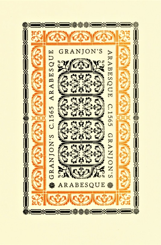
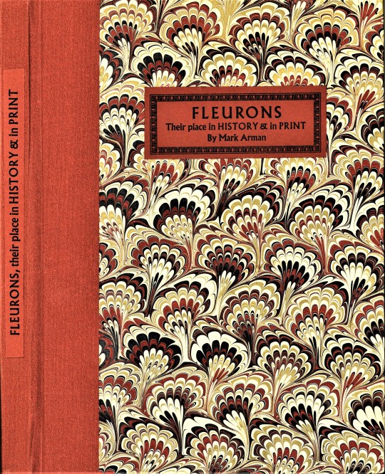


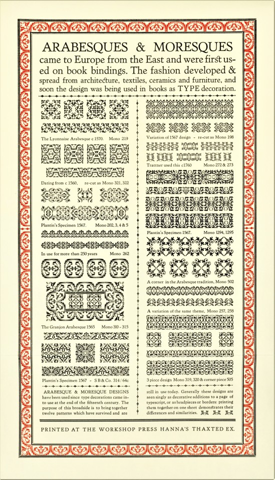

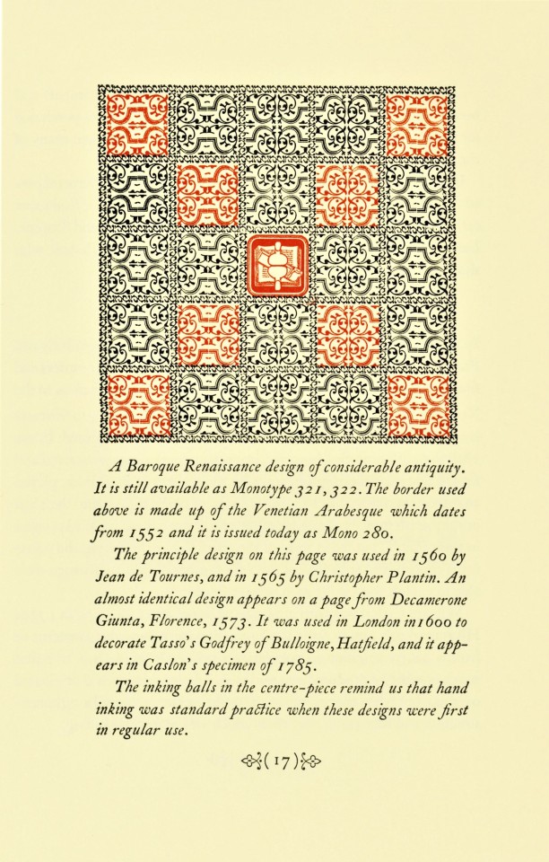

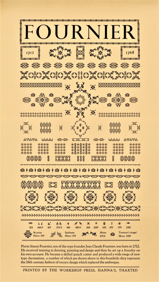
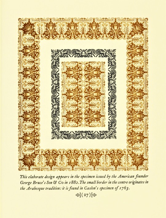
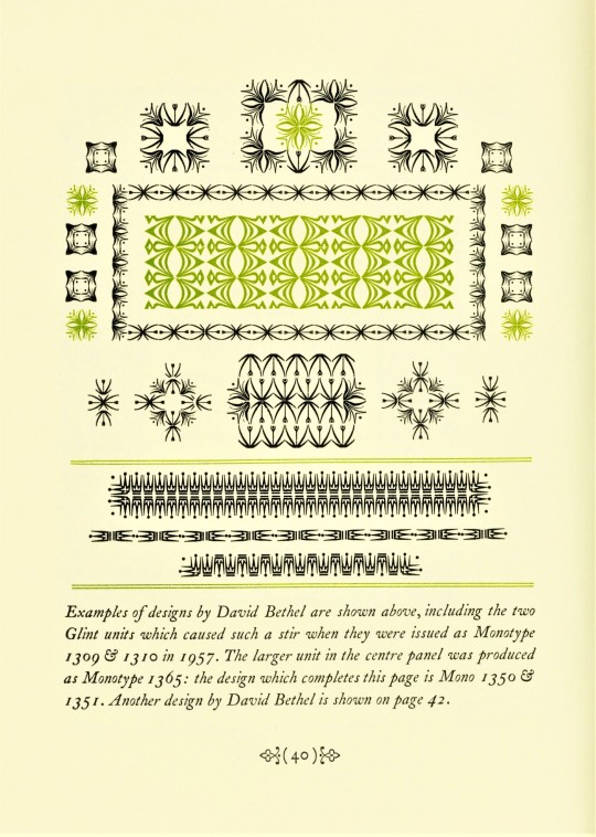
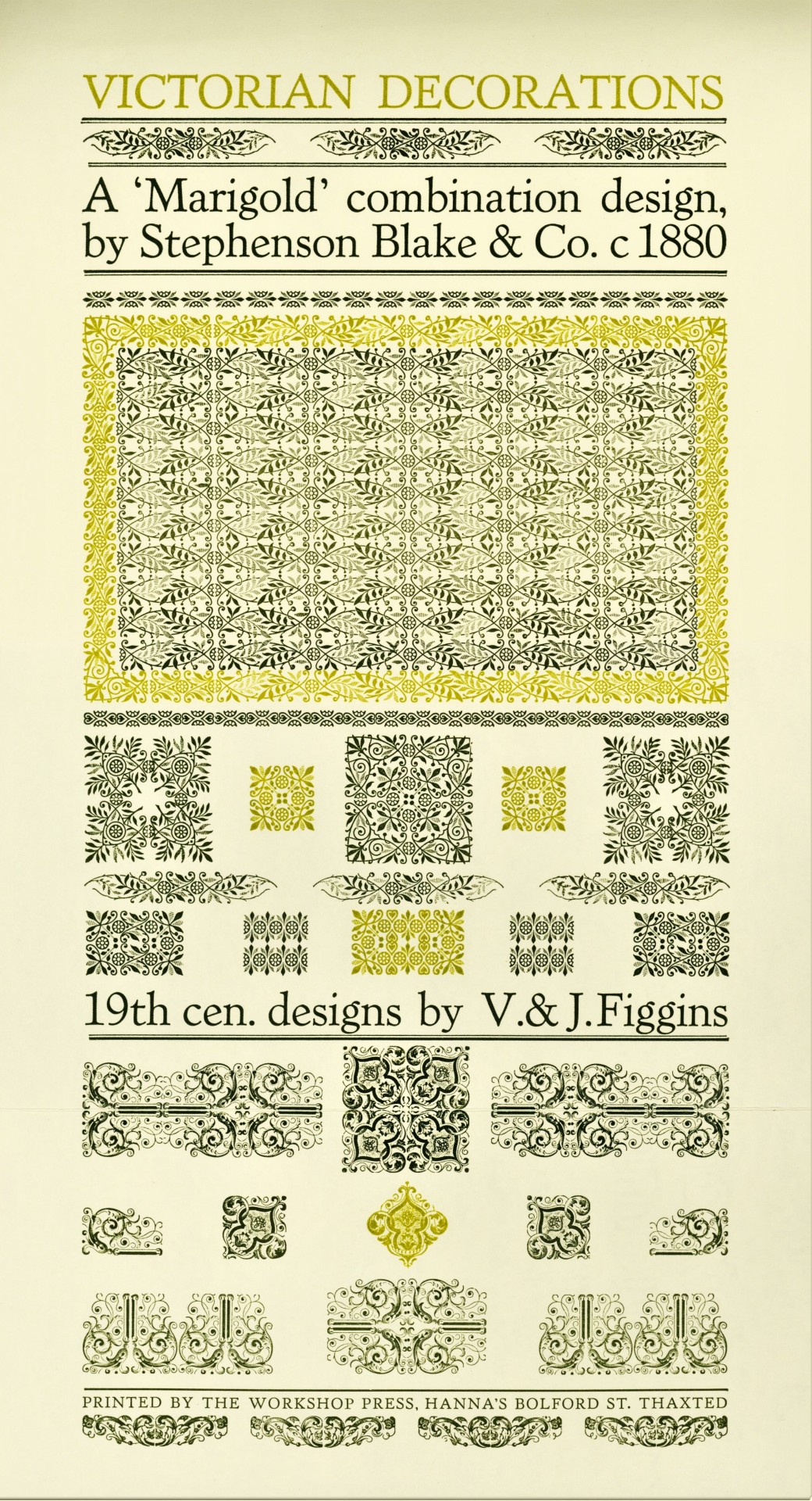
Typography Tuesday
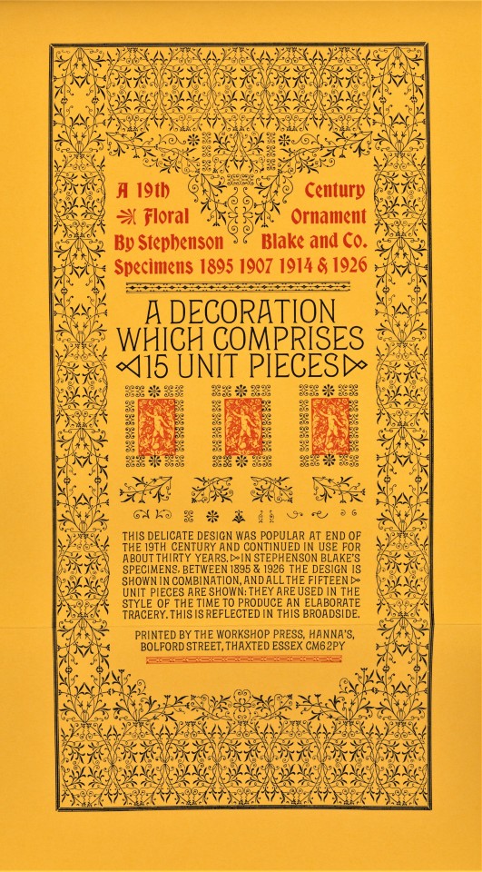
Fleurons or Printers' Flowers have been a prominent element of typographic tradition at least since the early 16th century, especially those of designer-punchcutter Robert Granjon. They became less used over the 17th century, but were revived in the mid-18th century when Pierre Simon Fournier introduced an entirely new style of printers' flowers. Soon after, their use enhanced as a fashion for classical typography changed the concept of type decoration at the end of the 18th century. The revival of fine typographic design in the late 19th century spurred a proliferation of new fleuron designs in the 20th century that has not abated to this day.
Fleurons may be combined in innumerable ways to create ornate and intricate typographic patterns. Today we show a few of those patterns from Fleurons, Their Place in History & in Print, written, designed, printed, and bound in 1988 by English type and printing enthusiast Mark Arman at his Workshop Press in Thaxted, Essex, in an edition of 170 copies signed by the author/printer. This book is another from the recent of from the estate of our late friend Dennis Bayuzick. Of printing fleurons, Arman writes:
. . . they can be grouped in a variety of combinations: elaborate arrangements are possible, and great enjoyment may be had exploring their possibilities. When I realised all this I began a collection of type decorations which, in the past seven years, has grown considerably. Part of the enjoyment has been finding specific designs. . . . All my 19th century decorations have come from old printing houses which have ceased to operate, or have gone over to litho, so they make a very mixed assortment. . . . [These] are illustrated in the following pages and the text gives a brief account of the craftsmen who created the design.
View other posts on decorative type patterns by Mark Arman.
View other books from the collection of Dennis Bayuzick.
View more Typography Tuesday posts.
#Typography Tuesday#typetuesday#fleurons#decorative type#20th century#Fleurons#Fleurons Their Place in History & in Print#Mark Arman#Workshop Press#Dennis Bayuzick#type ornaments
340 notes
·
View notes
Photo

Portuguese Angola
Portuguese Angola in southwest Africa was the first European colony on that continent. While settlement from 1571 proved problematic in the interior, the Portuguese did obtain a large number of slaves which they shipped to their Atlantic island colonies and to Portuguese Brazil right up to the end of the Atlantic slave trade in the 19th century.
With the capital at Luanda on the coast, the Portuguese struggled against the kingdoms of Kongo, Ndongo, and Matamba to gain control of the interior. The Angolan Wars saw shifting tribal allegiances thwart the relatively small number of Afro-Portuguese, but help from Brazil, eager to maintain the flow of slaves, proved crucial. The decolonization process in the mid-20th century was one of the most bloody and shambolic in Africa, and civil war continued long after independence was gained in 1975.
The Portuguese in West Africa
The Portuguese arrived in West Africa, and from the late 15th century they began to explore further south. Following the Portuguese colonization of São Tomé and Principe in 1486, the Europeans were looking for slaves to work on their sugar plantations. The Portuguese settlers on São Tomé and Principe had already been in trade contact with the mainland, searching for gold, pepper, and ivory. The main trading partner was the Kingdom of Kongo (c. 1400 - c. 1700), which controlled a booming regional slave trade. Through the 16th century, slaves from Kongo (and also the Kingdom of Benin) were transported to the Portuguese islands and to their colonies in the North Atlantic like Madeira.
The Portuguese had bought African slaves with cotton cloth, silk, mirrors, knives, and glass beads, but they got the idea to launch their own slave-capturing expeditions in Africa’s interior and cut out the Kongolese middlemen. The Kongo kings were not pleased with this development, and they were increasingly alarmed at the effects of European culture and the Christian religion on their subjects. As relations soured, the Portuguese began to look for another trade partner further down the coast of Africa.
Exploring further south in the mid-16th century, the Europeans came into contact with a new kingdom, or rather a loose confederation of Kimbundu tribes, then known as Ndongo, probably formed c. 1500. Its ruler was called the Ngolo, which derives from the local word for iron - ngola - and from which the name Angola derives. The Portuguese attempted to create a new slave industry partnership with Ndongo and even involved the kingdom in a war with their northern neighbours, the Kingdom of Kongo. Ndongo had already defeated Kongo in a battle in 1556 and so seemed a good candidate to satisfy Portugal's ambitions in the region.
Continue reading...
23 notes
·
View notes
Text
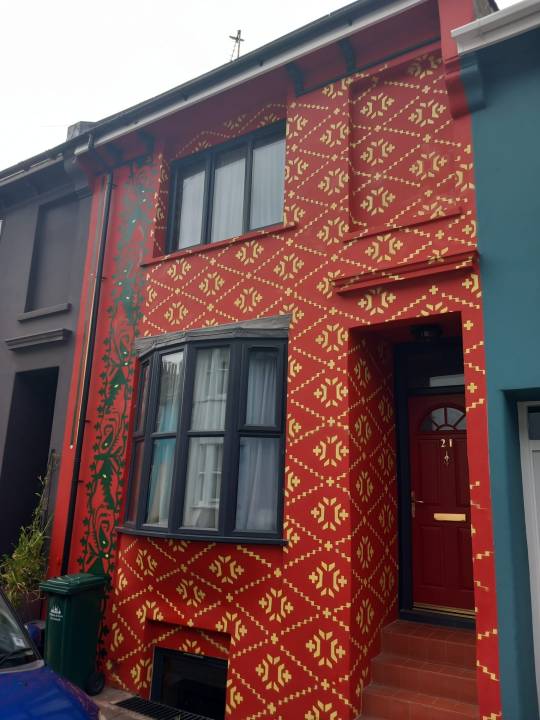
Brighton & Hove News, 28 July 2023:
'A Brighton family have literally stopped traffic with a new mural inspired by a sari pattern on their new home.
Poppy Jaman and Jaan Madan moved to Southampton Street in Hanover in January, and immediately knew they wanted to make a splash when decorating the outside.
She said: “One of the reasons we wanted to move to the centre of Brighton is that it’s so colourful.
“We were inspired by murals in Washington where there’s a whole area where there’s murals which have been created out of adversity.
“That inspired the idea of making a statement with our home. I wanted to not just paint something that I love. If you just love something that’s enough, but I also wanted to say here’s a bit of my identity.
“I collect saris and Jamdani is a signature saris of Bangladesh. It’s got a colonial past to it.

📷 X
The mural is inspired by the Jamdani weave saree, the signature saree of Dhaka, Bangladesh, which dates back at least as far back as 300BC.
Between the 16th and 19th centuries, Jamdani fabric – so fine it was known as ‘woven air’ – was one of the most highly coveted commodities in Mughal courts and further afield. However, by the mid-19th century, Jamdani had become almost extinct.
Poppy has written more about her relationship with the Jamdani design and its colonial history here.'
#sari#mural#brighton#mughal#textiles#textile history#jamdani#dhaka#bangladesh#colonial history#indian history#weave#woven fabric#pattern#surface pattern#surface pattern design#pattern design#textile design#surface decoration#street art#uk#england#british asian#saree#traditional crafts#traditional textiles#traditional clothing#bengali#weaving
144 notes
·
View notes
Text
Another Post About Crowley's Terrible Handwriting
Actually his handwriting here isn't terrible, it's just, like Anathema's spelling, 300 years too late.
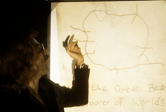
So first, I posit that we can be reasonably confident this is Crowley's handwriting because he is very likely the only celestial being besides Aziraphale who can spell devourer correctly.
Crowley has taken more care than usual with his penmanship today because this is a Fancy Presentation, and there are some delightful things to note about it:
--The beautiful serifs on each letter and variation in width of the strokes (the lowercase r's especially)
--Enthusiastic but intermittent capitalization of nouns
--The L that ends "Hail" is a small capital like the ones used in the Bible to spell LORD; the l in Worlds is lower-case
--The lozenge shape of the letter o
--Both s-es are oversized and dip below the writing line
--The kerning is terrible, the script wanders off the writing line at several points, and the location of the writing line is not imagined consistently
I am not an expert in the history of handwriting, but every single point of this suggests to me that Crowley learned to write in English in the late 16th or early 17th century, between say 1570 and 1620, and he learned to do it by copying printed material, not somebody else's handwriting. And it looks like late 16th-century writing. Or rather, like somebody learned to write by copying late 16th-century print and hasn't practiced enough for his style to change significantly in the last 400-500 years.
This means Crowley would have learned using a quill pen, poor devil, and if that's true no wonder he doesn't do it more often. (I wonder if this is why he now owns a pen that looks like it can break the sound barrier; if the Bentley is a permanent replacement for the loathsome, buttocks-abusing horse, maybe he keeps the expensive pen as self-reassurance that he'll never have to write with a quill again.) Quill pens would explain the lozenge-shaped o's: quills can only make a downstroke, so writers who used them shape o's as lozenges made of four downstrokes. Someone who learned writing with a quill would shape his o's like a calligrapher.
16th/early 17th century is the earliest I think Crowley would have learned to write in English because before that there was no block print; there was no print at all, only handwritten scripts of varying legibility, none of which look remotely like Crowley's handwriting does.
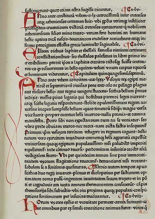
Here's what print looked like in Germany in 1471 (printing does not arrive in England for another 5 years after this):
The printing press showed up in England in 1476. Between 1500 and 1600, England got its shit sorted out wrt fonts and typesetting and started turning out what we would recognize today as readable material.
Here's what English printing looked like in 1623, c. 150 years after the German one above:
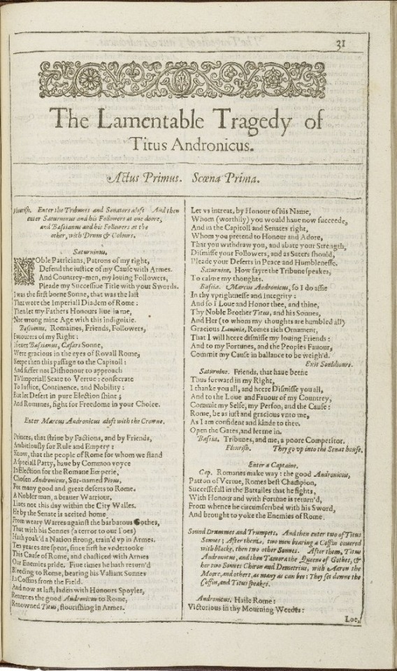
Not bad, right? I've received Xerox copies less legible than this in classes I paid for. I think it is likely based on his handwriting that Crowley learned to write from printed material a decade or two older than this. The adornments Crowley puts on his letters are serifs, not ligatures: these are not letters that were ever meant to join up in cursive, but letters that were copied from typeset.
From the 16th through the mid-19th century, variations in how a handwriter capitalized letters were very common, and two of these variations show up in Crowley's writing as well.
First, English inherited from German the capitalization of all its nouns. You can see it in Titus Andronicus, above (1623). Due to variations in education and taste, this quickly shifted to capitalization of whichever nouns the writer (or publisher, or printer) felt were important to capitalize, as you can see in Paradise Lost from 1688, below. Hail the Great Beast, devourer of Worlds.
Second, It was also very common during this time to capitalize terminal letters of words, either as a sign to the reader that previous letters had been omitted or because writers using quill pens wanted to be sure readers knew what letter they were looking at through the smudges and weird spacing and general wretchedness of the reading experience imposed by quill writing. I think this latter reason may be why Crowley writes "HaiL" when his other letter L, in "Worlds," is both lowercase and carefully printed with a pretty serif.
Handwriters in English between 1500 and 1800 also had a major hard-on for abusing the letter s, which was shaped like a lowercase f (to contemporary eyes) or a loose S, either of which drop below the writing line. Here's an example in print from 1688:
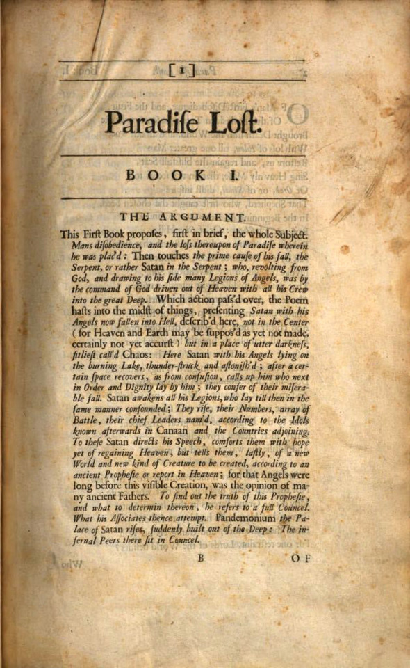
Use of the long S in print fell out of favor and disappeared abruptly in the UK after 1800.
Crowley's S-es could be a holdover from this: they both drop below the writing line, and they're both oversized.
What I think we can say for sure is that he's not very good at writing s-es, so they always turn out bigger than he intends. The S in "Beast" is noticeably different at the left curve than the S in "Worlds," which I would expect for someone who hasn't written thousands of s-es yet, and the S in "Worlds" looks very much like someone has faithfully rendered a shape they have seen rather than written a letter. Since he can write a letter r elegantly but can't do a curved s, it suggests to me that he hasn't had as much practice doing the curved s yet as he has the other letters, which fits with someone used to writing a long s 75% of the time.
Even the kerning speaks to me of someone who learned to write with a quill: leaving (comparatively) large spaces between letters gives the ink somewhere to drip and smudge without rendering the letter illegible.
There's one other reason I think Crowley probably learned to write in English in the 16th century: He's lazy, and he probably wouldn't have needed to know before then.
The movable-type press arrived in England in 1476. The Protestant Reformation kicked off in England c. 60 years later in 1534 when Henry VIII declared himself head of the English Church. Prior to the surge in literacy among the wealthy and merchant classes in the 16th century, thanks to this intersection of printing press and Protestants (who believe it's important that each person read the Bible for themselves), almost no one knew how to read, including most of the gentry and nobility, and still fewer knew how to write. If you had a message, you sent a guy or you showed up yourself. If you had something you wanted recorded, you summoned a scribe. If you needed to know something, you found somebody who knew and you asked them.
By the time of Queen Elizabeth's accession in 1558, 82 years after William Caxton began operating England's first movable-type printing press, a fully literate royal court were passing each other and their spies and their assassins gossipy notes like everybody was a 12yo in math class. Elizabeth wrote letters and poems. Among the gentry gentlewomen replaced monks as the medical caregivers for their communities (bc Henry shut down all the monasteries), and they wrote and shared and copied multi-generational "receipt books" and herbals of medical and cosmetic treatments. In the space of a single generation, literacy--the ability to write, not just to read--became a prerequisite for functioning in the upper echelons of society.
So if he didn't already know by then, Crowley would have needed to learn to write in English in the mid-16th century. And he would have had to learn it with a quill. (Wearing black probably came in handy for all the ink he spilled or dripped on himself.)
Last to consider is the W in "Worlds," which has no serifs and is not written with any particular attempt at straightness or symmetry. To me this suggests that Crowley learned to write w's from a modern reference, not his original reference. And this makes perfect sense: w was very much in use in the 16th century in English, but nobody agreed on how to write or print it, so there were crossed v's, two capital U's, and this weird gothic lowercase n with extra tentacles. W, Crowley would have learned, always needs to be checked up on before you commit.
Crowley's spelling here is modern, which is frankly a huge achievement for someone who was present for the formation and transformation of all 3 English languages. The contemporary Modern English we use today was a going concern for over 2 centuries before anyone wrote an English dictionary, and it was three centuries before dictionaries became authorities on how to spell correctly and people started giving a shit about that. (Before that as long as people could read the word and understand what you meant by it in context, you'd spelt it correctly.)
Taken together, the W and the modern spelling suggest that although Crowley almost never writes by hand, he reads regularly. This matches with two Words of God I've seen from Neil Gaiman (which I am too lazy to find and link) in which he mentions that Crowley likes to read but won't admit to doing so or to liking books.
Aziraphale should get him a book about ducks for Valentine's Day.
87 notes
·
View notes