#Fleurons Their Place in History & in Print
Explore tagged Tumblr posts
Text




Typography Tuesday
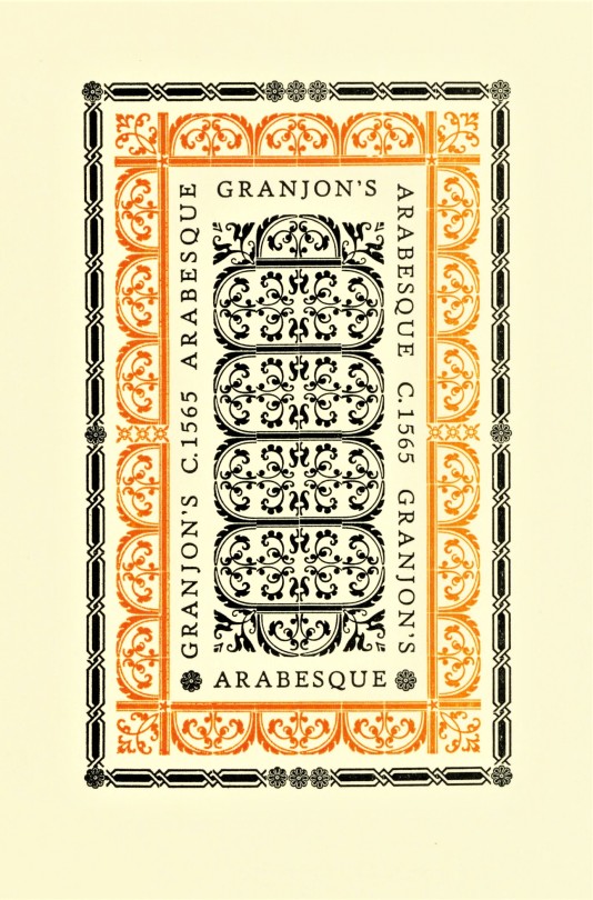
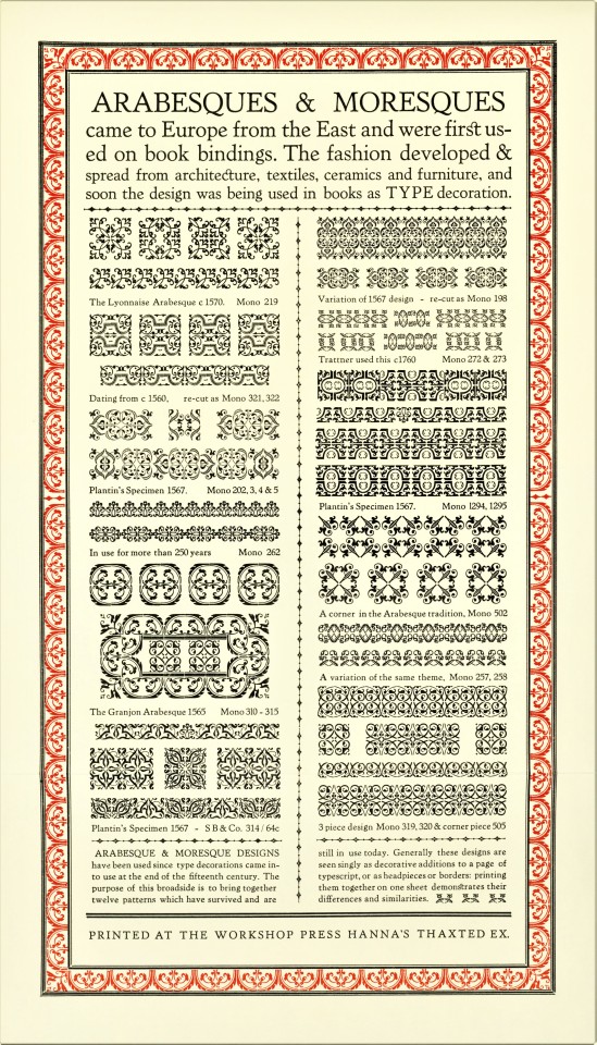
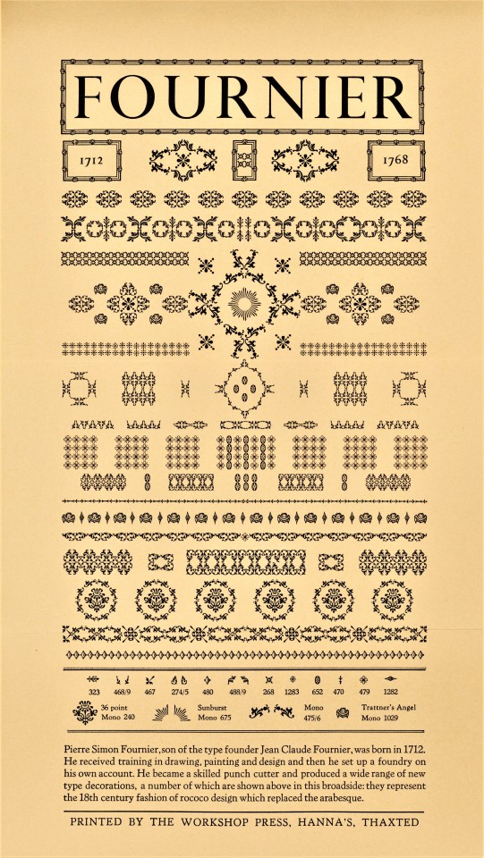
Fleurons or Printers' Flowers have been a prominent element of typographic tradition at least since the early 16th century, especially those of designer-punchcutter Robert Granjon. They became less used over the 17th century, but were revived in the mid-18th century when Pierre Simon Fournier introduced an entirely new style of printers' flowers. Soon after, their use enhanced as a fashion for classical typography changed the concept of type decoration at the end of the 18th century. The revival of fine typographic design in the late 19th century spurred a proliferation of new fleuron designs in the 20th century that has not abated to this day.
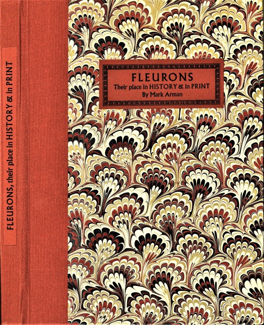
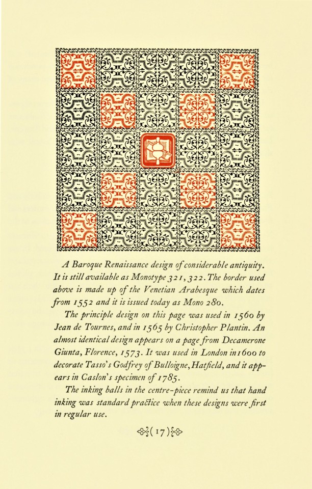
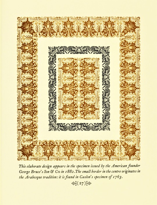
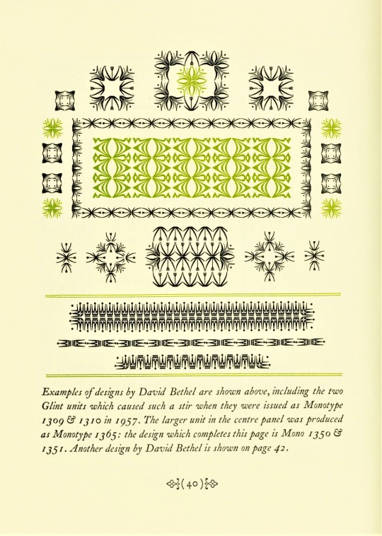
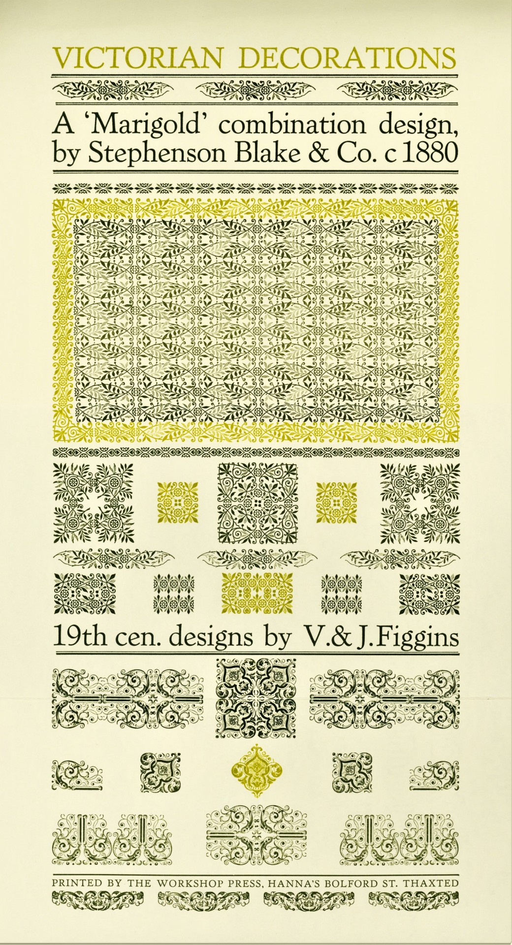
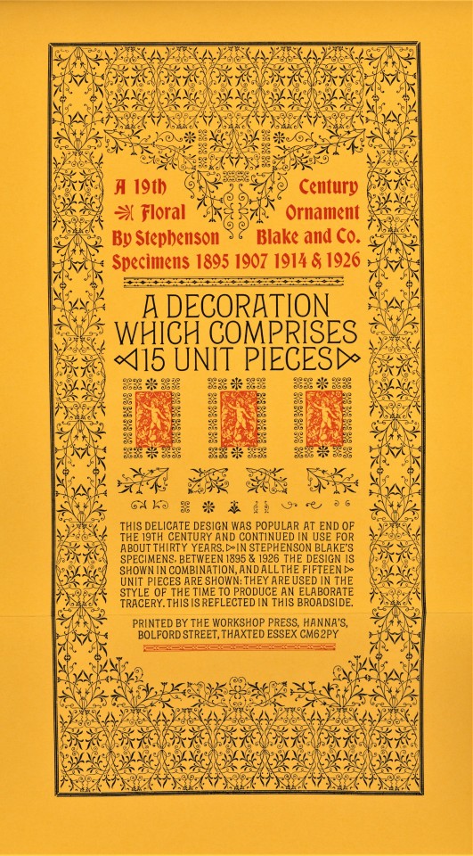
Fleurons may be combined in innumerable ways to create ornate and intricate typographic patterns. Today we show a few of those patterns from Fleurons, Their Place in History & in Print, written, designed, printed, and bound in 1988 by English type and printing enthusiast Mark Arman at his Workshop Press in Thaxted, Essex, in an edition of 170 copies signed by the author/printer. This book is another from the recent of from the estate of our late friend Dennis Bayuzick. Of printing fleurons, Arman writes:
. . . they can be grouped in a variety of combinations: elaborate arrangements are possible, and great enjoyment may be had exploring their possibilities. When I realised all this I began a collection of type decorations which, in the past seven years, has grown considerably. Part of the enjoyment has been finding specific designs. . . . All my 19th century decorations have come from old printing houses which have ceased to operate, or have gone over to litho, so they make a very mixed assortment. . . . [These] are illustrated in the following pages and the text gives a brief account of the craftsmen who created the design.
View other posts on decorative type patterns by Mark Arman.
View other books from the collection of Dennis Bayuzick.
View more Typography Tuesday posts.
#Typography Tuesday#typetuesday#fleurons#decorative type#20th century#Fleurons#Fleurons Their Place in History & in Print#Mark Arman#Workshop Press#Dennis Bayuzick#type ornaments
340 notes
·
View notes
Link
Heroes & Villains - Shady Characters - Typography Marks
Chris had suggested that I take a look at Shady Characters, a blog that discussed the history of typography and explaining the odd marks you might see from time to time but don’t understand the meaning of them. I was hoping to learn more about typography from the time my newspaper is set. what I ended up finding was that it seems to be set in awkward transitional phase where a lot of previously popular marks like the pilcrow and dagger marks fell out of use, but a lot of the interesting new marks had also yet to be created like the interrobang.
Octothorpe (#) - The hash sign has a kinda muddled history because it never had a defined use, for example in the US it would be used as a way to present numbers (#2) but in the UK, we chose to use “No.4″ Instead. The character didn’t actually have an official use in the UK because it actually originated from people messily writing “lb” turning it into a hash, but this mistake would never have been made in print.
Interrobang ( ‽) - The interrogate mark was created as way to show surpise within questions. I would have loved to have incorporated this mark in some way because I think it is genuinely interesting and useful but sadly it exist until 1962, before the time of my newspaper setting. #BringBackTheInterrobang
Pilcrow ( ¶) - The pilcrow is a mark that is used to separate paragraphs, although, although because of indented lines and line breaks they have virtually disappeared with them only appearing in legal documents today. While I was researching newspapers I found that indented lines were used incredibly often, so I think I would prefer to stick to this because it is more accurate.
Section Marks - Similarly to the Pilcrow, Section marks have also fallen out of use but not because they were replaced by better methods but because they were too closely associated with legal documents, which led to people avoiding their use outside of these documents because they felt far too formal anywhere else.
Dagger & Double Dagger - Daggers are characters that are still in use today, although they aren’t seen often because the situation they appear in is quite rare. Daggers appear in place of an footnote asterisk, if an asterisk has already been known. A double dagger is used is both a asterisk and dagger have been used.
Fleuron & Dinkus - The Feluron and Dinkus are both between paragraphs, Fleurons often take the form of decorate flowers, so they are often best used in situations that are quite formal. In contrast the Dinkus is just three asterisks beside each other and was used in much less formal situations making it better suited for documents such as newspapers.
0 notes