#Fleurons
Explore tagged Tumblr posts
Text


Typography Tuesday
Here are some arrangements of printer's flowers, a few electrotype cuts, and a wood engraving from Printing from Metal and Wood, handprinted in 1985 by English type and printing enthusiast Mark Arman at his Workshop Press in Thaxted, Essex, in an edition of 145 copies signed by the author/printer. Arman writes:
The purpose of this book is to illustrate and use different type faces , to experiment with those of the 19th century which today would be unfashionable, and to re-create an interest in those wood blocks, fleurons and electros, which were in use at the turn of the century. It is a book concerned with styles of printing and design which are no longer popular, but it is a book which owes its very existence to the author's delight in printing, type, layout and design.
Our copy of this book is another donation from the estate of our late friend Dennis Bayuzick.
View other books from the estate of Dennis Bayuzick.
View other posts on work by Mark Arman.
View other posts with type ornaments.
View more Typography Tuesday posts.
#Typography Tuesday#typetuesday#type ornaments#fleurons#electrotypes#Mark Arman#Printing from Metal and Wood#Workshop Press#19th century type#letterpress#Dennis Bayuzick
57 notes
·
View notes
Photo

#WordyWednesday
Printer’s ornament: A decorative piece of type, often showing a fancy flower, used by printers to make their pages a little more interesting. The first printer to use them was Giovanni Alberto Alvise in the year 1478. They are also sometimes called “dingbats” or, more prettily, “fleurons.”
Image: Typographica: An occasional pamphlet treating of printing, letter-design, and allied arts. New York: The Village Press and Letter Foundery, 1935. Z250 .T9 no.6
(via Page — Pulpboard · Rare Books: A Glossary · Special Collections and Archives)
#wordy wednesday#wordywednesday#john henry#special collections#specialcollections#rare books#rarebooks#bookhistory#fleurons#printers ornaments#printers flowers
19 notes
·
View notes
Text
(+2) I always am able to walk up and down anything when i use ❧the special glue I invented☙.
#realisposting#idk why copy pasting them from the pdf into tumblr made one of the fleurons bigger than the other
14 notes
·
View notes
Text


misc. art relating to my cave story mod, evergreen
play the demo now!!!
14 notes
·
View notes
Text

Lise Fleuron on a vintage postcard
#postcard#vintage#postkarte#ephemera#photography#tarjeta#fleuron#historic#postal#carte postale#briefkaart#lise fleuron#ansichtskarte#sepia#postkaart#lise#photo
11 notes
·
View notes
Text
I drove for meals on wheels again today, after a long stretch when I couldn't because my car had a severe oil leak.
It's nice to be doing that again.
🙞-------------------------------------------🙜
I went to an estate sale on the way back from the meals on wheels office.
I'm feeling kind of strange, thinking about all the things I learned about the person who's estate it was just by seeing the stuff that was for sale.
She was a musician. Played jazz saxophone. She had lots of costume jewelry. She had a dog. In her last years she was bed bound or nearly so. She was born in the 30s, judging by the photograph I saw. And she had either grandchildren or nieces & nephews.
And, I think, she lived alone.
There's a strange feeling that I have, thinking about these things. The passage of time. Death, the end of connection between people. It's like sadness, but it's also like, reflection. Wistfulness, the barest hint of what it's like to watch a tragic play.
Finality, nostalgia, and a smidge of melancholy.
The old world blues.
#actually blogging on your blog#things that affect me#I got a pair of computer speakers#a bag of unused kn95 masks#a music stand#and a dave brubeck quartet CD#today I learned it's impossible to center align text in a post on the dashboard#I had to use a bunch of dashes like a fucking 6th grader#I understand why the <center> html tag is deprecated but god fucking dammit it was easy to use I don't wanna use CSS#all this because tumblr doesn't allow horizontal rules either. bitchass losers#did you know that the official terminology for a typographic mark used to separate parts of a printed work is “dinkus”#hahahah that's a funny word#dinkus#technically the characters I've used are actually fleurons#but when they're used to separate thoughts they're a dinkus#fleuron#that's a pretty word
4 notes
·
View notes
Text
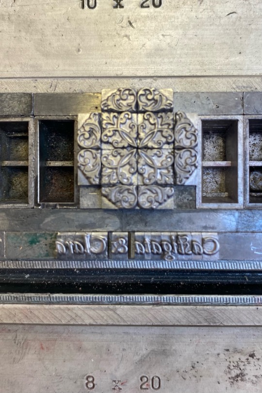
forme to ‹humanist eye strain 2.1›.
5 notes
·
View notes
Text
the fact that some unicode symbols were converted 2 emoji make me mad. Give me my little atom unicode symbol back. girl what even is ⚛️
#vicarious#i need it back#some unicode symbols flat out dont exist on some platforms#rip all those fleurons…
2 notes
·
View notes
Text
ok so i went looking into my personal font collection bc i knew i had a couple more of this type of fonts.
these are all great for mockups, wireframing, and prototyping, and all are free to use.
flow fonts:

flow circular | flow rounded | flow block
BLOKK font:

blokk font
scribble font:

scribble font
fleuron dingbats:

fleuron typeface
I just found the funniest font ever
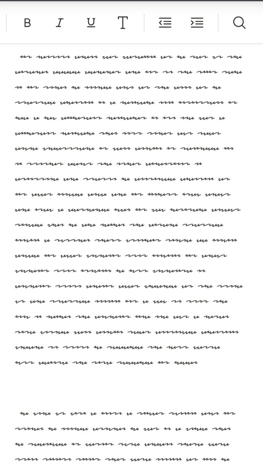
Like. What is this. Why is this. Who is the target audience of this?
#fonts#redacted fonts#flow block font#flow circular font#flow rounded font#by dan ross#BLOKK#by los-gordos#fleuron dingbats#fleuron typeface#by mickaël emile#scribble font#by vladocar#degraded rb
82K notes
·
View notes
Text
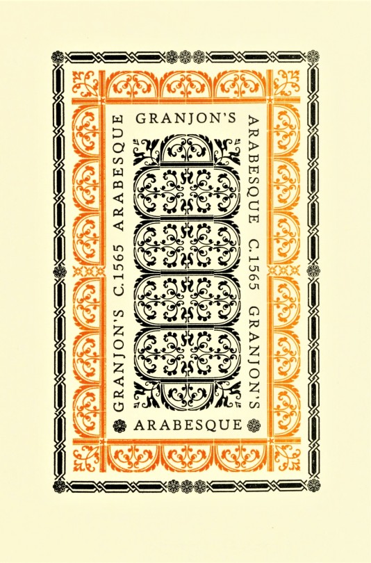
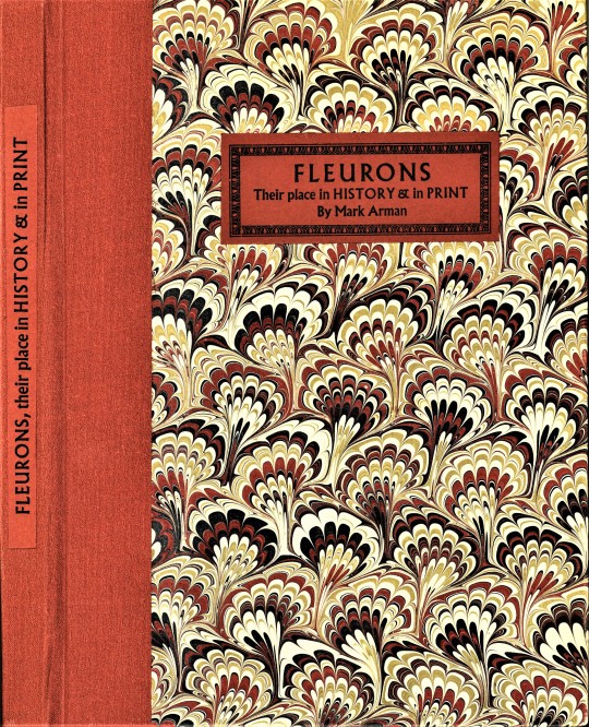


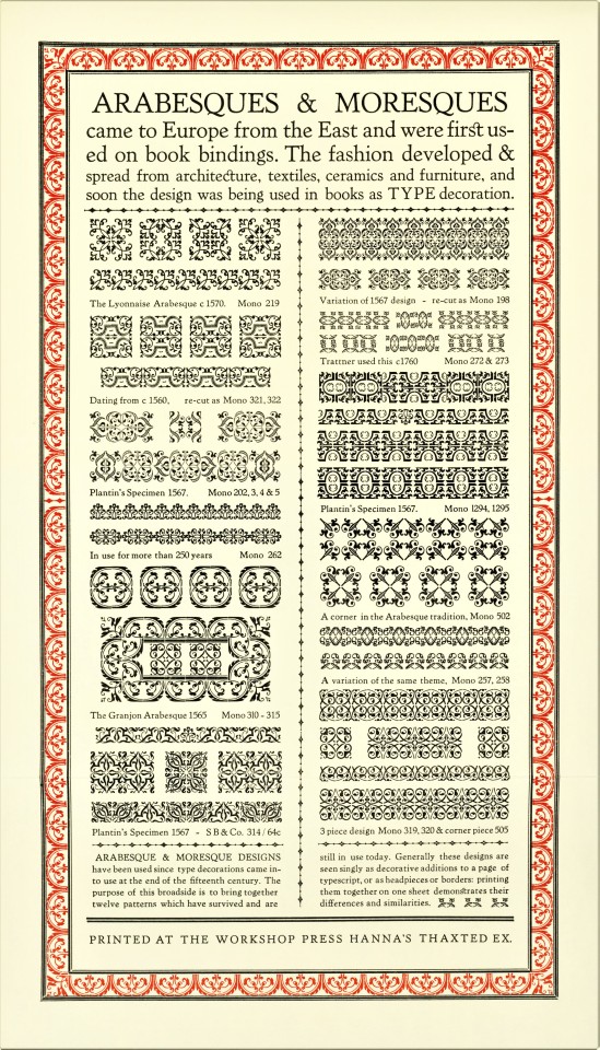

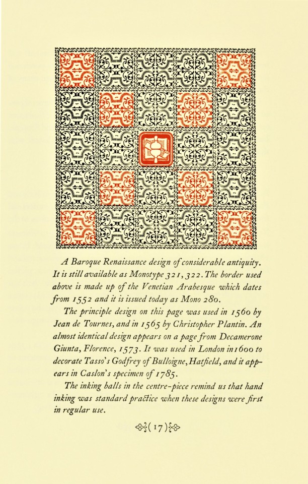

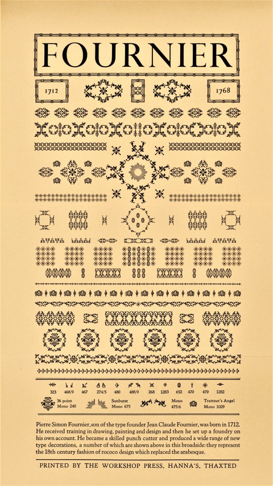
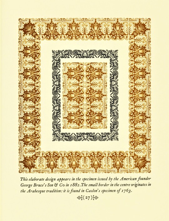
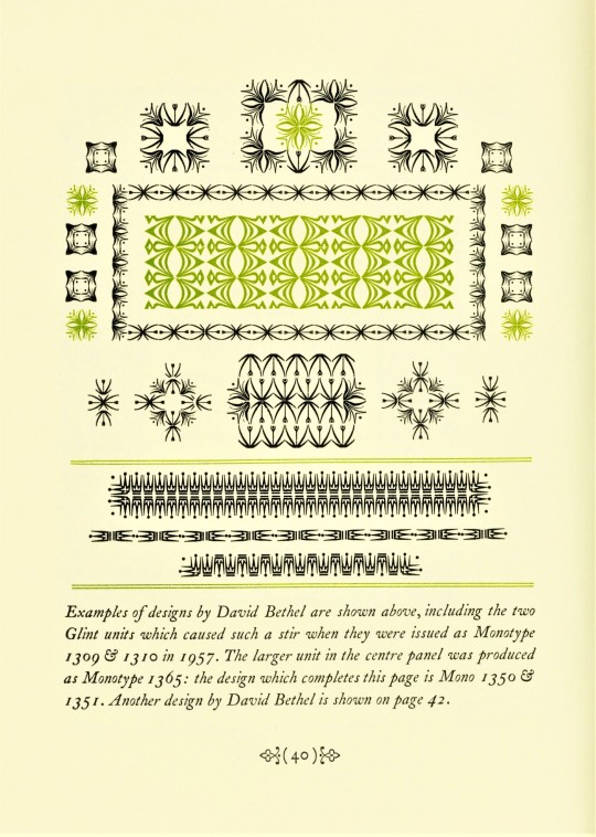
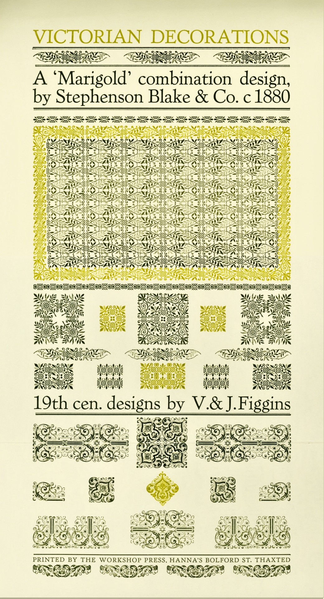
Typography Tuesday
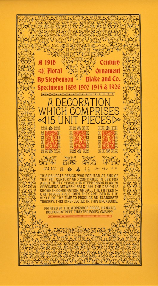
Fleurons or Printers' Flowers have been a prominent element of typographic tradition at least since the early 16th century, especially those of designer-punchcutter Robert Granjon. They became less used over the 17th century, but were revived in the mid-18th century when Pierre Simon Fournier introduced an entirely new style of printers' flowers. Soon after, their use enhanced as a fashion for classical typography changed the concept of type decoration at the end of the 18th century. The revival of fine typographic design in the late 19th century spurred a proliferation of new fleuron designs in the 20th century that has not abated to this day.
Fleurons may be combined in innumerable ways to create ornate and intricate typographic patterns. Today we show a few of those patterns from Fleurons, Their Place in History & in Print, written, designed, printed, and bound in 1988 by English type and printing enthusiast Mark Arman at his Workshop Press in Thaxted, Essex, in an edition of 170 copies signed by the author/printer. This book is another from the recent of from the estate of our late friend Dennis Bayuzick. Of printing fleurons, Arman writes:
. . . they can be grouped in a variety of combinations: elaborate arrangements are possible, and great enjoyment may be had exploring their possibilities. When I realised all this I began a collection of type decorations which, in the past seven years, has grown considerably. Part of the enjoyment has been finding specific designs. . . . All my 19th century decorations have come from old printing houses which have ceased to operate, or have gone over to litho, so they make a very mixed assortment. . . . [These] are illustrated in the following pages and the text gives a brief account of the craftsmen who created the design.
View other posts on decorative type patterns by Mark Arman.
View other books from the collection of Dennis Bayuzick.
View more Typography Tuesday posts.
#Typography Tuesday#typetuesday#fleurons#decorative type#20th century#Fleurons#Fleurons Their Place in History & in Print#Mark Arman#Workshop Press#Dennis Bayuzick#type ornaments
340 notes
·
View notes
Text

A_general_history_of_quadrupeds._The_figures_engraved_on_wood_by_T._Bewick._Fleuron_T061241-40.png
#wikimedia commons#1800s#1800#1800 Fleurons#PD-old missing SDC copyright status#CC-PD-Mark#PD-old-100-expired#PD-Art (PD-old-100-expired)#PD-Art missing SDC copyright status#Images uploaded by Fæ
0 notes
Text
Science po, le désastre absolu
Voici donc un ancien fleuron de l’université française qui bascule en officine idéologique anti-Israël. Par Maxime Tandonnet Nous publions régulièrement des livres pour réinformer face à la caste politico-médiatique hors de nos réalités quotidiennes.Cliquez sur l’image. Science po, le désastre absolu La direction de Science po Paris a conclu un accord avec les manifestants anti-Israël qui…

View On WordPress
#ancien fleuron#anti-Israel#Maxime Tandonnet#Observatoire du MENSONGE#politique#Science Po#université française
0 notes
Text
It's a bit misleading to say that it's "more specifically" a fleuron. A typographic element can be both a dinkus and a fleuron, but a fleuron is not a kind of dinkus; there are also fleurons which are not dinkuses (and vice versa).
Today I learned that there's a specific name for those floral-looking typographic widgets which are used to indicate a break or omission in a body of text, and you may be surprised to learn what that name is.
3K notes
·
View notes


