#fleuron typeface
Explore tagged Tumblr posts
Visit Tumblr Blog
Explore Tumblr blogs with no restrictions, modern design and the best experience.
Last Seen Tumblr Blogs


Fun Fact
Total funding amounts to $125.3M.
Text
ok so i went looking into my personal font collection bc i knew i had a couple more of this type of fonts.
these are all great for mockups, wireframing, and prototyping, and all are free to use.
flow fonts:

flow circular | flow rounded | flow block
BLOKK font:

blokk font
scribble font:

scribble font
fleuron dingbats:

fleuron typeface
I just found the funniest font ever
Like. What is this. Why is this. Who is the target audience of this?
#fonts#redacted fonts#flow block font#flow circular font#flow rounded font#by dan ross#BLOKK#by los-gordos#fleuron dingbats#fleuron typeface#by mickaël emile#scribble font#by vladocar#degraded rb
83K notes
·
View notes
Text

dante roman
passage from Ulysses by james joyce [the bodley head, london, 1967 (seventh impression, w/ corrections), p188].
set in digital reissue of monotype dante roman. dante is the 20th c. statement of renaissance inspired roman & italic by consummate typographer-printer giovanni mardersteig. the founts were initially proprietary to maredrsteig’s private press, the officina bodoni; first showning was a handset edition of boccaccio, Trattello in laude de Dante [officina bodoni, verona, 1955]—typeface name thus acquired. the punches were engraved by one of the last gifted punch-cutters, charles malin of paris, & subsequently served as basis for monotype’s pantograph-engraved matrices; monotype dante first issued in 1957 [english monotype 592]. [cf. john dreyfus, The Work Of Giovanni Maredersteig with Monotype Faces, the monotype corporation, london, 1967.]
finishing fleuron pair selected from p22 victorian. of their provenance—no clue.
for the dante italic vide ‹bembismo 2›.
3 notes
·
View notes
Text


Punch Typographic designs illustrate important moments in the history of typefaces. No ornaments, fleurons, dingbats were used, only uppercase & lowercase letters, numerals, standard punctuation marks and a small set of special characters. — 56 × 101 cm — 22 × 40 in • 2007
0 notes
Photo
Typography Tuesday
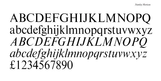
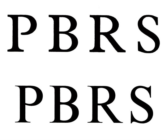
TIMES NEW ROMAN
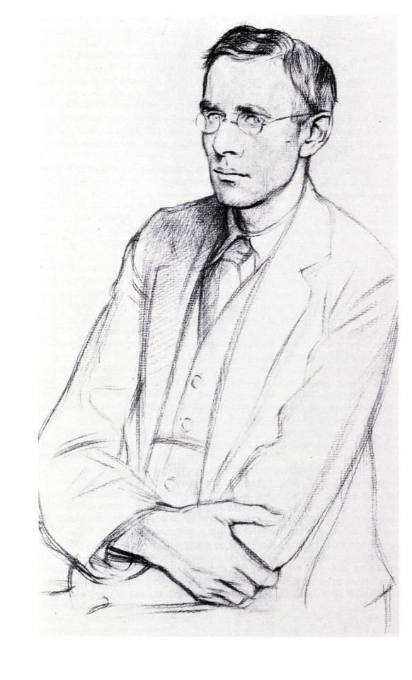
This week we present the iconic typeface Times New Roman, commissioned by the British newspaper The Times in 1931 and designed by the British type designer, type historian, and major typographic consultant for the Monotype Corporation, Stanley Morison, in collaboration with The Times's lettering artist Victor Lardent. The images here are taken from British type historian and Rampant Lions Press proprietor Sebastian Carter’s 1987 book, Twentieth century type designers, published in New York by Taplinger Publishing Company.
Morison began his crusade to reform The Times's typeface in 1929 by “pointing out how badly the paper’s design and printing compared with current standards of book production, and he impressed the management with a legibility study” conducted with Monotype Platin, Baskerville, and Perpetua. In considering a new type design, these three typefaces were considered as basic models. Morison wrote that a new typeface for The Times:
would be selected not with a view to their being of striking, but rather subtle allure, The face would be chosen for its effectiveness as much as for its “beauty”; the criteria of the effectiveness being a maximum of legibility to the reader who neither knows nor cares, one way or the other, for the mysteries of typographical minutiae.
After some review, Baskerville and Perpetua dropped out as models for not being condensed enough, and Plantin became the preferred choice to model a new font. The new typeface, Times New Roman, was designed and cut in 1931 and finally released to the public in the October 3, 1932 issue of The Times. The rest, as they say, is history. Sebastian Carter writes,
Times is the most successful type of this century, and outsold its nearest rival in the Monotype list by very nearly two to one. . . . the type exemplifies the way the best modern faces, though based on historical models, can leave their origins behind them and look completely of their age.
The images above show the full font set, a comparison of Plantin (above) and Times capitals, and a portrait of Stanley Morison (1889-1967) from a drawing by William Rothenstein as reproduced in the 1924 issue of The Fleuron, the influential British journal of typography and book arts co-founded by Morrison in 1922. Our copy of Sebastian Carter’s Twentieth century type designers is another donation from our friend Jerry Buff.
View our other Typography Tuesday posts.
#Typography Tuesday#typetuesday#Times New Roman#Stanley Morison#The Times#Victor Lardent#Sebastian Carter#Twentieth century type designers#Monotype Corporation#William Rothenstein#The Fleuron#Plantin#Baskerville#Perpetua#Jerry Buff#type design#typefaces#Typography Tuesday
94 notes
·
View notes
Text
typsetting the diasterisms AU collection

PAGES: 512
SIGNATURES: 32
TYPEFACES: Hertine for the titles and headers; Sabon for the body
The fun part is the paragraph dividers/fleurons. I took a cue from “oh autumn, oh teakettle, oh grace” and used Unicode characters of emojis.

ghostwalks (gin and fog) uses theater masks 🎭

into the great laugh of mankind uses sunrise over mountains 🌄

lilies of the valley uses bouquet 💐

oh autumn, oh teakettle, oh grace uses fallen leaves 🍂

Because You’re There uses snow-capped mountain 🏔️

the sad things i know about you uses open book 📖

surface of last scattering uses the astrological symbol for Earth, a sun cross ⊕

place the moon at my eyes uses the moon phases 🌒🌓🌔🌕🌖🌗🌘
14 notes
·
View notes
Photo

It's #TypeTuesday! I absolutely love our type specimen books, and these two typefaces from the American Type Founders Company -- Caxton and Missal, respectively -- are charming.⠀ Z250 .D27 1912c⠀ .⠀ .⠀ .⠀ .⠀ .⠀ .⠀ #typography #type #graphicdesign #caxton #fonts #fleuron #bibliophile #bookstagram #booklover #rarebooks #specialcollections #librariesofinstagram #iglibraries #mizzou #universityofmissouri #ellislibrary #ifttt
23 notes
·
View notes
Text
Lookbook Final Concept


This is my final lookbook design for the trend Curious Accents. I chose this trend because the reason behind it, injecting joy into hour homes during Pandemic times, is something that I connect to, as I too felt isolated in my home these past 2 years.This trend is all about adding personality or human touches to our interiors using DIY or crafts to Taylor it to our specific tastes.
I chose images and items that were unsusal or would stand out in a normal 'accepted' home, throngs the break the mould with standard interior design, such as the paper pulp chairs by Elizabeth Schweizer who's designs excite the eye and make the brain question what it is seeing. Other items like the bench made of clay by Maarten Baas that brings a practical element to the interior but does so playfull riffing on our expectations of what a bench is.
The colour pallet for this trend is one I would describe as elevated juvenile, using colours and colour groups that are generally used for children's toys or rooms brings a sense of playfulness to our surroundings, while also making them acceptable for adult or professional spaces. Colour plays an incredibly important part in our psyche, and these colours being connected with childhood or innocence, of a safe place to learn or explore, is deeply ingrained in our minds. "hen utilised correctly, in conjunction with pieces that excite the mind, create a perfect environment for stress relief or indeed a new safe space to live and work regardless of the uncertainty and stress of the outside world.
Coming to life during the Pandemic, and seeing the fragility of our natural balance, along with a greater conscious of our natural world has led to a trend of people taking used items like chairs or dressers and upcycyling them to create something new, often a bespoke piece that they cannot find in traditional outlet stores. It also follows a trend of people picking up traditional handcrafts such as knitting or crochet to create unique cushions or blankets that not only fit their own personal tastes but also allow a layman the ability to create their own interior. I have chosen pieces that utilise the result available and very entry level acrylic yarn that allow people to crochet or knit what they like not having to worry too much about the care or process behind using a more difficult or unusual fibre.
For my main typeface I chose a font that would look as playful and unique as the trend itself. The heading front is ‘Eckmannpsych,' and I chose this because the unusual shifts in weight of the letters echoed the organic shapes of the design elements I chose for the lookbook, using a hot pink for the main colour and a black outline that would make the heading visible. For the main body text I chose 'Fleuron' which looked essentially like a standard front, but for occasional letters that had a unusual look, the E being more curved than usual or the R consisting of straight lines, I chose this to emulate the idea that this trend is Accents, little pops of strange or unusual in a normal home, little elements of personality.
I think that overall I managed to capture the trend of Curious Accents in my lookbook well. I believe that my chosen imagery works perfectly for this trend, being both usable and also a statement piece, they embody the curiosity that this trend is inspired by, unique pieces that excite and give life to a home or space that is depersonalised through its use as an office or study area. I think that the type face I chose also fits this trend, as it is engaging to look at without being overwhelming or illegible. However I can find ways to improve what I have done, as the start of my lookbook feels like it flows together, the narrative page being the strongest, but I feel that I looses steam and slightly looses it's connection to each other as it reaches the back page with the colour pallet on. This page I believe to be the weakest as it doesn't quite mesh with the rest of the lookbook. To improve I would find a way to make the back page as visually engaging as the first few, buy using more elements of the surreal that I did on the narrative page with the changed perspective and the somewhat out of place window.
0 notes
Text
D&AD // Gardening
As Emma and I have decided to create a font that interwinds through the use of ligatures, glyphs, fleurons etc. Also, since our community is focused on gardening and horticulture we want to use plants and flowers that have a similar trait of climbing and intertwining incorporated into the typeface itself.
Examples of vines and climbing plants:
Clematis (species and hybrids) - Large-flowered hybrids, like the popular "'Jackmanii" and "Nelly Moser", the dainty bells of "Betty Corning" or the engulfing "Sweet Autumn" clematis. The vines don't climb so much as bob and weave their way through other plants.
Climbing Hydrangea (Hydrangea petiolaris) - It is a deciduous vine that clings by means of aerial roots.They produce their lacy hydrangea flower heads in June. They grow 10 - 80 feet.
Five Leaf Akebia, Chocolate Vine (Akebia quinata) - This April bloomer produces spicy scented, brownish-purple blossoms. Akebia is a very fast grower that clings by twining. They grow 30 - 40 feet.
Passionflower, Maypop (Passiflora incarnata) - Passionflower is semi-woody, with large serrated leaves. It clings to supports with tendrils. These vines are prized for their complex and exotic looking flowers, of which there are many, in a wide variety of colors and combination. They grow 15 - 20 feet.
Source: https://www.thespruce.com/top-choices-for-vines-and-climbing-plants-1402385
Since we’re looking at typography it’s important to look at layout and grids. So I wanted to find a link to gardening, so that’s when allotments and community gardens came to mind as they have multiple members they each have their own plot so the whole garden works on a grid system.

http://www.boundaryway.co.uk/site-access/map/

https://letusbuildcullypark.org

https://www.northshorelandalliance.org/roosevelt-community-garden/
Gardening Techniques/Methods:
Deadheading - the removal of flowers from plants when they are fading or dead. It is done to keep plants looking attractive and encourage more blooms
Pruning - it is the cutting back of tips, branches, limbs, and stems, you can also encourage youthful growth that produces abundant flowers. When you prune correctly, you encourage healthy growth and flowering (in the case of flowering plants), as well as good looks.
Dividing - Dividing plants regularly will ensure healthy, vigorous plants that will continue to perform year after year. It also offers the opportunity to multiply your plants.
Weeding - Weeding is removing unwanted plants from the ones you want to be productive or ornamental in your garden. You want the plants that remain to attain their full growth and maturity, and weeds steal sunlight, moisture, and other resources from the plants you are intending to grow.
https://www.finegardening.com/how-to
0 notes
Photo

Sparking Ideas - How we could Incorporate Flueron/Printers Flowers
The idea that this is super intricate and floaty typeface gives me the impression of something intertwining, climbing. Kind of like some species of flowers & trailers often found in flower gardens.
The idea of something so stylised means we could incorporate something quite floral such as the fleurons into the design without it being jarring for the viewer whilst also displaying a clear message, readability being super legible which is something that will take a bit of trial and error when working with designs like this.
found here
0 notes
Text
Garamond Research 2
https://fontsinuse.com/uses/14168/the-garamond-types-considered-in-the-fleuron-https://typekit.com/fonts/adobe-garamond/details/adobe-garamond-pro-regular
https://typekit.com/designers/robert-slimbach Digitized Adobe Garamond Pro
Slimbach also created his own sanserif font Acumin. It is very different from Garamond. The weight of the characters is much more uniform. There is no contrast in the characters while Garamond has a lot of contrast. At the same point size, Acumin has a heavier weight.
https://www.linotype.com/578/robert-slimbach.html
http://www.garamond.culture.fr/en/page/comparing_typefaces
“Inspired by the romans created by Aldus Manutius in Venice between 1495 and 1500, Garamond surpassed them in smoothness and readability.”
https://www.thebookdesigner.com/2010/10/typefaces-as-history-aldus-manutius-and-the-noble-bembo/
http://www.garamond.culture.fr/en/page/who_invented_garamond
https://designforhackers.com/blog/garamond/
Garamond is best used for print rather than on-screen reading. In this article, they mention how computers have a rough time showing curvature. Which Garamond has a lot of including its contrast.
http://www.identifont.com/differences?first=Sabon&second=Adobe+Garamond Garamond vs Sabon
http://www.identifont.com/differences?first=garamond&second=Adobe+Garamond&q=Go Garamond VS Adobe Garamond
https://www.theguardian.com/world/shortcuts/2014/mar/31/changing-font-to-garamond-save-us-370m
Cute little article about how Garamond is a thinner font so it would save ink; thus money.
https://www.fastcodesign.com/3028436/why-garamond-wont-save-the-government-467-million-a-year Another article explaining why switching to Garamond wouldn’t save money. I just find this whole thing quite funny. It’s like a competition Garamond vs Times New Roman. To be honest they’re really really similar so much that when I looked for it in print I couldn’t tell if it was Garamond or Times New Roman.
http://blog.ocad.ca/wordpress/thegoldenage/2011/10/main-characteristics-of-adobe-garamond-pro/?doing_wp_cron=1510750174.5282011032104492187500
https://blog.typekit.com/2014/06/12/the-adobe-originals-silver-anniversary-story-stone-slimbach-and-twombly-launch-the-first-originals/ the start of adobe garamond
https://fontsinuse.com/uses/14168/the-garamond-types-considered-in-the-fleuron-
https://fontsinuse.com/uses/14940/the-lord-of-the-rings-1992-harpercollins-edit
0 notes
Photo

This is the cover of the first volume of The Fleuron, a typographic journal edited by Oliver Simon in London, 1923. It was found in the book of typography we looked at in class. The typeface isn’t named, but it appears to be either of humanist or oldstyle classification.
This is the cover of a typographic journal, the first volume of seven, and was used to spread and record the happenings in typography at the time. Throughout the time it was in print, it recorded the history and use of such influential typefaces as Garamond, Perpetua, Bembo, and many more. It had specimens of type as well as essays and papers by typographers and book designers of the time. The audience it was aiming for was most likely similar to those who contributed to it. As such, these people would have probably held beliefs similar to that of Beatrice Warde- printing should be invisible. This is demonstrated in the subtly of the cover of this journal. The use of small caps and hierarchy eloquently gets across all the needed information in a quiet manner. The journal itself most likely held within it the demonstration of typography that was meant to be invisible as well as discussion on the best practices to go about making it as unnoticed as possible and it is only fitting that the cover meet this end as well. It may not have been known to the creators at the time, but this journal would be soon be renowned, and its design is fit for its sophisticated reputation. The small caps, the oldstyle numbers, and the single use of italics offers an elegant simplicity that befits the goals of this publication beautifully.
This typography does its job well, which is always something to learn from and to appreciate. I personally enjoy simplicity and can learn from this cover how to say what needs to be said succinctly and with grace. Even for a cover, this is humble and subtle, and I think that is something I can learn from. Sometimes even the parts meant to be loud and catch the eye can be more effective when quiet and simple.
— Hannah
0 notes
Photo


Typography Tuesday
Last #Feathursday we posted a folded broadside featuring nursery rhymes and wood engravings by Enid Marx from a collection of forty broadsides entitled Forty Sheets to the Wind, printed by Graham Moss and Kathy Whalen in 1999 to showcase the enormous collection of typefaces at their Incline Press in Oldham, England. The portfolio is part of a set of 150 copies that also includes a letterpress-printed introductory booklet.
Today we present ten more typographic broadsides from this collection. Here is some commentary on each broadside from the booklet, from top to bottom:
Forty Sheets to the WInd: “Focusing on bookwork we have little use for wood type as even the smallest sizes then to be too large for our use. . . . But somehow a few cases have slipped in and stayed, The two colour face is above a line of Cheltenham . . . .”
Beatrice Warde. Verses Written to the Sound of Fire Engines: The line drawing of Beatrice Warde is by Eric Gill, and is printed from a zinc plate. The hair color is produced by pochoir. Gill also designed the Perpetua type that the verses are set in .
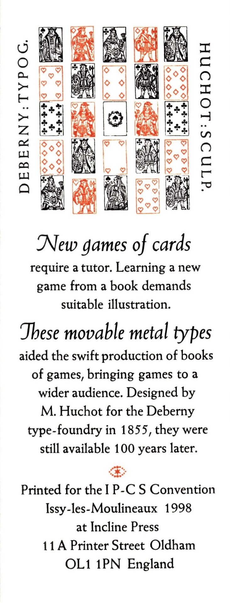
New games of cards: printed in 24 pt. italic and 14 pt. roman Weiss as a keepsake for the International Playing-Card Society Convention.
Hung Out to Dry: chiefly printed in Goudy Old Style, 18 pt. roman and italic with a little 14 pt. bold. The display face is Castellar 30 pt., surrounded by an illustration by Philip Woollard printed from a zinc plate.
Little Fishes: printed using 36 pt. Centaur roman, with a line of 12 pt at the foot, designed by Bruce Rogers, and Frederic Warde’s Arrighi italic. The wood engraving is by Anna Ravenscroft.
Spirit of Joy: The caption line is set in Fry’s Ornamented from the Stephenson Blake foundry, in 36 and 30 pt.; the rest is in 24 pt Fry’s Baskerville with some Monotype Baskerville italic, printed on Fabriano Rosapina. The drawing is by Claud Lovat Fraser with pochior coloring.
Some Papers Are Not Used: 24 pt Hadriano Stone Cut and 12 pt Hadriano designed by Frederic Goudy printed on Fabriano Ingres paper over a course handmade paper from La Papeterie St-Armand in Montreal.
Sonnet Thirty: 18 pt Monotype Garamond italic with Stephenson Blake borders on handmade paper from Griffin Mill.
The Fist: 18 pt Scotch type printed on Fabriano Ingres. The large manicle or “fist” at the bottom is a wood cut from Delittle of York.
I Like Discipline: 30 pt. Monotype Bembo and 12 pt Monotype Bembo italic on Fabriano Artistico. The circular decorative borders were made of four pieces designed for Monotype by David Bethel, lined with some Linotype fleurons.
Our copy of Forty Sheets to the Wind is a gift from our friend Jerry Buff.
View our other Typography Tuesday posts.
#Typography Tuesday#typetuesday#Forty Sheets to the Wind#Incline Press#Graham Moss#Kathy Whalen#wood type#Cheltenham#Perpetua#Weiss#Goudy Old Style#Castellar#Centaur#Arrighi#Fry's Ornamented#Baskerville#Hadriano#Garamond#Scotch Roman#Bembo#Monotype#Stephenson Blake & Co.#beatrice warde#Eric Gill#Frederic Goudy#Bruce Rogers#Frederic Warde#Anna Ravenscroft#Claud Lovat Fraser#Fabriano
67 notes
·
View notes
Photo


Typography Tuesday
This week we present some facsimile pages from Pierre Simon Fournier’s small 1764 publication Les Caractères de l’Imprimerie. This facsimile production, which only includes sample pages from the original volume, was published by the German type foundry H. Berthold AG in 1968 under the title Manuel Typographique as part of the series "Schatze aus der Berthold-Bibliothek" (Treasures from the Berthold Library).
Fournier was an influential 18th-century French designer, type founder, and theoretician who made significant contributions to typography. In 1737, he devised the first point system for the standardization of type sizes. In 1739, he established his own type foundry, which continued to operate into the 19th century, and designed several new typefaces, one of which, the eponymous Fournier, was re-designed and issued by Monotype Corporation in 1924. His fleurons and dingbats spawned a revival of 16th-century-style ornaments, especially after the 1742 publication of his Modèles des Caractères. And in 1754, with the German music publisher and typographer J. G. I. Breitkopf, Fournier developed and patented in 1762 types for the rounded musical notation system we use today.
Les Caractères de l’Imprimerie appears to have been issued as a printer’s specimen book, copies of which range in length from 124 to 168 pages. Much of this work was incorporated into the second volume of his notable 1764-66, 2-volume treatise Manuel typographique utile aux gens de lettres. Our copy of Les Caractères de l’Imprimerie is yet another donation from our friend and benefactor Jerry Buff.
View our other Typography Tuesday posts.
#Typography Tuesday#typetuesday#Pierre Simon Fournier#Les Caractères de l’Imprimerie#Fournier types#H. Berthold AG#Berthold Type Foundry#French types#musical notation#J. G. I. Breitkopf#Johann Gottlob Immanuel Breitkopf#18th century#Typography Tuesday#Jerry Buff#18th century type
34 notes
·
View notes
Photo

stanley morison telling us of giovanbattista palatino compels disparity in description of his character as given between james wardrop & emanuele casamassima: the setting is casamassima’s take, with which morison agrees [Early Italian Writing-Books, david r. godine, boston, 1990, p70].
set in linotype palatino italic, part of the now famous, neo-renaissance typeface family drawn by hermann zapf & named for palatino while not especially based upon his hand. the tail fleuron is digital reissue of monotype recutting of, apparently, the mirror of granjon’s vine leaf on english body, 1564 [cf. hendrik d. l. vervliet, Vine Leaf Ornaments in Renaissance Typography, oak knoll press, new castle (del), 2012, p308].
2 notes
·
View notes
Photo

passage excerpted from johann wolfgang von goethe, Römische Elegien, xx, from the subsection entitled «Das Wiedersehn», first part «Er». set in monotype walbaum: singular typeface for setting goethe in roman—vide ‹time is short, art is long›. head & tail bands composed of digital reissue of a fleuron pair [uk monotype 488 (left), 489 (right)], john baskerville cut this pair [cf. d.b. updike, Printing Types, vol ii, harvard university press, cambridge, 1937, p.115 & fig.274]; but it may have originated with william caslon, his long primer flower no.1 [cf. A Specimen of Printing Types by William Caslon, london, 1785].
translation [mine]: sweet friend, just one, only one kiss yet grant these lips! why today are you so parsimonious? yesterday the tree blossomed as today, we exchanged kisses thousandfold; to a swarm of bees you do compare yourself, the way they nuzzle & suck the blooms, hover & again suck; and lovely tone of sweet enjoyment resounds. all still practice this fair task. and would spring have fled us past before having strewn the blooms?
3 notes
·
View notes
Photo


tschichold’s sabon
1st illustration: laid-in sheet from jan tschichold’s Leben und Bedutung des Schriftschneiders Jakob Sabon [d. stempel ag & linontype gmbh, 1969], promotional for the release of the sabon typeface family.
2nd illustration: facsimile setting of the insert copy in linotype’s digital reissue of sabon—sabon next.
sabon was tschichold’s version of a garamond roman & granjon italic pairing. a technical achievement in the late 1960s as tschichold created faces that produced equivalent composition on monotype & linotype, or handset stempel foundry type: composition from the three could be interchanged or intermixed. the major drawback being the italic was limited by the linotype machine’s inability to cast kerned sorts & a further limitation on the set widths for italic glyphs, which had to map to the roman widths. tschichold found a happy median in his italic producing, for editorial purposes, an adequate mate to his garamond. for the digital reissue, linotype sabon next, jean françois porchez resolved the constraints & rendered glyphs more to his vision for this noble garamond-granjon pairing. in the first garamond-granjon revival, atf garamond, the trade name makes no indication of granjon as engraver of the italic, & the misnamed roman was actually recutting of a later roman, i.e. not cut by garamond; monotype’s garamond recutting followed suit. the error occurred due to the mislabeling as «garamond 1540» by france’s imprimerie national of their caractères de l’université; this remained undiscovered until a few years after these seminal revivals. in the Fleuron beatrice warde, writing under the nome-de-plume paul beaujon, showed unequivocally that these early garamond revivals were actually based upon the roman cut by the printer jean jannon of sedan c. 1621 [«The ‘Garamond’ Types, Sixteenth- and seventeenth-century sources considered», Fleuron, no. 5, 1926, pp.131-79]. & this convention continued: many later jannon adaptations were issued with a «garamond» trade name. in «sabon» tschichold found a perfect trade name for this classic pairing. jacques sabon was a puch-engraver & type-caster from lyon; his birthdate is unknown but he died in 1580. the first printer of frankfurt was christian egenolff; he founded his printing office there in 1530, which attached a foundry. after his death in 1555 his widow margarete continued the operation: sabon is first found in frankfurt working for the egenolffs—margarete & family. the literature is somewhat conflicting, but sabon is to be found in amsterdam a short time later working for the important amsterdam publisher-printer christoph plantin: one source states he was employed by plantin as punch-engraver 1565-7¹; another that he was summoned to amsterdam by plantin in 1563 to set up plantin’s foundry, but returned to frankfurt 1564². in either set of events, sabon returned to the egenolff establishment with matrices obtained in amsterdam & updated the egenolff foundry material to include types by garamond & granjon. in 1571 he married christian egenolff’s granddaughter judith & eventually ownership of the foundry passed to sabon. he kept close business relations with claude garamond & his successors in paris, & robert granjon in lyon, amassing an unsurpassed stock of french renaissance material. [cf. jan tschichold, Leben und Bedutung des Schriftschneiders Jakob Sabon, d. stempel ag & linotype gmbh, frankfurt am main, n.d. but c.1969.]
1. max rooses, Index characterum architypograpiae Plantinae, antwerpen, 1905. 2. gustav mori, Die Eigenolff-Luthersche Schriftgiesserei in Frankfurt am Main, frankfurt, d. stempel ag, 1926.
#typography#tschichold#typesetting#granjon#garamond#jannon#jean jannon#sabon#jacques sabon#christian egenolff#christoph plantin
1 note
·
View note