#H. Berthold AG
Explore tagged Tumblr posts
Visit Tumblr Blog
Explore Tumblr blogs with no restrictions, modern design and the best experience.
Last Seen Tumblr Blogs


Fun Fact
The total number of visits Tumblr.com received during January 2021 is 327 million.
Photo

Satz- und Druckmuster H. Berthold AG - 1923 - via Staatsbibliothek zu Berlin
2K notes
·
View notes
Text

H. Berthold AG Diatype // Manual Phototypesetting Machine (Germany, 1960s)
via janchristophschultchen
173 notes
·
View notes
Text

Josef Müller-Brockmann Müller-Brockmann + Co., Berthold Akzidenz-Grotesk, H. Berthold AG, Berlin, 1966-1980 [Museum für Gestaltung Zürich]
7 notes
·
View notes
Text
W02 SDL
01 Joseph Churchward
https://teara.govt.nz/en/biographies/6c10/churchward-joseph#:~:text=Churchward's%20most%20popular%20font%2C%20Churchward,in%20publications%20around%20the%20world.
“Joseph Churchward was born on 20 August 1933 in Apia, Western Samoa, the only child of Mary Coe and George Charles Churchward. Churchward was raised in Samoa by his paternal grandparents. In 1946, aged 13, Churchward travelled to Auckland with his grandmother and cousin. Became a naturalised New Zealand citizen in 1951.”
“Churchward joined Charles Haines Advertising Agency Ltd as a junior commercial artist on an internship; he was to stay with the firm for nine years. In 1962 Churchward left Charles Haines and set up Churchward’s Lettering Service, later Churchward International Typefaces (CIT). He specialised in creating alphabet fonts by hand, making detailed pencil sketches to measure the size, shape and impact of each letter, then tracing and inking enlarged images onto cardboard boards.”
“He ‘forged his own alphabets by reinterpreting the familiar forms of his daily work and endowing them with influences from his culture and surroundings’. He named some of his fonts after family members – the 1969 Churchward Marianna typeface, for example, was named for his six-year old-daughter, who was known as ‘plumpy’“
“Churchward’s most popular font, Churchward 69, propelled him into the international market. The highly regarded German typeface foundry H. Berthold AG purchased his fonts for use in publications around the world. Churchward became the first New Zealander to have a ‘licensed original alphabet”

Churchward Marianna Black - ‘Plumpy’

Churchward 69 Black
0 notes
Text
Joseph Churchward
A Samoan born graphic designer, Joseph Churchward was an internationally recognised typeface designer who's work was presented on billboards, newspapers and popular literature. He handmade 700 typefaces, many of which drew influences from his Pacific background and family. He wasn't well known until 2009 when Te Papa Tongarewa exhibited his work.

His most popular typeface (Churchward 69) is what gained his initial international recognition after the German typeface foundry; H. Berthold AG purchased his typeface to use in publications. Which led Churchward to become the first New Zealander to have a licensed original alphabet.

Churchward 69 was created in the late 1960s. The square sans serif is unique to the time and proved to be popular after being purchased by a German type foundry.
-
0 notes
Photo


Typography Tuesday
This week we present some facsimile pages from Pierre Simon Fournier’s small 1764 publication Les Caractères de l’Imprimerie. This facsimile production, which only includes sample pages from the original volume, was published by the German type foundry H. Berthold AG in 1968 under the title Manuel Typographique as part of the series "Schatze aus der Berthold-Bibliothek" (Treasures from the Berthold Library).
Fournier was an influential 18th-century French designer, type founder, and theoretician who made significant contributions to typography. In 1737, he devised the first point system for the standardization of type sizes. In 1739, he established his own type foundry, which continued to operate into the 19th century, and designed several new typefaces, one of which, the eponymous Fournier, was re-designed and issued by Monotype Corporation in 1924. His fleurons and dingbats spawned a revival of 16th-century-style ornaments, especially after the 1742 publication of his Modèles des Caractères. And in 1754, with the German music publisher and typographer J. G. I. Breitkopf, Fournier developed and patented in 1762 types for the rounded musical notation system we use today.
Les Caractères de l’Imprimerie appears to have been issued as a printer’s specimen book, copies of which range in length from 124 to 168 pages. Much of this work was incorporated into the second volume of his notable 1764-66, 2-volume treatise Manuel typographique utile aux gens de lettres. Our copy of Les Caractères de l’Imprimerie is yet another donation from our friend and benefactor Jerry Buff.
View our other Typography Tuesday posts.
#Typography Tuesday#typetuesday#Pierre Simon Fournier#Les Caractères de l’Imprimerie#Fournier types#H. Berthold AG#Berthold Type Foundry#French types#musical notation#J. G. I. Breitkopf#Johann Gottlob Immanuel Breitkopf#18th century#Typography Tuesday#Jerry Buff#18th century type
34 notes
·
View notes
Photo

Signal, H. Berthold AG #typespecimen
2 notes
·
View notes
Link
Il rilascio della nuova versione dell’Helvetica (chiamato Helvetica Now) è estremamente importante, molto più di quanto sembri e che porta inesorabilmente con se conseguenze che saranno chiare, perlomeno agli addetti ai lavori, solo tra diversi anni.
Tre le versioni annunciate da Monotype: Display, Text e Micro, tutte già in vendita dal sito MyFonts.com, anche se uno stile è già scaricabile gratuitamente per prove e test dal sito della casa madre.
Il nuovo design del font è pensato per essere attuale, pur mantenendo quel profilo di classico che da sempre l’ha contraddistinto sin dalla nascita, ma soprattutto per essere al passo con le nuove tecnologie, soprattutto per quanto riguarda i display ad alta risoluzione: una sfida molto difficile perché negli ultimi anni le scelte di mercato hanno imposto standard proprietari anche nei font e emergere nel mercato di adesso è di certo più difficile di un tempo.
Ma per capire la portata di questa rivoluzione dobbiamo guardare la faccenda da un punto di vista molto diverso e ampio: cambiare il font più usato al mondo non è semplice, comporta responsabilità enormi legate all’emozione, alla leggibilità, alla fattibilità di un business e della comunicazione nella sua più intima realizzazione.
Ma d’altra parte questa è una delle tante sfide che l’Helvetica ha dovuto affrontare nella sua storia, nata come la Cenerentola delle font e diventata sin da subito la regina della comunicazione a 360°.
Helvetica, quasi per caso
Si perché nel 1957, quando Max Miedinger, ex dipendente diventato (probabilmente a forza) freelance Svizzero, è incaricato dalla fonderia Haas di Münchenstein (piccola città di confine) di sviluppare un carattere senza grazie in grado di risollevare le nefaste sorti economiche, non immaginava i risvolti che ne sarebbero emersi.
Miedinger elaborò una nuova edizione del Akzidenz Grotesk, uno dei caratteri senza grazie più utilizzati all’epoca il cui disegno originale risale al 1896 (dalla fonderia H. Berthold AG), dandole il nome di Neue Haas Grotesk.
Il nome fu cambiato poi in Helvetica (da Helvetia, definizione latina della Svizzera) quando fu acquistato e distribuito dalle società Stempel e Linotype pochi anni più tardi probabilmente per una più facile penetrazione nel mercato internazionale.
Ma nonostante il successo del font Akzidenz Grotesk non subì nell’immediato forti scossoni, la svolta per il nuovo font di Miedinger arrivò quasi subito: Hans Neuburg lo recensisce nel numero 4 del 1959 della famosa rivista “Neue Grafik” parlandone come del nuovo Akzidenz Grotesk e citando letteralmente che l’Helvetica è il font “(…) a cui non abbiamo alcuna intenzione di rinunciare”.
Due anni dopo la distribuzione tramite Linotype (soprattutto) ne stabilisce un successo che cresce in modo esponenziale per tutta la decade successiva e arriva sino ai giorni nostri: la cultura degli anni sessanta (meno negli anni settanta dove l’estremismo porta a scelta qua e la diverse) è fortemente influenzata dall’Helvetica in tutti i suoi stili.
Con l’arrivo del digitale la conferma dell’Helvetica è forte: Apple lo include tra i caratteri presenti all’interno del primo Macintosh e QuarkXPress lo definisce come font di default nello stile Normale, sostanzialmente imponendolo come scelta primaria in tutti i tipi di impaginazioni grafiche del mondo, con grandissimo successo anche in Italia.
Nel 1989 Massimo Vignelli lo sceglie come font ufficiale per la segnaletica della città di New York, riscoprendolo in modo più razionale e da li in avanti il carattere è identificato come una impronta tipica dello stile Italo-svizzero moderno all’estero: nel mondo del business sono in molti ad apprezzarne l’armonia, la modernità e la formalità tanto che Microsoft lo sceglie per il proprio logo e Apple per tutti i testi dell’interfaccia nei propri device dal 2007 al 2015: l’Helvetica padroneggia i device a risoluzione normale, l’Helvetica Neue (primo ridesign del 1983) per i device retina, a risoluzione maggiore. Nel 2015 l’avvicendamento con il nuovo font San Francisco.
Luci e ombre
Difficile, e a tratti presuntuoso, definire in poche righe il perché di un successo così ampio dell’Helvetica nel mercato, rispetto a molte altre font con, sulla carta, tutte le armi per vincere. L’Univers di Adrian Frutiger, ad esempio, riporta la stessa età dell’Helvetica con anche le stesse radici grafiche tratte dal Akzidenz Grotesk, ma in questo caso con una elaborazione più moderna e originale, specie in alcuni glifi come la “G” e la “Q” e proprio per questo suo aspetto reso una scelta volontaria da parte dei grafici, laddove l’Helvetica appare più trasparente e meno deciso.
Forse gli anni sessanta hanno dimostrato da una parte la voglia di ritorno a linee più classiche nel design, pur senza un radicale sconvolgimento della geometria di font come il Futura, che aveva spopolato nel mezzo secolo prima e che tanto aveva dato alla comunicazione tra le due guerre.
D’altra parte l’autorità dell’Helvetica è cresciuta in modo così esponenziale negli anni sessanta, sfruttando una composizione sempre più capace che spesso si è accostato il termine “Design” all’utilizzo originale del font, più che al suo intrinseco disegno, nel pensiero di chi scrive forse una delle più evidenti chiavi del successo.
Anche oggi la sua popolarità è tale per cui anche tra i non addetti ai lavori l’uso dell’Helvetica (o dell’Helvetica Neue tra i più capaci) è sinonimo di carattere ���Normale”, al pari del New York Times, per la versione graziata.
Ed è forse questo il suo aspetto più compromettente: l’uso e l’abuso di questo font, in una epoca nella quale il digitale ha democratizzato la conoscenza tipografica, rende spesso i grafici alla ricerca di soluzioni alternative, non fosse altro per evidenziare la propria identità: eppure l’uso resta massiccio per molti motivi, uno tra tutti è la psicologia intrinseca del messaggio.
L’Helvetica è così conosciuto, trasparente, comodo e versatile che ispira fiducia in chi lo vede e lo legge. É un carattere che non fa riflettere, che non si sovrappone tra il lettore e il messaggio, seguendo quello che è stato uno dei pensieri fondamentali per la tipografia del novecento e a tutt’oggi uno dei capisaldi della grafica, il pensiero di Stanley Morison enunciato nel testo del 1929 “First Principles of Typography” dove diceva tra le altre cose che “(…) l’arte della tipografia non è estetica se non accidentalmente”.
Una descrizione contraddittoria e discussa ancora oggi che ben si addice all’Helvetica, che presenta una totale assenza di grazie, “se non accidentalmente” in alcune lettere come la “R” o una geometria sobria, “se non accidentalmente” provocatoria come la lieve inclinazione della chiusura della lettera “c” e così via.
L’Helvetica Now
L’Helvetica Now, che segue l’Helvetica Neue, restyling del del 1983, è una operazione che mira la comunicazione globale nelle sue fondamenta. Testi scolastici, tesi di laurea, libri di narrativa, manuali di istruzioni, lettering, loghi, interfacce grafiche per Desktop e mobile, grafica commerciale e persino i menu del ristorante o le insegne nella metropolitana o le targhe delle auto, tutto può cambiare da un momento all’altro e diventare, nell’idea dei nuovi eroi di Monotype, più chiaro e leggibile, più moderno e più ottimizzato, in modo che il messaggio passi più velocemente e con meno fatica del lettore.
Oppure ci accorgiamo che non è vero e che il redesign non è quello che sembrava, e allora d’un tratto quei tratti così trasparenti dell’Helvetica a cui eravamo abituati potrebbero apparire vecchi e frustranti e font come l’Univers e il Frutiger potrebbero avere una seconda, e sicuramente meritata, giovinezza al pari di soluzioni da sempre alternative come l’Arial (nato nel 1982 dalle mani di Robin Nicholas e Patricia Saunders e divenuto con il tempo identificativo del mondo Windows a causa delle scelte di stile, oggi discutibili, di Microsoft).
Le conseguenze? Emozioni diverse nella lettura, più fredde o più calde, più moderne o più tradizionali, più rassicuranti o più misteriose: i caratteri in fondo trasmettono questo nel loro design e più o meno tutti hanno la capacità di alterare l’estetica del messaggio tanto cara a Stanley Morison.
Pensate alla responsabilità che ha un quotidiano quando cambia font: i lettori possono apprezzare o meno e decidere di conseguenza di cambiare il valore della lettura. Questo può alterare l’informazione e il valore della nostra vita, l’elezione di un presidente o di un governo, la veridicità delle informazioni o la loro completezza, la capacità di catturare il messaggio da parte dei lettori o di fraintenderlo e così via.
Lo hanno capito molto bene i giganti del business, che negli ultimi dieci anni hanno preferito costruirsi i font in casa, adottando layout proprietari proprio per la capacità, capillare, di dirottare la fiducia dei consumatori a proprio vantaggio: alcuni esempi molto famosi sono il San Francisco di Apple, lo Youtube Sans e il Roboto di Google, Plex di IBM e TCCC per la Coca-Cola (no, non quello calligrafico, ma un Sans-serif).
1 note
·
View note
Text
«Helvetica the NFT» представляет культовый шрифт в цифровом мире
New Post has been published on https://cripta.today/nft/nft-proekty/helvetica-the-nft-predstavljaet-kultovyj-shrift-v-cifrovom-mire/
«Helvetica the NFT» представляет культовый шрифт в цифровом мире
За последние 65 лет культовый шрифт без засечек Helvetica не только пережил многие тенденции и стили, но и в основном был в авангарде их внедрения и завершения. Шрифт, который родился как Neue Haas Grotesk в 1957 году, вскоре стал фаворитом в сфере маркетинга, рекламы и дизайна. Под влиянием шрифта Akzidenz-Grotesk от H. Berthold AG швейцарские дизайнеры шрифтов Макс Мидингер и Эдвард Хоффман разработали новый шрифт в неогротескном дизайне. В дополнение к репутации Швейцарии как привлекательного центра ультрасовременного графического дизайна, Neue Haas Grotesk вскоре стал международным фаворитом и поэтому был переименован в Helvetica. Продвижение давнего значения шрифта в новейшие сферы и цифровой мир, Helvetica теперь является движущей силой для коллекции NFT. Американская компания Monotype в сотрудничестве с KnownUnknown, новым творческим сообществом web3, выпустила Helvetica The NFT, коллекцию NFT, созданную двумя десятками художников и дизайнеров со всего мира.
Любовь в любви автора Лэнс Вайман
В то время как типографика и NFT являются менее изученной комбинацией, первая в истории коллекция цифрового искусства Monotype, кажется, открывает новые возможности. Хотя каждый дизайн имеет свою историю, концепцию и стиль, присутствие Helvetica остается прежним. Объединяя художников из различных отраслей, таких как графический дизайн, брендинг, дизайн обуви и фотография, NFT демонстрируют множество разнообразных творений. Используя Helvetica Now Variable, наиболее цифровую версию шрифта из когда-либо созданных, эти известные художники разрабатывают свои собственные определения.
Кунел Гаур для коллекции Helvetica NFT
Джон Бенс для коллекции Helvetica NFT
«Типографика движет культурой и коммерцией, и в современном мире способность художников создавать новые формы самовыражения и делиться ими со своими сообществами никогда не была более доступной. Helvetica на новом рынке. Владельцы токенов получат доступ как к создателям, которыми они восхищаются, так и к растущему сообществу энтузиастов дизайна, которые являются частью экосистемы KnownUnknown», — делится Элис Палмер, старший вице-президент по маркетингу в Monotype. его низкое воздействие на окружающую среду, Monotype и KnownUnknown сотрудничали с блокчейном Avalanche, чтобы обеспечить сбор.
Райан МакДонах для Helvetica NFT
Маргарет Калверт, типограф и дизайнер, разработавшая дорожные знаки в Соединенном Королевстве, повторяя каждую буквенную форму с разным весом, создала Helveticadinfinitum , чтобы выразить идею того, что Helvetica будет существовать вечно. «Эта технология — замечательная вещь, она позволяет каждому иметь свой собственный маленький шрифт», — делится Калверт. Часто описываемая как «мастер-фокусник мгновенно знакомого» , влиятельный графический дизайнер и партнер Pentagram Паула Шер разработала Blow Up # . 1 , показывающий множество весов Helvetica от самой тонкой до самой толстой формы .представляет «дань уважения постоянно суетливому коммуникационному ландшафту на улицах Индии » через искусство. Задавая вопросы и определяя шрифт, Тоби Тинсли создает « ?» Он делится: «Я считаю этот символ самым знаковым в алфавите. Он просто ставит под сомнение все. Как без него можно задавать вопросы типографски?»
Андрей Богита для Helvetica NFT
В игривой петле под названием 0-9 автор « Вариаций формы письма» Найджел Коттье прославляет культовый шрифт и его мгновенно узнаваемую геометрию. Sneaker Revolution от дизайнера кроссовок Вики Выонг воплотил ��рафику Helvetica в чувствительной к температуре и меняющей цвет коже. «В этой коллекции я хотел отключиться от нашего восприятия Helvetica как модернистского швейцарского дизайна. Я склонялся к типографским экспериментам, случайным композициям и изучению текстур. Я хотел воспроизвести этот эффект Letraset в цифровом виде», — говорит Гермес Мазали о своем творении H_NOW_VAR для коллекции NFT. К этим творческим выражениям добавляются графические дизайнеры. Киль Мутшелкнаус, Джулиан Монтегю, Ясмина Зорник, Филипп Ким, Гурлал Дип Сингх и Чаокун Ван.
youtube
Кунел Гаур для Helvetica NFT
К списку креативщиков добавился директор по шрифтам Monotype Чарльз Никс. «Helvetica, пожалуй, самый известный шрифт всех времен. Это естественный представитель типографской формы, но это также и очень податливый носитель. Идея дизайна семейства заключалась в том, чтобы создать самый ясный, простой и нейтральный шрифт. Для дизайнеров эта концепция — вызов или вызов — сделать ч��о-то выдающееся из чего-то, что должно быть ничем не примечательным. Когда вы просматриваете всю коллекцию, вы можете увидеть разнообразие визуального выражения, которое каждый художник достиг, используя один и тот же основополагающий дизайн», — делится Никс о коллекции произведений искусства и своих личных произведениях искусства, которые включают в себя значимые слова в минимальной презентации.
youtube
0-9 Найджел Коттье
В то время как каждая отрасль вступает в цифровой мир, особенно Метавселенная, типографика является последним дополнением. Наряду с предоставлением гораздо большего количества вариаций для одного элемента, цифровое искусство кажется инструментом, который может сделать утверждение «все возможно» универсальной истиной. По мере того, как общество находит утешение в нереальном мире возможностей, искусство, типографика, дизайн и архитектура стремятся найти новые ниши в этом пространстве. Отойдя от ограничений физического мира, цифровой мир предлагает безграничные возможности и платформы. В то время как все перемещается из физического мира в виртуальный, смогут ли искусство, дизайн и системы, которым мы следовали годами, пережить эту трансформацию?
0 notes
Text
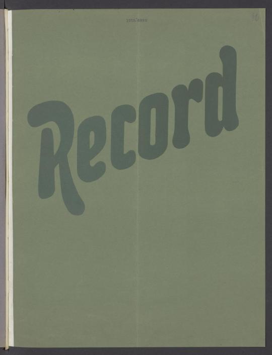
H. Berthold AG, Schriftgießerei Bauer & Cie., “Record”, 1915, Staatsbibliothek zu Berlin – Preußischer Kulturbesitz, Berlin, Germany
1 note
·
View note
Text
Designer Images Sources + Designer Research
Joseph Churchward
https://designersinstitute.nz/initiatives/black-pin/2009/joseph-churchward/interview/
Tobias Frere Jones
https://frerejones.com/about
Verena Gerlach
http://bitscon.asia/speakers/2015/verena-gerlach
Nadine Chahine
https://alchetron.com/Nadine-Chahine
Carol Twombly
http://luc.devroye.org/fonts-26216.html
Paula Scher
https://thegreatdiscontent.com/interview/paula-scher/
Jessica Hische
https://jessicahische.is/bloggable
Johnson Witehira
https://www.semipermanent.com/profiles/johnson-witehira
Fun designer facts !
Joseph Churchward
- Samoan-born typeface designer, created around 700 typefaces by hand with influences from his Pacific heritage and family. most popular font, Churchward 69, propelled him into the international market. The highly regarded German typeface foundry H. Berthold AG purchased his fonts for use in publications around the world. Churchward became the first New Zealander to have a ‘licensed original alphabet’.
https://teara.govt.nz/en/biographies/6c10/churchward-joseph
Tobias Frere Jones
- Typeface designer, multiple awards such as receiving AIGA Medal in 2013, designed widely-used fonts such as Interstate, Poynter Oldstyle, Whitney, Gotham, Surveyor, Tungsten and Retina.
https://www.semipermanent.com/profiles/tobias-frere-jones
Verena Gerlach
- Berlin-born, founded her own studio in Berlin in 1998, for graphic design, type design and typography. Now gives lectures and workshops about type and graphic design around the world and works as a freelance book designer for different art book publishers.
https://www.fontshop.com/designers/verena-gerlach#:~:text=Verena%20Gerlach%20was%20born%20in,design%2C%20type%20design%20and%20typography.
Nadine Chahine
- Lebanese designer, award winner and CEO at I Love Typography Ltd, her typefaces include: Frutiger Arabic, Neue Helvetica Arabic, Univers Next Arabic, Palatino Arabic, Avenir Arabic, Amareddine, Makdessi, and Koufiya.
https://uk.linkedin.com/in/nchahine
Carol Twombly
- American designer, best known for her type design, worked at Adobe Systems 1988-1999, designed or contributed to fonts such as Trajan, Myriad and Adobe Caslon.
https://en.wikipedia.org/wiki/Carol_Twombly
Paula Scher
- American graphic designer, at CBS she worked as the cover department art director, designing several hundred album covers, received four Grammy nominations for her designs, eventually left to pursue her own work, including the development of a typographic solution based on Russian constructivism and Art Deco.
http://www.artnet.com/artists/paula-scher/biography#:~:text=1948)%20is%20an%20illustrator%2C%20painter,layout%20artist%20for%20Random%20House.
Jessica Hische
- American lettering artist, illustrator, and author. prolific public speaker, appearing at colleges and conferences worldwide, has become as well known for her side projects as she has for her client work, doesn’t consider herself a web designer, but many of her personal projects are web-centric
https://jessicahische.is/bloggable#:~:text=She%20is%20the%20author%20of,%E2%80%9D%20working%20in%20Oakland%2C%20California.
Johnson Witehira
- An artist, designer and academic of Tamahaki and Ngāi Tū-te-auru descent. Co-founder of both Indigenous Design and Innovation Aotearoa (IDIA) and Waahi Wairua. On a mission to bring Māori culture into all aspects of New Zealand life, He has led the development of Māori design for some of New Zealand's most prominent organisations: The Auckland City Council, TVNZ, The Auckland International Airport, and Waka Kotahi (The New Zealand Transport Authority).
https://www.semipermanent.com/profiles/johnson-witehira
0 notes
Text
Global Microplate Instrumentation and Supplies Market Analysis, Key Company Profiles, Types, Applications and Forecast To 2026
Report Synopsis
Future Market Insights (FMI) offers a 9-year forecast of the microplate instrumentation and supplies market between 2018 and 2027. In terms of value, the microplate instrumentation and supplies market is expected to register a high CAGR during the forecast period. This study demonstrates the global microplate instrumentation and supplies market dynamics and trends across six regions: North America, Latin America, Europe, Japan, APEJ and MEA, which influence the current nature and the future status of the microplate instrumentation and supplies market over the forecast period.
Report Description
This research report provides a detailed analysis of the microplate instrumentation and supplies market and offers insights on the various factors driving the popularity of microplate instrumentation and supplies. The report includes an extensive analysis of the key industry drivers, challenges, microplate instrumentation and supplies market trends & microplate instrumentation and supplies market structure. The microplate instrumentation and supplies market study provides a comprehensive assessment of the stakeholder strategies and imperatives for succeeding in the business. The report segregates the microplate instrumentation and supplies market based on product type, sales channel, industry and different regions globally.
Request Report Sample@https://www.futuremarketinsights.com/reports/sample/rep-gb-8197
The microplate instrumentation and supplies market is expected to witness significant value growth during the forecast period owing to the rising adoption of innovative technologies and the availability of microplate instrumentation and supplies in different regions. The report starts with an overview of the microplate instrumentation and supplies market in terms of value. In addition, this section includes an analysis of the key trends, drivers and challenges from the supply, demand and economy side, which are influencing the microplate instrumentation and supplies market. A detailed analysis has been provided for every segment in terms of the analysis of the size of the microplate instrumentation and supplies market across different regions.
The next section of the microplate instrumentation and supplies market report contains a detailed analysis of the microplate instrumentation and supplies market across various countries in the region. It provides a microplate instrumentation and supplies market outlook for 2018–2027, and sets the forecast within the context of the microplate instrumentation and supplies market, which includes the latest technological developments as well as offerings in the microplate instrumentation and supplies market. This study discusses the key trends within countries contributing to growth of the microplate instrumentation and supplies market, as well as analyses the degrees at which the drivers are influencing the microplate instrumentation and supplies market in each region.
Key regions and countries assessed in this report include North America (U.S. & Canada), Latin America (Brazil, Mexico & the rest of Latin America), Europe (Germany, U.K., Spain, France, Russia & the rest of Europe), Japan, APEJ (China, India, Malaysia, Singapore, Australia & the rest of APEJ) and MEA (GCC Countries, Israel, South Africa & the rest of MEA). This report evaluates the present scenario as well as the growth prospects of the microplate instrumentation and supplies market across various regions globally for the period 2018 –2027. We have considered 2017 as the base year, and provided data for the remaining 12 months for the microplate instrumentation and supplies market.
To offer an accurate forecast, we have started by sizing the current microplate instrumentation and supplies market, which forms the basis of how the microplate instrumentation and supplies market will grow in the future. Given the characteristics of the microplate instrumentation and supplies market, we have triangulated the outcome of different types of analysis based on the services trends.
For any queries linked with the report, ask an analyst@https://www.futuremarketinsights.com/ask-question/rep-gb-8197
As previously highlighted, the global microplate instrumentation and supplies market is split into a number of segments. All the segments in terms of product type, sales channel, industry and different regions are analysed in terms of basis points to understand the relative contributions of individual segments to the growth of the microplate instrumentation and supplies market. This detailed information is important for the identification of various key trends in the global microplate instrumentation and supplies market.
In addition, another key feature of this report is the analysis of all key segments in terms of absolute dollar opportunity. This is traditionally overlooked while forecasting the microplate instrumentation and supplies market. However, absolute dollar opportunity is critical in assessing the level of opportunity that a provider can look to achieve, as well as to identify the potential resources from a sales and delivery perspective in the global microplate instrumentation and supplies market.
In the final section of the report, we have included a competitive landscape to provide clients a dashboard view based on the categories of providers in the value chain, their presence in the microplate instrumentation and supplies market, and key differentiators. This section is primarily designed to provide clients an objective and detailed comparative assessment of the key provider specific to the microplate instrumentation and supplies segment in the microplate instrumentation and supplies supply chain and the potential players for the same. Report audiences can gain segment-specific vendor insights to identify and evaluate the key competitors based on an in-depth assessment of their capabilities and success in the microplate instrumentation and supplies market place.
The detailed profiles of providers are also included in the scope of the report to evaluate their long-term and short-term strategies, key offerings and recent developments in the microplate instrumentation and supplies market. Some of the key competitors covered in the microplate instrumentation and supplies in the report are Beckman Coulter, Inc.; Biohit Oyj; Bio-Rad Laboratories, Inc.; BioTek Instruments, Inc.; BMG LABTECH GmbH; Eppendorf AG; Molecular Devices, LLC; PerkinElmer, Inc.; Tecan Group Ltd.; Thermo Fisher Scientific, Inc.; Agilent Technologies; Berthold Technologies GmbH & Co. KG; Promega Corporation and Tecan Trading AG.
Key Segments of Microplate Instrumentation and Supplies Market
By Product Type
By Sales Channel
By Industry
Microplate Readers
Microplate Washers
Microplate Dispensers
Microplate Accessories
Direct Sales
Indirect Sales
Pharmaceuticals
Food and Beverages
Chemicals & Polymer
Others
Key Regions
North America
Latin America
Europe
APEJ
Japan
MEA
U.S.
Canada
Brazil
Mexico
Rest of Latin America
Germany
U.K.
France
Spain
Russia
Rest of Europe
China
India
Malaysia
Singapore
Australia
Rest of APEJ
GCC Countries
Israel
South Africa
Rest of MEA
Key Companies
Beckman Coulter, Inc., Biohit Oyj, Bio-Rad Laboratories, Inc., BioTek Instruments, Inc., BMG LABTECH GmbH, Eppendorf AG, Molecular Devices, LLC, PerkinElmer, Inc., Tecan Group Ltd., Thermo Fisher Scientific, Inc., Agilent Technologies, Berthold Technologies GmbH & Co. KG, Promega Corporations.
Buy Report@https://www.futuremarketinsights.com/checkout/8197
About FMI
Future Market Insights (FMI) is a leading provider of market intelligence and consulting services, serving clients in over 150 countries. FMI is headquartered in Dubai, the global financial capital, and has delivery centers in the U.S. and India. FMI’s latest market research reports and industry analysis help businesses navigate challenges and make critical decisions with confidence and clarity amidst breakneck competition. Our customized and syndicated market research reports deliver actionable insights that drive sustainable growth. A team of expert-led analysts at FMI continuously tracks emerging trends and events in a broad range of industries to ensure that our clients prepare for the evolving needs of their consumers.
Contact
Mr. Abhishek Budholiya
Unit No: AU-01-H Gold Tower (AU), Plot No: JLT-PH1-I3A,
Jumeirah Lakes Towers, Dubai,
United Arab Emirates
MARKET ACCESS DMCC Initiative
For Sales Enquiries: [email protected]
For Media Enquiries: [email protected]
Website: https://www.futuremarketinsights.com
0 notes
Text
l’Helvetica c’est quoi ?
La typographie de caractère Helvetica fut dessinée par Max Miedinger, graphiste et typographe zurichois, en 1957.

lien image
Pour la créer, il se refera à la typographie linéale de la fonderie berlinoise H. Berthold AG, l’Akzidenz-Grotesk, conçue en 1896.

lien image
Max Miedinger et Edouard Hoffmann (directeur de la fonderie helvète Haas, situé à Bâle en Suisse) ont pour objectif de moderniser l’Akzidenz-Grotesk et de la rendre harmonieuse à l’oeil.

lien image
La composition de l’Helvetica est la suivante : une constante épaisseur de traits, une symétrie quasi parfaite et une terminologie horizontale ou verticale des caractères.
Elle symbolise la neutralité et la rigueur propre au style suisse. Le but de Miedinger est que l’on se concentre sur le message que livre la typographie plutôt qu’au style d’elle même.

lien image
Le succès de l’Helvetica fut observé la première fois au Salon international "Graphic 57" à Lausanne, sous l'appellation Neue Hass-Grotesk.
Elle est nommée ensuite Confœderatio Helvetica pour pouvoir être commercialisée.

lien image
Le saviez-vous ? L’Helvetica a pris part à la rivalité entre les deux géants Apple et Microsoft.
En effet, elle fut exporté au USA et de nombreuses enseignes achetèrent ses droits d’utilisation, dont la célèbre marque à la pomme, et contribua à mieux diffuser la marque. Microsoft n’eut pas cette chance et l’entreprise décide d’utiliser la police Arial, créée en 1982 et utilisée par défaut pour Windows en 1992. Elle a été dessiner dans le but de détrôner l’Helvetica.
Petite anecdote : Dans le logo Microsoft de 1987 à 2012, elle n’est pas composé de la police Arial, mais celle d’Helvetica, en gras et italique.

lien image
De nos jours, l’Helvetica est partout. Choisie pour sa neutralité et sa lisibilité, elle est présente dans beaucoup de marques …

lien image
Dans la signalétique des transports en communs…

lien image
... et comme typographie officielle du gouvernement canadien.

lien image
Il existe un panel de 110 versions de l’Helvetica, pour de nombreuses langues.
En 2017, Helvetica a fêté ses 60 ans d’existence et de nombreux graphistes ont réalisé des affiches typographiques lors de l’exposition 60helvetica, en hommage à celle ci. Ils en ont exprimé leur critique et leur vision de l’Helvetica;

lien image
En 2019, Monotype lance une grande opération de promotion de l’Helvetica Now, une refonte de la célèbre police.

lien image
0 notes
Text
International Typographic Style
Also known as the Swiss-style is a graphic design style that was created in Switzerland in the 1950′s that focuses on readability, objectivity, and cleanliness. it used typical features like asymmetric layouts, san-serif typefaces and flush left, ragged right text. Many of the early designs used typography as a primary design element as they focused mainly on typography as they viewed it as the root of communication and then other design elements like pictures where secondary.
Akzidenz Grotesk, The Typeface (1896)
It is a sans-serif typeface that was released by H. Berthold AG type foundry in 1896. It was the first sans-serif typeface to be widely used and influenced many later Neo-Grotesque typefaces. It is one of the major events that helped develop the international typographic style as Max Misdinger and the Haas Foundry and used it as an example to follow for the typeface Neue Haas Grotesk released in 1957 and was renamed Helvetica in 1960.

Josef Muller-Brockman
He was a Swiss graphic designer and teacher who studied architecture, design and the history of art at the university and Kunstgewerbeschule in Zurich. He opened his own graphic design, exhibition design, and photography in 1936. He is known for his simplistic designs and his use of typography, mainly Helvetica. His use of shapes and colours still inspire many graphic designers today.
Max Bill
He was a Swiss architect, artist, painter, typeface and graphic designer. He studied at the Bauhaus school in Dessau and from 1937 he was the prime mover behind the Allianz group of Swiss artists. He became a professor at the art school in Zurich in 1944 and in 1953 he and Inge Aicher-Scholl a design school that followed the traditions of Bauhaus.

0 notes
Text
Only the magic of Disney could turn the demonstration of a few “high-tech” measurement tools into an entertaining, interactive story that might actually be good at teaching kids (and adults!) some simple science concepts.
If you haven’t had a chance to see it before, the SpectacuLAB is a 30-minute play about an intern’s first day in a science lab learning about the lab’s cool technology through “experiments” that involve members of the audience! As of 2018, the SpectacuLAB is sponsored by Murata and most of the actors are real scientists from Science from Scientists, a non-profit that aims to get more 4th-8th grade kids interested in science. The show aims to teach force, acceleration, barometric pressure, and sound waves using Murata’s accelerometer, pressure sensors, and ultrasonic sensors.
Overall, the show is endearing and fun to watch at least once (I even saw the show as part of a second date!), but it wouldn’t hurt to incorporate more research-based evidence about learning science into the experience.

The Good
1. The show’s scientists are actually good role models for increasing diversity in STEM.
Research has shown that having a personal relationship with a scientist as well as seeing positive images of scientists increases students’ commitment to STEM and the SpectacuLAB can facilitate both of these. Both times I’ve seen the show, at least one performer has been a person of color or a woman (or both!) and kids have opportunities to start to build relationships with these scientists by participating in the show and asking them questions during Q&A. Although the majority of the audience is likely to be White and there are still many other institutional barriers hindering increased diversity in STEM, this show is a step in the right direction.
2. The show uses effective analogies, both to real-life experiences and across contexts.
To help explain pressure, the show makes analogies between ultrasonic sound waves making music to a car’s back-up monitoring, and to ears popping on airplanes.Incorporating students’ real-life experiences into science instruction is one of the most highly encouraged practices in the Next Generation Science Standards because it helps students see science all around them. There are also analogies between several applications of force – smashing one cup, smashing 1000 cups, applying weight to balloons, and laying on a bed of nails. This kind of careful control of what is being compared highlights what aspects are important for the scientific principle to hold – the distribution of force across a greater area – while downplaying more extraneous aspects – like the materials.
3. The show incorporates Jungle Cruise-esque humor and moments of suspense.
Although the empirical evidence on the effectiveness of humor and suspense on learning is weaker than for other techniques, there is some support that both are effective for creating memorable experiences. Humor has been shown to help memory (for punny jokes, in particular, see Summerfelt, Lippman, & Hyman Jr. 2010), and increases student motivation. On the flip side, the fear associated with moments of suspense may also be effective for learning. Usually suspense and fear are stressful and stress hinders learning, but the SpectacuLAB resolves the highly suspenseful moment of having someone lay on a bed of nails. Just like when music or horror movies resolve tension, the resolution of a suspenseful moment may help learning because it is a strong emotional experience. Both humor and suspense affect the dopamine reward system in the brain; linking the memory for science content with happiness from dopamine may help the learner retain the information longer.
The Less Good
1. The science doesn’t always work perfectly – especially the barometric pressure sensors.
The barometric pressure sensor game is very entertaining to watch but the sensors don’t always change color predictably, which can make the game frustrating for the players and confusing for trying to understand the science behind it. I think this demonstration could benefit from a screen showing a representation of air pressure in the room to explain what the different colors represent more than just a graph of where pressure is high or low. Even when the other experiments don’t go according to plan (like balloons popping unexpectedly or the ultrasonic drums being slow to respond), the scientists roll with the punches pretty well and this provides more opportunity for interrogation of the ideas after the show.
2. The show doesn’t allow for enough active learning opportunities.
Although holding a sensor is more active than sitting and watching someone else hold a sensor, this still isn’t the most effective way to learn. Active learning is when students (of any age!) are “engaged in” the learning process. Some examples that have been shown to be effective are self-explanation or even think-pair-share. Self-explanation – the process by which a student explains their own ideas to themselves through writing or speaking – has been shown to be effective for learning and retention, especially when dealing with multiple representations like in science. Think-pair-share is a common practice in classrooms at all grade levels in which students first think about their response, then tell a partner, and then share out to the whole class. These strategies are more effective for learning because they involve more construction of knowledge and questioning of relationships among ideas. Due to time constraints, these strategies are hard to incorporate in such a short show, but hopefully the show still inspires kids and adults alike to continue conversations about the content after they leave the theater to engage in more active learning.
3. The show could more strongly encourage more scientific practices.
Although the audience is exposed to a fair amount of scientific practices in the show – such as replication of results by repeating an experiment, manipulating independent variables (like stronger versus weaker applications of force), and interpreting data in graph forms – more opportunities could be built in for practices like making and revising hypotheses, and creating representations. When explaining force and pressure, there is some encouragement of making hypotheses but this could be incorporated more frequently and more broadly by getting the whole audience to share their ideas with even just a show of hands. Going along with the lack of active learning strategies, audience members don’t get the chance to demonstrate their understanding in scientist-like ways. Providing activity pages that encourage them to draw what pressure looks like, or make models about their predictions for additional scenarios could help them feel more like scientists. Outside of the theater, there are small interactive exhibits that allow visitors to practice more with the ideas from the show in authentic, scientist-like ways but these aren’t even mentioned during the show.
What are your thoughts on the SpectacuLAB? Which learning or physics concept would you want to know more about?
Additional Reading
Tsui, L. (2007) Literature review on strategies to increase the diversity of STEM fields
Allen-Ramdial, S. A. & Campbell, A. G. (2014) Reimagining the pipeline: Advancing STEM diversity, persistence, and success
Humor and learning popular press article
Humor and learning research article
Suspense and learning
Prince, M. (2004) Active learning
Berthold, K., Eysink, T. H. S., & Renkl, A. (2009) Self-explanation
Gentner, D. & Toupin, C. (1986) Surface similarity hinders analogy
Next Generation Science Standards
How spectacular is Epcot’s SpectacuLAB? From a teaching and learning perspective Only the magic of Disney could turn the demonstration of a few "high-tech" measurement tools into an entertaining, interactive story that might actually be good at teaching kids (and adults!) some simple science concepts.
#education#edutainment#entertainment#epcot#learning#physics#science#Science of Disney#scientist#spectaculab#STEM#technology
0 notes
Link
0 notes