#is this color/colour theory?
Explore tagged Tumblr posts
Visit Tumblr Blog
Explore Tumblr blogs with no restrictions, modern design and the best experience.
Last Seen Tumblr Blogs


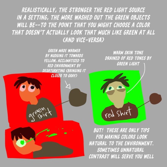
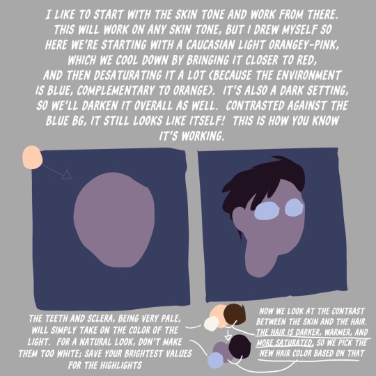
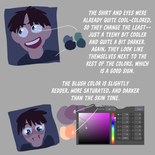
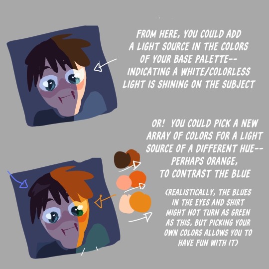
Fun Fact
Tumblr’s reach among the 26-to-35-year-olds in the US is 11%.
Text
@voidoffline
From my (extraordinarily limited) understanding, one way of thinking about it is that you basically look at whether you're using the additive or subtractive primary color/colour system, take the color/colour values, and then apply them to the opposite primary color system.
So, if you're using the Additive model, change your "Additive Red" value to the "Subtractive Cyan" value, your "Additive Green" value to the "Subtractive Magenta" value, and the "Additive Blue" value to the "Subtractive Yellow" value (Oh, and swap White/Light with Black/Dark).
Let's take these two images of the Additive and Subtractive Primary Colors/Colours:


And invert them!
(I used this online tool btw: https://pinetools.com/invert-image-colors)


Other than the letters, the Inverted Additive Primary Colors/Colours image looks identical to the Non-Inverted Subtractive Primary Colors/Colours image. And the same thing applies to the Inverted Subtractive Colors/Colours image, it looks identical to the Non-Inverted Additive Color/Colours image (ignoring the letters).
Also, if you look at a bright image for a while, then close your eyes, you should see an Inverted Version of the image!
Keep in mind:
1.) I don't actually know this stuff. I had some idea of it and wanted to see if I could answer your question so I looked into it a bit. While getting confused by whether the technical (not the colloquial meaning) Complementary Colors/Colours were the same as Inverted Colors/Colours and getting distracted (and confused) by Geometric Color/Colour Models, I had the thought of the Additive and Subtractive models being the Inverted Versions of each other and tested it (this is almost certainly a known thing already).
2.) this is just a way of thinking about it, even if it is a perfectly accurate way of determining what any given Inverted Color/Colour would look like (and I'm not 100% sure it is), it's probably not technically what it means to Invert a Color/Colour.
Also, OP, what the f***? That's a Photorealistic, Hand-Drawn, Inverted Color/Colour drawing. What the f***, what the f***, what the f***? How f***ing dare you make something so f***ing cool?! (Genuinely, really flipping incredible job!! Like seriously, that's amazing!!!)

Inverted ballpoint pen drawing!! The first picture is what I drew and the second picture is the inverted final piece
#colours#colors#inverted colors#is this color/colour theory?#I'll add those tags in case it is#color theory#colour theory
48K notes
·
View notes
Text
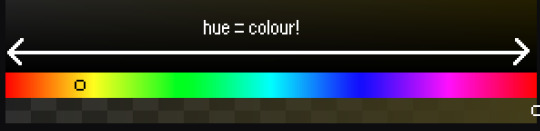
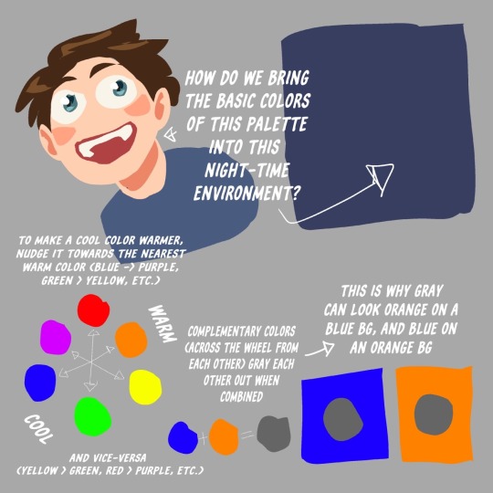
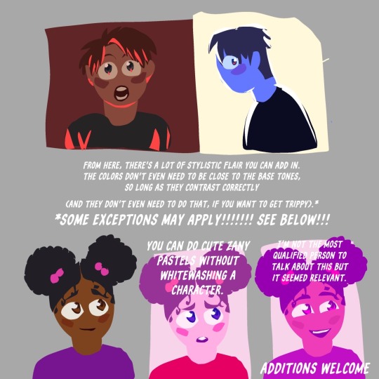
⭐ Pixel Art Fundamentals - Hue Shifting
This technique is not uniquely specific to pixel art, but it's a very common term to hear when starting out watching those "dos and don'ts" videos. So what is hue shifting?
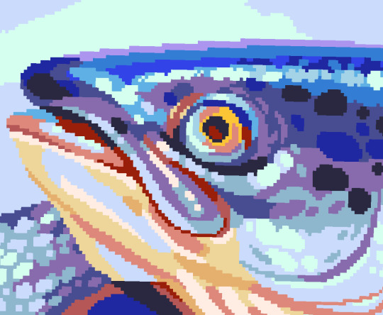
Hue shifting basically means to change the hue when making your shade darker or lighter. In this context, 'hue' = colour!
You may hear 'you need to hue shift more' when getting feedback on your art, but what does that mean really? Here are some examples:
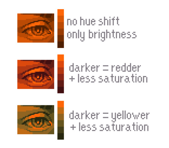
We can see even with just a bit of hue shifting, we have quite a different vibe for each drawing. In warm / daylight settings, no hue shifting can sometimes look a bit muddy or grey.
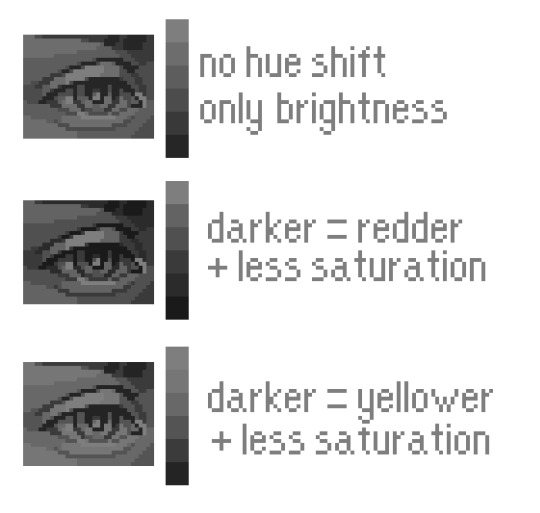
If we swap the image to grayscale, you can see that they look much the same:
As long as the hue shifted colours have a brightness that makes sense, they usually will work. You can get quite wacky with it.

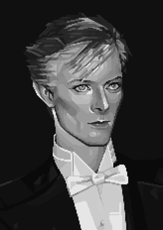
But is hue shifting always good? Not necessarily.
Below is some of my art where I intentionally didn't hue-shift at all. You can see it gives them an uncanny, digital, or photographic kind of look. As always, techniques are about your intention, or personal style.
I recommend trying different hue shifting methods! I especially love to use a cool blue or teal for the lighter shades.
Thanks for reading and I hope this helped a little! Have fun with it!!
⭐ Read my full pixel art guide here!
#pixel#pixelart#pixel art#pixel art tutorial#tutorial#art tutorial#colour theory#color theory#hue shifting#art#illustration#pixel illustration
5K notes
·
View notes
Text
Phan vs jedas RPF polls Suez canal glup shitto horse plinko live slug reaction I like your shoelaces do you like the colour of the sky Goncharov 1973 eeby deeby vanilla extract Nov 5th ides of march Tumblr TV summon crabs sexymen blorbo from my shows destielputinelection twitter downfall children's hospital colour theory sonadow generations ourgoodshadows no seriously imagine it car covered in hammers porn banned tramp stamps bug race muppet handjob corporate manufactured yaoi superhell
#deadpool and wolverine#phan#dan and phil#goncharov#goncharov 1973#bug race#vanilla extract#jedas#rpf#suez canal#glup shitto#live slug reaction#i like your shoelaces#do you love the color of the sky#eeby deeby#november 5#ides of march#tumblr tv#summon crabs#tumblr sexyman#blorbo from my shows#destiel putin election#twitter downfall#childrens hospital#colour theory#sonic x shadow generations#our good shadows#no seriously#imagine it#the croaker
212 notes
·
View notes
Text
Here's a colour wheel

Choose your favourite colour on this wheel
Got it?
Now choose your second favourite colour
Yes, good?
Now choose your least favourite colour! The hateful colour!
Okay
133 notes
·
View notes
Text
Toastyglow: “local colors!!!! relative hues!!!! listen I love a good adjustment layer they are so helpful especially when you need to work fast. but I also love picking special colors myself so here is a crash course in that–as I understand it, anyway.”
Source: Twitter toastyglow
#relative colors#art tutorial#digital art#art reference#art tips#illustration#drawing tips#local colors#relative hues#color theory#colour theory
422 notes
·
View notes
Text
This would look great outside a children's hospital
87 notes
·
View notes
Text

Slippery Eel
#color palette#color palettes#color#colour palette#colour palettes#colour#palette#palettes#colors#colours#colorful#color theory#blue#white#grey#gray#black
59 notes
·
View notes
Text
guys am i on to something abt lestappen
do you think that because charles stares at red so often, given that hes always surrounded by bright ferrari colours, that when he looks at Max, Max's blue appears more vibrant and pretty because its an opposing colour that he isnt as often surrounded by so his colour receptors in his eyes view Max in a brighter more vibrant hue than they would someone like Lando or Carlos who are also surrounded by reds and oranges and yellows, whereas max is just pure blue.
and vice versa for Max given that hes always surrounded by the deep dark blue hues and tones of redbull, that when he looks at charles he sees a pop of bright colour that he wouldnt get from someone like Alex or Lewis given that theyre both surrounded by various blues and teals
and that maybe thats why they enjoy hanging around each other so much, is because their eyes are naturally drawn to the brightest colours that they arent constantly surrounded by, and so in turn each becomes a sort of beacon for the other, and they are naturally drawn to one another over and over and over again
or am i just going insane because its 1 am
#formula 1#charles leclerc#max verstappen#mv33#cl16#1 am thoughts#im tired#lestappen#poetic#rambles#ramblings#formula one#ferrari#redbull#red bull f1#red bull racing#ferrari f1#scuderia ferrari#the brainrot is real#colour theory#color theory#max and charles
111 notes
·
View notes
Text
#red#colour#color theory#colour theory#color#artists#artists on tumblr#hellsite#tumblr#hellsite (derogatory)#polls#poll
120 notes
·
View notes
Text
an aside on our eyes and relative colour
I wrote a HUGE post on digital camera white balance, and this is just a little excerpt on one of my favourite aspects of colour: how slippery it is!
So!
If you light a scene with a flame, say in a campfire or on a candle, you know it’s giving everything a warm glow, right? The way it’s doing that is: the light produced by the flame is itself made of mostly red and yellow wavelengths of light. It’s not producing any light on the blue wavelengths.
The way we, or a camera, perceive color is by coloured wavelengths being reflected off the object we’re looking at. The object doesn’t create the coloured light, it requires light of the right color to hit it for the colours of the object to be visible. Sunlight, white light, contains the full spectrum of colours, and so in bright sunlight the light itself shows us all the potential colours – which means it changes none of them, which means the light itself feels white.
When the flame on a candle produces light, it’s mostly producing red and yellow light, which means if it encounters a red object, it shows us the red, but if it encounters a green object, it can only show us the molecules inside that green color that are yellow, and the molecules inside that green that are blue don’t reflect any light. To our eyes, this tints the object yellowish in the candlelight.
However, if you stay a long time in a room lit only by candles, you probably feel like you can see green and blue and purple colours a little still. As I understand it (and my neurologist family members will I’m sure be haunted by this maybe oversimplified info so please follow the rabbit hole here if you’re curious, it’s really interesting stuff!) this is your brain compensating for the tinted information by shifting your identification of colours, maybe to try and help you discern as much information as possible from the limited visual data. You don’t stop knowing it’s warm light, but you adjust to it.
As an example, and here I’m talking about your eyes, remember, not the camera tech yet (we’ll get back to it shortly), here is a photo of a candle.

First off, let me assuage your dress-related paranoia – this is a teal candle.
To me, looking at the photo, this is clearly a teal candle. You can see it’s a lovely seafoam green at the top where it’s warmer and glowing through the melted wax, and a much more vibrant blue farther down, away from the flame.
So let’s take a closer look at these colours! I have isolated a few into bigger dots and overlaid them on the image where they were eyedroppered from:
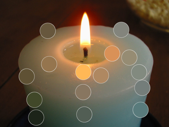
And here are the same colours just on a neutral 50% grey background.
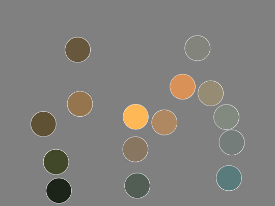
Here I have eyedroppered that brightest blue in the dots, the one on the bottom right of the image. This is how blue it is: not very blue! Pretty green still! Because that candle’s light cannot show us blue and purple wavelengths, we end up with an image where a cold green-grey starts to feel blue.
Our eyes work to compensate in limited-colour situations. We’re actually really good at it! And anyone who makes art commercially, anyone who designs colour for film and tv, advertising, fashion, games, etc? They all know this and use it when creating images. It’s why, given full colour vision, at a candlelit dinner, you can still tell your green veggies from your red ones.
And it’s not at all new! You can see this in Georges de La Tour’s famous candlelit paintings. The brightest light feels white, and colours still have some vibrance to them, and the scene feels rich, but, there’s no actual blues on the canvas, even though we have no trouble identifying the woman’s dress as light blue:

If you want to read more about how this applies to white balance settings on your cellphone or digital camera, the rest of the post is here:
#color theory#colour theory#white balance#relative colour#light temperature#photography#digital photography#candle#color#colour#agh
54 notes
·
View notes
Text
Sorry to put maths on your dash this early in the morning, but the polls to make colours are fundamentally biased, because all values should be independent to get the full spectrum. But in a poll, all values are related by the simple relation that a+b+c... = 100%
It means that most colours will not be obtainable from such polls !! Example given in RGB, to get white you would need 100% R, 100% G and 100% B. That is not a result you can get from a valid poll.
In more mathematical terms, if you project your RGB/HSV/whatever space on a cube where values ranges from 0% to 100%, the result set would be restricted to the intersection of this cube with the plane x+y+z=100. It's called Maxwell colour triangle.
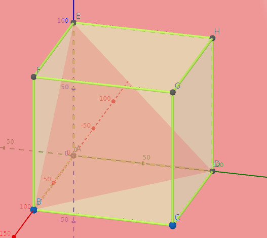
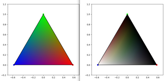
On left, Maxwell triangle for a RGB cube. On right, Maxwell triangle on a HSL cube. Plot code based on this website
So here you have it. The result from these polls will inevitably fall in these. cw spoilers I guess
EDIT : the joke about gay being bad at maths was a bit unconsiderate as it vehiculate stereotypical ideas. English is not my first language, and sometimes I would just replicate some things that I read elsewhere, but I should be more cautious. I edited it, but I thought it was important enough to acknowledge
Also edited some sentences a bit for clarity. Oh and also also : this is not inherently a bad thing, and poll makers are generally aware of this. I just want to share a fun fact !
#polls#colours#mathematics#rgb#HSL#science#maths#colour theory#color theory#color#spoilers lmao#science for your dash#please don't let me flop it took me 1h to gather all this data lol#I didn't eat because of that
2K notes
·
View notes
Text

68 notes
·
View notes
Text


something that took me some years to figure out is that desaturated colours are much easier to vary in hue because they are literally closer together


also the greys make your more saturated colours stand out more. if its all saturated then nothing really is
thats the power of the greys my friends
goot bye
1K notes
·
View notes
Text
We are able to hear a single tone. But we almost never (that is, without special devices) see a single color unconnected and unrelated to other colors. Colors present themselves in continuous flux, constantly related to changing neighbors and changing conditions.
Josef Albers, Interaction of Color
40 notes
·
View notes
Text

silly
#digital art#artwork#art#original character#illustration#clown oc#clowncore#colour theory#vibrant#colorful
86 notes
·
View notes
Text
Why does his ax glow like that
Color enthusiasts explain yourselves

#transformers#transformers g1#optimus prime#toy photography#transformers memes#transformers legacy#colors#colour theory#tf toys#tf memes#transformers photography#maccadam#figure collecting
27 notes
·
View notes