#relative colour
Explore tagged Tumblr posts
Visit Tumblr Blog
Explore Tumblr blogs with no restrictions, modern design and the best experience.
Last Seen Tumblr Blogs


Fun Fact
Tumblr.com rank in the US is 25.
Text
an aside on our eyes and relative colour
I wrote a HUGE post on digital camera white balance, and this is just a little excerpt on one of my favourite aspects of colour: how slippery it is!
So!
If you light a scene with a flame, say in a campfire or on a candle, you know it’s giving everything a warm glow, right? The way it’s doing that is: the light produced by the flame is itself made of mostly red and yellow wavelengths of light. It’s not producing any light on the blue wavelengths.
The way we, or a camera, perceive color is by coloured wavelengths being reflected off the object we’re looking at. The object doesn’t create the coloured light, it requires light of the right color to hit it for the colours of the object to be visible. Sunlight, white light, contains the full spectrum of colours, and so in bright sunlight the light itself shows us all the potential colours – which means it changes none of them, which means the light itself feels white.
When the flame on a candle produces light, it’s mostly producing red and yellow light, which means if it encounters a red object, it shows us the red, but if it encounters a green object, it can only show us the molecules inside that green color that are yellow, and the molecules inside that green that are blue don’t reflect any light. To our eyes, this tints the object yellowish in the candlelight.
However, if you stay a long time in a room lit only by candles, you probably feel like you can see green and blue and purple colours a little still. As I understand it (and my neurologist family members will I’m sure be haunted by this maybe oversimplified info so please follow the rabbit hole here if you’re curious, it’s really interesting stuff!) this is your brain compensating for the tinted information by shifting your identification of colours, maybe to try and help you discern as much information as possible from the limited visual data. You don’t stop knowing it’s warm light, but you adjust to it.
As an example, and here I’m talking about your eyes, remember, not the camera tech yet (we’ll get back to it shortly), here is a photo of a candle.

First off, let me assuage your dress-related paranoia – this is a teal candle.
To me, looking at the photo, this is clearly a teal candle. You can see it’s a lovely seafoam green at the top where it’s warmer and glowing through the melted wax, and a much more vibrant blue farther down, away from the flame.
So let’s take a closer look at these colours! I have isolated a few into bigger dots and overlaid them on the image where they were eyedroppered from:

And here are the same colours just on a neutral 50% grey background.
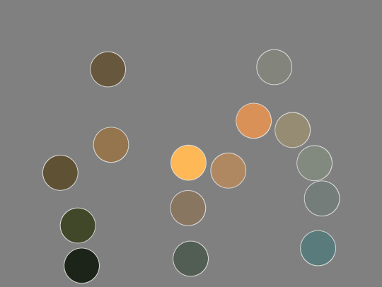
Here I have eyedroppered that brightest blue in the dots, the one on the bottom right of the image. This is how blue it is: not very blue! Pretty green still! Because that candle’s light cannot show us blue and purple wavelengths, we end up with an image where a cold green-grey starts to feel blue.
Our eyes work to compensate in limited-colour situations. We’re actually really good at it! And anyone who makes art commercially, anyone who designs colour for film and tv, advertising, fashion, games, etc? They all know this and use it when creating images. It’s why, given full colour vision, at a candlelit dinner, you can still tell your green veggies from your red ones.
And it’s not at all new! You can see this in Georges de La Tour’s famous candlelit paintings. The brightest light feels white, and colours still have some vibrance to them, and the scene feels rich, but, there’s no actual blues on the canvas, even though we have no trouble identifying the woman’s dress as light blue:

If you want to read more about how this applies to white balance settings on your cellphone or digital camera, the rest of the post is here:
#color theory#colour theory#white balance#relative colour#light temperature#photography#digital photography#candle#color#colour#agh
53 notes
·
View notes
Text

Run boy run!! The sex monsters eat salmon!!
In which i arrive Fashionably Late to the fishssek party
#critical role fanart#critical role spoilers#click for better quality i did my best w what i haddd#caleb widogast#essek thelyss#shadowgast#critical role animation#look at him flop!!#no i didnt work an extra week just to get the flop just right what are u implying XDDD#all for the memes#alll for the meeeemesss ^^♡#u will not Believe the journey it took me i staryed animating traditionally until i had a badic run cykle#downloaded flipaclip and did some tweaks#two weeks later of getting shapes cobsistent and coloured and here we aaareee#t h e n i had to find a way to make a relatively high quality gif bc my first few attempts were a wash tbh#anyhoo i made it !! :33#and Yes i know its a bit late in the dayyy but IM IMPATIENT#* throws a salmon ur direction w gusto *#man i miss csp..... one day ill have a functioning computer screen
3K notes
·
View notes
Text


sillies i forgot to post here
#someone on insta said the colours reminded them of the powerpuff girls#switched them around a little because i wanted to make stan be buttercup#fiddleford mcgucket#stanley pines#stanford pines#mystery trio#gravity falls#gravity falls fanart#artwork#gravity falls au#relativity falls
707 notes
·
View notes
Text


BANG CHAN ★ [deadpool & wolverine] 내·친·소 ⋆ marvelkorea@YT
#skz#stray kids#bang chan#bangchan#staydaily#bystay#staysource#channiesnet#userlau#:mine#t:gif#t:interview#sayang#big gifs are hard#idk how to colour sorry...#they are relatives not triplets#but anyway i saw a clip of the first gif and lost my shit#hes sooooo beautiful
479 notes
·
View notes
Text

early 2020 jerma streams be like
#this is just referencing a cat image lolol#back on my bullshit#jerma985#jerma#jerma fanart#excuse any wonkiness pls i did this in one sitting this morning and cant stand revisiting drawings so its going up as is#first portrait type painting in a while... i always love figuring out the colours of the cams from this era of streams#colour relativity is wild
1K notes
·
View notes
Text
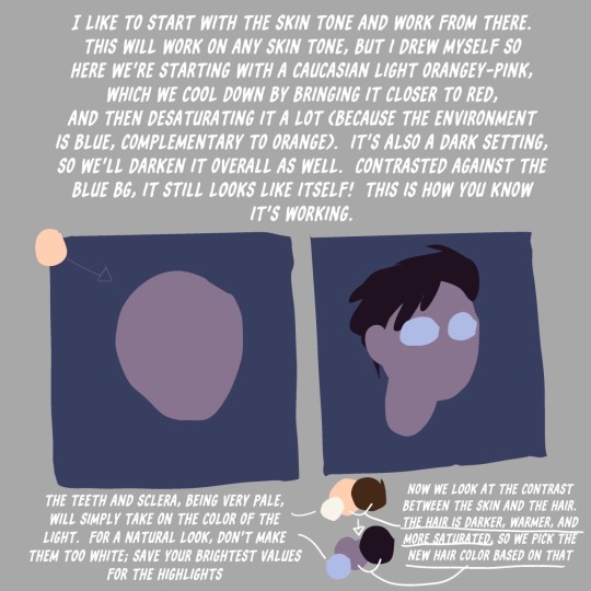
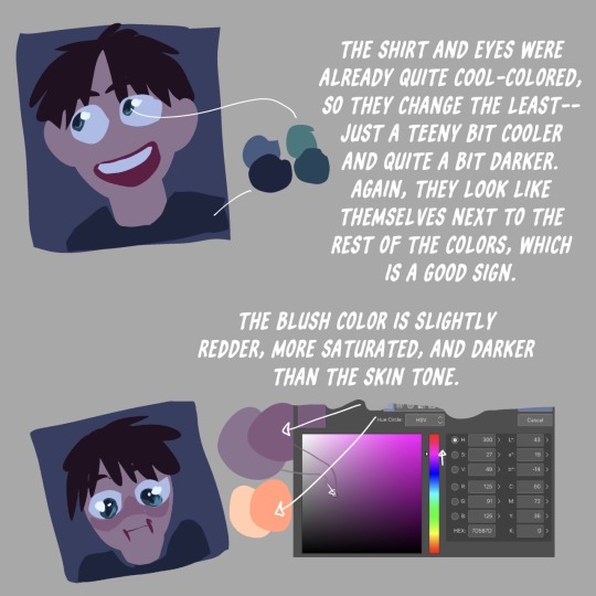
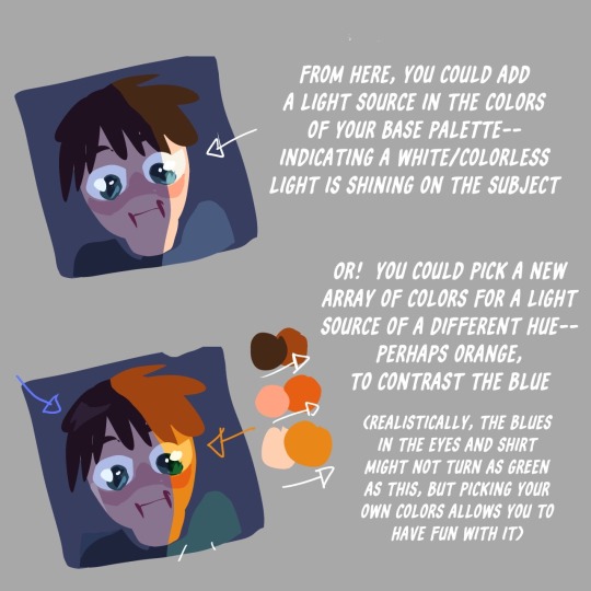
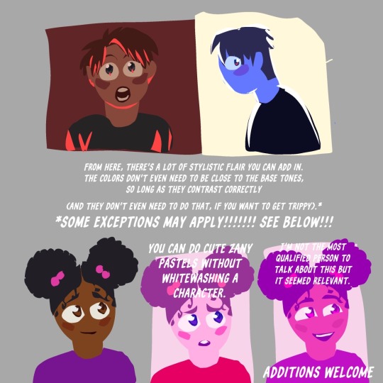
Toastyglow: “local colors!!!! relative hues!!!! listen I love a good adjustment layer they are so helpful especially when you need to work fast. but I also love picking special colors myself so here is a crash course in that–as I understand it, anyway.”
Source: Twitter toastyglow
#relative colors#art tutorial#digital art#art reference#art tips#illustration#drawing tips#local colors#relative hues#color theory#colour theory
419 notes
·
View notes
Note
Do you have a process in how you created the sprites in the L&L cuz they look simple but fit with the background really well!


This general process is the same for each character, though the complexity depends on what the character needs.

Unsurprisingly, the MC has the most... everything, while a character like Veda only has one body sprite and a handful of expressions.
#love and legends#art ref#tutorial#art style#visual novel#visual novel sprite#art#the background thing is also entirely a coincidence as I just rendered in my own art style#but i'm glad it works out#since love and legends is relatively light i kept shadows and the contrast pretty light#vs my vampire designs where i went harder into heavy shadows and deep colours
172 notes
·
View notes
Text


Meet Animus and Avarice, two lovers ensnared and animated by a long-forgotten cursed hoard of gold. They are a part of the hoard now.
This pair was six years in the making. First the target was grapefruit sanguine sanguine, then grapefruit sanguine crimson after realising how sick koi looked that way. @hor-wod-flir took over the final leg of the journey, ending a breeding project that has been going since at least May 2018.
(They are now a hatchery pair, and will produce little cursed goldlings together.)
#flight rising#flight rising dragon share#flight rising imperial#if you have a gold red red range dragon chances are i bred it or its relative or have a relative in my stock#my main pair i bred for years is nicholas and arrakis. they have LOTS of kids out there#but there's also spar and sang or spar and quicklime that bred a lot#i know other people liked the combo and bought the kids and bred it on. ive seen them#but when i started this project there was almost nothing on the site in their range#by my hands have i proliferated this colour range upon flight rising#malign fortune
59 notes
·
View notes
Text
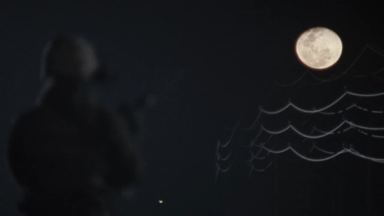


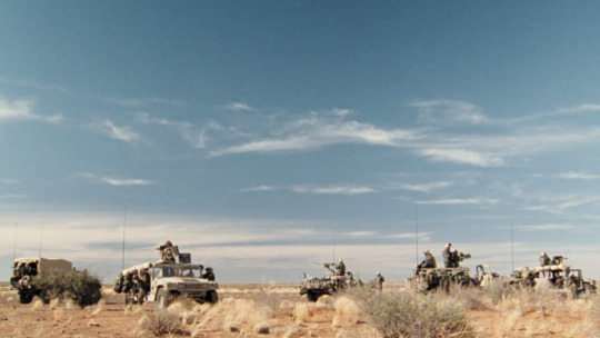


Generation Kill + scenery 🌈
#generation kill#see? it’s not beige *all* the time! …please come back…#challenged myself to do this with relatively little colour correction so ‘muted’ is the word of the day here
101 notes
·
View notes
Text
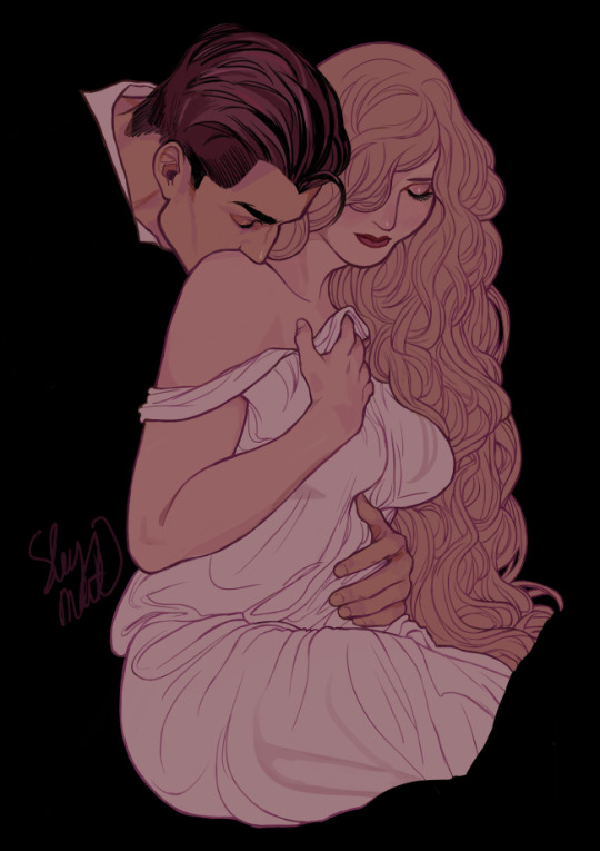
Hidden Ones
#hades#persephone#interpretations: greek pantheon#greek history au: phlegethon#OCs#OC artwork#creative outbreaks#can you believe I started this years ago#but never liked the rendering and started over 283523 times#well I decided to just post it with (relatively) flat colours
958 notes
·
View notes
Text
I got a new laptop today to draw on and tested it out with the boy ! He’s blue now

Blanji (blue sanji)
#it’s a second hand gift from one of my relatives#also this is a colour theory test ig#my art#op sanji#sanji fanart#one piece sanji#black leg sanji#sanji
29 notes
·
View notes
Text

birdified my blorbos
#oc#original character#birds#illustration#oc art#oc: felice#oc: selma#oc: freddie#oc: karoliina#oc: folke#oc: jan#pareidolia tag#i wanted to keep their colours relatively natural arvo is the exception bcs#if i did itd just be him. but normal bird
194 notes
·
View notes
Text

Thalassophobia - 2/4
Scripting a room full of people is all fun and games until you have to like. Actually DRAW a room full of people.
1
#solstrix draws#solstrix makes comics#monster high#my art#mh#lagoona blue#toralei stripe#clawdeen wolf#ghoulia yelps#draculaura#Cleo de nile#frankie stein#toragoona#I LOVE drawing these characters to be clear but. god. having to remember which one was positioned where in space relative to each other..#colours got a little washed out somehow from my tablet to this... hm.
17 notes
·
View notes
Text

Have a Skyquake I made studying intently at tfp concept art plus also made using green and pink shading/highlights as opposed to my usual purple and yellow combo :)
His pose may be a little stiff but well it's more of a study (ignoring half of the body that i might've wanted to study lmao)
#skyquake#tfp skyquake#transformers#tfp#maccadam#fanart#not only was this a different lighting colour it was also bottom lit so that was also a bit of a logic challenged#if you see me bullshit some stuff no you don't lmao#it's been a relative while since i've drawn robo quake (last time i drew skyke he was a human)#(which the last time at all was in 2022 at least digitally)#i forgot how much the tfp bots have comparatively turtled their necks into their body- compared to humans or even tfa style bots
90 notes
·
View notes
Text


"Seeing Swerve Strickland with that Killmonger type gear from #BlackPanther along with the robe of the Late Jimmy Rave, that was just a whole Vibe!! #AEWDynasty #ProWrestling #WrestlingTwitter Jimmy Rave would have been impressed with that entrance." - posted by @MrKingCoop on twitter, april twenty first, 2024
#aew#swerve strickland#prince nana#jimmy rave#the crown! jewel!#i hope he's resting in peace but also wilding. i hope he is sleeping easy but also losing his mind. i hope he is watching.#okay eight in the morning and i can be relatively average again now#[ colour commentary ]
34 notes
·
View notes
Text

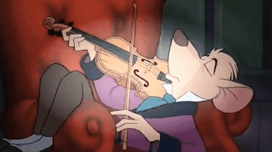


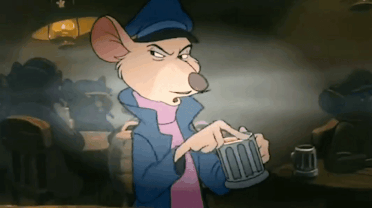
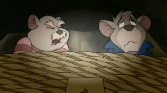
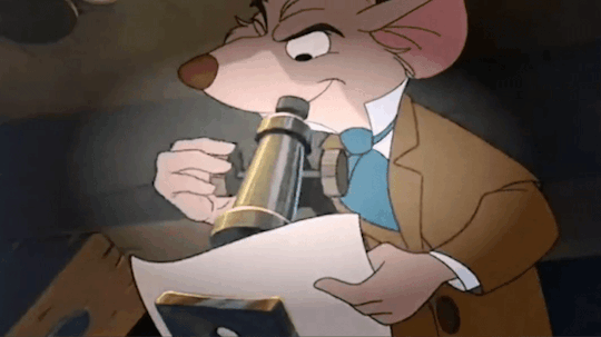


Pt. 1 - Pt. 2 - Pt. 3 - Pt. 4 - Pt. 5 - Pt. 6 - Best of
I didn't expect this to be a good Sherlock Holmes adaption, but it is!
#okay making 60 gifs at least helped me recognise what will work (relatively) well#these are in rough chronological order#i tried to arrange them in a way that makes the colours work#sadly I have no sense of aesthetics whoops#basil of baker street#the great mouse detective#disney#sherlock holmes#gifs#my gifs
127 notes
·
View notes