#and book 3 is FANTASTIC
Explore tagged Tumblr posts
Text
its kind of serendipitous that after my brain ordering a halt on 90% new media the past 3-ish years, it FINALLY lets up and i'm allowed to start in on the stack of books i bought two ENTIRE years ago. i looked up the series and the next book is out this august.
i finished book 3 in two days, now i'm on book 4. Pretty sure I can do it and 6 plus the short story anthology in plenty of time to grab that when it comes out.
book 4 is a little harder to engage with bc it's a departure from the rest of the series so far, and the two protagonists are 9, if very VERY smart 9 yer olds.
#each book covers a pretty short amount of time tbh so even tho the first book was written in 2012 in universe it's been less than a year#this would be the elfhome series by wen spencer#i loved the first two books when i first got them years ago#and book 3 is FANTASTIC#and 4 is interesting i'm just reading the nonsense these two BABIES are about to get up to and going oh NO#to say nothing of the way the bad guys in this series are frankly about six steps beyond horrible#i'm sure it will be fine#me#my life#books
6 notes
·
View notes
Text


Absolute Batman
#deadpool 3#deadpool and wolverine#hugh jackman#ryan reynolds#the batman#batman#superman#smallville#dc#dc comcis#dclifestyle#robert downey junior#henry cavill#ben affleck#absolute batman#trending#movie#viral#vintage#new look#fantastic four#kraven the hunter#spiderman#tom holland#tobey maguire#andrew garfield#x men 97#dc comics#comic books#comic con
242 notes
·
View notes
Text
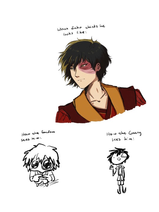
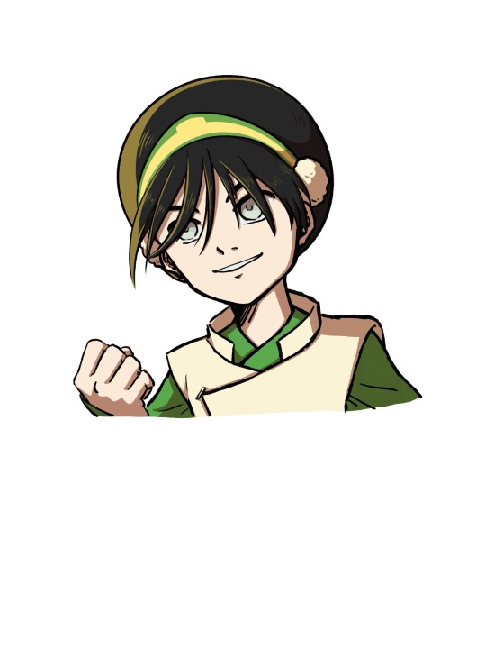
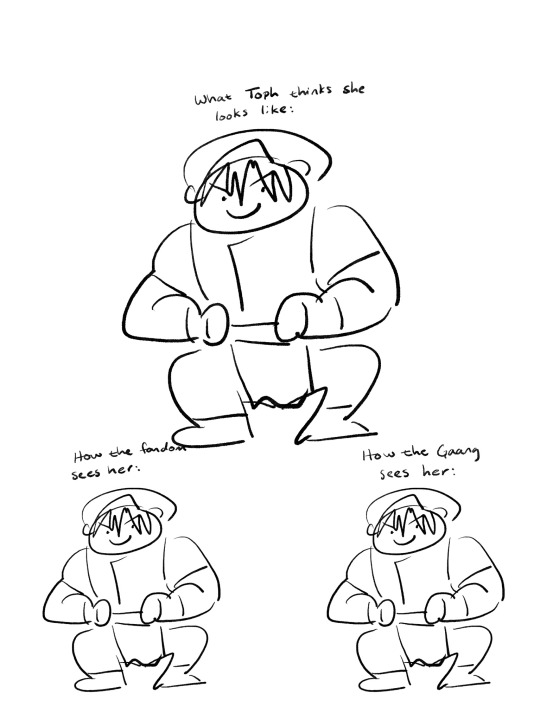
So basically ATLA brain rot has hit me like a truck
#atla#avatar the last airbender#zuko#toph beifong#what happened was I was forced to watch the live action#which is actually pretty good if you get past the first few episodes#and if you don’t have someone in your ear telling you it’s awful the whole time#first episode is definitely the weakest and that’s 50% gran gran’s fault#aang and katara are also pretty flat but whatever#sokka’s good and zuko’s fantastic actually#they did goof on a few things but overall I think it’s a fun time#just don’t expect it to be as good as the cartoon and you’ll be okay#ANYWAY it got me missing toph#so i rewatched the blind bandit episode#and then wound up watching the entirety of books 2 & 3 in a few days#and now I’m brain rotted#which is especially weird considering when I first watched it I was like#yeah that was good! and then never thought about it again#i dunno what changed but i need help it’s taking over my life#wanted to draw Sokka too but he looks hard to draw#and i had enough trouble with these two#maybe someday#sorry for rambling in the tags goodbye
187 notes
·
View notes
Text


embarrassingly, this is not the first time i have fixated on an Ice Guy™. they're just the...coolest...type of guy!! 🥁❄️
#favourite kind of powers. favourite Pokémon type. favourite aesthetic. ice-themed characters always look fantastic 🌨️☃️🌨️#i'm sure there will be others buried somewhere in the long long book cataloguing my beloved fictional favourites#and more to come in the future 😉#jack frost#winter king#snow miser#touya#the santa clause 3: the escape clause#simon petrikov#fionna and cake#the year without a santa claus#rankin bass#yu yu hakusho#yyh#the santa clause 3#the santa clause#toya#starleskatalks
57 notes
·
View notes
Text

From Spider-Man: Quantum Quest! (A Mighty Marvel Team-Up # 2) by Mike Maihack
#fantastic four#reed richards#susan storm#Johnny storm#Ben grimm#Reedsue#Such a cute and fun book. Love how happy Reed is to be reunited <3
84 notes
·
View notes
Text
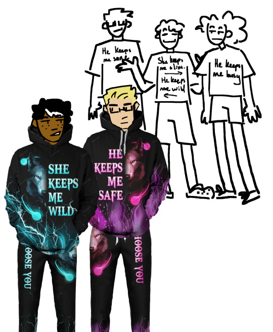

*puts them in a petri dish*
#i rlly like these guys#i think about them a lot#too bad only 3/5 of the books in hoo were actually good#oh well such is life#anyway by drawing them all i can pretend jason isnt dead#and i can pretend that piper got to be an interesting character#sighhhhhhh#also yes percy wears crocs im gonna stand by that#shoes that can get wet? fantastic for him!#percy jackson#pjo#hoo#annabeth chase#jason grace#art by cricket
35 notes
·
View notes
Note
The art style of Cloud Castle is absolute ass bro why are their eyes so big
Idk man it just looks.... off
I wish they brought back the og art style like Blue Scarab Hunt because that was gorgeous
Well if you’re referring to the book's artstyle as a whole, then calm down buddy the illustrations as a whole are pretty good all things considered (believe me some of the illustrations in the later books are waaaaayyyyy iffier)
But if you are referring to Danilo Barozzi’s illustrations in the book then uhhhhh… yeah I don’t blame you, I didn’t like the big anime irises either, she didn’t cook with this one,,,
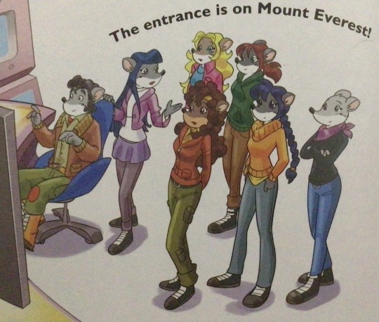
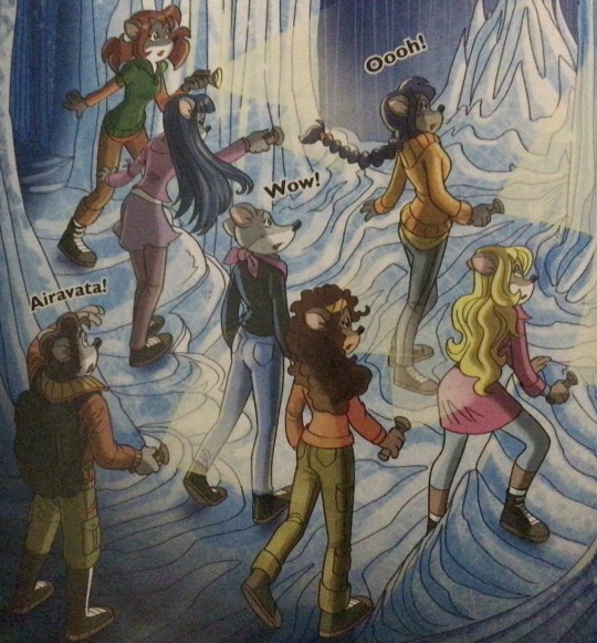
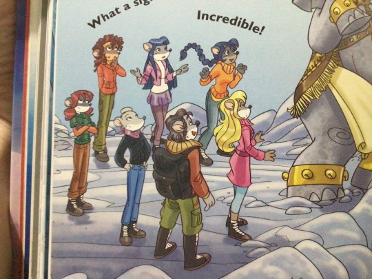
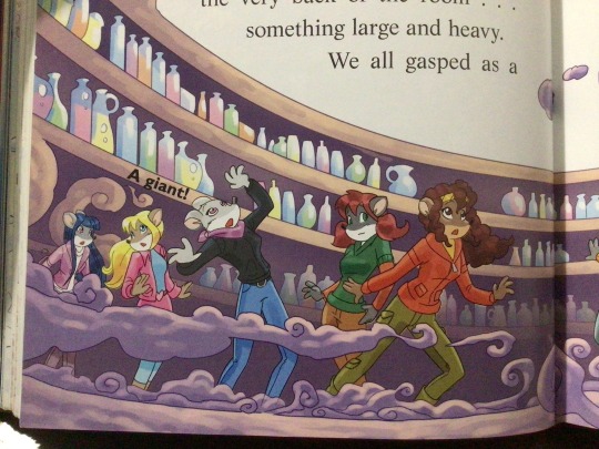
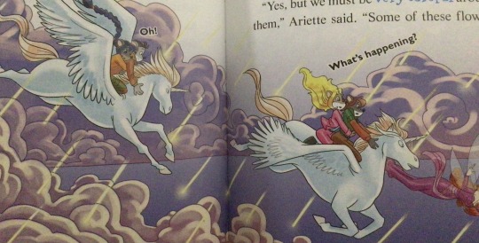
The interesting thing is Barozzi also did pieces for Secret of the Snow and those looked fine (she did well enough that I have to squint to determine which ones were done by her). My guess is either she did a lot of the illustrations for the latter half of SotS and we just got used to it, or it’s because the artstyle of special editions 2 and 3 were more… experimental? Books 4 onwards developed a very specific… look for the artstyle that adhered very closely to the main book illustrations of Spanish Dance Mission onwards, thus the illustrators had to follow suit, resulting in whatever looks off to look especially off.
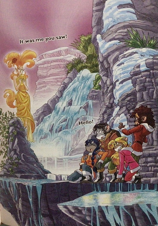
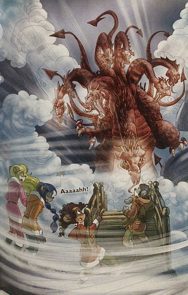
(Even with this set of pictures, I’m only about 70% sure these are Barozzi’s because of how alike yet different the styles are from each other in the book. The first one could be Barozzi’s, but it could also be Giuseppe Facciotto’s, since he also did illustrations for SotS and his stylization means he sometimes puts the eyes really close to each other in a way that’s weird but still makes sense somehow.) On the contrary, books 2 and 3 (and I would probably even include book 1 there) had a more experimental look to the illustrations, which seems to be based more on (and this is just a theory of mine) Giuseppe Facciotto’s iconic work for the covers of Mouseford Academy books 2-12, 14, 15 and 17 in the English books (he did waaayyy more covers for the Italian Mouseford books— he was basically the cover guy for the Mouseford books for a WHILE) as well as the books from Spanish Dance Mission to Lost Letters. If you’re wondering why those covers go as hard as they do, then now you know why.
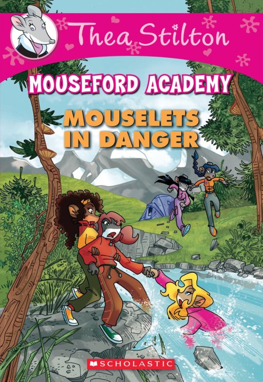
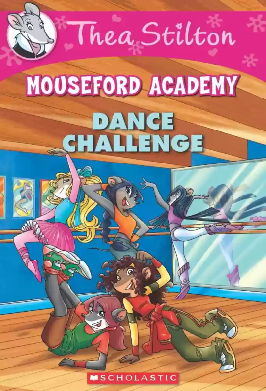
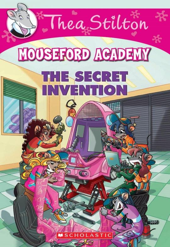
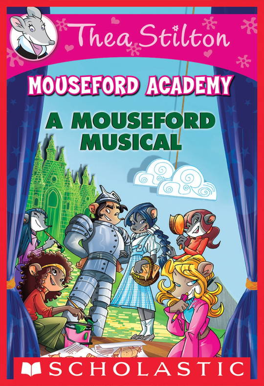
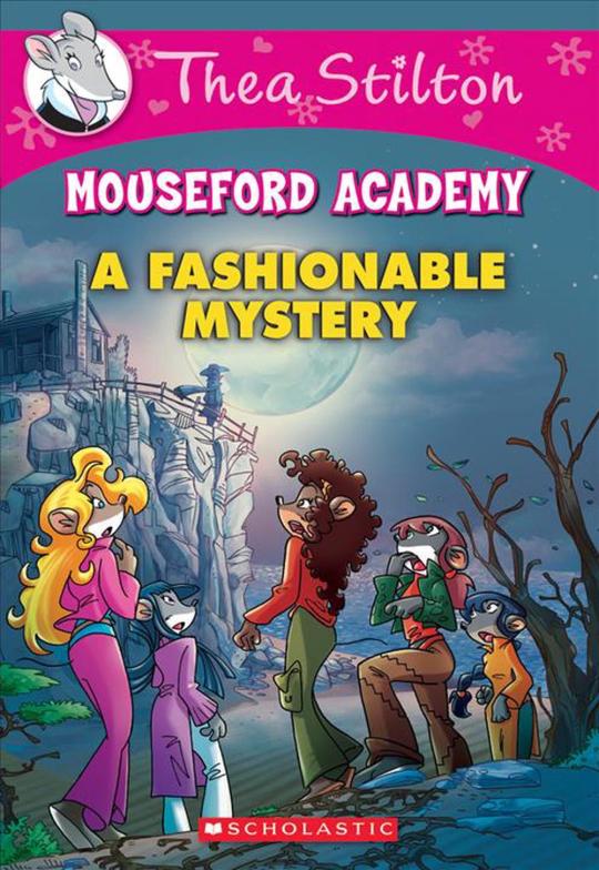
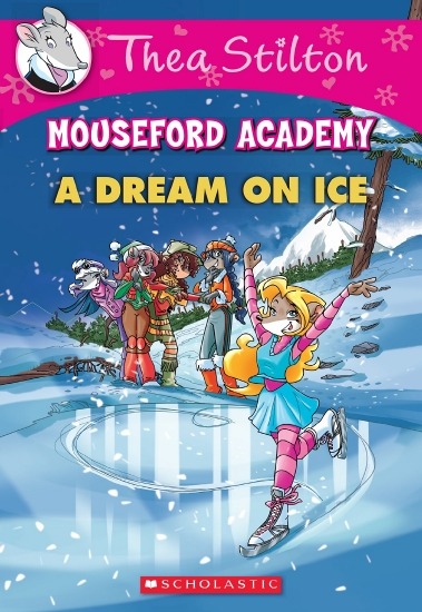
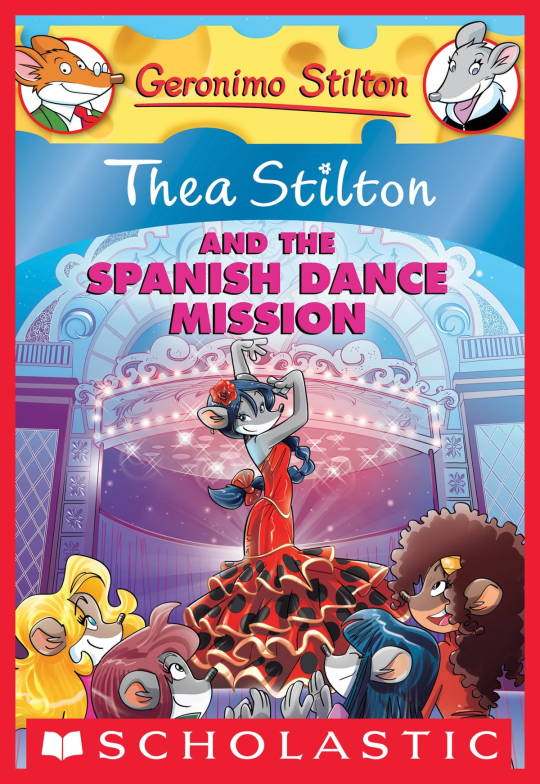
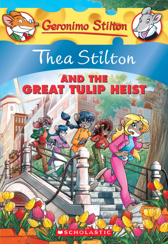
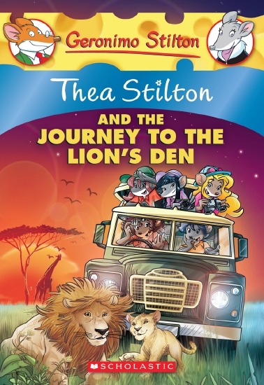
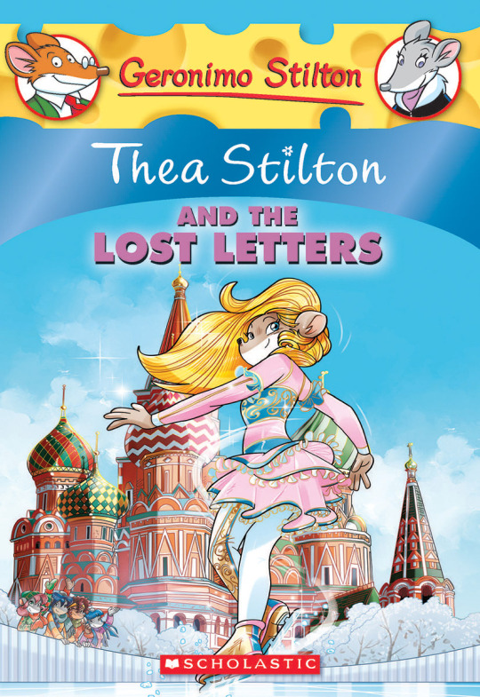
(These aren’t all of Facciotto’s works for the covers we know in English but you can see that he popped off <3)
But yeah as you can see with special editions 2 and 3, the art direction seems to be heavily inspired by Facciotto’s artstyle.
However, when Barbara Pellizzari’s works became the aesthetic poster child of the books’ brand, that was reflected in the illustrations and how their aesthetic changed, as seen in the main books and how they look currently, special editions 4-9, and the Treasure Seekers trilogy.
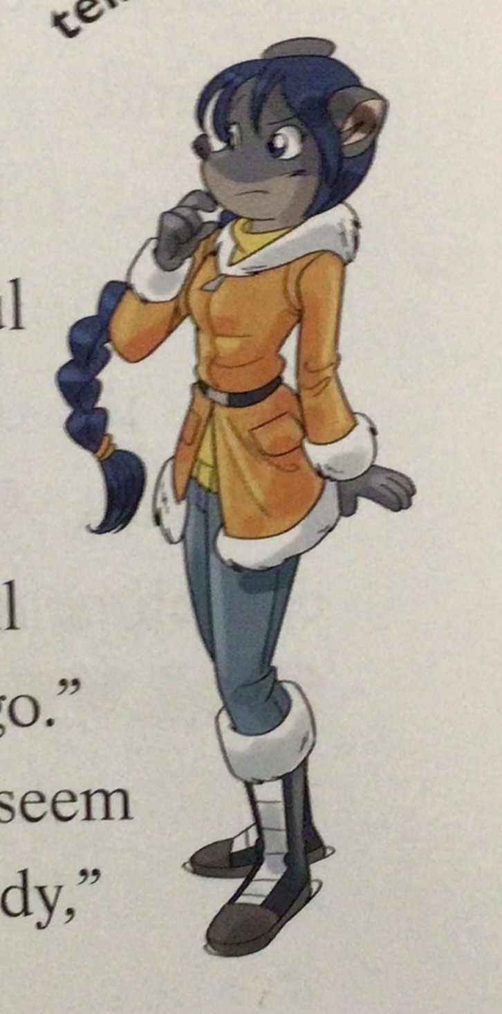
This new profile thing of the girls? This was done by Pellizzari (coloring was done by Flavio Ferron), and thus it became the main reference for how the girls look in the book’s illustrations.
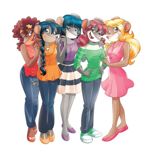
And it’s not just in the general direction to the artists for how to draw the Thea Sisters, but also in the direction given to the colorists. Alessandro Muscillo was the colorist for the special edition books since book 1 and the Treasure Seekers trilogy, and you can see that the direction for the style varied through books 1-3, like maybe direction was experimenting with the mood the illustrations were to convey, beginning with the cartoony and bright colors of book 1, easing into the more grounded and layered palettes of books 2 and 3
Then book 4 was when they transitioned to using digital art /j
I jest, but seriously book 4 was the debut of the coloring style we end up keeping for the rest of the special editions and for all of Treasure Seekers, which is very… bright :D
(I would show more picture examples but I manually took pictures of my physical copies for the Cloud Castle and SotS illustrations and gwuh I’m too lazy to grab my entire collection just to take pictures,,)
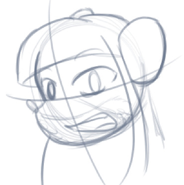
Bright as in like… the colors are very defined and saturated. I dunno how to describe it, but when you see it, you get what I mean. It’s very bright and pretty and colorful and it stands out. There are still variations that happen on occasion (Star Fairies in particular uses a good dose of airbrush for the lighting and shadow effects, and Crystal Fairies looks like someone had a bit of fun using sparkle brushes), but other than that, it’s very bright. I don’t hate it, but I do acknowledge that yeah, if I was introduced to the series when it had fully transitioned to the new style, I never would’ve gotten into the series in the first place, because the older books had something that didn’t make it feel specifically catered to girls. The colors were bright, but not too bright. Colorful, but unified. They weren’t that complicated, and they didn’t have to be because the colorists (plural, there were at least 3 per book once upon a time) were popping the hell off with the colors they were given. But y’know, the newer books’ consistent style did give me a good spot to practice drawing mouse furries so I’m not complaining too much about the newer style, haha.
(Tiny baby E’s (it’s literally from 2020 what’re you on about mate) her first mouse Violet drawing using Barbara Pellizzari’s artstyle in Treasure Seekers 1 as an anatomy guide!!)
With that said tho, yeah I miss the old books -m- dunno if it’d fit the aesthetic of the special editions but m a n we could’ve had it and it probably would’ve looked cool
Also the illustrations go way harder in the older books, like Prince's Emerald? I've talked about Prince's Emerald and how it goes hard before, and I still stand by it and say that it does in fact still go hard
Maybe it won't fit the uh splash of color they gave the hardcovers, but imagine they grabbed Giulia Basile's coloring work for the graphic novels and used that as sort've a basis for the coloring style of the hardcovers. Not exactly the same-- would probably still add a touch of whimsical watercolor and/or paint to the very cel-shaded style, but we could've had something pretty dope -m-
Anyway that's my ramble simultaneously defending the hardcovers' artstyle and reminiscing on what could've been haha
#geronimo stilton#thea stilton#thea sisters#questions with e#rambles#the style of the older books is gorgeous but the main thing I'm wondering is can it pull off fantastical whimsy#that's the main thing i dunno if it can do (i would love to be proven wrong tho)#the style is so grounded that i'm wondering if it can pull off what the hardcovers needed it to do#which is convey the otherworldly fantastical thrill of exploring the fantasy worlds (which uh the newer books were able to do but#my main gripe is that fantasy and reality are near indistinguishable in vibes coloring-wise#sure there are sparkles and stuff is more saturated but the girls' dorm in book 4 still has the same-ish feel of the land of clouds#i dunno what it is. the bright colors just feel mundane somehow and don't take a shift when returning to reality)#looked at my books again and i think it might be the fact that the later books have no grounding color?#compare book 3 to book 5 and you'll see it the most distinctly methinks#the newer coloring style doesn't have a color that grounds the illustrations' palettes and thus everything's always bright 100% of the time#the girls' colors are always at their most saturated#like they're always under broad daylight in terms of lighting#it's not eyebleeding or anything but they don't look affected by the lighting in the setting they're currently in#and the result is it looks.... meh?#we get so used to the bright colors that they end up looking meh somehow#i'm not an art expert by any means this is just my observations as someone with a little too much brainrot
42 notes
·
View notes
Text

From "Chapter 3 Let the World Beware!" in Fantastic Four #4, May 1962. Stan Lee script, Jack Kirby pencils, Sol Brodsky inks, Stan Goldberg original colors, Artie Simek letters. Photoshop color reduction.
#chapter 3 let the world beware#let the world beware#fantastic four#fantastic four 4#stan lee#jack kirby#sol brodsky#stan goldberg#artie simek#mr fantastic#mr. fantastic#mister fantastic#train#eye doctor#hats#marvel#marvel comics#comic#comics#comic book#comic books#reed richards#silver age comics#1960s#60s
11 notes
·
View notes
Text
A lil post about my interests!!
bc why not, also great chance to make new friends :]
My favorite shows!!!

Anime i like!!!

My favorite movies!!!

My favorite games!!!!

heavy on nitw, ultrakill and tf2 :3
My favorite music artists!!!

represented by my favorite album of theirs :3 (Cavetown - Lemon Boy, Fredo Disco - very cool music for very cool people, Tyler, The Creator - Goblin, Set It Off - Duality)
My favorite book series!!!

Lastly, here's a few artists on here i think are sooooo cool!!!


love these blogs 🙏
#my interests#about me#introductory post#stuff i like#my little pony friendship is magic#its always sunny in philadelphia#greys anatomy#jojos bizarre adventure#jjba#mlp#iasip#beastars#saiki k#chis sweet home#tokyo ghoul#tv shows#anime#movies#books#video games#music#everything everywhere all at once#9#9 (2009)#fantastic mr fox#gotg#gaurdians of the galaxy#gotg 3#night in the woods#nitw
8 notes
·
View notes
Text
next time i go in for a tattoo i’m getting the mark of the resistance tatted also
#dq liveblog#it actually means so much to me. all of this book means so much 2 me#city of the rats was the first dq book i ever read and i’m so glad it was#book 1 is fantastic but it’s just different from all the others. book 3 is an amazing introduction to the series#because it’s so strong in all the rodda aspects. the noradz plot twist. the strange magic of opal territory.#the characters are friends now but they’re still not united and it’s such a fun stage in their relationships#i just think my reading experience would have been very different if i started reading from the beginning#city of the rats
11 notes
·
View notes
Text
Lowkey hyperfixating now and I’ve come to the devastating conclusion that Jacob the main character of Water For Elephants… doesn’t really have a character arc
#or like#flaws#which is#bad?#like oh no that’s why every other character feels so much more 3 dimensional than him oops#so that puts a damper on my general opinion of the show#like oh no the book is missing the arc for its main character#I do wonder now if he had more of an arc in the book or the movie#but like#oh no the main character doesn’t have any character flaws#and like all the other characters are great marlena and august and fantastic#jacob is. a guy. he’s polish and he’s a vet and he’s sad. though honestly the sadness could have been more integrated into his character#like all the other characters got arcs at least a little#but jacob doesn’t really change throughout the story#which makes sense as to my thoughts yesterday that his and August’s relationship was under developed partially bc we really didn’t get#enough time seeing august actually coming to like jacob before he decides they’re besties nowbut also bc jacob is not very developed#in general#no actually he does have one flaw I can think of and that’s being Really Bad at pretending he and Marlena are not totally in love with each#other but that’s not like something he has to overcome it just kind of makes him look stupid cause the goal is not ‘get better at hiding#his feelings’ It’s ultimately ‘get away from august’ which like maybe that gets in the way of it but he doesn’t ever overcome his kinda#stupidity bc it’s not actually that plot relevant it just makes him seem annoying when he does that#I think I was too harsh in my opinion of grant gustin as jacob bc I’ve now realized it’s also the book’s fault#I’m hyperfixating and whenever I see a show I always have a lot of thoughts and now I’m hyperfixating in said show#still absolutely incredible though it’s definitely a new favorite but that part could be better#water for elephants#w4e#water for elephants musical#the heir speaks
18 notes
·
View notes
Text


Bought a custom head of the high evolutionary. Used a eternals body as its as close as it can get. I Mixed burnt amber and real brown to match the skin tone of the eternal figure painted the First coat. Second coat I sprayed primer in the paint. Then Paint it over it.
#marvel comics#marvel#marvel mcu#mcu#comic books#comics#fantastic four#marvel cinematic universe#avengers doomsday#marvel legends#high Evolutionary#guardians of the galaxy trilogy#guardians of the galaxy vol 3#guardians of the galaxy
7 notes
·
View notes
Text
DC is officially releasing new cover art and logos for their upcoming Absolute Universe! The new images and solicits include the main covers and exclusive variants for their core trinity. Among the images, DC shares further information about the creative teams for Absolute Batman, Superman, and Wonder Woman and a sneak peak at the “All In” branding. In addition, this elaborates on the original San Diego Comic-Con announcement and updates fans with several Fall release dates. While the how and why of the Absolute Universe is largely unknown, we have become aware of Darkseid’s overarching influence. As a result, some of DC’s heroes are heading in new unexpectedly dark directions. Via: Batman News Website


#superman#vintage#smallville#dc#the batman#the penguin#deadpool 3#deadpool and wolverine#hugh jackman#ryan reynolds#robert downey junior#ben affleck#henry cavill#fantastic four#batman#comic books#d23#sdcc#gotham#red hood#bat family#batman x superman#comic book news#dc comics#dclifestyle#wonder woman#james gunn#dc news#trending#viral
53 notes
·
View notes
Text
39 clues is a fantastic series because it's a YA globetrotting thriller with plotpoints like "the C plot villain is is already taken care of because he said bomb in an airport and got dogpiled by security"
#also the C plot villain in this instance is a child. and also black justin bieber but thats not relevant for like 3 more books#i say fantastic series i can only vouch for books 1 through 11 (10 + 1V) i stopped reading after that and just reread the first 10.#Vespers thing was cool but i planned to wait until the series ended for real after that and then it just. Didnt.
10 notes
·
View notes
Text

went and saw the last voyage of the demeter last night! this is not the dracula from that film, but boy howdy am i in a dracula mood now
this guy is loosely inspired by @dross-the-fish’s absolutely fantastic dracula design :]
(ID: a pencil sketch of count dracula from the novel dracula. he is an older man with short, somewhat spiky swept-back hair, pointed ears, thick eyebrows, and a beard. he is backlit and smiling cruelly, showing off his fangs. his irises are slightly glowing. end ID.)
#dracula#count dracula#ellie loves to draw#the demeter was really good btw! not really book accurate but i wasnt really expecting it to be#the suspense was fantastic and dracula was absolutely horrific <3
29 notes
·
View notes
Text
NOT TO BE DRAMATIC BUT FIRST 1K OF SUNLESS GROUND WRITTEN!!! a little bit:
She and Darren have been at the cabin for eight months. It belongs to a college friend of his—an arcing property flanked by evergreens and nothing more. She could lie to herself. Say she’s gotten used to waking every morning at yolky dawn in the bedroom she occupies alone. She’s gotten used to the scalding silence at midnight and gotten used to lighting the candlestick on the nightstand even in the middle of the day. The same instant peach oatmeal Darren keeps buying every time he treks out to the city because she said she liked it once. She can’t bring herself to tell him she can’t handle the flavour anymore, the way she’s gotten used to it and the way she’s gotten used to her hair getting longer, nearly touching her shoulders, the way she’s gotten used to her waxen face in the bathroom's uncovered mirror. She could lie. But nothing changes the truth even when she stays up all night, rocking back and forth, hoping something will. She made it out—no more running, no more hiding. It’s a good thing, and yet the prospect is so lonely, so frightening, that she sometimes considers walking into the woods until she makes it out the other side a woman who did not survive alone.
#REEVE POV!!!!!!!#holyyyy i thought I forgot to write with her and then it all came back#I love how beautiful and literary reeve's pov is just wait till we get to harrison's he's gonna be making sex jokes#ALSO I WROTE VIRTUALLY ALL OF THIS TONIGHT LMAOOO#i realize that i can just work on this concurrently with my other stuff because the writing is so dumb that i can handle that#tho actually i don't mean THIS writing is dumb this prose is fantastic LOL#that's more relevant for harrison's pov but in general the SV/SG brain is so different that it's not a hassle to write this and#multiple other things#also weird that this book is sunless ground because i've been used to seeing my sideblog username for like a year as that LOL#BUT I LOVE THE TITLE!!#also yolky is stolen from my changing states description <3#i'm considering doing a 10k day for SG just to get the plot rolling a little bit LOL just like I did with SV!#maybe not that high but maybe at least 5k?? we'll see!#I AM NOT ABLE BODIED ANYMORE LIKE WHEN I DID THAT THE LAST TIME SOOO LOLLLL#sunless ground
34 notes
·
View notes