#Colour theory
Explore tagged Tumblr posts
Visit Tumblr Blog
Explore Tumblr blogs with no restrictions, modern design and the best experience.
Last Seen Tumblr Blogs


Fun Fact
70% of Tumblr users say the Dashboard is their favorite place to spend time online.
Text
27 notes
·
View notes
Text
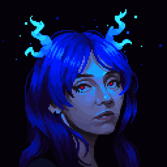
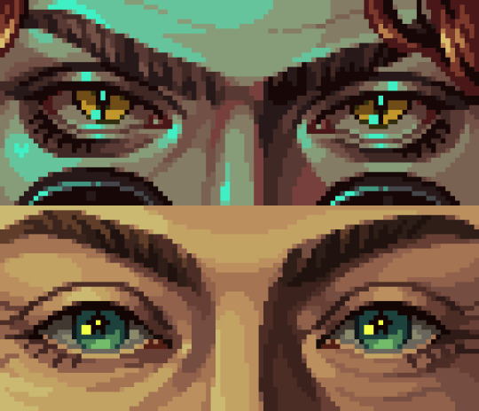
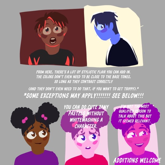
⭐ Pixel Art Fundamentals - Hue Shifting
This technique is not uniquely specific to pixel art, but it's a very common term to hear when starting out watching those "dos and don'ts" videos. So what is hue shifting?
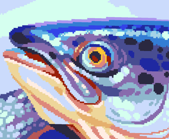
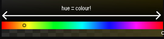
Hue shifting basically means to change the hue when making your shade darker or lighter. In this context, 'hue' = colour!
You may hear 'you need to hue shift more' when getting feedback on your art, but what does that mean really? Here are some examples:
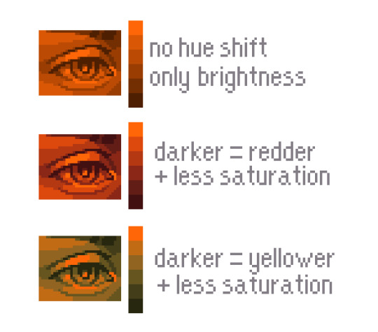
We can see even with just a bit of hue shifting, we have quite a different vibe for each drawing. In warm / daylight settings, no hue shifting can sometimes look a bit muddy or grey.
If we swap the image to grayscale, you can see that they look much the same:
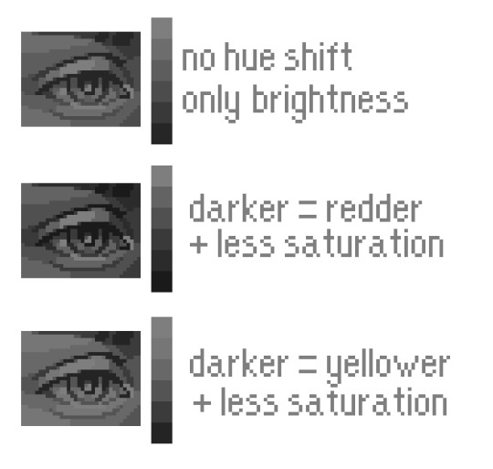
As long as the hue shifted colours have a brightness that makes sense, they usually will work. You can get quite wacky with it.

But is hue shifting always good? Not necessarily.
Below is some of my art where I intentionally didn't hue-shift at all. You can see it gives them an uncanny, digital, or photographic kind of look. As always, techniques are about your intention, or personal style.
I recommend trying different hue shifting methods! I especially love to use a cool blue or teal for the lighter shades.
Thanks for reading and I hope this helped a little! Have fun with it!!
⭐ Read my full pixel art guide here!
#pixel#pixelart#pixel art#pixel art tutorial#tutorial#art tutorial#colour theory#color theory#hue shifting#art#illustration#pixel illustration
5K notes
·
View notes
Text
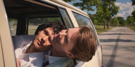
ok but the way they've been on again off again for three seasons specifically shrouded in the colours of the swedish flag - showing us the monarchy has intruded on their relationship. even the good, even the private, and always, always the bad and the ugly.
💙💛
makes this white flag moment of surrender even more powerful. they're stripped of this blue and gold brushed over them by society, colourless and allowed to create their own existence - together, a blank slate. themselves, again and only - forever.
🤍🤍
#I know you've missed me xoxo colour theory lili#young royals#Young royals analysis#Colour theory#Young royals s3#Young royals season 3
2K notes
·
View notes
Text
Phan vs jedas RPF polls Suez canal glup shitto horse plinko live slug reaction I like your shoelaces do you like the colour of the sky Goncharov 1973 eeby deeby vanilla extract Nov 5th ides of march Tumblr TV summon crabs sexymen blorbo from my shows destielputinelection twitter downfall children's hospital colour theory sonadow generations ourgoodshadows no seriously imagine it car covered in hammers porn banned tramp stamps bug race muppet handjob corporate manufactured yaoi superhell
#deadpool and wolverine#phan#dan and phil#goncharov#goncharov 1973#bug race#vanilla extract#jedas#rpf#suez canal#glup shitto#live slug reaction#i like your shoelaces#do you love the color of the sky#eeby deeby#november 5#ides of march#tumblr tv#summon crabs#tumblr sexyman#blorbo from my shows#destiel putin election#twitter downfall#childrens hospital#colour theory#sonic x shadow generations#our good shadows#no seriously#imagine it#the croaker
212 notes
·
View notes
Text

Small wip I'm working on of my favourite old victorian men, based on some photos I saw on Pinterest yesterday.
Big problem tho, I think there's something very wrong with the colours (it always is, with me, hard to pick them) so I thought I'd ask for y'all's help before I render It?
#it is supposed to be warm tho#I'll make a background too#maybe#if I have the courage#also the chair#it isnt supposed to be this colour#but I dont know what to make of it#😭😭😭#colour theory#art stuff#digital art#digital painting#art help#sherlock holmes fanart#sherlock and john#sherlock fanart#sherlock holmes#sh#acd sherlock#john watson#acd john watson#watson#dr john watson#artists on tumblr#acd canon#acd watson#acd holmes#acd johnlock#johnlock#once again being delusional about victorian men
199 notes
·
View notes
Note
I am head over heels for your art!!! What's your process in making art? Like what do you like to utilize to make your paintings pop?
-some newbie that likes a lot of colors

Hey Anon! I made this for you. Some thoughts on colour luminosity and saturation!
Here is the high resolution version for ease of reading
265 notes
·
View notes
Text

Wake up babe new children's hospital colour theory post just dropped.
106 notes
·
View notes
Text
VENTURE!! MY BELOVED

IF THEY DONT GIVE THEM MORE SKINS/EMOTES IMMA CRY
Drawing something mechanical and detailed in a simple style, proved to be a challenge. I kept adding too much detail and it would throw the whole piece out of balance!!
One weirdly realistic feature would draw the viewers attention (not in a good way)
I could go on a whole rant about line weight; How having both super thick and super thin lines just thrown about makes the whole work super lopsided and disjointed. But hey, I’m sure you know that!
#artists on tumblr#digital art#fanart#digital artist#venture memes#overwatch venture#venture ow2#venture overwatch#venture fanart#go team venture#overwatch memes#overwatch fanart#overwatch#overwatch 2#ow2 fanart#ow2#overwatch heros#cartoon#strike a pose#colour practice#colour theory#archeology#character art#character design#nonbinary#non binary#lgbtqia#lgbtq community#lgbt pride#lgbtq positivity
147 notes
·
View notes
Text
Cleo!

Just felt like drawing a Cleo today (I was trying to advance my art by using colour palattes)
I used a generator and it gave me 5/6 colours (I had to add the darkest shade because I needed contrast, spare me)
#fanart#my art#hermitblr#zombie cleo#zombiecleo fanart#digitalart#zombiecleo#trafficblr#hermitcraft fanart#hermitcraft#this is just my general design for cleo#I’m very proud of this!!#:3#art#colour theory#?#mcyt fanart#mcyt art
356 notes
·
View notes
Text
colour theory or smth like that
I got bored and angry so I made this <3
259 notes
·
View notes
Text
Criminal Minds S01E01 - a scene analysis/things I noticed
(The text in the images is the same, I just worried you can't read my handwriting)
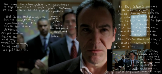
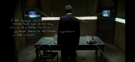
1. In the beginning scene where Gideon is asked to return to the BAU, the way the characters are positioned is representative of their power dynamic or role within the BAU at that point as well as representing the dilemma within the scene
- Reid is in the background since he is the youngest and least experienced, also the least in focus atp. He's also positioned in front of a map, which could be foreshadowing for his ample ability of geographical profiling
- Morgan is in front of Reid but still behind Hotch and Gideon
- At first, Gideon is positioned as the main focus with the camera showing him debating returning to the BAU for the first time since the Boston incident. As Hotch tells him that “the order came from the director” the camera focus switches as in the team “came back into focus” as Gideon realizes he has to come back.
- The camera then focuses on Hotch since he is the leader of the team. This shows that now that Gideons dilemma isn't the only thing in focus, the team has dynamics and roles which are also a large aspect of the show
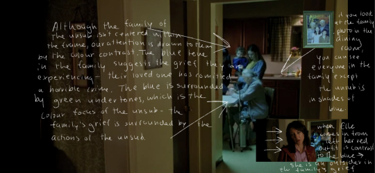
2. In this scene with the family of the unsub, although the family isn't centered they are very clearly the focus of attention due to the clear blue colour tint around them. This suggests the grief they are in after finding out their family member committed a crime. The family is surrounded by green tints as well, showing their grief is surrounded by the unsubs world (explanation in next observation)
- In the next scene if you look at the family portrait you will see that everyone in the family except the unsub is in blue, showing that the entire family was affected by his actions in their grief but also that he stands out from them.
- When Elle comes in from the left in the next frame, her red outfit is a contrast to the blue. She is from the outside world, an outsider to the family's grief.
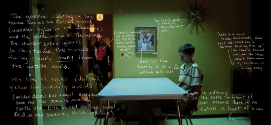
3. The general lighting in this scene shows an outside world (the warmer lights in the hallway) and the inside world of the unsub, with the darker green colors. In the frame pictured, the unsub is looking away from the outside world.
- Gideon is wearing red to contrast the green
- The family portrait shows how the unsub is an outsider with the rest of the family positioned in a tight triangle and him in the bottom right corner, also wearing different colors from the rest of the family
- The family photo is centered in this scene, showing a clear contrast between them surrounding the unsub versus him now being all alone
- The table in front of him is empty, showing he has no future in front of him. In a few seconds Gideon places his book in front of him, showing that the only future now is the BAUs work
- There is a chair facing backwards behind the unsub. This is like an interrogation, so the two chairs are for the two unsubs. But because the team doesn't know this yet, the chair faces away from Gideon, the interrogator.

4. Following the train of thought about the colors, we can see that the car the unsub used to lure the women into is red. The contact with the outside world is red, and in the scene where we see him kidnap a victim we can see he is wearing a green jacket as he locks the girl in the red car, showing that she is being locked away by the inside world of the unsub.
5. In this scene with Hotch interrogating the unsub, he is centered as he walks into the interrogation room to show his importance.
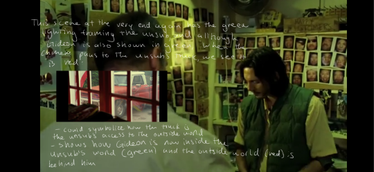
6. In the scene at the very end of the episode, the unsub is once again shown in green lighting. His truck is shown in red, while Gideon is also in green. This shows how Gideon Has stepped into the inner world of the unsub, and is looking out on the outside world from within as he realizes who he's talking to.
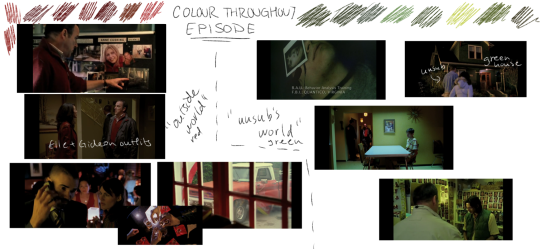
Colour contrast throughout the episode:
#criminal minds s1#criminal minds#scene#scene analysis#colour theory#the curtains are blue#and it means something#probably doesnt but it does to me#the cinematography#jason gideon#aaron hotchner#spencer reid#derek morgan#elle greenaway#rewatch#i forgot jj wasnt in this episode#penelope garcia#bau team#brother may i have some oats#can you tell english is my fav class#criminal minds spoilers#spoiler
165 notes
·
View notes
Text
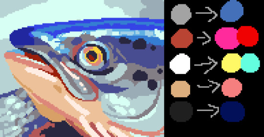
Toastyglow: “local colors!!!! relative hues!!!! listen I love a good adjustment layer they are so helpful especially when you need to work fast. but I also love picking special colors myself so here is a crash course in that–as I understand it, anyway.”
Source: Twitter toastyglow
#relative colors#art tutorial#digital art#art reference#art tips#illustration#drawing tips#local colors#relative hues#color theory#colour theory
419 notes
·
View notes
Text
how tofu colour
#colour theory#“theory”#no theory just vibes#pixel art#artists on tumblr#pixel artist#pixel illustration#pixel aesthetic#art study#pixel art study#pixel#illustration#pixel graphics#tutorial
3K notes
·
View notes
Text
What Pride Flags Mean, Part 1: Gender and Attraction
Welcome to the latest installment of my autistic hyperfixation on flags! I wanted to figure out a common language of Colour X means Thing Y. Like how pink is consistently used for feminine.
Having a common language for flag meanings matters because it improves cognitive accessibility of flags. ♿️💙
But I didn't want to be prescriptive about what colours should mean what. Just because I think Thing X should go with Colour Y doesn't mean everybody else would.
So this turned into a descriptive, empirical project. I gathered a data set of 2060 pride flag colour choices to figure out what are the most common colour-meaning combinations. Some of the results:
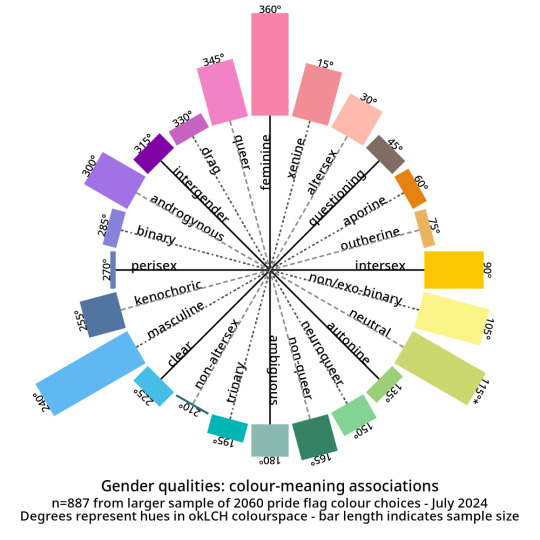
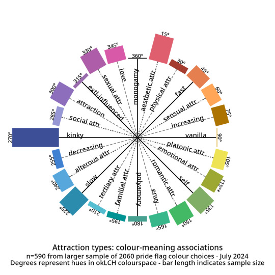
And here are the abstract modifiers: these are modifiers that were generally shared between the genders and the attractions. For example, black is used to indicate having no gender as well as having no attraction.
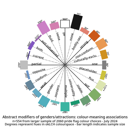
Click here for tables with okLCH values, hex values, definitions, and notes - I've put a more detailed write-up on my Wikimedia Commons userpage. (Mediawiki supports sortable tables and Tumblr does not.)
METHODS-AT-A-GLANCE
To make the figures above, I assembled a data set of pride flag colours. It contains 2060 colour choices from 624 pride flags, representing 1587 unique colours. Click here for a detailed description of how I gathered and tagged the pride flag colours and tagged them.
For each tag, I converted every colour to okLCH colour space and computed a median colour. OkLCH colour space is an alternative to RGB/hex and HSL/HSV. Unlike RGB/hex and HSL/HSV, okLCH is a perceptual colour space, meaning that it is actually based on human colour perception. 🌈
In okLCH space, a colour has three values:
- Lightness (0-100%): how light the colour is. 100% is pure white.
- Chroma (0-0.37+): how vibrant the colour is. 0 is monochromatic. 0.37 is currently the most vibrant things can get with current computer monitor technologies. But as computer monitor technologies improve to allow for even more vibrant colours, higher chroma values will be unlocked.
- Hue (0-360°): where on the colour wheel the colour goes - 0° is pink and 180° is teal, and colours are actually 180° opposite from their perceptual complements.
The important thing to know is that okLCH Hue is not the same Hue from HSV/HSL - the values are different! (HSL and HSV are a hot mess and do not align with human colour perception!)
You can learn more about okLCH through my little write up, which was heavily influenced by these helpful articles by Geoff Graham, Lea Verou, and Keith J Grant.
You can play with an okLCH colour picker and converter at oklch.com
🌈
MORE RESULTS: COLOUR DISTRIBUTIONS
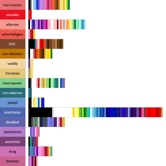
Back when I started tagging my data, I divided my data into five main chunks: Gender qualities (e.g. masculine, androgynous), Attraction (e.g. platonic, sexual), Values (e.g. community, joy), Disability (e.g. Deaf, blind), and Other.
I'll talk about Disability and Values in future posts! But for an alternate view of the data, here are the full distributions of the colours that were placed in each tag.
They come in three parts: tags I created for Gender, tags for Attraction, and tags from Other. The abstract modifiers are spread between the first two, though their contents transcend Gender and Attraction.
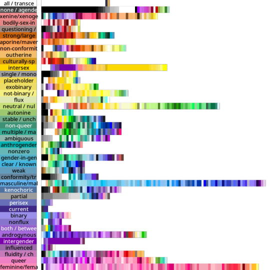
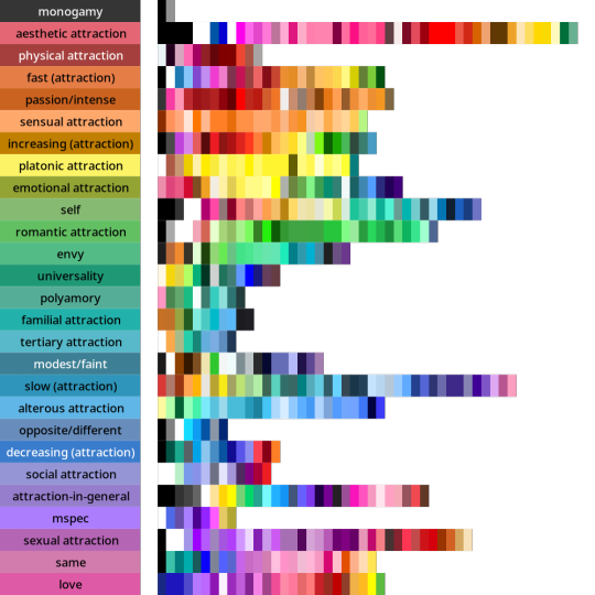
Some distributions have a lot more variance within them than others. Generally speaking, major attraction types tended to have the least variance: sensual attraction is really consistently orange, platonic is really consistently yellow, etc.
Variance and size do not correlate. Many of the smaller tags are quite internally consistent. I don't have a ton of tags in "current gender" but they're all the same dark purple. Xenine/xenogender has a whole bunch of entries, and there's a really big spread from blue to yellow.
Some tags, like intersex as well as kink/fetish show there are a small number of different colours that are very consistently used. Whereas other tags like masculine show a very smooth range - in this case from cyan to purple.
Overall I'm pretty satisfied with how things wound up! 🥳 It makes sense to me that an umbrella term like xenogender would have a lot of variance. What honestly makes me happiest is just how many tags wound up 180 or 90 degrees from their opposites/complements. 🤩
Not everything lined up nicely (the opposite of drag is .... neuroqueer? awkward.) 🤨 Some things lined up in hilarious ways, like how initially I had the opposite of kink/fetish being Christian (amazing.)
But as a whole, there's a lot of structure and logic to where things landed! I hope this makes sense for other people and can help inform both flag making as well as flag interpreting (e.g. writing alt-text for existing flags). 🌈
I'm hoping to post the Disability and Values analyses in the coming days! If you want to learn more, my detailed notes along with tables etc are over on my Wikimedia Commons userspace. 💜
Everything here is Creative Commons Sharealike 4.0, which means you're free to reuse and build on my visualizations, tables, etc. Enjoy!
#lgbt#lgbtqia#mogai#mogai flag#mogai flags#lgbtq flags#lgbt flags#lgbtqia+#vexillology#flags#colours#oklch#colour nerdery#colour theory#colour science#cognitive accessibility#design
188 notes
·
View notes
Text
data collection 2: electric boogaloo
#tumblr memes#I WANTED TO PUT GLUP SHITTO AND SHOELACES SO BAD BUT THERE AREBT EBOUGH POLL OPTIONS AREHHGSGS#plinko horse#eeby deepy#blorbo#blorbo from my shows#miette#miette sends you to jail#for ONE THOUSAND YEARS#superhell#eeby deeby elevator#its me boy im the ps5#ps5#colour theory#colour theory in the childrens hospital#childrens hospital#what#huh????#you KICK poll?????#you kick poll like plinko????#oh...OH#to JAIL#JAIL#FOR ONE THOUSAND YEARS#vanilla essence#vanilla essence actually smells so good dog#like MM#ok thats enough tags now#i lied no its not#wait...i can only have 30...? ok thats actually enough then
2K notes
·
View notes
Text
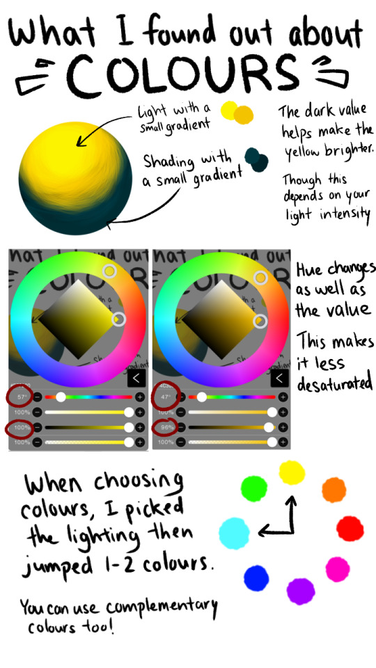
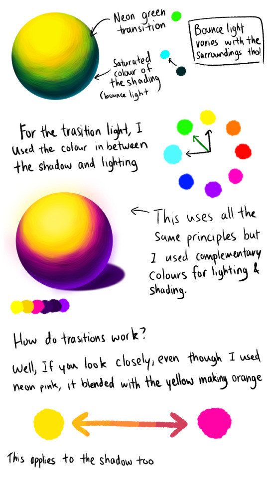
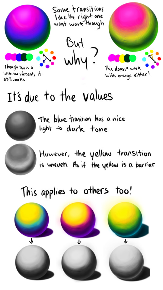
For the glowy effect I just used the same colour of the light and bounce light and just used an airbrush over it ^^
------------

You ask, I deliver 👀👀✨ @an4mations
Remember that this is just my own personal take/discovery and that it might not be 100% accurate! I'm still learning after all ^^
-
For people new to art and might not know what the diff terms mean...
Hue -> Colour (basically the original colours like red, orange, etc.)
Value -> How dark or light something is
-
#Note that this works best with neon colours ^^#colour theory#colour#art tips#art guide#art theory#colours#artist#artwork#art#artist on tumblr#digital artist#tumblr polls#polls
577 notes
·
View notes