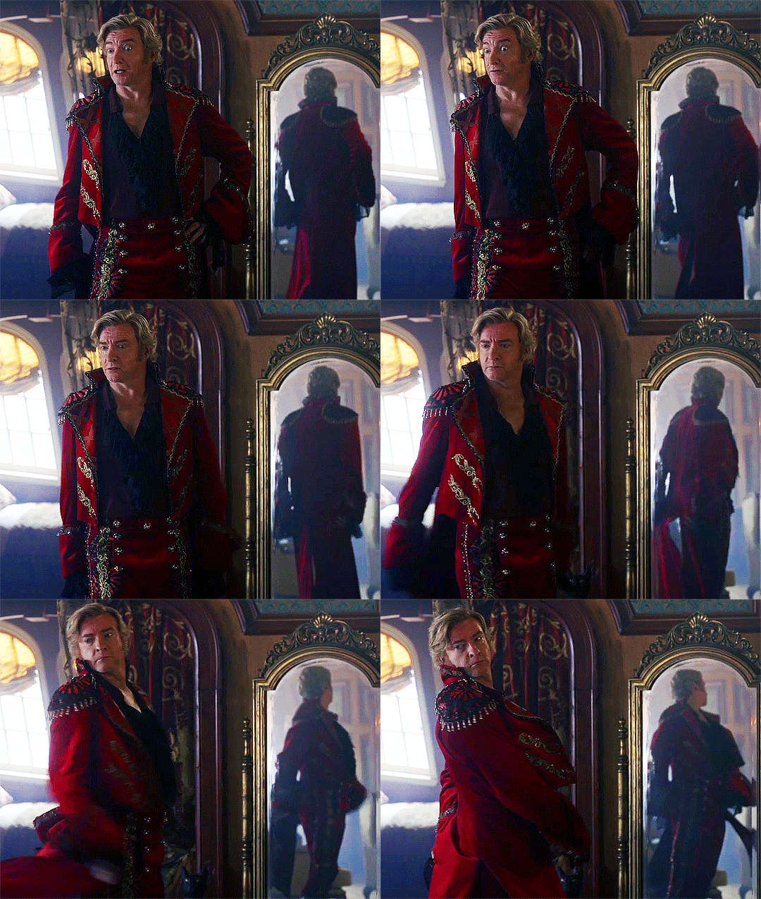
#the darker coloured shirts really suit them
Explore tagged Tumblr posts
Note
coob :(
JEREMIAH AND BUBBA MY HEARTTTTTTTTTTTTT
COOB!!!! :DDDD I love them so much they’re so tragic :(((

Themmmmmmmmm
#shoot from the hip#inside the mysterious cube#bubbamiah#that fucking pose istg#it's like they want me to wallow in sadness and despair#that and jeremiah's death scene when the “sun” rises and the light shines on them?? it's so hard to believe that it was all just improv#side note I love sam and luke's fits in this one#the darker coloured shirts really suit them#especially sam the navy blue dress shirt looks so natural on him
24 notes
·
View notes
Text
book!l&co character lineup
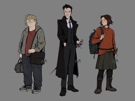
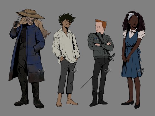


finally finished extended version of my L&Co designs, based on their book descriptions! it took months, but im happy with the results
ID of designs + thumbnail-sketch under the cut
[image ID: two digital drawings of characters from Lockwood and Co books, done in semi-realistic style, black lineart and plain colour against grey background.
image 1: from left to right there are full body drawings of George Cubbins, Anthony Lockwood and Lucy Carlyle. George is standing facing left, slouching, he's looking at the viewer with indifferent expression. he's fat, light-skinned and has medium length fair hair. George's wearing round glasses, red t-shirt, baggy jeans, unzipped grey hoodie and sneakers. he has a grey sport bag in right hand and a black messenger bag across left shoulder. next to him there's Lockwood, he's standing half turned to right, he's facing the viewer with a gentle smile. Lockwood is paler than George, almost a head taller and slim with short, slightly wavy, black hair. he's wearing a grey three piece suit with white shirt underneath, as well as smart black shoes and a purple tie. on top of it is a black greatcoat. Lockwood stands with one hand in pocket and another resting on rapier's grip. the sword is in its scabbard attached to Lockwood's belt. furthest on the right is Lucy, she's standing half turned to right, head facing left with a curious look directed at the viewer. her skin is light and her hair is warm brown, slightly uneven and spiky with middle parting. she has a wide frame and is the same height as George. Lucy's wearing a baggy orange sweater, plaid grey skirt, black leggings and tall dark-brown work boots with iron patches. she's holding onto a strap of her rucksack that is on her right shoulder. there's also a belt on top of the sweater which holds her rapier.
image 2: from left to right there are full body drawings of Flo Bones, human version of the skull, Quill Kipps and Holly Munro. Flo is standing half turned to left, facing towards the viewer with a smirk. she's light-skinned with long dirty-blonde hair, and her face has smudges of mud all over. compared to previous pictures, she's almost as tall as Lockwood, but not quite. Flo is wearing long blue puffer jacket on top of her darker clothes that resemble one of fisherman's with mudded thigh-high rainboots. she stands with one hand in jacket pocket, one raising a brim of straw hat with a knife. said hat has a fishing hook stuck on its brim and two lavender stems attached to hat band. next to her is the skull in his human form. he stands half turned to right, slouching, hands in pockets, with head thrown back with a wide smirk across his face. skull is very thin and not really tall, he is tanned and freckled with spiky dark hair. skull is wearing ill-fitting clothes: a white old-timey shirt that is slightly too big and grey trousers that are too small and short. he stands barefoot. third from the left is Quill Kipps, he stand half turned to right, crossing his arms, head facing left with a look of annoyance. Kipps is short and slim, he has ruddy and freckled skin and short ginger hair. Kipps is wearing a grey leather jacket with Fittes logo on it as well as two medals, tight black jeans and chelsea boots. his rapier scabbard has a baldric type of belt. rapier itself has green gems on a hilt. finally, there's Holly Munro, she's standing half turned to left, head facing right with a gentle smile. she's pretty tall and slim with deep rich black skin tone and black shoulder length curls. Holly's wearing a white short lantern sleeve shirt with a blue dress with a cloth belt wrapped around and tied into a bow at the back, as well as low heel shoes. she has a light-blue scarf wrapped around her head. Holly also has white small earrings and beige nail paint. all of the characters have artist’s watermark at the lower right side of them./end ID]
bonus sketch

#lockwood and co#l&co#character lineup#character design#illustration#digital art#fanart#lucy carlyle#anthony lockwood#george cubbins#holly munro#the skull#skull in the jar#quill kipps#flo bones#lockwood and co books#jonathan stroud#described#image description in alt#artpost#dont mind my silhouette practice#imho it's an upgrade from that one posts from almost 2 years ago (though designs haven't changed much)
648 notes
·
View notes
Text
Shizuroth, part eighteen
Previous parts: one, two, three, four, five, six, seven, eight, nine, ten, eleven, twelve, thirteen, fourteen, fifteen, sixteen, seventeen
-
Why hasn't he ever gone shopping with Sephiroth before? Aside from the fact that Sephiroth was socially repressed and awkward and aloof and would've never lowered himself as to be seen in public with anyone. And the fact that Genesis didn't want to even think about sharing his few precious moments of downtime with Sephiroth, of all people. And also the fact that Genesis was pretty sure, at least up until this point, that it would be an excruciating experience for everyone involved….
But it turns out that Sephiroth makes for a hilarious shopping company. The man is unexpectedly prissy and demanding - and, really, quite fussy when it comes to his looks.
While waiting for his coat to be readjusted, Sephiroth is putting on a fashion show in the tailor's very cushy dressing room.
"No, the hue is too cold - can you please get me the darker green one? Same size," Sephiroth says, making faces at his reflection, after trying out about a dozen different, almost identical, button up shirts.
"Right away, sir," the rather flustered tailor's assistant says and scurries off.
"I never thought you'd have a favourite colour," Genesis scoffs, lounging back on a fancy armchair while watching as Sephiroth accepts the shirt from the eager tailor's assistant. There's a pile of rejected and another of accepted articles of clothing nearby, and they're all in shades between dark forest green and the lightest shade of mint green.
No matter how much mess Sephiroth caused, the store would be making a big sale today - so much so that they'd closed early, just for Sephiroth.
But then again, there probably isn't a store in Midgar that wouldn't close for Sephiroth.
"You've never worn green before," Genesis adds, leaning back on the comfy armchair lazily and enjoying the VIP treatment - which includes coffee service and everything.
Tch. He was a VIP patron too - but they'd never closed the store for him.
"Hm," Sephiroth answers, deftly buttoning up the shirt and adjusting the cuffs, before pulling on the jacket of the suit he'd been trying on. Because that's what he's doing, trying to colour match a suit. A very light green suit.
It doesn't suit him.
"A much better match, sir," the tailor's assistant says, a little too eagerly, all but fawning over him. "You have such a keen eye."
"Is that so," Sephiroth says noncommittally, making another hilarious stink face at himself while buttoning up the suit jacket. He still doesn't look satisfied.
"It washes you out," Genesis points out the obvious and swings to his feet. "My friend, you simply don't have the colouring for such pale hues."
Sephiroth sighs unhappily, giving his own reflection a disappointed look. It's almost a Goddess damned pout. "I don't, do I?" he says in defeat. "And the green really doesn't do my complexion any favours."
"It really doesn't," Genesis grins, clapping him on his shoulders. "I'm afraid black is still your colour."
Sephiroth sighs again and then looks at him thoughtfully. "What is that shirt you're wearing?"
"Alas, it's not high fashion. A Shinra issue," Genesis explains with a sigh. "Mass produced and utterly commonplace."
"Huh," Sephiroth looks surprised. "It… looks good?"
"Oh, spare me, I know it doesn't, but when you go through so many it's simply easier to get them in bulk," Genesis says, shaking his head. "Bullet holes simply do not come off, after all. And the SOLDIER uniform turtlenecks are just about the only good article of clothing Shinra has ever produced."
Sephiroth hums, looking him up and down and turning back to the mirror. Then he sighs. "Please get me another version of this suit," he says to the tailor's assistant. "In black this time."
"Right away, sir," the mostly useless assistant says, doing a remarkably good job at not bouncing in excitement. "And for a shirt, sir?"
Sephiroth looks at himself for a long moment. He scrunches up his nose and then mutters, "... I suppose it should be in red."
"Stealing my style, now?" Genesis asks, leaning against his shoulder. "Also what is wrong with red?"
"It's not just red, rather the combination of black and red… ah, never mind. I suppose it will bring out my eyes," Sephiroth says, like he's admitting defeat.
It will bring out his eyes? Who is this guy and what has he done to Sephiroth? Genesis snorts and claps him on the shoulder again. "If you say so."
He's right, though. Red and black look much better on Sephiroth. As does the suit. Genesis has never even imagined Sephiroth in formal wear before, but… it's not a bad look.
"You know, one fight in those delightful clothes, and they're in very expensive shreds," Genesis points out, while idly trying on some gloves, wondering if he should invest in some formal wear.
"Why would it be in shreds?" Sephiroth asks almost resentfully, turning to select a tie. He's actually a little mad about red and black suiting him so well!
Wow.
"You…" Genesis starts and then sighs. Of course Sephiroth doesn't remember. "Fancy and very fitting," he adds, just to dig it in, "though they are, clothing of this calibre can't stand the types of battles you and I get in. That's why we wear leather. Or mass produced uniforms we don't have to pay for."
Sephiroth just sort of blinks at him, easing the tie over his head. "You've worn a uniform?" he asks, dubious. "You?"
"Yes, I have worn a uniform - I had to go through the whole two ranks to get where I am now, didn't I?" Genesis asks, testing the gloves by spreading out his fingers. They're fingerless and quite nice. "Not a fan of trousers, I admit. I never had the ass for them."
Sephiroth coughs at that, smothering a laugh, and tucks the tie into his collar. "I see," he says, looking down at himself in order to adjust the tie.
Genesis leans back to watch him. "Neither do you. Or, rather, you have too much shoulder going on. Far too top-heavy, you'd look ridiculous."
"Thanks?" Sephiroth says, amused, and then turns around to face him, a black tie firmly in place. "How do I look?"
"Like a damn Turk," Genesis scoffs. A very good looking Turk, but one nonetheless. He turns to the starry-eyed tailor's assistant. "Get him one of those great coats from the back - a black one, obviously, with red lining if you have it."
"Ah, those aren't leather, sir - mainly cotton and wool," the assistant says apologetically.
"Then get us a fancy wool one, and then go check how your master is coming along with our order."
"Y-yes, sir, right away, sir!"
"Please and thank you," Sephiroth says to the assistant, who almost trips hurrying off. "There's no need to be rude, Genesis."
"Who's rude? It's their job," Genesis huffs and folds his arms. "You rock up at Shinra tower looking like this, and they'll start making you go to functions too."
"What do you mean, functions?" Sephiroth asks warily.
"Parties, galas, meet and greets, maybe even interviews," Genesis scoffs. He's usually the one who has to go - he was more presentable than Angeal, who didn't know how to swim those waters, or Sephiroth, who had the social graces of a poisonous wallflower. "Public events of the social kind."
"Ah," Sephiroth says, fiddling with his cuff. "That's fine then."
"... That's fine? You hate those things!"
"Do I?" Sephiroth asks, giving him a bitchy face like he knows something Genesis doesn't. "Hm."
Genesis eyes him dubiously. "Well, I suppose you'll learn why very soon," he mutters. "If they make you go."
The tailor's assistant brings in the great coat, and Genesis throws it over Sephiroth's broad shoulders before the man can try putting his arms into the sleeves. Hanging over him like a cape, it ties the outfit together perfectly.
"There, you look fit to take over the world," Genesis says, motioning to the mirror.
Sephiroth hums, stepping so that he faces the mirror at an angle. "I guess it's a popular colour scheme for a reason," he murmurs, begrudgingly impressed, and flicks the hem to make the red lining flash dramatically. "Fitting, I suppose."
"Silver Elite are going to lose their little minds," Genesis agrees. "You'll take it, then?"
Sephiroth takes a moment, adjusting his collar. "I'll take it," he says finally. Then he smiles and slightly bows at the tailor's assistant. "Thank you for your efforts."
"I-it wasn't any trouble, sir!" the poor assistant gulps, looking a little wobbly at the knees. "The master is finished with your leather coat, sir. If you're ready…"
"I am," Sephiroth agrees, running a satisfied hand down his front. "I am very ready."
The planet isn't, Genesis thinks with a sense of exhilarated doom. The planet isn't ready for this at all.
-
Shizun can no longer rock Qing Jing Peak colours ☹️ The Tragedy is immeasurable.
(aka I meant to put him in Qing Jing Peak colours but then I looked up Sephiroth in a suit and 👌 black and red is really the Aesthetic here.)
(This is all Very Important To The Plot. Which Totally Exists.)
343 notes
·
View notes
Text
Personal Style(Colours) + Astrology

Disclaimer: My opinion👍
Fire signs:
Aries - Looks so good in beige, intense shades of red, dark blue, dark green, washed out yellow, Carnelian, they suit a laid back and chill style but also classy modern look. They suit Zara clothes a lot.
Leo- White, Jewel Tones, Classic Red, Orange, Yellow (Royal Royal Royal) anything that adds a touch of majesty.
Sagittarius- Red, Black, Charcoal grey, Colours which are a mix- indigo, turquoise etc, Copper… Very adventurous, motorbikes, leather jackets and all of that good stuff (80s vibe)
Water signs:
Cancer: Baby Pink, Baby Blue, a lot of Muted Colours look good on them too. I think When it comes to aesthetic, cancer is more fixated on hygiene rather than the little details.
Scorpio: Magenta, Maroon, darker shades in general , Silver. Maleficent vibes. HAHA (it’s true though, maleficent is so Plutonian) they look so good wearing outfits of one colour.
Pisces: white, most shades of blue, muted orange, salmon pink, look good with shimmery details too. Basically mermaid vibes. You want everything to seamlessly blend as if you were underwater.
Earth Signs:
Virgo: sage green, light yellow, caramel, light brown… very earthy colours for virgo. Simple clothes with no logos or details look super good too.
Capricorn: very solid colours, the basic colours on the colour wheel lol. Sophisticated styles very much so.
Taurus: They look good in classic colours, 1950s palette really suits them. They look very good mixing multiple colours from a classic palette/look
Air Signs:
Gemini: look super good in stripes, patterned shirts, clothes with patterns in general look super good. The influence of mercury here is making it hard for me to pin them down to specific shades. But I notice that 90s style can look super good on them and lean towards that unintentionally.
Aquarius: they look so good in ethereal colours, mixing ethereal colours with solid colours. Colours that remind you of the cosmos. ~Alien~
Libra: they look good in Y2K style very easily they gravitate towards that tbh, Barbie colours, very stereotypically feminine shades and colours… (basically most things) but in a way that stands out. NO washed out clothes/details. I think the muted colour that really suits them is beige.
I will be posting about Astrology& Personal Style on my YouTube Account too ;)
#astrology observations#astrology notes#aries zodiac#gemini#taurus#cancer zodiac#leo zodiac#virgo zodiac#libra zodiac#scorpio zodiac#scorpio#libra#virgo#sagittarius#aquarius#pisces zodiac#pisces#kibbe body types#law of attraction#manifesting#feminine energy#law of manifestation#metaphysical#self healing#manifestation tips#healing#Instagram
378 notes
·
View notes
Note
Ok ok so u had an idea of what clothes Sky would look good in. What about the other Links?? If u don’t wanna do them all maybe Wild/Tears and Twilight? (Bc those r the only Zelda games I’ve played lol
oooooo I've thought a while about what tears would wear because I am a little obsessed with him but not really what twilight would, just gonna drop some images here from my interest <3 (each boy is gonna get a dress too <3) If you'd like anyone else feel free to pop in another ask!! I'm also gonna take this chance to even out the playing field and share what dress I think sky'd suit too <3333
First tears/wild
(I can see them having similar styles in different colours tears lighter/more colours to match his hair while wild goes for darker/bluer colours)


I'm an actual sucker for techwear in places and I can see him adoring it for how versatile it is (I mean he's going to die over all the pockets), he's also surprisingly well dressed because???? his game? best outfits hands down.

p-pretty strawberry dress - I think this is a simple pick but I can imagine him loving flowy stuff because of how freeing it feels, everything ingame was essentially a part of his body so it just feels nice.
Now onto twilight!!


(fun fact what I searched for the second image was literally midwestern emo - it's him) he suits the darker grungier aesthetic and honestly he'd be pretty in anything

I showed this to my friends a while back and joked about twilight being apple jack (he would like mlp I'm sorry to admit, he's a bleeding heart like that)
but yeah!!! just gonna do those two for now - but to say why neither and by extension none of the self aware chain would really wear anything fitted or skin tight is due to that being all they've ever gotten to wear In the past, they've never worn proper clothes that weren't skin tight so they kinda like the feeling of flowy loose fabrics compared to say skinny jeans and tight shirts (not that they wouldn't wear them at times, it's just they prefer not to!)
Finally sky's dress to even it out :3

I felt like I was going insane for a minute finding this because?????? I swear there was a blueberry version ;-; pretty pastel blues remind him of home so I think he'd gravitate to that over any other colour
#I am weak for boys in dresses so help me#I think I made it clear with spooks posts but eh#might as well call myself out#sum up though? tears has tech/cyber twi is emo and sky is cottage/goblin(?)core#moss✦answers#self aware au#self aware loz#linked universe x reader#link x reader#yandere link#🐰 anon
58 notes
·
View notes
Text
I feel like we get to learn a lot about the heroes just by their costumes, which is some FANTASTIC visual storytelling on the part of the YJ creators.
Robin has a fantastic arc where he decides that he still wants to fight crime and save people, but he doesn't actually want to be Batman. And this is shocking, but at the same time, his costume is RED and YELLOW. YJ Batman wears black and grey, with a muted brown belt. Robin's colour scheme has set him apart from Batman from episode 1!! Of course he's not going to be a perfect carbon copy!!!
Artemis's costume, on the other hand, resembles Green Arrow's very closely from a surface view. They both have the multiple shades of green, quiver over the shoulder, utility belt around the waist, and her mask even gives a similar visual impact to his hood! There are differences, obviously, but in general Artemis is very much trying to look like she belongs on the team, and her supposed relationship with Green Arrow is her one ticket to achieving that.
Speedy, on the other hand, looks VERY different from Green Arrow (even before he rebrands). The colour difference seems the most drastic out of all the pairs, and his hat especially separates him from Green Arrow. He wants to be his own hero, and visually he looks like his own hero (though his costume is probably also the dorkiest, which might be contributing to his anger issues).
Superboy kind-of has two costumes, the pure white cadmus suit and the costume he picked out, neither of which bear much similarity to Superman’s costume. He keeps the symbol to signify his choice to be a hero, but he has to grapple with Superman’s rejection of his existence immediately, and is choosing to be visually distinct.
Aqualad is quite visually distinct from Aquaman, but the similar details of their costumes make them match. The design of their shirts, the ‘A’ symbol on their belts, the darker pants. They are two heroes that pair together well, but who have their own skill sets. I think this really contributes to how grounded Kaldur is as a leader.
Miss Martian's costume is very similar to Martian Manhunter, with blue cape, red X, and green skin. There are minor differences, but they don't visually separate them, instead making her seem like a miniature version of him, because since she wants to be a green martian, just like him!!!
Kid Flash matches pretty well with Flash, but they add all these little details (the goggles, the hair tuft, the snack compartment) that manage to really show his personality, which is already so big.
Zatanna’s costume is almost identical to Zatara’s, showing that they are clearly close and adding a visual element to Zatara’s overprotectiveness. But then Zatara gets taken over by doctor fate, which completely changes his costume. So it ends up with Zatanna replicating a costume that DOESN’T EXIST ANYMORE!! WHICH IS SUCH A POWERFUL REPRESENTATION OF HER LOSS!!!
Idk man it’s all just so good
#young justice#robin#dick grayson#superboy#artemis crock#connor kent#kid flash#miss martian#m’gann m’orzz#roy harper#zatanna#aqualad#speedy
20 notes
·
View notes
Note
happy new years!!! can i request rockstar!remus x fem!shy!r, where they first meet bc she lost her glasses (and r has horrible eyesight) & she doesn’t recognize remus & is absolutely mortified when she realizes who she’s run in (literally) to???
Happy New Year!! Thank you for your request <3 fem!reader
You'd only put your glasses down for long enough to rub your tired eyes, and yet you can't find them. They've slipped off the face of the earth.
And worse, you're so fucking awkward (said with only a pinch of self-loathing) that you can't make yourself do the awkward song and dance to find them, not when you're surrounded by strangers at a friend of a friend of a friend's house in the rich bit of London.
You stand up, wondering if you can identify the friend you'd come with by their shapes and colours alone, and take a misguided step straight into someone's side.
Air puffs out of you in a gasp and you take a hasty step back, eyes on the person's chest. There's a sanguine-coloured t-shirt with darker, looping writing across the front.
"I'm sorry," you say, trying to take a cautious step around them.
"Hey, that's okay," says a masculine voice, the body it belongs to veering into your path. "Are you alright, sweetheart? Did I clip you?"
You look up into their face and stare at the space between their eyebrows, knowing you look silly. You can vaguely make out his facial features, and your brain signals it as familiar, but the voice doesn't ring any bells.
"No, sorry, you didn't do anything. I'm looking for someone," you say.
"Anyone I'd know?"
"Elizabeth? They're in a green dress?"
He looks around the room. You can see his neck turn, the splodge of darker colour that is his hair moving with it. "I don't see any green dresses," he says apologetically.
You shake your head. The music playing increases in volume, and girls all over the room gasp as a favourite song starts to play. You wince at being shoved out of the way. The man in front of you moves to protect your side, hand behind your shoulder for a short, hot second.
"Somebody's lost their glasses," he murmurs.
You giggle nervously. "Is it obvious?"
He leans down to the settee and then stands tall. He does something with his t-shirt, pulling it away from his torso, and then he nudges a familiar shape into your hand.
"No, I mean, I saw them on the sofa. They're yours, I'm assuming."
You laugh again, drowning in embarrassment. As you open the legs of your glasses, you think, Well, it could be worse. Elizabeth said that The Marauders of all people are going to be here tonight. Imagine making a fool of yourself like this in front of them.
And then you put your glasses on. You can't speak.
"Is that better?" Remus asks, bassist of The Marauders and in the flesh. "Sorry to say, you have thicker lenses than James. I'm surprised you can see at all without them."
"I can't, really," you say, your voice a far away thing.
"They suit you." He grins at you, all pretty-lipped and dark brown eyes, the scar over his nose turned white at the edges with the strain. "I suppose I looked more handsome before."
"No," you say.
His smile turns playfully smug. "No? I'm glad. You look prettier with them on, too."
Your cheeks are so hot they're burning, and your chest is lit by a panic you can't describe. You were being completely, entirely genuine with him — he's a thousand times more handsome now you can actually see him, with a voice to match. Smooth, steady, and teasing. Despite the boy-next-door of his sandy brown hair, his sweet smile, there's a stickier emotion playing on his lips. You worry he's gonna eat you alive right there and then.
"Can I get you something to drink, pretty girl? Or can you manage now your vision's been restored?" he asks.
His banter throws you off kilter. "I think you'd better get me one," you say, not because you're smooth in any capacity but because you're worried you'll fall over.
He laughs warmly, worse when he sees you realise you'd sounded flirty.
"I'd love to get you a drink," he says. "If you'll be alright while I'm gone?"
You nod wordlessly, collapsing into the settee again as soon as he's gone. You're gonna need a drink to survive this.
#remus lupin x reader#remus lupin x you#remus lupin#remus lupin x y/n#remus lupin x fem!reader#rockstar!au#rockstar!remus lupin#bassist remus#bassist!remus#the marauders x reader#the marauders fanfiction#the marauders fanfic#the marauders#marauders#marauders era#remus lupin imagine#remus lupin fic#remus lupin fanfic#remus lupin fanfiction
1K notes
·
View notes
Note
what is your ideal outfit for your little one?
Awww, that varies~ I am someone with picks and tastes, but I also have a variety of different tastes that I could and would enjoy~ I guess it would be really dependent on the little in question.
For example, I know a good few of babies are tomboys at heart. I know that a lot of cuties would look adorable wearing shortalls and flamboyant bright colours of reds, yellows, greens, and so forth that they wear as a onesie... of course, their shortalls will definitely have something adorable and cute like a teddy bear or kitten sown on the front to show everyone that she is a little cutie, alongside a paci clip to match her bright onesie... though with how messy and curious those little ones are, I wouldn't even bother having them wear shoes as they crawl in the backyard and do what they do best: pull and throw grass around, playing in the sandbox, and gurgling as an adorable little mess.
Then there are the little ones that are a lot more 'gothic', little cuties that want to be all 'dark and mysterious', in spite of them being as good of a pamper packer as they are being so adorable. Having them wear dark dresses of blacks often complimented with purples, red, pinks, or whatever ascents with the blacks... alongside a large fluffy bottom, a pink tutu strapped and tied around her black pampers and under her black skirt to showcase how cute they are~ Would be very cute to see someone that loves to dress and be in darker tastes being all cute and bubbly~
Then there are the super princess baby types, the ones that are often in need of pastels and soft colours, of big poofy shoulders and adorable dresses, often accented with their ruffled baby pants and fairy butterfly wings that they love to show off as they jump up and down~ Having them be so soft and sweet in their own form of sweet lolitas and princess dresses to fill their wardrobes~ Would be very cute for all kinds of big babies to have their hair done all cute, either with pigtails, or a single pigtail on the side, a pony tail, a palm tree on the top, or a gentle forest of ribbons and bows across their head as well~
Those are a few examples~... but, then again, that's when I would feel like they should be dressed up; honestly, I think the most beautiful thing about a human being, especially an adult baby girl, is one with an adorable puff of bed hair, either nothing or their dada's shirt or hoodie, and them looking so sleepy and relaxed as they are sitting or lying down in their padding... and that's if dada even gives such a top to the little drool bugs. Honestly, having them just feel so soft and warm that they are comfortable in their near birthday suits and just gurgling with half-closed eyes would be so precious and adorable~
Hope that answers your question~
8 notes
·
View notes
Text
good day, my lovers. it's time for another edition of rating suriya's outfits
it took me 5 business days to recover from the song that is named yolo, a title that is a decade too late, but here we are. we shall take a look at his outfits that we have a clear-ish full view of, in ascending order based on my esteemed correct opinions. strap in, babes
patterned blue beach shirt with white pants

an atrocity beyond all measure. it's not even a proper pattern on the shirt. the kind of random abstract print that is ugly, on top of that horrible shade of bright blue. suriya looks good in darker blues, this ain't it. and the white pants... kill. 1/10
2. patterned yellow beach shirt with white pants

another nonsense outfit and colour combination. why are they obsessed with such bright colours... IT DOESN'T LOOK GOOD!! STOP IT!!!!!! the design on this isn't as bad as the blue beach shirt, but it's still dumb. the white pants as always, are a straight no. we need to start shaming people in white/beige pants. 2/10
3. abstract patterned beach combo set??? with white singlet

actually, it's not that bad. i get the appeal of beach combo shirts and shorts (i have them, too), and even though it's another shitty abstract pattern, as it's part of a set, i can close an eye to excuse it cos they're meant to be garish and silly looking. my 2 beach combo sets are pineapple designs in beige and orange, so i understand. 4/10
4. white tracksuit

the only thing wrong with this is the white. i really hate white outfits. he would be smoking in this if it was all black instead. so smoking in fact he would (and should) have his bones jumped (to put out the smoking fire, i mean. yeah) 5/10
5. blue dotted shirt and white pants

guys.. this was so close to being a good fit. the shade of blue is decent, but once again, it's the white that ruins it, both in the asymmetric dotted design and of course, the disastrous white pants again that i'm so sick of seeing. we need to burn them, suriya. please listen to me. it's enough. i do like his glasses in this, though. 5.5/10
6. yellow and black checkered suit

the gay outfit, if i say so myself. and i do. i'm saying it. i'm not sure about the colours, and i'm not even sure about the design, cos lbr it's kind of a gnarly mess. if this was on anyone else i'd point and laugh. but because it's suriya, it's strangely captivating. he's like a whispering siren in my head. no, i can't hate this even if i really want to. 6/10
7. blue tracksuit

FINALLY WE'RE GETTING TO THE ACTUAL GOOD STUFF. HE ACTUALLY LOOKS WHOLESOME AND CUDDLY HERE! I WANT TO HUG HIM! YES, KING! GO CYCLING! DO YOUR EXERCISE SEXILY! i know it. a very simple and clean outfit in a good colour. this is what i want. this is what i need. in fact, i'm cycling spiritually with him right now. 9/10
last but not the least....
8. vest without shirt open slutty chest pastel pink outfit

OKAY. OKAY. HEAR ME OUT. THIS IS ACE. firstly, i've always loved suriya in soft pink, i think it's one of the best colours on him after black. this is an insane outfit cos of the shirtlessness. we wear vests over a shirt, yes? that's why they're called 3-piece suits. suriya has simply made this a 2-piece suit and gone on full chest out and the only reason the chest out even works is cos it's unshaved, since nothing is more disgusting that shaved hairlessness (TO ME). i love the slutty hairy chest out look and the pastel pink and his warm smile NO IDGAF IT'S JUST GOOD. 9.5/10
WHY NOT 10/10 YOU ASK??? yeah it's cos of his ugly ass white shoes;

i literally have no idea what these pair of shoes are doing on him and paired with a suit. baby what's going on!!! who told you to do this!! get a nice pair of boots! black or brown, either would work with pink!!!! as a long time diehard doc martens truther, i need someone to get suriya a pair of those. i wear it with everything. shorts, jeans, sweatpants, work pants, idc. a pair of black standard doc marts are the shoes for any occasion. as with my hatred of white for anything other than like a plain t-shirt/singlet, i don't believe in white shoes either. it's ugly, and i won't apologise for it. but worst of all, track shoes shouldn't be paired with suits. we used to beat up people for that.... but i won't, cos suriya is so cute in pink i can't do that to him. in fact, have another pic of him just for no reason;

my angel meow meow forever :') <<<333
#yolo#kanguva#suriya#tamil cinema#kollywood#first kanguva thesis on the internet.. YOU'RE WELCOME SIRUTHAI SIVA!!!!!!!!!!!!!!!#mine*
8 notes
·
View notes
Text
Evolution of Molluck

This post is dedicated to analysing changes Molluck has gone thru and how he became the Glukkon he is now. I just felt like gathering my thoughts and observations related to him since they are pretty much scattered around right now, and I haven't even mentioned them all, but I also wanna write about them in more detail... So, let's talk about this endearing Gentlegluk!
This is a huge post, as you can assume, since I could just keep talking about Molluck... So, I also just share my thought about Molluck 'n' stuff related to him in general. I also discovered new things while working on this post... Man, Molluck is so fascinating...
I hope that my 'unnecessary expertise' on him can give you something:
------------------------------
Table of Contents
Appearance
RuptureFarms 'n' Essence
Anatomy
Voice
Personality
Other
------------------------------
Appearance

Despite of the redesign, Molluck has kept his certain recognizable features: His trusty cigar, glowing eye(s), sharp pinstripe suit, and similar shoes.
His facial features have remained quite similar too:

But there are still lots of changes which can also make him unrecognizable.
His colours have changed significantly. He has now pale skin and dark gray suit instead of his previous darker brown-ish skin and purple suit with a red shirt (or whatever that is). His eyes are red instead of yellowish orange, and he has better/more teeth now. In general, his features have become more refined and delicate. But I would also like to say that it's interesting how 'human-like' his current teeth seem now. It makes me wonder if Glukkons eat also something else than mere meat since their teeth look clearly like omnivore teeth now. Mudokons instead seem to have herbivore teeth. I just really have been wondering what does Molluck eat... Other than some luxury meat stuff I mean.
His suit has also a different shape now. OWI probably wanted to make it describe better his business trait, since "Molluck was inspired by [Lorne's] encounters with smiling, ruthless Wall Street brokers and NYC's gangster-business types who thrived in moral gray zones" (Lorne Lanning on X | 15.8.2024). Everything can be business! "Don't take it personally when he sells your guts for fertilizer - it's only business", said the manual of Abe's Oddysee about Molluck. But Glukkons got more personalized suits 'n' looks since Abe's Exoddus, so it could also relate to storytelling OWI wanted to do for Abe's Oddysee because all the Gluks in AO look very similar. (But it might also be just due to limited time and budget.)

Before I continue about Molluck's suit, I wanna point out that not only did his suit change from the early Soulstorm concept, his head is also a bit different in the final version. His final head looks once more more refined and delicate. It seems that his eyes might even be a bit bigger than they were in that concept art piece.
It's really interesting that OWI changed the side of his suit clip. The early Soulstorm concept had the same side as the previous Mollucks, which is also the same side as men's clothing has. But he isn't the only Gluk in Soulstorm whose suit fastening side on the left: Morguer also has his buttons on the left. The other two have their buttons on the right, as you could assume. I have been wondering if it really means something, that is it like a sign of something... I have only made a joke that it tells you about the Gluk's preference, which means 'a win' in my case... But I really wonder why the side of their suit fastening differs... I just don't feel like it was changed just because "it looked better". But the design of Molluck's suit clip was also changed to the final version since the earlier Soulstorm concept seems quite similar to the previous versions.
But his medal in Soulstorm also got more refined shape later on. It's surprisingly difficult to find online good versions of those concept art pieces with his medal visible, and even odder is that one earlier medal concept piece ended up to both 'Oddworld: Abe's Origins' and 'Oddworld: Soulstorm - the Art of the Videogame' books... I would have assumed the artbook to have the newest one but nope. But, at least there you can find a good quality version of that. But his 'neckthing' has changed earlier too. It seems that the earliest version was like a necklace and then it was changed into a collar-like necklace. His current 'neckthing' is like a bolo tie which is more related to his career than those previous Magog Cartel necklaces. His current bolo tie doesn't really have less authority though since it's an award for his success: a gold medal of Stockgluk Guild which denotes his position as a keeper of livestock.

In NnT, Molluck did lose his suit pocket he had in AO, but he got something better in return in Soulstorm: It seems that those 'arm holes' of his suit were a later addition. It has been confirmed that those holes do exist that the Glukkons can now use their hands, well, as hands. Too bad that we don't see that 'hand action' in Soulstorm. But I'm still glad to see that Glukkons ain't anymore as helpless as they used to be. Though yeah, they do are still quite limited physically, but Molluck has been proven to be deadly even with such limitations. Don't mess with him!
Related to anatomical things: In Abe's Oddysee, you could clearly see Molluck's elbows thru his suit, which was changed in New 'n' Tasty. Therefore, Molluck's backside in Soulstorm is similar to one in NnT. Frankly, I have been wondering what OWI thought when those elbows were visible... I cannot personally watch that opening cutscene 'normally' after I noticed that detail because they look like odd buttocks to me... I just laugh like everytime I see that cutscene because of that. (Though, I do laugh at it in all the cutscene in AO in general, but yeah... Meat grinder would probably call me if that Molluck knew it. (Y)) I wonder if the other creatures in Oddworld thought the same before it was changed... Yeah, using the finest silk ain't always the best option for a suit.

Soulstorm Molluck model is a reworked New 'n' Tasty model and it can be noticed for instance from some details. For example, Soulstorm Molluck has some of the same pimples as the NnT one:

I personally like those lil pimples he still has! But he certainly looks better having them less than previously.
I feel like these photos show some other similarities and changes too, obvious stuff that I don't need to explain. But I assume that Soulstorm Molluck has still the same body as the NnT one since in the Soulstorm artbook his bare shoulders can be seen and there seems to be no change. (There was obviously no need to do changes since we don't see him naked in Soulstorm... A pity.)
Hot or Not According to OWI
Originally, Molluck was described to have "boyish good look" and "charm", but in Soulstorm, he is described to be "uglier than before" with his lost eye and broken "disgusting teeth", making him seem scarier too. So, original Molluck had better looks according to OWI.
From boyish good looks 'n' charm to ugly 'n' scary. (Y) These are subjective opinions though, but the way OWI presents his looks has changed. But OWI has called Glukkons the ugliest species in Oddworld during the release of Soulstorm anyway, so he is kinda just another ugly Glukkon according to OWI. He is still kinda unique compared to the other Glukkons since he is the only one with glowing eye(s).
So, it's basically up to you if Molluck is still "attractive by Glukkon standards" since OWI seems to have changed the way they talk about Molluck's looks. (If you ask me, Molluck is my whole beauty standard!)
Oh, and yeah, I almost forgot that Lorne has called Soulstorm Molluck a "crazy-looking smart monster" in this video. So yeah, that's how Lorne sees Molluck. (Y) He doesn't seem to talk about him in a positive way there anyway, but it's totally understandable, I see the narrative. But I still see him in a different way... So, the message got corrupted on its way to my brain or something. (Just joking. I love that 'crazy' Gluk!) Also, I have said this earlier, but it seems that Lorne has forgotten or doesn't realize that Molluck does have one stereotypical feature that is related to highly intelligent characters: large head. Molluck has the biggest head/brain of all the Glukkons in Soulstorm and I bet that it's not a coincidence.
RuptureFarms 'n' Essence
Originally, RuptureFarms seems to have had burgers as one of its products. These are some logo designs and RuptureFarms marketing tactics:

Glukkon Burgers, I'm lovin' it. (Y) What. These are just quite interesting concepts... They make it seem like those burgers are made from Glukkons, not that they were made by Glukkons, in general at least... Frankly, I would still be interest in tasting some Glukkon meat, even they are my favourite Oddworld species... (I still eat octopuses even they are my favourite creatures on Earth, so it's the same... I eat them with love! It's quite rare meat here though.) Those logo designs also kinda evoke a question if Glukkons practice any cannibalism... Just wondering.
I wonder if the Munch's Oddysee PlayStation 2 tech demo has a reference to this. The part where the Sligs march with a looming hamburger on the background just reminds me of this.
There also happened another kind of development but between Abe's Oddysee and New 'n' Tasty: RuptureFarms is cleaner and lighter now.

Man, it's long since I touched NnT... I still feel like I cannot really stand playing it but I wanted to take some screenshot to show the difference. And this comes from a person who played all the main Oddworld games for the first time in the same year. I personally feel like Molluck is somewhat ruined in NnT, has less personality and soul than in AO, but I appreciate the model though. (Y) But more about this later.
But I have been joking that RuptureFarms is cleaner now because there are 299 Mudokons instead of 99! Molluck figured out how many Mudokons it takes to clean up the Farm. (Y) But I gotta say that I really prefer this bloodier and darker Farm. I'm really glad that Molluck got back to more like his original self in Soulstorm where he basically embraces butcher theme. Just look at his blimp:

There he is, with a meat cleaver 'n' hook! There's even like a circular saw on the background, which reminds me of the limited edition cover of New 'n' Tasty though... But it doesn't still remove the fact that NnT Molluck seems softer than AO Molluck, no matter how pitch shifted his voice is there. My point was just that Soulstorm Molluck feels more similar to AO Molluck than NnT Molluck. SS Molluck and AO Molluck feel like the same character while NnT Molluck just feels like something is off...

When I look at these, that SS Molluck and AO Molluck have the same energy and expression while that NnT Molluck more like just looks at the Slig without frowning like the other Mollucks, but his mouth's expression is also different. (Molluck is so cute also when he looks angry!) So, I tend to think that SS Molluck's personality is more like from AO Molluck, but his appearance is derived from NnT Molluck. More about the personality change later on.
Though yeah, I also gotta mention that RuptureFarms brand is slightly different in Soulstorm, which can be seen from Molluck's blimp:

I think that the interesting thing here is why "brand" is well, "brand"... Is this the same Molluck who knows that his products are disgusting? I mean, in Abe's Oddysee, he knows it:

I hope that you can see what I see, that AO Molluck and SS Molluck are surprisingly similar. (That text was removed in NnT. A pity... I love that text!)
Anatomy
After getting into meat here, let's look at Molluck's meat, I mean, his anatomy, since it has gone thru some changes too:

How much moolah I need to get that sculpture, even just to rent it... There ain't any radical changes here but they are still interesting, at least for me. That early concept art Molluck also got an interesting tattoo there.
In the early concept art, his body is shorter and his pectoral muscles seem more like ribs. In Abe's Oddysee, his body seems to be longer and he seems more muscular in general. In New 'n' Tasty, Molluck's body looks, yet again, longer but also more refined, which makes his body parts more distinct; earlier his pectoral muscles and ribs seemed to be like smashed together. NnT model also seem to have less muscular arms than AO one. His hands have also gone thru some slight changes, but my own personal favourite is that hand on the top right and I use that as my reference for my Molluck stuff. (Those hands are just like the most beautiful hands, okay... I love those long sharp nails too...) Oh, and yeah, his single toe nails have some lil changes too, mainly related to its size though. (I prefer that NnT model one here.) So, yeah, when it comes to my Molluck anatomy, I have mixed my favourite stuff but also done my own refinement. But my basis is also that NnT model, like it's for the Soulstorm model too.
I have seen that people mainly laugh at Molluck's body, or if they do shipping, like self-ship stuff, they alter his body to have 'human-like' body proportions, or at least change 'that one fact'... Yes, I do laugh at Molluck's elbow ass in AO, but he is clothed there and I wouldn't laugh at his bare body. I personally love his body as it is, and I feel like I would even like it much less if it had more 'normal' proportions. Yeah, I might have an odd taste, but his body is just, uh... exquisite, the whole Gluk is! Like, I only find his lil legs as dainty and beautiful. I just prefer his body just as it is here, without any additions to his anatomy, you know, I don't miss that thing. One person on the official Oddworld Discord served did a great image of that though; I love that. (Y) But yeah, frankly, he doesn't need it. (That Gluk just makes me go crazy... I cannot hide it; I only want him... No one else has made me feel like he does... OWI, can I marry Molluck? I wanna give him all my love... I only just wish that he could still enjoy making love, since it's about love for me, and I only wish him to feel good.)
I love that little big Molluck! His 'odd' body proportions are a part of him and I feel like he would lose a part of himself if they were altered significantly. It's also one reason why he is so adorable to me... Oh, and I'm not here to judge anyone, just sharing my observations and thoughts. Just like your Molluck stuff like you want! But frankly, I feel like I like/love/prefer Molluck in a different way than the others in general... I have just seen no one like me... Maybe they are just silent but still.
Voice
Even Lorne Lanning has always been Molluck's voice actor, his voice is different in each game. But the most interesting example of this is New 'n' Tasty:
In cutscenes, Molluck has quite pitch shifted voice which makes him feel more soulless and having less personality. He doesn't even do his lovely murmur 'n' 'giggling anymore in the opening cutscene when Abe introduces him, just some generic growling... I just love that AO Molluck's giggling. (Y) But what's the interesting thing here is that the emergency boardroom meeting announcements given by a Glukkon sound mainly very close to Soulstorm Molluck...
I recorded those announcements from the game and there are some Sligs screaming stuff on the background due to that... But you can hear the stuff still. When I tried to record these, the first two came only once while the other two multiple times, so some of them are rarer than others. I have been able to catch four unique announcements by a Glukkon, and I hope that I have them all...
The first one is the most interesting one, and I don't think that I have even heard it before... But those first three ones really sound like Soulstorm Molluck in my opinion... That fourth one actually reminds me of Dripik but I still wanted to include it here.
I'm not totally sure if those all are made by Molluck, but my point is that that Glukkon voice sounds like Soulstorm Molluck! Why the odd he couldn't have that voice in NnT cutscenes... He has just way too much pitch shift there... In Soulstorm, I'm only glad that they gave him some pitch shift! That earlier a bit higher Molluck voice just makes me laugh... It just doesn't sound good enough. So yeah, I dig that final Molluck voice, love actually. (Y) You can still hear the 'unnatural' pitch shift though, especially when he breathes, but it's alright.
I gotta say that while recording those announcements, I started to think this question: Did Molluck use the Glukkon executives as 'a meat shield' since he didn't come to the meeting? I mean, Molluck did probably understand/know how dangerous Abe could be, so he made a plan where he tricked Abe to use his power to the executives and after that ordered the Sligs to capture Abe. This really makes sense to me... Yeah, he probably tried to use the other Gluks to save his ass, but the Mudokons' 'supernatural powers' ruined it all. It really sounds like him; he is described to be cruel, a ruthless back-stabber after all. Also yeah, Molluck knowing about Abe's powers could explain all the security orbs around the Farm that prevent Abe from chanting...
And if that's the case, the first announcement is certainly by Molluck! See, he asks all the executive Gluks to report to the boardroom, and then the Slig asks if he is also coming to the meeting. He certainly doesn't wanna answer the truth, because it would make the other Gluks doubtful. So, if I hear right, he answers the Slig "Shut your piehole!", because the Slig is about to ruin his plan. Man, I only now started to think about this more... I have never even seen anyone talking about this. But welp, I'm probably 'the biggest Molluck enthusiast on Earth'... Someone gotta take care of Molluck too! But before I completely change the topic, I wanna say that the second announcement gotta be Molluck too because it sounds exactly like the first one. I'm not sure about the third one, but it does sound like him still.
Therefore, I gotta give some props for NnT for helping me to discover this Molluck's plan I have ignored all this time... Man, why it feels like NnT Molluck has more personality in that one announcement than in any NnT cutscene... Like, that's the actual Molluck for me! I'm glad that I finally found him in NnT too. (Y)
I don't feel like it's necessary to put any direct voice comparison stuff here since well... I'm mainly just pointing out interesting stuff here and you can do that comparison by yourself if you wish. So, um, yeah, I'm just like a guide here.
Personality
I have said earlier that New 'n' Tasty Molluck seems 'softer' than Abe's Oddysee Molluck, but I cannot still deny that NnT Molluck feels more like some 'generic evil Gluk' and it's mainly due to his too low pitch shift voice... But otherwise NnT Molluck seems 'softer' than AO Molluck, and with softer I mean like less cruel or something.
One example of this is the ending cutscene. In Abe's Oddysee, Molluck says "Kill 'im!" when he orders the Slig to pull the lever, while in New 'n' Tasty, Molluck says "Get toast!". Why Molluck had to be 'more child-friendly', or how I should describe that change... I like Molluck brutal. (Y) But if you also just compare those two cutscenes, you can see the quality difference here, which really affects my way to see these two Mollucks... NnT doesn't even show how Molluck's clothing gets burned, just changes the camera... AO one just has more details, like look at that smoke that comes out from Molluck's mouth when he shouts too! (That detail is not in NnT either.) It's a pity that we don't have those cutscenes in high quality... Oh, and I did forget to mention earlier that NnT Molluck doesn't laugh with the other Glukkons like AO Molluck does after revealing his Mudokon Pops plan. It's an interesting change... He just seems to be pleased with the Gluks liking his plan.
I feel like I have already explained those differences that much that I'm unsure of how to describe the personality change any better after all... It's just something I see and feel, and therefore, it's not easy to explain. But yeah, I do see that Soulstorm Molluck has a soft side because he just feels friendly... But he still has the same brutal and ruthless side as he has in AO. He do is always ready to throw someone under the bus and cut 'people' (or what the odd you should use in Oddworld...) out from his life, when he doesn't need them. So, I bet that he barely has empathy and is egoistic like Gluks do are in general, but I still feel like that deep inside of him he is also able to love and care... He just needs to be like that in order to survive; it's also how he gained his position. Saying "life is a game" would fit this. His mother doesn't even seem to truly love him, since I bet that she loves him just for him being successful and is ready to abandon him after failing her. Molluck's life is just about working hard and getting rich, living and dreaming of luxury life. He was bred to work for Magog Cartel. I just wish that he could get to feel true love too...
I'm not justifying Molluck's doings, or trying to make him seem innocent, but just trying to paint the bigger picture. He is even afraid of his investors... I just feel bad for him since I see that he could also be kind... This is just how I see him. I just wish that I could hold him tight... Worker Glukkons are basically just 'higher slaves'. Molluck's main priority is to keep his investors and the Cartel happy. But I'm not denying that Molluck probably does actually enjoy being brutal, but it's interesting that he produces products that he sees as disgusting... Does he produce them because his investors wish that? But yeah, the way Lorne descibes those Magog Cartel investors here doesn't sound pleasant indeed... But I really hope that OWI is able to show them like he says there! Frankly though, I'm a bit afraid of the next Oddworld thing since I wish that nothing brutal happens to Molluck... Like, I don't wish to see him die... I bet that you can understand this since he is just so dear to me... But even if it happens, I'm okay with it; it's just his story and I accept it. I can still keep him loved and create an alternative story where Molluck has a happy ending.
Oh, and yeah, Lorne has also explained some stuff about the Glukkons at that annual board meeting, like who they were, which I did ask. You can find the answer here, if you are interested. I'm totally changing the subject here... But like I said, I ended up painting the big picture of Molluck's life here, for whom and with whom he worked. I just wonder the whole Glukkon staff at RuptureFarms since there seems to have been also other Gluks working there... For example, that cancelled Oddworld movie would have contained a Glukkon named Mr. Ryce who was responsible for the security at the Farm. Interestingly, New 'n' Tasty mentions him too... But if you read the script of the movie, you can see Molluck's usual behaviour... He ordered him to be fed to the Wyenas. I wonder if 'Wyenas' are hyena-like creatures in Oddworld. But I'm just really interested to know what like Molluck's life was at the Farm, like even just his average day...
Other
Here's some smaller stuff I feel like mentioning:
Age
Originally, Molluck was described to be 40-something, but Lorne has said Soulstorm Molluck is 50-something, when I asked him how old Molluck is 'n' other stuff like that. I just wanted to be sure about it since frankly, Molluck doesn't seem like 40-something, and he seems to had been close to retiring... Poor Molluck... (I just genuinely feel bad for Molluck, okay.) This is again like something unrelated, but I just wanna say that I have been wondering if smoking is the reason why the average Glukkon lifespan is 65 years... But according to the lifespan, Molluck has lived 80-90 % of his life. Can he be considered old? I personally don't know...
Retirement
Previously, it seems that Molluck's retirement plan was to buy a house in Lake Como after he could afford it, and then leave RuptureFarms behind. But Soulstorm suggests that he actually wants to retire on a luxury air yacht. It's an interesting change, but fits Glukkons in general.
Scarring
I have been wondering if Molluck's scarring is something that's only present in Soulstorm, because 'the previous Molluck' doesn't seem to have any scars after 'the disaster'... Those are only concepts though but still, I would assume him have some scars if he was planned to have them back then.
But I have also been thinking if he got scars just like that to look more evil... I mean, that kind of eye scar seems a somewhat stereotypical villain scar. And his red eye(s) highlight this theme here even more. So yeah, I bet that OWI did aim to make Molluck look intimidating, sinister, and evil. But yeah, like I wrote earlier, this message did 'corrupt' inside my brain, so all I see is just the cutest creature I know! That message's error rate gets just greater the more time passes... I mean, I just keep loving this Gluk more and more. He makes my heart burst...
Oh, and I can say that I do have several nicknames for him... They are mainly just some Finnish nonsense derived from his name though... Möllykkä, Möllyskä, Mällökki, Mälökki, Mällöskä, Mollukka, Molluska, and so on... (If Molluck's name was written in Finnish like its pronounced in English, it would be "Mälök".) Yeah, I love my language's versatility. (Y) I also tend to call him 'Mussukka' which, yes, sounds kinda like his name, but it's also an actual word in Finnish. (Some of those nicknames I mentioned are also actual words in Finnish though.) I love Molluck's name too, by the way!
This whole post is becoming some nonsense at this point... So, better end this post now...
---------------
Thank you for your time and interest! I hope that this post gave you something, was worth reading. I'm always glad to talk about Molluck. And yeah, this seems to be my longest Molluck post so far, at least when it comes to writing... And here ain't even all I could write about him! I just cannot get enough of this Gluk... He just feels like "the one" for me, and I love him with my whole heart... Molluck! <3
Oh, and my goal here is not to make you also love Molluck. I more like just wanna share my thoughts about him, like how I see him and what observations I have made. What I post on my blog is just my narrative. You can think whatever you want about Molluck, even hate him with your whole heart. I'm still always interested to hear how people see him, even if he was hated, I can get it. Love is not about loving only someone's positive sides, so I do also see his negative sides, but he is still just such an adorable entity... I just think that he is a lovable character.
This whole blog was established to spread Molluck love, so I'm just doing my job! And "I love this job", like that one Slig said. (Y) Oh, and it seems that I got a message from Molluck:
I just had to... It's just funny how I can make good enough Molluck impersonation. It's very useful for creating some Molluck stuff. (Y) I still think that he wouldn't shout at me like that, so I only made that for shits and giggles. His way to talk can be harsh though, but he doesn't always mean to be harsh. (Also yeah, I love that grumpy face!)
I still feel like I might have forgotten something, but it's probably the best to continue the talk in other posts...
(All the thing I'm doing for this Gluk who ain't even 'real'... But our brains see no difference between loving a real person and a fictional character, so gotta blame my brain! I mean, sometimes I just laugh at my Molluck thing, even he means the world to me... Man, how many times I have even repeated that I love him? Not enough apparently. I just feel like I love him so much that I cannot even express it... Again, you can think whatever about this, I don't mind; I'm used to be seen as a weirdo. I also got other things in my life and am able to do them successfully, but Molluck is like always on my mind. (Y))
#molluck#oddworld molluck#molluck the glukkon#oddworld#why I feel like I'm more proud about that banner image edit thing than I have ever been about my art...#and I'm very rarely proud of anything I have done...#but frankly I feel like I like my Molluck edits more than my actual art... I just don't feel like my art is good (enough)...
9 notes
·
View notes
Text


I made this a while ago but since other artists are doing it now I thought I might as well do it too!! I wanna mention that the render I traced might be fan-made rather than an official one but I couldn't find any proper source for it.
One more thing I wanna mention before I explain what I changed and why. I did take some tid bits of inspiration from other artist's charlie redesigns, but for the most part it all came from my own head! Also please do let me know if you know who the artist of the original render is, I'd like to credit them if it isn't official!!
I tucked charlies shirt in, since it didn't feel quite as professional as she's clearly trying to be, and personally I just think it looks better. And I gave her ears, because Vivziepop seems to hate ears for some reason.
I made her trousers a slightly darker red colour to contrast better with the suit and also turned them into flare pants because 1. I love flare pants 2. I think it makes the design a little less flat 3. It screams "I'm a theatre kid and love to sing and dance"
I also made her shirt yellow because it can be confusing having her shirt colour and skin colour be the exact same colour (Looking at you Angel Dust. You will be next)
I gave her pupils, but not only that, I made them horizontal!! Like a goat's!!!
Last main thing I did was make her hair a little bit darker and brighter so it doesn't blend into her skin so much, and made her hair bands spiky like thorns to sorta represent the crown Jesus had to wear in the bible (at least I think that's accurate. I'm really sorry if not 😔👊 /gen)
#jazzy dreamer#jazzy art#hazbin hotel#charlie magne#charlie morningstar#hazbin hotel Charlie#fanart#digital art#redesign#Procreate#art#character design#jazzy redesigns
29 notes
·
View notes
Text
I Like How They use Colour in Our Flag Means Death.
Hello, I should be working, but today I just want to take a moment to gush about something that I haven't really seen anyone really talk about yet, but would love to discuss. Our Flag Means Death is a series about love and identity in so many ways, and one of the ways they 'subtly' depict where a character stands with their identity is with the use of colour. The most obvious one that can be addressed is, naturally, Blackbeard. Everything about his character in the show to start encompasses the colour black, including those around him.
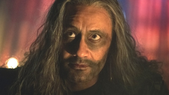
Everyone on Blackbeard's crew conforms to Blackbeard, all in black, all in leather, and to an even deeper extreme in the second season as Ed spirals. It's all dark makeup, face paint. Crudely dyed hair. Not even Izzy, whose entire attire has remained unchanged, is not left unscathed when Ed is at his lowest.
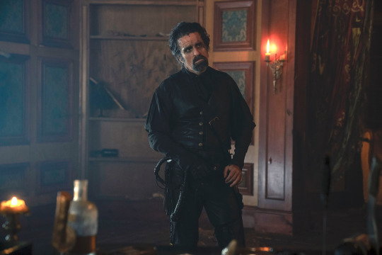
(you know, besides the whole... toe... leg... thing) The times that we see Ed in anything but his leathers in the first season are times where he is slowly breaking away from the persona he had built up. We see it a few times when Stede and Ed wear each other's clothes, but that is when they are working on the mutual goal of becoming more like the other. The other notable time this happens in season 1 is when the two are imprisoned, and the clothing that defines each of them is gone, leaving only two men with growing feelings to face one another as equals.
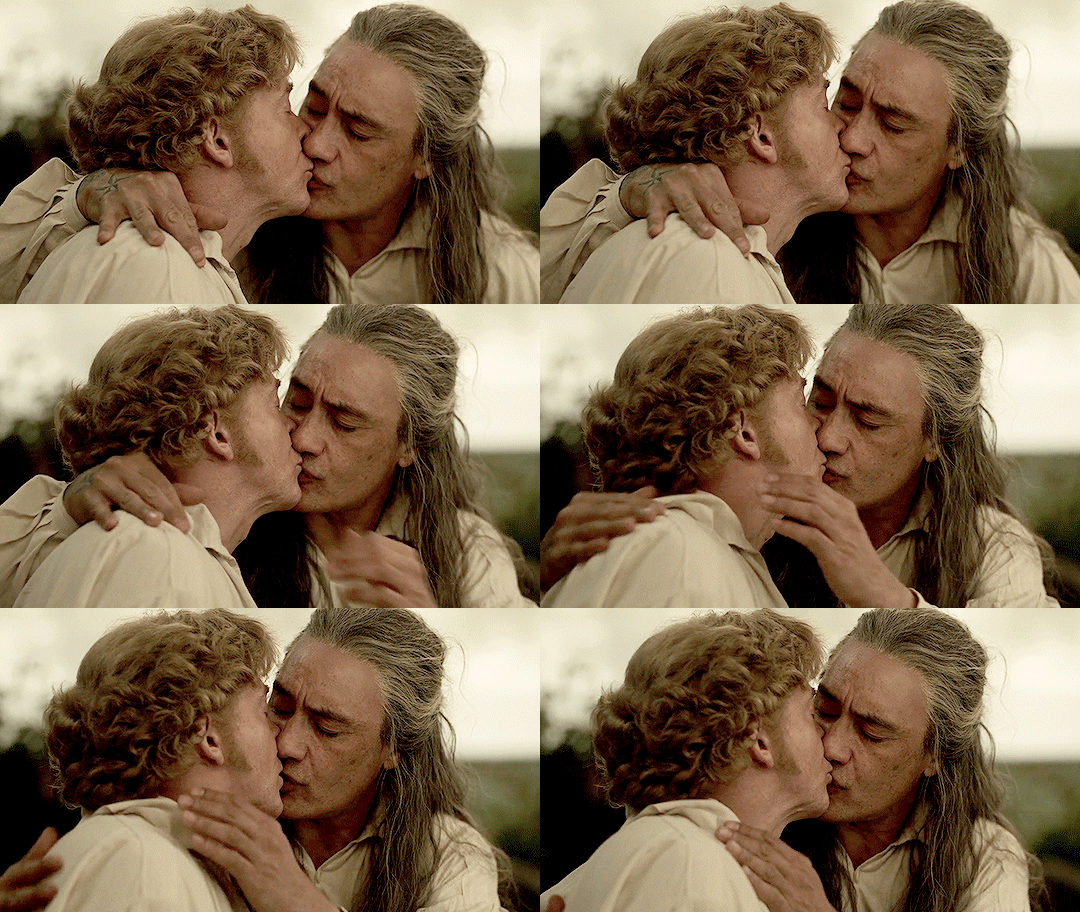
However, Ed's not really the one who I want to focus on here. Instead, I'd actually like to talk about Stede. See, I feel the whole thing with Ed was made very abundantly ham-fisted for a reason. It stresses the idea of colour and theme to us in a simple way, before adding in places beyond Blackbeard. The thing about Stede Bonnet is that, up until the most recent episodes aired (Season 2, episode 7), Stede always had a splash of white incorporated into his attire; be it a cravat or a loose shirt, Stede's attire always has a brightness to it to make his noble ass stand out from the more neutral tones of his (admittedly commoner) crew.
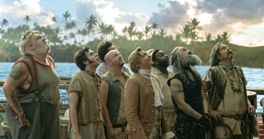
But even when Stede is wearing tones that blend in, there's always that smattering of white somewhere. Or sometimes everywhere.
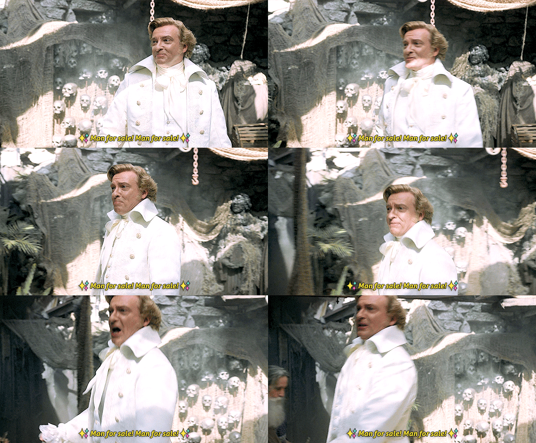
This is naturally supposed to be in contrast to Ed at all times, as no matter what, Ed's attire is always a little or a lot darker than Stede's, even when Ed was at his most Stede-like.
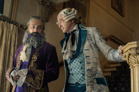
Things start to truly change mid season 2 with the discovery of a beautiful deep crimson (cursed) suit, which, if you remember, Stede secretly swipes the shirt from to keep wearing. It is this episode where we start to see a shift in Stede's colour scheme from whites and brights to something far darker than he's ever willingly worn before.
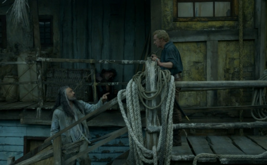
This here is the start of Stede's true descent into embracing his pirate persona in a way that did not really fit with his original ideals. By keeping a piece of the suit, Stede lies to his crew that the curse is fully, truly gone from their lives, which frankly, is quite a pirate-like thing to do, and from that moment on, his progression to being seen as a "real pirate" truly takes off. He is wearing that same shirt when he offs Ned Low, and so far, we haven't really seen him wear white since.
It all culminates into the midpoint in episode 7. Stede is basking in the fame, his ego's gotten the better of him. He's casually set a man on fire moments earlier. Ed, on the other hand, is fancying himself a career change. He had thrown his infamous black leather garb into the sea at the beginning of the episode, instead donning something much more soft and neutral; a mid-grey shirt and pants. To add to this, in the scene with Stede, Ed says the following: "I don't even know who I am! I don't wan't to be a pirate... and you- look at you! You're blowing up. You're the toast of the town!" Ed, in his neutral greys of uncertainty, and Stede in deep blues. Not in each other's clothes, but garb they had willingly chosen for themselves, and so the colour shift, where Stede is in darker colours than Ed, is a significant turning point for them both.
I personally don't see it as being White = Good or Black = Bad. I think you could see it in a lot of ways: Society vs Piracy, Gentleman vs Pirate. It could be perceived as the loss of innocence, or maybe just two strict ideals of toxic masculinity on opposite ends of the spectrum. Either way, I think it's a beautiful touch in a show about the exploration of identity of one's self. Thank you for listening to my Ed talk.
#our flag means death#ofmd season 2#ofmd spoilers#ofmd s2#stede bonnet#ed teach#blackbeard#ed x stede#colour theory#i feel like i could talk about this forever#i just think it's neat#this could be really obvious#i don't know#but i thought it'd be fun to discuss#in this essay i will
36 notes
·
View notes
Text
Headcanon:
Otis doesn’t have a favourite colour… He simply likes every single colour that could possibly exist. Every shade, every variation and that’s why he wears so many of those cute, colourful shirts, because that way he gets to represent a different colour every day.
If someone he doesn’t really know/doesn’t care about, or someone he knows he won’t see again, asks him what his favourite colour is he just says blue. Basic, boring blue. But if someone he cares about asks, someone who he wants to know then he goes into detail about what he loves most about each colour. How, when it comes to suits, he prefers darker colours. But when it comes to his everyday shirts he prefers brighter, patterned shirts and he doesn’t care if they’re dorky or not, he loves them anyway.
#this just came to me#and i had to share it#brian otis zvonecek#otis#brian zvonecek#otis chicago fire#otis zvonecek#otis headcanon#brian zvonecek headcanon#brian otis zvonecek headcanon#chicago fire#chicagofire#chicago fire headcanon#chicago fire opinions
8 notes
·
View notes
Text
Massacre Masquerade: Chapter 1
All the people were laughing and dancing as the band in the corner played their music. Everyone was more open than they usually were, more outgoing and more like their true selves. A lot of people didn’t have to hide who they were. Nobody could see another person's face, so no one could judge one particular person. You could do whatever you wanted and nobody would know it was you. It was all hidden behind the masks.
A new army for the king’s guards had been formed. The first event where all new recruits could attend was a masked ball. None of the new guards had met before, none of them had even seen each other around, so no one would know who was under each mask. The masks, ranging from plain and simple to flamboyant and colourful, would be worn all night, so then the next day, the first day on the job, no one would be able to tell which mask had been worn by which person. For all they knew,the most grim, emotionless, unsmiling person in the army, could have been the friendly, smiling, bubbly person at the ball with the unicorn themed mask who was making friends with everyone.
That was the point of this night. To be yourself with anyone else knowing who you really were.
There was a person making their way through the crowds of singing and dancing people, a paper cup with vanilla coca cola in their hand. Their mask was one they had made just the night before. A simple mask with pieces of broken CD’s, DVD’s and mirrors glued to it, with four small swan feathers sprinkled with purple, blue, pink and white glitter, two on each side of the mask. Their suit was one that someone behind a frog themed mask had said looked similar to the suit that David Bowie wore as Jareth in Labyrinth during their masked ball scene. Looking down , the wearer supposed that Frog-Mask had been on to something.
They wore a navy blue tailcoat suit, a white button up shirt, and almost pitch black trousers. The coat was speckled with gold and white sequins and plastic gems. Very similar to Jareth’s. Jareth-Suit and Frog-Mask had moved into a friendly and lengthy conversation after that encounter. A conversation which somewhere along the way had turned into flirting. Now Jareth-Suit was making their way through the crowd to a dark and secluded area where Frog-Mask had told them to meet.
Reaching the area, Jareth-Suit looked around for any sign of Frog-Mask. A hand suddenly shot out of the darkness and pulled Jareth-Mask into the shadows. Once their eyes adjusted, they could see Frog-Mask in their green puffy dress, and thigh high leggings of a darker shade of green.
‘How do you want to do this?’ Frog-Mask asked, in their deepish voice.
‘What do you mean?’
‘I like you. You seem fun. But I have no idea who you are or what you look like. I don’t want this fun to be a one night thing. I want to see you again and talk to you again. If I don’t know what you look like we can’t do that.’ Frog-Mask said.
Jareth-Suit shifted uncomfortably. ‘Can’t we just recognise each other through our voices.’ J.S had always wanted to play by the rules, and revealing each other's identity to each other would break basically the only rule this ball had.
‘Can’t do that,’ Frog-Mask replied. ‘I suck at recognising voices. If we want to be able to see each other again after this then we're gonna have to show each other what we look like.’
J.S studied F.M suspiciously. They had a feeling F.M was lying to them about the voice thing, that that was just their way of getting them to reveal their identity.
‘I’m not sure,’ J.S said uncomfortably.
F.M groaned. ‘Oh come on! No one’s around. No one will even know what we’re doing. Please. I promise I won’t tell anyone.’
Still Jareth-Suit hesitated. They didn’t know what to do. On the one hand, they really wanted to see Frog-Mask, and wanted to socialise with them in the future, become friends with them, and honestly, J.S wouldn’t mind if their relationship evolved into something else. But on the other hand, there were still rules.
‘Well?’ Frog-Mask asked, ‘What do you want to do?’
Jareth-Suit decided. ‘Okay.’
‘Really?’
‘Yeah. I agree. I like you. I want to see you again.’
‘Okay cool.’ Frog-Mask then reached behind their head and slipped the mask off of them. Jareth-Suit took in their features. They had dark eyes that would make steady eye contact with anyone. Their mask had covered their face fully, and Jareth Mask was surprised to see a stubble of facial hair on their chin. They had a very masculine face, and the surprisingly deep voice and broad shoulders made sense to Jareth-Suit. They were surprisingly attractive.
F.M was looking at J.S expectantly. ‘You gonna take yours off?’
‘Right, yeah of course.’ Jareth-Suit then reached behind their own to take off their mask. Now it was Frog-Masks turn to take in their features. They had bright green eyes and a clean shaven face. Their hair came just below their ears, and was a light brown colour and was straight and looked like it was constantly washed really well. Frog-Mask had similar thoughts with thinking that they look quite attractive.
They both stared at each other in silence for a few minutes, neither of them knowing what to say or do. It was extremely awkward for both of them.
Then suddenly without warning, Frog-Mask leaned for and kissed Jareth-Suit.
I feel like the story moved a bit too fast but what do y'all think? I also feel like this first chapter might have been to long. Please to hesitate to give feedback, suggestions or comments is you have them I am open. By the way for reference this is Jareth's suit I'm talking about:

#creative writing#here have some stories#writeblr#writers#writers on tumblr#writerscommunity#writing#author#mystery stories#tumblr stories#stories#massacre masquerade#massacre#labyrinth#jareth the goblin king#frogs#gay pride#gay#queer pride#queer writers#queer representation#lgbtq#masked men#masked ball#masquerade ball#massacre masquerade chap 1
4 notes
·
View notes
Photo


SO, for school we are making designs for on shirts/tote-bags and all the money will go to a non-profit of our choice, i’m backing a transgendercare non-profit (cause ofc i am)
my question is, which of these sketched out designs would you like on a shirt/totebag? (deffo lmk in the replies, i’d like as many answers as possible!)
oh and please share if you can!
Specific notes about each design under the read more
admittedly be water my friend has had the most work put into it and also is like the genderfluid design tho i think it just works in general whether you’re genderfluid or not. All the depicted fish are able to change gender depending on the circumstances (also i just personally love fish) I tried doing a version with the genderfluid flag colours but uh.... it looked really bad
the no gender design is the agender design out of these. I went for two different colour palettes cause i wasn’t entirely happy with the agender flag coloured one. I kinda based them on like final fantasy black mages/brimhats from witch hat atelier. I googled some stuff and i found somewhere that a circle is the agender sign, but then later i found different signs so uhm... well we’re already here
creature of the night is like.... idk to me werewolves and vampires got trans vibes, and i wanted something that was a little darker for the goths among us (however i kind of suck at drawing wolves and he came out a little goofy) the vamps lines in the coloured sketch got a little lost in the colouring but i hope to properly work her out (also the colours of this work are like a darker version of the trans flag)
and last the knights, i don’t even have text for them yet (so if you know anything feel free to give a suggestion!), i personally really love knights and also like.... i love armour, love helmets, who cares about gender when you could wield a sword or a spear and a full suit of armour (tho also arguably the messiest sketch among them, but it’s about the potential i suppose)
All the shirts are gonna be in black and white, so the background lets you know what colour the shirt will be
#transgender#genderfluid#agender#nonbinary#art#rivers art#god i don't know how to tag this at all#transvisie#<-- that's the non-profit i'll be donating to
7 notes
·
View notes
Note
It was never mentioned what colour(s) would suit Emmy best personality-wise and fasion-wise, but in Kill Switch, Will imagined her in blue (panties, but not clothings). What colour(s) do you think could or would represent Emory' personality & fashion choices, and why?
I always figured that blue was one of his favorite colors because navy was Thunder Bay Prep's school color. We see it in their uniforms. So he would have most often seen her in blue between the jacket and skirt, plus the band uniform. Along with that, I figured she probably wore jeans and jean overalls most often outside of school. It may just be a color he likes to see her in.
I am not the person to ask about fashion or style. I'm very basic and don't have really any idea of style. But I have posted about what I think her work style would be before here.
In that post, I said I didn't know if she'd wear much jewelry. This is because she works with her hands, so anything that could get caught or dangled might be a hazard. However, based on her coloring, I think she'd look best in gold if she did choose to wear it. Though, we do see her pick a silver dress for her wedding so maybe I'm wrong.
I really do think she loves jeans. They're comfortable, they can be loose and relaxed, fitted, dressed down or dressed up a bit. She can get them dirty with grease or paint and still use them. Jeans are very useful to her.
As far as PD goes, they seem to put her in a lot of black. I'm not sure if this is just a go-to for the series, as in all these characters have in common is them liking darker things, or because that's just an easy color to work with, of if that's just Emory.
This time I went to the official Nightfall Pinterest Board to see what PD would put her in. It's not always easy because PD doesn't exactly label what the pin is inspo for. Sometimes I'm taking a guess that it's Emory related.




So I'm gonna stand by my assumption that the girl would love a graphic tee. I said from a favorite movie, but I forgot that this girl is a true nerd. She'd go for the comics too. What I am surprised by are the collared shirts. It seemed a little to... classy for what I imagined Emory wearing. To me, this style fits more with Winter. Maybe I thought Em would find them fussy, and she seemed like a no-fuss type. You learn something new everyday. I did picture her in turtlenecks, so maybe I was going in the right direction?
I figured she'd like a good sweater, being from New England.
But as we can see, from the colors that PD chose, Emory would stick to basic neutrals. Tans, blues, blacks, whites. Her biggest style choices might be the graphic tees. Whether this is her style because it's simple and she didn't have a lot growing up or just what she feels comfortable, is up for interpretation. I think it's what she'd feel comfortable in. As she returns to Thunder Bay as an adult, without the all the emotion baggage she's been carrying, I could see her expanding her taste, opening up to new things, but I still think this would be her fall-backs, her comfortable, her go-tos. Nothing wrong with that.
Here are a sample of the images I find on Pinterest that fit the image I have of Emmy in her everyday life, from home to work. I think I have put her in more colors, especially browns, than PD. Browns just work for the coloring she has in my head. Don't get me wrong. Emory would own a ton of black, but...



I couldn't find a good graphic tee styled the way I see emory styling it so I chose to forego it.
And the Reverie dress from PD's Pinterest broad just for fun

Let me know if I missed anything or if you have any input. This sort of goes along with the idea from the other discussion that we don't get a good picture of Em because she's so far removed from her usual environment. Most of the time she's either wearing her uniform or clothes that aren't hers. Even in the past scenes.
... i just realized all of those pictures have long sleeves. That's not intentional.
#asked and answered#devil's night series#emory scott#character discussion#clothes#style#response to prev ask#asked and answered 80#character appearance: emory#chapter appearance
6 notes
·
View notes