#incredibly down bad
Explore tagged Tumblr posts
Text


She is so boyfriend by Justin Bieber coded
44 notes
·
View notes
Text
i need to be stuffed and puffed by my anime men
#jjba#polnareff#risotto nero x reader#jean pierre polnareff#la squadra di esecuzione#incredibly down bad#jotaro x reader#f/o x reader#romantic f/o
52 notes
·
View notes
Text

This had me howlinggg lmao 😭
also tagging anyone who’d like to join in!!
Let’s play a game
Everyone post the most recent picture in your camera roll. You only get one sentence to justify yourself if you wish. This one is mine.

My boyfriend is rly good at Latin, so I was looking up how to say ‘I love you’ but found this instead :)
Your turn!
@bookmovietvworm
@myfairkatiecat
@i-am-a-fish
@valtsv
#prev my THIRD pic happened to also be a pic of Kathryn Hahn 💀#we’re in the same boat#incredibly down bad#shauna shipman#yellowjackets#incorrect quotes
6K notes
·
View notes
Text


Can we talk about this? I feel like not enough people talk about this happening in the movie
#he just gets so well behaved and domesticated so quickly#they set up his lone wolf edgelord personality and then after he realises he's been mean to these incredible people helping him#he becomes like... the goodest boy there ever was but in a silent cat type of way#donutdrawsthings#fanart#logan howlett#james logan howlett#xmen#x men#x-men#x men 2000#xmen 2000#charles xavier#xmen storm#xmen rogue#wolverine#the wolverine#bro the tags tumblr keeps recommending me when i type logan and wolverine oh my GODDDD everyone here is down bad#but ykw so am i
4K notes
·
View notes
Text
The fact that hua cheng is canonically the best in bed out of all the mxtx tops is funny to me only because i imagine him painstakingly studying erotica novels and the kamasutra
Taking notes only he can read only because his handwriting is abysmal
Highlighting information like he's learning for an exam
Practicing dirty talk and seductive lines
All completely shamelessly because he must know all these things. Not that dianxia would ever do such things with him, dianxia's so holy and pure, but just in case! Just in case! This is just in case!
Hua Cheng is not fantasizing about it happening, this is just in case something wild happens and dianxia needs him to do this! This is purely practical knowledge!
2K notes
·
View notes
Text
there are a lot of posts out there that are positive and healthy coping mechanisms for handling the holidays. this is not one of them :)
i think there's like. going to be times in your life you will be stuck in a social situation that you cannot escape from gracefully. i do not know why the internet doesn't believe these times exist. it's not always just that your physical safety is at risk - sometimes it's legit like "i just don't currently have the energy or time to put in the effort of responding to this." sometimes it's a coworker you hate so much. sometimes it's just like, fine, you know? like you know you can handle your aunt when she's cheerily horrible, but if you actually set a boundary around her, it's going to be weeks of fallout with your father.
i don't know why people think the answer is always just "cut them out!" or "don't let them get away with that!" because ... the real world is tricky and complicated. i think kind of a lot of us have an internal "radiation poisoning" meter for certain people. like - i'm talking about the ones who are absolutely giving you gradual ick damage. like, you can handle them, but you'll be exhausted.
and yes. you absolutely should listen to your therapist and the good posts about handling others and set good boundaries and take care of yourself. prioritize peace.
HOWEVER :) ...... since im often in a situation with a Gradual Sense of Ick person i cannot just "cut out" of my life (without losing someone else precious to me) - i have sort of developed the most. maladaptive form of mischief possible. because like, if i'm going to have to listen to this shit again, i like to have a little bit of private fun with it.
now! again, i am physically safe, just mentally drained by this man. you should only do this with people you are not in danger with. which leads me to my suggestions for when your Unfortunate Acquaintance shows up and says oh everyone pay attention to me.
my favorite word is "maybe!" said as brightly and happily as possible. whenever the Horrible Person starts in on a topic you do not want to go further with, particularly if they make a claim that you know to be inaccurate, do not respond to it. you and i have both tried to actually argue with this person, and it hasn't gone well, because this person just wants the drama of an argument. however, "maybe!" gives them literally nothing to go on. it is incredibly disarming. they are used to people having some response. they know they can't prove what they're saying, and maybe! treats them like the child they are. it dismisses them in the politest way possible.
i like to say maybe! and then, in their stunned silence, immediately change the subject. this is because i have adhd and i will have something unrelated to talk about, but if you can't think of topics fast enough, i recommend just pointing to something and saying, "isn't that lovely?" because fuck you let's bring in some positivity.
by the way. that second trick - of pointing to something and stating an opinion about it? - that just works on its own, like, 70% of the time. i picked it up from teaching preschoolers. it's an intentional "redirect". it stops children crying and it also stops grown adults from finishing their explanation on why women belong in kitchens. dual wielding!
keep it silly for yourself. i absolutely do not care if people think i'm fucking stupid (it's more fun if they do) and as a result i will purposefully misunderstand things just to see how long it takes them to realize i've completely removed them from the subject at hand. when they say "women aren't funny" i get to be like. "which women." "all women." "all women in america?" "no in the world." "like the mole people? the people in the world?" "what? no. like, alive." "oh are we not counting the mole people?" "what the fuck are you talking about." "you don't believe in the mole people?"
similarly, i play a personal game called "one up me." my Evil Acquaintance literally knows this game exists (my family & friends caught onto it and now also play it) and it always fucking gets him. i don't know why. you have to be willing to be a little free-spirited on this one, though. the trick is that when they make one of those horrible little bigoted or annoying comments they are always making, you need to go one unit weirder. not more intense, mind you - just more weird. "you don't look good in that dress." "yeah, actually, my other dress was covered in squid ink due to a mishap at the soup store." "you shouldn't wear such revealing clothes." "wait, what? oh shit. sorry, your son tears off strips when no one is looking and eats them. i swear it was longer before we left the building."
the point of "one up me" is to completely upend this person's narrative. we both know this person likes setting up situations where you cannot "win" and then they really like telling other people how badly you handled it. in a usual situation, if you respond "please don't say something that rude", you're a bitch. but if you let it happen, you're letting yourself be debased. they are not usually expecting door number three: unflappably odd. because what are they going to say when they're telling everyone how badly you behaved? "she said my son eats her dresses" ".... okay?"
if you can, form an allyship with someone whomst you can tagteam with. where they can pick up on your weird "soup store" story and run with it.
the following phrase is amazing and can be deployed for any situation: "oh, be nice :) it's the holidays!" i do not know why this works as often as it does. i'll say it for the most random shit. i think this is bc most of the time these people know they're being impolite, they just like to fight.
godbless. when in doubt, remember that you could always start stealing their pens.
the whole point of this is - if you can't escape. maybe see how long you can just be. like. a horrible little menace.
#this is objectively bad advice#don't listen to it protect yourself and do real work on yourself find one of the good posts i've made about this#but also. u know. if u want to have fun while u do the work of setting boundaries#.... it IS fun#i will say that my fear of him went SO down after i just started. fucking with him.#bc i used to get SO fucking upset#i'd spend WEEKS arguing with him. tearing my hair out. sick with anxiety and dread and anger about all of it#and now i just LITERALLY do not engage#instead i'm like '' haha :) mole people" and get the HELL out of any tense conversation#i kind of think some of these people are literally addicted to drama as a form of connection#they like the rush they get from arguing#but those arguments are incredibly damaging for me#so like..... i am in the process of literally rehabilitating this person to figure out how to find connection thru#NORMAL CONVERSATION#he doesn't get it yet#i also do talk to them like they're preschool kids lmafo . ''are you using a safe and kind voice right now?''#'' do you need a snackie? you sound a little upset. let's have some hummus and come back to playtime when we feel ready''
32K notes
·
View notes
Text
george rexstrew deserves awards for many things but i have to say. edwin’s bloodcurdling scream as niko gets killed deserves a whole award unto itself. like. that scream did not feel at all like a tv show scream. to a somewhat jarring degree. and i can’t express how much I respect that
#he has a number of very convincing screams and suffering noises which I imagine was an important prerequisite for the role#but this one is just especially chilling and again. jarring. not saying that the other actors are bad or anything but no one even comes#close to competing with george and its stark in moments like this#another screaming moment that I thought he did really well in particular is far easier to gloss over and that’s#when he and charles are escaping hell and he almost gets dragged down into lust#when he’s screaming out for charles he borderline SCREECHES#throughout that arc in general it’s just incredible but yeah#I think part of what makes it so convincing is that he isn’t afraid to be high pitched and genuinely Scream rather than yell#like. he is clearly immune to being put off by ‘you scream like a girl’ rhetoric#I think a lot of male actors avoid screaming and screeching like that for that internalized reason when. if you wanna be as realistic as#possible. a scream is high pitched. if you’re scared for your fucking life it’s just involuntary#I can also see it being uncommon due to difficulties getting that sound adequately recorded but yeah anyway you get my point#tldr: george rexstrew is great at disturbingly realistic screaming and I applaud him for that#I really hope he didn’t have to retake that part too many times..#his poor throat……….#george rexstrew#edwin#edwin payne#dead boy detectives#dead boy detectives spoilers
770 notes
·
View notes
Text
Reminder that simping was invented by James T. Kirk
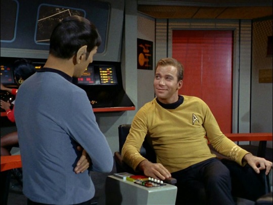
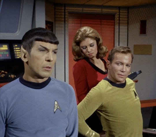
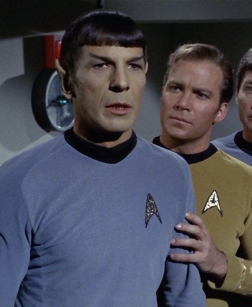
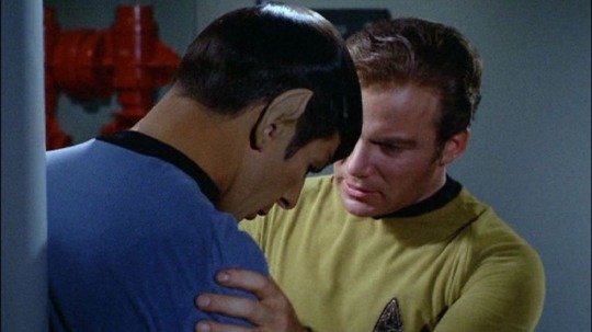
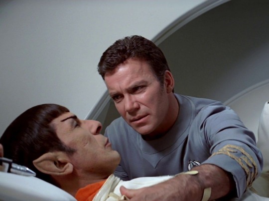
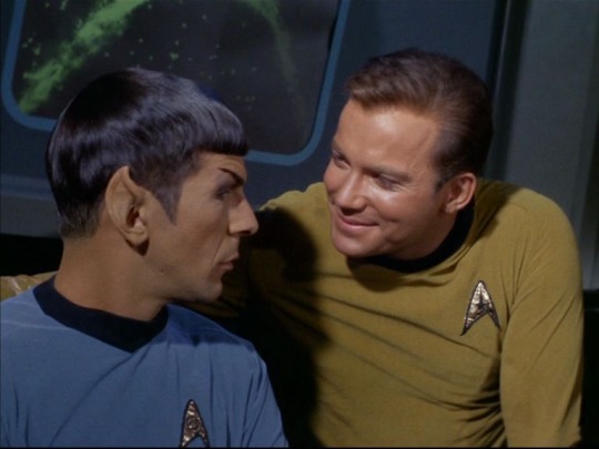
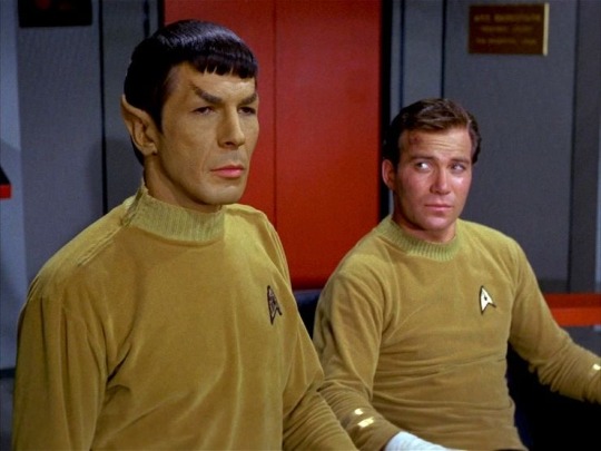
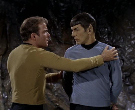
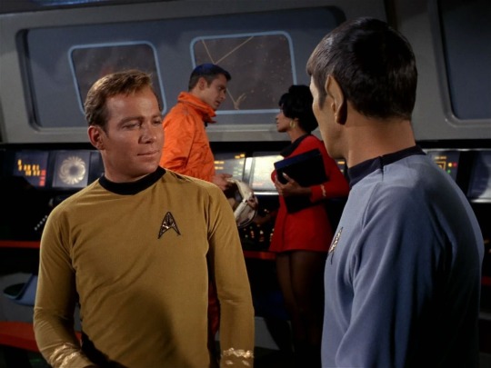
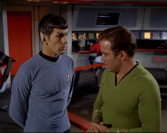
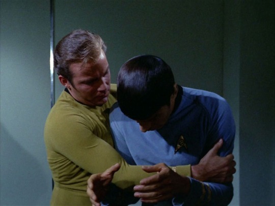
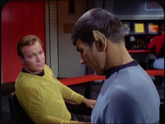
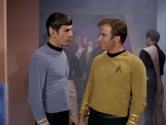
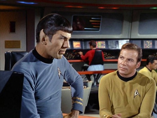
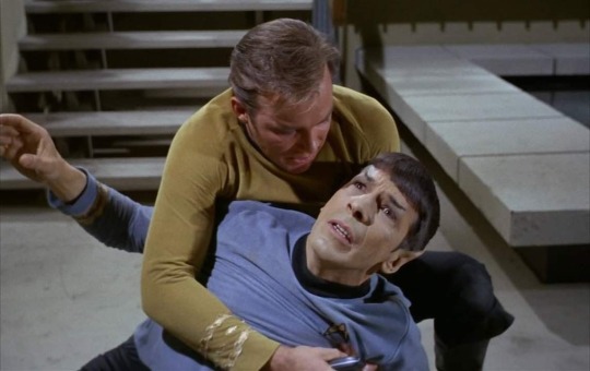
#down bad#down horrendously#down horribly#down unforgivably#down stupendously#down unimaginably#down spectacularly#down astronomically#down incredibly#james t kirk#jim kirk#spirk#spock#star trek
921 notes
·
View notes
Text


You know when you're getting a shot and the first few seconds are fine, but then it stays in for a while and really starts to hurt? Yeah ew
#collegeposting#the owl house#hunter toh#toh hunter#digital art#toh fanart#fanart#my art#doodle#needles#The nurse was actually very nice and it still wasn't as bad as the COVID shot. Anyway my roommate got me sick with something else yay!#I was so incredibly busy all day but I just sat down with some tea and I want like. The rest of the night to myself. Tomorrow Me can cope
216 notes
·
View notes
Text
So, we know that Abed is the one who invited Annie, Shirley, Pierce, and Troy to join the study group. Annie and Shirley make a lot of sense; they're both relatively friendly and clearly intelligent, it's easy to imagine either of them having brief positive interactions with Abed that would lead him to thinking of them. Pierce, while not someone I think Abed would seek out, is 100% down for inserting himself into situations. I bet he overheard Abed talking to Shirley or someone and invited himself from there. Troy, though? Troy is a little more complicated. I know that Troy and Abed are the iconic duo of all time, but it took time for that to develop. I have trouble believing that they just somehow had a good chat or something before the pilot, because in the episode Troy refers to Abed as "slumdog millionaire," which makes Shirley call him racist. I know that Troy was leaning hard into his asshole jock behavior during the beginning of season one, but I truly do not think he would say something like that if he had actually interacted with Abed. We know that Troy thinks incredibly highly of Abed once he gets to know him, and that his adoration is what pulls Troy out of his shitty high school persona. Even if he wasn't immediately able to acknowledge that he aspired to be more like Abed, he wouldn't be casually dismissing him like that if they'd ever really interacted. So, this leads me to the only possible conclusion: Abed just had a stupid crush on Troy from day one and wanted an excuse to spend more time with him outside of class. Abed might pride himself on his objective observational powers, but even he isn't perfectly logical. He'd probably tell himself that it's because a jock archetype would round out the ensemble cast dynamic, but in reality Abed is not in fact immune to Pretty Boy.
#this post is brought to you by my desire to see more appreciation for all the ways in which abed fails to live up to his supposed perfection#like i love that everyone in the show and the fandom just agrees that (like jeff says in the pilot) “abed is better”#but let's be real he's not actually above his emotions#i simply like the idea of him actually being in deeper denial than troy#because even though abed is aware of his feelings as a factor he thinks he can control them#whereas troy never even pretends that he can be normal about abed#give me more representation for abed being incredibly down bad and struggling to convince himself that it's actually about the narrative#community#nbc community#community tv show#troy barnes#abed nadir#troy and abed#trobed
331 notes
·
View notes
Text
i can't believe how few people are talking about extraordinarily sinister Rolando is!!! 👀💖💖 as an Infestor demon who thrives on psychological torment, every aspect of his body is designed to unsettle: the too-wide smile, the ability to reconstruct his physical form, and the disconnect between the smooth and jerky movements...!!!! gahhhh i just think he's so cool 🙈🙈🙈
#please folks are sleeping on this master of creepery and how well-executed he is 🥺🥺#it's understandable given what an incredible and emotionally heavy episode it is in other areas#but John Waters' fantastic performance and the care the animators put into Rolando is AMAZING 💖💖💖💖#yes i may be down bad but that's only a little part of the equation shut up 🙈🙈🙈#rolando#rolando helluva boss#helluva boss rolando#helluva boss#helluva boss spoilers#ghostfuckers#ghostfuckers spoilers#ghostf**ckers#ghostf**ckers spoilers#starleskatalks
197 notes
·
View notes
Text
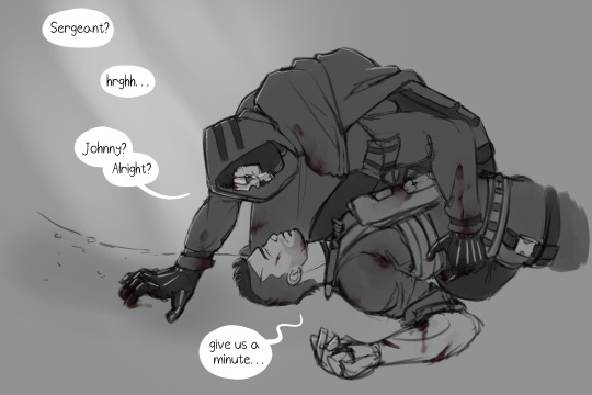
Anatomy is one of the biggest thing I need to work on, so why not do it while drawing these two fuckers.
Tried to focus just on the sketch/lineart, so no shading on this one...
#call of duty modern warfare 2#cod mw2#cod ghost#cod soap#simon ghost riley#john soap mactavish#cod fanart#ghostsoap#soapghost#ghoap#Incredibly homoerotic. as it should be#POV you're a FNG watching the LT go on a rampage after your Sergeant went down#only to find them like this after the fight ends#also of course they're covered in blood#honestly... should've put more of it#really dunk them in red paint yknow#also yes the next chapter of not alive nor dead will probably come out tomorrow#bc i left yall on another mean cliffhanger and i feel bad. again.#still got a lot to improve on with anatomy but i dont hate this
887 notes
·
View notes
Text
why Aurora's art is genius
It's break for me, and I've been meaning to sit down and read the Aurora webcomic (https://comicaurora.com/, @comicaurora on Tumblr) for quite a bit. So I did that over the last few days.
And… y'know. I can't actually say "I should've read this earlier," because otherwise I would've been up at 2:30-3am when I had responsibilities in the morning and I couldn't have properly enjoyed it, but. Holy shit guys THIS COMIC.
I intended to just do a generalized "hello this is all the things I love about this story," and I wrote a paragraph or two about art style. …and then another. And another. And I realized I needed to actually reference things so I would stop being too vague. I was reading the comic on my tablet or phone, because I wanted to stay curled up in my chair, but I type at a big monitor and so I saw more details… aaaaaand it turned into its own giant-ass post.
SO. Enjoy a few thousand words of me nerding out about this insanely cool art style and how fucking gorgeous this comic is? (There are screenshots, I promise it isn't just a wall of text.) In my defense, I just spent two semesters in graphic design classes focusing on the Adobe Suite, so… I get to be a nerd about pretty things…???
All positive feedback btw! No downers here. <3
---
I cannot emphasize enough how much I love the beautiful, simple stylistic method of drawing characters and figures. It is absolutely stunning and effortless and utterly graceful—it is so hard to capture the sheer beauty and fluidity of the human form in such a fashion. Even a simple outline of a character feels dynamic! It's gorgeous!
Though I do have a love-hate relationship with this, because my artistic side looks at that lovely simplicity, goes "I CAN DO THAT!" and then I sit down and go to the paper and realize that no, in fact, I cannot do that yet, because that simplicity is born of a hell of a lot of practice and understanding of bodies and actually is really hard to do. It's a very developed style that only looks simple because the artist knows what they're doing. The human body is hard to pull off, and this comic does so beautifully and makes it look effortless.
Also: line weight line weight line weight. It's especially important in simplified shapes and figures like this, and hoo boy is it used excellently. It's especially apparent the newer the pages get—I love watching that improvement over time—but with simpler figures and lines, you get nice light lines to emphasize both smaller details, like in the draping of clothing and the curls of hair—which, hello, yes—and thicker lines to emphasize bigger and more important details and silhouettes. It's the sort of thing that's essential to most illustrations, but I wanted to make a note of it because it's so vital to this art style.
THE USE OF LAYER BLENDING MODES OH MY GODS. (...uhhh, apologies to the people who don't know what that means, it's a digital art program thing? This article explains it for beginners.)
Bear with me, I just finished my second Photoshop course, I spent months and months working on projects with this shit so I see the genius use of Screen and/or its siblings (of which there are many—if I say "Screen" here, assume I mean the entire umbrella of Screen blending modes and possibly Overlay) and go nuts, but seriously it's so clever and also fucking gorgeous:
Firstly: the use of screened-on sound effect words over an action? A "CRACK" written over a branch and then put on Screen in glowy green so that it's subtle enough that it doesn't disrupt the visual flow, but still sticks out enough to make itself heard? Little "scritches" that are transparent where they're laid on without outlines to emphasize the sound without disrupting the underlying image? FUCK YES. I haven't seen this done literally anywhere else—granted, I haven't read a massive amount of comics, but I've read enough—and it is so clever and I adore it. Examples:


Secondly: The beautiful lighting effects. The curling leaves, all the magic, the various glowing eyes, the fog, the way it's all so vividly colored but doesn't burn your eyeballs out—a balance that's way harder to achieve than you'd think—and the soft glows around them, eeeee it's so pretty so pretty SO PRETTY. Not sure if some of these are Outer/Inner Glow/Shadow layer effects or if it's entirely hand-drawn, but major kudos either way; I can see the beautiful use of blending modes and I SALUTE YOUR GENIUS.
I keep looking at some of this stuff and go "is that a layer effect or is it done by hand?" Because you can make some similar things with the Satin layer effect in Photoshop (I don't know if other programs have this? I'm gonna have to find out since I won't have access to PS for much longer ;-;) that resembles some of the swirly inner bits on some of the lit effects, but I'm not sure if it is that or not. Or you could mask over textures? There's... many ways to do it.
If done by hand: oh my gods the patience, how. If done with layer effects: really clever work that knows how to stop said effects from looking wonky, because ugh those things get temperamental. If done with a layer of texture that's been masked over: very, very good masking work. No matter the method, pretty shimmers and swirly bits inside the bigger pretty swirls!
Next: The way color contrast is used! I will never be over the glowy green-on-black Primordial Life vibes when Alinua gets dropped into that… unconscious space?? with Life, for example, and the sharp contrast of vines and crack and branches and leaves against pitch black is just visually stunning. The way the roots sink into the ground and the three-dimensional sensation of it is particularly badass here:

Friggin. How does this imply depth like that. HOW. IT'S SO FREAKING COOL.
A huge point here is also color language and use! Everybody has their own particular shade, generally matching their eyes, magic, and personality, and I adore how this is used to make it clear who's talking or who's doing an action. That was especially apparent to me with Dainix and Falst in the caves—their colors are both fairly warm, but quite distinct, and I love how this clarifies who's doing what in panels with a lot of action from both of them. There is a particular bit that stuck out to me, so I dug up the panels (see this page and the following one https://comicaurora.com/aurora/1-20-30/):

(Gods it looks even prettier now that I put it against a plain background. Also, appreciation to Falst for managing a bridal-carry midair, damn.)
The way that their colors MERGE here! And the immense attention to detail in doing so—Dainix is higher up than Falst is in the first panel, so Dainix's orange fades into Falst's orange at the base. The next panel has gold up top and orange on bottom; we can't really tell in that panel where each of them are, but that's carried over to the next panel—
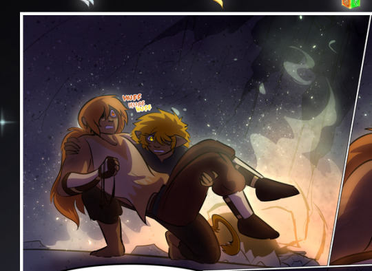
—where we now see that Falst's position is raised above Dainix's due to the way he's carrying him. (Points for continuity!) And, of course, we see the little "huffs" flowing from orange to yellow over their heads (where Dainix's head is higher than Falst's) to merge the sound of their breathing, which is absurdly clever because it emphasizes to the viewer how we hear two sets of huffing overlaying each other, not one. Absolutely brilliant.
(A few other notes of appreciation to that panel: beautiful glows around them, the sparks, the jagged silhouette of the spider legs, the lovely colors that have no right to make the area around a spider corpse that pretty, the excellent texturing on the cave walls plus perspective, the way Falst's movements imply Dainix's hefty weight, the natural posing of the characters, their on-point expressions that convey exactly how fuckin terrifying everything is right now, the slight glows to their eyes, and also they're just handsome boys <3)
Next up: Rain!!!! So well done! It's subtle enough that it never ever disrupts the impact of the focal point, but evident enough you can tell! And more importantly: THE MIST OFF THE CHARACTERS. Rain does this irl, it has that little vapor that comes off you and makes that little misty effect that plays with lighting, it's so cool-looking and here it's used to such pretty effect!
One of the panel captions says something about it blurring out all the injuries on the characters but like THAT AIN'T TOO BIG OF A PROBLEM when it gets across the environmental vibes, and also that'd be how it would look in real life too so like… outside viewer's angle is the same as the characters', mostly? my point is: that's the environment!!! that's the vibes, that's the feel! It gets it across and it does so in the most pretty way possible!
And another thing re: rain, the use of it to establish perspective, particularly in panels like this��

—where we can tell we're looking down at Tynan due to the perspective on the rain and where it's pointing. Excellent. (Also, kudos for looking down and emphasizing how Tynan's losing his advantage—lovely use of visual storytelling.)
Additionally, the misting here:
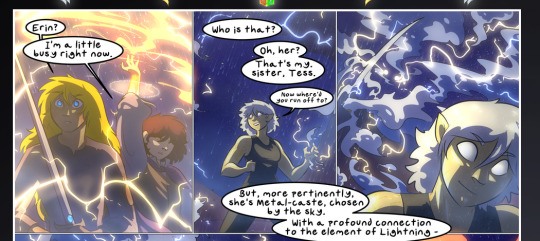
We see it most heavily in the leftmost panel, where it's quite foggy as you would expect in a rainstorm, especially in an environment with a lot of heat, but it's also lightly powdered on in the following two panels and tends to follow light sources, which makes complete sense given how light bounces off particles in the air.
A major point of strength in these too is a thorough understanding of lighting, like rim lighting, the various hues and shades, and an intricate understanding of how light bounces off surfaces even when they're in shadow (we'll see a faint glow in spots where characters are half in shadow, but that's how it would work in real life, because of how light bounces around).
Bringing some of these points together: the fluidity of the lines in magic, and the way simple glowing lines are used to emphasize motion and the magic itself, is deeply clever. I'm basically pulling at random from panels and there's definitely even better examples, but here's one (see this page https://comicaurora.com/aurora/1-16-33/):

First panel, listed in numbers because these build on each other:
The tension of the lines in Tess's magic here. This works on a couple levels: first, the way she's holding her fists, as if she's pulling a rope taut.
The way there's one primary line, emphasizing the rope feeling, accompanied by smaller ones.
The additional lines starbursting around her hands, to indicate the energy crackling in her hands and how she's doing a good bit more than just holding it. (That combined with the fists suggests some tension to the magic, too.) Also the variations in brightness, a feature you'll find in actual lightning. :D Additional kudos for how the lightning sparks and breaks off the metal of the sword.
A handful of miscellaneous notes on the second panel:
The reflection of the flames in Erin's typically dark blue eyes (which bears a remarkable resemblance to Dainix, incidentally—almost a thematic sort of parallel given Erin's using the same magic Dainix specializes in?)
The flowing of fabric in the wind and associated variation in the lineart
The way Erin's tattoos interact with the fire he's pulling to his hand
The way the rain overlays some of the fainter areas of fire (attention! to! detail! hell yeah!)
I could go on. I won't because this is a lot of writing already.
Third panel gets paragraphs, not bullets:
Erin's giant-ass "FWOOM" of fire there, and the way the outline of the word is puffy-edged and gradated to feel almost three-dimensional, plus once again using Screen or a variation on it so that the stars show up in the background. All this against that stunning plume of fire, which ripples and sparks so gorgeously, and the ending "om" of the onomatopoeia is emphasized incredibly brightly against that, adding to the punch of it and making the plume feel even brighter.
Also, once again, rain helping establish perspective, especially in how it's very angular in the left side of the panel and then slowly becomes more like a point to the right to indicate it's falling directly down on the viewer. Add in the bright, beautiful glow effects, fainter but no less important black lines beneath them to emphasize the sky and smoke and the like, and the stunningly beautiful lighting and gradated glows surrounding Erin plus the lightning jagging up at him from below, and you get one hell of an impactful panel right there. (And there is definitely more in there I could break down, this is just a lot already.)
And in general: The colors in this? Incredible. The blues and purples and oranges and golds compliment so well, and it's all so rich.
Like, seriously, just throughout the whole comic, the use of gradients, blending modes, color balance and hues, all the things, all the things, it makes for the most beautiful effects and glows and such a rich environment. There's a very distinct style to this comic in its simplified backgrounds (which I recognize are done partly because it's way easier and also backgrounds are so time-consuming dear gods but lemme say this) and vivid, smoothly drawn characters; the simplicity lets them come to the front and gives room for those beautiful, richly saturated focal points, letting the stylized designs of the magic and characters shine. The use of distinct silhouettes is insanely good. Honestly, complex backgrounds might run the risk of making everything too visually busy in this case. It's just, augh, so GORGEOUS.
Another bit, take a look at this page (https://comicaurora.com/aurora/1-15-28/):
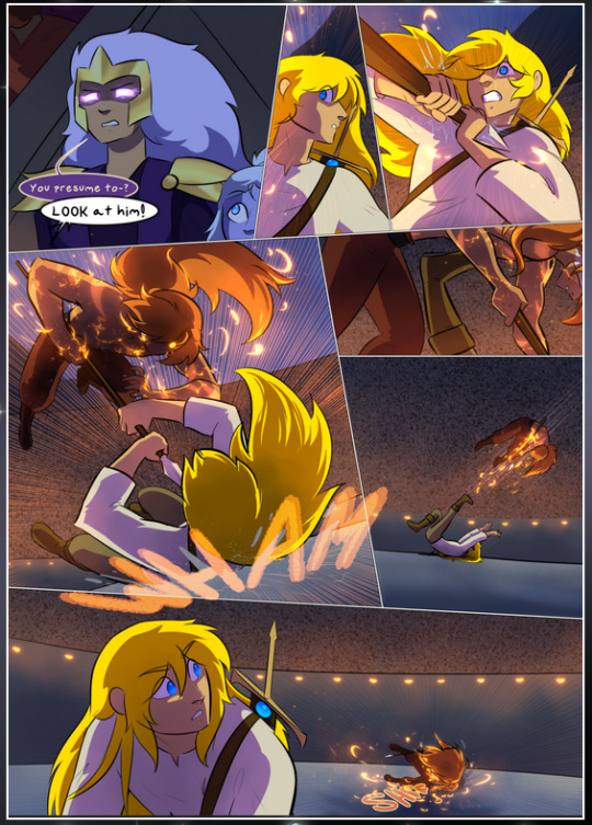
It's not quite as evident here as it is in the next page, but this one does some other fun things so I'm grabbing it. Points:
Once again, using different colors to represent different character actions. The "WHAM" of Kendal hitting the ground is caused by Dainix's force, so it's orange (and kudos for doubling the word over to add a shake effect). But we see blue layered underneath, which could be an environmental choice, but might also be because it's Kendal, whose color is blue.
And speaking off, take a look at the right-most panel on top, where Kendal grabs the spear: his motion is, again, illustrated in bright blue, versus the atmospheric screened-on orange lines that point toward him around the whole panel (I'm sure these have a name, I think they might be more of a manga thing though and the only experience I have in manga is reading a bit of Fullmetal Alchemist). Those lines emphasize the weight of the spear being shoved at him, and their color tells us Dainix is responsible for it.
One of my all-time favorite effects in this comic is the way cracks manifest across Dainix's body to represent when he starts to lose control; it is utterly gorgeous and wonderfully thematic. These are more evident in the page before and after this one, but you get a decent idea here. I love the way they glow softly, the way the fire juuuust flickers through at the start and then becomes more evident over time, and the cracks feel so realistic, like his skin is made of pottery. Additional points for how fire begins to creep into his hair.
A small detail that's generally consistent across the comic, but which I want to make note of here because you can see it pretty well: Kendal's eyes glow about the same as the jewel in his sword, mirroring his connection to said sword and calling back to how the jewel became Vash's eye temporarily and thus was once Kendal's eye. You can always see this connection (though there might be some spots where this also changes in a symbolic manner; I went through it quickly on the first time around, so I'll pay more attention when I inevitably reread this), where Kendal's always got that little shine of blue in his eyes the same as the jewel. It's a beautiful visual parallel that encourages the reader to subconsciously link them together, especially since the lines used to illustrate character movements typically mirror their eye color. It's an extension of Kendal.
Did I mention how ABSOLUTELY BEAUTIFUL the colors in this are?
Also, the mythological/legend-type scenes are illustrated in familiar style often used for that type of story, a simple and heavily symbolic two-dimensional cave-painting-like look. They are absolutely beautiful on many levels, employing simple, lovely gradients, slightly rougher and thicker lineart that is nonetheless smoothly beautiful, and working with clear silhouettes (a major strength of this art style, but also a strength in the comic overall). But in particular, I wanted to call attention to a particular thing (see this page https://comicaurora.com/aurora/1-12-4/):
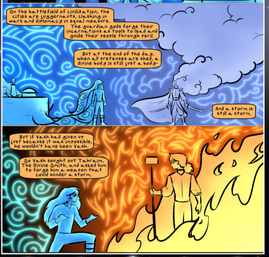
The flowing symbolic lineart surrounding each character. This is actually quite consistent across characters—see also Life's typical lines and how they curl:
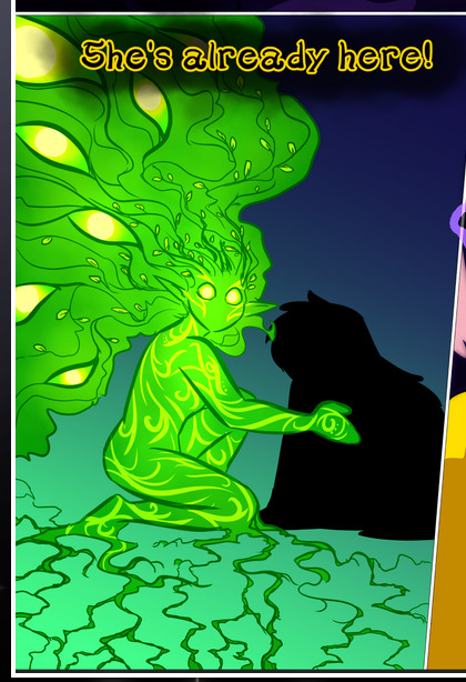
What's particularly interesting here is how these symbols are often similar, but not the same. Vash's lines are always smooth, clean curls, often playing off each other and echoing one another like ripples in a pond. You'd think they'd look too similar to Life's—but they don't. Life's curl like vines, and they remain connected; where one curve might echo another but exist entirely detached from each other in Vash's, Life's lines still remain wound together, because vines are continuous and don't float around. :P
Tahraim's are less continuous, often breaking up with significantly smaller bits and pieces floating around like—of course—sparks, and come to sharper points. These are also constants: we see the vines repeated over and over in Alinua's dreams of Life, and the echoing ripples of Vash are consistent wherever we encounter him. Kendal's dream of the ghost citizens of the city of Vash in the last few chapters is filled with these rippling, echoing patterns, to beautiful effect (https://comicaurora.com/aurora/1-20-14/):
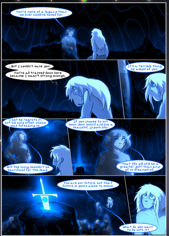
They ripple and spiral, often in long, sinuous curves, with smooth elegance. It reminds me a great deal of images of space and sine waves and the like. This establishes a definite feel to these different characters and their magic. And the thing is, that's not something that had to be done—the colors are good at emphasizing who's who. But it was done, and it adds a whole other dimension to the story. Whenever you're in a deity's domain, you know whose it is no matter the color.
Regarding that shape language, I wanted to make another note, too—Vash is sometimes described as chaotic and doing what he likes, which is interesting to me, because smooth, elegant curves and the color blue aren't generally associated with chaos. So while Vash might behave like that on the surface, I'm guessing he's got a lot more going on underneath; he's probably much more intentional in his actions than you'd think at a glance, and he is certainly quite caring with his city. The other thing is that this suits Kendal perfectly. He's a paragon character; he is kind, virtuous, and self-sacrificing, and often we see him aiming to calm others and keep them safe. Blue is such a good color for him. There is… probably more to this, but I'm not deep enough in yet to say.
And here's the thing: I'm only scratching the surface. There is so much more here I'm not covering (color palettes! outfits! character design! environment! the deities! so much more!) and a lot more I can't cover, because I don't have the experience; this is me as a hobbyist artist who happened to take a couple design classes because I wanted to. The art style to this comic is so clever and creative and beautiful, though, I just had to go off about it. <3
...brownie points for getting all the way down here? Have a cookie.
#aurora comic#aurora webcomic#comicaurora#art analysis#...I hope those are the right tags???#new fandom new tagging practices to learn ig#much thanks for something to read while I try to rest my wrists. carpal tunnel BAD. (ignore that I wrote this I've got braces ok it's fine)#anyway! I HAVE. MANY MORE THOUGHTS. ON THE STORY ITSELF. THIS LOVELY STORY#also a collection of reactions to a chunk of the comic before I hit the point where I was too busy reading to write anything down#idk how to format those tho#...yeet them into one post...???#eh I usually don't go off this much these days but this seems like a smaller tight-knit fandom so... might as well help build it?#and I have a little more time thanks to break so#oh yes also shoutout to my insanely awesome professor for teaching me all the technical stuff from this he is LOVELY#made an incredibly complex program into something comprehensible <3#synapse talks
778 notes
·
View notes
Text
Whenever people who are entrenched in diet culture talk about how terrible chemicals are, I just want to whip out this:
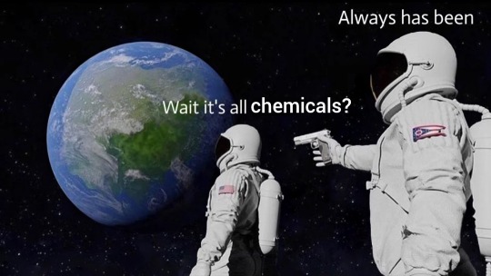
#diet culture#diet culture tw#described images#image description in alt#'it's got CHEMICALS in it' and so do you! and me too! IT'S ALL CHEMICALS ALL THE WAY DOWN#instead of running from this world we must learn to embrace it#i'm not particularly angry at people who say this because it makes me think that they're incredibly invested in diet culture...#...i just don't want the whole 'food = bad' or 'bodies = bad' to go unchallenged...#...part of the reason why diet culture seems just as prevalent now (if not moreso) is partially because it isn't really...#...challenged or questioned without provocation. it's just assumed to be correct because it makes you 'feel in control'#when chemicals are bad you can control what chemicals you consume. it's individualistic and places the blame onto you for 'being good'#it places responsibility onto the person in such a way that it becomes impossible to fulfill#it isn't that i'm upset that people want to treat their bodies in a way they think is responsible...#...moreso that the *way* they go about it ensures that they're stuck in a cycle of self-blame and even self-hatred#because the METHOD is ineffective. not the desire to treat your body well#also the state of ohio looks stupid and i do Not respect it#it looks like a ball that is simultaneously deflated and over-inflated#also their state flag looks silly to me#it looks like the person who was making it fell asleep making it#i'm just clowning on ohio at this point. have never been to ohio but. are you guys okay
1K notes
·
View notes
Text


i thought if i demanded more and pushed myself, it’d be a means to escape my own prison. ➢ jack davenport as lieutenant ralph clarke, the incredible journey of mary brant (2005)
#the incredible journey of mary bryant#jack davenport#ralph clarke#filmedit#periodedit#perioddramaedit#*userbolt#gif: misc#i just want to pull that collar straight so fuckin bad. smooth the ruffles down. etc.#this shirt did not fit him at all but it is a small price to pay for having this scene exist at all#ugh. ugh!!! this guy!!!!
103 notes
·
View notes
Text
The way Carla showed up absolutely smitten down bad horrendous in the gayest of outfits she could find just be called a friend ohhh the PAIN


#the way carla is the one thats down bad is such a breath of fresh air though#thank u corrie for girlkisser carla connor we all say in unison#shes so incredibly sexy though LISA PLEASE#shes clearly been through this before shes like augh she's just straight its whatever#but with carla literally turning up in this how could u at all think this is a straight lady#lisa ur so funny sometimes#coronation street#swarla#carla x lisa#i love lisa swain SHAKES HER affectionately#carla connor#lisa swain
60 notes
·
View notes