#image ids
Explore tagged Tumblr posts
Text
Id: a flag with 5 equal horizonal stripes. From top to bottom, they are dark red, dark orange, a warm light yellow, the same dark orange, and the same dark red. In the middle of the flag there is a graphic of a sun that uses the colors from the flag.


01. amotresolale! (a-mow-tray-sol-ail)
[pt: amotresolale, pronounced a-mow-tray-sol-ail]
a gender connected to having a love-hate relationship with either the Sun or something/someone directly connected/related to the Sun!
coined for day 1 of norma's coin war! we're on team apollo and we chose the prompt 'the sun' for today! no spoons for id, help appreciated but not forced <3 coined by felix!

taglist!!! @radiomogai @idwl @rwuffles @daybreakthing @boingogender
24 notes
·
View notes
Text
Sometimes folks who take it upon themselves to provide image IDs for other people's posts end up demonstrating oddly specific knowledge. Like, you'll see an image depicting (among other things) a bearded man in a nondescript black robe, and then the followup reblog is like "ID: a deacon of the Latvian Orthodox Church [...]" like, getting the denomination and rank is impressive enough, but the jurisdiction as well? Now we're just showing off. I love it.
1K notes
·
View notes
Text


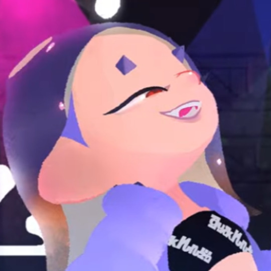

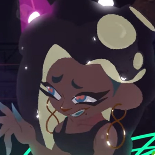
suffer no fools ! matching? pfps / icons
free to use no art is mine id in alt text
#pearl houzuki#frye onaga#shiver hohojiro#marina ida#marina splatoon#splatoon 3#splatoon#splatoon 2#off the hook#discord#twitter#random icons#icons#profile picture#matching pfps#alt in id#image ids
240 notes
·
View notes
Text
Use alt text on your dividers, on your dni banners, on every image you post. Create image IDs when you are able, or AT LEAST tag as undescribed.
Your alt text for your dni banner can literally just be the text on the banner. For a divider it could be "Row of white hearts and bows." For your images you just describe the important bits of the image.
It's really not that hard and it's a failure to members of our community who have low vision, who get overwhelmed by images, who rely on screen readers for whatever reason.
TLDR : use alt text because you are failing members of our community
#did system#did osdd#actually did#did community#did posting#did alter#osddid#actually dissociative#dissociative identity disorder#plural stuff#plural#plural community#plural system#plurality#alt text#image ids#screen readers#low vision#pluralgang#actually plural#actually disabled#disability#accessibility#ableism#disablism
50 notes
·
View notes
Text
I made a bunch more embroidered patches!
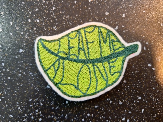
[ID: A green, leaf-shaped patch with darker green details. The veins of the leaf are shaped like letters that read 'Leaf Me Alone'. End ID.]
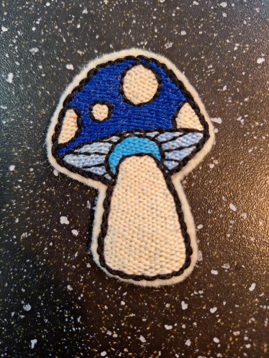
[ID: A patch shaped like a cartoon mushroom. The mushroom has a blue cap with white spots. End ID.]
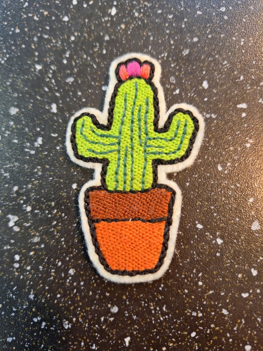
[ID: A patch shaped like a light green cactus in a terracotta pot. The cactus has 2 arms/branches and a pink flower on top of the central stalk. End ID.]
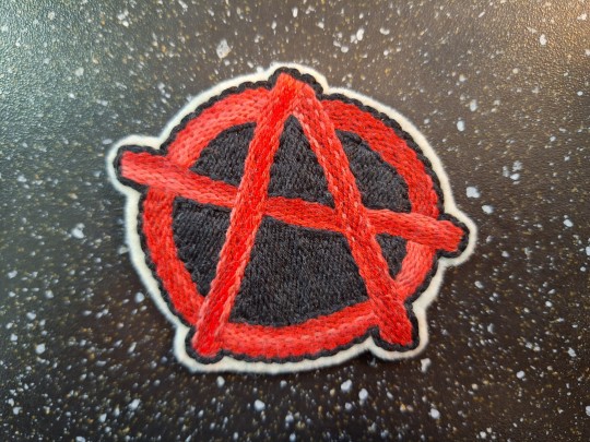
[ID: A red and black patch that features the Anarchy symbol. End ID.]
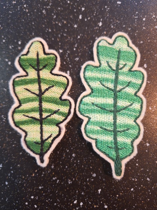
[ID: 2 patches shaped like oak leaves. They are embroidered with multicoloured thread that gives them a striped appearance with varying shades of green. End ID.]
#i'm still having fun making these#it takes a long time though#embroidered patch#patches#patch making#punk patches#embroidered#embroidery#handmade#sewing#diy#punk diy#sew on patch#diy punk#solarpunk aesthetic week#solarpunk#id#image ids
88 notes
·
View notes
Text
Hey y’all I’m here talking about misusing alt texts again
I made a post like this a while ago, but I can’t find it to reblog so I’m just making a new one
Basically, I’m just wanting to talk about how some people (and I’m not talking about anyone in particular here) use the alt text feature for things that don’t include image descriptions.
For anyone who doesn’t know, an alt text is an accessibility tool used to give a description of an image. It benefits lots of people, including visually impaired people.
They’re also handy, because they can make hard to parse images more clear, or describe audio in videos for people who can’t hear it, among other things.
That includes folks who just don’t have their sound on, too! Also if your internet is patchy and and an image won’t load you can read an alt text to get an idea of what the image is about!
Basically, they’re very handy!
Now, alt texts & image descriptions are an optional thing you can add to posts, and I’m not trying to pressure people into making them! I just want to talk mainly about misusing the feature!
(Bold talk for a girl who just spend several paragraphs talking about other stuff)
Anyway, onto my main point:
What the alt text feature is not used for is adding extra commentary.
I see people just putting random things in alt texts somewhat often, and it always annoys me a bit.
By adding an alt text that isn’t a description, you’re making it more unclear to people who need them.
And you’re making your commentary less easy to find by putting it in the alt text, but that doesn’t really matter.
And no hate to anyone who does this! I’m just trying to explain that it’s maybe not the best thing to do.
If anyone is interested in making image descriptions for their posts, it isn’t too hard! You don’t have to do anything crazy. A simple description is always better than none at all.
You can be as detailed as you like, but keep in mind that this isn’t creative writing practice, so try not to get too convoluted. (With the exception of descriptions of art, because it can be much more subjective)
You’ll just want to describe the main points of the image. This may include:
-the subject(s) of the image
-text or lettering
-details relevant to the post*
-and lots of other things, depending on the context
* an example of this would be something that adds to the punchline of a joke. Like, if an image is a cat with a funny shocked expression, then you’d want to make sure to mention the cat’s expression, since that’s the important part of the image.
Instead of “a tabby cat sitting down” you’d want to say “a tabby cat with a surprised expression”, if that makes sense
Anyway, that’s all i had to say! Feel free to send me asks about this if you have questions. I will answer them to the best of my abilities :]
Also, I don’t claim to be an expert on writing image descriptions, I just make them for my posts almost always
Also also, thanks for reading my long post!
#my posts#sigh#this is one thing that probably isn’t a big deal but I still want to talk about#I know max two people will actually read this but that’s whatever#accessibility#image ids#accessibility on tumblr#?#pods rants
34 notes
·
View notes
Text

Forgot to post this here, my bad!!!!!
#amy rose#amy rose sonic#artists on tumblr#my art#fanart#game fanart#sonic the hedgehog#sonic the hedghog fanart#sonic the hedghog fandom#sonic the hedgehog amy#sonic amy#sonic amy rose#sthh#sth#fanart sonic the hedgehog#fan art#fan arts#image id#image ids#furry#sfw furry#sfw furry art#furry art#amy rose the hedgehog#amy the hedgehog#digital art#digital artist#amy rose is so cool#i made a cbc based on her and i love that cbc#legit one of my favourite character based characters i made
20 notes
·
View notes
Text
abro bear!

this bear is the defender of aspecs and microlabels. reblog to have her maul an exclusionist and/or a queerphobe
#byrd chirps#byrd's silly art#an exclusionist and/or a queerphobe? that's just the same thing twice! etc etc#abrosexual#abroromantic#pride critters#abro#aspec#acespec#arospec#aplatonic spectrum#abroplatonic#image described#described#image id#image id in alt text#image ids#id in alt#alt text#shoutout to Janus her sona may be a wolf but she's a mama bear fr fr
53 notes
·
View notes
Text
To those saying they do not know how to write image descriptions for graphics here a small tutorial. keep in mind we can go into a large amount of detail with ID's because we are writers outside of tumblr. Please know you do not need to be elaborate with the details simply ID's are alright as well. I will start off with images, especially complex ones, because this is a huge one people struggle with. I will give an example with the graphic below
(all art is official from LoL, and the graphic was created by us)

First you are going to want to start off by understanding composition. What is the main focus in the image and from there what details are most important. in this image there are 4 main elements. I will start with the main focus of the image then go into the background doing my best to explain what we are looking at. Below is 2 examples of first is a longer more indepth example the second is a shorter one.
[Longer description ID]
Image ID: there is a pastel pink portrait photo with the text 'Yummi' in an off white colour with a bright pink border. Inside the image is a white cat with pink accents sitting on a book. The background of the photo is sky blue with clouds and pink effects. On the right of the image of a cat who is mostly white with pink accents, the cat is on top of a floating book and it has a slightly transparent shadow underneath it. behind the portrait is a bright pink curtain with 2 bows on either side of the image. behind both images is a light pink circle shaped lace texture.
[End of long ID]
[Shorter ID]
Image ID: A graphic with 2 photos of a white cat with pink accents. one is in a pastel pint portrait photo with text that says 'Yummi' in an whiteish colour with a bright pink outside. behind that is a bright pink curtain and a light pink circle lace.
[End of short ID]
Tips - do not use the characters name as a replacement for explaining the characters look as it does not help those who may not know that media. Avoid using hex code colours. Instead, use terms like dull / bright / soft / muted / dark / neon to describe colors. For those who are colourblind or may not know the colour, you can ask friends, ask in servers you might be in, or just try your best. Lastly, if you are someone like me who has a chronic illness and has days were trying is hard you can see if someone else can help you with the ID or keep it simple. Image IDs do not need to be complex, they can short as long as people can get a general idea of what the image is.
@/ing in order to get this post across
@herrscherofmemories @preydatory @fwus @gutsinabrainjar @whisfer
#editblr#sntry graphics#rentry.co#rentry graphics#image ids#rentry#sentry#lol graphic#rentry resources#idk what else to tag
40 notes
·
View notes
Text
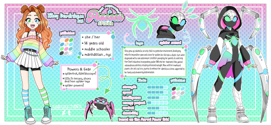

It is finally time, after 2 years, Riley once again has a new reference. I am extremely happy with this one. The layout of everything was the hardest part for me... I might keep this sort of style for Yuki's ref as well, just with different elements. »——-«══✿═╡°˖✧✿✧˖°╞═✿══»——-« [Image ID: A detailed digital character reference sheet for a Marvel Spider-Verse OC named Riley Dominique, alias The Prismatic Peacock-Spider. The background features a pink to blue to green gradient with polka dots. Riley's appearance includes orange wavy hair styled with space buns, green and blue eyes a beauty mark under her left eye, a pink choker necklace, a green hairclip, and silver hooped earrings. She wears a pastel rainbow striped sweater over a tank top and a pleated white skirt with a bubble chain with black bike shorts underneath, paired with blue and green striped socks and teal glitter sneakers. Next to her is her Spider-Bot who is roughly soccer ball sized. The Spider-Bot is named Kaleidescope, Kal for short. Kal is pink, black, and white with green and blue lenses for eyes. Riley's spider suit incorporates the colors pink, green, blue, black, and white. It features a built-in hood, with the interior of the hood being pink. The lenses in her mask are blue and green. Additionally, the suit is equipped with four iron spider legs attached to the back. Her shoes are equipped with LEDs emitting blue and green colors. A bust drawing depicts Riley in her suit with her hood lowered, her spider sense activated, manifesting as peacock feathers.]
#(✿~autistic_artist~✿)#(✿my_art✿)#oc#art#redesign#superhero#marvel cinematic universe#marvel#marveloc#spideroc#into the spider verse#across the spiderverse#spidersona#image ids#image id in alt text#image id is in the built in image description#id in alt#described#image described#alt text
43 notes
·
View notes
Text
this was. supppsed to be a . sketch.

[Image ID: A digital piece of Golden Wind fanart of Fugo, showing him driving a car in front of a Chipotle. He is scowling. Text in front of Fugo reads: “Pissed because Chipotle had no iced tea.” with proper capitalization and punctuation. /. End ID.]

[Image ID: A continuation in the same medium, this time of Narancia. He is inside a different car in front of town scenery. Narancia is smiling proudly with a Chipotle iced tea machine resting against his shoulder. The text in front of him reads: “finessed chipotle iced tea machine” with no capitalization or punctuation. /. End ID.]
bonus:

[Image ID: A digital, messily sketched image of Fugo opening a door, looking solemn. Red SFX text to his left reads “sigh”. /. End ID.]

[Image ID: A continuation in the same medium. With the back of his head facing the camera, Fugo stares wide-eyed at Narancia, who is facing the camera with a smile as he kicks his legs back and forth at a dining table. A drink is in Narancia’s hands, and a Chipotle iced tea machine is set up on the table. Narancia is saying “Fugo! Loo-“ and is cut off by the next image. /. End ID.]

[Image ID: A continuation in the same medium. Fugo stares directly at the camera, expression unreadable yet intense, with the red, capitalized word “YOU.” placed in front of him. /.End ID.]
#jjba golden wind#jjba part 5#jjba vento auero#narancia ghirga#pannacotta fugo#shitpost#my art#image id in post#image ids
20 notes
·
View notes
Text
me & my mutuals
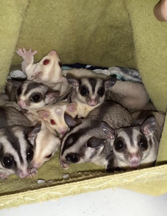
[image ID: 8 sugar gliders nestled together in a yellow, blankety, enclosure tent.]
#otherkin#therian#alterhuman#therianthropy#sugar glider therian#sugar glider#marsupial therian#marsupial#therian things#therian meme#therianthrope#alterhuman community#image ids
35 notes
·
View notes
Text
I fucking hate the innacessibility in the tumblr poetry community.
The amount of screenshot or pictures of poems without image IDs makes me so mad!! They're so easy to add!! Just add the fucking ID!!!
21 notes
·
View notes
Text
Hey folks! Here's a silly little blog to make the site a bit more accessible. Feel free to request ids/descriptions or ask for help making your own ids.
I'm just a beginner when it comes to this, so if anyone would like to help moderate this account let me know through asks or somewhere on my blog @trenchcrows (they/them)

( Image taken from https://www.tumblr.com/vanilla-bean-buttercream/747691303086718976 )
28 notes
·
View notes
Text
Idc if I seem like a dick for saying this but:
NOT EVERY IMAGE NEEDS AN IMAGE IDENTIFICATION. NOT EVERYONE NEED TO CATER TO YOUR NEEDS. 
#:33< text !#just because you have a disability#doesn’t mean everyone needs to cater to it#im (mentally) disabled myself and I don’t expect everyone to cater to my needs.#I fear that is common sense#———————————————————#tumblr is so sensitive#image ids#disability#disabled#mentally disabled#disabilties#mental health#mental illness#mental wellness#low empathy#low sympathy#idgaf anymore#npd#actually npd#narcissistic pd#actually narcissistic
12 notes
·
View notes
Text

[ID] denim sweat pants layed on a carpet floor. there's a variety of political, band and fandom patches sewn on with floss. some stitching are in the classic punk style while others are in other experimental styles. most patches are homemade from black fabric while two are store bought. there are also safety pins attached in empty space [END ID]
crust pants progress. there's sm patches i have ideas for but i'm just so hyperfixated on games i forget sighh. feel free to take inspo!
#cripple punk#cripplepunk#cpunk#diy punk#trans punks#trans punx#crip punk#c punk#crust punk#hardcore punk#punk rock#punk#crust pants#patch pants#patches#diy or die#image ids
28 notes
·
View notes