#i added a lot of stuff furniture included
Explore tagged Tumblr posts
Text
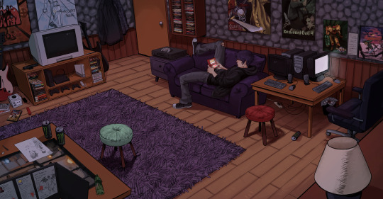
FINALLY FINISHED THIS!! my own interpretation and additions to Sebastian's room in sdv ! Tried to keep anything in the image from the year 2010 or predated. i think theres a few give and takes but i really like the "older brother" early 2000s grunge aesthetic on another level and i thought who better fits it than him. I put a lot of references to stuff i personally like as well ^_^

#my art#sdv#sdv fanart#stardew valley#stardew valley sebastian#stardew#sebastian stardew valley#sdv sebastian#could be ooc in some parts#i added a lot of stuff furniture included#for funsies#referenced almost any media in here from real cases and posters as well
9K notes
·
View notes
Text


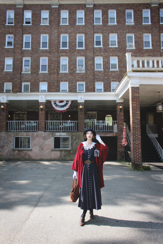
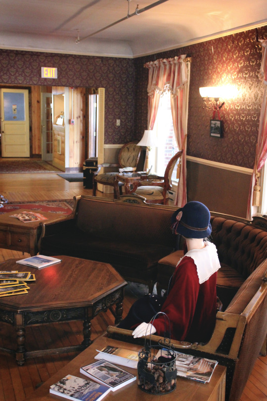

Back in August, my mother, my sister and I did a three day roadtrip to Lake Placid in New York State, where the 1932 and 1980 Winter Olympics were hosted. We hiked and visited Adirondack natural wonders the two first days, but because my health was starting to fail me on the second day, we kept the third one for visiting the Downton Abbey costume exhibition at the Lake Placid Center for the arts.
On our way to the exhibit, we passed by the Pines Inn, formerly known as the St. Moritz Hotel, a hotel built in 1907. I had wanted to stay at that hotel, but my mom refused, saying it was in poor shape and looked haunted on the hotel booking sites (she wasn't wrong, but I love that stuff, as you know). I still insisted for us to at least visit it, and we sure did NOT regret it. We stumbled upon one of the concierges (or new owners, correct me if you see this!), and he loved my outfit so much that he gave us a tour of the hotel, including in areas closed to guests. He told us that Albert Einstein and the Kennedys had been guests at the hotel, that there was n*de sunbathing on the roof in the 1930s and that a lot of the furniture was original. Sadly, after the 80s, the hotel slowly went into decrepitude and abandonment, and many things got stolen and damaged. The new owners are currently working hard to restore the hotel, and it's indeed a lot of work.
Outfit rundown Dress: vintage Ingeborg (Pink House) Velvet michiyuki: vintage Hat: Rudsak with added brooch by Fuwari Gloves: vintage Shoes: old Clarks Bag: second-hand Vivienne Westwood Belt: thrifted Big British stamp brooch: second-hand Jane Marple Small marine cat stamp brooch: Via Carousel Anchor and crest brooches: vintage Earrings: old Dracolite
#fashion#vintage#vintage style#vintage fashion#1920's#1920's fashion#1920 fashion#20's fashion#retro fashion#pink house#jfashion#historybounding#old buildings#historical building#old hotel#lake placid#st. moritz#1900s architecture#antique#antique decor#long hairstyles#vintage hair#faux bob#vintage makeup#fanny rosie#fannyrosie
514 notes
·
View notes
Note
Hello! I’m just here bc I’m a little confused on what you meant by Smythe drawing out “each individual asset” when she was making comics? Now, granted, I can see that it made her file ginormous, but me personally as someone who knows nothing about making online comics but is really wanting to get into it (and also as someone who has a ‘too many layers’ problem myself), is there a way to avoid using too many layers?
My current way of making comics has been to draw the panels individually and then format them (which I know is terrible management wise and also messes with the quality) but I honestly have no other idea of how to do it properly, and seeing how stunning Lore Rekindled looks, I don’t know how you would manage to put all that lighting effects and little details on the same layers. (But also I may be thinking of it wrong so I’ll let you talk qwq)
Ah I can actually give you a visual breakdown of what I meant by that!
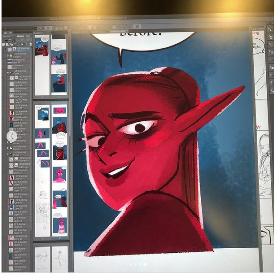
So in this you can see there are a TON of layers, and not even all of them are visible because some of them are stuffed into FOLDERS that have been left closed. BUT if you look REEEEALLY carefully-

^^^ These layers right here? That's specifically Minthe from this panel in Episode 61:

(the unique pose here makes it real easy to tell that this is the corresponding panel, you can see the matching body shape with the dark shading that's clipped to the base layer below it!)
So what this means is that Rachel didn't draw all her characters on one base layer, she drew every single character in every single panel separately. Now of course, she could merge all these layers together as working on separate layers helps make it easier to work on elements that collide separately (like one character being 'underneath' another character like Hades is here) but because she has all of those clipping layers with the shading already added in, she likely didn't merge them afterwards because that would actually create MORE problems (because if she merged the Minthe layer in with Hades, then the shading for Minthe that she painted outside of the lines would show up on Hades and then she'd have to erase it which is just a bunch of extra work).
You can also tell all these characters are on their own layer because the layer thumbnail EXCLUSIVELY shows those characters. A layer will show as much canvas length as it needs to cover what's in that layer, so if the thumbnail is only showing one character, that means there's NOTHING ELSE on that layer. If there were more elements on this layer than just Minthe, the layer thumbnail would look more like this:

Now let's compare it to Rekindled's layers! I'll use a completed page to make it fair as we use a lot of extra layers in the post-production phase where we add the texture effects and glow and all that fun stuff, plus I'll even make it a more complicated page like that big nymph explanation spread from Episode 51:
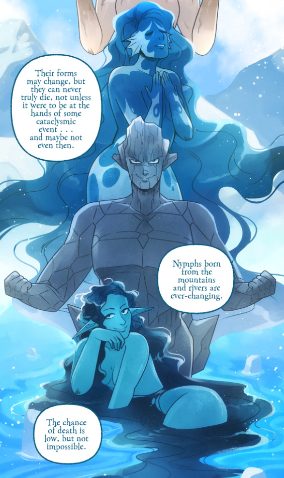
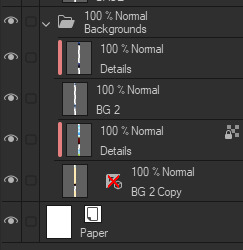
So I'll break it down to make this make more sense:
BG 2 Copy (technically this is supposed to be BG 1) - Basically the panel shapes, what I'll do is mark out the panels with flat blocks and through that we'll add background elements in a clipping layer (usually done by Banshriek). Often times they'll do multiple layers to make the process easier and then merge them all together in the end. With these shapes operating as panels, it means I can just auto select the whole layer, invert the selection, and easily erase whatever's outside of it (such as the lineart and base colors that I put down afterwards). I could just use masking layers like I did in [AFTERBIRTH] but I find this way works better for the process of making Rekindled.
BG 2 - This is where we add objects / foreground elements. So stuff like furniture, interactables, anything that needs to be kept separate from the larger background to make it easier to work with. This can also include "floating" panels that need to be above other panels, such as this:

All of the backgrounds are then nested in a folder for organization purposes (we also sometimes use clipping layers on top of those folders to apply extra effects over anything contained within that folder without affecting other folders, that's a common technique that Banshriek applies)
Then we get into our Characters folder:
BASE - This is where I do the majority of my work, all the characters in every panel on a page are flatted into this layer. Sometimes I do have to create separate layers to, again, make it easier to work with overlapping characters, but usually those layers will be merged before I go into the shading process. I simply shade on a single layer by using the lasso / magic wand tool to select my area for painting, the flat colors make it really easy to do that. Sometimes I need to create a secondary shading layer if I've put down dark colors that start to bleed into the lighter colors, but again, I merge when I'm done into a single shading layer. We also sometimes employ an Add (Glow) layer into the clipping set if we need a glow effect that's exclusive to the characters and doesn't travel outside of their base colors.
There's a (leaves) layer here that I used for the dryad because I needed the leaves to be above the base layer, after that I selected the leaves elements so that I could erase the lineart in the layer above it where needed.
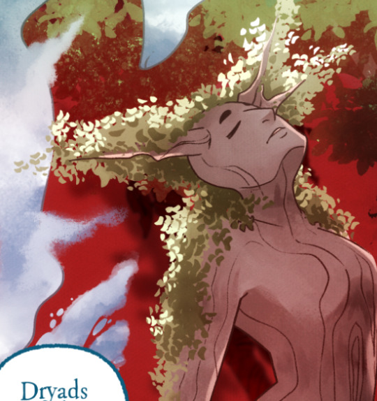
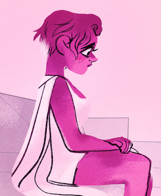
LINEART - It's lineart, enough said haha That said, I do think Rachel actually uses clipping layers for her lineart in places, it seems to be visible in some of her process videos where you can see the lineart present in a clipping layer, and that would explain why there are panels where the lineart suddenly 'cuts off' and doesn't travel outside of the base layer, like so:

GLOW - This is where we do an Add (Glow) layer that isn't restricted to the base layer, it's where we add all the fun lil' glow and sparkle effects over the characters !
The CLOUDS layer is, like the leaves, a background element that needs to be above the base layers rather than constricted to the background.
Above the Characters folder you can see what I mentioned earlier where Banshriek has added more post-production effects that are exclusively clipped to the contents of the Characters folder. This means the effects / blend modes do NOT affect the background layers or anything above it.
The BLUR (Overlay) layer is something we just started doing over the past several episodes, it's a technique I actually picked up from 66 of City of Blank where I merge all the layers into a new visible layer which I then apply a Gaussian Blur to at around 60% and then set to Overlay (and then I adjust the layer opacity until it looks right, usually around 25-35%), it gives it a bit of a softer "dreamier" vibe in the final colors and really helps unify everything!
CANVAS - This is an Overlay layer which is also set to an opacity of 25-35% where I go over the panels with the Add Canvas brush from the Kyle Webster set, unlike the Canvas overlay texture in CSP I can actually choose the colors I want to use which means I can match the canvas texture color to the mood and environment of the scene (ex. I'll use a very light blue for scenes in the Underworld). Not only does it give it that signature texture from S1 of LO, but it also helps balance out the effects of the BLUR layer.
The SKETCH layer sits on top of everything and gets turned off once all the base layers and lineart are down, and ofc the SPEECH folder is just where all the text is kept.
I know everything I just laid out is a LOT but ultimately it's how we operate, it works for us! But it also begs the question of why Rachel operates the way she does because a lot of it seems extremely unnecessary and more likely to bite her in the ass (the more layers there are, the bigger your file size gets, the risk of drawing on the wrong layer increases as well as the risk of posting a panel that's missing elements because the layer was left turned off by mistake, etc.) And it's more so concerning with how she operates with her assistants because if she's still using this many layers when collaborating with other people, hooo boy. Though based on what I've observed of what her assistants contribute, I get a lot more of the sense that she circumvents this by having the artists do the flats separately and then importing them in as separate assets that she then just imports into the page and places them where they need to be. Still not a great workflow IMO because it's what's led to a lot of the issues of characters "floating" rather than feeling like they're actually in the environment-
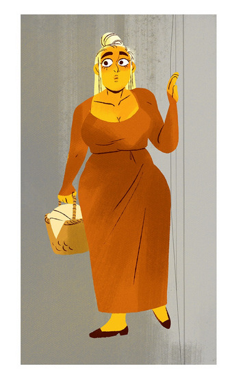
-but that's still an issue that could be solved by Rachel just taking more time to actually flesh out the backgrounds and lighting to give more of an impression of the characters actually existing in the space. Like that Hestia panel could easily be fixed by just giving the background a bit more detail and putting actual shading underneath her (and lighting from whatever direction it's coming from).
Either way, regardless of whether or not Rachel's process is productive or not, I hope that breakdown helps explain how we do it in Rekindled! Learning how to manage layers is definitely a skill that can be tricky to harness, but once it "clicks" there's a lot you can get away with. Ultimately how you do it is up to you, but my best piece of advice to offer is to just be open to other types of workflows because you don't know how much you might be shooting yourself in the foot doing things the hard way when there are often way easier and more efficient ways to get the same job done. That's basically the vibe I get from observing Rachel's workflow, it seems like she's still using methods that she thinks are working for her (and probably did work just fine for her when it was JUST her) but could be vastly improved for her and her team if she'd just get over the initial hump of stepping outside of her comfort zone. Would probably make for a better comic too LOL
I hope that helps! Good luck! ( ´ ∀ `)ノ~ ♡
#ask me anything#ama#anon ama#anon ask me anything#lore olympus critical#anti lore olympus#lo critical#lore rekindled#webcomic advice
154 notes
·
View notes
Text


"I had the pleasure of designing and illustrating the long sleeve for @julienrbaker’s merch capsule by @slowdowndrygoods for her current tour. This work was really special to me and I have some words about it if you’d care to continue reading As soon as Eli asked if I wanted to make something I knew I wanted it to have a nostalgic warmth. The whole project involving Memphis folks is already so special, I wanted to contribute to that in the most authentic way possible. We had the idea to run with a candle as the main focal point. I love illustrating rooms, furniture, and domestic scenes of all kinds (as I have emphasized ad nauseam through my tattoo work) The life and memories held within four walls can feel electric and evoke such varying emotions from person to person. Drawing particular spaces from memory, I find, adds a surreal and dreamlike quality that transforms it from specific to personal, reflecting and highlighting elements of a room that have stuck with me over the year, moving through and away from them. It is all at once vulnerable, specific, vague, and inviting. This space is inspired by The Seven House back in Memphis where I’d seen so many shows, seen Julien perform with The Star Killers and Forrister, and so many other keystones in the scene at that time. I included a bunch of other stuff that’s not so specific to The Seven House but to Julien herself. So, that said, there’s a lot of memories crammed into this room that I hold in my heart and now you can carry it with you too A few things I snuck in here include a painting by @arielwolfebaldwin, a smith7 sticker, Julien’s beloved Beans, a Dunkin’ Donuts cup, a picture of the Memphis College of Art building, and more. I don’t usually sign my drawings but I sort of put myself in here, in a more pictorial / literal sense. I also fully remember the 7 house having a busted standee of a basketball player? Can anyone confirm this? Anyway, now you know what your merch means. Thanks again for asking me to be a part of this, Eli. And thanks to Julien for always carrying your friends with you. Much love Layout and formatting for print by @mrdrewryan Thanks @smith7_wicker for all the memories" - via tattoosbyclover
#“thanks to julien for always carrying your friends with you” yeah ouch because exactly this exactly this!!!#i loooove this story so felt important to share in full!!!!#i tried putting the split images back together but it messes up the quality so ill just keep it like this#julien baker#side note i need this shirt a lot
83 notes
·
View notes
Text
FINALLY
after NINE. HOURS. (NOT including meals and sleep) ITS FUCKING DONE.
A complete floorplan of the entire Harrington house. Including too much thought about random, throw-away lines from characters and squint-to-see-it background glimpses inside.
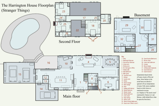
plently of stuff in the actual house is altered or straight up ignored in favor of following the fiction logic and because I Wanted To. A lot of this is motivated by my headcanons for the Harringtons and how I'm writing them in my fic, but I'm also certainly not an architect so it's by no means perfect. It is, however, unreasonably canon compliant in the few bits we do see.
Thought Process (for context):
the darker shaded floor areas are lower than the rest, some bits like the garages having stairs and some areas like the sun and dining rooms list being like a step lower. Windows are marked with dashes along the outside, sliding doors are two thin lines slightly overlapping, stairs change color as they diverge from the level we're looking at, and furniture is eyeballed so don't look to closely a the scale.
not all closets are labeled, just the ones i figured could be confusing. Steve and the guest rooms have closets i promise.
the laundry room and pantry are not the same size but by the time i noticed i was exhausted. so pretend they're both more reasonably sized.
i don't know what the floorplan symbol for garage door is and then i forgot to look so the headlights point to where the doors are and you can see them clearly in photos so yeah.
The general layout is based on the idea that the Harringtons are or were into hosting dinner parties and business meetings in their home, especially as a young rich couple looking for respect in their circles (Mr. Harrington taking on his father's business and reinforcing that power, Mrs. Harrington climbing her own social ladder and building an image).
So the house is laid out with hosting areas towards the right with the office big and near the dining room because it's more than just a workplace, it represents him as a businessman. In canon the entryway and living room both have very high ceilings and no second-floor above them, so I'd imagine they're also aware of how the top floor looks from below, hence the fancy double/french doors to the master bedroom which is in plain view from below. Steve's room and the guest room are's nearly as visible.
As for the kitchen and sun/pool rooms, I see them more as secondary hosting areas that aren't used as the main location most of the time and are more this background setting to these events that still feel rich. The kitchen is massive and mostly for dinner-parties and Mrs. Harrington's social events.
The kitchen and main bathroom's placement is based on a line Steve said to Barb giving her directions to the bathroom: "down past the kitchen, to the left". With the massive living room on the left and wanting to keep the dining and office close by, i interpreted the "to the left" part being like "find the kitchen, then turn left". And with the rest of the area being open-concept, the bathroom would be the only normal door over there and easy to find. it's a bit of a stretch with just that line, but it makes sense to me with the rest of the context for the layout.
the basement is similar to this, though not as openly displayed so I imagine its for slightly closer friends. Theres a garage door down there so I figured Mr. Harrington might have a cool car he shows off, like he's letting people in on a personal detail about himself. There's also a guest room down there (the only one still considered 100% for guests, more on that later) for those people.
beside the basement garage, there was originally one main garage that holds two cars, obvious Mr. and Mrs. Harrington's cars. I imagine they bought the house before having kids, so a third one wasn't on the mind but after having Steve they added the front one (either turning the carport into a closed garage or they never had a carport and added a whole new addition, up to you)
Both garages lead to the same part of the house, and that area is the only one besides the water heater room that is purely function over effect. It still looks good like the rest of the house but it's not made to be fancy because guests would rarely need to be over there if at all and it's not noteworthy from other parts of the house.
In my headcanon, Steve's room used to be a guest room, staying his room from nursery to present with Mrs. Harrington renovating every now and then. Its one of those places in the house that doesn't have to look perfect for all to see, so she gets creative and has fun with it.
The upstairs guest room is also unofficially Mrs. Harrington's room, based on a line where Tommy mentions a fireplace in "his mom's room" instead of "guest room" or "parent's room" or "master bedroom". I belatedly realized this could be a solidarity thing with Steve hating his dad and calling the master bedroom his mom's room, but that was after 9 hours of this and im not changing it but there you go. In this version, I imagine she leaves the master some nights because her marriage with Mr. Harrington is failing (cheating and all, I wouldn't want to be in the same bed with someone who cheated either)
the master bathroom was an executive decision, just looking at the house in canon and not having enough space in my first attempts, i decided the triangle roof part above the dining and office could fit a master bathroom.
Feel free to use or reference this in your own fics! Feel free to block out my furniture or walls and make your own version. If you share my image please credit with an @ mention!! (again, 9 hours) (thank you fhalsfhd)
#steve harrington#steve has bad parents#stranger things#steve's parents#the harringtons#steve harrington stranger things#stranger things steve#stranger things season 1#steve stranger things#stranger things steve harrington#Steve's house#stranger things thoughts#stranger things theory#stranger things tumblr#devon's steve henderson au#steve henderson au rambles#this was made specifically for my steve henderson fic so a lot of this backstory is tied to that#i've listened to david bowie the entire duration of this and istg my internal monologue is dubbed in this guy's voice hELP ME#im so tired#wELP TIME TO DO HENDERSON'S HOUSE#devon thinks sometimes#shit you can use if you wanna
1K notes
·
View notes
Text
Another sex offender TIM released into the public.........and given a laptop
Daughter's fury as paedophile father who abused and shared images of her with other sick perverts online before changing gender in prison is quietly released (...and given a laptop by an offender's charity)
By ROSS SLATER
PUBLISHED: 10:47 EDT, 16 July 2023 | UPDATED: 10:49 EDT, 16 July 2023
A paedophile who changed gender while in prison for sexually abusing her own daughter as a child and sending explicit photos of her to perverts online has been quietly released back into the community - and given a laptop by a do-gooding charity.
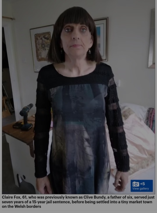
Claire Fox, 61, who was previously known as Clive Bundy, a father of six, served just seven years of a 15-year jail sentence, before being settled into a tiny market town on the Welsh borders.
Fox, who wears a black wig and floral dresses told neighbours, who knew nothing of her sordid past, that she was an electrician from Bangor as they helped her get settled into her new surroundings and helped her furnish her flat.
Fox's release from prison has appalled her daughter Ceri-Lee Galvin, who bravely waived her right to anonymity, having been abused by her father for nine years from the age of eight.
Revealing her astonishment, Ceri-Lee, 24, told MailOnline: 'My father is not a woman and I refuse to recognise him as such. He changed his gender in prison to make his life there easier.
But now he is out and already up to his usual tricks – conning everyone he meets.
'The fact he is now dressed as a woman makes him more dangerous as young girls are his thing and he has never shown any remorse.
'My father is a highly manipulative man who has attended no sexual offender rehabilitation programmes, shown no remorse for what he has done and openly admits finding children attractive.
'There have been no meetings I'm aware of to tell local schools about his presence, he has no tag and no curfew. He has just been put into this community and given all he could wish for – food, furniture, a home and a laptop.'
Ceri-Lee, now a student paramedic, added: 'I am in no way transphobic and I feel incredibly sorry for people who genuinely need to transition. They face stigma and worse because of cases like this.
'But it should just not be an option for those convicted of sexual offences against children to suddenly say that they want to be a woman.
'This only arose at the end of 2021 when he was due to be moved to an open prison but then had a fight with a fellow prisoner that was serious enough to stop the move.
'That is when he went for the gender change – when he was almost 60, having been a macho man all his life and having had eight children and having never mentioned gender dysphoria before.
'Now he is being indulged by everyone. The prison service gave him make-up and women's clothes and now a charity for the armed forces have provided him with so much stuff when all he did was a short stint in the Territorial Army in his 20s.
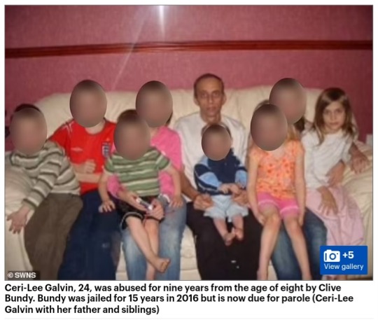
He has conned them. He was never a soldier. The whole thing is outrageous.'
Fox arrived in a sheltered accommodation block for older people in a tiny town at the start of June.
She was given new furniture, a television, printer, washing machine, crockery and a laptop by the armed forces charity SSAFA because she had once been in the Territorial Army.
Fox's neighbour Lyn Robinson, 74, said: 'My first impression was that this person was very cheerful and amenable, assuring all us older people that they'd be no trouble. They seemed very confident despite the outlandish appearance.
'I thought she might find it difficult fitting in so I really took care of her. I gave her clothes and even lent her £70, which is a lot for a pensioner.
'I took her to the food bank at the Baptist Church where she was given loads of stuff including vouchers for a butcher in town and for a coffee shop.
'And we went to a concert at St Edward's Church where I introduced her to the vicar. I had no idea of her history.
Fox's decision to change gender before being released from prison, provoked a storm of protest when it was revealed in April.
She chose the same name as gender-critical campaigner and media pundit Claire Fox, now sitting in the House of Lords as Baroness Fox of Buckley.
Campaign groups fear that by changing their gender, sex offenders can effectively whitewash their past and could avoid detection under the Home Office's Disclosure and Barring Service, set up to protect children from abusers.
DBS uses official paperwork such as a passport or driving licence to carry out their checks, both of which can prove difficult to check after choosing a new name and gender.
The potential loophole is provided by the Gender Recognition Act (2004), which created a 'sensitive applications route' for trans people.
Ceri-Lee added: 'The victim liaison officer told me the only reason I was being informed about the name and gender change was because he had given permission for this to happen.
'It's allowing him to say that Clive Bundy never existed, that my abuse never existed and it is clearly a danger to children which is why I decided to speak out.'
Fox is not the first sex offender to change gender while in prison
A rapist who carried out sexual attacks as a man named Adam Graham in 2016 and 2019 sparked a heated debate earlier this year after changing gender and name to Isla Bryson while waiting to stand trial at the High Court in Glasgow.
And in 2018, convicted rapist 'Karen White' – branded a 'highly manipulative' predator by a judge – was moved to HMP New Hall in Wakefield, West Yorkshire, and sexually assaulted two women inmates.
Fox was arrested after police discovered images of Ceri-Lee online that the abuser had been trading with other pedophiles.
She was later charged with and admitted to several counts of sexual activity with Ceri-Lee, inciting a child to engage in sexual activity and distributing indecent images.
In 2016 she was sentenced to 15 years in prison. It was not until the end of 2021 that she told the authorities she wanted to change gender.
A SSAFA spokesperson, said: 'SSAFA, the Armed Forces charity provides practical, emotional and financial assistance to serving personnel, reservists, veterans and their families in their time of need. Due to data protection laws and our need to protect our beneficiaries' and employees' confidentiality, we cannot comment on individuals or their circumstances.'
A spokesperson for Dyfed-Powys Police said: 'In line with national guidelines we can neither confirm nor deny the information you have provided.
'However, we can confirm that Multi Agency Public Protection Arrangements are utilised throughout the entire force area to manage appropriate offenders living in the community and they will be closely supervised by local officers to minimise any risk.'
393 notes
·
View notes
Note
idk if this is allowed but maybe laughing jack or candypop x pregnant reader? hope this doesn’t break any rules 😭

I technically have two LJ pregnancy posts, click here for telling LJ you're pregnant, and click here for a couple headcanons of him during pregnancy
As for Candy, I hope both of you enjoy ^^ I just included both the requests since you both asked for it.
ABSOLUTELY over the moon once Candy finds out the news that you're pregnant. Candy has always been a big family man, and he's always felt a bit lonely since the loss of his original family all those years ago. To be able to start a new family with you here and now makes him so indescribably happy, he almost doesn't know what to do with himself, he's basically vibrating and he can't stop (gently) scooping you into his arms because he's so excited. At one point while he's hugging you he begins to cry because he's so overwhelmed, and of course, you get concerned for him, but he assures you it's just because he hasn't felt this excited about something for a long, long time.
Candy keeps his eyes on you a LOT during your pregnancy. He doesn't want you to push yourself or let you get too stressed because he doesn't want any harm to come to you or the little one developing inside of you. He makes sure to go to all of your appointments with you and remember any information they tell you, and he makes sure if they tell you any recommended vitamins you should be taking to pick them up when you guys are heading home, and he makes sure you're eating all the right stuff. He almost gets a bit more into your pregnancy than you are, but he's just so excited for the three of you, yes, including the little one. When it comes to the possibility of knowing the gender before the baby is born, I think Candy would want you guys to be surprised, especially since it's not 100% accurate. Plus, he thinks it's fun to think up names for both possible genders, although I also think he's the type to try to think up a few gender-neutral names, that way you could find a name both of you love that could be used for your baby regardless. He loves just laying down with you at the end of the day and staring at each other as you cuddle up, just saying random names until one of them clicks, it's so domestic and it's a kind of bliss he's wanted with you for so long.
When it comes to decorating a room for your baby, I feel like that's one of the most exciting parts for Candy to be quite honest, as he loves decorating, and knowing it's for your baby just makes him so hyped up. In my canon bedrooms in the mansion adjust to however the person living in it wants it to look accordingly, so an extra door and another little room are soon added inside Candy's bedroom for the two of you to use for the baby. Rather than letting the mansion decorate itself, though, Candy decides to paint and furnish the room with the two of you. He paints the walls himself, and I think he'd paint a beautiful landscape, with clouds and fields, and the far wall at the top is a starry night sky, under which you can put the crib. He loves picking out furniture and toys for the little one with you, although I'm also sure Jason and LJ make a whole metric fuckton of toys for the two of you as Candy's best friends. When it gets into late pregnancy and you have a harder time moving around he's more than happy to carry you himself, especially because it gives him a reason to be closer to you. He's a huge help to you throughout your pregnancy, and he just can't wait for the two of you to meet your baby once they're born, as he knows the two of you are going to love and care for that little guy so much together.
#creepypasta#creepypasta headcanons#creepypasta headcanon#creepypasta x reader#candy pop#candy pop headcanon#candy pop headcanons#candy pop x reader
66 notes
·
View notes
Text
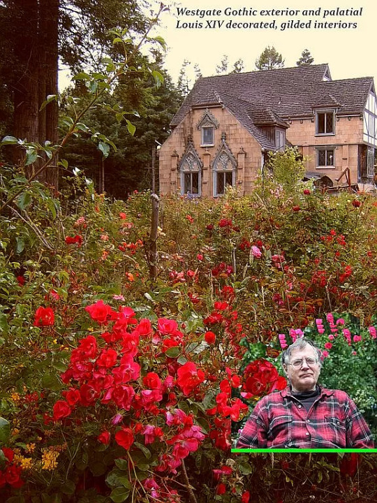
You know how I love offbeat properties and I found this seller's For-Sale-By-Owner ad on Zillow. He started building the home in 1969, in Eureka, California, and it's been under construction for 43 years! It's a French ornamented cathedral Gothic, with all custom ornaments, molds and scaffolding techniques. This mansion is based on Newport, Rhode Island style and spirit from the 19th Century.
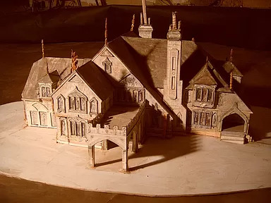
This is what it's supposed to look like - The Vision.
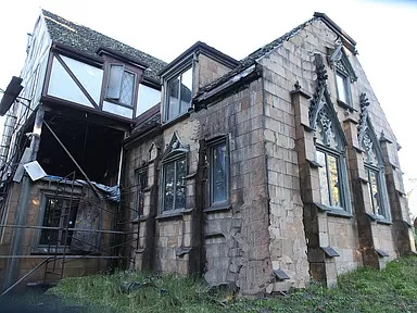
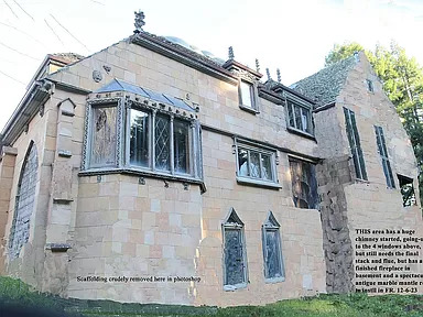
And, in 43 yrs., this is what he's done so far. He's asking $4.5M. Now, he has been living in it, so you can live in the finished part. The house is being sold furnished, and what furnishings! Read what he wrote about them below:
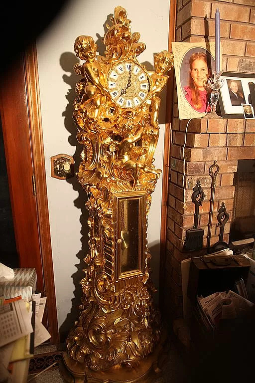
"Also for sale here are 1500 sq. ft of the ultimate grade palatial antique Italian marquetry, veneer and solid wood furniture, ranging from console tables and mirrors; 10 different sizes of round antique tables, up to a 12' x 6' museum-piece dining table, various rare cabinets, marquetry, upholstered chairs, couches, china and other cabinets, solid gold (plated) grandfather clock and two huge antique chandeliers, all worth over $300k on the market now and arguably TWICE that!"
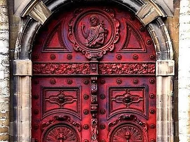
This outer door is amazing.

Here's a gargoyle and other ornamentation that still has to go on the house.
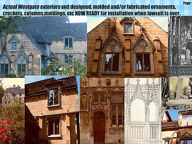
But, look at this - it says the exterior designs are ready for installation "when the lawsuit is over." So, the property is involved in a lawsuit, too? (Check the blog - I found the lawsuit papers and posted it.)
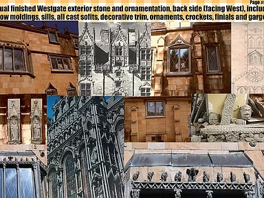
There's so much stuff here.
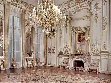
This room is done. It must be a ballroom. I don't know what to make of all this. This looks like the Romanoff's place.
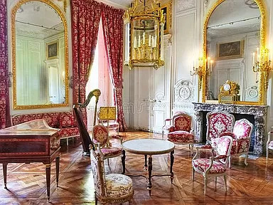
This must be a music room. There's a harpsicord and a harp in here.
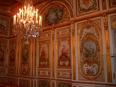
Look at these walls. He says the walls are hand done- are these the actual walls?
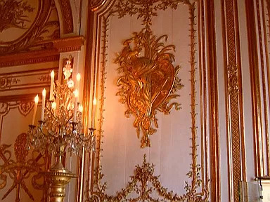
The walls are hand painted according to the description.
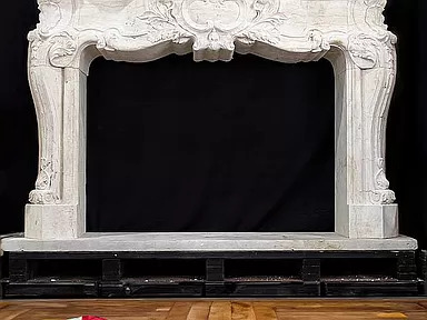
Here's a mantel waiting to be installed.
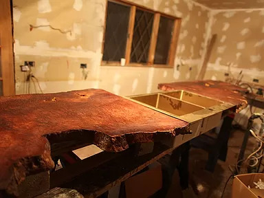
This is going to be the kitchen.
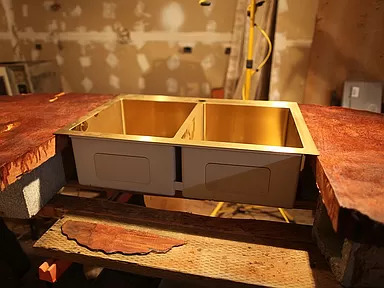
The gold double sink.
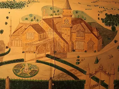
I don't know if this is an old picture of the original inspiration for this home, but it's definitely a representation of the home itself.
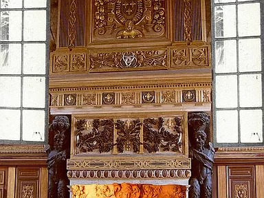
This is an amazing fireplace.
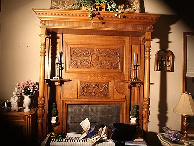
Another beautiful fireplace.
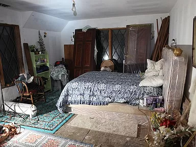
He's using the bedroom, but it's not finished.
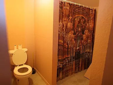
I'm disappointed in this bathroom. Maybe it's just temporary?
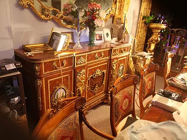
He has a lot of photos of the furniture and these are really primo antiques. So, this would be one of the dining rooms.
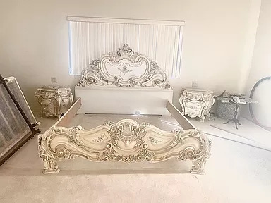
This looks like a brand new bedroom set. Looks like a furniture store that used to be near me called Roma Furniture.
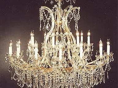
The chandelier in the ballroom that he says is included in the sale.
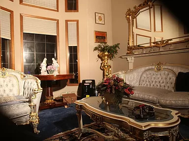
One of the sitting rooms.
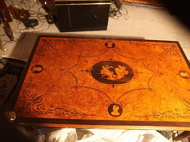
Nice inlaid table.
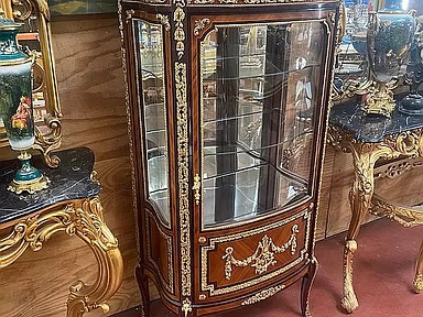
There's a lot of furniture. If you want to see it all, click on the link b/c he's posted 100 photos. But, I'm very confused.
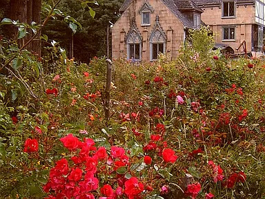


The property measures 6 acres and there are "massive fall color and rose gardens, 20,000 plantings, plus 10,000 daffodil, iris, lily, etc. Bulbs are spread over 6 acres, still there mostly, alive and colorful. Plus, hundreds of valuable landscaping sculptures are included."
124 notes
·
View notes
Note
The music and sound design for Midst is absolutley masterful. You mentioned some cool and weird methods of making noises for the Fold - can you tell us of any other unconventional objects or noises youve used to create some of the tracks?
🎷: YES, YEP, I can tell you about cool and weird sounds ANYtime. Here’re a few fun ones in brief:
The Blinding’s sounds are heavily remixed and modified vocalizations from a variety of different types of seals.
Years ago I had access to a storeroom full of defunct old A/V and electronic gear including old film projectors, vintage adding machines, typewriters, strange retro printers, and loads of other obscure electronics from the 50s-70s. I recorded tons of random audio in there of various contraptions doing various things, and a lot of that vintage machinery is what makes up the mechanical ambience of the Trust bank machines in the Central Vault and in Imelda’s mission.
S1E12 “Coda” was probably the most wild sound production episode of season 1, and I had several days of fun throwing myself bodily around the room, knocking over furniture, smashing pomagranates, and generally hyperventilating while semi-literally strangling myself. 10/10, would repeat. Good times.
We decided that teletheric devices in Midst emit sound not with diaphragmatic speakers, but with organ-like pipettes that emit overtones (you can see them pictured in the episode icon for S1E03) – so processing audio in Midst to sound like it was coming out of a teletheric wasn’t just a simple process of making it sound “radio-y” with some EQing, but rather a fun techno-anthropological process of converting audio into mechanically-accurate harmonic sidebands based on the technology in-universe that we decided was creating that sound.
The reality-eating sound of the Tearror consuming the cave in S2E04 is 75% the sound of my cat snoring and digesting his breakfast. I stuck a stereo mic under his belly while he napped and recorded the whoosh of his breathing, the pulse of his heartbeat, and the gurgle of his lil' cat intestines for use as the stuff of nightmares. Scary sounds can sometimes come from very cute places!
90 notes
·
View notes
Text
The Diaz Family Home
this is the house that my buddie sims currently live in with chris and their baby. i built it trying to bear in mind what kind of house buddie would realistically move into in the near future, and since los angeles loves the spanish bungalow, i decided to go for that style
Exterior:

like insaid before I wanted to still go for that spanish bungalow style that eddie’s house in the show has; i think a lot of the decor and furniture that eddie has in the show is suited to this style in almost a mismatch way so i wanted to maintain that throughout, even though in my game, buddie are engaged and have a baby so they would have bought new furniture/replaced things over time
Layout:

doing research to find inspiration for the floorplan/exterior showed that a lot of these homes in california follow a similar pattern with one side if the house dedicated to the bedrooms and the other to the living areas with a hallway splitting the middle. i had a lot of fun playing around with different layouts and i was very happy with how it turned out
Front Porch:

just a simple covered front porch that is common in this style of house.
Living Room:


i kept the vibe of eddie’s current house in the show, including a lot of the same furniture itsms i used for my re-creation of that house to show that while (in the story of my game) they’ve moved out of that house, they still kept some things while also adding new pieces/replacing some stuff. (note: some picture frames are empty bc i am going to be filling them with photos i take as i play the game)
Dining Room:


again i wanted to keep a similar vibe to eddie’s current house, but in my head, he and buck would probably have purchased a new dining room set when they moved- i also wanted to use green instead of the black that eddie currently has just for some more color
Kitchen:


once again, same vibe, but different colors and a slightly larger area for buck to cook (bc lets face it eddie would burn the house down trying to make grilled cheese)
The Nursery:


so i know we all love girl!dad buddie but when i started playing with these sims a while back, i had buck and eddie have a baby via surrogate (or as the game calls them a “science baby”) and it was a little boy w blonde hair and blue eyes so i named him Luke (i also named buck’s baby luke in my waitress au fic bc of this)
Luke’s Bathroom:


it’s just a basic bathroom but i think the wall decals are so fucking cute
Half Bathroom:

just a jack-and-jill style half bath that sits between the kitchen and the hallway
Chris’s Room:


so in my game chris is still a child sim, so i decorated his room as if he were still like 9 or 10… i again wanted to keep some of the same items i used in the recreation of the show house but changed the colors slightly to say that they “painted” it or smth but only bc i think the darker woods fit the color scheme of the room better
Chris’s Bathroom:


all the bathrooms in the house are the same layout, but i wanted to make chris’s a more ‘accessible’ bathroom. since we don’t have disabilities in the game chris’s sim doesn’t have CP, but i wanted to still decorate his bathroom with a shower unit so that he could access it better by himself, even if in the game he has no mobility limitations (i also had a makeshift shower chair in the shower at one point but it made the shower unusable so i had to delete it but the idea is still there yk)
Buck and Eddie’s Bedroom:


my thought process here was that when they bought this house to move in together, they bought a whole new bedroom set for themselves, so this room is almost completely original with no brought over pieces from eddie’s current house. i also have the in-game wedding certificate item hung in their room although technically they’re still only engaged at the moment in game
Buck and Eddie’s Bathroom:


just a basic en suite bathroom
Backyard:


I wanted to test out the new round pools that came with the latest update so they do have a pool. i also included a little kiddie pool for when luke ages up to a toddler, and i also have s swingset and a slide. on the back deck i gave buck a nice grill so they can host 118 barbecues after bathena’s house was barbecued (laugh at me i’m so funny)
Hallway:


i didn’t wanna just leave this hallway bare so i put a couple little clutter/storage items. the mirror table is something that in my head i went “maybe this was helena’s mother’s that eddie took when she passed away and they were cleaning out her house” or smth but it filled blank space so i used it
Laundry/Backdoor:


this is just a tiny space off the kitchen. nothing fancy or special about it, i just wanted to include it since the og house had a laundry room too.
#911 abc#911#911 on abc#eddie diaz#evan buckley#buddie#buck and eddie#buddie 911#911 buddie#911 in the sims
38 notes
·
View notes
Note
are you still receiving requests? if yes, can i ask for the monkey boys (separately) with a tsundere s/o?
like, their love language is acts of service and gifts so they often cleans the boys’ things and buy them things that they heard they would like to have? and they just look away and shrugs like telling they had nothing better to do or ‘whatever’... also touch starved! they get hyper flustered and cute when receiving touch or affection in general but secretly wants more.
uh, whatever...
— macaque & wukong x gn!reader

wasn't sure if 'monkey boys' included MK or not—if it does!! feel free to send in another ask and i'll do another for him, too :))
;; romantic, fluff, no warnings? tsundere behaviour.

MACAQUE
- he would find this behaviour very cute.
- likes to tease you a lot for it, revelling in your flustered state and whines, trying and failing to deny his flirtatious words.
- he's lowkey glad that you struggle with handling physical affection, because it distracts you from the fact that he can't handle it, either.
- people around you two, staring with deadpan expressions as you whine and fluster at Macaque placing an arm over you shoulder, pulling you close to himself as a bright red blush covers his face, unable to make eye contact with anyone.
- you'll both be awkwardly reaching for each others touches and attention, touch-starved but struggling to handle the feeling.
- eventually, you both work it out, though—he gets a lot more confident and cockier with his advances and flirts, and you get a little more used to it, while still flustering.
- honestly, Macaque is quite lazy in nature, and with the occasional depressive episode he puts himself through because of his past, his places tend to get a little... messy, to put it lightly.
- although he may not show it, you cleaning up after him REALLY helps his mental health, and he appreciates it more than he can possibly admit.
- genuinely, though, if he comes home after a long day to find that you've cleaned his belongings and furniture, he won't be able to stop himself from falling in love even more.
- depending on his mood, he'll either kiss you on the spot and force you to relax on the couch with him, or he'll discreetly show his gratitude through an expensive gift somehow turning up amongst your things, or that one restaurant you've been craving arriving at your front door.
- but, if you get him a gift in return, he'll feel bad.
- Macaque isn't used to people buying stuff for him, especially as often as you do, so he's constantly trying to convince you to not waste your money/time on him, or is getting you a gift of similar expenses in return.
- keep it up and keep insisting that he deserves it, he'll eventually get used to it and won't feel as bad or undeserving of it all.
- he honestly adores your stubborn nature.
- Macaque loves that you usually have a response to his witty comebacks, or that you at least try to fight him on it.
- he likes the fire inside you, and is constantly adding to it with the intention to purposefully rile you up.
- sometimes, he may take it too far, though.
- once he realises he upset you, he'll feel really bad about it and will do just about anything to gain your forgiveness.
- in all honesty, he fucking sucks at apologies.
- but he'll try his best, stuttering over his words and giving you a peace offering in the form of a cute plushie or a sugar snack that he knows you like.
- "a-ah, i'm... sugarplum, i'm sorry—i didn't mean it. could you, uh, can you forgive me?"
- just tell him you do and give him a big ol' smooch and his tail will be wagging happily.
- he'll still tease you, though, just for the fun of it; but, he learns your limits and boundaries, and makes sure not to cross them again.
WUKONG
- this man is also guilty of teasing you a lot.
- it's practically his love language, other than physical touch.
- he can't get enough of the look on your face when he flusters you, making himself blush in the process due to the extent of his love for you.
- it's not too difficult to fluster him back, though.
- he'll take any of your physical affections in stride, but isn't as used to someone flirting back at him, or pulling any... 'spicy' gestures on him.
- be warned, though, if you even TRY to do this, whether you succeed or not, he'll reverse it back onto you later, when you least expect it, to get his revenge.
- he's really good at seeing past your exterior personality, and understanding the true way you genuinely feel about things.
- he's thanking you for something, and you say, "whatever... i didn't do it for you, anyways."
- in reality, he knows the micro-expressions you make show that you're happy he appreciates your work, and the blush on your face solidifies this for him :))
- when he first met you, your reaction to his physical touches and affection made him back off a bit, assuming you genuinely didn't like it.
- but, later on, he realises that you lean closer to him whenever he's nearby, and that your hand trails after his when passing an object to each other.
- it makes his heart flutter to recognise that you do want his affections, you're just stand-offish and reserved in your own way.
- he's a lot more physical with you after that, cherishing his moments with you and finding your nervous reactions fun.
- he appreciates your acts of service and gifts, but he'd much rather spend time with you and enjoy the smaller things.
- he's Sun Wukong! the man already has plenty of objects and presents, its a problem, if anything.
- although, he won't leave your gifts in his hoarding piles, no, no—they've got their own place, where he won't lose them and the monkeys won't find them and destroy anything.
- as a compromise, though, he'll simply do these things with you!
- if you're getting him a gift, he'll go shopping with you! or will keep you company/offer help if its something that you make yourself.
- if you're cleaning around the mountain (good luck getting through the hoarding piles), he'll do it with you! helping sort things into piles, or taking out the trash—he just wants to spend time with you :(
- you'll probably yell at him for it... if he can help you clean, why can't he clean it HIMSELF???
- this is lowkey hypocritical of him, though, he likes buying you gifts a lot, especially if its Monkey King themed; he'll buy anything that reminds him of you (which is a lot, considering you're almost constantly on his mind).
#lego monkie kid#lmk#sun wukong#monkey king#six eared macaque#macaque#macaque x reader#sun wukong x reader#monkey king x reader#— fawns fics#headcanons#fluff
124 notes
·
View notes
Text
Tease Tidbit Tuesday/WIP Wednesday

Thanks for the Tuesday tags @elvensorceress @loserdiaz @spotsandsocks @hoodie-buck @weewootruck @wikiangela @giddyupbuck @daffi-990 @tizniz @diazsdimples Tagging you back for WIP Wednesday and looking forward to all your works 💖
So don't be mad, OK? I'm posting another snippet of this. (Under the cut because it got long) That being said, it's going to be the last one for a while until I finish some other stuff. Aaaand it's written in a POV I'm not sure I'm gonna keep. With that in mind... enjoy???? Also everybody who's into this thank James for forcingmaking me flesh out more details and @watchyourbuck for threatening me (with love ofc).
no pressure tagging (lmk if you want added or removed) @stereopticons @shortsighted-owl @eddiebabygirldiaz @disasterbuckdiaz @theotherbuckley @apothecarose @barbiediaz @buckaroosheart @buddierights @chaosandwolves @eowon @fortheloveofbuddie @gayedmundodiaz @giddyupbuck @heartshapedvows @honestlydarkprincess @indestructibleheart @jesuisici33 @ladydorian05 @lemonzestywrites @monsterrae1 @spaceprincessem @statueinthestone @steadfastsaturnsrings @the-likesofus @theplaceyoustillrememberdreaming @thewolvesof1998 @vanillahigh00 @watchyourbuck @wildlife4life @your-catfish-friend @epicbuddieficrecs @rmd-writes @welcometololaland @lizzie-bennetdarcy and anyone else who wants to 😘
Shit. This moment calls for a lot of different emotions, but that one is the most prominent. The glaring neon sign at the forefront of her brain as she registers the second pink line that’s becoming increasingly blurry.
She brings a hand to her mouth, covering a silent exclamation. She wouldn’t have to. It’s not like there’s anybody around to hear. Just the secondhand furniture, personal items moved from her Mom’s place, and a few decorative things she bought to make the apartment more cozy.
She sinks to the bed still clutching the plastic stick tightly between her fingers. Something about sitting there feels almost like she’s breaking the laws of a sacred space. Normally that would be right up her alley. Poking at the edges of societal norms just to see what she could get away with. But right now, perched on the edge of the mattress with a positive pregnancy test feels wrong. Even if it is the same place it happened. The place where her and Eddie first stumbled into something more than friendship together after too many drinks at the bar one night. Where they woke up the next morning and muddled through Did we just… and We could do it again. Where they kept landing until they had the guts to admit it was fun, but not what either of them really wanted. Because they both missed their best friend and enjoying each other without the expectations of romance.
Not to mention the Evan of it all. Shannon had seen it coming from a mile away. From the first week her and Eddie met him at the Brass Bell and kept managing to run into him as he settled into town.
A few people, one or two of her girlfriends included, whispered about Eddie and Evan getting together so quickly after the “breakup”. Some, thinking they were being supportive, came to her bitching about how rotten the situation was and that she deserved better. How dare he leave her for someone he barely knows? Honestly, it gave her a great deal of satisfaction watching them go pale when she casually mentioned she not only didn’t mind, but had pushed Eddie towards him.
It was already obvious that her and Eddie weren’t heading for anything serious. And, as his self proclaimed platonic soulmate who knows him better than he knows himself, she felt it was only a matter of time anyway. Why delay the inevitable?
She looks at the two lines again. How is she going to tell him? He’s the happiest she’s seen him in a long time. Maybe ever. Without question, he’s going to feel that overwhelming sense of loyalty and responsibility. The same fiercely protective instinct he has for Sophia and Adriana. Shannon can already see him devoting himself to this– Fuck, she can’t even think the word to herself. But he’ll throw himself into caring for her and break Evan’s heart. She can’t let him do that. Not when she doesn’t even know if she wants to move forward with everything.
Shannon sits up a little taller, wiping away the remaining dampness from her eyes and cheeks, and makes a decision. She walks the test to the closest trash can, ties up the mostly empty bag, and drops it down the building’s garbage chute.
When she returns to her apartment, she navigates to the last picture Eddie texted of him and Evan. They look… blissful. Content. He and Evan have their arms wrapped around each other while Evan presses a kiss to Eddie’s cheek. His skin is flushed and rosy, making him look almost bashful.
She can’t tell him. It’s as simple as that. Eddie hasn’t said anything, but he doesn’t have to. She knows that look. He’s in love. Even though it’ll be ages until he allows himself to admit it and say the words out loud, that doesn’t make it any less true.
There’s still time, she thinks. Time for her to get a checkup, to gather facts, to evaluate what she wants to do. Time to let Eddie be in love and hope he forgives her for not saying anything.
#there will be no Shannon bashing or hatred#understand my dudes????#so a lotta angst in the middle#or maybe right up front???#who knows...#certainly not me#tw pregnancy#usernolan#buddie wip#hippo writes#fic: you can plan for a change in the weather and time#tease tidbit tuesday#wip wednesday
53 notes
·
View notes
Note
okay I just got this idea so if it's chaotic it's because I just got it🤣 so I've seen you wrote a lot of achilles stuff today but do you mind writing one more? when he was something like friends with reader when they were little but then their contact kinda cut when she moved away and now she's back after those years and when achilles comes back from war he kinda bumps into her and she recognizes him. and she finds him so hot and he does find her an insanely beautiful woman too etc.
my god it's making me all blushy mushy just to think about it🤣
ah, are you the mysterious anon who has come out of the blue with all the requests? I must say, its greatly appreciated, I really needed a distraction and writing everything has been great (no clue how I've been managing to write this many fics but Achilles be inspo himself lol), you have some seriously amazing ideas!
Achilles x F!reader (I got to include his mom, which made me so happy!) told by y/n(I like to do a variety of different styles so if people have a preferance their is something for everyone). The reader is sort of an oracle, AU where Hector and Patroclus live.
I got to Google what they would have eaten for dinner and that made me really happy as well.
Chance meeting


It had been a long time since I had been there. What had I been, nine or ten? When I had clutched the lady Thetis and begged her not to let me go, when I had wept against my friend's shoulder and he threatened death to anyone who dared take me from him?
Achilles was now a legend, the great warrior, feared and held in the highest regard. I had always listened in great detail to the tales of his feats. But, I was also a legend, weren't you? Wise men sought my counsel, of a glimmer of what possibly the future could be like for them and their family's.
That's why I was sent back to Phthia after all. To learn from the goddess, the mother of Achilles and the woman that I had called Aunt in my childhood.
The journey from Sparta had been easy for me, possibly because I hated the courts of Menelaus, especially now that he had his wife back. The ship was only dropping me in Phthia and with my small pack, I jumped into the shallow water, wading to the cove where I remembered Thetis always was when I was but a child.
My memory served me well, as I walked up the beach through a rocky arch and saw her, plucking a shell from the water. It was such a relief to see her that my satchel hit the sand with a soft thud, wanting to run into her arms. "My lady?" My voice was a soft whisper and she turned toward me, her wise face crinkling in a smile.
"Y/n! When I heard your mother was sending you to me, I didn't think it would be so soon." I tucked up my skirt, putting one edge into my belt, hurrying towards her, splashing to water softly as I came to her side. "You have grown so much." I opened my mouth to say something but I couldn't think of anything except a weak chuckle as she cupped my face.
"I have missed you, my lady." I blinked away tears as Thetis shook her head. "You remember how you used to call me Aunt Theti? call me Aunt dear child, you are still a friend." I nodded, and she began to ask how my life had been, why my mother sent me to her, and what I wanted to start on learning first.
It was dusk when we walked the path up to the palace. It had changed little. Maybe a few decorations and furniture pieces had been added or moved, but the idea was the same. A servant took my satchel to my chamber and I spun slightly as I walked after my aunt, trying to re-learn everything about the halls.
My back hit something warm and hard and I turned, my heart jumping in my chest when I saw who it was, Thetis smiling wisely at me, from a few feet away. "Achilles, you remember Y/n, don't you?"
My mind began to race, though outwardly I was calm. In short? My friend got really hot. His hair was a darker blond, longer and more wavy. His blue eyes roamed my face, my body, as if in disbelief. "I did not remember her to be so...enchanting." He took my hand, pressing a flirtatious kiss to the back of it.
"What brings you here after all these years?" He still grasped my hand, thumb running over my knuckles. "I came seeking your mothers teachings. To refine and hone my ability to foresee." My eyes traced his features, he was much taller then me now and he offered me his arm, I took it and he guided both me and his mother into the hall, where the tables were set with food and drink.
He led me to a seat at his side. He sat up on the great chair his father had sat on when we were children. The meal was welcome, the warm and rich meat, eggs, cucumber, carrot, cheeses, olives, bread and fish, littered the table. I hadn't eaten in quiet sometime and I eagerly accepted the plate that was passed to me by Thetis.
The cured olives bursting with flavor on my tongue, before biting into a piece of tender venison. A servant poured me wine and I sipped from the cup, looking about the room, trying to avoid the gaze of Achilles. He was staring at me, I could feel his eyes raking up and down my body, re-learning my face.
After I had my fill, I leaned back, watching Patroclus play his songs by the fire. "You have certainly made a name for yourself, old friend." Achilles smiled softly, an unusually relaxed look on his face. "Tales of your feats are told all over Greece." I finally looked at him. "I missed you, dearest Achilles." His eyes meet mine and its like the breath is squeezed from my body.
Even though it had been eleven years since we had seen each other, me and Achilles became close soon after my arrival.
I watched him and Petroclus train, and when I wasn't learning from his mom, we would walk the beach together, it was fun.
I was standing on the beach, watching the water move with the tide. I heard footsteps, coming towards me fast and I turned around only to be pulled into his chest, kissing me deeply, one hand on my back and one in my hair as his lips moved with mine and my heart finally admitted to loving him.
The end?
#fanfic#fandom#troy 2004#the iliad#achilles#achilles x reader#romantic#romantic relationships#muse writes fanfic
7 notes
·
View notes
Text
OC Inspiration Meme!
First of all, thanks @lynxfrost13 for the tag, because finally I have a reason to talk about the origins my characters, SPECIALLY Sasha and Powder. Because I can't talk about their inspirations without bringing up the fact that they're wildly different from their first iterations.
(Warning: lots of yapping, potentially long, Also, I added songs and animals because personally they're a bigger inspirartion for me than existing characters).

When I said Powder was a loser, I man a legitimate, actual certified girlfailure (current Powder at the very least is competent at her job), who kept her cool composture until she mets in the mines with this particular unnamed mynah and cries in her arms. That's it.

...ok she's still like that, but now she has more nuance, I think.
Like, she keeps up an cool and overconfident facade, it's quick to make bad choices, and being aloof when things go wrong (like Morganite from hnk and the song "Nothing Man"), but it comes from a place of worthlessnes and wanting to be useful for the others (Powder from Arcane, which YEAH I stole her name, NO the bangs are a coincidence that I'm just noticing I swear-).
She's like a dog, but those "scary dogs" that area actually quite playful or Police dogs that fail their training (I visualize her as a doberman with cropped ears but an long tail, to be specific), and most of her character can be summarized with the songs "Fighter" and "Two Time".

Sasha came to be because one day I asked to myself: "What if a MNHR unit was a total party animal and loved drinking?" And then I came up with this silly, but also very messed up story for her (which is why DRHDR is listed as an inspiration).
A Mynah got decomissioned, survived, and it's found by this pair of gestalts that have a shady bussiness selling metals and other usable stuff from scrapped/stolen goods. They go "HELL YEAH FREE MANPOWER!!" and kinda adopt her. Eventually she starts trusting them, opens up and develops the personality of a loud but well meaning teeneager with dark humor, who also does a bit of organ harvesting (because, well, "scrapped goods" also includes other decomissiones replikas...)

Nowadays she's waaay more chill (like, literally none of the previous characterization applies anymore) and her arc is more about grieving your past self in face of new discoveries that shatter your previous beliefs, as well as figuring out your identity with being "reborn" into someone new (Inspired by Phosphophyllite from hnk as well as the song "Still Feel" by Half Alive).
Bottom left is a double feature, both for the lyrics of "The Unknowing" (in a way that she tries to move on with her life, but she feels haunted by memories from her gestalt donor and the implications of such); as well as the cover art. She's pretty much like a cat, but those that are shy and hide behind furniture until strangers leave, so it takes time to gain their trust, similarly to how she keeps most people at arm's length.
Anyways, I tag @clodcakes, @plasterhound, @fischlich, @shpakatsila and anyone else that wants to do it (as always, zero pressure tho)
#so yeah. this means that Powder was destined to end up with a mynah from the very beginning#She sees a big gentle woman and falls to her knees. it's in her genetics#... In retrospective I think I accidentally gave her mommy issues... Oh well#Also no. Sarah and Jonathan doesn't run a shady bussiness and Sasha doesn't do organ harvesting anymore#just to clear that up#The Yappening#my ocs#the powder tag#the sasha tag
12 notes
·
View notes
Text
Downtown: 205 Custer Boulevard


This Lot Requires at minimum 4t2 For Rent Set
Download [SFS]
Alternate: [Simblr.CC] (Adding Soon)
Good Evening!!
Tonight I bring to you 205 Custer Boulevard. It's one of the Downtown Lots. This lot will be the lot that will house my Mayor for Downtown. Now, HERE'S THE THING. Please read carefully as you will need CC to make this Lot build look like the pictures. I will only link the build mode items, although some sets may have Buy mode objects such as the 4t2 For Rent Set. The download itself is CC free however if you have the items in your downloads folder already, they will appear in the house if I am not mistaken. If you do not have the build mode items in your downloads folder, you have a decision to make.
Download the build items on the list.
Work with what you get when you put it in your game and adjust it how you want it to look.
Don't download, don't use.
The reason why I did not include the CC in the download is because I am not sure of permissions, I rename all of my files so they will not overwrite if you have them and why not check out the creators' pages? they have awesome stuff, you might come across someone you didn't know existed :)
I did not include links to the decor and furniture CC as there is a lot to look up, and some pages are not search friendly, but I will answer WCIF requests.
Always make a backup of your game before installing this or any DLC into your game to prevent permanent loss of all your hard work in your game.
I used TS2 UC to makeover this lot. This lot is technically NOT CC free as it will not look like the pictures without the CC. If there are any issues, please let me know so I can fix and re-upload. Enjoy.
Build Items needed are:
Lord Crumps Collab with Episims, TvickieSims, Platinumaspiration: 4t2 For Rent
Pixelated Sims: Rounded Edges, Industry Matters Brick Facade
Tombstone L&D: Mosaic Tile
RDN: Doors, Stairs, and a fixed mesh
Shastakiss: Wallpaper, Painted Walls
Deatherella: Basement Hatch Door
Nonsensical Pixel: Garden at Home
TVivkieSims: Plants and Trees
Curious B: Wallpaper
If I forgot anything, please let me know. If there is decor, furniture, clutter you are looking for from the pictures, please do a WCIF ask, and I will answer it when I see it.
Have an awesome Night!!
Check out the beautiful rooms below :D
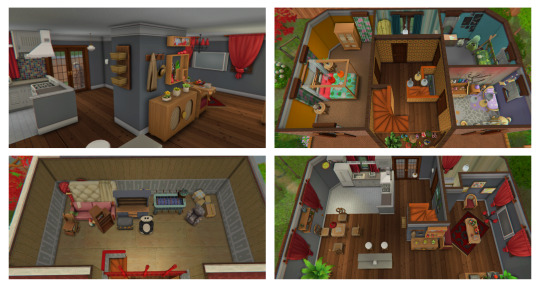
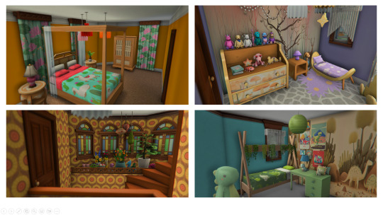
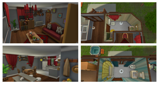
#sims 2#sims 2 download#sims 2 maxis match#sims 2 cc free#s2 lots#s2#sims 2 lots#sims 2 makeover#s2 makeover#ts2 downtown
46 notes
·
View notes
Text

Buy This, Buy That, "Less than a coffee now!" It seems like every time we're on social media, we're bombarded with products, fashion trends, advertisements, and new "aesthetics" that, conveniently for drop shippers and fast fashion empires, require us to buy a whole new wardrobe and interior design scheme. So, here are my top 10 tips for breaking the cycle.
Figure out who you are. Rather than the you the advertising algorithms tell you that you are.
Go through your current closet, jewelry box, vanity, and decor. Keep what makes you happy, and toss, sell, or donate what doesn't anymore. Yes, this includes those impulse dopamine-seeking purchases and the "little treats."
Make a list of things you realistically do in your day-to-day life that may need closet supplementation from what a standard "capsule" wardrobe would offer you. Church clothes? Sport-specific clothing? Officewear? Do you do a lot of formal events that require attire for certain dress codes? Do you do date night and girl's night outfits? For example: I need dependable workwear for after-hours farm calls so I keep about 5 items in my wardrobe that fit that function. I also keep a bit more workout clothing than some would since I work out 6 days a week.
In the same vein as number 3, are there places where you can increase cross-over between categories in your wardrobe? For example, choosing well-fitted tees that can be worn as under-scrubs and as casual tops around town?
Figure out if there are colors and shades that you look best in/feel the most confident in. There isn't a need to do the one-size-fits-all color analysis that TikTok and Instagram are constantly trying to sell you on reels based on the seasons. Figure out which colors you are complimented the most in, that you feel the best in, and that inspire the most positivity for you. Narrow it down to 4 or 5 colors for both colors and neutrals (blacks, grays, whites, nudes). I did 2-3 colors per season, plus my standard neutrals.
Figure out your style. Personally, I tend to have a fashion that draws inspiration from American traditional, southern prep, English country attire, and the fashions of foxhunting. Think Orvis, LL Bean, Cordings, Dubarry, Talbots, Tory Burch, Ted Baker, and Lily Pulitzer. In decor, I tend to be drawn toward colonial era antiques, leather upholstery, campaign furniture, heavy fabric drapes, ox tongue wood finishes over cherry, oil paintings, black marble, gray field stone, and polished brass. It's not everyone's cup of tea, but I found it by perusing fashions, furniture, decor, even TV and movies for things I adored.
Quality over Quantity: This is a big one. Rather than buying a new outfit every time I wanted to do something, or buying each cute accessory I saw and wanted to buy on impulse, I started getting really picky about the materials and workmanship in the things I purchased. Cheap may look good for a brief time, but it fades quickly. The things I buy now need to fit well, be of good material, be tailorable, have finished seams and edges, and be of substantial enough material that I trust that it will last me 2-10 years depending on the item, with some items being things I intend to only buy once in the cases of jewelry and scarves.
Cool off: This product looks like it would solve XYZ problem for me! Will it? Put it on a wish list and save it for later. If you still think it's going to revolutionize your life a month later, work it into the budget.
Quit buying from TikTok Shop, the majority of the stuff on there is drop-shipped junk made to capitalize on a quick trend, which is also part of why there's always pressure added to the pitch "before it sells out" "For less than the price of a coffee" "While the sale is on" if a product can be sold for $9 when it's usually $100, the deal is too good to be true, and the product won't last. Same goes for Shien and Forever 21 if I'm honest.
Focus on 1-2 items per season, an accessory, a cute top or a fun dress. Reducing my consumption to replacement levels plus 1 or 2 items has drastically cut my spending on fashion and decor. I also check second-hand stores first.


I went ahead and included some inspiration boards for you, one with pretty typical accessories for me, one to help better visualize my fashion sense, and then 2 palettes, my colors and my neutrals. I hope you all liked this, I'll also be doing a breakdown of my jewelry, vanity, and closet here soon.
Love,

#cvt2dvm#studyblr#self care#self improvement#self love#study blog#vet med#photos#Fashion#it girl journey#That Girl#Gaslight Gatekeep Girlblog#Self Improvement#Self Development#self growth#self worth#self awareness#personal branding#Minimizing#Simplifying#Reducing Consumption#Fast Fashion#Consumption#Budgeting#Reducing Spending#Reducing Fashion Waste#Reducing Waste
8 notes
·
View notes