#anime pre-production
Explore tagged Tumblr posts
Text

Finally settled on my codfather Jimmy design! Adding all the details was so fun tehe (try and spot them!)
Other empires designs I'm working on: Scott | Lizzie (WIP)
#forcing myself to not make a animator friendly design was so freeing 😭#what doing an animation degree as a pre production artist does to a mfer#the codfather#codfather Jimmy#solidaritygaming#empires SMP#empires s1
1K notes
·
View notes
Text
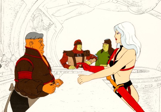
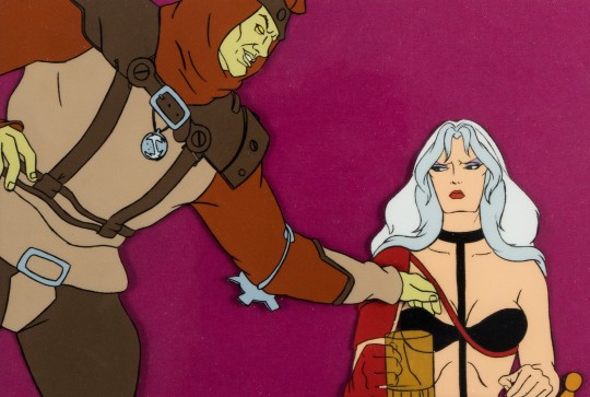


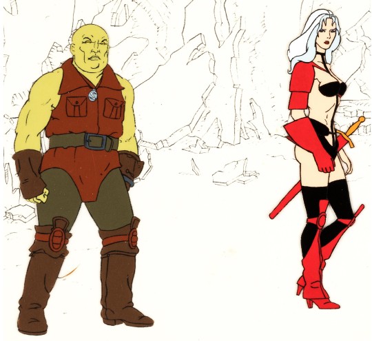
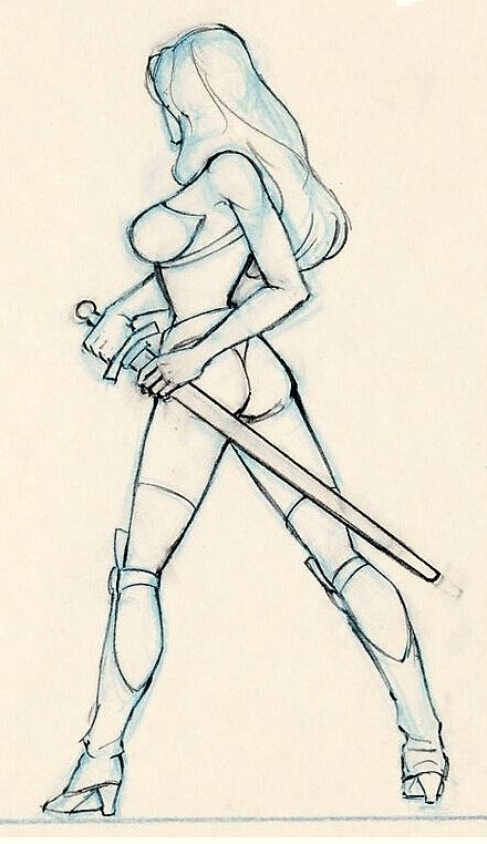
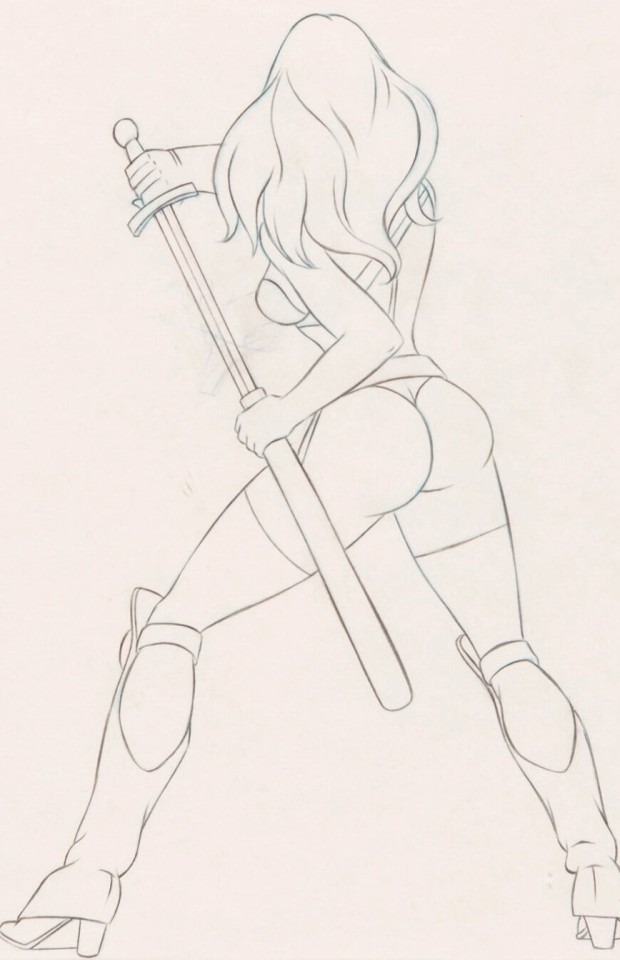
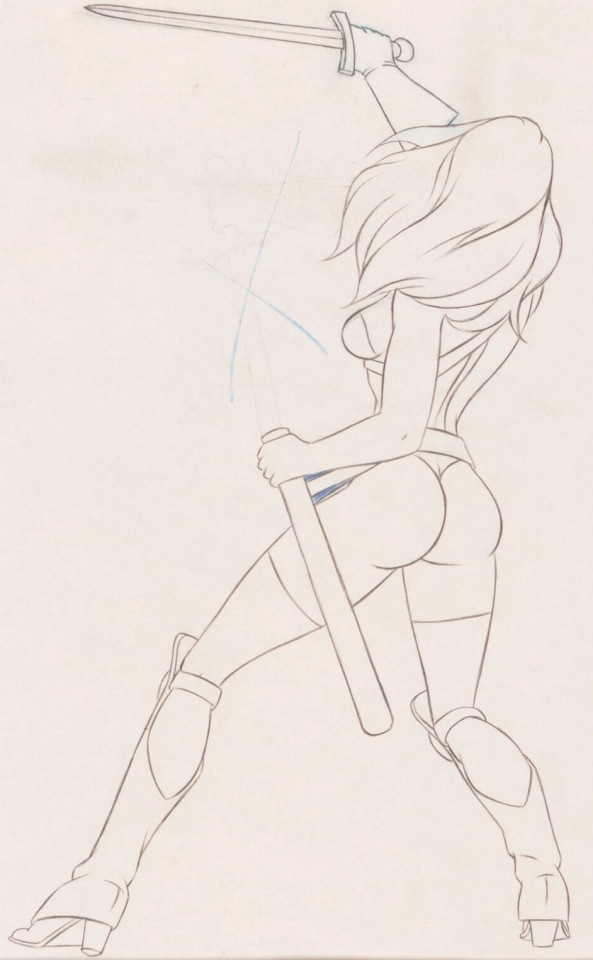
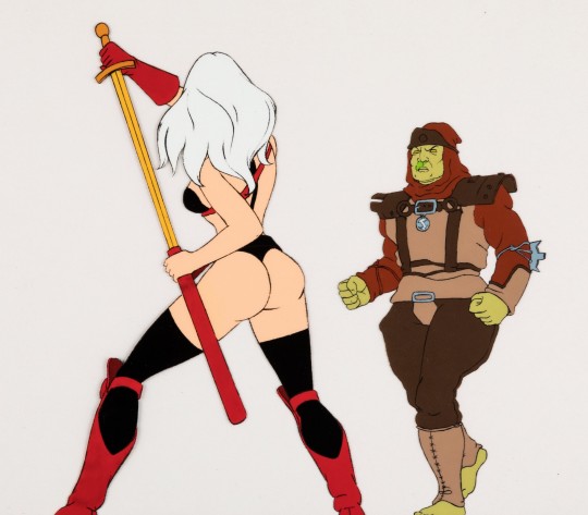
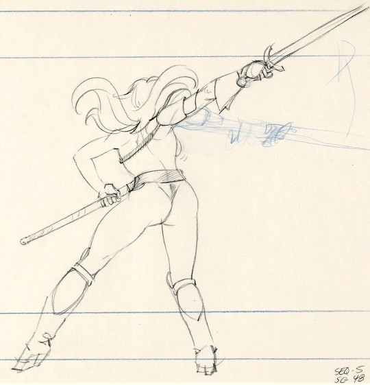
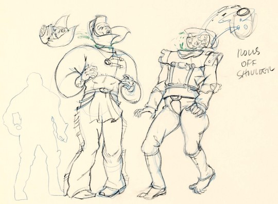
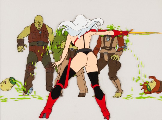
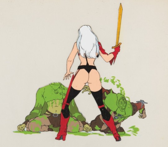
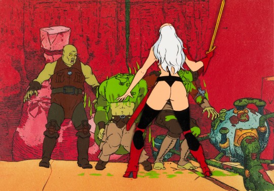
Taarna animation drawings and cels - Heavy Metal (1981)
#heavy metal#taarna#80s fantasy movies#80s animation#concept art#animation cels#film pre-production#animated features#moebius#jean giraud#gerald potterton#ivan reitman#1980s#1981
382 notes
·
View notes
Text

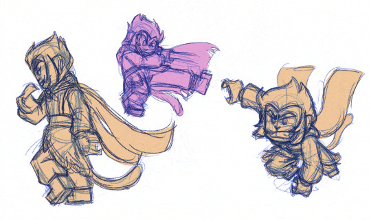


Some lmk monkey studies (+ my notes and self-critiques) except I swapped monkeys for my reference poses nyehehehehe
i keep drawing the heads the wrong size :/
#me vs. learning how to draw characters on-model#i think im winning?#*flails*#i gotta say lmk's animation#(pre-s5 sorry wildbrain but rigged anim just doesn't hit the same)#has ruined me for any cg lego productions that don't have a slappin bappin story (shoutout to lego batman movie)#to make up for the fact that they've just animated actual lego figurines#like wdym no lovely/goofy stylized expressions???? and the character's won't squash and stretch and sakuga style the fight scenes???????#outrageous!!!#studies#lmk studies#lmk#lego monkie kid#fan art#sun wukong#monkey king#mk#lmk mk#six eared macaque#liu'er mihou#pose studies
60 notes
·
View notes
Video
tumblr
half the song’s boards are preeettyy much done! (YIPPEE!!) later half is going to be more action-y and dynamic (MANIFESTING) so itll prolly take me longer but im on solid pace rn with it
#chris animates#dave strider#hs#homestuck#song is slow motion by luke wild!#once i finish the boards im Actually Going to Do Pre Production Stuff I Shouldve Before Boarding#like i need to make a proper character turnaround#id like to tackle doing a color script too?#and i gotta do some render shot tests for what the final compositing + stuff will look like#i have no idea what vibe im going to go for w the bgs yet#and using light composites on an ffffff white character is gonna be Tricky#but i love a challenge
604 notes
·
View notes
Text
Waste, waste away in the gutter with me. No, I can’t tell what is fake in my reality

I forgot to post this um 😭
If u know this song let’s make out
#adding lyrics to my drawings is my fav thing ever#my uzi :(#she’s going through it#murder drones#murder drones art#murder drones fanart#md#md fanart#md art#uzi#uzi doorman#uzi murder drones#murder drones uzi#md uzi#uzi md#uzi art#uzi fanart#uzi murder drones fanart#uzi murder drones art#solver uzi#absolute solver#glitch productions#liam vickers animation#art#my art#digital art#digital illustration#lyrics#is this post-final or pre-final? no one knows!#Spotify
47 notes
·
View notes
Text

• • • EILEEN CHAN
Though Eileen dawns a serious and stubborn image, in truth she is easily swayed by others. Having followed the set path laid out by her parents since birth, she is not one to hold much personal ambition. That is, until she is unable to get an annoying fox to leave her alone and for once makes a decision for herself: she must take matters into her own hands by becoming a spirit hunter.
#fox around the night#characters#pre production#concept art#character design#oc#oc art#animation#original character#sketch#2d animation#indie animation#indie animated series#indie anime#indie series
14 notes
·
View notes
Text
anyone serious about anime needs to watch magipokka to at least why its a brainmelter nearly two decades on
#i dont like calling it bad bc that does a diservice to all the wonderful character animation and ace voice work#but it is trashy#really is a product of pre-anime explosion where they really good animators drawing whatever#i could never reccomend it in good faith to someone that isnt already like#an otaku sonuvbitch for lack of a better word
19 notes
·
View notes
Text


Hello Tumblr! With all the awfulness going on with Instagram and Meta I want to start uploading the insanely large backlog of art I have here😭 I think it’s almost 3 years worth of stuff but we’ll get through it! Thanks to those who have stuck around here and hopefully we can find some solace in Tumblr for now! To start us off I have a little character design dump from 2022 or so.
#character design#character designer#2d drawing#2d animation#art student#artists on tumblr#drawing#cartoon#artist#art#design#animal character#character ref#character reference#animation#animated#portfolio#designer#cartoony#digital art#digital drawing#animation student#my art#artwork#character turn around#turn around#production art#concept art#pre production
11 notes
·
View notes
Text

Very rough animation here - Dr. Fennel instructed Sylvie to use her magic to "make a cloud".
Animated at 10 fps
#art#artists on tumblr#my art#illustration#my ocs#oc art#x13#sylvie tag#dr lilac fennel#sylvie newind#magic#gif#animated gif#animation#rough animation#wip animation#hand drawn animation#digital animation#frame by frame#this is veeeery early in the timeline#pre-mask to be specific#x13 lore#i would wait to post this until its more refined but its a product of last nights art burnout and idk if im coming back to it lol
8 notes
·
View notes
Text


THE KOOKY, KITSCHY, OFF-BEAT EVOLUTION OF LAIKA'S PREMIERE SILVER SCREEN GRRRL.
PIC(S) INFO: Spotlight on assorted concept art and/or character designs for Coraline Jones, the titular character from the 2009 stop motion animation film titled "Coraline," produced by Laika and Pandemonium, and directed by Henry Selick. Artwork by Shane Prigmore.
THE STORY: "While exploring her new home, a girl named Coraline discovers a secret door, behind which lies an alternate world that closely mirrors her own but, in many ways, is better. She rejoices in her discovery, until Other Mother and the rest of her parallel family try to keep her there forever. Coraline must use all her resources and bravery to make it back to her own family and life."
-- CHARACTER DESIGN REFERENCES/ART OF ANIMATION
Source: https://characterdesignreferences.com/art-of-animation-3/coraline.
#Coraline 2009#Coraline Movie 2009#Coraline 2009 Movie#Coraline Movie#Coraline#Neil Gaiman#Stop Motion Animation#Stop Motion Epic#Coraline Stop Motion Movie#Stop Motion Animated Movie#Animation#Animated Movies#Shane Prigmore Art#Stop Motion Animated Motion Pictrue#2009#Coraline 15th Anniversary#Shane Prigmore#Shane Prigmore Artist#Fantasy Movies#Coraline Jones#LAIKA Studios#Concept Art#Stop Motion#LAIKA#Pre-production Art#Stop Motion Feature Film#2000s
8 notes
·
View notes
Text

Every once in a while I can make art I really like... Hope you like it too!
#digital art#oc original character#original character#tv head character#tv head#Booker#the booker man#Glitch Hunters#concept art#webtoon#web series#animation project#in development#pre production#key art#digital drawing#digital illustration#digital card#character creation#character illustration#antagonist#Villian#villian oc#glitch#hacker aesthetic#evil oc#main character#original characters#clip studio art#askstrangeweird
27 notes
·
View notes
Photo
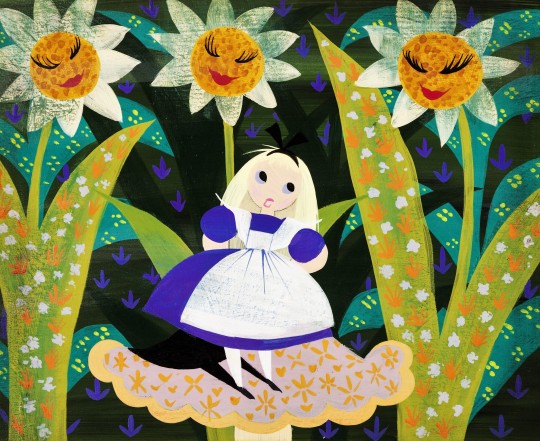

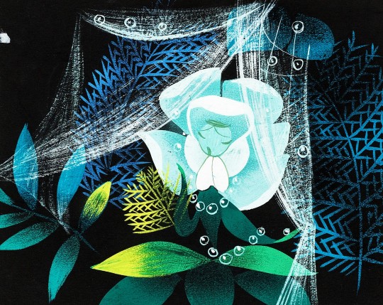

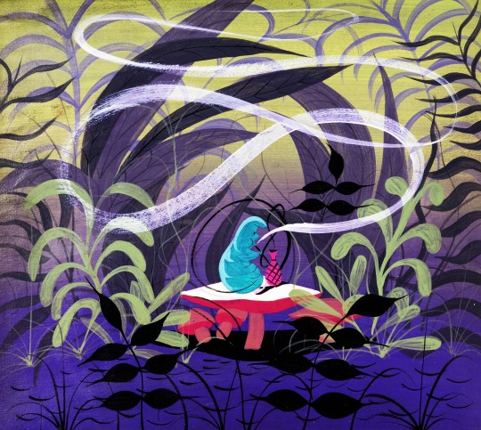
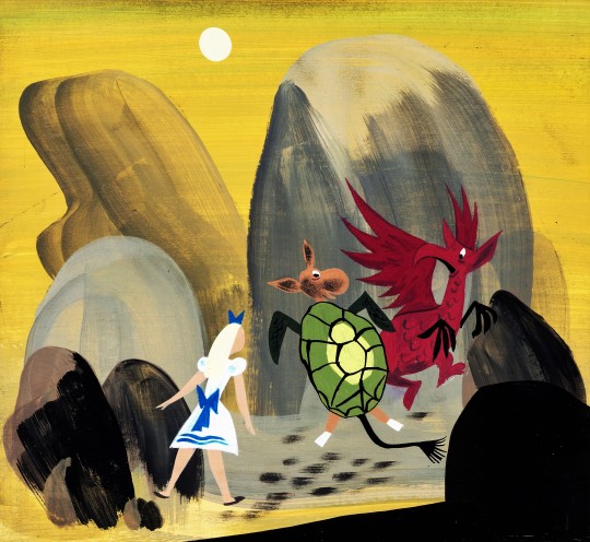


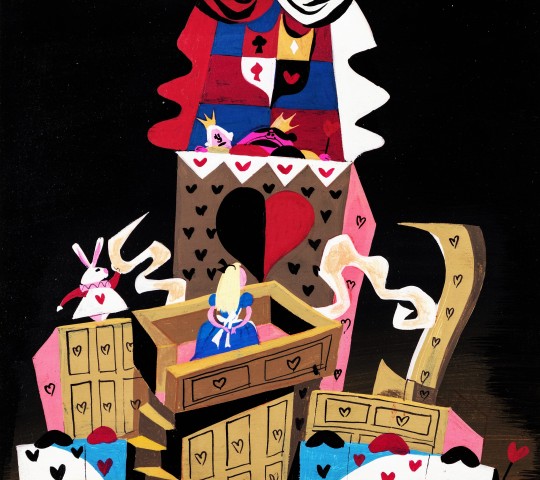

Alice in Wonderland - Concept art by Mary Blair (1951)
#mary blair#alice in wonderland#walt disney#disney concept art#animation#pre-production#animated features#50s movies#1950s#1951
767 notes
·
View notes
Text
Animation ideas
We were told to spend 20mins writing down ideas w could use for an animation. The only dead had to have something to do with movement so it was a little hard coming up with ideas. Especially relating them back to my theme.
I eventually landed on a couple having a somewhat heated conversation. There is gonna be no dialogue instead the colours and shaped if the speech bubbles are meant to convey the tone of the conversation.
Hopefully everything goes well.


Literally have no idea what gif to use
4 notes
·
View notes
Text
Guess who finished her micro-movie project?? 🥳🥳🥳
#personal#finally#after 6 weeks of pre production#and 6 weeks of production#IT'S LIVING#(and I'm dead)#still have to pass 3 final orals before my vacations tho#so much work for 30 sec of animation
12 notes
·
View notes
Text


LONG POST! 💫The main character of Little Things always had a sheep esque design, even before having any meaning/adding in the sheep plushie at the end. As production went on, the sheep design came to symbolize a lamb walking towards its own slaughter. The character had to be simplified a few times. Colors were pretty difficult to choose, turquoises and blues were symbolic of life in the film, so I originally wanted to keep their hair blue, but pink was supposed to be symbolic of this "spirit realm". I went with the pinkish brown hair for the cohesiveness and also because SPOILER, the character isn't dead or alive and is somewhere in between. Plus the blue was more of an indigo anyways.

💫OKAY AND THE MONSTERS
I meant for watchers to either wonder what the monster's motives were or just think they were cute with randomly designed accessories - why are they determined to help MC? Do they want to eat them? Are they just cute little guys? Etc.
Animating 10+ characters was never going to be easy. I designed the monsters to all have the same base body shape with small changes like height. That way, it wouldn't feel like you were animating all 9 different monsters and instead it would feel like just 1. Personality traits were added which would tie into the family portrait during the void sequence, while also allowing clean-up/detailing to give the individuality. Plenty went into the designs themselves, but that will take forever to go over.
💫I'm very much an animator at heart, but I think this experience has given me more confidence and has made me realize that I actually do enjoy concept work. I love designing, but struggle with stagnancy which is why I struggle with turnarounds.
If you enjoy these BTS recaps, I have a Little Things page on my portfolio that you can check out!
#Character design#concept art#character development#Film development#Film#Animation#Animator#Animating#Animation film#Short film#Short animation#animation production#Little Things#Character#Pre production#vis dev#Visual development
16 notes
·
View notes
Text

• • • LAURA WU
Laura’s eyes peer deeply like empty voids holding concealed multitudes. She was once Eileen's closest friend, but that Laura was different: her eyes twinkled. Now reborn, her past life is barely an afterthought. Her eyes look straight ahead, consumed by her art⎯⎯her overwhelming ambition.
#fox around the night#characters#pre production#concept art#character design#oc#oc art#animation#original character#sketch#2d animation#indie animation#indie animated series#indie anime#indie series
11 notes
·
View notes