#lsad
Explore tagged Tumblr posts
Visit Tumblr Blog
Explore Tumblr blogs with no restrictions, modern design and the best experience.
Last Seen Tumblr Blogs


Fun Fact
1,644 Tumblr posts in 1 second.
Text

Monday March 3rd, Today In animation We learned how to use adobe animate and We played around with just moving squares and transitions then moved onto a bouncing ball. I also decided to make another shot of my animation in the evening because I felt the first one didnt fully encompass what I was aiming for and this one will be easier to animate. I used procreate for this and included and time lapse of my progress.https://www.fiverr.com/s/vvGYBDL?utm_source=CopyLink_Mobile
https://www.fiverr.com/s/vvGYBDL?utm_source=CopyLink_Mobile
44 notes
·
View notes
Text

Birb
30 notes
·
View notes
Text


With the release of Sonic 3 I decided to make some art outside of our Assemble project with college. Initially it started as a sketch on paper which I then decided to bring it into CSP to paint digitally and here it is!! Quite happy with it
26 notes
·
View notes
Text
Movement - 23 jan
Hand studies continued

I did some studies of hand gestures from one of my favourite shows jjk. I love the different hand signs they use its a really creative way to show how they draw their power from a calling hand gesture.

(Gif of one of the hand gestures used in the above sketch)
When sketching the hands i was able to understand the movements it took to create them better by mirroring them on my own hands.
~~~~~~~~~~~~~~~~~~~~~~~~💭~~~~~~~~~~~~~~~~~~~~~~~~
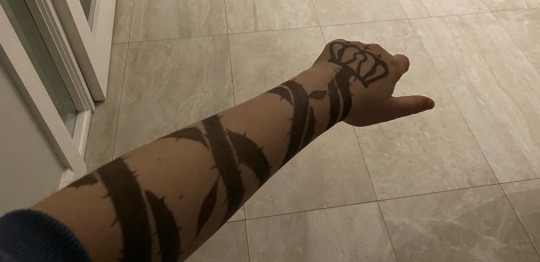

Since I was participating in a painting workshop this week, I decided to paint a tattoo from one of my favorite characters on my hand. This served as an exercise to work directly on my own hands while studying movement.


Tattoo belongs to kaiser from bluelock😼
26 notes
·
View notes
Text
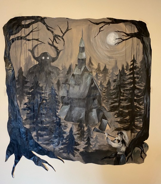
My painting inspired my the black metal movement.
I created this using the brown paper provided by the school as well as black and white acrylic paint.
I wanted to create a atmospheric piece and felt that I’ve done and I’m very proud of my work.
#artists on tumblr#art#design#lsad#diy#watercolor#mayhem band#burzum#black metal#norse mythology#norse paganism#varg vikernes#dead#euronymous#pelle ohlin#acrylic paint#acrylic#college
212 notes
·
View notes
Text

Another primary source drawing
30 notes
·
View notes
Text

The Emperor Needs No Clothes
#art#artists on tumblr#bad omens#fuck trump#donald trump#america#no justice no peace#no hope#i made this#lsad#hashtag#antifascist#anti capitalism#rage#traitor trump
14 notes
·
View notes
Text

Week 4 LSAD 10/10/2024. Brief 2 "Assemble"
Zine publication with Fiona
I feel like I touched on Japan a little in this work. I realized how important energy-saving technologies are and how unique it is to work with a risograph that saves energy and is eco-friendly, knowing that my creative result is part of that process. I also think there’s a small hint of Japanese minimalism in my works.
21 notes
·
View notes
Text
Nursery Rhyme Group Project
Second minute of the animatic
Basically I plan to get a minute done for each day so the last minute of the animatic should be done by tomorrow or Thursday
9 notes
·
View notes
Text
MOVEMENT:
Artist Reaserch: Edward Twohig


Edward Twohig, an Irish artist, who specialized in drypoint etching influenced me this week for my use of drypoint print and inspiration directly from nature. I like his simple but affective use of etching, and how the effect of movement flows through his artwork. In the third piece his use of leaves surrounding the moonlight is captivating and makes me want to create more drypoint prints in the future.
14 notes
·
View notes
Text
Movement Project - Artist Research, Q Hayashida
Q Hayashida is a Japanese manga creator known for her works such as Dorohedoro and Dai Dark.
In one of her rare interviews, Hayashida reveals that she is a mixed media artist who uses whatever media she ‘feels like in the moment.’
The chaotic, sketchy, raw and colourful look to her art works harmoniously as she depicts her gory and dark but funny stories.
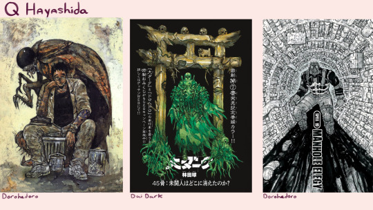
I love her usage of gouache, watercolour, ink and pen, majority of the time mixing these media together in the same piece creating a layered texture reminiscent of grime, reflecting the apocalyptic settings often found in Hayashida’s manga. Matching her colours, line weight and compositions to fit each scene and its tone is highly impressive and a source of inspiration for myself since I first read her work Dorohedoro many months ago.
Her character design is also equally interesting. Dorohedoro’s cast including the protagonist, Kaiman, a man with a lizard head searching for the sorcerer who cursed him, mypersonal favourite being Jonson, a giant realistic cockroach and plenty others, diverse, well-written and designed human characters. I can’t forget the monsters, each with unique personalities highlighted by their designs, brilliantly adding to the horror aspect of her works.
Lastly, my favourite technique Q Hayashida uses to instil discomfort, is her use of repetition and massive spaces, infinite crowds of monsters showing the viewer how powerlessness feels and drawing giant empty settings, such as a department store where the protagonists are stuck in devoid of all life, which perfectly matched the unease the characters she wrote were feeling.
55 notes
·
View notes
Text


Fellow classmate and good friend of mine asked me would I draw solid snake from metal gear solid and to say I was overjoyed was an understatement. Its relevant in more ways than one outside of our assignments as working on this reignited that sense of determination and joy in my flow. It took time which is honestly where I'm happiest personally. Not the quickest at what I do generally with Art but I've learned to use that as a strength. This piece was created on bristol board using various pencils and fine liners. I love how smooth bristol board is to work on as it offers a slight sheen to finished work but is very durable for layering most mediums.


UPDATE: a second request so I drew up another one!
19 notes
·
View notes
Text
18/02/2025 - Reading week
I decided over reading week that it was a good time to try lino cutting as I had never done it before. I got a small square from the materials store, I bought some cutters and sketches out the main idea onto the lino.
For my first try, I'm really happy with the results. I intend on printing one of these.
Here's a progress picture.

Here's the final cutting.

I can say that I have literally put my blood, sweat and tears into this cutting.
8 notes
·
View notes
Text
Finished Ceramic Cat House
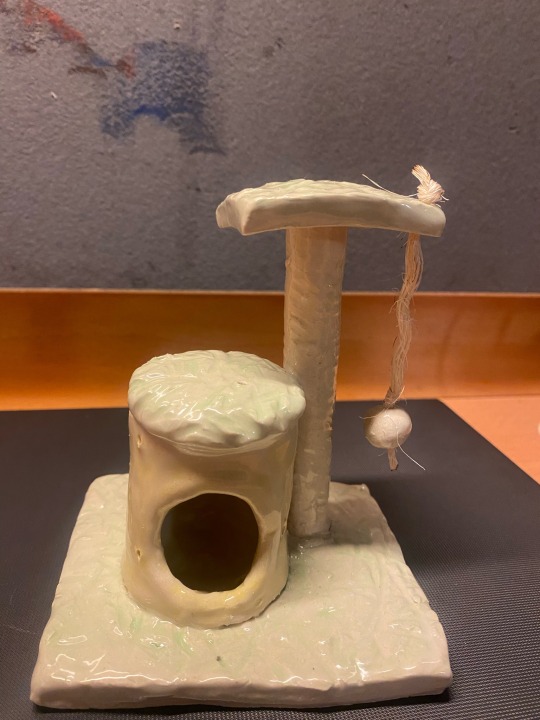
After the final firing my cat house was finished, and I’m so pleased with the results.

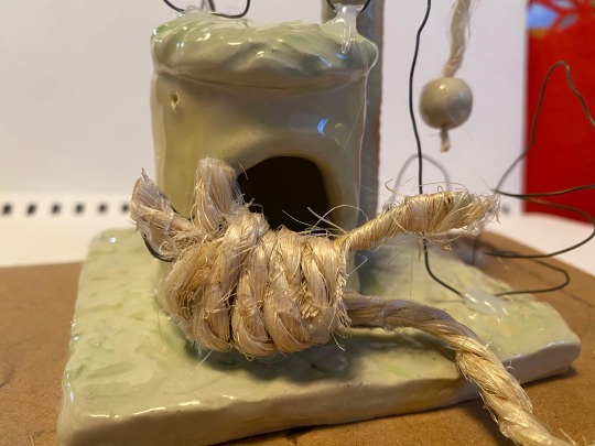

I added my two cats to the ceramic piece, and a trail mapping out their movements.
The wire cat and trail, represents loona, my kitten.
And the wool represents ponyo, who’s 10 years old.
I wanted this piece to convey the abundance of energy the kitten has compared to my older cat.
Loona jumps over, around and under the structure, whilst Ponyo just strolls over to hollowed out section to sleep.
#art#artists on tumblr#design#diy#lsad#books & libraries#watercolor#cats of tumblr#cat#ceramics#clay
119 notes
·
View notes
Text
Quick gestural painting

I used acrylic on cardboard here, painting a section of the courtyard outside. I kept this quite quick and messy to correspond with the bustling atmosphere in this area, and partly just to try something new. I like the colour scheme, quite muted save for the reds peeking though the foliage. I think this has sort of an impressionist vibe. I'm pleased with the figures in the way you barely notice them at first glance.
7 notes
·
View notes
Text

I realize most of these are American companies, but I know some of y’all use Amazon etc so please consider participating and sharing this around.
#lsad#fuck bezos#fuck elon musk#fuck trump#economic blackout#no justice no peace#no money#shop local
9 notes
·
View notes