Text
Painting - Final Statement
youtube
And so, the end of the painting elective and my first year itself is here. I've attached a video of my work created during this self-portrait project, making these videos has become a habit I picked up earlier in the year.
What I'm proud of
Overall, I'm very happy with the quality of my work. I've seen clear improvement with anatomy, proportions, colour mixing and composition in the paintings I have made during this project.
I've gone outside my comfort zone yet again. Prior to the painting elective, I've never painted so much, worked with such large scale, using media I've never used or was previously not comfortable with.
My personal take on self-portraiture. I thoroughly enjoyed exploring creating self-portraits through non-convention means. I researched hard and thought deeply of how to depict myself and my point of view, and discovered focusing on the deeply personal and almost taboo topic of my personal finances, spendings and possessions felt right to me.
and lastly, I'm excited about all I have learnt. Eoin and Sylvia have been amazing tutors and have taught me lots and shown me different ways of thinking and seeing, such as colour, concepts, media, tools and artists. The library and the exercises I attended have been amazing assets for every step of the way.
I love the work I have created during this time and I'm glad I chose the painting elective.
What I would have done differently.
Right off the bat, I would have tried to balance quantity and quality better. I felt as if I made less pieces than my previous projects as I spent my time focusing on the quality. While I love what I've made I wish I'd have created more.
Experimented with texture and form. I unconsciously worked quite flat. I wish I'd have changed things up and tried out painting on 3D such as on clay or sculpted pieces or perhaps even brought different textures into my works, such as impasto or working on different surfaces. I noticed this flat pattern and towards the end incorporated layered paintings with collage into the book I made.
And last but not least, I'd have researched more artists. The five weeks went by quick and between finishing up my CCS notebook and painting, I carried out less research into artists than I would have liked, I still did research three separate artists and carried over inspiration from previously researched artists but I'd have liked to have done more.
So long first year! New adventures await!
0 notes
Text
Painting - Work Display
And finally! Here is the display of a few of my works for the assessment that I hung up.

(Although it's a lil' bit hard to photograph in the corridor where I had to put mine up outside the second painting studio as there was no room.)
0 notes
Text
Week 5 - Wallet Book
(22/4/24-26/4/24)
For fifth and final week I wanted to contrast my previous work, going from large monochromatic ink paintings to a small, with vivid colours.
To achieve this I stitched together a small sketchbook comprised of 16 pages filled with collage of my receipts and price stickers , paintings and sketches.

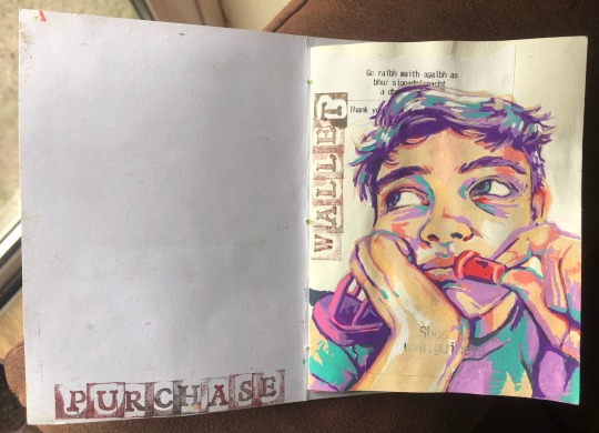


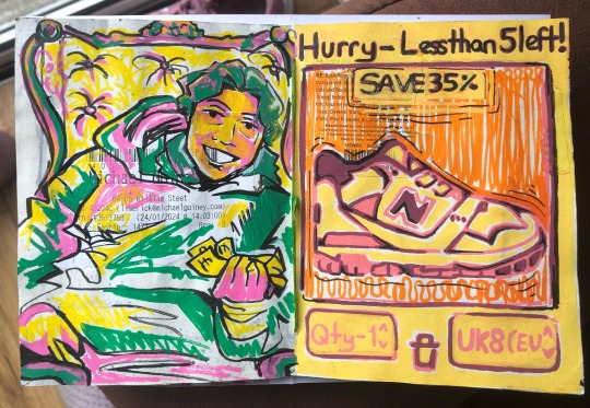
I exclusively worked from photographic references my family and I had taken or screenshot and paid strong attention to the scale of my book and how it reflected the size of a wallet and how up-close and personal finances are. I did this after detailed research on the artist, Luc Tuymans who utilises both scale and photographs strongly in his work.


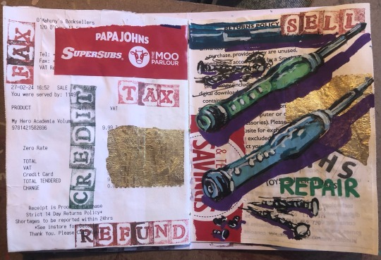
I definitely thought working smaller meant working quicker but I was wrong, this book took the whole week to complete including searching for materials to collage with but I’m very happy with the results.

#lsad#self portrait#bookbinding#artist inspiration#acrylic painting#oil pastel#ink painting#collage#mixed media
11 notes
·
View notes
Text
Week 5 - Book Inspiration
After telling Sylvia I was working on a little book she brought me to the library and showed me some of the incredible works fellow students had previously made.


Here are some photographs I took of a few I love how the paper surfaces are used with the positive and negative spaces and the overall concepts and execution.
2 notes
·
View notes
Text
Week 4- Room Triptych
(17/4/24)
I was working on this series of three conjoined paintings as I was researching for my artist presentation so I was feeling very inspired by Luc Tuymans' domestic interior scenes filled with allegories I painted my own.
Using Indian ink to achieve the same monochromatic palette and working from photographs I took with my phone I painted three angles of my bedroom, a deeply personal place to me.
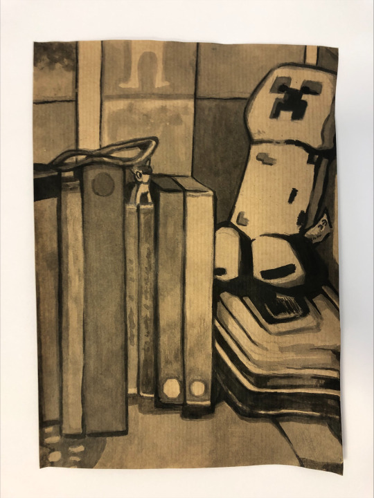


When the three were completed I took inspiration from Tuymans' mounting and glued my ink paintings onto white card to frame them. Almost giving the illusion of looking in a window.

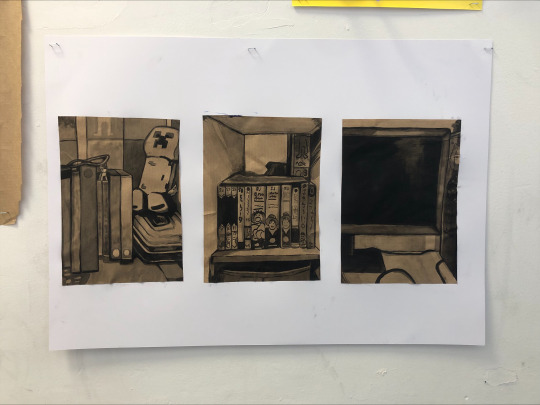
I waited till after I had presented on the 19th before I uploaded these.
#lsad#painting#indian ink#ink painting#interior painting#artist inspiration#Luc Tuymans#monochromatic art
3 notes
·
View notes
Text
Week 4- Artist Presentation (Luc Tuymans)
Today I presented my PowerPoint on the painter Luc Tuymans.
I found myself really admiring him as a person and artist the more I researched. I've even already seen his influence in my work!
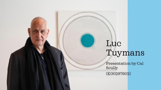


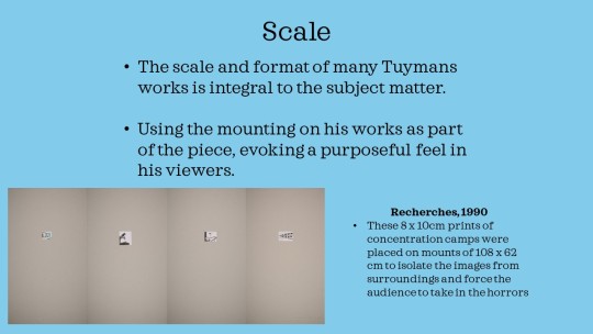

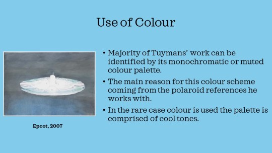
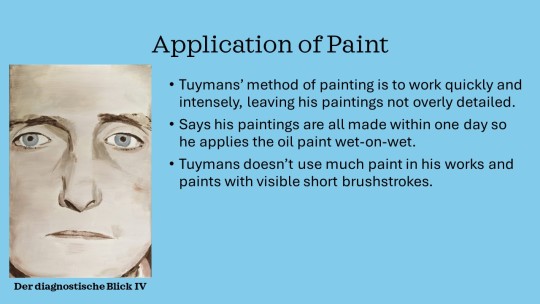
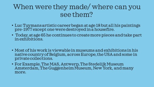
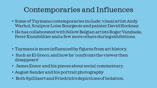
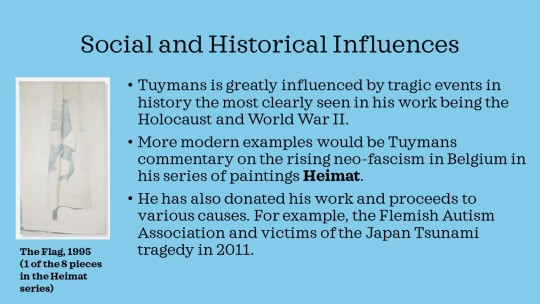
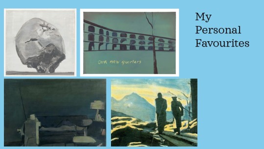
Hope ye like it, I used the wonderful books about Tuymans from the library which I highly recommend!
#lsad#artist research#Luc Tuymans#artist presentation#artist inspiration#art student#painting#oil painting#historical painting
2 notes
·
View notes
Text
Week 4- Online Shopping Ink Painting
(16/4/24)
I was out sick on Monday so I missed the final life painting/drawing with Jeff :’(
So today I jumped back into a self-portrait based on a sketch I made last week of my face in an Amazon online checkout.

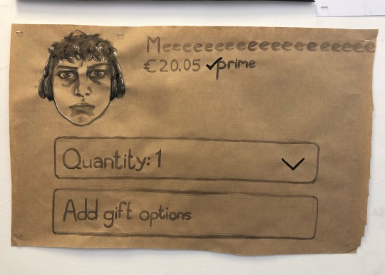
Finances are a very personal almost unspoken thing. Someones purchases, spending and income can…I guess you can say… paint a picture of them, and many rightfully so don’t want to be defined by this and I thought that was a pretty interesting way to do a self-portrait. Both Literally with my face on there and also with my spending (fictional in this case, I did not buy myself for €20).
2 notes
·
View notes
Text
Week 3- Colour Theory
(11/4/24)
After being given an explanation on how colour theory works and how colours affect each other by Sylvia, we made these little rooms with different coloured card to place our subject matter, fruit!
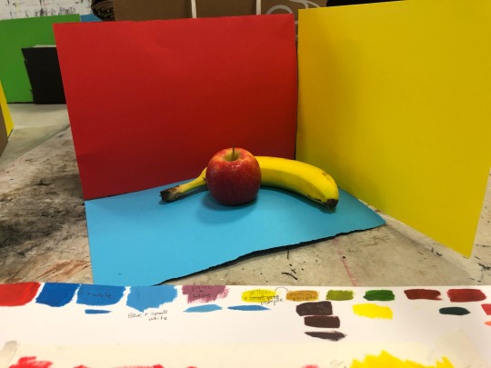
I found this exercise so difficult and I loved it! I learnt so much about mixing colours when I thought I already knew how and learnt how to paint with yellow which I found very difficult due to its almost transparent coverage. Drawing a mini colour wheel in my sketch helped a lot when mixing up my shadows.


Of course my colours did come out a bit dark and not fully accurate but I’m happy with the final result overall.
5 notes
·
View notes
Text
Week 3- Sketchbook Work
(10/4/24)
Heading back to the sketchbook to strengthen my concepts.
I tested out different sizes of my fine-liner pens drawing the same piece of merchandise in repetitive sketches.
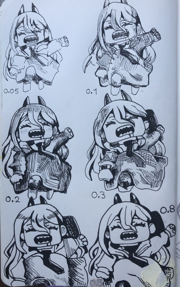
Then I moved on to thumbnail sketches of possible paintings I could create related to my self-portrait of not just my physical self but myself through finances and purchases.
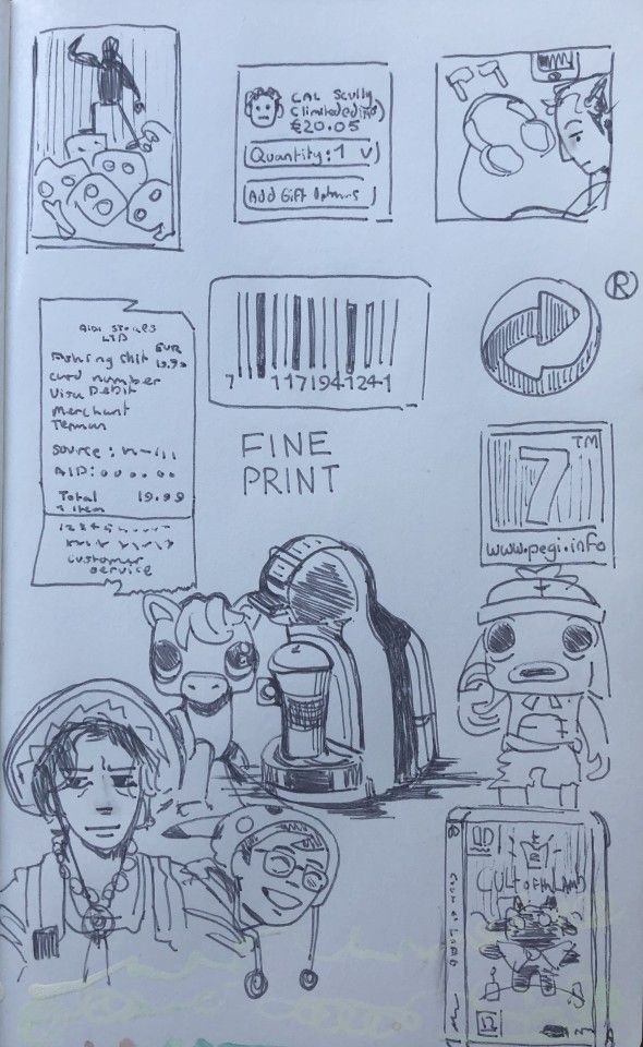
4 notes
·
View notes
Text
Week 3- Warm Vs. Cool Self-Portrait
(9/4/24)
After nearly losing a fight to an easel I got set up with my mirror and started painting. Cool colours for the foreground contrasted with the warm colours for the background.
I'm mostly happy with how the portrait turned out but i struggled with the facial proportions and spent way too much time on the one piece.
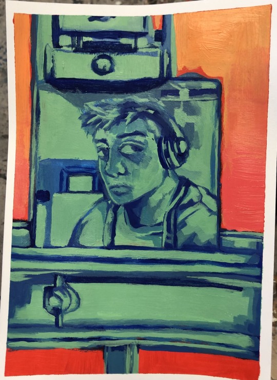
After I finished the portrait i moved on to another idea but ran out of time for the day, using the same warm and cool colour palette I started painting my 'Consumerist Cowboy' inspired by a cowboy hat and my poor spending habits.
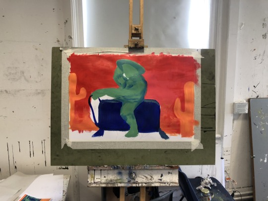
I see this painting as more of a preliminary sketch. Due to the anatomy being a bit off I'm considering restarting this concept as an ink painting instead.
8 notes
·
View notes
Text
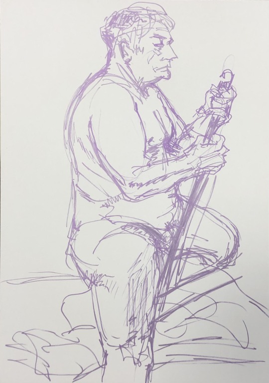
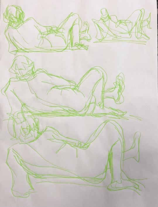
Week 3 - Life Drawing
(8/4/24)
20 minutes per pose and to keep myself on my toes I changed between various markers types and charcoal sticks (my enemy). Though I will say the metallic marker didn't photograph well with the glitter effect.
These life painting exercises are brilliant learning experiences for myself on how to capture the human form and it's poses.


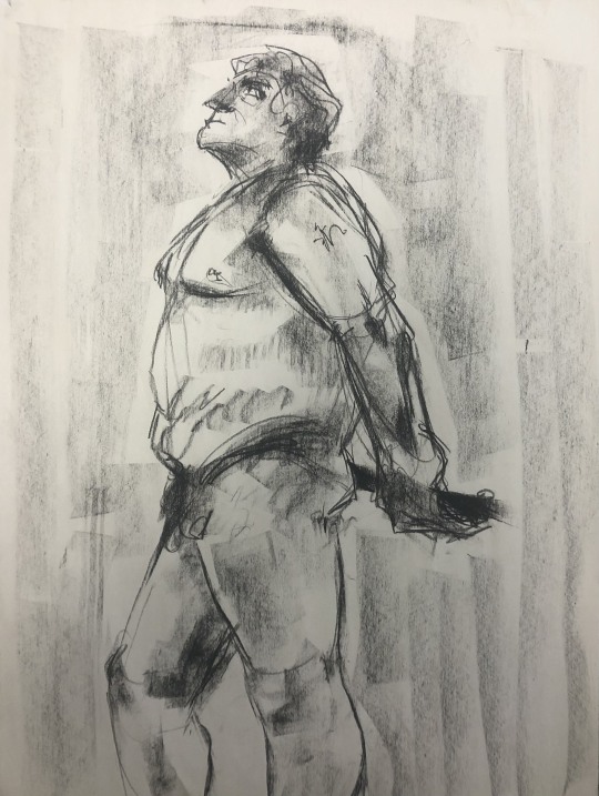






4 notes
·
View notes
Text
Artist Research - Katherine Bernhardt
American artist Katherine Bernhardt is known for her quickly made vivid paintings centred around pop culture and everyday items such as Pokémon, Garfield, cigarettes and junk food. Bernhardt has been featured in over 100 exhibitions across the globe and numerous publications.
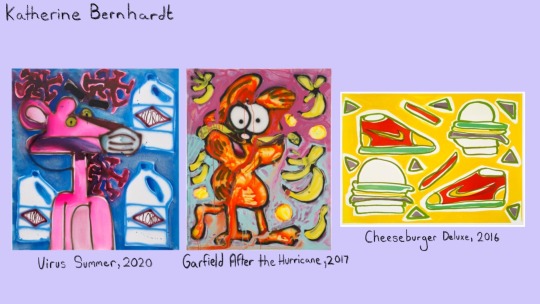
Her subject matter, media and large scale are what stand out to me. She has used cartoon characters such as the Pink Panther, as her muse for paintings blending and putting her own twist by adding other deeper themes and meanings, for example; the pandemic. Almost representing herself with these cartoon characters.
Bernhardt often uses spray paint, gaining a unique texture and look, which I would love to try out for myself.
Finally, her large scale quickly made paintings pique my interest as someone who has mostly worked in a smaller scale and this makes me want to try out larger scales and force myself to work quicker and cover more ground.
#lsad#Katherine Bernhardt#artist research#artist inspiration#painting#painter#pop culture#contemporary artist
2 notes
·
View notes
Text
Week 2 - Money Self-Portrait
(22/3/24)
I attempted to paint a self-portrait using a mirror and limited colour and found the result too bland and not like me at all. So, Inspired by Jean-Michel Basquiat’s graffiti-like paintings full of doodles and personal meanings I took out a paint pen and began drawing all over my hard work.
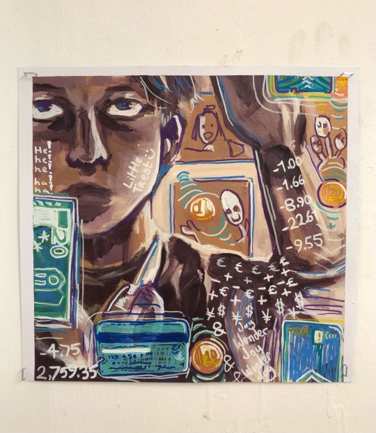
I wanted to draw money imagery on the piece, I included my own debit card (fake numbers sorry lads) coins from my wallet and a few transaction history digits thrown on here and there.
The theme for this was finances, and budgeting so I can live but also enjoy a silly treat every now and then to bring myself joy. Retail therapy on a college student budget I suppose.
7 notes
·
View notes
Text
Artist Research - Jean-Michel Basquiat
Jean-Michel Basquiat (1960-1988) was an American artist who began his artistic career with graffiti in New York City with his friend Al Diaz where the pair went by the name SAMO. Later on in 1980, Basquiat moved on from graffiti art altogether to painting and mixed media pieces but the influence of New York City’s graffiti culture stayed.
Basquiat’s expressionist and abstract style shook up the art scene at the time with his vivid colours, usage of crayons and oil stick to make scribbles and write messages often containing political or highly personal meanings. Blending contemporary painting and his graffiti art experience to make a unique and highly recognisable art style and some of my favourite pieces.
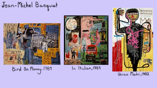
I love the idea of layering messages and doodles on top of a painting, his usage of bold thick lines and would love to try blending abstract into my own works. To create paintings outside of the typical way of paintbrush and acrylic / oil / watercolour paints and look outside my comfort zone.
4 notes
·
View notes
Text
Week 2 - Keyring Ink Painting
(21/3/24)
With encouragement from Eoin to paint big on the brown paper and the merchandise I already had on my keys and bag I was ready to go!
I first stapled the keyrings I recently purchased at a convention and now carry with me everyday that remind myself and show others my interests and poor spending habits to the wall so I could use them as reference instead of from a photo. Then after sketching and painting with the ink, I slowly added white painting to the jar to create a mid tone and highlight. A last minute decision was to add some paint droplets to imitate the look of graffiti art and I’m glad I did so.

I love how this turned out and how large the piece is! (roughly a metre or so tall and wide) This is a major accomplishment for myself. After the life painting sessions I’ve found myself paying more attention to shadows that I’d have once ignored so I made sure to include them.


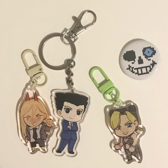
The photo of the keyrings is missing one cause I lost it whoops!
3 notes
·
View notes
Text
Week 2 - Quick ink sketches
(18/3/24)
Sketches I did of myself with Indian ink and a hot pink paint pen for a bit of charm. For the first row I used a mirror to capture myself and the other row I used photos I took. I like working with the mirror as I could see the form and depth of my face with my own eye but the photos allowed me to get poses I couldn’t get when constantly looking to the mirror.

I worry quite a bit about making mistakes so being unable to erase anything and working fast was a beneficial exercise. The sketches may not look like me but this is just practice to help me later on with self-portraits.
6 notes
·
View notes
Text
Week 1 - Still Life Painting
(15/3/24)
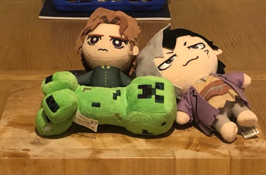
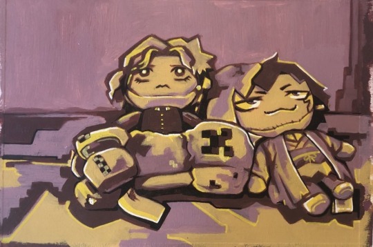
For most of the week I was out sick from college so I wasn’t able to participate in many of the workshops so instead I gathered some of my plushie merchandise and set up a scene for me to paint.
I took inspiration from the life painting workshops, a limited palette, 3 main tones, a number 12 hog hair brush and making sure to detail the shadows and highlights.
One of these teddies is a bootleg, one was imported from Texas and another a gift from a friend, can you tell which is which?
1 note
·
View note