#I like the color palette of the second one a lot but I don’t have the energy to work on it rn so it’s on hold
Explore tagged Tumblr posts
Text


some color comps and thumbnail sketches (only one of which has actually been executed). I always find the ideation process of other artists interesting.. my concept sketches normally start completely incomprehensible
#sketches#I like the color palette of the second one a lot but I don’t have the energy to work on it rn so it’s on hold#and I am currently workshopping the last one#the thumbnail for the first img came pretty close to the final product. I just changed the water flowing out. that wave caused me so much#trouble. I finished and redid it 2 or 3 times
13 notes
·
View notes
Note
okay so hear me out y/n in a revealing outfit for shadow milk cookie and pure vanilla cookie to rate It and you can of course make It yandere :3
oooh, I was brainstorming really hard on this one mhm, I have so many interesting post in my askbox I'm so happy and grateful for you guys ahhhhh hearts!!!
WARNING- Yandere, outfit ripping,
Pure vanilla will definitely favour a light color palette, consisting of creams, white, soft pinks, or baby blues. Very dreamy. Shadow milk's got the opposite spectrum; dark blues with gothic influences. He wants to make you a living doll. Anyways let me skip to the part where we're all here for. Now...with Pure Vanilla seeing you in a revealing outfit, he'd cup your cheeks, eyes filled with awe. “Oh, my dear… You look divine" you’d see the slight dusting of pink across his cheeks—he’s not immune to fluster, even if he tries to be composed. If the outfit had a lot of frills or a dreamy, fairytale-like quality, he’d melt.
But if it’s too revealing, you might hear him gently clear his throat, his fingers subtly adjusting the fabric. “Ah, this design is rather… daring. But it suits you beautifully, even if I’d prefer something a touch more modest.” What can I say? The man is old-fashioned.
His rating? 9.5/10. He adores how angelic you look, but if the outfit is too immodest, he’ll definitely get a bit shy about it.
“Now this—” he drawls, circling you like a predator inspecting his prize, “—this is art.” He’d love the contrast of darker, bolder colors—deep purples, velvety blacks, even a dramatic splash of his very own blue. If the outfit has intricate designs, dramatic draping, or something teasing like sheer fabric, he’d be so pleased. “Ah, Pure Vanilla likes his little doll in soft pastels, does he? Tch. Predictable.” He tugs at the fabric slightly, admiring how it clings to you. “But this? This makes you look absolutely ruinable.”
His rating? 10/10. No complaints. None. It’s perfect. If anything, he’d probably start thinking of even more daring additions just to mess with you further. Their final thoughts? Pure Vanilla: “You don’t have to wear something so bold, little one… You’re already beautiful in anything.” Shadow Milk: "Oh, please. Let them enjoy the attention. Look at them—don’t they just shine under it?” But then, in a rare moment of agreement, their gazes darken at the same time. The outfit is pretty, yes… but wouldn’t it be even better if it was in pieces? Pure Vanilla tilts his head, feigning a thoughtful sigh. “This fabric is so delicate. I worry it might not last very long…” Shadow Milk grins, a sharp, wolfish smirk as he tugs teasingly at the hem. “Mm. A real shame.” His voice is dripping with amusement. “Wouldn’t it be so tragic if it just… fell apart?”
Before you can react, there’s the unmistakable sound of fabric tearing.
Pure Vanilla’s hands, gentle as they may seem, are deceptively strong as he easily pulls apart the fragile material at the seams. Shadow Milk, on the other hand, grip is ripping away excess fabric without a second thought. “Well,” Pure Vanilla murmurs, trailing a finger down your now-exposed skin, his smile far too composed for the situation. “I suppose that makes it a perfect 100/10.”
Shadow Milk’s breathy laugh is pure mischief. “See? Much better.” He flicks away the last bit of fabric clinging to you, watching as it flutters to the floor. “You should’ve just let us do this from the start.”
Outfit Rating? Doesn’t matter. The real fun is in ruining it -- I feel like this at this point I should just write my own characters because I think I'm ruining PV and SM, are they too out of character??? Like, I know PV would never do this but I just love the though of him hanging around SM and SM just becoming such a horrible menace and influence on him.
#shadow milk cookie x reader#shadow milk cookie#crk#crk x reader#yandere shadow milk#yandere shadow milk cookie#yandere pure vanilla#pure vanilla cookie x reader#pure vanilla cookie
442 notes
·
View notes
Text
“Emberlynn is NOT a goth!! We don’t claim her!! She’s an egirl!!”
First of all, what’s wrong with egirls?
Second, you do realize there’s a sub style of goth called Pastel Goth, right? There are so many substyles of gothic fashion. Gothic fashion doesn’t only include all black stuff.
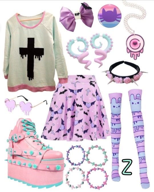
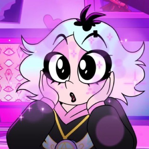
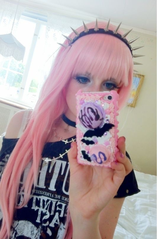
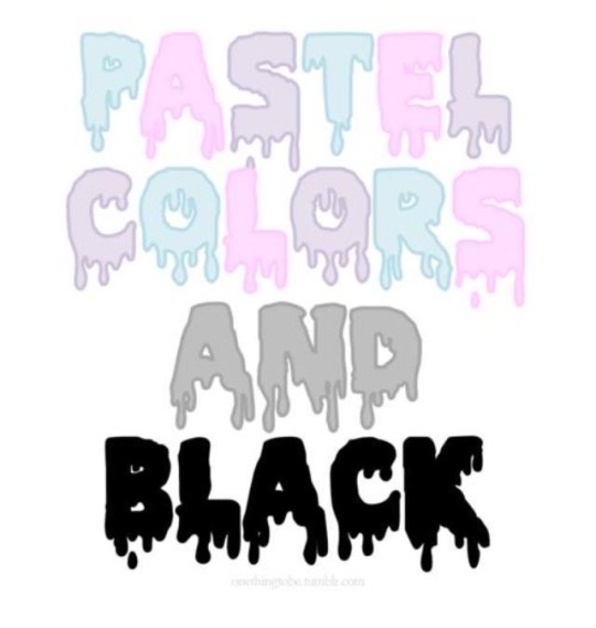

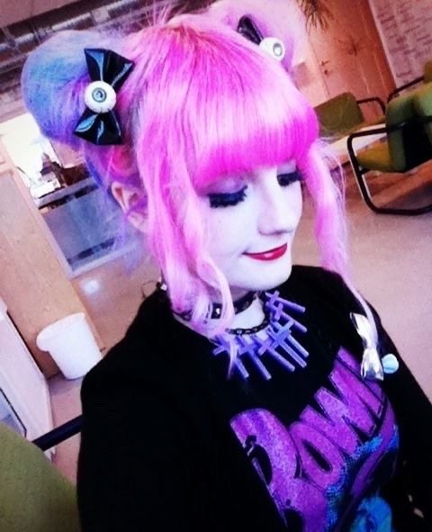
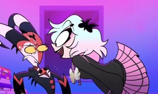
Even the person who designed Emberlynn confirmed that she is indeed supposed to be Pastel Goth.
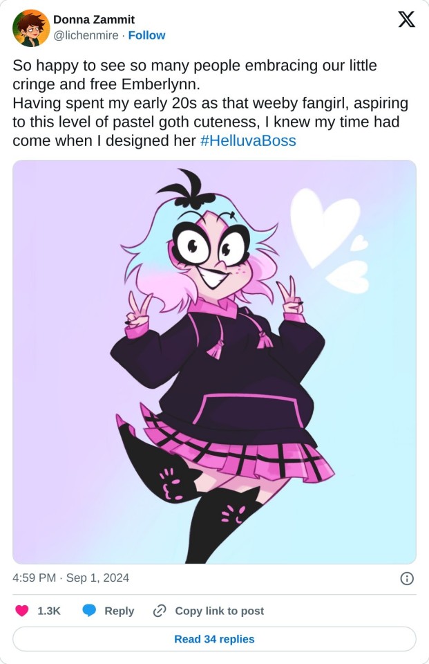
Plus goth is for the most part a music based subculture it’s not all about the fashion. If you personally don’t consider her goth cuz she likes anime, kawaii stuff, and smut then that also makes no sense.
I have never come across a goth or alternative person in general online that isn’t into anime, fanfiction, or smut. I’ve seen mostly positive things about Emberlynn but I’m also not liking this other new hate wave towards her.
“But she’s cringe”
THATS THE POINT. She supposed to represent all of those “cringy” fangirls who are obsessed with anime, fanfiction, smut, and their fictional crushes who also got bullied and made fun of for their interests. Even then it’s just a lighthearted jab at the fandom it’s not like Emberlynn was created out of malice.
A lot of thought and care went into her design and she was created BY people who are exactly like her which is why a lot of us see ourselves within Emberlynn and why a lot of ppl in the fandom love her. Because a lot of us are kinda like her in a way. And Viv and the ppl who work on the hellaverse team know this, because a lot of ppl on the hellaverse team, Viv included are also most likely like Emberlynn. SHE IS FOR US.
She’s for all the fangirls and or fans in general who’ve been bullied and made fun of and told that what we do and or love is cringey and wrong. She’s not for the ppl who for some reason haven’t grown out of cringe culture yet. She’s not for you.
No one is saying you HAVE TO like her or anything, but I frankly find it pretty weird at the amount of ppl I’ve seen who are genuinely upset about her existence along with saying incredibly mean and vile things towards her.
You guys will post saying that we need more quirky female characters who’re unashamed to be cringe and free and then you turn around post about how you much you hate Emberlynn’s personality or her character as a whole along with boasting about how wanna throw a brick at her face..
What is it with “cringey” fangirl characters and or quirky female characters in general that makes you guys get so angry and violent?? Yall clearly can’t handle characters like her at all despite claiming how much you want to see more characters like that in media. Grow up..
Anyways, Emberlynn Pinkle is such an amazing character. I love how relatable she is to a lot of us. Her human and sinner designs are so cute!! The color palettes for them are the definition of eye candy. We love a pastel goth queen.🩷🩵🖤
#rant#kawaii#pastel goth#pastel goth fashion#alternative#alternative fashion#goth#gothic fashion#goth fashion#pastel grunge#helluva boss#emberlynn pinkle#hellaverse#helluva boss spoilers#alt fashion#helluva boss emberlynn#emberlynn helluva boss#vivziepop
462 notes
·
View notes
Note
Hi! First time requesting here (and it might not be the last), mind doing a fix with Anaxa (or the other Amphoreus boys) that reader likes Chimera’s and has multiple plushies of them and sleeps in Chimera themed pajamas . Bonus is that the Chimera reader likes resembles them (color, quirks etc).
(Since Anaxa really likes Dromas (Livestream 3.2 special program 30:03-30:25 and has PJs of it I thought it be cute if they matched or was similar in a way) Thanks in advance, really love your fics, keep up the good work! -🦈⭐
"𝓨𝓸𝓾 𝓵𝓸𝓸𝓴 𝓬𝓾𝓽𝓮!"


💫𝒞𝒽𝒶𝓇𝒶𝒸𝓉𝑒𝓇𝓈: Anaxa x Gender-Neutral reader
💫𝒮𝓎𝓃𝑜𝓅𝓈𝒾𝓈: with reader that really likes Chimera's
💫𝒲𝒶𝓇𝓃𝒾𝓃𝑔𝓈: Fluff, & Spelling Mistakes


💫𝒜𝓃𝒶𝓍𝒶 "𝒯𝒽𝑒 𝓈𝒸𝒽𝑜𝓁𝒶𝓇 𝑜𝒻 𝒜𝓂𝓅𝒽𝑜𝓇𝑒𝓊𝓈"
Just looking at your shared closet, one side is yours, and the other side is his. You both have your clothes for the day in there. But! Then you both have another closet together, and that one has all of your themed pajamas and clothes. Your side has most of the chimera color schemes, while his side has Dromas pajamas.
Honestly, your shared room looks exactly like the pajamas in your closet. The two sides of the room are basically separated by your hyperfiction about your favourite animals.
You two enable each other's favourite animals, even wearing each other's pajamas as a way of showing your love before going to sleep for the night.
─── ⋆⋅☆⋅⋆ ───
“See! You look nice in that.”
You actively clapped your hands while you had the biggest smile on your face. Especially a pretty pair of pajamas of a chimera that is based around the color palette of his hair, a turquoise chimera, Anaxa!
He stared at you in silence. Five long seconds passed. The floppy chimera ears on the hood drooped slightly, the turquoise tail stitched onto the back swayed when he shifted ever so slightly—but otherwise, he didn’t move.
That smile on your face was like that of a child receiving candy.
But you know the end of your deal, you’re going to have to wear his Dromas pajamas.
Your grin widened even more, if that were possible.
“…You’re going to make me wear the Dromas pajamas now, huh?” you asked, already bouncing a little on your feet.
Anaxa didn’t say anything, but the way he crossed his arms told you everything. His expression was unreadable, but his silence was smug.
You gasped. “That’s unfair. You don’t even look excited.”
He blinked slowly. “I am.”
You snorted, walking over to the Dromas pajamas that were neatly laid out like he’d been waiting for this moment all day. It’s visible, purple skin.
“Okay, okay! But when I come out, you better clap for me the same way I did for you!”
“No promises.”
“Anaxa!”
He raised a hand. “Fine. I’ll clap once.”
“That’s barely a clap!”
“I’ll make it a slow clap.”


if you liked this, consider tipping me on ko-fi! it'd mean a lot!
#✧*:・゚✧:・ Yurinna's Writing :・゚✧*:・゚✧#hsr x reader#hsr x you#honkai star rail x you#honkai star rail x reader#star rail#star rail x reader#hsr anaxa#anaxa x reader#anaxa x you
159 notes
·
View notes
Text
“ lipstick on your face (so it goes) ”
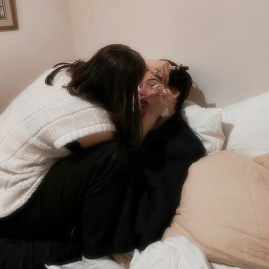

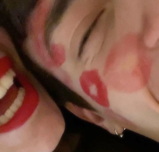
leo valdez x female!reader 🔨
leo realizes the power of makeup
⚠️ makeout, slightly spicy
˖ ݁𖥔 ݁˖ 𐙚 ˖ ݁𖥔 ݁˖
“Can I do your makeup?”
He looked up at her from what he was currently working on, “what?”
“Come on,” she frustratedly threw her head back, “I’m bored and you’re pretty.”
He smirked, “I am pretty,” he sighed as he stretched out his arms.
She raised her eyebrow, leaning closer to him from the chair she was sitting on, “so you’ll let me?”
He stayed silent for a minute. He looked away, then back at her.
“No one else will see it!”
“My siblings-“
“I love you.”
“Why would you say that?!” He laughed. He slid his hands down his face, “you can do my makeup,” he finally caved in.
Her smile grew, “I’ll be right back,” and with that, she pecked his lips before running out the door.
Minutes later, she came back holding a pink sparkly bag, that Leo could only compare to a lunchbox. She placed the bag on the table next to his tools.
“I‘ll start with concealer,” she began, grabbing a small bottle that was so not his shade.
“Babe,” he laughed, “I don’t think that’ll work.”
She rolled her eyes, placing dots under each of his eyes, “you’ll live.” She grabbed an eyeshadow palette next. As she opened it, he swore it smelled like vanilla frosting, “what color do you want?”
He glanced at the palette, “f/c,” he answered, looking back at her again. Did he really care for that color? Not until he met her.
“You’re not just saying that?”
“You love that color and I love you, so it’s perfect,” he smiled.
She felt her heartbeat slightly pick up speed as she watched his lips. She grabbed the brush, blending the color onto his eyelid. She tightly held onto his jaw to make sure he didn’t move.
She stood back, tilting her head as though she were examining a painting. She nodded to herself before taking out a black tube.
“No way.”
She giggled, “what? Are you scared?”
He shook his head, “I just know you don’t have the steadiest hands.”
“You can trust me,” she tried to convince him. She opened the tube and straddled his lap to get a better view of his eye, “it would, you know, accentuate your already amazing eye shape.”
He held onto her hips to steady her, “you need to stop flattering me,” he joked.
She bit her lip as she smiled. She leaned into him, beginning to brush the liner onto his eye.
He couldn’t help but pay all his attention to her bubblegum scented breath fanning his face. His eyes twitched slightly, but he overall was too distracted by trying not just throw her onto the table and kiss her lips right then and there.
She screwed the cap back onto the eyeliner, placing it back in the bag, “that’s all done at least,” she turned back to her boyfriend and wrapped her arms around his neck.
“Is that all?” He questioned as his thumbs traced circles on her hips.
She paused for a minute, “one more thing.” She leaned back, pulling out a lip gloss. He puckered his lips as he thought she was about apply it to him. But instead, she glossed her own lips before putting the gloss away.
Before he had a chance to question her, his lips were taken over by the warmth of her own. He fell into the kiss as his eyes closed. He could feel the stickiness of the gloss being transferred to his mouth but he couldn’t have cared less, because all he cared about right now was pulling her as close to him as possible. His hands traveled down her body which made her press further into him.
She took her lips away for only a second so she could whisper, “you really are pretty,” she moved a stray strand of hair out of his face.
He laughed, “I know.”
“Shut up,” she added before leaning into another kiss. That was when Leo knew he would be asking her to do his makeup a lot more often.
#leo valdez#leo valdez x reader#cabin 9#heroes of olympus#percy jackson#percy jackson and the olympians#percy jackson x reader#leo valdez fanfic#caleo#the seven#bunker 9
901 notes
·
View notes
Text
Finally Ironed out some ninja designs! I Usually don’t share references but with the behind the scenes stuff I’m doing on my Skybound project I don’t have much else I can share yet.
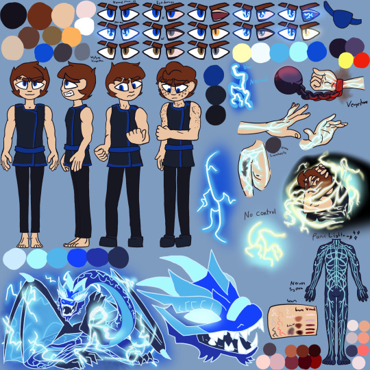

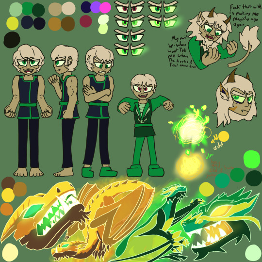
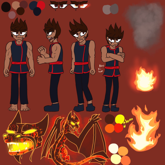

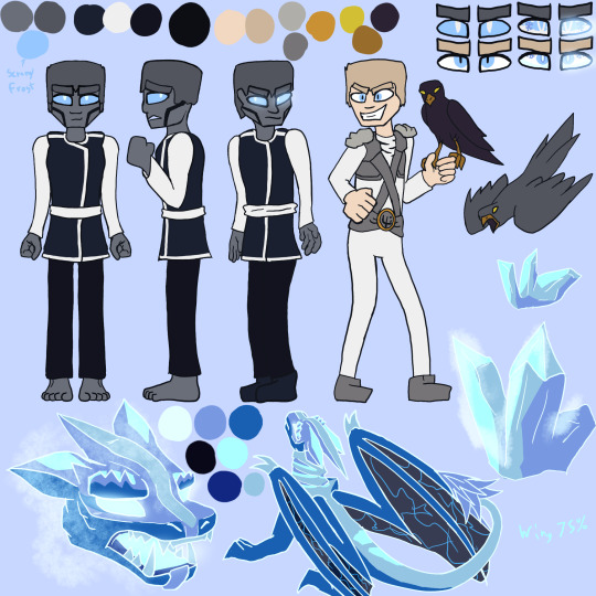
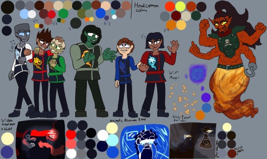
There is a few headcanon/ Fic stuff in references and powers and the all ninja shot is for first part of Skybound project.
I can share Skybound project Updates! I’m making lots of progress! Trying to focus on p1 stuff so I can put full force into the p2 stuff!
|
V
P1 may be ready Summer? 2025
My Skybound talk Video:
* God I have so much to ramble about just when I think I covered something a new angle gets me
* How TF am I supposed to sanely transition from the wholesome reasons I love this season into the horribly problem stuff. Sigh*
* Actually studying videos covering serious topics to navigate how to word things.
* I have to stop drawing so much art for everything or no one will ever see this video.
* The desire to animate my character lipsinking to me is an evolutionary disadvantage I will resist.
Cannon compliant Animatic:
* Song is Ironed out fought a while adding voice lines and I’m way more excited than I thought I’d be for this animatic because I thought it would be overshadowed by how strongly I feel about the other 2. But damn.
* I’m storyboarding after like my life depends on it rn
* Really trying to capture Nya’s character Ark which sent me right back to the video script because I remembered that one reddit post calling her a bitch and rage wrote for 2 hours.
* I am determined to make people see how good her character arc actually is.
* Throwing Jay shade in this one lol he was kinda awful even with being manipulated.
* Trying to convey clear Ideas and story through art is pain but also addicting.
* This is meant as a leading to both part two animatics, but bbnb Kai is shorter than wytyaa Kai. The difference is significant everything else pre dinner with Nadakhan is the same. The other head cannons are almost aligned as far as I know. It’s JUST Kai. What do I do with him?!? Lmao Might just distance him from the other ninja so you can’t tell how tall he is. Thank goodness he is the most gullible and first to wish it all away
P2 out like December if I’M lucky TT
Even though I should focus on first things first, I can’t help myself. these fics have lived rent free in my brain for like 2 years and despite plans shifting the excitement of drawing the story I read and put to music in my head is a force of nature. Thanks Adhd
Wytyaa:
* I storyboarded about half the scenes I want to. Songs are decided but a few parts I’m waiting for the rest of the story for.
* I think I’m going to mess with color palette. I really want to capture the emotion and intensity. I’m learning the full potential of my art and
* I need Final ch released for maping out the second half.
* BUT I AM NOT READY TO READ IT @mondothebombo And from what you told me I don’t think I’ll be able to finish P1 by then. cries*
* I wanna capture the feeling reading wytyaa.
* May make my wytyaa specific refs so I can make animatic art I can post early.
Bbnb
* It’s all storyboarded and half animated
* Thinking about redoing most the earlier stuff, consistency has been a problem
* Also was to mess with colors, dark backgrounds and intense colors.
* I fought with my ref forever to find good enough lightning scar colors cause figuring out the right amount of contrast is pain.
* So now I want to redraw my bbnb scar references a third time.
* May draw other bbnb specific refs so I can make some art for the animatic I can post here early or on on my old A03 book
If you have Any questions feel free to leave an ask! I answer all eventually sometimes I do save em up though so if I didn’t answer something yet, Sorry I will get to you.
#ninjago#ninjago art#ninjago skybound#ninjago jay#lego ninjago#ninjago angst#ninjago nadakhan#Oli Art#my skybound project#jay ninjago#ninjago kai#nya ninjago#ninjago cole#ninjago zane#cole ninjago#ninjago lloyd#ninjago nya#ninjago skybound art#ninjago season 6#wytyaa#bbnb#<- my friends fics are incredible but very dark head the warnings#especially bending but never breaking adults only
80 notes
·
View notes
Note
All of the background/minor characters in Helluva Boss are much more interesting than the main characters and I’m entirely certain it’s because they aren’t forced into the Stolitz universe and they’re the only reason I watch the show now.
Like, look at this imp family/single parent unit here.
They’re watching the trial, but before that the imp woman was washing dishes and the son was grabbing cookies off the shelf.


Hi! Thanks so much for reaching out.
I absolutely agree and I think there are a couple of reasons for this—
First—The imps actually have RULES for how theyre designed as a species.
These rules are really simple, and so pretty much anyone can design an imp.
1. Imps have red skin and yellow eyes.
2. Scars, birthmarks, freckles, and other skin markings are white
3. All imps have horns. Biologically female imps have black horns and black hair, and biologically male imps have white hair and white and black striped horns.
What’s nice is that, even with these general guidelines, there’s plenty of room for variation in designing imps. Some imp’s legs are bent like a satyr’s some have more human legs, they have varying lengths of tails, different body shapes and sizes, etc.
Idk if these design rules were in place for Imps as a species from the very beginning of the show, but I think having these rules helps A LOT because it means the character designers do have freedom to make unique and appealing designs, while not getting TOO crazy, which prevents them from being too over-designed:
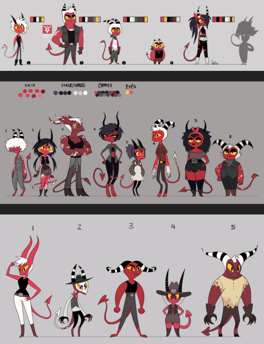
(All character design sheets by Erin Frost—former artist and character designer for Helluva Boss)
Second—due to being background characters, they’re less likely to over-designed in general. This hasn’t always been the case (and sometimes still isn’t) with Hellaverse shows, especially Hazbin’s Pilot:
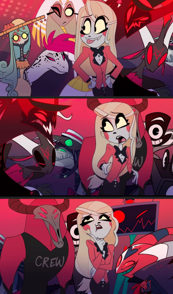
I don’t even think these are all necessarily “bad” or incompetent character designs on their own, but they have a lot of little details, and when they’re all squished together like that, it causes some pretty rough visual clutter. Charlie is supposed to by the main focus of the above shots, but she doesn’t really stand out from the background crowd.
Same with shot of Alastor watching the broadcast—he stands out a little better since he’s silhouetted, but the characters in the foreground having so much going on really detracts from Alastor as the main focal point.
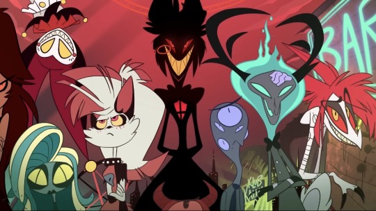
This is also just like. Not a very good composition. I’m really not trying to be mean or rude but, the characters being so overly designed and having such similar color palettes really muddles things.
Also—because there are so many design elements trying to be incorporated at once, we sometimes end up losing all those little extra details that are added due to the visual clutter. I didn’t have any idea Alastor was a deer until like 2 years ago, because his antlers were so small I never noticed them. I thought he was an owl, tbh.
I think we get the most overly complicated designs when the character artists and designers are given like. 3 or 4 different themes or ideas that they have to blend together. Alastor is a deer AND a “radio demon” AND a practitioner of voudo. Angel Dust is a spider AND a mafioso AND a porn star. Some of those ideas absolutely end up being lost because so much is trying to be fit into the design.
The most infamous example of this is Queen Bee, who’s supposed to be a honey bee, lava lamp, fennec fox, party girl, and apparently also an animal tamer?
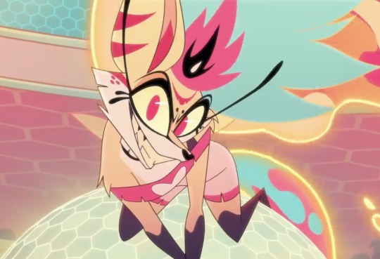
And I’ll be honest, I’m actually one of the few people who kind of likes her design. I think if you were to simplify her and take out a lot of the extra details, she could still be a fun sparkle dog-type character. But there’s so much going on with her, that a lot of her design elements get lost.
Like, apparently the little pink mark on her forehead is actually a closed eye??? Like I think it’s supposed to be an Ocelli, the third “eye” insects can have:
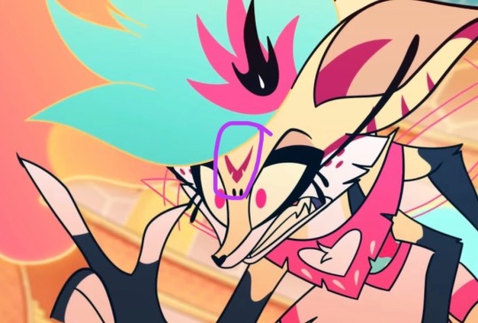
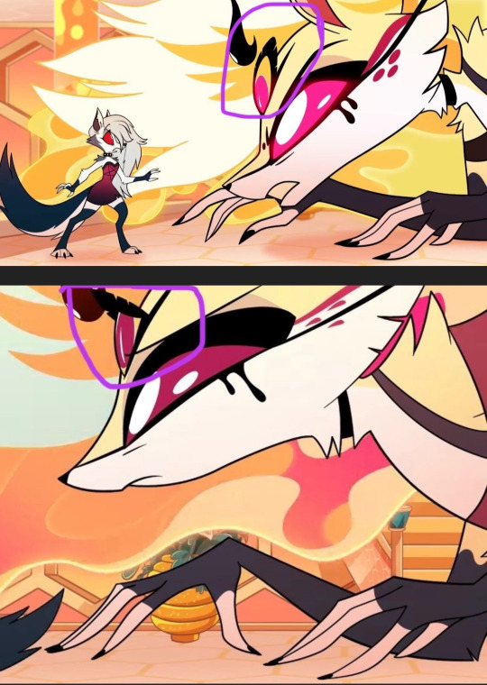
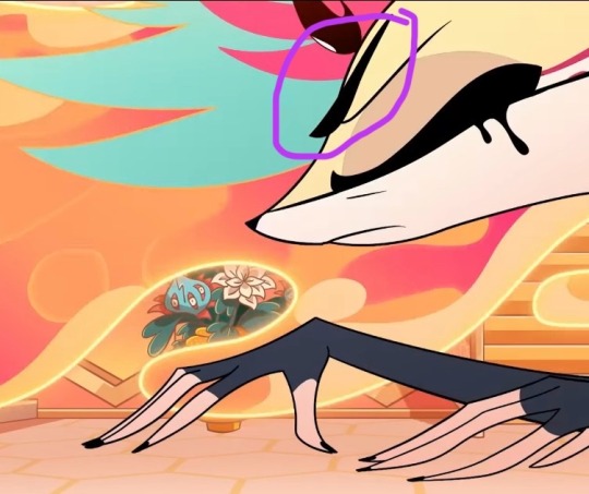
But it’s just like. Closed usually I guess. In theory, it’s not a terrible design idea for an insect character, but Bee has SO MUCH going on visually that this design choice gets entirely lost. I just thought it was like. A weird symbol on her forehead, and it took me AGES to realize it’s supposed to be her Ocelli or a third eye.
This happens a lot with more of the main characters in Hb and Hazbin, because they’re apparently supposed to be SO many different things that the character designs get too cluttered.
I think this is the main reason for a lot of the less appealing character designs in the Hellaverse, because they’re trying to be like. Ten different things at once. The imps avoid this fate though because, other than maybe their general profession and age, they’re supposed to be imps. They have those design rules we outlined before. I think thats what makes the biggest difference and is also why Mammon is actually the best design of the seven deadly sins because he’s literally just a round jester you look at him and your brain goes “yep that’s a jester” and youre not left trying to figure out what he’s supposed to be for 10 minutes. He’s not trying to be seven things at once. He’s a jester. With some extra arms. Sorry I was wrong when I said it was belphagor before. It’s mammon. Dudes literally just a jester.
#helluva boss critical#hazbin hotel critical#helluva boss critique#hazbin hotel critique#hb critical#hazbin hotel criticism#helluva boss criticism#character design#character design critique#funhouse convo#media criticism#media critique
72 notes
·
View notes
Text
DATE NIGHT
Light
Is pretty open to whatever you want to do. If you ask him to choose, he'll go with the classic dinner at a nice restaurant and maybe go to a museum or something.
He's a very good conversationalist. He loves to learn so he's very easy to talk to; he remembers details.
'Oh, they hate this color, I better pick a different tie.'
If you're doing something fun, he'll have a good time. But he's not a fan of the 'lay around on the couch' kind of dates, they make him feel unproductive.
L
He LOVES the lay around on the couch type of dates. They're a good safe option for him when it's not safe for him to be in public.
When it is safe for him to be in public he's completely shameless. All of his habits and quirks are out on display for the whole world to see and he does not care if he gets judged for it.
So if you can't handle the secondhand embarrassment of your boyfriend having his bare feet out for free, you're going to have a bad time.
If you do go out, he likes quieter, more private dates. A library, a park, places that aren't too crowded or chaotic.
Cafes and bakeries are always a win for obvious reasons.
Misa
She really goes all out. You have to schedule your dates with her, because they can be like 6 hours long.
She's a big fan of classic romantic dates. The 'dinner and a move' kind of thing.
I think she would absolutely love to take you to a masquerade. A chance to experiment with fashion and dance with you all night? She'd be all over it.
She would also like shopping dates. She loves to pick out clothes she thinks would look good on you and will let you pick out things for her too.
Takes lots of cute pictures through the night and displays her favorites in her room.
Mello *NSFW mentioned*
He’ll only go on dates with you on his off time- work always comes first. He has to beat Near by any means necessary, that means his love life comes second to that. In another world where everything was resolved neatly, he would likely be more willing to engage in romance.
Mello loves an adrenaline rush. His favorite dates are always a little risky and you always end up sweaty and out of breath (in a good way.)
I imagine he would like taking you out for drinks and going dancing- probably to raves rather than nightclubs.
The dark is a nice excuse to hold your hand- so you don’t get separated of course.
When you’re so exhausted and dizzy you can’t see straight, he’ll call you both a cab and you’ll do everything short of have sex in the back of it.
The real fun starts when you both get upstairs ;)
Matt
Matt loves relaxed stay-at-home dates. You hop on multiplayer on a really relaxing game like stardew valley or minecraft and just lay in a snuggly pile of blankets together.
I think he would also like dates where you make something together- trying a new recipe, or making an art project. It might not turn out great - he doesn’t have a sophisticated palette or a lot of artistic skill, but he would have a lot of fun.
He doesn’t mind going out once in a while, but he doesn’t like dressing up. He hates wearing ties. He’ll do it occasionally for your sake, but it’s not his favorite.
Near
He doesn’t really do specifically set out *dates*. You both just… end up in each others company.
It’s never a case of ‘Let’s set aside this Saturday at 7 for a date night.’ Usually, you just end up in his room while he’s working, you distract him, and you two end up spending the next six hours talking.
I imagine he would like that type of date, where you sit and have a really, really good conversation for hours and hours.
Especially since you’re one of the only people in the world who can really keep up with him.
He might bring out something for you two to work on together, some of his toys, puzzles, models, etc.
He likes meticulous, detail oriented work. Introduce him to knitting/crochet and you two can sit and knit together for hours. (embroidery would also work for this.)
Matsuda
Silly goofy guy.
He likes new experiences, he’s willing to try just about anything once. So if you have a really wild date idea, he’s probably down with it.
If he’s the one to come up with the date, he tries to put some thought into it and make it personal to you. But he has trouble coming up with new ideas so he tends to stick to what he knows - you two have a dedicated date night restaurant you both like.
I have no idea why, but I imagine he would love live theater? Like specifically musicals. Take him to see Hairspray, he’ll have the time of his life.
#death note#death note x reader#dn x reader#death note Light#light yagami#light yagami x reader#light x reader#death note l#l lawliet x reader#l x reader#l#misa amane x reader#misa x reader#misa amane#misa death note#misa misa#death note imagine#death note preference#mello#death note mello#mello x reader#mello death note#mihael keehl#mail jeevas#nate river#near#death note matt#matt x reader#matt#death note near
464 notes
·
View notes
Text
Dreamswap Design Critiques
Okay, I haven't read or even looked at Dreamswap in the SLIGHTEST however, Sarco has ranted to me about it, and then gave me the designs of Dream and Nightmare and…. I HAVE A COUPLE THOUGHTS…
That is putting it lightly, I went on a near multi-hour typing spree about them, and then they dragged me into a VC just to hear me rant for many more hours and for whatever reason enjoyed every single second. (I’m pretty sure my friend is a sadist). This was all two months ago, by the way, but I can’t help but still think about this AU and all the bad history behind it.
So hy threw 6 designs at me. I have a couple of analyses and opinions to share based on my own history with character design. That being said, even though both I and Sarco absolutely despise Dreamswap and for many many many justified reasons, this is mainly about the designs of the six main characters, Dream, Nightmare, Ink, Cross, Blue, and Error. The designs for the side characters are bullshit as well, but I’d like to preserve what’s left of my sanity. I like to share what’s on my mind with you guys after all, so long as I can tolerate it.
Where we shall start is with the supposed “villain” of this story that I never read and don’t plan to, Dream.

Looking at the initial “pre-incident” designs, before corruption/villain point, we see something completely odd. The presentation of both Dream and Nightmares’ clothes during this starting point makes them look like their AU takes place during the old western days. I can hear Bonanza’s theme playing in the background when I look at these. Focusing on Dream, we see a lot of pale yellows, golds, browns, blacks, and tans. If it weren't for the blacks, the colors would blend into each other, and far too much at that.

The reason why OG Dream’s color palette, from the second design symbolizing his maturity, works is because the colors are simple and eye-catching. The mix of primarily yellow and black represents Dream’s goal of achieving emotional balance throughout the multiverse. If he was against this, his outfit would have stayed mostly yellow only. But no, the ratio of black and yellow is equal.
Dreamswap Dream looks well-too taken care of to be an orphan or “out of place” in his AU. If anything he probably wouldn't be too out of place in a stand-off at high noon against some random gunslinger from Longmire.
Also if he and Nightmare are not supposed to be siblings and guardianship is different in Dreamswap… why do they still have the metal circlets?
Has anyone ever asked that? Why are the circlets present? Why keep them?
In the original Dreamtale, Nim gave Dream and Nightmare those circlets, and it’s obvious that for them both, they hold great sentimental value and stand for their statuses as guardians to the Tree of Feelings.
With Dream’s circlet, however, it poses a picture-perfect resemblance to the golden filet Sun Wukong, The Monkey King, The Great Sage Equal To Heaven, had to wear throughout the vast majority of events in Journey To The West, which was perhaps either the first or one of the oldest sources of the golden filet’s debut in popular fiction.
Now there is always a chance Joku incorporated the golden filet into Dream’s design just because it looked cool, and I agree with that sentiment. But walk with me to this pier that the Chinese golden filet does hold great symbolism that may or may not add to Dream’s character for you. I swear this is important to my rant.

In Journey To The West, Sun Wukong is tricked into wearing this golden filet by Guan Yin, the Chinese Goddess of Mercy, and Tripitaka, the monk Sun Wukong must accompany as one of his disciples as they head into India from China to retrieve scriptures important to Buddhist enlightenment. However, Sun Wukong is established to have a nasty temper and a bad habit of resorting to extreme violence and murder, which is why the golden filet has a spell on it. Only Tripitaka and Guan Yin know the words to set off said spell (at least at this time), and when said phrases are recited, the golden filet constricts Sun Wukong’s skull until the pain paralyzes him, thus stopping him from committing the violence and murder he was initially trapped under a mountain for 500 years before in the first place. The golden filet serves as a source of punishment for Sun Wukong, it gives him a reason to learn self-restraint and control, it quite literally forces him to if he wants the freedom and enlightenment he’s working for. It ultimately is a big factor in what makes him a better person by the end of the journey.
Yeah, I know, pretty wild stuff. Chinese mythology was off the shits back in the day and Journey To The West is also the origin of just about all common tropes in modern fiction today, including that golden filet.
How this applies to Dream is the golden filet on his design may imply the exact opposite. Whereas the golden filet actively disciplined Sun Wukong, ultimately teaching him the discipline of character, Dream has way too much discipline. So much discipline, so much self-control and self-restraint from his own personal wants and needs, that he hardly gets to enjoy his own life. And this quality of character in Dream is necessary given his conflict with Nightmare and the balance of the multiverse being in direct tandem with which of them lives or dies.
Everyone benefits from Dream’s excess of self-discipline, but Dream actively suffers on the inside with that trait being one of those adding factors. So to the people who insist canon Dream has no character flaws at all, here’s a big one for you served on a silver spoon. Enjoy!
Back to Dreamswap, if Dream and Nightmare are not siblings, are not treated as siblings, and are just two random boys who met each other from the same AU, why do they have the circlets at all? There is no Nim in the narrative to hand them off, so why do they have them? Where did they get them? What the fuck do they represent? The guardianship the creator clearly didn’t care enough about to think through?
I know a part of why Dreamswap was created was to spite Jokublog on the behalf of petty drama, most of which was caused by a language barrier, and so the creator didn't bother to think about the designs or the story influencing those designs through enough. The entire story, mainly what became of the Dreamtale brothers, was created to bastardize the original. It was all a statement, yet people pretend it was all initially created for “fun” as a little sandbox concept they could do whatever the fuck they wanted with.
And to an extent… yeah, sure, the latter is true now, but that wasn’t its purpose at the beginning.
I’m getting off track.
Let's be clear with something, crowns/filets symbolize royalty, upper class, and if anything else, power and authority. When I first saw these designs I got two contradicting messages from them: Royalty, and Old Western. These things can exist at the same time depending on the creative work, and after all, England always had royalty, but the Old Western theme was set in America. This is why I have a problem with it.
Then there is the fact that both Dream and Nightmare have matching outfits. Not exactly 1:1, but they are very eerily similar, almost as though they both go to the same school and have to wear a uniform.
Gold and Silver often give the image of royalty and purity and this does the same for the both of them. They look far too alike to be two random kids who just so happened to be adopted under the same roof.
They look far too alike to NOT be siblings.
They look far too alike to NOT be just made from spite and spite alone.
Now to not be too mean towards these designs, for a character who is going to inevitably be a villain or at least have an antagonistic role that challenges the protagonist in some important way, having Dream’s outfit be buttoned up is a good way to symbolize a “closed off” nature. A way to show he is secluded socially and personality-wise, hiding his motives and keeping his cards close to his chest.
But that is the only good thing I can say about the design… the first design.
Now for the full villain design…
Oh god, the fucking villain design.

This is where that whole “Old Western” out of place thing comes into play. That jacket he is wearing is not something that would be from an old western AU and it clashes with everything else.
To get to the point, as someone who tends to overdesign the HELL out of her characters, this character is overdesigned. Again, the colors of the jacket blend together horribly, and blend into his wings horrendously to the point that it's just a yellow mass. And even then the clothing under the jacket looks to be the same one from prior to the corruption so the argument still applies, but now the message of being a sign of him being “closed off” now is null and void.
He looks far too heroic to be a villain!
You can make the argument that he is convinced he is a hero, but that argument falls dead on the vine when you can't read the character as the villain he is supposed to be.
Villain characters are supposed to fully communicate that they are villains. Plain and simple. Take for instance, Darth Vader from the Star Wars franchise.

He dresses in all black, black being an EXTREMELY COMMON way to communicate that someone is a villain, the same goes for red, hence why he is always depicted having a red lightsaber.

Another villain is Veigo from League of Legends. Another way that villains are communicated is via sex appeal. Veigo has no shirt on, a black leather jacket, black leather pants, black armor pieces, and has a few pale colors to contrast that aside from this toxic yet ethereal teal/green which is a common color to symbolize the Shadow Isles. To help show off his tragic “obsessed lover” aspect and having a “missing piece” (his wife that he is still obsessing over despite being dead for hundreds of years already) he literally has a black hole in his chest. Very few colors, very few details, A FUCKTON COMMUNICATED.
But if that is too simple, let me get another villain from League of Legends because that is my go-to and has riddled my every waking moment with nuclear brainworms from Mars. Send help.

Bel’Veth. What to say other than WOW. Like holy shit. Bel’Veth has design in everything from the moment she floated into the scene in the cinematic she first appears in. Her voice emanates from her so her animation literally cannot lip sync because she is not human, but mimics them. She waddles as she floats to mimic walking, again she isn't human rather mimicking humans, AND THEN THERE IS FACT THAT SHE HAS A FALSE FACE. OH MY GOD.
Okay geeking out aside, design goes far further than just outfits, it goes into how they move and hold themselves. How much posing can tell you about a character. If you look at the physical design you can completely remove the false head from Bel’Veth and you'd see her actual face and multiple eyes, literally revealing to you the actual monster you are looking at. The pale grays and purples on her design are the very colors that have always signified the Void and its corruption.

I know it's not fair to compare a couple of random artists to a multi-billion dollar company, however, it is best to learn where you can. We all take inspiration from other forms of media and that inspiration can come through in one's own work and we all learn design by looking at the creative properties of the people around us.
To give the best example I have that gives away what Dreamswap Dream is trying to communicate, we must look no further than Kayle from League of Legends.
Now Kayle’s design isn't great, but there is something that it does do better than anything else… in its base form.
Impersonality.

Kayle (pictured on the right), via covering her face, disposes of any personality, any true compassion she can communicate with the viewer of her sense of humanity. Her helmet does so much to communicate that. The fact that she takes it off when she reaches her ultimate form ruins the design completely.
If we were to give impersonality to Dream to show his (which is oddly enough a similar thing to Kayle) impersonal completely “godly” justice shtick some actual fucking leverage. We'd actually get a “Oh, this guy is someone who took justice way too seriously and way too far, it’s become an addicting vengeance” vibe.
But we don't get that.
We cannot get that.
All we get is weird angel vibes from Dreamswap Dream because the creators didn't think his design through.
—
Nightmare.
To show that I'm standing unbiased here I'm going to criticize his original design. Yes, the OG. Specifically his corrupted design.
His corrupted design is literally just OG Sans… who looks like he got pushed to a vat of black paint. End of story. I know it has a narrative purpose to be this simple, but I really want to call it lazy. So I will. It's lazy.
That is what we're calling corruption now? Huh. Okay.
Now to Dreamswap Nightmare’s starting design, pictured above.
It has the very same complaints as Dreamswap Dream’s, however it doesn't have the color palette complaint because it's very different from Dream’s. The silver compliments the blue neckerchief very nicely. But that is the only compliment I can give.
His hero design, however…. (this is only one of them, I know)

Oh, we have a lot of problems because… it's trying way too hard to be canon Dream. It really is. Like just canon Dream but with the color purple overlayed on top of it.
Dream’s Cape was literally the fucking sun flag that his brother gave him to shield him from the rain. That flag/cape/now hood has great sentimental purpose to canon Dream as a character because that is the last remnant he carries of his brother.
So giving Dreamswap Nightmare a cape serves no purpose to the character and thus makes absolutely no sense. Is he trying to hide his identity? Can he feel cold? Is that why he has the cape? Is it supposed to symbolize a wanderer, since that’s what Dreamswap Nightmare is? If so, there are so many different and better ways of doing that so it would actually make him look far more interesting and compelling, and again with the circlets. Why?
Plus the stave, baton, or otherwise unexplained staff thing. What kind of weapon is that? Seriously? Is his fighting style even explored or is that there just to be there? Again, since this guy is supposed to serve as some kind of opposite counterpart to the original Dream, at least canon Dream as reasons for having the weapons he does. Dreamswap Nightmare doesn’t. Every theme put into him, if there even are themes to name, looks like they were just slapped together with no understanding of what the designer really wanted. It’s way too obvious to Sarco and I that Onebizzarekai did not understand any of the themes that made Dreamtale stick out as an AU, and that is part of the active reasons why Dreamswap ended up sucking this much.
If you want an interesting moon weapon, just look at the Lunari from League of Legends’ lore. Seriously. Get some actual fucking ideas. Inject some inspiration into your veins. Please.
—--
Ink…

Okay I'm not AS upset with this design, they actually look like they travel around buuuuuuuuuuut–
What the fuck is behind him?
What is that?
Is it a cape attached to his jacket? Why?
Just… why?
Also the entire point of his scarf was to help with his memory issues, it was to serve as a convenient way for him to take notes on important things he knows he’s going to forget, and since he’s always wearing that scarf, he has free access to those notes whenever he needs them. Does this version of Ink not have any memory problems? I ask that because instead of a scarf, he has a bandana around his neck, which if he does have comical memory loss, is there something else he uses to set reminders?
Does he still have to take his paints to, y’know, live? I ask because he doesn't look like he has his paint vials with him, instead he has a belt of bullets or bullet-looking things….
I see they were trying to make this version of Ink look “badass” but take it from me, the bitch that plays League of fucking Legends, it’s not having a gun that makes a character cool. It’s not being an asshole that makes a character cool either, it’s all the things that influence why they have that behavior that gives them the depth that makes them cool. I mean I’m a fan of Ekko from League of Legends and Arcane. He doesn’t have any of the traits that I just described and he is the most badass character ever written to me, I’ll fight you on that.
Anyways, unless Dreamswap Ink fucking eats bullets, I don’t know what other conclusion I could draw here. I genuinely cannot tell if that’s a sash of bullets or paints sorted in containers that look like them.
—
Cross.

The original scar on OG Cross’ face was given to him by XChara and XFrisk as a way to force him to remember the other timelines. It is literally a symbol of his trauma and the abuse he suffered. He is also a variation of Underswap!Sans by the way. His entire AU’s happiness and designs were inspired by Underswap. He is a Swap!Sans already. Changing his design and scar placement was fucking pointless and says nothing different aside from “I just wanted to make this character look different in the cheapest way despite my deep understanding of the original version of Jakei’s character.”
But again it shows that these designs are not thought through; they were made out of hatred or laziness on behalf of the original creators who made all these characters in the first place.
—
Error.

Oh, where to fucking begin…
Where to fucking begin….
1. What the fuck is that on his back? Are they supposed to be spider legs? Jellyfish tentacles? If they are either – why? Is it because Error is often compared to spiders and jellyfish? I am doubtful that that is the reason why his design looks like this.
2. What the fuck is with the hood? Why?? Like… okay I gotta dissect this.

Error's Lucidia redesign by CrayonQueen actively shows his strings via the stitches on the sleeves and pants, and the bagginess showing that he is a very active character, a way of communicating movement. This also makes him an easy character to draw for the creator allowing them a sense of ease. His scarf is a way to communicate movement as well, allowing it to flap about and show direction for when they draw him in comics.
These choices also show the fact that he is a very VERY simple person. He is someone who would rather lay down at home, watch Undernovela, and stuff his face with chocolate more than anything else, aside from destroying everything he can’t stand.
But with the design by Onebizarrekai, we don’t get any of that aside from the spider legs as something that shows his strings… but he isn’t a spider monster and spiders have exoskeletons, so he can’t be a “spider-skeleton” in that way, and perhaps not a hybrid either, and I don’t think Onebizarrekai was going for a Spiderman-type character for Dreamswap Error anyway.
If you want to show off the strings more, you can always have a webbing design on the sleeves or maybe have strings all over him, or have his outfit be more stitched up. Make it look like he doesn’t care that much about his own clothes, that he rips them to shreds and stitches them back together out of necessity. Maybe he has limited access to clothing and that is why he fixes them repeatedly.
To use an example… I will use my own “version of Error”, Digital Klezmer.

Digital Klezmer is overdesigned – but the separate colors allow him to not have the same blending problem that Dreamswap Dream has. I have his AU set in the ROARING TWENTIES (that’s the 1920s in New York). His AU is set in a completely different era. We’re talking swing music, movies being called “Flicker shows” and every woman is either called “Dame”, “Doll”, or even on occasion a “tomato”. His world is ruled by slang and the stereotypical New Yorker accent.
His cape of fur has his hood seamlessly blended into it, and the cape itself has significance, that being his Papyrus was so overprotective of him that the jacket was specifically made for him and the cape is crafted from fur so thick that if he were to fall over, he wouldn’t turn to dust on impact. That fur would cushion the fall and negate all damage. His Papyrus was that fucking paranoid over his brother’s safety and health.
His voice, as I had described in the story that Sarco and I are writing, his voice sounds like it’s coming from an ancient radio – thus showing how ingrained he is to his own culture and his AU’s era. This is a way to show how much of his background influences who he is as a person and what he does.
I had him play the piano instead of the trumpet, showing a subtle oddity in comparison to other Sanses. The era of where he is from is shown with how practical he dresses aside from the jacket which is sentimental to him. The vest showing class and the turtleneck showing his ties to the cold of Snowedin (yes, that is how it’s spelled in The Outer Realms universes).
His shorts show his ties as a “Sans”, but his practical shoes show that he’s a bit more athletic and isn’t as lazy as the average Sans.
The fur on the hood is also to give a bit of a lion-like feel to him, and enhance his silhouette a bit in comparison to other Sanses. It makes him appear much bigger than he actually is, indicating what he might think of himself and the influence he has on The Outer Realms, and then the Inner Circle of the multiverse.
All of these differences are nothing compared to his personality as a gambler and the way he uses his magic.
Playing poker with this man is like placing a bet on a dying horse, you are gonna lose. Every time. He loves gambling and even actively carries a deck of cards wherever he goes.
His magic is used COMPLETELY DIFFERENTLY than any other Error presented. I had him be someone who plans ahead, and has his team – yes HIS team. He doesn’t work for The Outer Realms’ Nightmare, that Nightmare works FOR HIM – go out as a distraction so he can hack into other universes (specifically negative ones) so he can set them to self-destruct. He weaves his teal strings into ribbons that turn into spears that can do damage based on the tension he gives them. He can control them without moving. He also uses his strings to become claws. And he can even destabilize himself to negate any attack instead of dodging, or even just turn into a string of code to increase his speed. He is active and takes advantage of his new HP but still values his own safety, hence why he is not afraid of getting into fights.
Digital Klezmer takes full use of his abilities and gets quite creative with them, unlike the original Error, who fucks himself over by making each job of his harder for himself.
But he also has an actual weapon. Its story is very important in the future, so I won't reveal its significance here. I’m a total cunt, but I’m not cruel.
But to show how proud I am, I will give you one final tidbit of Klezmer’s design that I am way too proud of. His left eyelight. It’s an “x” with two rings around it. It signifies his focus and endless stubbornness. I thought this shit out FAR MORE than anyone realizes – Sarco legit had to stop me from going on because I nearly gave spoilers. This is why I have an editor breathing over my shoulder, thank you Sarco, I love you. I’d legit fight a bear for you.
This is all to say that I’d LOVE to see more designs and takes on other AUs, I’d LOVE IT. I really would… But these designs are not it, and Error’s Dreamswap design is just… not good at all. It’s so boring, it’s bland in the worst way possible. The only interesting things are the spider legs and they do NOTHING for the character. They add nothing to him.
–
Swap!Sans, or what’s called Swap!Sans or Blue. The bane of Sarco’s existence, and I see why (Ve fucking HATES this guy more than anything fucking hell).

No armor, a shit-eating grin, absolutely no depth to be perceived other than what I’ve already been told. Out of all the designs I have been sent, though, Blue is the only one out of them that looks a little happy, not an angry two year old wishing they could break the camera their overbearing mother stuck in front of their face.
Why is there no armor? Isn’t this guy supposed to be an enthusiastic practicing Royal Guard? Of course not, cause Onebizarrekai seems to have had an addiction to assholes with a base-level characterization and in application to every character at the time they were making Dreamswap.
The entire idea of Underswap in general is that the roles of many main characters were swapped, mostly in occupation but some partial trades in personality. Asgore is the one who lives in the Ruins, Toriel takes her place as Queen and rules over the Underground, Papyrus takes up the simple guard post, and SANS IS IN THE ROYAL GUARD TRAINING UNDER ALPHYS WHO IS THE CAPTIAN OF THE ROYAL FUCKING GUARD.
Deep breath…
There is absolutely nothing in this design that references any of this information, and if Blue is supposed to be extensively different from the original Swap!Sans, which I assume he is, why the shitty casual wear? He’s definitely not an average Joe, I can tell by the glitch and the ERROR in his left eyesocket, but how he got that isn’t made evident aside from maybe, maybe he got stuck in the Anti-Void at some point. Did he have an encounter with Error or did he end up there via a different source?
What the fuck is that on his shoulders??? Is that supposed to be a fucking poncho. If it is, it’s a BAD ONE. Ponchos are supposed to go down your waist, not stay only covering your shoulders. They are supposed to cover your torso.
Ponchos are a wonderful way to show that a character is someone who travels a lot, they give a very nice silhouette, they also give warmth because that is another thing they do, along with keeping the arms from getting sunburn should your character be in a desert. However, it’s made null in this case because of how… insignificant it is. It’s there, but why? Is it supposed to be part of the cape? I’d assume that if it weren’t for the scarf, and the thing on his shoulders being a completely different color from the thing going down his back so that must mean the thing going down his back is actually a part of his scarf. SO THEN WHAT FUCK IS ON HIS SHOULDERS??? If it’s not an unfinished poncho, I can’t grasp what the fuck else it could be.
That’s… about all I have for Dreamswap Blue.
Fuck, I don’t like any of these designs. They add nothing to whatever vision Onebizarrekai had for these characters, only take away what made the original versions so interesting in the first place, and it’s not like I can efficiently judge these designs on what their Dreamswap counterparts were going to be, because Dreamswap doesn’t have a concrete story or character work, which makes sense considering all the themes it has fucked up. I took one look at their pinned post and found this.
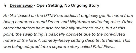
Drawing takes effort and I know it takes a long time to learn how to draw, and these guys have some talent. I will always give props where it is due. I’m pretty sure all these designs were made back in 2016-2018 too, so they’ve been around for at least 6 years now. I have no doubts Onebizarrekai got better over time.
HOWEVER…
When it comes to character design, the Undertale fandom has problems and as a whole needs to take a step back, take a deep breath and start actually putting in some fucking effort. Like come on guys… and I’m not addressing the people still learning how to draw.
I don’t like saying this but… you all are getting lazy. Are you not thinking about your world design, the lore. ANYTHING, REALLY? By no means is anyone a professional concept artist here and I am not asking for that, if that helps.
I understand, a lot of you are just trying to have fun and maybe I’m the weird one for asking for more, but I actually like thinking about the worlds my characters inhabit, the way their stories reflect in their designs. It’s something that I personally love to do, and no doubt others reading this do too. And a lot of the designs from the fandom don’t really reflect this; those that do reflect, their stories are a handful at most and even then, some of them are only reflective of the designs and don’t show the story they’re supposed to have.
Take Outertale for instance. It’s 100% space aesthetic, but 0 story. The designs themselves make them look like they’re supposed to be attending a space themed party. I got so upset with it not having pushed the designs far enough and having no story I made Outerswap – again no spoilers– I SEE THE GUN, SARCO. STOP. RELEASE ME.
What I am saying is, I want you all to do better because I KNOW you can do better. This fandom has a fuckton of talent behind it but does NOTHING with it. Most AUs I’ve seen are like Dreamswap here, a rehashing of projects that already exist and doing nothing new or interesting with them, and that’s not inspiring. It’s just a pattern.
For those of you still learning, just try. I’m not expecting instant improvement. I’m saying TRY. Put in the effort. We don’t grow as artists and storytellers if we don’t TRY. If you need inspiration, explore other things, especially elements you aren’t familiar with. Look at other people’s artworks, look at videos critiquing character design like TBSkyen – my personal favorite. If you are insecure about storytelling, read more fanfiction, read more books, read more poetry. READ. There is always something you can take inspiration from for your own work and it doesn’t have to be Undertale only. Use as many sources as you like, there is no limit to what you can use at your disposal. GO FUCKIN NUTS, MATE!
There is always room to grow. And that is what shows the most in artwork of all kinds, be it drawing or writing, and what it takes to do that is to get out of your bubble more often.
Sarco interacts with and follows people who are already doing this, but there’s nothing wrong with more, more, more!!
Anyways, that’s my critique. Have fun, go nuts. You only ever have one spark of madness, don’t lose it.
…trying to force a nice concluding sentence when I’ve been critical this whole time is a tone shift I am not okay with, holy shit. Get away from me. Get out. Run.
– Ouija, edited by Sarco
#message from ouija's board#sarco screams#utmv#undertale au#undertale multiverse#utmv au#ut au#art critique#dreamtale#dreamswap#errortale#inktale#underswap#xtale#league of legends#dream sans#nightmare sans#ink sans#cross sans#error sans#swap sans#lucidia error#undertale fandom#digital klezmer#digital klezmer sans#proship dni
62 notes
·
View notes
Note
Hello, sweetheart! I was wondering if you could do Alastor with an overlord reader? I was imagining reader having water based abilities and a blue theme to them! I also imagined the reader being a lot shorter than him (cause he’s like 7 feet tall).Like how would he react to reader being able to summon a tsunami and drowning a bunch of sinners, but being an absolute sweetheart at the same time! Please ignore this if you feel uncomfortable!
~Angel <3
hi angel!!! i can totally do that! thank you for your request and your patience on this!!!
i would love to do this! i’m doing this more in a head cannon/ficlet format, but i may come back to this to make a full fic.
i hope you enjoy!! ☺️
alastor first noticed how short you were. you were tiny
at least to him.
but he’s like 7 feet tall and you kept your human height of 5’2 when you descended to hell.
the second thing that he noticed were you were completely opposite of him
your color palette, your disposition and even the way you spoke were all opposites.
you had a mainly blue color palette. your hair was long and blue, your outfit flowy and not really structured, your eyes were the red that overlords though
you were rumored to be powerful but alastor had never seen any display of your power
you were happy and kind of go lucky, you and charlie were almost like two peas in a pod.
that was until one day, someone threatened the hotel and he wasn’t there.
Idiot sinners who thought they could beat the radio demon
it was the thought that if the radio demon wasn’t there, it would be fine as no one took charlie seriously.
and you wouldn’t let her dirty her hands on these… cretins
The fire balls soared through as they called out for Alastor. Everyone was running around trying to put out the fires and Alastor wasn’t around. He was in Cannibal Town today visiting Rosie. You sighed and closed your eyes. You made your way to the front ignoring the calls of your name and to watch out. You raised your hands and a shield of water surrounded the hotel. You walked out and stared at the sinners.
“Who are you bitch?” One asked. Looking there seemed to be about 30 sinners who made up this party.
“Yeah! Where’s Alastor?” Another asked, raising a molotov cocktail and getting ready to light it.
“Look, gentleman, why don’t you go back to wherever you came from and we can forget this ever happened.” You say, looking at all of them. There’s a beat of silence and then they all start laughing. You look annoyed and the one who seemed to be the leader spat at your feet.
“Like hell, bitch. Be a good girl and get Alastor.” He said laughing again.
“Oh, you’ll wish you got Alastor.” You said, bringing your hands together and then throwing them in a down motion to the ground. Suddenly chains appeared on all of the sinners. Their eyes widened and the leader started to struggle. You smiled as you reached your hand towards him and he flinched thinking you were going to grab him, but then all of a sudden you closed your fist. The group looked at you confused until the water that held them where they were at started to boil.
You raised your left hand up and the boiling water started to encase their legs slowly. You looked at the leader and smiled.
“Wanna make a deal? I’ll end this pain right now, you give me your soul, never come to this hotel again and are at my beck and call whenever I feel like it. You will do anything I ask of you. Do we have a deal?” You grinned as he cried out his confirmation.
You stopped the water from boiling and proceeded to make the same deal with all 30 sinners, they scampered off afterwards and you let down the shield on the hotel. You looked to your left and saw Alastor there, his eyes wide and his grip on his cane tight. Rosie next to him, grinning.
“Oh hey!” You said nonchalantly.
alastor is enamored
you a little thing so sadistic that you get 30 sinners to make a deal with you at once?
he’s not sure if he truly feels threatened or admired you.
rosie adores you
you shock alastor again when another group of sinners come to the hotel and you don’t even walk outside
the only thing heard is a rumbling, a crash and then quiet. everyone looks outside and sees a tsunami drowning a larger group of sinners than before.
everyone looks at you sitting at the bar, complimenting pentious’ drawing and him beaming at your compliments
you were such a sweetheart but you were terrifying
#hazbin hotel x reader#hazbin hotel#hazbin hotel imagine#hazbin alastor#hazbin hotel alastor#alastor x reader#alastor altruist#alastor/reader#hazbin hotel alastor x reader#alastor fanfiction#alastor
395 notes
·
View notes
Text
Family
A MerMay Prompt
Masterlist
Previous / Next
Eventually, you calmed down enough to remember yourself and stop clinging to the stranger.
He chuckled at you as you let go. “Feelin’ better there, darlin’?”
“Yeah……” You said, keeping up with the group. The whole orca pod stayed in a tight group around you. They seemed to be really close, like a family.
Sans grinned at you, a large, sharp, toothy grin, and held out his huge hand to you. “Name’s Fell. Nice to meet you.”
Odd. You thought the taller skeleton called him Sans.
“Y/n. Nice to-.” Your body jolted as a jolt of electricity buzzed through you as you shook his hand. You couldn’t move for several seconds.
Fell burst into thundering laughter. “The buzzer in the hand trick! Works every time!”
You were starting to hate meeting new people. And who puts enough volts to stun someone in a buzzer?!
Fell grabbed your arm and dragged you as you recovered from the shock. “Well, y/n. We’re here.” He nodded in the direction the pod was heading.
Looking forward, you froze. There was a trench, just as he said. It was stark against the continuous rock in all directions, decorated by sunken ships from many different eras. You could see caves and dens littered with shiny objects. It looked like there were gold coins in some dens.
But it wasn’t your home.
“I thought you said you’d take me home?” You spoke up, confused and honestly a little disappointed.
The taller skeleton glanced at you before swimming past you towards the trench.
Fell nodded at you with a look of sympathy. “And we will. But you look exhausted. I figured you might appreciate some time to rest before taking the long swim back home. Are you okay with that?”
That sounded reasonable. Something did twist in the pit of your stomach as you looked into the trench. It was full of very aggressive-looking orcas. You weren’t sure you wanted to meet more strangers.
“……That sounds nice…” You finally responded.
He nodded. “Let’s go then. We have a den for guests.” He pulled you into the trench by your arm.
You tried to ignore your concern. They were trying to help you. The least you could do was appreciate it, but something deep in your gut twisted as he led you into the depths. You could see the bottom of the trench, but the lower you got, the less treasure was sitting in den entrances.
Monster orcas glared at you as you passed but one look from Fell and they turned back to what they were doing. Some of the local sirens weren’t orcas and looked vastly different from the black and red color palette everyone else seemed to have on. A grey human/seal siren briefly caught your attention but your view was immediately blocked by a hideous orca monster with the worst manners you’d ever seen.
It felt like all the orca sirens were watching you. Something burned in the back of your mind as if you had forgotten something but couldn’t quite remember.
“So, we only have one den with space for you.” Fell interrupted your worrying. “There’s someone already living there but she’s a sweetheart when you get to know her. She’s a little…… disturbed, to put it nicely. She might say some weird things. Just ignore her.” He smiled at you. A genuine smile that somehow soothed your nerves and made them worse at the same time. “You can call her Mama Tori. She really likes being called that.”
You gave him a small smile. So you were going to stay at a grandmother’s house. That sounded kinda cute actually.
As you traveled deeper, fewer and fewer gems decorated the caves along the walls. The walls slowly became a depressing grey that did not help you calm down at all.
Fell stopped with you at the very bottom of the trench in front of a darkened cave. A chill went up your spine just looking at the cave.
This was a bad idea.
“Here we are. Mama Tori!” Fell called into the cave.
“Fell, I’m okay with sleeping outside if you don’t have a lot of space.” You started, trying to get out of whatever this situation was. “I actually don’t really like sleeping in caves.”
He waved you off. “Nonsense, darling! You need shelter and protection while you rest. Mama Tori can help you rest.”
“Did I hear my name?” Interrupted a feminine voice from the cave.
You froze as chills went up your spine. Something felt very wrong.
A goat monster that looked similar to the one you saw before swam out of the cave. Her eyes were a sickly yellow, and when they found you, you suddenly felt like you were completely trapped.
“Oh, hello, my child!” Mama Tori greeted. Her eye contact was wide and unsettling. “Come in! Come in! You must be exhausted!” She reached out and grabbed your arm tightly.
Fell didn’t help you as you were dragged into the den by the massive siren.
“You look exhausted, my child.” Mama Tori smiled, not breaking eye contact. “Come. There’s a bed to rest in and some freshly made pie. You can rest here forever.”
You didn’t want to be rude, but this woman was freaking you out. “I’m not actually tired, ma’am… I just want to go home.”
“Don’t be silly!” She laughed but her eyes held something that unsettled you. That and the bone-crushing grip on your arm made you shut your mouth. “This is your home, my child! We’re family! I am your mama! Now come eat your food!” Mama Tori pulled you further into the den.
Oh, stars.
She was insane.
You looked back at Fell for help but he was gone. Dread filled you as you realized you’d fallen into a trap.
That feeling you had of having forgotten something finally clicked.
Killer whales purposely sought out dolphins and other ocean life to torment and torture them. Especially dolphins.
You should have seen this coming.
You were caught again.
~~~~~~~~~~~

@mustaskyoutocome
How? How did you know?!?
20 notes
·
View notes
Text
Constantine XI Alter (Saber)
>Spoilers for Constantine’s Interlude<


Foreword: This was supposed to be a sketch, I swear. But on another note, I am alive! Just slowly working up to writing after a few hectic weeks. But the train is moving, just very slowly which I imagine is nothing new. One thing I HAVE been getting up to is my painting of portraits of my blorbos for their birthdays. I suck at drawing anything festive, so I hope the quality of the piece makes up for it, hehe… I have Constantine’s done and I am extremely proud of it.
Buuut that’s in February, so let’s get into my explanation and thoughts on this hypothetical of my boi! Starting off with…why he looks like this.
(I would also like to note that I haven’t ran this through TTS yet so there probably is some grammatical errors and for that I will apologize in advance, I will iron them out soon.)
Fixed it! And I added a few more lines just to explain things further.

On the Subject of Appearance:
Alright, obvious and iconic Alter color palette aside, what’s up with the vast amounts of white? That’s because… Our guy wears black mostly in his first ascension and then dies it down in his second by adding a LOT of red, so it’d make sense that his alternative would be set apart by having him wear and have the color white. Plus it illustrates just how DIFFERENT he is compared to Micheal, how opposite or perhaps opposing he is. But more on that later.
I also tried making his hair look significantly messier than Constantine’s to set him apart and make him look more scary with his wild hair, especially in his third ascension. I looked at a panel of Yhwach from Bleach to see how I could do that since his hair looks so COOL but I couldn’t quite get it to how I wanted it thanks to the pencil I was using admittedly not being the best for that sort of thing. Now if I had used monoline instead then maybe it could’ve came out better…
(Also I was planning on this being just a sketch so I wasn’t really thinking of coloring anything until his second ascension when I realized I would have to in order to communicate how different he is from Constantine and it kinda snowballed from there. Oops… You might be able to tell, but I was looking at Saber Alter’s sprite from Stay Night for ideas on how to color him. Now. I just noticed that I forgot his crown for 3rd ascension and I did try adding one recently but it looked kinda bad… So we’ll just leave him without it for now. I could justify its absence by saying that it broke when he was altered and it basically signals his now ironically unholy nature, but I had to speak truthfully first.)
Now, about the cracks on his skin. THAT is marble. Sections of Alter’s body are petrified marble with a few dry cracks in the skin. Why? Because of the legend circulating after his death of him being a marble statue. It’s like how Hans has mermaid scales and how Okita will forever have tuberculosis, Alter’s body along with several other things were affected by how people saw him. I’ll get into it more later.
But! There are some cool things, or not cool rather, to note about the marble patches on his body. Like how a lot of pain he’d feel is nullified by it thanks to lack of, y’know, nerves. This also goes for sensations in general as he wouldn’t know if you were tapping him on the shoulder or were pouring boiling water on that spot. Sections of his body cannot feel but can still move just fine. It doesn’t impede his movement at all. It just…cracks a lot.
If you ever see him stretch and pop his spine, you will not only hear the snapping of bones but also stone splitting. Don’t worry, it’ll fix itself so you don’t have to worry about him sustaining major damage from just moving around. It’ll just take some getting used to on your end.
Now. You may have noticed that the marble patches grow more the further into his ascensions he is, to the point where his armor receives patches of marble on it too. Now this wouldn’t even be something to mention if not for the fact that I’d like to think that anything new he wears in his 2nd and 3rd ascension starts petrifying slowly over time. Not all the way but enough to the point where it gets to be a chore doing laundry. Just a neat addition to what is already there.
But yeah, that’s all I got for his design so far. On to the next!

On The Subject of Class and Gameplay:
If you play JP or have Clairvoyance then you already know why its not the obvious choice. Because his legend mentions specifically that the angel who wakes him up will give him the sword he used on his final day. So it’d make sense that his class would change to Saber.
Now. In this hypothetical where I’m the one designing him as a unit. I’d imagine his gameplay to be like so:
2 Buster Cards with 5 hits, 2 Arts Cards with 4 hits, and 1 Quick card with 3 hits. Five hit Extra Attack because he’s cool like that. Same card numbers but different hits on most.
His NP would be an Offensive Buster NP whose description looks something like this:
Legend of The Marble Emperor (EX):
Increase Buster Card Effectiveness for 3 Turns, Increase ATK for 1 Turn, Inflict Curse, Deal Major defense ignoring damage to one/all enemies, Restore HP by 2,000 (effect increases with Overcharge), Apply Resistance to Death by 5000% for 1 time (non-stackable) and Apply a stackable Guts for 5 turns that restores half of Constantine XI Alter (Saber)’s HP upon Death.
That is one hell of an NP that not only hits hard but also provides major survivability which is what Constantine is all about. Now, I could quite decide if he should be a Single Target or an AOE but I do imagine his gameplay to be your awesome clutch soloist unit for CQ’s, Advanced Quests or boss fights. Is this really cool hypothetical NP a showing of my massive bias? …Maybe. But that’s not important, onto the skills!
Skill 1: The Ends Justify The Means (A) [Cooldown at LV.10 is 6 Turns]
Increase Buster Card Effectiveness for 3 Turns, Increase ATK for 3 turns for All Party Members and Apply Target Focus to All Party Members Excluding Constantine XI Alter (Saber) for 3 Turns.
Skill 2: Demise Privilege (Alternative) (C) [Cooldown at LV.10 is 7 Turns]
Increase NP Gauge for Self by 50%, Gain crit.stars per turn for 3 turns, Remove 2,000 HP from all Non-Roman Party Members and Restore HP by 3,000 to self, Apply Guts to self for 3 Turns.
Skill 3: The People’s Wish (Alternative) (EX) [Cooldown at LV.10 is 6 Turns]
Apply a State Where Upon Hitting an Enemy, Inflict Curse (1,000 DMG) and Disastrous Curse for 3 Turns, Apply Special ATK to enemies with Curse.
As you can see, Alter is a very selfish DPS that drains HP from his non-Roman allies to keep himself alive along with inflicting curse stacks for damage over time. He’s be a nice pair up with Van Gogh for that last thing. And much like his NP, he really wants to live and it’s going to be difficult to kill him. So yes! Soloist in the form of a Saber.
Is his kit too cracked? …Maybe. Maybe not. I’ll let you all tell me what’s what.

On the Subject of Composition:
Constantine XI Alter is a Saber class servant comprised of three parts.
The first and the largest portion—the base, if you will—is Constantine’s ideal self, dreamed up during his final years of life in the late 1400s. As we are aware, Constantine utterly despises how weak he thinks he is. He hates the fact that he feels like he wants to breakdown and cry so much, he hates the fact that he’s terrified of dying, and most of all he hates that he isn’t strong enough to take the current crisis in stride like he believed his idols would have. Thus, Constantine saw his ideal self as a man who would not feel fear in times of crisis, would not cry when he was losing, and would not break under pressure. A truly stoic and strong leader that can handle any sort of disaster, that is to say: an emperor who wins for his people and survives.
The second part that makes up this servant are the wishes of the people of Constantinople. After Constantine’s death, a rumor floated around that the emperor had not died. He was rescued by an angel at the brink of death and turned into a statue. He would then sleep in a hidden cave underneath the Golden Gate of Constantinople awaiting the call of an angel who would restore his form and give him the sword he used in the final battle. It was a lovely thing to hope for and believe in, thus that rumor turned into a legend backed by the hopes and dreams of the people. It is this that would have completed this variation of Constantine had it not been for…
The third and final part is less of a ‘part’ per se and more of a distortion of what already existed. A wild, vengeful anger and grief corrupted what would have been the lovely culmination of the ideal self of Constantine plus the people’s hopes and dreams and twisted it into a cold automaton hellbent on continuing the existence of Rome as he knew it no matter the cost. These intense negative emotions came from the one and only Constantinople herself. When our favorite emperor perished and the Ottomans took over, there was no one as thoroughly stricken by grief—if we ignore George and Constantine’s remaining family—as Constantinople. It was pure agony to watch her people be murdered, enslaved and violated for days with the subsequent rebuild and installation of new buildings hurting too. But the most painful thing of all was watching her subjects slowly disappear one by one: people she watched grow up and live life for centuries on end vanishing never to return until all that was left was a large group of strangers who now occupied that space. It was maddening to say the least. The result was a lot of time passing and the events of Constantine’s interlude (yes, I read a summary of it and it could not come sooner for me.) While Constantinople WAS forced into slumber through the battle, much like the emperor she is so deeply connected with, Constantinople made a final last ditch effort to have her and Constantine’s wish come true. Thus the creation of an Alter of Constantine XI as well as a new singularity set shortly after the death of the real Constantine came to be.

On The Subject of Personality:
Alter is barely like the man we are familiar with, he would be practically unrecognizable if his face and voice were different. The most glaring difference is the lack of any expression on this man’s face. The muscles on his face only move for three reasons: he’s speaking, blinking, or the boiling rage underneath his skin has erupted upon the mention or appearance of the Ottomans. He just carries that same deadpan expression no matter what happens, good or bad. This is due to Constantine’s wishes to be a truly stoic man down to his core. Though, thanks to the distortion caused by Constantinople, most of his other emotions have been muted to make room for the, and I quote: “Boiling Rage™ that is 100% necessary and important to the restoration and maintenance of the Byzantine Empire. Yup, totally required. Why? Because screw you that’s why!”— Constantinople, circa Right Now. I kid, I kid. But really. Alter is either having tiny tinges of emotion flittering around in his skull sometimes—you know like the alleged to exist fruity taste of La Croix—or pure and absolute anger, no in between. Thankfully, for masters, the percentages of the anger are incredibly low unless for some odd reason you have Ottoman Turks appearing left and right in your area.
Unlike our friend Micheal, or any sapient being really, Alter doesn’t really…have opinions. He’s just neutral about most things in the world and mostly shrugs at whatever he’s interacting with. Good weather? Okay. Great food? Okay. Amazing friends? Okay. The milk went bad and the store’s closed right now? Okay. You stepped on the corner of five different Lego blocks on your way to the bathroom? Okay. Your pillow is scorching hot and you can’t sleep? Okay. Several hundred people just died in utter agony? O—you get the point. I’m sure you know one exception that Alter has, but allow me to provide you with one more and we’ll get into another in the next section.
The red earrings on his ears, cracked beyond belief yet still hanging just fine… Yes, Alter likes those. That’s why he hasn’t taken them off or let them shatter. Why? Well… He vaguely recalls someone important to him gifting him these. That man, after helping Constantine put his on, took out another similar pair and placed them on his own ears. He then said: “Now we match! Plus, I’ll be able to pick you out in even the most dense of crowds, my lord, as these earrings are one of a kind.”
(Yes, I headcanon that George gifted Constantine his iconic red earrings and has a matching blue pair for himself so that they both kinda match but hold their individuality all the same. A nice little thought that warms my heart.)

On The Subject of Speech:
The way this man talks is so dry and bland that one would think that Alter is bored out of his skull by simply existing. His voice is so flat and borderline monotone, no effort to emphasize anything or even to make digesting the info any easier. And to make matters perhaps worse he doesn’t talk much and tends to make what little he does say compact. It’s a flavorless way of communication that only changes when, you know, the Boiling Rage™ surfaces.
You know how in Constantine’s Bond Profile #1 it states that he “sometimes speaks more roughly in times of duress?” (Or “a more crude tone” if we’re reading the fan translation.) Yeah, well that’s no longer a sometimes. He still doesn’t talk much but man is he swearing and being rude as hell when he is pissed. The imperial decorum that our Micheal lives by has gone out of the window and will not be seen again until Alter calms down. No, he won’t apologize to anyone. Don’t bother, it’s a fruitless endeavor.

On the Subject of His Knowledge:
Alright, what does Alter know about himself? He knows that he was crafted by Constantine to be the ideal version of him. He knows about the legend surrounding his death and that being the reason for the petrification on his body. And he knows about Constantinople messing with his Spirit Origin and his current reason for existing and the objective that comes with it. …That’s it. That is all he knows.
Nothing about his personal life or his family or his best friend who had his back throughout it all, nothing. In its place are vague and fuzzy vignettes of familiar people he can’t put a name or face to that appear in his mind’s eye from time to time.
Now, as for his opinions on what he knows… Uh, I’ll just get the one with the least words on it out of the way first. The petrification thing? Yeah, he could not care less. The patches of marble on his body don’t limit his mobility any and yeah, the petrifying of his clothes is kind of annoying but it’s slow enough to where it’s not that big of a deal. It’s whatever for him.
Now. As for his creation—that being Constantinople messing with him and him being Constantine’s ideal self—he has a…not very good opinion on the two. And by that I mean he absolutely hates them both.
He hates Constantinople for twisting his already good spirit origin into what it is now and placing within him an undying anger. He also hates her for basically using him as a tool to get what she wants all because the ‘real’ Constantine rejected her wishes, essentially using him as a replacement. A simple means to an end… Yeah, even someone as dry as Alter isn’t happy with her one bit and immediately rebelled against her the moment she turned her back on him.
He hates Constantine for cursing him with the ridiculous traits of being stoic down to his core as well being the ‘perfect’ emperor for his people, the one who wins and survives. Because of that, not only does he not FEEL anything at all but he also has this immense pressure in his very soul that he MUST have Rome survive at all costs and that he must solely devote himself to that cause with every fiber of his being. Yes, the severity of those traits were caused by Constantinople’s anger and grief distorting him but the base traits were all on Constantine.
Now, in Constantine’s defense (because I am a Constantine defender), he had no idea that this would happen let alone that an Alter of himself based on what he saw as his ideal self, the emperor his people deserved and would suit them best, even existed in the first place. It was a dream to him. A dream of a man who was much better than he was, doing way better than he is and winning all at once. That is all that Alter was to him then and what he was to Constantine before the singularity. And upon seeing the cursed man before him, he could not feel worse about himself if he tried.

Endnote: Whew… That was a lot! But I think that was I’ve got on Alter. As you can see, I’d been doin’ a big think on him and he was a very fun character to design both artistically and in writing.
Whew… That was a lot! But I think that was I’ve got on Alter. As you can see, I’d been doin’ a big think on him and he was a very fun character to design both artistically and in writing. I hope you don’t mind the crumminess in the piece, if you can even call it that. I wasn’t joking when I said it was supposed to be a sketch hence the noticeable climb in effort across the ascensions.
In other more exciting news… I have 10 followers! Ten whole people! That’s enough to get one of those long tables at the fancy restaurants with!
It’s quite the milestone, one I was not expecting. So, to celebrate, I’m going to bypass the order of things I WANTED to get through with before I did this sort of thing—since I didn’t think I’d get 10 followers, honestly. But, I will be dropping a poll sometime soon—before the day’s end Nope, way too sleepy right now.—of a few headcanons you guys can choose from for me to do next! And not JUST for Constantine, Mehmed, or Sannan—no, no. I will also be tacking on my two other blorbos that I have neglected to mention, them being Hajime-chan (my strongest Saber) and Izou (my strongest Assassin.) So it’ll be Multi-Core Headcanons (haha), five people in one list. And don’t you worry, it won’t be like, one paragraph long or anything half-assed. That shit will be long, like 4k minimum per person which would—if I strictly hang around that number—would be a 20k long HC list.
So case in point! It’ll be a celebration and I implore you to vote.
But yeah. That’s all for this post. I’ll also be posting something else shortly after that is NOT the poll but a nice occurrence for lil’ ol’ me. If you have questions, comments, a desire for elaboration or a keyboard smash of your thoughts, let me know! And I’d like to thank you all for indulging my delusions today and before today and I hope you all have a great day.
—Redline, over and out!
#constantine xi#kōnstantînos xi#constantine xi fgo#kōnstantînos xi fgo#fgo headcanons#fgo headcanon#fate series#fate grand order#fgo#fate go#fate/go#Constantine XI Alter#Kōnstantînos XI Alter#Redline CAN draw?!#I also recently learned how to use pencil for lineart so that’s neat#I do kinda still prefer monoline due to its crisp#I also suck at giving names to things#So his skill names might be cringe#And I have no clue what his NP name could be#Also System 0 and Melting Away from Umineko were my jams for this#That soundtrack is excellent and I will never get enough of Harpsichord and Violin Rave Music#edit: shoot shoot I forgot the spoiler tag SHOOT
33 notes
·
View notes
Text
Let me apply your color-💜˚˖𓍢ִ໋💄✧˚.🎀༘⋆


notes: ello ello! i was reading some Acheron lore and found out about how she would carry makeup around her in her hometown, sooooo i thought, "hey! what if i made a fic exploring this fact!" and ooooo boy did i go all out and put someeeee of my insecurities here! in all seriousness even though i wrote this as wlw, i wanted to express how it is okay to struggle in makeup! whether you're a girl, boy, orr a lovely they/them! but enough about spreading my slight angst...let's get to it!!!
warnings: reader feeling insecure, some mentions of Acheron's past, basically i sprinkled in a little angst here and there
content: fanfiction
shoutout: huge thanks to @robyntherav3n for helping me a bit with gettting acheron's character! they've been a hugeee help so give them a warm hand!

It was another average day in Penacony, the night sky was shining, the people were out and about, and everyone was getting drunk on a random soda...you know, an average day. You had just finished getting ready for your date, your short black dress flowed gracefully, your hair was kept well and done neatly…everything was perfect. There was just one problem that pissed you off just slightly…makeup. Whenever it came to applying eyeshadow or choosing the right blush, you always had a lot of trouble with it. During your teens, you would spend hours practicing to no end, but no matter how hard you tried…you always looked like a mess by the end. Seeing other people use makeup so flawlessly always made you insecure. Over time your insecurity grew, and so did your jealousy, this would eventually lead you to stop caring about makeup, to the point where you don’t even bother anymore. But this time was different, this time you had to master the art of makeup for your gorgeous, sexy, and sword-wielding partner!
As if it was on cue, Acheron enters the room, her gaze lands on you leaning against your vanity and struggling. Heat rushed up to your face as you felt a wave of embarrassment come over you, the last thing you wanted was to let Acheron see you like this! You turn to her, faking a smile to hide your shame, “Ah…sorry to keep you waiting, babe. Give me one second and I'll finish this up”. Acheron lets a faint chuckle escape her lips, “Don’t worry about me…are you doing okay though?” Acheron raises a brow as she sees you struggling with the makeup “You look like you’re having a bit of trouble”. Your face heats up even more after she notices, and you can’t stop yourself from looking like a fool, you give up on the act and smile half heartedly “Heh…is it that obvious?” you asked, already knowing the answer. “Hm…just a bit,” she replied getting straight to the point, this made you feel a bit ashamed of your makeup abilities. Acheron sees your face fall and quickly regrets her response, she didn’t mean to come off bluntly, the last thing she wanted was to make her love feel bad. After a short silence, she came up with an idea “Would you like me to help you?”. You felt your shame take a halt as Acheron spoke up “With your makeup, I mean.”. You looked towards Acheron, you couldn’t tell if she was being serious. Acheron glanced away, unsure if she had made the situation any worse “It’s fine if you don’t want me to…”. You gave the offer some thought, it wouldn’t kill you to accept a bit of help…plus you really wanted to go on this date.
You gave Acheron a small nod, giving her permission to do what she needed to do, she nodded in response and walked over to your vanity. She picked up the eyeshadow palette “Could you close your eyes?” she asked softly, you nodded and followed her command, letting both of your eyelids flutter shut. Acheron hummed under her breath as she got to work and her fingers would guide the brush to your eyes. You could feel the brush graze softly as your partner painted your eyelids a rosy red. After she finished the first eyelid, she moved on to the second, her fingertips would gently tilt your head in the direction she wanted. After the eyeshadow, Acheron would move onto the blush, she would use a different brush and pat it lightly against your cheeks. You couldn’t help but feel an old pang in your chest as Acheron did your makeup, the way she would use the right palettes and guide the brush in the right direction…you couldn’t help but feel guilty as you felt your jealousy come back. “Is something wrong, dear?” She asked as she took a second to inspect you. You let a soft sigh escape from your lips “It’s just-” you pause, not sure how to express your emotions “You seem to know what you’re doing, it’s…incredible” You smiled as you idolize your partner and her skills. “I just…wish that could be me, you know?” your smile started to fade “someone who could do their makeup…”. Acheron wasn’t sure how to respond to that, she just couldn’t see what the big deal was, especially since to her, you were pretty with or without such cosmetics. She sighed as she tried to think of a way to make you feel better without coming off as aloof. “While…that may seem troubling for you, you shouldn’t feel ashamed because you lack skill in a certain area”. Her fingers brushed against your chin, her thumb rubbing the area in small circles “Everyone is different when it comes to what skill level they have…this doesn’t mean that you should feel discouraged”. You let Acheron's words settle in, taking in her advice as you slowly realize that she may be onto something. “Thank you, love” You felt less guilty about your makeup abilities, Acheron nodded and hummed in response, hoping her words would help you out at least a bit.
As Acheron went back to quietly working, a sudden thought came into your head “How do you know how to use makeup?” you asked aloud. This made Acheron freeze for only a few seconds before she responded “My hometown would have heavy rainstorms often…” she paused as she reminisced on the weather she used to deal with every day, “The girls there would carry makeup around them in case something happened to them in the weather” she took the eyeliner and drew sharp lines along your lash line in small strokes “While I was one of those girls, I never carried much makeup on my person”. You hummed in response, you never knew much about Acheron’s past life so it was nice to know a bit more about it “Do you miss your hometown?” you asked innocently, little did you know your question carried much weight for your partner, Acheron sighed in response, her hand halts the strokes she was applying “I…miss it deeply”. Acheron’s voice was below a whisper at that point, you felt a tinge of sadness for her as you felt her pain “I’m sorry…that must be hard for you” You paused, and you felt a lump grow in your throat as you spoke “Having to let go of where you grew up”. Acheron exhaled deeply “It hurts…” She finished the eyeliner and grabbed the wine-colored lipstick “The memories of my past that have been forgotten long ago…however, there have been times where I would try to remember…to cling to those moments that I have once held dear.”. While you couldn’t see it, it was clear that whatever happened in her past or hometown haunted her deeply “While having this burden hasn’t been easy…having you here, with me…” Acheron paused, her eyes gazed upon the soft features of your face “your presence…has made my burden easier to face, that alone has made me grateful for having you in my life, whether it’d be chatting or walking…or even doing your makeup” She smiled gently as she began to press the lipstick along your lips, making light strokes. As Acheron finished your makeup, you couldn’t help but have a warm feeling in your chest as your partner expressed their gratitude for you. Most people never see Acheron for her softer side, she only showed that to those she trusted dearly, so for her to show her vulnerability to you…that made you feel special. Acheron takes a step back and admires her work on her beloved muse, she was surprised by how well she did for someone who hasn’t touched makeup in so long. “Alright…” She stood back, “You can look now.”. When your eyes flutter open you couldn’t believe it! You gaze into the mirror to inspect the detail Acheron put into your face, to you…you were-
“Perfect…” you muttered with a weak voice, words can’t describe how grateful you were to have your girlfriend save you from making yourself look like a fool. “You know, dear…” Acheron steps up behind you, her loving gaze falls upon you as she admires your beauty. “I believe that in my eyes, you’ll always be seen as beautiful…with or without makeup.”. You felt a smile form as you heard your girlfriend’s words “Thank you, Acheron…that means a lot”. Your girlfriend gave you a smile of her own “Of course…” she looked at the clock, she had been so caught up in expressing her love that she almost forgot about the date “Now, shall we get going?”. You nod as you stand up from your vanity. As you reach the door, Acheron offers you her hand, you take it with a smile as you both step out to enjoy your date.
#honkai star rail#hsr#hsr acheron#honkai star rail acheron#acheron#acheron x reader#wlw#wlw post#hsr x reader#fanfic#fanfiction#yuri#the girls are winning#pretty sword woman go brrrrr#plz dont flop#honkai star rail fanfic#honkai star rail fandom
20 notes
·
View notes
Text

I FINALLY HAVE A HUMAN DESIGN FOR HIM THAT IM HAPPY WITH!!!!
Reblogs greatly appreciated!
Rambles about the design under the cut!
Sooo the previous designs *sigh*. I’ve never posted them, but here they are now!


The one on the left is the first one I did and tbh, It wasn’t that bad it just wasn’t where I wanted it to be (I REALLLY hated it at the time) I also don’t think I did a good job with the color palette, it the green and purple just clash so bad with everything else it’s just AAAAHHHH! I made it around the time the trolls hyperfixation, so it’s also kinda old now, ngl.
The second one, I hate. Hate may be a strong word but that’s how I feel. While I still took a lot of the elements from that design into the current one, I still think that it’s pretty bad (especially the hair). At least the colors are good! It just felt too much like someone cosplaying him rather than him, ya know?
And an issue with both of them I have is neither of them really had his body type, correct. I was still learning how to draw body types more similar to his and I was just kind of struggling.
Outfit Stuff

In the current design, I tried to lean into a sort of swimwear look without actually giving him a swimwear. So for his crop top I took inspiration from those full-body suits that a lot of surfers wear (photo above, for reference) and made the neck part (idk what it’s called) very fitted.
I also gave him sandals to fit the swimwear theme.


I also gave him those scene arm things (idk what those are called either) because rave clothes seem to have quite a bit of overlap with the scene aesthetic. I also made his pants low-rise and gave him a crop top for this reason. It also gives the separation between his top and pants a bikini-esqe look, feeding into the swimwear theme.
Gave him some chains for his pants since that is in line with the aesthetic as well.
Hair + Other Physical Features


Designing his hair was pretty simple, I gave him dreads and tied them up in order to emulate his cannon hair.


I also gave him dermatosis papulosa nigra (NPD) in order to emulate his cannon pixelated freckles.
I am now finished with my yapping, and if you came this far, have a gold star!✨🌟 ✨
#art#cute#cute art#fanart#my fanart#fan art#dreamworks trolls#trolls#dreamworks trolls fanart#trolls fanart#king trollex#trollex#techno trolls#trolls trollex#techno beat drop button#gajinka#human version#character sheet#tamagotchi#idk what else to tag
144 notes
·
View notes
Text
Chapter 3: She has her father's eyes
Olivia has lived at the orphanage as long as she can remember, but her life changes when she meets a little girl named Sara, with whom she's connected with in a way she would've never imagined. In other words, what if Sirius had a daughter he never knew of? What if he meets her during the events of the Order of the Phoenix?
Word count: 6000 ish oops
Story masterlist here!

As we ascended the narrow staircase, the old wooden steps creaking underfoot.
Molly, ever the attentive guide, glanced back at us with a warm smile. "Don’t mind the creaks. This house has been in the Black family for generations. It’s seen better days, but we’re making it a home again, bit by bit. If you meet the house elf, Kreacher, don’t mind him. He’s just… Not very fond of outsiders"
I couldn’t shake the feeling of Sirius's eyes on me and Sara. His reaction had been so intense, so full of shock and disbelief, that it made my skin tingle. I wasn’t sure what to make of it. Why had he looked at us like that?
Molly’s voice broke through my thoughts as she opened a door on the second landing. “Here we are, dears. It’s not much, but I’ve put fresh linens on the beds for you, and you’ve got a little space for your things.”
The room she led us into was small but tidy, with two twin beds on either side of the window. The walls were adorned with dark green wallpaper, faded from age after years and years there, and a single wardrobe stood against one wall. A large mirror, slightly tarnished, hung crookedly above a small dresser. It wasn’t luxurious, and not really welcoming because of the cold color palette, but it was certainly more than enough.
“Thank you, Mrs. Weasley,” I said, setting down my bag. “This is perfect.”
Molly beamed. “You’re welcome, Olivia, and please, call me Molly.” She turned to Sara, who was eyeing the room nervously. “And if either of you need anything, don’t hesitate to come down and ask. There’s plenty of food and tea if you get hungry later, and we’ll have dinner all together in the evening.”
Sara gave her a small nod, still clutching her stuffed dog. I smiled at the woman, grateful "Thank you... Molly."
Molly smiled warmly at her and then, with a final encouraging nod, headed for the door. “I’ll leave you to get settled, then. I’ll be downstairs if you need me. Try to get some rest”
As soon as she left, the room fell into a quiet stillness. I sat down on the edge of my bed, staring out the small, slightly grimy window. Sara hesitated, then sat on the bed across from me, her eyes still wide admiring every new detail around her.
She was only four years old, and yet, I sensed she seemed to be adapting a whole lot better than I was. Then again, she had already known about magic through her mother, so the wizarding world wasn’t something unfamiliar to her.
“Are you alright?” I asked her, coming to sit down at her side.
She nodded, as ever clutching her stuffed animal to her chest, looking around wide-eyed and then back to me.
“They are all witches and wizards, right?” I guessed she was asking about the Weasleys, and the other new people we had met minutes ago down in the kitchen, so I nodded “Do you think… Do you think that they knew my mommy?”
It was a tough question, really, but I sensed I knew the answer.
“I think they did,” I said softly, though my mind was spinning with the implications. It was the way they all looked at us… especially some of them. Like we weren’t complete strangers. "They must have all known each other from before—during their school time maybe. Remember what Dumbledore told us? Your mommy and my mother were sisters.”
“And you and I are cousins” she smiled at that, at me, and hugged my side.
“That we are,” I returned the hug, seeing her yawn a few seconds later “You tired?” she nodded softly, and I stood up, helping her set the covers of her new bed back “Come on then, bug. Get some sleep”
It had been a long day already, with a lot of new information. Apparition had also taken a lot out of us—it wasn’t a feeling I was used to yet, and after the long journey, the tension of arriving at Grimmauld Place, I felt like I could sleep for days.
I stood up to again to draw the curtains, darkening the room. Within minutes, the room was filled with the soft sound of Sara’s breathing, deep in her sleep. I crawled into my own bed, the covers heavy and comforting, and despite the swirling questions in my head, exhaustion pulled me under.
I didn’t have any nightmares, but I saw myself, or rather, a woman who looked like myself. She was talking to me, smiling softly. But there was also sadness in her look. She said something, but I couldn’t hear her despite how hard I tried to. Only when I was waking up, I recognized a word she was saying: Olivia.
I woke to the smell of something cooking—garlic, maybe onions, mingling with the scent of roasted meat. It was comforting. The room was dim, the last light of the day filtering through the gaps in the curtains. I turned to see Sara standing at my bedside, holding her dog in one arm, and waving at me with the other hand.
“Liv, I’m hungry, but I… Don’t want to go down alone” she whispered, rather loud. I smiled sleepily at her, nodding, as I made my way out of the bed. If I was four years old, I wouldn’t have wanted to wander around that dark old house by myself as well. Still at fifteen I didn’t feel too comfortable with the thought of doing so myself.
With a quick peak out of the curtains we could see that the sun was almost gone for the day; the street outside was deserted, just as when we had arrived a few hours ago, and the streetlamps were on now, casting a warm glow on the pathway.
“We should unpack before going downstairs,” I said, looking at our bags on the floor by the beds. We hadn’t got much, so It would be quick to put our clothes away in the drawers before heading down “Then we will go have dinner, I promise.”
There was a knock on our door just as I was putting away my last pair of socks. The door opened slowly, and Mrs. Weasley peaked inside, smiling upon seeing us awake.
“Dinner’s ready, girls” she nodded approvingly when she saw we had already taken care of emptying Sara’s suitcase and my bag “Oh, how tidy you girls are! Not like my boys," Molly added with a mock sigh, shaking her head fondly. "If I don’t tell them to put their things away, it’ll be weeks before they do, if they even do so. You two are a breath of fresh air, I’ll tell you that. You’ll meet them soon enough—they’ll be here next week. Then the house will be much noisier, I promise you."
I smiled, finishing up folding my last shirt and placing it neatly in the drawer. "I’m sure it’ll be nice to meet them."
Sara, standing by the door, hugged her stuffed dog closer to her chest. "Are they nice?"
Molly chuckled warmly, brushing a stray lock of hair behind her ear. "Oh, they’re a handful, but yes, dear, they’re very nice. Fred and George, especially—they’re the twins—are always up to some mischief, but they’ve got good hearts. And Ron, my youngest boy, he’s around your age, Olivia. He’ll be pleased to meet you. As well as Ginny, my girl, she’s a year younger than you, but I’m sure you’ll all get along just right."
Sara nodded, her eyes brightening a little at the thought of meeting more people. The nervousness from earlier seemed to fade slightly.
“Well,” Molly continued, clapping her hands together gently. “Why don’t we head down to dinner before it gets cold? I’ve made a roast, and there’s plenty of vegetables too. Dumbledore and the others are already in the kitchen.”
Sara tugged on my sleeve, looking up at me expectantly. “Let’s go, Liv! I’m starving!” she said, her stomach giving a little rumble as if to emphasize her words. I couldn’t help but grin at her excitement.
"Alright, bug." I said, ruffling her hair as we followed Molly out of the room and down the narrow staircase.
As we descended, the scent of the food grew stronger, and my own stomach gave a low growl. Sara giggled beside me, and I shook my head with a smile. Even though we were in a strange place, there was something comforting about it—the smell of dinner, the warmth of Molly’s presence, and the thought of sharing a meal with people who seemed to care, even if we had only just met them.
We arrived at the kitchen to find Dumbledore, Remus, and Sirius already seated at the long wooden table, talking amongst themselves, although they stopped to greet us once we arrived. Sirius glanced up briefly when we entered the kitchen, his expression unreadable but his eyes lingering on Sara and me just a moment longer than I was comfortable with.
Molly ushered us to sit at the table, sitting us between Tonks and Remus, placing plates in front of us with generous portions of food. “Eat up, girls, you’ll need your strength,” she said with a wink before taking her own seat.
The clatter of cutlery and the soft hum of conversation filled the room as we began to eat. It was peaceful for a while, the tension from earlier not as noticeable, but I could still feel the weight of Sirius’s gaze on me from time to time. I didn’t look up, choosing instead to focus on Sara, who was happily munching on her food, her stuffed dog resting on the chair beside her.
“The food is delicious, Mrs. Weasley.”
“Thank you, dear. It’s nice to get some appreciation from time to time,” she glanced around the room, especially towards her husband, Moody, Remus and Sirius, and a second later they were all nodding with their heads, murmuring about how good their meals were “And I’ve already told you, you can call me Molly.”
“Have you both slept well?” asked her husband, Arthur.
“Oh, yeah,” I glanced at the girl beside me, seeing her nod as well, munching on some broccoli. She smiley shyly when she got caught with her mouth full “The sleep was very much needed after… Well, the journey.”
“You’ll adapt soon,” Tonks sipped on her glass before speaking up again “You’ll feel at home in no time.”
I didn’t have the heart to tell her that I had never really felt at home nowhere before, so I wouldn’t really know what it was like.
When Remus, to my left, stood up to get himself more to drink, I caught Sirius’ gaze on me again. He had been silently sitting in front of Remus during the dinner, both of them on Dumbledore’s sides, at the end of the table. His grey eyes were full of intensity, yet, soft. Nostalgic, even.
“I apologize for not introducing myself properly earlier when we first met” his voice was tight, measured. He was holding back layers of emotions underneath, controlling himself the best he could, but I wouldn’t know that “I’m Sirius. Sirius Black. It’s a pleasure to have you both here”
“Thank you for having us,” I smiled politely. I recalled Mrs. Weasley’s words from earlier when she first took us to our room, about the house belonging to the Black family “So… This is your house, then?”
“It was my parents’ house,” He clarified quickly. It seemed like he wanted to make sure he had no association with the house, not as the owner, at least “I offered it as headquarters for the order.”
I hummed in acknowledgement, taking another few bites from my plate, not really knowing what to say next. I wasn’t really good at small talk. Sirius’ gaze remained on us, still, even when Remus came back to his seat.
“Sirius,” he warned him, sternly, as if wanting to say ‘stop looking at them like that’.
“I’m sorry,” the man grimaced, and the nostalgia in his eyes turned to longing and sadness “It’s just that… You both resemble your mothers in an astounding way.”
“You knew my mommy?”
Everyone turned to look at Sara, who seemed excited at the prospect that all these wizards and witches could have in fact, known her mother. She had seemed to start getting tired again the last few minutes after finishing her dinner, but now she was bright and up back again.
Sirius hesitated for a moment, his expression softening even further as he glanced at the girl. His gaze lingered on her, and I could see a flicker of something in his eyes—almost as if he was transported back in time. His voice, when he spoke again, was quieter, laced with a kind of reverence that I hadn’t expected.
“Yes,” he said softly, addressing her question. “Adler.” it seemed as if saying her name out lout was taking a toll on him. I watched him as he stayed quiet for a few seconds. “She was… To say she was wonderful would be an understatement.”
Sara’s face lit up, her small hands gripping her stuffed dog tighter. She smiled at Sirius, and he returned it with a smile of his own. I could’ve sworn he was starting to tear up.
“Did you…” I wasn’t sure if I wanted to ask my question, but I had already started talking, so I might’ve as well finished it “My mother. Albus told me she was Adler’s sister. Did you… Know her as well?”
Sirius nodded, switching his gaze back to me. It wasn’t him, though, who spoke up. It was Remus:
“She was… A good friend, in the past,” his tone was nostalgic, just as his and Sirius’ gazes. “We met her back in Hogwarts. She was two years younger than Adler, still, they were inseparable.” He smiled, humming to himself “It is true, what Sirius said. You both look exactly like them.”
Albus had told me that I looked like my mother. Now Sirius and Remus were doing the same. It was a bittersweet feeling, knowing that I resembled her so much and yet, not remembering her.
I felt a tug on my arm, and I looked at Sara, who was pressing her head against her stuffed dog with sleepy eyes. All the emotions of the evening had caught up to her along the tiredness she still carried with her, as myself, from all the changes lived today. I could see the way her eyelids were drooping, her grip on the stuffed dog loosening just a bit.
Tonks, who had been sitting quietly throughout dinner, glanced at Sara and smiled warmly. “Looks like someone’s ready for bed,” she said in her usual cheerful tone, her bright hair shifting from pink to dark blue as she stood up. “What do you say, little one? Want me to walk you upstairs?”
Sara hesitated, glancing at me for reassurance before nodding. “Okay,” she murmured.
“Go on, I’ll be up in a little bit,” I said, giving her a smile. She nodded again and stood up, holding Tonks’s hand as they made their way toward the staircase. I watched them disappear up the stairs, the sound of their footsteps growing fainter.
Once they were out of sight, the atmosphere in the kitchen shifted. It became heavier, more serious. I glanced around the table. Dumbledore, who had remained silent for most of the meal, was watching me carefully. Remus and Sirius were both quiet now, their faces shadowed with the weight of unspoken memories. Moody and the Weasleys remained silent as well, but they could tense the tension rising around us.
I wasn’t sure where to begin, but I knew I had to ask. The questions had been swirling in my mind for so long, and now, with these people who had known my mother so well, it felt like the right time—though, I also felt strangely hesitant, as if I was intruding on something deeply personal.
“I expect that… This can be a difficult topic to discuss but-“ I looked at Albus as I swallowed down the lump that was forming inside my throat, gathering the courage to speak up, trying to ignore Sirius and Remus’ tense postures “Two days ago I lived in America, in an orphanage, thinking I had no one. Now I’m in England, with a cousin, and a whole lot of people who knew my mother. And, not to forget, magic is real!” I could’ve gone mad, I swear “I just need to know… What happened to my mother? What’s her story? And Sara’s mother’s?” I took a deep breath in, trying to gather my thoughts “Please, I- I need answers.”
Dumbledore sighed softly, his blue eyes filled with a kind of sorrow I hadn’t expected. He folded his hands on the table in front of him, as if preparing himself for the difficult conversation ahead. “Olivia,” he began gently, “There are many details to discuss. The context to what happened to your mother, which gives us the reasons to why what happened actually did, isn’t a pleasant one.”
There had been a war. A wizard who had turned to the dark side was trying to eradicate everything that the people at that very same table loved dearly. He wanted a world of pureblood wizards who believed in his vision; the ones who didn’t… they’d get killed. His name was Voldemort.
After my mother’s graduation from Hogwarts, she had joined the Order of the Phoenix. Her sister, Adler, was also a member, as well as their friend group: Sirius, Remus, and a couple named James and Lily Potter, alongside other witches and wizards. They opposed Voldemort’s followers, the Death Eaters, defending the world Voldemort wanted to destroy.
“So… He’s the reason my mother fled to America?”
“Indeed,” he confirmed “For more than fifteen years, the Order only knew she had disappeared. We didn’t know her real fate. Only recently, have I discovered the truth,” just as when we were talking back at the headmaster’s office, he took something out of his tunic, this time not only one letter, but a stack of them “Through her sister, Adler, when she contacted me a few months ago.”
Both Sirius and Remus went stiff.
“That’s impossible.”
Dumbledore looked at both of them with pity, shaking his head.
“That’s impossible,” Sirius repeated Remus’ words, his voice sharp and incredulous. His eyes flicked from Dumbledore to the stack of letters in the headmaster’s hand. Remus, sitting next to him, looked equally shocked, his face paling.
I sat frozen, caught between their disbelief and the weight of Dumbledore’s words. I could see the turmoil flickering in Sirius’s eyes, shock warring with a desperate hope he hadn’t allowed himself to feel in years.
Dumbledore, calm as always, gave a slow nod. “I understand your disbelief, Sirius. We all thought Adler had perished during the war—along with so many others. However, she was alive. She has been in hiding in the United States, searching for her sister... and protecting her daughter, Sara.”
Sirius opened his mouth as if to argue, but no words came out. Remus leaned forward slightly, his brow furrowed, his voice much quieter than Sirius’s but no less urgent. “She… she was alive all this time? Why didn’t we know? Why didn’t she reach out to us? Why didn’t anyone—” He stopped, his gaze shifting to the letters in Dumbledore’s hand, as if the sight of them made everything more real.
One of their best friends they had thought dead had been alive all this time. I could understand the impact. But what was the deal with my aunt?
Dumbledore let out a long sigh and placed the letters gently on the table between us. “Adler did not intend to be gone for as long as she was. As you know, both Miranda and Adler disappeared on the same day. Now we know that Miranda had actually left on her own terms. However, what happened to Adler… It was all a terrible accident.”
“What do you mean?” I asked, my voice shaky. “An accident?”
Dumbledore met my gaze, his expression full of understanding and empathy. “What really happened is that shortly after Miranda fled England, Adler attempted to go back in time and stop her. As she explained to me in one of her letters, back then, she had been exploring alongside Sirius, James and Remus the hideout of some of Voldemort’s death eaters, when they found a series of magical objects. One of them was a time turner. They are very rare and nowadays all of them are locked away in the Ministry of Magic. The day Adler found her sister’s letter, she decided to use it to stop Miranda before leaving. Only a few hours back in time would be enough. Yet…” his look turned harder “It didn’t work. The time-turner was cursed. And instead of traveling back, she was thrown ten years into the future.”
Sirius let out a strangled sound, part gasp, part cry. He let out a shaky breath, his eyes wide with shock. Remus looked equally stunned, blinking as if trying to process the information. Sirius stood abruptly, the legs of his chair scraping loudly against the floor. His eyes were fixed on Dumbledore now, and I could feel the anger building in him even before he spoke.
"Why didn’t you tell me?" His voice was low but edged with fury. "Why didn’t you tell me Adler was alive?"
Remus stiffened by my side, glancing between Sirius and Dumbledore, but remaining silent. So did Moody and the Weasleys, who kept on listening quietly as I did myself.
Dumbledore sighed deeply, setting down his fork and steepling his fingers. “Sirius, I understand your frustration—”
"Frustration?" Sirius’s voice rose, his fists clenching at his sides. "You’ve known for months she was alive, and you didn’t think to tell me so?!”
Dumbledore remained calm, though his voice carried the weight of the situation. "I didn’t want to get your hopes up. Adler’s situation was complicated. She was in hiding, and I didn’t want to jeopardize her safety—or yours, you’re still a fugitive after all”
Sirius shook his head, his grey eyes blazing with disbelief. "You had no right to keep this from me! I could’ve helped her—protected her—”
“There was nothing you-“
“She was my fiancée!” He cried, hurt “I had all the right to know!” He was breathing hard, silent tears running down his cheeks. “There is nothing I wouldn’t have done for her. Nothing.”
I felt my stomach drop at the revelation. Fiancée? Adler and Sirius had been engaged?
Sirius sat back down, his strong façade from earlier crumbling to pieces thinking about his late love. I glanced at Remus, who had his gaze locked on the empty plate in front of him, his thoughts probably distant.
I, on the other hand, didn’t really know how to feel myself. But I did feel sorry for these people, who had evidently cared deeply for that woman. “So… when she arrived in the future… everyone she knew was either gone or… changed,” I whispered.
Dumbledore nodded. “Yes. It is all explained in her letters. Imagine her shock— She was still her same self from the past, barely twenty years old, but the world around her hadn’t stopped. Time had passed, ten years to be exact. There had been many changes and crucial events she had missed. Her friends, the Potters’, had died. Remus had become untraceable, Sirius had been imprisoned in Azkaban… Her world had crumbled around her. The grief she felt was overwhelming, but she did not stop. She decided to search for her sister, Miranda. She didn’t know, however, that she had died not long after giving birth to you.” Dumbledore’s voice reflected the pity of his words. “In the end, not even escaping overseas saved her. But she did safe you, Olivia. From the dark wizards haunting you.”
My mother had died saving me. And I didn’t even as much as remembered her. It all felt so wrong.
“As for Adler,” Albus discretely looked over at Sirius, who was immersed in this own thoughts, before adding: “After the cursed time-turner incident, when she travelled to America in hopes of finding her sister… She discovered she was pregnant.”
Mrs. Weasley gasped, and her husband held her hand. Moody watched us. Remus tensed, and Sirius flinched at this, his eyes locking on Dumbledore with a haunted intensity. His voice was hoarse when he finally spoke. “Pregnant?”
It was complicated to process. Before Dumbledore had left to go fetch Sara in America, he had told the members of the Order that he had received news that confirmed that Adler had indeed had a child that was now an infant. Until then, all of them had thought she had disappeared almost sixteen years ago. Just as my mother. How could they have known she had been the victim of a cursed time-turner?
When Dumbledore had told them about Adler having had a daughter, Sirius had been hurt by the idea of her having moved on with another man. He had never known what had really happened to her, and now Albus had told him that she had still been alive long enough to have a child without him. He had thought of her as his one true love. He had thought that if after the war she wanted to have children, it would be his. Theirs.
They believed Adler had died years ago. They didn’t know it had happened recently. They didn’t know Adler had raised her daughter the last few years overseas. Sirius wasn’t sure how he’d react once he saw her.
However, once he had met Sara, he didn’t care about that she wasn’t his. That was Adler’s daughter. He fell in love with the child almost immediately. She looked just as her mother when she was a child, down to every detail… Except the eyes.
Sara may have looked like her mother, yes, but her grey eyes were all her father’s.
As if all the information Dumbledore had been revealing were puzzle pieces, they all clicked together in my mind.
Fifteen years ago, Adler had travelled ten years forward when she was, unbeknown to her, already pregnant. Her child, my cousin, Sara, was four years old, soon to be five. She couldn’t have lost her baby and fall back pregnant again in that time. Sara was the baby she had been pregnant with when she got time-cursed.
Sara’s necklace came to my mind. Her mother’s, gifted to her by her father before she was even born. It had a ring hanging from it, and a pendant.
“You are my one true love. Yours forever, S.B.” I said, looking at Sirius. He flinched hearing my words. “You are S.B., aren’t you? Sirius Black. You gifted Adler a necklace with those words engraved in the pendant.”
His eyebrows frowned and he shook his head, haunted by the memory.
“How do you… How do you know about that?” his voice was shaky, lacking the strength he had shown minutes before when he got angry.
“Sara,” I answered “She has her mother’s necklace. It has the pendant and a ring hanging from it. She told me that Adler said they had been a gift to her from her father.”
Adler was Sirius’ fiancée. They were to be married fifteen years ago, before everything went tragically wrong. They had been a couple. They had loved each other.
“She is your daughter,” I murmured, looking at the man in question. He was speechless “You are her father.”
Sirius’s breath hitched, his face drained of all colour. Remus had his hand half-raised as if to reach for his friend but then lowered it, frozen in shock.
The room fell silent with the massive weight of the truth resting upon all of our shoulders.
"When I went to bring Sara back after her mother’s passing," Dumbledore continued, finishing at last his story glancing briefly at me, "I also found Olivia."
Sirius looked at me then, truly looked at me, and I could see the conflict in his eyes. The shock, the questions, and something else—a recognition that he was still trying to make sense of.
I realized in that moment that he was my uncle. Through my mother’s side, he was my cousin’s father. We were family as well.
He stood up then, almost tripping over his own feet, and he excused himself making his way quickly out of the kitchen. I followed him with my eyes until he disappeared behind the kitchen door into the hallway, and I almost expected to hear the front door opening, but instead he seemed to walk upstairs and go into a room somewhere up there, slamming the door shut.
“You don’t have to worry, he won’t leave the house,” assured Albus, looking at me. “There is still much you have to learn about the wizarding world. About Sirius, he was falsely accused many years ago, as I have mentioned earlier, and imprisoned because of that same false believe. He spent twelve years in Azkaban, a prison for witches and wizards, until he managed to escape two years ago. He’s been living here ever since, until we manage to prove his innocence.”
“What did they accuse him of?” he didn’t seem violent to me. Shaken, a bit emotionally unstable… But I guess it was normal after having spent twelve years in prison, and more than fifteen years without knowing what had happened to his fiancée.
“Betraying his friends,” spoke Remus, for the first time in a very long time. He had also seemed affected by the revelation concerning Adler, Sara… And everything else, but he also seemed to be processing everything internally, on the opposite to Sirius, who had had most of his feelings written on his face throughout Dumbledore’s speech “He didn’t, though… He never did. Never could’ve. He would’ve died rather than betray any of us. Still would. Loyalty is his fatal flaw.”
He stood up, managing a gentle smile in my direction before excusing himself as well, saying he would be going to check on Sirius.
The room fell silent once more, but Mrs. Weasley didn’t give it much time before she began to gather all the empty dishes with a flick of her wand, and made her way over to me urging me to go to bed.
“A good night’s sleep will help you process all the new information,” she said, smiling warmly at me, although I could see in her eyes that she was also still shaken from all the new revelations “Do you need anything to help you relax? A tea, perhaps?”
“No, no,” I shook my head as she put a strand of my hair behind my ear, looking me in the eyes studying them to see if I was telling the truth. I was too stunned by her genuine act of care to say anything more coherent; no one had ever done that to me. “I’m fine Mrs. Weasley, really. Thank you.”
“Molly,” she insisted, putting a hand on my shoulder. “Go get some rest then, dear. You’ll see how it makes wonders.”
I nodded, taking her advice. I had received enough news for the day anyways; my brain might’ve had exploded if I was told anything else about my past and my family’s.
It did hit me that Albus hadn’t mentioned one crucial person in his story: my father.
“Your aunt didn’t know who he was,” he answered, once I asked him about his identity “Nor do I. Your mother didn’t reveal it to her sister when she informed her she was leaving… Only that she was expecting you, and that she had to make sure you were protected from the dark lord’s wrath.”
It seemed like there was still a mystery to discover, then.
I told everyone goodnight before exiting the kitchen, entering the dark and cold hallway. Before I made my way upstairs, though, the door to the kitchen opened again. It was Albus.
“I have to leave for a few days,” he told me “There are some school matters I need to take care of. I know it can seem fast paced to leave you and your cousin here by yourselves already, but you will be well taken care of. The people you’ve met today… They are family. Some even more than you could’ve initially believed, as you can see from what you’ve learned today. You’ll be alright, I’m sure of it.”
Somehow, I knew he was right. Not that I trusted him blindly, but up until that same moment, he had given me enough reasons to not doubt him. And even if it was only for Mrs. and Mr. Weasley, I was already starting to get comfortable in that dark and old house.
He handed me the stack of letters he had shown us earlier. Adler’s letters to him from the last few months. “I wanted you to have these,” he said “Maybe reading her story told by her own words helps you understand it more. And this one.” he pointed at the letter that was on top of the others; this one was still inside a sealed envelope, and it was bigger and thicker than the rest “She wrote it for Sirius. She wanted him to have it… Now that she’s not with us anymore, I thought he’d still want to receive it.”
“She wrote to him?”
“She did. I haven’t read it, of course. But I believe he must. Just as for yourself, hearing her story written by her own hand and quill can probably help him wrap his mind around it better” he sighed, raising his gaze above us to the ceiling. “He’s going to need some time, and help. I hope you will give him a hand?”
I would, of course. He was my cousin’s father. Now that I had a family, I wouldn’t let it fall to pieces, not if I had a say in it.
“I have to return to Hogwarts now,” Albus said, smiling behind his half-moon shaped glasses “And now that I remember, speaking of school matters…” he waved his hand, and a last letter appeared out of thin air. He gave it to me, almost solemnly “I’ll see you soon, Olivia.”
He dissaparated in the blink of an eye, and just like that, I was alone in the hallway once again. I looked at the last letter he had given me. On one side, it said my name, followed by the very place I was standing at:
Mrs. O. Fox
The Hallway by the Kitchen
12, Grimmauld Place
Islington, London
It was the first time I was being addressed at with a last name, so that was an initial shock I had to overcome first. Turning the letter around, I was faced by an emblem with a big letter ‘H’ in the middle, surrounded by four animals. ‘Hogwarts’, it said.
Hogwarts School of Witchcraft and Wizardry. The school my mother had been to. As well as my aunt, my uncle, and their friends. Inside the envelope was an acceptance letter to the school, signed by a so-called Professor McGonagall.
Last week, I had been a normal girl living in a non-magical world waiting for something magical to happen. Now, magic was real, I had sort of a family, and even if there was still much I didn’t understand, I knew two things for certain: I wasn’t alone in the world, and I would be going to Hogwarts.
Taglist: @lj0990@fvckiminthecloset@earphonejack09 @httpvomitello
#sirius black#daughter of sirius black#harry potter#marauders#the marauders#remus lupin#james potter#padfoot#moony#prongs#Hogwarts#back to hogwarts#hermione granger#ron weasley#gryffindor#ravenclaw#slytherin#hufflepuff#the maraunders map#minerva mcgonagall#gary oldman#fanfic#fanfiction#harry potter fanfiction#sirius black x reader#sirius black fanfiction#sirius black imagine#sirius black fluff#dad!sirius#dad!sirius black
22 notes
·
View notes
Text
Welcome back, disney duck's enthusiasts fellas!!! I'm finally back with my actual explanation about...
Why I don't like Gosalyn's Redesign for the Ducktales Reboot:
(Beforehand, I would like to notice that I will touch a very delicate matter latter on in this post. As such, if you're sensitive to discussions about culture and race, this post is probably not for you. I wrote said point with educational purposes in mind)
Now, most reasons are just my personal preferences, and please have in mind that LOVE hate on things I like. It's weird, I know, but I can help myself. Also, I know close to nothing about character desing. Finally: Alex perdóname hermano.
Anyways, reason number one!! : Her new design is not similar enough to her original design.
Most of the characters redesign are just modernized version of what they have been wearing since they were created. Donald wears his typical sailor attire but in black (like in the comics); Gladstone is a modernized version of a dandy; each triplets wears different characteristics of their usual designs; Mrs. B's uniform is now modern and more formal ... you get the point. Every character feels the same but in a different setting.
Now, Gosalyn had a single design, so it should have been easy. She was a read head with pigtails and a purple basketball shirt that I think she wears as a dress. Her redesign does not wear purple as a main color nor a basketball shirt, does not wear pigtails but a ponytail, and for some reason she now has curly hair. Also, though still a redhead, the read is much more subtle, mostly brownish/deep red.
I'm gonna admit that they did succeed in keeping her a tomboy through and through. But here I shall lay out my second problem:
Gosalyn's redesign is quite maximalist.
She wears a lot. And most characters don't wear that much, so she feels out of place. Yes, other characters, like Della and Launchpad, wear full outfits too, I'm aware, but their designs are keeping up with their original design or had more or so a simple color palette to work with. Gosalyn, on the contrary, wears too much color: she is deep red, olive brown, like three shades of green, black, gray, white, and purple. The original design kept her in warm tones and simpler lines.
As I said, I like the redesign do reflect the character personality indeed: she's sporty, so she wears a hoodie. She needs gadgets for her superhero adventures, so she has a backpack. She needs to go undercover, so her colors are muted. It works.
But I also have a third problem here:
She looks older.
The girl is young in dwd, like nine. In the reboot, the main kids are aged up from the 80s show: they are ten in the first season and eventually twelve in the third season, but all the desings are still the same from the moment we firt met them, so they still look and feel ten. Gosalyn does not. She gives me the impression of being like fourteen, as she also has a more mature personality (and I also didn't like that, but whatever).
This does not go well with the reboot because her story is supposed to lead up to her being the daughter of Drake Mallard, who is forty I think in dwd (at least that's the impression it gave me). But in the reboot, Drake is like a millennial, so he is at most in his thirties. The age difference is not quite there. How could they ever become actual father and daughter then? Mentor-protégé, sure. Older sibling protector, maybe. Father and daughter... idk. Would a gen z like to be adopted by a millennial?
Anyways, I don't think they translated that well her overall design for the reboot. When I first saw <Let's Get Dangerous!> I did felt all of these things I'm explaining. "Why does she wear boots? Does she really needs leggings? If under the green hoodie, she wears a purple hoodie that reassemble her original basketball shirt better, then why don’t she just wear that? Was it hard to draw her in pigtails instead?"
The design is pretty, and it works with the aesthetic of the episode, but the overall show. This is not Darkwing Duck Reboot; this is Ducktales Reboot.
Now, all said above is not that deep actually (I told you I like to complain). But there is a greater problem with Gosalyn that I just can't deal with, and I need to share with the world because it actually disappointed me enormously:
Gosalyn is supposed to be a latina now.
... no, she's not.
I'm not sure how to explain this, but latinoamerican is not a race. Each latam country has a different type of racial diversity depending on their history and geography. On the other side, there's this recurrent discussion in latam about how we mustn't consider every latino descendant a latino through and through if they don't participate and/or engage in the culture or social struggles of their respective origin country.
When the ducktales crew announced Gosalyn to be latina, I was... concerned. Mainly because till this day, I dont understand why they can't just say the name of the country the character is supposed to be from. If they don't, then I'm assuming they mean by race, which does not exist in latam for as I explained, latam is full of different races, which mean again they ment Gosalyn to be mixed looking/browned skin. Which didn't make her latina.
Fenton is an ok representation for Ducktales. The mom feels Mexican, their Spanish is quite understandable, there’s participation in the culture, they even gave them a new name: Cabrera (which is not a stereopltycal/overly common surname thanks heavens). It checks out.
Gosalyn does not: She does not speak spanish (and neither portuguese for the matter), she does not get a new surname, does not seem to engage with the cultural identity of any country other than usa (Calisota is canonically in usa). She is not one of us. WHICH WOULD HAVE BEEN FINE!
She could had just have her new look for the reboot and it would had been fine enough as she could pass out as many more non white identities that exist in usa, so using the latino label just feels comercial, which feel frustrating.
Now I shall go and hide for a few more months. xoxo and peace (^3^)/^ ~♡
#gosalyn mallard#ducktales gosalyn#dt17#darkwing duck#they could naver top og gosalyn#character design#representation
27 notes
·
View notes