#character design critique
Explore tagged Tumblr posts
Visit Tumblr Blog
Explore Tumblr blogs with no restrictions, modern design and the best experience.
Last Seen Tumblr Blogs


Fun Fact
US Tumblr user growth rate is estimated to slow down to 4.1%.
Note
All of the background/minor characters in Helluva Boss are much more interesting than the main characters and I’m entirely certain it’s because they aren’t forced into the Stolitz universe and they’re the only reason I watch the show now.
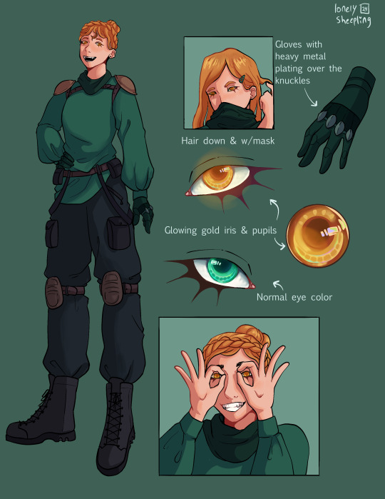
Like, look at this imp family/single parent unit here.
They’re watching the trial, but before that the imp woman was washing dishes and the son was grabbing cookies off the shelf.


Hi! Thanks so much for reaching out.
I absolutely agree and I think there are a couple of reasons for this—
First—The imps actually have RULES for how theyre designed as a species.
These rules are really simple, and so pretty much anyone can design an imp.
1. Imps have red skin and yellow eyes.
2. Scars, birthmarks, freckles, and other skin markings are white
3. All imps have horns. Biologically female imps have black horns and black hair, and biologically male imps have white hair and white and black striped horns.
What’s nice is that, even with these general guidelines, there’s plenty of room for variation in designing imps. Some imp’s legs are bent like a satyr’s some have more human legs, they have varying lengths of tails, different body shapes and sizes, etc.
Idk if these design rules were in place for Imps as a species from the very beginning of the show, but I think having these rules helps A LOT because it means the character designers do have freedom to make unique and appealing designs, while not getting TOO crazy, which prevents them from being too over-designed:
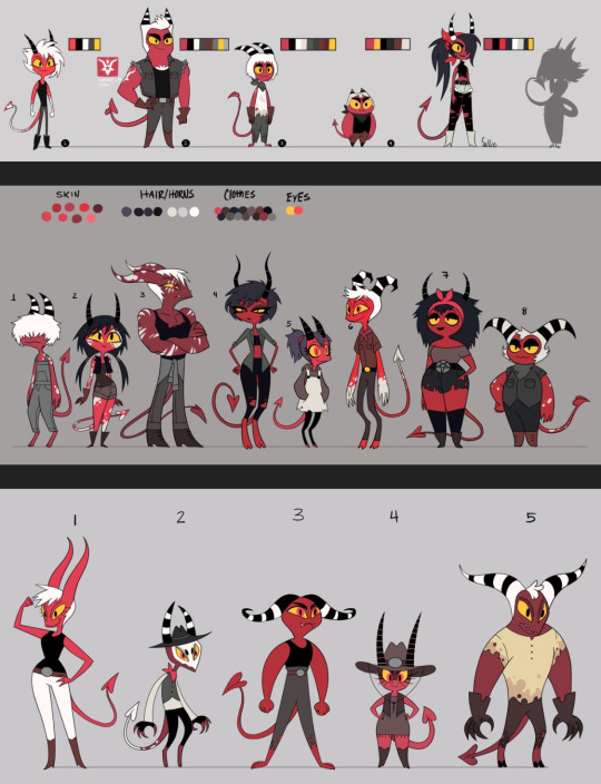
(All character design sheets by Erin Frost—former artist and character designer for Helluva Boss)
Second—due to being background characters, they’re less likely to over-designed in general. This hasn’t always been the case (and sometimes still isn’t) with Hellaverse shows, especially Hazbin’s Pilot:
I don’t even think these are all necessarily “bad” or incompetent character designs on their own, but they have a lot of little details, and when they’re all squished together like that, it causes some pretty rough visual clutter. Charlie is supposed to by the main focus of the above shots, but she doesn’t really stand out from the background crowd.
Same with shot of Alastor watching the broadcast—he stands out a little better since he’s silhouetted, but the characters in the foreground having so much going on really detracts from Alastor as the main focal point.
This is also just like. Not a very good composition. I’m really not trying to be mean or rude but, the characters being so overly designed and having such similar color palettes really muddles things.
Also—because there are so many design elements trying to be incorporated at once, we sometimes end up losing all those little extra details that are added due to the visual clutter. I didn’t have any idea Alastor was a deer until like 2 years ago, because his antlers were so small I never noticed them. I thought he was an owl, tbh.
I think we get the most overly complicated designs when the character artists and designers are given like. 3 or 4 different themes or ideas that they have to blend together. Alastor is a deer AND a “radio demon” AND a practitioner of voudo. Angel Dust is a spider AND a mafioso AND a porn star. Some of those ideas absolutely end up being lost because so much is trying to be fit into the design.
The most infamous example of this is Queen Bee, who’s supposed to be a honey bee, lava lamp, fennec fox, party girl, and apparently also an animal tamer?
And I’ll be honest, I’m actually one of the few people who kind of likes her design. I think if you were to simplify her and take out a lot of the extra details, she could still be a fun sparkle dog-type character. But there’s so much going on with her, that a lot of her design elements get lost.
Like, apparently the little pink mark on her forehead is actually a closed eye??? Like I think it’s supposed to be an Ocelli, the third “eye” insects can have:
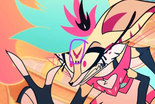
But it’s just like. Closed usually I guess. In theory, it’s not a terrible design idea for an insect character, but Bee has SO MUCH going on visually that this design choice gets entirely lost. I just thought it was like. A weird symbol on her forehead, and it took me AGES to realize it’s supposed to be her Ocelli or a third eye.
This happens a lot with more of the main characters in Hb and Hazbin, because they’re apparently supposed to be SO many different things that the character designs get too cluttered.
I think this is the main reason for a lot of the less appealing character designs in the Hellaverse, because they’re trying to be like. Ten different things at once. The imps avoid this fate though because, other than maybe their general profession and age, they’re supposed to be imps. They have those design rules we outlined before. I think thats what makes the biggest difference and is also why Mammon is actually the best design of the seven deadly sins because he’s literally just a round jester you look at him and your brain goes “yep that’s a jester” and youre not left trying to figure out what he’s supposed to be for 10 minutes. He’s not trying to be seven things at once. He’s a jester. With some extra arms. Sorry I was wrong when I said it was belphagor before. It’s mammon. Dudes literally just a jester.
#helluva boss critical#hazbin hotel critical#helluva boss critique#hazbin hotel critique#hb critical#hazbin hotel criticism#helluva boss criticism#character design#character design critique#funhouse convo#media criticism#media critique
71 notes
·
View notes
Text
I lost the post, but I saw that supposedly Belphegor is a fortune teller. And there is no evidence of that, but I like the concept. My only issue in her design is her neck.

I would have loved to have seen the eyes on her neck fashioned after the phases of the moon. A twist on the Maiden, Mother, and Crone. But with it being eyes instead of moons so the Maiden is wide eyed, the mother is half and the crone is tired.
22 notes
·
View notes
Text
Disclaimer‼️ I am not a professional designer in anyway. These are just my opinions and if you like the original designs that is a-okay and more power to you!


So I found out about the Hundred Line Defense Academy from a repost tweet and checked it out only to find that most of the designs are alright… well except for two. Two of the designs we’ve seen so far were either so bad or so awkward that I felt the urge to redesign them complete with design comments.
Closeups + extra comments + earlier outfits I was struggling with under the cut ✨


Darumi’s original design is the one I actually outright hate. There’s just too much going on (the blue hair that awkwardly goes from black to blue at the top, the bows, the weird face tattoos, the striped sweater with bright red patches randomly thrown on, and the random pins??)
Plus the colors are just an eye sore (bright light blue, bright pink for the eyes, dark blue for the sweater, and strong red for chocked and patches????)
She also gives me vibes of being made in a test tube to be the fan favorite
Not only that but we have only seen two lines of dialogue from her we’ve seen (as of making this post) are just like- groan worthy
I went with the black with bright colors to try and make the whole “bright” colors thing work without making it as much of an eyesore
Anyways I feel like I strayed too far from the original in my redesign. I could’ve stuck to the blue color scheme a bit more instead of making her mostly black and pink. Oh well, it is what it is. I at least improved the colors a bit and still made the design fit her personality which is what matters


Kako’s original design is better to me than Darumi’s. It’s more awkward that outright bad
Again, the colors are a bit weird, but unlike Darumi’s original colors, the original colors could work. Light lilac, crimson red, navy, and white could work. The problem is the placing. By making Kako’s hair light lilac and uniform crimson red, that makes her mostly liliac and red which classes a lot. Your eyes are immediately drawn to the red uniform because it stands out so much instead of her face
However, unlike Darumi, another complaint I have is that Kako just looks like two Danganronpa characters smashed together (which is a fair complaint in my opinion because Kodaka made Kako AND Danganronpa and it’s in the same art style). She has a light lilac hair and purple eyes, which makes her look like Kyoko Kirigiri and a VERY similar outfit to Maki Harukawa (there’s a few differences like how Maki has a white bow with tiny red dots, a striped collar, and infinity pin and how Kako’s uniform is a dress and Maki’s is a shirt and skirt). Like at the very least they could have changed the uniform colors and eye colors
It took me until finishing Kako’s ref up to realize this, but the mini buns and extra strands of hair could work because they are kinda similar to Sailor Moon, and I dig her design. Though Kako’s hair is still off to me despite that for a reason I can’t pin down
Anyways I ended up making my redesign closer to her original design because her original design wasn’t as bad as Darumi’s and because I felt like I needed to balance things out since I made Darumi too far from the original I think
Alright that’s all I got commentary wise. Here’s some work in progress stuff for outfits that I ended up not going with
Hope this was a fun read through, for those interested


#artists on tumblr#art#fan art#character design#character design rant#character design critique#critique#art critique#art criticism#criticism#redraw#screenshot redraw#danganronpa#danganronpa fanart#danganronpa 4#hundred line last defense academy#hundred line#last defense academy#darumi amemiya#kako tsukumo#hundred line last defense academy fanart#hundred line fanart#last defense academy fanart#realclemart
24 notes
·
View notes
Text
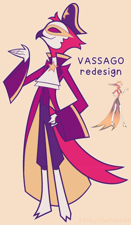
Learning he was supposed to be a pirate ruined me because wtf
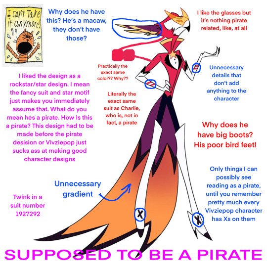
He’s actually one of the better designed characters, which is saying something
#Vivziepop critical#Helluva boss critical#Helluva boss#Vassago#Hazbin Hotel critical#Vivziepop#redesign#myart#character redesign#character design#bird#parrot#design#furry#furry art#art#artwork#procreate#artists on tumblr#Hazbin Hotel#vassago helluva boss#vassago goetia#Fanart#design critique
616 notes
·
View notes
Text
the Magnus Protocol Character Designs

these are just my current headcanons, as well as some things I've seen from others. idk who came up with the Sam amputee hc but I rlly fwi! These aren't final, so feel free to tell me your hcs in the comments, I'd love to hear about them!!
Colin, Lena & Celia are next, and if i find the time I'll try to work on some others like Bonzo etc.
Some details:
#tmp#the magnus protocol#fan design#character design#tmagp#tmagp fanart#fictional podcast#the magnus pod#headcanon#alice dyer#samama khalid#gwendolyn bouchard#digital art#trans artist#digital drawing#haha they're so cute i'm sure they all have plot armour and nothing bad will happen right? right???!?#critique welcome#my art
2K notes
·
View notes
Text
Recently read @queenofthequillandink ’s DPxDC crossover fic Unearthed, Reborn
I got inspired to draw character sheets for Danny, Sam, Jason, and Jazz’s vigilante personas. Here’s a link to the author’s drawings of their outfits (these were a vital reference for me when doing this so thank you so much for sharing them Quill) More commentary (like 7+ paragraphs plus 2 images) about this project and the designs below the “keep reading” line.
None of these thoughts I have for each character are in order, but I have a lot of commentary for these since this project was a lot more conceptual than my normal work. I also just like talking about my art/design process. If you ever find yourself wondering at some point why an element from the original design wasn’t included, the answer is that the removal was completely intentional and part of my grandmaster vision for this work and wasn’t because I just forgot about it entirely during the design process.
————————————————————————
Aconite (Sam)
This was the first one I sketched out, I wasn’t even sure at the time if I was going to fully commit to drawing all of them. I thought that Sam was gonna be the hardest since her description was way longer than the others, but then bird boy beat her out. I took a lot of creative liberties with her design, the bag was added bc I couldn’t figure out how to add pockets to the skirt. I was trying to avoid a joker color scheme so I had a lot of ref images that I got by searching like “purple green aesthetic” on Pinterest. The dark purple and dark forest/blueish green won out in the end. I desaturated a lot of my colors for her just to get as far away from the neon Gotham rogue aesthetic. I also added the bdsm harness over the armor to add more punk elements to her design, I know that in real life that would be very uncomfortable to wear over scalemail armor but sometimes we take creative liberties when they look sick as fuck. Also, I didn’t realize until I went to look for a reference for aconite flowers that aconite is wolfsbane! That was neat to learn! Also, the font I used for Aconite is called “zai Art School Calendar 1931”, I’ve used this a few times for other projects, it’s one of my favorite fonts. The ‘zai’ fonts the creator has are all very good.
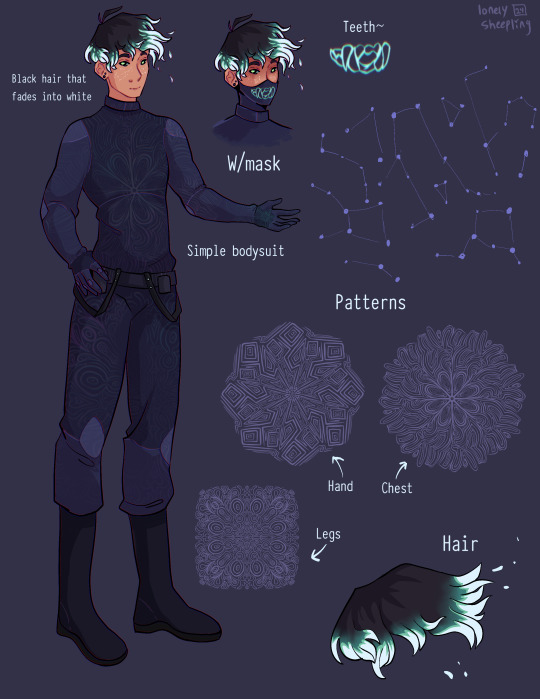
Shade (Danny)
There wasn't much to add to this page. His outfit is pretty simple (besides the patterning). I wasn’t sure how to pull of an optical illusion pattern but I was reminded how I sometimes get an eyestrain induced headache when looking at someone wearing a patterned shirt with really thin stripes so I just leaned into the idea of a small/detailed hard lined pattern. I originally made 5 separate patterns for him and then turned them into stamp brushes in procreate. I only ended up using three of them, the one on the chest, the one on the legs, and the one on his hand. But, I imagine the patterns fade and shift when he moves, sort of like a lenticular print. I gave him constellation freckles and stylized the hair’s fade into white. The hair was inspired by how time-woods draws Martin Blackwood’s hair (linked: time-woods’s fanart of Martin Blackwood). Also put way too much effort into the teeth on the mask. I just like the chunky teeth design. Oh yeah and the font I used for him is called “Typewriter_Condensed_Demi”
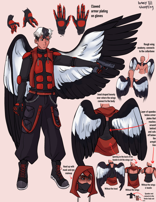
Erinys (Jason)
Repeatedly ran into the issue of not having enough canvas space bc of my fervent need to thoroughly document and plan out how the wings worked. I also reversed the colors for the bodysuit & armor so the under layer was black while the armor plates were red. I only realized afterwards that I may have been inspired by the red centipedes in Rain World (linked: gif of the red centipede, don’t click the link if you’re unsettled/afraid of bugs/insects), artists subconsciously draw inspiration from other artists all the time though so I’m not like upset about it. I stand by it because it looks sick as hell. Also leaned into the magpie theming for the wings. I think the vigilante form was supposed to be reverse magpie coloring? I can’t remember, but I stuck with normal magpie coloring. The anatomy of how the wings connected to the collarbone was inspired by JayEaton’s Magpie Bridge Project. Reference image link. Link to the article the image is from. I didn’t draw the wing armor because I couldn’t figure out how to would work with the wing anatomy and I ran out of canvas space. Finally, the font used for him is “DIN Condensed” this is a default font, I would’ve used something more punk but I needed the text to be legible.
Insight (Jazz)
I did Jazz after I’d already finished the initial trio, so I had to switch to a new canvas for her bc I’d hit the layer limit multiple times on the previous one. I really do love doing that spiked under-eyelash thing with characters. Don’t know when that started. Anyway, I added the shoulder pads to her outfit to help break up the empty space. The golden eyes were a nice accent color since her design is very overwhelmingly green. Honestly the braid hairstyle and gold eyes really do obscure her identity, multiple times when drawing her I was worried that she didn’t really resemble Jazz enough. There wasn’t a drawing from the author for her so I only had the text description to go off of. I just realized that she sort of reminds me of a forest ranger and I don’t know what to do with that realization. I copy/pasted my drawing of her eyes when gold and recolored them to match her normal eye color. There were two layers for that, a hue shift and a hard light layer to emphasize the shadows.
Here’s what it looks like without the hue shift:
It looks really cool and I’m 100% that color combo in another drawing down the line. Oh yeah and the font used for this sheet was “Euphemia UCAS”. It comes with Apple’s operating system, I use it as a neutral default text most of the time bc it’s nicer than helvetica but not overly fancy like Times New Roman—and why am I talking about fonts. ——————————————————————— Anyway, this project was very fun to work on. The alt text for this was its own endeavor, hope the folks using screen-readers don’t mind 4-5 paragraphs of description text. Also, I cannot remember for the life of me if Dani got a costume description, but if she does I’ll make sure to update this image set with a sheet for her. And to the author, QueenOfTheQuill, if you’re reading this message that I’ve left at the very bottom of this post below a read more line, thank you for the fic. It’s very good and I’m glad I caught it during my slow decent into DPxDC brainrot. I love the interactions between Jason and Tim, it’s nice seeing a revived Jason that’s not bogged down by pit rage. They definitely seem like they could’ve been good friends if not for the unfortunate circumstances that led them to meet in canon. Also, I’m sure Jazz will love interacting with Batman and Nightwing. So much psychological & childhood trauma to unpack with them. Feel free to use/share these images if you so desire and thanks again for your work.
#art#art tag#digital art#my art#procreate#illustration#character design#fanart#dc#dc comics#jason todd#danny phantom#sam manson#jazz fenton#danny fenton#dpxdc#dp x dc crossover#alt text#id in alt text#alt text included#writing out the alt text for these was long and hard#but now that I’m finally back on my adhd medication I have the motivation to do it again#as always message me or comment if you have critiques regarding the alt text#character concepts#concept art#conceptual art#danny phantom fanart#danny phantom crossover#batman crossover#crossover fanart
496 notes
·
View notes
Text
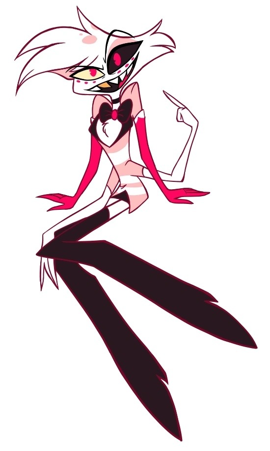
Lute redesign!! aka the sapphic knightify of lute because I actually really enjoyed her character. I was interested in her way back when she was first teased along side Adam and when I finally got to see her in action in the show I was enthralled, I loved her songs!
For this design I decided to add more armour to her, she’s not afraid of getting hurt or anything but I feel like it sets her aside from the rest of the exorcists. She takes her job incredibly seriously, she is a lieutenant after all. I added some crosses to her design and made her wing colour match her hair, also added a second hair option to show off her undercut!
It’s a brighter purple and I think she looks neat with it, I’ll probably add some casual clothing for her, I found it weird how she and Adam were actively sporting their exorcist outfits freely in heaven when the rest of heaven isn’t supposed to know about the annual extermination. Lute even had blood all over her outfit.
I hate Adam but him and lute as a duo was my favourite part they were funny and their duets were great, kinda feel like we got a major villain death wayyy too soon tho. I should be taking a crack at the seraphim sisters or Adam next.
#hazbin hotel#hazbin#hazbin lute#hazbin hotel redesign#hazbin hotel fandom#hazbin hotel fanart#hazbin art#hazbin critical#hazbin hotel lute#hazbin hotel critical#hazbin hotel critique#hazbin hotel art#character design#art#sketch art#sketch#artists on tumblr#artwork#digital art#fanart#vivziepop critical#hazbin hotel exorcists#ghostygray
1K notes
·
View notes
Text

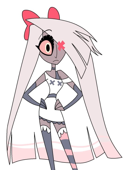
sorry for the lack of lps dc updates, i’ve been struggling w some of the designs, but i think these ones turned out well. if i do say so myself U__U
#cassandra cain#guy gardner#diana prince#joker#batgirl#wonder woman#green lantern#lps#littlest pet shop#dc#dc comics#dc fanart#character design#dandoodles#lps hyenas don’t exist so i had to get a little creative#i think you can tell that’s what he is tho#rly rly pleased w my guy and diana. maybe hooved lps were my calling#idk how to feel abt the cass one yet. idk her as well as i’d like to so i feel like i’m missing a special smth#i don't like the bat symbol placement on her chest fluff but idk how else to do it 😞#btw whenever i post these lps i 100% encourage feedback/critique#i want these to be the best that they can be before they enter the physical realm!
316 notes
·
View notes
Text
Rating Hazbin Characters based on if I could tell what animal/creature their supposed to be:
Disclaimer: THIS IS NOT MEANT TO BE AN ATTACK ON HH’s CREATOR/ARTISTS.
I really hate that I even have to say that, because art critique is part of engaging with art and design. People shouldn’t have to worry about being bullied or sent threats because they don’t like every single thing about a piece of media. I’m not saying these character designs are “objective bad” or anything like that.
I just realized that I didn’t know most of the designs were apparently based on animals for a long time, or until it was pointed out to me, and wanted to kind of review/examine that.
Ratings below:
ANGEL DUST—Spider—2/5:
I’m giving Angel a 2 because his design does look spider-ish to me, but I had to be told he was a spider to see the spider-elements to his design. I don’t think I would have figured it out unless told, the only time I think I could have figured it out on my own is with the spider web elements in Addict. The spots under his eyes being extra spider eyes kind of makes sense, but I don’t think I would have realized they were supposed to be eyes if I hadn’t been told. They did actually get drawn as eyes briefly when Angel got mad in the show when it came out-so that was actually really nice to see.

ALASTOR—DEER—0.5/5
Literally nothing about this man’s design makes him look like a deer to me. I gave the half point for the teeny tiny antlers at the top of his head, and because I do think his shoe print being a deer hoof pattern is kinda clever. But i should be able to see his antlers easily if they are an important part of his character design and if he’s supposed to be a deer. I also thought he was an OWL for like. 2 or 3 years while the Pilot was being animated b/c of his hair tufts. They looked like a great horned owl’s feather tufts to me.
VEE—no I’m not calling her that—MOTH
Pilot: 0/5 // Final Show: 1/5
I wanted to add Pilot Vee b/c other than Charlie her design was probably the one that seems to have changed the most. Pilot Vee gets a 0 sadly b/c, while I actually don’t mind her base design that much, and think she looks good, literally NOTHING about her looks like a moth. Is she even still supposed to be a moth? Asking genuinely b/c that’s what everyone says but if that’s the case I sure as hell couldn’t tell and still can’t.
Show Vee gets 1 point b/c I DO like the design element they brought back from her first ever design where her hair is supposed to mimic a moth’s wings laid back. I thought that was clever and fun. It’s the only thing tho that kind of points towards her being a moth. Again if I’m wrong and she’s not supposed to be a moth lmk but every source I’ve seen says she’s a “moth demon” or that her design was based on a moth.

HUSK—CAT—5/5
I mean just look at him. That’s a fucking cat alright! Only thing I may have docked a point for is the feather tail thing, but tbh it’s still very clear he’s a cat. If someone tells me he’s not supposed to be based on a cat tho I may lose my mind.

NIFFTY—???/5 (???)
Is Niffty supposed to be an animal? No, right? She’s just like. A weird creature/girl. Please tell me Niffty is not supposed to be a certain animal or anything b/c I have NO idea what animal that would be.
VALENTINO—MOTH—0/5
I literally had no idea this guy was supposed to be a moth until his coat turned out to be wings for some reason. Nothing about the coat made it look like wings to me. I thought his “antennae” were just feathers in his hat. Even when his coat became wings I was still very confused and thought for a moment he was supposed to be a butterfly? But no apparently he’s a moth. He’s got extra arms but I didn’t think that was specifically a “bug/moth” thing, b/c so many of the character designs in HH have extra features. I’ll be real I really don’t like anything about Valentino’s design and don’t understand the appeal of him at all. Sorry Val fans :(

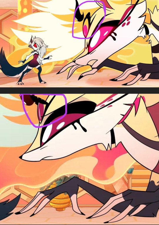
KATIE KILLJOY—PRAYING MANTIS—0/5
I’m really sad I have to give out another 0 but like, I had NO idea that Katie was supposed to be a Mantis. I’m not sure if that’s even accurate like maybe that was just a rumor/speculation?? Right? Please let me know b/c I seriously NEVER would have guessed that she’s supposed to be a Praying Mantis. Even in her other form, I would have thought they were trying to imply she’s a spider…why did they give her 4 eyes? I can’t tell if they’re supposed to represent pseudo-pupils or a mantis’ ocelli but I never would have thought of them as that. I just thought she was like. A scary monster white lady/“karen”-type 😭

CHARLIE—PUPPY/PORCELAIN DOLL/LAMB?GOAT? THING???—2.5/5 (?)
So, based on the creator/character designers statements from a podcast, I believe that Charlie is supposed to be a sort of…amalgamation of the above? But honestly I’m not sure. I’m that statement they mentioned she had a lamb or puppy nose, and I think they mentioned before that her heels are supposed to look like hooves? But also the creator made a tweet saying they never intended her design to be a goat, so I don’t really know what she’s supposed to be. I gave Charlie a 2.5 b/c she DOES look like a porcelain doll to me. Or like. A. Clown??? Cause of her cheek marks. Idk. She at least looks like one of the things she’s “supposed” to be according to the creator, and I can see the puppy element with the nose if that’s what was intended. The lower ranking is more because I’ve heard MULTIPLE things about her design elements so I’m not sure what the intention was with her.
I would have bumped her up to a 3 if I knew what she was supposed to be, but b/c it’s been stated that she’s based on several things it’s hard to tell, and I can’t actually tell if that’s still the case.
———
I may do another one of these with some other characters. There are a few in Helluva Boss that I couldn’t really read either but most of those designs make much more sense to me. ¯\_(ツ)_/¯
#hazbin critique#hazbin hotel critique#hazbin hotel critical#hazbin hotel criticism#character design#character design convo#funhouse convo#character design critique#character designs#art#animation#media criticism#media critique#media conversation
121 notes
·
View notes
Text


video game shop mockup, props, & character design for class 😁
#i orginally designed this character for fucking. sophomore illustration. but i love her so im bringing her back#she's a baker with a pop up shop that is essentially an oven on wheels lmfao. the idea is she always hauls her ass to the entrance to#whatever dungeon the player is at and bakes all of her shit fresh for them to buy. it's a very lucrative business strategy#anyway. can you tell i like botw. i feel like that ui is SOOOO botw but it's all i know#skribbles#this is another final that has not been critiqued yet <3 she'll be shown on wednesday
292 notes
·
View notes
Text
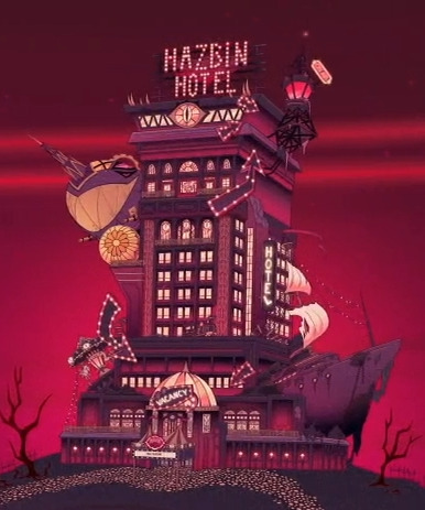
Was looking at the hotel for a drawing and never realized the large degrade from the pilot design (on the left).
I think it was a good choice to simplify it down as the OG design was VERY complex compared to the new design (and some things like the carasoul up top didn't work well considering Alastor was moving his tower up to there). So while I like the pilot hotel more, 100% good move to change it to what we got.
HOWEVER, the pilot design gives that dingey, rundown feels SO MUCH better than the final design. I think background-wise the pilot is better in a lot of ways (like with colors, having them less saturated than the characters). But the hotel in the official series, especially the interior, didn't look as rundown and dingey as I think it was meant to.
You could argue "well Alastor could've spruced it up", but we see in the episode "Dad Beat Dad" a chandelier falling, cockroaches, and Lucifer clearly supposed to be unimpressed with the place. But the show had a very clean and nice looking hotel both interior and exterior. The pilot was good with it being dark and dirty feelings on both these ends. While the final design was super clean-looking but SUPPOSED to have a "roughness" to it, the pilot had a really nice exaggeration of its roughness that gave it a lot of character and made it more interesting. Between the two, I'm more interested in what's inside the pilot hotel than the final design. And it sorta sucks because season 1 ALREADY had the hotel rebuilt all nice and pretty (which like Lucifer showing up, SHOULD'VE been saved for a later season. I get why they did it, but I think the risk of not doing it in season 1 would've had a stronger payoff in the later seasons).
Again, I think it was obviously the right call not to make the hotel so complex for the show. However, there's a stronger mood and personality to the pilot hotel over the final one that feels like it wants to look super nice but it is supposed to be seen as rundown and needs to be fixed-up. And that sucks because I would've loved seeing the rundown place, but we really just got a nice-looking hotel that, in the universe, isn't supposed to be seen as "nice looking" or "clean" (and issues with the hotel concerning its structure and everything was ONLY brought up in "Dad Beat Dad". Little details like a character saying the plumbing was broken AGAIN or things breaking/falling in the background or something would've gone a long way).
It's just a bit of a bummer that the hotel really lost the mood and personality that it did have in the pilot when I really think they honestly could've kept those aspects without making it super complex. I don't dislike the final hotel design, but I don't like the lack of personality and mood it's SUPPOSED to have that the other design achieves.
#Celtrist#cel rambles#I'm by no means an environment expert. But a good environment should have as good of a personality as a character.#And it's not like the final hotel IS lacking a personality exactly. But it doesn't have the “fixer-upper” feel I think it's meant to have#The new hotel in the final episode honestly looks like just a slight upgrade from the before design#Imagine having that new hotel design when the previous was more akin to the pilot hotel design in terms of the mood and personality?#There would be such a stronger feel of “holy shit this is an improvement” and “look at how it's changed”#The old hotel and new hotel has pretty much the same vibes of being show business/clean/vegasy#Hazbin hotel#hellaverse#hazbin hotel critical#hazbin hotel criticism#hazbin hotel critique#hazbin critical#hazbin criticism#hazbin critique
172 notes
·
View notes
Text

Wip of a Danny/Ember fusion design.
#danny phantom#my art#character design#wip#If anyone’s got any constructive critiques lemme know bc it doesn’t feel finished yet#I don’t think the face shape and the silhouette are unique enough?#obsessed with the tatts tho#their name is Ashby#or Ashton?
2K notes
·
View notes
Text

He should’ve been the villain and not a woobified annoying whiny mess 😭 I loved him at the beginning of the show and it slowly turned into pure hate towards him, he’s actually so grating to listen to in the new episodes

#myart#Vivziepop critical#Helluva boss critical#Helluva boss#Hazbin Hotel critical#Vivziepop#redesign#character redesign#character design#bird#design#furry#furry art#art#artwork#procreate#artists on tumblr#Hazbin Hotel#stolas goetia#Fanart#design critique#owl#stolas#Helluva boss stolas#goetia
275 notes
·
View notes
Text


Joel!! (to be read in the way Iskall says it)
My idea that in Joel’s cyberpunk town food is made out of local ingredients that he farms: glowsquid, glowberries, and sakura ofc! (does he have honey as well?)
Oh, and those things on his back? They are some high tech stuff that allows you to model light after anything, so it can be basically used for carrying berries, or transform into an elytra!
#joel smallishbeans#hermitcraft joel#hermitcraft fanart#hermitcraft season 10#hermittblr#mcyt fanart#mcytblr#my art#digital art#artists on tumblr#digital illustration#character design#cyberpunk aesthetic#and eefo#I find it hard to nail Joel’s design#bug coded#I’m open to critique and helpful suggestions
442 notes
·
View notes
Note
Tell me every reason you enjoy Zootopia enough to give it all the rewatches you do.
Every? Oh boy.
Good Story
Perfect Characters
Visual Appeal
Earnestness
Let me break it down.
1. Good Story
Zootopia’s main point is: “Try to make the world a better place by realizing we’re fundamentally the same.”
That’s a really good main point.
It has the benefit of being true. Right now our culture is super into “self-identification,” and this crazy contrast between, “I want to be able to identify as something special” and “Now that I know what categories I fit in, I can choose who’s ‘one of us’ and who’s ’not one of us.’” Okay well that sounds pretty and I’m sure it fulfills some emotional need at some point, but it’s actually super divisive, and self-serving, and it’s the seeds for all prejudices. Including racism.
Do we have differences in origins and experiences? Yes. Of course. Do we also have some fundamental things in common? Yes. Of course. Which truth are you going to give the highest priority to? If it’s “no, I’m a prey animal, I know exactly where I belong, that’s who I am, that’s how I dress, that’s my compass for how I interact with others” then you’re getting all your security from your “sense of self,” and being able to understand what that is…which is just a fancy way of saying “I’m all about me. My own perspective informs everything I do.”
Anyway. Zootopia’s message was super true.
And the coolest thing about it is that if only Judy were in the wrong, and the other half of the dynamic duo, Nick, was this open-minded, un-prejudiced guy…and she just hurts him and has to apologize…the movie’s message wouldn’t be as well-communicated.
They have their prejudices and their hurt-from-being-prejudiced-against in common!
They’re the same…because they’ve both felt what it’s like to be treated like they’re not “the same.”
Nick isn’t the only character being mistreated and written off because of his species. The whole first half of the movie is about Judy being mistreated and written off. They think she can’t be a cop because she’s little and cute and a prey-animal. They think Nick can’t be trustworthy because he’s sneaky and small and a predator.
So literally…if Judy represented one race, and Nick represented a completely different race…the movie would be saying that both those races are discriminated against. They even have discrimination in common. AND, if Nick represented men who people make assumptions about because he’s a man, and Judy represented women who people make assumptions about because she’s a woman—the movie would be saying that both those genders are falsely judged.
I mean. Wow. Right now, your movie is either pro-woman or pro-man. Right now, your movie is either BLM or white-supremacy. Everybody’s lining up on one side of the line or the other. Zootopia says, “it doesn’t matter what character you’re looking at, from the elephant that can’t remember anything to the two main characters—every single one of them has fundamental things in common, and one of those things is that they all live like they’re in their own special category. When actually, they’re all fundamentally the same.”
I don’t want to keep beating the dead horse. But I have a post somewhere that lists every background character and points out that each animal is the exact opposite of what you would assume they are based on their animal-stereotype. The otters are never shown being playful or snuggly, only traumatized and ferocious. The cheetah is fat and slow, not quick or even quick on the uptake. Etc.
Even if you look outside of characters—look at the sets. Look at the environments. The whole city is designed “for animals, by animals.” But it’s in neat little segments. The animals organize themselves by habitat. Of course, in one sense that’s practical—the polar bears can’t live in Sahara Square, etc. but the point is, by making Judy and Nick, the main characters, small animals, in a city where everything is built to accommodate by species—UGH this is so good—they have to figure out how to problem-solve in situations that weren’t made to accommodate them.

Little Rodentia? Judy has to avoid stepping on all the mice or knocking over their buildings. Parking tickets? She has to figure out how to jump to reach bigger animals’ windshields—or she inconveniences smaller animals because the tickets are all printed at the exact same size. Stuck in a cell? The guards didn’t think about the fact that small animals can fit down the pipes made to accommodate big animals.

Zootopia is a city advertised to be where all the animals can come together. But the way they do that is by trying to accommodate every species’ preferences. So then actually while they try to come together, everything from their cars to their districts remind them of their differences. The whole idea is that they prioritize the wrong truths. Yeah, mice can’t drive giraffe cars—but they still have “driving” in common. See?
And oh my word. Initially it was supposed to be a spy story. But they changed it to a buddy cop story. Why? Well because justice doesn’t discriminate. Or at least, it’s not supposed to. So then there’s another lens to look at the story’s main theme through.
It’s just that every layer, every perspective you look at the movie from, is just hammering that truth into you: “Try to make the world a better place by realizing we’re fundamentally the same.”
2. Perfect Characters
Every character is so well-thought-through in this movie, even the side characters. You get the feeling you could watch a whole movie based on the side characters, because that’s the amount of love and nuance built into them.
Look at the main ones, though. Bellwhether is supposed to be soft and a follower. She’s a sheep. Instead, she’s hard and bitter—and she’s a leader. A villainous leader, but a leader, nonetheless. Even as she tries to keep animals divided based on fear of their stereotypes, she’s not fitting her own stereotype. Her voice actress has this strained, half-hoarse, but sweet voice. Like you can tell that this character has spent a lot of time under pressure and trying to manage appearances. Appearing like she’s fine, and she can handle it—until you realize that the appearance she’s really managing is “the cultural fear-based identify of the city.” They dress her in plaid and flowers and she’s a farm animal, because that’s the kind of character Judy would be most likely to trust. But she still has green eyes, and jagged teeth, so that when she does start making evil expressions there are some caricature-pieces in there that come out and accentuate that.

Nick Wilde—everybody’s favorite—is supposed to be sly and smooth and shifty. And he is. He’s a fox. But he’s also brave, helpful, and trustworthy. The first time you see him is when he’s dodging out of the way of a bigger animal ignoring him and about to run him over. Well, that’s important.

Because Judy knows what it’s like to have to get out of the way of larger animals, because they overlook her.

So right off the bat, this character she has to get along with and work with, this character who furthers her development and nails the main point, is introduced in a way that has something in common with her. But he’s also introduced in a way that gives her an opportunity to focus on a different truth—that he is different from her. Because the sheep is yelling that he’s a “fox.” Right away, we’re back to species-as-identification.
And that’s what the movie does, all the way through. It presents new animal characters, and with those new animals characters, more than one thing is true at a time. And Judy has to try to focus on which truth is more important. “Try to make the world a better place by realizing we’re all the same.” Yes, Nick is a criminal. But Nick is also brave, helpful, and eventually, becomes trustworthy.
Judy, too. Judy is an incredibly well-done character. Because she believes, in her head, that anyone can be anything—which is not what the movie ends on. In fact, she goes from saying, “anyone can be anything,” to saying, “we all have limitations.” It’s not true that a fox can be an elephant. But it is true that a fox can be trustworthy. Figure out what’s true, and try to make decisions for the better, based on that.
I could talk about character design and acting. Ginnifer Goodwin gives just the right amount of smugness and self-confidence to Judy without making her unlikeable—you don’t realize she’s smug and her self-confidence is misplaced until she does, when she fails to make the world a better place for Nick.
Judy wears tight, actionable, well-fitting uniforms for the whole movie. In her civilian clothes when she comes to Zootopia, she’s wearing athletic t-shirts and shorts. Ready for action, that’s Judy, even in her civvies. Meanwhile, Nick? Nick wears loose-fitting clothes. Loud, patterned clothes that don’t match. Like he didn’t even what, ladies and gentlemen? Like he didn’t even TRY. “Try to make the world a better place…”
Because when you meet Nick Wilde, he’s long since given up on trying, in life. So his character design reflects that. He rarely even stands up straight, or opens his eyes all the way—his default is drooping. And guess what?
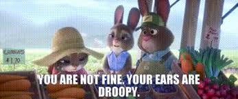
When Judy “gives up?” Quits her job? Goes back home? Stops trying? Her civvies aren’t ready-for-action, trying clothes. They’re loose flannels. And her “ears are droopy.”
SERIOUSLY, you can find things like this in every corner of the movie. For every character. Not one character is a throwaway, not in voice acting, not in design, not in animation, and not in narrative.
3. Visual Appeal
Which leads me into this point—no other animated anthropomorphic animal movie is as visually appealing as Zootopia.
What Zootopia does is it matches the best of the best anthropomorphic animal designs from past Disney movies:
And they marry it with this incredible intentionality with modern CGI.
Did you know Disney invents its own software for things like fur textures?
The sheep’s wool, the velvet pig skin, the fox fur, the bunny fluff—it’s all completely different textures. There’s no one “fur” covering all the hairy mammals.
Nick isn’t just orange. He’s orange with deep red and dark tufts. Judy has black tips to her ears, too—which helps the two of them look like, in some sense, they belong “together” in every shot.
It’s so important to the movie that the animals feel like animals that they worked this hard to do this. And then that extends to the textures of the snow, the ice, the sand, the wet leaves, the grass, the fire.
Every character moves like their animal, and like themselves. Nick and Gideon are both foxes, but they don’t move similarly at all. Gideon is aggressive and glowering and physical. Nick, again, is slouchy, leans on everything, completely non-confrontational.
Other anthropomorphic animal movies like Sing or Puss in Boots—they’re not doing both as well. Zootopia is appealing, without sacrificing realism completely, and without cutting character acting.
The lighting. Nope. This post is too long, I can’t talk any more.
4. Earnestness
There is no disingenuous moment in this movie.
The animators are never lazy. They always go for the challenge. They don’t cut corners. Have you ever seen “Over the Hedge?” I like Over the Hedge. But I watched it recently and it’s crazy how many shots are strategically placed so that the animators don’t have to solve a certain effects problem.
For example, when RJ sprays Hammy with cool whip to make it look like he has rabies? He doesn’t. You never see the cool whip leave the can. It just cuts away, then cuts back when RJ is pulling the can away from his face. The shots are also cut so that you never have to see gas actually come out of Stella—and you never see Vern’s full body as he gets back into his shell, just the upper part of the shell as he wiggles it around, going through the motions of putting it back on.

That’s because that stuff would be painstaking to animate. Any time one character has to interact with props or substances (especially liquids) that are not part of their model, it’s harder on the animator.
Zootopia? We’re getting full-on views of characters getting wet, fur and all, characters touching various objects and elements, foam coming out of the mouth, new clothes, new set pieces, multiple models, huge crowd shots of different animals in different outfits, all with their own movement patterns and acting.


And all that hard work and effort, aimed so totally at the main theme of the movie? Making sure it looks as good as it can? Not just that, but the way it’s written, the acting, is so genuine. They don’t hold anything back. They don’t shy away from real emotion.
Judy Hopps’ apology scene is brutal. She’s crying, having a hard time finishing a sentence, her voice is all tight. It’s not pretty, it’s not romantic, it’s like…ugly crying. And her character is wrong in a super embarrassing way. They're not afraid to go there. The writers, the actors, the animators—they’re not afraid of being too vulnerable with these character flaws.
So many movies, especially kids’ movies today—they just pull up and shy away from being real through their characters. They think a quick sad facial expression will get the point across. And it does. The audience gets that the character feels sad about whatever the circumstance of the scene is. But not as powerfully. Because you didn’t put as much work and heart into it.
Zootopia is all heart, from work ethic to vulnerability to the filmmakers enjoying what they’re doing, enough to make it as good as it can possibly be. I can’t explain it better, other than to say, you feel like they would’ve been happy making this movie much much longer than it was. You feel like they’re cramming every bit of joy and passsion into every little joke, every side character, every hair on a CGI bear.
There you go. Long post, you did ask for it
#Zootopia#Nick Wilde#Judy Hopps#Zootopia appreciation#anthropomorphic animals#Fox#bunny#Disney#Zootopia 2#Jason Bateman#ginnifer goodwin#byron howard#meta#character analysis#design#over the hedge#puss in boots#sing#movie#animation#character design#character study#critique#review
303 notes
·
View notes
Text
Not only that. Skin colors are one thing, but actual representation of the group is another. Like for example Dislyte makes effort to show that characters are Asian, Black etc. with more than skin color alone. And on top of that, Dislyte also doesn’t fear playing with body types.
While Genshin limits itself to 3 of the same body types, which they don’t even expand when they should have (like when they released Itto and didn’t expand basic body types for a new bigger type or used one of those huge body types of Inazuman Rounin to accommodate the fact that he is a goddamn hunky oni youkai), Dislyte goes out of their way to play with any bodytype that is imaginable. When Genshin designs new characters, it looks to me as if they were just putting wigs and clothes and a face on the base model that is always the same, unchanging. No facial features are ever changed. No new models are released. Even fat NPC have only 1 body type per gender (and the male one is for some reason bigger than the female one, because if you are a woman you can only be an appropriate size of fat). The only thing Genshin ever puts a lot of though into are the clothes and their cultural roots. But characters just look as if a barbie doll was the base model and then someone drew a new face, put a new hair on her and put her in fancy new clothes. But when Dislyte designs a new character, I know they do it from scratch. That they make a new model entirely for each and every single one of them.
This is like my biggest pet peeve in a lot of games nowadays.
That studios choose to limit themselves with the designs.
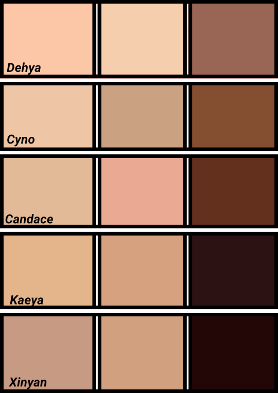
Since some of y'all are actually convinced that Genshin has darkskin characters, I've decided to compare the skin tones to one another.
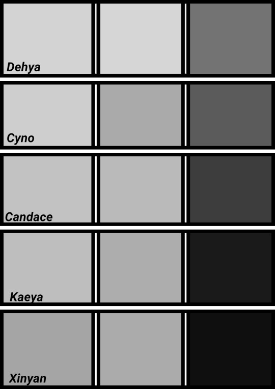
There's currently only 5 official playable Genshin characters with an ounce of melanin. Xinyan, Kaeya, Candace, Cyno, and Dehya.
Here's their skin tones + a grayscale to compare the variety
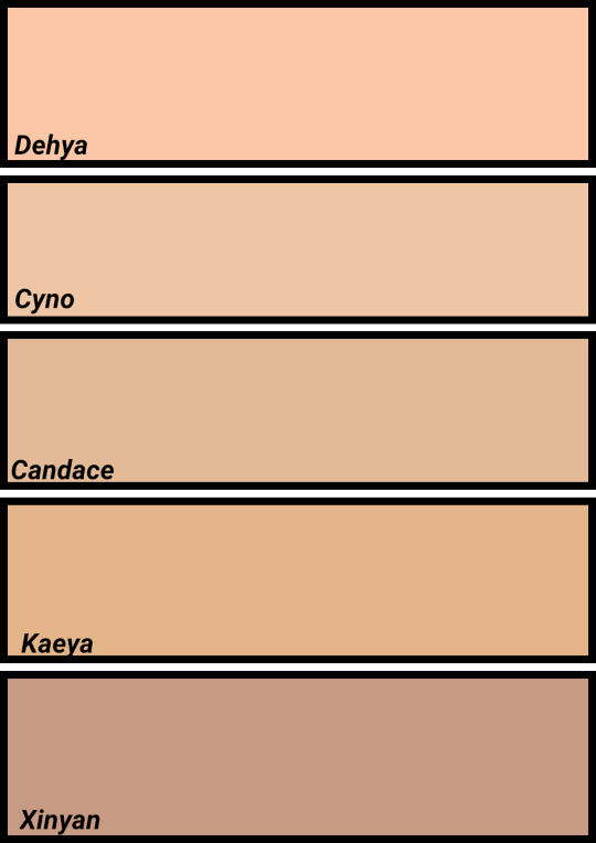
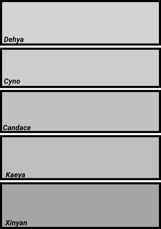
This, is not varied at all.
All of these characters except Xinyan and lightskin. Even then, Xinyan is one shade away of being lightskin.
This, is skin tones picked from my OC's and edits I've done.
Now, I don't wanna hear no "But they're a Chinese company!" bullshit in my notes.

This, is a comparison of skin tones from Dislyte. A game released two years later and is also located in the same city as Hoyoverse. This doesn't include the Sumeru characters as it was made before their release nor does it include the newer characters for Dislyte.
Dislyte managed to do more diverse characters in one year while Genshin hasn't done the bare minimum in two.
At this point, it is blatantly obvious Mihoyo/Hoyoverse doesn't care about the countries they're using as their inspiration. As long as they can take money away from people with a basic character, they're happy.
#video games#character design#character design critique#genshin impact#dislyte#i hate it when game studios limit their artistic expression#i don't care what is the reason#i don't care if those was executives fault#or budget fault#or convenience for animation#or anything else#it's stupid to chose blandness over variety#especially in video games that earn money per character sold#i wish genshin at least gave us facial features that are ETHNIC#but noooo they think anime is limited by the art style#while we anime artists know that if you want YOU CAN#there are countless black anime characters that LOOK black#it's not that fucking hard!
255 notes
·
View notes