#2d animation tutorial
Explore tagged Tumblr posts
Text
10 tips for character animation in CLIP for beginners and not-so-beginners!
This is the software I use for anime work, it's pretty much the industry standard in Japanese animation. Knowing the software is not skill-based and it can be a game changer ;) so check it out!
youtube
#animation tutorial#youtube video#animators on tumblr#clip studio paint#csp animation#2d animation tutorial#2d animation#anime tutorial#Youtube
268 notes
·
View notes
Text
From Combat to Canvas: The Soldier Who Became an Artist
From Combat to Canvas: The Soldier Who Became an Artisthttps://youtu.be/dAwyEUUwWlw
#clipstudio paint#2d animation tutorial#art#clip studio#clip studio animation#Clip Studio Paint#clip studio paint brushes#clip studio paint tutorial#clipstudio 2.0#clipstudio update#craft#CSP#digital art#digital artist#Digital Painting#Drawing#drawing tutorial#fisheye tutorial#hand scanner#how to animate#how to draw#how to draw hands#military#shading assistant#shorts#speedpaint
1 note
·
View note
Text


A knight and friends.
#art#digital art#original character#character design#2d animation#animation#oc#animated gif#cartoon#tutorial#art tutorial#animation tutorial#how to#knight#medieval#steed#horse#bird#pet#quest#adventure#dnd#d&d#fantasy#king arthur#arthurian#derp#derpy#equestrian#armor
529 notes
·
View notes
Text
Been going through a lot of animation reels this past week and a bit and one prevailing thing I noticed was that a lot of animators either struggle with, or completely disregard, the timing and pacing of their frames. Timing and spacing is (to me) utterly essential to create some nice, smooth and well flowing animation, otherwise it can look very jittery, jumpy, volume will fluctuate greatly and won't look too good.
This clip here should help show you how I place my keys, breakdowns and inbetweens to get some nice movement. (I wish I had room for timing charts!)

As you can see from the timeline grab here, a lot of this is on 3's, with a few 2's here and there. Even some 4's to help ease. With proper placing of frames even 3's and 4's can look smooth!
AND, if you have toon boom, and you wanna have a deep dive into this file, I've attached it below so you can really have a good look!
4K notes
·
View notes
Text


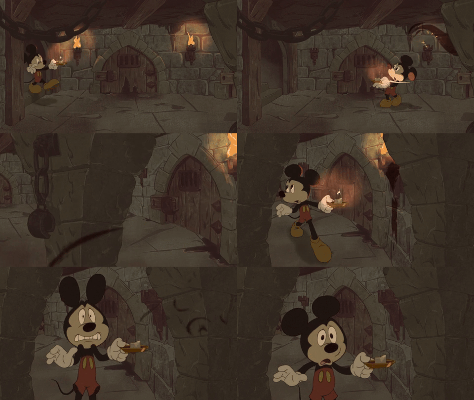
NEW TUTORIAL! Today we're talking about using roughs and rigs together, with the goal of improving 2D rig animation. This is how I personally like to do it
The goal: make rig animation better. You may have seen or heard about this technique, but it is still mysterious for several reasons. 1; each project and animator does it differently, 2; The work in progress material isn't often approved for portfolio use, or 'making of' material , 3; studios/publicity sometimes lie about it 4; it's locked within an expensive software. Anyway, this is how I like to do it, when I get the rare chance. There is still a lot to explore and improve with these techniques, so I want to encourage people to do their own versions
yt link
#animation#2d animation#toon boom#toon boom harmony#art#tutorial#2d rig#traditional animation#the cuphead show#mickey mouse
242 notes
·
View notes
Text
Heroes of the Dragon Age
An animation I've made for Dragon Age Day 2023, featuring my main Warden (Alyssa Cousland-Theirin), Hawke (Eleena Amell Hawke) and Inquisitor (Sulevin Lavellan)!
It's to this day one of my best artwork and I thought I should share it here too! 90+ hours between the original sketch, outfit design, the rough animation, rotoscope, inking, flat-colours, background shading and even the audio :')
Interested in the process? I detailed it below since it was my first time doing something like that:
I would like to start by saying I'm not a professional animator!Everything you've seen here is the result of experimentation and a lot of practice to learn and understand how 2D animation works.

My first idea started in May 2023. I just finished rewatching DA Absolution for the X time, and wanted to analyse why I loved the intro so much. (Even after countless rewatch, I never skipped it once.) I was inspired to study it with my main three protagonists!


Then came the first test with Alyssa Cousland-Theirin, my Hero of Ferelden! I tried to understand which part to separate for the animation. Mainly the hair and cape because it flows a lot more than the rest! If I recall, my first idea here was to make her counter flame attacks (?). Then, as the camera turns around her, I tried to add a grid to know how the camera would work around it.
I ended up making the clip longer, so she could position herself to the further left and leave space to the two other protagonists.

Now it was time to try to animate Sulevin Lavellan, my Inquisitor. I really kept that quick doodling style just to capture the vibe without putting too much time/effort into it! The background would be static to contrast with Alyssa's. I also loved the idea of a rogue sneaking!

Instead of working on Eleena Amell Hawke, my Champion of Kirkwall, I went back to Alyssa and started working with Clip Studio Paint 3D models (this entire animation has been done on the EX version of the software!) It helped for rotoscope animation and maintaining likeness! That's when I got the idea to make the background swirl around the character to let the eyes be guided by the rest of the screen!

After a couple more hours, I planned the entire animatic with 3D models and quick doodles! I finally found a cool pose for Eleena Hawke, which was honestly the hardest of the three to imagine for some reason? I tried many other poses but ended up picking an animation from the game!


This whole time, I was studying a bunch of background ideas and how studio Red Dog Culture House (who made Absolution) work! Thankfully, they have a YouTube Channel where they shared some BTS content so I could analyse it!


Then, I simplified my character and their original designs in the style of the studio! These outfits are how I imagine them after Trespasser. Alyssa as the Queen of Ferelden, looking for a cure to the Calling, Hawke following Fenris to Tevinter & Sully as a Red Jenny Inquisitor!


The idea for Sulevin's animation actually came from a piece I doodled on a live stream, when I was drawing pose studies and turning them into finished artworks haha As for Alyssa, I wanted to draw the fight that got her facial scars!

Once their designs were ready and the background ideas too, I made the rough version of the animation! Basically a sketch done on top of the 3D models to add the details, staying pretty rough just to capture the idea and movements.


Then it was time to start the lines! I decided make a folder per frame, so I could separate all he main elements and draw them one by one. It helps keeping the likeness of a character in the different frames without having big "jumps" between frames! In fact, every parts were coloured differently to recognize them, and then I used vector erasers and masks (Ah yes, the entire lineart is done in vectors of course! It's easier to adjust and save time when working on similar frames!)


At first of course, everything overlaps! But I find it easier to draw too much and erase after, just to make sure everything is coherent in each frames! The cool thing about CSP is how you can change the colour of the layers in one click! So all the coloured lines turned into black in one second, and I could reverse it just as quickly to double check!

Then I started working on Sulevin! I made a blue line to mark where her feet were, as the sketch in the background wasn't perfectly straight! (Like Sulevin's sexuality 🤭😂) The silhouettes were very quick to do, but I had fun adding more & more details as she came closer to the foreground!

I really wanted to add that little dagger trick, but I remember it required me to change the pacing of Eleena's apparition, as it was recovering her arm too quickly! I had to change the pace of multiple frames quite a lot during the project, to make sure the flow was right! For Eleena, most of her animation remained around her arms and the staff itself, as magic would be the most difficult part! That way each character has their own focus: Alyssa has a very animated background, Sulevin got the grappling hook and Eleena the ice!

Then it was time to start adding colours! Just like for the lineart, I separated every colour on it's own layer, so I could easily adjust the colours later if needed. I added one colour at the time, going through all the frames, and then another colour!
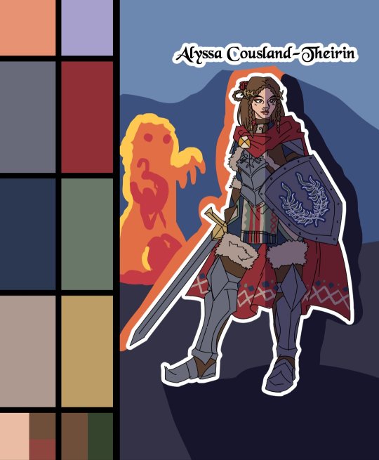
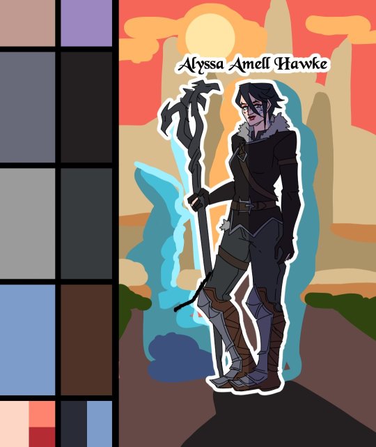
I made full palette tests with the colours I would use for their background at this point, checking if the details remained readable! Alyssa was the most challenging in terms of clothes, because I made her a very detailled armour! I had to simplify the Theirin heraldry, vectorize/redraw the Cousland, and make a brush for her cape's pattern!

Once I was done adding the flatcolours, I started the background, and oh boy it was a wild ride. For the cave, I painted multiple tests. I imagine was to use CSP panorama tools, which transform a texture into a 3D sphere, so each corners must match to look good. Sadly, it made the background very blurry, so after hours of testing, I changed ideas. Instead of the random fire balls (?) I originally imagined for Alyssa, I made three simple frames of a Rage Demon to attack her.


I ended up using the cave as a repeated pattern to make it turn 360° around the character. For Eleena, I mixed inspiration from the comics, Dreadwolf & Absolution, using warm colours matching Hawke's signature red. Just like I made the cave very grey/blue to match Grey Wardens. For Val Royeaux, it was more complex because I wanted to make it green, matching the Inquisitor's signature green. But bright green couldn't work, and the original colour during day time was blue/white/gold. So I added more leaves, played around the design a bit! After adding the rage demon, I made the shading! It was surprisingly easy and quick to do now!

I clipped a white layer on the flatcolours to not be distracted by the colours, and made thin lines to separate the light/shadows, then simply filled everything with the bucket tool! Then you set the layer to multiply and remove the white layer, and you have celshading shadows! Now the character looks out of the picture, so I added layers of blue in color burn, saturation and substract blending modes to make her look like she's in the right setting! Of course, I did the same with the other two, giving Hawke a red overlay and Sulevin green shadows!

Then I added the details, it went from white irises, to sword/staff smears to earrings and smaller finition that goes on top of these layers. To add the lights, I simply selected the shadows and reversed the selection! Using warm and cold tones to create contrast with the purple/bluish shadows! I also added more ambient light layers for Alyssa to reflect the Rage Demon fire. Now it was time to add ice magic! My first attempt had too many frames, making it look weird! Sometimes it's better to lower the frame rate to make things less bumpy!

Then I downloaded some cool ice brushes on CSP assets that made it look less like blue magical flames! But when I covered the screen in ice, I realized "Oh wait, I could make a cool transition from the ice, to blue lyrium turning red?"Red Lyrium truly links these three games and The Veilguard somehow! I spent the next hour painting over the idol and putting it in a black background, with lyrium and then the golden Dragon Age title text.
For the SFX, I used free youtube libraries sounds & "Darkspawn!" comes from the violent human female voice set (iconic for ""Can I get you a ladder? So you can get off my back!"😂🤭) After editing all that, the animation was finally done!

Here's the final math:
About 15 hours for the sketching/rough/animatic phase, 30h for the lineart, 25h for colours, 10h for backgrounds, 5h for details & 5h for music & SFX, for a total of 90 hours. Aka the same amount of time it took me to finish Baldur's Gate 3 the first time lol
If you have any question regarding the animation or the softwares etc. do not hesitate to ask, I'll do my best to answer!
#dragon age#dragon age origins#dao#dragon age 2#da2#dragon age inquisition#dai#da4#dragon age dreadwolf#dragon age the veilguard#animation 2d#original character#tutorial#warden#grey warden#warden cousland#alistair x cousland#alistair x warden#ferelden#hero of ferelden#queen of ferelden#hawke#fem hawke#eleena amell hawke#mage#warrior#rogue#lavellan#inquisitor lavellan#solavellan
296 notes
·
View notes
Text
RESOURCES FOR ANIMATION
Book Disney Animation: The Illusion of Life by Frank Thomas & Ollie Johnston

Book The Animator's Survival Kit by Richard Williams

Book Drawing Lessons from the Great Masters by Robert Beverly Hale

Book Character Animation Crash Course! by Eric Goldberg

TUTORIAL VIDEOS:
youtube
youtube
youtube
youtube
#reference#tutorial#art reference#art#poses#artist#art resources#resources#web#pages#help#guide#action#line#figure#animation#2d animation#3d animation#courses#12 principles of animation#youtube#video#pdf#book
220 notes
·
View notes
Text
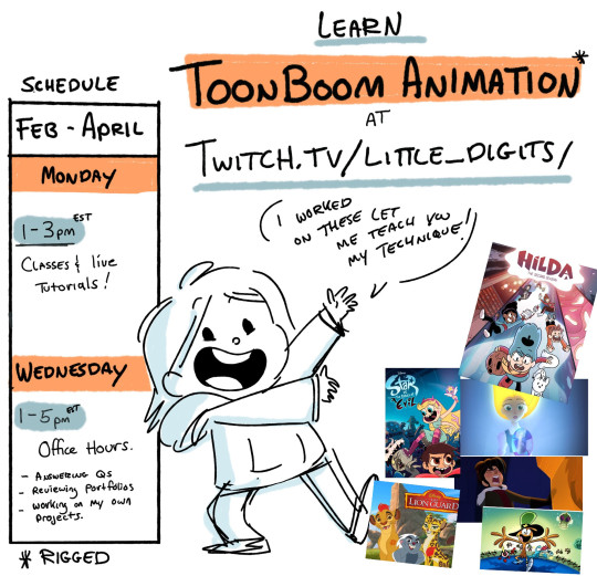
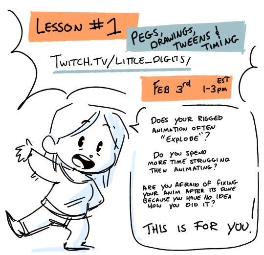
HELLO EVERYONE. Starting on Feb 3rd and then continuing every Monday for a bit, I will be livestreaming lessons about RIGGED CHARACTER ANIMATION IN TOONBOOM HARMONY on my twitch page.
This is not meant to be a step by step, but discussion on core things to understand and thought process when making choices that are creative, but also compliment the program. If you struggle to get what you what out of your rigged animation and if you spend a lot of time fixing your 'exploding' tweens, these first lessons will be really helpful! I aim to start simple and then build techniques on top of it, calling back to things learned in the previous lessons. VOD will be enabled so you can watch even if you cant check in live. I will also be streaming on Wednesdays for 'shop talk' and questions. I'm also raising money with my amazing community group for Extra-Life this year. These lessons will be free but if you show up and learn something, hey. Toss a few bucks to my goal! I have a few incentives for fun ! https://www.extra-life.org/index.cfm?fuseaction=donordrive.participant&participantID=550136 hope to se you there !
141 notes
·
View notes
Video
youtube
In this video, ZeBirdBrain explains how and why we included the construction lines in the LACKADAISY pilot. There’s also a lot in here about the cleanup process in general.

Ze is our crew’s well-known, resident Toon Boom Harmony wizard! Whether you’re a beginner with animation software or an experienced animator, chances are Ze’s got some advice and tutorials you’ll find useful in her YouTube catalog.
#lackadaisy#lackadaisycats#zebirdbrain#harmony#toon boom#animation#2d animation#indie animation#lackadaisy film#tutorial#lackadaisy pilot
1K notes
·
View notes
Text
(I'm testing brushes lmao)
Hey new blocktales animation
#block tales#blocktales roblox#block tales player#greed block tales#solitude block tales#fear block tales#hatred block tales#tutorial terry#2d animation#animation#kyoko block tales
66 notes
·
View notes
Text


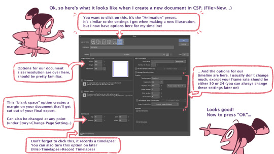

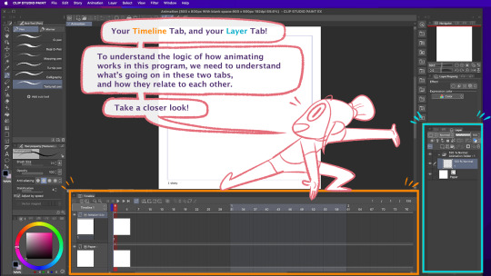
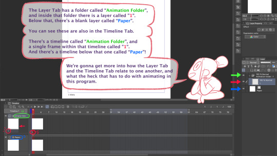
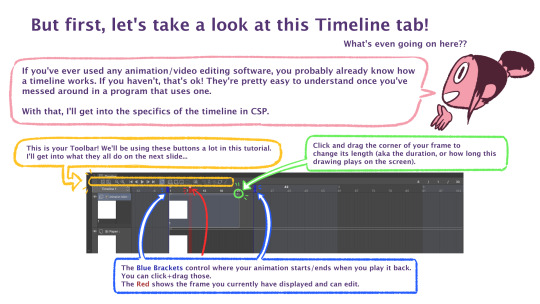

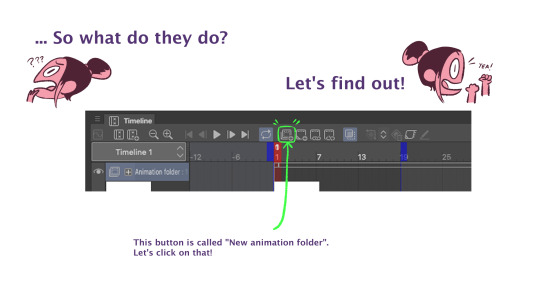
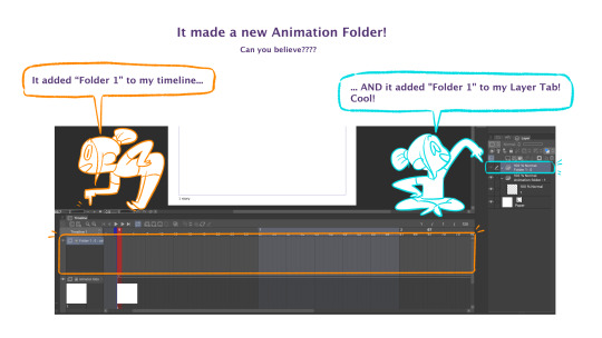

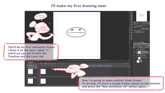
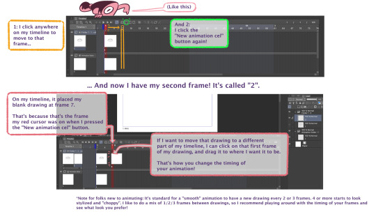
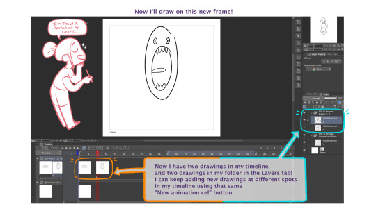

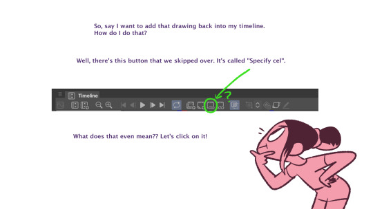
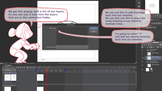

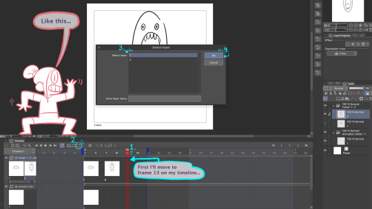
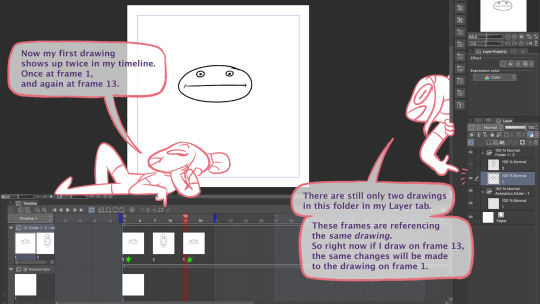
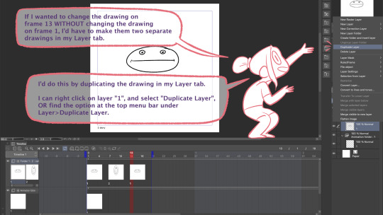

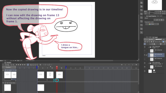
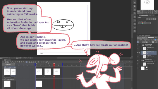
Part 1 of my tutorial for how I use the animation tools in Clip Studio Paint! I had to split it into 2 posts because it's over 30 images.
Hope it's helpful!
Link to Part 2:
839 notes
·
View notes
Text

Animate DTIYS with tutorial!
Meet Petals and Antenna 🌸 🍃 I’m hosting my first DTIYS challenge, aimed at 2D animation beginners or illustrators who want to try animation, check out the tutorial!
(The main challenge is on Instagram, but of course, you can share it here too! Though I gotta be honest, I still don't know exactly how Tumblr works, so I may not see it, but tag me or send a message or something please! And I'm sorry I feel so boomer lol).
Guidelines - Animate (or draw) Pet and Anty (one or both) - You can follow the tutorial or make a crazy sakuga, however you want! - I’ll share them until June 15th
With all the AI stuff going on, I am in a pretty bad mood regarding art; so much disrespect toward artists is disheartening. To counteract that, I decided to host my first challenge with an animation approach! Starting 2D animation can be daunting, hopefully this challenge and tutorial gives you an easy introduction and gets you pumped about what you can accomplish!
Cheers 💕
#dtiys#animation tutorial#animators on tumblr#2d animation tutorial#animation for beginners#2d animation#animation#gif animation#marianarira#beginner animation tutorial#artists on tumblr#dtiyschallenge
113 notes
·
View notes
Text
Me, several years ago: "I'll never try digital 3D art... just have no interest to learn it. Already have learned other art forms that I barely use anyway... so why add to that ?..."
Me, currently: [Is attempting to model a donut in Blender] "... uh... I can explain..."
#7rambles#idk what compelled me to attempt Blender finally but gosh...#no... actually I know why...#so I was thinking on how hard it would be to animate PJ... (yep it all comes back to that sass blob) in 2D...#and then I visualized him in a 3D art style and just went ....“welp - gotta at least attempt that...”#but man this program - even with my knowledge of ADOBE products and LIVE2D - feels overwhelming...#so... gotta go through a tutorial and the donut one seemed like the most comprehensive one!#soooooooooooooo will I ever get to the point of modeling PJ?#uh... after I give him an updated reference sheet XD#and who knows when that'll happen#gosh... this plus wanting to do that Miku Miku Beam meme thing... and a separate drawing thing I want to do for a KPop group...#now I'm running into the “all inspiration - zero time” rut of creating things XD
147 notes
·
View notes
Text
Knight Process
#art#2d animation#animation#cartoon#animated gif#digital art#artwork#original character#character design#oc#animation tutorial#art tutorial#art guide#art tips#animation tips#how to#step by step#animation process#art process#behind the scenes#creative process#process#character#character animation#walk cycle#horse animation#animated loop#looping animation#line#lineart
59 notes
·
View notes
Text
felt like animating a bit of bucky and gios argument from my COOL FIC YOU SHOULD TOTALLY READ HAHA (please)
#me after ignoring animation tutorials#and following my heart#(i actually had fun)#sw64#sw64 fanart#shipwrecked64#shipwrecked#shipwrecked 64#shipwrecked arg#shipwrecked fanart#shipwrecked 64 fanart#bucky beaver#animation#procreate#2d animation#digital art#character animation#art tag 🪐
95 notes
·
View notes
Text
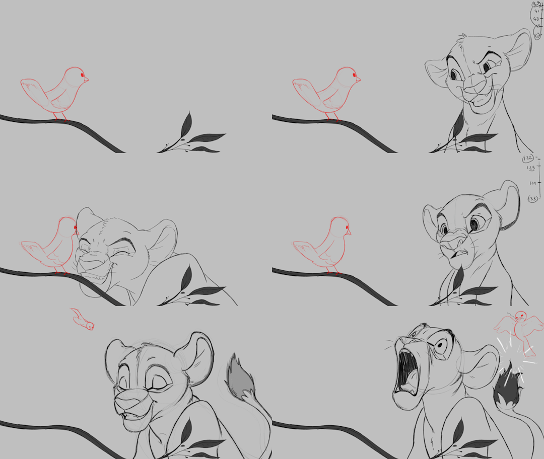
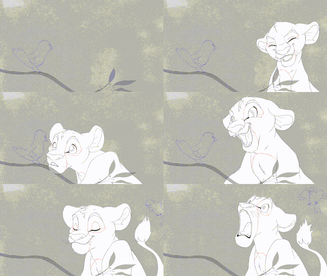

'ello folks, my Cleanup tutorial is finally done and out! hope you find it useful
#Animation#Tutorial#Advice#Lesson#The Lion King#simba#animation#Disney#character design#how to#2D#traditional animation#frame by frame#Adobe#Photoshop#Animate#Flash#After Effects#Premiere#Video#Film#Drawing#Tips#Gestures#cleanup#lines#krita#toon boom#procreate#tvpaint
1K notes
·
View notes