#//I have added alt text explaining if you like or if you are using a screen reader
Explore tagged Tumblr posts
Text

WELCOME TO HERMIT-A-DAY MAY 2025!
Another year, another Hermit-a-Day May! I'm so thrilled to be able to bring this event to you all for the third year in a row.
THE RULES: 1. Any type of fanwork is welcome so long as it features, or is otherwise inspired by, the Hermit of the day. 2. Tag #hermitaday to have your fanwork reblogged, or submit it directly to the blog (Please note that while we recognize the value of fanworks involving more mature themes, and they can certainly count toward challenge completion if you're keeping track for yourself, content on this blog will be kept "PG-13" so that all may enjoy.). 3. Fanworks for one Hermit posted after the day rolls over to another Hermit's day (per the US Central time zone) will be reblogged in one big queue in June. 4. Traced or stolen work is NOT welcome. If we discover you have posted traced or stolen work, you will be given one chance to delete it and apologize, or you will be blacklisted from the blog. AI-generated/assisted pieces are similarly unwelcome and will not be featured on the blog. 5. We are not interested in seeing captions or tags in which you disparage your art/skills, and will not be reblogging posts where this happens. We're all improving all the time. Be kind to yourselves. 6. Technically not a rule, but we strongly recommend adding alt text or description to all images. Click here to learn more about writing alt text - it's pretty easy!
WHY SHOULD I PARTICIPATE? To show love to every Hermit, from the most to least subscribed, from those who have been on the server from day one to those who only joined this season! And because challenges are fun! And because we are once again out here for a good cause: we're running another fundraiser for Gamers Outreach, featuring art incentives by nine amazing artists. Learn more about our incentives in these posts:
MILESTONE REWARD POST
INDIVIDUAL REWARD POST
RAFFLE POST
WHO’S RUNNING THIS? Hi! My name is Luna! You can use ze/hir, she/her, he/him, or ro/ros/roseself pronouns for me. My main blog is @as-if-unreal. Helping me out this year is the incredible Mod Sky ( @skyspersonalhell ), who uses any pronouns!
BONUS DAY PROMPTS EXPLAINED UNDER THE CUT
FAVORITE "ALT" HERMIT - May 4th HoTGuY and Poultry-Man. Helsknight and Evil Xisuma. Renbob and - look, you get the idea. This server is full of theater kids ready to toss on an alternate skin and play into a brand new character at the drop of a hat. Who's your favorite?
OUTFIT SWAP - May 9th What would Doc look like in Cleo's Life Series leotard? How would Cub fare in Wels's armor? What laundry day mishap could lead Mumbo's suit to lose its sleeves like Skizz's? Only hilarity can come from this...
GROUPS AND COLLABS - May 14th This month is all about one Hermit a day... but what we really love is when they interact with each other. What does your favorite duo or group of Hermits get up to together?
FAVORITE BUILD - May 18th The Hermits have put thousands of hours into their builds, from cozy starter bases to the sprawling halls of Deepfrost Citadel, from idyllic natural landscapes to machines the size of mountains. Which builds have inspired you?
TFC - May 23rd While he may no longer be with us physically, TFC left behind him a legacy of quiet care and good humor, and Hermitcraft would not have been the same without him.
FRIENDS OF HERMITCRAFT - May 28th There are plenty of shows, podcasts, competitions, other servers, and more woven into the internet ecosystem around Hermitcraft, and plenty more people involved in them. Today is for celebrating all of those who, while they may not be Hermits themselves, exist and entertain in proximity to them.
#hermitcraft#hermitaday#reference post#impulsesv#grian#tangotek#falsesymmetry#mumbo jumbo#bdoubleo100#hypnotizd#geminitay#cubfan135#pearlescentmoon#smallishbeans#ijevin#goodtimeswithscar#rendog#zombiecleo#xbcrafted#xisumavoid#keralis#joe hills#vintagebeef#zedaph#welsknight#skizzleman#docm77#ethoslab
3K notes
·
View notes
Text
Inspired by this post by @thanergetic-hyperlinks, I present to you
Tessellations of the Nine Houses
(Or "I can't really draw figurative art so my Locked Tomb fanarts are geometrical vector drawings")
"A tessellation or tiling is the covering of a surface, often a plane, using one or more geometric shapes, called tiles, with no overlaps and no gaps." — Wikipedia.
Making tilings themed after each necromantic House seems obvious: for each House you pick a tile with the same number of sides as the number of the House; but this does present some challenges for some of the Houses.
note 1: this might give the impression that I first decided on the symbols and then found patterns to match them in a very organized and motivated manner; in practice it was much more chaotic and multidirectional, the patterns informing the symbols as much as the symbols informed the patterns; this is fine since symbolism is entirely associative and arbitrary anyway
note 2: I added alt-texts for all the images, but I have no idea of how to properly describe abstract geometric art; if you feel you can do a better job than I did, feel free to put your fingers where your mouth is--wait, hang on-- I mean feel free to provide better descriptions if you can
note 3: looking forward to the geometry nerds explaining to me how I got basic geometric details wrong, friggin nerds
The First House
The First House seems obvious, as a shape with one side is an ellipse (of which the circle is a special case). There's just one problem: ellipses do not tile the plane. No matter how much you stretch them and deform them, the very nature of ellipses means you'll always have gaps or overlaps.
So we cheat and we work with overlaps: turns out there is a history of tilings that use circles as a construction pattern, then turn the overlapping sections into the actual tiles. Such patterns have been used extensively in European and Middle Eastern art, and have also been associated with the New Age movement, so it fits Jod's style perfectly. And so we get this:

The different cells correspond to different House colors, with the resulting gothic stained-glass appearance quite in line with the Roman Catholic Empire vibe Jod is going for. The overlapping circles convey the intricacy of the relation between the First House and the eight other, both autonomous from it yet intrinsically part of it.
The Second House
There's a variety of geometrical shapes that have two sides, but most of them don't tile the plane, altho there is one that does — if we take a crescent shape and slightly thicken it so that the inner and outer curves are identical, we can do this:

The waving pattern is of course evocative of the flag of conquest which the Cohorts of the Second House have planted on many worlds.
The Third House
With the Third House things get a lot easier, because equilateral triangles are one of the three regular polygons (where all sides are the same length and all angles are identical) that tile the plane all by themselves without needing any other shape! Which however doesn't mean we have to be boring; we can have a little bit of fun:

Flowers for the beauty and ionizing radiation warning signs for the rancid vibes.
The Fourth House
Squares are the second regular polygons that tile the plane by themselves, so again our job is easy here, altho we still want to not go for the easiest option in order to be able to work in some symbolism:

The four big navy squares with a small white square at the center of course evoke the number five and the shadow of the Fifth House's regency over the Fourth.
The Fifth House
Regular pentagons do not tile the plane, so we have to use a more unusual shape — there are many options, but obviously we want to again pick one that offers some interesting numerical symbolism:

The cross-like patterns of course bring up the number four and the hold of the Fifth House over the Fourth. As for the crosses themselves and the fact that they appear to be made of wooden stakes, well uh… Abigail Pent, Vampire Hunter??? She does have Van Helsing vibes.
The Sixth House
Hexagons are the third and last regular polygons that tile the plane on their own. But this is the Sixth House we're talking about, things need to look orderly but in a convoluted way. So how about multiple levels of recursion:

The apparent complexity of the pattern is created by different orientations of a small number of elements, either 3 irregular hexagons, or 1 patterned regular hexagonal tile, depending on how you look at it, in line with the kind of hermetic scientism one imagines the Sixth House indulges in. The result is those apparent three-dimensional elements and emerging higher-order patterns, including that of ꙮ, the Multiocular O found in exactly one word of one 15th century Old Church Slavonic translation of the Book of Psalms ("серафими многоꙮчитїй" many-eyed seraphim).
The Seventh House
Regular heptagons do not tile the plane, but they don't need much tweaking to work, which is fine since for the Seventh House we want something deceptive yet simple (deceptively simple? deceptive in its simplicity?):

Hearts for the beauty, snake scales for the poison [the Seventh House is on Venus, the planet named after the Roman Goddess of love, but etymologically "Venus" is actually the same root as "venom", and of course "Septimus" resembles "septic" — tho in that case there's no etymological connection, it's just a happy coincidence].
The Eighth House
Octagons do not tile the plane, but they come pretty close, so we can give the Eighth House a simple, stern, but slightly threatening pattern:

Boring sterile bleached temple mosaic, with just a little bit of passive-agression, a perfect fit for Evangelical Christians Tumblr puritans the Eighth House.
The Ninth House
And so we reach the Ninth House. Now the thing about the Ninth House is that, even by imperial standards, they're huge freaks, like they're completely unhinged heretical weirdoes. So, when it comes to their tiling, we need to get weird, like, a lot weirder than we've been so far, and this will require some context, so get ready because now we're officially going on a wild tangent.
So far all the tilings we've seen were periodic. That is, they were drawing a pattern that repeats itself indefinitely in all directions.
But starting in the 1960s, mathematicians began to study aperiodic tilings, tilings that don't repeat; you can keep expanding them forever and never exactly find back the original pattern you started with. The first mathematical proof of such a pattern was made in 1964 and theoretically required 20,426 distinct tile prototypes… This was soon refined to just 104 tile prototypes, then a mere 40. By 1971, it was mathematically demonstrated that you could make such a pattern with just 6 tile prototypes.
Except that was a lie.
Note that I said mathematically demonstrated. As it turns out there was an aperiodic pattern with just 5 tile prototypes, known as Girih, that had been used in Islamic art… since at least the 13th century — but it had historically been treated merely as an element of architectural design, and its mathematical properties weren't studied until 2007.
Then in 1973 this guy Penrose came along and demonstrated you could make an aperiodic tiling with just 2 tile prototypes. So now the goal was to find the ultimate aperiodic tiling, the one that would use only one tile prototype. Given how fast the field had progressed so far, it seemed that this discovery was imminent.
It took 50 years.
Not only that, but it was the work of amateur mathematician David Smith who accidentally discovered a 13-sided polygon that could make an aperiodic tiling all by itself (he then had his discovery checked by and co-authored a paper with a number of professional mathematicians).
EXCEPT THAT WAS A LIE AGAIN.
In turns out an aperiodic tiling using only one tile prototype had already been found… in 1936. But since the study of aperiodic tilings only started in the 60s, its significance in that domain wasn't understood at the time. It was seen as significant, but for an entirely unrelated reason: it was the first demonstration of a polygonal shape that needed only two copies of itself to completely enclose the original one — many mathematicians before that point thought the minimum possible was 3 (think of the Triforce from Zelda, with one equilateral triangle completely enclosed between three other identical triangles).
And coincidently, that shape happens to be a highly-irregular nonagon [yes "enneagon" is """technically""" more correct but "nonagon" has been used since the 17th century and is more common and it has Nona in it and Nona loves you]. So here it is, the Voderberg tiling, the freakish freakish tessellation of the Ninth House:

Like you see this and you're like "what is this, what is that thing, that's not a tiling, what the fuck is that" — but it is, it is a tiling, you can keep adding the freaky polygon and it keeps expanding outward forever, with no gap, no overlap, and with an ever-changing pattern. A double-spiral radiating outward, for Anastasia and Samael, Anastasia and Alecto, Alecto and Harrowhark, Harrowhark and Gideon.
And if you were thinking that this last one must have been significantly harder to draw than the other ones, you would be correct.
453 notes
·
View notes
Text

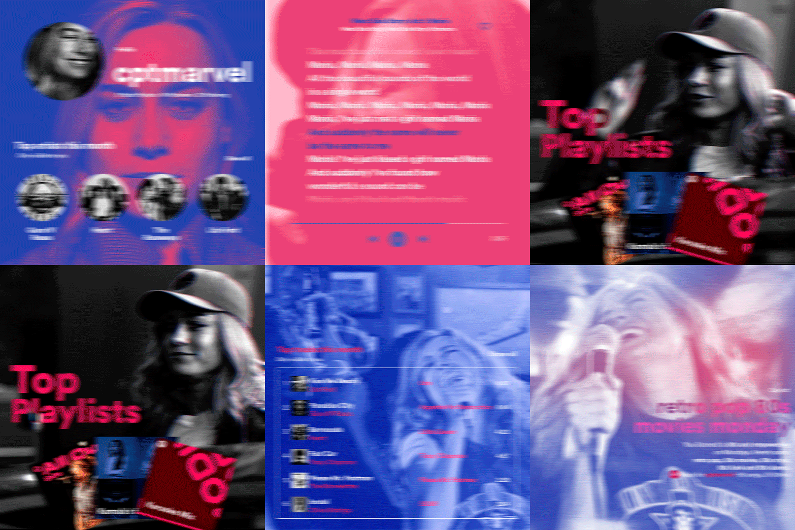
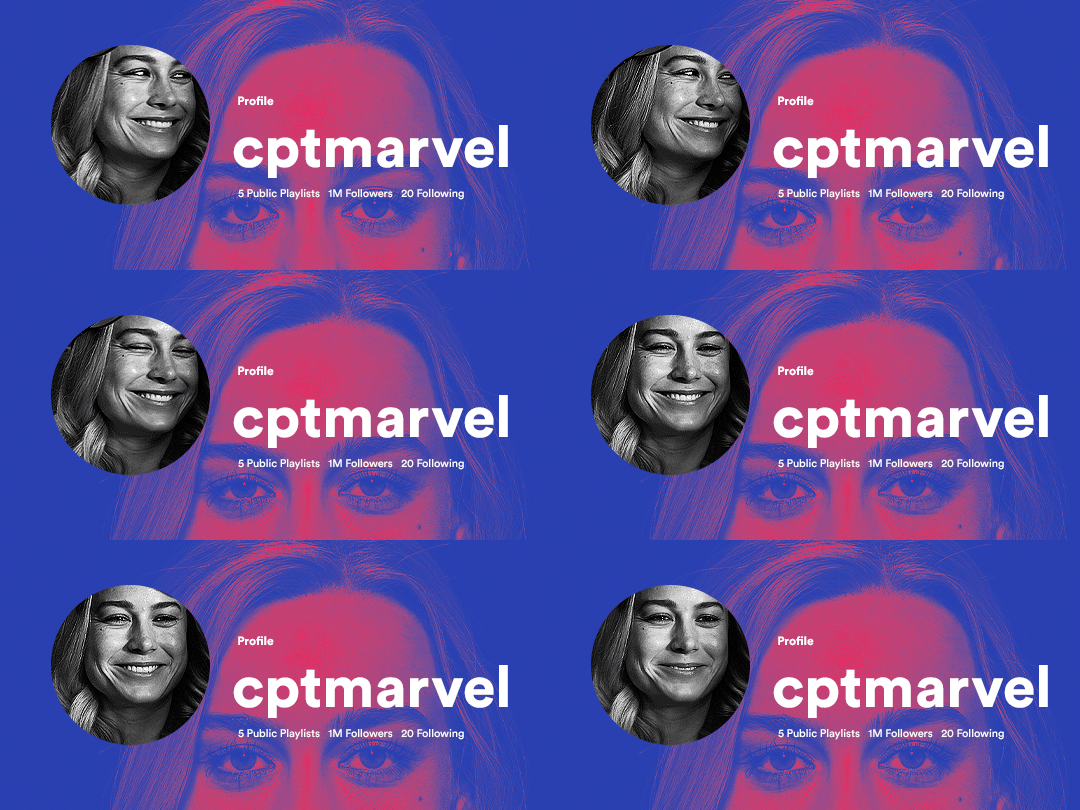
hi! someone requested me to do a tutorial based on this gifset!
this tutorial requires an intermediate knowledge of gifmaking. i won’t teach you how to do gifs from scratch, there are other tutorials for that out there.
[tutorial under the cut]
THE BASICS
AN INTRODUCTION
first off, the gifset in question is based on this gifset by @/eddiediaaz and i got permission from them to explain the process. i won’t be sharing the template because it’s a near replica of theirs (that isn’t shared to the public) and i don’t feel comfortable doing so, but you can recreate it by yourself just like i did!
also, ESL, so please pardon any mistakes.
THE FONT
Circular ST (Medium & Black). download it here & here.
CLIPPING MASKS
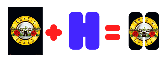
clipping masks are the way i put images and gifs inside of shapes. i used that method in the first and second gif of the Spotify gifset as you can see here. what does a clipping mask do? basically, it links two or more layers together in a way it follows the “shape” of your base layer. ie, everything that is shown follows the “shape” of your main layer and nothing more. your base layer can be anything: a shape, an image, a gif, a text, an adjustment layer, really everything. let’s see an example:
CLIPPING MASKS & SHAPES

the original image (Gun 'n' Roses logo) is intact, as in, it’s not cut like a circle, something that cannot be undone. instead, everything outside the limits of the blue circle is just hidden. if i delete the base layer (the circle layer), the original image will appear as it originally is, as an rectangle. talking about layers, let’s see my layers panel (some things are in Portuguese, but i think you can understand):
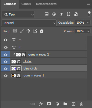
notice the little arrow pointing downwards to the “circle” layer. that is the clipping mask symbol. the base layer always needs to be below what is being clipped. if the base layer is deleted, the chain is broken and every layer clipped will now act independently and have its original shape. you can have as many clipped layers as you want. you can also have multiple chains going on in a .psd, each one with its own base layer. to clip a layer, you just need to press ctrl+alt+G or cmd+option+G while having the layer you want to clip selected (NOT your base layer). or, you can go to LAYER > CREATE CLIPPING MASK.
CLIPPING MASKS & TEXT
let’s see the same example, but with text instead:
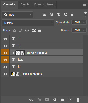
A TIP
because adjustment layers are clippable, you can completely gif by using clipping masks. this is very useful when you have more than one gif inside a canvas and don’t want an adjustment layer to affect everything besides a certain layer/element.
let’s take my first gif of the Spotify gifset as an example.
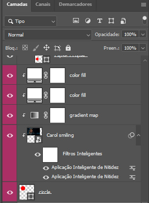
the circle is the base layer. the “Carol smiling” layer is my gif converted to a smart filter. above that “Carol smiling” layer, there is a black and white gradient map and two color fills of white so i can achieve the coloring you see. all those layers are clipping onto the circle layer, making my now b&w gif have the shape of a small circle as well. those layers are in a folder in the .psd of my first gif, so i don’t have multiple files sitting on my PC to assemble just one gif. i could have giffed that small gif separately and pasted it onto my canvas as well, but i like to do this way so i can adjust everything i want in real time instead of redoing a gif over and over every time i want to change something.
HOW TO MAKE EACH GIF
all gifs are 540x540px.
THE FIRST GIF
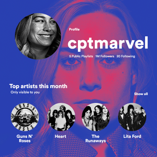
the first gif has 6 elements. the elements are: a big gif serving as a background (a close-up of Carol), a smaller gif inside a circle (a b&w gif of Carol smiling) as a profile picture and four static images for the featured artists. i giffed as i normally do (loaded screencaps, resized the gif, sharpened the gif, etc) for my background gif. to achieve the coloring, i’ve added a gradient map (layer > new adjustment layer > gradient map) purple to pink. to the profile picture, i made a 160x160px circle in the top left corner. the color of it doesn’t matter. the next step is a matter of taste: i giffed the smaller gif in the same .psd thanks to clipping masks that i explained earlier, but you can do it in a separate canvas too. for the featured artists, i made four circles with 98x98px each. for the images, i had to check Spotify for their selected PFPs. after that, i googled “[band/artist] spotify” to find the images. the PFP of bands and artists in the Spotify app are displayed in black and white, so you might have to make them b&w if you happen to find them only in color. to make the artists PFPs pop a bit more, i transformed them into smart filters and added a bit of sharpening to them (intensity 10 x radius 10). you can adjust the colors and the brightness if you want, too. the sizes of the texts in the gif are: 58px (username), 20px (top artists of the month), 15px (name of the artists), 12px (only visible to you + show all + profile) and 11px (following and follower numbers).
SECOND GIF
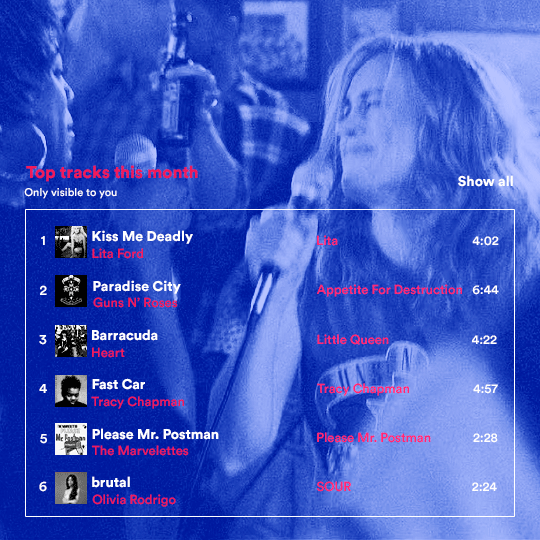
for the chart, i created a black rectangle (490x308px) that i set its blending mode to lighten (thus making it transparent) and i added an internal white stroke. i added the text and the little squares next to the top 6 numbers. the font sizes are: 17px (top tracks this month), 11px (only visible to you), 14px (song title, show all, top 6 numbers), 13px (artist/band, album title, length of the song). i added the album covers — that i made b&w — by clipping images onto 32x32px squares. for the coloring, i added a gradient map (dark purple > light purple).
THIRD GIF
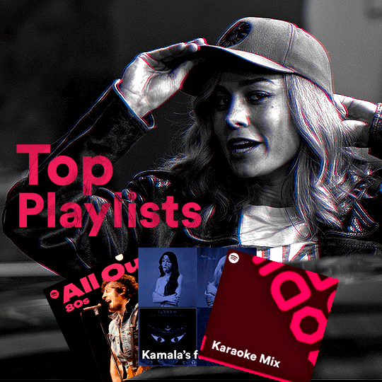
there are three types of playlists in this gif: a Spotify original playlist, a playlist made by a user and a Mix. you don’t have to follow this formula if you don’t want to, but in the case you do, here’s how i did it: browse Spotify for an original playlist of theirs. chances are, if you google the playlist’s name, you can find its cover on Google Images. at least, i found the “All Out 80s” cover that i used in my gifset. you can also create your own. for the user playlist, just pick four songs and find their (album) covers, also on Google. create a square canvas on Photoshop and make four squares, each in one quadrant of the canvas. paste your images onto your canvas and clip the images to each square. then, add a gradient map (black + whatever color you want) to all those images and title your playlist (font size: ). save that collage as a PNG and load to your gif canvas or merge all the layers+transform into a smart filter and drag the smart filter layer onto your gif canvas. now, the trickiest one. while you can invent your own Mix, i wanted to use a real one, but i had no idea on how to find them. thanks to reddit, i discovered that, if you search “made for you” on Spotify, you will find their Mixes! some of them are very whacky and specific! i just picked the Mix that made the most sense for Carol from that (gigantic) list. before doing the next step, i would advise you to google the name of the Mix you picked to see if you are able to find the cover of it with good quality. i wasn’t able to find mine (Karaoke Mix), so i just screenshotted my Spotify app, pasted that screenshot into Photoshop and cut the Mix cover and pasted that onto my canvas. the quality wasn’t great, so i transformed the cover into a smart filter, added a bit of gaussian blur and then sharpened it (intensity 10 x radius 10). the color wasn’t what i wanted either, so i used Hue/Saturation to change the hue. because the original image for the Mix was smaller than i wanted and i stretched it to make it bigger, the quality of the text and the Spotify logo was botched. i painted over the Mix cover and created a text with the font i linked earlier to replace its now pixelated title. i also painted over the little Spotify logo, found a logo in the internet and pasted over the Mix cover about the same size of the original logo. to achieve the “3D effect” of the gif, i made my b&w gif, the base. then, i duplicated all layers and added a gradient map (black > pink) and merged all the layers of that duplicate. i made a second replica of my gif, now with a different gradient map (black > blue). i set both replicas to the ligthen blending mode. you will notice that the replicas will "disappear" and only the original b&w gif will remain. if you move the replicas a bit, that colored border will appear. this doesn't work much in very bright gifs without a lot of dark areas, btw.
FOURTH GIF
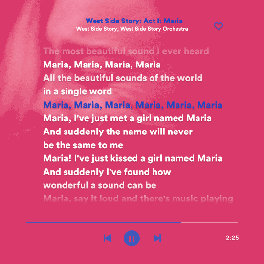
this gif used an altered (by me) version of this template. (i changed the fonts to match the rest of the gifset, too.) for the color text effect, you will have to gif with the timeline bar. take your gif’s length and do the math to find how many frames are ⅓ of it. take your lyrics’ layer and cut it into three equal parts or close to it by using the scissors icon in the timeline panel. in each third, change the color of just one line, line by line. when you play your gif, the colors of the lyrics will change like in Karaoke. you can do the same thing with frames iirc, though. i explained the timeline method because that’s the one i used in this gifset and use in general gif making. for the coloring, i added a gradient map. to make the colors pop a bit more, i add two gradient maps: the first one is in black and white, the other is in color. that adds depth to the blacks and darker colors of the gif.
FIFTH GIF
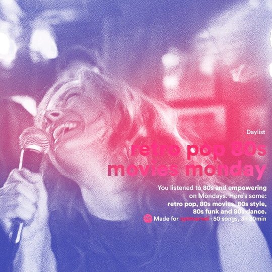
like in the Top Playlists gif, i wanted for my Daylist to be real as well. to achieve that, i listened to my Carol Danvers companion playlist (that you can listen here) for a long time until my Daylist refreshed itself. (Daylists refresh in certain times of the day — don't worry, Spotify will tell you when.) then, i just copied what it told me — the title and the genres i listened to generate such a Daylist, plus the genres i should check it out. you can invent your own Daylist if you want, but because it is generated by AI, i find very difficult to mimic its crazy titles, but you can try! you can also search in the web for other people’s Daylists if you want, but usually people don’t tell you what they listened to to get those playlists and nor what was recommended for them to listen to and i, at least, find that information important for the gifset. be aware that Daylists aren't available for every country yet (like in mine), but i found a way to work around that. the browser Opera GX offers a free "VPN" — not exactly a VPN, but it works close enough — so you can set your location to the US and listen to in-browser Spotify. i recommend not log into Tumblr while using Opera's VPN as there is a myth (that could easily be true!) that Tumblr terminates people's accounts that use a VPN. font sizes: 43px (daylist title), 13px (text), 12px ("daylist" & "made for"). for the flare effect, i searched for flare overlays on YouTube and downloaded one of those videos with 4K Video Downloader, a free software. i loaded the overlay into Photoshop and added a gradient map (purple > pink) over it, thus changing its color. i pasted the overlay onto my b&w gif and set its blending mode to screen. voila!
that's it! i hope you liked it and that i was able to express myself well. if you have any questions, feel free to contact me, i love helping people about their gifmaking questions! 💖
#*#*tutorials#gifmaker tag#dailyresources#usergif#completeresources#alielook#userairi#userhallie#userbess#userrobin#usershreyu#userzaynab#tuserju#tusermalina#tuserheidi#usertina#userabs#userbuckleys#usermagic#userjoeys#antlerqueen#userarrow#flashing gif tw
450 notes
·
View notes
Note
Can you tell me how you post your art on Ao3? I keep trying and failing. Maybe it's my image hosting site?
Hey! Sure I'll attempt to explain. It's possible it's your hosting site, but hard to say. I use a site called Maltshop, or more accurately MLTSHP. It's been working great for me since I started using it but the downside is that it is a paid hosting service at $3 per year. I know not everyone can do that though, but if you're able to throw them $3 per year it could be worth it. At that tier they allow for up to 300MBs per month uploads. They have a $24 per year tier that is unlimited file size uploads. Another benefit - and this may not apply to you, but maybe someone who's reading this - is that they allow for Adult/Mature/NSFW whatever you want to call it image hosting.
Here's my process - and keep in mind this is just for adding an image. If I'm adding an image to a fic then I start a new post on Ao3, paste the fic in first, then add the image in the body of the fic where I want it also following this process:
I go to MLTSHP and upload my image. It thinks for a second then gives me two URLs. A "post url" and an "image url." I copy the "image url"

2. Then I go over to Ao3, click "new post," add all that necessary stuff it asks you to add like title, tags, summary, etc. then in the actual Work Text editor box I click "Rich Text." That's key as it defaults to "HTML" editor when you start your new post and while some people are awesome and good at HTML, I am not that "some people" and need my Rich Text editing box.
3. When you're in the Rich Text editor version of the Work Text box, click the little image icon
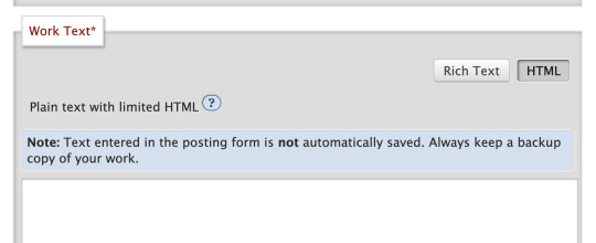
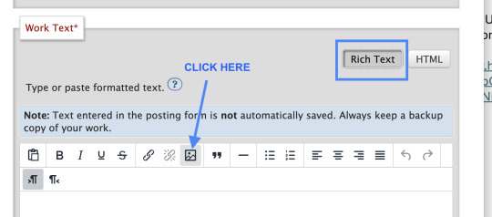
4. A dialogue box will pop up where you can paste that Image URL link from step 1 above. You can then add your Alt Text (called Image Description) and adjust the size of your image, then click save

5. Then I futz with the sizing for a bit, make sure all the necessary post info is included, add text if there's any to go along with your image - ya know like if you have a whole fic you're posting, then preview, then post the image and voila!
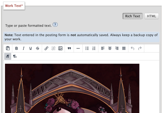
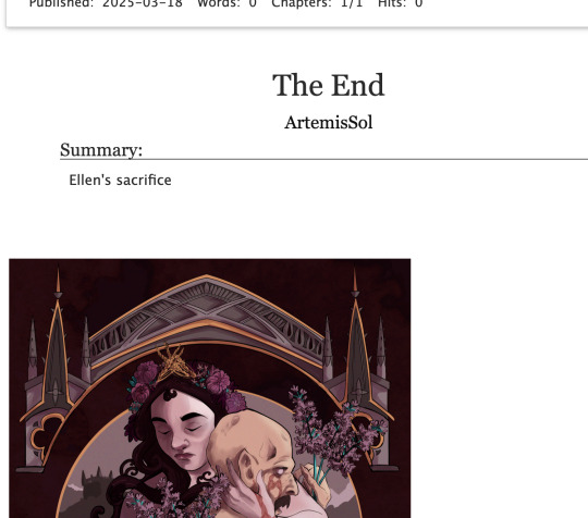
And that's my entire image posting on Ao3 process! I hope it helps, but if you need further help, feel free to DM me!
136 notes
·
View notes
Note
In what way does alt text serve as an accessibility tool for blind people? Do you use text to speech? I'm having trouble imagining that. I suppose I'm in general not understanding how a blind person might use Tumblr, but I'm particularly interested in the function of alt text.
In short, yes. We use text to speech (among other access technology like braille displays) very frequently to navigate online spaces. Text to speech software specifically designed for blind people are called screen readers, and when use on computers, they enable us to navigate the entire interface using the keyboard instead of the mouse And hear everything on screen, as long as those things are accessible. The same applies for touchscreens on smart phones and tablets, just instead of using keyboard commands, it alters the way touch affect the screen so we hear what we touch before anything actually gets activated. That part is hard to explain via text, but you should be able to find many videos online of blind people demonstrating how they use their phones.
As you may be able to guess, images are not exactly going to be accessible for text to speech software. Blindness screen readers are getting better and better at incorporating OCR (optical character recognition) software to help pick up text in images, and rudimentary AI driven Image descriptions, but they are still nowhere near enough for us to get an accurate understanding of what is in an image the majority of the time without a human made description.
Now I’m not exactly a programmer so the terminology I use might get kind of wonky here, but when you use the alt text feature, the text you write as an image description effectively gets sort of embedded onto the image itself. That way, when a screen reader lands on that image, Instead of having to employ artificial intelligences to make mediocre guesses, it will read out exactly the text you wrote in the alt text section.
Not only that, but the majority of blind people are not completely blind, and usually still have at least some amount of residual vision. So there are many blind people who may not have access to a screen reader, but who may struggle to visually interpret what is in an image without being able to click the alt text button and read a description. Plus, it benefits folks with visual processing disorders as well, where their visual acuity might be fine, but their brain’s ability to interpret what they are seeing is not. Being able to click the alt text icon in the corner of an image and read a text description Can help that person better interpret what they are seeing in the image, too.
Granted, in most cases, typing out an image description in the body of the post instead of in the alt text section often works just as well, so that is also an option. But there are many other posts in my image descriptions tag that go over the pros and cons of that, so I won’t digress into it here.
Utilizing alt text or any kind of image description on all of your social media posts that contain images is single-handedly one of the simplest and most effective things you can do to directly help blind people, even if you don’t know any blind people, and even if you think no blind people would be following you. There are more of us than you might think, and we have just as many varied interests and hobbies and beliefs as everyone else, so where there are people, there will also be blind people. We don’t only hang out in spaces to talk exclusively about blindness, we also hang out in fashion Facebook groups and tech subreddits and political Twitter hashtags and gaming related discord servers and on and on and on. Even if you don’t think a blind person would follow you, You can’t know that for sure, and adding image descriptions is one of the most effective ways to accommodate us even if you don’t know we’re there.
I hope this helps give you a clearer understanding of just how important alt text and image descriptions as a whole are for blind accessibility, and how we make use of those tools when they are available.
391 notes
·
View notes
Text
creatives, please use alt text
one of the first things i learned in journalism school was how to write alt image descriptions.
at first, it felt tedious. every single photo or graphic required a description, and if we skipped it—or wrote a lazy one—our professors didn’t hesitate to fail us. at the time, i didn’t fully understand why it mattered. but now, i’m so grateful they drilled it into us. if i’d never gone to journalism school, i might have never known how vital alt text is.
for those unfamiliar, alt text (short for “alternative text”) is a written description of an image. it allows people who use screen readers to know what’s in an image, making content accessible to those who are blind, visually impaired, or have other disabilities that prevent them from viewing images. you're basically translating visual content into words.
as creatives, whether we’re writers, artists, photographers, or meme page admins, we have a responsibility to make our work accessible. after all, what’s the point of creating something if a huge portion of your audience can’t engage with it?
why alt text matters
it ensures accessibility - a visually impaired person using a screen reader should be able to understand the context of an image just as easily as a sighted person.
it’s inclusive - adding alt text isn’t just for people with disabilities. sometimes, images don’t load due to bad internet, and alt text helps everyone understand what’s missing.
it’s good practice - if your work exists online, you want it to be as widely understood as possible. accessibility makes your content stronger.
okay, but how do i write alt text?
writing alt text isn’t as hard as it might seem! here are some tips:
be concise but descriptive - describe the essential elements of the image. what would someone need to know to get the gist of it?
include context - if the image is part of a larger story, explain its relevance. for example, “a black cat sitting on a pumpkin, used to illustrate a halloween-themed story.”
don’t overthink it - you don’t need to describe every pixel. just focus on the most important details.
alt text and ai tools
in the era of chatgpt and microsoft copilot, we’ve got a major advantage: ai tools can now generate alt text for you!
while these tools aren’t perfect and often need a bit of tweaking, they’re a great starting point. platforms like adobe, microsoft, and even some social media apps have built-in options for generating descriptions. if you’re overwhelmed by the idea of writing alt text from scratch, let ai do the heavy lifting, and then refine it.
a creative responsibility
alt text isn’t just for journalists or big companies, it’s for all of us.
as creatives, we have the power to make the internet a more inclusive place. whether you’re posting a masterpiece, a meme, or a picture of your cat, take a moment to add alt text.
adding alt image description is SO EASY and quick and we all need to get better at adding it to our posts. i, myself, am not perfect. on here, for example, i've been really bad about writing alt image descriptions, and it's something i'm very disappointed in myself for. (i hereby pledge to do better, and please call me out for lacking in the future!)
writing alt text is not only about respecting your audience, but it's also about recognizing disabled people's right to engage with your work.
accessibility isn’t optional !!
#alt text#accessibility#writing#writeblr#journalism#inclusivity#inclusion#altimage#screenreaders#onlinecreativity#writingcommunity#accessible art#art#disability awareness#web accessibility#artists on tumblr#disability rights
143 notes
·
View notes
Text
two years have already passed...
today, two years ago, all of Ukraine woke up to explosions, sounds of flying fighter jets, gunshots and screams of terror. today, February 24, is the anniversary of russia's invasion of Ukraine. full-scale invasion, escalation of ten-year genocide. I can't explain the feeling when I first saw wounded people, when I first heard a rocket flying overhead aimed at a residential building.
it is emotionally difficult to comprehend all the terrible events that happened during this time. everything I'm trying to cover here as soon as I get my thoughts together. and everything that I don't have enough strength for...
Bucha massacre
Mass burials in Izium
Mass execution of Ukrainian prisoners in Olenivka
The tragedy of Mariupol
Defense of Azovstal
Bakhmut Fortress
Ecological disaster in Kakhovka
The tragedy of Hroza
Tens of thousands of Ukrainian children forcibly deported to russia
Torture of civilians
The battle for Donetsk Airport
The Ilovaisk Tragedy
russian manipulation and propaganda
burning Ukrainian books, destroying Ukrainian museums and entire cities, torturing people for tattoos connected to Ukraine. forced re-education of children and adults who are forced to learn the russian national anthem, worship portraits of putin every day and receive russian documents in order to receive water and food in the occupied territories. daily shelling and casualties, daily struggle for survival and freedom, which russians want to take away from us.
all the terrible cases of execution of Ukrainian soldiers: beheadings, castration, amputation of limbs, execution of prisoners. burning civilians alive, raping women, men and children, torturing even animals, even little mice. tons of photos and videos that I don't want to add here because even the slightest glimpse of all those images breaks my heart and causes me to have a panic attack. however, you can find it all freely available on the Internet by simply typing in keywords.
instead, I would like to show photos of rallies in support of Ukraine, which took place today all over the world. to find out where each photo is from, see the alt text for them.

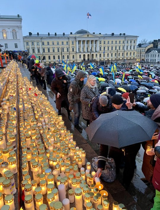
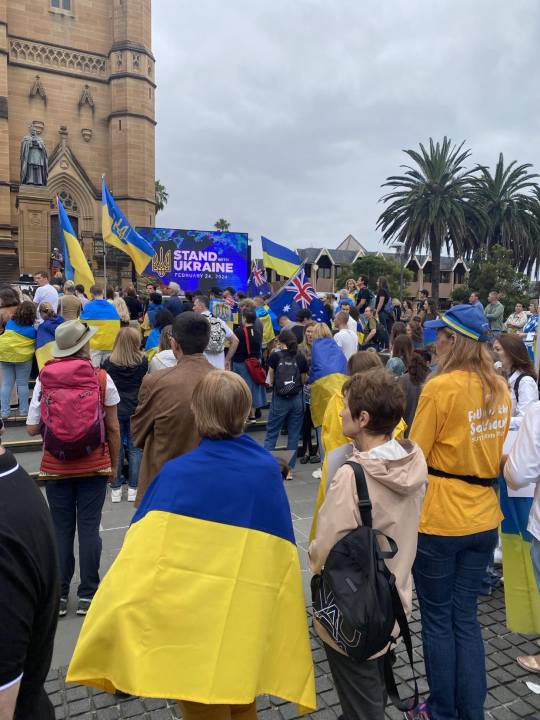

despite the fact that in russia they celebrate the war, Ukrainians, who were forced to flee from the war, gathered at rallies around the world, together with residents of the countries that gave them shelter. the civilized world expresses sympathy and grief, with calls to provide arms to Ukraine so that we can defeat russia as soon as possible and return peace to our lives.

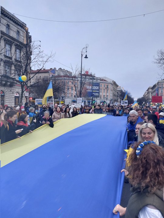

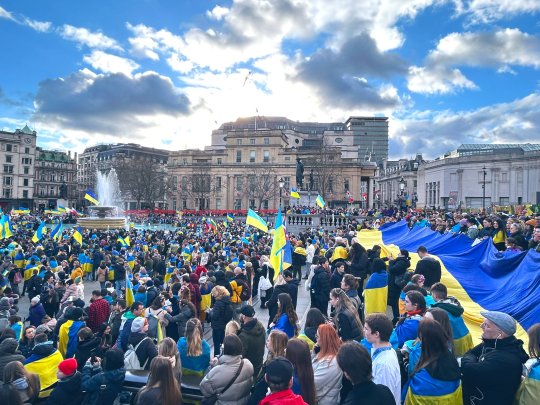
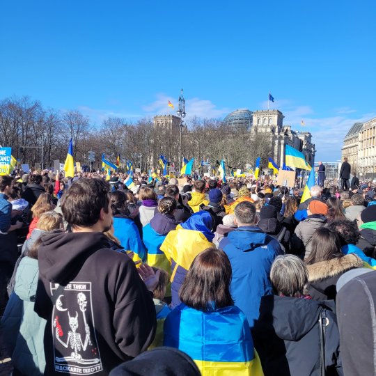

it's sad that more photos can't be added to show as many cities as possible that came out to support us today. but I've been looking at all the photos and videos of the rallies all day today and I have tears of gratitude in my eyes. thank you all for continuing to stand with Ukraine!
#stand with ukraine#russia is a terrorist state#help ukraine#support ukraine#save ukraine#stop russia#fuck russia#russian agression#russian invasion#russian culture#russian art#russia#russian terrorism#ukraine#signal boost#rally#russian war crimes#war in ukraine#war
345 notes
·
View notes
Text
VAPORWAVE/SYNTHWAVE LISTENERS:
I need you all to be aware that there seems to be a massive uptick in AI generated "music" clogging up youtube. As someone who's starting to get into writing their own vaporwave music and has wanted to write vaporwave for the past decade, this really upsets me for a lot of reasons!!!!
So I'm gonna show you how to spot these AI generated mixes::
WHILE WRITING THIS BLOGPOST I LEARNED MANY OF THESE SAME IDENTIFIERS APPLY TO WEIRDCORE / AMBIENT MIXES AS WELL!!!!

1) No Tracklist
Many of the AI generated mixes have no tracklists attached to them whatsoever. In my personal opinion, this is one of the biggest red flags. Some uploaders have added "track lists" but the names of the songs are pretty nonsensical even by vaporwave standards (example: "Helicopter Fly") and have no artist credited.
2) Suspiciously Long Uploads
If you're anything like me, you probably have noticed all videos on youtube search if you type "vaporwave mix" into the search bar are 3 or more fucking hours long.


I know there's some lengthy older mixes out there (example: Aisle 420, which has become a group listening background music staple whenever my friends and I play minecraft together!) but if it's fairly new and has a really obnoxious timestamp attached to it, be wary!
3) Extremely Specific Naming Scheme
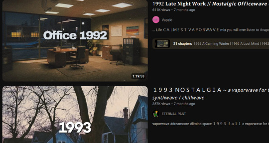
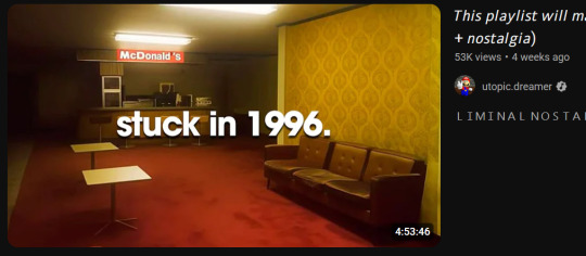
Going to crossreference back to the images in number 2, one of the many things ALL these AI channels have in common is that they title all their mixes " Something In Wide Text [ YEAR ]" Again, this is something older mixes have done before. But there's a very noticable difference between genuine mixes that incorporate a year into the title and these, especially when you look at the upload dates and how the naming scheme is extremely similar across all the channels that exhibit these patterns and AI usage.
4) Year in the Thumbnail Image
Much like Number 3, but specifcally in regards to the thumbnail image. There'll be a four digit number plastered in big text across the thumbnail. I have no idea why they all do this.
5) AI Generated Captions
Not just very likely AI generated, but also copypasta'd across every channel that's like this. Examples will speak better than explaining in text can.


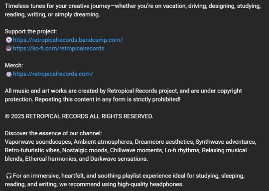
Some things to note here are a weird fixation on copyright, and the phrase "Reposting This Content In Any Form is Strictly Prohibited!" being a shared factor.
6) AI Generated Visuals
This one is pretty easy to spot unless you're running youtube in a tab in the background.


7) Extremely "Samey" Sounding
So if you're like me and let youtube autoplay run while you're working, one of these may have decided to come on without you actually clicking on it. From what I've listened to when this happens, a lot of the music sounds very empty and "samey." As if you're listening to the same song for 10 minutes but it's actually all different songs. There's not much substance to any of the actual songs and also a very clear distinct lack of sampling. I don't want to include lack of sampling as it's own point, because it's entirely possible to compose music in-genre without sampling at all. However, none of these channels use samples. Not a single one, out of any of their several dozen three hour uploads.
8) Very Short Intervals Between Uploads
One of the things that made me start thinking "holy shit, are all these new playlists that're popping up AI generated?" was the upload dates. These channels will seeminly push out a new mix every couple of days, sometimes even every day.


Bro, you are NOT writing that much over that period of time.
9) Sometimes, They'll Just Admit It

youtube has also thankfully started flagging some of them with the tiny little disclaimer in the caption, which imo isn't enough seeing as they paste a whole AI generated novel in the caption half the time but at least it's something.
Channels I Can 100% Confirm Are AI:
•Retropical Records
-alts: Eternal Past (Weirdcore/Ambient) Nebula Breeze (Jazz?) and Dunes of Time (??? I can't be assed to click on any of those videos to find out, not gonna lie.)
•Utopic.Dreamer
•Luminescence
•Music Farm
•dream.surfer
•devs.fm
• FOR WEIRDCORE LISTENERS: aurora.heaven
-likely run by whoever's running utopic and dream surfer
Thank you so much for reading this through to the end. It's such a shame to see this genre go down this path and I hope we as creators can do something to offset it.
May your journey into the eternal mall be pleasant and AI-Free <3
#vaporwave#aesthetic#music#ai generated music#anti ai#ai bullshit#AI#thoughts#informative#synthwave#retro#retrowave#retro aesthetic#lofi aesthetic#lofi#youtube#dreamcore#weirdcore#crossposting to those tags bc of findings during my research!!#composition#musician
50 notes
·
View notes
Text
Blinkie.World coding and efficiency
Hi everybody. Thank you all for the support on my last post! I literally only just got on Tumblr, and I already feel very loved and supported. This is a very nice community for sure. It makes me happy to see so many people excited about it. And to every person saying they'd love their blinkies to be included... bold of you to assume you're not already on my radar! When I say I'm collecting every blinkie, I mean EVERY blinkie! The only exceptions are immoral ones like proship and anti equal rights. Even if I'm already getting blinkies from you guys, I do appreciate everyone sharing/ pointing them out to me. It helps me to be sure I've got as many as I can! So, thanks you guys. You're all very kind.
Anyhow, since there seems to be interest in Blinkie.World, I'm sharing a little more about it. This is about how the site's being made physically, both explaining it and trying to think of ways to improve the process. Also a bit on the workflow side of things. If that's not of interest to you then you can go ahead and give this one a skip. This one's probably a bit boring for most people, but if you are interested... then onto the post!
Someone mentioned that they hope I have automation for making the site, since it seems like a lot of work. I've done what I can to help this go efficiently, but at the end of the day, I am just doing it by hand. Last time I showed what the code looks like per blinkie, which is this:
<a href="" target="_BLANK">
<img src="" alt="" title="Credit: . ID: """></a>
<!--Categories: -->
<!--Screencap: -->
That is the actual code I use. I copy and paste this every time, then enter in the details. I'm not sure that counts much as automation, but at least I'm not out here typing that over and over. This is an example of what a blinkie looks like coded in:
<a href="https://web.archive.org/web/20030406002318/http://mywebpage.netscape.com/antikao/pinkieblinkiepage1.html" target="_BLANK">
<img src="https://lonelycoconut.neocities.org/blinkie%20site/pink%20blinkies/Calvin%20%20%20Hobbes.gif" alt="Calvin + Hobbes" title="Credit: Pinky Blinkies. ID: "Calvin + Hobbes""></a>
<!--Categories: Pinky Blinkies, pink/, cartoons/, comics/, calvin and hobbes/, calvin/, hobbes/, kidcore/, animals/, mammals/, tigers/ -->
<!--Screencap: https://lonelycoconut.neocities.org/blinkie%20site/Screencaps/Pinky%20Blinkies.png -->
That is an actual snippet from the site! First is the link to the creator (and yes, it HAS to be the creator, not a reposter of any kind), and a target="_BLANK" which makes the link open in a new tab. Next is the image link. Each image is named the same as the text on the blinkie. That way, I type what the blinkie says, then copy and paste that to the image name, alt text, and image description (title). Then is the title. If you don't know, a title for an image in HTML is text that appears when you hover your mouse over an image. So, for each hover text (title), it says the name of the creator, then a caption of the blinkie's text (since they're often hard to read). After that is </a>, which closes the link, making only the image linked to the source.

After the link and image, there are the comments. In HTML, a comment is text that's in the code but doesn't appear or affect the website itself. It's usually just notes to self. The first comment is categories. First I put the creator, then the color category it is sorted in, and lastly every other category it's in. You'll also notice that each category listed has a slash after it. The reason is, when I put a slash after a category, that means it's already added to that category page.
Below that is the screencap. This is an image showing the creator, every blinkie they have made, and their terms if any. Here's this specific screencap if you want to see how that looks. I go in and screenshot all the pages I need, then combine them all in Photoshop, then name it after the creator, upload it to Neocities, and finally add the screencap image link below every blinkie by that creator! And, that's how I fill in the code for a blinkie!
So, yeah, this is definitely a lot. I'm sure I could benefit from more ways to speed up the process, but I don't know much else I can do. It's mostly copy pasting and routine. There are some other things I've done to help though, and that's browser extensions!
One I use is called Download All Images, which as you can assume, downloads all images on a page! You can also specify what kind of images you want to download. What I do is set it to add every gif that is 150x20 pixels (or bigger if I see that there are big blinkies on the page).
I also use GifsOnTumblr. If you've ever tried downloading gifs on Tumblr, you'd know Tumblr is a little weird about it. It always saves as a gifv, so you have to open the image link, then change the end of the link from gifv to just gif, click enter, THEN it downloads as a gif. It's not that hard, but let me tell you, now that I have an extension that makes it download as a gif immediately, it saves more time than you'd think!
That's about all I've figured out as far as maximizing efficiency here goes. If anyone else has any advice/ideas, I'd love to hear it! I've been at this since October (give or take, I'm not 100% on that), and as for the workflow, I'm wondering a bit how long it will take before all the blinkies I have are online. It seems like years for sure, but I think I can handle it if I'm slow when I need to be. As in, if I'm tired then I'll stop. I'm not going to treat it as something I HAVE to do, because then I'll burnout most definitely. I'm being chill about it. Especially since I'm currently on break from another huge project, believe it or not.
Just a few months ago, I burnt out from my other project, which is an animated music video I've been animating for almost two years (in which I initially planned out in 2020, started it in 2021, burnt out, cancelled it, then decided to try again and start it all over in 2023 and since). My point is, I'm very ambitious, often to a fault. I'm a workaholic. (I'm also ADHD, so I think being a workaholic is me overcompensating for it, at least partially.)
Because of that, I'm going out of my way not to take this too seriously. It's a passion project, and if it's not fun, then it's not a passion project, then what am I doing it for? Even so, my ambition cannot be held back! When I get excited on a project, I grind like crazy. I'm not scared by the idea of something taking a long time. I want to do this. I'm happy I'm doing this. I'm not going to pretend it's not a lot of work, but working is what I do! It's how I'm built. When I don't work, I feel like I start to loose it. It's not a matter of IF I work, it's a matter of WHAT I work on (and the intensity).
So, despite the somewhat daunting nature of such a big project, it makes me happy, and if it stops making me happy, then I'll stop doing it. It's as simple as that. That's about my feelings on the workload side of this. I can handle it, and if I'm wrong and I can't handle it, then that's okay too. But if anyone has any advice or ideas on how to make this process faster and/or easier, I'm more than open to hear it! (But don't give me ergonomics advice. I promise you I do every ergonomic thing in the book lol.)
30 notes
·
View notes
Text
You added an "image description" to my post - now what? (FAQ)
While I'm literally always willing to answer (good faith) questions about image descriptions, alt text, and online accessibility writ large, I also know lots of people have social anxiety about sending DMs, doing IDs "wrong," or just not knowing what IDs are for in the first place. Hence, this FAQ.
If I added an ID to your post and/or asked you to do so, and you're confused about any aspect of that, this is where to start. You can absolutely still reach out to me, I just thought I should consolidate as many answers as possible.
"What is an ID and why does it matter?"
IDs, or "image descriptions," are a description of the content of an image, and can range from a transcript of a screenshot of text, to a description of a detailed piece of art. They should be in plain text, and placed on the line immediately following the image (unless it's alt text, more on those pros and cons later).
Before we can answer "why it matters," there are two brief but crucial pieces of prior knowledge we need to establish for this whole post:
Blind people can use computers, and navigate the Internet, with technology like screen readers and Braille displays.
Blindness is a spectrum. Partial vision is common. Some blind and low vision people can't make out all the details of images, but can still read enlarged text.
Now, we're ready to answer why IDs matter. IDs are primarily for blind and low vision people, who need text alternatives to images as they use screen readers, and/or enlarged text on their devices, to navigate the internet.
IDs help others too, including lots of neurodivergent people. Check out this post (link) and the notes for more examples (dyslexics, migraine sufferers, people who can't interpret expressions, people with slow internet...)
IDs are important because without them, the Internet really sucks for people who need them. You probably don't realize how many undescribed images circulate on Tumblr every day, with no way for a lot of disabled people to engage with those posts.
A blind person talks in more detail about all of this here (link).
"I reblogged your ID, is that enough?"
It's not that I don't appreciate it, but editing it into the root post and then reblogging that is much more impactful, for a variety of reasons. It means people who need IDs don't have to dig through the notes for them, it means that Tumblr can't glitch by failing to load the notes and make the ID functionally disappear, and it means all people who find the post in the tags or on your blog will be sharing the accessible version.
To explain visually, the best thing to do is something like this:

[ID: two mock-up Tumblr posts to illustrate adding an ID from the notes to the root post. A blog named "your-blog" posts an image of text reading "something cool you posted" with the caption "check out this cool image I made!" In the notes, the blog "image-describer" reblogs with an ID, which is highlighted. This version of the post is labeled: "original post, reblogged via ID writer."
The second version of the post is from "your-blog" again, where they've added the ID directly under the image, with the same caption below the ID. This version is labeled "updated root post, with ID copy-pasted. End ID.]
"My commentary first, or ID first?"
Include the ID right under the image, followed by your commentary. Unless you're putting your commentary before the image itself, a sighted person will see "image, commentary" in that order, so to ensure the post flows the same way for screen reader users, use the order "image, ID, commentary."
Commentary frequently assumes that the reader has seen the image, after all! A person might not even realize the image is described if the ID is buried too deep, because they might lose patience and skip the post. Or, to explain visually:

[ID: two mock-up example posts with an ID, one formatted well and one poorly. They both start with an image, which is just the text "screenshot of a tweet or something." The first post includes the ID immediately under the image. Below, it continues: "commentary blah blah blah get a load of this guy can you believe it." The post is labeled "Like this!" in green with a check mark.
The second post includes the commentary first, then the ID after the commentary. It's labeled: "Reads awkwardly, deprives screen reader users of immediate context" in red with an X. End ID.]
"I want to make a change to the ID, is that okay?"
Yep! If you want me to change it on my blog too (whether it's characters' pronouns, some typo, etc), just message me.
"What if someone else adds an ID to my post? Would they also be okay with me editing it into the original post like you are?"
Almost certainly! I can't speak for everyone, but I've literally never met an ID writer who wouldn't be okay with it — because we all have the shared goal of maximizing accessibility. If you're unsure or nervous, you can always include credit, but most people are even fine with going uncredited.
"I put your ID in the alt text, is that enough?"
I will never tell you not to use alt text when the alternative is an undescribed post, but I suggest putting it in both the alt text and the post. Some people who use screen readers prefer the flow of alt text, for good reason — but it's also poorly implemented on Tumblr, and it can glitch and disappear on reblogs, in drafts, or just apropos of nothing.
Moreover, when a low-vision person or anyone else wants to read the alt text directly, Tumblr's display options aren't great. (Unless you use XKit Rewritten's AccessKit, which I will always plug, but that's not an option for mobile users.) Hitting the alt text button requires a level of fine motor control that not all people have. And, Tumblr used to use a terrible eye-straining purple background for alt text, and could always do that again with no warning. It's just not ideal.
Here's a visually impaired person talking more about the pros and cons (link).
We're in need of a compromise, so what can you do? One option is to include the same alt text as image description (placing the ID directly under the image as always, because remember, flow is important). I like to lead with "ID from alt," in order to clarify to screen reader users that they can skip the ID, and help differentiate it from the other option I'm about to describe. This should be self-explanatory, but here's an example of a post I did in this style (link).
Option two is to include a short description in the alt text, and then a more detailed explanation in-post. This can let screen reader users instantly know that the post is described, and decide whether they're interested enough in it to stick with it, but it maintains an in-post description for others to benefit from too.
Example of me doing this in a post about IDs (link)
Example of my mutual describing art like this (link)
Also, it's the style I follow throughout this exact post! Take a look!
As usual, the ID is directly below the image in all these cases. This means screen readers move immediately from the alt text to the full description, and the post flows the same way it would for a sighted person.
If you're here because I wrote an ID for you, it might be easier for you to put it in the alt text and the post body identically. That's perfectly fine! But if you're confident writing one short sentence for the alt text, and then including my ID in the body of the post, you can always go for that too.
"Do I need to keep the brackets or the words 'image description/ID' in the alt text?"
Nope, no need. Brackets are purely for the visual distinction, and regarding the "ID" label, most screen readers preface alt text with something like "Image" that fulfills the same purpose. It's not the end of the world if they're there, but it's redundant, so feel free to remove them.
"Can I put the ID under a read more? Or in small text?"
Please don't. Read mores are glitchy, and oftentimes have to be opened in a new tab. Accessibility that requires jumping through extra hoops isn't accessibility. And worse, if you change your URL or get deactivated, that read more link is usually just gone for good, and the post is undescribed again.
A blind person talks about read mores, and why not to put IDs below them, in more detail here (link).
The exception is if the image itself is below the read more, of course. Then putting the ID below the image, also below the read more by extension, is fine.
You should also write your IDs in text without any fancy formatting (by which I mean, you should write them unformatted, just like the text I'm using in this paragraph). Small text, italics, colored text, and so on are bad for low vision people or others who read the IDs directly such as with increased font size. You should not use them for IDs.
The only type of formatting you might want to consider is an indent. As far as I know, indents are a perfectly accessible form of formatting that shouldn't mess up any screen readers, or impair readability — while still helping IDs stand out from the rest of the post. Indents are optional, but can help non-ID readers know what parts of the post they can skip, which can be helpful for anyone who gets overwhelmed by a lot of text. To demonstrate:
[ID: sample indented text. End ID.]
And one more time, just to drive the point home: IDs always go immediately below the image!
I demonstrate the issues with fonts and small text in this post (link).
"Why do you sometimes copy colored text or small text as plain text? Is that a screen reader thing too?"
Same reason IDs shouldn't be in small text, italics, et cetera — because of sight readers with low vision. Small text (and to some extent, italics for some people) is hard to read, so I try to provide an accessible transcript.
Colored text is sometimes even inaccessible to sighted people using certain Tumblr themes! (I'm speaking from experience with regards to the lightest shade of blue text, on the default white background, actually!) If Tumblr gave individual users the option to disable small text and colors on their dash, then I'd tell you to use them to your heart's content, but as it stands, they're not very accessible.
A visually impaired person talks more here, about why plain text is helpful to a lot of people, but a separate issue from screen reader accessibility (link).
"Okay, I want to make my blog more accessible, but I don't feel capable of writing IDs on my own. How can I get help?"
Good news, this is my absolute favorite question! I strongly recommend the People's Accessibility Discord (invite link here, please let me know if it breaks).
It was created for this exact purpose of crowdsourcing IDs (and answering questions about them). I talk about it more in this post (link), but I also describe an alternative if you're like me and have massive social anxiety about Discord servers.
TL;DR: ask in your undescribed post if someone can add an image description, and edit it in once someone does! If you've read this far in the post, you're clearly an expert on how to do that.
In that post, I also recommend text extractors like OnlineOCR (link), OCR Space, and Google Lens to extract text from images, and save you typing if it's just a twitter thread, or something. I would always spot check the text, adjust formatting, and remove superfluous characters, but it usually saves you lots of time when you might not normally have the energy to describe something.
Lastly, a lot of description blogs take requests! I don't unless I specify otherwise, because I easily run out of spoons, but @accessible-art is a great example of a blog that does this for non-fandom art, and there are lots of fandom blogs out there that do similar.
"I want to learn how to write image descriptions for my posts! Do you have any resources?"
This is my image description masterpost (link). I get a little scared about linking it because it's long, and a lot of the linked posts are long too, and I don't want to overwhelm people — so please, start with the first few links to get the broad strokes, and then feel free to treat the rest like a index. That is, peruse it if you're looking for answers or advice on a specific topic!
While learning, keep in mind that different ID users want different things out of IDs, and that's okay. Some people, including many blind people, care quite a bit about color, but others don't, and that doesn't mean either is wrong about the types of IDs they prefer versus ones they find unnecessary.
Additional reading: Blind People Still Like to Know About Color, as a blind person explains (link)
Overall, blind people have a massive range of lived experiences, and all the other people who benefit from IDs broaden that range even more. Generally, no one involved wants huge walls of text, but some people prefer super-minimal IDs, while others prefer a nice handful of (relevant) details. It's stuff like the difference between "Two characters hugging in a cozy-looking house," versus "Two characters hugging with their eyes closed, both smiling. Their house looks cozy and cluttered, with warm lighting."
Neither of those is objectively wrong, and there will be people who prefer either. Nor is it wrong for you, the ID writer, to make a subjective judgement, such as on the "cozy" mood. You don't want to misrepresent things, but subjectivity is usually unavoidable on some level, and therefore fine. Likewise, you don't want to let the ID get so long it's a slog to get through (here's an example of what NOT to do), but if you're describing a complicated image, like some art might be, it's okay to add some details. Just start with the important stuff and general idea first, which helps with clarity.
The purpose of an image also matters. With memes, shorter is almost always better, and excessive detail is annoying (post with examples). You don't need in-depth detail to appreciate most quick jokes. But on the other hand, art is often shared for the purpose of appreciating the details. This post goes into detail about how context matters, and how longer IDs make sense for art sometimes. It puts it better than I could, so I really suggest reading it if this is something you're wondering about! Key word: not length, not brevity, but "relevancy."
In my opinion, IDs are easiest to learn by doing, but also by starting small. If you want to build up your "description muscles" and confidence by just transcribing screenshots of text, that's perfectly fine — and also, the path that myself and a lot of people I know have followed.
Lastly: follow some described blogs! Check out how other people do it! Writing IDs is an art, and though it has a few hard do's and don't's we've gone over, we've also gone over how it's subjective. Everyone brings a slightly different style, with a different level of lengthiness, and it's great to learn from multiple sources. Here's one list of blogs like those (link)!
"Why would this matter if I know I don't have any blind people following me?"
Consider the cycle of inaccessibility (link). If no one ever accommodates blind people, then of course you're not going to see them on Tumblr, in fandom, or in whatever internet circles! There are blind people who might want to use Tumblr, but left because they weren't welcomed and accommodated (link). And blind people aren't the only people who need image descriptions — again, consider this post, especially this addition (link).
Worst case scenario, even if you have no one who can benefit from IDs following you, and no people who need IDs would follow you even if you included them, you're still helping people who do maintain accessible blogs to do so — and moreover, normalizing image descriptions in general.
"I don't think blind people would be in this fandom. I mean, there's a huge visual component!"
Described comics and webcomics exist. Audio descriptions for TV shows and movies exist. Disabled people who find creative ways to play video games exist. People who watched a playthrough of a video game by a let's player, who happened to read out the dialogue, and give descriptive commentary on the action, also exist. People who lose their vision over time, or gain other reasons to rely on IDs over time, also exist.
"Where can I learn more about blindness and related accessibility issues, especially from blind people themselves?"
Wonderful question — check out @askablindperson and @blindbeta for starters! BlindBeta focuses on blind characters in fiction, but discusses accessibility too, and both these users have wonderful and very informative pinned posts! I'll link a few additional posts/tags below, from both these bloggers and others:
BlindBeta on Myths That Harm Blind People
"For a lot of blind and visually impaired people, sight is a conscious effort."
Variation in blind experiences and accessibility needs
Ask A Blind Person's tag on Braille
118 notes
·
View notes
Text
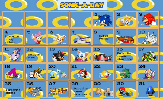
WELCOME TO SONIC-A-DAY MAY WHERE FOR EVERY DAY ON THE MONTH OF MAY, WE CREATE FOR OUR MAGNIFICENT SONIC CAST!
Many were interested in participating to an event like this. So, here we are, the Sonic-A-Day May Event, inspired by @hermitadaymay.
Important rules to note
1. Any type of fanwork is welcome so long as it features, or is otherwise inspired by, the Sonic character of the day.
2. Tag #sonicfriendsaday to have your fanwork reblogged (keep in mind that while every fanwork has its own merit and value, even those involved in more mature themes, this blog will only feature PG-13 works for everyone to enjoy)
3. Fanworks for one Sonic character posted after the day rolls over to another character's day (per the Eastern Day Time) will be reblogged in one big queue in June. I will try my best to reblog everything tagged, please be patient if I haven't reblogged your fanwork.
4. No traced or stolen work allowed. AI-generated/assisted pieces are also not allowed and will not be featured on the blog.
5. Be kind to yourselves. I will not be reblogging posts that talks negatively about your art/skills, whether it is in the caption or the tags. Everyone is always improving.
6. Technically not a rule, but it is strongly recommend adding alt text or description to all images. Click here to learn more about writing alt text.
Small intro on the person running this
Hello there! My name is Bloop! You can use she/her and/or they/them pronouns for me. My main blog is @bloop-im-a-frog-now.
Prompts explained and name of the character for each day
May 1st - Sonic the Hedgehog
May 2nd - Miles "Tails" Prower
May 3rd - Knuckles the Echidna
May 5th - Amy Rose
May 4th - Favorite boss/villain
The Sonic games have many beloved bosses and villains. If you want to create something for Black Doom or Mephiles or the Egg Dragoon, that is the perfect day for them! Metal Overlord and its variations can be for the Metal Sonic day or for this day, it is for you to decide.
May 6th - Cream the Rabbit (and Cheese too!)
May 7th - Big the Cat
May 9th - Dr. Ivo Robotnik/Dr. Eggman
May 8th - Super forms
Since Sonic the Hedgehog 2, super forms have been a staple of this franchise. If you don't have at least one super form per game, then you're probably playing a racing game. Which super form is your favorite? Who would you like to see have a super form? How would super forms affect the body? If super forms come from the Chaos Emeralds, does that mean every living being is familiar with Chaos Energy? Some questions to ponder upon for this day. You can also just do Super Sonic, game, TV show or movie counterpart, and it would fill this prompt!
May 10th - Silver the Hedgehog
May 11th - Blaze the Cat
May 13th - Shadow the Hedgehog
May 12th - Favorite NPC
Sonic games have had many NPC throughout the years. From Chip to Vanilla, some that affect the plot more, others that don't (I see you, Sonic Man (i think that's his name)), it can be anyone that was not playable in a Sonic game! It can also include characters from TV shows or the movies! They can technically be NPCs. They weren't playable in the games. Truly, if you love a character and you wish they were playable, here's your chance to make them shine!
May 14th - Rouge the Bat
May 15th - E-123 OMEGA
May 17th - Vector the Crocodile
May 16th - Favorite comic character
Sonic has many comics! From the Archie's, the manga to the IDW publishing. Do you have a favorite comic character that is not a main member of the Sonic cast? They get a spotlight during that day!
May 18th - Espio the Chameleon
May 19th - Charmy Bee
May 21st - Mighty the Armadillo
May 20th - Chao/Wisp/Koco
Somehow, Sonic games have adorable creatures. Some prefer the Chao, others love the powers the Wisps give you. The Kocos were plot important in Sonic Frontiers, and even have Lore you didn't expect these little creatures would have. Which one do you like? Which type of Chao/Wisp do you like? Now's the time to make your preference known!
May 22nd - Ray the Flying Squirrel
May 23rd - Jet the Hawk
May 24th - Wave the Swallow
May 26th - Storm the Albatross
May 25th - Favorite game
Do you have a favorite Sonic game? Which one is it? It's time to show it some love! You can show your favorite part of that game, you can write about its story, you can talk about a mechanic you thought was really cool. Anything goes, as long as it ties in with your favorite Sonic game.
May 27th - Marine the Raccoon/Sticks the Badger
May 29th - Maria/Gerald Robotnik
May 28th - Favorite zone/location
We all know SEGA loves Green Hill Zone. What about you? Do you like City Escape? Or Final Haunt? Maybe you like Babylon Garden or Planet Wisp! Show some love to your favorite zone/location.
May 30th - Orbot/Cubot
May 31st - Metal Sonic
#sth#sonic fandom#sth fandom#sonicaday#sonic the hedgehog#miles tails prower#miles prower#tails the fox#knuckles the echidna#sonic movie universe#amy rose#amy the hedgehog#cream the rabbit#big the cat#super sonic#eggman#dr robotnik#ivo robotnik#dr eggman#silver the hedgehog#blaze the cat#shadow the hedgehog#rouge the bat#e 123 omega#omega e123#vector the crocodile#espio the chameleon#charmy bee#chao#wisp
50 notes
·
View notes
Text
the worst part about the i/p discourse
it's NOT the posters of Nazis with the swastikas on their flags replaced by stars of david. or the pages and pages of blood libel conspiracy theories in instagram posts about why local pride organizers are such big meanies. or the newfound insistence that jews just exaggerate and make up antisemitic incidents to smear the pro-palestine movement....
it's the fact that every. single. time. i try to post anything about any of these things, i end up in a rabbit hole SO DEEP IT'S IMPOSSIBLE TO GET TO THE BOTTOM.
Yesterday, I saw a --
YOU SEE? I went to Reddit for a second to find the link to the post about the Melbourne protest this week that had people carrying the Nazi-star-of-David posters. But first, I saw a post that began, "All I see on social media and the news is more and more attacks. Who beat up a Jewish family here, who stabbed a 1 year old in front of a synagouge. Those are two examples, I've lost track of all of the other ones."
and I was like, SOMEONE STABBED A ONE YEAR OLD IN FRONT OF A SYNAGOGUE?!?!
And I started to look that up. AND THIS IS EXACTLY WHAT HAPPENS. EVERY SINGLE TIME.
Two days ago, I saw an article about Cincinnati Socialists setting up a table at North Kentucky Pride without asking, it sounds like, to hand out flyers saying the war in Gaza was Netanyahu's "Final Solution" for Palestinians. Cincinnati Pride organizers alerted the NKY Pride organizers, who kicked them out.
I was like, "okay, well, let's see what Cincinnati Socialists say about it." Then I discovered that their instagram not only "names and shames" the two Cincy Pride organizers and one NKY organizer. Which led to the Cincy ones getting so much harassment and violent threats that they resigned....
But also has a related post that goes on for pages and pages of pure blood libel.
So then I sat there fact-checking all their blood libel and finding out that not only was it untrue and impossible, but half the stuff they referenced didn't even exist.
Then I ended up fact-checking things in the "article" that they'd clearly used as their source. Fact-checking things I found while fact-checking those.
Trying to write a Facebook post about how fucked up it all was. Giving up on the Facebook post after several hours because it made more sense to write it on Tumblr, or at least to write it on Tumblr FIRST.
Then I'm also looking at the post they made "naming and shaming" the organizers, which is like... "the Cincy ones are partners! two days after Hamas's incredibly violent and brutal massacre, one of them changed his profile picture to a photo of them honeymooning IN ISRAEL two years ago! they did it through some group that COVERS A LOT OF THE COSTS FOR HONEYMOONS IN ISRAEL!!!!" and "the other one went to a protest of Hamas's massacre!!! with a sign saying to free the hostages!!!"
oh no. the fucking horror. truly how did these genocidal monsters even end up on the pride organizing committee. this is a shanda scandal.
then I'm responding to people's comments, trying to talk them down from horrible positions. telling people things like, "I know it's asking a LOT, but if people could grasp the idea that "going to Israel for your honeymoon" ISN'T "committing genocide," it would be really great. Or that wanting the hostages freed is actually something that both Israeli AND GAZAN protests have called for, and it's only Westerners who are opposed to it. Or that in fact, saying you "Stand with Israel," a few days after an incredibly brutal attack that burned multiple towns to the ground in one day, killed entire families and their pets, an attack which Hamas has promised to repeat "again and again and again" till Israel is violently destroyed... is opposing that attack, NOT calling for genocide."
then i'm like, "oh, i should edit these images to show the correct info, and i can explain that I drew arrows and added the correct info!" so then i'm doing that and working on writing alt text, and holy shit??? how many fucking hours??? did i spend on this?????? just because i read a frigging reddit post that linked to an article about it?????????
and like. i can go through and debunk all that shit in the comments. (and did. i responded to every single comment that believed this shit.) but ultimately, everyone who pulls this shit has way more reach than I do.
just. like. THAT'S ONE ORG IN ONE PLACE. And it was bad enough that I persevered and finished debunking it and commenting on it today and started telling people about it. Do you even know how many more of those I've seen?! How many I would see if I looked for them on purpose?!
The tsunami of deliberate disinformation is SO FUCKING BAD. All of it is SO FUCKING LAYERED. In any single bullshit post, there are SO MANY horrifically bad and wrong assumptions. So many of them are DESIGNED, BY HAMAS, to lead people down the path to "All Zionists should die! Israel should be violently destroyed!"
There were so many comments on a "Free Palestine Melbourne" group's instagram post (Sydney? Could've been Sydney) asking, pointedly, how many Jews are Zionists. What percentage of Jews are Zionists, again?
One (1) had a response telling them it doesn't matter what the percentage is, no percentage would justify collective punishment of Jews.
The rest all said things like, "Too many."
It feels like constantly being lied to. Just constantly being lied to about things I have looked up and verified myself from solid sources, now and in the past, by people I counted as my community.
Then just now I opened Instagram because I hadn't taken screenshots of a couple of the pics I wanted to add. And I'm hit with these:
instagram
instagram
instagram
Then some brighter posts (including one of a baby bat!!) and then a post which sums up a lot of what I'm feeling right now.
instagram
It's like, yes, that, plus the uncomfortable sense that some people are getting thisclose to going, "Most Jews are Zionists anyway, so YEAH, I DO think most Jews deserve to die."
90 notes
·
View notes
Text
'Semi' Incoherent Basketball Tangent Crossposted From Twitter Dot Com (Directors Cut)
does . Does adding a title ruin the #aesthetic
Umm anyways last night i was thinking really hard about basketball and robot flower's arc (mainly basketball's part in it. Unfortunatley) and basketballs run in tpot (Unfortunatley)
I just thought itd be fun to put here (under cut) and do some more thinking Because .. its a Little incoherent and im kind of Negative (i err cant provide alt text at the moment for the screenshots, will edit later Dont Worry)


although i still Agree with my points i feel a little bad for Not going into the problems with rf's perspective (and how she was Handled as a whole) (which.. i Wont be doing rn 🙁 DEFINITLEY LATER . TRUST ME I HAVE WORDS . just. This is very obviously about that ball)
one (get it) thing i have to bring up is One (get it) - I can see why they used basketball to get that Part across, she was easy to grab. problems with her team, not being listened to, stress over robot flower. Yeah Yeah.
My biggest problem is how it feels like it just. Wasn't elaborated on, most of this has to do with tpot 13-14, where basketball's whole Deal with one is basically.. Over (ESPECIALLY TPOT 14) but even during the time the two were together.. it felt a lot like.. Basketball was just getting exposition dumped? Besides when rf was coming into Play, none of it really.. corresponded to her character. (I mean.. I can understand Why. You gotta get exposition out SOMEHOW.. Lol)
She's considered important for things she Didn't Do, just things she happened to be There to witness.
and, this is something brought up when i was talking on Here, actually!! - It's implied one had seen herself in basketball, I mean. She compares herself to her. Bringing back my Earlier gripes with Bball and One, how most of the exposition dump doesn't seem to have anything to Do with basketball, I wish more of that needed elaboration could've been in tpot 14.
Girl literally had just encountered a Scary Cryptid alien who made her sign a Mysterious Contract, she can at the very least express some concern. It doesn't even have to be scenes of her doing full on explanations.. maybe a retread of tpot 12? She's desperatley Trying to explain to the others about where she was and What happened.. and if they aren't going to do any "big expansive plot moments" with her anymore, maybe.. just Maybe.. make her a little more on edge than just.. Standing there . LOL
Unfortunatley, alot of my suggestions feel like they'd be discredited just because of the fact that . She's already Taken up so much screentime.. (this is where my mind kind of fogs! I need to rewatch tpot Sorry, some things may be Wrong ;_; ) so much of the basketbot arc is built up upon basketball doing.. Nothing. It took until Tpot 10 for her to actually get a Plan. (which.. as much as i like to interpret it as part of her character of being. Really bad at working things on her own, i Don't think was the intention.. Said plan ends up going nowhere anyways) She gets focus on scenes that don't lead up to anything, really. It's a slow burnt plot that just Wasn't working in the show.. and the way it was solved with the contract is Such a dissapointing ending when you take into account that it went Nowhere. (especially on rf's end, outside of the one stuff, Dont Get Me Started)
From my perspective, if you've given a character so much screentime already, you're going to have to deduct some for the sake of the rest of the team.. which is Understandable!!! I get why 100%. I dont want to look at basketball's Ugly Mug any longer then normal. But it leads to having more to be desired when things actually.. Get Going later on.
But, i guess in our Perfect Bball Centric World- If she had survived her elimination (Please No. Im sorry she HAD to go.. its so funny to Make Fun of her, her vote count is humiliating Ok...) it would've been fun to see her work with fanny and ice cube regarding One.. I dunno, whenever i see tennis ball mystery solving i just think My Ball Couldve Been Here.. but i digress . She's Dead
Now that she IS eliminated though, i really Did think her and robot flower would Continue to be important, given they WERE on fanny and ice cube's whiteboard, and their rather unconventional way of getting Eliminated, they could've gone missing... A Number Couldve Been.. AFOOT.. But nope. Next time we see both of them, they're part of the Masses trying to escape 😭 'Course, tpot isnt Done.. so we COULD get more of them (i really think rf couldve been involved ok... again A Talk For Later (eye twitch))-
Maybe they told the others about one? That's why they all want out? I'm trying to not Focus on speculation though, rather then looking back on how she was this season. Eitherway, her relevancy seems Unlikely 😞
Now, looking back at her characterization .. it's definitley. Done. (Im progressivley losing my train of thought SOS I HAVE MORE TO SAY I SWEAR. Times catching up to me, too.. I Got Things 2 Do)
I like the idea of them branching away from her dependancy issues, i like it A Lot. but in execution (though this may be a fault Of the writer change) it tends to fall flat. Tstoe defintley suffered from the writing change, if i remember correctly they got a Little .. Santized? The team felt a lot less Dysfunctional. (WHICH I CAN HANDLE! it just felt a little sudden.. no real Bonding Time, Yaknow..)
Basketball is ABSOLUTELY not a leader type character, I think the idea of her Dilly Dallying away in challenges to focus on what She deems as more important, much to her teammates dismay, is a fun idea.. I wish she had time to be more selfish and get reprimanded for it (She literally didn't do shit about grassy being Burnt Alive 😭 and then.. No one cared?? Not even robot flower.. girl you knew her the longest you Know how much she cared for the little guy)
I wish her relationships with her other teammates on strongest team were given more importance (Outside of rf, LOL) especially her relationship with Grassy 🙁 grassy immediatley moved on from her and it stinks because.. they had such a fun dynamic (hoping for more of them in idfb.. its Interesting how they're established friends in bfb beforehand.. Please 😢)
Another relationship of hers that was slowly forgotten about was with golf ball, it's just as dissapointing. Basketball's dependancy on 8-ball Immediatley shifting to her wanting that with GB despite not liking her beforehand is really funny, her 'switch up' in Tpot im a big fan of because. You kinda see it coming, she really does Not see Gb as someone she'd want to stick with, but her follower mindset directs her to it anyways. But now she's given the chance to prove herself as 'better'? She takes it and just acts like a Prick. (Okay i May be getting a little headcannony here.. a Rewatch is imminent.)
Alas, basketball's reign of terror is Hopefully done. It's sad to see her go, despite her being Kind Of Ass . I do miss her presence.. it's not the same without her aura farming..
Uhh Uhh.. i may do a Follow Follow up to this if i get to rewatching/think of something at work .. Very sorry if this was the Worst Shit youve read and I am 10000% Wrong . Oops 😓
Ok wait i thought of another good closer . Sigh. Despite basketball of bfdi not winning tpot.. she did win one thing.. being the Biggest Bum on the show...
#kiwi yap#BIG KIWI YAP#BIIIIG#that ball i hate#Im sorry if this is super Negative snf#i think a lot Ok...#if anyone even reads this >_>#Hi#ill touch up on all of this later but i Have work soon. Kiwork
17 notes
·
View notes
Text
Arranged to be Yours - Part 6
[Image Alt ID: a four picture collage with a black background. The first picture is of sun shining though the tops of trees onto a forest floor. The second picture is of a girl with black hair in a white dress. She is standing in front of a lake or pond. She is looking off into the distance. The third picture is of two hands touching some vines on a tree. The final picture is a close up of a girl. Her curly, dark hair is over her face. You can see her lips, chin, and neck. There is a white text block across the middle that reads “arranged to be yours” End Alt ID]
- - -
Masterlist Series Part 5 (Series Complete)
- - -
8.9k words
- - -
Sybil gets transformed into a faery. Harry helps her with recovery. Sybil begins her duties as princess and takes care of something that has been weighing on her mind.
(Warnings: being held under water, mentions of the kidnapping of chapter 1)
Sybil lies in bed, tossing and turning, unable to close her eyes and get some rest. Harry keeps trying to wrap his arms around her, but she is moving too much.
"Baby, what are you doing?" Harry grumbles.
"I can't sleep. I'm sorry." She apologizes.
“Nothing to be sorry for love. What’s wrong?”he asks, becoming more alert.
“Aren’t you nervous?” She asks him. He sits up and motions for her to come here. She climbs into his lap and he holds her tightly.
“I’m not nervous, but it’s your transformation. I can understand your anxiety. It’s not something you’ve ever done before. It’s new, and I know that causes you to worry.” Sybil rests her head in the crook of his neck as his hands draw patterns in her skin.
“Is it going to hurt?”
“I’ve never done it. I was born with my magic, but from what I’ve heard, no it doesn’t. The ones I’ve witnessed, the people say the scariest part is the water.”
“What’s so scary about the water?”
“It’s where the transformation happens, but just remember I’m going to be there the whole time. I’ll be right in front of you.”
“Do you promise?”
“I- what is it you humans use? Pinkie promise?” He asks, a smile growing on Sybil’s face. She holds up her hand, her pinkie finger sticking up.
“You have to lock pinkies to do a pinkie promise. You can’t break it.” She explains. Harry brings his hand up and completes the pinkie promise. She giggles as their hands fall.
“You must study humans pretty closely to know about pinkie promises.”
“I’ve studied humans for a long as I can remember. It was a subject in my lessons, and I’ve been expanded on it since then. If we want them to come here, there should be at least one person who knows about them. What better person than someone who has power and can do things for them?”
“That’s pretty smart.” She says.
“Plus, my mom helped teach me. She could only teach me about where she grew up and how things worked there, but she was a good teacher.” He smiles. He sits in the memories for a moment before coming back to the moment. Sybil rests in his arms, trying to calm down. Harry has an idea to distract her. “Can you tell me about where you’re from? Or a favorite memory from your world?”
Harry can feel Sybil smile on him as she lays, her face nuzzling his neck.
“Hmm.” She hums. She takes a moment to think about the happiest times of her life. “One of my happiest days from that world is probably the day I moved out of my foster home. I was 18. I hated my parents. I hated my sister. They were awful people. But I got to pack up my trash bag of clothes and suitcase of belongings and get out of there. I moved cities. Many miles away so they could never find me again. It wasn’t as close to wilderness as I had liked, but an apartment was better than nothing. I got to my new apartment and I found that it wasn’t furnished. The ad said it would be but they changed their mind I guess. I didn’t even care at that point. I would sleep on the floor with my blanket and pillow until I could afford a bed. I would eventually get all of the things I needed to make that place mine. But I was free that day. They didn’t have a hold on me anymore.” Sybil spills without hesitation.
Harry listens intently, absorbing every detail. All this times he’s been raving about how great of a mom he had, when she didn’t know hers. She had foster parents, but they were terrible. “I’m sorry I’ve bragged about my mom so much-“
“No need to apologize. I’d like to believe that my parents gave me up for a reason. And you having a great mom is nothing to ever apologize for. I’m so glad you had her. I wish I could meet her.” Sybil tells him and Harry gives her a sad smile.
“I wish you could too.” He says. They sit there for a moment, Sybil not even realizing that she has calmed down some just from talking with Harry.
Harry continues to hold her and hum her songs until she falls asleep in his arms. Harry falls asleep sitting up, holding the most beautiful girl in his arms.
Sybil wakes up before Harry does, but when she sees how they fell asleep, she chooses not to move until Harry begins to stir. When Harry sees how they held each other while they slept, a smile blooms across his face. His hands squeeze her tighter.
“Good morning, princess.” He says sleepily.
“Good morning, sleepy.” She replies. A knock pounds on their door a moment after they wake up fully and get dressed. Harry allows whoever it is outside to come in. Ace appears in the door and greets them.
“They are ready for us.” Ace says gently to them.
“We haven’t even gotten to eat yet.” Harry defends quickly while Sybil stands anxiously.
“It’s okay Har. You grab something. I don’t think I can eat right now.” Sybil says quietly. Harry gives her a concerned look.
“You need to eat.” He tells her. She shakes her head.
“Too nauseous to eat.” Is all she says. Harry disagrees, but he knows she isn’t going to budge on this.
“I’ll eat after then.” They take each other’s hand and walk out of the door to go to the castles crown room.
Ace puts their crowns on their heads, ready to walk down to one of the most important places in the city. Sybil looks at herself in the mirror. Her dress wraps around her snuggly, hanging all the way to her feet. The gray cloth folding and ruffling in every area.
As soon as the castle doors open, people flood Sybil’s vision. This is her first time leaving the castle and going into the rest of the kingdom. It’s also her first time appearing publicly since the wedding. Guards line the edges of the pathway out, keeping the people behind them. Ace leads the way down the sidewalk and into town. Sybil clutches Harry’s arm nervously.
“It’s going to be okay Sybil. It’s a short walk, and this won’t take too long.” He assures her. They continue to walk, Harry unfazed by the amount of people just wanting a glimpse of them. A glimpse of their royalty. Their leaders. The town buzzes with excitement to see such a tradition.
As they approach the building, Sybil is reminded of the churches back in her town. This building is huge. It looks old and worn, paint fading. Colorful windows line the walls and a huge tower with a bell in it stands at the top.
Harry and Sybil stop at the bottom of the steps as she looks up at the place.
“This is one of the oldest buildings in our land.” Harry tells her this fact, a small distraction from everything. “This ritual is as old as time. The building has tried to be updated and kept by adding the paint outside and putting in new floors, but it still looks as old as it is.”
“It looks like a church.” Sybil point out.
“I suppose it does. I’ve only seen pictures in books.” Harry admits. Ace turns around and faces them.
“Are you ready?” He asks. Sybil swallows the lump in her throat.
“Yes.” Is all she can manage to say. Ace opens the doors. The inside is beautiful. Natural wooden floors, the sun casting the colors on the benches inside. The aisle lines with a green carpet. Decorations fill the wall space that the windows don’t. Sybil takes it all in.
She looks down the aisle to find a large pool of water, a platform above it, and many people wearing white robes. Ace leads them up to the platform. The benches of people and the other royalty that attended the wedding watching closely.
The room is silent except for a few whispers of the robed people.
“Today, we are here to transform Princess Sybil Styles.” Ace announces to the room. “We ask that everyone remain seated and quiet for the transformation. As many of you know, this process is delicate. We ask for calm and quiet during this time to help us be able to watch for any signs of issues that may occur.” The crowd nods at him after he finishes speaking. “Let us begin.”
The people in robes gather on the platform with them, preparing for the steps.
“Prince Harry. We ask that you come down in the aisle for the transformation.” A man tells him. Harry knew he was not going to be able to stay up on the platform. He isn’t a prince witnessing a normal transformation today. He is the transformed’s support. He is going to watch from below, and be ready to help Sybil when she is done.
Sybil watches anxiously as two men lead Harry down to the front of the aisle, beside the two benches closest to the pool of water. He gets down on his knees and looks up to her. The two men return to the platform and gather on each side of Sybil. The man who told Harry that he had to go down to the aisle is the same man who begins to speak again.
“Sybil. Is your intention true?” He asks her quietly. “This could be fatal if it isn’t. Better to tell us now than to die in the waters today.” Her hands shake. Of course her intention is true, but what if she messes up somehow?
“It is true.” She says, unable to hide the shake in her voice. The man nods and gives the men beside of her the signal to proceed. They remove her crown. They take her by the elbows and lead her down the steps into the water.
The cold water quickly causes goosebumps to cover her skin. They lead her down until the water is waist deep, making her shiver.
“Are you ready?” The man on her right asks her. She nods her head. The men lean her back into the water. They hold her there, despite her instincts of fighting them to get to air. She holds her breath, afraid to breathe in the water.
Harry looks with anxious eyes. Everyone he has ever talked to says this is the worst part. He can see the water splashing as she fights being put under. Even the people with the truest of intentions said they were scared. It felt like they were going to drown. That’s why they fight.
The men begin to use their magic, it glowing through their hands and into the water surrounding her and onto her.
When Sybil can’t hold her breath any longer, she ends up taking in the glowing water around her. She didn’t realize by taking it in, she would find the relief she wanted from the air.
The magic fills her lungs, relieving the burning from not being able to breathe. Her body relaxes and feels like she’s floating.
Harry is still on his knees, watching as the fighting and splashing dissipates. Anxiety fills his chest as they just stand and watch her in the water. He wants to run to her. To pull her out and to hold her until she’s feeling better. He’s never felt this way before when he stood and watched others do this, but he’s also never been the one who was going to receive the person coming out of the water. He’s never had someone come out of the water and need him.
When the men eventually lift Sybil from the water, her body is limp. Her eyes are closed. She is held there for a moment, Harry watching impatiently for signs of her waking up. Signs of her magic.
Almost as if Harry conjured it, her eyes shot open, glowing purple light coming from them. The men put her on her feet in the water.
Sybil feels the magic rushing through her, a feeling like she’s has never felt before. She sucks in a deep breath of air. She can’t see, the magic overwhelming every sense.
Wings begin to manifest behind her, fluttering at a rapid pace, sending her into the air. She stays there for a moment, magic causes her eyes and her wings to glow brightly of purple. Water drips off of her flowing dress and back into the pool.
When her body begins to come down, she lands herself right in front of Harry, sitting on her knees like he is. The glowing subsides from her eyes. Sybil regains her vision and sees Harry in front of her.
Harry immediately wraps his arms around her, not caring how wet his clothes get.
“Sybil! Are you okay?” He asks as soon as her eyes open and focus on him. She gives him a tired smile.
“I’m okay. I love you.” She says, the rushing that she felt beginning to fade, making her exhausted.
“I love you too.” Harry says. “We’re almost done, and then you can rest.” Sybil nods her head, and copies Harry’s motions from the wedding. She focuses every bit of energy she has to her hand. She focuses her love. Her adoration. Every feeling she has for him into her hand, and her chest begins to glow purple, just like her eyes moments ago.
Sybil pulls her hand away and a glowing purple ball holds in her hand. Her very first act of magic right in front of her. She looks at it in awe. She did that. She made that. That’s her magic. Sybil closes her hand around it, shrinking it until her hand is fully clasped shut. When she opens it a small purple crystal on a silver chain sits in her hand, and a tear escapes her eyes.
Harry gently grabs the meaningful piece and clasps it around his neck. The room erupts in clapping and shouting. Everyone yelling their congratulations.
Sybil rests her forehead against Harry’s as her eyes begin to fall shut. Harry looks at her with worry.
“Sybil?” He asks, trying to get her attention. Her eyes flutter open again.
“I’m… so tired.” She says. Ace comes off of the platform and walks to them, putting his hand on Harry’s back and giving Sybil his congratulations.
“Dad, she can barely keep her eyes open.”
“We are going to fly her back. Transformations are tiring enough as it is, but her giving the magic right after? I have no doubt that she is exhausted.” He says, which helps ease the anxiety is Harry’s chest. “We have a carriage outside. Adeline is in there waiting for her. Sybil doesn’t even stir when Harry takes her by one arm, Ace taking the other and carrying her out to the carriage.
Once inside the carriage, they lay her down on her side, her wings facing them as she faces the wall. Adeline check over her as Harry and Ace take a seat. The carriage doesn’t take long to lift into the air and take them back home.
“Her magic is strong. Can you feel it?” Adeline says excitedly.
“I can.” Harry says with a smile, letting the rest of his anxiety go.
“It’s so bright.” Adeline tells him. When entering the castle, Ace teleports them to their room.
“We could have walked dad.” Harry says.
“I’m sorry son, but I didn’t want to carry her up all of those stairs. I figured this would be easier.” Ace tells him. Ace leaves temporarily as Harry changes her into dry clothes. Ace comes back in and they lay her on the bed, making sure not to hurt her wings. She curls up on the mattress as Ace and Harry step aside from her.
Ace wraps his arms around Harry, hugging him with a pat on the back.
“I’m proud of you son, for all that you’ve done.”
“Thank you dad.” Harry answers, emotions coming to the surface.
“Adeline will be checking in every once in a while. Take care of her until then.”
“I will.” Harry says. Ace walks out of the room. Harry walks back over to Sybil and takes a moment to see her like this. She’s sleeping, but her magic is so bright. Her wings a sparkling purple. He gently takes his fingers across the lines on hers, and he wonders if it feels the same as the day she touched his.
She looks so peaceful curled up on the bed, her light snoring making her even more cute.
Sybil dreams vividly, all focusing on her new found abilities. She flies around, casting magic onto things around her. She zips through the woods, Harry following close behind her.
When her dream begins to fade away, her eyes begin to flutter open. She sees Harry writing at the desk. She goes to turn over to face him when she feels something on her back. She looks over and she’s that she has her wings out, sparkling in the sunlight that comes in the room. She sits up so she doesn’t pinch them or crush them underneath of her. She lacks the energy to try and put them away like Harry does.
She stays quiet, watching him work diligently. His hand taking its time to draw each symbol on the page. A rumble fills the room as Sybil’s stomach reminds her that she hasn’t eaten yet today.
Harry turns around and sees her sitting up. He puts his pen down and walks over to her.
“How do you feel?” He asks her gently.
“I’m still pretty tired, but I think I’m more hungry than anything.” She says.
“Do you want me to get you something?” He offers. She nods her head.
“Can I come?”
“I think Adeline has you on bed rest. I can be super quick though.” He informs her. She is disappointed but understands. Harry walks out of the room and into the hallway. He takes a deep breath.
Since that day that she enjoyed the flying and the carriage ride, Harry has been trying to get more comfortable with flying again. He knows she is going to want to the first moment she can. He takes his wings out of hiding and takes another deep breath. Today he’s going to try the short distance from here to the kitchen.
He slowly lifts himself into the air, anxiety making his hands shake. He knows that he’s going to be able to fly just fine. He’s flown before. He just had one bad accident. Just one accident. He’s older now.
Harry sits there repeating to himself that everything is going to be okay. He slowly begins to move through the hallways, his wings flapping slowly. Harry continues to take deep breaths, picking up his speed the farther he goes.
When he finally gets to the kitchen and lands, he has someone get her a plate of leftovers and heat them up. He gently flies the plate back to the room. He puts his wings away and walks in to see her standing up in front of the mirror, admiring her wings. Harry sets the plate down and walks over to her.
“I’m pretty sure bed rest means stay in bed.” Harry reminds her.
“How did you get my shirt on over my wings?” She asks, ignoring his reminder. He gives her a gentle smile.
“I used a little big of magic to phase the shirt through them. I hope you don’t mind that I helped you change. You were dripping wet.”
“It’s okay. I don’t mind.” She says. “I like wearing your clothes.”
“I know you do. I wanted you to be comfortable while you recover.” Harry places his hand on her back and guides her to the bed. She sits forward on the bed, not letter her wings touch the pillows.
“Do you know how to put them away?” Harry asks her. She shakes her head.
“I thought that just thinking about it would do it.”
“You have to focus your magic like you did to make the crystal. It doesn’t have to be that intense, but it requires some focus.” He tells her. When he mentions his crystal, her eyes flick down to see the chain on his neck, a purple crystal hangs from it, making her smile. He is hers.
She focuses her attention to her wings. She focuses on the feeling of them behind her. The magic. How she wants to lay down on her back without crushing them. The feeling of letting the magic subside. And just like that, her wings fade and are put away.
Harry pats her on the back for being able to put them away. Sybil sits back onto the pillow and Harry gives her the plate of food. She eats until she’s full and gives the plate back to Harry. Harry takes the plate away and comes back to see her under the covers and lying down.
Harry lays beside her on the bed and rests his hand on her hip. His other hand is placed under is cheek. “How do you feel, love?” He asks her gently.
“All I’ve done is sleep today but I’m exhausted.”
“I can only imagine not having magic and then suddenly having it. I bet it is wildly exhausting.”
“I don’t like to sleep all day. I want to go outside while it’s still bright out.” She says.
“I wish there was a way we could. As soon as Adeline clears you, that will be the first thing we do, okay?” He assures her. She gives him a tired smile.
“Okay.” She says. Harry readjusts on the bed, lying so that she can climb over and lay her head on his chest. When she does, her hand rests above the crystal on his neck. She fidgets with it as they lay together. “This feels like a dream.”
“What do you mean?”
“Everything has been such a whirlwind. My life is something you see from a movie. I literally have magic. I’m a princess. It just doesn’t feel real.”
“It is very real baby.” He rubs his hand up and down her back.
“I love you Harry.” She says, drifting off to sleep.
“I love you too Sybil.” He tells her, but her eyes are already closed.
Harry lays there and holds her for about an hour before his door has a slight knock and pops open. Adeline comes in the door and walks up to Harry.
“How is she doing? Is she feeling okay?”
“She’s alright. Very tired.”
“Has she eaten anything yet?”
“Yeah. Almost a full plate.”
“That’s great.” Adeline says, writing it down on her clipboard. “Has she been walking around?”
“A little. She was up at the mirror earlier. She really wants to go outside.” Harry tells Adeline and she nods.
“Do you think she’s strong enough to walk all that way?”
“I don’t know. She’s just been so tired we’ve just been lying here. Is there anything I can do to take her outside?”
“Not unless you use magic.” She tells him and he sighs.
“I’m trying to get more comfortable with that for her. She’s going to want to fly. And I want that for her. So I’ve been using magic for small things. Helping her get dressed, flying around the castle.”
“That’s great to hear Harry. You know, I remember not that long ago getting to talk to Sybil while you were busy with your dad. I told her about how you can feel another persons magic. How bright yours was.” She starts. “It’s amazing to be able to feel hers. It’s as bright as yours.” Harry’s smiles spreads across his face, threatening to take over all of his features.
Sybil begins to stir at the sound of their voices. She looks around confused before realizing that she fell asleep on Harry’s chest.
“Hello Sybil.” Adeline greets her softly.
“Hi.” She says, sleep evident in her voice.
“Do you mind getting up? I’m here to evaluate you.”
“That’s fine. Just give me a minute please.” Sybil told her and Harry chuckled. “What’s so funny?”
“You’re just not a morning person.”
“Technically, it’s not morning. I’m just not a perky person when it comes waking up.”
“I know. It’s adorable.”
“Hush.” Sybil laughs. She finally sits up in bed and climbs out. Adeline smiles at her wearing Harry’s clothes.
“Okay. How are you feeling?”
“Pretty good. I’m tired, but it’s getting better.”
“Good. Have you tried your wings yet?”
“No, I haven’t.” Sybil replied. Adeline nods for her to go ahead. She focuses her magic like Harry said to do to put them away, and she brings them out again.
Harrys eyes watch her, swooning over every little detail about her. She was beautiful as a human, of course, but Harry sees how she lights up when using her magic. How she gets excited to do something so normal to him and his way of life. She’s beautiful.
It doesn’t take a lot of focus to begin moving her wings. They flutter lightly behind her, lifting her feet off of the ground. She rose higher into the air, swirling herself about before her feet touch the ground again.
“Those seem to be doing alright. I think you’re good to go for anything you feel strong enough to do.” Adeline confirms what Sybil wanted to hear. Sybil sits down on the bed as Adeline speaks. “Just see me if you need anything.”
“Thank you.” Sybil tells her and Adeline leaves the room. She directs her attention to Harry who stands in front of her. “Do you think I could make it outside?”
“That’s all depending on how you feel.” He says. “We can go whenever you’re ready.”
“I mean, I have a little energy. Not a whole lot.”
“Maybe we should wait then. We will go soon, okay? I promise.” He says, sticking out his pinkie just like the night before. Sybil beams at Harry’s remembrance of the requirements of the pinkie promise. She locks fingers with him and puts her wings away. She lays down on the bed again and drifts off to sleep under Harry’s touch.
Days passed as Sybil’s energy levels returned to normal. Her practicing her flying inside the bedroom when she felt that she could. She loved being in the air and wondered if Harry would ever join her. She wanted him to so bad, but she didn’t want to push him. She knew he hated it.
Harry was supportive, not pushing her to do anything she wasn’t ready for. She dabbled in a little magic, but not a lot. Harry helped her and demonstrated things as she asked. She liked to push the covers back with her magic so she could climb in bed. Some of the best moments of her recovery were when Harry asked about her old life. She would tell a story, and then Harry would mention that he read something about a detail in his studies before. Then Sybil would explain.
Sybil also continued her studies as she stayed inside and recovered. She wrote, she read history books. Harry was taken by surprise when she decided to ask,
“What ever happened to the people that used to be in the dungeon? When I was down there, I know the cells were full.” She asks as she practices more of her writing. She’s getting more fluent with it, but practice is still necessary.
“My dad released the ones who hadn’t already been transformed.” Harry says, also putting down his pen.
“Did he let them go home?”
“No. They are still here somewhere.” Harry answers. He puts his pen down and Sybil does the same. “Why?”
“They should have the option to go home. They shouldn’t be forced to stay.”
“I don’t know how-“
“I think it’s time we both learn. And we give them the option to go.” Sybil says. Harry nods in silence. “I’d like to make a proposal.”
“For?”
“What happened to those people, what happened to me. It can’t happen again. I don’t regret a single thing, but I chose my role. I chose my path. I accepted it. They should have a choice too. They shouldn get to go home, with the promise that every human who comes here is here by choice, not because we kidnapped them.” She says and Harry looks upset.
Harry has wanted to fight for them but didn’t know how to go about finding them. He doesn’t want to announce to the kingdom that they kidnapped humans, but how else is he supposed to find them? How will those humans trust him to send them home?
Harry grabs another piece of paper and begins to label the top. Sybil looks over and reads it. ROYAL PROPOSAL FOR THE LAW.
“Is there a specific way it has to be done?”
“Yes. It has to be written to be submitted. Then it is reviewed at the next meeting.” Harry informs her.
“And then it’s announced if it’s passed.”
“Correct.” Harry says and continues writing. “How do you want to word it?”
“How fancy do I have to be?” Sybil asks, not knowing if she can just speak her mind or if she has to articulate it differently.
“Formal, but don’t worry about a few mistakes because it will be rewritten a time or two if changes are made.”
“Okay, does it have to start any certain way?”
“No. Go ahead and say it and I’ll write.”
“Humans must come to our land voluntarily. For no reason shall any person, human or faery, take another human and force them into our world. If discovered, the human will be given the option to stay or return back to the human world, and their captor will be sentenced to the dungeon.”
“How long do you think punishment should be for?”
“I think if they want to take away someone’s life, they shouldn’t get to have theirs. I’d say for life. Unless you plan on releasing James any time soon?” Sybil asks and Harry shudders at the thought.
Harry urgently writes that detail onto the paper.
“I’d also like to add that portals should be openable by almost anyone. The exception being people who seem unfit and children. People should be able to go to that world if they don’t want to be here, or if they want to visit.” Sybil add and Harry writes it as well.
“Okay. We can submit this. I’ll go and give it to my dad to share with the others.” Harry says. He steps out of the bedroom and opens his wings. He flies to his dad and explains the paper. Ace agrees to review it and will present it at the meeting tomorrow.
Harry comes back and informs Sybil. She continues her writing, making more notes to show her progress.
Tomorrow comes around faster than anyone could think, and Sybil is nervous. She gets dressed in a hurry when she wakes up.
“You alright, love? You’re shaking.” Harry asks her and she nods, swallowing the lump in her throat.
“It’s my first meeting. My first proposal.” She tells him, looking in the mirror at herself. She fixes her hair as Harry comes up behind her.
“You’re going to do great. You’ve got this.” He tells her, wrapping his arms around her and holding her. Sybil spins around, taking a deep breath. She meets Harry’s smile when she faces him. She places a gentle kiss on his smiling lips.
“I love you.” She says, her voice almost a whisper.
“I love you too.” He says. They make their way down the hall at a slow pace.
When they get to the meeting room, Ace is there looking over the proposals. A few advisors come up and introduce themselves as Sybil takes her seat in the new chair beside Harry. Once all 11 people are seated, the meeting begins.
“Good morning everyone. Let it be stated in the record that this is Sybil’s first meeting with us in her new role as Princess. Now to begin, we have two proposals to review and either pass, deny, or ask for revisions. Let us begin.” Ace delivers the opening statement. Harry takes the papers from Ace’s hand and begins to read the first one.
“Proposal for law titled ‘New Kingdom Holidays’, requesting the addition to the royal calendar of three holidays. As is tradition, royalty’s birthdays, coronations, and anniversaries are added to the calendar. To show respect to newly crowned Princess Sybil, her birthday of July 15 be added to the calendar, as well as her coronation and our marriage date.” Harry reads. Sybil feels her heart pounding. Who proposed this? Why do they need to celebrate me, she thought. “Any comments?” Harry asks the table.
“It is customary. I say we all should agree.” One member says, her standing to draw attention.
“I can understand my birthday and my coronation, but why our anniversary. Shouldn’t that just be for us?” Sybil asks Harry, her heart pounding and echoing in her ears.
“We don’t need to celebrate with the kingdom. We have the freedom to plan something of your own, but the kingdom celebrates these holidays in the town square. It’s important to them.” He informs her. “But it is important that we make an appearance for your birthday and coronation. The people have only ever seen you. They have never gotten to talk to you. Your birthday is soon. It will be good.”
“And this is customary?” She asks. Everyone at the table nods. “They do it for you?”
“They still celebrate my mother’s birthday and coronation. They grieve her loss every year. We mean something to these people.” Harry tells her and Sybil takes a deep breath.
“Okay.”
“Alright. All in favor?” Ace says. All hands at the table raise. “All opposed?” All of the hands go down. “Alright then. Proposal titled ‘New Kingdom Holidays’ is passed.” He writes on the paper passed 11-0 with no revisions. Harry switches over to the next paper.
“Okay. Proposal for law titled ‘Voluntary Human Travel and Common Portals’. Request is for assurance that what has happened most recently must not happen again. Humans must come to our land voluntarily. For no reason shall any person, human or faery, take another human and force them into our world. If discovered, the human will be given the option to stay or return back to the human world, and their captor will be sentenced to the dungeon for life. Also, portals should be openable by almost anyone. The exception being people who seem unfit and children. People should be able to go to that world if they don’t want to be here, or if they want to visit.” Harry reads their proposal. “Any comments?”
“I don’t believe anyone should have access to portals to the human world.” One advisor says, who earlier introduced himself as Alex.
“Which is why the statement was put in there to say ‘the exception being people who seem unfit and children’. That part is vague and may need revision to include what makes someone unfit.” Ace says.
“We did what we had to do to help our population. Sybil is only here because of that mission.” Alex says.
Sybil becomes more nervous, knowing she has to speak up. She has to defend her proposal.
“I may only be here because of that mission, but I would have come here voluntarily. Let’s also not forget the abuse I endured to be here. James is to blame for that, and I know that wasn’t part of what you all were trying to do. But I’m fascinated by this place and would have come over voluntarily. All of those people who were taken before me need to be given the option to go home. They got ripped away from their families. Their lives. This isn’t right. They deserve the choice to stay or leave.” Sybil defends, much to Harry’s surprise.
“The curse ripped so many families of ours apart. We can’t continue to rip other families apart just to save ours.” Harry says and Ace nods. The room is silent for a moment.
“If we revise our statement of portal use, I would accept. But I don’t believe anyone should have access. I think there needs to be assessments for fitness. Those can be discussed in the next meeting.” Another advisor says.
“Alright. Let’s settle this then. All in favor?” Ace asks. No hands. “All opposed?” No hands. “Needs revision?” All hands go up. Ace writes this on the paper. Harry can’t help but to feel bad for not thinking of the fitness part of the proposal. It’s his fault that it got pushed back another week.
“I have a question.” Alex states as Ace writes notes for revision. “This mission was kept secret from the public. No one knows how Sybil got here, or the others. How will we announce this?” Ace sighs.
“We have to be honest. We messed up.” Ace admits
“The other leaders won’t receive this well. They think she came over.” Alex warns. Ace nods.
“I know. We will just have to deal with the consequences. What we did wasn’t right. We have to fix this.” Ace says and the room is silent. Everyone begins to disperse. Ace hands the proposal back to Harry to fix. Not another word is said as everyone leaves, leaving Sybil and Harry in the room alone. Harry’s arms snake around Sybil and he holds her.
They spend a quiet moment together like this. This is her life now. It’s her job to fight for what’s right, humans and faeries alike. This is important to her.
Harry and Sybil spend the next few days brainstorming and thinking of how to revise the proposal. They come up with a set of standards and write them down.
The next meeting rolls around and everyone is at the table again. Sybil’s leg bounces nervously under the table as she repeats in her head the revisions.
“Alright everyone. Today’s agenda. There are no new proposals, but one that has been revised and is ready to be reviewed. Let us begin.” Ace starts. Harry holds up the revised version of Sybil’s proposal and begins to read.
“Revision was requested for proposal titled ‘Voluntary Human Travel and Common Portals’. Revisions are as follows. The fitness of an individual will be determined by multiple factors. First being mental fitness. To be considered mentally fit, you must have no mental health issues that would affect your ability to determine if a portal is necessary. You must also know about the human world. A small test of knowledge must be passed to open the portal. Also, anyone with a criminal record will not be granted access to portals.” Harry reads, the last line making Sybil think of James. She shakes her head to rid herself of the thought.
“Are there specific mental health issues listed?” Someone asks. She gives Harry a questioning look.
“Yes. They are listed below the initial paragraphs.” Harry says. The paper is passed around for thorough review of the fitness qualifications. Each one is discussed and reviewed.
“Are we ready to vote?” Ace asks and everyone nods. Everyone around the table passes the proposal and Ace signs it.
“Since that is passed, I think before we leave the meeting, we should figure out what we are going to say to the people.” Ace says before everyone gets up from their seats.
“I think it would be smart for Sybil to speak. It’s her proposal. She was a victim. Wouldn’t it be best coming from her?” Alex mentions and everyone around him agrees. Harry looks over at me.
“This would be your first public address. Do you feel comfortable with speaking?” Harry asks. Sybil feels nervous again, her heart beating out of her chest.
“I can speak, if that’s what everyone agrees to.” She says, then taking a deep breath. Everyone looks to Ace.
“I think it would be best. More honest than if any of us did it. Harry and I would be by your side. Let’s come up with something and address it this evening.” Ace says and everyone pulls out some paper.
The rest of the meeting is spent drafting talking points for Sybil to speak on at her address. When everything is all said and done, an advisor rings the bell for the kingdom and it echos loudly through the streets. People begin to come out of their homes and flocking to the front of the castle, where Sybil will stand and give her speech.
Sybil, Harry, and Ace all stand at the door, waiting to go out and make an appearance.
“This is going to be shocking news for all of them. Their negative reactions aren’t going to be at you. It’s going to be with us. My father specifically. Don’t worry okay?” Harry whispers to her. She nods as she straightens out her dress that she just put on.
Sybil puts her hand on the doorknob and twists it, letting the setting sun light cast over her and the floor. She steps out, followed by Harry and Ace. They stand on both sides of her and let her address her people. They gave her tips and advice, but this is hers.
She looks out over the hundreds of people that have flocked in such a short time and just takes it in. These are her people. These are the people she’s trying to help.
“Good evening. Thank you all for gathering in such a short time.” Sybil begins, her hands clasped in front of her to stop the shaking. “Tonight is a very important night. Not only is it my first time getting to speak to you, but we have something important to tell you.”
She breaks and allows for their chatter and clapping. When it dies down, she resumes.
“Tonight we had our weekly meeting to discuss proposals and laws. I submitted a proposal and we thought it was important to inform you all of why this proposal was submitted and passed. Not very long ago, King Ace and his advisors decided to set out on a mission to help the population crisis that threatens us. Knowing that humans are the only way to get around this curse, he set soldiers out on a mission to take humans from their world and bring them here.” She says and the crowd gasps and chatters. Ace bows his head in shame.
“These humans were either transformed or were released into the public still as humans. If you are one of them, I need you to listen carefully. I see you, I am one of you, and I apologize on behalf of the king. We have made this proposal for you. This proposal prohibits any capturing of humans like this again. Humans should be able to come and go voluntarily. Faeries should be able to come and go as well. People who are caught smuggling humans through portals will be sentenced to life in the dungeon and stripped of their magic. Also, opening portals is now going to be taught to those who the kingdom seems fit enough to learn. There is questions that need answered and a test that needs passed, but it will be available for anyone to take. The most important take away from this is, if you were one of those humans who were taken, we’d like to send you home. We’d like to invite you to the castle and we will transport you home.”
Murmurs and chatter fill the streets after Sybil’s speech. Sybil steps to the side and Ace comes to the center of the crowd.
“I’d like to come up here and apologize myself for my actions. We were desperate to solve the issue, but this isn’t the way. Getting to hear Sybil and talk to her as she went through this journey of living in this world since that day, I deeply regret everything I have done to cause you harm.” Ace says. “We are willing to take questions, if you have them.” Ace says to the crowd. Hands shoot up into the air. Ace picks a hand.
“The kingdom had never heard of Sybil until the royal engagement. Was she one of the ones brought over from this mission?” A man asks. Ace takes a deep breath.
“Yes. She was. Harry and Sybil’s marriage was arranged, but let me clarify that this mission was a secret mission between me and some of my advisors. Not even Harry knew until after it happened.”
“So you forced them to get married?” The man asks, taking another turn. Sybil steps forward to speak.
“The marriage was arranged, but I chose this path because I love this world and I love Harry.”
“How did you choose when you were held prisoner?” Another voice asks, no malice, just genuine curiosity.
“I could have fought. I could have not cooperated. We don’t have the time to discuss every small detail that has happened since then, but believe me, I want to be here, and I’m glad I was able to put this proposal into action to protect others who were like me. This will never happen again.” Sybil says with a finality to her voice.
A silence fell upon the crowd at her final statements. Footsteps came from different parts of the street and several people stood in front of the crowd. No wings.
“I want to go home.” One woman says. “My kids are there. I’d like to go back.” Sybil welcomes her up with open arms. The woman comes forward and wraps her arms around Sybil before standing behind her.
One of the others steps up to Sybil and does the same. A total of eight people step forward in front of the crowd asking to go home and being received by Sybil with open arms.
As Sybil calls for any more humans who’d like to go home, a shout from the crowd erupts from the silence.
“How are we supposed to trust our king when he even went behind his own son’s back to complete a mission like this?” The crowd talks amongst themselves.
“I know it may be hard to trust me after this, but I’m asking you to. I know I give you no reason to, but believe me when I say I feel horrible about what I’ve done, and this is just one of the things we are doing to try and help fix what I’ve done. I understand the feelings of mistrust and betrayal.” Ace tells them with a sorrow voice.
No more comments are made as Sybil leads the group of humans inside. The kingdom disperses and all goes back to whatever they were doing before. Talking, working, relaxing. Whatever activity it was before Ace and Sybil flipped their world.
Ace leads them all to a room, Harry recognizing that it is one of the few rooms in the castle that he wasn’t allowed to enter.
All eyes wander around to the various objects and magic sitting about the room. Some bottles glow while others are collecting dust. Books remain open on tables, papers scattered about.
Ace walks over to a small box on the table and opens it, a small stone sits on the cushion. Sybil recognizes the small pebble sized object that Ace picks up and places in the palm of his hand.
Her mind flashes back to that day, watching the portal begin to open before her eyes were covered again. The feelings of her wrists and ankles being tied together again.
Harry watches her closely as her mind drifts off to another place. He can’t even imagine how hard this is for her, to send these people back when she wasn’t given the opportunity. She says she wants to live here, but that first moment that they had met she would have jumped through a portal instantly. When she absentmindedly begins to rub her wrists, he places his hand on her shoulder to bring her back to the present.
Sybil is thankful for Harry’s gentle reminder to come back. Ace uses his magic and a light green portal begins to open. The humans chatter excitedly to get to go home. When the portal is ready, Ace begins to speak,
“I’m so sorry for what I’ve done. I wish you all the best of luck.” He say and helps them into the portal. Not one of them says goodbye, glad to be out of this land.
When the last human steps through the portal, Ace whooshes it closed. Silence covers the room like a thick blanket. Harry holds Sybil close, his hand on her waist. Ace looks silently at the stone in his hand.
Sybil feels relief for the humans, but grief for her old self. She never got this choice. She loves Harry, and loves her life now, but just a short time ago this is what she wanted. She chose to accept her duties and participate, but she didn’t get to choose her cell. Her situation. She didn’t get to choose what happened with James. She never got to choose to go home. She’d love to see it just one more time, but she can’t. Not anymore. She wishes she could go back to her apartment and grab a few things, but she can’t. She doubts there is even an apartment left for her. She has a job to do for her people. That’s what’s more important.
Harry can feel her sadness. He’s not sure anyone else would notice, but her attitude has shifted. The confidence she carried when speaking to those people and sending them home is gone. He knows what she is feeling. He understands somehow.
“Dad.” Harry says quietly. Ace looks up at him. “Can Sybil and I… can we step through just to visit? I’ve never been.”
“Harry.”
“Dad, I just want to see it. No funny business. Please?” Harry pleads. A hope bubbles in Sybil’s chest. She might get to see her world one more time. She might not get to go home, but one more time would be enough.
Ace reluctantly gives in, afraid of Sybil wanting to turn on her position but he knows she deserves this. Ace opens the portal again, and he steps through. Sybil gives Harry a hopeful look before they step through together.
Harry is taken when he sees the way her smile looks like the sun upon stepping through the other side of the portal. Ace takes them to a different location than the people he sent home. It is a big grassy field with trees lining the edges, and at the horizon line you could see the city, beginning to glow from the lights as the sun sets. Ace closes the portal but stands in place.
“Stay close. Let me know when you’re ready to return.” Ace tells them. Sybil takes Harry’s hand and walks with him closer to the skyline, but still far away. She sits down, not caring if the dress she has on gets stained or ruined. Harry sits down beside her and looks at the sun disappears over the tallest buildings he has ever seen.
“My mom always told me about how beautiful it was here. She was right.”
“This is beautiful.” Is all Sybil can manage to say. “Thank you.”
“You don’t have to thank me.” He says, his fingers dancing over her hand as it rests on his knee. “I could feel it. I could feel how you felt.”
Sybil doesn’t respond to what Harry said, but instead she lays her head on his shoulder and just watches everything. Harry asks her questions about stuff in the city and Sybil tells him not only answers, but stories of her life. She’s told Harry stories before, but not like this. This was everything. She spilled and rambled on about her world. How it’s different from his. How the people are. How cars work. Phones. Technology. How advanced everything is compared to aspects of the fae life.
It begins to get dark and Sybil has Harry lay down. The stars begin to appear up above them. She teaches Harry some of the constellations.
Harry tries to commit everything to memory. He doesn’t want to forget anything here. This is her in her element. He’s been teaching her so much about them, and now it’s his turn to learn about her and where she’s from. More importantly, he’s trying to remember exactly how she looks in this light. How she’s the one getting to teach. How happy she is that she gets to show Harry something he has never seen before. How her enthusiasm reminds him of how his mom used to smile when telling him about this place.
They sit and stare at the stars for a while, not worried about if Ace is ready to go home. This is for Sybil, and nothing can take her from this moment.
“I love you, Harry. Thank you for this.” Sybil almost whispers.
“I love you too.” Harry tells her, looking over at her instead of at the sky, taking in everything he can and loving her even more.
- - -
Masterlist Series Part 5 (Series Complete)
Taglist: @jerseygirlinca @maudie-duan
13 notes
·
View notes
Text
Please, if possible, add alt text to your images. (Describe every image, please.)
I've seen people post before about how every image posted, ideally ought to have an image description. They generally get a lot of support from people already doing it, but also some objections, questions and even anger.
So let me first say: I understand that not everyone can add image descriptions for a variety of reasons. But, if i grab 100 random posts with images here it's lucky if one or two have a description. Now I know that not that many of you have some serious reason why you can't describe the damn images.
This simply isn't the case on other social platforms I frequent. Mastodon would be well above 60% described. Even twitter (before I left that hell-hole) had like 20% of the images described. Now both of these platforms have popular tools that will remind you if you forget a description, and frankly it's easier to edit descriptions there... so some of this is Tumblr's Fault. Tumblr make image descriptions easier and make a reminder!
But it's also about user culture. People here just don't think image descriptions matter. But they do!
I WILL NOT reblog posts if they don't have image descriptions. So I end up adding them myself, and frankly I pass over MANY posts that I would have quickly reblogged but I don't have the time to be everyone's mom and describe everything. So, I just do that for the really great posts I can't pass up. But having a description will make more people share your work since you aren't making work for us if we want to share it.
Why do I need to describe images? Because many people use screen readers and if a post makes no sense unless you know what's in the image your post is useless to all of those people.
Why do I need to describe art? Because people who are blind, and people with vision impairments also like art. My brother's kid loves my ant drawings. They're legally blind, but they can see if they enlarge an image and look close up, the description give them the context they need to understand what they are looking at. Frankly, I read image descriptions all the time myself when I find a post confusing, so it's helpful to... literal minded people too. And it just makes your post seem more complete and exciting. Why miss out on putting a neat description.
I don't know what to write! Imagine you are reading the post over the phone to a friend. What would you say "And then there is that meme with the guys in the hot tub, sitting five feet apart" put that. Even something short is better than nothing. Just explain the post for everyone. Since it's YOUR post you know best what matters most about the image. When I add descriptions after the fact they can get a little long since it's not my post and I don't know what matters most. OP's description in the alt text is the best description.
If you have other questions you can ask me. I'll find out if I don't know.
(Did you know you can add alt text to your images by clicking the "…" symbol in the lower-left corner of an image when writing a post? Having the description attached to the image is the best way and only the OP can do this, but I also often add descriptions in brackets [ ] when I reblog cool art, cats and ant stuff. So, if you can't add a description yourself, it's OK, there are people who will help.)
164 notes
·
View notes
Text
share/give to help two families!!
Hey guys! I got a message on Bluesky by someone to share her campaign, and I also got a request to share her brother's gofundme, and the link to her paypal which she uses to help her friend's family that don't have their own account. Since i have way more followers here than I do on there, I asked for her permission to post it here, and she said yes.
Hanaa is a mother of 5 children trying to take care of her family. She would like to raise money for treatment of some injuries/sickness her kids and husband have sustained on top of needing to pay for food, water, and shelter. here is where you can donate to her gfm.
Additionally, she has gotten a gfm set up for her brother, Muhammmad, as well as a link to her paypal to help support her friend's family of 11.
message screenshots under the cut
also, one of my mutuals in the replies asked abt any verification this campaign might have. I really just used my own discernment when deciding to trust this campaign, but I will include what convinced me to help spread the campaigns. i'm not a verifier so i just tried to do some cursory inspection (looking through posts, images/video, looking for her corresponding twitter account, making sure names matched up between account names related to the gfms and the paypal account).
i added alt text to the screenshots but i've heard that sometimes alt text messes up so i transcribed it below as well. i'm not sure if it's the proper way to do text ID, but it is accurate to the text in the images.

[IMAGE 1 TEXT ID: Hello, my dear, I am Hanaa from Gaza, from Palestine. I am a mother of five children. We have been suffering from a genocidal war for a whole year. There is no food, no clothes, no clean water. Our house was completely destroyed and we were left homeless with a tent. The tent was also burned, and my husband was injured in the back. Please help me to provide treatment for my husband and food and water for my children, and help me collect the rent for the room that I rented, otherwise we will be thrown out on the street. Please.
I need to pay the room rent, treatment for my husband who was injured in the war, and other necessities so that we can live. This campaign is the only income for my family.]
[IMAGE 2 TEXT ID: (Me) Can you explain why I got a message around the same time from an account linked to a different gofundme but the same paypal account as the one you've sent met? That made me feel uneasy due to the uncertainty, so I wanted to get some clarity from you before I made my post.
(Hanaa) Hello, my dear, how are you? This paypal belongs to me, but I also help my family and my friend's family through this PayPal because he does not have a PayPal account
(Me) Thank you so much for clearing that up. I'll be making the post now and hopefully that will get some more donations rolling in.
(Hanaa) Thank you, my dear, for your help. Please also, if you can help my friend's family by publishing, do not hesitate. It is a family in dire need of help. END TEXT ID]

[Image text ID: i did look through hana's bluesky account and she also has a twitter that is w her name and her [paypal] and [gofundme] and the images/videos of her family are consistent, but i really just had to use my own discernment with this one.
her bluesky handle seems to be just random letters, which i'd attribute to everyone scrambling over there from twitter, but her x/twitter handle represents [the] name which is connected to her name on the paypal and the name in the second gfm (the one on her brother's behalf) does also match her name from her paypal. END TEXT ID]
38 notes
·
View notes