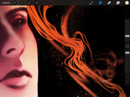
#this is a test panel for my color practicing
Explore tagged Tumblr posts
Visit Tumblr Blog
Explore Tumblr blogs with no restrictions, modern design and the best experience.
Last Seen Tumblr Blogs


Fun Fact
Tumblr was the first site to host the blog for President Barack Obama in 2011.
Text

Laura design dump
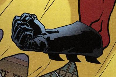
#art#carmilla#lesbian#vampire#sheridan le fanu#laura#carmilla book#carmilla 1872#gothic literature#lesbian vampire#don’t trust her that girl iS GÆ#this is a test panel for my color practicing
61 notes
·
View notes
Note
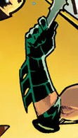
im tired of being called a ghostbuster. what color should i dye my flight suit? (currently desert tan/coyote brown)
So ultimately this is down to the purpose of your flight suit:
If your goal is to go undetected...
if your machine lands somewhere unexpected because you're a warfighter or an infiltrator you want british greens (left) if you're in milder climates like europe and darker green if you're in hotter/sweatier climates like the Americas, Asia or close to the equator.


2. If you expect to go down in an urban settlement or, you want gray.


If your goal is to be rescued after you go down (eg, you're civilian), you want bright colors
1. with oranges and reds (the least common colors in nature) being hyper-desirable, sometimes with hi-vis panelling.


2. or red: This is the same practice used by those who are in hostile spaces such as snow-drifts, often looking for people who are lost with red marking those who are searching or rescuing (akin to the red cross coloration associated with medicine).
Note the radar reflector (middle): this is often worn by civilian pilots as well as whose who would be rescued hiking, or searching for lost hikers, and is an ideal retrieval tool.


3. It is likewise, why most space flight-suits are bright orange (space shuttle, fighter & SR71 suits respectively.


4. There is then the SR71 flight suit, which is white and yellow, with under-portions of green. Its yellow to be highly visible, but the material is a NASA white, so the two combined make a golden yellow.
The point of the color is to signify something to others:

If you can mix the flight-suit with the right kind of vest and harness, it might be an idea to mix and match because you'll come to really satisfying combinations (as the white, brown, yellow and green does on the SR71 suit).
Climbing harnesses, support harnesses, vests, its your call. Usually its easiest to get accessories in dark or muted colors however.
There are also fixed color combinations, either by mixing different panels of the same fabric, or by using unusual colors (generally for test-teams, and for demonstration teams, such as the herritage squadrons, or the blue angels)


Look into the CWU series from Dupont to see who uses which.
So now we've gone from a question of which color, to which thing you want to communicate to others, since all of fashion is fashioned to signal and signify something to others.
Sorry that I didn't pick a color out for you, but I hope helps.
Do you need to be seen and rescue (red) or get rescued (orange), do you war-fight (green), do you warfight undetected (dark gray), or do you perform overwatch high above on the freezing edge of space?
Personally I'd go for dark green as a combatant, or dark gray but depending on the drape you get from the fabric you may want to look into other colors.
Likewise, if you want to stop being seen as a ghostbuster, you need to find patches which represent your values and adopt them in ways which break up the suit's purpose.
A flight-suit without patches or a jacket is often seen as incomplete, since it fundamentally is a jumpsuit until it is paired with a vest or a jacket most of the time.
Scroll down here for a list of patches. Remember that you should be attaching the patches to velcro sheets, and then attaching velcro to your jumpsuit akin to how it is attached standard on military equipment, instead of directly ironing them on unless you're displaying them on a jacket (which is seen as informal, but communicative).
Godspeed, pilot.
41 notes
·
View notes
Text

Found an art challenge template meme and put Guz into it!
I normally draw Guz from memory because... she's my own damn OC. To make it a little more interesting I did not use my color reference until the last drawing.
The second one--drawing with my left hand--was by far the most difficult. Agonizing. I could not do it with my drawing tablet at all, I had to draw it on my sketchbook, then digitize that. The coloring was done with my tablet and left hand though. The hair drip is on the wrong side on purpose.
For the closed-eyed one you can see a couple different test versions but i realized the only way I'd be able to make one I'd be happy with would be to simplify the hell out of it. I colored it with my eyes closed but only after opening them to look at the line art.
I honestly thought I'd do better on 1min timed. In order to make it not look like the odd one out, i also gave myself an additional minute to color it.
The mouse one wasn't too hard. I had a lot of practice doing art with a mouse before i got a tablet and it wasn't too hard to get back into it. It was waaaay easier than the left-handed one. This one was done all on a single layer, playing pretend that I was using ms paint or something.
For looking @ reference, I used the line-art and shading style of a panel from the first Guzcomic post, with the on-model colors from my Guz color reference image (can you tell they're sliiiightly different than all the others?), but matching the expression of the other ones. I added a background to it just to highlight the goo style, since the goo was done using multiple layers like i normally do whereas all of the other drawings use a single layer for their coloring.
Template:

#Eaurp Guz#Slimegirl#Slime girl#star trek#star trek lower decks#lower decks#fanart#original character#art challenge#art meme#challenge-challenge
22 notes
·
View notes
Text
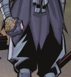
Shadow Tim (Reverse Robins)
So, a few very important things to keep in mind for Tim's iteration of the Shadow design:
Tim is taking it up as a tribute to Steph after her death.
Tim does not have a Moonbeam as his partner. (He was supposed to be the next Moonbeam, apprenticed under Cass, until shit went down.)
Tim lacks the fully context & perspective on Being Shadow that Steph & Damian had about it (but he's trying his best.)
To start with, Tim brings Shadow back to Damian's greyscale & gold color scheme, but with one critical difference: where Damian had pops of red, Tim uses very light touches of purple.


(Tim also keeps Steph's bat symbol, so here's a quickly thrown together contrast. Tim has no Moonbeam, so he gets no light/metallic accent on his bat symbol.)
The second major tribute is that Tim adds a cloak, specifically taken from Steph's original Spoiler design. Tim's version is black with a purple lining, and gold trim around the edge of the hood, calling back to both Steph's dual-tone hood & her hair. The cloak itself is ankle-length; not practical, but evocative & stylish.
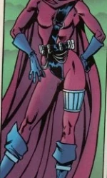
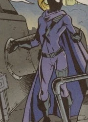
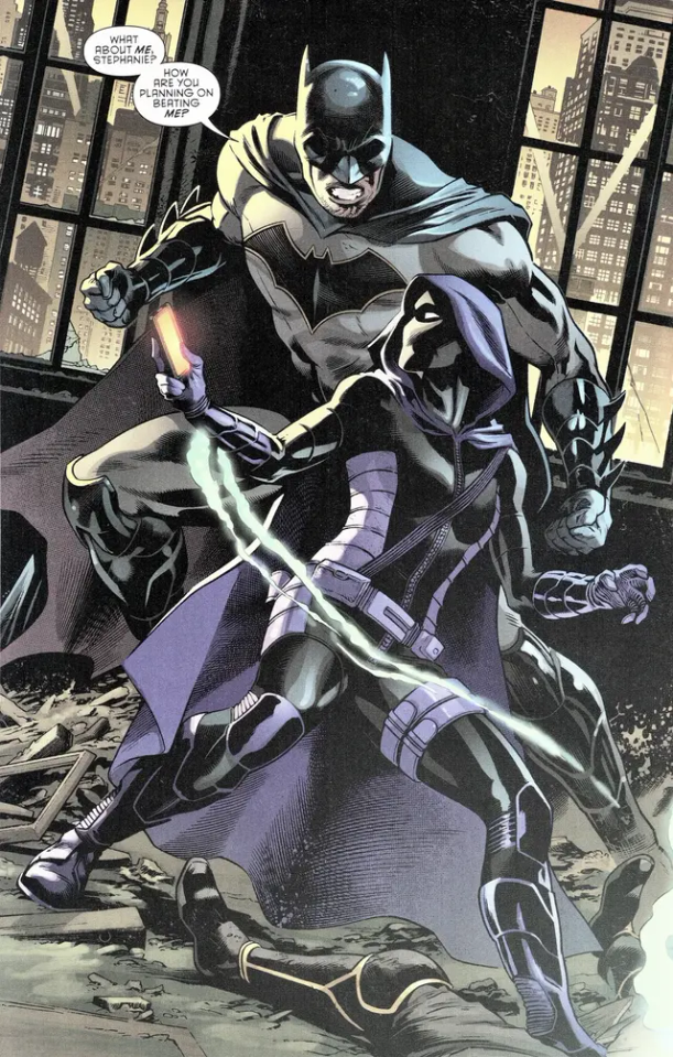
(So this style cape, and massive thanks to the Stephanie Brown Costume History page, y'all are lifesavers.)
Tim relies on the cloak to disguise his form, with the costume itself being much closer-fitted than previous iterations. The top is a black bulletproof vest with short sleeves added not dissimilar to his traditional Robin costume, but the weird stripes are actually places for him to tuck gadgets he expects to grab in a hurry.

(Basically this, but all one piece, with the Robin sleeves, and obviously lighter on detail to keep from being visually cluttered. No one wants to draw or look at all those lines & straps, or that little wheel-velcro-thing.)
Tim wears a dull grey chainmail body suit between his black undersuit & outer costume. It shows mainly on his arms, between the top sleeves & his gloves, but if his pants tore it'd be visible there too. The gloves themselves are his spiky gauntlets from more modern costumes, in black but with a gold hem at the very top to reflect the band on his hood (paying tribute to Steph's thick hems & blonde hair, while also bringing back Damian's color scheme.)

(These bad boys.)
Tim sticks with the neck gaiter Steph switched to, but does not keep the greasepaint. Instead, Tim has a headset styled after ski-goggles. He was originally designing it for becoming Moonbeam, hoping an AI scan of his opponents' moves would help him predict what they were going to do (allowing him to better mimic Duke & Cass's skillsets.) It's still a pretty rough prototype by the time Steph dies, but Tim's put a hell of a lot of work into it, he's not not going to field-test the thing, now is he?

(You meet the new Shadow, and this stares back at you from under the hood [lightly edited for appropriate drama])
Below the utility belt (grey with gold snaps/buckles,) Tim wears black heavy-duty cargo pants tucked into knee-high armored boots. The extra pockets even further emphasize that Tim is a character with a diverse set of skills and especially gadgets, and the slight puff caused by tucking not-entirely-fitted pants in at the knee calls back to Damian's "Infinite Frontier" outfit that inspired my original Shadow design.
(Not quite that puffy, but that would probably be down to the artist.)
For the boots, I do really like the ones Tim's been recently wearing in comics... mostly, at least. The ones on-panel have a little tabi toe-stripe most of the time, which either appears to be decorative (just a notch in front of the toe, which I don't like the look of) or does weird things to the depth (making his feet look flat.) Also, as someone who cannot even wear flip-flops without getting bloody blisters, it just looks uncomfortable to me. I really like the version Tim wore on that cover with Damian—the shape looks more comfortable, it looks like it has better grip & heavier armor, and looks like a shoe it'd really suck to get kicked by—but the stripes are nearly invisible, and the weird spike of armor above the knee is a bit much.


Combine the foot from the cover-boots with the shape & highlights from the panel-boots. Make the stripes & knee-pad border gold, and add a gold trim along the top edge of the green sole; the sole itself should be dark grey.
And that's Shadow Tim!
A little higher-tech to foreshadow his ascendance to Oracle, while also reflecting Tim's canonical love of weird gadgets through the ages.
Pays heavy tribute to Steph, but not in any way that'd be super-obvious if you weren't in-the-know, without directly ripping off her designs or looking so much like her that the other Bats could mistake Tim for Steph out of the corner of their eyes.
Pays light tribute to Damian, but aside from being a Shadow costume, Duke & Cass have about as much influence on the changes Tim makes (see: chainmail, glove style, face covering) as Damian does.
Misses a few important details of Shadow's design (see: no longer visible eyes, no more grease paint, dramatically changed silhouette) showing Tim wasn't prepared to step into this role but is doing his best anyway.
Extra armor & pockets shows that Tim's got even more protection than previous Shadows, hinting through design alone about the impact Steph's death had on the family.
Sticks to Tim's fashion tastes without going overboard.
Adds a cape for him to go swish.
I'm pretty happy with it!
#reverse!robins#reverse robins#reverse robins au#reverse order robins#reverse order batkids#reverse batkids#reverse batfam#reverse batfamily#batfamily#bat family#bat fam#batfam#batkids#bat kids#batbros#bat bros#bat brothers#bat siblings#batsiblings#tim drake#shadow!tim#timothy drake#costume design#my writing#mine
22 notes
·
View notes
Text
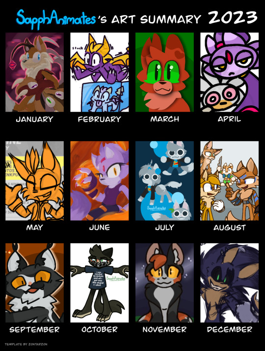
2023 Art Summary
I originally created my blog back in April, but I've decided to jump on the trend and share a compilation of some of my favorite works.
JANUARY
My first attempt at a digital painting style, featuring a character I don't believe I've introduced here before. A reimagining of the Tails Doll, with a Phantom Ruby twist: The Phantom Amalgamation (or Maggie, as my friends call them), made for Project Alacrity. I'll have to get around to redrawing them so they can have a proper introduction.
FEBUARY
Fanart for YouTube creator, Miharu the Fox. Whilst watching one of her streams, I asked what I should draw, with her co-host Marc suggesting that I should "Draw Spyro glitching into the abyss." Seeing that they were playing Spyro Enter the Dragonfly, it seemed only fitting. So I drew him shaking on top of a trapped baby dragon in ice.
MARCH
An attempt at a papercraft style using a tutorial by YouTube user, CariadsCoffee. The character pictured is Squirrelflight (or rather, Squirrelstar) from Warrior Cats, using my own design. Learning this method of drawing is what eventually led to me adopting the lineless style I use in many of my posts.
APRIL
Parody designs of Silver and Blaze, aptly dubbed Pothead and Lighter. They originate from a Sonic 06 parody comic for 4/20 that was written by my friend, @alzikeiswrong , and was illustrated in TuxPaint by me. Whether or not I decide to actually finish and post it is a mystery.
MAY
A post made as a gut reaction to discovering the amount of articulated parts the Jakks Pacific Tails Nine figure had. 70 points of articulation is ridiculous, but man is the figure amazing. I just wish he was to scale with the normal Tails figure.
JUNE
My second attempt at a digital painting, this time featuring Blaze the Cat. Manipulating the flames and how they interacted with Blaze and the background, was a fun challenge, as well as figuring out the textures and posing.
JULY
This is the point when I discovered my lineless style. Specifically the one I use when drawing my fursona, Sapph. Her design has developed a lot over the years, from being a Minecraft X Warrior Cats crossover OC, to slowly rounding out and becoming less Minecraft, gaining new design details in the process, to where she is now.
AUGUST
A drawing of multiple AU designs of Tails for Project Alacrity, socializing at some sort of get together. This was mainly a test to practice how to frame a drawing with multiple characters in it, as well as giving them each something to do. To show the differences between these various different versions of the same core character through their designs and how they interact with one another.
SEPTEMBER
One of the ask answers for my MommyClan cat's ask blog, @stepcousinclawspeaks . Stepcousinclaw was originally created for the fanclan in August, but this panel was one of my favorites. It shows his chaotic and often arsonistic side really well. I'll return to the blog soon for a big story update. Stay tuned!
OCTOBER
October brought with it the Sonic OC Showdown 2, which I had miraculously managed to get my Trace the Tasmanian to participate in. She passed the first round by a close call, but lost by a wide margin in the following. It was a good fight, with a good string of propaganda art coming from me and some of my supporters as a part of the campaign. Thank you all for supporting me while I was a part of it.
NOVEMBER
Whilst exploring through old files, I came across a template I saved. I used it to share the designs I made for various Warriors characters, some who I already had made designs for, and others I had to make up on the spot. One of my favorites was Spottedleaf. The balance of colors and details seem just right to me, as well as being a vast improvement from the color inaccurate one I had made as a ten year old.
DECEMBER
December's was fun. I haven't ever really had a "set style." Every time I try to revisit one specific design I always make something a bit off. Same can be said for this sketch style. I loved doing it. It felt the most accurate to how my art on paper feels as I draw it. Rough around the edges, but lifelike. Sadly I've had a hard time returning to it after dumping out all my thoughts around the 06 AU onto my screen. I've been working on it. There's more to see in the coming year, so I hope you'll stick with me to see how I can grow as a young artist!
Template is by @zontarzon !
#sapphanimates#sapph talks#art recap 2023#sonic the hedgehog#project alacrity#sonic au#trace the tasmanian devil#sonic oc showdown#warriors#warrior cats#spottedleaf#sonic oc#crypt the hedgehog#stepcousinclaw#mommyclan#miles tails prower#sapph ginger#tails nine#jakks pacific#blaze the cat#pothead and lighter#silver the hedgehog#phantom amalgamation#tails doll#spyro#squirrelflight#squirrelstar#spyro the dragon
17 notes
·
View notes
Note
hey!! Ik you’re probs a bit busy w these so no rush, but I’d like to request a match up for either mha or kny. My pronouns are she/her and I’m a female, either gender is fine by me!
For personality, Im have the ISFP type. I’m quite introverted, I hate speaking to strangers, or people in general. Crowds kinda scare me as well. I’m pretty shy and meeting new people is especially difficult for me. Im pretty funny (not my own words) and I love to draw, read, write, or anything with creativity tbh. I’m practically married to my Spotify, there’s barely any time you won’t see me without headphones. I get decent grades, but I do tend to get distracted very easily and I zone out a ton! I’m pretty outgoing once you get to know me, and I’m definitely a bit touch and attention starved. My aesthetic is sorta tomboyish ig. I’ve been told multiple times that I dress like I’m homeless lol. My favourite colour is navy blue.i hardly ever wear make up also, I’m just too lazy
I have shoulder length hair that’s sooo thick. It takes forever to brush and I can’t even shower properly w it. I like to dye my hair, and right now it’s purple at the ends with my natural roots (brown). My favourite season is fall just bc where I am we get stormy autumn’s, and I LOVE stormy weather. I usually go outside when it’s raining as well, I adore it.id definitely consider myself an insomniac as well, staying up to ungodly hours of the morning on the days before tests has proven that. It’s nonstop, I can’t remember a single night I went to bed before midnight. This means I also have hella dark under eyes 😭
thx for taking the time to look at this!
(also sry for the bad set up of the request, I rambled)
Demon Slayer/ Kimetsu no Yaiba
I match you with

Mitsuri Kanroji
Mitsuri can be nervous around crowds or people she doesn't know too, or at least she was. I know I saw either a fanart or a manga panel of her hiding in Rengoku’s haori somewhere and it was adorable. So she understands
I think she's gotten more comfortable and able to handle dealing with strangers better now, so she'll take the lead and keep the pressure off of you
She loves your humor and thinks you're hilarious
I think she's creative too, but of your interests she probably shares reading the most
She will give you all the affection you want😂 she's a sweetheart like that
She's not the kind to mind if you don't wear makeup or if dress “tomboyish” she just loves you for you
She'll love to help you take care of your hair, she knows a few things from taking care of her own long thick hair
She's has to stay up all night dealing with demons a lot herself, so she might be up to be there with you anyway
My Hero Academia
I match you with

Dabi/ Touya Todoroki
By nature he's pretty introverted and does not socialize…. Like at all
Your humor was surprising to him, as in he didn't really have anything to genuinely laugh about before you. Now he laughs all the time because of you. *its a small chuckle or maybe even a smirk/smile but a win is a win*
He's more destructive in nature, not creative, but I think over time your creativity rubs off on him
He's attention and affection starved too, unfortunately that means that at first he isn't used to it. But eventually you both get comfortable with each other and giving and receiving affection
He dresses a lot like you so win-win, you get to swap clothes
We've all seen the jokes about him being a hairstylist correct?😂 It would be in a different way than he normally does *through fire* but he would help you with your hair too. He really likes you're colorful hair
He likes rainy/stormy weather as well, so if you go out in it he will definitely join you
Does he ever sleep anyway?😭😭 He’ll more than likely be up along with you
But you guys can have your own special thing when that happens like playing cards or going for walks. Nice quality time
I truly believe Dabi could be good if given the love and affection he deserves so being with you just automatically makes him better
#demon slayer matchup#demon slayer#kimetsu no yaiba match up#kimetsu no yaiba#kny#mha matchup#my hero academia#bnha matchup#boku no hero academia#mitsuri kanroji#mha dabi#dabi#touya todoroki#demon slayer mitsuri
4 notes
·
View notes
Note
Hello, I am thrilled with your forgettable - au! But I thought it was a bit strange to ask this question on the blog where it's being released, so here I am. Do you have any tips on how to keep the quality of the pictures when you put up a post with a comic?
I apologize for my bad English. I'm using a translator
Ohhh It's nice getting asks over here too hehe
I think you mean how to keep up quality when posting the pages?
Gonna add a keep reading here because I'll probably talk a lot akshwk
In that case, my usual art style takes me a lot of time, so I had to develop something that was quicker
To keep up quality while also posting regularly you need to develop methods that help you go faster/skip parts of the process
Also know that sometimes it's gonna be ugly D: and that's okay
I think my pages look very bad when I'm at the lineart stage because I don't like doing lineart, but I need to because it makes the coloring process much faster
But usually when I color them they look fine! You need to trust the process and accept that not every page has to be perfect and that some panel are gonna be ugly (sometimes the angle won't make sense, sometimes the hand is drawn wrong, but usually people don't notice this!) , develop a style that looks good but that doesn't take that much time
I usually simplify things a lot <33 sometimes I make the hand a little ugly blob and people don't notice because I drew a good hand in another panel
For background I make them very messy and people won't really notice unless they zoom in
But honestly, it all comes down to practice! Before I started the oficial comic
I made a LOT of mini comic related to the AU, to help me test the waters and practice
I really recommend doing that!!!! Record your time and see how you usually do and see whqt takes you the longest, that way you can shorten your procces :D
Not super sure if this was what you meant... but I hope u find it useful
#dw about the english#it isn't my first lenguage either#honestly coloring and shading helps a lot#but I think the think that makes everything look great at the end is coloring the lineart akshekej#as long as I haven't colored the lineart things look kinda messy still#answered ask
5 notes
·
View notes
Text
Week 8 - November 1
When I started to think about prototyping, at first I thought I should have gone the digital route with me practicing some basic animation on Procreate. Honestly. So time consuming and did not feel so into it either. After some feedback, I was guided to look away from the digital and work on physical paper prototyping and testing out one of my other ideas, which was creating some sort of comforter or quilt. I created a VERY ROUGH first paper prototype, where I did a dozen squares (squares being a common shape/pattern on quilts) of different memories (heavily inspired by Faith Ringgold and her quilts). Some of these memories were drawn based on photos from things like my mom's Facebook, some were purely from memory or how I perceived that memory, and a couple were recreated drawings of my own old drawings from about second grade. Almost half of these include my younger sister, who I don't think I would've had as fun of a childhood without.
In order from top left to right:
from memory, being pushed on a swing by my grandmother, who taught us how to swing and have fun whenever she took us to the playground after school
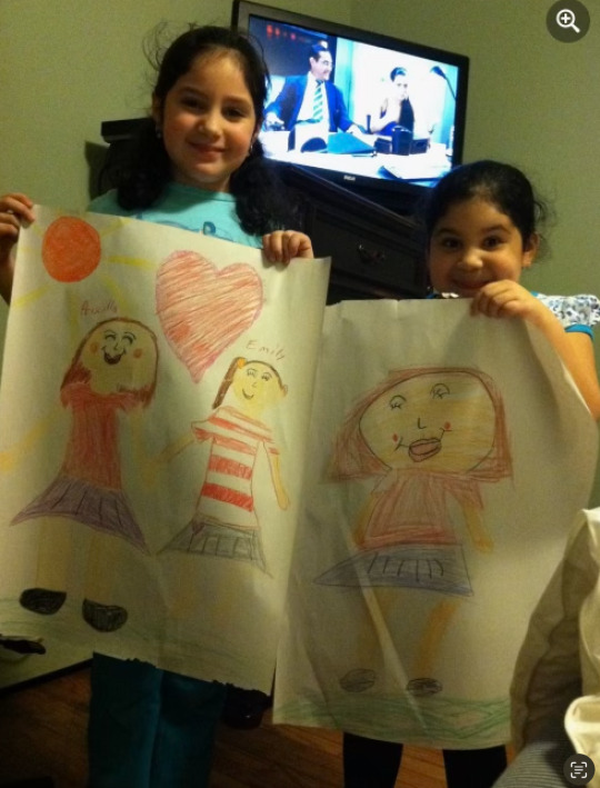
recreated drawing I made of my aunt and I (full photo below)
I suck at drawing people so this will be super fun when I possibly do some face drawings/paintings on future prototypes/final quilt, but this is from a young photo of my sister and I
from a photo, playing monopoly with family during Hurricane Sandy, where we had a power outage for almost 2 weeks
from memory, playing Just Dance with my sister
from memory, roasting marshmallows when we would go upstate to our grandfather's camper
recreated a drawing of a desert that I did in second grade
from a photo, me winning first place at the science fair
recreated an assignment/drawing from second grade
from memory, sort of a first person perspective of hopscotch; my grandfather loved buying us chalk to draw the hopscotch and anything else that came to mind
from a photo, making pizza from scratch with my sister
from memory, decorating the Christmas tree with my sister
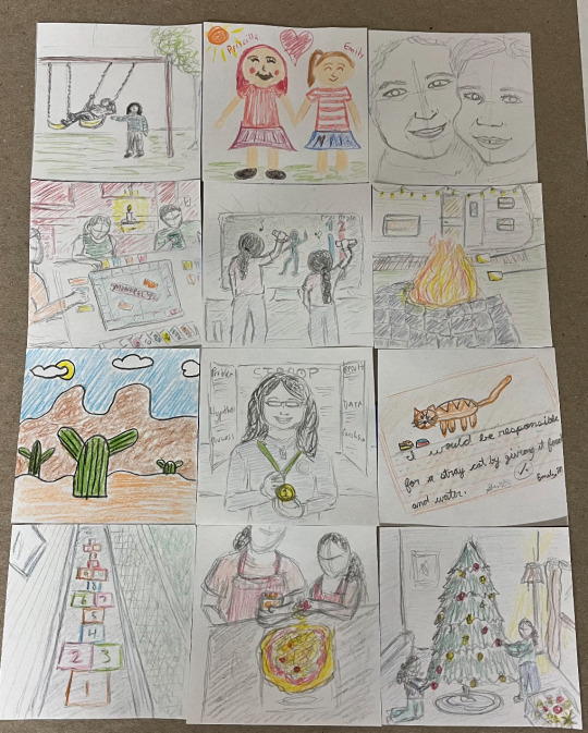
There's a lot that I want to do from this point on.
Of course, adding more memories; however I don't want them all (maybe any) to be super realistic (partially because I am not a pro at realism but can definitely try for some memories)
I want to test out different orders on how these memories are laid out on a quilt (how would this feel in a chronological/linear order, another random variation, mixing in solid color or patterned squares or keeping those only as a border for the quilt)
Abstracting some of these memories by using squares of different colors or significant patterns that relate to my childhood in some way (maybe they represent a person, a feeling)
Testing out how cropped these memories are on the square (do they reach the edge of the square, fade towards the edges, overall how much space does the memory take up? how much detail or coverage is really needed?)
What kind of text can I possibly include, if any?
This will probably not be something I do this week but maybe next week, but testing scale and materiality, like making one of these memories into an larger square on paper and/or on fabric (I did already buy fabric so I can test this)
What types of fabric or material overall can I use? Buttons? Sequins?
Overall, a lot to think about, but lots of ways that I can test things out and help me figure out how I want the final quilt to be in the future.
For this week, I'm going to try out how reorganizing the memories feel, add some more memories or work on solid color squares with patterns, and maybe try a larger scale square (we'll see).
Nancy also showed me this beautiful website of the many, many quilts that have been made in honor of those who lost their lives to AIDs. Hopefully this link takes you to the interactive quilt display:
My sister and I. I am obsessed with how proud she looks of her work.
2 notes
·
View notes
Text
Last Line Tag Game
Rules: In a new post, show the last line you wrote (or drew) and tag as many people as there are words (or however many you like).
Thank you @mathomhouse-e & @ginoehfor tagging me!!
So I was hoping I would be able to write some of my gothic romance dreamling! AU so I could share it with you all but alas...no time! adult life is cruel like that BUT I do have a couple of drawings so here:
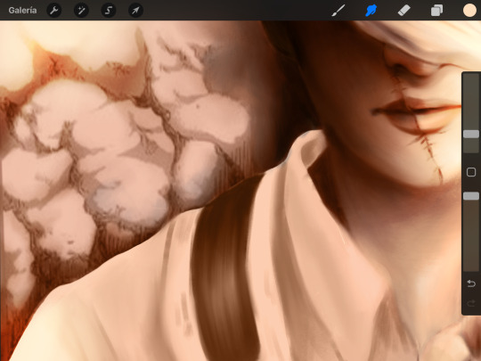
A redraw of Levi Ackerman's last panel in the AOT manga:
And my beloved Dream of the Endless:
Both of this are mostly done ( specially Dream's that one just needs a few details here and there) I've been using both of this as testing grounds for some cool color + lighting so I might be able to finish this under the guise of practice this week but we'll see.
I shall tag @virgo-dream @rainy-days-and-nights @wolfgirl-valentineand uhhhh whoever else wants to do it? I'm so bad at tagging people on top of my head, so sorry 😔 !!!
#tag games#thanks for the ask!#levi ackerman#dream of the endless#the sandman#attack on titan#cloudy rambles#cloudy illustrates
12 notes
·
View notes
Text
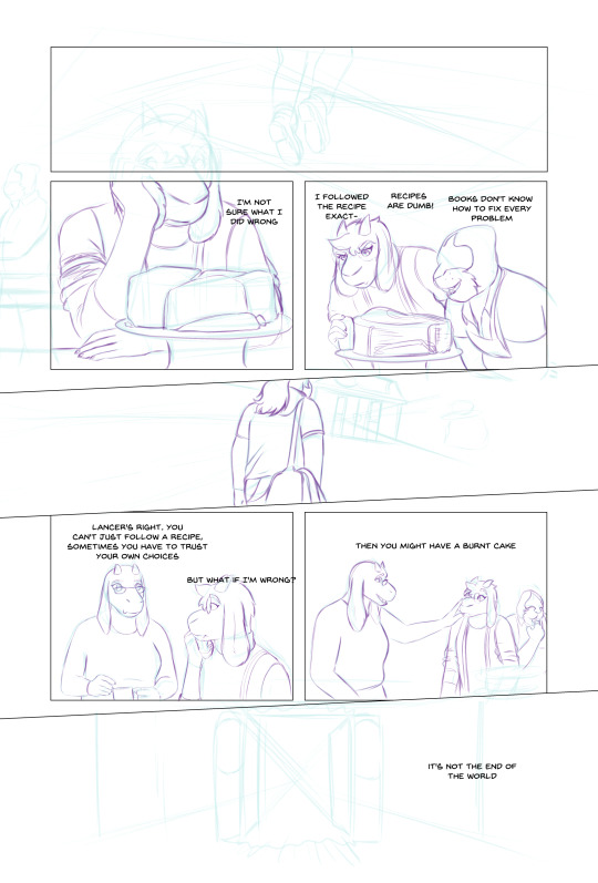
Looking Glasses Behind the Scenes #1
Here's a look at my process for building a comics page
Let's use Page 55 of Looking Glasses as an example
Roughs
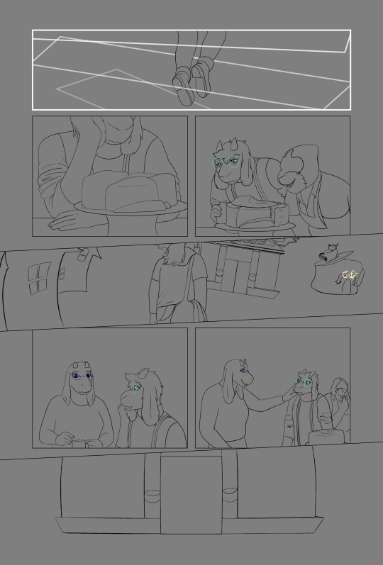
I start with a layout, roughly sketching scenes from my script, trying to puzzle out how they'll fit into panels on the page. I don't usually specify panel layouts in my scripts, I find it kind of hard to picture layouts until they're actually on the page. Here's my initial layout
You can see there are some major differences from the final product. I initially planned for Lancer to get his admissions letter in the background of this page, with no dialog, but I came to realize that it needed more space to breathe. It was harder to tell what was going on here and I wanted Lancer to get a moment with Toriel, so I ended up moving that scene to the previous page and scrapping most of these panels, although I reused some elements that I liked. After a round of revisions I got this:
Sketch Phase
From here I move my sketches around and test out panel borders until I find something I like, roughly place the text, then I refine the weaker sketches. This page went through so many versions that most of the roughs were pretty sketched out already, sometimes my roughs are practically just have stick figures.
I have strict rules about paneling Looking Glasses, which are pretty evident here. The Light world has exclusively gridded panels with gutters. For the dark world, panels aren't allowed to be rectilinear, they have to overlap with each other, and they're always full bleed. The space between the dark and light world literally uses panel borders to transform from one to the other (you can see how the shapes Susie is passing through in the final page are just transformed versions of the panel border)
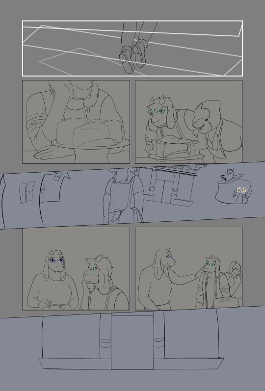
Inking
Next, I ink over my sketches. Sometimes I have to come back and re-draw something after this stage, but I try to keep from changing my inks after this.
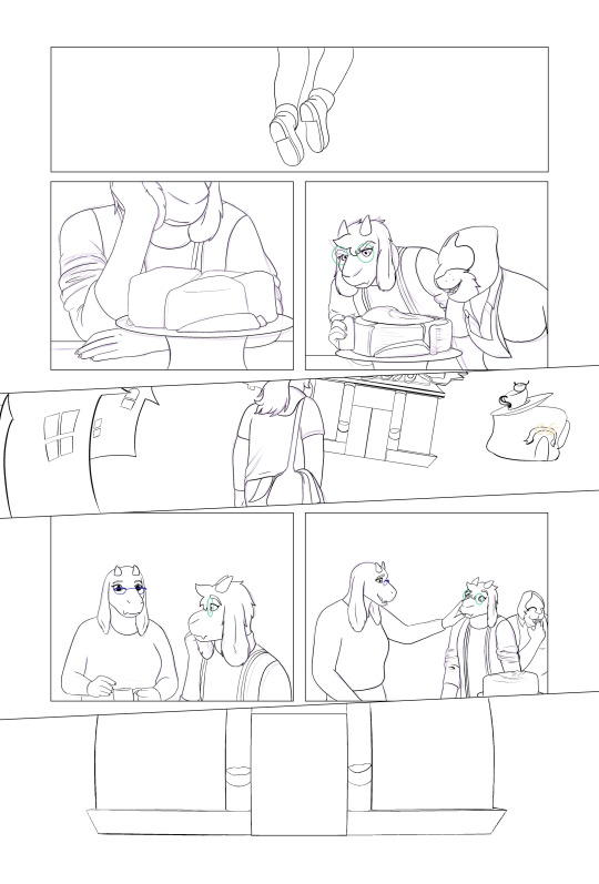
Flatting
Using the Close Area Fill tool in clip studio, I add flat colors to a layer behind my inks. My lineart is aliased, so I could just use a paint bucket, but I work professionally as a flatter, and I prefer the types of flats I get from the Close Area Fill.
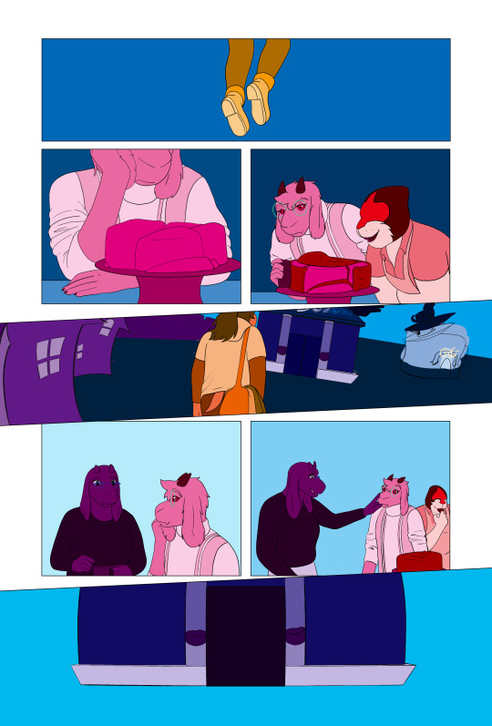
I flat my work in three stages. First I do the figures, making sure that I use the same colors for each repeated element, then I duplicate that layer and do any background elements. After this I flat the panel backgrounds separately. This allows me to select the figures or the panels quickly and easily during later steps.
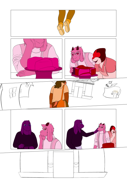
Coloring! (My favorite bit)


I duplicate my flats and merge them, use the paint bucket to drop the correct colors into place, and then do any detail work/painting/effects in a separate group.
Shading
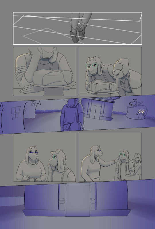
I like to shade over a neutral background, so I add a layer of grey under the lineart. Then I adjust the colors of each scene with a minor tint, to help unify my colors. Toriel's house is very orange, so I give it a little bit of extra warmth, where as the dark world is otherworldly and vibrant, so I push it towards blue. Then I render the work. Each location in looking glasses gets a different treatment. The dark world gets really strongly colored shadows, but because there's no light in the dark world I don't add highlights unless there's an obvious light source. The light world gets fully rendered (shadows, highlights, fill lights, rim lights, etc.) but I make sure to use desaturated colors. In the space between the dark and light worlds, I only shade with black shadows and white lights, it's also the only location that doesn't get a tint.
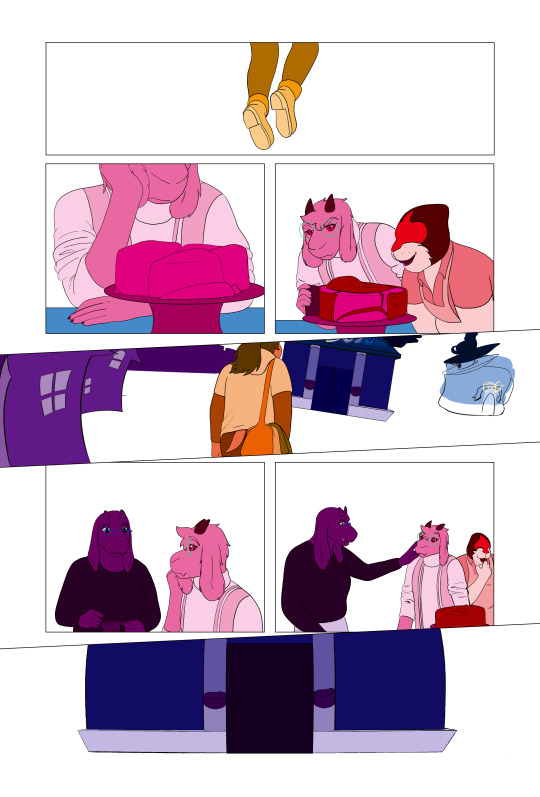
Finalizing


Lastly I finalize my dialog, which often goes through a couple of wording changes once it's on the page (You can see that happened here). Then I add my balloons, give them tails, and export the page.
And that's it!
#looking glasses#ferrousart#ferrouscomicscraft#I really wanted to do a breakdown of this page because of the three different visual styles#I know the “and then I color” step leaves a bit to be desired#maybe I'll do one of these just about my coloring process
17 notes
·
View notes
Text
Late 1890s Corset Part 4 - Flossing and Wrap Up
July 22, 2021
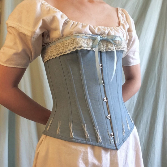
[Image ID: a neck-to-hips photo of Alex wearing a blue and ivory corset over a muslin shift.]
Part 1 - Research
Part 2 - Mockups
Part 3 - Construction
My 1890s corset is finally constructed and wearable, but it's not quite complete yet. It's time for some finishing touches!
Flossing
For the flossing, I used a silk buttonhole twist from B&T in a cream color that matches the lacing in the back and the lace I'll use to decorate the top edge of the corset later.
I started along the top edge of the boning with a simple crossed pattern, like these instructions from Sidney Eileen, but only doing two threads in each direction and... not going in the correct order. It turned out the same, so whatever I guess. My flossing here isn't perfect, but I wanted to get a feel for it in a place where I could cover my mistakes.
Should I have just done a test on some scrap fabric? Yes! Did I just jump in with no practice instead? Also yes!
While I do like the simplicity of the flossing design I used along the top, I wanted something a bit prettier for the bottom edge, since it'll be exposed.
I found this flossing design from 'Bridges on the Body,' a corset-sewing blog, and fell in love with it. (Seen on the far right in the photo at the end of the post.) I was afraid the design would be difficult, but it's really deceptively easy. I even followed the directions this time! It took a few attempts to get it perfect - figuring out the spacing and whathaveyou - but I had really nailed it by bone #5. (I have to say that it also looks really nice with fewer crisscrosses, too.)
I used a slightly altered version for the bones on either side of the lacing, and yet another variation on the busk. (The left two and second-to-right designs in the photo at the bottom.)
Lace
With the flossing done, I could attach some lace! In my stash I had a cream-colored, two-layered lace that had holes for ribbon along the top. I attached it using small, spaced-out stitches, with the more solid part of the lace (under the lacing holes) lined up right under the edge of the binding.
I found quarter-inch grosgrain ribbon in a similar shade of blue to the corset and threaded it through the lace. I secured the end to the binding at the lacing panels, and tacked the ribbon at a few more points to keep it upright. I left ribbon tails at the busk so I can tie a bow at the center front when I'm wearing the corset.
And then I was done! Completely, finally, 100% done.
Final Thoughts
I thought sewing a corset would be really difficult and take me all year to do, but it didn't. I started back in January and finished in June, and that includes long periods of inactivity. It's not perfect by a long shot, but I'm proud of my work and I've learned a lot.
This project was kind of expensive, though (at least by my standards). All told, I spent about $77 on this project. I could have saved a few dollars if I didn't buy way too much fabric (3 yards when I could have gotten 1.5 yards and still had extra) and an extra spool of thread, or if I opted for cotton embroidery floss instead of silk buttonhole thread. But I also could have spent a lot more if I had splurged on coutil instead of canvas. I'm doing a lot of stash-bushing this year, so I had room in my sewing budget.
So, what's next? While I do have some more late-Victorian projects planned (like combinations, a corset cover, padding/"enhancers", etc...), I'm headed back into the Regency for a while to do some stash busting and expand my wardrobe a bit. I also have a few small one-off, non-historical projects that need my attention too.
Stay warm. Stay safe. Stay healthy.

[Image ID: a detail photo of four flossed areas of the corset, done in ivory silk thread on dusty blue canvas. The two on the right are on either side of the lacing, the third one is the bottom of the busk, and the last one on the left is an example of the flossing at the bottom of most bones.]
3 notes
·
View notes
Text
I did get my shit together. Like 4 times.
Every time I get my shit together someone else comes along and fucks up my shit.
I'm not going to get my shit together again unless I get to
1. Find everyone who ever did that to me and charge them $500,000 over a period of 4 years in evenly distributed chunks which pay out on the first of each month via direct deposit.
2. Recieve a public apology from Chappell Roan which mentions me by name and explains what she did and who put her up to it, full legal rights to all her songs and merch and all profit from them, and a legally binding contract from her that she will dye her hair a color other than red and never be photographed in public with red hair or brown lipstick ever again. I will them use the money to contract deleteme.com to scrub all reference to her from the entire internet forever.
3. My mother, Gale Tousignant, is placed on house arrest on an ankle bracelet and is not allowed to be around children in the future.
4. The government creates a committee for the investigation of munchausen by proxy of psychiatrist that investigates the psychiatric community.
5. Churches are required to pay taxes on tithes and on any income from owning businesses and real estate.
6. The US government decriminalizes and supports the sale of drug safety tests for drug users.
7. All laws against pornography are repealed.
8. All citizens over the age of 18 are entitled to any form of birth control including condoms and abortion for free.
9. All minor children are given a ubi
10. Men who pay child support have their payment amount automatically adjusted based on their withholding amount.
11. People under the age of 26 automatically qualify for food stamps
12. University education is free for everyone
13. 25 dollar an hour minimum wage
14. Strict labor laws are made on the entire usa to prevent abusive scheduling practices at hourly wage jobs.
15. The labor board does an investigation into coercion to quit or incitement to make mistakes with the intention of creating a fake paper trail to fire people in jobs as a form of discrimination or retaliation
16. Unemployment is the same rate as whatever someone was paid at and it lasts 99 weeks for any adult after a layoff
17. The government regulates the job application process to prevent ghost jobs, require a set salary or hourly wage be written in the add and not a range, and make job interviews illegal (literally illegal, if someone's skills and references check out you don't need to subject them to a test based on subconscious biases and privilege.)
18. Capital gains tax
19. The government will limit the number of rental properties someone can own to 3, and the number of single family homes someone can own to 3.
20. Immediate dissolution of laws that prevent people with yards from using them to grow vegetables or farm chickens
21. Government program that reimburses the full cost of putting solar panels on any building.
22. Government program that requires any business which owns more than 4 locations with a flat roof or makes more than 1 billion annually to put solar panels on the roofs of all their buildings.
23. Government buyback program of power people don't use from their solar panels.
24. No fault divorce is not to be touched.
26. An organization designs an app that allows any citizen to make a living will, a will, prenuptial agreement, model release for use on social media, or a contract to be used which which is designed to be something like a prenuptial agreement for roommates to protect them with splitting bills and lease and so on, with common situations to create boilerplate style more or less correct documents that can be witnessed by an attorney or verified by a notary public and signed. A good faith effort is used to allow the app to make suggestions and help with common disputes and legal situations people have in these cases in the way that a real attorney would, so that even though the contracts can still be challenged and can't demand either party to break the law, the average person can create documents that help them with these situations effectively.
27. When a generic product is produced in the same factory as a more expensive name brand product using the same ingredient, a law requires a specific label on the front which makes it easy for consumers to identify in grocery stores.
28. A team of forensic accountants is hired to testify before congress every year on live TV explaining how tax planning works to take advantage of loopholes.
30. An awareness campaign about sexual abuse from women against women, including "enforced modesty" as abuse and grooming
31. The tax on inheritance is immediately tripled.
32. A bot net is created to link statistics about nepotism and inherited wealth and class mobility on any hint of meritocracy propaganda online.
33. EL James is sued for damages and loses all profits from the sale of her work for grooming and entrapment of women in financially abusive relationships.
Idk. I still think I just wanna die.

45K notes
·
View notes
Text
Ultimate Phlebotomy Tubes Chart: Your Essential Guide to Blood Collection Colors & Uses
Ultimate Phlebotomy Tubes Chart: Your Essential Guide to Blood Collection Colors & Uses
Welcome to your ultimate guide on phlebotomy tubes! If you’re in the medical field or just curious about blood collection, understanding the different types of phlebotomy tubes, their colors, and their specific uses is crucial. This comprehensive article covers everything you need to know, along with practical tips, benefits, and more! Let’s dive in.
What Are Phlebotomy Tubes?
Phlebotomy tubes are specialized containers used to collect and store blood samples for various laboratory tests. The color-coded caps on these tubes indicate the type of additive inside, which can affect the blood chemistry and the test results.
Why Color-Coding Matters
The color of the phlebotomy tube cap is not just for aesthetics; it serves an essential function in laboratory diagnostics:
Prevent Contamination: Different additives avoid chemical reactions.
Streamline Testing: Ensure the right test is matched with the right tube.
Improve Accuracy: Helps healthcare professionals avoid mistakes in specimen collection.
Your Essential Phlebotomy Tubes Chart
Tube Color
Additive
Common Uses
Red
No additive (glass) or gel (plastic)
Serology tests, blood bank
Gold
Gel separator
Serum tests, biochemistry assays
Light Green
Li Heparin
Plasma tests, glucose, lactate
Dark Green
Na Heparin
Plasma tests, chemistry panels
Lavender
EDTA
Complete blood count, blood films
Gray
Sodium Fluoride
Glucose tolerance tests, lactic acid
Blue
Sodium citrate
Coagulation tests, PT, aPTT
Benefits of Understanding Phlebotomy Tubes
Having a solid grasp of the different types of phlebotomy tubes can led to numerous benefits:
Enhanced Patient Safety: Reduces the risk of incorrect sample collection.
Improved Efficiency: Quicker sample processing times in laboratories.
Accurate Diagnostics: Ensures the right tests are performed on the right samples.
Practical Tips for Blood Collection
To ensure quality blood collection processes, keep these pointers in mind:
Use the Right tube: always select the appropriate tube based on the test.
Fill to the line: Avoid under or overfilling the tubes.
Mix Properly: Gently invert tubes with additives to ensure a thorough mix.
Label Promptly: Clearly label each sample as soon as it’s collected.
First-Hand Experience: A Day in the Life of a Phlebotomist
As a phlebotomist,I often emphasize the importance of correctly using phlebotomy tubes during my daily routines. One memorable experience involved a patient who had a history of tough veins. Properly selecting a light green tube for their plasma sample ensured a smoother experience and accurate results. These moments reinforce the need for meticulous protocol adherence in the blood collection process.
Case Studies: Importance of Tube Selection
Hear are a couple of brief case studies that illustrate the importance of using the correct tubular collection.
Case Study 1: Misdiagnosis due to Incorrect Tube
A patient required a glucose test but was inadvertently given a lavender tube. The EDTA in the tube interfered with glucose stability, leading to a misdiagnosis that required further testing and intervention. this demonstrated the urgency of proper tube selection.
Case Study 2: Successful Blood Collection
In another case, a patient with clotting issues was carefully assessed, and a blue tube was chosen for a coagulation test.The sodium citrate additive ensured accurate results, saving time and preventing complications in patient care.
Conclusion
Understanding the ultimate phlebotomy tubes chart is essential for anyone involved in blood collection and testing. By familiarizing yourself with the various tube colors, their additives, and common uses, you enhance not only your professional skills but also patient care outcomes. Whether you are a seasoned phlebotomist or just starting, this knowledge is a vital pillar in effective healthcare practices.
With the tips and insights provided in this guide, you can confidently navigate the world of phlebotomy tubes and ensure that your blood collection processes are safe, accurate, and efficient. Happy collecting!
This article is structured, informative, and incorporates SEO best practices to optimize visibility in search engine results.
youtube
https://phlebotomyschoolsonline.org/ultimate-phlebotomy-tubes-chart-your-essential-guide-to-blood-collection-colors-uses/
0 notes
Text
Mastering Phlebotomy Tube Colors: Your Essential Guide to Blood Sample Collection
Mastering Phlebotomy Tube Colors: Your Essential Guide to Blood Sample Collection
Phlebotomy is a critical skill in the healthcare industry, and understanding the meaning of phlebotomy tube colors can make a critically important difference in effective blood sample collection. In this detailed guide, we will explore the different types of phlebotomy tubes, their associated colors, and the specific tests they are used for.
Understanding Phlebotomy Tube Colors
Phlebotomy tubes come in various colors, each indicating a specific additive used for blood testing. Using the correct tube is crucial for obtaining valid test results.Below you will find a breakdown of common phlebotomy tube colors and their intended uses.
Tube Color
Additive
Common Tests
Red
No additive
sera, blood bank tests
Light Blue
Sodium citrate
PT, APTT
Gold
Gel separator
Comprehensive metabolic panel
Green
Sodium heparin
Plasma tests, chemistry tests
Lavender
EDTA
CBC, blood smears
Gray
Sodium fluoride
Glucose, lactic acid
Benefits of Understanding Tube Colors
Having in-depth knowledge of phlebotomy tube colors can provide several advantages:
Accuracy: The right tube ensures test reliability and correctness.
Efficiency: Proper selection minimizes the risk of retesting due to incorrect tubes.
Professionalism: A phlebotomist’s skill in tube selection reflects their competence.
Practical Tips for Blood Sample Collection
Collecting blood samples requires careful technique and adherence to best practices. Below are some practical tips to ensure successful phlebotomy:
Prepare Your Materials: Have the correct tubes, needles, and supplies ready before beginning.
Patient Identification: Always verify the patient’s identification to avoid errors.
Order of Draw: Follow the standard order of draw to prevent cross-contamination.
use Proper Technique: Ensure the site is clean, and apply mild pressure on the site post-collection.
Case Study: Real-World Application of Tube Color Knowledge
In a hospital setting, a phlebotomist collected a CBC and a chemistry panel from a single patient. Understanding tube colors, he utilized a lavender tube for the CBC and a gold tube for the chemistry panel, ensuring that the samples would not cross-contaminate and interfere with lab results.
First-Hand Experience: What It’s Like to Work with Phlebotomy Tube Colors
Working as a phlebotomist, I quickly learned that mastering phlebotomy tube colors was essential to my role. I once encountered a patient with multiple tests ordered, and my knowledge allowed me to confidently select the appropriate tubes. This not only streamlined the process but also built trust with the patient, knowing their samples were handled accurately.
Conclusion
Mastering the various phlebotomy tube colors is critical for any phlebotomist or healthcare professional engaged in blood sample collection. With the knowledge you’ve gained from this guide, you can ensure accurate testing, improve patient care, and maintain a high level of professionalism in your practice. Remember, the right tube choice enhances the reliability of test results – and that ultimately contributes to better patient outcomes.
youtube
https://phlebotomytechnicianprogram.org/mastering-phlebotomy-tube-colors-your-essential-guide-to-blood-sample-collection/
0 notes
Text
Important Guide to Phlebotomy Test Tubes: Types, Uses, and Best Practices
Essential Guide to Phlebotomy Test Tubes: types, Uses, and Best Practices
Essential Guide to Phlebotomy Test Tubes: Types, Uses, and Best Practices
Phlebotomy plays a critical role in healthcare, allowing for the collection of blood samples for diagnostic testing. One of the key components of a successful blood draw is the type of test tube used. In this essential guide, we will delve into the various types of phlebotomy test tubes, their uses, best practices, and other crucial information to help healthcare professionals perform their duties effectively.
Understanding Phlebotomy Test Tubes
Phlebotomy test tubes are specially designed containers that collect blood samples for laboratory testing. They come in different sizes, colors, and biochemical properties, each serving specific testing purposes. Different additives can influence the sample’s integrity and analytical performance.
Types of Phlebotomy Test Tubes
Here’s a breakdown of the most common types of phlebotomy test tubes along with their specific uses:
Tube Colour
Additive
Main Uses
Red
No additive
Serum tests, blood bank
Gold
Gel separator & clot activator
Serum tests, chemistry panels
Light blue
Sodium citrate
Coagulation studies (PT, PTT)
Green
Sodium heparin
Plasma tests, chemistry
lavender
EDTA
Complete blood counts (CBC), blood smears
Gray
Potassium oxalate & sodium fluoride
Glucose tests, lactic acid levels
Uses of Phlebotomy Test Tubes
Each type of test tube has specific uses based on the additive contained within. Here’s a closer look:
Red Tubes: Ideal for serology tests and blood bank collections.
Gold Tubes: Used for various serum chemistry tests and provide faster results due to clot activator.
Light Blue Tubes: Primarily employed in coagulation studies,crucial for diagnosing bleeding disorders.
Green Tubes: Frequently used for plasma tests, especially in chemical analyses.
Lavender tubes: Essential for hematological tests, including complete blood counts, which assess overall health.
Gray Tubes: These are important in glucose testing due to their specific additives that prevent glycolysis.
Benefits of Using the Correct phlebotomy Test Tubes
Choosing the appropriate phlebotomy test tube is crucial for accurate test results.Some benefits include:
Improved accuracy: The right tube prevents contamination and ensures the integrity of the specimen.
Efficient Testing: With the proper additives, processing is more efficient and time-effective.
Reduced Errors: Using specific tubes for different tests minimizes the risk of inaccurate results.
Best Practices for Phlebotomy
Whether you are a phlebotomist or a healthcare professional involved in blood collection, adhering to best practices is essential for both patient safety and testing accuracy. Consider the following:
1. Correct Tube Selection
Always choose the correct tube based on the tests ordered to prevent unnecessary delays and complications.
2. Proper Labeling
Ensure all test tubes are labeled at the time of collection with the patient’s information, date, and time of collection.
3. Patient Planning
Inform patients about any necessary preparations before blood collection, such as fasting requirements for specific tests.
4.Use of Standard Techniques
Follow standardized procedures for blood collection to reduce the risk of errors and ensure patient safety.
5. regular Training and Updates
Frequent training sessions help phlebotomists stay current with the best practices and any changes in guidelines.
First-Hand Experience: A phlebotomist’s Insight
As a practicing phlebotomist, I have encountered various challenges and learning experiences throughout my career. One particular incident stands out where I mistakenly used a green tube when a lavender tube was required. This misstep delayed the patient’s diagnosis considerably, reminding me of the importance of tube selection. by sharing my experiences, I hope to encourage my peers to be vigilant in their practices.
Case studies
Here are two brief case studies illustrating the importance of phlebotomy test tube selection:
case Study 1: Incorrect Tube Choice
A patient had a coagulation test ordered, but the phlebotomist inadvertently used a red tube rather of a light blue tube. The result was a non-diagnostic sample that delayed treatment. This underscores the necessity for a thorough understanding of test tube applications.
Case Study 2: Training Impact
After attending a workshop on phlebotomy best practices, one clinic saw a 30% reduction in sample rejection rates due to improper tube use. Regular training proved effective in enhancing staff knowledge and patient outcomes.
Practical Tips for Phlebotomists
Here are some practical tips to ensure success in phlebotomy procedures:
Always double-check test orders against the tube color codes.
Keep a color-coded reference guide handy in the laboratory.
Communicate effectively with patients to ease their anxiety about the procedure.
Utilize safety equipment properly to maintain a sterile environment.
Conclusion
Understanding the essential role of phlebotomy test tubes in blood collection is paramount for healthcare professionals. By selecting the right tubes, following best practices, and maintaining a commitment to ongoing training, phlebotomists can improve diagnostic outcomes and patient care. Investing a little time in understanding test tubes enhances the accuracy of tests and ultimately benefits the healthcare system.
Stay informed, practice diligently, and always prioritize patient safety.
youtube
https://phlebotomytechnicianschools.net/important-guide-to-phlebotomy-test-tubes-types-uses-and-best-practices/
0 notes
Text
Mastering the Essentials: Your Complete Guide to Ordering Phlebotomy Tubes
Mastering the Essentials: Your Complete Guide to Ordering Phlebotomy Tubes
Phlebotomy plays a crucial role in healthcare, serving as the bridge between diagnosis and treatment. One of the essential components of this process is understanding how to correctly order phlebotomy tubes. Whether you’re a seasoned phlebotomist or just starting your career, mastering the essentials of phlebotomy tube ordering can significantly impact patient care.
Understanding Phlebotomy Tubes
Before diving into ordering phlebotomy tubes, let’s first understand what they are. Phlebotomy tubes are specialized vacuum containers designed to collect blood samples for laboratory analysis. These tubes come in various types, each containing different additives that help preserve the blood and facilitate various tests.
Common Types of Phlebotomy Tubes
Tube Color
Additive
Common Tests
Clear
No Additive
Discard Tube
Red
None
SeroLOGY, Hepatitis
Gold (SST)
Silica Clot Activator
Comprehensive Metabolic Panel
Lavender
EDTA
Complete Blood Count (CBC)
Light Blue
Sodium Citrate
Coagulation Studies
Green
Heparin
Plasma Tests
How to Order Phlebotomy Tubes
Ordering phlebotomy tubes effectively requires knowledge of your testing needs, inventory management, and supplier relations. Here’s how you can streamline this process:
1. Identify Your Needs
Assess the type of tests you routinely perform.
Evaluate the volume of blood required for each test.
Understand which additives are necessary based on your laboratory protocols.
2. Choose the Right Suppliers
Select reputable suppliers who offer guaranteed quality and reliability. Build a relationship with them for better pricing and priority service during urgent situations.
3. Manage Inventory Wisely
Implement a first-in, first-out (FIFO) inventory system to avoid expired tubes.
Regularly check stock levels and trends in tube usage.
Utilize automated inventory management software to streamline reordering processes.
The Importance of Proper Tube Selection
Choosing the correct tube is vital. Incorrect tube selection can lead to sample contamination, inaccurate results, or even retesting, killing productivity and wasting valuable time. Here are some benefits of properly selecting your phlebotomy tubes:
Ensures accurate laboratory results.
Reduces the risk of patient discomfort by minimizing retakes.
Saves time and resources in busy healthcare environments.
Practical Tips for Optimal Ordering
Optimizing your ordering process can make a significant difference. Consider the following practical tips:
Establish a regular ordering schedule based on usage data.
Conveniently label all tubes for quick identification.
Communicate with the lab frequently to stay updated on any changes in protocol or required tube types.
Real-Life Experiences and Case Studies
Many healthcare professionals have streamlined their phlebotomy processes by implementing these tips. For example, a local hospital reduced sample rejection rates by 30% after enhancing their training programs on proper tube selection and ordering processes.
A Phlebotomist’s Perspective
“Initially, it was overwhelming to manage different tube types and their uses. Once I started using a color-coding system and tracking my orders, things became much more manageable. My error rate decreased, leading to better outcomes for patients.” – Jamie, Lead Phlebotomist
Conclusion
Ordering phlebotomy tubes might seem straightforward, but it’s a critical aspect of patient care that merits careful attention. By understanding the types of tubes, knowing how to order efficiently, and implementing best practices, you can significantly improve your workflow and the quality of patient testing. Master these essentials today and elevate your phlebotomy processes for better healthcare outcomes.
youtube
https://phlebotomytechnicianschools.org/mastering-the-essentials-your-complete-guide-to-ordering-phlebotomy-tubes/
0 notes