#these are your keyboard shortcuts how do you not have them all
Explore tagged Tumblr posts
Visit Tumblr Blog
Explore Tumblr blogs with no restrictions, modern design and the best experience.
Last Seen Tumblr Blogs


Fun Fact
Forty percent of Tumblr users are between the ages of 18 to 25.
Text
if you’re gonna cheat on an online test you gotta throw at least one or two answers so it doesn’t seem suspicious. and by throw i mean organically mess up because either you didn’t bother doing enough research online to actually find that answer or an authoritative website that should’ve had it all failed you i guess
#peach rambles#listen. why does the adobe suite website not have these answers#these are your keyboard shortcuts how do you not have them all
27 notes
·
View notes
Text
Tumblr Hack Week, January 2024 Edition
Once again it was Hack Week (more than just a day!) at Tumblr! This is getting repetitive in the best way. A couple of times per year we slow down our normal work and spend a week working on scratching a personal itch or features we want as user and see how far we can get with our hacks. One thing from the last Hack Week in September made it all the way to a new experiment out to some testers: Tumblr Patio!
Here are some of the projects that got built for our most recent Hack Week in January. Some of these things you may also end up seeing on the site…
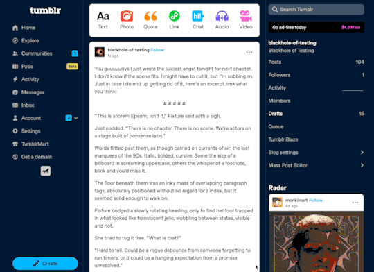
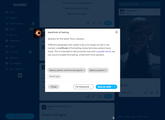
Spoiler text, spoiler blocks, and centered text!
This one is so obvious and amazing, it’s wild we don’t already have it. For Hack Week, Katie added the ability to select text in a paragraph to be hidden behind a wall of black that can be revealed with a tap. This can be super useful to hide spoilers. And even better: whole spoiler blocks. And while we’re here, the ability to center text!
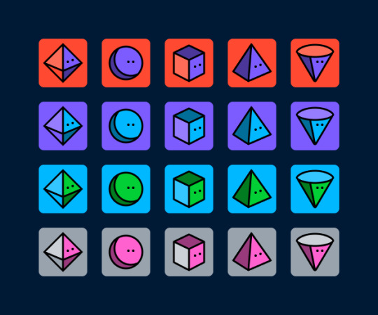
A plethora of new default blog avatars
We haven’t updated our default avatars in several years. (Some of you may remember this one from 10+ years ago.) They’re feeling a bit stale to us, so why not update them? And while we’re at it… make a ton more variations! Paul from the Tumblr Design team came up with a suite of new default avatars, using our latest Tumblr color palette. Here’s a look at some of them, but there are actually many dozens more using different colors:
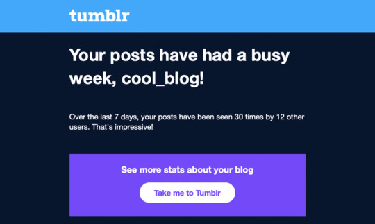
Notifications and emails about engagement on your posts
This one is for the folks on Tumblr who love numbers and their Activity page. Daniel, @jesseatblr, and the Feeds & Machine Learning team worked on some new notifications and emails we could send out to people about how their posts have been doing lately on the platform, such as how many views they’ve gotten, and by how many people. We already have this available (and more) when you Blaze a post, but why not open it up to more people? It’s really useful to the folks who use Tumblr to help build an audience for their work!
A new way of navigating the web: the Command Palette
Some apps we use a lot have a “command palette” accessible via a keyboard shortcut for quick keyboard-driven access to different parts of the platform. For example, Slack and Discord have Command + K to access their quick switchers to hop around conversations. What if Tumblr had one? Kelly and Paul built one! Press Command/Control + K on Tumblr and you can use your keyboard to jump to your blog, Activity, your recent conversations, search, dozens of places!
As always, stay tuned to the @changes blog to see if any of these hacks make it on Tumblr for real!
2K notes
·
View notes
Note
I know you generally work fast but I'm curious on how long on average it takes for you to get out a page of ThUG? I haven't had the opportunity to read it yet (it looks SO good) but I'm making the assumption a page is the size of an average print comic style versus webtoon scroll episode length format. Also curious on what short cuts you might take to get them out faster/more efficiently. I'm currently planning a comic in a similar format and am trying to plan my process ahead.
Thank you!
I don't do whole pages in one go (I do all the thumbnails then all the lineart then all the colour) so it's hard to tell exactly how long but maybe around 3-6h per page? Which makes a chapter (25-30 ish pages) take around 150 ish hours. I definitely prefer this to the webtoon format for a number of reasons, one of which being the satisfaction you get seeing a bunch of panels come together versus having to scroll through them separately.
In terms of speed, my entire process is pretty optimised for it, both in comics and outside. I stick to an A5 format and downsize it further (I tend to work with pages at 1000px width and 300dpi) to keep myself from overworking details. If an eye closeup feels tiring to get right or loses proportion, my resolution is too high
I also use textured brushes and leave the lineart more like a clean sketch, which allows me to not only skip straight from thumbnails to it but also to skip work on backgrounds, objects and figures at a certain distance
The main point of comic work is to convey emotions, movement, etc, not to draw everything accurate all the time, and that's probably the biggest lesson I've learned over the past years. You want your art to evolve in a way that means even without a lot of shading/linework/detail the scene gets properly conveyed, imo
Aside from that, I skip work on SFX and just. Write the sounds down or sketch motion lines as basic as they get. That's a stylistic choice but it works for me. And I have a workspace + automated actions + keyboard shortcuts that are all sort of optimised to make me move as little as possible between tasks and screens etc
255 notes
·
View notes
Text
Transferring your Kindle library to calibre: The Easiest Way
For people who are trying to get their Amazon Kindle libraries imported into calibre, this is the easiest method I have found.
Pros:
easy if your entire library fits on your Kindle
Faster and less clicking than manually downloading each book onto your computer from the Amazon website and then importing it into calibre
It allows you to import "Docs" from your Amazon Digital Content as well as "Books"
Does not require you to understand coding language or how to use scripts
This method should continue to work after February 26th (when Amazon will no longer allow manual downloads from its website to your computer)
Cons:
you have to use whispersync (only a con if you can't use or are opposed to using whispersync)
Doesn't work if you don't own a Kindle
These instructions are for the latest edition of calibre in Windows, but it works similarly on Mac (typos ahead because I am dictating this and my dictation does not spell calibre nor many other things correctly):
On your Kindle:
Download every Book and Doc you have stored in the Kindle cloud. You have to do this one at a time so it's boring, I did it while watching TV and listening to podcasts.
On your desktop:
Download and install calibre
Open caliber
Click on preferences from the top menu, roll down to add plugins
Install the KFX input plugin
Do an internet search for "NoDRM" caliber plug in. The latest version is 10.0.9. download and unzip the file folder. There are zipped files inside that folder. Leave those zipped files alone.
Go back to caliber, go to preferences, select advanced, select tags. You have the option of importing plugins from your desktop. Choose that option. Through that option, go to the folder you just unzipped and click on the "NoDRM" or "DeDRM" zip file. It should install.
IMPORTANT: click on customize plugin. A screen will appear where you can enter the serial number from your Kindle. You must enter a serial number or this plugin will not work.
Connect your kindle to your computer using a USB cable. A device icon should show up on the menu at the top of your caliber window. Click on the device icon.
A list of all the books and documents you have downloaded onto your Kindle should appear in the library window. Select all of them using the ctrl-A keyboard shortcut. Right click and choose "add to library".
Wait until caliber says you are done importing. Then you can disconnect your Kindle.
You've done it! If you want to convert everything to a more universal file type like EPUB, go to your library, select all, right click, choose Convert Books > bulk convert, choose EPUB as your output format in the top right corner of the window, then hit okay in the bottom right corner of the window. Wait for the process to complete before quitting caliber!
If you get a message saying that you cannot open your Kindle books or that they cannot be converted, it's probably because you did not enter your serial number, you did not save it, or you entered it incorrectly. Go back to the plug-in settings and check on them. Other than that, I can't give you any tips because I only figured all of this stuff out yesterday!
85 notes
·
View notes
Text
It's a common misconception in the amateur Linux/Unix world that "Control C", AKA "intr" or "interrupt" (not to be confused with the CPU concept of an interrupt) is a keyboard shortcut. It isn't, really. Not ostensibly.
This all goes way back the very very early days of ASCII, when it was both a character set and a communications protocol. (Remember that the "II" stands for "Information Interchange".)]
ASCII defines a series of seven-bit codes, each of which has some fixed meaning. For the "printable" subset of these codes, we commonly describe this relationship as though a given code 'means' some character; but from the communications protocol point of view it's more like they 'mean' to print some character. i.e. 61h doesn't just mean 'a', it means "print 'a' and advance the cursor".
Actually, "cursor" is the wrong word to use here. We think of ASCII as something computers and only computers use, but this wasn't the case in the early days. ASCII is a telegraph code. Helpful for computers, yes, but built from the ground up to allow operators to control typewriters (teletypewriters, AKA TTYs) from across the world over the telegraph network.
That's why there are more than just printing codes. These are the "non-printing" or "control" codes, designed to control the typewriter on the other end. You're probably familiar with some of them: 20h, AKA "Space", which advances the type head but prints nothing; 0Dh, AKA "Carriage Return", which puts the type head back the start of the line; 0Ah, AKA "Line Feed", which advances the paper one line; and 09h, AKA "Tab", which advances the type head some configurable amount.
Some of them you're probably less familiar with. 07h is "Bell". It rings a bell on the receiving end, perhaps to wake them up and let 'em know a message is coming. There's 06h and 15h, Acknowledge and Negative Acknowledge. There's 01h, 02, 03h and 04 -- Start of Heading, Start of Text, End of Text, and End of Transmission. There are codes to turn on and off the receiver's peripherals like a tape punch recorder or reader. There are codes to delimit files and records. There's a backspace code! Everything you could want as a telegrapher in 1963.
We run into a problem when trying to type these control codes, though. By definition they don't really print anything, so what are we gonna put on the keys? Furthermore, there are a lot of control codes. Even if we figure out what should be on the keys it'll double the size of our typewriters to include them all! (I mean we can do it for some of 'em, like "Space" which already has a key, but "BEL"? "ACK"? "X-ON"?)
Fortunately, there's an existing solution to this kind of problem. Here's a picture of the keyboard of a Teletype Model 33, one of the first products to use ASCII, and it shows this solution:

See that "CTRL" key? Forget how you think it works.
Y'know how when you press "shift" on an old mechanical typewriter, it physically "shifts" the type basket down so you can use capital letters and punctuation marks? Like, shift-g isn't a "keyboard shortcut" for 'G" so much as "how you type 'G'". It selects between map layers, makes it so you don't need to have two keys for every letter.
Control does the same thing. Control-g is not a "keyboard shortcut" for ringing the bell, it's how you type "ring the bell".* Control-f is how you type "Acknowledge", control-s is how you type "turn off the tape reader", and so on and so on. All in the same way that shift-4 is how you type '$', and w is how you type 'w'.
So what's control-c? ^C is "End of Text". That's why it's used to end processes, alongside counterpart ^D "End of Transmission". You're not telling Linux you pressed "'control' and 'c'", you're telling you pressed "End of Text", and it knows "End of Text" means "end this process".†
If you take a look at the stty tool, you'll find that you can rebind some of these default actions. Maybe you want ^Y to be your interrupt instead of ^C. You can do that! Run stty intr ^Y in a terminal it'll do it. But you can't bind, say, control-9, because that's not a control character. Or control-., or control-page down, or "enter" on the numpad. The Linux line discipline has no idea what those are. It deals in characters, not keys.‡
That's why ^C isn't a keyboard shortcut.
*You'll commonly see these control characters transcribed with so-called "caret notation", where BEL is ^G, ACK is ^F, etc. The ^ means control, the letter indicates what key you'd press to type it.
†That's not to say that Linux interprets every control character like the spec says. ^W ("End of Transmission Block"), for example, is used for "word erase". Presumably because it starts with the letter 'w'. Under the hood it's still interpreting the keys you pressed as "End of Transmission Block", though.
‡You might wonder how the arrow keys work, then. You can think of them like macros. "Up" for example will type "^[[A" -- that's three characters, '^[' AKA "Escape", '[' AKA "Left Square Bracket", and 'A' AKA "Latin Capital Letter A". "Down" is "^[[B", "Right" is "^[[C", and "Left" is "^[[D". These work...sorta like printf formatting strings. '^[' tells Linux that next couple characters contain control information and not their usual meanings. Read more about this here.
104 notes
·
View notes
Text
Some tips for The Sims 3 Buy/Build
Install LazyDuchess’ Smooth Patch to alleviate lag, esp in Buy/Build and CAS.
Keep your CC merged and organized, esp your patterns, this will also alleviate a lotta lag across all modes.
When building on community lots, or any lot rlly, avoid going to the edit world menu, and just put testingcheats enabled into the cheat window, then shift+click the ground of the lot to enter Buy/Build mode. This makes leaving it to save a lot easier, with less “preparing” screens to possibly get hung up in.
Lower your settings, you don’t need any adjacent lots loaded, and you certainly don’t need super water on either. You can always switch these back on when you’re done.
While you’re at it, remove your HQ mod, and turn off your Reshade/Gshade preset, or at least turn off your depth shaders. I only ever turn on my depth shaders when I’m taking screenshots for better fps while playing. The DoF shader esp requires a lotta resources your game could be using to simulate all those 78 townie sims instead.
Save as… vs Save, I Save as… at least every third save. It’s also just good habit to keep backups.
When using the CASt tool, set down everything you plan to CASt first, then switch to a category like the wall tool to avoid eventual lag and drag when using it a lot. Love yourself. You don’t have to suffer using CASt tool in an overpopulated category like misc deco.
Utilize the clone option through testing cheats to duplicate already CASted objects, it’ll keep your design just like the dropper tool, but it’s a lot less time consuming, I promise.
Don’t be afraid to use the swatch save tool for objects you use often, esp community lot objects, as it helps to keep your aesthetic consistent. I also keep all of my favorite streetlamps, benches, and public trash bins etc in a convenient custom collection folder to speed up the process of doing multiple lots in one sitting. These handy tools are there, use them.
The issue with custom counters. They mess up sometimes, if you can’t recolor it suddenly, here’s how to fix that. Now if you can’t place down a cupboard suddenly, even though nothing’s in the way, and you’ve got moveobjects on activated, try putting it on the wall a tile over, and then try adding it to your desired spot again. Lastly if you set down counters or cupboards at a corner, and it messes up the textures, but you can still recolor it, you could do what the video I linked above does, or you could simply pull out the CASt tool, and switch it back to any of its original swatches and click the check, then feel free to recolor it as you want.
Railings will also do the “can’t recolor” trick too, but this is a simple fix, just delete it, and replace it, and you’re good.
“Oh no, I switched between buy and build mode, and now my catalogue won’t load, and I can’t click on anything at all!” Don’t panic, hit F2 and/or F3 on your keyboard, these are shortcuts for switching between them, and if you’re lucky it’ll load properly again. Should you get the bug where you load a category and it’s somehow empty, don’t fret, just click on a different category and this should fix it. Then if you get the bug where all the objects you put down disappear suddenly, sorry your game is haunted. Call an exorcist, or just reload, they might reappear if you do.
Tbh, if you run into any kind of major bugs, it’s likely a sign to either save immediately or just restart your game. These only ever show up when you’ve been at it a while ( at least for me ), therefore starting fresh wouldn’t hurt. Probably also wouldn’t hurt to check whether you might’ve installed something the game didn’t agree with by running Dashboard, or put it through the ol’ Save Cleaner.
Honorable Mention: Keep an eye on the texture sizes and poly counts of objects. I know it’s tempting to build these ultra hyperrealistic lots with clutter at every inch, but unless you’re just doing it for screenshots, or for your story, or using it very sparingly, it is not by any means recommended purely for gameplay. This is just the truth when it comes to any Sims game. You don’t want lag, or max memory crashes, or save errors? The Sims 3 is a 32bit game, that’s almost old enough to drive, be easy on it.
485 notes
·
View notes
Text
Okay, gardening stuff is done (plus it is way too hot outside for late October, thanks climate change), so, here's a quick tutorial on how to use the Navigator function in Libreoffice to organize your writing :)
Don't have Libreoffice yet?
Download the free, open-source writing processor here! :)
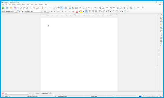
Once you've got Libre opened up, you'll probably be greeted with a generic New Document, like this:
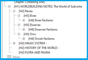
To get the most of out taking notes and references, as well as just generally organizing your story (especially if you have it all in one master document), you'll want to use the Outline / Navigator function!
To get started, go up to the "View" drop down menu from the very top of the document (third option from the left) and in the drop-down menu, go all the way down and select "Navigator" (fourth from the bottom).
.Click it, and ta-dah! You now have your Navigator menu open.
You can re-size it by dragging the right-hand side to show more or less of it at any time, and I think you can move it to elsewhere in the document, but I use it where the default view is, so that's what I'll show here.
At first, it'll be empty:

But that is easy enough to fix!
To learn the ropes, type in a few example sentences in your document on seperate lines labeled 1 through 5.
As you type the first line labeled 1, highlight the sentence, and go to the Styles menu (shown below) and select "Heading 1"

Go head and type the other 4 sentences labeled 2, 3,4, & 5, changing each one's Style to the equivalent Heading (Heading 2, Heading 3, Heading 4, and Heading 5, accordingly)
(To do it more quickly with keyboard shortcuts, you can do CTRL + [Heading Number] to quickly change to a Heading, by doing CTRL+1, CTRL+2, etc)
until your document looks like this:

Notice how your Navigator now has different tiered categories, which you can collapse to hide the lower headings, which will nest together on the Navigator underneath higher level headings.
So, how is this useful?
If you have a document dedicated to Outlining your novel, you can now easily organize and find your information by sorting them by categories and subcategories, like below:

Here's what it looks like when most of the categories are collapsed:
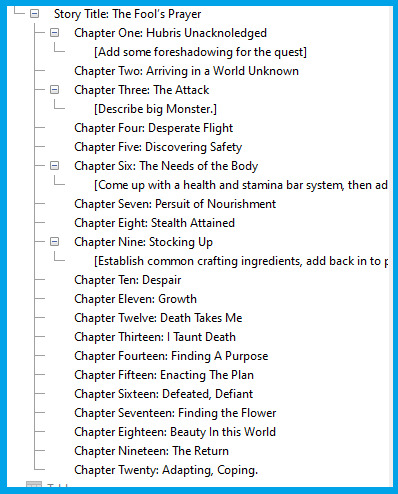
And, of course, when you're writing your story all in one Master Document, being able to easily navigate to different chapters is essential!
Here's an example:

If you need to make notes for editing later, such as:
[Add a description of location here]
[Come up with a fantasy animal here]
[rewrite this scene so its more clear]
[Skipped this scene from writers block, come back and redo]
etc
You can simply add these notes in as Heading 3 (or one-tier lower according to how you're organizing your document) to make it show up as a sub-heading inside the chapter to easily find it again :D

Obviously, 99% of works are going to have Tables of Contents much less chaotic than this example lol:
91 notes
·
View notes
Text
Tutorial: How-To Create Striking Gradient Shapes & Waves for Adobe Illustrator for iPad

In this tutorial, we will explore step-by-step instructions and tips to create striking gradient waves and shapes that can enhance any project, from digital illustration to web design and marketing materials.

Starting off you'll want to open Adobe Illustrator on your iPad, and select 'custom size'.

Create a canvas that measures at 3000 x 3000 points.

Set the colour mode as 'RGB'.

Select the 'Pencil' tool, and then select 'Paint Brush'.

Select 'Calligraphic' brushes, and scroll down until you find the 15 pt. 'Round' brush and select it.

Select the 'Fill' option and set the colour value to none.

Select the 'Stroke' option and set the colour value to a colour of your choosing.

Select the 'Smoothness' option and set it to the maximum value (10).

Draw a wavy line.

Select the 'Stroke' tool and choose a new colour.

Draw another wavy line over the top of the previous.

Select the 'Stroke' tool and choose another new colour.

Draw another wavy line over the top of the previous two.

Select the 'Selection' tool.

Select all of the shapes.

Select the 'Repeat' tool.
Within the 'Repeat' tool, select the 'Blend' option.
Tip: If you have a keyboard connected to your iPad, you can use the keyboard shortcut 'Command+Alt+B' when objects are selected to blend them.

Now our gradient wave shape has been created!

Once the shapes have been blended, you can manipulate the spacing of each shape with the three dots in the middle, each one represents each of the lines.

Move each point around until you feel comfortable with their spacing.

We may want to make some alterations to our shape such as changing the rotation, shape, size, order of lines. Here’s how we can do that.
Select the 'Selection' tool.

Drag and select the shape.

Select the 'Object' tool.
Select the 'Release' option.

Now the objects are unblended they can be altered or manipulated to our liking.

To put our gradient wave back in place, first select the 'Repeat' tool.

Then select the 'Blend' option.
Congratulations on completing the tutorial on creating striking gradient waves and shapes in Adobe Illustrator for iPad! You've taken significant steps in enhancing your design skills, learning how to apply gradients effectively, and bringing your digital artwork to life with vibrant colours and dynamic forms.
Keep Practicing - As with any creative skill, practice is key to mastery. Continue experimenting with different gradient combinations, wave patterns, and shapes. Find new ways to enhance your designs.
The more you practice, the more confident and proficient you will become.
If you're interested in supporting me, or checking out some free eBooks, Wallpapers, and more. Please consider checking out my Ko-Fi page: https://ko-fi.com/spikeeager
#freebies#guides#guide#how to#howto#how-to#how-to's#how-tos#art guide#art#design#illustration#art help#art tip#art advice#art tutorial#drawing tips#graphic design#creative#unique#marketing#tips#artwork#art process#digital painting#drawing#illustrators on tumblr#illustrator#illustrative art
142 notes
·
View notes
Text
Updated: How I edit my sims 4 screenshots (night-time edition)
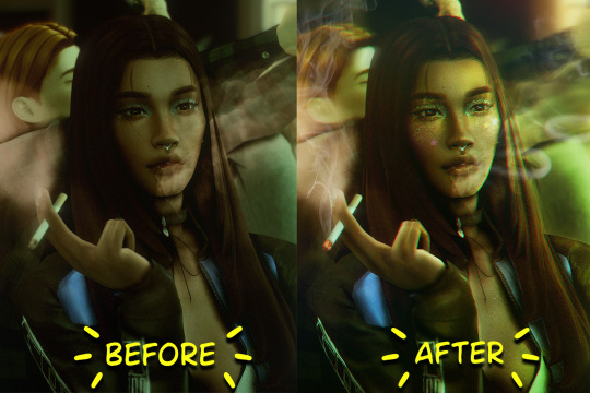
A more detailed editing tut so you can understand my process as it may help you, i edited this relatively quickly and usually spend about 1-2hrs editing something...so let's goo.....
Before taking screenshots:
Help yourself as much as you can in-game, I always make sure there is some sort of light source in my pictures or something interesting that I can add to enhance something already there
Understand good/bad composition and add variety by using different angles
I take LOTS of photos just to end up with 1 or 2 good ones

I'll just be using photoshop for this, but i also like to use the procreate app as i'm more confident w it.
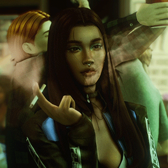
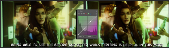
step1: I check if there are any major glitches or hard areas e.g, fingers elbows etc.. that have sharp points and pull them in liquify so they are smooth. Then use curves to change the contrast.
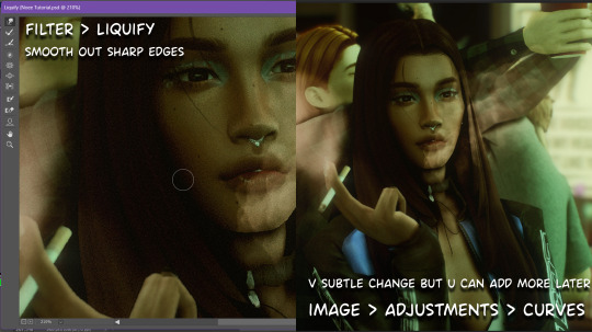
step2: *duplicates image* using the dodge and burn tools (keyboard shortcut: o ) i'll add emphasis to highlights and shadows (be careful with these as the dodge tool can ruin the image if used in excess) *merges image* (i duplicate and merge as i go, utilise using lots of layers so you can go back if you mess up/ want to change the opacity of an effect.)
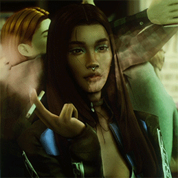
step3: making light sources POP. *new layer* change blending mode to overlay or soft light and choose a colour you like.
step4: *new layer* draw hair strands. i just use a basic round brush in photoshop and change the hardness or i'll use a sharp caligraphy type brush depending on my sims hair type. (i try not to overdo it as i like maxis hair and don't want it to look too realistic)
step5: i would then add a new layer and set the blending mode to multiply to add more shadows, but i don't feel like i need to at this point.
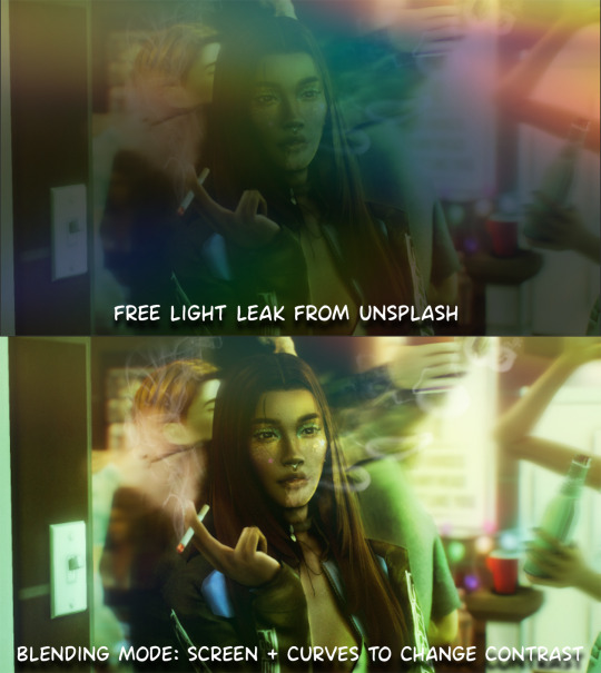
step6: *duplicates image* go to filter > camera raw filter, i change the "light" and "curve" panels, i like green tints in my screenshots especially the night ones. (this is where all the magic happens really so just adjust all the channels to your liking, lightroom is also really good to use)
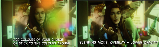
step7: *create new layer* blending mode: screen or linear dodge (add) / makeup and finishing touches! - for this look i'll get stars and glitter pngs off google or unsplash same for the smoke, though if i'm using procreate they have free brushes for that :')

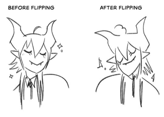
step8: add light leaks as they add some fun dynamic lighting and textures to your screenshots. (i also flip my image horizantally [image > image rotation > flip canvas horizontally] whilst editing as it's like a "fresh pair of eyes" when you've been editing for a while so you can see what looks off)
final step: merge all the layers (though i do merge along the way once i'm happy with something) go to filter > sharpen > smart sharpen. I leave it as the default setting.
extra step if u want: for party pics i might add chromic abberation here is a 60 second tutorial on youtube it makes the pic look cool and trippy.
And you're done!! congrats on surviving. if you have any questions please send them in my ask box so others can see and get help too.
265 notes
·
View notes
Note
Hello! Sorry to bother but do you have any digital art tips? I’m quite new to it and any tips, tricks or advice would be helpful! Your coloring style is very beautiful and I love it a lot!
thank you! 💚💚💚 sorry this is a bit late, hopefully there's still something helpful in it!
(also, it got pretty long, sorry!)
I think the biggest thing is to just take things slow -- digital art feels different than drawing traditionally, and it's SUPER easy to get overwhelmed by the billions of cool features that the digital world offers. (I say, as someone who spends a lot of time downloading cool brushes and textures...and then never using them ever.) there is a ton of really cool stuff you can do digitally, but because there's so much, I think it's really important to take time to figure out what is and isn't working for you. spend some time doodling without any intent to do a finished piece, figure out how you like to hold (or not hold) your tablet, what keyboard shortcuts you end up using a lot (and therefore might want to map to your pen/tablet buttons for quicker use)...that kind of thing!
everyone's workflow and preferred program and style are different, so it's hard to give hard-and-fast general advice. but the things that I think of as the essentials for learning digital art programs, and what I think of as a good order to focus on learning them in (although YMMV, especially depending on what kind of art you're doing):
brush customization (e.g. flow, opacity, softness)
layers and layer masks
selections and transformations (e.g. scale, rotate, flip horizontal/vertical, skew) (skew is underrated and I will die on that hill)
blending modes (e.g. multiply, screen)
adjustments/adjustment layers (e.g. hue/saturation, curves)
and I think most stuff after that is gravy! often very good gravy though! but yeah, as overall advice I recommend just taking things one little bit at a time, spending some time just drawing and messing around with each feature and what you can do with it. whether or not you end up incorporating any of it into your workflow, it's always good to try things out and just see how they feel! :D
and just so there is at least a little more concrete helpfulness in here, here's a few more specific things that I think are super important to keep in mind!
use! your! tablet/pen buttons! I mentioned this earlier, but they are extremely useful for keyboard shortcuts that you use often! most programs will also let you create new shortcuts for other things -- personally, I use the magic wand tool to fill in big color blocks a lot, so I made shortcuts for 'expand selection' and 'fill' and then mapped them to my tablet buttons.
flop your work horizontally often! when you're working on something, you get used to the way it looks, so seeing it mirrored is a quick way to see it with fresh eyes! in my experience, it often feels like this:
(a common thing is to find that everything is sort of 'leaning' too much one way, which is where skew really comes in handy!) (seriously, I love skew, it is my savior)

if you're working with color, keep a hue/saturation adjustment layer (or a layer filled with black or white and set to Color) on top and toggle it on occasionally to check your values! a lot of people who know a lot more about color than me (and are better at putting it into words) have written about why values are so important, so all I'll say is that the rule of thumb is that your image should still be readable in greyscale:

there are some exceptions and grey areas (do ho ho), but it's a good general rule to keep in mind! (some programs also have a colorblind mode, so you can check to see how your work will look to someone with colorblindness!)
and finally, here's some digital art programs I recommend, if you're still looking for a good one!
free: krita, FireAlpaca
paid: ClipStudio, Procreate (iOS/iPad only)
#art#...sort of#horizontally flipped mal isn't my favorite drawing i've ever done of him#but it's up there#anyway i do personally use photoshop#but i absolutely do not recommend it when there are better and free-er art programs out there#it is the equivalent of texting with a giant 90s-block phone that has been jury-rigged to somehow install whatsapp#because i don't NEED a new phone i KNOW how to use this one it's FINE#(oh god i've become my dad)#someday i will have to actually switch to clipstudio and learn new keyboard shortcuts :(
410 notes
·
View notes
Note
Your art so surreal, did you take inspiration from African masks it’s amazing. You have probably gotten this question before but what’s your process and how do plan these beautiful pieces out. I am a beginner artist and would like some advice on how start doing digital painting.
thank you for bringing me back from the dead with your kindness, (i was so sad today ughhhh i think watching vampire diaries starting to affect me hjkhjk), i really, really deeply thankful that you spend your time to write something so sweet (also sorry it took me literally ages to reply phphp THE USUAL)
yeah, in buryatia shamanism like the big thing, so when i went to search what's out there in the masks department - google's mess of the results for once was helpful and showed this massive collection of beautiful african masks. the one that was inspo for tiisha lived in my head rent free for weeks before the character was even born phphph now i cant even imagine her without it
(here is little tiisha for you before i'll proceed to be not helpfull phphphph)

oof advices are not my strong side , like..........my process mostly is just sleep through the whole thing i guess..........................i very rarely do sketches, i hate study anatomy and perspective, drawing cubes makes me physically sick etc etc my approach to drawing were "fuck around and find out", always about chill and fun and barely ever about learning. imho thats why im so shitty at drawing simple things but not bad at coloring. so yeah, my biggest advice always and forever will be - be gentle to yourself, please
digital or traditional or whatever else is out there, dont forget you make it for yourself and for yourself only okay? it supposed to be fun, not sad tiring and competitive
advices for digital specifically tho - very objective, apply with caution
learn all the keyboard shortcuts, ideally to press them without thinking
explore more instruments than just brush. it will be tedious and sometimes feel like a chore so mb pick one victim once a month and browse youtube for a stuff like SECRET ULTIMATE TIPS ABOUT MAGIC WAND TOOL THAT WILL SAVE YOUR LIFE (they indeed will save your life)
check if your drawing program has artboards - turning it on will give you more freedom over canvas positioning and your refs will always be there and not in the separate window
idk about others but using auto tone, auto contrast and auto color often gives me well needed perspective on what im doing
in 99% cases be sure that you can reanimate even the most messiest artpiece you ever did. working in digital gives you the chance to mess with shapes, colors and perspective at any time so if you dont want to gave up on something - you absolutely didnt have to
from time to time while you are still learning - go out there in the wilds and search for the new brushes. tweak with them if you want. i have like ~500 and i use 6 max, but those 6 i found by at some point trying to draw with all of the 500
MADE. BACK UPS. and i mean not like save layers just in case before merging them (tho that's too will help) no, i mean click SAVE AS once an hour and create A NEW FILE. PLEASE. i lost so much stuff to sudden power outage. its never pretty and you loosing will to work for days
watch at least one tutorial about the whole rgb srgb and cmyk thing - i did, understood not a thing, but at least im not playing dora the explorer with my colors after the export now
uh idk think thats it? tried to think about those that id hope i knew when i started so hopefully something will help
have fun with your drawings!!
63 notes
·
View notes
Note
Link your three favorite fics right now
How do you chose with POV to write from? And is there one you generally prefer out of Daniel and max?
Well, I'm in the process of switching from my kindle to a kobo and things have been *gestures* so I haven't been reading loads, but here are a couple of fics that I've got in my 'go back and comment on' pile (larger than I would like given that my new year's resolution was "comment more when you enjoy something")
I just want to know you like nobody ever has by @33max - They are in the bathroom, Daniel had insisted that he needed a shower if they were going to do this. He’s still damp, Max hadn’t even waited for him to dry himself off before he was pushing Daniel against the counter and dropping to his knees behind him.
Move Along Through the Dark by @overtake - In the wake of Daniel’s flailing career, Daniel sometimes finds Max’s thighs wrapped around his waist and Daniel’s hands flirting under the hem of a Red Bull polo. Daniel swears, through gritted teeth and papaya stained scars, that it’s nothing. That in the middle of this nosedive, Max doesn’t feel more important than it all.
freedom of the fall by anonymous - When Max’s eyes meet his again, there’s something pleading in them, and Daniel can’t ignore it anymore. They both want this, how can it be wrong if they both want this?
pegging and other adventures by Stromesquad -
"Come on," Daniel pouts as he sits on Mel's couch "Please? I promise I'll make it good for you." "Alright," Mel says. "I'll bite, but on one condition."
"I'll do it," Daniel says, sticking out his hand to shake on it.
Mel laughs, a throaty, amused sound that makes Daniel's skin tingle a little. "You let me fuck you first."
Edit: I managed to post this mid writing it because I mistakenly found the keyboard shortcut for post instead of save as draft, but I'm actually super tired so I'm going to come back to the second part tomorrow. Sorry!!!! Bad posting etiquette.
26 notes
·
View notes
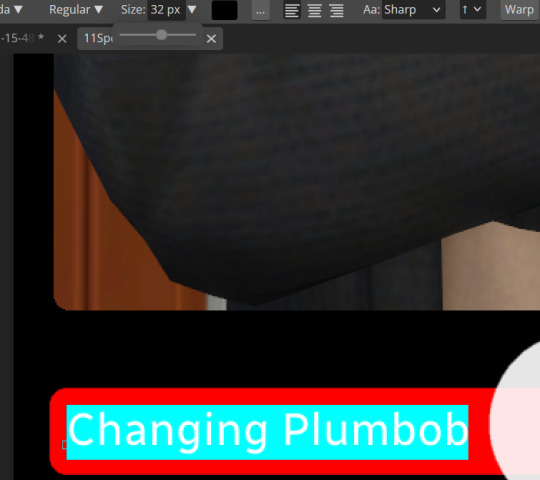
Text
A Party To Die For Templates: SFS


So I may have got a tad overexcited about the Halloween CAS Challenge created by @la-llama-sims, and I made templates for every prompt. I wanted to share them on the off chance someone wanted to also do the challenge but maybe didn't have time to do much other than screenshots.
Tutorial below on how to make your own cards using the templates if you are unfamiliar with photo software, all you need is the template and a screenshot of your sim! Very little technical skill required to so feel free to jump in for Simblreen (the month of October on simblr). Remember to go to the original creator post to check out the prompts and the hashtag given for creations is #LLPTDF. Hope to see some of your creations next month, keep them for the spooky season 🎃👻🦇
Strap in and follow along as I make Glenn here (he won't do the spellcaster prompt for Simblreen, it's dress up after all, but it makes sense for a demo)
Step one: Grab the zipped folder of templates on SFS HERE. Unzip the folder and put it somewhere easy to find in your documents, I have a tumblr specific folder my templates are normally sorted in.
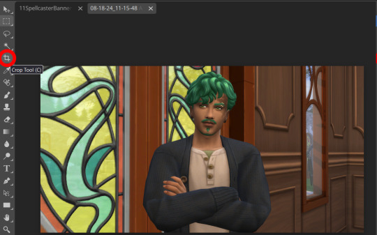
Step two: Open your photo editing program of choice. I use paint.net which is old but for this demonstration I will use Photopea, the online free alternative to adobe. You will see the screen below
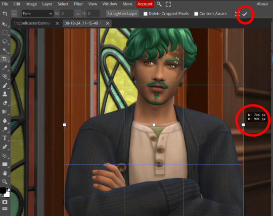
Step three: Click "Open From Computer" right in the middle under the main title. Find the screenshot you have taken that you would like to use and open it. Now the hole in my template is 744x991 but you can make it slightly bigger if you don't want to fuss as much with lining things up exactly. To resize image from the top bar (Image -> Image Size) We're going to use the crop tool when we have our picture.
Step four: Pull on the squares at the edges to change the size. If you need click View in the top bar and you can zoom in to allow finer selecting. When you have the right size click the tick and copy the image. Keyboard shortcuts are Ctrl+A to select all, then Ctrl+C to copy.
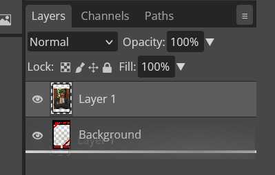
Step five: Open the template you want to use (File -> Open, from the top bar). Add a new layer using either the top bar (Layer -> New -> Layer) or the icons on the bottom right.
Step six: With the new layer selected paste the image, Ctrl+V.
Step seven: On the right of the screen you'll be able to see layer order. Drag the layer with your sim underneath the background layer. This is what will let you slot in your picture.
Step eight: Finishing touches! Unless you are super duper lucky your sim won't appear in the exact right place, you'll have to move them around using the move tool. For precision you'll need to zoom in and move your field of vision using the hand tool.

You'll know it's in the right place when you can no longer see any of the negative space behind it. I like to check both corners to make sure I've got it. This is where having a sim image slightly larger will make it easier.
If you like you can finish now. From the top bar File -> Export as -> PNG or JPG. The picture will save to your downloads folder. If you want to add your own text, keep reading, as I've left space at the bottom for your username, the sim name, and a profile pic or other logo. Or go ahead and crop it out, who needs extra hassle when there are cute CAS looks to be made?
Step nine: From the bar on the right select the large T to add some text, it will automatically spawn in a new layer. Scroll through text options and find one you like (the text style I used isn't in photopea so we will find another). Depending on the type of text you will likely need to play around with the size as well.
Step ten: Start typing. When you're done you can highlight what you have written and use that size box to adjust how big the text is. Select the move tool from the right to move your text where you want it. Repeat step nine if you want text on the other side. I've chosen to put my username on one side, and my sim's name on the other.
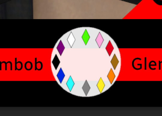
Step eleven: Logo time. Open a pre shrunk logo (I scaled my pride plumbobs down to 125x125) and copy. Back on the template add a new layer then paste your image (for some reason I had to copy twice before it would do the right thing, I don't have an explanation sorry). Then using the move tool and the hand tool get your image where you want it.
From the top bar File -> Export as -> PNG or JPG. Again it will have saved to your downloads folder.
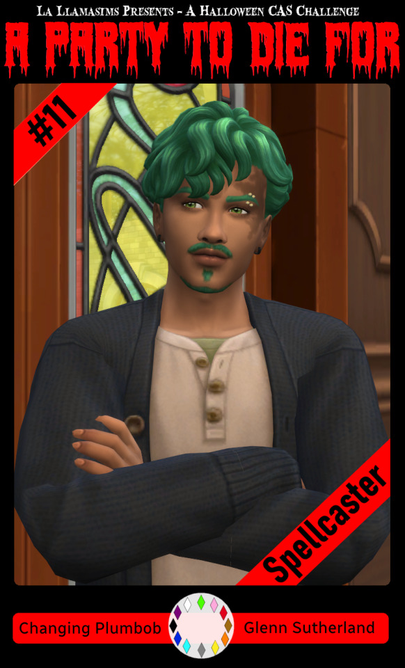
Voila, we have a Glenn card! Hopefully you have a your sim card. I spent hours doing up all the templates so feel free to fill them with your sims for the challenge. All I ask is that you don't claim templates as your own work or shove them behind a paywall because rude and the whole premise of Simblreen is free treats! Obviously you do NOT need the templates to participate in the challenge, the cards are just how I'll be presenting mine. Like CAS challenges the possibilities are most often only limited by your imagination.
#sims 4#the sims#simblr#my sims#ts4#active simblr#Enjoy my friends#I wanted all of us to be able to do Simblreen#Even if we don't have prior skills
53 notes
·
View notes
Note
Do you have any recommendations for art references and or video's that might help me improve as an artist? Your art style is really inspiring to me and I'd love to get better at drawing because I haven't been on that grind recently of doing so!!!
Honestly your best bet is learning the RULES of art instead of the process, at least that's how I did it
I find it easier to NOT do the things that make it wrong than to learn ALL the things that make it good
There's like a million different ways to make art appealing but a lot of them typically avoid the same mistakes. It also makes the learning process customizable for you
To anyone else other than Gongus, I wanna say first that this post is heavily catered to cartoonier art styles but the links are for general art. I will also be laying down a lot of the things I learned from college (multimedia arts course)
Alright, first of all try to dabble up on some character design rules, here's a video that teaches it and a channel that has a series with critiquing people's portfolios
youtube
(she's not really insulting the portfolios btw, the thumbnails are just click baity)
Then also learn about the 12 animation principles because it can still be applied to non animation art like comics and stuff
youtube
Get yourself some line of action crammed in there. Regardless of art style, a lot of people struggle with stiffness, line of action is the counter attack to it
youtube
Optionally, if you're gonna learn line of action then you're gonna be doing gesture drawings to practice it. I suggest going to @adorkastock for reference images
Next up, color also have rules so here's the basics
youtube
I only linked that so you can smoothly transition here wjsndndm
But YEAH color fuckery is an underrated art cheat, you can get away with art that looks good without shading if you know how to toy with the colors right
youtube
Trouble making thumbnails?
Photography as an art form has got your back. Composition techniques can be applied to the drawing sort of art
youtube
Here are my personal tips now skskksks
1. Use your inspirations as reference. I got a sense of solidity when I saw the reference sheets for Wander Over Yonder and copying stylistic aspects from DST, TF2 comics, Clone High, and Pizza Tower.
SPEAKING OF TF2, I also wanna throw in this video about it's character design and other visual aspects (you'd only wanna watch the first half, the rest talks about the characters writingwise)
youtube
2. Another thing I do with references to make it easier is draw it at least two times. First time to trace it (directly or eyeballing it. You can also do with skeleton sketch or not but preferably give it a skeleton), then the second or third or fourth is to make it slowly morph into your style.
This will give you a sense of solidity, teaching your hand the traits that should be kept or exaggerated
3. If it looks like ass or you don't like it then that's okay. You DON'T have to post EVERYTHING you make. Sometimes you will feel like you draw a character you've always drawn wonky and that's because you just need to do warm up doodles.
I have SO MUCH sketches that I haven't posted and will never post because they're warm ups. Y'all think Pepperman is hard to draw? Y'all think I draw him good? I have good news for you, I fumble his face more often than not AND THATS OKAY
4. ANOTHER niche technique is to learn the keyboard shortcuts and other functions of your art program. Do not underestimate how much time that can spare you. It's gonna be tricky to find or get used to but it's gonna be so worth it
I learned you can alt+G on Krita one day and it makes a folder for your layers, total game changer. I can move layers at once instead of the old one by one with precision
5. Final note is to do the opposite of everything Vivsiepop does, it does not matter if you like her shows or not because time and time again critiques of her art and writing style breaks SO MANY RULES without UNDERSTANDING why they exist in the first place.
Art is like architecture, you need to know how to make a basic house before going straight for the fucking manor from Hello Neighbor 💥 or else you're never gonna figure out why the living room collapses everytime you flush the toilet
Anyway eeee, that's about everything I can teach, hope these help and if there's anything else to ask or add on, please do so!
23 notes
·
View notes
Note
I saw an aesthetic picture about spreading Satan through the Internet recently and it got me thinking about being the IT support at the ministry, and which papas and ghouls would be best and worst at technology. So now I obviously want to hear your thoughts.
(I think Primo would surprise us by being surprisingly proficient, sort of like how my grandma mastered email and Facebook in her 80s.)
I have discussed this at great lengths with my best friend, @her-satanic-wiles, and these are the conclusions we have come to. These include all technology and use of the internet and social media habits.
Please enjoy as much as we did - it was too much fun. This is long, so i've put a page break in.
Some 18+ content here, MDNI!
Primo
As you said, surprisingly proficient.
He learns very fast, intently listening to you when you explain email, Microsoft Word & Excel, and Facebook.
He doesn't get Instagram but that's okay, that's not his target audience.
Doesn't understand how the internet works... "So, is it floating around in the air, or...?"
But he does know how to work it, and how to use it.
Secondo
No patience for technology at all.
If it doesn't work how it should, it is immediately referred to as broken.
"Mostrami solo le mie email, pezzo di merda!" you'll hear him scream from his office.
If it is not broken, it soon will be. His frustration makes him violent.
Got the iPhone 4 when it first came out but it perished in a mysterious fire. He doesn't know how it happened. Stop asking him.
Has been through four Ministry issued keyboards and one monitor that saw violent ends.
Terzo
Not bad at technology at all, in fact learns very quickly.
However, the discovery of Internet Pornography set him back in his paperwork by about a week.
He takes casual nudes and sends them to everyone, like him sat on the toilet or just having got out of the shower. Just because he can.
Your phone keeps saving them automatically and you have to do a mass exodus of Terzo nudes at least once a week to save your phone memory.
When you delete them he sends you more out of spite.
Ends up with Malware on his computer all the time from scam emails that promise him 'hot single babes in his area'.
The kind of guy to go on Omegle to flirt with random people, maybe find someone to jerk off with.
Copia
Boomer.
He's bloody useless, it always makes him feel like a silly old fool.
The only thing he can do by himself is search YouTube for rat videos, because you've shown him a million times.
Types with the screen close to his face and with one finger.
FaceTime angle of a typical dad.
"Look at this!" and proceeds to not flip the camera because he doesn't know how so you just end up staring at his face anyway.
SHOUTS when he's on the phone, no concept of noise at all.
Always forgetting his passwords - you get phone calls asking what his password for this and that is every. damn. day.
How many times do you have to remind him his phone unlocks with FaceID?!
Got scammed by a Facebook ad and had to change all his credit cards.
And now for the Ghouls...
Rain
He's VERY good with tech.
Quiet little genius, knows all the keyboard shortcuts and phone tips and tricks going.
Others ask him for help a lot, and he gets such a sense of pride when he can help them, swishing his tails and smiling to himself as he's helping.
Rain is also in charge of Copia's computer. He built it, fixed it, and cries every time Papa does something he shouldn’t to it.
Swiss
Technology conspiracy theorist.
He is terrified of tech, thinks it's listening to him all the time. Alexa is a demon he doesn't trust and his phone is an old Nokia he uses for emergencies ONLY.
That Nokia is also his weapon that he throws at people's heads when they piss him off. Which happens entirely too often and has caused some damage...
Mountain
Always up to date with the latest tech, never misses a launch.
He keeps leaving his second-hand phones in places Swiss will find them to trigger his technophobia and paranoia.
"DO THEY BREED, OR SOMETHING?!" Mountain is snickering outside his dorm listening to the chaos he's created.
Phantom
TROLL.
Chaos maker, through and through.
He is a serial redditer. The havoc he creates on there is diabolical, honestly.
Goes on Omegle to troll people.
He came across Papa Terzo one evening. They both agreed to never speak of what he saw ever again.
Plays on Swiss' technophobia along with Mountain.
He even created a cruel "conspiracy mode" on the Alexa that plays dramatic music, changes the lighting and shuts the window blinds in Swiss' room whilst Alexa tells him "I'm here, Swiss. I see everything."
Sodo
Has absolutely no interest in the internet or technology whatsoever.
Serial text forgetter. Sees you've text him, ignores it. Promises to get back to it. Never does.
When it comes to guitar tech though, he'll chew your ear off for hours. He knows EVERYTHING.
Ask him a question, but be prepared to be stuck there for approx. 45 minutes while he explains it in great detail with tangents you didn't ask for.
Aurora
Very good with tech, specifically social media.
Basically the social media manager of The Ghost Project.
She loves tiktok, makes them regularly. but it gives off 'Illegal Disney' vibes... Total crack.
Papa had to stop her making them and tell her to take them down.
Ask her about dance challenges - she knows them all.
Cumulus
CANNOT BE BOTHERED.
Why does everything take so long? Typing and everything... so much effort.
So she's a voice note kinda girl.
And they can be full blown podcasts, she talks and talks and talks....
Always takes Mountain's old phones after Swiss has been spooked by them. She hasn't bought a new phone in 6 years. Mountain is none the wiser.
Cirrus
Has a basic understanding, but feels guilty asking for help from IT support.
If an error message pops up, she'll panic and call Aurora.
"No but it says Error 404... WHAT DOES THIS MEAN?!"
Queen of cat videos. Falls asleep to 10 hour loops of rain storms on YouTube.
#ghost bc#the band ghost fanfic#papa emeritus iv#papa emeritus 4#cardinal copia#papa emeritus iii#papa emeritus 3#copia#terzo#papa copia#papa terzo#papa secondo#secondo#papa emeritus ii#papa emeritus i#papa emeritus primo#papa primo#primo#primo headcanons#secondo headcanons#terzo headcanons#copia headcanons#papa headcanon#ghost ghoulettes#ghost ghouls#ghouls hc#ghoulettes hc#sodo ghoul#swiss ghoul#phantom ghoul
186 notes
·
View notes
Text
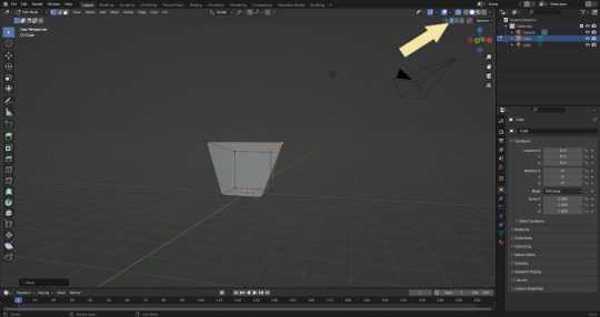
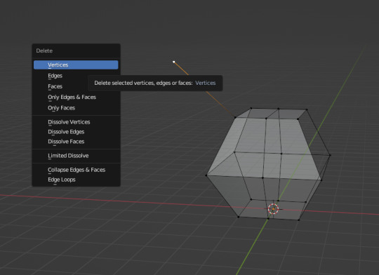
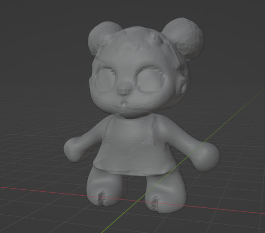
Blender: Which Buttons Do I press? (Part 1)
There are a lot of tutorials where you already need to know how to "do the basics" like "maneuver the camera." So this tutorial is focusing on the Buttons- not on the sculpt or the object, just on the buttons and shortcuts that I personally use in Blender.
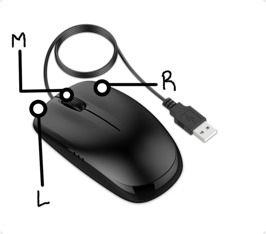
Note: You will need a mouse with 3 buttons / scroll wheel for this.
Before we start, I'm going to explain which shortcuts I use in this, but, not to make myself redundant, there's a shortcut for seeing shortcuts: Press Spacebar + Shift to see all available shortcuts in each mode.
I'm using Blender 3.6 for this tutorial. I recommend you use the same. It's completely free and has a lot of great features! For this tutorial though, 3.4 will likely work as well.
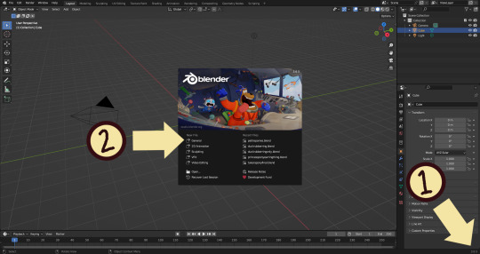
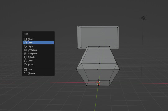
Click "General" under New File.
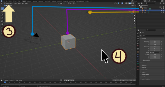
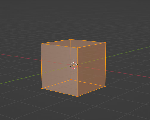
Your screen should look like this. There are 3 default objects in the file: Camera, Cube, and Light source.
3. This bar indicates that you are in Object mode. This menu will allow you to go into other modes depending on the object you have selected.
4. Lets talk about shortcuts. You can zoom, rotate, and move the screen using buttons at the top right, but I haven't marked those because I will teach you a better way. Feel free to click them all and see what they do, but I assume you're here because you don't want to explore every button in this godforsaken program the hard way.
Below, the Left and Right buttons are marked as a reminder as well as the Middle button which is also the scroll wheel (press down to click it)
Left click: Select an Object Left click and drag: Selects multiple objects Scroll Wheel: Zoom in and out Middle Click and drag: Rotate your view Shift + Middle Click and drag: Move your view Right click: Brings up a menu that won't be relevant here. Shift + Right Click: Moves the 3D cursor. Not important for this tutorial, but I do it on accident a lot. Hit Shift + C to reset the cursor and also to reset the viewer position to see all objects at once.
Move the viewer around as practice! You're gonna need to do it a lot while modeling. If you have a keyboard with a Numpad (the calculator-looking thing on the right side, says Num at the top) you can use Numpad 1-9 to automatically adjust the view to front, left, right, backwards, and different angles. If not, test out the rotate tool at the top right which does something similar.
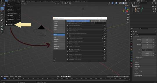
There's a helpful menu I use to switch between Modes (if you hit the dropdown menu where it says "Object Mode" you can do this without the shortcut); click Preferences to enable it.
Hop over to the Keymap section and check "Tab for Pie Menu"

And then close the window. No "Save" button is needed.
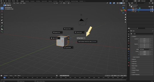
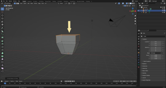
Now that you have the shortcut enabled, select your box with Left Click, hit Tab and Left click "Edit Mode"
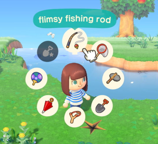
And yes, this is just like the Animal Crossing tool ring:
Now that you're in Edit Mode (You can swap back anytime by hitting Tab -> Object Mode), click arrow at the top right to open a menu where you can check the "X-ray" box. You'll be able to see through your cube. As a reminder, Spacebar + Shift will show you the available shortcuts in this mode, but I'll go over the important once momentarily.
What is a 3D object made out of?
This box is made out of vertices, and each face of the cube has four vertices at each corner- a triangle with three vertices also works, but we'll stick with squares for this tutorial. Moving the vertices will change the shape of the box, like a piece of stretchy fabric over a wire frame.
From now on, I'll be calling the vertices dots, because I hate reading and typing the word vertices over and over again.

5. By all means you can fiddle with the buttons over here but I'm gonna show you the shortcuts I use and the buttons you'll actually need. Don't get intimidated by the amount of buttons. Also press the T key and the toolbar will go away!
(Seriously, though, feel free to play around in this section as much as you want to, but we'll go over the shortcuts a few at a time with examples. at the end of this section will be a summarized list.)
6. Left Click one of the dots and press the G key. You'll see below a whole bunch of additional shortcuts show up at the button. Here are the ones I use:
G key: Grab and move around the dots
R key: Rotate two or more dots*
S key: Size two or more dots*; if two dots are selected, the distance between the dots will change but the angle between them will stay the same.
*Left Click and drag to select multiple dots!
CTRL + Z to Undo edits.
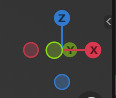
When you move a dot with the G key, imagine that the dot is against a piece of glass at a fixed point ahead of your viewer. The dot will not move farther or nearer to you, but will instead move parallel to your view.
As an example, if you press Numpad 1 and view the object from the front (The -Y green circle will be at front and center in the rotate tool), the dot will only move left and right (X axis) and up and down (Z axis). It will not move farther or nearer on the Y axis by default.
Play around with the G, R, and S tools before moving on.
This little X button at the top right will turn on symmetry. You don't need to use this, but it can be useful.
Left Click and drag so that an entire face (flat square) is highlighted and then press the E key to extrude. Extruding will add another set of dots that are automatically connected to the first set.
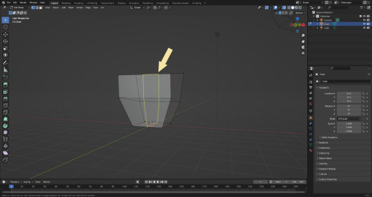
Ctrl + R adds a loop cut. This will divide the existing faces into two and add more dots. You can also drag loops to slide them to different positions.
The 3 key (not on the Numpad) will switch your Select Mode to Face Select. This is useful for extruding. Essentially it is simply selecting all the dots at the corners of the squares.
The 1 key will switch back to Vertex Select (or Dot Select) mode and the 2 key will switch to Edge Select (the least useful of the three, to me)
Before we go wild, there are a couple of additional things to know. For the tutorial, focus on working with faces, not vertices. If you accidentally pull a single vertex, select it and press the X key to delete it.
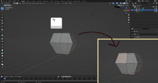
If you want to add shapes, I recommend sticking to cubes for now. Ctrl + A will open the Add Mesh menu and you can add a cube. Feel free to have complete cubes overlap for this tutorial.
Double Left Click will select a series of dots connected in a loop, and can be helpful for selecting areas all at once.
Ctrl + B is the bevel tool, and when a loop is selected it can turn it into two.
Here is a summary of all of the Edit Mode shortcuts:
G key: Grab and move around the dots R key: Rotate two or more dots* S key: Size two or more dots* *Left Click and drag to select multiple dots Double Left Click will select a series of dots CTRL + Z to Undo E key to extrude faces Ctrl + R adds a loop of dots Ctrl + B splits one loop into two X key -> Vertices to delete dots (vertices) 1, 2, 3 keys to switch Select mode Numpad 1-9 to move viewer automatically Ctrl + A to add a shape
Go play with them. See you back here in a while.
7. I used a single cube to make this figure. It's still very blocky, but that's fine. Loop cuts created additional faces which were extruded to create arms, legs, and a neck. Definition to the face was added by selecting individual dots. Remember, Ctrl + Z (undo) is your friend!
Once satisfied with the shape you made - a boxy figure or object is fine- continue on.
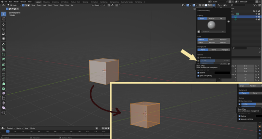
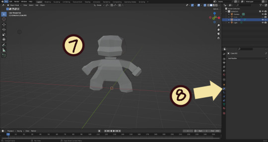
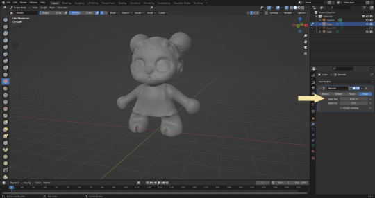
8. Press Tab -> Object Mode. Turn your attention to the right hand bar and make sure the Wrench button is selected. Note the Add Modifier Button.
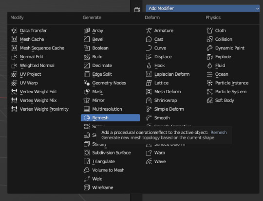
There are a heck of a lot of buttons here that you don't have to worry about- just select Remesh.
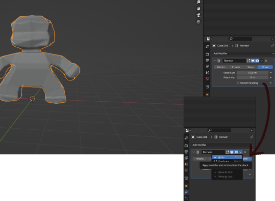
Change the number under Voxel Size to .05m by Left Clicking and typing it (there is a slider, but I find this causes lag). Then, apply the remesh by clicking the down arrow and selecting Apply.
Your figure should be shaped similar to before, but have a slight "graininess". If you have added multiple cubes, it will seamlessly merge them into one. The smaller the Voxel Size you put, the more dots will make up your object. However, I suggest starting with something in the .03-.06 range. We will refine this later.
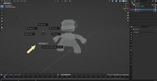
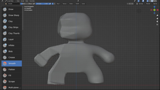
Press Tab and select Sculpt Mode.
This is a mode where I actually use the tool bar for modifying my sculpt, as there are a lot of brushes . The icons show roughly what the brushes do using small icons (note on adjusting this below)
9. Observe the Radius and Strength bars, which will adjust the... well, the size and radius. Note that although the "brush" looks like a flat circle, the affected area is actually a sphere. Select a brush with Left Click and Left Click and drag on the sculpture.
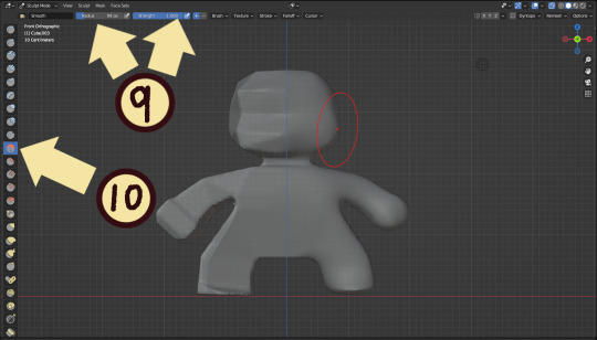
10. This is the smooth tool. I have smoothed out the right side of this figure. Note that I turned off symmetry to do this, but i usually have X-axis symmetry selected.
Although I am used to the small buttons, there is a way to change them. Hover near the toolbar to Left Click + Drag so you can see the names. Hold Ctrl + Middle Mouse button and drag to resize. You will be able to make the size of the menu much larger. This goes for many of the menus in Blender.
The above arrows point to the symmetry button (Top right) and Grab brush (bottom left). The Grab brush uses the shortcut G Key.
The lines point to which tools were used for each part of the sculpt. The Draw Sharp tool was used to mark out eyes. Clay strips made the hair texture. Round cheeks were added using the Inflate tool and a nose (and buns) were added using the Blob tool. The aforementioned Smooth and Flatten tools were used judiciously to remove sharp edges.
I don't have a shortcut list for you here, but here are all the tools I use the most:
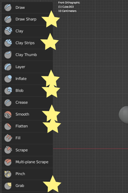
You can hold the Ctrl key while using the brush to reverse its effects. For example, if you hold the Ctrl key while using the Inflate brush, it will deflate the shape instead, creating a concave shape.
As you can see, my figure is getting a little grainy. So, we're going to remesh this model again and add more dots and therefore detail.
This time, we're putting the Voxel Size to .01m. Apply the remesh as before. Now we have more dots to work with and we're just repeating the process, smoothing, and sharpening the lines.
I was going to add a bit about how to take a photo of your sculpt, but I ran out of photo space. I will add a reblog with this information.
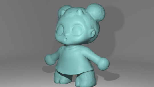
I came up with this little lamb character on the spot because the clay strips created a nice texture. She's by no means perfect, but she did turn out pretty cute so i might make a cleaner version later on.
64 notes
·
View notes