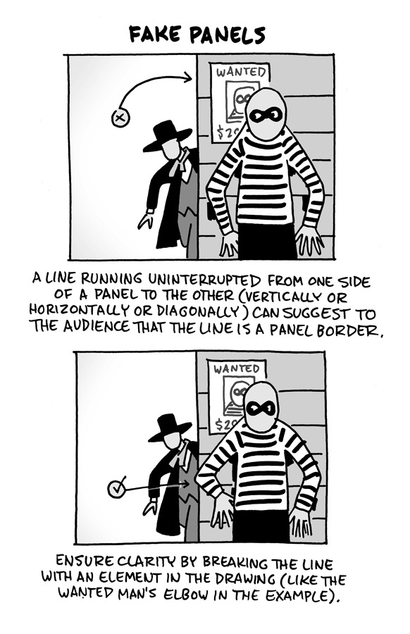
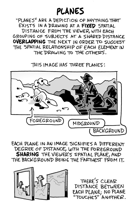
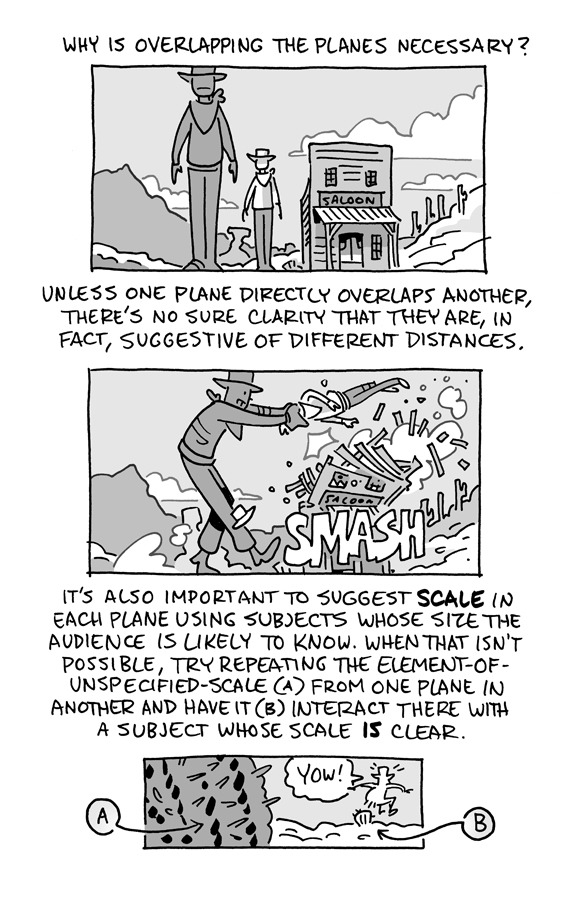
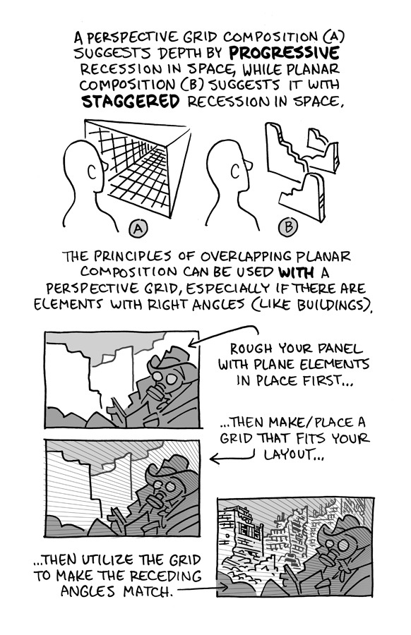
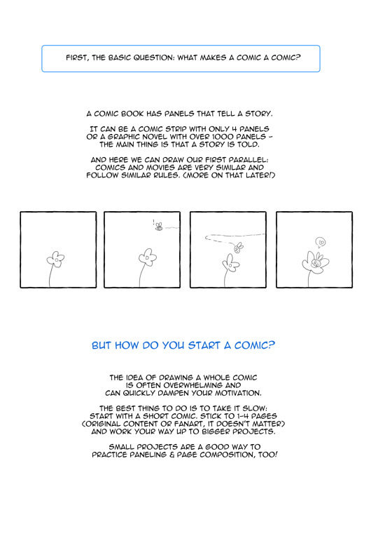
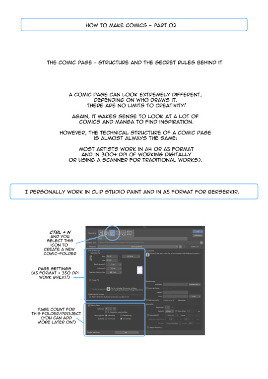
#Tutorials
Explore tagged Tumblr posts
Visit Tumblr Blog
Explore Tumblr blogs with no restrictions, modern design and the best experience.
Last Seen Tumblr Blogs


Fun Fact
Tumblr was acquired by Yahoo for $1.1B in 2013.
Text
Hiding the Getty Watermark
Plenty of people have talked about this one before but I can't find anything rn. Have had a few people dm/ask about this since I mentioned it offhand in a post. Took a bit of time but have written a tutorial. Includes gifs of what I'm doing.
No generative AI, just old-fashioned image editing.
This trick is not intended for stealing from Getty or the photographer who owns the rights to the image. This is meant for non-profit, transformative fan content such as sports web weaving.
The "hiding" part isn't magic and isn't going to give you a perfect, full resolution image. Someone looking closely, who knows what to look for, will be able to see where the work was done.
Good news!! Most people aren't looking that close, they're reading the poetry you pasted to the image and weeping about your web weave.
You will need
Two copies of the image you want from Getty -> (1) the high resolution version with the watermark, and (2) the low resolution preview without the watermark.
Any image editing software that allows for the use of layers and a simple rectangle select tool. If you don't have one, Photopea is a free, browser-based editor. I will be using this one :)
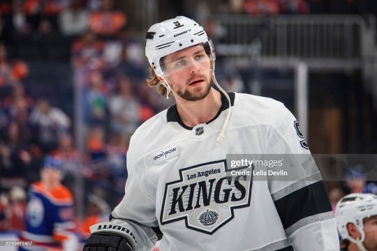
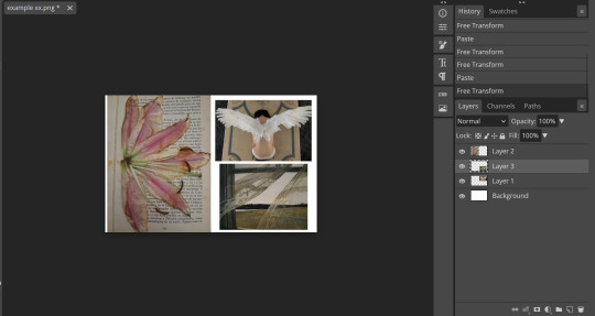
For this tutorial we will be enlisting the services of the beautiful Adrian Kempe:

Method
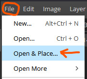
Open your copy with the watermark:
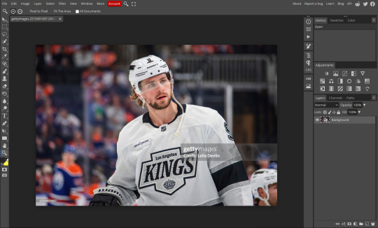
2. File -> Open & Place... the copy without the watermark. It will appear much smaller on a new layer on top of your original image:
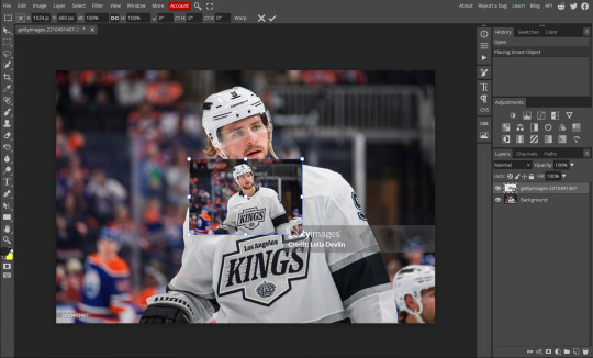
3. Transform (Scale) this to lay exactly on top of the original image. Very important that it is the exact same. Photopea and other image editors will have snapping, this feature is your friend:
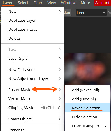
4. Hide the low res layer for now. With the watermarked layer visible, use the rectangle select tool and select the two watermarks. The little one is in the bottom left. In this case, an exact selection is not required.
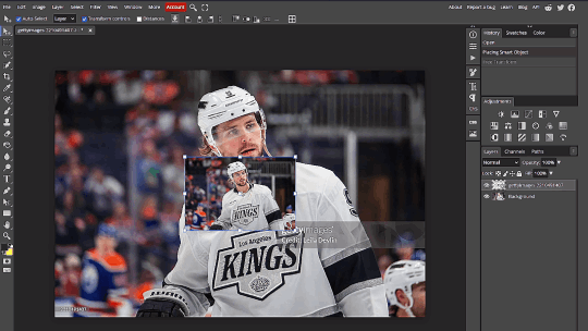
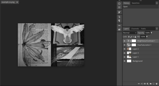
5. While on the low res layer, go to Layer -> Raster Mask -> Reveal Selection. Un-hide the low res layer. You have now gotten rid of the watermark:
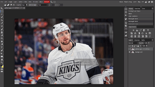
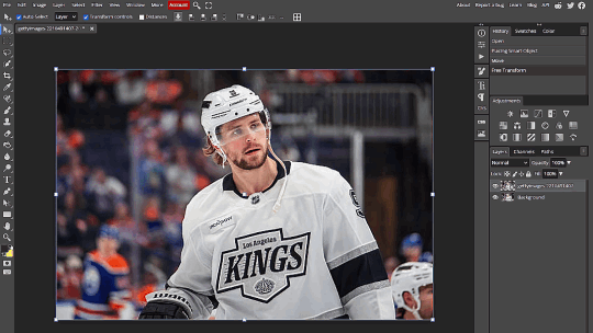
6. Final product looks like this:

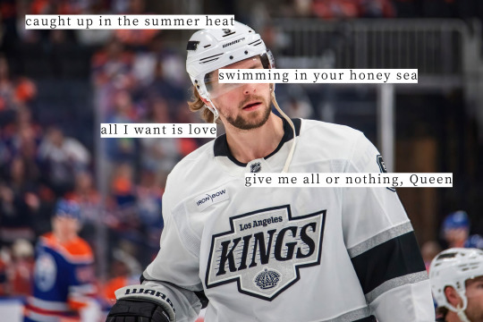
Add your lyrics or poetry or do whatever edits you like as normal. For fun I chose Queen by Magic City Hippies:
Final Notes
If you look closely you will be able to see the "seams" where the mask was applied and the low res image was spliced in. I prommmyyy nobody is looking that closely on tumblr dot com.
Live examples where I used this method in my AGAIN web weave - photos of the players are all sourced from Getty, some light cropping was applied for the desired aspect ratio and the colours were edited.
If you hate drop-down menus you can create a macro i guess ? Also the same effect is achieved if you click the little layer mask icon at the bottom of the layer panel instead of menus. I just wanted to be thorough.
If you can’t find those exact menu options in your image editing software you can use the “Search” tool which is usually found in the “Help” section.
You can also invert the selection and use the Erase tool on the low res layer if your editing software somehow doesn’t have a masking tool??
Have fun making your web weaves <3
#GO MY TUTORIAL!!!!!!!!!!!!!!!!!#made the gifs in an hour but took 3 days to write the alt text for everything bc i was agonising over economy of phrase <3 lol#idek what to tag this#puck!research#tutorials
483 notes
·
View notes
Text
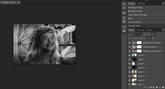
messy and slightly ugly graphics tutorial xx
disclaimer : this is barely a tutorial, and i'm tired as hell as of writing this post. this is just how i do my graphics, and you can really do anything you want.
all you need for this is an editing app ( i use photopea, but you can use gimp or ibis paint or anything with layers. i do not care. ) and some pictures. having a colouring prepared is helpful, i get all mine off deviantart, but you can also just make it black and white and up the contrast. this requires very minimal editing knowledge, but having an idea of how to use your editing app is recommended.
step one : get your canvas. i like to use anything vaguely rectangular. exact dimensions do not matter, whatever fits your purpose, just don't make it too wide. this one is 1920 by 725 pixels.
step two : gather your background images and lay them out on the canvas. for this example, i'll just be using pictures from my " unpinned " board on pinterest. ideally, have three background images, and a centre image. i frequently use my faceclaim for the centre image, but you can use whatever you want the subject of the graphic to be. this is why we need the layers ! your canvas should be looking a bit like this :
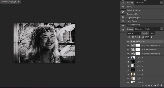
step three : create your background. edit the images together however you want, or you can follow what i do and just collage them all together. then, i like to desaturate them and up the contrast, so i can see how they work together. you should, so far, have something that looks like this :
step four : time for the focal point of your graphic. again, i'm just using a picture of elle fanning, but you can use anything. remove the background ( i like to manually erase it to get a soft edge, but you can use this site if you don't really care ) and slap it in the middle of your image. it should now be looking something like this !
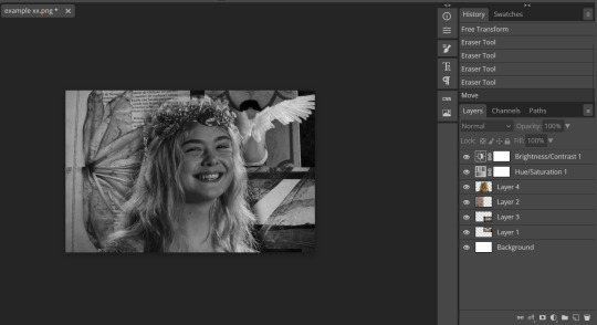
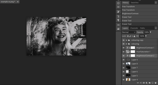
step five : okay, the fun part. overlay time. this is when it starts to actually look decent. i like to make another brightness / contrast layer as well, but you don't have to do that. i just find it makes it look less flat.
the overlays i'm using for this are below, but you can find them on pinterest by searching keywords like " grain " , " texture overlay " , " words overlay " , etc. etc. i put all my overlays on either a lighten, multiply, or overlay layer, and fiddle around with the opacity until it looks good.


once you've added your overlays, it should look something like this :
step six : time for the flavour ! get your colouring ready, i'm using the one i always use ( which i do gatekeep, sorry ) but you can use absolutely any colouring you like. i get mine from deviantart and edit the shit out of them. i slap that on top of everything else.
step seven : adjust, adjust, adjust ! fix the lighting if it looks crazy, move your main subject around, add more overlays, whatever you need to do. personally, i think this graphic is a bit bright, and i want to add some grain and stars. so, i'm going to do that. at this point, i'll sometimes also add something behind my main subject. i like more word overlays for this.
and there you go ! that's how i make my graphics.
29 notes
·
View notes
Text
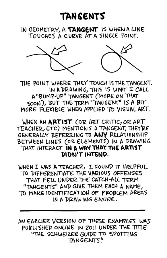
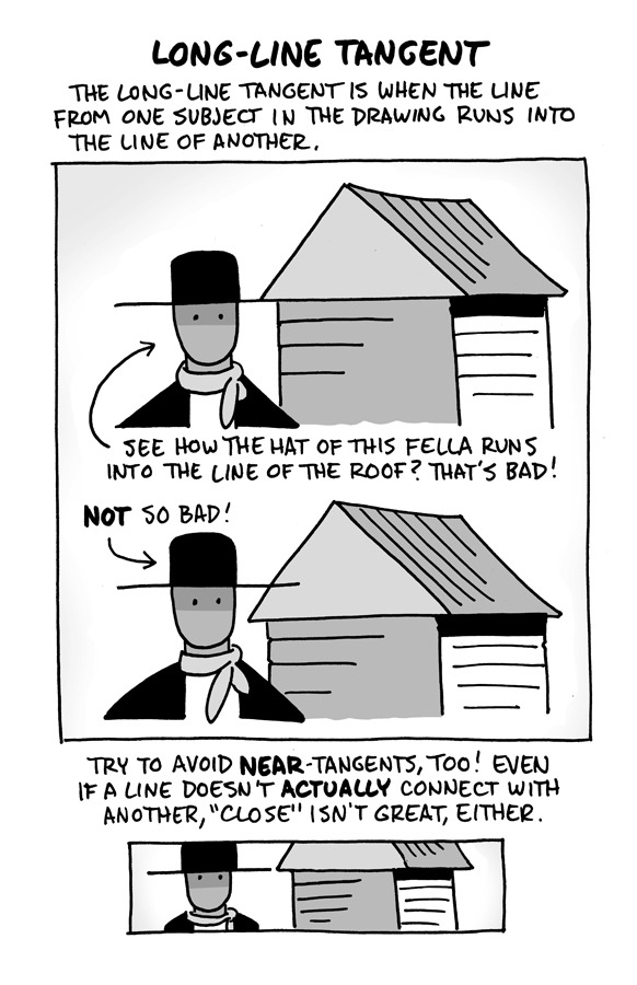
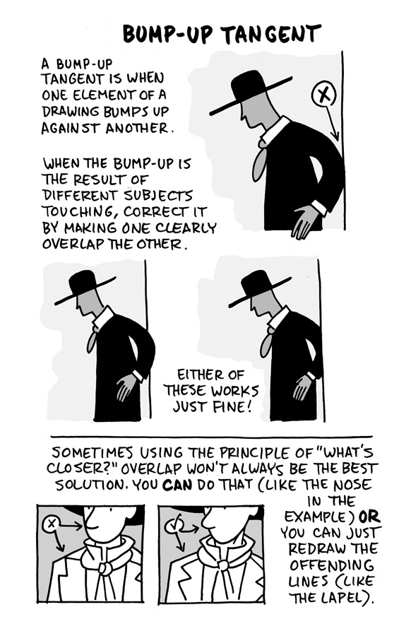
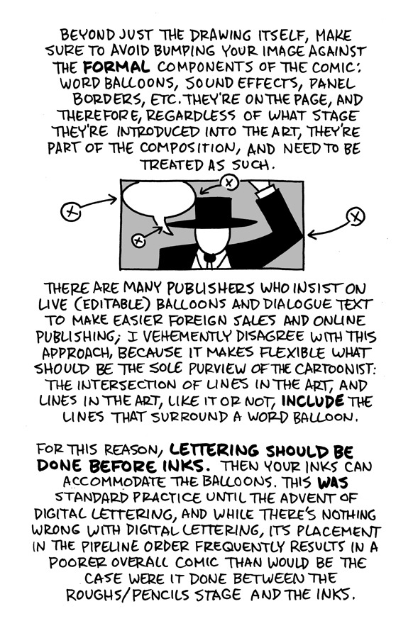
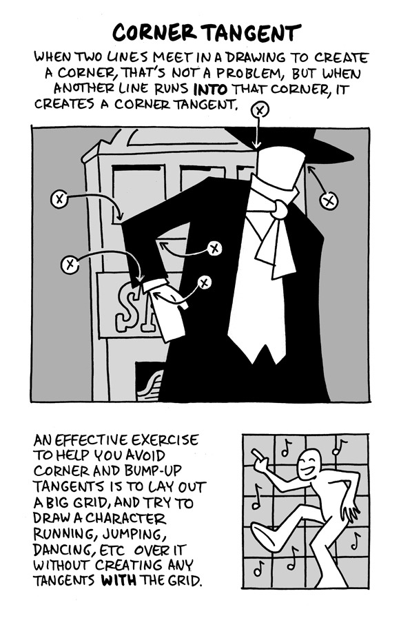
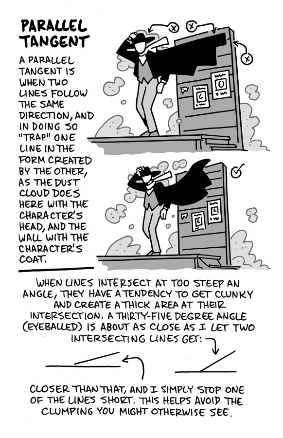
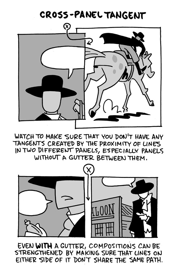
Hello, friends!
I reworked the ol' "Schweizer Guide to Spotting Tangents" lecture from my comics-teaching days, figured I'd share it here. If you want a free, printable PDF for yourself or to share (especially if you're an educator), you can find it at the bottom of this same lesson on my website.
-Chris
14K notes
·
View notes
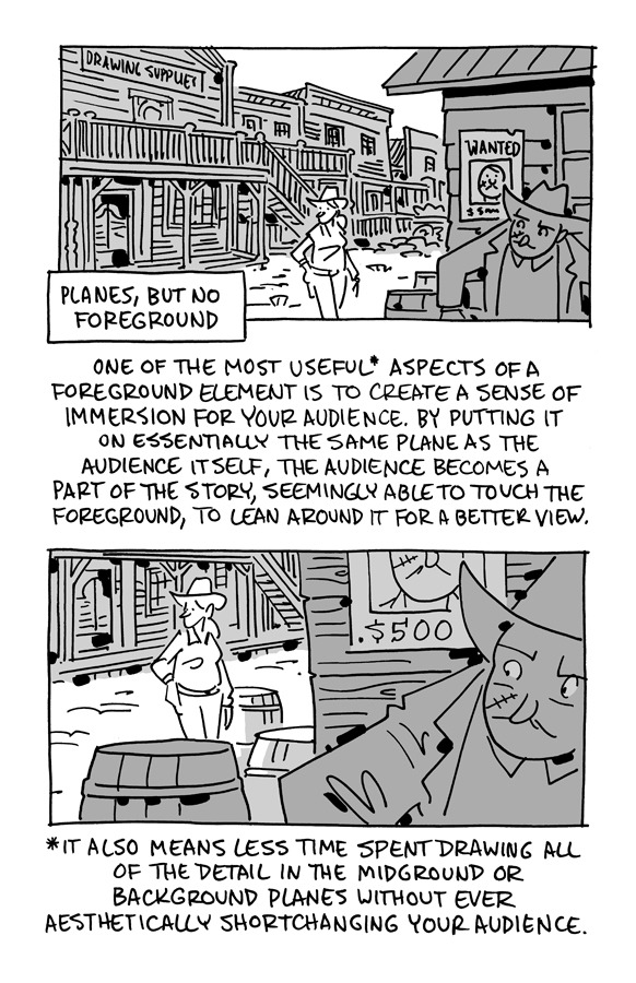
Text

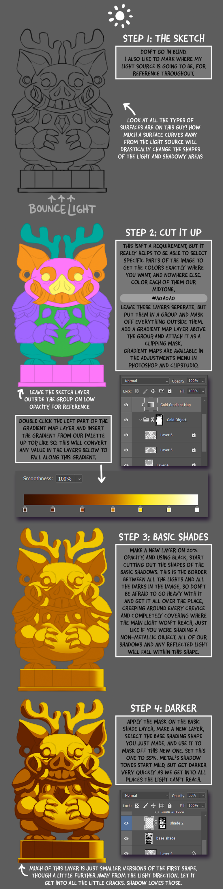
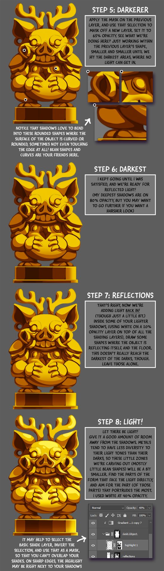
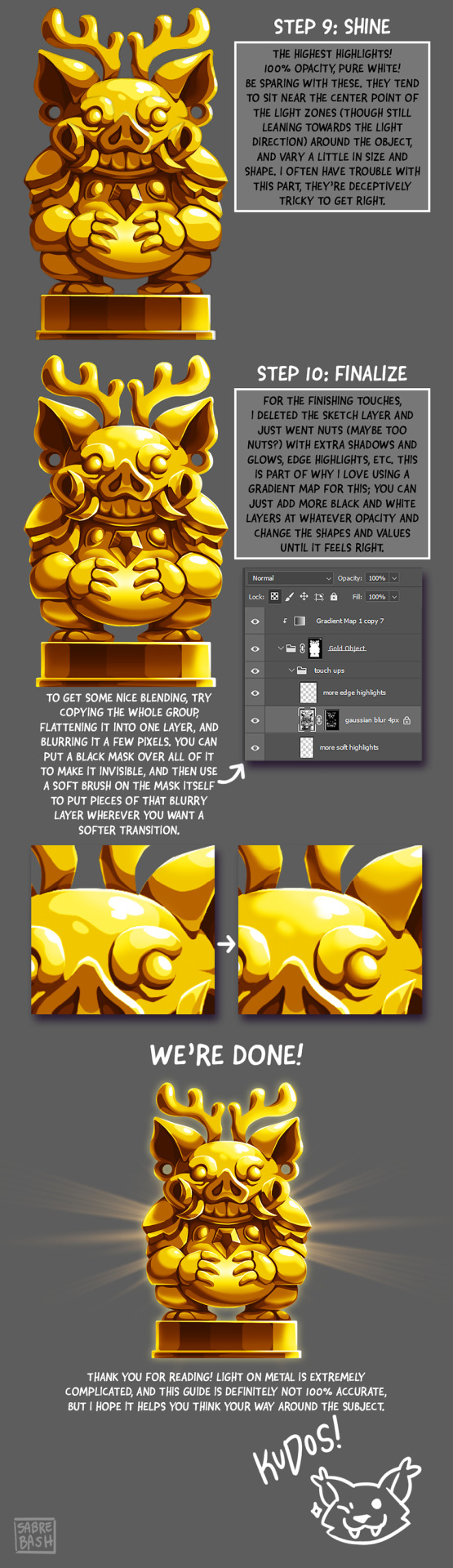
I have to draw a lot of gold and metal for my work, but wasn't happy with any of the metal tutorials i could find around. I prefer really specific instruction, so after some research i put together what i think works as a generalist's guide/tutorial. Not perfectly accurate, but i hope it's helpful!
#tutorial#tutorials#art#painting#artists on tumblr#reference#art reference#useful#art tutorial#art resources#tips#longpost
31K notes
·
View notes
Text
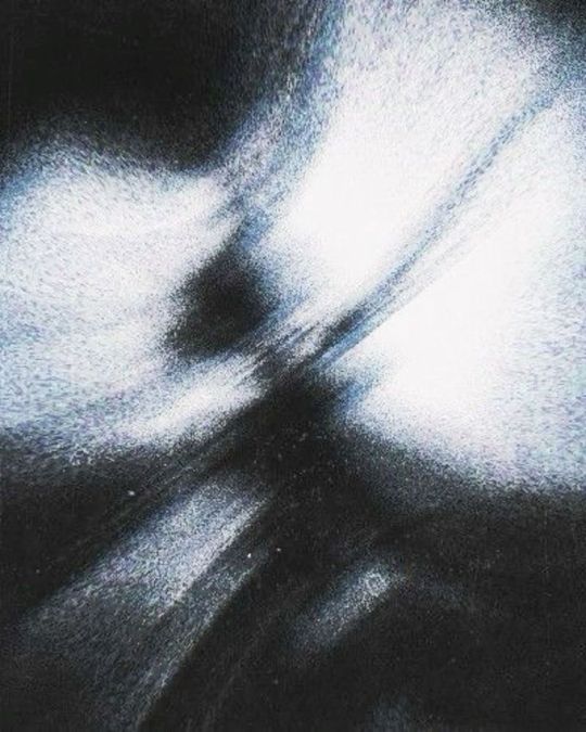
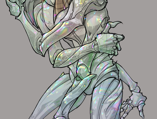
gonna show u guys a little opalescent highlight hack i threw together today
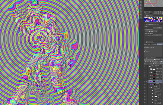
rainbow gradient above your main figure (i usually have all my main figure folders/layers in one big folder, so i can clip gradient maps + adjustments to it!). liquify tool to push the colors around a bit. STAY WITH ME I KNOW IT LOOKS STUPID RN I'M GOING SOMEWHERE WITH THIS
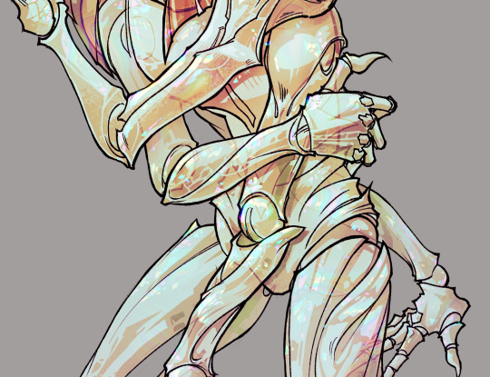
THEN: set it to add/glow (or the equivalent in ur drawing program), lower the opacity a bit, and apply a layer mask. then u can edit the mask with whatever tools you like to create rainbow highlights!!
in this case i'm mostly using the lasso fill tool to chip out little facets, but i've also done some soft airbrushing to bring in larger rainbow swirls in some areas. it's pretty subtle here, but you can see it better when i remove the gradient map that's above everything, since below i'm working in greyscale:
more granular rambling beneath the cut!
u could also just do this with a brush that has color jitter, but what i like about using layer masks for highlight/shading layers is how simple and reversible it makes everything. i can use whatever brushes i want, and erasing/redoing things is super low stakes, which is great when i often approach this stuff with a super trial-and-error approach.
example: have u ever thrown a gradient w multiple colors over an entire piece, set it to multiply etc, and then tried to erase it away to carve out shadows/highlights? it's super frustrating, bc it looks really good, but if u erase something and then change ur mind later, u basically would have to like. recreate the gradient in the area u want to cover up again. that's how i used to do things before figuring out layer masks!! but masking basically creates a version of this with INFINITE undo bc u can erase/re-place the base layer whenever u want.
anyway, back to rambling about this specific method:
i actually have TWO of these layers on this piece (one with the liquified swirls shown above, and another that's just a normal concentric circle gradient with much broader stripes) so i can vary the highlights easily as needed.
since i've basically hidden the rainbow pattern from myself, the colors in each brushstroke i make will kind of be a surprise, which isn't always great -- but easily fixable! for example, if i carve out a highlight and it turns out the rainbow pattern in that area is way too stripey, i can just switch from editing the mask to editing the main layer and blur that spot a bit.
also, this isn't a full explanation of the overall transparency effect in these screencaps! there's other layer stuff happening below the rainbow highlights, but the short version is i have all this character's body parts in different folders, each with their own lineart and background fill, and then the fill opacity is lowered and there's multiply layers clipped to that -- blah blah it's a whole thing. maybe i'll have a whole rundown on this on patreon later. uhhh i think that's it tho! i hope u get something useful out of this extremely specific thing i did lmao
12K notes
·
View notes
Text
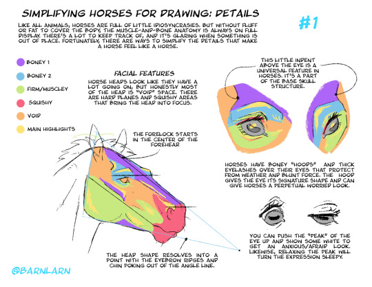
Working on another poster! Here's part 1: facial structure and eyes. Nose and ears up next.
Simplifying Horses for Drawing Part 1
#art#tutorials#horse#horse drawing#horses#tips#drawing tips#anatomy#drawing reference#wip#horse heads
3K notes
·
View notes
Text
How to wrap chinese jiaozi饺子 (dumplings)
3K notes
·
View notes
Text
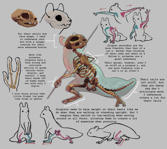
someone asked me a while ago how I draw slugcats and I wanted to make a huge guide going into how I rationalize their anatomy but I’ve been so busy w college I haven’t been able to touch it in like a month! So I decided to post these few notes I had! One day I’ll get back and make an entire guide but for now have these little notes :)
Animals I tend to gravitate towards for slugcat references are: otters, weasels, cats, and monkeys!
Also this isn’t me saying this is what their anatomy is, more so how I think of it and what landmarks I use when I draw!
4K notes
·
View notes
Note
Hi, Tracy! Can you please tell me... what that hell is the context of this drawing? Found this on here, Tumblr, and i have been asking myself ever since. Love your work <3
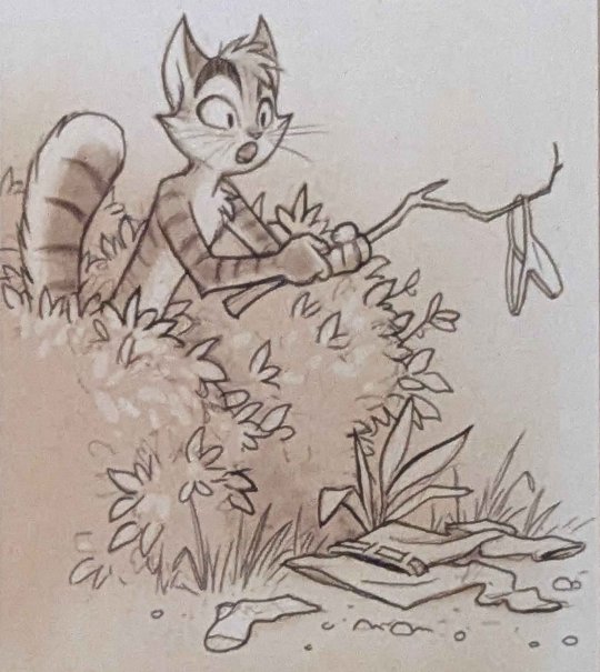
Hehe.. It's from a tutorial I made about drawing clothing wrinkles.
(The tutorial is available to my Patrons. It's also in the Lackadaisy Essentials Book + eBook.)
1K notes
·
View notes
Text
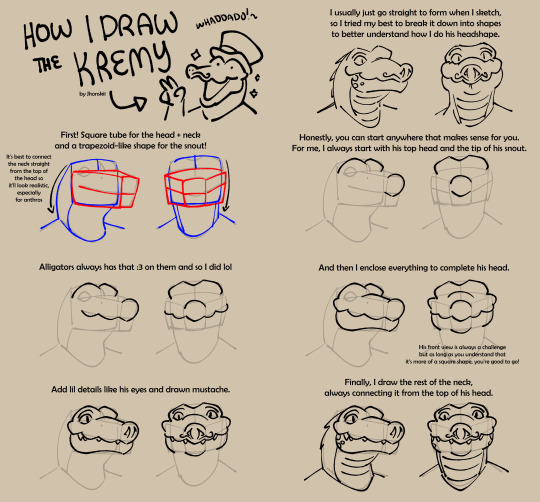
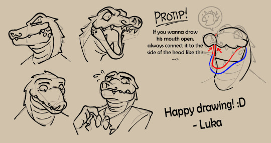
Made a quick tutorial on how I do Kremy's head for the peeps from the official avantris discord and now Imma share it here too :3
#jhonskii art#tutorials#kremy lecroux#once upon a witchlight#legends of avantris#alligators#fanart#hope this helps a little :'3
2K notes
·
View notes
Text
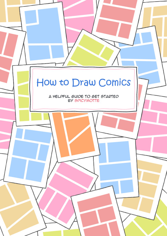
⭐ How to Draw Comics - a helpful guide for beginners by spicymotte is a 20-page booklet on how to make comics, even if you have never touched this subject before! My guide for comic newbies is now available on itch.io!
592 notes
·
View notes
Text
fuck the hero's journey you don't need all of that you only need 4 points to kickstart a story basis you can build on top of
who: want: obstacle: need:
define your character. tell me what it is they want in this story. what obstacle is preventing them from getting what they want? now, what do they need to realise in order to resolve their conflict? in some cases the need may result in the story ending without them getting what they want, and that's real bc they still went through an emotional arc. examples + rambling under the cut
i will bullshit something right now just to show you
who: a gay bartender. want: to get with the guy he's serving. obstacle: no matter what the bartender mixes and serves to try and impress the guy, the guy doesn't seem invested. need: to realise the guy wasn't interested in the drinks bc he was more interested in eyeing up the bartender, and that he only ever needed to ask the guy out in plain terms.
who: someone who sinks into the background and is very shy. want: to become famous and the life of the party, for everyone to know and like her. obstacle: talking to people is scary! and really hard to do consisently! need: to realise she didn't really desire attention from all sides, but just wanted one friend she could grow close with. turns out the quiet life is quite pleasant! and even more pleasant with a pal.
sometimes throwing down stuff like this will lead u onto more developing thoughts which tie stuff together more. such as: maybe girl in example 2 learnt she only wanted 1 friend bc she found someone who thought her shy personality was charming. so now you wanna develop who this friendly friend is, and so on.
you can apply it to stories you already know too. try and reverse engineer some stories you enjoy to figure out their basic structure.
ofc this method has its limitations, it kind of relies on some sort of moral throughline to tie things together instead of just letting things naturally exist and progress and find complexity, but as a way to kickstart writing a story from scratch it tends to help me out so i hope it helps u out toooooo
also just so we're clear dont worry hero's journey u are brilliant as u are and a fantastic tool for story-making. i just dont have enough braincells to do all that when i need to just chuck something out as a foundation which i can then play with and reiterate upon asap
#its 2am and ive been listening to cj the x#and i was overwhelmed with the urge to share this self consolidated lil checklist with the world bc i realised its just kind of#sat in my notes. but it's very handy so why let it rot in there#maybe it'll help someone. idk!#tutorials#writing advice
511 notes
·
View notes
Text
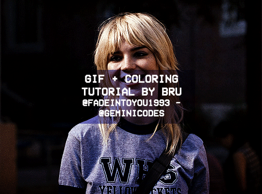
Hello! I've decided to make an updated tutorial on how I gif, since some of my giffing methods have changed since I made my first one (and this one is still valid, by the way! I've just changed a few things and I thought the update would be good.)
In this tutorial you'll find:
A download link for Photoshop CC 2020;
Step-by-step instructions on how to make gifs and color them;
A sharpening action for your gifs;
A base psd for gifs.
Get the tutorial here (just type 0 to get it for free, and if you'd like to support me, any amount is extremely appreciated).
I accept commissions for tutorials + support me on ko-fi?
#tuserdee#dailyresources#completeresources#userbecca#gif tutorial#gif resources#mine#resources#*#my tutorials#tutorials#my resources#gif#my psds#my actions#psds#actions#reposting it on main bc fucking sideblog is shadowbanned LOL!!!!!!!!!!!
421 notes
·
View notes
Text
Halfway through a Tumblr art tutorial on how to draw horses, squinting at the screen with furrowed brow like, okay, is this a very high concept autobiography piece, or is it really just about how to draw horses?
686 notes
·
View notes
Note
If you don't mind my asking, how do you go about drawing fat? :3
JUST THE EXCUSE I WAS LOOKING FOR
So, for me personally, a lot of the time when I draw fat characters, I'm not looking to specifically capture the specifics of fat as much as the feel of fat. Bulkier, rounder shapes in the right places that has a feeling of weight to em! A lot of that is intuition and simplification at this point, but it all works on the same frame as just any ol' person. Like take this-

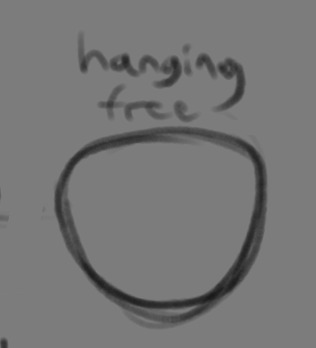
For example. This is the basis for any body shape, not just the more average one that it may imply. Sure- it can be that average body shape:
But also a fat one too!

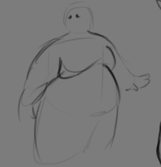
And a big part of that is knowing where fat usually tends to bunch up on the body, so lets take a look piece by piece! (Please keep in mind this is very simplified, and not completely precise in some parts)
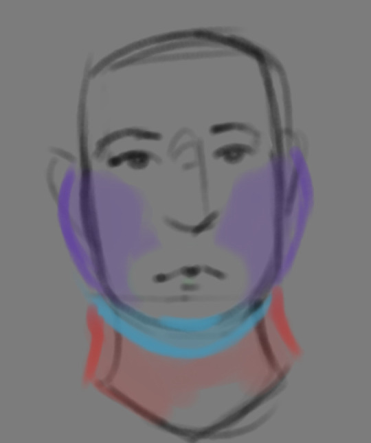

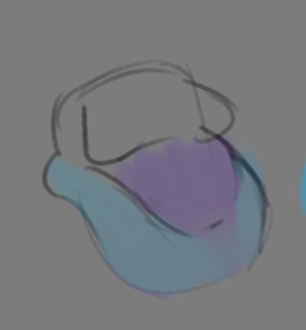
THE FACE: Cheeks (in purple) and especially the chin (in light blue) are the places where a lot of the fat is gonna wanna gather and round out on your face! Additionally, theres a small pocket of fat beneath the cranium on the backside of your head. It's small, but it is there. I believe fat can build up elsewhere like the bridge of your nose and forehead, but generally speaking, you're gonna have a whole lot more buildup in other places first.
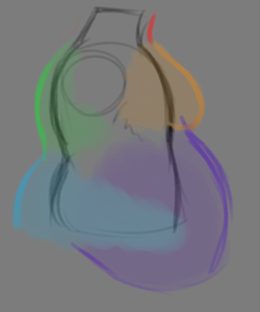
THE TORSO: A lot of the fat built up on the torso is gonna be sent to your tummy. More cushioning for vital organs, mostly out of the way, it just makes sense. Additionally, the lower backs fat builds up and joins with a patch of fat on your sides that forms what is typically referred to as the love handles to make that double belly look. Along with this, the immediate next target for the torso is the breasts, followed by the upper back!
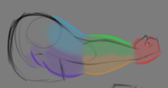
THE ARMS: For this limb, a VERY notable amount of the fat present builds up on the tricep and bicep areas, lessening once you get towards the flexor and extensor areas. You can almost think of the arm as a sort of triangular shape, wide side starting from the shoulder and tapering towards the hand, which itself mostly builds up fat around the back of the hand and the fingers. The shoulders themselves don't build up too much fat unless you got a lot
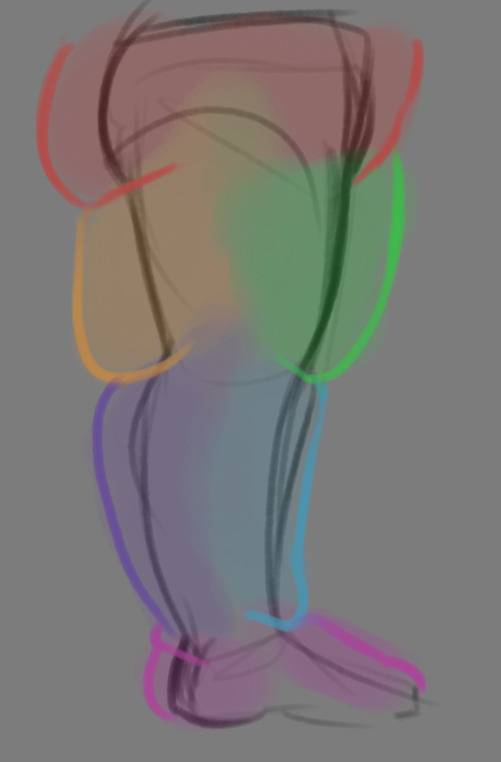
THE LEGS: And finally, you can think of the legs having pretty similar curves to what you're probably already used to thinking. The front of the thighs getting a big buildup, along with the back of the calves, the other parts being flatter in turn. As far as the feet go- similarly to the hands, the top of the feet, along with the heels get most of the buildup, as fat on your soles would impede mobility. The glute, hip and crotch area will also especially build up fat, lending to the same triangular shape that you can see in the arm!
A big thing to note with fat is that it tends to taper off towards joints. Your knees, elbows, shoulders, hips, and all the other places are gonna have significantly less fat so that you remain mobile and flexible, as that's important!
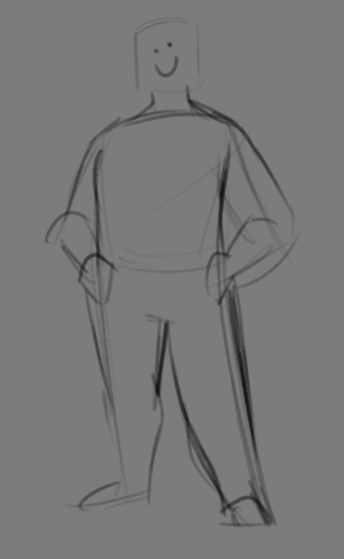
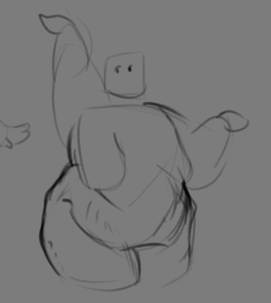
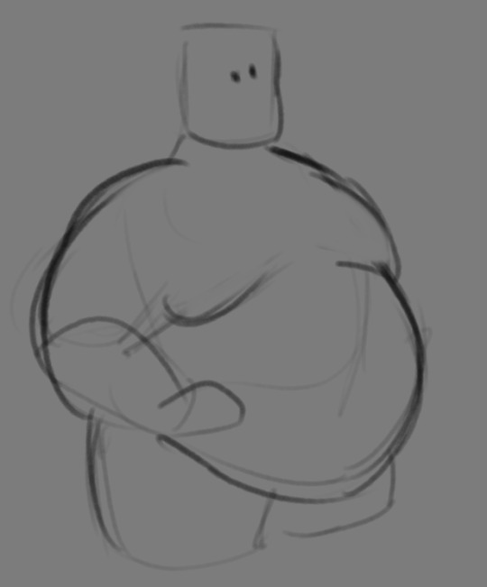
Now that we have an idea of where fat builds up on the body, you might have something that looks kinda like this
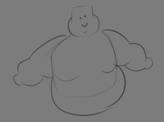
Which yes, does demonstrate a solid understanding of the places fat builds up, lacks the weight you're probably trying to convey, which brings us to out next point! Fat is well... heavy! Gravity is what gives fat much of it's shape, especially as you tread towards larger and larger bodies.
This is demonstrated really well on the arms especially-


Those big ol' bits of fat'll really start to sag when left hanging, and they will squish like hell if they run into something. I like to think of these bits of fat as big ol' ovals that squash and stretch depending on if there's an obstacle in their way or not


These are the important shapes to remember when it comes to the weightiness of fat! If you take all of this into mind, you should be getting something a lot closer to that shape you've been after!

Oh, and always remember that fat bodies come in all variety of shapes and sizes! Play around with a whole lot, and seek out all the resources you can! it'll really lend to your knowledge when it comes to this kinda stuff!
And as I always recommend when it comes to learning art- look at what your favorite artists do with fat bodies. See what you really like about the fat bodies they draw and try to replicate it in your own work, I promise you it's one of the most helpful things ever.
This is like the most basic of basics when it comes to drawing fat bodies though. If there's any additional thing about fat bodies, or maybe you want clarification on something, don't be afraid to ask! If there's enough to cover, I'll make an addition to this post!
#hat answers#my art#design talk#tutorials#yeah im unfortunately pretty tired so this gets a liiiitle rambly at the end but i think this covers like the basic basics#i hope this was helpful at all#and again dont be afraid to ask questions and stuff#if theres enough traction/questions on this i will most definitely try to clear up as much as i can in an addition to the post#whoops this took a bit!
3K notes
·
View notes