#there are too many colors but the vibe is there
Explore tagged Tumblr posts
Note
i'm buzzing from coffee so here we go. sorry if i missed anyone, my memory is akin to the invertebrates sometimes. also i'm tagging people who may not even know i exist in this, so if you don't want to be tagged, no hard feelings, lmk and i can remove it ᰔᩚ
ps. this is all /pos, /lh, and /genuine with some /silly sprinkled in
@queen-belial i have 0 idea who astarion or durge is, and i have never played baldur's gate in my life. but nevertheless, know that i am always so utterly enamored at the rare crumbs of art and fics you post.
@abyssmal-skies you're one of the few people who are still into traditional art and i think it's amazing!!!
@harmonysanreads with her crazy deep in-depth character analysis proficient brain writes banger after bangers of yandere works that will make you shiver in a good way.
@brynn-lear is yet another lv.999 yandere writer, with her plot twists, unique ideas, signature art, → !!!GAMES!!! <-, and cannibalism tendencies.
@mochinon-yah with her amazing amazing art and personality as sweet as her name.
@euniveve with her series and worldbuilding and amazing arts like girl how does your brain work i need to study it.
@pranabefall who cuts open my heart and stabs far too many needles in it before sewing it back up (wow thanks, doctor) with her beautifully painful fics.
@jessamine-rose the concept of playing with dollhouses as a blog 'theme' itself is already so unique, but the worldbuilding and character building jess is doing in every fic of hers is INSANE!!!
@naraven alon oh alon.... your music. you're the toby fox in our squad in my head and i really hope one day your music will be heard by all.
and if we're speaking about beautiful proses being written to mesmerize your senses, @chryseis-lxve aka cherry does it like no other!!!!
@teabutmakeitazure serves quality dark tea for your aventurine, childe, and chrollo fixations ☕️
@dottiro is THE canon dottore writer in my head but their pantalone fics especially are so 🫶🏻🔥🩸 (interpret those emojis as you will)
@stickyspeckledlight may use whimsy and silly words in their fics but you'll look up from their works at the end of the day and go 'what the fuck /pos'.
@crystalflygeo writes delicious smut (and will occasionally break your heart *sideeyes LoHK*) and will beckon you to visit her blog more for more delicious food (perhaps pet the local deer in the process too).
@floraldresvi may not be your 'typical writer' where she posts drabbles under the 'x reader' tag, but she drops a bouquet of happiness into her friends' inbox and i respect that so much ᰔᩚ
@silentmoth if the utterly adorable moth persona didn't bait you into looking into moth's blog then you're a monster let me just say i binged moth's masterlist. it was very worth it. 20/10 would do it again.
@pawpiefawn's calming, quaint vibe doesn't deceive - it's a cozy space for wriothesley and al haitham enjoyers, but let's be real here. i think the main charm here is miss ying's personality!!!
@silkjade has a way of writing that will leave you wondering what beautiful truly means because her aesthetics sense is top-tier and it flows into the way she writes her fics ✨
@pearlywritings has super comforting and fluffy fics that makes my day and some spicy stuff that makes me go 👀 → 🤔 → 🤤... i don't even kiss diluc but i want to root for familyau!diluc and reader, they're SO LOVABLE.
@the-travelling-witch has a plethora of magical potions you can select from, but just be careful because the poisons are as potent as the love potions ;)
@risustravelogue may be on hiatus but will still forever be one of my favorites because time means nothing to the kinship i have over fellow devs doing art and writing ;w;
the combination of @persicipen's pastel colors and the way she writes always leaves me feel like i've just watched a grand performance at a local classical concert at the end of every fic ✨
@lovegasmic if mila's theme(s) isn't pulling you in then i am silently questioning your aesthetic sense her yummy drool-worthy smut fics will. the o■■p■s fic.... the kn■■■■■g fic.... mmm.... yes.....
no big sis? no problem! @grimmweepers is THE big sister figure and THE al haitham writer for your al haitham fixations.
@unriding if evie's personality hasn't pulled you in then you're a monster her moze musings and fics will; i don't even kiss him but she makes him look so squishy (/pos).
@euthymiya with her quality writing pumps content after content of quality dishes (and side dishes of personal rambles which i find endearing) all over my dash, it's amazing.
@saetiate if their url didn't clue you in their wit then let me ー you'll find banger genshin and hsr smutfics that will blow your mind like it did mine.
i used to associate @catcze with pink but now i just associate her with being one of the aesthetic queens bc every theme is SO pretty ー delve into her wriothesley tag, you will not be disappointed.
@xeraeus with the amazing amazing art that i always somehow miss because timezone is a bitch (jun, i still think you're secretly a wizard or something bc how do you finish commissions that fast!!!).
@danijaci needs no introduction, we all know they're an absolute madlad in drawing (/pos) and those comics + blushing series + biker series will alwasy live in our head rent-free.
i personally think a good artist can relay a story or depict an object with a few lines because it shows that they fully understand the essence of things - which is what @erabu-san does splendidly.
idk if this is allowed but can we make this ask into a post where everyone tags their favorite content creators/artists/fic writers in the fandom so that they get the recognition and love they deserve!!
let's do it!! 💖💖💖
@jojaxcola @crispyanonart @eemamminy-art @itsmeglycine @nicoleknives thank you for all your wonderful sdv art <3
#rin reblogs#ok back i go to hide in the back of my teahouse now bye#sorry for the tags shfshdfh i hope it wasn't a bother!!!
194 notes
·
View notes
Text
High & Low: Part VII
A Drew Starkey x singer/actress!oc SMAU
Summary: While on hiatus from touring and wanting to branch out with her career, Ivy Blake auditions for OBX, immediately hitting it off with none other than Drew Starkey during their chemistry read. As tension and drama brew between the two, can they get through the highs and lows that come with fame and relationships together?
A/N: Small blurb today along with the usual posts! Kind of a filler chapter. Enjoy!!!
Dividers by: @cafekitsune ⭐️🌙
Previous Part // Masterlist

Ivy was confused, to say the least. Why on earth would O*dessa be messaging her about Drew? Irritation flared inside her as she considered even opening the message.
She glanced over at Drew, who was peacefully sleeping, completely unaware of the constant thoughts plaguing her mind regarding his relationship with O*dessa. He didn’t recognize the discomfort she felt each time her name came up. It wasn’t like Ivy to be so wary of a friend of her boyfriend; she usually made a significant effort to get to know them. But something was stopping her, especially after her conversation with Madelyn just a few days earlier.
It felt as if she didn’t want to accept the possibility that her suspicions were valid, and she certainly didn’t want to confront them head-on. She knew she needed to talk to Drew about her feelings, but how could she bring it up without sounding crazy and jealous?
Ivy wanted their relationship to thrive on communication and honesty, and if she didn’t confess her feelings now, she feared she would only build a wall between them. She understood that she’d never be able to fully let him in if she didn’t start now.
Letting people in had always been difficult for her. After being played and used by too many people in her almost 26 years, she learned those lessons the hard way. This time, with Drew, she refused to let that pattern continue. She had fallen hard for him and, for the first time in her life, saw a future with someone. There was no way she could throw that away over some silly insecurities.
These thoughts kept her awake until the sun began peeking through the cream-colored curtains in her childhood bedroom, causing Drew to start stirring.
Ivy felt his arms wrap around her, pulling her to his chest and pressing a kiss to her neck. “What are you doing up so early?”
“Couldn’t sleep,” she sighed, turning in his embrace to lay across his bare chest, melting into him. “Guess I had a lot on my mind.”
His arms tightened around her. “Anything you want to share with the class?”
She chuckled half-heartedly, her heartbeat thrumming nervously in her chest. “Actually, yes. It’s about O*dessa.”
Drew stiffened. “What about her?”
“She messaged me on Instagram last night, asking me to get you to reach out to her.”
“I feel like there’s more on your mind than that.”
Ivy hesitated, feeling her hands start to shake as the fear of potential confrontation took over. She didn’t like being that girl—laying her insecurities bare and discussing her feelings. In the past, it had always led to conflict. She had a habit of bottling things up just to let them go without a fight, finding herself a human doormat. This relationship with Drew would not be like that, even if it physically pained her to go against everything she was accustomed to.
She sat up, turning to face him and occupying her hands with the hem of the threadbare t-shirt she had dug up from high school. “Um, there is. I’ve just had this feeling about her. Like there’s something off about her vibe. The whole thing with the event mix-up last week has been really bothering me.”
Drew closed his eyes, mentally battling the guilt about the situation. He had been deciding whether to tell her that the entire thing had been a setup, manufactured by none other than O*dessa herself.
“Baby, why didn’t you tell me about any of this?”
Ivy sighed, avoiding his gaze. “I didn’t want to cause any problems. I know you’re close to her, and I’d never tell you who you can and can’t be friends with, but my gut is just telling me something is off.”
“Do you not trust me?”
“Of course I do. I just think it’s her. She seems very dependent on you, and I get that, but…”
Drew noticed Ivy’s shaking hands as she started to pick at her nails—a nervous habit that usually emerged when she felt anxious or overwhelmed. It pained him to see her so torn up just discussing something that bothered her. If he could, he would personally confront everyone who had ever made her feel like a burden for sharing her feelings. He knew how hard this was for her and he hated that he couldn’t help her more.
His hands found hers. “Sweetheart, look at me.”
She glanced up, meeting those denim-blue eyes that she adored.
“I swear to you, you have nothing to worry about. We are just friends, and we have only ever been just friends. You’re my girl. I feel terrible about missing your event, and I promise to start writing everything down so there aren’t any more mix-ups.” He rubbed his thumb across hers, feeling her shaking start to lessen. “But I need you to talk to me about things. I know your past has made you hesitant to open up, but this is different, baby. We’re different. I want to know every single thought that goes through that beautiful head of yours.”
“I’ll try.”
______
drewstarkey
Liked by haley_james, JillianBlake, and 2,347,766 others.
drewstarkey happy birthday stink 🧜🏼♀️
View comments
User1 HAPPY BDAY IVY
user2 this is so cute
User3 no one’s gonna talk about the 2nd pic???
railaslovechild THEIR BIRTHDAYS ARE ONLY A DAY APART 🥹
user4 HBD QUEEN
starboyd

Liked by JillianBlake, brooke_starkey, and 123 others.
starboyd Happy birthday, angel 🩵
View comments
sonotivyleague 🥹 happy to be spending and almost sharing a birthday with u 🩵
madrecliner I TOLD YALL TO STOP IT 😭
lacigurl HAPPY BIRTHDAY GORGEOUS 💋
brooke_starkey happy birthday, pretty girl! ☺️

ivyblake
Liked by drewstarkey, hichasestokes, and 23,387,977 others.
ivyblake it’s been a good day 🩵
View comments
madelyncline 26 HAS NEVER LOOKED HOTTER
carlaciagrant happy bday gorgeous girl 🫶🏾
madisonbaileybabe HAPPY BIRTHDAY ANGEL FACE
drewstarkey🪽🩵
user4 HI DREW
user5 DID ANYBODY SEE DREW’S STORY JUST NOW??!
railaslovechild OMFG DID HE SET THIS UP?! MY HEART 🥹😭
o*dessaazion hbd
user1 🤨 @/user2
user2 @/user1 🥸
sabrinacarpenter happy birthday darling 🩷🩷🩷
TheIvyLeague HAPPY BIRTHDAY QUEEN 🎁🎉🎈
ivyblakeupdates HAPPY BIRTHDAY YOU LOVELY HUMAN
ivyblake
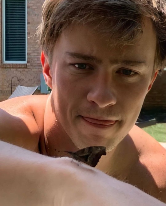
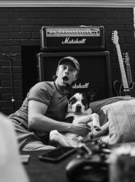
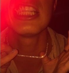
Liked by brooke_starkey, railaslovechild, and 21,332,456 others.
ivyblake happy birthday drewby doo, hoping you had your daily pb&j to make it the best day 🩵
View comments
drewstarkey I suspiciously had a freezer full of Uncrustables this morning, any idea how that happened???
ivyblake that’s so strange 🤭
user1 they aren’t even trying to hide it anymore 😂
railaslovechild MARRY EACH OTHER RN
madelyncline Happy birthday drewseph!!!
DrewIvyUpdates SO CUTE HBD DREW
DrewIvyUpdates wait is that IVY'S NECKLACE IN THE 3RD PIC
sonotivyleague
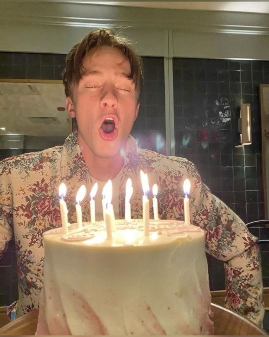
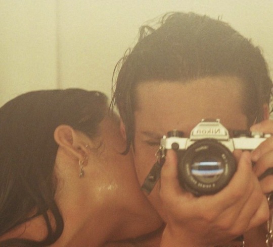
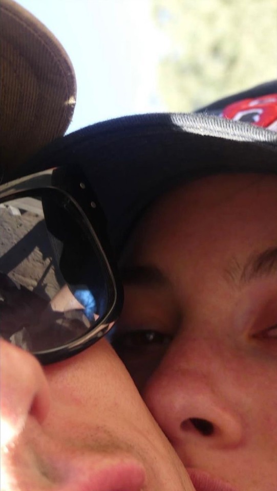
Liked by haley_james, lacigurl, and 213 others.
sonotivyleague birthday boy 🩵
View comments
JillianBlake happy birthday sweet boy!
starboyd thank you mama Jill! madelyncline already in good with the in laws I see 🤭
rude_boy hbd drewseph!!!
lacigurl HAPPY BIRTHDAY BESTIE!!!
o*dessaazion
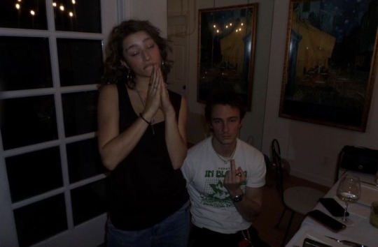
Liked by ivyblake, drewstarkey, and 877,323 others.
o*dessaazion Happy birthday Joseph. Keep eating that pb n j once a day, it's really good for ur bones
View comments
user3 ummm, did she just somewhat copy Ivy's bday post???
user4 this is umm.... yeah
user5 Ivy liked....
hater1 I LOVE U GUYS
haley_james lol...ok
user4 HOLY FUCK user2 did not see that coming
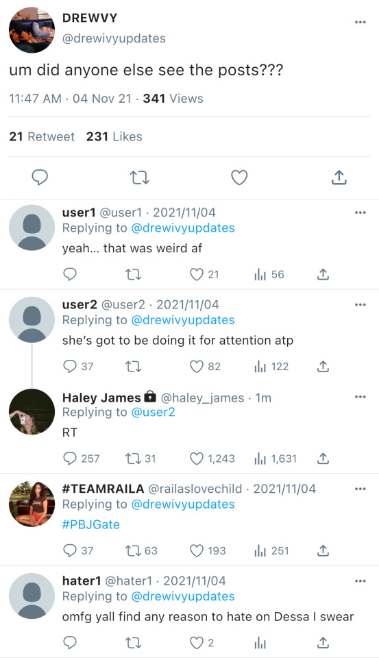

A/N: Not Haley being messy 🫣
THANK YOU for all of your support!!! Please let me know what you think and don't forget to like and reblog! My inbox is always open for any thoughts or discussions you would like to have about Drew/Ivy! I would love to hear from y'all.
Taglist: @davinashifts333, @rafegf-real, @chalahyung01, @jjmaybankmylovee, @f4irywor1d
#drew starkey#drew starkey smau#drew starkey blurb#drew starkey x oc#drew starkey angst#drew starkey fanfic#drew starkey fic#drew starkey fluff#drew starkey imagines#drew starkey social media au#drew starkey fanfiction#drew starkey imagine#drew starkey one shot#drew starkey one shots#drew starkey scenario#Drew Starkey x actress!oc#drew Starkey x singer!oc#Drew Starkey x costar!oc#High and Low LNV
29 notes
·
View notes
Note
( @phantomguild ; ???)
The Shaymin leaned down, observing the Goomy's coloration. She'd never seen a shiny Goomy in specific, but she did know enough about the species to know what they normally look like.
"Out of curiosity, you're what some call a 'shiny pokémon', aren't you? Don't see too many of them in my travels, especially with my universe in the shape it's in."
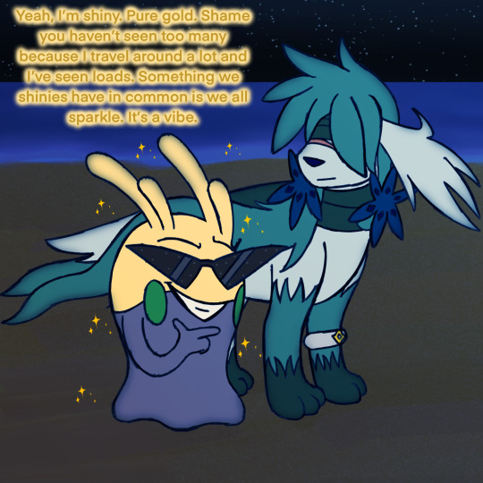
Slime Boi: I'm sure you'll be able to find some more if you believe.
*He looked curiously at the shaymin.*
Slime Boi: We've gotta talk about you. I mean, I've seen a lot of shaymin in my time and you've certainly not got the colours of a regular shaymin. It's a vibe I dig. Go out of the box. Screw the norm. What's up with that? And also what was up with that comment about your universe? Like, is it in bad shape? You could say I know a thing or two about universes so I wanna know what the dealio is there.
#pokeaskmagiretreat25#ask blog#askblog#goomy#pokeask#pokemon#pokemon ask blog#pokemon askblog#pokemon oc#pokémon#pokémon askblog#pokémon ask blog
20 notes
·
View notes
Text

As one game project nears completion—you'll ideally see it by halloween—I start concept work for the next. Meet... Archer, I guess her name is. She came about as a study in building a character (secretary bird with robot legs) around a game idea (action-platformer where you kick things) whose design is still at least vaguely readable at 64px tall, all under a limited palette resembling but not wholly constrained to '1-bit'-style pixel art. Ended up with more of an NES look, albeit with extra colors.
#furry#anthro#my own art#oc#original character#universe undetermined#game dev#bird#secretary bird#prosthetics#cybernetics#sprite art#aseprite#pixel art#limited palette#1 bit#well kind of#there are too many colors but the vibe is there
138 notes
·
View notes
Text
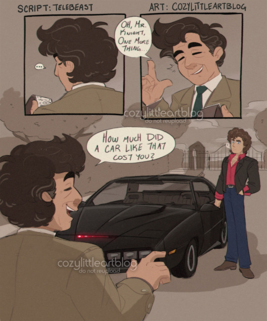
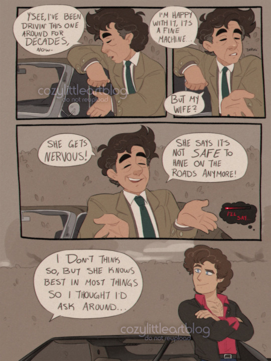
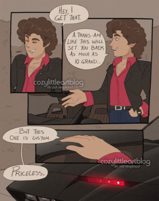
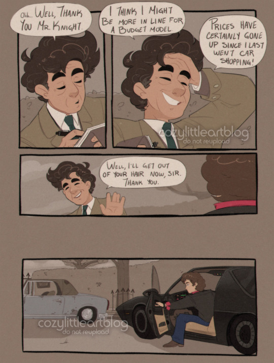
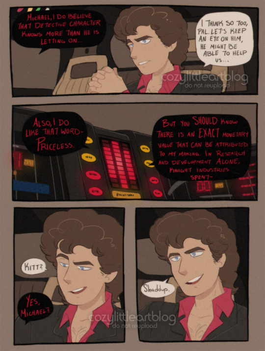
Columbo and the Knight (1984)
put me in the universe where Columbo ran through the 1980s and had a crossover episode with Knight Rider. I think they deserved it, and I am not just saying that because they're my two favorite Old Shows. @telebeast wrote a little fanfic blurb about it and I HAD to visualize it into a comic (which is also the longest comic I have finished thus far at five pages...), so writing credit goes to them.
Autism W!
#columbo#knight rider#art#michael knight#kitt#comic#highlight reel#crossover#telebeast#there are two small easter eggs here. can you find them. they were somehow not Entirely lost when i resized these for the public#this is what i mean when i say I Draw And It's Everyone Else's Problem. look at my INCREDIBLY niche crossover comic boy#if the knight rider fandom has like 12 people in it. how many of y'all have seen columbo#this comic is for like 4 people and me and phoenix are already two of them#niche is my specialty lets be real. weird niche obscure shit and ships nobody's paid attention to yet#not to suggest this is ship art. columbo has his wife and michael has his car lmfao#stylizing real people is EXTREMELY hard btw sorry for when they get off model. its partly a 'better imperfect than never finished' situatio#cant tell you how much i redrew some of these panels. weeps#this took me 2 weeks but i think i thumbnailed it all in may and the ideas been rollin around in my head since march#is anybody good at editing. please edit michael and columbo into an image together like its a screenshot. NOT generated. edited.#it would be so cool#ive drawn columbo a lot but i haven't drawn a lot of michaels. i was learning things about his outfit AS I WAS DOING THE DAMN#COLORS ON THIS. all the lines done. it was too late to change anything. i did all the lines and colored page by page#i realized my mistakes on like page 3. 1 and 2 were already done. it was Too Late.#imagine it though. them working a case together. switching between the more serious tone of columbo vs the goofier#action antics of michael and kitt. columbo being so impressed by Modern Technology. there's more i could say but phoenix may write#more of this crossover and i don't want to spoil it :'3#there's opportunity here though i swear. there's gold to be dug.#i like how kitt gets shading but columbo's junker peugeot doesn't. kitt looked wrong without any. columbo's car is matte and dirty#i also applied effects to this to make it look a little film-grainy and VHS like. some CRT TV vibes#the only question left is. did they put knight rider into columbo; or columbo into knight rider 🤔
3K notes
·
View notes
Text

creeping shadows, rising smoke
the kremy wallpaper is done! @szaryherbatnik gave me the idea in the first place <33 (like. a month ago….better late than never?) click for higher quality; speedpaint beneath the cut
#FELLOW KREMY NATIONERS (szare especially. of course) THIS IS FOR YALL#more kremy content <33#drawing him is one of my favorite things ever#im surprised this took 1h45m???#it felt so much longer#probably because my first attempt (only got to the grayscale sketch phase; 46m) spanned many many days (way too many..)#i only now realized that. my other rendered piece of kremy has the same overall vibe/color scheme…….#i actually went back to check the other one and#damn#the way i draw kremy has evolved so much in like five weeks??#much happier with it now#ramble over thank you for reading thus far <33#kremy nation#once upon a witchlight#legends of avantris#kremy lecroux#ouaw#my art#ouaw fanart#illustration
378 notes
·
View notes
Text
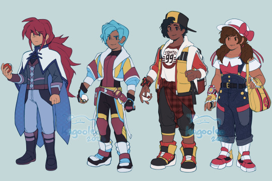

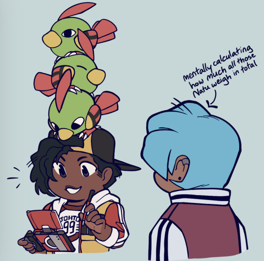
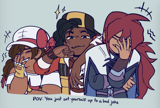
the gangs all here!!!
#kagarts#rival silver#trainer kris#trainer ethan#trainer lyra#johto#pokemon gsc#pokemon hgss#I think it’s fascinating seeing so many interpretations of this bunch#on who is champion or what each of them do in postgame/timeskip scenarios#it’s really cool seeing so many variations of each like. hell yeah man#here’s a lot of factoids on designs sorry for the wall of text in advaaaaaance#lance picked silver’s main cape color and chose white so he would appear less intimidating and approachable when teaching kids about dragons#lugia matchy too for that dragon connection there#kris’ gear revolves around biking and the lil tassles were an attempt at suicune ribbons#she has aspects from all the lion dogs in her full fit (she gets a helmet and jet/boostpack)#channeling kamen rider and bomb rush cyberfunk/jet set radio to give her a more future vibe#ethan I personally wanted to channel the ken sugimori chill vibe of how he was drawn#very old school (college fit); with a bit of early age grunge#friend to all birds and does a bit of nature/wildlife photography (based on the hgss picture taking feature!)#also loves the pokeathlon#he gets a ho-oh pattern/colorset for his tracksuit#lyra in this interpretation is the champion and got to battle red#protag to protag communication happened and she wants to set a better example for trainers going forward#a great teacher who wants to encourage the next set of trainers to set out on their own journeys#she’ll be the champion until she has to pass that torch on#but she also cares for the ilex shrine as per family tradition (even taking that with her into her champion outfit! celebi dresssss :D)
1K notes
·
View notes
Text

👾Went for lazer tag vibes👾
#gravity falls#bill cipher#art#digital art#iartbook#too many colors#im procastinating#lazer tag vibes#colorful#fanart
154 notes
·
View notes
Text

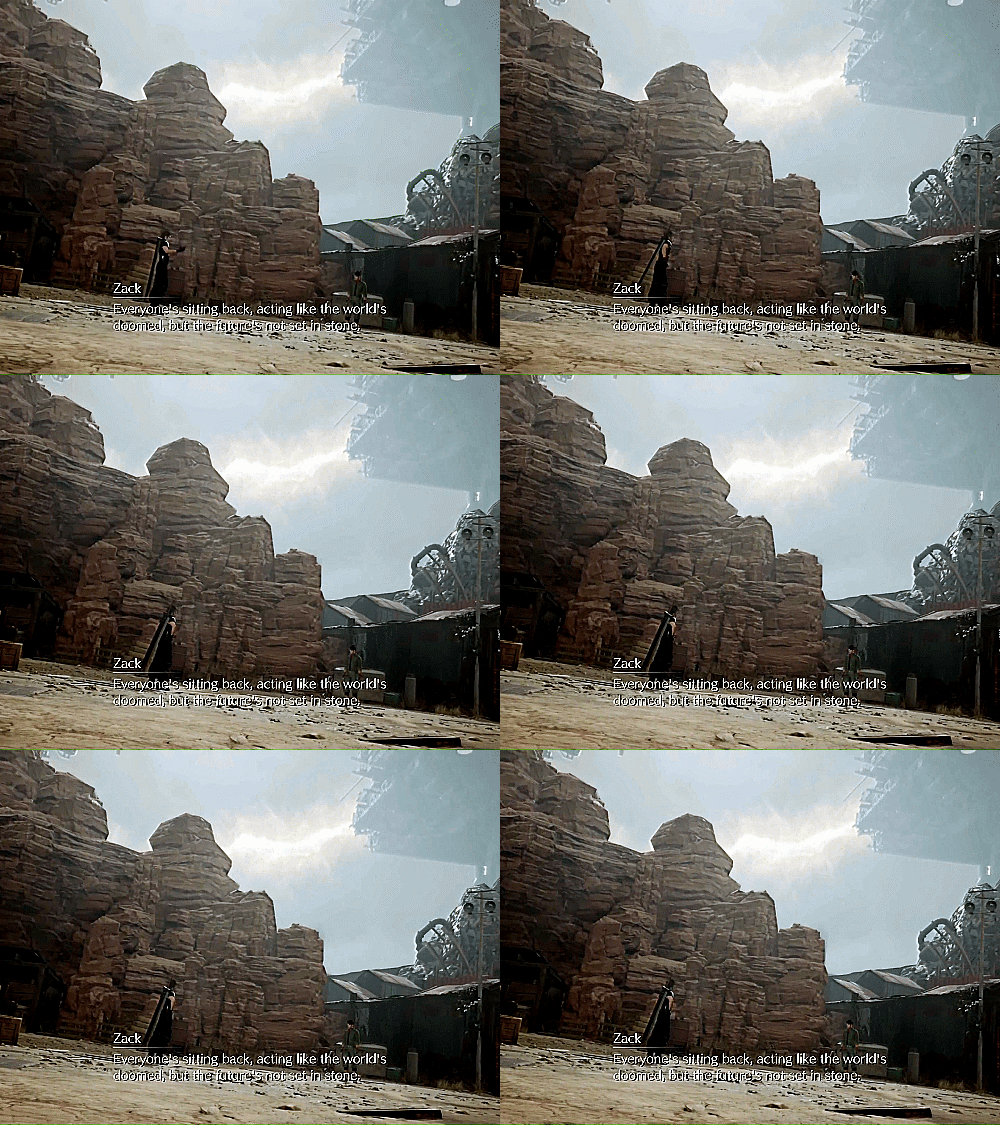
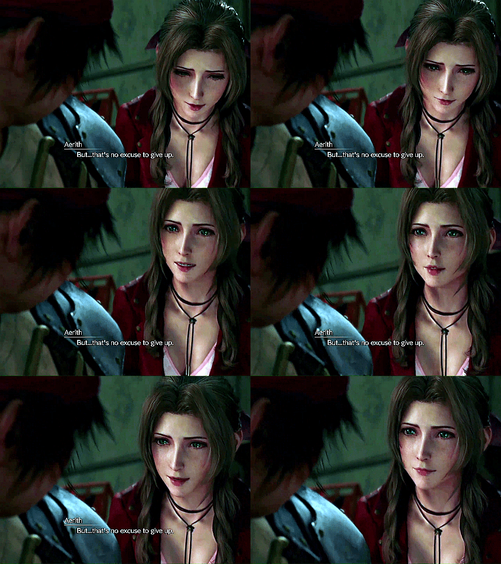
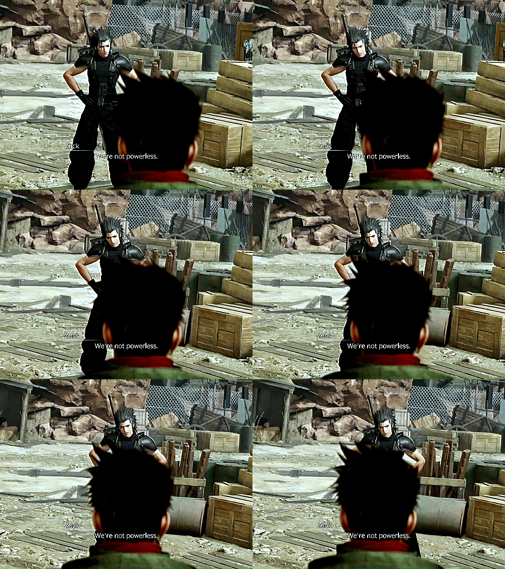


"The world's lucky to have you."
#ffvii remake#ffvii rebirth#ffvii rebirth spoilers#zack fair#aerith gainsborough#zack x aerith#zerith#biggs#wedge#briana white#caleb pierce#ff7redit#ffviiedit#zackfairedit#aerithgainsboroughedit#zerithedit#just wanted to make a gifset with zerith talking to/motivating avalanche members they barely know#i know aerith hardly has any scenes with wedge but still...#also their speech read as sort of similar to me? idk#there's at least one more gifset of them talking to biggs and wedge that i wanna make#just genuinely good people trying to do their best to help#i know biggs was the only one to say that quote but i feel like wedge might've thought something along those lines#look i'm a multi-shipper but i just think that personally this is zack and aerith's best match?#they're alike in so many ways but they bring out different sides of each other and i just think that that's beautiful#aerti is the second best aerith ship to me#but like... CLOSE second#what can i say? zerith gives me rapunzel and eugene vibes a little!#it's the rotating camera in both scenes for me too#pardon me i can't color correct these scenes for shit...
198 notes
·
View notes
Note
hi i ride motorcycle year round and wanted to chime in. for vasco's small around-town trips he'd probably be fine with his ears free, but for longer trips at higher speeds or when its cold out he'd want them protected. probably by tucking them under his chin into the collar of a jacket and then putting a scarf or bandana on. also goggles would be helpful if a full helmet wasn't wanted. since they're in europe and around italy specifically he could have a nice ducati (fast rockety sport bikes) or a cafe racer (much more like a motorized bicycle but they can still have a lot of power) a cafe racer would offer a lot of seat space for machete to be thoroughly uncomfortable in lol
i love your ocs they're great thanks for all the cool art :)
.
#oh that's really good practical advice actually! I've never riden a motorcycle so I wouldn't even know where to begin#the ears tucked under the jacket collar is a smart way to go about it#having hard time choosing a bike for him there's too many options#it looks like lots of ducatis have a very sleek and sporty vibe to them#loving the bright colors and the shapely design#cafe racers on the other hand come across as iconic looking to me and could potentially have a sort of vintage aura which I personally like#and the flat topline (I'm sorry I don't possess the right vocabulary for these things) that some of them have is visually pleasing#they'd be a nightmare to draw though since the frame is a lot less covered and there's a ton of complex mechanical detail in the midsection#bike viscera if you will#I don't know but it's fun to think about#thank you for chiming in! this was genuinely helpful#answered#anonymous#modern au
255 notes
·
View notes
Text
stuck while playing the newest horrortale waterfall game??? I CAN HELP!!!!
below are Triglycercule's Tips And Tricks for beating the puzzles and such :3 WARNING FOR SPOILERS OF COURSE HEHEHE
ways to avoid certain death:
DONT say you'd fight for your life when goner kid asks
DONT take the river person's boat
CLOSE the door flap right before you go through the bushes
AVOID ending up with the temmies
DO NOT talk to sans/horror (even though its tempting... i know i know)
DO NOT open the water valve until the color puzzle is solved
(there might be more but i can't remember as of now, feel free to add on and i'll add them!)
the two puzzles i personally struggled with the most were the bushes and the colors. for the bushes i assume you have to follow what the echo flowers and this map says


BUT PERSONALLY? i just figured out the way to the bushes by guessing. the pattern is LEFT RIGHT LEFT (and then you'll get to monster kid and be able to get sans's bone!) (if not you end up with the temmies and,,,,, aliza dies D:)
FOR THE COLOR PUZZLE you have to use the word searches given to you below:


the way you use these word searches to solve the color puzzle is to solve them and then the letters NOT used in the answers are the solutions! i solved them already so here they are


the order is BLUE RED GREEN!! input that into the water valve below sans that you unlock after returning the bone from monster kid to him and.........

YIPPEE!!! ALIZA ESCAPED!!!! i hope this was helpful :3 i am very lazy. i dont know how i had the time and patience to do this on my own. for those out there who are ALSO very lazy: this is for you. if i missed anything again feel free to let me know and i'll add it!
like and subscribe for more bangers and dont forget to hit that notification bell if you like my videos B) see you next time gamers
#GOD playing this game was so good the atmosphere..... the vibes the dialogue the animations ALL OF IT WAS PEAK#IT WAS WORTH THE WAIT!!! THANK YOU SOUR APPLE STUDIOS FOR NOT GIVING UP ON HORRORTALE ❤️❤️❤️❤️#my favorite part OBVIOUSLY is the chat with horror (even though aliza dies.....)#and the telescope being broken EUAAHHHHHH FREE THEM ALIZA PLEASE FREE THEM#his eye was gray in this did anyone notice that...... why's that 🤨🤨🤨 a coloring error? i doubt it#onionsan's design freaked the FUCK out of me!!! the EYES??? ewwwwww#the way the river person kills you is goofy as hell too LMAOOOOO#this was so fun i literally screamed when i saw horror i did NOT expect him to be in this LMAO#what a step up from the previous game SERIOUSLY SO MANY MORE OPTIONS NOW#AND THE OST!!!! i gotta check if these songs have already been posted on youtube hehe#but enough praise from triglycercule. time to tag :3#tricule rant#utmv#sans au#horrortale#horror sans#murder time trio#(just because i have to sneak trio into this somehow) (we WILL be analyzing everything horror does in this)#something something horror and dust killing humans/monsters both for the greator good#something something how can i connect the new horror lore with killer so i can have full trio :3
24 notes
·
View notes
Text

nya

#I wanted to give it a sorta animated meme vibe#And do the bold colors contrasted by some soft pastel colors#This was also done on my phone in which I barely draw on there mostly on my drawing tablet or on paper#Too many ideas in my head lol#dbz#dragon ball#dragon ball super#my art#kylo's art#goku#son goku#beerus#onesie#cute#mochi#I was listening to city pop and this sorta helped bring up the idea#Goku my beloved#ssg#super saiyan god
31 notes
·
View notes
Text

Blue Diamond Miss Trixtin and Pearl Philza for @chrisrin 's gemcyt au!!
#mcyt#miss trixtin#philza#gemcyt#als art#I was just vibing thinking about this au when I realized Kristin would be a great blue diamond#I feel like I could have done more with this design but blue diamonds actual design is pretty simple so I didn't want to add too many thing#also phil was going to be a green pearl at first but I wanted him to be blonde so I made him yellow-green <3#that is the only reason I made that choice#also maybe a bit of a reference to that pink diamond lizzie and lime pearl joel#now TWO diamonds have off color green pearls because they love their silly little husbands#also phil's hair covers his eyes as a reference to blue pearl in the show#look at the cracked gems on kristins hat btw#mayhaps an example to other gems not to cross her? or just a decoration? probably both knowing her
329 notes
·
View notes
Text


We live and die in the fog alone
#zero escape#9 hours 9 persons 9 doors#akane kurashiki#999 spoilers#june 999#the last one is the paprika frame yeah#okay so this was me playing with an old pallet and trying to draw akane with this#I don't know colder? air to her? not necessarily intimidating but a more serious vibe than I usually do#I should post the tiny kanes that I made w this pallette at first they're cute and honestly this had way WAY too many drafts#my art#oh! and why are the keys there? I honestly just wanted to know if I could get away w making that color look like yellow
286 notes
·
View notes
Text
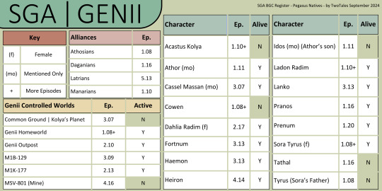
SGA Background Character Register
Pegasus Natives | Genii
-
Decided to start a Pegasus Native register
I'm debating on adding a sheet that describes these characters' attributes so they can be easily added to any fic
-
Notes:
- Only Genii with names - Canonically female characters are marked because there are less of them - Alive: Meaning we never saw them die or been informed of their death
Feel free to use this as you see fit just please keep my user name on the image
-
Sga Background Character Register | Atlantis Expedition S1
#not too sure about the colors - I feel like it gives off genii vibes but idk 🤷♂️ im not paid for this 😂 so whatever#just been thinking about the genii and got inspired because I did not know there were this many who had names in the show lol#tried a new font apparently this is a good one for dyslexia - works good for me so far so I'm hoping it does for others#sga#stargate atlantis#genii#twotalessgastats#twotalessgadata#pegasus natives#side character love#sga background character register#acastus kolya#dahlia radim#cowen#sora tyrus#ladon radim#tyrus#toran#haemon#cassel massan#athor#idos#fortnum#heiron#lanko#pranos#prenum#tathal
12 notes
·
View notes
Text
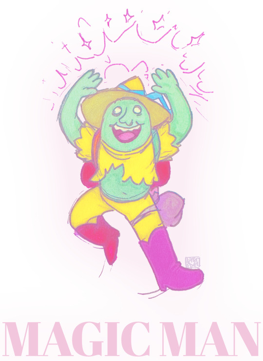
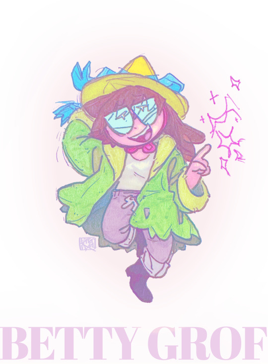
“And it’s! Clean out the bank and, bump off your daddy,
You can come live with us amidst the has-beens and the addicts!
These are crazy times down at Costello music!
You can answer the phone and talk any way you choose it, come on!”
More Betty and Magic Man! And… I maybe should wait to post these as part of a photoset cuz… I do still have more wip stuff of them but… I spent all of today coloring these chibis I wanna upload them ghgh-
#adventure time#betty grof#magic man#at magic man#doodles#the song in this one is ‘Henrietta’ by the fratellis!#because… god. the fucking vibes and energy of this song. it feels rlly fitting. just for these two doing crazy shit together#ghghg I’m sorry I can’t stop drawing Betty w magic man I just!!! gOD. my brain has so many fucking thoughts on them….#one of these days I will upload art for them when my brain isn’t mush and then I’ll actually articulate my points gGHG#legit… I spent like half of yesterday sketching and lining like 6 diff pics. these chibis included#and then I spent even MORE time today coloring and actually finishing these 2!#which like.. finishing 2 pics in 2 days.. is nice…. but it’s also… like. me pummeling my brain w a bat#I couldn’t help it tho.. I couldn’t fuckin stop drawing ghgh#my brain is like. in overdrive adventure time mode….#eXCEPT ITS ONLY BETTY MAGIC MAN AND SIMON#I can’t even promise I will draw anyone else… I WILL TRY. I can promise u. more Betty magic man and Simon tho gGH#that I can fucking guarantee you…#I like other characters in this show too!! just! just! I am only obsessed w these 3 ghgh-#unrelated but the actual topic of this song I don’t think is super fitting for them ghghg#but the VIBES are immaculate!!!!! like the energy… u understand
97 notes
·
View notes