#the covers and extra illustrations are gorgeous
Explore tagged Tumblr posts
Text
logging off for vacation! see you in a week. my queue has lots of posts atm and will probably keep going the entire time.
#tütensuppe#since i managed to sort my job stuff out i can go to denmark now!#once i start i wont be able to take vacation time for a while so this is kinda last chance for this year#when im back ill order the first few omniscient reader books im excite for that too#the covers and extra illustrations are gorgeous
3 notes
·
View notes
Text

As promised folks! PRE-ORDERS ARE HERE!
It has been a long journey and it was a long Summer, however after months of hard work we are now PROUD to reveal the results of all our incredible contributors' talents!
@Domnorian graced us with a BEAUTIFUL cover for our zine, which contains over 120 pages of art and writing celebrating Kon and Bart!
We also listened to YOU and what your merchandise interests were, and your budgets by carefully examining the interest check - as a result were are glad to offer the following bundles!

Starting at 18 USD is our Friends to Lovers Bundle which includes;
1.) The Superpulse: A Konbart Fanzine SFW physical zine. 2.) A gorgeous contrasting bookmark that was voted on BY YOU designed by @vampiregokudera 3.) 2 vinyl stickers designed by @colonelbaconbits & @pup-pee

At 25 USD our Tactile Telekinesis Bundle includes things you can WEAR (it's tactile, get it?). The bundle includes;
1.) Everything from the Friends to Lovers bundle. 2.) A heart shaped button by @aquanym 3.) 2 more stickers by @cannimochi & @miratho 4.) A 6x9 print illustrated by @poltergrease
This tier will be open to the first stretch goal where an acrylic key chain will be added to all orders automatically at no extra cost if we get 25 orders! See below for the key chain reveal! Update: Our first stretch goal has been reached and the key chain is unlocked! THANK YOU!

50 USD is our Lightning Rod Bundle which is the largest bundle that includes;
1.) Everything from the Tactile Telekinesis bundle (including the stretch goal key chain if unlocked) as well as 2.) 1 additional fun sticker by @jayzelnut (hey you guys said you loved stickers) 3.) 2 additional, stunning 6x9 prints illustrated by @harumel-hm & @beeqisch
This tier will contain our second stretch goal of a gorgeous enamel pin that will unlock at 50 orders and will be added to all orders of this tier at no extra cost. See below for the pin reveal! Update: Our second stretch goal has been unlocked! THANK YOU TO EVERYONE!
STRETCH GOALS!


25 orders will unlock the adorable 3" acrylic key chain designed by @miratho. UPDATE: This has been unlocked!
50 orders will unlock the 2.75" enamel pin designed by @ftl-faster-than-life. UPDATE: This has been unlocked!
Are you only interested in one type of merch? Don't want ANY merch, and just want the zine? We got you covered, with our A-La Cart section where you can purchase ONLY the zine or specific merch (like the key chain or pin when they unlock) or make your own bundle.
Finally, because the interest check was CLEAR we have one more item available for purchase and that's our After Dark NSFW Zine.

The After Dark Zine is a physical NSFW zine priced at 10 USD which includes over 70 pages of art and writing encased in a spicy cover illustrated by @zeroducks-2.
Note: Kon and Bart are both over 18 years old in all zine interactions.
#konbartzine#konbart#bartkon#superpulse#bart allen#kon el#dc#impulse dc#dc impulse#superboy#dcu#dc comics#dc fanart#dc universe#dc fanzine#fanzine
251 notes
·
View notes
Text


This is Spacecraft 2000 - 2100 AD (1978), by Stewart Cowley and a bevy of uncredited artists who were under contract at J. S. Artists Ltd, an art agency. It is the first of four volumes dedicated to describing the Terran Trade Authority, which grew out of the World Trade Authority in 1999 and functioned as an important administrative and manufacturing body for humanity’s exploration of space.
Do y��all remember The Tourist’s Guide to Transylvania that I posted about a few years ago? TTA is the same basic idea: take a bunch of agency art that had been used as illustrations or book covers elsewhere and give them a second life as the tentpoles for a new sci-fi universe. Cowley took the paintings and sort of ekphrastically reconciled them all using a framework of fictional history (and a little bit of extra art that provides explanatory diagrams of various ships). The primary appeal is getting these gorgeous sci fi paintings printed big in A4 books, but Cowley’s narrative is good fun too (better here than the ridiculous Transylvania book) and scratches an RPG-adjacent itch similar to the Star Trek Technical Guides, where you get a bunch of what I’d consider system agnostic sourcebook material. It that context, TTA is way ahead of its time — you wouldn’t really start seeing this sort of sourcebook in RPGs until the mid-to-late-‘80s.
This is really the keystone book of the series, laying out types of spacecraft and detailing some missions they took part on. Flip through it once and you immediately see why folks are keen on the series (and why the books command high prices on the collector’s market). Grab ‘em if you see ‘em!
146 notes
·
View notes
Text
It has arrived!! PART 2!!

Oh would you look at that...it's absolutely gorgeous. And it's mine~...er, ahem! So! Yes, you are looking at the cover to the Season 2 DVD set of "She Loves to Cook, and She Loves to Eat." I actually got it a day early, alongside other pre-orderers...which is amazing because I'm in the Northeast US and most everyone else who has pre-ordered this is probably only in Japan. That's some amazing shipping power, hot dang!
Anyway, below you will find more photos and me gushing about this firsthand~ [for my S1 post, check here]

The power of fandom knows no bounds, sometimes....The only reason this DVD came to be was thanks to the vocal Japanese fanbase begging all the NHK channels to release it on home media after the show ended back in February. They filled out surveys, they would answer the little engagement posts on Twitter and the like. And bam. Suddenly, in August, this just kinda gets announced out of nowhere! That was when I looked into proxy shipping with CDJapan (I definitely recommend them if they can ship to your country!). I have had this pre-ordered since SEPTEMBER. It has been a long, eager wait.


This one has 3 discs (I love the 2nd disc's photo lmao). After all, S2 was 20 episodes long. Needs more room! But this also has a few more extras than last time, video-wise. The booklet is simpler in comparison, but I did appreciate an actual relationship chart with the whole season's cast featured on it (and I mean whole cast. It even has Fujita's coworkers and the folks that Nomoto and Sayama were working with). That one I will attempt to translate for you all, just like I did with that Yuri Yamada foreword in the S1 set.

The other noteworthy thing from the booklet is just the art that's featured in it. I mean the actual photos and art pieces, not just screencaps. The cover alone? A pretty mash-up on that two-photo set from the promo poster shoot. The first page features some art from Yuzaki-sensei. It's some regular illustrations as well as the announcement illustration made that a S2 was happening. Gotta love the pancake motif~

And then I was floored by the end of the booklet. The same photo is used on the back of the DVD, yes, but let me tell you, it looks REALLY AMAZING as a standalone. I mean, look that that. It's so warm, almost ethereal, the two women looking forward into a brighter future, together!

I should totally also scan that when I scan the relationship chart as well. You all deserve this.
Now, if you'll excuse me, I need to finish a Good Couples Day illustration and then proceed to enjoy the three different extras featured in this set (a 5-min PR vid, the one 10-min special with Higa, Nishino, and Fujiyoshi, and I guess some social media ads? Something like that, anyway~)
#funari's photos#tsukuritai onna to tabetai onna#she loves to cook and she loves to eat#tsukutabe#yuri#gl series#jdrama#my tsukutabe shelf is getting cramped...no regrets though#i preordered vol 5 btw so i'm gonna have to make some room lmao
29 notes
·
View notes
Text
Touhou Danmaku Kagura: Phantasia Lost coming to PS4 on April 16; second Toby Fox x ZUN collaboration and sixth song pack now available - Gematsu

Publisher Alliance Arts and developer Unknown X will release a PlayStation 4 version of Touhou Project rhythm game Touhou Danmaku Kagura: Phantasia Lost on April 16, the companies announced.
Touhou Danmaku Kagura: Phantasia Lost first launched for PC via Steam on February 8, 2024, followed by Switch on September 5, 2024.
Additionally, a second Toby Fox x ZUN collaboration and a new song pack are available today for $6.99. Here are the details:
Alongside ten new songs in the sixth downloadable content song pack, witness a legendary crossover event where composers Toby Fox and ZUN arrange each other’s songs. Toby Fox’s arrangement of Touhou Project‘s “Necrofantasia” theme, and ZUN’s arrangement of Undertale‘s “MEGALOVANIA” are available today. Animator, illustrator, developer, and Undertale lead artist Temmie Chang created gorgeous song cover illustrations for Toby Fox’s newest track. Unleash bullet hell attacks while stepping to the beat, dancing and dodging around enemy fire. Uncover the cause of Gensokyo’s collapse with Reimu Hakurei and other Touhou heroines in danmaku-style rhythm battles. Switch to Kagura mode to play each song in classic falling notes rhythm game style and rack up points with precision, and customize gameplay elements with changeable note designs, note speeds, and the ability to reposition screen elements. Uncover the mystery behind the catastrophic event that turned the once-vibrant Phantasia into a fragile bubble. As Reimu, gather Fragments of Memories to rebuild her home and reveal the truth behind the turmoil. Encounter beloved Touhou heroines along the way, teaming up with them to unleash their legendary spells in thrilling Danmaku rhythm battles.
“As always, having ZUN-san make a cover of one of my songs is a dream come true… What!? I have to make a song, too!?” said Toby Fox in a press release. “This time I took the original Megalovania and did bone-lengthening surgery on it to transform it into a cover of Necrofantasia. People might call it lazy, but it is pretty cool. … You know, just like Sans or Yukari. So you can’t complain. By the way, this has nothing to do with the song… But personally, I was really concerned about Sans, a male character, showing up in the female-dominated world of Touhou. Therefore, I made him wear girl’s clothing. Thanks everyone. (Hey! That didn’t fix anything!)”
Undertale lead artist Temmie Chang added, “The song was really cool and gave me a lot of energy and a feeling of nostalgia to a time that’s passed, but meant much to me. It was fun to draw for this while listening to it on loop. I’m really happy I was able to draw each of these illustrations. If you were to tell a baby Tem that she’d get to draw something for ZUN one day, I think her heart would’ve stopped. Thank you for the opportunity! The Yukari Sans drawing is my favorite drawing I’ve ever drawn.”
Watch a new set of videos below.
Extra Song Pack Vol. 6 Trailer
English
youtube
Japanese
youtube
Gameplay: “Megalovania of the Empty Corse” by ZUN
youtube
Gameplay: “Necrolovania” by Toby Fox
youtube
#Touhou Danmaku Kagura: Phantasia Lost#Touhou Danmaku Kagura#Touhou#Touhou Project#Alliance Arts#Unknown X#Toby Fox#ZUN#Undertale#rhythm game#Gematsu#Youtube
12 notes
·
View notes
Text

My final Fanfic Writers' Appreciation Day package has been delivered! Ten Prides in Portland by Leiascully and Simple Machines by coffeesuperhero continue the Leverage OT3 theme I've got going on this year. The fic aren't necessarily a series, but are thematically connected, and also the authors are married to each other. (It happens! My wife and I met writing Due South and Hard Core Logo fanfic lo these many years ago!)
There are some similar things I adore about both these fics. I love the sort of playing with structure in both of them, and watching the characters evolve, and also, seeing the queer community in all of its heartfelt messy occasionally infuriating glory. I also adore the thoughtful Eliot character exploration.

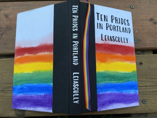


First off, Ten Prides in Portland! What it says on the tin. Ten years post-series at a certain brewpub in Portland, as Elliott finds queer community and figures himself out. This book is the reason I now have rainbow ribbon for bookmarks. As you can see, I went so very literal with this one. Homemade book cloth, acrylic paint, and cardstock endpapers printed with a map of Portland.
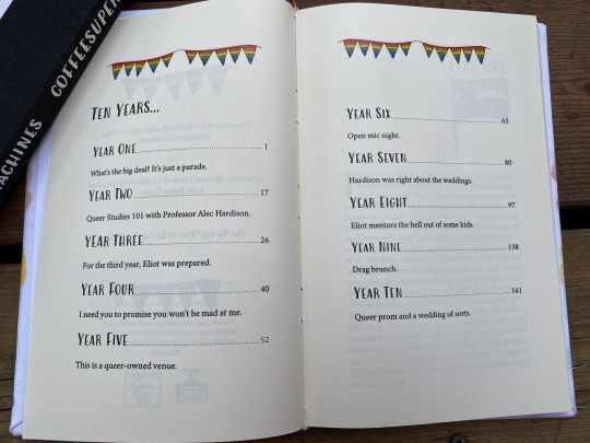
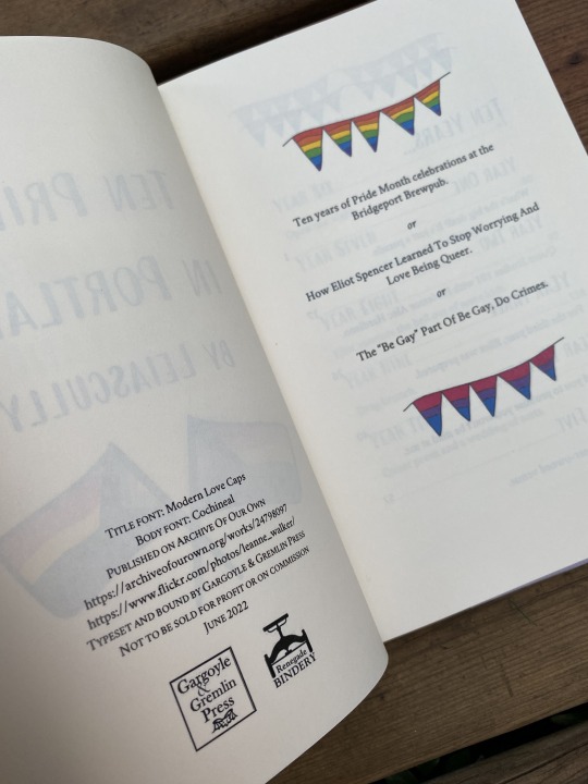
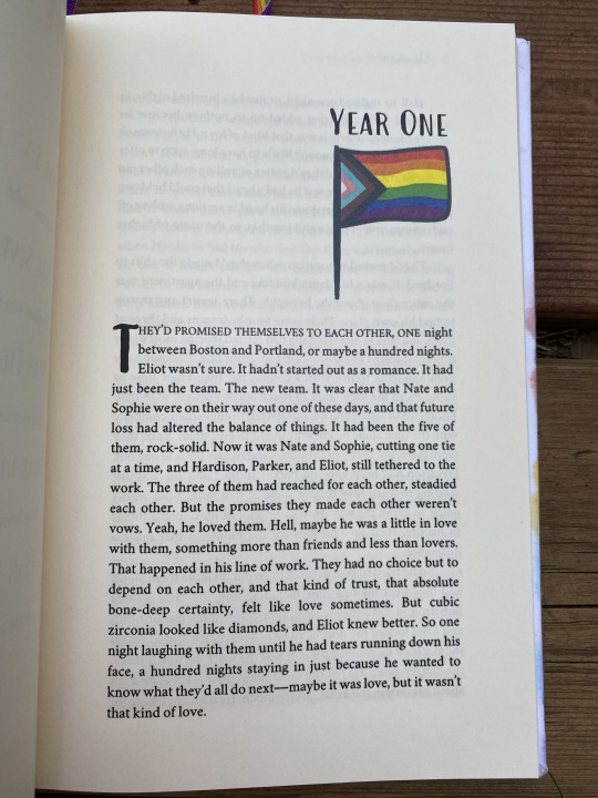
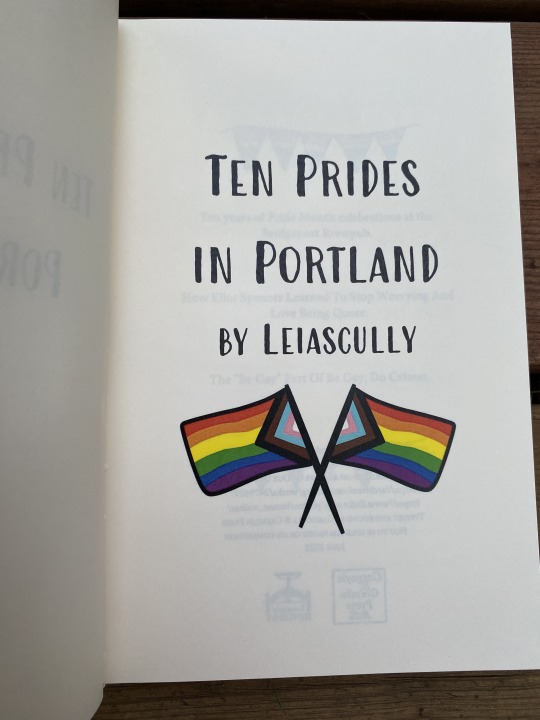

I had way too much fun with the layout on this one! It was an easy theme to lean into.
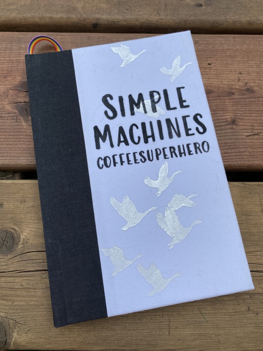

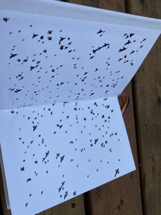

Eliot navigates a relationship with two people he loves, runs a restaurant, and figures himself out. I love the character dynamics, the cast of queer characters, and the way the second fic in the series is structured around brewpub menu items. The titles are from the iconic Mary Oliver poem Wild Geese, which is where the bird theme comes from. I used a really lovely fancy liquid mirror silver paint for the geese on the cover, which is gorgeous in person but hard to photograph.
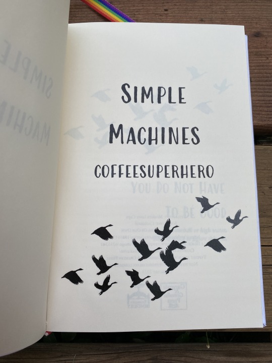

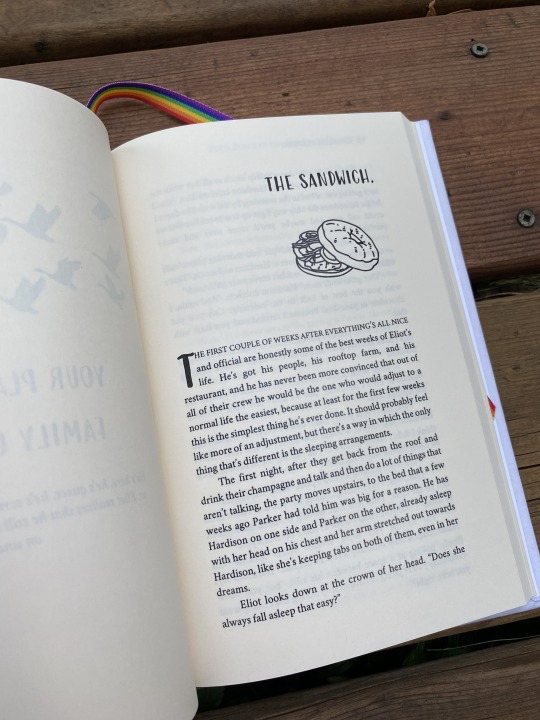
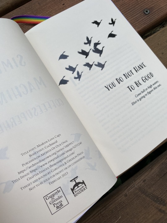

More geese! Some menu formatting! Also, a food-themed illustration at the beginning of each chapter to match the menu item. (Thank you, stock images on The Noun Project.) This was another fun one to play with.
Not pictured here for either book: the insurmountable printer issue I was having where any page with an illustration turned out extra-dark, and the flip side was correspondingly lighter. BUT. I'm still pretty pleased with how they both turned out, happy to have both of these on my shelf, and even happier to send them off in a set together to the authors' hands.
Happy slightly belated FFWAD, Leiascully and Coffeesuperhero!
#fanbinding#ficbinding#ffwad 2023#fanfic writers appreciation day#renegade loves fic#leverage fic#leverage ot3#eliot/parker/hardison#operation: give queer characters queer community#ten prides in portland#leiascully#simple machines series#coffeesuperhero#just another really elaborate fic rec
160 notes
·
View notes
Text
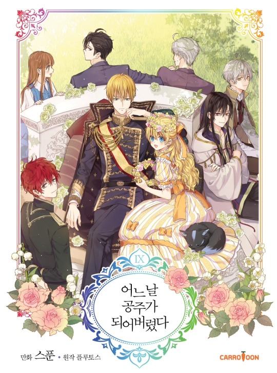
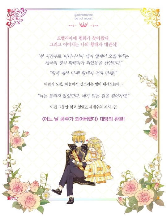
After @lithi pointed out that you can now buy wmmap per volume on Ridibooks, I wanted to try and see if you could get a better version of the cover. The answer is yes! Kinda...

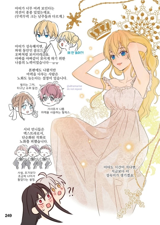
As you can see, this version of the manhwa looks pretty much the same as its printed equivalent, including panel layouts and extra content (the only exception being the congratulatory pictures other manhwa artists drew for the manhwa's ending included in chapter 125, but Spoon's comments are there). I had to do some tomfoolery to take screenshots because the Ridibooks app (the only way in which you can read wmmap per volume, you can't do it on the browser version) doesn't allow it, so please don't repost the pictures. I will find you if do you /j.
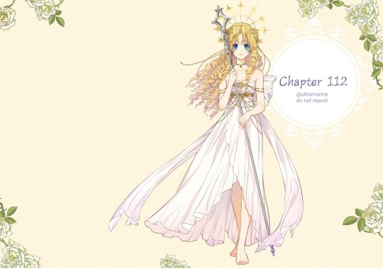
This spread looks gorgeous on a big screen. I'm sad that I can't provide better screenshots...


At the end of the volume, there are these two full illustrations, which happen to be the postcards included with volume 9 when it first released. The quality isn't suuuper HD, but it's certainly better than what we had before...
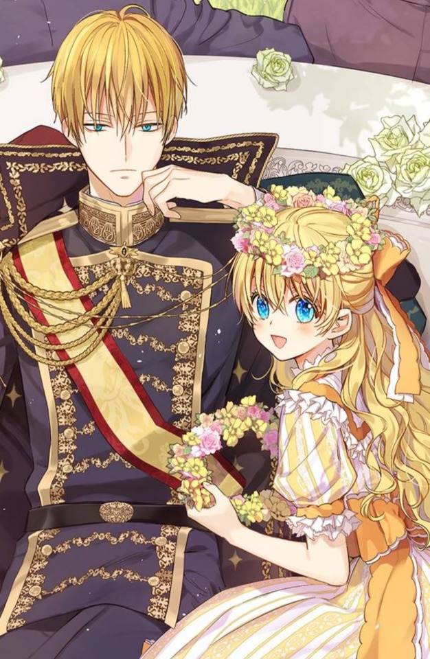
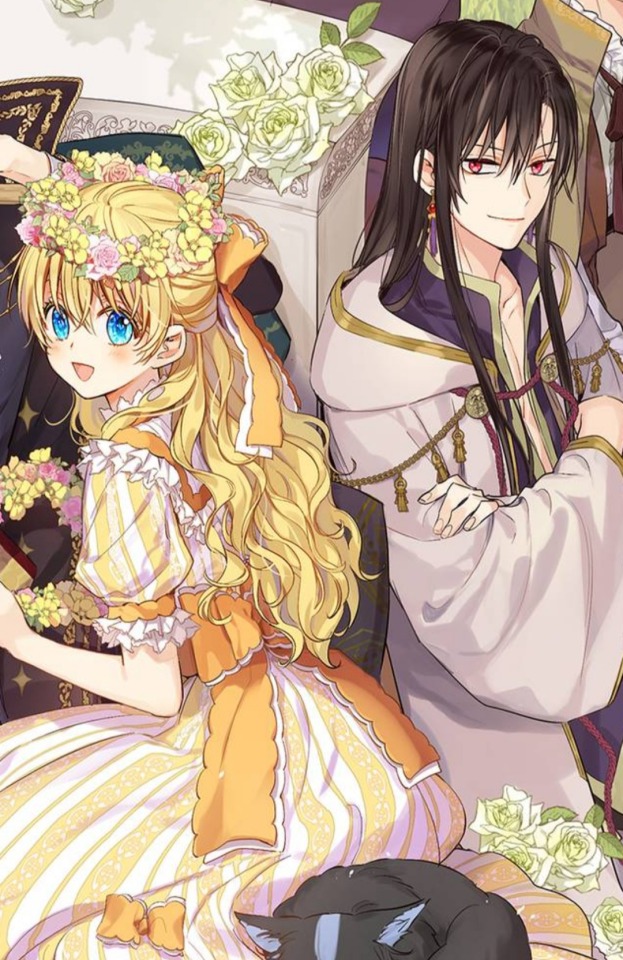
Some close-ups
I also bought volume 2 by mistake lmao, and it's a literal digital version of the printed Korean volume, so they all should included all the content present in those physical versions. I'm not crazy enough to buy wmmap yet again to see if that includes the beach extra, but that should be the case.
I will say that the overall picture quality seems to be worse than in the solo chapters, so I would still recommend buying them individually tbh.
#i forgot in which volume the beach extra is included...#if someone wants to donate to me i will buy it! lmao#it is kinda scummy that ridi doesn't give you the full volumes if you already bought the full manhwa per chapter#but i guess its not exactly The Same. bleh#who made me a princess#suddenly became a princess one day#i suddenly became a princess#wmmap#sbap#sbapod
50 notes
·
View notes
Text
The names I picked out for the animated/illustrated Horrible History characters from the show/books !! (Note that most of the names were taken from Fantasy Name Generator)

Savage Stone Age caveman = Grug
Awesome Egyptians mummy = Ma-nefer
Awful Egyptians pharaoh = Senouphis
Groovy Greeks soldier = Lossif Vallelis
Rotten Romans soldier = Septimus Sergius Silius
Rotten Romans gladiator = Postumius Volso
Cut-Throat Celt warrior = Niall Ó Mocháini
Smashing Saxons lady = Mathilda Withburga
Smashing Saxons warrior = Beorhtnoth the Hammer
Vicious Viking = Ragnar Sverre
Monk = Vierfuel Vozier
Stormin’ Normans knight = Norman (Ba-dum tss)
Angry Aztec noble = Nahuapan
Incredible Incas lady (2009 HHTV) = Tamya Ñaccha Arotinco
Incredible Incas lady 2 (HH book cover) = Yawar Chamba Allauca
Measly Middle Ages knight = Richard the Honorable
Measly Middle Ages peasant = Egbert
Radical Renaissance = Philip Amideo
Terrible Tudors commoner = Ella (Elizabeth) Amideo
Terrible Tudors headsman = Timothy Chopsalot
Roundhead officer = Victory (Canon name !)
Jacobite Soldier (Blood Scotland/Edinburgh) = Lennox Whyte
Gorgeous Georgians lady = Lady Jane
Putrid Pirate = Wycliff Gabranth
Vile Victorian commoner = Benjamin J. Harold (Funfact, his canon name is Harold)
Vile Victorian chimney sweep = Archie
Awesome USA cowboy = Daniel 'Long Shot' Osborne
Frightful First World War British soldier = Ronnie Burke
Heroic Home front british soldier = Harper Wilkins
Woeful Second World War British soldier = Howard Newman
Woeful Second World War captain = Dale Ernest
Blitz Britz Lady = Madeleine Fletcher
Troublesome 20th Century hippie = Daisy Harper
Wales miner (book) = Toby Mills
Fabulous French guard = Médard Marais (I’m calling him a guard for now there’s so much ranks and terms in the French Revolution wiki I’m getting so confused)
EXTRA CHARACTERS !!
HHTV News reporter = Simon Skirmish (Canon name) S9 EP3

BBC Launch crew (left to right) S9 EP15
Sydnie Presencia Valle
Aspen Bayard
Lennard Holmes

Eirunn (Ragnar’s daughter !!) S9 EP11

That’s about it for now, will update when I come up with more names !!
14 notes
·
View notes
Text
Preorders for THBU Zine and 77 Years Zine go back on pre-order tomorrow!
But what WAS the 77 Years Zine? Well… 🧵
It all started in early 2022, when Mod Kat had the idea to make a zine about the Master’s exile on Earth. This was too big of a project for one, so she found…
Mod Em, famed Thoschei fandom cryptid and Social Media Guy, and—
Mod Dev, literal pug and graphic design whiz. 💜
The three of them found the best and brightest of the Doctor Who fandom’s writers and artists for the project, including the amazing @wykart who designed this stunning cover art!

Through several months of Intensive Project Wrangling, the intrepid mods and contributors managed to get every fic and piece of art written, drawn, edited, tidied up, and compiled into a gorgeous book, complete with production notes from the Master himself in the special edition!
The zine chronicled the Master’s journey around the Earth- from America to Russia to the UK and back to Russia again, and it was illustrated with fashion magazine-style pictures of the Master in era-accurate styles ✨
There was also an audiobook edition, compiled by Mod Kat- here’s an exclusive behind the scenes look at the editing process for it: 👀
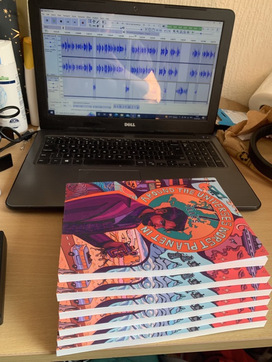
Then it was time to promote the zine! Throughout the preorder period, Mod Kat braved the wilds of Cardiff to photograph the zine in random places, and Mod Em relentlessly ensured that no one on dwtwt could forget that there was a zine out!

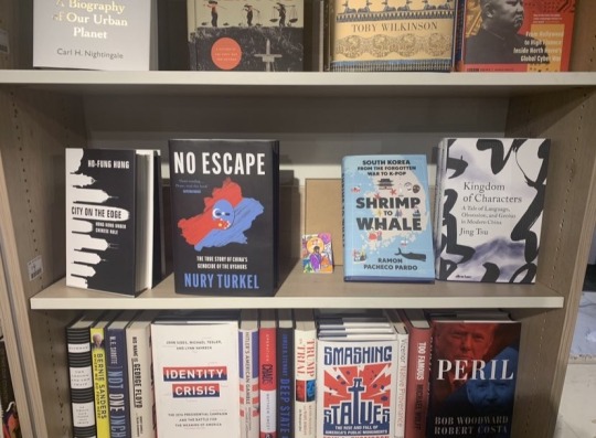
Mod Kat even made a mini zine, which made it to the BFI, the shelves of Waterstones, and the very proud hands of both Mods Em and Kat 💜💜


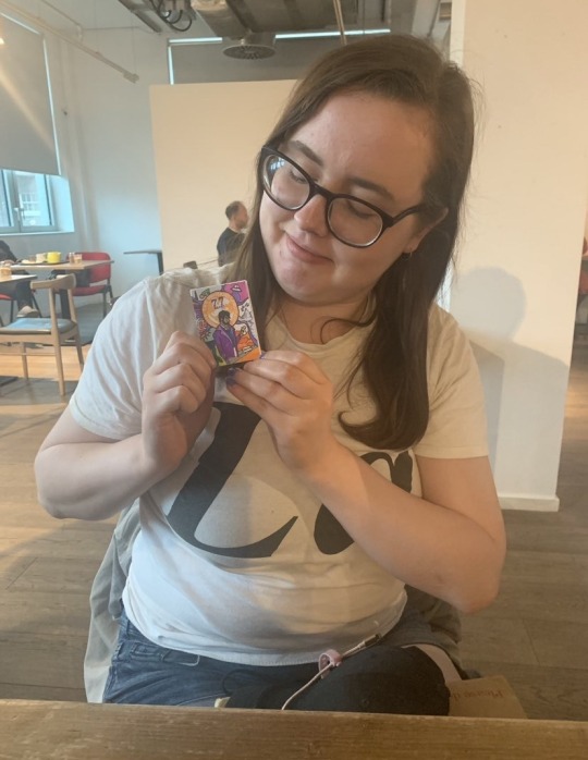
After months of effort, the zines finally shipped, with these gorgeous extras and packaging. They went around the world, with well over a hundred physical copies sold!


They even got a special thank you from Sacha Dhawan himself, thanks to then-contributor and now-Mod Nat finding him at a con to hand over a copy for him to keep. In the end, they donated £1083.78 to Crohn’s and Colitis UK, a charity supported by Sacha!!
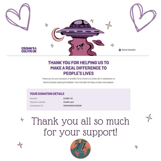
Shortly after that, they started working on the next zine, and the rest, as they say, is History… 💜💙
#doctor who#the master#dhawan!master#thoschei#spydoc#13th doctor#sacha dhawan#doctor who zine#best enemies#charity zine
37 notes
·
View notes
Text
Who was in charge of marketing for Harry Potter?
(This isn't about She Who Must Not Be Named or her bigotry. This is purely about the business of bookselling.)
If you were a YA reader at the time, or you're into fandom history, you might know the story: July 16, 2005, in the wee hours of the morning a car pulls up to a bunch of teens and children standing outside a bookstore, and some jackass shouts at the top of their lungs: "Snape kills Dumbledore!" and then speeds away.
That story was infamous. THE biggest plot twist of THE biggest book series in the world, spoiled before anyone could even crack the pages.
Which is... actually kinda weird, right? How'd they know?
Had they read an advance copy? Did they stand in line since like 4 PM to get their hands on the book, and then the second they got their hands on it just frantically start skimming the last hundred pages or so until they found a particularly devastating bomb to drop? (Trolls being trolls, this was not considered particularly extreme behavior).
Or were they paid to do it?
This is adult me with conspiracy goggles on, but consider: The message that was sent is not that a character killed another character, but that no matter how hard you try to avoid spoiling your favorite story, some bad-faith actor is going to jump out of the bushes and do it anyway. There's no time to wait for your library's copy to be available, no time for your friend or your sibling to finish and hand it to you-- you have to buy your own copy right the fuck now.
And everybody and their sibling (literally, people were buying multiple copies per family) around the world buying the same book in the space of the same two weeks? That is how a book guarantees a spot on every international best seller list for a long ass time.
The thing is, whether this was a deliberate move or an amazingly convenient and lucrative bit of trolling does not matter. Regardless of the source, the marketing department pounced on an opportunity. Every brick-and-mortar bookstore left had piles of bookmarks and buttons, posters plastered on the windows, dividing readers into one of two teams: either "Trust Snape" or "Snape is a Bad Man". People wearing those pins sparked conversation and debate in real life, to say nothing of what was going on in the forums. Essays and treatises and manifestos were written. Books were published-- both officially licensed materials and unofficial ones full of theories and details.
When that next and final release was coming out, you bet your ass everybody on the planet was going to be there (or risk another drive-by spoiler). When the next movie was released that November, it didn't matter that what had come before was kinda iffy in quality-- people were showing up in costume.
Even before The Drive By Spoilering, the marketing team was honestly the stuff of legend. Gorgeous hand-illustrated covers and chapter header artwork, branded title fonts that could be recognized from a mile away in the dark, big fancy displays present in every single school book fair, and then that website-- the official website was a thing of absolute beauty, especially in that time. It was colorful and had a million moving parts and secrets to uncover, it was updated frequently and with a lot of little secret extra tidbits on the character and world, and oodles of essays from the author herself that were often very endearing to the readership. It was a gathering place for fans as much as the fan-run websites.
(I should point out that with marketing this robust, I have no doubt in my mind that all those tidbits and essays were themselves run past the team for approval, to make sure nothing particularly egregious slipped through the cracks. But that kind of editing isn't cheap, and I suspect it would only really have been employed during the Important Years for the franchise.)
I remember wanting to be a writer as a teenager, embarking on that career as I got out into the world and started querying books I'd written, and for every single one of us in the writing community, that kind of marketing was the dream. The midnight releases in full costume, the gorgeous custom covers, the posters in every library and bookstore, the breathtaking website. But all of those things turn out to be heinously expensive, and for every franchise that returns on that investment, there were dozens, perhaps hundreds, who didn't make back enough, or cover their expenses at all. And that's where you get to the point where querying authors were advised to establish massive followings on social media in order to demonstrate that they were a safe bet, that half the work was already done if the publishers would just give us a chance-- and sure, for some of them that effort did get them publishing contracts. At which point, even if the publishers felt inclined to spend more than a pittance on promoting new authors' work, there wasn't any point in doing so to the degree that the Harry Potter books received. There's little room to stand out in a saturated market; a flash in the pan is only impressive if the pan isn't already on fire.
These days there's little hope of any one new author rising to that kind of fame, though with self-promotion and self-advocacy, a lot more diverse authors are starting to carve out places for themselves. But marketing yourself is exhausting, and it's expensive, and it makes you vulnerable to all sorts of stupid blunders and career-ending missteps.
I'd rather stay indie. But I wouldn't say no to that marketing team.
25 notes
·
View notes
Text
actually yknow what I will Not stop talking about amprule 4th anniversary art because I know Uri (the artist who designed amprule) puts so much detail into each drawing they make of them so let's break down this banger artwork together
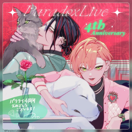
Let's start simple! A pink rose! Pink roses signify elegance and deeper colored ones can signify appreciation! While the characters themselves are Korean, their artist is Japanese, so I also looked up what they mean in Hanakotoba (Japanese flower language) they signify trust, happiness and confidence! Considering their dynamic, these could be the meanings they were going for!!
Up next the dog & the cat. They are possibly a Maine Coon and a Pyrenean Mountain Dog!
From what I've gathered the Pyrenees are used as a livestock guardian. Because of this they are rather protective of their family, as well as loyal and loving but also do not get along well with strangers. All of which work for a rather good descriptor of Chungsung considering how he has dedicated himself to taking care of and protecting Dongha.
Maine Coons, from what I know of them, are curious cats who'll follow you around and try to get included in whatever their owners are doing. So basically, they're giant cats that are clingy. Which, again, works well with Dongha, since he clings to the people he loves! He is afraid of being left behind by Chungsung and he has always been clinging to support he had provided for him.
Now this part might be a reach but when it comes to Uri's art I'm not leaving any idea unsaid. Compared to how the dog is sleeping peacefully in Dongha's lap, the cat is looking at somewhere else, possibly showing how Dongha is desperately trying to get his father's approval?
I would also like to add that in the extra art Uri posted, it is pretty much made clear that the animals are supposed to represent each other, thus signifying the trust they have for one another.
And at last, the color swap. It is my favorite part of the whole thing ngl. Colors mean a lot of for Amprule in my opinion, green means Dongha and red means Chungsung. In their original designs Chungsung's reds are Dongha's accessories, they're eye catching and are mostly associated with hearts. Meanwhile Dongha's greens are naturally blended into Chungsung's clothes with a gorgeous pattern inside his coat. In this illustration however they covered in each other's colors! Hell, in Dongha's case he's covered head to toe in pink!! And this is a Huge Thing especially considering how their main colors contrast each other (but when two colors are contrasting they are also complementary).
But also gold means Dongha and silver means Chungsung. In an interview with Uri, they talk about how they used the gold & silver accessories to show their power imbalance. While it's not a complete swap, bronze & pearl keeps it similar to the colors of gold & silver without losing their difference in monetary value.
It's Dongha's brooch that sums it all up perfectly, green & red and bronze & pearls together in one beautiful piece of jewelry. Put a crown on top of it and that's Amprule.
In the end, I think this is the perfect illustration to showcase how Amprule has changed and will keep changing!! And here's to hoping that sometime soon they'll wear each others colors in not so muted tones.
[if you're here because you read this whole thing, thank you 💚❤️]
#shout out to my beloved twitter mutual keken for suggesting the dogs breed btw <33#MENTAL ILLNESS WINS!!!!!#Uri I love you and I love how much thought you've put into designing them#Guys please read this I spent a lot of time writing it while also making myself seem like a coherent person#EDIT ok the brooch line added bc i saw a post on twitter dot com and typed it out in its qrts. I then decided to add it to the post#paradox live#amprule#dongha yeon#chungsung baek#nile talks
28 notes
·
View notes
Text
Tension Points print edition (now with link!)
So I've already made a post like a year ago that Tension Points has a print edition. I'm just yoinking the photos of that and giving some new info for y'all. You can now buy the book directly from Lulu, you do not need to contact me or PayPal money directly to me anymore! You haven't in like a while, I just don't think I ever said that here... More info below!
So for about a year, I worked pretty tirelessly on a Tension Points print edition. I made it publicly available on Jan 1 of 2023, though at the time, I couldn't figure out how to let people buy it from Lulu without sharing it on the open Lulu market. If you search Lulu for Tension Points, you will not find it; you need a direct link.
The link will be below, but first let's share some photos and such! I took all these a year a go but like the book has not changed in that time lmao
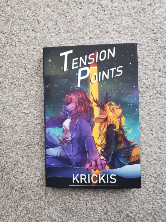
This book is roughly 350 pages, hardcover. The actual book under the dust jacket is a tad boring (solid red with gold letters) because that's what Lulu offers. But the dust jacket is gorgeous, all artwork by my good friend @renrink . On that note, it is not lavishly illustrated; there is a full page black and white illustration opening every act, and a final one at the end of the story, for four illustrations (plus about the author/illustrator images).
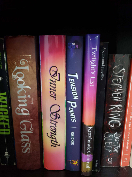
I will not be asking for extra money for myself on this book, which is sold at cost. I will not profit off it in any way unless you feel so inclined as to send extra money. Which I won’t ask you to, and I won’t try and guilt you into it. But if you want to support me financially by buying this book, it is up to you to decide how much extra to send to me, which can be done by PayPal through this link: paypal.me/evilbun
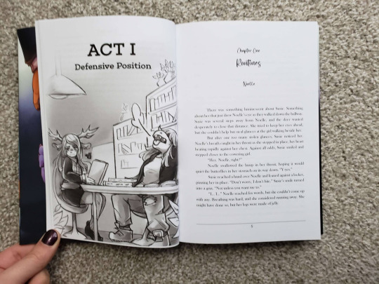
If for any reason you cannot buy through the link below, then you should get in touch with me and I'll see what I can do. But it should be pretty straightforward for ordering it! Note that if you want something special, like a personalized note or whatever (lmao my ego, it grows ever larger) I'll need to have your book shipped to me first and then ship it to you, as I don't exactly keep spare copies on hand lol, which like I can do but the double shipping will also need to be paid for. Contact me before buying, obviously (and if you bought the book already and want a note added to your copy, contact me over that as well and we can work on it).

I think covers it! If you have any questions, I'm always happy to answer them. But anyway, here's that link for y'all!

14 notes
·
View notes
Text
oh by the way I HIGHLY recommend this copy of pride and prejudice, it's the marjolein bastin classic edition, with the most gorgeous flower illustrations and cover and a ribbon bookmark AND!! little extra things!! dance instructions, a dance invitation, and. of course. darcy's letter to elizabeth, envelope and all
#big pages and a decent font too! cannot stand super small fonts in a book. but this is very pleasant#oh and little bird illustrations too.........it's so sweet and cozy and fun#and hefty!! this book has weight!! could in fact murder!!!!
2 notes
·
View notes
Text
Top 10 Covers of Single Issue Comics I Own (Ranked)
I am just focusing on Loki-centric or Loki-featured comics. I am ranking purely on cover aesthetics, not on content of the actual comic.
Loki: Agent of Asgard, issue 17 (illustrated by Lee Garbett)

I'm obsessed with Loki's post-ego death look. I love all of the other issue covers around him. I'm less fond of the reminder that this is one of the last issues of this run, since this is my favorite series.
2. Loki, issue 1 (variant) (illustrated by Stanley "Artgerm" Lau)

Gorgeous. I love her. My shitty photo does not do the lighting of this artwork justice.
3. Marvel Voices: Pride #1 (2022) (illustrated by Amy Reeder)

The more Lokis, the better. I love all of the variants, I love all of the flags, and how the Loki in the foreground (and Croki) is standing on the rainbow flag, bringing to mind the bifrost. The only way this could be better is if his actual gender flag was here and President Loki was not.
4. Loki, issue 1 (variant) (illustrated by Rod Reis)

I love this cover for similar reasons to the above entry: all of the different faces Loki has and iterations he's been. I also like that the back of his throne is reminiscent of his crown, and that he's clearly in Jotunheim.
5. Loki, issue 2 (variant) (illustrated by Matteo Lolli)

I'm obsessed with this imagery too. The flock of magpies and how Loki's appearing or disappearing out of the magpies is just ugh so poetic and perfect. It makes me think about the last line from Where Mischief Lies: "Be the witch, and know everything."
6. Defenders Beyond issue 1 (illustrated by Natacha Bustos)

Loki as the Mad Hatter. Need I say more? Okay I will. Loki without shoes on.
7. Loki issue 3 (variant) (illustrated by Mirka Andolfo)

I've already posted about this cover. Teddy is checking Loki('s coat) out. I love it and I think it's fucking hilarious.
8. What If...? Dark Loki (variant) (illustrated by Ema Lupacchino)

Listen, I don't like the way Loki gets ahold of Mjolnir in this, and I don't like what happens as a result. But I am such a fan of Loki holding Mjolnir that I ignore everything else going on.
9. Loki issue 1 (variant) (illustrated by Todd Nauck)

So one website was calling these window shades, and maybe Loki is that extra that he's got red velvet curtains, but I saw this and I was like oh my god he's on stage! And that's what I love about this. He seems like he's in a spotlight and everything.
10. Norse Mythology issue 4 (variant) (illustrated by David Mack)

So this isn't Marvel Loki, but I love Norse Mythology by Neil Gaiman. I haven't actually read the comic, but I've read the novel and listened to the audiobook (read by the author) many times. So naturally I needed to buy the comic adaptation with Loki on the cover. I love the watercolor look to it and the collage of all of his symbols surrounding him. I also love how he doesn't have one solid human shape; this idea that all of these forms are him is wonderful and also a theme in Agent of Asgard, so of course, I love the idea that Al Ewing drew on mythology for that idea.
#loki#genderfluid loki#loki comics#comic covers#marvel comics#norse mythology#loki miniseries#loki: agent of asgard#defenders: beyond
1 note
·
View note
Text

Parallax by Fightbeast
4 mysterious glowing boxes out of 5!
Recommended for comics enthusiasts who love a nice, dynamic art style (All 5 chapters and the extras can be read here for free :D)
Synopsis:
Lomax isn't exactly happy with the direction his life is going in. Feeling trapped in the seemingly dull town of Silverdalen, and powerless due to his shyness and lack of self-esteem, this 17 year old pretty much only does what he's told, hoping tomorrow will be just a bit different. When he is approached by his science teacher who offers him a mysterious box, claiming it's just what he needs, Lomax hesitantly accepts the gift. The box brings great change, but for better or worse, who's to say? PARALLAX is a story about personal growth, friendship and how to avoid getting killed in epic supernatural battle. Adjusting to his new life in Silverdalen, Lomax must learn how to handle newfound mysterious power, and to face his challenges. Apparently getting magic powers from the science teacher still doesn't get you a passing grade in science class.
Review under the cut
This was a reread! I remember really liking this comic when I read it in high school but couldn't remember the ending, so I revisited this on a whim at the beginning of December. Turns out the comic ended pretty soon after a hiatus that I remember being super bummed by. This results in a somewhat rushed (if still technically complete) ending. I think that, by the standards of webcomics, this is one of the more cohesive story-driven webcomics I've read.
The artstyle is far and wide my favorite thing about the comic (and my blurry cover image definitely doesn't do it justice), from the gorgeous palette of every chapter (and even every individual panel), the sharp linework, the dynamic composition of each page. This level of polish is something I'd be surprised to find in even a lot of published comics today. I'm also a fan of the landscape-style illustrations, which feel fresh even in 2025 (or perhaps even more so in 2025, when scrolling webcomics are so popular).
The story and world are also compelling, though with the rather sudden ending, both left me wanting a bit more to bite into. It doesn't look like the artist/author is still active in the webcomic space, but I'm very glad that they left the webcomic up! If there was a way to get a print copy (or even a PDF copy) of the comic and support the artist, I'd do it in a heartbeat. Aside from this most recent reread, I remember visiting and revisiting the comic site to look for Parallax updates every day after school. It still holds up the same draw to me, though I understand someone without nostalgia-goggles may look at the comic more critically.
started 4 December 2024 / finished 4 December 2024
#oriole book reviews#title: parallax#author: fightbeast#artist: fightbeast#genre: fantasy#category: comics#4 to 4.75 star reviews#december 2024 reads#2024 reads#2020 publications
0 notes
Text
2024 1st Edtn Ltd Edtn 31/75 SIGRUN & THE MIST By Jack Grayle New Esoteric
2024 1st Edition , SIGRUN & THE MIST With Commentary by Shani Oates By Jack Grayle Jack Grayle - writer, ritualist, and explorer of the lost lore of antiquity. Illustrated By: Format: Hardcover, Language: English Dust Jacket: No Jacket, Dust Jacket Condition: No Jacket Published By: Grayle Press, octavo (8vo 6 × 9 152 × 229),Pages ISBN: Book Details: 75 leather bound limited edition copies Extra illustration only in the deluxe edition Extra Valkyrie ritual written by Klara Wolfe 10 gorgeous tintypes and ambrotypes Over 200 pages of high-grade paper Smythe-sewn binding Cloth cover with black-foilstamp and Valkyrie photo Blindstamped dragon on back cover by Rowan E. Cassidy Black ribbon; black and white head and tail bands Colored endpapers The Northern Lights flicker… Stars flash in the night wind… Listen, you can hear it – The shriek of the Valkyries echoes over the snow-deep vales! Folks, it is HERE! After five sold-out runs of The Hekataeon, Jack Grayle is BACK with his first new book in five years: Sigrun & the Mist! Where does Choice end and Fate begin? What happens when we defy the gods? Can love outlast death? What is the difference between Destiny and Doom? These questions form the red-hot heart Grayle’s new book, which takes the reader on a timeless quest from a lost age… Sigrun & the Mist is a thrilling retelling of an Icelandic folktale in which heroes, giants, pirates, princes, gods and Valkyries clash in the frozen fjords and mighty mountains of the farthest Northlands. Robert Graves once wrote that the true gift of the Great Goddess was poetry, and Grayle proves the point by publishing something unprecedented in occult literature since the days of W.B. Yeats: a full-length play in blank verse. By turns funny, exciting, romantic and raw, this poetic retelling of a Norse legend brings to life an ancient story with profound implications for our time. Additionally, Shani Oates, the much-admired occultist, scholar, and Maid of Clan Tubal Cain provides a remarkable 30,000 word commentary on Sigrun in this volume, in which she explains the true nature of the Valkyrie as reaper-of-the-slain, as well as giving invaluable historical and cultural context of Norse magic, seidhr and warfare. Shani also provides two new bindrunes which she personally created to help the practitioner connect with the Valkyrie current that is revealed in the story. For those who wish to compare the play with the original tale, skillful author David Koffer supplies a fresh and fast-paced version of the 500-year-old Icelandic romance with wit and insight. Finally, Sigrun herself is brought to life in a series of astonishing ambrotypes and tintypes created in an exciting collaboration between wet-plate photographer Nicola Huffstickler and the Kate Moss of Occultism, model Klara Wolfe. Each of these ten photos revivifies the 19th Century pictorialist tradition in a series of iconic images replete with pathos and power in which the true nature of Sigrun is revealed with candor, courage and skill. The book ends with two personal statements, one by Huffstickler describing the dangerous craft of wet-plate photography, and the second by Wolfe, describing the challenges and triumphs of embodying Sigrun for the camera’s eye. Don’t miss this opportunity to join the Valkyrie’s quest to fulfill her destiny! SKU: BTETM0002422 Approximate Package Dimensions H: 12.5, L: 30, W: 25 (Units: cm), W: 2Kg
New - Deluxe leather bound edition with only 75 hand numbered copies. Book is in new unread condition Please see photos as part of condition report
0 notes