#my whole problem is probably just my art style
Explore tagged Tumblr posts
Text
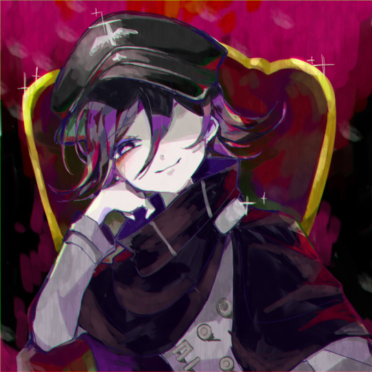
King
#he should be sued for the amount of collateral damage hes done to my brain#i have lots of fun coloring#my whole problem is probably just my art style#its kinda here and there#hopefully I'll get it all figured out soon#my art#kokichi oma#kokichi ouma#danganronpa v3#ndrv3
346 notes
·
View notes
Text


A detective trying to uncover just what exactly is going on and where did all these magical girls come from VS his niece and her group of trouble making friends who are a tad bit too obsessed with an old cartoon for their own good, following him around like ducklings
#investigation is always ten times harder when the dino tracks group are around#evidence always seem to disappear just before he reaches it#and so does his money whenever the kids get hungry#feeding an almost half a dozen growing teenagers on the salary of a private investigator is never fun#his wallet keeps getting thinner#they never stop still#god what are they feeding these children#probably not much if his thinning wallet is any proof#also yes this is that one trend of the teacup ride#was very fun to draw actually#i think i finally found my art style after so many years of trying#and i wasn't even trying this time#fate is funny#anyways#magical girls#magical boys#digital art#future comic#magic vs apocalypse#love these kids so much and ive barely known half of them for a couple days#artwork#yes their group name is dino tracks#cause they have official dino tracksuit merchandise and they will make it everyone's problem#and cause they track things and play detectives#tho mostly cause of the dino merch#the whole thing was his niece's idea (and obsession. she's the one who dragged all of them into this)#aight bye
9 notes
·
View notes
Text
Me when I think my dad is cool and admirable
#the previous earl lost the game lol#like i think if ciel's dad came back from the dead instead of ciel prime that ciel would have the same im the earl reaction#i don't have a reading of this narrative at all that he's trying to be his dad or wants sebastian to be his dad bc number one i think...#...vincent only looks like sebastian bc that's yana's art style and number two it also gets on my nerves the really fandom-y brain to...#...assign found family into actual nuclear family roles. when ciel's whole house now is made up of relationships that are really only...#...defined by how much they all love each other. it's the opposite of what his life was like before where he was stuck in like. an older...#...brother does this and marries this and the watchdog does this and rich people are expected to be like this and a family is a nuclear...#...kind of family unit and that's honestly what caused madam red and ciel and ciel prime a lot of their problems pre fire#now instead the people in ciel's house care about their roles as maid and gardener and chef etc only insofar as playing that role is a...#...way to have freedom for them and it's a way to do things for ciel only bc they love him. not that vincent and rachel completely sucked...#...and didn't love their kids but it was the opposite of ciel's situation now and uh i don't think he wants it back or to recreate it#i think he sees his parents and the midfords as sheep just like of the rest of the rich people he complains about#it's a category 10 albert moriarty situation#he was raised in it so he understands just how destructive these expectations are madam red had the exact problems with the expectation...#...she should get married and have kids when i don't think she particularly wanted that to the point she had to convince herself she did...#...even though it felt unnatural to her and i think that's why she was so attached to the idea of vincent but anyway comphet madam red...#...different post i have already made somewhere probably#it's the same deal for ciel i think he thinks the way the rich people govern their lives is stupid and sebastian has both spoiled him and...#...made him feel like he's above all that and honestly that mindset genuinely informs a lot of this arc and the sheep motif#kuroshitsuji#my kuro posts#ciel
12 notes
·
View notes
Text


I have no one to talk to about AU stuff so I'm just concept doodling and going insane
#Mephiles#mephiles the dark#sonic au#solaris#teeth#gore#technically? it's dry gore#my man be kinda crumbling as time goes on being split#thankfully for him it's not deadly just a pain in the ass; he can recharge by contact with the yellow super emerald#Knuckles is not happy about this. this creepy dude will not leave his house and he can't do anything about it#cause it was technically Solaris's house first#long story#most my shit is worldbuilding so there's always some weird details like that Solaris is literally the yellow Super Emerald#I should probably tag that actually since it's technically a character in this au#Yellow Super Emerald#I know Mephiles more associated with purple but I have reasons; I have a whole pepe silvia style thing going on with the super emeralds#these guys are so stupid and dumb all the time but also can change dimensions and be such a problem I love them#there are other canon guys that are also super emeralds but this aint about them#something hilarious to me about these petty gods maliciously ignoring their siblings getting fucked up cause 'I'm in my lane'#like babes; please; your bro is the head landscaper for Time as a dimension and he's being used as a science experiment by humans who know#not what they do; maybe you should be concerned about that#anyways I love beings beyond comprehension that absorb just enough personality to communicate but not enough to know how to do it *well*#Mephiles could have talked to someone like a normal person but naw he thought manipulating teenagers into fights would be the best way to#fix things. although tbf from his perspective Shadow swung first and Meph holds grudges and just wanted to fuck with him back#anyway; technically a 'good guy Mephiles' au; he's lawful good/neutral but he's an asshole about it; doing shit like pretending to kill#teenagers (there was no blood; Sonic didn't literally die and Solaris was trying to fix the timeline so it wouldn't even happen)#because it seemed like the easiest solution to the problem; essentially hardcore scaring the hiccups out of a kid#I'd like to believe even he'd recognize that being so incredibly resistant to crying probably indicates some underlying issue and she gets#therapy in his fixed timeline. especially cause he'd 1000% kill the duke way earlier like that guy tortured him apart yeah he ain't livin#my art
6 notes
·
View notes
Text
sudden realisation that the thing holding my art back is that I never had an anime phase
#going to find a time machine and get my younger self into death note or smth#I have been driving myself insane for the past few years bc I wanna draw characters but all I know how to do is portraits#I’m trying to figure out how I could recreate smth similar now and tragically I think it does just come down to draw more :/#however! I am also going to try using brushes which will be bad for sketchiness and better for lineart bc I might need to force myself here#I just gotta simplify things down to basic shapes how hard can it be#[has been thinking this exact thing for years and it’s not worked]#I am getting better every time I do stuff I’m just not satisfied bc art is frustrating when you know what you want but can’t get there#god it’s 2am I should not be awake rn but I could draw again tonight so I was taking advantage#endlessly frustrated by hair. why is it so awkward. I need to understand hair better how do I do this#i have a feeling it’s bc I’ve not figured out how to apply the shit I figured out abt volume yet#I’m also getting impatient bc I’ve been trying to do a study thing for some art styles but I decided I wanted to draw ocs instead of that#when I hadn’t gotten to the actually important bit which was. making smth new. but I can still do that#and I ended up doing a different style anyway (someone pls stop me rounding everything make me use high opacity square brush for my health)#the Other problem is I never wanna switch brushes. like I want to use one brush for whole drawing bc the extra clicks annoy me#I wonder if there’s a shortcut to swap brushes#anyway I’m gonna stop complaining bc drawing is fun but god I wish I’d drawn some more pokey mans when I was a teenager yknow#ideally younger. would rlly like to not have to actually think to figure this out rn#I’m probably overthinking stuff anyway honestly and I KNOW I’ll get it if I practice enough but goddamn it is hard to practice#especially when my me insists on making the bad things look better by making it more realistic#instead of figuring out why the shapes aren’t working#OKAY IM DONE WITH THIS NOW. GONNA TRY NEW ART THINGS LATER STOP TALKING <3#luke.txt
4 notes
·
View notes
Text
fashion help | charles leclerc x fem! reader x alexandra saint mleux !
summary; how charles, y/n, and alexandra came to be all because of y/n wanting to help a clueless charles in a mall
warnings; ?? none i think
word count; 635
all works taglist; @goldenmclaren @namgification @c-losur3 @minkyungseokie @lavisenri @ollieshifts
note; requested !
masterlist !
⋆ ˚。⋆୨♡୧⋆ ˚。⋆⋆ ˚。⋆୨♡୧⋆ ˚。⋆⋆ ˚。⋆୨♡୧⋆ ˚。⋆

⋆ ˚。⋆୨♡୧⋆ ˚。⋆⋆ ˚。⋆୨♡୧⋆ ˚。⋆⋆ ˚。⋆୨♡୧⋆ ˚。⋆
“Alex! These are cute too, no?” Y/n questioned as she ran over to a pink dress and a matching red one beside it. The couple were searching for a matching outfit for an art exhibit event which led them to the large department store in Monaco to find outfits.
“These are quite cute, amor.” Alexandra quietly says. One hand was interlocked with her girlfriends and the other ran down the fabric of the dress. “The fabric isn’t the greatest but-“
She turned to look at Y/n but she was seemingly distracted, staring at the men’s side of the department store.
“Why is he grabbing those blue pants? They’re hideous.”
Alexandra followed where Y/n was staring and saw a confused brunette looking through the racks of clothing. He held up a pair of patterned blue pants which the Art student had to admit was hideous.
“Maybe he’s shopping for a friend?”
“Then I have to help him! If someone gifted me those pants I’d be offended.”
“Y/n, no-“ Before She could finish her sentence, Y/n was already walking towards him.
Alexandra loved her girlfriend, she truly did. She just hated sometimes how extroverted she was and was willing to go up to a stranger to tell him about his poor fashion choices. She hesitantly shuffled behind. She was already preparing to apologize to her girlfriend when she suddenly heard the mystery man thank her.
“Honestly, I don’t even know what I’m doing here. My friends always say I’m bad at this.” He says with a chuckle, causing both Alexandra’s and Y/n’s hearts to skip a beat. “But thank you. I didn’t quite catch your name?”
“I’m Y/n and this is my girlfriend, Alexandra.”
“Charles, it is a pleasure to meet you both.” He smiled as he shook their hands. Any other man would’ve probably been shocked at Alexandra and Y/n’s relationship, which was common because men always hit on them, but Charles was different.
Both girls were bisexual, so they weren’t new to romantic feelings towards the opposite sex. But they had been dating for a few months and only had feelings for each other. Until the confused-looking Monegasque caught both of their attention. Even Charles felt intrigued, noticing how Alexandra stared at him or how Y/n’s touch lingered for a second too long when shaking his hand.
There was a tension that fell over the three of them and neither could quite decipher what it was. Y/n cleared her throat after a few seconds of silence had passed.
“Good thing Alex and I have good fashion taste.” She said with a smile. With one hand she holds onto Alexandra’s hand and with the other she grabs Charles. “Now, looking at you, I think these would fit well.”
Her girlfriend gave the Monegasque a look before they both laughed at Y/n’s enthusiasm about what pants style and what color looked best on him.
Hours had passed by the time the girls finished picking out a whole new wardrobe for Charles, although it felt like it was just a few minutes.
“I’ve got to thank you both. I really do appreciate the help.” Charles said with a smile, the three of them walking out of the store with bags in hand.
“Oh, it’s no problem. I’m a fashion major so this is kind of my thing.” Y/n said with a smile.
“She just really likes to help people.” Alexandra nudged her girlfriend’s side as she chuckled.
“Are you two busy?” Charles suddenly asked, “I’d like to treat you both to lunch as a thank you.” He wore a hopeful smile as the two girls shared a glance.
Y/n being the most straightforward one, linked one arm with Alexandra and the other with Charles. “Well, lead the way!” She exclaimed with a laugh and the rest was history.
#formula one x reader#f1 x reader#f1 scenario#formula one scenarios#f1 imagine#formula one imagines#formula one imagine#f1 scenarios#charles leclerc x reader x alexandra saint mleux#charles leclerc scenarios#charles leclerc x reader#charles leclerc imagine
1K notes
·
View notes
Text
𝐀𝐎𝐓 𝐇𝐄𝐀𝐃𝐂𝐀𝐍𝐎𝐍𝐒!
my fave anime/manga omg I’ve been wanting to write for it for a while but I’ve had no idea where to start but then I was like ‘I should probably start the way I start everything else lol HEADCANONS!!’
so here’s some Relationship + Random hc’s of some of my favorite AOT characters! If you want a part two or a specific character added in the next one, lemme know!
Featuring: Eren, Armin, Mikasa, Jean, Levi, Hange, and Erwin
𝐄𝐫𝐞𝐧

✦•······················•✦•······················•✦•······················•✦
An amazing soldier, but a dumb boyfriend
Like, on the field, fighting, he’s brilliant
its not to say he’d be a terrible boyfriend
im just saying he’d have no idea what to do half the time
like if ur upset he’s just like “um don’t cry 🧍”
*awkwardly pats ur back*
but he’s pretty much clueless otherwise
as you can tell in the series, he’s not good at processing his emotions
and if he thinks he can’t process his OWN emotions, just wait till he tries to process yours
ngl tho it would get to a point where he’s so good at understanding you and how you’re feeling that it’s like ‘stfu Eren you’ve got ur own problems’
like bros so invested in just TRYING that he pushes his own emotions to the side
on a random note
he snores like crazy
if he’s not awake that is bc if he’s awake he’s like being silly at fuckin 1 AM
either talking with Armin, or just yapping
or maybe practicing melee moves in the middle of the floor
or working out
Or snacking
you get the idea
hes also a chocoholic bye-
✦•······················•✦•······················•✦•······················•✦
𝐌𝐢𝐤𝐚𝐬𝐚
✦•······················•✦•······················•✦•······················•✦
sweetest shyest pookiest gf ever
shes got so much emotional depth, but she has a hard time expressing it
but when she does
shell tell you the sweetest thing ever
or like give you the most thoughtful compliment you’ve ever recieved in ur life
and then she’ll get shy and run away
not only she’s like ‘omg why did I say that’
buts she’s also like ‘oh god I probably made them uncomfortable was that weird?’
and then u reassure her like ‘nah that was actually the sweetest thing anyone’s ever said to me’
and verbally she’s like ‘oh ok 🙂’
but internally she’s like ‘yay 🙂’
on a random note
when she’s nervous in public cos there’s a lot of people
shell subconsciously hold ur hand
it’s not like she’s like scared, bc u know she’s Mikasa
but big crowds make her anxious and the noise gives her a headache
so most times she just prefers hanging out somewhere quiet
like a boba shop or a library
And I also hc that she’s actually really good at drawing and has this sketchbook that she carries with her and draws in when ur at boba shops
And while you’d think it was full of quick doodles it’s actually all ART. (maybe I should do hc’s on each characters art styles if they have one lmao)
✦•······················•✦•······················•✦•······················•✦
𝐀𝐫𝐦𝐢𝐧

✦•······················•✦•······················•✦•······················•✦
this Barbie is a sweetie pie bitch
honestly he carries the dates tho
and by that i mean he’s PLANNING THEM ALL MONTHS IN ADVANCE
freakin loid forger ahh
he’s got most of it written down but he’s also still got some date ideas stored in that big head of his
bc he’s an over thinker and an over achiever so he wants to like maximize the experience ig
like a nerd 🤓
(im sorry im bullying him i swear i love him)
so he plans all these dates, and everything is going well until he’s actually on said date with you
bc he rehearsed a few little one liners and flirtations for weeks on end but upon seeing you he immediately forgot them 😅
so he’s a stuttering blushing mess the whole time
freakin cutie
random hcs
he hates spicy food
it literally makes him cry
but he also doesn’t really like sweets much
so he usually resorts to really simple foods or something savory
basic like him (I’m sorry)
I also hc that he’s self conscious about his forehead (same bro)
hence the thick bangs lmao
but yk what big head big think is what I always say
✦•······················•✦•······················•✦•······················•✦
𝐉𝐞𝐚𝐧
✦•······················•✦•······················•✦•······················•✦
everyone knows he’s respectful
A true gentleman
but if you recall that scene with Mikasa in the cadet corps
He’d also be super nervous around u
blushing and smiling
(Ohh my god my heart)
he tries so hard to play it cool
but no amount of flirting and smirking can hide the fact that he’s stuttering and blushing like an idiot
and oh god if you flirt back
he’s like actually gonna pass away 🫠
and I am too bc he’s so cute
random hcs
he talks in his sleep
hes a thigh guy
hed walk on the outside of the sidewalk w u unprompted
he’s reaaaally good at impressions
he once did a killer impression of captain levi
and everyone laughed until they spotted Levi a little ways behind him
and then they had to hold back their laughter while Levi yelled at him for it 💀
he once tried to cut his own hair growing up
and it was so bad that his mom ended up shaving his head
He swears he looked handsome w it tho
✦•······················•✦•······················•✦•······················•✦
𝐋𝐞𝐯𝐢
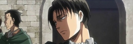
✦•······················•✦•······················•✦•······················•✦
omg this man
no one would ever know you two were together
except for Hange, Miche and Erwin bc they sniff out this shit like crazy
but when yall are alone
he holds your hand like all the time
hes super clingy
but won’t admit it
like
hes laying on top of you with his arms and legs wrapped around you like a koala
and he’s like “you’re so clingy y/n 🙄”
random hcs!
we know he doesn’t sleep
but what’s weirder is when you wake up and he’s just staring at you
”hey”
and scares the shit outta you
like Jean he walks on the outside of the sidewalk unprompted
and he’s also a sidewalk karen
like if someone else is walking by he’s giving them a look like “try and move me bitch”
”you can’t”
My stronk scary boi
And because he’s old as rocks I also hc that he probably knits as a hobby
idk why, but I can absolutely see him knitting scarves and shit for Eren and the others (and u ofc)
like its winter and everyone is training and he’s out here passing out scarves he made 😭
Hanged like ”where’d you get all these scarves Levi?”
and he’s just like “mind your damn business”
and his ears get pink when he’s embarrassed so that kinda answers the question
✦•······················•✦•······················•✦•······················•✦
𝐇𝐚𝐧𝐠𝐞

✦•······················•✦•······················•✦•······················•✦
AHHHHH
as a Hange Kinnie I’m not projecting whatsoever 😌
but they’d totally be clingy
in like the most extroverted way
yapping about you to everyone
till Levi tells them to shut up
They’re out there fighting titans like “you know y/n usually kills titans like this”
and Levi’s like “Y/N IS RIGHT OVER THERE”
Brings u pretty rocks
cant flirt to save their life but it’s the thought that counts 😌😌
random hcs!
asks the most random and way too personal questions
“I’m not gonna dignify that with a response” said a shocked and disgusted Levi
Hange absolutely points out animals they see
like, in the middle of a fight they’re just like “CAPTIAN LEVI Y/N!!”
and you both look over scared bc you think Hange is hurt
and they’re just like “LOOK THERES A SQUIRREL! 🤩”
✦•······················•✦•······················•✦•······················•✦
𝐄𝐫𝐰𝐢𝐧
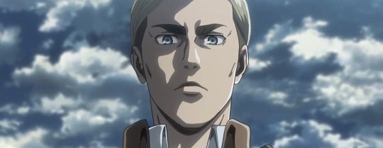
✦•······················•✦•······················•✦•······················•✦
we know he’s a gentleman
and I see so many ppl making him out like he’s “daddy”
to which I say
Nah
hes ‘father figure’ 😌😌😌
he’d actually be an amazing partner though
buys you flowers on a regular basis
dates might not be as often
hes a busy man you know 😏
but he definitely treats you to a date whenever he can
if you’re self conscious
no you’re not 😶
he’s got the most random, deliberate, sweetest, kick your feet and giggle compliments stored up for you
and he’ll tell you all of them if it makes you feel better about yourself
random hcs
another loud as fuck snorer I fear
but that’s heard on the occasion that he actually sleeps
bros obviously a workaholic so
he also forgets to eat
you and Levi have to remind him
when he’s not on the job and completely focused
hes actually kind of scatterbrained and loses random stuff like “where are my glasses” and they’re on his head 💀
he’s so old istg I love him so much
✦•······················•✦•······················•✦•······················•✦
#eren aot#aot#levi aot#aot x reader#attack on titan#shingeki no kyojin#eren yeager#eren jaeger#eren x reader#eren jeager#hange#armin#eren headcanons#armin aot#armin arlert#armin x reader#snk armin#eren#jean kirschstein#mikasa#armin headcanons#mikasa ackerman#mikasa aot#mikasa x reader#mikasa x you#mikasa headcanons#jean kirstein#jean x reader#jean headcanons#aot levi
152 notes
·
View notes
Text
Falsettos unpopular opinions because two people asked for this and honestly I don’t give a fuck anymore. I want to state this isn’t in response to anyone in particular, though, and if you get offended by any of these think about why. For a good reason? Please tell me and I’d love to debate it, truly. For a petty reason? You’re simply part of the problem.
1. They are Jewish. End of story. If I see anything related to Christianity or Christmas or whatever the fuck with them… shut up. Yes Whizzer is half-Jewish, yes in the revival Cordelia isn’t Jewish (WHICH BRINGS ME TO ANOTHER POINT ILL GET INTO LATER), yes they are most likely secular as evidenced by Mendel’s “religions just a trap” and ‘Days Like This’, no this does not give you the right to ignore their ETHNICITY AND CULTURE.
2. It’s okay to like the revival more. It’s not okay to ignore the original just because you get blinded by conventionally attractive men. Going to my Cordelia point, she’s Jewish in the original, her line ‘Shiksa caterer’ is ‘Kosher caterer’. Again it’s fine if your headcanons and fanfics and fanarts are based on the revival, I love it too, but stop acting like it’s the only version.
3. Whizzer’s entire personality does not revolve around being gay. He’s not a sassy twink. He’s a full grown man with issues that need to be addressed. Again, I reiterate, he is not a twink. Stop. Drawing. Him. Skinny. And. Hairless. I don’t care if ‘ oh but but that’s just my art style!’ Shut up.
4. Correlated to the above point, here are things Whizzer is not: a prostitute, a drug addict, relying on Marvin for everything, a twink (saying that again to get it through peoples fucking skulls), innocent. I’m 100% positive if the people who had these headcanons watched the OBC version of the show they’d never continue to advocate for them… once more I’m begging you guys to look past Andy Randy’s beautiful face and actually use critical thinking skills when it comes to Whizzer.
5. Short but (not) sweet: don’t claim to understand Marvin if you haven’t watched In Trousers. Just don’t.
6. If you flat out hate any character in the show, you’re wrong. Yes I’m still mad about the Mendel thing; if you think any one character is worse than the rest and isn’t just a fully human person with flaws and nuance, you don’t understand the musical as well as you claim.
7. It’s not the ‘gay’ musical. If you like falsettos for Whizzvin and nothing else, please, just… I don’t even know. There’s so much more to it than ‘ooo boys kissing.’ Please grow up, this leads into a whole other point but fetishisation is never okay, no matter who does it.
8. So many people treat Trina as either a perfect angel or just the side character in the way of the gay people. She’s an entire person, an entire character with flaws and hardship and terrible actions done by her and to her. Treat my homophobic queen with the respect she deserves, and acknowledge her faults too. It’s more misogynistic to treat her as perfect when she has issues too than just saying ‘she’s never done anything wrong’.
9. Stop making AIDS jokes.
10. This next one is probably the most iffy on the list. I will never be one to police fandom and creation, you can engage with material in any fucking way you like it literally doesn’t matter to me… but I dislike AUs. Now, I’ll always enjoy a little fun, adding in a twist like lesbian Whizzvin, or enjoying a feel good college AU. But. Especially for Falsettos the canon events are so fucking important and cannot be disregarded as casually as some do. AIDS is an extremely important part of the story, as well as the fact that both Marvin and Whizzer are men. I’m trans myself, but I dislike making them so simply because everything about their characters, all the characters, are so highly specific and important to take these aspects away is to disrespect the message of the musical.
11. It’s very important Mendel is straight. I see some people headcanon him as bisexual or trans or so on, and this just feels so wrong to me. Trina and Mendel are straight and that’s why their acceptance and love for the others in the Tight Knit Family is so important, especially Trina struggles with moving away from the idea that these ‘homosexual tendencies’ are wrong. They are straight but they love Whizzvin and the lesbians just as much as anyone else.
12. This one is so petty and I accept that, but… HIS NAME IS NOT MARVIN GARDENS. GARDEN IS A JOKE CHRISTIAN BORLE MADE BASED ON MONOPOLY. Jesus guys please just stop it it’s so stupid, William Finn didn’t have a last name for Marvin on purpose, and though I can’t do more than theorise what that purpose was, Gardens is so stupid. It’s not even funny. Same goes for Cohen, which just is odd. The only name I could begin to accept is Falsetto, and even then… just work around the last name in your fics.
12 1/2. SIDE TANGENT Jason would never take Weisenbachfeld as his last name. As a child of divorce… no. He’ll never view Mendel as a true father over his own dad, especially after Falsettoland, and he wouldn’t take that name. Hell, I’d known my ex step-father since I was two and I’d never have taken his last name. So, please, I never want to see Jason Weisenbachfeld again. That’s just not how it works.
At the end of the day this is just me alone in my room bitching… I just hope these points resonate with others.
#falsettos#falsettos opinions#don’t like this? just scroll and move on with your life#I’m tired of seeing these points#marvin falsettos#the marvin trilogy#whizzer brown#whizzer falsettos#jason falsettos#trina falsettos#mendel falsettos#mendel weisenbachfeld#Charlotte falsettos#Cordelia falsettos
117 notes
·
View notes
Text
Astro observations🌺


FYI I’m not a real astrologer, just my observations :) TW🔞
The cancer moon men I know are pretty chill and laid back + funny, but the women are so bitchy and moody😭 with a big sweet tooth
Every twin I know either has Gemini or Pisces placements
You ever meet someone and their neck just stands out for some reason added points if they smell good, most likely they’re a Taurus rising/ mars. Good example is Megan thee stallion her neck is so cute to me hehe
Aries in the chart can show you the things you were introduced to at a very young age, the early memories that you think of and say ‘That was wild lol’
3rd: could’ve started learning way before you started school(like flash cards and things) siblings and cousins, music, having access to electronics early
4th: erratic home life, the woman around you could be go getters
6th: could’ve got a lot of injuries when younger, probably couldn’t have a peaceful day even if you tried, bad experiences with animals
7th: domestic abuse, might have seen people having affairs, lots of disagreements between couples
12th:paranormal events, you could’ve had a lot of deja vu moments without even knowing, tend to have strong spiritual gifts,people having ill intentions towards you
Aquarius moon or degree/ moon in the 11th tend to have a “second mom” a person that treats them like their one of their own children, sometimes even better than their own mother does. 🌚
The people with mars in the first house I know have so many battle scars on their body
Moon/cancer in 3rd love changing their voices, and they have a bad habit of not telling the whole truth / white lies
Water sign on the descendent- people are always wondering what you’re up to, no matter how much you show them they’ll still wanna know what you’re hiding
Your first house correlates to how you came into this world, I have Chiron (ruled by Virgo) in my 12 conjunct my ascendant, uhm she said she almost d*ed having me😀 and I was a C-section baby. And the hospital did her so dirty(you know much they hate black women) they didn’t even stitch her back up correctly or drain her fluids and to this day she still has problems. The also gave her extra dosages of drugs just cause she’s a plus size woman- honestly I could go on and on but it really correlates with my cap rising and Neptune/Uranus in 1st
Mercury ☌ Sun, these people voices are just💋💋 they sound so sensual and unique ugh hard to explain it but 🥴 ex. Jungkook , Tupac
Gemini/ Libra in 2nd love collecting things like figurines makeup clothes candles plushies, could easily be a borderline hoarder tho
Ives noticed that sun in 10th have a strained relationship with their father, but their later years in life their relationship gets better, or not could really go either way, also could have money issues in their early years but ends up climbing the corporate ladder. It may take you a while to tho but just know it’ll be worth it in the end :) also they always stand out at their work place in some way, the coworker that you’re glad to see clock in at rush hour cause you know they gonna handle shit

Venus- mercury positive aspects love giving out nicknames to their favorite people 🥺if they’re always calling you cute names just know they really care about you lol
Sag moons and degrees have no chill😀 like calm down bae sag anything tbh🚬
9th house ruler in the 11th could go to the same college with their old friends or could become very popular in the area they’re in, I think they’d make good bloggers
Air signs or degrees in 5th are trend setters.
Aquarius you inspire people, they could take things and make it into their own like art
With gemini here people will “copy & paste” ur looks. But no matter what it just looks like a knockoff version of what you did lmao it just never look as good as yours
Libra here people are very opinionated on how you express yourself either in a good way or bad, neither less you guys get a lot of compliments on your style
Every time I see a Capricorn rising with Neptune in the 1st it’s like their skin is see through and fragile😯makes sense tho since caps rule the skin and Neptune fogs things up. A good example is Ariana Grande her skin looks so delicate
Pluto/Scorpio in the 11th/11th house ruler in 8th, your friends could hate each other🤺 also they could have a rough life/childhood, trauma bonding or just experiencing traumatic events together is common here
Chiron in Aries (honestly any Aries placements it just depends on where it is), most people didn’t pay attention to them in their childhood in some way so they learned to be independent because of their lack of support cardinal things fr
That’s all for today! Give me a follow if you enjoyed💕

#follow for more#astro observations#capricorn#astro notes#astrology transits#asteroid astrology#astro#ask me anything#celebrity astrology#hi#Scorpio#moon#caps#cancer#Gemini#Pisces#pac#pick a card#full moon#follow#fill my ask box#send me asks#send asks#tarot#tarotcommunity#ask#libra#taurus#aquarius
2K notes
·
View notes
Note
Thank you. You make me feel sane for hating on vivs art😭 (she did influence my art in middle school, but now I see all the issues with it)
no problem! I think her art had a lot of bad influence on newer artists simply because at first glance it’s appealing and people like you (and me) thought why can’t we just copy it and go from there? Welllll problem is that just copying an artist will lead to you consuming and producing the mistakes they make or not fully grasp why they exaggerated something the way they did. Unfortunately those anime hating art teachers held some truth in their words, just copying right off of another artist without fully understanding the rules of art will lead to getting stuck.
I’ve gotten “stuck” before, my art deformed contorted to the style and gave me a mess where the heads were too big and the proportions too wonky when I could have spent my time understanding anatomy and proper colouring techniques. Of course there’s nothing wrong with just wanting pretty looking art and nothing more but if you want to expand and not hit a ceiling it’s better to learn the rules before you break them. You’ll probably learn things you never knew you never knew! Find things about your style you never dreamed you could have drawn before and expand into your OWN person and your OWN artist, instead of being the vivziepop drawalike.
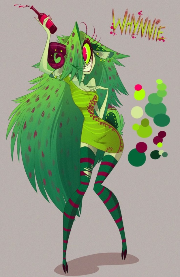
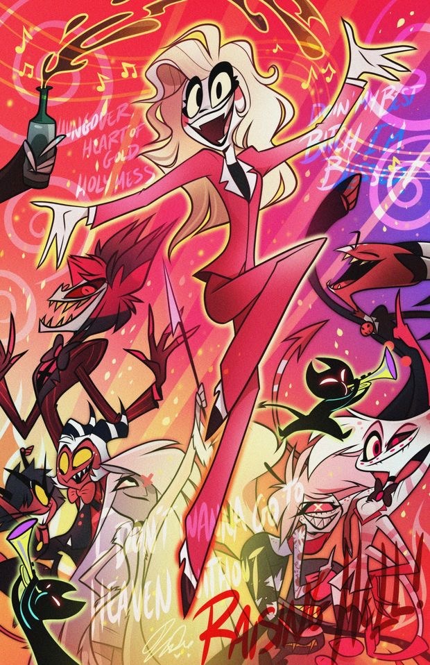
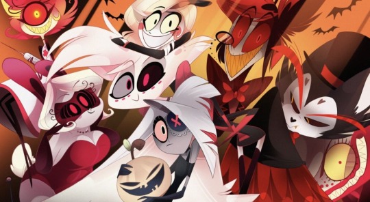
DECONSTRUCTING VIVZIEPOP ARTISTIC ISSUES WE MAY HAVE CONSUMED AS CHILDREN (if her art has improved I haven’t seen but I will give her the benefit of the doubt! So let’s just isolate this to the past for US ex hazbin artists to understand where our problems truly began)
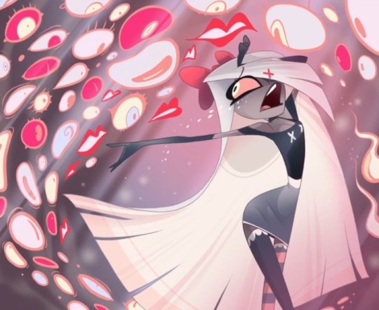
Anatomy: Vivziepop has a habit of not properly following even the anatomy of her own drawings let alone anatomy rules at all. I had to bend and meld what I thought a limb may look like from its transition from in front to behind a limb (like the legs) since the lines didn’t properly match up. Arms change size, legs have no knees, one thigh thicker than the other and hands that have fingers which melt into the palms.
you could say it’s stylistic, but considering she’s ONLY ever drawing stylistically whether she liked to or not this bad anatomy has become a crutch and down fall. If she wished to draw more realistically I will assume she can’t or can’t anymore…
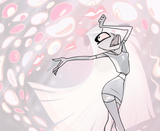
Here’s a draw over. You can keep the stylistic effects while keeping your anatomy at least somewhat readable, especially the hands 💀
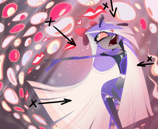
Shading: shading plays a huge role in not only give us context to the image like where the light source is coming from but also the shapes of the body. the body is comprised of different shapes (cylinders for arms and legs, circles and ovals for head, different planes for the face) with shading like vivziepop’s we don’t know where the light is coming from but also the shading blends into the drawing as visual noise, or worse makes things look flat and lifeless. Her legs especially are shaded as if they are two pieces of paper sticking out from under her dress.
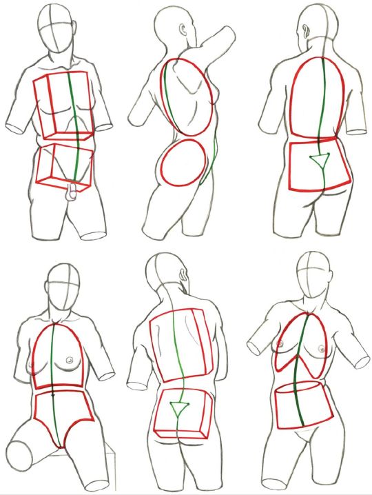
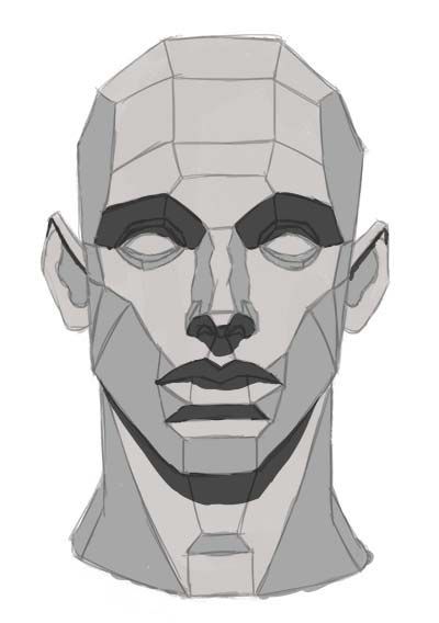


Colours: we all know her main appeal in art is her colours, but designing your piece by just how pretty you can make all the colours also is ignoring fundamentals in what makes your art from good to BEST. With too much of one shade your whole piece blends together in the eyes of the viewer. With not enough contrast in the right areas you will have a focal point that bounces around (like us her chest the focal point? It’s the darkest spot on the piece! Or is it all those eyes that clutter up the whole drawing with the random stripes in the back…. Ouch! I can’t tell what’s what!)
conclusion: I leave you and others with this quest, you wanna get better at art? Take a moment to critique even your own favourite artists. You can have inspiration of course but question their decisions before blindly hoping on the hype train. Or you could be consuming their own mistakes and end up STUCK, like I was, like many have become.
Give critiquing these pieces a try, deconstruct them, trace them (don’t post) see where the lines match up- do the limbs look as if they existed behind the limb or do they go to a void and come up the other side a completely different size? You tell me…
#hazbin hotel critical#helluva boss critical#spindlehorse critical#vivziepop critique#hazbin critical#hazbin hotel criticism#hazbin hotel critique#helluva boss criticism#artists on tumblr
93 notes
·
View notes
Text

Ok, it's time, isn't it? My first "Art Versus Artist"! and always, my complete Good Omens Art Gallery if you are curious!
Hello my dears! Your little Frenchie wing-addict here! 2024 has been a hell of a ride, so many great things happened since I decided to join the Good Omens fandom ! What a ride, yeah, from my first Red Art sketches in January to my most recent full-colour tries and experimentations - most of them still secret, sorrryyyyy. My wrist surgery and the physiotherapy still going on, depression and health problems hitting hard again... BUT I KNOW I wouldn't be here without the fandom and without your wonderful support.
The constant research of my own art style, while i was granted the chance to work with amazing writers and artists. The pleasure to share my improvements with you all, dear followers and friends!!!
Thank you so much, for everything. Wishing you the best for 2025, I hope I'll be able to make you smile and dream even more!
Linktree - Masterpost - Ko-Fi - Prints of my Art here!
And, here, I'll have to stop a minute and try to remember ALL of you dear people I'd like to thank even more personally... with all my love and my gratefulness. (!long text under the cut!)
@vavoom-sorted-art dear M'am, I have already told you how one of your Tumblr posts litteraly saved me in the beginning of 2024 and gave me back the courage to continue to make art. It was probably a very small thing for you, but for me it has been a life-changing thing for the best. Thank you again, thank you so much for your kindness, and your advice about my art during this year. I wish you the best for 2025, for your studies and everything else <3
@malohkeh-main My dear, you're the first one who encouraged me to do this personal Red Art Daily Challenge in January. Thanks for your wonderful support and our translation teamwork, life happened between us but I'll never forget our discussions.
@floscrap-blog, my dear frenchie friend I have met on international GOAD sub, while we were living almost right next door, how was it even possible?? Dear Hun, thank you so much for your kindness, I'll treasure our friendship forever.
@kotias, the one and only! I can't even say how much I'm grateful for you finding me and dragging me into the wonderful behind-the-scenes of this awesome fandom. Because of you (and it's a compliment) I was suddenly drawing even more, writing again after a 3-years-blank-page-syndrom, meeting so many new people and collegues and friends. My life has definitely changed the day we started to talk, and I discovered what the tag "found family" might mean. Thank you so, SO MUCH, Madame.
Thanks to @goodomensafterdark for creating the best goblin nest ever. Your whole community supporting me when I was about to get my wrist surgery and when I was scared as hell? Probably my best wonderful memory ever of this summer. Still crying about it. Thank you so much, for everything.
@demonsandpieohmy, dearest, I still remember this comment on my art on GOAD, mentioning your fingers tingling... and then, "To Shreds" was born, and it was just the first of our several collabs together. Thank you so much for your trust and your support on my very first NSFW artworks! Thank you for your friendship, we might have talked less these last months but it's always a pleasure. Wishing you the best for your ulterior writings!
Thanks to @the-bentley and @cassiecasyl for choosing me on the Reverse Bang Minisode and for our wonderful teamwork!! I have been uncredibly lucky to have you both.
Greatings and many thanks to the people who supported me on Ko-Fi and/or commisionned me this year. It's been an honor and a true pleasure. <3
Hugs, love, and big thanks to my dear friends and fellows artists/writers: @daneecastle (your kindness and your advice still help me everyday, dear), @gribouli (tellement heureuse d'avoir pu te rencontrer, merciiiii pour tout!), @nosferatini (Thank Mama Nos for everything, can't wait for 2025 ;-D), @sweetmascherari (the "BIG" project was so much funnier by your side!<3), @eybefioro (my dear I'm so happy to finally be able to work with you!)... and I probably forgot people and I hate it but be sure I'm so so grateful T.T
Thanks even more to all my lovely friends from the TNAN discord - and specifically to @itsscottiesstark, my dear friend and co-moderator. I love what we have created there and even if this BIG BABY of a network is sometime a little bit overwhelming now, it's always a pleasure to co-event with you and having fun during your Story-Times.
And, last but not least, thanks to my dear internet Spouse, @captainblou. Writing and arting by your side has been one of the most wonderful things I was able to do this year. Thank you for that, and for everything else, each day, every day.
Happy NYE everyone! See you in 2025!
Tag-list (ask in comment to be add if you want to be notified next time I publish my Good Omens arts and WIPs! A lot of secret work is almost done and is coming!!!)
@goodomensafterdark ;
@floscrap-blog ; @demonsandpieohmy ; @amagnificentobsession ; @captainblou ; @mamamissy
@ineffable-hyperfixation ; @itsscottiesstark ; @moralsofanalleycatsposts ; @featheredboaconstrictor ; @lenareadly
@fearandhatred ; @eybefioro ; @crowleys-bentley-and-plants ; @ashfae ; @crowleys-hips;
@paperclipninja ; @silverdphantom ; @neverlet ; @naturallyteal ; @goodoldfashionedlovergirls-blog ;
@madaims; @daisydimple20092 ; @seraphhiim ; @rebeccakatmauri ; @cobragardens
#good omens#fandom#good omens fandom#ineffable husbands#art versus artist#art vs artist#happy new year#recap#2024 recap#elenthyaandgoodomens
76 notes
·
View notes
Text
i've been seeing ai takes that i actually agree with and have been saying for months get notes so i want to throw my hat into the ring.
so i think there are two main distinct problems with "ai," which exist kind of in opposition to each other. the first happens when ai is good at what it's supposed to do, and the second happens when it's bad at it.
the first is well-exemplified by ai visual art. now, there are a lot of arguments about the quality of ai visual art, about how it's soulless, or cliche, or whatever, and to those i say: do you think ai art is going to be replacing monet and picasso? do you think those pieces are going in museums? no. they are going to be replacing soulless dreck like corporate logos, the sprites for low-rent edugames, and book covers with that stupid cartoon art style made in canva. the kind of art that everyone thinks of as soulless and worthless anyway. the kind of art that keeps people with art degrees actually employed.
this is a problem of automation. while ai art certainly has its flaws and failings, the main issue with it is that it's good enough to replace crap art that no one does by choice. which is a problem of capitalism. in a society where people don't have to sell their labor to survive, machines performing labor more efficiently so humans don't have to is a boon! this is i think more obviously true for, like, manufacturing than for art - nobody wants to be the guy putting eyelets in shoes all day, and everybody needs shoes, whereas a lot of people want to draw their whole lives, and nobody needs visual art (not the way they need shoes) - but i think that it's still true that in a perfect world, ai art would be a net boon, because giving people without the skill to actually draw the ability to visualize the things they see inside their head is... good? wider access to beauty and the ability to create it is good? it's not necessary, it's not vital, but it is cool. the issue is that we live in a society where that also takes food out of people's mouths.
but the second problem is the much scarier one, imo, and it's what happens when ai is bad. in the current discourse, that's exemplified by chatgpt and other large language models. as much hand-wringing as there has been about chatgpt replacing writers, it's much worse at imitating human-written text than, say, midjourney is at imitating human-made art. it can imitate style well, which means that it can successfully replace text that has no meaningful semantic content - cover letters, online ads, clickbait articles, the kind of stuff that says nothing and exists to exist. but because it can't evaluate what's true, or even keep straight what it said thirty seconds ago, it can't meaningfully replace a human writer. it will honestly probably never be able to unless they change how they train it, because the way LLMs work is so antithetical to how language and writing actually works.
the issue is that people think it can. which means they use it to do stuff it's not equipped for. at best, what you end up with is a lot of very poorly written children's books selling on amazon for $3. this is a shitty scam, but is mostly harmless. the behind the bastards episode on this has a pretty solid description of what that looks like right now, although they also do a lot of pretty pointless fearmongering about the death of art and the death of media literacy and saving the children. (incidentally, the "comics" described demonstrate the ways in which ai art has the same weaknesses as ai text - both are incapable of consistency or narrative. it's just that visual art doesn't necessarily need those things to be useful as art, and text (often) does). like, overall, the existence of these kids book scams are bad? but they're a gnat bite.
to find the worst case scenario of LLM misuse, you don't even have to leave the amazon kindle section. you don't even have to stop looking at scam books. all you have to do is change from looking at kids books to foraging guides. i'm not exaggerating when i say that in terms of texts whose factuality has direct consequences, foraging guides are up there with building safety regulations. if a foraging guide has incorrect information in it, people who use that foraging guide will die. that's all there is to it. there is no antidote to amanita phalloides poisoning, only supportive care, and even if you survive, you will need a liver transplant.
the problem here is that sometimes it's important for text to be factually accurate. openart isn't marketed as photographic software, and even though people do use it to lie, they have also been using photoshop to do that for decades, and before that it was scissors and paintbrushes. chatgpt and its ilk are sometimes marketed as fact-finding software, search engine assistants and writing assistants. and this is dangerous. because while people have been lying intentionally for decades, the level of misinformation potentially provided by chatgpt is unprecedented. and then there are people like the foraging book scammers who aren't lying on purpose, but rather not caring about the truth content of their output. obviously this happens in real life - the kids book scam i mentioned earlier is just an update of a non-ai scam involving ghostwriters - but it's much easier to pull off, and unlike lying for personal gain, which will always happen no matter how difficult it is, lying out of laziness is motivated by, well, the ease of the lie.* if it takes fifteen minutes and a chatgpt account to pump out fake foraging books for a quick buck, people will do it.
*also part of this is how easy it is to make things look like high effort professional content - people who are lying out of laziness often do it in ways that are obviously identifiable, and LLMs might make it easier to pass basic professionalism scans.
and honestly i don't think LLMs are the biggest problem that machine learning/ai creates here. while the ai foraging books are, well, really, really bad, most of the problem content generated by chatgpt is more on the level of scam children's books. the entire time that the internet has been shitting itself about ai art and LLM's i've been pulling my hair out about the kinds of priorities people have, because corporations have been using ai to sort the resumes of job applicants for years, and it turns out the ai is racist. there are all sorts of ways machine learning algorithms have been integrated into daily life over the past decade: predictive policing, self-driving cars, and even the youtube algorithm. and all of these are much more dangerous (in most cases) than chatgpt. it makes me insane that just because ai art and LLMs happen to touch on things that most internet users are familiar with the working of, people are freaking out about it because it's the death of art or whatever, when they should have been freaking out about the robot telling the cops to kick people's faces in.
(not to mention the environmental impact of all this crap.)
648 notes
·
View notes
Text
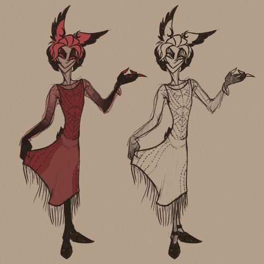
"Lose the jacket"…
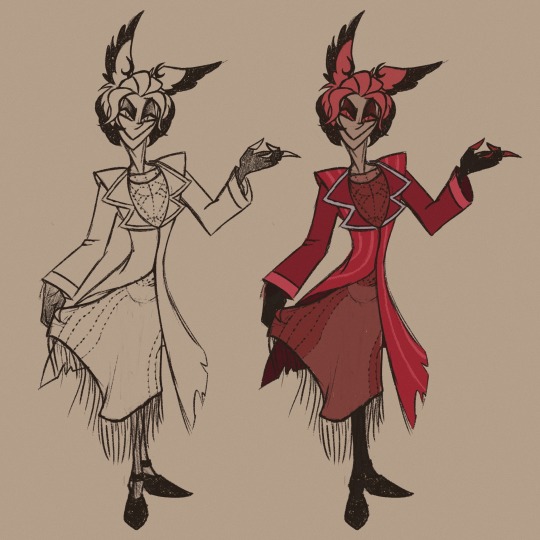
More Alastor in dress from this post because I am completely normal about it (I’m not).
@prince-liest : answering previous asks, let’s establish now that if I mention you directly in my posts, you are free to link the art to your fics without asking (after all, it wouldn’t have existed without them). I’m pretty sure I’m not done with them. Cheers <3
Artist’s little side note (because I feel like rambling again): so Hazbin gave me two life improvements (well, three, if you add the music) - one was stepping foot into the unknown aroace territory and being hit on the head with realisation that it was my home all along, making my questionable behaviours and reactions in the past a whole lot less… weird. At least for me, the allos probably still thought I was weird af, but that’s their problem now.
Second improvement was discovering a cartoony style that just sits right with my hand. I’ve always loved cartoons, had a little nostalgic era at the end of high school where I went back to the stuff I’d watched as a kid (Jake Long, Ben 10, Kid vs Kat, Samurai Jack), then I was discovering shows that were made quite recently already as an adult (Over the Garden Wall, Gravity Falls, The Owl House), I loved them for various reasons… but every time I tried to play with their style, I couldn’t get past a few drawings.
I also never truly worked out my own cartoony style, so I thought I’d be stuck with realism for all eternity - which is not bad by any means, it’s just that added pressure of your own artistic ego whispering into your ear that if you misplace one tendon or muscle, or get the proportions wrong, you’ll likely burn down in some special part of hell, specifically for artists that are too lazy to check their anatomy atlas for every single drawing they make. Or maybe that’s just me.
The point is – I don’t remember the last time I produced so many drawings in such a short time, and it’s a blast. And I can focus on posing and emotions more than anything, thus learning new tricks, and it might improve my realistic art as well, right now limited by my fear of it somehow looking incorrect (because that would surely mean the end of the world).
-End of ramble-
#hazbin hotel#alastor#hazbin alastor#radio demon#my art#aroace alastor#alastor in a dress#he’s a cutie patootie#princeliest#spilling more thoughts#aroace#art ramblings
208 notes
·
View notes
Text
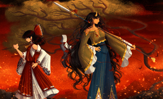
[Click image for better quality]
I FIGURED OUT A WAY TO FUCKING MAKE THE IMAGE SMALLER FOR POSTING ON TUMBLR WITHOUT SACRIFICING THE ACTUAL QUALITY OF THE IMAGE OH MY GOD
Ok so, what I did is go into the clip studio paint file, make a new file, copy and paste the group in the original file, merge everything, get rid of the extra stuff outside of the canvas, and then make the flattened image smaller and crop the canvas. Once you have that, export it and you're done. This helps maintain the actual quality of the image and also helps shrink the file size down to something actually postable (if anyone has a better way of doing this please tell me)
[Edit]: Ok I guess posting something to Tumblr just naturally compresses the image a bit more somehow because I'm looking at it now and zooming in too much makes it a bit blurry so I'm still gonna have to futz around with image quality for future pieces oof
Artist's Note:
I'm so glad I figured out a way to do this because I like working on a big canvas so I can get as much detail in as I possibly can. Only problems are how laggy it gets while drawing lol.
I had an idea for a drawing with Reimu and Zanmu because I really like thinking about their potential dynamic a lot. I also wanted an excuse to draw Zanmu again but in my normal rendering style because last time I drew her she was in my more sketchy style with generally flat colours so I wanted to draw her again. Speaking of, looking at the sketch for this is a jumpscare that I never enjoy seeing, like, man am I glad I didn't use those for my final piece.
Also about her spear. I was originally gonna make it like the ones she had in game, but it kinda threw off the whole piece. It was too big, too blue, and too flat, so I just went "fuck it" and gave her a different one instead. My headcanon justifying this is that the ones she uses in game are for danmaku battles whereas in any other fight she just uses a proper yari, or she still uses the yari and just makes it all glowy to power it up, maybe both lol. I pulled as much inspiration as I could from Sengoku era spears, and even put in some blue into the decorative part of the spear and also added a little skull to pay tribute to the original spear. Also, in my research I saw some art of izanami and izanagi making japan and saw that the yari izanagi has had a little decorative tassley thingy on it so I took some inspo from that and just made it one of Zanmu's tassles (Idk when that art was from or if the spear was still accurate to Sengoku period Japan but hey, probably the same reasons Eirin puts little bow ties on her arrows, it's just for personalization purposes).
I love rendering hair and clothes so much omg, while I like the super curly hair Zanmu, the longer, wavier hair suits her better for this drawing (I imagine it only does that like how Ghibli characters hair moves when they feel angry lol). I love making Zanmu's hair all messy and crazy, as well as giving her grey hairs, this woman has aged like a fine wine. Also, if the hem on the ends of her sleeves, top of her shirt, and her pants look like gold to you, that's because it is! It's fairly light so she's not collapsing under the weight, but it's gold! (I don't care how impractical it is, it's just cool). Not the undershirt though, it's made of a gold fabric. I had a cute idea with Reimu's hair to make it have a red shine to it. I also changed up Reimu's outfit so it isn't just a blob of red. I like it a lot when Reimu's skirt and outfit is segmented into different layers, so I wanted to incorporate that.
I tried to draw their hands differently as well, but IDK how noticeable that is. Also, I am super happy with how the side profiles for the two of them turned out, I used to struggle a lot with how to make the side profile of a character actually look like the character, so I'm really happy that they actually look like themselves.
Also added in the tree and rocks in the background as an homage to Zanmu's character art in Touhou 19, just because I was getting kinda stumped on what to do with the background lol.
In terms of a story idea with Reimu and Zanmu, idk why but the potential plotline of Zanmu wanting to ascend to godhood is so fascinating to me. Like, it is very possible that if she just convinced everyone she was a god (which would be very easy for her to do), she would become one in a heartbeat. Also, if she were to become a god, with her ability to return stuff to nothing, could she hypothetically get similar abilities to (Jojo Part 5 spoiler btw) GER? Like, idk about the death timeloop stuff, but the concept has been haunting me every night as I have been trying to find loopholes in GER's ability for a while now ( for no reason in particular). Back to the main topic, I imagine that she would probably tell Reimu that if she were to become a god she would take over the Hakurei shrine since the god there might as well be dead, and Reimu just says to her, "Over my dead body bitch." Like, I have no idea how to summarize their dynamic but like, it's the type of hero-villain dynamic where the phrase "We're not so different, you and I" would definitely be a phrase said during a fight. I think that if another IN style game were to release, Reimu and Zanmu would be in a team together. They could also have an interesting mentor and pupil kind of dynamic. Can you tell that Zanmu has been charging my mind rent these part few months? Like, instead of living in my head rent free, she kinda just uno reversed the whole situation and now she's the one charging me rent. What happens if I get evicted from my own brain? Actually, scratch that, I don't think I wanna know.
#touhou project#art#fanart#touhou fanart#touhou 19#touhou#東方project#zanmu nippaku#unfinished dream of all living ghost#reimu hakurei#東方
276 notes
·
View notes
Text
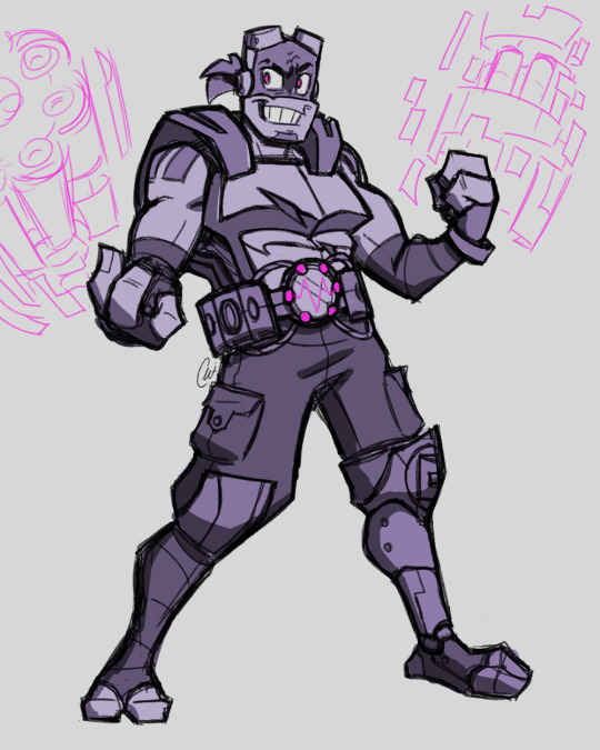
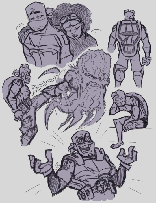
Updated Future Donnie Concept Art!!!
So, I've been hesitant to try my hand at designing an Apocalyptic Future version of Donnie for a while, for a number of reasons - mainly that I just didn't have a clear idea of him in my brain yet and the thought of attempting to update his already pretty perfect design was highly daunting - but I finally caved and decided to take a crack at it. A couple months and several revisions later, I'm actually genuinely happy with the result. I'd still consider this "concept art" more so than a final design, elements of it could definitely be improved, but I really do like the concept as a whole - I think it could work!
The main goals I had in mind while working on this were: A. Must fit the character/look like something Donnie would canonically wear and still be easily recognizable. B. Must work in the Rise world & style (i.e. not be overly detailed or have too complex a silhouette.) C. Must fit in with the other (canonical) Future Rise designs.
I was also thinking about what problems Donnie might be trying to solve, which is what inspired the belt (more info on that below). All-in-all, although there might still be a few kinks to work out, I think I managed to come up with a pretty solid base design for my favorite Warring Warrior Scientist (Jr.)
Some additional character tidbits under the cut.
Also, I can't draw mechanisms to save my life, so just pretend those vague ninpo-gun-things make sense lol
Donnie has a mechanical prosthetic leg. How'd he lose that leg? Up to interpretation - my working theory is that it was a minefield accident that occurred when he was trying to blow some Krang dogs to Timbuktu. Naturally, since it's Donnie and they are in the midst of an alien apocalypse, he designed the leg to do a whole lot more than just help him stand without falling down. It's a multifunctional tool that contains a plethora of secret uses - including, but certainly not limited to, sawing off ugly Krang faces. It's essentially his new tech bo.
Bonus leg tidbit: Casey Jr. saw him deploy the saw blade in battle once when he was little, he then proceeded to beg for a saw-leg of his own to fight the Krang with. Donnie, realizing that amputating a perfectly healthy child's leg is probably not that most morally acceptable option, instead made him his own "sawing stick"(AKA, his motorized hockey stick)...which the others then made him wait until Casey's 10th birthday to give him.
The belt that Donnie's wearing here is a prototype of his latest invention. Its intended purpose: to deflect the Krang's mystic-blocking attacks, allowing them to use their ninpo in close combat. It took a lot of risk-taking to collect the necessary information to create such a device, and he experienced a number of way-too-close calls (one of which may or may not have resulted in that large gash across his plastron), but he finally managed to crack the code and pinpoint the frequency of the Krang's sound waves. He's testing it out right now to make sure that it works and is safe to use, but once it's out of beta, he plans to mass-produce them for every mystic-wielder in the Resistance to use in battle. He believes it could turn the tides of the war...unfortunately, the device never makes it out of beta, as he dies before its completion.
Donnie's gloves are fashioned after the ones his dad used to wear in his Lou Jitsu days (with some modifications, for comfort and to make working with screens a little easier and less annoying.) The material they're made out of is far more durable, of course, since he's working with them near-constantly and under varying conditions. But maybe he designed them to look like this as a way of keeping his dad's memory close, similar to Leo's sword hilt?
Ironically, Donnie uses his ninpo probably the most consistently out of all the brothers (even though Mikey uses his to the greatest extent, hence his rapid aging). He's constantly using it to check on the base's security status and multitask while working on other projects. Because his ninpo takes a good deal of brain power to operate, it puts a significant amount of strain on his nervous system and this causes frequent complications. Seizures, spasms, and blackouts become a semi-regular occurrence - especially in the latter part of his life. Donnie does his best to manage them, but the workload makes it almost impossible to do so properly. Mikey is able to help with these attacks when they happen, but Donnie - not wanting his brother to overuse his powers any more than he is already - usually opts to just ride it out and save the mystic healing for people who need it. The exception to this rule being when he's in the middle of an extremely important procedure and can't stop long enough to let the attack pass naturally, then he has no choice but to accept Mikey's aid.
This is probably needless to say at this point, but much like Leo and his other brothers, he is a giant. Equal in height to Leo (if not slightly taller, even without the goggles.) The doodle in the top-left corner of the sketch page where he's next to April is meant to be them sitting, so don't take it as anywhere near an accurate representation of their height comparison. It is not, he dwarfs her by several feet, lol.
#rottmnt#donatello hamato#rottmnt donnie#rise donnie#future donnie#rise of the tmnt#rise of the teenage mutant ninja turtles#rottmnt future timeline#tw: amputation#Sort of. You don't see anything but if half a leg freaks you out best not to look.#fanart#concept art#character design#chiscribbs#Heavily referenced Krang because Idk how to draw them yet WOOTWOOT
573 notes
·
View notes
Text
People who complain that Sonic's character is "static" must have never played Unleashed or Black Knight. Or they did, but they didn't understand them.
I think one of the reasons why Unleashed and Black Knight are such fan favorites and stick in our memory so well is because the entire theme of both games is about taking Sonic out of his element, taking away things that he has relied on for so long- speed, jumping, spindashing, boosting, homing attacks- taking all those things away from him, and seeing how he does.
And he still shines. Even without all the abilities that he has relied on throughout his entire life, he still manages to beat the Big Bad.
(Please note that I haven't finished either game yet and I'm just drawing from what I've been spoiled on.)
As the werehog, Sonic is not able to curl into a ball at all (we're ignoring the mobile games for this post), and his greater height and weight, probably due to a larger bone structure, as well as heavier, thicker fur, keeps him from being able to run as fast or jump as high as he's used to. He now how to resort to fighting styles he has never used before, including several forms of martial arts (aided by his Dark Gaia-powered stretch abilities). Perhaps the most unusual of all is how he has to get down on all fours to run.
In addition, Sonic describes his werehog form as "pretty ugly." Sonic thinks of himself as good-looking, and this is a part of his personal identity, which is part of why he was upset that Amy didn't recognize him (no matter what feelings he may or may not have for her). The werehog form also seems to be physically uncomfortable and taxing on Sonic's body due to the heavier weight, as the werehog idle animations include Sonic stretching in an exaggerated way and forcibly rotating his shoulders (motions I, myself, have learned to use after years at a desk job that has ruined my neck and upper back). Sonic's idle animations also include him being jumpy and looking around every few seconds- basically, the werehog never fully relaxes.
All in all, Sonic is very uncomfortable as a werehog, and prefers not to be seen in this form. But the reason why is not fully evident until he thanks Chip for protecting him and keeping him from turning evil. To this, Chip replies, "I haven't done anything, Sonic. You're too strong to lose yourself."
On top of this, Amy doesn't have a problem with Sonic's appearance. She still loves him. Tails also doesn't care what Sonic looks like. Neither does Professor Pickle. Neither does ANYONE. Even if they're startled by the werehog's appearance at first, they all seem to go, "Oh, it's just Sonic. This is just what he's like at night."
The entire story of Unleashed was about Sonic coming to realize that he is not who he is because of what he looks like or how he is built.
Black Knight takes this a step further. In Unleashed, Sonic wasn't able to run, but he was still able to use his body as a weapon. In Black Knight, Sonic can run again, but nowhere near as fast as his normal speed. All of Sonic's abilities to fight with his body are stripped from him, and he is forced to use an actual weapon, instead. And Sonic hates this. He even says it: "I wish I didn't have to use this dang sword!"
Sonic has never used a weapon before in the games (as far as I am aware, anyway). His weapon has always been his own body: his feet, his fists, his whole body via spindash and homing attack. Now he's having to train himself to fight with something outside of his own body. This requires not only the creation of new muscle memory, but also a complete shift in the way his brain processes information to fight. He always has the option to just crumble and say, "I can't do this, it's not what I'm used to, I give up." He never does that. He complains a bit at first, but eventually rises to the occasion and excels at swordfighting.
Please bear in mind that I haven't ever gotten past the King Arthur battle. I presume Sonic is forced to kill him, and then I believe there's another half a game after that. But so far, it seems that Sonic's character arc in Black Knight is about him learning that he is not who he is just because of what he can do.
What makes Sonic Sonic is not what he looks like or what he is able to do, but about who he is inside. Sonic is someone who cares, someone who is strong, someone who doesn't give up, someone who sees a difficult situation and, no matter how much of an inconvenience it may be, turns it around and finds a way through.
#sonic the hedgehog#sonic unleashed#sonic and the black knight#in this essay i will#my opinion#character analysis
55 notes
·
View notes