#my pixel is nicer than that pixel
Explore tagged Tumblr posts
Text


some flooring & carpets!
#wanted to try make the flooring a bit more detailed in mudborne to match the environment#esp. compared to apico which was so basic for the floor#however did mean a little bit more messing around for the tiling to look nice#also did something a bit hacky to save my needing to do the usual 48 tile variations#which worked nicer than i expected#mudborne#pixel art#frog#frogs#game development#indie game dev
11 notes
·
View notes
Text
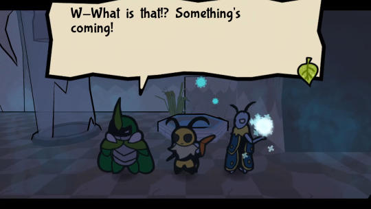

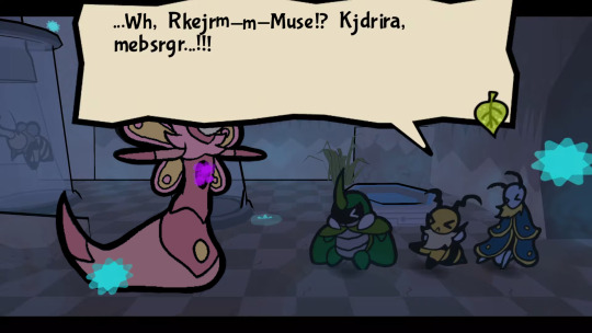
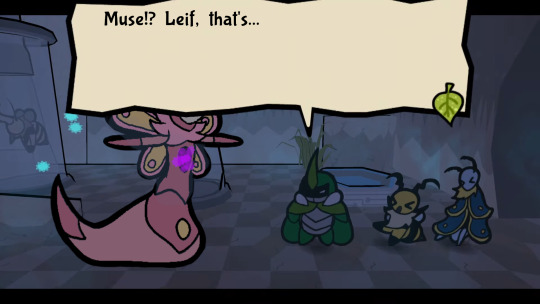

[Image Description: a set of five edited bug fables screenshots from the pre-battle zommoth encounter. The first is the same as in-game, Kabbu saying "W-What is that!? Something's coming!" The second is of zommoth appearing on screen with its sprite edited to be various shades of pink and yellow, wings the same pattern as Leif's (but still with the purple blight magic stuff in the chest area.) The next three images have the sprite edited in the same way.. The third image is of Leif's saying "...Wh, Rkejrm-m-Muse!? Kjdrira, mebsrgr...!!!" The next is Kabbu saying "Muse!? Leif, that's..." The final is Vi saying "T-That doesn't make any sense!" End ID]
I thought about one of my fucked up and evil au ideas for five minutes again, so I decided to spend like fifty hours making a thing about it. Basically what if Muse went back into Snakemouth later to try to rescue Leif or at least bring back his body and got caught by the roaches.
Putting just the edited sprites under the cut if you wanna see those without the lab mood lighting:


#bug fables#bug fables spoilers#muse bug fables#or as I've been saving my files for this as:#Zommuse#:3#Leif bug fables#despite taking a super long time (not actually fifty hours but it felt like it) this was fun!#I am so much more comfortable with writing than visual art stuff but since I don't have any specific thoughts on the scenario#past this moment this is a way easier way to get my thought across in slightly more description than my one paragraph up there#eyedropped all the colors off Muze and Grandpa's sprites and then played with them a bit to make them go together nicer#part of the length was me figuring out how to do stuff and part of it was because I had to stitch some stuff together inconveniently#as I said earlier: aa spoiled me. what with having all the game assets and backgrounds either conveniently already extracted#or at least mechanically very easy to get myself because it's all just pixels and all the bits are on different layers!#(also storywise I usually tend to go with giving muse fire magic when I'm thinking things. but keeping the blight was easier shorthand.#and also all those times she's more on leif's end of the cordyceps spectrum. mind more there. so.)
40 notes
·
View notes
Text
Boring life update:
After looking at all the options in the budget phone range, I'm just going with the newest version of the phone I have.
While a "nicer" phone would be good, the reviews from other long time moto g fans say the same thing--2023 is a huge improvement over the other ones in this line but you can still drop your phone with abandon and have it be okay.
My phone requirements are: basic internet and the ability to drop my phone an average of 3 times a day for 3 straight years and still have it function. I AM the intended original Nokia user. And moto g delivers on that kind of durability. So, basic budget phone it is!
#i call my budget style the marie kondo of finance#as long as my phone kind of works i'm happy with it and it brings me joy#i do not need a phone nicer than my laptops to bring me joy#so i'm not going to spend money on that#even with the repair policy added in the entire thing is cheaper than the current pixel 6a#and while i could probably limp my current phone along for that long to get black friday sales...#i need to admit my phone is dying and it's okay to buy a new one before i hold a total brick in my hands#i didn't do a trade in so I can use my old phone as emergency back up if my new one breaks or dies unexpectedly so#i have a phone while i wait for a replacement#i got the replacement policy because i am THAT hard on phones#i'm just a clumsy person#i'm getting better but i'll never be good at not knocking things over or falling over or dropping things#but i made my current phone last 3 years#hoping to get 3 years out of the next one
1 note
·
View note
Text
I have gotten a lot of messages saying that they really love the presentation of CURSE/KISS/CUTE. Often the commenter in question can’t say what exactly it is about the formatting that they appreciate, but that it just reads well and looks good. Well!!! Allow me to bare my wealth of secret knowledge for you once and for all:
I sorta just did some research into book typography...?
Here’s something you should know about web development, alright: typography on the web is really, really bad. The tools we have at our disposal—HTML and CSS—are incredibly powerful, but they are set up to fight you every step of the way towards Good Typography. When you know what you’re looking for, you can fix all the common issues quickly and easily. But it’s not easy to know what to look for, because
problematic typography is overwhelmingly the norm on the web, and
good typography is invisible.
Here’s a screenshot from CURSE/KISS/CUTE episode 0:

Now, I don’t want this post to come across as prescriptive. It is not my intention to tell you, “This is what good typography looks like, so follow my lead exactly.” I made a lot of choices with the typography of my web novel: many of those choices would not make sense in other contexts. What I want to convey to you is what those choices are, so that you will know they’re available to be made.
I mentioned that the web “fights you” when it comes to good typography. What do I mean by that? Well, check this out:

This is how that passage of text renders “by default.” In other words, this is how a web browser would render that text without any input from me about what styles to apply. It kind of sucks ass! But it also looks pretty familiar, right? This is not that far off from how a lot of websites—even websites full of prose (looking at you, AO3)—render text.
I think the most illustrative thing to do here would be to walk you through my thought process and show you, step by step, what decisions I made to turn this unstyled text into the styled version you see in the novel.
So, first things first:
1. We have got to shrink that text column.
Computer monitors... are wide. They are wider than they are tall. They are so wide, and they have so many pixels. This means you can fit a lot of characters on them. If you wanted, you could just have a wall of characters from the left side of the screen all the way to the right side. Talk about efficient!!
You should never, ever, ever do this.
This is one choice that I actually will make a prescriptive statement about, because it’s supported by quite a lot of research: fairly narrow text columns are more legible. Specifically, research seems to support the idea that a width in the range of 50 to 70 characters per line is the most comfortable for people to read*. Every font is different, so it takes a little doing to turn that “characters” figure into a pixel measurement; I went with 512 CSS pixels for the maximum width of my text column:

Isn’t that just so much nicer to read already?
*A commenter reminds me that I’d be remiss not to point out that the research on column width legibility isn’t completely conclusive. You do want to limit the width of your text columns, but going over the 70 character-per-line recommendation isn’t necessarily the end of the world, and you might have good reasons to do so. I did not: as mentioned, one of my goals was to mimic book-style typography, and books by nature have fairly restrained column widths, on account of they’re books.
2. Picking a font.
I’m not going to give you the blow-by-blow on how I decided what font to use. The short story is that I asked some designers, and one of the recommendations I got was the free font Crimson Pro, which I took a liking to immediately:

It’s just an all-around attractive serif font, but one thing I really like about it for use in a novel is its highly-visible quotation marks. They’re just kinda jumbo! They’re real big! Easy to see! In a novel, those things aren’t just ornamentation. It makes a great deal of practical sense for them to stand out just a bit. It also has a fairly large x-height, unlike a lot of the more traditional options, which is good for legibility on a computer screen.
3. Adjusting the line-height
Web browsers default to a line-height of about 1.2em, which, as you can probably tell, is quite cramped. If you go and Google “optimal line height for legibility”, you’ll get a number of results right off the bat suggesting 1.5em. Sounds good! Let’s do that:

Well... hmm. That’s definitely an improvement, but between you and me, it actually looks a bit too spacey to my eyes. I wonder why?
I’ll cut to the chase: the 1.5em recommendation makes some assumptions about the font you’re using. In Arial, the letter “A” is about 0.6em tall; in Crimson Pro, it’s about 0.5em. That means that there’s no one-size-fits-all solution to spacing your lines, because different fonts have different amounts of empty space baked in. How annoying!
Let me tell you something about the kind of nerd I am. When I had this realization, I grabbed some books off my shelf and pulled out a literal micrometer. I started measuring the line-heights against various font features to see if there were any patterns I could spot in professional typesetting. Here’s what I found:

Almost every book on my shelf spaces lines such that the distance between one baseline and the next is about three times the x-height. How cool is that? I clapped my hands like a seal when I put this together.
Adjusting the line-height to match what I observed in the wild gives us this:

It’s a subtle difference, but to my eyes it feels just right. It’s almost like magic!
4. Paragraph spacing...
Let’s address the elephant in the room. Probably the most controversial choice I made with CURSE/KISS/CUTE’s typography was to opt for book-style paragraph indentation rather than web-style paragraph spacing—like so:

I did this for a few reasons:
It’s what I’m used to. I’ve read a lot of books, and this is just the way that books are formatted. I think for something aspiring to the title of “novel”, there’s value in making it look the way a reader probably expects a novel to look.
A novel has a lot of paragraph breaks in it. A paragraph in, say, an encyclopedia entry might go on for half a page or more; whereas it is unusual for a paragraph in a modern work of narrative prose to run for more than a handful of sentences, especially in any scene with dialogue. Because paragraph breaks are so common, spacing between paragraphs in a novel results in a lot of wasted space. Also, subjectively speaking, the additional space seems to me to lend an undue amount of weight to paragraph breaks. I’m just starting a new thought; there’s no need for a 21-gun salute, you know?
Having said that, here are some good reasons you might decide not to do paragraph indentation anyway:
Doing it right requires a bit of extra legwork. Notice how the very first paragraph in the image above has no indentation. That’s because it’s the start of a new section, and the first paragraph in a section traditionally goes unindented. This is an easy detail to miss, and it can be difficult to wrangle CSS into doing it for you automatically.
Web users don’t expect it. For the first decade of the web’s existence, there was no good way to do paragraph indentation; by the time CSS rolled around and made it easy, paragraph spacing had already become the norm. And while CURSE/KISS/CUTE may be a novel, it is also, specifically, a web novel!
But it’s my house and I get to make the rules, so I went with indentation. Incidentally, there seems to be a dire lack of research into the question of whether indentation or spacing is more legible for readers—but the data that does exist appears inconclusive at best. So, the choice really does come down to vibes.
5. The tragedy of justification.
You’ll note that one way in which I did not make my web novel look like a paper novel is the text alignment. It’s un-justified: the right margin is ripsaw-ragged.
This is because it is not possible to justify text on the web.
Oh, you can try. Look right here: there’s a CSS property for it and everything. Just turn on “text-align: justify” and...

Nightmare! The interword spacing on that first line is almost as wide as the indentation!
Reader, I’m afraid that your web browser is simply too dumb. That’s not the browser’s fault: robust algorithms for justifying text without creating these distractingly huge gaps between words have existed for many decades, and modern computers are powerful enough to run them in real time with little performance impact. It’s just, uh—nobody has ever bothered to implement them into web browsers. It is the damnedest thing.
I tried, I really did. You can mitigate this problem a bit if you enable automatic hyphenation, but browsers are unfortunately also kind of dumb at hyphenating. Firefox, for example, will refuse to hyphenate any word containing a capital letter, so any sentence with a lot of proper nouns in it is a lost cause. I tried manually inserting soft hyphens with a text preprocessor I wrote myself, but still these overjustified lines plagued me: when the text column narrows, for example on a phone, even hyphens can’t save you. The line-breaking algorithm is simply too naïve to optimize for well-justified text, and that’s not something you can fix as a web developer.
As a result, my heavy-hearted recommendation is to never use text justification. It’s just too distracting.
6. And then some extra stuff just for me

I added drop-caps because it looks neat and I made the ellipses spacier because I think it looks good when it, uh, when they are spacier. I think that looks pretty good that’s just my opinion though.
That’s all! Hope you learned something bye!!!
498 notes
·
View notes
Text
OK OK OK I NEED TO SLEEP BUT
in celebration of @notsofrozt teasing art
(omg omg check this out ITS SO GOOL),
AND this fic reaching 35 pages (someone save me) here's more Airplane vs The System!
Let the games begin >:)
---
There was only one thing Shen Yuan hated more than being considered stupid and it was actually acting stupid.
Because why, WHY haven't they checked the bane of their existence, the persona non grata of binary code, the absolute most devilish collection of pixels and fuckery, aka the System?
It was right there, the notification blinking in green, marking it as a mission in progress.
He clicked, actually expecting more trouble on top of the Mobei business, only to be presented with-
Mission in progress: Author's favorite.
UV002 objective: aid UV001
Mission progress: 47%
What. The fuck.
He hadn't accepted any new missions, there wasn't even an obnoxious notification! And what's up with his objective?! Aid UV001?! How?! It didn't give him any other hint of what to do!
Oh he wasn't just angry, he was furious.
To the point that he had almost torn the door off its track when he opened it, the noise loud enough to startle Shang Qinghua into throwing his brush at him.
As if that would help against a real attack.
“Have you seen the new mission?!” He snapped as he entered Shang Qinghua's improvised office, glaring at the other trasmigrator.
“W-What?” Shang Qinghua blinked like a deer in the headlights, eyes puffed red as if had been crying moments ago.
Shan Yuan swallowed his pity, hardening his heart to focus on the task at hand. He closed the door to buy himself time before approaching the desk covered in parchment, slowly putting both hands on top of it to get closer to Airplane.
“Have you seen,” he pitched his voice low so they wouldn't be heard, doing his utmost to convey his fury through whispering. “The new. Mission.”
“Uh,” Airplane blinked again, scrubbing tears away, looking as lost as a puppy dropped from the moving truck. “Cucumber-bro-”
“Don't! You Cucumber-bro me,” he held himself back, closing his eyes to not lose his temper. “We're going to talk about your murderous ways later. Right now I need you to shut up and check. Your. System.”
He could see Airplane about to ask why, but his expression might have been terrifying enough because he just nodded and opened up his system, immediately frowning.
“What the fuck?”
“What? What is it?” Shen Yuan moved to get next to Airplane to better read what he was seeing. It never failed to amuse him how different their systems were: his looked like a proper video game menu, while Airplane's just looked like a lazy programmed blog.
“There's stuff missing. And I can't click on any missions. Like, I could at least check my old stuff? But now it's all gray?!”
“What do you mean?” At this point he was almost putting his face next to Airplane's so he could see, the bland white screen making his eyes burn. “Urgh how can you stand this, can't you change to dark mode? And go check for new missions.”
“As if, your system is way nicer than mine. Wait, do you have a new mission?”
“Yeah, it's called Author's Favorite. But it says nothing, just to help UV001. It's your user, right?”
-------
See you guys in the next update!
#scum villian self saving system#svsss#moshang#mobei jun#shang qinghua#god!shang qinghua#god!sqh#shen qingqiu#shen yuan#airplane shooting towards the sky#peerless cucumber#cumplane#🕯🕯🕯🕯✈️🕯🕯🕯🕯#prayers to my guy sqh so I keep writing like I'm insane#my writing: airplane vs the system#airplane vs the system#lets fucking gooooo
137 notes
·
View notes
Note
For your 3D art:
What are your influences?
What is your process for creating and texturing the models?
What software do you use?
Other than that, I will be keeping an eye out for more of your models as you are what I aspire to be as a hobbyist 3D artist.
Thanks for asking! I'll apologize ahead of time I'm not the best a writing but I hope my answers will be helpful and fun to read
1: I'm really inspired by arcane and into the spider verse! I love the way they can make 3d look like paintings or comic books I love to stylize 3d and I hope with more practice I can make my 3d art come off as different 2d styles. I'm also a big fan of the old low poly games look with the silly pixel texture it's kinda a funny balance between wanting my art to look nothing like 3d and wanting it embrace the sillies of the art form.
2a modeling: I start with cubes for almost everything I make. I started my 3d art journey with texturing Minecraft skins so I kinda like cubes, it also makes unwrapping it onto a flat plane for texturing just a bit easier for me. Here's an image with the geometry of my silly mailbox model highlighted.

3: I use Blender to make all my models although I just learned a little bit of 3ds Max in my first 3d animation class, I'm mostly self taught though that being the one semester of a 3d animation class under my belt but youtube has been a gold mine for every question I have about 3d and I've practically learned everything I know about using Blender of youtube tutorials.
2b texturing: I use an add-on called uv pack master in blender to speed up my uv unwrapping process so I can make my texture look nicer faster. As for painting I use the tools in blender to texture my models with a couple extra brushes from another add-on it's outdated though and I should probably find some new brushes lol. This is what my texture looks like btw! It's a little messy but I hope you can find it helpful!

I'm really passionate about 3d animation and almost everything involving it I love talking about it thank you for asking!
101 notes
·
View notes
Text
Incompetent Gamer Has Technical Questions (re: Whims)
cut out of consideration for my mutuals
So I'll preface this with saying that I think Whims is a really great mod. The creator is clearly a huge fan of the game and put a lot of love (no pun intended) into it which is more than I can say for the last two expansions. And on the whole, it's fairly intuitive - except I just have a few things that I can't figure out how to fine-tune.
Get Sims to automatically redress after sex, especially on home lots. This will be more an issue for my BC if that takes off. As funny as it is to stick peaches over everyone's rear ends, I'd rather not have to micromanage yet one more thing and remind them to cover up again.
Stop Sims from asking if they can join in a pre-existing sex act. Again, more an issue for the BC - I don't really care what my pixel people get up to. But it seems like when a Sim is refused, even if it's one of the nicer options ("no, no one can join in" or "no, but you can watch"), they lose a few friendship points. Also Watchers who submit a pixel for the BC may understandably not want to have them participate in threesomes.
Make only certain rooms/furniture sex locations. Likewise this is just for the ease of screencaps. I've set up what I'm calling the 'shag shed' behind the back of the main building for my BC and increased it to 99 percent likelihood for viable objects (the double bed and the chair). Is that enough?
Any help people can give me would be appreciated <3
21 notes
·
View notes
Text
Even MORE games for alterhumans!! Just like the last one, these are all games where you play as an animal, but this time they aren't all super realistic!! A few of these cost money, indicated by a "$" next to the title, but all of them are free on the last list!!
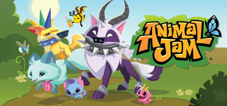
Animal jam [Play Wild!]: Starting off this list with another BANGER as of today, AJPW updates monthly, with a new animal, pet, and den in every update! AJPW released in 2015, 5 years after the classic version! The game is super active and likely always will be, and there's no singleplayer option, but there's no requirement to interact with others to play.
Playable Animals: [every update animal leaves shop with the next update, so im only listing the ones that do NOT rotate.] Choose between Monkey, Bunny, Wolf, Fox, Tiger, or Panda as your first animal, and buy the Arctic Wolf, Horse, Lion, Lemur, Snow Leopard, Arabian Horse, and Eagle later on with your sapphires!
Customizability: you can customize every animal's fur colour, special pattern, eyes, and accessories to your liking!! The wide range of accessories lets every player have their own unique look!!
Rating: I give it a 10/10! I've played AJPW since 2018 and i dont think ill ever quit..


Dungeon Dogs: Dungeon Dogs is an idle rpg released in 2020 by Pocapp Studios, with tons of dogs to collect and battle with!! It's entirely singleplayer, and im not quite sure how often it updates 😓
Playable Animals: Dogs!
Customizability: With accessories, coats, and pets you unlock upon leveling up, you can customize your dog to look however you'd like!
Rating: 10/10, i like the events and silly main story, and it's fun watching my little team of dogs beat up bears and leopards.


Castle Cats: Another singleplayer idle rpg released in 2017 by the creators of Dungeon Dogs!! Again unsure of how often it updates 😓
Playable Animals: Just cats!!
Customizability: Just like Dungeon Dogs, you can entirely customize your cat's fur, accessories, and pets upon leveling up!
Rating: 9/10, It's still silly and fun, I just prefer the art on Dungeon Dogs more 💔💔


$ - Shelter 2: Take care of your four cubs as you fight to survive the wilds. Hunt for them, defend them from predators, and watch them grow up. Released in 2015 by Might and Delight, it's a VERY pretty game <3
Playable Animals: Lynx!!
Customizability: You cannot customize any of the Lynx beyond their names!!
Rating: 10/10! This game is so pretty!! i love the exploration, and the ending is always my favorite part of it!!


$ - Paws - A Shelter 2 Game: Play as a lynx cub on a quest to get back to your family after getting separated.
Playable Animals: Lynx cub!!
Customizability: You cannot customize them!!
Rating: 10/10!!! The entire game feels like a storybook, it's so cute <3


$ - Cattails: Released by Falcon Development in 2017, Cattails lets you become a pixel cat, join a clan, raise a family, maybe even create your own clan!! Hunt, gather, participate in seasonal events, decorate your den, just be a cat!!
Playable Animals: Cat!
Customizability: You can customize your eyes and your coat whenever you'd like!! You can buy some coats from shops, unlock coats from quests and redeem LOTS of coats with LOTS of codes!! My favorite is the Winter Snowday !! [Check out this coat colour guide too!!]
Rating: 10/10!! I love the style, and causing chaos with my devsprint is super fun !!


$ - WolfQuest [Anniversary Edition]: Released in 2019 by Eduweb, Wolfquest 3 is a pretty realistic wolf game !!!! This version is a lot nicer than the original, and the creators still update it! It even has a multiplayer option!! The main goal is to raise and protect your pups, but you can do whatever you want!!
Playable Animals: Wolf!
Rating: 10/10!! SUCH a pretty game !! I have a black wolf who is like 8 [ingame] years old..


#here we go again#this has been in my drafts for a month#dog therian#dog theriotype#dogkin#therian#therianthropy#therian community#target audience >#canine therian#canine theriotype#caninekin#wolf therian#wolf theriotype#wolfkin#fox theriotype#fox therian#foxkin#panda therian#lemur therian#lemurkin#lion therian#lion theriotype#lionkin#cat therian#cat theriotype#catkin#lynx therian#lynx theriotype#lynxkin
22 notes
·
View notes
Text
Back to Reality
A subway station in Bridgeport, January 1st
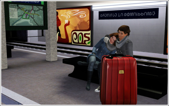
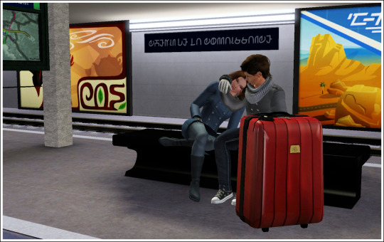
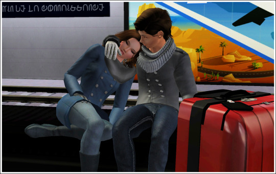
Oof, that's rough. We've all been able to see how these two made the night count, but check-out was at 10, so they're feeling it this morning. That, and, of course, they're returning to their reality, which is a cruel trick I'm playing on them.
Now that this little festive AU thing I did is ending, there's a few things I think I need to say about it all. Especially since I gained a few followers because of my seasonal AU posts (Hi! So happy to see you!) and I guess it's good to point out who these two characters are in the real story.
So, here's James and Sadie, friends and both leads in their band The Hot Wings. They're music students at Honeycomb University and there's... something... between them. There was a lot of built-up tension and eventually they slept together. Once. A lot of emotion followed and while they both claim it's not romantic, I'm not too sure. If you want a quick update on recent events, read Release and Consequences on my WordPress blog by clicking these links. All other past story updates are on my blog too.
In the actual story we're going back to, it's getting close to Spring of 08 (I'll do a post on years and time and all that at some point) and there's a lot to come. For James and Sadie, and for my other characters as well. We have Rachel's Dating Adventure waiting in the wings and we'll be going back to "The Valley" to see how Joshua is doing, among others.
I loved doing this festive AU side story. To escape the writer's block I am currently dealing with and to give "Jadie" a chance to be together for a while. I added in the "I love yous", because they never get to say that in the actual story, other than in a friendly way, and it sort of floats in the air as unspoken words. Them saying it, at the point they did, was something I really wanted to do. To stress that in this AU, they really are both in love and committed to that love.
I was upset the spicy post got flagged though and hope it was just the prude Tumblr bots and it didn't get reported by someone. After all, it was both labelled and tagged appropriately, so if pixel nudity is not your thing, you could have easily avoided it. Also, if I do ever post something that offends someone, please let me know. I'd like to think I'm generally a nice person and quite easy to talk to, so drop me a line.
Anyway, I think the train is coming, so I have to go and make sure James and Sadie get on it. Time to go back to where they need to be. I'm sorry, my lovelies, I'll try to be nicer to you in future. I promise. Maybe.
#Back to reality#atoh au#random rambles#ts3#the sims 3#sims 3#sims story#sadie stevens#james wyler#about the process
39 notes
·
View notes
Text
I’m making a small game inspired by The Binding of Issac, BUT WITH BIRDS! because birds are cool ofc UvU
So I was thinking of posting one of the characters that will be in the game (probably will be a boss along side another character)
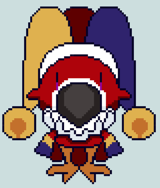
This silly has no name yet, but I know he gives off Fizzarolli vibes so I don’t need anything other than that (if anyone does want to suggest a name, maybe I’ll use it)
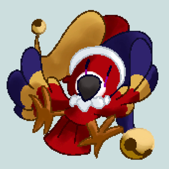
And some nicer looking pixel art of the silly
(note idc if no one cares about my silly birds, I will still show them to the world regardless)
(and sry if I misspelled anything, I can’t spell even if my life depended on it, sooo have fun decoding what I say if that happened :D )
7 notes
·
View notes
Text

The whole sketch sheet is complete, finished shaded, and more. I spent too much time on this... Of course, when I took the picture.It's been a week or more since it been done, i thought it'd be fun to try to write the story a little bit while posting the other pictures. Since it's a little undercooked now, I fear I burned it... These next words are more of closing thoughts...
(Game over, she swore she saw those words before up there. In the blackness of the void, but they're a lot more sugary than last time, last time? The memory slowly came to rear its ugly ahead. Oh yeah, this happened before.... But back then, there was more of a red glare. This was a soft, sugary game. Of course, the game over would be different, but the words underneath it... Insert four quarters to continue, rummaging around the pockets. Those are normally filled with the brim of code data to help her, to find nothing. Of course, she looks down at her body. Seeing the sugary facade slowly go first pixel by pixel, revealing the horrible truth underneath, and pretty soon that will go to... But why is it so painfully slow? The deletion process was a lot faster last time,... A sigh escapes her lips. She has accepted this situation... There's nothing here, but a void of black and a mistake, and the words...
She figured she would reflect on the past. Well, she's here to review everything, as her thoughts scramble for panic that she's trying to suppress, a memory popped up a good memory of the twins, helping her decorate and make her own little garage area sense she didn't have one,... She saw what happened to road blasters from the highest point of the bleachers quickly running down to her siblings that she loved even though she caused chaos on the track whenever she was on, she still cared about them, she tried to yell at them, tried to get them out of the game, but they wouldn't listen, "i should've drive them out myself. Or at least put myself in the player position so the game would still run, i guess I can't change it now. I hope wherever they are, they're okay. ".... A clunking sound could be heard to roll out.The void, like a quarter, was being inserted. She looked up at the words, Insert three quarters to continue,... She stared at it confused, didn't it say four?, penny for your thoughts munch?, with a huff, she tried to think of something else for a bit since the thought of turbo time is so painful,
Vanellope...oh... I wish I would have been nicer to my little sister... Teach her how to glitch more effectively... at least keep her safe... I couldn't even do that..."If it makes up for anything, I am sorry, my little glitch," she mumbled... Another quarter sound can be heard, 2..."So I guess this self reflection is helping somewhat. "... A bit of desperation finally seeps into her code, encouraging her to think of something else as the last bits of pixels fade from the sugary facade. Revealing an inverse coloration of turbo, looking down at herself, she is reminded that she is just a copy of a shadow of a man.That is so selfish it hurts...
Now, thinking about it, what is she even supposed supposed to be... Everyone tells her that she has removed the code, but no one tells her what that code is... Or what it is, since she's not a her anymore... Can she even keep that monocle... She doesn't see why not since she has nothing else to show her identity... thought it occurred to her. She never thought of what she's supposed to be doing. Or what her code is telling her to do, thinking back. She always finds joy in driving and causing chaos for the other drivers around her throwing stuff, knocking over barrels, she had to keep that on the down low for sugar rush, and it drove her mad, when getting those sugar cubes during a race? Oh, it was heaven either to wait until an affordable opportunity to screw over as many racers as possible or do it right away. Just for the heck of it and to see the look on their faces... I'm an enemy racer, of course, I take joy out of seeing a player, spin out... Whoa, where did that come from... She blinked a couple of times. It must have been her code that finally reached out to her to tell her what she was... An enemy racer,ha, everything makes sense now... her want to ruin her game, other games just for the sake of screwing over the players. She can kinda see why her code was kind of removed now, but to go to extremes, to completely crash, sugar rush was a little overboard, "i guess taking things too far is kind of my specialty"..."And besides, the game wouldn't be fun without some form of antagonist,"... She laughed and giggled, finding pure joy, just the thought looking up at that face behind the screen with an angry scowl. On their face, mad at her for ruining their fun time... Then, the realization hits her. She's just deleted code. The code itself had to reach out to the spreadsheet of turbo and invert the colors just to give her a model..."i guess in a way I was doing my job, hehe," her laughter died down, that doesn't excuse her actions, not even close, causing a pit in her stomach, the quarter sound hitting the bank plays again...1...
She started to cry a little... She couldn't think of anything else that she wanted to reflect on, only her anger on turbo and what he had done. It makes sense now. On why is she so angry at him all the time. She's supposed to be a rival or a straight-up. Antagonist to him... It doesn't give her an excuse to be so mean to him. She could have been better about it, then again, given what he has done to Sugar Rush. She should've knocked him in the head until he passed out, but instead, she thought she would be the better person and work alongside him to keep herself safe... She couldn't even guarantee that she wouldn't be erased... So half of his actions did fall upon her to do... All for what... Attention that she's probably never gonna get... That word came up again... Attention... Does it even matter?... The players are gonna hate her anyway... Maybe because she saw the ego in him growing and did nothing about it... If she did do something, He would just probably ignore her or call her names, throw her in a corner, and forget about her... Maybe she's mad at him for being such a selfish monster... No, that's being a hypocrite... Cause she was a monster herself... She wanted this goal so bad that she was willing to hurt herself for it... Well, that's not a healthy thought process... And it clearly shows on her precious lowrider...huh... "I guess I have a problem. Maybe if I asked ralph for help, he would help me to?".... She thought about it... ralph did say there was a support group for bad guys... And under some technical terms, she is a bad guy... Maybe they could help... That's if... She was still alive... She slowly looks down in despair...
Half of her actual body is gone... But the sound of a quarter filled in the space as her head snapped up, the screen was going bright... And she can see, it's starting to sparkle, like the sugar cubes, she tried to make out something in the brightness, and she swears she could see mister lickwhack but she wasn't able to get much details before something jabs into her from her back, regenerating the sugary facade, and everything else in a blink of an eye, knocking her out, slowly wiping her memories of this experience, only keeping the important stuff, before everything going bright again,... Press start)
This was mostly inspired by the game over fan Fics that I came across. If I ever figure out how to link text, I will put them here..
#oc#wreck it ralph#wir#turbo#glitch#Last place#sugar rush#final piece#Excuse me#whail i go to the hole of depression for a bit
13 notes
·
View notes
Text
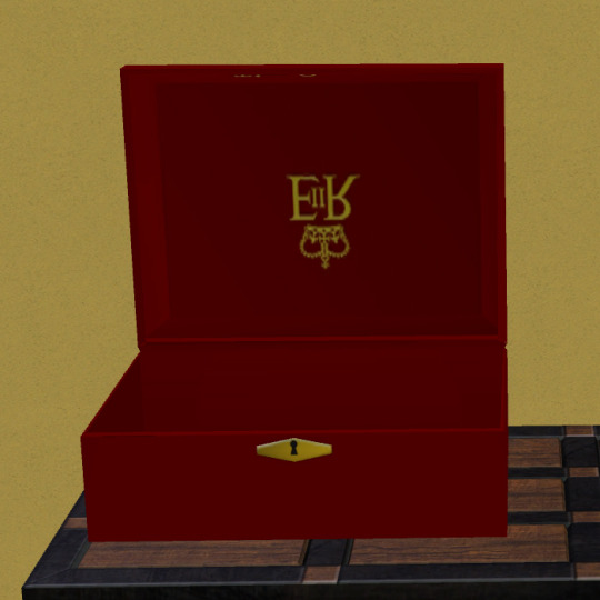
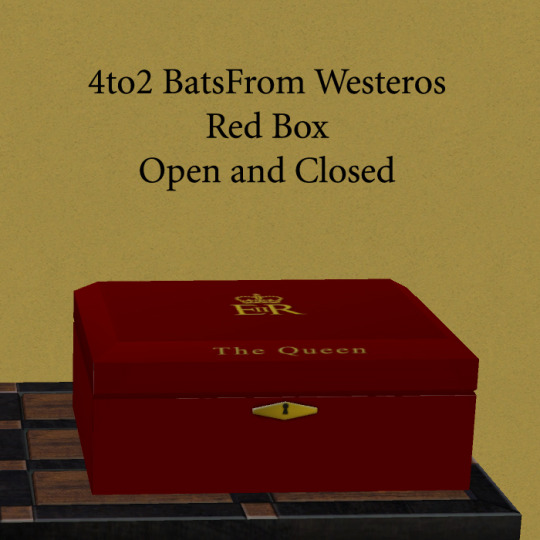
More goodies from my folder of stuff to upload. This post has conversions from meshes by Bats From Westeros. Above is their Red Box meshes - open and closed. They were bigger than all the table surfaces so I scaled them down.
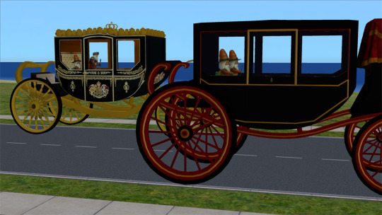
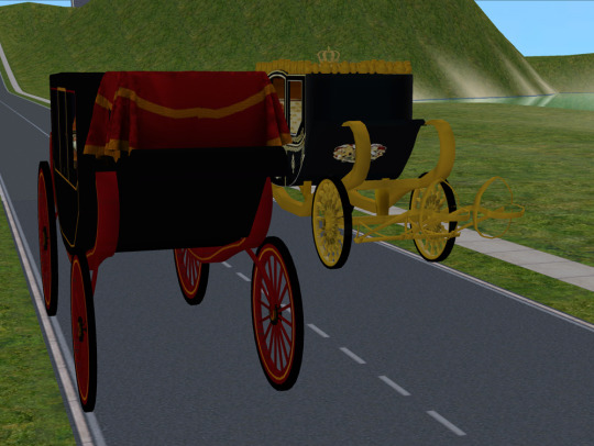
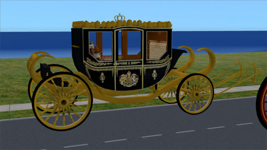
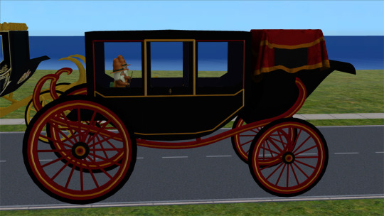
Here are their Jubilee State Coach and Stafford Carriage. I made them out of a coffee table so we could plop sitting deco sims in them or use Inge's little seat mod to put Sims in them. I am not happy with how the textures turned out after shrinking down the 4000+ pixel templates. If anyone out there is ambitious, can you tear into them and make us nicer looking textures??? I kept trying this and that and got fed up with it, I confess. I think I put them in the vehicles category of the catalog.
Download.
55 notes
·
View notes
Text
Balatro-Inspired Spinning Card Tweetcart Breakdown
I recently made a tweetcart of a spinning playing card inspired by finally playing Balatro, the poker roguelike everybody is talking about.
If you don't know what a tweetcart is, it's a type of size-coding where people write programs for the Pico-8 fantasy console where the source code is 280 characters of less, the length of a tweet.
I'm actually not on twitter any more, but I still like 280 characters as a limitation. I posted it on my mastodon and my tumblr.
Here's the tweetcart I'm writing about today:
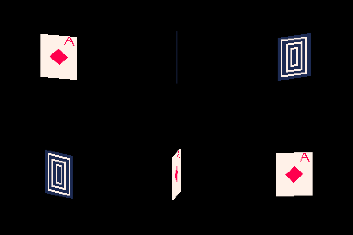
And here is the full 279 byte source code for this animation:
a=abs::_::cls()e=t()for r=0,46do for p=0,1,.025do j=sin(e)*20k=cos(e)*5f=1-p h=a(17-p*34)v=a(23-r)c=1+min(23-v,17-h)%5/3\1*6u=(r-1)/80z=a(p-.2)if(e%1<.5)c=a(r-5)<5and z<u+.03and(r==5or z>u)and 8or 8-sgn(h+v-9)/2 g=r+39pset((64+j)*p+(64-j)*f,(g+k)*p+(g-k)*f,c)end end flip()goto _
This post is available with much nicer formatting on the EMMA blog. You can read it here.
You can copy/paste that code into a blank Pico-8 file to try it yourself. I wrote it on Pico-8 version 0.2.6b.
I'm very pleased with this cart! From a strictly technical perspective I think it's my favorite that I've ever made. There is quite a bit going on to make the fake 3D as well as the design on the front and back of the card. In this post I'll be making the source code more readable as well as explaining some tools that are useful if you are making your own tweetcarts or just want some tricks for game dev and algorithmic art.
Expanding the Code
Tweetcarts tend to look completely impenetrable, but they are often less complex than they seem. The first thing to do when breaking down a tweetcart (which I highly recommend doing!) is to just add carriage returns after each command.
Removing these line breaks is a classic tweetcart method to save characters. Lua, the language used in Pico-8, often does not need a new line if a command does not end in a letter, so we can just remove them. Great for saving space, bad for readability. Here's that same code with some line breaks, spaces and indentation added:
a=abs ::_:: cls() e=t() for r=0,46 do for p=0,1,.025 do j=sin(e)*20 k=cos(e)*5 f=1-p h=a(17-p*34) v=a(23-r) c=1+min(23-v,17-h)%5/3\1*6 u=(r-1)/80 z=a(p-.2) if(e%1<.5) c= a(r-5) < 5 and z < u+.03 and (r==5 or z>u) and 8 or 8-sgn(h+v-9)/2 g=r+39 pset((64+j)*p+(64-j)*f,(g+k)*p+(g-k)*f,c) end end flip()goto _
Note: the card is 40 pixels wide and 46 pixels tall. Those number will come up a lot. As will 20 (half of 40) and 23 (half of 46).
Full Code with Variables and Comments
Finally, before I get into what each section is doing, here is an annotated version of the same code. In this code, variables have real names and I added comments:
[editor's note. this one came out terribly on tumblr. Please read the post on my other blog to see it]
This may be all you need to get a sense of how I made this animation, but the rest of this post will be looking at how each section of the code contributes to the final effect. Part of why I wanted to write this post is because I was happy with how many different tools I managed to use in such a small space.
flip() goto_
This pattern shows up in nearly every tweetcart:
::_:: MOST OF THE CODE flip()goto _
This has been written about in Pixienop's Tweetcart Basics which I highly recommend for anybody curious about the medium! The quick version is that using goto is shorter than declaring the full draw function that Pico-8 carts usually use.
Two Spinning Points
The card is drawn in rows starting from the top and going to the bottom. Each of these lines is defined by two points that move around a center point in an elliptical orbit.
The center of the top of the card is x=64 (dead center) and y=39 (a sort of arbitrary number that looked nice).
Then I get the distance away from that center that my two points will be using trigonometry.
x_dist = sin(time)*20 y_dist = cos(time)*5
Here are those points:
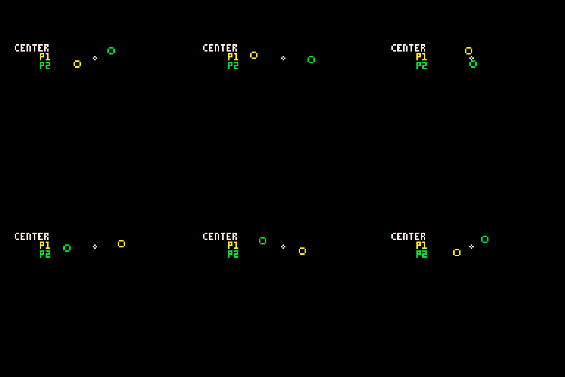
P1 adds x_dist and y_dist to the center point and P2 subtracts those same values.
Those are just the points for the very top row. The outer for loop is the vertical rows. The center x position will be the same each time, but the y position increases with each row like this: y_pos = row+39
Here's how it looks when I draw every 3rd row going down:
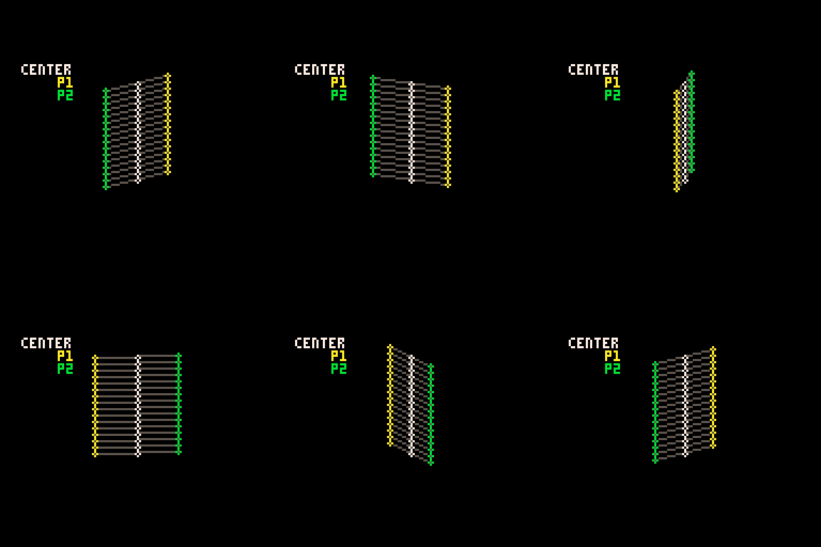
It is worth noting that Pico-8 handles sin() and cos() differently than most languages. Usually the input values for these functions are in radians (0 to two pi), but in Pico-8 it goes from 0 to 1. More info on that here. It takes a little getting used to but it is actually very handy. More info in a minute on why I like values between 0 and 1.
Time
In the shorter code, e is my time variable. I tend to use e for this. In my mind it stands for "elapsed time". In Pico-8 time() returns the current elapsed time in seconds. However, there is a shorter version, t(), which obviously is better for tweetcarts. But because I use the time value a lot, even the 3 characters for t() is often too much, so I store it in the single-letter variable e.
Because it is being used in sine and cosine for this tweetcart, every time e reaches 1, we've reached the end of a cycle. I would have liked to use t()/2 to slow this cart down to be a 2 second animation, but after a lot of fiddling I wound up being one character short. So it goes.
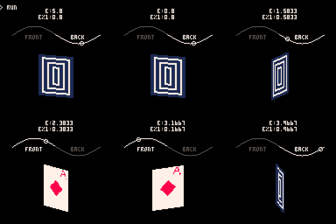
e is used in several places in the code, both to control the angle of the points and to determine which side of the card is facing the camera.
Here you can see how the sine value of e controls the rotation and how we go from showing the front of the card to showing the back when e%1 crosses the threshold of 0.5.
Drawing and Distorting the Lines
Near the top and bottom of the loop we'll find the code that determines the shape of the card and draws the horizontal lines that make up the card. Here is the loop for drawing a single individual line using the code with expanded variable names:
for prc = 0,1,.025 do x_dist = sin(time)*20 y_dist = cos(time)*5 ... y_pos = row+39 pset( (64+x_dist)*prc + (64-x_dist)*(1-prc), (y_pos+y_dist)*prc + (y_pos-y_dist)*(1-prc), color) end
You might notice that I don't use Pico-8's line function! That's because each line is drawn pixel by pixel.
This tweetcart simulates a 3D object by treating each vertical row of the card as a line of pixels. I generate the points on either side of the card(p1 and p2 in this gif), and then interpolate between those two points. That's why the inner for loop creates a percentage from 0 to 1 instead of pixel positions. The entire card is drawn as individual pixels. I draw them in a line, but the color may change with each one, so they each get their own pset() call.
Here's a gif where I slow down this process to give you a peek at how these lines are being drawn every frame. For each row, I draw many pixels moving across the card between the two endpoints in the row.
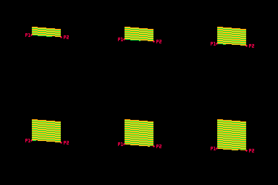
Here's the loop condition again: for prc = 0,1,.025 do
A step of 0.025 means there are 40 steps (0.025 * 40 = 1.0). That's the exact width of the card! When the card is completely facing the camera head-on, I will need 40 steps to make it across without leaving a gap in the pixels. When the card is skinnier, I'm still drawing all 40 pixels, but many of them will be in the same place. That's fine. The most recently drawn one will take priority.
Getting the actual X and Y position
I said that the position of each pixel is interpolated between the two points, but this line of code may be confusing:
y_pos = row+39 pset( (64+x_dist)*prc + (64-x_dist)*(1-prc), (y_pos+y_dist)*prc + (y_pos-y_dist)*(1-prc), color)
So let's unpack it a little bit. If you've ever used a Lerp() function in something like Unity you've used this sort of math. The idea is that we get two values (P1 and P2 in the above example), and we move between them such that a value of 0.0 gives us P1 and 1.0 gives us P2.
Here's a full cart that breaks down exactly what this math is doing:
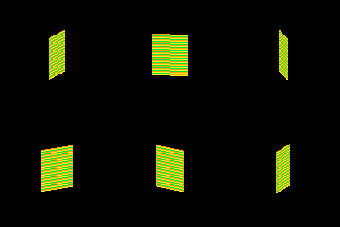
::_:: cls() time = t()/8 for row = 0,46 do for prc = 0,1,.025 do x_dist = sin(time)*20 y_dist = cos(time)*5 color = 9 + row % 3 p1x = 64 + x_dist p1y = row+39 + y_dist p2x = 64 - x_dist p2y = row+39 - y_dist x = p2x*prc + p1x*(1-prc) y = p2y*prc + p1y*(1-prc) pset( x, y, color) end end flip()goto _
I'm defining P1 and P2 very explicitly (getting an x and y for both), then I get the actual x and y position that I use by multiplying P2 by prc and P1 by (1-prc) and adding the results together.
This is easiest to understand when prc is 0.5, because then we're just taking an average. In school we learn that to average a set of numbers you add them up and then divide by how many you had. We can think of that as (p1+p2) / 2. This is the same as saying p1*0.5 + p2*0.5.
But the second way of writing it lets us take a weighted average if we want. We could say p1*0.75 + p2*0.25. Now the resulting value will be 75% of p1 and 25% of p2. If you laid the two values out on a number line, the result would be just 25% of the way to p2. As long as the two values being multiplied add up to exactly 1.0 you will get a weighted average between P1 and P2.
I can count on prc being a value between 0 and 1, so the inverse is 1.0 - prc. If prc is 0.8 then 1.0-prc is 0.2. Together they add up to 1!
I use this math everywhere in my work. It's a really easy way to move smoothly between values that might otherwise be tricky to work with.
Compressing
I'm using a little over 400 characters in the above example. But in the real cart, the relevant code inside the loops is this:
j=sin(e)*20 k=cos(e)*5 g=r+39 pset((64+j)*p+(64-j)*f,(g+k)*p+(g-k)*f,c)
which can be further condensed by removing the line breaks:
j=sin(e)*20k=cos(e)*5g=r+39pset((64+j)*p+(64-j)*f,(g+k)*p+(g-k)*f,c)
Because P1, P2 and the resulting interpolated positions x and y are never used again, there is no reason to waste chars by storing them in variables. So all of the interpolation is done in the call to pset().
There are a few parts of the calculation that are used more than once and are four characters or more. Those are stored as variables (j, k & g in this code). These variables tend to have the least helpful names because I usually do them right at the end to save a few chars so they wind up with whatever letters I have not used elsewhere.
Spinning & Drawing
Here's that same example, but with a checker pattern and the card spinning. (Keep in mind, in the real tweetcart the card is fully draw every frame and would not spin mid-draw)
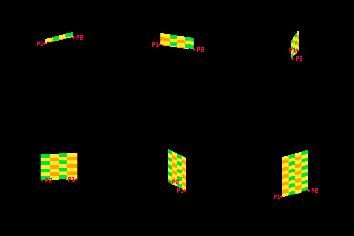
This technique allows me to distort the lines because I can specify two points and draw my lines between them. Great for fake 3D! Kind of annoying for actually drawing shapes, because now instead of using the normal Pico-8 drawing tools, I have to calculate the color I want based on the row (a whole number between0 and 46) and the x-prc (a float between 0 and 1).
Drawing the Back
Here's the code that handles drawing the back of the card:
h=a(17-p*34) v=a(23-r) c=1+min(23-v,17-h)%5/3\1*6
This is inside the nested for loops, so r is the row and p is a percentage of the way across the horizontal line.
c is the color that we will eventually draw in pset().
h and v are the approximate distance from the center of the card. a was previously assigned as a shorthand for abs() so you can think of those lines like this:
h=abs(17-p*34) v=abs(23-r)
v is the vertical distance. The card is 46 pixels tall so taking the absolute value of 23-r will give us the distance from the vertical center of the card. (ex: if r is 25, abs(23-r) = 2. and if r is 21, abs(23-r) still equals 2 )
As you can probably guess, h is the horizontal distance from the center. The card is 40 pixels wide, but I opted to shrink it a bit by multiplying p by 34 and subtracting that from half of 34 (17). The cardback just looks better with these lower values, and the diamond looks fine.
The next line, where I define c, is where things get confusing. It's a long line doing some clunky math. The critical thing is that when this line is done, I need c to equal 1 (dark blue) or 7 (white) on the Pico-8 color pallette.
Here's the whole thing: c=1+min(23-v,17-h)%5/3\1*6
Here is that line broken down into much more discrete steps.
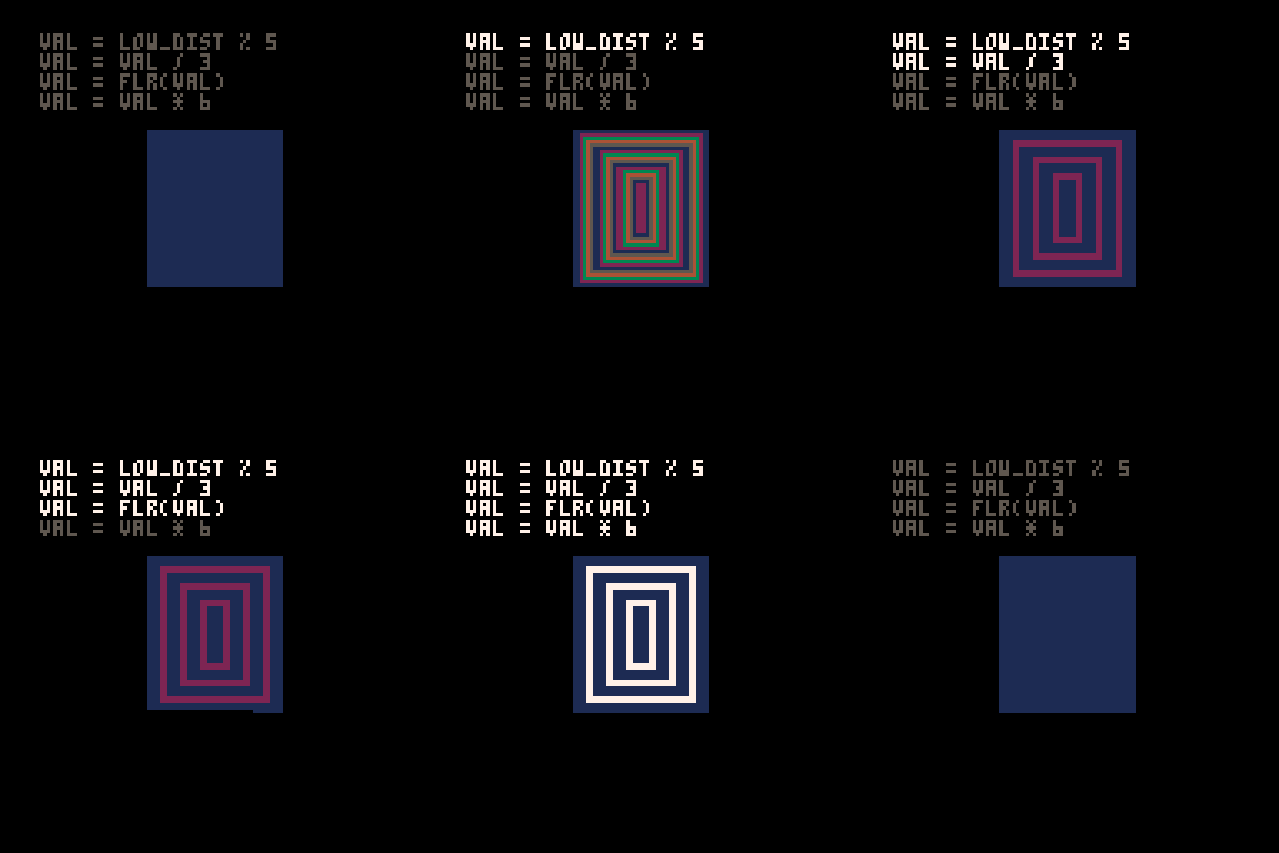
c = 1 --start with a color of 1 low_dist = min(23-v,17-h) --get the lower inverted distance from center val = low_dist % 5 --mod 5 to bring it to a repeating range of 0 to 5 val = val / 3 --divide by 3. value is now 0 to 1.66 val = flr(val) --round it down. value is now 0 or 1 val = val * 6 --multiply by 6. value is now 0 or 6 c += val --add value to c, making it 1 or 7
The first thing I do is c=1. That means the entire rest of the line will either add 0 or 6 (bumping the value up to 7). No other outcome is acceptable. min(23-v,17-h)%5/3\1*6 will always evaluate to 0 or 6.
I only want the lower value of h and v. This is what will give it the nice box shape. If you color the points inside a rectangle so that ones that are closer to the center on their X are one color and ones that are closer to the center on their Y are a different color you'll get a pattern with clean diagonal lines running from the center towards the corners like this:

You might think I would just use min(v,h) instead of the longer min(23-v,17-h) in the actual code. I would love to do that, but it results in a pattern that is cool, but doesn't really look like a card back.

I take the inverted value. Instead of having a v that runs from 0 to 23, I flip it so it runs from 23 to 0. I do the same for h. I take the lower of those two values using min().
Then I use modulo (%) to bring the value to a repeating range of 0 to 5. Then I divide that result by 3 so it is 0 to ~1.66. The exact value doens't matter too much because I am going round it down anyway. What is critical is that it will become 0 or 1 after rounding because then I can multiply it by a specific number without getting any values in between.
Wait? If I'm rounding down, where is flr() in this line: c=1+min(23-v,17-h)%5/3\1*6?
It's not there! That's because there is a sneaky tool in Pico-8. You can use \1 to do the same thing as flr(). This is integer division and it generally saves a 3 characters.
Finally, I multiply the result by 6. If it is 0, we get 0. If it is 1 we get 6. Add it to 1 and we get the color we want!
Here's how it looks with each step in that process turned on or off:
A Note About Parentheses
When I write tweetcarts I would typically start by writing this type of line like this: c=1+ (((min(23-v,17-h)%5)/3) \1) *6
This way I can figure out if my math makes sense by using parentheses to ensure that my order of operations works. But then I just start deleting them willy nilly to see what I can get away with. Sometimes I'm surprised and I'm able to shave off 2 characters by removing a set of parentheses.
The Face Side
The face side with the diamond and the "A" is a little more complex, but basically works the same way as the back. Each pixel needs to either be white (7) or red (8). When the card is on this side, I'll be overwriting the c value that got defined earlier.
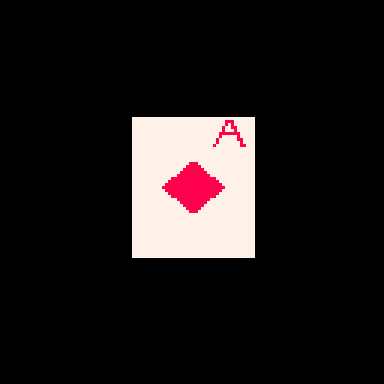
Here's the code that does it (with added white space). This uses the h and v values defined earlier as well as the r and p values from the nested loops.
u=(r-1)/80 z=a(p-.2) if(e%1<.5) c= a(r-5) < 5 and z < u+.03 and (r==5 or z>u) and 8 or 8-sgn(h+v-9)/2
Before we piece out what this is doing, we need to talk about the structure for conditional logic in tweetcarts.
The Problem with If Statements
The lone line with the if statement is doing a lot of conditional logic in a very cumbersome way designed to avoid writing out a full if statement.
One of the tricky things with Pico-8 tweetcarts is that the loop and conditional logic of Lua is very character intensive. While most programming language might write an if statement like this:
if (SOMETHING){ CODE }
Lua does it like this:
if SOMETHING then CODE end
Using "then" and "end" instead of brackets means we often want to bend over backwards to avoid them when we're trying to save characters.
Luckily, Lua lets you drop "then" and "end" if there is a single command being executed inside the if.
This means we can write
if(e%1 < 0.5) c=5
instead of
if e%1 < 0.5 then c=5 end
This is a huge savings! To take advantage of this, it is often worth doing something in a slightly (or massively) convoluted way if it means we can reduce it to a single line inside the if. This brings us to:
Lua's Weird Ternary Operator
In most programming language there is an inline syntax to return one of two values based on a conditional. It's called the Ternary Operator and in most languages I use it looks like this:
myVar = a>b ? 5 : 10
The value of myVar will be 5 if a is greater than b. Otherwise is will be 10.
Lua has a ternary operator... sort of. You can read more about it here but it looks something like this:
myVar = a>b and 5 or 10
Frankly, I don't understand why this works, but I can confirm that it does.
In this specific instance, I am essentially using it to put another conditional inside my if statement, but by doing it as a single line ternary operation, I'm keeping the whole thing to a single line and saving precious chars.
The Face Broken Out
The conditional for the diamond and the A is a mess to look at. The weird syntax for the ternary operator doesn't help. Neither does the fact that I took out any parentheses that could make sense of it.
Here is the same code rewritten with a cleaner logic flow.
--check time to see if we're on the front half if e%1 < .5 then --this if checks if we're in the A u=(r-1)/80 z=a(p-.2) if a(r-5) < 5 and z < u+.03 and (r==5 or z>u) then c = 8 --if we're not in the A, set c based on if we're in the diamond else c = 8-sgn(h+v-9)/2 end end
The first thing being checked is the time. As I explained further up, because the input value for sin() in Pico-8 goes from 0 to 1, the midpoint is 0.5. We only draw the front of the card if e%1 is less than 0.5.
After that, we check if this pixel is inside the A on the corner of the card or the diamond. Either way, our color value c gets set to either 7 (white) or 8 (red).
Let's start with diamond because it is easier.
The Diamond
This uses the same h and v values from the back of the card. The reason I chose diamonds for my suit is that they are very easy to calculate if you know the vertical and horizontal distance from a point! In fact, I sometimes use this diamond shape instead of proper circular hit detection in size-coded games.
Let's look at the line: c = 8-sgn(h+v-9)/2
This starts with 8, the red color. Since the only other acceptable color is 7 (white), tha means that sgn(h+v-9)/2 has to evaluate to either 1 or 0.
sgn() returns the sign of a number, meaning -1 if the number is negative or 1 if the number is positive. This is often a convenient way to cut large values down to easy-to-work-with values based on a threshold. That's exactly what I'm doing here!
h+v-9 takes the height from the center plus the horizontal distance from the center and checks if the sum is greater than 9. If it is, sgn(h+v-9) will return 1, otherwise -1. In this formula, 9 is the size of the diamond. A smaller number would result in a smaller diamond since that's the threshold for the distance being used. (note: h+v is NOT the actual distance. It's an approximation that happens to make a nice diamond shape.)
OK, but adding -1 or 1 to 8 gives us 7 or 9 and I need 7 or 8.
That's where /2 comes in. Pico-8 defaults to floating point math, so dividing by 2 will turn my -1 or 1 into -0.5 or 0.5. So this line c = 8-sgn(h+v-9)/2 actually sets c to 7.5 or 8.5. Pico-8 always rounds down when setting colors so a value of 7.5 becomes 7 and 8.5 becomes 8. And now we have white for most of the card, and red in the space inside the diamond!
The A
The A on the top corner of the card was the last thing I added. I finished the spinning card with the card back and the diamond and realized that when I condensed the whole thing, I actually had about 50 characters to spare. Putting a letter on the ace seemed like an obvious choice. I struggled for an evening trying to make it happen before deciding that I just couldn't do it. The next day I took another crack at it and managed to get it in, although a lot of it is pretty ugly! Luckily, in the final version the card is spinning pretty fast and it is harder to notice how lopsided it is.
I mentioned earlier that my method of placing pixels in a line between points is great for deforming planes, but makes a lot of drawing harder. Here's a great example. Instead of just being able to call print("a") or even using 3 calls to line() I had to make a convoluted conditional to check if each pixel is "inside" the A and set it to red if it is.
I'll do my best to explain this code, but it was hammered together with a lot of trial and error. I kept messing with it until I found an acceptable balance between how it looked and how many character it ate up.
Here are the relevant bits again:
u=(r-1)/80 z=a(p-.2) if a(r-5) < 5 and z < u+.03 and (r==5 or z>u) then c = 8
The two variables above the if are just values that get used multiple times. Let's give them slightly better names. While I'm making edits, I'll expand a too since that was just a replacement for abs().
slope = (r-1)/80 dist_from_center = abs(p-.2) if abs(r-5) < 5 and dist_from_center < slope+.03 and (r==5 or dist_from_center>slope) then c = 8
Remember that r is the current row and p is the percentage of the way between the two sides where this pixel falls.
u/slope here is basically how far from the center line of the A the legs are at this row. As r increases, so does slope (but at a much smaller rate). The top of the A is very close to the center, the bottom is further out. I'm subtracting 1 so that when r is 0, slope is negative and will not be drawn. Without this, the A starts on the very topmost line of the card and looks bad.
z/dist_from_center is how far this particular p value is from the center of the A (not the center of the card), measured in percentage (not pixels). The center of the A is 20% of the way across the card. This side of the card starts on the right (0% is all the way right, 100% is all the way left), which is why you see the A 20% away from the right side of the card.
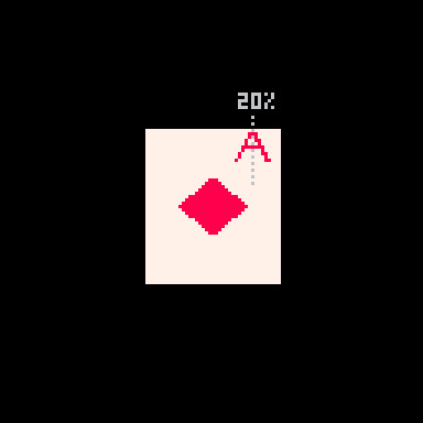
These values are important because the two legs of the A are basically tiny distance checks where the slope for a given r is compared against the dist_from_center. There are 3 checks used to determine if the pixel is part of the A.
if a(r-5) < 5 and z < u+.03 and (r==5 or z>u) then
The first is abs(r-5) < 5. This checks if r is between 1 and 9, the height of my A.
The second is dist_from_center < slope+.03. This is checking if this pixel's x distance from the center of the A is no more than .03 bigger than the current slope value. This is the maximum distance that will be considered "inside" the A. All of this is a percentage, so the center of the A is 0.20 and the slope value will be larger the further down the A we get.
Because I am checking the distance from the center point (the grey line in the image above), this works on either leg of the A. On either side, the pixel can be less than slope+.03 away.
Finally, it checks (r==5 or dist_from_center>slope). If the row is exactly 5, that is the crossbar across the A and should be red. Otherwise, the distance value must be greater than slope (this is the minimum value it can have to be "inside" the A). This also works on both sides thanks to using distance.
Although I am trying to capture 1-pixel-wide lines to draw the shape of the A, I could not think of a cleaner way than doing this bounding check. Ignoring the crossbar on row 5, you can think about the 2nd and 3rd parts of the if statement essentially making sure that dist_from_center fits between slope and a number slightly larger than slope. Something like this:
slope < dist_from_center < slope+0.03
Putting it Together
All of this logic needed to be on a single line to get away with using the short form of the if statement so it got slammed into a single ternary operator. Then I tried removing parentheses one at a time to see what was structurally significant. I wish I could say I was more thoughtful than that but I wasn't. The end result is this beefy line of code:
if(e%1<.5)c=a(r-5)<5and z<u+.03and(r==5or z>u)and 8or 8-sgn(h+v-9)/2
Once we've checked that e (our time value) is in the phase where we show the face, the ternary operator checks if the pixel is inside the A. If it is, c is set to 8 (red). If it isn't, then we set c = 8-sgn(h+v-9)/2, which is the diamond shape described above.
That's It!
Once we've set c the tweetcart uses pset to draw the pixel as described in the section on drawing the lines.
Here's the full code and what it looks like when it runs again. Hopefully now you can pick out more of what's going on!
a=abs::_::cls()e=t()for r=0,46do for p=0,1,.025do j=sin(e)*20k=cos(e)*5f=1-p h=a(17-p*34)v=a(23-r)c=1+min(23-v,17-h)%5/3\1*6u=(r-1)/80z=a(p-.2)if(e%1<.5)c=a(r-5)<5and z<u+.03and(r==5or z>u)and 8or 8-sgn(h+v-9)/2 g=r+39pset((64+j)*p+(64-j)*f,(g+k)*p+(g-k)*f,c)end end flip()goto _

I hope this was helpful! I had a lot of fun writing this cart and it was fun to break it down. Maybe you can shave off the one additional character needed to slow it down by using e=t()/2 a bit. If you do, please drop me a line on my mastodon or tumblr!
And if you want to try your hand at something like this, consider submitting something to TweetTweetJam which just started! You'll get a luxurious 500 characters to work with!
Links and Resources
There are some very useful posts of tools and tricks for getting into tweetcarts. I'm sure I'm missing many but here are a few that I refer to regularly.
Pixienop's tweetcart basics and tweetcart studies are probably the single best thing to read if you want to learn more.
Trasevol_Dog's Doodle Insights are fascinating, and some of them demonstrate very cool tweetcart techniques.
Optimizing Character Count for Tweetcarts by Eli Piilonen / @2DArray
Guide for Making Tweetcarts by PrincessChooChoo
The official documentation for the hidden P8SCII Control Codes is worth a read. It will let you do wild things like play sound using the print() command.
I have released several size-coded Pico-8 games that have links to heavily annotated code:
Pico-Mace
Cold Sun Surf
1k Jump
Hand Cram
And if you want to read more Pico-8 weirdness from me, I wrote a whole post on creating a networked Pico-8 tribute to Frog Chorus.
16 notes
·
View notes
Text
Vent ahead about Mouthwashing but I'm not tagging Mouthwashing because I don't wanna bother the people on the tag so feel free to ignore.
Sigh
This is a hot take maybe: The fandom would be nicer and more understanding of Curly if he was a girl. I'm calling it right now, they would be. They would suddenly understand that Jimmy abused him, that his fawn response and people pleaser mentality got in the way of protecting Anya and wouldn't villainize him for it, that his worst moment was being too nice for his own good.
I think I'm just gonna step away from Mouthwashing as a whole entirely and only discuss it with people who I trust (You know who you are if I do trust you, we've talked on it before). It's not fun interacting with this fandom when all I do is get headaches and spiral over how they treat Curly.
I know he's fictional. I know it's stupid. I can't help it. I see my own past in Curly's fate. I remember the abuse my friends put me through. I remember how hard I defended them against people who didn't like them. I remember losing people who cared about me over it. Because I'm too nice for my own good, and I just want the best for everyone.
I know it's a problem. I know I'm better now. But I also had years of therapy and cut them all off. I wasn't put in an impossible situation where I had to interact with those people as part of my job, be responsible for them, be trapped with them in the confines of space. I wasn't given the impossible situation of only having 24 hours to solve it when things got dangerous. I wasn't threatened with making the whole group, including myself, not receive their paycheck for handling it. The only thing that kept me from cutting them off was my warped sense of reality. That maybe I was overreacting, that I was being a bad friend, a bad person, by telling them it wasn't okay. I was convinced somehow that I was the bad guy. And then when I did cut them off, I was still treated as the bad guy, so what difference would it make?
Curly is in a "damned if he does, damned if he doesn't" scenario as far as I can tell. If he reprimands Jimmy, if he does anything to stop him, he's not only gotta process all of that trauma Jimmy put him through that he's not ready to face yet, but even worse, he's gonna get the entire group in trouble and make them lose money; money that they need because it's a capitalist hellscape that cares more about a job being done than the safety of their workers.
However, look at what happens when he didn't. He's suddenly called a rapist apologist, a rapist defender, an enabler, a rapist himself, etc. He's treated even worse than Jimmy is. I went into this game thinking I was gonna hate Curly because of how fucking awful the fandom treats him. This whole "he defended Jimmy and failed Anya" spiel they all had was him just... Trying to protect Anya from getting hurt. By saying he'd handle it. By freezing up and doing a fawn response, trying to deescalate Jimmy and calm him down before anything could happen. Was it enough? No. It will never be enough. That doesn't mean he didn't want to try anyway. Dead Pixel scene; he said he'd go crazy trying to figure out what Anya was talking about. He didn't dismiss or ignore her; he believed her that the pixel was there. But he's too nice for his own good, and his brain was blocking it out. There was too much at stake to acknowledge it right then and there.
And it's obvious he didn't even realize Anya was talking about Jimmy SAing her when she told him about the Dead Pixel; he's literally unaware of what she's talking about. He doesn't know shit about Jimmy assaulting her until she tells him she's pregnant and reminds him of their dead pixel convo (Which happened the literal day before she told him she was pregnant, mind you). And then before Curly could help solve it, Jimmy crashed the ship 24 hours later.
I'm making no sense right now. I know everyone who reads this, or at least a majority, will call me a lot of fucking words I don't wanna type out because of what I'm saying.
"Well, if I was Curly-"
But you're not.
"If I was the captain-"
But you're not.
"If I-"
But you're not.
Curly is a victim. No matter how morally grey you wanna call him, he's still a victim. Not a "perfect" victim, not an "innocent uwu bean who did no wrong," no he did wrong, he made mistakes, but he is still. A fucking. Victim. It's just that what he did wrong was be too nice for his own good. And everyone else's own good. And I can't exactly be mad at him for that, when I get it. When I have been in his shoes before.
And really, seriously, do you think everyone would call him a good, a great captain, if he was anything like you're saying? Do you think Anya would trust him with any of this info if she thought he wasn't going to do something to help? She's not helpless. She's smart enough to know who to trust and who not to trust. She knew Curly was Jimmy's friend.
Also, one final thing: If you call Curly a bad person, or think he should have done more to help, or any of that bs, but then go on to defend Swansea and say he's your fave, or that he's better than Curly, please remember Swansea admitted in his speech before dying that he was a bad person. Remember that Anya also told him, directly, about her SA and all Jimmy got from him was "Yeah, she said a lot about you." Remember that he had an axe and didn't use it.
I'm not interacting with this fandom anymore until I can get a therapist I think. Because I know this shouldn't trigger me this badly. But it does. And I can't handle it. So until I can talk to a professional who can help me out with this, just. Yeah.
Also, I'm willing to block people and delete this post if y'all end up being that mean to me. Watch it. Curly might've not been able to do anything, but I sure can.
6 notes
·
View notes
Text
Villareal: Chapter 6, Part 14
A chill but speedy Friday with my pixels.

CW: Moderate sim spice. Content Warning Guide
For ease of reading if the toddlers are trying to say real words I'll put the English in brackets. Luna (mummy) and Devin (mama) use some German and Italian. Bambino/s (Italian) Male child/children Caro (Italian) Dear
The family are sitting down to pasta when Rilian notices Devin’s hair is different…
Rilian: Mama hair? How?
Devin: Caro, it’s called being the watchers favourite. Don’t even need a salon
Alfred: What watcher
Luna: Your Mama and Zio think there is someone watching over us in our life, helping us out and keeping us safe. I don’t but you get to believe whatever you want. Many other sims think the watcher exists
Devin: The watcher loves us bambinos, you can tell
Rilian: How
Alfred: *sings song of watcher adoration*
Devin: Little things. We’re very lucky, always dressed nicely…
Joey: We’re generally happier than the average sim and have nicer names to. There are other things but you’re too young to understand loading screens yet
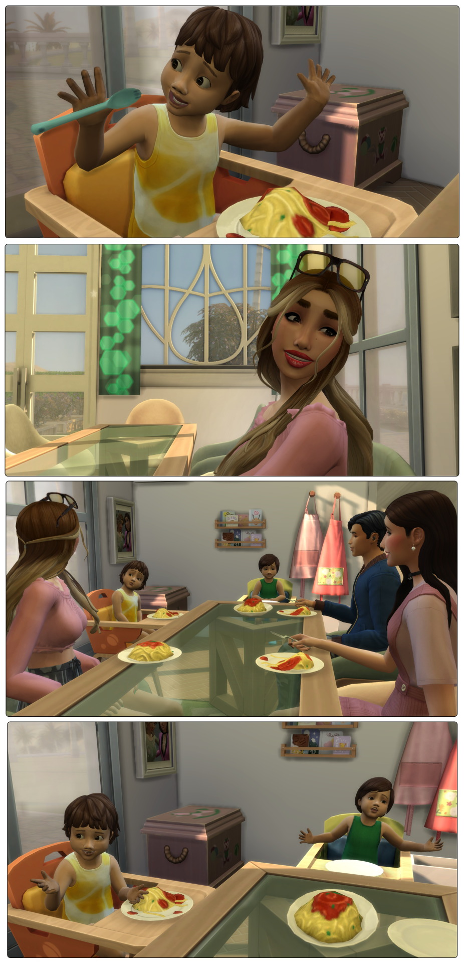
Luna: It’s a big concept
Rilian: We big
Devin: Well you don’t have to decide if you believe in the watcher or not tonight. And no matter what Mama and Mummy will still love you
Dinner finishes and the toddlers get sorted for bed. Joey knows what he thinks, no nephews of his will grow up not believing in the watcher. Mod dangers lurk everywhere, the boys must be prepared! And stepping back from the paranoid sim…
Devin practices some of the scripts she’s been sent before bed to see how she feels about the characters. There are some interesting ones, she’ll have to get Luna to read them when she has time.
Luna: They’re asleep, shall we turn in
Devin: I hope you didn’t mind me talking about the watcher
Luna: They had to be introduced to the idea sometime. Now come to bed
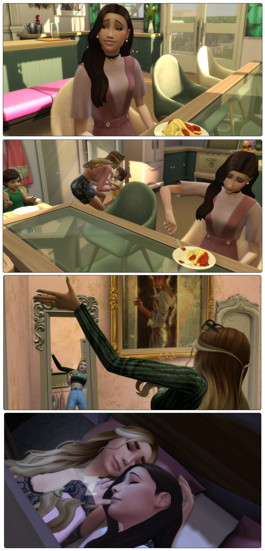
In the morning Devin tries once again to bring Luna around to the idea of a watcher.
Devin: So how do you think my hair changed
Luna: Plenty of people have sudden hair changes, just look at your sisters
Devin: And you don’t think your brothers look more polished recently?
Luna: I suppose they have tidied themselves up a bit
Devin: Lu the watcher let me impregnate you, how can you not believe in them
Luna: I’m trying it’s just… if there is a watcher why won’t they give me answers about my mum
Devin: Oh... I can get that view. But Lu the watcher works on her own timeframe, I’m sure one day we’ll find out
Luna: Well when we do, then I’ll believe. Deal?
Devin: Deal!!! The watcher is going to help me with this I know it
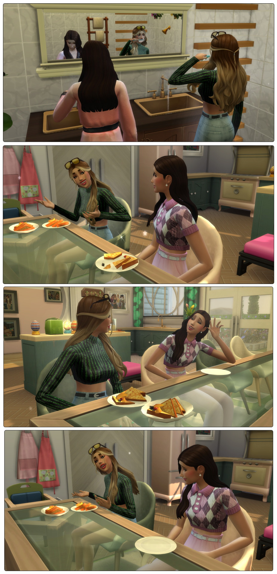
Following a breakfast where Alfred scoffed and Rilian barely made a dent Devin shepherds the twins to the bathroom. Luna and Joey head to their jobs while Devin makes sure each twin gets squeaky clean. Afterwards the trio move to the master bedroom where Devin works on her acting skill. She reaches level 10! Alfred also maxes his communication skill!
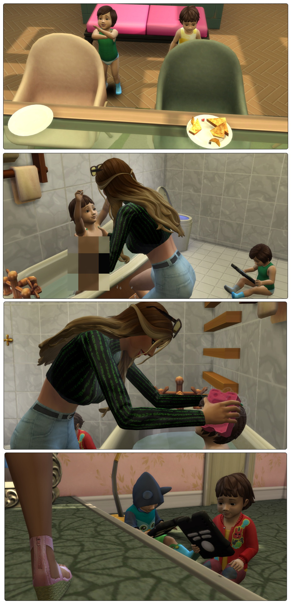
Following a quick trip to Tartosa to give Calista and Aaron some family photos the twins spend their afternoon working on their motor skill while Devin gets her workout in. Look at her doing those laps without even shaking her sunglasses off! Swim done she watches the bambinos while knitting a gift for everyone’s favourite rooster, Mr Cluckton himself!
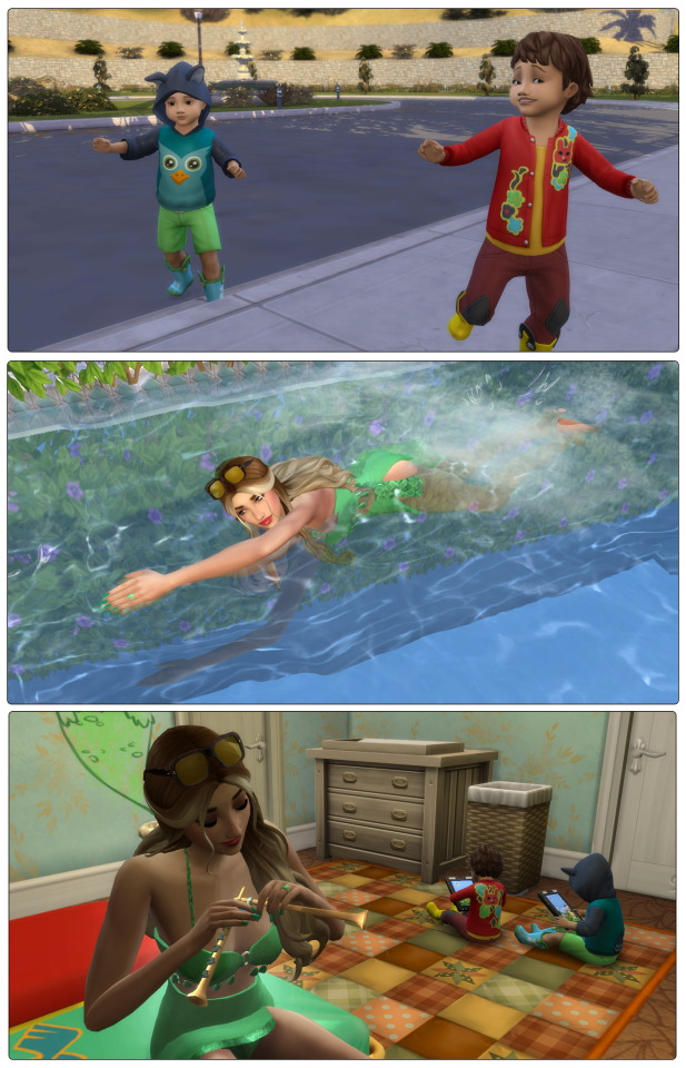
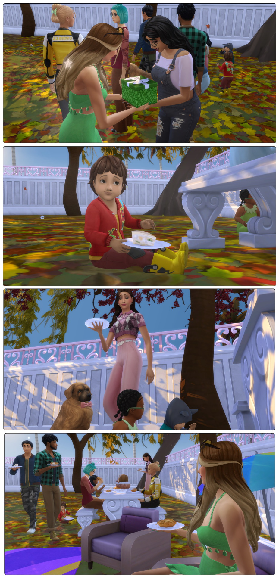
With Cassandra’s eldest having school responsibilities now the regular Friday best friends lunch play date has shifted to dinner time. Devin gives Cassandra her gift for Cluckton and the Nishidake family and Chopra family descend on the picnic basket for some fish pie and bagels. Unfortunately most are sad due to a mod but hey, at least the gang is together!
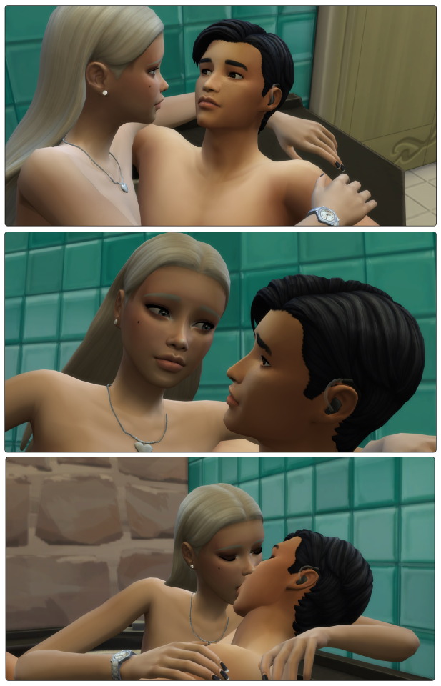
Following the picnic Joey gets a notification that he’s matched with another sim who is down for no strings fun. Inviting her in he has to admit to himself that she’s not his normal type (his panel said he found her unattractive, excuse me sir) but woohoo is woohoo and he’s always happy to get some. She expresses interest in his jacuzzi tub so taking her by the hand he shows her.
Joey: The water is good, come on in
Starting to remove her dress Luisa hesitates for a second
Luisa: I should probably tell you… just so you’re not crazy shocked… umm… I probably don’t have the pixel parts you’re expecting
Joey: You see yourself as a woman right? Your profile said
Luisa: Yes…
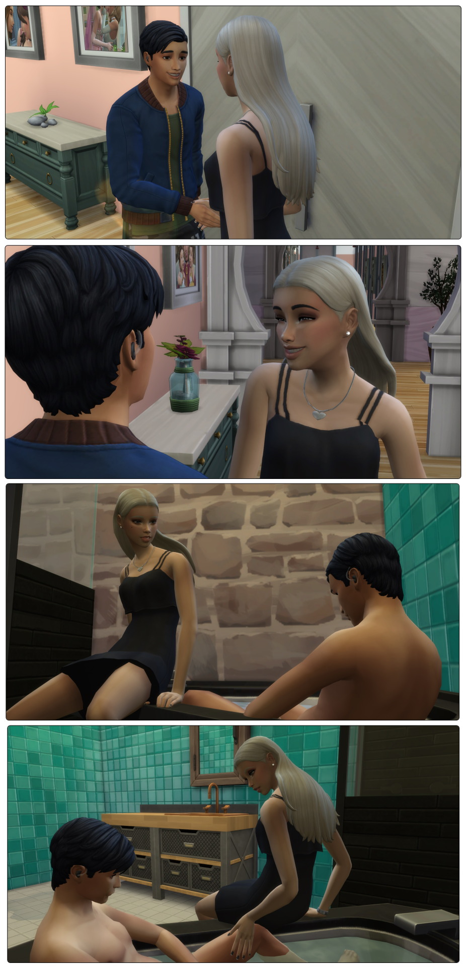
Joey: Then that’s how I see you. The water in here is good no matter what you do or don’t have under that dress
Luisa exhales in relief and strips off to climb in beside him.
Luisa: Sorry for being weird I’ve just had some… bad reactions
Joey: Clearly jerks. I have to tell you though, this is new to me. Tell me what you want me doing or not doing. I want this to be as good for you as I can see it being for me. I don’t want you being uncomfortable
Luisa: I have a feeling I won’t be. Something is telling me I clicked on the right profile
Joey: It’s my eyes isn’t it? The perfect kind of chocolate to drown in
Luisa laughs and leans down to close the gap between them with a kiss.
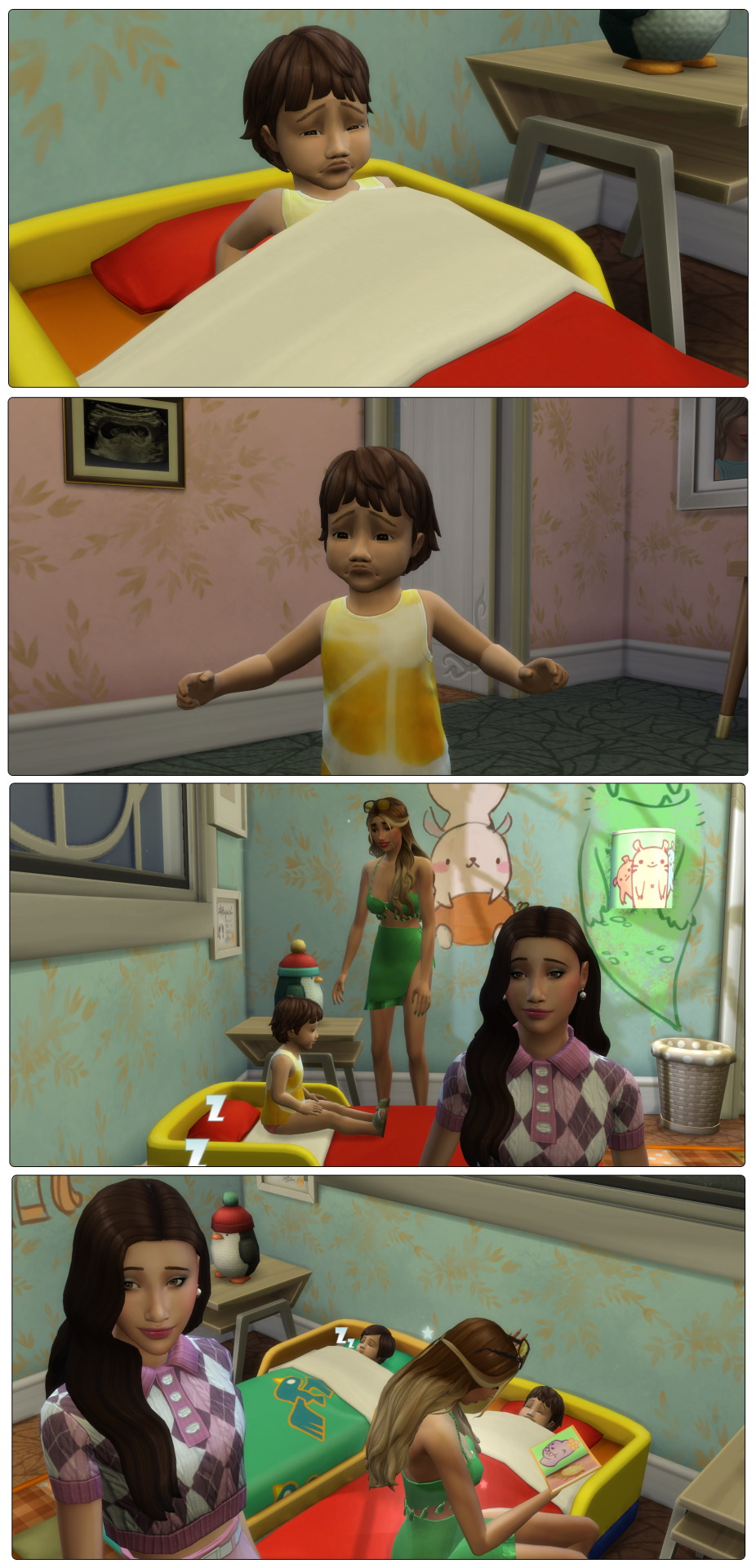
Nightmare alert! Poor Rilian has been chased by a monster into a lake of fire. Waking up sad he goes to try find his parents. In their room Luna is working on her next lecture and Devin is practicing her guitar. They both stop when the crying toddler walks in and bundles him up with kisses. Luna carries him to bed and Devin settles him down while Luna tucks in Alfred, making sure he stays asleep. Devin only has to read a few pages before Rilian returns to dreamland, hopefully with less fire.
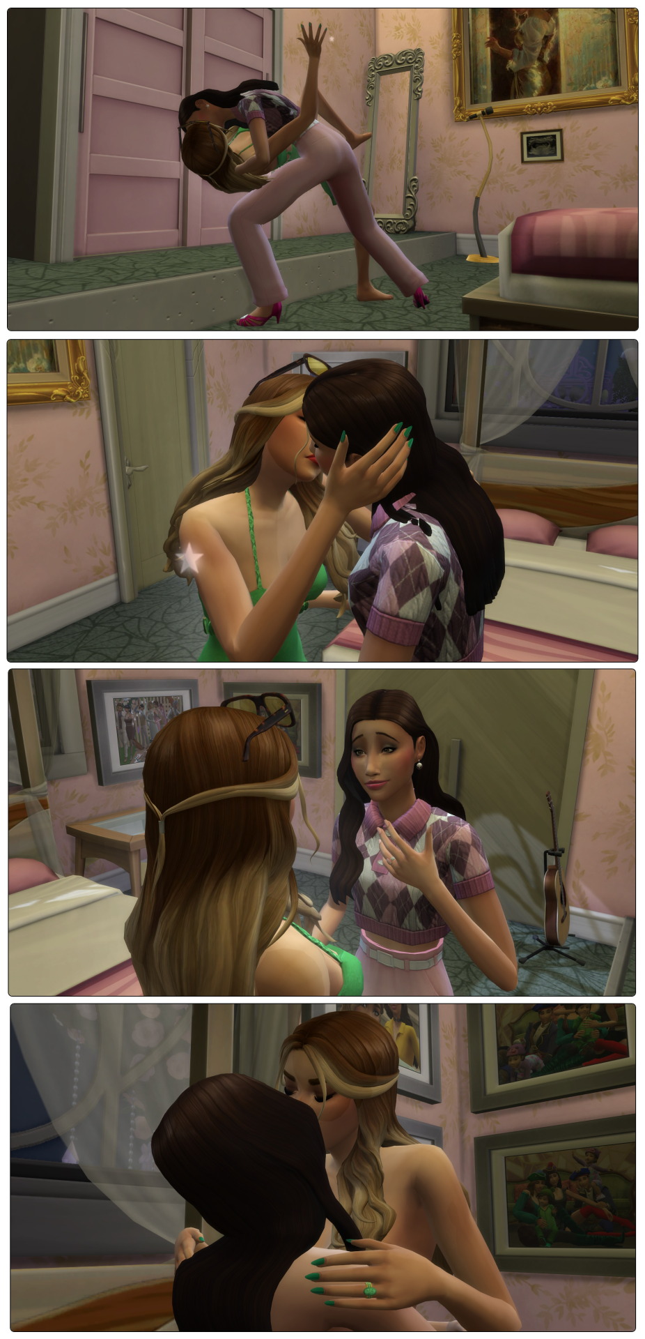
Pulling the door of the nursery shut the pair are alone in their room where Luna dips Devin into a passionate kiss.
Luna: You are such a wonderful woman
Devin: I’m inspired by my wife *kisses* I know I wanted to wait for a third kid but maybe that was just me being a coward. I shouldn’t assume you’ll get postpartum depression again
Luna: And I shouldn’t assume I won’t be affected again. Perhaps we just need another solution like a surrogate or a science baby
Devin: Do you know how much I love you
Luna: I imagine it’s almost as much as I love you
Undressing each other the pair head to bed.
Luna admits that if she can’t find out if her mother had postpartum depression, it’s wise to avoid her getting pregnant again. And of course Devin has her career to think of, a career where she needs to be in shape. But a baby… they both want another baby. They’ll have to look into the options but they have faith a solution is out there for them. One they can find together.
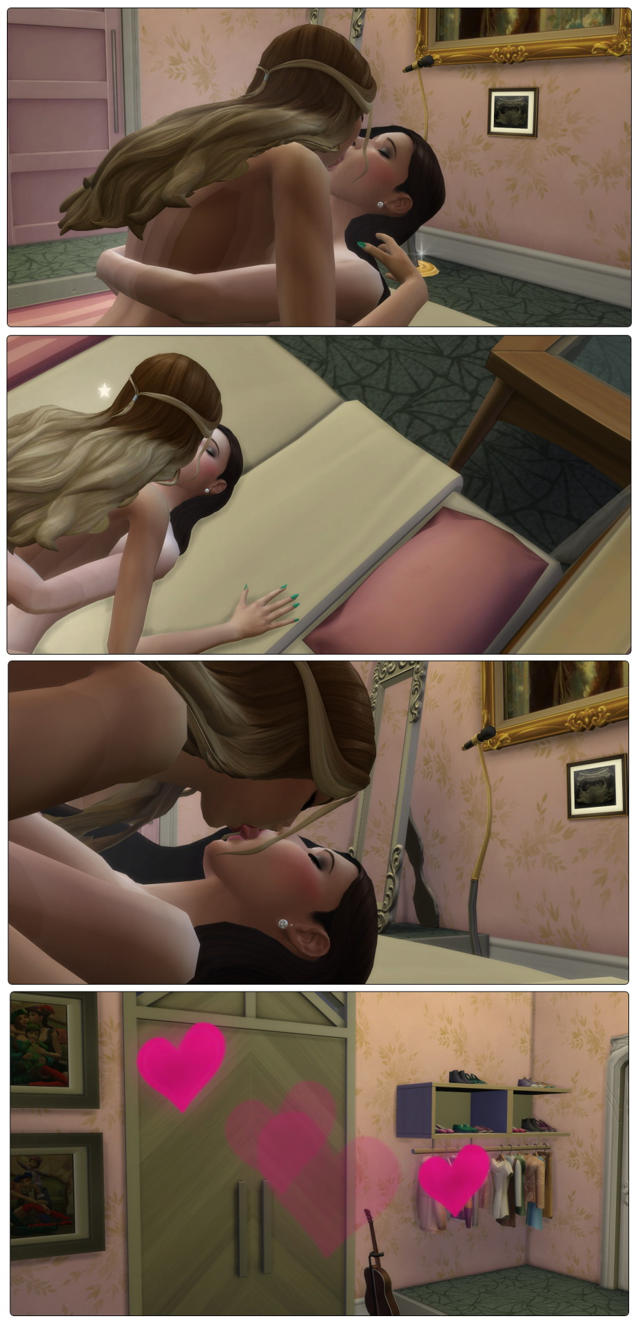
That’s it for now for the Villareals, see you later Del Sol Valley!
Previous ... Next (Nishidake)
#sims 4#the sims#the sims 4#simblr#ts4#my sims#ChangingPlumbobStorytime#R0906#DevinVillareal#LunaVillareal#AlfredVillareal#RilianVillareal#JoeyYork#Active Simblr
19 notes
·
View notes
Text
@dandenbo asked me for the art asks: 🎠What is a typical 'workflow' for a piece from idea to finished? It turns out to be a long answer so here's its own post, under the cut to save your dash! How I go from screenshot to painting: (This is not intended to be a 'this is how you do it!' kind of guide. I absolutely don't do an optimal route, this is just how I go about painting and what works for me! I've done a workflow for a screenshot to painting as I do a few different things but this is one I could explain somewhat coherently. My comics tend to be created pretty chaotically lol)
1) I take an ungodly amount of screenshots while playing. Also pester friends for their screenshots or stalk the group discord for interesting shots.
2) Go through all those screenshots cursing why I took so many, looking for those great moments that I want to paint. I’m particularly looking for nice poses/captivating moments, dynamic lighting or interesting expressions, and they don’t need to have all 3 as we can fix some of that in the next step. Here’s the screenshot I chose for my Keahi x Thane piece:

It was a cute, soft moment between them and I liked the highlight at the edge of their profiles. 3) Refine the screenshot. I don’t use anything fancy for this. I game on windows PC, so I open up the screenshot with windows photo editor. I crop the image, play around with saturation, exposure, contrast, just basic editing until it looks tastier. For this piece I wanted it to be hyper colourful and vibrant, leaning towards warmer tones.
4) Decide what I will change, then gather references for those changes. In this case I was fortunate that not a lot needed changing. I knew I wanted to move Thane’s eye position to looking at Keahi rather than the way he is slightly off focus, do a more realistic ear with earrings for Keahi, make Thane a little more smiley and lower his eyelid and give Keahi nicer eyelashes. I keep a whole bunch of art guides and tutorials on my PC so I grabbed the necessary ones and sent them to my ipad ready to have on hand for the sketch stage. I have Thane’s character model in XNApose, so I can check things like his eyelid specifically in that (this is actually for a different project but shows you what I mean)
If I was going to change up the lighting/shading I would also gather references for that. For example sometimes i’ll take screenshots of lighting schemes I love from films/tv shows (think the strong teal and orange scheme in Mad Max or the neons of Blade Runner). Or for precise shadows, I can again use XNApose. I also have a little 3d printed Thane head I can shine a torch at and take photos of to get shadow ideas. For humans there’s lots of reference to be found with online searches, I find pinterest more useful than google for this. For specific expressions or body parts, i’ll just take photos of myself (hand poses, smiling from the right angle etc.) My camera roll is an interesting place. I have drawn drell frills on my neck and on my chest before to see how the lines would fold at certain angles. 5) Setting up a canvas I work in procreate. For a piece like this I try to go pretty big, say 5000 x 4000 pixels, then i’ll crop down later as needed. 300 DPI. As I work, I’ll make duplicates and continue on the copy each fresh session. When i’m finished I make a backup save of the PNG and .procreate files on an SSD. I immediately turn the background colour down to a more muted colour to not burn my retinas. If i’m using a textured background like an oil board i’ll insert it, and any overlays like canvas effects. Set up my layers from the start basically for easy toggling throughout. I try to be good and label things to make life easier, it doesn’t always happen though. I don't wear a digital glove or use paper effect screens but I do have a bottle of screen cleaner and a microfibre cloth handy at all times. 6) Sketch. I’m still very much learning to draw. I tried for a long time to do the classic ‘ball for a head, draw the planes/lines etc. It was a constant struggle and never clicked for me, the ball especially always made things much worse, turning a circle into a 3d image in my head just does not happen. I find it better to just start drawing and work things out as I go (I use procreates reference window to see my screenshot). So I’ll have my sketch in one canvas, and i’ll also have a second canvas with the photo ref on it at the same size, and if I feel like something is really wonky and off i’ll test my lines over the photo to see what’s gone wrong, then go back to the sketch and correct the areas that revealed. Sometimes I’ll use the grid feature if i’m getting stuck. Here's a few of the sketch stages:


Here I tried out the lines on the photo and noticed that Thane’s frills were a little too far to the left, and Keahi’s eyebrow needed to arch down towards the nose.In the next pass I correct these:

Also, and I know i’m gonna get side eye from some people for this but I really could not care less to be honest. On some pieces i’ll just trace the screenshot. Sometime I just want to get to painting, am not in the mood or mindspace for a learning experience, and this is a hobby. It’s my screenshot, no one is getting ripped off. My latest Javik piece was done this way 🤷♂️ 6) Painting. I’ll start by blocking in the background and the portrait flats, usually on separate layers. I try to have an idea of the background colour from the start as this can effect the whole piece overall, but sometimes you just gotta change it as you go so having it on a different layer makes this much easier.
The painting itself I’ll lay down wider areas of colours, then start going in and refining bit by bit, I tend to work on one area at a time, and sometimes I’ll get pretty well rendered on a small area before moving on, other times work on a wider area. It really depends on my mood and what i’m vibing with that day. Like you can see here I’ve done some general messy colouring all over Keahi, but done a lot of refinement on the eyeball:
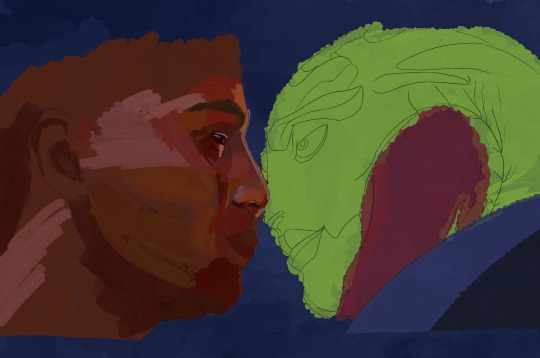
7) Finshing the piece, uploading and testing: When I’m sick of rendering the painting and don’t think I can add anything more to it without gnawing my own wrist off, it is time to finish up! I make sure I toggle all the layers I want on, add a top signature layer (lol I lie I forget this all the damn time). Then i’ll upload the piece to my google drive and open it up on my big 4k monitor on my PC, and on my phone, and see how it looks (my ipad is a 9.7inch air). I find that once off my ipad, it often looks a little less saturated and contrasting as it does in procreate. So I might go back and change the levels if it’s too big a difference until it looks decent across devices (it’ll never look perfect on them all though, just gotta find that happy medium).

8) Posting online I really don’t have any strict steps for this. I know some people go for optimal posting times, and will make multiple copies of their pieces in different sizes to fit better on different sites (damn you instagram and your need for everything to be square). I… do not do any of this lol. I post when I’m done whatever time or day that is. I do tend to reblog/retweet etc before I go to bed, as I live in the UK and that will at least be getting into evening time in US. I reblog my own stuff a fair bit.
16 notes
·
View notes