
🌱 Writer, cartoonist, and composer for CURSE/KISS/CUTE🍀 Jackrabbit-of-all-trades artist-type with computer inclusions🌿 Queer, trans🥦 She? He?
Don't wanna be here? Send us removal request.
Statistics
We looked inside some of the posts by valeriehalla and here's what we found interesting.
Average Info
Notes Per Post
2K
Likes Per Post
2K
Reblog Per Post
530
Reply Per Post
17
Time Between Posts
4 days ago
Number of Posts By Type
Note
11
Text
6
Last Seen Tumblr Blogs


Fun Fact
The “We are the 99%” Tumblr blog became the slogan for the Occupy Wall Street movement.
Note
ive been wondering if aster focused could they shapeshift?
concentrating allows Aster to shapeshift in much the same way that it allows them to grow their fingernails or induce their gallbladder to secrete bile into the small intestine, which is to say that it doesn’t and they just do that on their own without conscious intervention!
while it’s true that a lot of monsters are inherently a little magic, the magic bits tend to be precisely those bits that aren’t under the monster’s conscious control. sandalphon can’t turn off his halo, aster can’t decide how to change their body, and if drippy decides she wants to do chocolate milk this month then she has to actually change her diet. mally can shapeshift, but that’s because they’re a slime. you can imagine that if cartoon slimes existed in real life, shapeshifting would just be one of their innate faculties, so it’s not actually magic when mally does it.
conscious control of magic is something you have to bargain for, and that’s why witches are a rarity even in the Middle Wood...
53 notes
·
View notes
Text

not for nothing, but i’m really feeling like “we’re so back” with this one.

CURSE/KISS/CUTE - “Name of the Helper, Part I” - Scene One is now up on Patreon!
in which the thing happens to Nathan Small.
254 notes
·
View notes
Text
CURSE/KISS/CUTE - “Name of the Helper, Part I” - Scene One is now up on Patreon!
in which the thing happens to Nathan Small.
254 notes
·
View notes
Note
Is the music for CURSE/KISS/CUTE available to download anywhere? It's so catchy, I'd love to listen to it more.
word on the street is that following the release of episode 1 there will be a combo ebook+soundtrack release of episodes 0+1 ..... but you didn't hear it from me ..............
31 notes
·
View notes
Note
Can Lexie have chocolate?
i have no strong opinion about lexie eating chocolate. however, answering "no" here would imply that lexie can't eat things that are poisonous to dogs. and that would mean she couldn't, for example, chug a Monster® Energy drink—which i feel strongly that she could. therefore, it must be safe for her to eat chocolate. Q.E.D.
60 notes
·
View notes
Note
Read CURSEKISSCUTE last night and it has not left my mind for a moment (to the point my organic chemistry teacher assume i was nodding off because i kept zoning out thinking about it lol) its genuinely incredible and is already a huge motivator for how i want to be
I did have a question tho! Are plants and animals affected by the curse? Animals like pets im especially curious about
non-human animals are generally not affected by the Curse. indeed, you could say that the Curse exclusively operates on monsters: in the cosmology of the Middle Wood, humans are just another type of monster. the Curse can freely change the form of a monster into that of a human and vice-versa, so implicitly, they categorize together. meanwhile, one can assume that most animals do not have a strong sense of self, so there's not much there for the Curse to act upon.
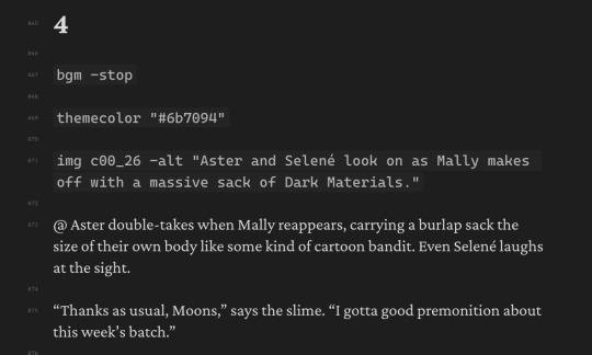
there's actually a four-way categorization scheme for living things in CURSE/KISS/CUTE, and considering it generally doesn't count as "good writing" to insert a taxonomical diagram into your prose novel about gay monsters kissing, i suppose this is as good a place as any for it to go:

68 notes
·
View notes
Note
Do the Woods mess with your memory?
Well, I know it does b/c Aster doesn’t remember what bits they were born with, but I was wondering if the Woods messes with more than that. More than just forgetting what your original form was.

this is what we in the business call "a lie". aster of course knows the answer to the question of what junk they had before they got on the train. they're simply enjoying the fact that nobody else does. they will continue enjoying it forever, because their curse renders that information strictly unknowable.
#ask#text#(even i—the author—don't know. i didn't bother generating that information because it would have been a bit own-point-missing)
46 notes
·
View notes
Note
The casual gender fuckery and trans-ness in CURSE/KISS/CUTE makes me so happy. I found myself crying halfway through episode 0. It wasn't even anything in particular. You just managed to send me on a very emotional journey. I have to hand it to you, now I'm longing for a place that isn't real but I feel like I can very tangibly miss. Fantastic work, stimulating synesthesia. Hope you're well <3
at some point in our world's future there will be a moment where everybody finally Gets Over It. it will happen at different times in different places. there are some places where it's already happened. i am interested in writing stories set in that "after". charmside as a setting represents an "after". queerness in charmside is the default state not because everyone in it is queer but because there is no one left who cares enough to reject the label. the concept of being straight or cis never took root here. the farther you get from the train station, the less monsters you'll find who could even comprehend what the word "cis" means without taking a college course on human sociology.
i think this is a real future and i believe with my whole ass that it will be manifest. however, it's also a little hot to think about? like, to scoop up some humans from the "before" world and plop them down into the "after" ... where there's not a soul in sight who can conceive of their self-repression as anything other than transparently maladaptive behavior ............ what do you mean you can't wear a skirt ............ who told you that ............................. huh?? i just don't get it ...................................... well i think you should try it on though ...................................... look how cute it is!
140 notes
·
View notes
Note
just finished reading your novel, and OH MY GOD ITS SO GOOD!!!!
can i ask whats your biggest inspiration?
u fool... my novel has only just begun. episode 1 coming soon ™ ™ ™ ™ © ® ℠!!!!!!!!
it is so beyond possible to prise apart my inspirations... it's really a gestalt situation. where art is concerned the closest at hand are obviously my peers in the cartooning and comics space, like my wife vivi, joan chimeracauldron, ivy coquettedragoon and zack paranatural and gg soulsov and cripes if i try to make this list complete it'll be embarrassing for Everyone. taylor titmouse not in terms of art style necessarily but as a peer in the illustrated erotica space who is killing it and probably inspired the switch to the more prose-oriented format that CURSE/KISS/CUTE has now.
in terms of prose inspirations i'm sorry to be predictable but neal stephenson and terry pratchett obviously top the list. stephenson's electrifyingly stupid present-tense narration in "snow crash" rewired my brain as a teenager and while i only read a pratchett novel for the first time after finishing the draft for chapter 0 i don't think it will surprise anyone that my brain wears that man's immaculate conversational prose like a glove.
i also owe a life debt to the 40-foot shipping container of untranslated boys love visual novels i read as a young adult. the fact of the matter is that CURSE/KISS/CUTE is, spiritually and forever, Actually A Yaoi. even when the girls kiss it will be a yaoi. if you don't know what i mean by this it's fine. well bye
53 notes
·
View notes
Note
Wasn't aster asks a series you started a few years ago?
it was! it only ever got the one entry. the ideas i had for that series eventually got rolled up into CURSE/KISS/CUTE, the first episode of which i named "Aster Asks!" in its honor, to the confusion of everyone.
42 notes
·
View notes
Text
curse/kiss/cute episode 1 coming soon
105 notes
·
View notes
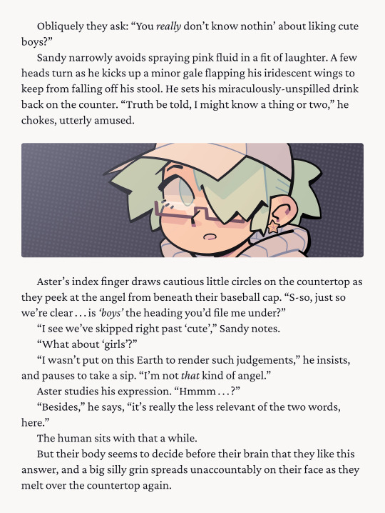
Note
I have only known Sandy for about 3 hours but if anything happened to him I’d start leveling cities. That being said, “Leveled City” is about the magnitude that I need this twink obliterated. 😍
from a story engineering standpoint i originally slotted sandalphon into episode 0 as sort of a DEI hire to increase the hot boys quotient in an otherwise girls-heavy pilot episode, but he ended up being my absolute favorite character to write for. please mentally read all of his lines with a james from team rocket type of accent. he's vers by the way.
57 notes
·
View notes
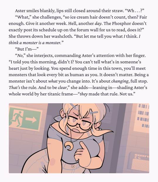
Note
I’ve just finished reading the Curse/Kiss/Cute pilot, and, oh my god, help! I’m having a lot of gender envy over Drippy and her drippy-ness!
Also, while I have this ask. Um, why doesn’t she wear pants or a skirt? Is it a confidence thing or does she not care?
some people become monsters and it takes them a long time—maybe a lifetime—to fully scrub the grout of human social mores from between their brain-folds. for others, it's like sloughing off a bad pair of jeans after a long day. it's not about confidence and it's not merely an ambivalence to the concept of pants. a new body is an opportunity to redefine the terms and conditions of how people think about and interact with that body. in other words, it's about control. but most importantly of all, it's about looking cute in cute underwear
70 notes
·
View notes
Text


This afternoon, read CURSE/KISS/CUTE, my illustrated web novel for queers 18+. Features include:
hope
flirting
emotions
the inherent sexiness of change
vaguely scary deep lore (also sexy)
forcefem (woke)
jokes
It's literally free: www.dicot.moe/ckc
326 notes
·
View notes
Text


NEW RELEASE: CURSE/KISS/CUTE episode 0: “Aster Asks!”
Read it for free in your web browser right now!
CURSE/KISS/CUTE is a new episodic erotic web novel about cute gay monsters hooking up in a cursèd wood, with full illustrations and an original soundtrack. 🔞 For adults only! 🔞
738 notes
·
View notes
Text
so it turns out that while tumblr will let you make a post with the tag #CURSE/KISS/CUTE, it is impossible to actually search posts with that tag, as i have only just learned. i will have to start using #cursekisscute instead. whoops!!!! My Excellent Naming Conventions.............
75 notes
·
View notes
Note
mwah mwah mwah mwah mwah I just found your VN and it's so cute and arresting and so full of nonbinary longing I'm absolutely in love already and it's kinda inspiring me to do the scary job of opening up a word doc and try writing some of my own stuff for the first time ever
also wrt aster i love love love love love the idea of being freed from agab. just... can't remember. who cares. no longer having to measure up to a gender metric or constantly minimizing your male shoulders or female hips and worrying about your ratios or presentation - and just relax and enjoy it instead of treating it like a constant chore of maintaining a dozen spinning plates to avoid being "found out". freed from presentation pressure. mwah.
also also as a fellow web developer I'd love to hear more about your stack for ssg - gatsby? svelte? vite? 93 nested imported html docs? one really really big div? I ask because while I don't know if I'll ever have the chops for music production, reading and discovering that inline music player absolutely tickled me, both narratively and as a developer, what a delight, so so so good
My “stack” ... hmmm. “Stack” .................
So, for the main website I just used “Lektor”, which I picked out of a hat on the basis that it was python-based and could do the one thing I cared about (HTML templating). But the CURSE/KISS/CUTE reader is coded from scratch. It is a single-page app, and it loads and displays story content by grabbing the HTML from a JSON file I call the “story file”. The JSON in turn is created by a parser that I wrote in python that parses a specially-formatted markdown file which I also confusingly call the “story file”. The script format for this latter file is slightly custom but is mostly just “normal markdown but I repurposed code ticks as a macro format”:
The music player is pretty rudimentary and just offloads all the complicated business to howler.js.
It’s a funny patchworked leaning tower of python but it gets it done and gets it done entirely client-side and that means I don’t have to dip even one of my toes into the haunted pool of server-side web development =w=
62 notes
·
View notes