#i'll have to think more about the difference between something being overall unique and unique in application to smth else because im....
Explore tagged Tumblr posts
Text
hitting this article with a rolled up newspaper. bad. stop it

sigh. exhaustive argument that none of these shows grouped together have the same art style below, complete with images and whatever
oh also im not the type to comment on articles so idk the etiquette but don't like. go over there and say "ur list sucks >:P" that's just gonna bring more traffic to it. i linked it so people could ratio me if need be not so that you guys could dunk on this random listicle writer. it's pointless and kind of cruel. just so we're clear on that
edit: the quote above uses "time period" instead of "era". i quote it as saying "era" a lot. i'm not fixing that
note: here i'm assuming "art style" refers to, generally: character designs (facial and body proportions, how things like hair is dealt with, etc), lighting, color (palette, saturation, value), line weight, etc [and mostly excluding things like shot composition, direction, etc because while those probably count my personal experience with these shows is mostly limited, and because most people focus on the previous things i've listed in their discussions of art styles. the analysis within the article is incredibly shallow, and if they think samurai champloo's art style is "rehashed and reused", i don't think they're like. super deep in the art analysis sauce. anyway]
code geass vs death note. what are you saying. what are you talking about


code geass' approach to color is more vibrant, and dn's is more washed out. dn takes a more realistic approach to faces and bodies, both in proportion and in shape (namely how curved their features are (as opposed to cg's far more exaggerated sharp faces, large eyes, and lanky bodies. note how lelouch's lips barely jut out in profile, for instance)). i shouldn't have to explain this they're not even close
that's the most extreme example, but samurai champloo and cowboy bebop aren't That similar either


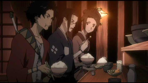


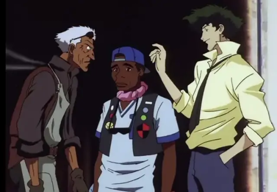

it's hard for me to speak on bebop for the most part because i've never seen it (vs my ~8 eps of samurai champloo knowledge), but from what i have seen, bebop often has a sort of delicate intricacy to a lot of its linework (especially its backgrounds) that champloo tends to sacrifice in favor of bolder lines and higher contrast. it was hard to find great examples, but the silhouettes champloo's characters cut are often sort of.. choppy and wild, and usually lanky and stretched-out, while bebop's are more realistic (focus on the shoulders in the last image set, for instance). there's overlap, sure, but there are clear and intentional differences in the designs, to say nothing of champloo's higher saturation and the natural differences between hand-drawn and digitally-drawn animation
(and if "art style" is referring to the direction rather than just character design, lighting, color, etc, it's because these two have the same director, which hardly creates an "era". that's like comparing two miyazaki films from the 90s and saying "this is what 90s anime movies looked like", it's nonsense. also, i feel like lumping these two together because they look a little similar is unfair because they're pretty unique from their contemporaries in their own right. they may resemble each other a bit, but how much do they resemble other late 90s early 00s sci-fi/historical anime? does samurai champloo look like outlaw star to you? or trigun? or evangelion? does cowboy bebop look like ninja scroll? or samurai 7? or sword of the stranger? etc etc etc?? if we're claiming that cowboy bebop and samurai champloo share an "era", then what of their contemporaries, and what about differences across bebop and champloo's very different genres? more on this point later)
even fruits basket and ouran, the ones i initially felt were most similar, have clear distinctions

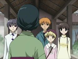
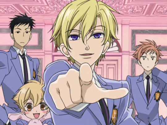

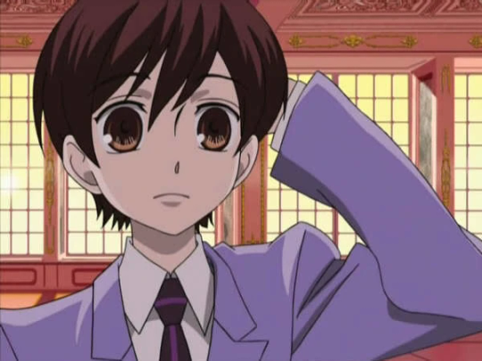


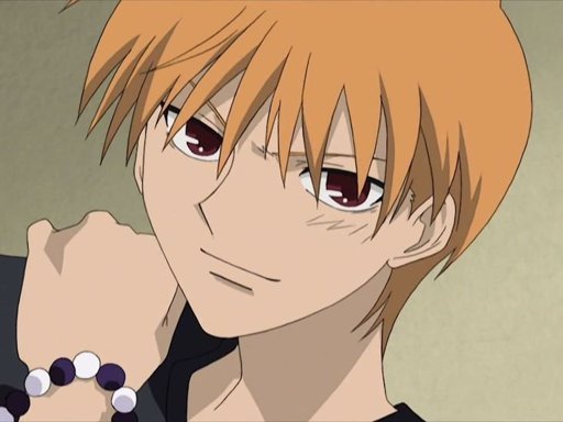

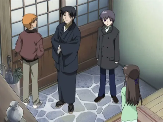
ouran's got a distinct abundance of pastels in its color palette, tending towards pinks, blues, yellows, oranges, etc. its use of black and brown is very limited. fb's palette is a bit more relaxed, and while its colors are often pale, i wouldn't call them pastel (they also skew more towards natural, earthy tones). fb's characters have noticably.. flatter skulls? in some shots, and their heads are so squat that they can seem consumed by their eyes. anyway this is a trait ouran does not quite share, for a number of small reasons, like how their cheeks bow out, greater emphasis on noses and mouths, and its use of highly variable line weight (vs fb's very stable line weight). hair is more voluminous and multilayered in ouran, and features like lips and noses (esp noses) are fuller, more three dimensional (in general, ouran's approach to shading hair and faces makes the characters feel rounder). the sharp edges and bell-sleeves of ouran's uniform blazers are actually far more reminiscent of the designs in code geass than fruits basket, imo. (actually.. i'm not sure how to express this but a lot of the poses in ouran resemble code geass poses, in their locked-joint arms-stretched kinda way). ouran forgoes hair-shine, while fruit's basket adds them in either jagged points (see most of the images i included) or a sort of triangle wrapping around the head (not pictured here, just trust me)
(note: i'm assuming they are referring to the 2001 anime adaptation of fruits basket rather than the 2019 one, because not only does the 2019 adaptation resemble ohshc even less, but because they are closer in time period, and the grouping is supposedly based on era).
my point is none of these shows look rehashed from one another. there's sometimes overlap, but each has a unique aesthetic based in many small choices made in their design.
now let's look at their use of "eras" a little more. this is the timeline of air dates for the first episodes of the six shows mentioned (for their original japanese runs, obviously):
cowboy bebop, april 1998
fruits basket, july 2001
samurai champloo, may 2004
ouran high school host club, april 2006
code geass, october 2006
death note, october 2006
code geass and death note being paired by era is, at least, accurate. same month, same year. it's about as close as one can get. however, the other two groups are far more removed from each other. fruits basket and ouran have five years between them, and bebop and champloo have six. this wouldn't be such an issue if there weren't other anime within this list that came between them. if bebop and champloo are in the same era, why is fruits basket grouped differently? ouran came out in 2006 just like code geass and death note, so why is it grouped with something that came out five years prior instead of them?
i think it's fair to say that eras are not purely chronological, that there's overlap between them. one doesn't begin as soon as (and not a moment before) its singular predecessor ends. but era feels like an incomplete distinction here. this list alone shows quite a lot of variety for what someone can mean when they say something "looks like 2000s anime". most anime fans have a picture in their head of that, and, to be so honest, i don't think samurai champloo is it. using only time as a distinction rather than movement, genre, etc is simply not enough. the fact that 5/6 of these shows occur within 2001-2006, and yet they're set apart into three different eras, and each pair (in ways i'm sure the author of this piece would admit) does not resemble the other, is proof enough that 2001-2006 did not have one repetitive art style, at least not in a way these anime exemplify. that's to say nothing of whether or not the anime within the era-pairs look the same, which we've established i don't. but since they don't actually tell us what their eras are, we can only speculate. personally, i speculate that they didn't think about it too hard at all, or even look up the release dates, going off vibes instead, if that.
when this person is talking about "eras", i think "eras within certain styles or genres" is more accurate, but even with these in mind, matching shows up like this makes a lot less sense than i think they realize. death note and code geass are sometimes lumped together because they're both mind-gamey thrillers with megalomaniacal protagonists with a single unique power that they use to try and fix/control the world, not because of their art styles. trying to say they look the same just because they share plot elements and came out around the same time is just... really weird. fruits basket and ouran both fall into early 2000s shojo, which is part of why the comparison fits more. target demographics and what magazines cater to those demographics (and thus the aesthetics of those magazines, which you have to fit into enough to get your manga published, and which also just influence what you want, what readers want, etc through exposure) (<- oversimplifying) are an actual valid point of comparison, at least more so than "idk 2006 lol". even if the result is more like "romcom for girls, 2006"
it doesn't help that many of the choices they made for unique art styles don't feel particularly "unique" to me.


choices like mononoke and land of the lustrous i get. and i'm not saying any of the examples i've just pulled or in the article are bad art styles, or that they don't bring anything unique to the table. i'm sure many of them are beautiful, and help elevate the tones of the stories, and all that jazz, whatever. but if the name of the game is "unique", then i don't think these cut it from what i can see. it doesn't help that most of the analysis comes down to "it looks really really cool" or "you don't normally see this art style with this genre/tone" (which is not the same thing as being broadly unique, imo)
it could be that we have different impressions of what "art style" means. it could lie somewhere in the bits of art style that i cut out, like shot composition and direction, etc. and some of it is probably a difference in what constitutes uniqueness, both between our differing experiences with media and personal taste/philosophy. but i don't think i'm wrong here when i say that the assertion that samurai champloo is era-typical in a way that beyond the boundary (2013) isn't is just fucking wrong.
look i know that bit that i screenshotted that started all this was a filler paragraph. i know it was the mandatory setup for the listicle you scroll to immediately, the parts you're supposed to ignore. i usually ignore articles like this completely because they're kinda bullshit. but i think this hunt for what looks the most unique is a flawed and confused one, at least to some extent. especially when all of the justifications are like "it supports the vibe well", which is something that all art styles are supposed to do, no matter how "unique" they are or are not, and i think that when people discuss things like art styles and anime and what looks generic and what looks unique, lumping things together too much often removes the nuances that really do influence people. i'm an artist. it's gonna sound dumb, but the way things look matters to me, even if it's stuff like how shirtsleeves or noses are drawn. to ignore all these little differences that make each piece unique is to blend so many singular, unique things into this easy-to-categorize mush that just... does a disservice to the choices every artist makes, i think. even if it is a pretty mild disservice. again, i cannot stress enough that this article is not important, and that this post responding to it is also not important.
look, what i'm trying to say is stop and smell the roses. notice the differences in the art you consume and think about it. looking for something that's so different it jerks your brain around is cool and good and fine and normal, but to disregard things as "basically the same as xyz" is reductive and icky and i don't like it. if you want something unique idk go watch kaiba (2006) have fun it's really good. i'm going to bed
nvm miscellaneous gripes section + i go to bed at like 5am lol i LIED:
the only thing said about beyond the boundary's art style is "it's hard not to fall in love with the art style", and the rest of the comments are other elements. that's too vague! i'm docking points!!
a lot of this seems based in the color palette now that i'm rereading it. not that my analysis doesn't also involve that, and not that that's invalid, but it makes me think there uh. might not have been Too too much thought beyond that. (example: "Though the dark and cool colors provide a sense of dullness, these colors cater to the tone of the story, which is dark and representative of its heavy content." like. that's not. unique. that's not unique to solo leveling y'know to have a dark story be awash in dark and cool colors that's pretty normal actually. maybe how they do it is unique, but we'll never know bc i haven't seen solo leveling and the author didn't care to elaborate :/ oh well)
this one's petty but i actually think ohshc's art style is pretty unique. maybe it's just because i've seen it several times and certain details like how the bottom-lip-to-chin shadow is done have caught my attention but like. pouting crossing my arms huffing >:( i think it's unique wth...
demon slayer's an alright choice i agree. idk i barely watched it a few years ago and it still wrenched my art style in a new direction. i dunno anything that looks quite like it. i'm not mad about all these choices per se it's just hard to whittle something like uniqueness down to a top ten list, i guess. and to say samurai champloo's generic while violet evergarden is the 5th most unique anime you've ever seen is like. weird. you're setting yourself up for people to go ehhhh... idk...... if you're not picking stuff that's like. Clearly Out There (i.e. mononoke)
"It’s no surprise that Demon Slayer is an anime with some of the best art styles." i might be fighting something that was written by ai now that i think about it...
oh god this was totally written by ai. or it went very unedited. man i spent like 2 hours on this (<- LOSER LOSER). they can't decide what the plural of anime is
they insist that chainsaw man's art style is weird enough to maybe put people off, and the only reason i can think that is is bc it's cg. but don't do the same for land of the lustrous, which is also and much more obviously cg. idk
they phoned it in but didn't even include that ping pong anime smhing my head. y'know the one everyone includes. which means whoever wrote this actually did stick to personal choices over crowd-pleasers, or chatgpt goofed or whatever. idc. guys they didn't even put flcl (<- but they put gurren lagann? as a gurren lagann fan im confused) oh my godd
ik i said this before but im saying it again: a lot of their pros and cons come down to whether or not an art style is typical for that kind of story, so like whether something gritty in tone has a more realistic art style or whether it has something visually cutesy instead. art style is more than just those things, but even that analysis is like. pretty much as bare-bones as what i just said. yucky
oh also part of my issue with this (didn't phrase it right sorry) is like. "unique" is a broad term. a really broad term. it can mean anything. there is no top 10 anime with unique art styles article that would escape that problem, and my analysis here does not escape that problem. i find the term a little unproductive (same with the concept of "originality"), so just know that i guess
#this doesn't even go into things like shows with variable art styles. yu yu hakusho cycles through storyboarders in a very obvious way#and jojo's bizarre adventure's art style adjusts for every part (creating a sort of average for the gradual shifts in araki's style over th#course of that part). and that's off the top of my head i'm not even like a big boy weeb y'know#listen take all of this with a grain of salt i haven't watched any of these all the way through (minus ouran) and some of them i haven't#watched at all. but a lot of this is evident from just Looking at stills and footage bc it's a visual thing. that's gotta count for smth#at the very least i'm confident that my analysis is um. better than the person who wrote this's analysis. so yeah#i'll have to think more about the difference between something being overall unique and unique in application to smth else because im....#not 100% settled on the idea that one is the True Meaning Of Unique. again part of my problem with this is the oversimplification of unique#the concept y'know so like. whatever#noticing more differences. ouran includes the nose bridge/beginnings of a brow more than the middle line of a nose or a sole dot like fb
9 notes
·
View notes
Text
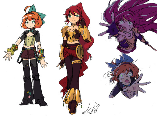
The Diary of Penny Polendina
The other day I was inspired to try working on a different NeverFell Projects installment, one that would probably be a lot shorter and quicker to write, because it's not like I care that deeply about Penny, right??
Well, I was incredibly wrong. ^^; So wrong that I'm actually having trouble with this story now...essentially, Penny goes through a bit of a 'rebellious phase' (gross oversimplification, but that's all you get for now) and there are, surprisingly, a lot of aspects of that character arc that I want to explore. Plus, a pivotal connection with Pyrrha, the climax of which I haven't quite figured out yet...
God only knows if I'll be able to finish, or if I'll just write the first 2/3rds of the story and leave it at that. But I figured I might as well warm up by talking about the designs. ^^
Penny's new look is basically 'Disney's Pinocchio, color picked from Arthur Watts' character design'~
I didn't necessarily want her to look evil, just...bolder. Like she specifically picked 'daring' items that maybe her father or Ironwood's PR team would rather she didn't wear, at least not compared to the more innocent frilly pastels she had on before. Between the chest window, midriff, and short sleeves, she's actually showing a lot more skin than before, despite still being 90% covered up. ^^;
Those multicolored wrist accessories are prototype weapons invented by Dr. Watts, that mix and pressurize Dust from the cartridges to cast "artificial magic". This way I get to do a bit of the 'Winter Maiden Penny' stuff in this Vol. 3-locked AU~
Penny's magic usage is one of the things that stumped me when writing this story...In NeverFell, magic isn't just glowy rainbow lasers or weather powers-- it essentially allows the user access to any conceivable semblance at any time; its potential is limitless. Being a beginner, Penny would probably just come up with one signature 'spell' to use in tandem with her Floating Array...but I can't decide what I want her to do. ^^; I think I'd like for her to do something connected to dance, because I feel like that's something unique to her, the way she dances with her weapons before striking. Nobody ever points out how the "robot" in the cast is the one who chooses to spend energy on unnecessary movements that aren't even used to maneuver around an enemy; they're just cute and fun. ^^ I think that's a great encapsulation of who Penny is~
Redesigning Pyrrha is always super difficult, because her original design is so perfect. But I like this end result a LOT. ^^ I may need to adjust the pant legs a bit, but overall it feels like a very believable alt outfit that keeps the spirit of the character.
Pyrrha is another one of the stumbling blocks in this story, because I'm now forced to create at least one malleable personality trait for her-- i.e. one that isn't intrinsically tied to Jaune and/or the plot. Something that she could actually take into a meaningful relationship with a different character... I had the idea to expand her "I'm sorry!" gag into a real guilt complex, where she has trouble letting go of instances where she's made mistakes or hurt someone. In this case, dismembering Penny 1.0 and essentially ending her life. :T She seeks out 2.0 in a desperate effort to make things right, and ends up helping her with ...things, and growing as people or whatever, and all that other stuff I have yet to write. ^^;
I just realized that Pyrrha could use her polarity semblance to pull Penny towards her in a situation where they need to reach each other...that's so cute. ^^ I gotta remember that~
484 notes
·
View notes
Text
Uniquely recognizable
a post on making fantasy people species that stand out but still feel enough like their mainstream counterparts that your audience won't get confused.
Like me, a lot of you want to use the standard fantasy people in your projects. gnomes, orcs, elves, goblins, dwarves, etc. But you don't want to use the same old typical designs you see in every fantasy roleplay game, movie, show, book, video game, whatever. Those designs have become iconic and ingrained in the common understanding of what those fantasy people are supposed to look like.
But it gets tedious, doesn't it? Sometimes it feels like the only difference between elves in different media is the size of their ears. Sometimes it feels like every fantasy people group is designed to be as close to human as possible and then their fantasy traits are just an afterthought. You're tired of it! You want to do something new!
But where is the line between a unique looking elf and a personally unique fantasy people that need their own name? How far can you alter the standard orc before it stops being an orc? And what are gnomes, anyway?
in this post, I'll be showing off a few of my own fantasy folks and talking about the balance between a recognizable design and a unique design. Including one of my own folks that began as something typical and gradually became something else, until I had to come up with a new name to avoid confusion.
first up: Goblins! what are goblins? if you asked a handful of random people, what traits would they consider the most typical of a goblin?
small, usually green, big ears, lanky limbs? frequently a large nose, sharp teeth, and yellow eyes? those are all common traits for goblins in media across the genre. here are a few sketches of easily recognizable goblins: (including one of my favorites, the goblin design of @pocketss)

(image description: three sketches of goblins. The only one directly labeled is the pocketss goblin, which is very small, has a round head and thin pointy nose, and large leaf shaped ears. it is wearing a little coat. the other two goblins are more typical of fantasy roleplay and video games, having large noses, crooked ears, and short bodies with long arms. one of them is wearing a mechanic outfit with overalls and goggles. the other is wearing a hooded rogue outfit. end description.)
these are all different from each other, but they're similar enough that you could glance at any of them and say "oh that looks like a goblin!" You've probably even seen similar goblin art from other tumblr artists, or your favorite fantasy media.
so now let's look at how I draw goblins:

(image description: a frog-like goblin standing in a cheeky pose, leaning on an invisible surface of some kind. They're nude, but have no external sexual traits. Their belly is a pale yellow while the rest of their body is light green with darker green stripes. They have a round face, yellow frog-like eyes, a small nose, long whiskers, and big bat-like ears. next to them on either side are lists of traits that are common for goblins in fantasy media, contrasted against the more unique traits of this goblin design. end description)
this is one of my fantasy people that I consider the most recognizable. They've got a lot of standard goblin traits! green skin, yellow eyes, sharp teeth, big ears, lanky limbs, and they're rather small. On the other hand, they also have several traits that make them stand out from the common depictions of goblins.
They're amphibious, they have whiskers and a frog-like vocal sac in their throat. their skin comes in different colored patterns like real life frogs. and they're also hermaphrodites in the scientific sense. my goblins don't have set biological sexes from birth. they change between laying eggs and producing sperm based on various environmental factors.
But I think it would be hard for anyone to take a glance at this design and not recognize it as a type of goblin. it strikes a pretty good ideal between the typical and the unique, in my personal and somewhat biased opinion.
Moving on from this, let's look at my depiction of gnomes. They're kind of on thin ice with that title, I don't think they're as easily recognizable. But at the same time, I'm not sure I can come up with an alternate and more fitting title. Gnomes are weird. I see them depicted in only a limited handful of ways in mainstream fantasy, and far more varied ways from independent artists. Gnomes come from a mythology where their name could have referred to several small fae things, or been easily exchanged with other small fae things and similar creatures. The most common depiction of them is probably the garden gnome, which has little in common with how gnomes are depicted as a playable race in roleplay games. but here are three ways I usually see them depicted:

(image description: three sketches of gnomes. the first gnome is labeled "dwarf lite" and resembles a short humanoid with a sturdy body, pointy ears, and a short thick beard. they are wearing a pointed cap and a durable work outfit with gloves and boots. the second gnome is labeled "mousey" and resembles a small humanoid with a hairy face, larger semi round ears, and a long skinny tail. they also appear to have small claws on their fingers and toes. they're wearing a collared shirt, vest, and simple pants. the third gnome is labeled "elf hobbit" and resembles a short humanoid with pointy ears and long hair, wearing a cloaked adventure outfit. end description.)
common gnomish traits include a larger nose, pointy ears, some form of facial hair, and a short torso with somewhat longer arms. The most common versions in mainstream media are the "dwarf lite" and "elf hobbit" versions, like no one can quite decide if gnomes should primarily be tinkerers or spell casters, and which role they're depicted with determines whether their design is more dwarf-like or elf-like. But the mousey with a tail gnomes are more common from independent artists. It reminds me of some illustrations of the Borrowers, and I do wonder if the artists had them in mind.
here's my gnome design:

(image description: a gnomish woman sitting casually and looking upwards with a smile. she has a pig-like snout and ears, as well as four-digit hooved hands and feet, and a stiff short tail. she is wearing a wrapped head scarf over her hair, an off-the-shoulder shirt, and long pants with a climbing belt. on either side of her, there are trait lists comparing the expected gnomish traits with my own different gnomish traits. end description.)
My gnomes do match the concept of being small, agile, magic using folks with a prominent nose. But mine are also not as small as typical depictions of gnomes, and I've gone the porcine route to connect them with my orcs rather than leaning into the typical dwarf lite or elf hobbit depictions. I would not expect every new viewer to see this design and say "oh, obviously that's a gnome." because the pig-like traits are very atypical for depictions of gnomes. But at the same time, they have enough in common, and gnomes are varied enough in other media, that it doesn't take too long to adjust the audience view so they accept this as a gnome. at least I hope it doesn't lol.
and finally let's look at a fantasy people design where I got too into my unique ideas and had to rename them because they just lost the most recognizable traits of the original thing.
I will admit that in middle school I was a Twilight fan and I thought the vampires in that series had a lot in common with elves, so I decided I also wanted elf vampires. Cringe, I know. But the elf-vampires kinda got away from that origin as I built up my world and characters, and I just couldn't keep calling them vampires! I had to think of a new title. But I also didn't want to work too hard at that new title, so I just took some letters out of "strigoi" and I'm going to say it shares in-story linguistic origins with the word "drow", so both of these groups were named after an old elvish term for "those who live below/ in the dirt/ at the roots". Stroi and Drow almost sound kinda similar. Close enough to claim linguistic drift, at least! So they are vampires no more, and I am quite happy with how they fit into my worldbuilding.
for comparison, here are a few typical vampire designs:

(image description: three bust portrait sketches of different vampires. First is an undead human, looking like a common human man wearing a coat, but his eyes are red and he looks very tired. second is a nosferatu, who is bald with crooked pointy ears, a sunken face, and big sharp teeth and clawed fingers. he's wearing a dark robe. third is the fantasy dracula, looking more similar to an elf with sharp teeth and red eyes, but his features are more angular and he has more facial hair than the typical elf design. he is wearing a fancy cloak. end description.)
and here's the elf-cousin stroi that just stopped being a vampire a very long time ago:

(image description: an elf-like man with curly red hair and a long tail. He is standing on his toes. His outfit consists of a simple pair of pants, a shirt with a broad neckline, and a slouchy square cardigan. on either side of him, there is a list of common vampire traits and a list of stroi traits. end description.)
vampires are typically some form of supernatural immortal being, usually undead, often having fangs and venom and special weaknesses. They usually have magical powers like shapeshifting and entrancement. They pretty much always survive on a diet of blood and nothing else and they're generally nocturnal.
when I created the stroi as vampires at the start, I designed them as blood drinking elves who came from a cursed bloodline, all descended from some revived dead warriors. In concept, this is a pretty cool idea! but as I got more and more into speculative evolution and fleshed out my world and characters and all my story ideas, I ended up changing a lot of details for these folks and eventually they just no longer resembled vampires! I don't think a single person would look at this design and think "that's a vampire". no, they're more likely thinking "that's a funny looking elf", and they're right.
my stroi are living creatures in a perfectly normal way, though they have long lifespans. Unlike the elves, they live on the ground and are primarily carnivorous, so they do have sharper teeth and they do consume blood as a result of consuming raw or less cooked meat. They are not strictly nocturnal or diurnal, taking their own shifts to be awake at different times of day, taking oddly timed naps as all carnivores do. They can use magic, like anyone in my setting, but they have no powers unique to them, and certainly no special weaknesses. They don't even have venom, unless you count normal mouth bacteria. So you see, they just don't share enough traits with vampires to justify the title. People see the word "vampire", and it gives them some very particular expectations that my stroi simply cannot fulfill. Their lore has changed too much.
and sometimes this is necessary for the creative process. coming up with a new title for your fantasy people when you realize they no longer fit their origin can be very difficult! but it's so much worse to keep clinging to that origin and trying desperately to maintain the traits that people expect to see even though it doesn't work for your project anymore. I couldn't even stick with my idea that the stroi could still be vampiric if they were brood parasites for the elves. it's another cool idea, but it doesn't fit what I'm writing at all.
Learning to let go of your old ideas and move forward with the new ones is an important skill. Maybe you really really wanted to have elves in your story, but you leaned so hard into some new traits, got invested in all of that, and months or years down the road you look back and realize your elves aren't so elf like anymore! you wanted them to be wolf-like, but you got so excited for your wolf-elves that you ended up with something else entirely. it happens! and it's okay to let go of the elves and move forward with your awesome wolf people. maybe you just have to go do some research on wolf people in mythology now and figure out if there are any other non-werewolf creatures you can take the name of and use as further inspiration to flesh out your wolf people. or maybe you'll have to come up with a whole new title from scratch.
the most important thing to remember is that you should be enjoying your creative process! whatever that ends up looking like.
64 notes
·
View notes
Note
are there any neopets/colors/combinations thereof you have a really strong opinions about but haven’t had the chance to review?
(I'll do Peophins for this one as I feel like I like them more than most and there's no requests in for them right now.)


I'm always amazed that Peophins aren't more popular than they are. They are one of the most beautiful 'pets by far—Neopets as a whole have pretty stocky, chunky anatomy, but Peophins are abnormally thin proportionally, and surprisingly anatomically accurate to real horses compared to something like the Uni. This gives them a natural elegance, which a lot of colours build upon.
Peophins are also really strong conceptually, taking inspiration from mythologies like the hippocampus. Even if you don't know what that is, the mere idea of an aquatic horse with a tail instead of back legs and fins along their ears is a very unique and easy design to grasp. Little things like the plates on their snouts also add to the uniqueness of the design.
The only thing that's bad about Peophins (other than the fact that underwater Neopets like them don't get much NPC rep) is that their basic colours are kind of terrible. They have the base color and yellow accents, but then turn around and have a really off-putting second color for the mane and a random green spot on their forehead gem, creating a mess of a palette. It would've been much better if the green gem was either yellow or the base color, and the mane was a neutral lighter tone. Thankfully, most other Peophin colors fix this issue.

Peophins benefited heavily from conversion, as their old art was extremely dated. In addition to overall art quality, the anatomy was also improved to be less lumpy and things like the ears and mane were improved proportionally.
Favorite Colours:


Tyrannian: Tyrannian's caveman-like designs are not something I'd usually refer to as pretty, but the Peophin knocks it out of the park. The dark streak down the back and the underbelly combined with the fur makes it look a lot more like a prehistorical seal-esq creature, and little details like the mask being made out of stone are perfect. The mane is also quite pretty and adds a much needed pop of color.
Both the UC and converted versions are great, though I'll give the UC a minor edge for having a slightly more unique shape to the ears/fins and having the tail elements be more visible.


Royal: What I like about royal Peophins is that they take the idea of the Peophin's head plate and gem and expand on it, both by wrapping it around the ears to make a kind of crown and by adding lots of complimentary jewelry. I also like how the robes flow nicely with the body and make logical sense for an underwater creature. Both the royal girl and boy are good and match each other well, though between the two I do like the royal girl a bit more just because of the lovely palette.


Stealthy: Slightly unusual for a ninja colour but still very cool, the stealthy Peophin feels like it was also made with the water in mind. Lose-fitting cloth ninja robes are replaced with water-friendly mesh, and there's a bunch of metal holding bands that compliment the usual head plating. I also think that it's neat that they have a tie around their mouth similar to the reins of a normal horse. Also, the unclothed base, while much simpler, is also pretty nice.


BONUS: I'm normally of the opinion that faerie pets are best with markings, whether they be swirls, layers of color, or speckles, so that they're not just a normal Neopet with wings attached. However, while I would've loved to see some light pink swirls around the hooves and tail of the faerie Peophin, it still looks really nice. This is mostly because the lavender base is complimented by pink and silver accents, making it different than a basic Peophin.
Also, the UC/styled version is stunning; the pose is super fluid, the shading is really good, and the slightly different, more defined anatomy in the face really adds something. The converted version is still nice enough, but the wings are a bit too small and washed out color-wise, having lost the yellow dots in them.

They also screwed up the wing shape a bit; it's easier to see in the original Battledome poses, but the wings are one single wing that should run down the back rather then overlapping. They only overlap in the styled art because of the perspective on the tail that isn't present in the converted version.
54 notes
·
View notes
Note
Are there any interesting differences in localization for Possessed Palutena and maybe Pseudo Palutena, too? Love seeing your localisation posts they're such interesting reads🫶
Thank you for your ask! And thank you for your blog and your posts too, they're a lot of fun :)
I actually did a whole post on possessed Palutena. It's super interesting and it's probably one of my favorite posts. Take a look here (never realized you could attach a hyperlink to a word so uhhh let's hope it works??).
So instead let's talk about pseudo-Palutena. The differences between versions are pretty mundane but interesting nonetheless, I think. Unlike possessed Palutena, pseudo-Palutena's tone of voice is pretty much identical between versions. The key difference is that in Japanese she kinda just says the same thing over and over while in English she has unique things to say with every line. Let's take a listen below...
The whole scene is split across several audio files so I'll just rapid-fire them all right here... Here goes!
Whoa, those are some serious voice cracks. These kinds of things really are hard to notice when music and sound effects are playing, huh? But hey, you really get to hear that something is seriously off about Palutena. And there is a little bit of back and forth between her and Pit.
In contrast, Palutena doesn't really participate in the conversation in the Japanese version. I'll rapid-fire again with translations below:
Pit: Lady Palutena?! Why are you in this place?
Palutena: Ahahahahahaha. Now then Pit, please finish yourself.
Pit: H-hey!! Dyntos! This is beyond poor taste!
Dyntos: Sorry about that. But, if that's a fake Palutena, where is the real Palutena?
Pit: Huh? Lady Palutena? Lady Palutena? No response...
Palutena: Now then Pit, please finish yourself!
Pit: Huh?? Is she the real thing?! This is troubling. Should I really defeat her?
Palutena: Finish yourself!
Palutena: Please finish yourself!
Pit: What the heck is that?! Of course it's a fake. I'm glad I decided to attack!
Pit: You fake!
Palutena: Finish yourself!
There you have it. Pseudo-Palutena's just a broken record in the Japanese version. But otherwise they've got the same overall tone of voice.
Maybe the translation was a little bit awkward. But this time it isn't as a result of me rendering things literally. In this scene, Palutena's using various iterations of ヤラレてしまう (yararete shimau). We can break this down into やる (yaru) and しまう (shimau). Like I discussed in a number of posts, やる (yaru) can mean a whole lotta things (it's usually equated to "to do" in English) but in this context it's probably something along the lines of "to kill." Palutena's using the passive variant here, or やられる (yarareru). In other words, it's more like "to be/get killed." しまう (shimau) meanwhile is more of an auxiliary verb that gives the implication of an action being done to completion or its fullest extent. If I were to translate やられてしまう (yararete shimau) I'd probably say it's like "to be/get completely done in." But that's a bit lengthy, don't you think? Fortunately we can contract it to simply やられちゃう (yararechau).
Apologies for the grammar lesson. The reason I'm bringing all of this up is because this is the Japanese version's equivalent of "I'm finished." Any instance of "being finished" in the English version is instead replaced with some variant of ヤラレちゃう (yararechau) in the Japanese version (the main verb is always rendered in katakana for what I presume to be stylization purposes). So on that basis, I chose to translate it as "finish." But if we really wanted to be blunt about it, pseudo-Palutena's essentially telling Pit to kill himself over and over.
Sadly I'm not quite done on this note. Bear with me. As the scene progresses, Palutena's speech becomes more informal. This is super notable because Palutena uses formal speech 99% of the time. Her deviation from this norm is a telltale sign that it's an imposter speaking.
First she says ヤラレてしまいなさい (yararete shimainasai). なさい (nasai) is how one would render a polite command issued from a figure of authority. Next she says ヤラレちゃいなさい (yararechainasai). The sentiment of a polite command is retained, but now she's contracted the word so it comes across as a wee bit less formal. Then she says ヤラレちゃえ (yararechae) which is probably as informal as you can get when it comes to issuing commands. It's both a contraction and the informal imperative form. This particular imperative form has a masculine feel to it. When her true identity as an imposter is revealed, she regresses to ヤラレちゃいなさい (yararechainasai) but her final line is once again ヤラレちゃえ (yararechae).
One last thing! Her model and portrait have a small difference between versions...


Do you see it? It's on her forehead. The Japanese version has オレ (ore) written on it. The Japanese language features a plethora of different first-person pronouns with varying degrees of formality and gender expression. オレ (ore), or 俺 as it's typically written, is an extremely informal and extremely masculine first-person pronoun. It would only be used with close friends. I think the joke here is it's very unfitting for Palutena. The English version simply uses a backwards letter "P." It seems someone's been taking notes from Waluigi...
And that's all! Honestly, thanks for bringing this up at all because otherwise I would have probably never covered it. Chapter 24 is easily my least favorite level in the game so I don't revisit it often. As a result, this moment completely escaped my mind.
As always, feel free to hit up my inbox if there's anything in particular you'd like me to look at that I haven't already. Doesn't matter how big or small.
#thank you for the ask!#also check out this user's blog#he posts fun kid icarus trivia#kid icarus#kid icarus uprising#localization#japanese
15 notes
·
View notes
Text
I've watched Beast Machines with @optimistpax and this might be controversial.
Beast Machines isn't as horrifically bad as the fandom says it is.
This is largely just my opinion.
Is Beast Machines good?
LISTEN I know the designs are scary, the genre swap from beast wars to beast machines is very jarring, some of the writing is wack, and they really did Rhinox dirty. Yes. I agree. I wouldn't say it was an amazing or even great show. Overall I'd say it's okay. Interesting at best. BUT you gotta admit that there was some unique ideas that they tried to showcase.
I started out thinking the same thing everyone did "WTF is this show, why are the designs creepy? the "I am transformed" bit is kinda weird" stuff like that. But we began to look past odd design and story choices and tried to view it as something more independent from Beast Wars and we saw some interesting stuff going on.
I'm well aware of its flaws, you're probably well aware of its flaws, so I'm not going to talk a lot about those. This is mostly talking about some of the good or almost good things it brought to the table.
The Redeemable
@optimistpax pointed out that the designs were almost good in some of their choices. Despite my early dislike of the designs I kinda had to admit that, even though they didn't quite stick the landing, they were kinda brave in going as funky and as distinctly shaped with the designs as they did. I respect the fact that they didn't waffle about being out there and alien. They straight up committed to being as weird and unusual as possible. And the designs have some cool potential if you look past the sort of creepy aspects. Ngl im tempted to try adjusting their designs to try and make them a lil less creepy. But some of the artistic choices were really unique!!
Post-apocalypse survival is a really cool vibe to see in a TF show! It was such a massive tonal difference from Beast Wars which personally?? I felt it kind of worked, at least for me. I can see why it might be a jarring shift for people but it was fun to see the characters encounter an entirely NEW set of problems unlike anything theyve fought before. It was fun to see the same characters fighting in an almost new genre. But I can see how that also might bother viewers who were expecting more Beast Wars.
The idea of the balance between the organic and the mechanic is also kinda cool. At some points it got weird, I'll readily admit, but the idea of balance between tech and nature is an interesting concept. I've always kinda wanted techno organic ideas to be explored more because there's often suggestions in Transformers media that hints at humans and Cybertronians being linked in some way. So to see this kind of explored was a good time. Wish they went in more depth.
Some of the artistic choices were actually surprisingly good. Like there's an episode featuring Rattrap where there's some really great colour, lighting, and composition choices. I can't remember the name of the episode offhand but it was the one where Rattrap promised not to let anyone harm megatron for 24 hours(I think) in exchange for something they needed. And he had to facedown his own teammates.
The episodes usually made sense and there was some really interesting character interactions. I liked seeing Cheetor kinda grow up from how he was in Beast Wars. I loved seeing Airachnid as fully on team Maximal. Her personality was so fun. Rattrap had some interesting character defining moments which I thoroughly enjoyed?? Despite being pretty neutral about Rattrap in general. Nightscream, Botanica, and Strika were very fun additions and I love their designs. Really put of the box thinking.
I didn't fully understand Megatron's motivation. Like I understand what he wanted to do but I'm not 100% sure what sparked it or why he'd want it. I do think him wanting to essentially run a dystopia is a cool concept however. I like the idea of him trying to rid himself of his organic side. It kinda hammers home the techno organic inevitability message that they want to get across.
Honestly I think that people hate Beast Machines largely because it was meant as a follow up from Beast wars and was incredibly different from it. It wasn't the direction that a lot of people wanted and expected the story to go. Which is fair enough. If viewed with some degree of separation tho I'd say the quality of it isn't that different from Beast Wars.
At the end of the day the writing was goofy but fun. The designs were unique and alien but kinda scary and needed a few more passes before going to production. But there's something charming about it that I think a lot of people miss.
If you haven't seen it yet but want to watch the show, my best recommendation is, don't expect it to feel like Beast Wars.
12 notes
·
View notes
Text
My Demon: Inspiration or Plagiarism?
Guardian Goblin...Guardian Mountain God...Guardian Demon
In the latest drama, "My Demon," we're introduced to a guardian demon. However, as I delved into the series, a sense of déjà vu crept in. Was this guardian demon truly distinct, or did he bear striking similarities to others we've seen before?

Questions about plagiarism first emerged when Gu Won's death scene in "My Demon" closely resembled that of Kim Shin's death scene in "Goblin". Many dismissed the notion that the writer had plagiarized the scene, citing the cinematographer had worked on both "Goblin" and "My Demon".
However, I believe the issue of plagiarism extended beyond cinematography; from the characterization of the male lead to the overall concepts, "My Demon" seemed almost identical to well-known fantasy kdramas, echoing themes, lines, and scenes from its predecessors. The writer, Choi Ah Il, appeared to borrow extensively from existing works, crossing the line between inspiration and outright plagiarism.
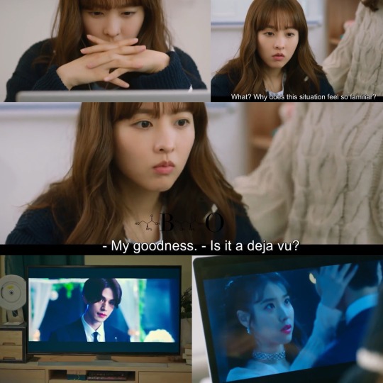
Gu Won, the guardian demon, was a mishmash of characters from various supernatural dramas. His personality, appearance, and even punishment seemed like something taken right out of "Goblin", "Tale of the Nine-Tailed", and "Doom at Your Service." Beyond his Thanos-like finger snap and cross tattoo, there was very little that made him unique.

For a writer who criticized goblins, nail-tailed foxes, grim reapers, and vampires, Choi Ah Il failed to differentiate her demon. Gu Won could've been a distinctive supernatural character with his own unique backstory or even a different style, but instead, he felt like a Frankenstein creation of well-established supernatural creatures. Ultimately, I was left to wonder if the writer or even Gu Won himself knew who he really was.

In my field, we constantly aim to create innovative and original ideas. Therefore, I understand the fear that can come with breaking new ground. For Choi Ah Il's first fantasy drama, the fear of her original ideas not being good enough might have led her to heavily rely on existing works.
My advice to Choi Ah Il is to have more confidence in both herself and her ideas. When we put our entire heart and soul into our work, our sincerity and passion will shine through, making them more likely to be appreciated by others. We should embrace all of our "crazy" ideas instead of plagiarizing others' work. Even if our idea doesn't work out, at least we know we gave it our all. And this, to me, is infinitely more fulfilling than imitating others.
So in conclusion, "My Demon" had the potential to be a great fantasy drama, but it seemed to copy too much from others' works. Whether it's an issue of inspiration or outright plagiarism, the drama left me wondering what ideas truly belonged to Choi Ah Il. As viewers, we deserve to experience a writer's unique voice, not a patchwork of borrowed elements hastily stitched together. Going forward, I'll probably give this writer one more chance to improve her scriptwriting. I must add that if it weren't for the great cast and their impeccable acting and adlibs, this drama would've been doomed due to its messy plot and lack of true originality.
Below are some scenes and concepts from other shows and movies that are nearly identical to the ones in "My Demon". I'll let you decide for yourself if you think the writer of "My Demon" was inspired by other's works or simply plagiarized them.
(Note: I might add more later, but it's a lot of work to go through each show and screenshot everything and then compile them in a collage)
p.s. I'll post my review, thoughts, and analysis for Eps 15-16 in a few days!
Goblin The Great and Lonely God
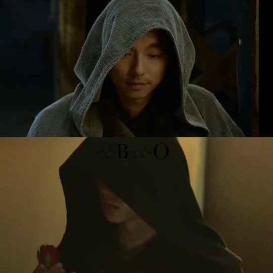
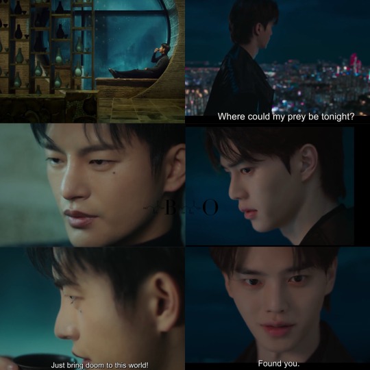
Hooded supernatural
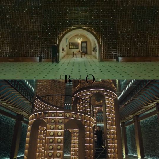
2. Objects that represent the end of a human's journey...clocks instead of tea cups
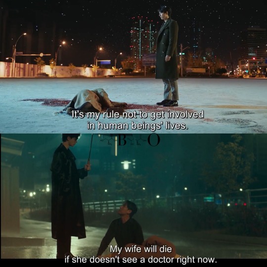
3. The mother has complications with her daughter's birth and is saved by a supernatural being
4. In the past, the FL dies, ML kills a bunch of people, and ML ends his life. ML has memories of his past sins erased. As punishment, ML is turned into a grim reaper character.

Others:
The quote Madam Ju said in Ep 3 about plants and seeds was similar to the one said by Ji Tak in "Goblin": Humans have four lives. A life of planting seeds, a life of watering seeds, a life of harvesting, and a life of using the harvests.
The ML's had blamed God for all the obstacles in their lives and when they finally got a chance to talk to God, God told them they didn't have all the anwers to their questions and that they didn't know everything similar to God in MD.
The FL dies at the peak of her happiness similar to how in MD, the FL's parents died at the peak of her happiness.
The FL in "Goblin" was the key to ending the ML's life as an immortal just like how in MD, the FL was the key to making the ML human.
Tale of the Nine Tailed
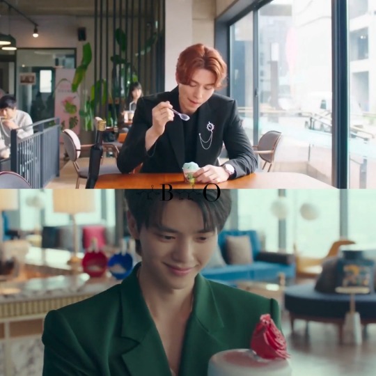
Supernatural ML has an obsession with desserts
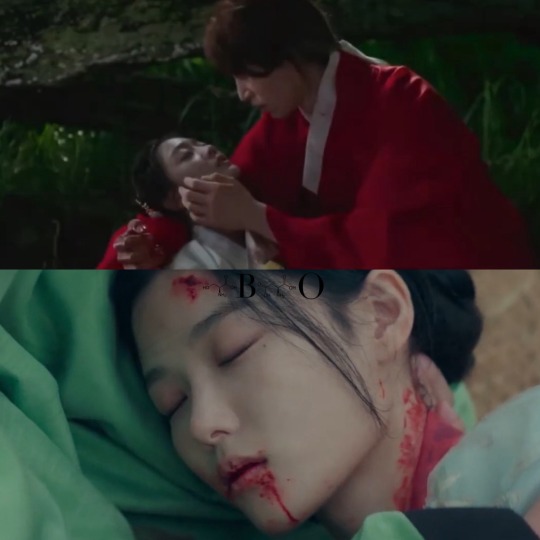
2. FL died in the past to save the ML
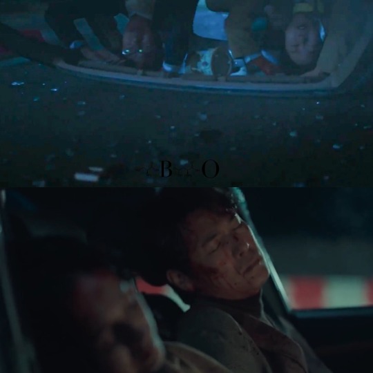
3. FL's parents is involved in a car accident on FL's birthday (9th birthday in TOTNT and 10th birthday in MD)
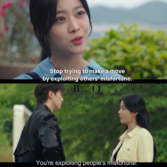
4. Wishes Granted By The Devils

5. Wishes and Exploiting Other's Misfortunes to Survive
6. FL wears object and remembers tragic past life

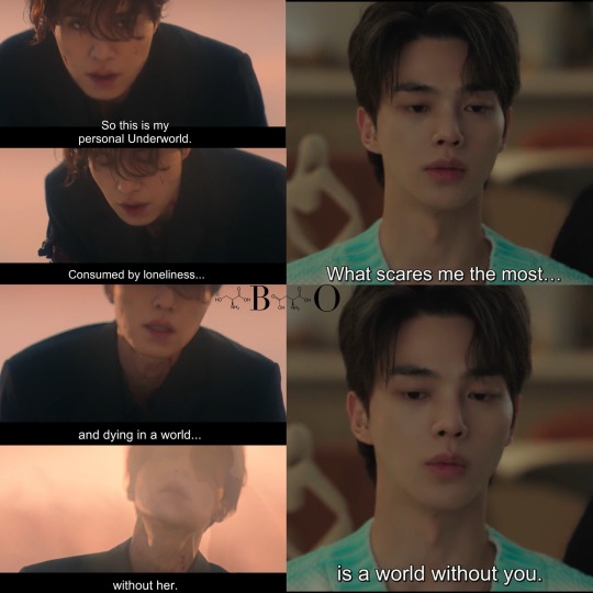
7. Personal Hell is being in a world without the FL
8. Working for the Divine as Their Best Performer

9. Mother-like Figure is a Goddess
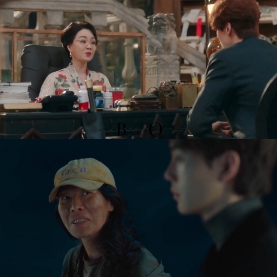
10. Wearing Two Wedding Rings

Others:
In "Tale of the Nine Tailed," The Almighty granted Nine-Tailed Foxes or Gumihos various powers, but they were bound by one rule: they must fulfill their end of the deal/contract with humans or face death. This rule aimed to prevent Gumihos from murdering humankind. Similarly, in "My Demon," Gu Won faced a similar fate. If he didn't make deals with humans, he would die. Additionally, if Gu Won murdered humans, he would also face death. In both cases, rules and contracts were established to prevent supernatural beings endowed with god-like powers from killing humans.
The concept of wanting to live or die together in TOTNT was also present in MD
In TOTNT, the FL tried to protect the ML, but ended up dying. In the present, the ML made it a mission to protect the FL to prevent the same tragic fate from happening. ML ended up saving the FL in present but died in the process...and then ML came back to life just like in MD.
ML in TOTNT came back to life/was reincarnated as a mortal human with Gumiho powers similar to how after Gu Won came back to life, he was a human with demon powers.
Twilight
Supernatural leaves human because they hates their monstrous nature

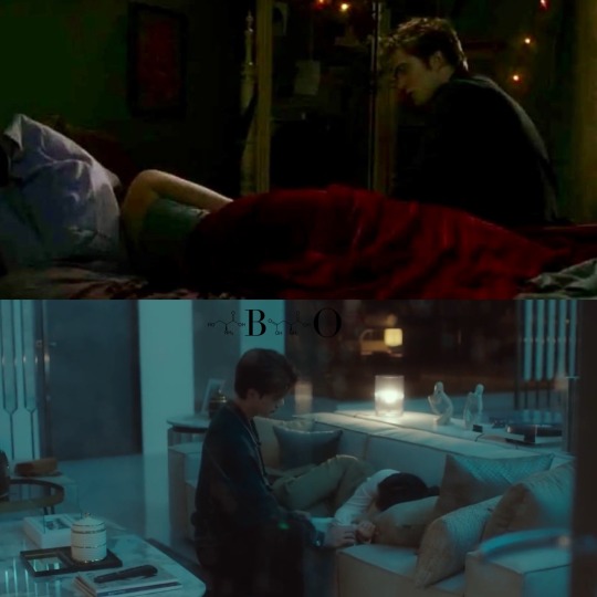
2. Supernatural watches their human sleep
3. Human is kidnapped to draw out supernatural ML

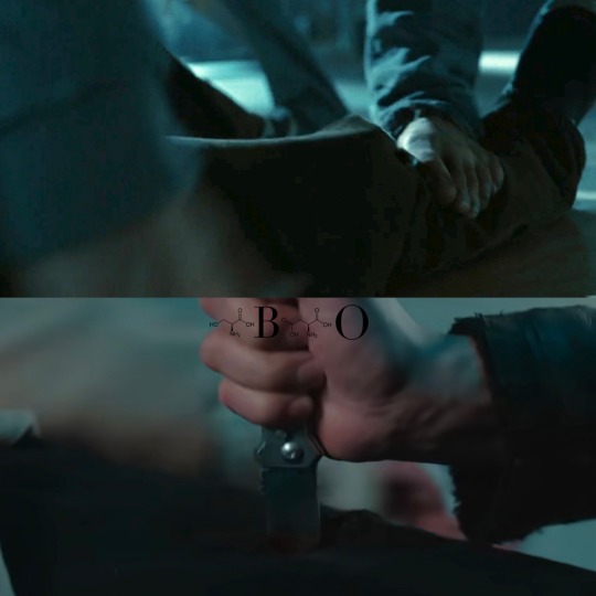
4. Human gets a leg injury during kidnapping
Others:
Gu Won played "Clair de lune" just like Edward did in Twilight
Doom At Your Service
Listening to others' wishes and meeting a wisher that would change their fate
2. Beginning of a new journey filled with hand-holding, bubbles, and water
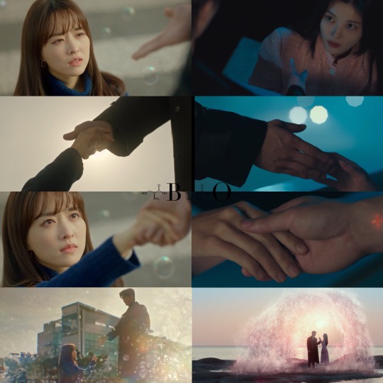
3. Necessaity of holding hands/wrist to recharge

4. Creating a dream of the FL's deepest desire

5. Celebrating a supernatural's birthday
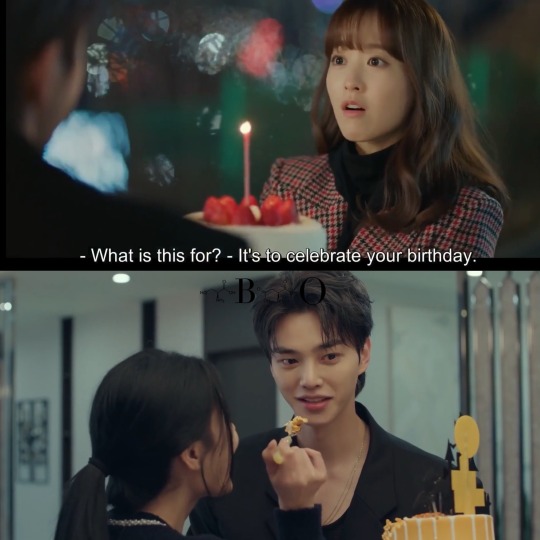
Others:
One of the major themes in DAYS was choices just like in MD
Hotel Del Luna
Fireflies by the lake
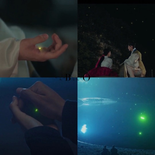
Others:
FL's name was Man Wol (means "Full Moon") in HDL and FL's name in MD was Wol Sim (means "Moon Heart")
#my demon#do dohee#gu won#kim yoojung#song kang#jeong gu won#tale of the nine tailed#goblin the lonely and great god#doom at your service#twilight#eclipse#new moon#breaking dawn#grim reaper#lee yeon#kim shin#myul mang#there are probably grammatical mistakes
108 notes
·
View notes
Note
After recovering from the doomed yuri (he said, like a liar), I had a moment to think about a little detail that I'm not sure was seen again or addressed at all?
In the mission where we go into the cache copy of the Infinite Forest, there were 4 doors in the central room.
One led to Saint-14's Tomb and the other led to what would be the Encore area. But I recall the other 2 doors had some distinctions from the others (clearly remember one having what seemed like scorch marks and/or ice?) that were inaccessible.
....What's up with that?? There was speculation about where those could lead, but then I don't think we ever went back there to check?
Of course, I could just be misremembering things (it's not like my heart was mercilessly torn out from my chest, no no. I'm very capable of rational thinking at the present, yes)
No you remember right! They're there, I went batshit insane about this when I first got there. Took additional screenshots on my other visits and wrote up my observations in one of the posts, but I'll drop the screenshots here again because they're better quality/angles.
The icy gate is Europa gate. It literally uses the same textures and ice and snow:


Normal Sol Collective Vex come out of that gate during the fight, aka the ones you'd find on Europa. This isn't too big of a deal overall because those Vex are just the standard Vex units in the system. However, the other gate? The grassy one? That's the Black Garden gate:


During the fight, Sol Divisive Vex come out of it. This means that the Europa gate doesn't just have random Vex, it's like that on purpose, otherwise this one could've also had the Sol Collective, rather than Sol Divisive. The distinction between them does matter. Could just be for the purpose of showing off different units and all; not necessarily some huge hint but still. I don't think I'll ever stop thinking about it.
It's a really big area with a lot of stuff that's really unique, such as these various gates. It hasn't been used for anything other than this mission. Was it just a nice setpiece for a really important mission or is there something more here that might be revisited? No clue, but it looks like something that could be used at a later date.
You can return here from Encore, but I don't think it's intended. You can't come back when you're at the start of the mission; there's a turn back zone. But when you return to the starting area while doing the secret chest, you can go back fully to this room. And it's a little weird. The radiolaria pool on the floor is not moving or damaging you, for example, which means that it's not intended to go back. But if you want to go explore the area, you can!
I have no idea if they ever plan on expanding on this. The whole idea is super intriguing to me. Nessus has these "archives" that can apparently go to different places? At least Vex-controlled ones like the Black Garden and Europa (I'm thinking it's possibly connected to the Nexus/Glassway). Can these be tuned to make other areas accessible, even if they're just archived? And obviously a really peculiar detail is that they specifically use the Infinite Forest portal, including being able to go to the Infinite Forest archive, in the case of Saint's tomb at least.
Obviously this went beyond the scope of this season, but when it comes to the Vex and their abilities and options, I am very intrigued by this whole area and what it may be capable of. Also, better image of Descendant Wyverns which are unique units made only for this mission (that I am aware of):

Used only once, here. They have to have made them to be used at some point again in the future.
Certainly one of the most fascinating areas that just looks like something other than simply a setpiece for a one-time mission. The whole concept of it is really intriguing as well because if we could possibly access some of these other archives, could we learn more about the Vex and their plans? Uncover some of their secrets? Find a way to fight them better? Do these archives contain information about the actual places like the Black Garden and Europa, or are they just archives of simulations from the Forest? Or both? Also, which collective controls this archive even? One of the gates leads to the Black Garden and Sol Divisive isn't on good terms with the rest of the collectives, so how are they dealing with that?
These are questions for another day, I suppose. *punches through the drywall*
#destiny 2#vex#nessus#ask#long post#vex scholars and infinite forest scholars HATE it here and are killing themselves!#we need to go more in depth about the vex some day. please#like what the hell is all of this#the archives........... i need to know#NOT to mention that any sort of connection to europa immediately makes me think of the glassway portal and volantis#i know it's hard to actually make something plausible in how we deal with the vex. they're just so complex with the time shenanigans#but still. i want it. i want us to deal with the vex more. and like. figure out what is all of this that they have
22 notes
·
View notes
Note
can you do more Mario scenes? I really enjoyed your first post xD
Yes of course! I'm so glad you did, and I'd be more than happy to do some more posts about Mario game scenes!
Now, originally I had thought to keep it to more obscure games, or at least games that aren't talked about as much, like Super Mario 3d world. But I'm very stressed and exhausted at the moment, and I'm indulging with one of my favourite Mario games, so perhaps....
Overly Analyzing Luigi's Mansion 3; Mario Rescue cutscene
All screenshots taken from this video (hence the watermark, sorry, I cant record it myself)
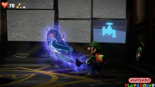
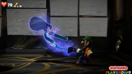
So, in order to rescue Mario, the player has to defeat the hotel owner, Hellen Gravely in her office. Each boss ghost has their own unique animation before being sucked into the Poltergust G-00, and hers is to demand Luigi pause long enough for her to apply her make up. Queen moment, if I'm to be honest.
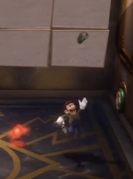
Luigi also has a celebration animation after he defeats ghosts and bosses, and here he tosses his hat off in celebration. It's such a cute moment; he's been constantly terrified in this haunted hotel, but he's so proud of himself for conquering this particularly scary obstacle!
Now, the main reason I'm looking at this scene today. Luigi uses the Dark-Light feature of the Poltergust to rescue Mario from the portrait he was trapped in. Said portrait was hanging up in Hellen's office, and she used it to taunt Luigi to come fight her to save his brother, I should add.

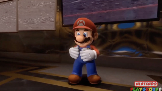
Mario falls from the painting and is seemingly dazed and confused at first. Unlike in the first game, the portraits here are frozen, unmoving images, so it takes Mario a moment of checking out his body and arms to realize he's free.
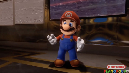

The second he looks up at Luigi, though, he instantly lights up. I recommend you check out the scene for yourself, because the way he bounces up and stretches his arms out as he goes "OH YEAH!" is so cute and expressive. They really outdid themselves with the cutscenes in this game.
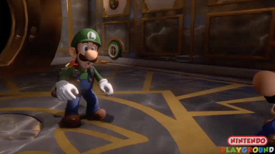
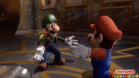
Mario runs over to Luigi, exclaiming "Way to go, Luigi!" and his joyful energy is immediately returned by Luigi. Luigi spreads his arm, happily exclaiming "Mario!" while Mario jumps into his arms and just. Look at them.

Look at them.
(I had to find a gif of this specific moment because screenshots would not do it justice)
I can't even begin to describe how happy this makes me. Mario jumping right into Luigi's arms like it's so natural and common for them to do, Luigi's leg lifting up as he catches Mario, Luigi holding Mario up for a split second, Luigi's loud "MARIO, hey bro!" it's so tender and wholesome. This is the kinda sibling energy I wanna see with them!
There's so much display and affection and trust on display here in just a few seconds of animation. And there's just something about Luigi being the one to do the hug lifting that's just, so cute. Chefs kiss, no notes, perfect scene.

Luigi sets Mario back down on his feet, and I love that this shot allows us to see Mario's perspective. While this is overall a very joyful and upbeat scene, I think it's nice to also show Mario getting some much needed comfort after his third time being rescued from a portrait in the Luigi's Mansion series, poor guy.
Very briefly, before they step back, Luigi is also shown patting Mario's back with his hand. Again, even though Luigi has navigated this hotel scared out of his mind, the fact that he's shown to be consciously giving his brother some show of comfort is adorable.
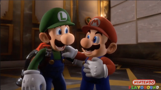
Luigi steps back and they both laugh, Mario placing his hand on Luigi's shoulder. They're both equally happy to be reunited! Smaller note, but Luigi appears to be ever so slightly bending his knees, probably to be closer to Mario. Yes the height difference between them really isn't that noticeable, but I'll take what I can get, okay?
For a second, the scene lingers as they simply stare at each other in relief. Then Luigi seems to snap back to it, having a small "wait a minute-" moment as he looks at the camera.

Immediately, Mario's smile drops too, and his hand drops off Luigi's shoulder as he straightens up. You can tell Luigi kinda forget where they were for a moment, probably because of how relieved he was to see Mario again, and now he's remembering that oh yeah, they're kinda stuck in a haunted hotel with a giant Boo that specifically has it out for them.

Luigi grabs Mario by the shoulder and exclaims, "Come on! This way!" clearly referring to Professor E Gadd's lab.
A bit of context for those who haven't played the game; before rescuing Mario, the player rescues the three Toads who also accompanied them on the vacation trip to the hotel, and every time Luigi escorts them to the elevator so they can stay in E Gadd's lab, safe and sound from the ghosts. So we can infer Luigi's immediate thought was to also get Mario there, so he wouldn't be in danger anymore :'3


He keeps his arm on Mario's shoulder, and grabs his other hand to literally start leading him in the direction of the elevator. Which is just.... so precious. Literally "I just got you back and you are not leaving my side until I know you're safe" energy. They care so much about each other guys. I love protective big bro Mario with all my heart, but protective Luigi fretting and worrying over Mario's wellbeing is so special too.
However, unlike the Toads who were more than happy to stay in the safer lab, Mario has other plans.

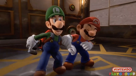
While wiggling out of Luigi's gripe, Mario corrects him with "Ah ah, ah ah, this way!" and pulls him back into the office. Luigi's confused, and his hand reflexively almost reaches for the Poltergust since they're heading back in the direct of danger (or it could just be his arm swinging back from Mario's pull, but again, over analyzing.)

The camera pans over to reveal the wall with the portrait Mario was trapped in on it.

Mario turns back to Luigi, clearly gung-ho and ready to go. We don't see much of Luigi's face, but I like to think he had an "oh no, not this again-" expression, because he knows exactly what Mario is about to do.

Mario gestures over his shoulder with a "Come on!" and takes off, leaving Luigi to startle and raise his hand. Here we get their classic dynamic; Mario, head strong and determined, running recklessly right into the action, and Luigi, timid and cautious, taking a moment to really sit and think about the situation.
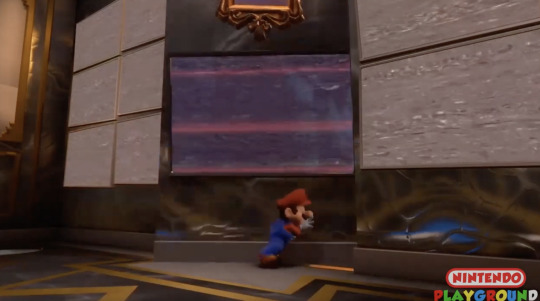
Mario throws himself at the sliding wall and pushes it aside, demonstrating some serious physical strength. That's a pretty thick wall, with a portrait and tv screen on it to boot, but he manages to throw it open fairly easy.

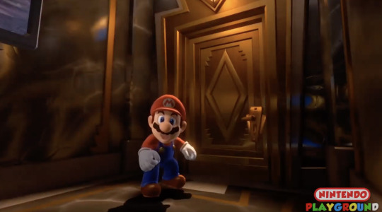
Once past that, we see Mario stumble a bit from the momentum of pushing the wall. He immediately sets himself upright, gesturing again for Luigi to "Come on!" without much of a pause. Again, so much character on display here; Mario is flinging himself right into the action, and while he isn't particularly clumsy, he's practically stumbling from how fast he's pushing himself.
You can read this as that's simply in Mario's heroic nature - to run right into danger without so much as a second thought - but you can also read it as him being ecstatic to be out of that portrait. Even though he knows at this point that King Boo is waiting for them and Princess Peach still needs saving, he's still smiling and urging Luigi to follow him, like they're on an adventure. This is much more his speed, as opposed to being the one needing a rescue.
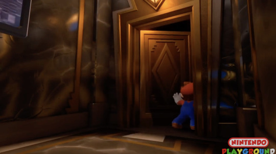
So Mario opens the door, not bothering to actually wait for Luigi, and continues on ahead. I read it as a bit of his impulsiveness with charging ahead, and also as trust that Luigi will follow him anywhere - albeit at his own pace.
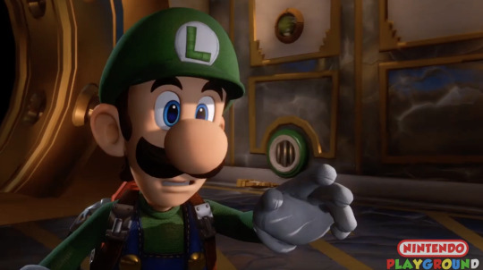
For a split second, Luigi hesitates with a confuse "Mario?". Even though he knows his brother, he probably wasn't expecting Mario to bounce back so quickly. But hey, if his brother is still willing to forge on ahead even though he just escaped a trapped portrait, Luigi can't hold himself back either, can he?
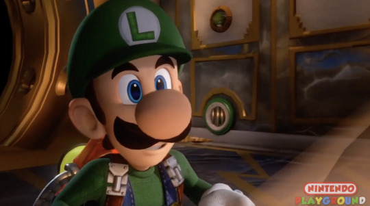
He grabs his flashlight and exclaims a energized "Okay!". Again, keep in mind that this whole game, Luigi has been terrified out of his wits and scared of every obstacle in his way. But now having his brother back has him grinning and ready to face the challenges up ahead. The way they inspire courage in each other can actually be so personal-
Even though Luigi's Mansion 3 came out first, and the two don't really have a lot of connections outside of being based on the same property, I can't help but connect the new movie's "Nothing can hurt us, as long as we're together!" theme to this scene here.
Such a good scene, great animation and personality on display. Literally my only complaint is that I want more of well thought out cutscenes in Super Mario games in general.
Oh, and more bro hugs. Definitely more bro hugs.
#Super Mario bros#super mario#smb#luigi's mansion#Luigi's mansion 3#mario#luigi#snake talks#this scene means the world to me I would KILL for more cutscenes like this in Mario games#If you guys want more of these or any specific scenes pls send an ask! these are so much fun :3#asks#also since you didn't specify anon I chose this game I hope thats ok!!#ive been having a rough few days so I needed to gush about Luigis mansion to keep me sane loll
132 notes
·
View notes
Note
Hello!!!!
I just wanted to come on here and say that I love Delirium and your writing!!! It's so amazing how you managed to write such a rich and complex story without having it shoved down your throats or just underperforming. There are many things I loved about Delirium that I could go on and on about but I'm just going to settle on two things.
One is how I loved how Crow was written. Idk how to explain but I love anyone can imagine themselves in it. They are very ambiguous to the point where you can imagine what they would wear and not have to worry about if you can see yourself in them. A little rant incoming, but I've never liked how many authors always had a set image of their mc/reader in mind. This is different if regards their personality (we can't a boring mc can we?) but this is about how the author writes what the mc puts on or describes certain aspects of their body (hair or body) and this always set me off from most stories. Im sure this is such a small thing to get peeved over, but there many people that aren't included in that image of an mc an author has. When I reading Delirium, I was surprised on how Crow's appearance was never really described unless it was clarify wounds or things that happened to them. It's also amazing how Crow still has personality and yet is able to be imagined as anyone! Honestly, thank you for writing Crow/mc so ambiguously, ik this probably something stupid to thank you for but I'll thank you a thousand times for this.
Next would be how you wrote the relationships between the proxies and shades (I'm not if that's the right word) and overall the occupants of the mansion. It's very unique and interesting how you decided to write them actually caring and having fun with each other. A majority of the creepypasta fics I've read mostly involve all the proxies and others absolutely despising each other. Seeing each other as coworkers and nuisances. While I'll admit there are many fics out there that execute this perfectly, it's honestly boring and overused to see the proxies hate each other and yet live in the same house which honestly never made sense to me. Reading how the trio and others look out for each other, viewing them as friends and even family is honestly so astonishing. You managed to write the Slender Mansion trope that was loved for it comedy and crack and turned it into something that was still on crack but had the serious element that comes with serial killers working for an eldritch being so perfectly. It's also crazy how you wrote the characters as well. I mean the main trio in most fics would be written to hate each other and have that "I hate my coworkers but we have funny banter once in awhile". It's funny but I think prefer your version of the trio. In reality, they're just a bunch a mentally ill men who find solace and peace with each other. While they do banter, it's more light-hearted and teasing. How they're written with others is also amazing. The scene with Ben was pure comedy to me. Usually they argue and tell the other to fuck off but seeing how they interacted with him was so cool. I adore how you wrote the proxies and others together and I cannot wait for more.
I literally cannot for Delusion to come out. It's been on my mind for so long I'm pretty its evolved itself into my brain. I do have some questions regarding the story but please don't worry if you can't or won't!
1.) Are the Acts going to focus on something specifically? Is there a clear plot going on? An example could be like Act 1 focusing on Crow adjusting to their new life and then Act 2 being their victims or something else. I'm sorry if this was worded weirdly!!!
2.) Is Kate going to be a main part of the story or just someone who appears in one act? Is she going to put Crow into some trouble? Will Crow feel inclined to live up to her legacy or just feel indifferent?
3.) How are the others (proxy trio and occupants in the mansion) going to react to Crow now being part of the family? Is there going to be resentment towards them joining in? Are they going to be compared to Kate? (I'm not sure if I can ask this but doesn't hurt to try.)
4.) Is Crow going to retain their old personality or just be an empty husk that grows into their personality? Will they keep likes, dislikes or preferences? Or have to learn about their self all over again?
5.) Who are the love interests going to be? Is there going to be little or a lot? Will they come from beyond the Slender Mansion?
I think those are all the questions I have. Please feel free to not answer them if they are spoilers to Delusion or ruin the element of surprise you are planning!!!
I also have some hc's regarding Crow which I'm going to keep short.
1.) I like to think that Crow starts to collect shiny things or just starts to collect in general. Part of their namesake after all.
2.) From what I remember, crows are known to be super intelligent and remember the faces of those who are kind to them. They even give gifts to them. Id like to think that Crow remembers everyone. The ones who were kind, mean, etc. They won't leave gifts but maybe they show in subtle ways that they remember and appreciated it.
This is so long. I'm so sorry if this was super chunky but leaving long comments and asks is my love language to all my favorite authors. I hope you have a good day or night and take care!!!!
I am grabbing you gently by the face and looking you deeply in the eyes before planting a big messy kiss on your forehead!!! I am taking you by the hands and taking you to the aquarium!! We will go to the touch tank and giggle about the rays splashing us with water!!!
I was not expecting such a wonderful dissertation in my inbox! Your words mean so, so much to me. There's so much love and care I've put into Delirium and to see that others are able to get it is frankly, staggering. I'll be honest, I never expected the reception I've gotten on Delirium. Hoped for it, yes certainly! But it was like a pipe dream. Please lend me your ear for the ramble that I will now bestow upon you as a reward for your lovely, lovely words.
Crow was/is my best attempt at ambiguity because I, like you, did not like the heavily intended imprint that other authors put on reader-inserts. Power to them, of course, it's their sandbox-- but as a nonbinary person, The intense fem lean in so many of them really made me uncomfortable. Not to mention the explicit whiteness present in nearly all of them! I've been trying to lend an ear to the BIPOC parts of the fandoms I'm in and one thing that really stood out to me was the fact that many authors don't notice that the way they use descriptors implies that the reader is White. It's because they are White themselves, of course, but it really hit me that internal biases can come out in such subtle ways (is it a bias? Probably not the right word, but I'm more talking about the way one thinks about themself and how it translates into text, with a racial focus).
Then I made a friend who has Alopecia and is bald, or nearly so. And I realized that so many reader fics put emphasis on the presence of hair. This also ties into the BIPOC exclusion, because a lot of that description also implies that the hair is straight or wavy, not curly or coily.
So, I've tried my best to read about it and eliminate those unconscious descriptors from Delirium. I'm certain its not perfect-- most people have hair, for example, and with different textures, so it's hard to not mention hair at least once-- but I tried to give it the best I've got with a vagueness that could imply almost nearly everyone.
It's harder with personality, with Crow's reactions to things, with the family set up, with the relationship with Cathy (I've gotten lots of comments regarding these); but as you said, no one likes a boring MC, and I'm okay with these things being picked over. They're integral parts of the story I'm writing, after all-- but what Crow looks like? That isn't.
(I'm open to constructive criticism, of course. The internal biases ingrained into us through the dominant culture are deep set and require constant maintenance and vigilance. Learning comes from both the self and others.)
Yes! Yes! The relationships are so important to me!! Gah! I've put these little guys in the spin cycle of my brain for so long!! At this point they have been so blorbo-fied that releasing them back into the wild will certainly lead to their death, so I keep them safe in their enclosures and make them get along :] -- Shades is the right word, by the way! Anyone not a Proxy is a Shade.
The ever-present tension and fighting is interesting, yes, because conflict is tasty-- but as you said, this does not bode well in a living situation. I've done quite a few instances of close living with others for periods of time (camping, mainly), and with many types of people. Some chill and some not. And despite the not-chill ones being there and causing problems, those problems didn't happen all the time. When a group is so big, there comes a point where the members get along because they have to. Social pressure does a lot, but the shared existence does as well. No one is bad or mean all the time.
Now, murderers 'employed' by otherwordly beings is a different barrel of fish, of course. But we treat our crack seriously here. How good is your 'business' of your 'employees' are constantly yelling and beating the shit out of each other in front of the 'customers'? This isn't a Waffle House. It's a respectable manslaughter establishment. This is a Waffle Home.
And here I burst into tears and blubber nonsensically on the floor-- hearing someone say they like my interpretation of the Proxy trio dynamic makes my week. My month. My year. My goddamn lifetime.
"In reality, they're just a bunch a mentally ill men who find solace and peace with each other"
You!! You get it!! You see it!! My tears could replace the ocean. With all they've been through, everything they've seen and experienced together, the horrors they go through every day-- in the end they have each other. They rely on each other. They trust each other. They bicker and banter and argue and fight and after that they put each other back together. They help each other hold their broken pieces. Their relationship is messy and brutal and harrowing and so, so good. Companionship blooms on the battlefield. Devotion flows out the trenches. Fealty coats their bullets. It fills their bunks. It keeps them warm against the icy cold.
Okay, enough weeping.
The scene with Ben was quite important, in my eyes-- from what I remember, there hadn't been any sort of scene with the Proxies and the other's in their Family interacting (Jason isn't part of their Family, to be clear). It's an important scene because it's stage dressing. It shows you what goes on, expands upon the fanon-atypical characterization. To bring back the 'business' metaphor-- the Proxies are like supervisors. They take orders from management (their Lord). They must, then, be at the very least cordial with the workers (Shades) to keep the business operating. In my world, in my interpretation, they're all in the same boat. They're all trying to make it to the end of their shift. They have to work together, they're a team. So, at this point, when everyone's been coworkers for so long, everything just kind of mellows out. They've had their disagreements and arguments, there's been grudges, etc. But everything's chill now.
At least until the new hire arrives. Now that's certain to stir things up :]
Responding to your Crow headcanons wayyyy at the bottom:
1. This is an excellent one because I love trinkets and it's such a fun way to tie into the name symbolically. This is going into the character sheet for sure.
2. Memory is a complicated subject here, but I will say this plays in nicely with what is to come :]
(I'm also always, always rabid for thoughts about my book and it's characters, so feel free to lay more headcanons on me!)
---
As always, I write way too much. Answers to your (wonderful) questions under the readmore:
1. Not weird! There is a clear, overarching plot that builds throughout the book; the 'Acts' are essentially the more minor plot arcs that the characters will go through, the kind that flows into each other and both builds on themselves and that bigger plot behind them. Your examples are quite similar to what I'm thinking! Act 1 will be about Crow adjusting to their new life, yes, but also other things. The other acts, well... You'll see ;]
2. If I say nothing, that's almost like saying something, isn't it? ;]]
3. Resentment, yes, as well as curiosity, anger, eagerness, bitterness, and much more. Some of these feelings will change for the better, some worse. Crow will most certainly be compared to Kate-- they're her replacement, after all. Some won't care about that, and other's will be incredibly hurt.
4. A little bit of both-- Crow will retain parts of themself, and have to relearn many others. Some things will never quite come back, and some new parts will come to light. Think of yourself as you were a year ago. Are you the same? What about five years ago? It's a similar thing if you ignore all the eldritch-bullshit going on.
5. This is a liiiiiitle harder to answer than the others (genuine rant/discussion incoming. Sorry):
I've been thinking on this exact thing for a long while. I don't really... Have a firm grasp on what romance is or looks like. When I first started this project my goal was for Crow to get all romantical with the Proxy trio (Masky, Hoodie, and Toby) because I thought I wanted them to kiss me on my hot mouth. That was like, seven to eight years ago. Not saying I don't want to mack on em still! Just that my personal life journey has meandered along until I had to take a good, long look at the story and wonder what I wanted it all to say in the end.
There's a lot of hard, heavy topics in Delirium. There's gonna be a lot more in Delusion. We're talking about severely mentally ill serial killers and Lovecraftian horrorterrors here-- it's gonna get pretty ugly. And as I've been pulling together the plot and writing the characters and constructing the end, and thinking about my own life, I realized something.
Romantic love is always placed on a pedestal. It's considered the final destination, the top of the pyramid. It's what everyone wants, what everyone needs to feel complete. To be complete. To be fixed and healed. Not only that-- it's what you should want and need. It's what should fix and heal you. And if you don't-- if it doesn't-- something is terribly, terribly wrong with you.
At least, that's the current zeitgeist (the defining spirit or mood of a particular period of history as shown by the ideas and beliefs of the time, thanks internet). But that's not really true, is it? It isn't the reality for a lot of people. It isn't for me.
I may be philosophizing and queer theory-ing a little too hard over a Creepypasta reader-insert fanfiction, but it's what I feel. For many real people, and for these characters, romantic love won't save them. It can't. But does one need to be saved? Does one need to be 'fixed' or 'made complete', especially by love? Who says they are broken, or incomplete in the first place? Is that what I really want to say here? Not really.
So there was no romance in Delirium. And if you (I'm using the non-specific, all encompassing you here) are hoping that there will be some in Delusion, I'm not sorry to say there won't be. Not in my opinion, at least. Because, really, there's gonna be parts in Delusion that people can construe as romantic. It's not necessarily un-romantic-- there's gonna be kissing, hand holding, cuddling, sharing clothes, making food for one another, sharing interests, sharing secrets, entwining lives inseparably, etc. Some can argue that these are actions reserved for romantic partners-- but I do all of these things with my friends. Others in real life do as well. What delineates romantic love from platonic love? Sex? Certainly not. People have sex with strangers they'll never see again. Are they in love? Friends with benefits exist. Are they in love? Some married people, when they grow old, stop having sex. Are they no longer in love? Some people don't have sex until after being married. Do they not love each other? Some people date for several months or years before having sex. Were they not in love until then?
Or, more importantly-- did they not care for each other until sex was put in the equation? I think that's something that is-- incorrectly-- tied to sex. That one does not actually care, or trust, until they have sex.
Do you not share your food with your friends? Your secrets? Do you not spend time with your friends? Go out to eat with them, see movies, play games? Do you not share your interests with them? Your art? The vulnerable, fragile sides of you?
A cat shows you its belly. A dog stares at you, pressed as close to you as possible. A lizard closes its eyes as you watch it. A deer lowers its head to graze. A snail gently rasps its radula against your skin. A caterpillar inches across your finger. A mouse cleans itself in front of you. A crow brings you gifts.
How is that not trust? How is that not care? How is that not love?
I think it's one of the fatal flaws of reader-insert fanfiction. Generally people expect romance with these things. How do I, exactly, essentially, 'advertise' that Delirium and Delusion are an insert fic without an x or /? The ampersand (&) has been making its way through the general ecosphere, but I don't know how well it translates. I don't want to falsely advertise, but at the same time I don't want to miss readers who may genuinely like it, who will read and be satisfied in the end even if there's no true romance.
So, to finish: there will be no love interests. But the original vision stands: Crow will have a deep relationship with Masky, Hoodie, and Toby. They will be close to others as well (that may be spoilers, so I'm keeping it vague).
Thank you, again, for your words. For taking the chance and reading my work. I hope to make Delusion live up to your expectations <3
#mycelium netw0rk#mushroom musings#This is two thousand words. Great heavens#Brevity is the soul of wit and I am unfortunately witless#btw we are getting married. Spring wedding.#Delirium fic#Delusion fic#realizing I'm the creator and thus any headcanons I agree with makes them canon. Rubs my hands like a fly
10 notes
·
View notes
Text
SPOILERS FOR ALL GAMES
The Quintet Trilogy
I played Soul Blazer and Illusion of Gaia recently, and I just got around to Terranigma. I wanted to give my quick thoughts on each game cause they've been on my mind heavy as of late.
Soul Blazer

The beginning of this journey that took me too long to finish because I kept getting distracted. To start with It's super simple, but I love that the most almost about it. The gameplay loop of going into a dungeon slowly saving souls, unlocking a shortcut to the main area{which sidenote gave me the save feeling of finding a shortcut in a soulsborne game}, getting something you need to progress or simply talking the souls you have saved and then continuing with level despite not being the most unique structure for a game was so satisfyingly executed that it was addicting. Speaking on those the fact that you had to save everything's souls including animals and plants not just people gave me more of a feeling of saving the world than most other RPGs. I also love that said worlds atmosphere is so melancholy I wouldn't call it said but there's an air of sadness that I appreciate. Also the soundtrack is genuinely amazing better than even Terranigma's don't @ me.
Extra: Favorite song from said banging soundtrack
youtube
Illusion of Gaia

For me this one is probably the most polarizing. I remember when I first played it, I wasn't really impressed it didn't really impact me. But looking back, the game has a lot more I enjoyed than I realized. Out of the trilogy it definitely had the best dungeon design. Having to traverse the different environments by swapping between you're different forms to solves puzzles was definitely the highlight for me gameplay wise . The story, which at first I didn't really care for, had a lot of somber moments that looking back I really enjoyed. The highlights were definitely Will and Kara growing closer while floating out at sea. The Incan ship, seeing this remnant of a civilization unknowingly living out their last days, was truly tragic. I also have grown fond of the overarching story with the meteor and the remaking of earth. At first I thought it was kind of boring, and even if it never really grasped me I grew an appreciation for how over the top it was. Pure RPG goodness. However the rest of the cast for me was forgettable. Overall not my favorite in the series but who knows maybe if I replay it down the line I'll learn to love it.
Terranigma

Here it is. The final game in the trilogy. You can tell that this is really the culmination of years of refinement of World building and Story telling for Quintet. However lets talk about the aspect I would say wasn't the strongest the level design. Don't get me wrong the combat was honestly super fun. Way faster paced than Illusion of Gaia's mostly due to Terranigma's dash attack and jump dash attack being feeling so fluid in the moment to moment to gameplay. Goes to show how much a simple change can impact a system. However the level design was a huge downgrade in my opinion compared to illusion of Gaia. Less of an emphasis on traversal and puzzles led to the dungeons feeling same-y in my opinion. However I don't think these issues significantly hurt the experience especially since the combat itself is still extremely fun.
My favorite thing to look at in games, movies, books, shit sometimes even music is worldbuilding. And I'm happy say that Terranigma's world is incredible. It brought back the premise of resurrecting the world from Soul Blazer, which were missing from Illusion of Gaia, and expands on it. Once you resurrect the world in the game you're asked to help develop them. Even if the way you help the world grow is a little tedious just taking different items to different places most of the time seeing the cities advance technologically, culturally, and economically while also hearing the villagers thoughts on the world changing was so gratifying. Plus I liked how the villagers had differing opinions on the changing world super interesting they didn't all have positive things to say and it made the world feel that much wore real.
Now the story. A lot happens in this game and I can't explain it all and I'm still a little confused on some parts, but what I can say is that it made me care. Ark the main character was so fleshed out its incredible him going through this whole journey while at times questioning what his real purpose is, only to find out that the life he has known was just a fabrication the main villain for his plan was genuinely heartbreaking. I liked the rest of the cast a lot too I found them to be a lot more likable than the cast of Gaia. I think this has to them being better developed overall even if they aren't traveling with you like in Gaia the key scenes they had were just stronger overall.
Also the music is incredible I still prefer Soul Blazer's but I see why people consider this to be one of the best SNES OSTs
Favorite song:
youtube
In conclusion all three of these games have something to offer be it unique music, incredible level design, or a beautiful story and world, I see why people hold these games so dear.
6 notes
·
View notes
Text
So, I decided to talk about Downpour DLC of Rain World, because, why not?
I'll talk only about More Slugcat Expansion part of DLC, because Co-op and expeditions that were added is just great, I don't have anything to say about them.
Also I want to make clear that everything said here is purely my opinion and I don't force anyone to agree on it, and also spread hate on anyone who disagree on this opinion.
SPOILERS!!!
So, Downpour. An Expansion, that added 5 new characters to play and 5 new campaings to expirience, and yet, there's something I don't like about it. So let's talk about everything one by one.
1. Slugcats
Gourmand, Artificer, Rivulet, Spearmaster and Saint. Five new scugs, five new ways to play the game. I really like how fun they are, really, they all powerful and unique, you have to adapt for every single one of them. But this coin has two sides. Fun and power we got, cost us the idea of vanilla Rain World, the fact, that we are almost at the bottom of a food chain, we can overpower every threat, but with pure strugle and effort, not just because we have the ability to make everything go kaboom. I can't say I dislike the gameplay of new scugs, but I can't say I purely like it. The same creatures and threat that we encountered as vanilla trio, doesn't feel the same way for new squad, they can arguebly easy kill anything. I do believe, that there is a golden line between fun and philosophy of Rain World, it is probably possible to balance every scug in a way, that they will feel more natural for the eco-system, but still being fun to play. I'm not a developer, nor a game-designer, it's just my opinion as a player.
2. Story
This is something that I started to think about not so long ago. Each of the new campaings, except Saint, has a pretty similar pattern: Go to FP, listen to some dialogue, go into new region and get your score screen. Why is it always Five Pebbles? You have to visit him in order to progress the story. Which isn't true for Hunter, Monk or Survivor. I mean, as a new player, you'll visit him to get a basic understanding of what are you even suposed to do, but when you know where do you need to go, you can get to the ending without visiting Pebbles or Moon. You could say, that it makes sence for them to go to Pebbles, because they have to receive something from him. Fixing ID drone for Arti, giving Riv the ball, opening gate to outer expanse for Gourm and taking thr pearl put of Spearmaster. For SM, I'll say right now, that it is logical for him to visit Pebbles in prder to progress, he is a messenger. Probably it is the same for Riv, but I still have a filing that it could be done differently. Though I think it should be different for Arti and Gourm. As a Gourmand, it doesn't make sence for Pebbles to give him a mark of communication at all, he could just sent him out of his can and show him the direction to the Outer Expanse via the Overseers, much like Iggy does guide Monk and Survivor to Looks to the Moon and then to Five Pebbles. For Artificer, since she's next after Spearmaster, of which visit FP wasnt happy at all and he could just lock the karma gates to FP region like he did with Outer Expanse, so no one could enter his structure and distract him. Sofanthiel (ID drone), could be more useful in this scenario, he could act as an Overseer of sorts, pointing out threat, flashing images of Chief Scav and Elite Scavs as warnings and he could lead to the alternative way into Metropolis and also, I would give player a bit different route to the Chieftain Scav arena, the route that would make a visit to Atop the Tallest Tower mandatory for going forward, and the Echo there would give player a choice, proceed with the path of violence or choose a path of Ascension, which, in my opinion, does fit the "What fate a slugcat?" phrase.
Saint is just worth a whole another post to just talk about him, because he gives off mixed signals for me. But I can say, that, I love his campaing.
Overall, I do think that downpour story is good at some points, for me at least, but I also think, that it could've been done a lot better.
3. Five Pebbles.
I do like the new character of Five Pebbles, it does waves away almost everything pre-Downpour FP showed us, byt it's still a great character with good tragedy story. Five Pebbles and other Iterators being more human-like is a good thing for me. Five Pebbles being more similar to humans with his personality is something I like, because you can grow a bond with him through out the story. From SM's campaing where he is an angry teen who just pushes everyone away, all the way to the Riv's campaing, where he is more mature, regretting everything he's done in the past, not seeking forgivness upon himself. Seeing him first time in Saint's campaing and listen to him barely able to speak is... Heavy. It is a really emotional moment and I couldn't hold the tears, looking at the way he speaks and trying to listen his favorite pearl, even though it's already showing sings of decay, slowly fading out.
4. Sliver of Straw.
It's more about Challenge 70 being uncanon. I do dislike this statement and I think, it wastes a lot of interesting things to discuss because of it. All the theories about Sliver and Saint, also about Iterator's abbilities just fell into nothing. I personally love the theory about Saint being THE triple affirmative, created by Sliver herself to ascend her and probably others, but, it just happend too early, before Sliver was able to share the news about solving their great problem, and that's why she fought back, as Saint tried to ascend her. I just love this theory and I hate the fact, that it all just nothing more than a silly headcannon, because of how Challenge 70 is considered non-canon >:(
That's all I have to say about Downpour. Sorry if there was too much hate of just straight up nonsence, these are just my unfiltered thoughts on the DLC. Also I am, by no means encouraging you to spread any form of hate towards Downpour developer team or Videocult themselfs, they all did a massive job to bringing this Expansion to life and I am happy we do have it at all.
#rain world#rain world iterator#slugcat#rain world downpour#rw downpour#downpour spoilers#rain world saint#rain world spearmaster#rain world spoilers
10 notes
·
View notes
Text
RPG Role Analysis Series #11 - Paper Mario: The Thousand-Year Door
Continuing on from my earlier post about Paper Mario 64 (Part I, Part II), I wanted to talk about The Thousand Year Door, because I think a lot of elements of the game are a second attempt at executing the concept, and as a result, a lot of the character design decisions are variations on the original game. Several party members are designed to fit the same overall role, so their differences make a nice case study. A lot of what I say will build off of my PM64 posts, and I'll see if I can fit it all into one.
One major difference that is core to the game itself: Party Members have their own HP now, so where they fall on that curve signals something about their role.
Goombella - Just like Goombario, Goombella has access to Headbonk, Tattle, & Multibonk so she sizes up enemies and can focus down one enemy (of some kinds) with good input. She swaps Charge for Rally Wink, so instead of powering herself up, she gives Mario an extra turn. Multibonk can still focus down a single enemy (and she gets access to it earlier than Goombario), but since she isn't self-buffing, it requires timed inputs for longer. Giving Mario another move can be really powerful, since he's the strongest, but Goombella's variant of an strategist character deemphasizes personal combat just that slight bit more, but essentially uses a Haste effect. You also get a permanent Tattle Log, which is a new UI option, but it's her domain, so I'll give her an edge toward the strategy side over Goombario. Her HP is dead average.
Koops - Like Kooper, Koops gets Shell Toss and Power Shell, attacking grounded and low-hovering enemies, but ditches the ability to daze enemies for Shell Shield, which protects Mario from damage (but crucially not himself). Instead of fire damage, his stronger ground-based Shell move ignores Defense, which is also battering ram-like, but really more of a cleave/pierce than bashing them regardless of Defense would be, but Shell Shield makes me want to call him a shield knight. Oddly, Koops has slightly low HP, but has 1 point of Defense and blocks 1 incoming damage, so he isn't a tank, but blocks well. This notably wasn't true of Kooper because PM64 Party members didn't have their own HP.
Flurrie - Flurrie was a fun one once I realized. As a kid, I thought she was supposed to be some kind of Boo, now I know she's meant to be a wind elemental of some kind. Her abilities at first glance seem like they borrow from Lakilester (Gale Force is similar to Hurricane, Dodgy Fog to Cloud Nine) and Sushie (maybe? Her Body Slam is like Belly Flop), but no, she's a vampire, dude. Her unique move is Lip Lock, which steals a decent amount of HP, it's a life drain ability, but consider the ones she borrows more closely as well. Her version of Cloud Nine (granted its still targeted at Mario) is reflavoured to fog? Fog and life draining are totally vampire traits. Also, Gale Force is a multi-target instant death spell, and unlike the ones from PM64, you do get experience from it instead of scaring or blowing enemies away (you do blow them away, but mechanically it's analogous to them being defeated). So Flurrie is a vampire lord that summons violent storms. Pretty cool.
Yoshi - I think Yoshi is a monk? Ground Pound hits one enemy many times, but for small amounts of damage, so it can be blocked by armor, and Stampede (though it's flavoured as summoning a bunch of Yoshis) is the same but with more hits against random enemies. These remind me of a flurry of blows-flavoured unarmed attack, with some mobility between multiple targets. Gulp is a throw that grabs the closest enemy (physical contact is a factor, because it doesn't work on enemies on fire, so it really is a grad and throw) and tosses them into the enemy behind to damage them both, ignoring Defense. Mini Egg is weird, it's also multi-hit to random enemies, but can shrink enemies? I don't know where that fits, but ultimately being Tiny decreases their Attack power, so it's like catching them off guard by battering them with consecutive small hits.
Vivian - Vivian, like Bow, can hide Mario and themselves completely for a turn (and in the overworld), avoiding damage but skipping a turn. Already thinking kind of rogue-ish for that alone Their basic attack can target anyone and leaves enemies with a burn, but in this game that's just damage over time. Vivian is surely fire-themed, but this is like your basic Poison mechanically, so another point to rogue. Fiery Jynx hits all enemies, ignores Defense, burns them, and is definitely fire elemental mechanically, because it hits Ice-based enemies for more damage, so I'll call that one elemental magic, but the pierce/apply burn(poison?) effect is also like an assassin rogue though now with a clear fire elemental component. Vivian can also mass-confuse enemies. They've got all the traits to be some kind of fire mage/assassin hybrid.
Admiral Bobbery - Bobbery is obviously pretty comparable to Bombette from PM64, and his Bomb move works the same way, and overworld ability to bomb walls is similar, but his other moves have changed. Bobbery also has the highest HP of any party member, making him pretty tanky. His new moves include throwing a set of time bombs that explode on a later turn, Hold Fast which prepares him to punish enemies with revenge damage for hitting him directly, and the move Bob-ombast which is a mass-damage explosion which also sends flying enemies to the ground, as well as flip some armored enemies. Bomb Squad's time bombs can hit flying enemies, but it's hitbox-based, so grounding them first could help with this. If enemies had enough HP to require this, a good strategy could be to set up the bombs and ground/unarm everyone on the turn they go off, though I think by then most enemies will already be finished, and Bob-ombast is expensive to cast. He could be some kind of patient trapper with a Counter ability, I'm just not entirely sure what to call him overall.

Ms. Mowz - Love Slap pierces Defense, Kiss Thief steals items, and Tease attempts to daze all enemies (which this time lowers their accuracy instead of stunning them). Below average HP. Her overworld ability helps you find items. So straightforward, Ms. Mowz is a thief rogue both in the narrative and mechanically. Her one other move is Smooch, which heals Mario, but she isn't meant to be healing very much IMO. This is by far the highest FP cost move of any Party Member in the game, and I don't think it was meant to be a reliable healing option as much as it is a way to flavour her as a femme fatale.
So that's it for TTYD! Probably I'll do Super Mario RPG some day, I'm not sure the other Mario RPGs have much in the way of character class analogues between them, but I'm not sure this works for the other Paper Mario games and I'm more familiar with the first two Mario & Luigi games where all you party members do very similar things to one another, maybe later games in the series would surprise me.
#paper mario#paper mario ttyd#the thousand year door#ttyd#rpg#game design#rpg design#jrpg#rpg classes#video games#gamecube
10 notes
·
View notes
Note
can u do aespa kissing style? pls
Karina || page of swords, the tower: Intense, full of passion; the type of kiss that takes one's breath away. She likes to tease, for sure, and steal little kisses here and there. At first, she might start off a little shy, but soon enough she gets over it and just gives her all to the other person & the moment. I think Karina also really likes it when her partners are taller than her, so she can stand on her tip toes, put her arms around their neck and pull them towards her - not only as a way of showing how much she wants them, of course, but also because it gives her a sense of power. When it comes to touching, too, I see her loving it when they put their arms around her waist and/or move their hands up and down her back while they kiss.
Giselle || temperance, five of cups: A lover of french kisses, I see… Giselle is all about the feelings, the emotions, the connection between the two individuals. Her kisses her slow, soft and gentle. Again, I think she's big into using her tongue - not only do I see her loving the feeling of it as they kiss, but also, specifically, how it feels when she touches her partner's soft lips with hers. She tends to keep her arms down, closer to their waist or might even just keep her hands on their chest, so the other person can have more control over direction and pace of the kiss.
Winter || three of cups rx, queen of wands rx: These cards took ages to come out, and the messages I'm getting are very few and short + while shuffling, I just kept feeling like Winter didn't really want to reveal much. With that in mind, I'll just go very straight to the point… I don't think she likes kissing, to be completely honest with you. She's shy and intimacy might be something that she has a lot of trouble with, and so stuff like this kinda only gives her anxiety and, as strange as it may sound, the icks? That's all I'm getting, really…
Ningning || the fool, four of cups rx: Ningning is a playful and enthusiastic kisser. No kiss is ever the same as the previous or next one; they're all unique, as if they were specially crafted by her for that precise moment - of course, all kisses are naturally different, but this just letting us know she is unpredictable and adaptable; she's not the type of person who makes the same move twice or that tends to go for the same style of kiss every time, as many do. I see Ningning being quite touchy with her partners, and enjoying it when they reflect that towards her. She likes it specially when they hold her face in their hands, touch her hair/ears/neck, brush their thumb over her lips, and such. These moments are always intimate, yet still very lighthearted, overall.
(Disclaimer: All is alleged and for entertainment purposes only. Based on current energies.)
37 notes
·
View notes
Text
Anon wrote: HELLO. I have a question on how to get past an ego trap. I had recently figured, through your blog, that I'm a high Fe + Ni user (likely ENFJ). I also have fallen to similar traps in thinking as xNFJs who subconsciously downplay the importance of other people's lives while making social connections for the sake of fulfilling social ideals.
An example of this is my bad habit of not being able to talk to people as often. Regardless of how close we were or how much my silence is making them worry, I find it hard to reach out to them. Even if I care about them and want to ease their worries. They aren't necessarily doing anything bad. They can be completely normal people who have been nothing but kind to me. Yet I still get burnt out when talking to 'the same type of person' for 'too long'.
I try to do better nowadays. It works, I've sometimes thawed my odd fear of replying just by forcing those thoughts out of my head and taking action. However... I don't fully understand how my functions are causing this behavior and which mindset I should best adopt to pull through easier. I'd been thinking to myself, "It's okay to take my own time for my own life, and it's okay to have differing tastes about the people I surround myself with, but these people are as real as me and they'd appreciate being contacted again." Other times, I think: "It's my own life and if I don't withdraw when I need to then I'll burn myself out on talking to others."
I think it's partly because of me being at a low ego stage. I lack the self-awareness of how my actions/inactions affect others.
My questions:
What are your thoughts on a possible solution?
How do the functions work in these scenarios?
-------------------
It's a good idea to do things in the right order. You're asking me to use type to analyze your problem but you haven't even figured out your exact type yet. I won't get into specifics about functions until this is cleared up. ENFJ and INFJ are not the same. Each functional stack has its own unique dynamics to understand. Each type has its own unique issues and optimal path of development. The first thing you ought to do is put in the work for a proper type assessment. The process would help you understand yourself better.
What is the problem exactly? First, you say it's "fear of replying". Then, it's suggested that the real underlying problem is getting "burnt out" by socializing. And your default solution is basically to stop socializing. Is that a good solution? No, for a variety of reasons. It interferes with the development of quality relationships. You are unable to maintain a good social support network. People might get hurt by your absence/negligence. Social isolation is an obstacle to extraverted development. Suffering the same internal conflict over and over is not good for your mental health and well-being.
You seem to be in this "ego trap" because you think in oversimplistic either/or terms: Either I choose myself OR I choose others, as though it's a zero-sum scenario. You speak as though you have no influence over how socializing proceeds. It's like you open the door to socializing and then suddenly you're just a passive victim? Perhaps this helplessness is why you choose an extreme solution like cutting people off? This cognitive pattern is usually indicative of weak Fe (which makes ENFJ less likely than INFJ).
However, that's not how relationships should work, so there's something quite problematic with your overall approach.
A healthy relationship should be equally satisfying for both parties.
A healthy relationship should allow both parties to strike the right balance between self and other.
If it matters to you to be a good person, then you ought to respect yourself and your needs AND you ought to respect others and their needs. Whenever there is a conflict between them, you shouldn't just automatically default to either/or and do harm to yourself or others. Rather, you should put more thought into finding a middle ground or compromise that both parties can live with.
What is a better solution to "burn out"? Many possibilities: Plan and manage social time better. Learn better communication skills so that socializing is more energizing and less tiring for you. Negotiate rules and enforce healthy boundaries for socializing. Be more assertive about your needs and wants in the relationship. Categorize and prioritize relationships properly so that your socializing energy is used optimally. Make new friends that you can relate to better. Let go of relationships that aren't going anywhere.
In order to solve a problem, you must 1) be able to name and describe the problem accurately, and 2) explain why the problem is occurring, usually by correctly identifying the root cause(s) of it. It seems you haven't achieved either yet. Me making guesses about what's happening is of limited use when knowing your exact type could easily provide the explanation you need for improved self-awareness.
18 notes
·
View notes
Note
i’m gonna follow the pattern here lol:
your thoughts on…the different scarecrows? especially MOF jon?
Oohh spooky Twig Boys that I may or may not slightly slightly enforce my southernness on (only the good southernness like cooking, music, hospitality none that other shit) I'll be more than happy to oblige anon hehe. It's not often I get to talk/discuss the masters of fear.
Again gonna just kinda discuss all the ones I write for since I'm the most informed on those versions so sorry if I missed one and the post got long lmao
Masters of Fear Scarecrow: since you asked for him specifically I put him first lmao. And this Jon is just incredibly endearing? I think he's an adorable spry kinda guy that, like most, deserved better. I'm also super fond of his design. Also as someone who writes for "x reader" it was nice to see him...actually have a romantic interest? (albeit she was a bully bitch) listen listen...any extra info in a romantic sense of a character I will take
Arkhamverse Scarecrow: Uhh can I just say, absolute whiplash in design and mannerisms lol. While I enjoy both its like...such a bizarre change? Like yeah he did go through something traumatic (being very close to dying) but like...a total voice change? Maybe there's some behind the scenes explanation or something I don't know but yeah...I do enjoy him being whimsy and silly in Asylum and brooding and stoic in Knight with his waxing poetic lectures...but also also...does anyone have any idea how Knight Scarecrow's face works? Like his mouth and such?
TNBA Scarecrow: Definitely a more gritty and intriguing take, especially considering its a revamp of BTAS. Allegedly this is the idea of Scarecrow with a noose started? And now we've seen it incorporated in other designs which is pretty cool.
BTAS Scarecrow: Much like Jervis and I think Batman as a whole, this was my first Scarecrow encounter, and cause of such there's a wee bias to him being one of my favorites lol. Super rich voice, I don't care if he's terrorizing me, I will die of fear peacefully. Solid design and a super strong depiction of the character overall? Also my god his theatrics, top notch such a dramatic lad I love him.
Dark Knight/Nolanverse Scarecrow: pretty eyes...pretty eyes..strong jawline..pretty pretty scarecrow..huh, what? Oh..uhh yeah he's...fine I guess..I mean like not just fine as in fine as hell just...meh? I don't know I just remember him being stupidly criminally pretty. Although to be fair I don't recall much about him..sorry (granted I don't recall much about nolanverse as a whole...its been at most five years rip)
Year One Scarecrow: it took me an embarrassingly long time for me to actually read Year One rip. But it was very gut wrenching. It was the best updated take I've seen on Jon's origins and just how deeply rooted he is in his obsession, and it was a unique way too? Like it was an interesting take on the broken family scenario, I dunno I just thought it was super enriching.
Fear State Scarecrow: so I will say the designs for him are jarring as there's like..a different artist between the beginning, middle, and end of Fear State. But I like both looks, especially in the middle where he looks a lot like his BTAS counterpart. It was an amazing surprise to see the spikey red hair and wide eyes again in comic form and more realistic but still animated? I hope that makes sense. But I loved the story, and he was especially cunning and ruthless here.
Happy Halloween, Scooby-Doo! Scarecrow: asdgggh this boomer asshole lmao. But definitely one of my top three favorites. He's a decent blend of old and new for me. Like he bears resemblance to BTAS but also some other comic appearances, he doesn't even need to he in the costumer and you can just tell he's Jonathan Crane. Also his voice is amazing, and I will forever be grateful to the writer that decided that Scarecrow was a fucking Elvira fan boy. Like of fucking course he'd love Elvira, Mistress of the Dark asdfghjj one of the few times where canon got it right lmao
#ri rambles#long post#lots of thoughts#lots of words#about the scarecrows#lmao#if only i could get better at writing for them rip
20 notes
·
View notes