#uniquely recognizable
Explore tagged Tumblr posts
Text
Uniquely recognizable
a post on making fantasy people species that stand out but still feel enough like their mainstream counterparts that your audience won't get confused.
Like me, a lot of you want to use the standard fantasy people in your projects. gnomes, orcs, elves, goblins, dwarves, etc. But you don't want to use the same old typical designs you see in every fantasy roleplay game, movie, show, book, video game, whatever. Those designs have become iconic and ingrained in the common understanding of what those fantasy people are supposed to look like.
But it gets tedious, doesn't it? Sometimes it feels like the only difference between elves in different media is the size of their ears. Sometimes it feels like every fantasy people group is designed to be as close to human as possible and then their fantasy traits are just an afterthought. You're tired of it! You want to do something new!
But where is the line between a unique looking elf and a personally unique fantasy people that need their own name? How far can you alter the standard orc before it stops being an orc? And what are gnomes, anyway?
in this post, I'll be showing off a few of my own fantasy folks and talking about the balance between a recognizable design and a unique design. Including one of my own folks that began as something typical and gradually became something else, until I had to come up with a new name to avoid confusion.
first up: Goblins! what are goblins? if you asked a handful of random people, what traits would they consider the most typical of a goblin?
small, usually green, big ears, lanky limbs? frequently a large nose, sharp teeth, and yellow eyes? those are all common traits for goblins in media across the genre. here are a few sketches of easily recognizable goblins: (including one of my favorites, the goblin design of @pocketss)

(image description: three sketches of goblins. The only one directly labeled is the pocketss goblin, which is very small, has a round head and thin pointy nose, and large leaf shaped ears. it is wearing a little coat. the other two goblins are more typical of fantasy roleplay and video games, having large noses, crooked ears, and short bodies with long arms. one of them is wearing a mechanic outfit with overalls and goggles. the other is wearing a hooded rogue outfit. end description.)
these are all different from each other, but they're similar enough that you could glance at any of them and say "oh that looks like a goblin!" You've probably even seen similar goblin art from other tumblr artists, or your favorite fantasy media.
so now let's look at how I draw goblins:

(image description: a frog-like goblin standing in a cheeky pose, leaning on an invisible surface of some kind. They're nude, but have no external sexual traits. Their belly is a pale yellow while the rest of their body is light green with darker green stripes. They have a round face, yellow frog-like eyes, a small nose, long whiskers, and big bat-like ears. next to them on either side are lists of traits that are common for goblins in fantasy media, contrasted against the more unique traits of this goblin design. end description)
this is one of my fantasy people that I consider the most recognizable. They've got a lot of standard goblin traits! green skin, yellow eyes, sharp teeth, big ears, lanky limbs, and they're rather small. On the other hand, they also have several traits that make them stand out from the common depictions of goblins.
They're amphibious, they have whiskers and a frog-like vocal sac in their throat. their skin comes in different colored patterns like real life frogs. and they're also hermaphrodites in the scientific sense. my goblins don't have set biological sexes from birth. they change between laying eggs and producing sperm based on various environmental factors.
But I think it would be hard for anyone to take a glance at this design and not recognize it as a type of goblin. it strikes a pretty good ideal between the typical and the unique, in my personal and somewhat biased opinion.
Moving on from this, let's look at my depiction of gnomes. They're kind of on thin ice with that title, I don't think they're as easily recognizable. But at the same time, I'm not sure I can come up with an alternate and more fitting title. Gnomes are weird. I see them depicted in only a limited handful of ways in mainstream fantasy, and far more varied ways from independent artists. Gnomes come from a mythology where their name could have referred to several small fae things, or been easily exchanged with other small fae things and similar creatures. The most common depiction of them is probably the garden gnome, which has little in common with how gnomes are depicted as a playable race in roleplay games. but here are three ways I usually see them depicted:

(image description: three sketches of gnomes. the first gnome is labeled "dwarf lite" and resembles a short humanoid with a sturdy body, pointy ears, and a short thick beard. they are wearing a pointed cap and a durable work outfit with gloves and boots. the second gnome is labeled "mousey" and resembles a small humanoid with a hairy face, larger semi round ears, and a long skinny tail. they also appear to have small claws on their fingers and toes. they're wearing a collared shirt, vest, and simple pants. the third gnome is labeled "elf hobbit" and resembles a short humanoid with pointy ears and long hair, wearing a cloaked adventure outfit. end description.)
common gnomish traits include a larger nose, pointy ears, some form of facial hair, and a short torso with somewhat longer arms. The most common versions in mainstream media are the "dwarf lite" and "elf hobbit" versions, like no one can quite decide if gnomes should primarily be tinkerers or spell casters, and which role they're depicted with determines whether their design is more dwarf-like or elf-like. But the mousey with a tail gnomes are more common from independent artists. It reminds me of some illustrations of the Borrowers, and I do wonder if the artists had them in mind.
here's my gnome design:

(image description: a gnomish woman sitting casually and looking upwards with a smile. she has a pig-like snout and ears, as well as four-digit hooved hands and feet, and a stiff short tail. she is wearing a wrapped head scarf over her hair, an off-the-shoulder shirt, and long pants with a climbing belt. on either side of her, there are trait lists comparing the expected gnomish traits with my own different gnomish traits. end description.)
My gnomes do match the concept of being small, agile, magic using folks with a prominent nose. But mine are also not as small as typical depictions of gnomes, and I've gone the porcine route to connect them with my orcs rather than leaning into the typical dwarf lite or elf hobbit depictions. I would not expect every new viewer to see this design and say "oh, obviously that's a gnome." because the pig-like traits are very atypical for depictions of gnomes. But at the same time, they have enough in common, and gnomes are varied enough in other media, that it doesn't take too long to adjust the audience view so they accept this as a gnome. at least I hope it doesn't lol.
and finally let's look at a fantasy people design where I got too into my unique ideas and had to rename them because they just lost the most recognizable traits of the original thing.
I will admit that in middle school I was a Twilight fan and I thought the vampires in that series had a lot in common with elves, so I decided I also wanted elf vampires. Cringe, I know. But the elf-vampires kinda got away from that origin as I built up my world and characters, and I just couldn't keep calling them vampires! I had to think of a new title. But I also didn't want to work too hard at that new title, so I just took some letters out of "strigoi" and I'm going to say it shares in-story linguistic origins with the word "drow", so both of these groups were named after an old elvish term for "those who live below/ in the dirt/ at the roots". Stroi and Drow almost sound kinda similar. Close enough to claim linguistic drift, at least! So they are vampires no more, and I am quite happy with how they fit into my worldbuilding.
for comparison, here are a few typical vampire designs:

(image description: three bust portrait sketches of different vampires. First is an undead human, looking like a common human man wearing a coat, but his eyes are red and he looks very tired. second is a nosferatu, who is bald with crooked pointy ears, a sunken face, and big sharp teeth and clawed fingers. he's wearing a dark robe. third is the fantasy dracula, looking more similar to an elf with sharp teeth and red eyes, but his features are more angular and he has more facial hair than the typical elf design. he is wearing a fancy cloak. end description.)
and here's the elf-cousin stroi that just stopped being a vampire a very long time ago:

(image description: an elf-like man with curly red hair and a long tail. He is standing on his toes. His outfit consists of a simple pair of pants, a shirt with a broad neckline, and a slouchy square cardigan. on either side of him, there is a list of common vampire traits and a list of stroi traits. end description.)
vampires are typically some form of supernatural immortal being, usually undead, often having fangs and venom and special weaknesses. They usually have magical powers like shapeshifting and entrancement. They pretty much always survive on a diet of blood and nothing else and they're generally nocturnal.
when I created the stroi as vampires at the start, I designed them as blood drinking elves who came from a cursed bloodline, all descended from some revived dead warriors. In concept, this is a pretty cool idea! but as I got more and more into speculative evolution and fleshed out my world and characters and all my story ideas, I ended up changing a lot of details for these folks and eventually they just no longer resembled vampires! I don't think a single person would look at this design and think "that's a vampire". no, they're more likely thinking "that's a funny looking elf", and they're right.
my stroi are living creatures in a perfectly normal way, though they have long lifespans. Unlike the elves, they live on the ground and are primarily carnivorous, so they do have sharper teeth and they do consume blood as a result of consuming raw or less cooked meat. They are not strictly nocturnal or diurnal, taking their own shifts to be awake at different times of day, taking oddly timed naps as all carnivores do. They can use magic, like anyone in my setting, but they have no powers unique to them, and certainly no special weaknesses. They don't even have venom, unless you count normal mouth bacteria. So you see, they just don't share enough traits with vampires to justify the title. People see the word "vampire", and it gives them some very particular expectations that my stroi simply cannot fulfill. Their lore has changed too much.
and sometimes this is necessary for the creative process. coming up with a new title for your fantasy people when you realize they no longer fit their origin can be very difficult! but it's so much worse to keep clinging to that origin and trying desperately to maintain the traits that people expect to see even though it doesn't work for your project anymore. I couldn't even stick with my idea that the stroi could still be vampiric if they were brood parasites for the elves. it's another cool idea, but it doesn't fit what I'm writing at all.
Learning to let go of your old ideas and move forward with the new ones is an important skill. Maybe you really really wanted to have elves in your story, but you leaned so hard into some new traits, got invested in all of that, and months or years down the road you look back and realize your elves aren't so elf like anymore! you wanted them to be wolf-like, but you got so excited for your wolf-elves that you ended up with something else entirely. it happens! and it's okay to let go of the elves and move forward with your awesome wolf people. maybe you just have to go do some research on wolf people in mythology now and figure out if there are any other non-werewolf creatures you can take the name of and use as further inspiration to flesh out your wolf people. or maybe you'll have to come up with a whole new title from scratch.
the most important thing to remember is that you should be enjoying your creative process! whatever that ends up looking like.
50 notes
·
View notes
Text
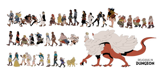
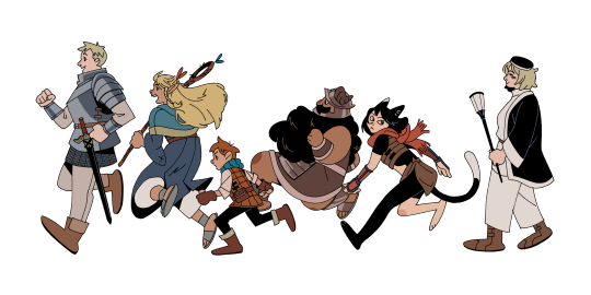
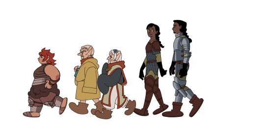
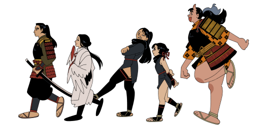
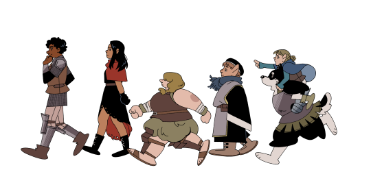

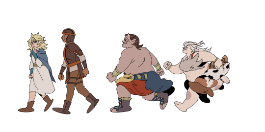
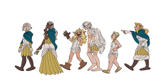


I started this around September 2023 anticipating to finish it for dunmeshi's finale! But things got hectic! Here is the finished product to celebrate anime airing day; 2024 is truly the year of dunmeshi!
#tumblr try not to crunch up my pictures challenge failed!!!!#ryoko kui's character design is so good#i've been wanting to do a big shapely lineup for a while and her designs are so recognizable and unique it was perfect for this#posting the 'smaller' version of the full thing bc its 30 x 13 in and I think it might never load#mayhaps i will revive my inprnt and make this a print#anyway!!#dunmeshi day!!!#year of the dragon -> falin year#dungeon meshi#delicious in dungeon#dunmeshi#my art#illustration#fanart#FORGOT TO TAG FOR SPOILERS#dungeon meshi spoilers#dunmeshi spoilers
5K notes
·
View notes
Text
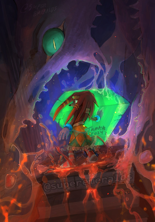
the end of the echidna clan
or alternatively: chaos is having a snack
#tikal the echidna#perfect chaos#my art#tried a new signature??#i feel talaka is more unique/recognizable than superemeralds
2K notes
·
View notes
Text
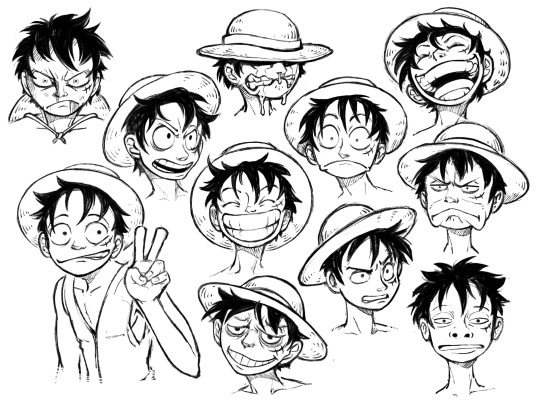
An older sketch page, trying to figure out how his face works.
#one piece#art#fanart#luffy#monkey d. luffy#if i made a character this fun to draw i’d write 1100+ chapters too#face shape is so simple yet uniquely and instantly recognizable#and SO expressive#peak character design
413 notes
·
View notes
Text
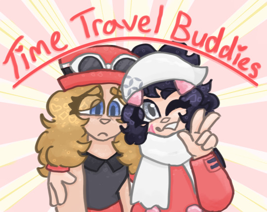
I think Serena and Dawn should be time travel buddies. You agree with me 🌀🌀🌀 ooo you agree with me 🌀🌀🌀 let them be best friends. perhaps even honorary sisters. i expect fanfiction as soon as the game comes out, maybe sooner. get on it /j
#the two most fashionable protags SHOULD be besties actually. why didn't I think of this before#i acknowledge the fact that more Legends games will come out and Serena and Dawn won't be special/unique#but consider: i donjt care#anyway Dawn's appearance here is a combination of her Platinum and Arceus outfits i guess#kept the ponytail + the kerchief from Arceus and went with the Platinum outfit for the rest of it#i actually have a design for her post-Arceus but 1) i'm not sure abt it and 2) it's not recognizable to strangers so#anyway#pokemon#pokemon z-a#pokemon z#pokemon legends z-a#plza#pokemon legends za#pokemon za#<- jesus all for one game?#pokemon arceus#legends arceus#pokemon legends arceus#pla#dawn berlitz#trainer dawn#pokemon dawn#pokemon serena#trainer serena#pkmn#pokemon presents#pokemon day
121 notes
·
View notes
Text
study of chris bachalo’s art style (plus some other artists who popped in also)


[Image Description: digital sketches of deadpool, spider-man, and a random girl. top left corner has two colored sketches of spider-man, one from the front and the other a side profile. both show his head and half of his arm only. he looks angry and confused in the first one, and angry and thoughtful in the second one. top right corner is a colored sketch of deadpool with his mask halfway up. by his side, there’s a little blonde girl with a purple beanie. bottom left corner has two colored sketches of deadpool, both a headshot. first one is an angry looking deadpool from a 3/4 view. second one shows him lurking and peeking into something from a side profile. bottom right corner is a colored sketch of deadpool looking sideways in confusion. he’s drawn from his face to half of his torso, but the arms have not been drawn. in the middle of the canvas, there is a little spider-man mask and a very open eye with a light blue pupil. the background is a solid white. the next picture is a collage of all the references used taken from the comics. /end ID]
#i recently got one of the spider-man/deadpool issues!!! and i was very excited to study chris bachalo’s artstyle#i love it#idk#there’s something in it that amazes me. it’s so shaped and very recognizable#i love the way he draws faces and the eyes of the mask#it’s very unique and interesting#had lots of fun with this one#hope i get to implement some aspects of his style to my own#if anyone’s curious the comic is the 27th issue 🫡#of the spider-man/deadpool comics#i got like 11 comics so expect some daredevil soon. maybe#i don’t promise anything#deadpool#deadpool fanart#spider-man#spider-man fanart#spideypool#spider-man/deadpool comics#comics marvel#marvel comics#comics#peter parker fanart#peter parker#wade wilson fanart#wade wilson#digital art#art#fanart#digital artist#my art
242 notes
·
View notes
Text

based on that weird dream i had except i made him a more purple/violet color like my ninjago oc anya
BASICALLY the dream is that danny was gonna Fully Die but clockwork intervened and gave him a chance at a new life in a different world, completely over from scratch. he ended up keeping his memories of his past life but because the worlds are so different the only things that were handy were like. science and math he could remember since physics mostly worked the same. he was born to two parents, john and maria mortis (they weren’t named in the dream but i decided to keep their names close to jack and maddie hehe >:3)
he ends up keeping some of his powers still-- invisibility and intangibility, which he has to re-learn from scratch, and also he can see and interact with certain shades and echoes left behind from living people (which are different from ninjago’s version of ghosts, these shades can’t interact with the world and are completely passive, but they are immune to water).
eventually he ends up in S0/S1 of ninjago training with the four core ninja and his weapon was technically a spear or staff thing but i decided that a set of kama were a cooler weapon-- they’re mostly japanese farming sickles but they are used in some katas in different martial arts in southern asia so i thought they were cool. didn’t wanna draw them tho
there’s more information i could write but there’s so much here already that maybe i should Chill out
#danny phantom#danny fenton#dp#ninjago#ninjago fan art#dp x ninjago#danny phantom x ninjago#crossover#au#dp ninjago au#something hard i was trying to figure out is how to make his eyes/face more unique than the other ninja#like all the ninja have a recognizable face under their mask with their eyes/eyebrows#that help differentiate them from each other#especially when their suits are simpler or if someone is completely colorblind it makes it easy to tell Oh Yeah That's Kai with the Scar#or zane's angular eyebrows or cole's bushy ones#and jay's freckles#and nya's eyeslashes cause GIRL!!!#and lloyd's freaky green eyes#but i ran out of ideas lol#also yes his hair is a bit more purple than i usually color it in i just thought it looked cooler#and shows that danny is technically not a Fenton anymore#even tho he probably still keeps that name close to his heart#he's probably like 15/16 in season 0/1/2#i imagine when he gets older he gets a tattoo of something that reminds him of his past life#ominousart
53 notes
·
View notes
Text
I think it's so silly when people write Will as having a southern accent (which btw is different from having a Texas accent) when he's from fucking Austin
I hate to break it to you but he has a basic white man voice (unless maaaybe his mom is from a more rural area of Texas and has a thick accent that he got from her but literally the majority of his peers won't have an accent so it's doubtful)
#pjo#percy jackson and the olympians#hoo#heroes of olympus#toa#trials of apollo#tsats#the sun and the star#will solace#<- tagging everything because i want my point to be seen lmao#as an austinite i just have to laugh#dude i wish i had a texan accent that seems so fun and silly#but no#will just sounds like a man™️#(not saying that his accent is the “default” but like it's not some super recognizably unique one)#will solace would not say “darlin'”#ik im devastated too#but also austin rep for the win
28 notes
·
View notes
Text

Say what you will about the Discowing suit, but the early 90’s Nightwing look that followed was an absolutely iconic silhouette. I think it’s so cool and fun. I know the ponytail’s divisive but LOOK at the yellow accents, the fake-wing effect, the ability to mimic a cape flare without slowing his movements down like a full cape would.
Idk man sometimes I look at Red Robin’s feathery wings cape and can’t help but think he was taking inspo from his big brother yet again.
(Robin (Vol. 2) #0 1994)
#dc#comics#nightwing#robin#listen#the finger stripes look has my whole heart#but you cannot deny the unique recognizability and creativity of this one either#Nightwing’s yellow accents/sleeve flare appreciation
28 notes
·
View notes
Text

currently on the vander study struggle bus
why are all the pictures i find of him either super low-res or like. just bad. why. help
#doodles#digital art#no wonder all the art i see of him and silco are like. people struggling with vander's features lmAO#like i feel you guys dont get me wrong#i think his features are just... a bit harder to capture than silco's#mainly bc silco has a lot of lovely well-defined planes#while vander over here is more subtle#also it helps that you can just slap a red and black eye on a skinny dude and he's recognizable#meanwhile with vander....#i mean that being said! there are some silco traits that make him uniquely silco#he always needs to look like someone pinched the bottom of his face between two fingers#like uyou get what i mean right!!!!!
12 notes
·
View notes
Text

Back at it with more of these. It's a fun exercise to do!
Imperial / Undertide / Pearlcatcher / Auraboa
#flight rising#fr art#pearlcatcher#fr fanart#jem draws#so many ways you can spin simple shapes into unique characteristics#pushing the design but still keeping it recognizable
359 notes
·
View notes
Note
Just wanted to say that your characters feel like real people in the best possible way! I really enjoy reading the snippets of lore you post about them.
(and also, your art style is beautiful - it's extremely recognizable, unique, and makes the graphic designer part of my brain very very happy)
That's so nice to hear, thank you!
#maybe this sounds weird but#when you reach a certain level of familiarity with a character you've created it almost starts to feel like they're a person you know#and whose comings and goings you're just documenting for some reason#it's like#when they get enough momentum it requires a lot less active planning on your part to figure out what they would do and how they would think#you just know#does that make sense?#also thank you I'm glad you find my style recognizable and unique!#answered#chelerin
146 notes
·
View notes
Text

Homunculus
#codacheetah#my art#pokemon#pkmn#vulpix#fennekin#ok so#idk preface i'm not a modern pokemon design hater this is not hater art#but i do think. the style shift progression of pokemon has been fascinating to watch.#a lot of early pokemon particularly the first mmmmm two generations were relatively sensible proportionally#a lot of pokemon that feel like animals but to the left.#and as time has worn on pokemon i think have kind of shifted away from 'balanced' design towards 'cartoon' design#like fennekin. ridiculously huge head with big huge eyes and dramatic fur tufts and tiny little neck and body#compare to vulpix which is also a ridiculous chibi animal mind you. but its proportions are more grounded in reality#head that's only Mildly too big for its body and smaller eyes and visible paws (vs. fennekin's stumps)#i've always felt like fennekin and vulpix is like the kind of microcosm of pokemon designs shifting to be sleeker and more exagerrated#where it's so apparent since they have the same basic design idea#hell you can kind of see it with alolan vulpix. slimmer neck smaller body bigger eyes#this post is kind of meaningless i've just been thinking abt it lately#pokemon no longer has a consistent artstyle. there are many galarian and paldean pokemon that i dont think ever would have made it in rby#and many early gen pokemon look visibly different to the new because they are more simplistic and understated#this is not a bad thing it is just a Thing. it's the natural growth of a franchise where they have to reach further with ideas and designs#with each generation. because there's 1000 of these fuckers. we are long past Basic Fox and Basic Bird and Basic Bug#every pokemon has to be uniquely charismatic and recognizable when they have so much competition#anyways all this to say i think vulpix and fennekin look ridiculous standing next to each other but in a vacuum? both designs are nice
20 notes
·
View notes
Text
my theory is that people aren't actually as tired of musical adaptations as they think they are because some of the most popular musicals both in general and right now are adaptations in some form or another. the issue is that recently there have been a lot of musical adaptations of properties that simply do not lend themselves well to the stage
#i wrote two paragraphs trying to explain this point this is my condensed take. i've been thinking about it today...#i also think the issue is when shows start leaning on their recognizable ip as a marketing crutch#rather than taking the leap into the show having its own unique identity. because historically that is what tends to make a show succeed#.txt
30 notes
·
View notes
Text

#hlvrai#lies about yapping#oh hi. its been a while#i drew this to get out of art block it isnt. perfect. the proportions are off#but for the most part these are my designs for everyone. i like keeping them close to canon so theyre... yknow. recognizable#making unique outfits for everyone is a must-have though#even in my earliest fanart tommy had a bowtie... im a truther#sorry ill quit yapping#art#doodle#sketch
13 notes
·
View notes
Text
me being a little delusional and thinking ummm i kinda hope im not recognizable in any way in that doodle of me bonking komaeda. like. no bitch. ur not
#plums.prattling#teehee#also its yknow... its a what were you doing on hate me island situation... if it happened#i think i AM pretty recognizable irl considering certain things that i do to my appearance but like it doesnt matter here bc#the only reason im unique irl is cause i live in a small southern town where everyone wants to look the same#otherwise i am not at all#which i like teehe#i like being distinguishable but i like being hidden just as much#anyway
7 notes
·
View notes