#i write too many tags
Explore tagged Tumblr posts
Text
I love having things to do and then completely forgetting to do them!
Fun!
#sent from my alien flesh computer#mental illness#fuck me i guess#i love completely useless tags#like who is searching up “bongus”#me.#bongus#bonguscorr#bonguscoded#no relation to#bingus#i write too many tags#oh shit i couldve been doing#like#work right now#Whoops!#*canned laughter*#*outro theme song*#*slow zoom out#credits roll
3 notes
·
View notes
Text


Icons, truly
#I don’t even have anything to add in the tags#this stuff writes itself#my art#phineas and ferb#gravity falls#dipper pines#Mabel pines#phineas flynn#ferb fletcher#candace flynn#wendy corduroy#soos ramirez#grunkle stan#stan pines#isabella garcia shapiro#dr doofenshmirtz#waddles the pig#too many characters….
21K notes
·
View notes
Text
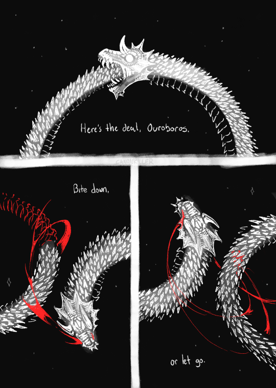
but you can't keep holding on like this.
#you can put a disability metaphor in any legfndary draconic entity. many people dont know this#my art#comic#ouroboros#for tag filtering:#blood#its a blurry day forgive typos#for search results:#bite down or let go#here's the deal ouroboros#for qna:#yes you can get it tattooed i would appreciate a tip through ny kofi (pinned) and i would love to see if you feel comfortable sharing#yes its an original quote i do write sometimes#no its not cringe or bad if you blorbo tag or whatever. go nuts. if i didnt want people connecting w my work I wouldn't post it#yes you can quote it in your own art and I'd love to see that too#anyways i love you. we'll both get through this regardless of how it changes us okay? i love you.
59K notes
·
View notes
Text
thinking about how Humans Are Space Orcs stories always talk about how indestructible humans are, our endurance, our ability to withstand common poisons, etc. and thats all well and good, its really fun to read, but it gets repetitive after a while because we aren't all like that.
And that got me thinking about why this trope is so common in the first place, and the conclusion I came to is actually kind of obvious if you think about it. Not everyone is allowed to go into space. This is true now, with the number of physical restrictions placed on astronauts (including height limits), but I imagine it's just as strict in some imaginary future where humans are first coming into contact with alien species. Because in that case there will definitely be military personnel alongside any possible diplomatic parties.
And I imagine that all interactions aliens have ever had up until this point have been with trained personnel. Even basic military troops conform to this standard, to some degree. So aliens meet us and they're shocked and horrified to discover that we have no obvious weaknesses, we're all either crazy smart or crazy strong (still always a little crazy, academia and war will do that to you), and not only that but we like, literally all the same height so there's no way to tell any of us apart.
And Humans Are Death Worlders stories spread throughout the galaxy. Years or decades or centuries of interspecies suspicion and hostilities preventing any alien from setting foot/claw/limb/appendage/etc. on Earth until slowly more beings are allowed to come through. And not just diplomats who keep to government buildings, but tourists. Exchange students. Temporary visitors granted permission to go wherever they please, so they go out in search of 'real terran culture' and what do they find?
Humans with innate heart defects that prevent them from drinking caffeine. Humans with chronic pain and chronic fatigue who lack the boundless endurance humans are supposedly famous for. Humans too tall or too short or too fat to be allowed into space. Humans who are so scared of the world they need to take pills just to function. Humans with IBS who can't stand spicy foods, capsaicin really is poison to them. Lactose intolerance and celiac disease, my god all the autoimmune disorders out there, humans who struggle to function because their own bodies fight them. Humans who bruise easily and take too long to heal. Humans who sustained one too many concussions and now struggle to talk and read and write. Humans who've had strokes. Humans who were born unable to talk or hear or speak, and humans who through some accident lost that ability later.
Aliens visit Earth, and do you know what they find? Humanity, in all its wholeness.
#humans are space orcs#humans in space#earth is a deathworld#earth is space australia#tagging this so that ppl can find it even though the space shit i write about always feels like its in direct opposition to all the pop tag#also my biggest pet peeve in all of writing - all writing. everywhere. not just in fanfic but books and tv and movies too - is when people#write off an injury by saying something like 'oh nothing bad just a couple of scratches some bruising and a minor concussion' like girl WHA#MiNOr ConCuSSioN is such an oxymoron and I hate it so fucking much. like i dont care how minor it was thats still brain damage.#especially when the same character does this more than once. like im sorry ms. but uh. you can no longer read. or talk eloquently. sorry#evidence: my brother has had two 'minor' concussions and now cannot read write or speak without tremendous effort. And like its totally#ruined my ability to watch action shows/movies because now i just sit there and count how many concussions there characters are getting#after a certain point it becomes totally impossible to believe that these guys are able to function. (still fun to watch tho im not a hater
2K notes
·
View notes
Photo

thinking about the... potential clawthorne woodcarving mentorship.
+ bonus cuz also thinking abt how if hunter ever met dell's palisman and got reminded of flapjack, he'd probably feel bad abt making that association cuz he knows what it's like to be seen only as someone's different version (even though the bird wouldn't mind much so lol)
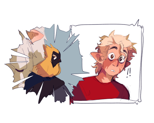
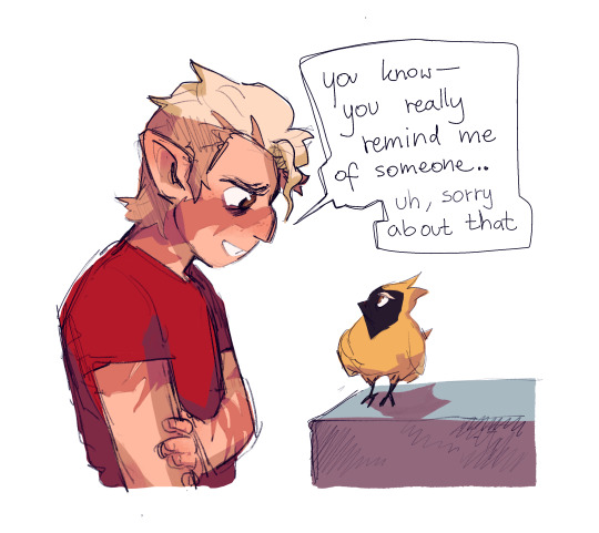
#eda having that palistrom seed.. hunter saying he wants to learn how to carve palisman... his relation to clawthornes. it HAS to mean STH js#the owl house#toh#hunter toh#toh hunter#hahaa always thinking abt hunter growing a soft spot for palismen and loving creating and bringing them to life#but never being able to replace flapjack no matter how many palismen for other ppl he carves. I'M GONNA-#:((((( :///#like he's not going to want to replace flapjack just like that rn. cuz he LOVES that bird. it's gonna be so hard for him to just.. Move On#and flapjack's a PART of him.. so very curious where they'll go with this because..... HM. HM like he serves as his disability aid almost#and he can't just REMAKE him. but he cannot also just.... ignore what happened straight away. but it's also important to heal#but whatever he decides to do i feel like he'd love to just............ create. whether it be for himself or others#BUT GAH. ANYWAY XKJSJSK wrote an essay abt this already don't need to write one in the tags TOO. so uh .. yea#little guy.. pls find happiness#my art#fanart#hunter#hunter noceda#hunter wittebane#eda#eda clawthorne#dell#dell clawthorne#dell's palisman#toh art#edalyn clawthorne#also like...... if flapjack and dell's palisman were caleb's and evelyn's palismen...... and knew each other........#and while flapjack was waiting for his new person at the bat queen's cave dell's palisman was being passed down clawthorne generations#OUUHGHHHHGHHHH they were probably friends..... they Knew each other#what's up with you you mysterious yellow bird with eyebrows...... what's your story
19K notes
·
View notes
Text
I was reading a post about CoTG and I realized: Rick has seemingly started to write every character pairing with the exact same dynamic, and he's not good at writing that dynamic and it doesn't make sense for 90% of the characters he writes it for.
It's that very specific dynamic of one half of the pair who is almost aggressive to the other party - "teasing" them constantly/insulting them, affectionately punching/judo flipping/maiming/etc, seemingly almost always exasperated with the other - and said other party usually just accepts this treatment or blanketly views it fondly, and may generally be framed as more incompetent than their partner and a little bit of a doormat (particularly relating to being insulted/teased/etc by their partner).
We start seeing this dynamic in HoO with Percy and Annabeth, as a sort of semi-inconsistent twist on their rivals-to-friends-to-lovers dynamic from the first series. Then the dynamic pattern develops further with Leo and Calypso. Then Magnus and Alex. Then Nico and Will, particularly in TSATS. And now in CoTG, it's Percy and Annabeth again but even more in this direction.
I know people have talked about Nico and Will's relationship over the series rapidly being shoehorned into Percabeth Two™, and it's extremely apparent in TSATS that Rick's doing it on purpose (including directly quoting Percabeth scenes but minorly tweaking them to be Solangelo). But recognizing it as an overarching trend in Rick's later books honestly reminds me a lot of how Rick started trying to apply the "Percy Formula" so-to-speak to nearly every protagonist in HoO (and then try to replicate similar character archetypes with Magnus and Apollo's narrations - moreso Magnus in being jaded and sarcastic, very much trying to be first series Percy. He only sounds unique because Rick failed at making him Percy 2. Apollo is more akin to later-series Percy characterization of being goofy and incompetent. Apollo [and Zeus] even got retconned to give Apollo a more similar backstory to Percy's). Rick seems to have decided that he thinks the audience wants this specific dynamic but 10 times over, except he's not good at writing it the first time because it's a bastardization of the time he did a different thing okay.
And Rick also seems aware of that too! Because he retconned Calypso and Leo at the end of TOA, probably because he realized how absolutely awful it was reading when they were written with that dynamic of Calypso just functionally hating Leo and constantly being aggressive towards him! The only time Rick's actually made the dynamic even semi-successful was with Magnus and Alex, because it actually fits within their characters, their dynamics with each other, and their environment. Alex beheading Magnus on the regular works out fine because there are no repercussions to that in Valhalla, Magnus will be fine, so it does genuinely come off as humorous. And Alex has been effectively established to be abrasive at times but have her genuine feelings shine through regularly, and that meshes well with Magnus' jaded-and-aloof-but-quietly-very-empathetic character. And Magnus has been established to, yes, not be great at combat, particularly compared to Alex. They are the only time that flavor of dynamic in that form was effective and cohesive.
Percabeth is no longer rivals-to-friends-to-lovers badasses on equal levels with shaky pasts who finally found some form of permanence with one another. Now it's super smart doting and affectionately aggressive girlfriend and her silly goofy 50%-of-the-time incompetent boyfriend who she judo flips/pushes off cliffs/etc - but affectionately~! Solangelo is trying to riff off of the early series "Poseidon & Athena are enemies" dynamic that Percabeth had but with Apollo & Hades being "opposites" but learning to accept each other, except it ends up with Will just coming off as a huge asshole and Nico being retconned to a complete doormat about it - when prior to that those characterizations would be completely contrary to their established characters (even just from TOA!). Calypso in HoO gets retconned from her PJO characterization to being snooty and aggressive, and Leo's false persona gets merged into his just normal personality except he just also becomes a doormat but more goofy than Nico with occasional haha-dark/depression-humor! Which Nico also got. Which was also a bastardized Percy trait that got redistributed.
It's exhausting. Rick write more than one relationship dynamic you can do it I promise
#pjo#riordanverse#percy jackson#tsats#annabeth chase#nico di angelo#will solace#mcga#magnus chase#alex fierro#leo valdez#calypso pjo#analysis#< bwah i feel bad putting that many tags but it is relevant#rr crit#< i guess?#tsats crit#< that one can be here though. the other crit tag is usually for Bad Stuff ergo why i feel weird putting it. this one's just random stuff#i feel like i should tag ships too cause it is an analysis of those ship dynamics in canon but i dont want it to come off as shipbashing :(#eh fuck it i'll ship tag. disclaimer- this is not shipbashing i am just doing analysis of how rick is bad at writing this specific dynamic#i am tagging these ships for relevancy and analysis purposes only. i do not intend to be mean about them re: fanon#fierrochase#percabeth#solangelo#caleo#i do think this is good to note though with writing these dynamics - like rick's intentions vs execution vs consistent characterization#i think you could also argue Carter and Zia exhibit some traits of this dynamic? like an early form of it in Rick's writing perhaps#i havent reread it in awhile though so i will save my thoughts on it for later#long post //#forgive if this post is semi-incomprehensible it was a quick late night rambly thing
508 notes
·
View notes
Text

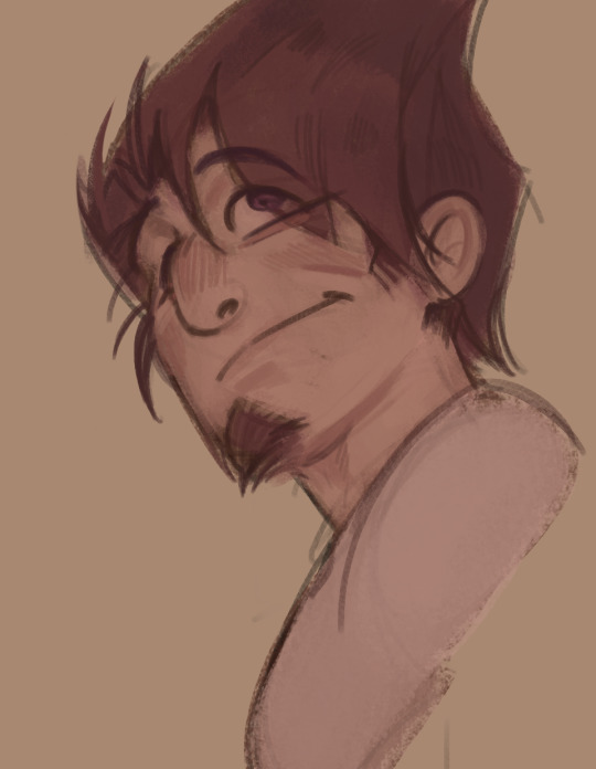
Experimenting with style on these two
I feel a little empty, since I finally finished the oumota comic. I can start drawing another one while I have the strength....
I have comic ideas that are tearing my soul apart. Or I can just draw something romantic ∠( ᐛ 」∠)_
#(It would be cool to know what YOU want)#I don't want to choose#The other day I died in the therapist's office so now I have at least some strength to live#I also have ideas for illustrations on amalgamate.....#Maybe I should draw them so that senpai will notice me#Senpaaaai~\(★0★)/#Sorry#This is my puny little dream#I want the author of the amalgamate to notice me#I really love amalgamate and its author#and I just realized that I forgot the oumota tag on the comic#I have too many tags but I love writing them#danganronpa#danganronpa v3#drv3#drv3 kokichi#drv3 kaito#danganronpa kokichi#danganronpa kaito#kokichi ouma#kokichi oma#kaito momota#oumota
661 notes
·
View notes
Text
short asl thing based on @where-does-the-heart-lie's modern au :) i started this over a year ago but the beginning is all dialogue and felt more like a script to me i suppose??? which deflated my desire to work on it. anyway i checked it over recently and it's completely fine lmfao, self-confidence restored here we go !
-
"Yo. Aren't you usually in the middle of your shift by now?"
"I've been banned from the hospital."
"Like, for life?"
"No. For the next, uh.. Twenty-two hours."
"That's oddly specific."
"It was twenty-four, but I fell asleep after leaving the building."
"That wouldn't have to do with why they kicked you out, at all?"
"Hmmm. I'm too sleep-deprived, apparently."
"Ah. And, um, you called me because...?"
"I pressed a random number in my call log after waking up. Lucky you, I guess."
"Yeah. Right. Lucky me. And your car keys are...?"
"Confiscated."
"Ah, right, of course."
A beat of silence. Two. Three, then "Look, if you're busy, then–"
"No, no. You called me, so I'll be there. Give me twenty minutes."
"Alright. Thank–"
"Thank someone else. Also, if you fall asleep in my car, I'm taking it as express permission to drive you around wherever I want."
"Ugh, go die. I don't even know why I bothered."
"LUCKY YOU, I guess," sounds off way too loudly in his ear. "No take backs. See you in ten."
"I thought you said–" Sabo breaks off as the call ends, leaving him staring blankly at his phone's too-dim screen. He squints, turns the brightness all the way up, and still squints as the sunlight proves too strong for the display.
Ace shows up in more than ten but decidedly less than twenty minutes. Sabo doesn't waste much brain power on it, only climbing into the passenger seat and yawning into his palm while his other hand fixes the seatbelt into the buckle. Not a second too soon, too, as Ace roars the engine to life and peels away from the curb at record speed.
Ace fiddles with the radio. He turns the music up, then dial it back down to inaudible. They hit the expressway and he leans over the steering wheel, frowning with his eyes fixed on the road far ahead. Sabo yawns again and this appears to be the limit to his patience.
"Hey, so, I had a thought after you hung up on me."
Sabo grimaces. "You mean you–"
"Today's Wednesday."
He doesn't elaborate. Sabo is too tired to process. "Yes," he follows, after a second. He glances at the sky out the front window. "What time is it?"
"Oh, uh." Ace fumbles with hand placement so he can lift his watch to his face. "Nine forty."
Sabo takes a couple beats to try and process this, moves his eyes away from the skyline, and sighs as he pulls his phone out. 2:47 is what the display reads, which sounds much more believable.
"How did the minute hand get off?" he mutters to himself, chancing a look at Ace's busted wristwatch. Ace raises a brow, taking his gaze off the road to scrutinize Sabo. "No, it doesn't matter," he mutters to himself once more, sliding his phone away back on his person and out of his hands.
"My point is," Ace continues, like he hasn't just been interrupted by a whole thing. "Your timeout will be done midday Thursday. Did they switch your days off?"
"No." Sabo sighs. "They technically gave me the next thirty-six hours. Technically closer to forty. Something like that. I go back in on Friday. Sometime.” He tries to smile and it turns out very lopsided, from that he can make out in the rearview mirror. “Can you tell I’m tired?”
“I don’t think ‘tired’ is an accurate description,” Ace quips. “When did you eat a proper meal last?”
“Uh, yesterday. Maybe.”
“Maybe??”
“A ‘proper meal’ means different things to the two of us,” Sabo huffs. “On my account it was yesterday. I’ve had food since then, of course.”
“Alright, so here’s the plan,” Ace announces before absolutely whipping it around a curve. Sabo is his passenger in the passenger seat and had fully prepared to be so when he got in the vehicle, but he’d been vastly underprepared for this sudden course of action, which is how he ends up halfway out of his seat with his cheek slammed into the cold window. Ace doesn’t quite notice his brother’s terminal velocity until the car is once again on the straight and narrow, and only then it’s because of the audible thunk Sabo’s face makes when it collides with the glass.
“Aw shit. You good bro?”
“Ow,” Sabo mutters. “If I have broken bones I’m suing your ass.”
“Well, if you’re good enough to make jokes, I think you’re better than you’re letting on.” Ace keeps the wheel steady with one knee while he takes both hands away to crack his fingers. When he glances over at Sabo again, he looks even more pathetic – like he’s becoming one with the glass. “Anyway, as I was saying.
“I’m taking your ass home. You’re going straight to sleep and while you crash, I’ll make you something decent to eat and stick it in the fridge for you to heat up later. I’ll even make you two servings to eat two different times, since you clearly can’t be trusted to take care of yourself correctly.”
“Ouch.”
“I want you to conk out for as long as your body allows. We can reset your sleep schedule tomorrow, alright? Put your phone on silent; do not answer any calls. In fact, you know what, just give it to me.
Sabo glances over to see Ace’s hand held out to him, palm up. Fingers wiggling expectantly. His lips pull up into a grimace. “I’m not doing that.”
“Fine.” Ace takes his hand back. “But you will comply with everything else.”
“Wow! It’s so funny, I didn’t realize you turned into my mother overnight! Really tapped into your mom potential, huh? Anything exciting happen in your life that would cause that? I guess I wouldn’t know, since I’ve been a zombie for the past two days.”
“There’s nothing wrong with acting like your older brother, you dipshit, especially if you keep putting yourself through the wringer like this. You go home. You sleep. You wake up and eat. You go back to sleep. Then we do laundry. Does that sound agreeable?”
“That’s negotiable, at the least,” Sabo mumbles. “I will accept good food as a form of bribery.”
“Oh, nice, because I’m flat broke at the moment.”
Sabo makes a mental note of that, and then they’re pulling into the driveway. Ace lets him exit the vehicle by himself and then promptly manhandles him all the way onto the couch where it will be easier to force his body to relax than in a real bed. Ace knows this, so he calls him weird before chucking a loose blanket at his head. Sabo is almost too tired to function at this point, so he lets Ace have the last laugh in favor of finally closing his eyes.
Coming to is a surreal experience, especially since the sun is still out. He must make a noise because Ace is suddenly within view. His limbs are tangled in the blanket and still so heavy that he doesn’t bother moving. “Thought you would be gone,” he half-groans, eyes slipping shut again for a moment.
“I did leave,” Ace confirms. “I had to go pilfer some stuff to make stew with. It’s almost done, so I’ll hang here until then.”
Pilfer. That could mean any number of things. Sabo chooses to believe in the option where Ace is an upstanding citizen, and then remembers Ace saying earlier that he had no money. He frowns and squirms on the cushions enough to where it looks like he’s checking his pockets. “Where’s my wallet, Ace?” he bluffs.
“Somewhere around here,” Ace pipes up. “Your stomach will thank you for your contributions to the Portgas Household’s pantry!”
“Ugh, I got robbed,” he complains. “This sucks. ‘m going back to sleep.” He rolls over so his back is to Ace.
“Yeah, you do you, bro. Stew will still be here later. I’ll see you when you’re back in the world of the living.”
—
Luffy comes in late that night and slams the front door shut as loud as humanly possible. When he appears in the main room, he doesn’t seem to be upset, so Ace writes it off as a Luffyism. Sabo hasn’t stirred at the noise, so it’s all good.
Realizing this, Luffy pads closer to Ace’s side and looks at Sabo’s unmoving body warily. “Why is Sabo passed out like a corpse? Is he sick?”
“No, he’s not sick, he just can’t take care of himself. Which is why we are going to let him sleep for as long as possible.”
Luffy just nods to this, but it’s the uncomprehending Luffy-nod that means he’s just going to end up doing whatever he wants to regardless. Ace sighs, then jerks his head towards the kitchen. “He ate a little earlier, but I want him to eat again when he wakes up. There’s stew in the fridge if you want it – just leave him a little. Got it, Monkey D. Luffy?”
Luffy throws him a salute and then runs off in his socks. “Yippee! Ace made stew!”
“Think of your brother, Luffy, and make good choices!” Ace calls after him. “He’s a pathetic man who needs food to feel better or he’ll end up sleeping through Laundry Day!”
—
Sabo does not sleep through laundry day, but he does sleep for sixteen whole hours, so it’s just around noon when he forces himself up off the couch and into a warm shower.
Ace is around, which is mildly unexpected. But he’s still half-asleep, so everything is at least a little unexpected. He glances up from playing video games with Luffy to see Sabo leaving the steam-filled bathroom with his hair hanging around his shoulders. “You look like a wet cat,” he calls.
“Sabo’s awake!” Luffy cheers. “Ace thought you died at one point.”
Ace elbows Luffy in the gut, making him hunch over. “I did not!”
“He totally checked to see if your heart was still beating!”
“I’m undead, actually,” Sabo says completely seriously.
“Does that mean you don’t need to eat anymore?” Luffy questions. “Because I ate all the stew last night.”
“I saw that coming and made extra.” Ace finger-guns in Sabo’s general direction. “That’s why I bought two sets of ingredients. With your money!”
“With my money,” Sabo echoes, because it’s such a wild statement to have to deal with this early in the day. Well, early for him. “Fuck you.”
“I mean, I can tell Luffy where I hid–”
“Thank you, Ace, for agreeing to share your quarters with both of your brothers so we can all do laundry today on your dime!” Sabo raises his pitch so his voice is mockingly squeaky when he says this. He starts moving down the hall before Ace can start to argue, letting his and Luffy’s voices bleed into the background.
When he comes back out, now dressed, it smells significantly better than before. “I reheated the stew,” Ace announces, gesturing for Sabo to take a seat at the kitchen counter. “Let’s all have lunch before we head out.”
“You have to drink this too,” Luffy tells Sabo, sliding a Gatorade across the counter so it sets in front of him when he finally does take a seat. “Ace’s orders.”
“Gotta get those nutrients back somehow.”
“Aren’t we so considerate, Sabo?”
“Do you even know what ‘considerate’ means?” Sabo asks, lips quirking up into a half-smile. At Luffy’s shrug, it turns into a real smile. “Well, thanks anyway. Both of you.”
“No sweat. And look!” Ace brandishes a five dollar bill for both to see. “I found this baby for us to use on coins! It’s all on me today–”
“Where’s my wallet, Ace?!”
#writing#op#whery if i realized anything while doing this its that we need 2 get you a custom theme....#1) anyone whos not logged in will be able to see all your posts w/ no limits#2) (and the more important COUGHCOUGH) it'll be so much easier to find shit on your blog#if you want a cool blog layout lmk and i'll hook you up but for now#there are many benefits to a custom tumblr url........ being able to search /tagged for better blog organization is one of them#if there's a switch to writing style i wrote the first half of this in april 2023 so thats why!!#also lmao i jus spent the weekend w/ my brother so if its too mean-spirited thats unintentional n i'm prolly channeling is all#sighhhhhhh i love when they look after each other its so very very good#wittb has been great but i do wanna see them get up to other shenanigans later#after the comic (plot) at large i mean#little one-off side things still in the modern au#enjoy the rest of artfight month for now tho!!!#(< says someone who has been putting off af attacks to write things again)
394 notes
·
View notes
Text
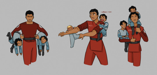
Cadets
(aka trash children, chaos children, and children who understand 98 is getting graded on this)
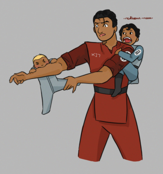
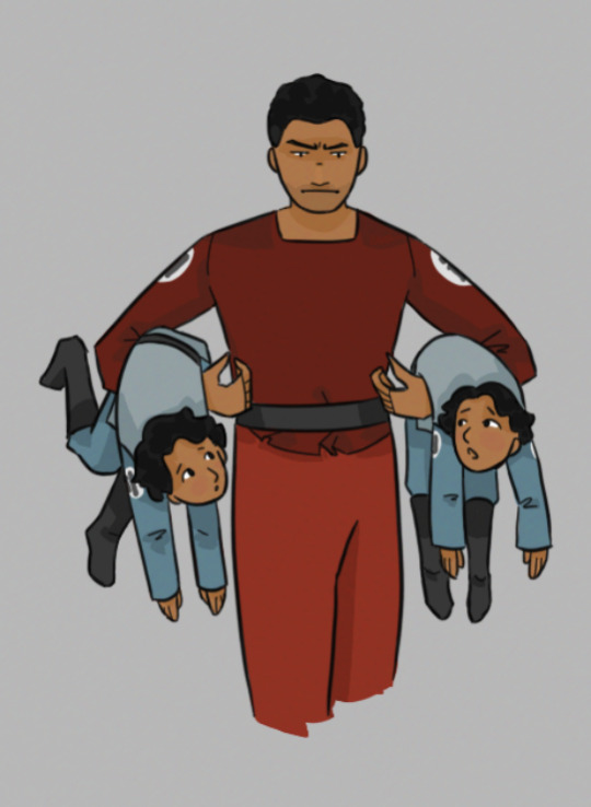
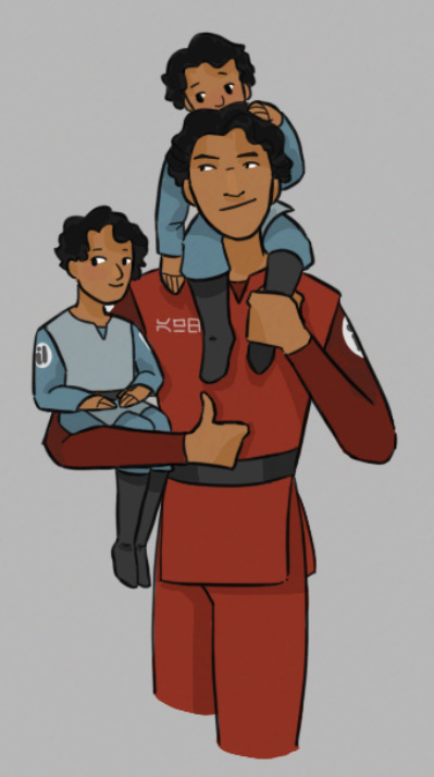
Inspired by @thefoundationproject! Closeups under the cut:
jesse got this pic from jangotat:
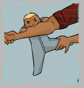
#star wars#tcw#soft wars#doodling in the soft wars sandbox#i think that'll be my tag for these things#alpha 6#commander fox#commander neyo#alpha 17#captain rex#commander wolffe#jangotat#commander doom#commander davijaan#(probably?)#shebse#edee#chekar#i may have messed up the ages oops#but hey we can pretend that the shebse found rex when he was a baby/toddler but he didn't officially join the squad until he was older!#hopefully i did 6's expression justice#against his better instincts he loves his trash children but he is also so so tired of fishing them out of the garbage#6 is grumpy as always; 98 is smug as always; and 17 is too busy getting bitten by a baby to have any other concerns at the moment#(he is about to have many more concerns)#wolffe climbed up 17s back to bite him while he was distracted with the tubie gnawing on his arm#specifically to bite 17s neck because he saw a video of an actual wolf taking down a space-deer and wanted to try it out#i just realized the alphas were still in training for most of the cadet-raising#poor 17 had to write strategy essays or whatever with four 10 yr olds competing to see who can provoke him the most#and a 6 yr old chomping on his ankles#not to mention 16 in the soft wars eu dealing with half of 44's squad on top of his own cadets and probably assorted shebse too
419 notes
·
View notes
Text


YAYY VUZI DRAWINGG!! 2 vers because i like contrast :D (I will draw for the fanzine next >:3)
#meow folder#murder drones#murder drones fanart#uzi x v#murder drones vuzi#vuzi#md vuzi#uzi doorman#serial designation v#my art#Z.txt#uzi doorman fanart#murder drones v#v murder drones#md art#too many tags idk im writing this at 1 am this is scheduled#FUCK I FORGOR A DETAIL ok
381 notes
·
View notes
Text
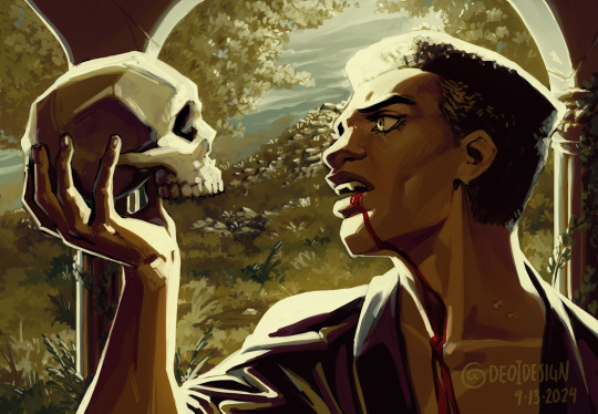
Thinking about vampires, death, life, and the space they occupy in between
#to be or not to be. that is the question#ty adam for being my model for dramatic vampire moment#musings on the thinkings about:#when to live you are required to hurt others. you must repeatedly ask yourself what the value of your life is#To sleep... perchance to dream...#ah. THERES THE RUB.#ok I actually couldnt come up with too many thoughts. I had a lot more while I was drawing this but I guess I put them in the painting LOL#reading that soliloquy and being like damn this is just like vampires#the reality of course is that the soliloquy is a debate over suicide and ultimately making the choice to live#even if just out of fear of the unknown#and vampires are about dying and then in undeath choosing to continue to live#despite the fear of eternity and loneliness and hurting others#theyre not the same. but like let me thiiink come onnnn I'm allowed to thiiink and have incomplete thoughts#I would have to write like a proper essay about this to organize my thoughts. this is the tags on a tumblr post.#anyways finished episode 79#working on patreon stickers for this month (and next month soon)#and working on book 4. taking a pause from episodes cause I've got 3 weeks of buffer now... UGH#I'm so mad that they changed it. it would have been 5 weeks before but it's fine it's whatever#anyways yeah taking a break from episodes to make my book now!#its good stuff.#and this painting is good stuff#banger after banger from me tbh#this was a little relaxing giving myself a couple hours to muse#it's necessary for my health and I always forget that til I do a painting...#I loved doing the little landscape in the background too I should do that more! I love how plants are just like whatever shape you want#like you can make up any plant you want and not only does that plant PROBABLY exist somewhere#a weirder plant exists somewhere too. so. literally whatever you want#ok bye again for a few days while I get back to work
269 notes
·
View notes
Text
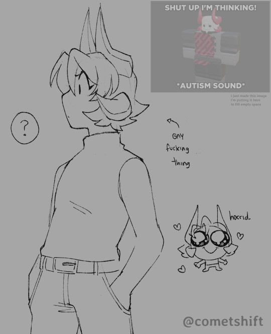


predisasters
#phighting#phighting art#subspace phighting#medkit phighting#art#subspace#medkit#predisaster tag#i think young subspace often gets way too overconfident and there's like a 50/50 chance it'll end weirdly well for him or very badly instea#medkit is the down to earth guy to keep him in check... maybe. if he feels like it#but more often than not he finds more amusement in seeing subspace eat shit. he thinks it's funny#though even when he does try subspace is too stubborn to listen to him. so medkit just leaves him to his luck. they're both terrible#i didn't mean to write so much in the tags sorry i have so many thoughts on them. i'm normal#also i made the 3d model in the top right on the first image i'll post renders soon hehe
505 notes
·
View notes
Text
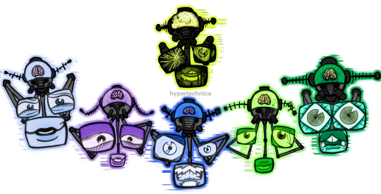
the thinkerrrrrrrrssss

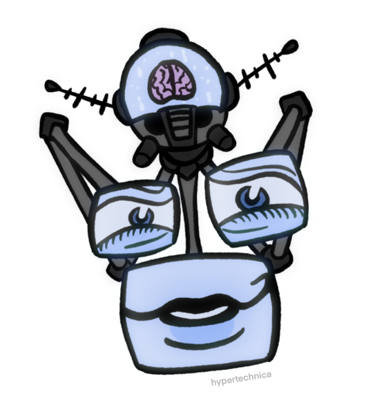
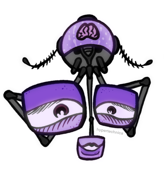
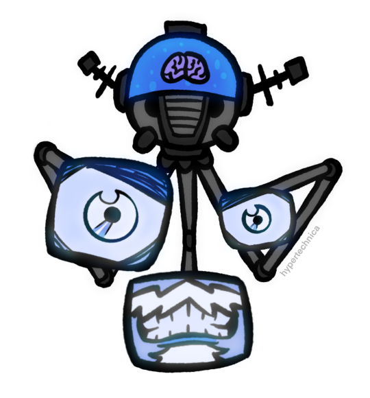
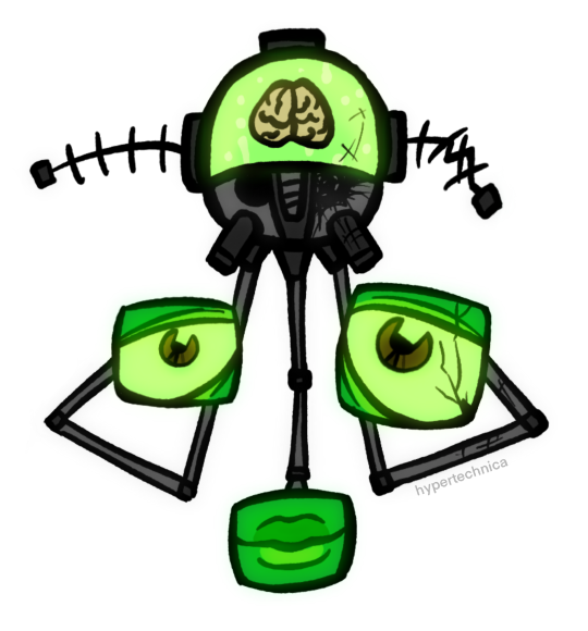

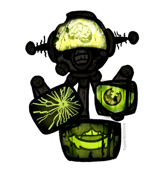
#someone make them less hard to draw PLEASE#fnv#fallout new vegas#fallout nv#old world blues#fnv old world blues#fallout new vegas dlc#the think tank#dr 0#dr dala#dr klein#dr mobius#dr 8#dr borous#objectum#techum#robots#robot art#character design#my art#there’s too many ways to write their names bear with me#doctor 0#doctor dala#doctor klein#doctor mobius#doctor 8#doctor borous#tell me if this doesn’t belong in the -um tags i just think it’d appeal to that demographic (me. i#i’m the demographic.)
295 notes
·
View notes
Text
why Aurora's art is genius
It's break for me, and I've been meaning to sit down and read the Aurora webcomic (https://comicaurora.com/, @comicaurora on Tumblr) for quite a bit. So I did that over the last few days.
And… y'know. I can't actually say "I should've read this earlier," because otherwise I would've been up at 2:30-3am when I had responsibilities in the morning and I couldn't have properly enjoyed it, but. Holy shit guys THIS COMIC.
I intended to just do a generalized "hello this is all the things I love about this story," and I wrote a paragraph or two about art style. …and then another. And another. And I realized I needed to actually reference things so I would stop being too vague. I was reading the comic on my tablet or phone, because I wanted to stay curled up in my chair, but I type at a big monitor and so I saw more details… aaaaaand it turned into its own giant-ass post.
SO. Enjoy a few thousand words of me nerding out about this insanely cool art style and how fucking gorgeous this comic is? (There are screenshots, I promise it isn't just a wall of text.) In my defense, I just spent two semesters in graphic design classes focusing on the Adobe Suite, so… I get to be a nerd about pretty things…???
All positive feedback btw! No downers here. <3
---
I cannot emphasize enough how much I love the beautiful, simple stylistic method of drawing characters and figures. It is absolutely stunning and effortless and utterly graceful—it is so hard to capture the sheer beauty and fluidity of the human form in such a fashion. Even a simple outline of a character feels dynamic! It's gorgeous!
Though I do have a love-hate relationship with this, because my artistic side looks at that lovely simplicity, goes "I CAN DO THAT!" and then I sit down and go to the paper and realize that no, in fact, I cannot do that yet, because that simplicity is born of a hell of a lot of practice and understanding of bodies and actually is really hard to do. It's a very developed style that only looks simple because the artist knows what they're doing. The human body is hard to pull off, and this comic does so beautifully and makes it look effortless.
Also: line weight line weight line weight. It's especially important in simplified shapes and figures like this, and hoo boy is it used excellently. It's especially apparent the newer the pages get—I love watching that improvement over time—but with simpler figures and lines, you get nice light lines to emphasize both smaller details, like in the draping of clothing and the curls of hair—which, hello, yes—and thicker lines to emphasize bigger and more important details and silhouettes. It's the sort of thing that's essential to most illustrations, but I wanted to make a note of it because it's so vital to this art style.
THE USE OF LAYER BLENDING MODES OH MY GODS. (...uhhh, apologies to the people who don't know what that means, it's a digital art program thing? This article explains it for beginners.)
Bear with me, I just finished my second Photoshop course, I spent months and months working on projects with this shit so I see the genius use of Screen and/or its siblings (of which there are many—if I say "Screen" here, assume I mean the entire umbrella of Screen blending modes and possibly Overlay) and go nuts, but seriously it's so clever and also fucking gorgeous:
Firstly: the use of screened-on sound effect words over an action? A "CRACK" written over a branch and then put on Screen in glowy green so that it's subtle enough that it doesn't disrupt the visual flow, but still sticks out enough to make itself heard? Little "scritches" that are transparent where they're laid on without outlines to emphasize the sound without disrupting the underlying image? FUCK YES. I haven't seen this done literally anywhere else—granted, I haven't read a massive amount of comics, but I've read enough—and it is so clever and I adore it. Examples:


Secondly: The beautiful lighting effects. The curling leaves, all the magic, the various glowing eyes, the fog, the way it's all so vividly colored but doesn't burn your eyeballs out—a balance that's way harder to achieve than you'd think—and the soft glows around them, eeeee it's so pretty so pretty SO PRETTY. Not sure if some of these are Outer/Inner Glow/Shadow layer effects or if it's entirely hand-drawn, but major kudos either way; I can see the beautiful use of blending modes and I SALUTE YOUR GENIUS.
I keep looking at some of this stuff and go "is that a layer effect or is it done by hand?" Because you can make some similar things with the Satin layer effect in Photoshop (I don't know if other programs have this? I'm gonna have to find out since I won't have access to PS for much longer ;-;) that resembles some of the swirly inner bits on some of the lit effects, but I'm not sure if it is that or not. Or you could mask over textures? There's... many ways to do it.
If done by hand: oh my gods the patience, how. If done with layer effects: really clever work that knows how to stop said effects from looking wonky, because ugh those things get temperamental. If done with a layer of texture that's been masked over: very, very good masking work. No matter the method, pretty shimmers and swirly bits inside the bigger pretty swirls!
Next: The way color contrast is used! I will never be over the glowy green-on-black Primordial Life vibes when Alinua gets dropped into that… unconscious space?? with Life, for example, and the sharp contrast of vines and crack and branches and leaves against pitch black is just visually stunning. The way the roots sink into the ground and the three-dimensional sensation of it is particularly badass here:

Friggin. How does this imply depth like that. HOW. IT'S SO FREAKING COOL.
A huge point here is also color language and use! Everybody has their own particular shade, generally matching their eyes, magic, and personality, and I adore how this is used to make it clear who's talking or who's doing an action. That was especially apparent to me with Dainix and Falst in the caves—their colors are both fairly warm, but quite distinct, and I love how this clarifies who's doing what in panels with a lot of action from both of them. There is a particular bit that stuck out to me, so I dug up the panels (see this page and the following one https://comicaurora.com/aurora/1-20-30/):

(Gods it looks even prettier now that I put it against a plain background. Also, appreciation to Falst for managing a bridal-carry midair, damn.)
The way that their colors MERGE here! And the immense attention to detail in doing so—Dainix is higher up than Falst is in the first panel, so Dainix's orange fades into Falst's orange at the base. The next panel has gold up top and orange on bottom; we can't really tell in that panel where each of them are, but that's carried over to the next panel—
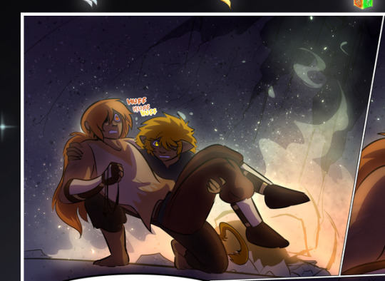
—where we now see that Falst's position is raised above Dainix's due to the way he's carrying him. (Points for continuity!) And, of course, we see the little "huffs" flowing from orange to yellow over their heads (where Dainix's head is higher than Falst's) to merge the sound of their breathing, which is absurdly clever because it emphasizes to the viewer how we hear two sets of huffing overlaying each other, not one. Absolutely brilliant.
(A few other notes of appreciation to that panel: beautiful glows around them, the sparks, the jagged silhouette of the spider legs, the lovely colors that have no right to make the area around a spider corpse that pretty, the excellent texturing on the cave walls plus perspective, the way Falst's movements imply Dainix's hefty weight, the natural posing of the characters, their on-point expressions that convey exactly how fuckin terrifying everything is right now, the slight glows to their eyes, and also they're just handsome boys <3)
Next up: Rain!!!! So well done! It's subtle enough that it never ever disrupts the impact of the focal point, but evident enough you can tell! And more importantly: THE MIST OFF THE CHARACTERS. Rain does this irl, it has that little vapor that comes off you and makes that little misty effect that plays with lighting, it's so cool-looking and here it's used to such pretty effect!
One of the panel captions says something about it blurring out all the injuries on the characters but like THAT AIN'T TOO BIG OF A PROBLEM when it gets across the environmental vibes, and also that'd be how it would look in real life too so like… outside viewer's angle is the same as the characters', mostly? my point is: that's the environment!!! that's the vibes, that's the feel! It gets it across and it does so in the most pretty way possible!
And another thing re: rain, the use of it to establish perspective, particularly in panels like this—

—where we can tell we're looking down at Tynan due to the perspective on the rain and where it's pointing. Excellent. (Also, kudos for looking down and emphasizing how Tynan's losing his advantage—lovely use of visual storytelling.)
Additionally, the misting here:
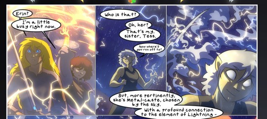
We see it most heavily in the leftmost panel, where it's quite foggy as you would expect in a rainstorm, especially in an environment with a lot of heat, but it's also lightly powdered on in the following two panels and tends to follow light sources, which makes complete sense given how light bounces off particles in the air.
A major point of strength in these too is a thorough understanding of lighting, like rim lighting, the various hues and shades, and an intricate understanding of how light bounces off surfaces even when they're in shadow (we'll see a faint glow in spots where characters are half in shadow, but that's how it would work in real life, because of how light bounces around).
Bringing some of these points together: the fluidity of the lines in magic, and the way simple glowing lines are used to emphasize motion and the magic itself, is deeply clever. I'm basically pulling at random from panels and there's definitely even better examples, but here's one (see this page https://comicaurora.com/aurora/1-16-33/):

First panel, listed in numbers because these build on each other:
The tension of the lines in Tess's magic here. This works on a couple levels: first, the way she's holding her fists, as if she's pulling a rope taut.
The way there's one primary line, emphasizing the rope feeling, accompanied by smaller ones.
The additional lines starbursting around her hands, to indicate the energy crackling in her hands and how she's doing a good bit more than just holding it. (That combined with the fists suggests some tension to the magic, too.) Also the variations in brightness, a feature you'll find in actual lightning. :D Additional kudos for how the lightning sparks and breaks off the metal of the sword.
A handful of miscellaneous notes on the second panel:
The reflection of the flames in Erin's typically dark blue eyes (which bears a remarkable resemblance to Dainix, incidentally—almost a thematic sort of parallel given Erin's using the same magic Dainix specializes in?)
The flowing of fabric in the wind and associated variation in the lineart
The way Erin's tattoos interact with the fire he's pulling to his hand
The way the rain overlays some of the fainter areas of fire (attention! to! detail! hell yeah!)
I could go on. I won't because this is a lot of writing already.
Third panel gets paragraphs, not bullets:
Erin's giant-ass "FWOOM" of fire there, and the way the outline of the word is puffy-edged and gradated to feel almost three-dimensional, plus once again using Screen or a variation on it so that the stars show up in the background. All this against that stunning plume of fire, which ripples and sparks so gorgeously, and the ending "om" of the onomatopoeia is emphasized incredibly brightly against that, adding to the punch of it and making the plume feel even brighter.
Also, once again, rain helping establish perspective, especially in how it's very angular in the left side of the panel and then slowly becomes more like a point to the right to indicate it's falling directly down on the viewer. Add in the bright, beautiful glow effects, fainter but no less important black lines beneath them to emphasize the sky and smoke and the like, and the stunningly beautiful lighting and gradated glows surrounding Erin plus the lightning jagging up at him from below, and you get one hell of an impactful panel right there. (And there is definitely more in there I could break down, this is just a lot already.)
And in general: The colors in this? Incredible. The blues and purples and oranges and golds compliment so well, and it's all so rich.
Like, seriously, just throughout the whole comic, the use of gradients, blending modes, color balance and hues, all the things, all the things, it makes for the most beautiful effects and glows and such a rich environment. There's a very distinct style to this comic in its simplified backgrounds (which I recognize are done partly because it's way easier and also backgrounds are so time-consuming dear gods but lemme say this) and vivid, smoothly drawn characters; the simplicity lets them come to the front and gives room for those beautiful, richly saturated focal points, letting the stylized designs of the magic and characters shine. The use of distinct silhouettes is insanely good. Honestly, complex backgrounds might run the risk of making everything too visually busy in this case. It's just, augh, so GORGEOUS.
Another bit, take a look at this page (https://comicaurora.com/aurora/1-15-28/):
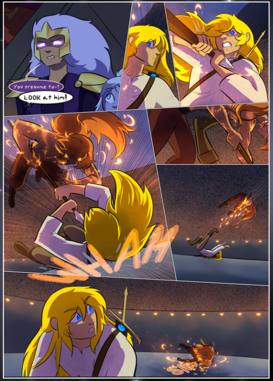
It's not quite as evident here as it is in the next page, but this one does some other fun things so I'm grabbing it. Points:
Once again, using different colors to represent different character actions. The "WHAM" of Kendal hitting the ground is caused by Dainix's force, so it's orange (and kudos for doubling the word over to add a shake effect). But we see blue layered underneath, which could be an environmental choice, but might also be because it's Kendal, whose color is blue.
And speaking off, take a look at the right-most panel on top, where Kendal grabs the spear: his motion is, again, illustrated in bright blue, versus the atmospheric screened-on orange lines that point toward him around the whole panel (I'm sure these have a name, I think they might be more of a manga thing though and the only experience I have in manga is reading a bit of Fullmetal Alchemist). Those lines emphasize the weight of the spear being shoved at him, and their color tells us Dainix is responsible for it.
One of my all-time favorite effects in this comic is the way cracks manifest across Dainix's body to represent when he starts to lose control; it is utterly gorgeous and wonderfully thematic. These are more evident in the page before and after this one, but you get a decent idea here. I love the way they glow softly, the way the fire juuuust flickers through at the start and then becomes more evident over time, and the cracks feel so realistic, like his skin is made of pottery. Additional points for how fire begins to creep into his hair.
A small detail that's generally consistent across the comic, but which I want to make note of here because you can see it pretty well: Kendal's eyes glow about the same as the jewel in his sword, mirroring his connection to said sword and calling back to how the jewel became Vash's eye temporarily and thus was once Kendal's eye. You can always see this connection (though there might be some spots where this also changes in a symbolic manner; I went through it quickly on the first time around, so I'll pay more attention when I inevitably reread this), where Kendal's always got that little shine of blue in his eyes the same as the jewel. It's a beautiful visual parallel that encourages the reader to subconsciously link them together, especially since the lines used to illustrate character movements typically mirror their eye color. It's an extension of Kendal.
Did I mention how ABSOLUTELY BEAUTIFUL the colors in this are?
Also, the mythological/legend-type scenes are illustrated in familiar style often used for that type of story, a simple and heavily symbolic two-dimensional cave-painting-like look. They are absolutely beautiful on many levels, employing simple, lovely gradients, slightly rougher and thicker lineart that is nonetheless smoothly beautiful, and working with clear silhouettes (a major strength of this art style, but also a strength in the comic overall). But in particular, I wanted to call attention to a particular thing (see this page https://comicaurora.com/aurora/1-12-4/):
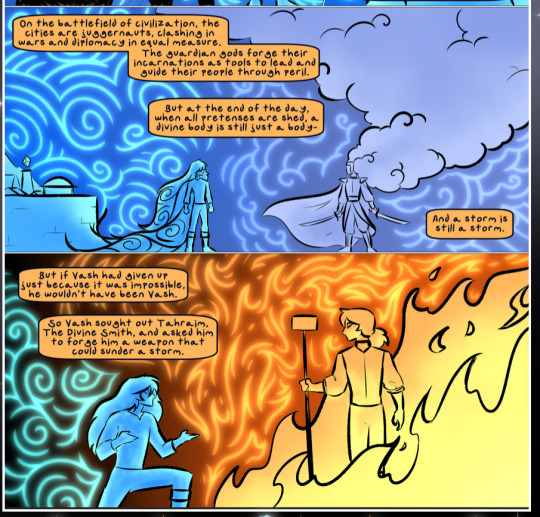
The flowing symbolic lineart surrounding each character. This is actually quite consistent across characters—see also Life's typical lines and how they curl:
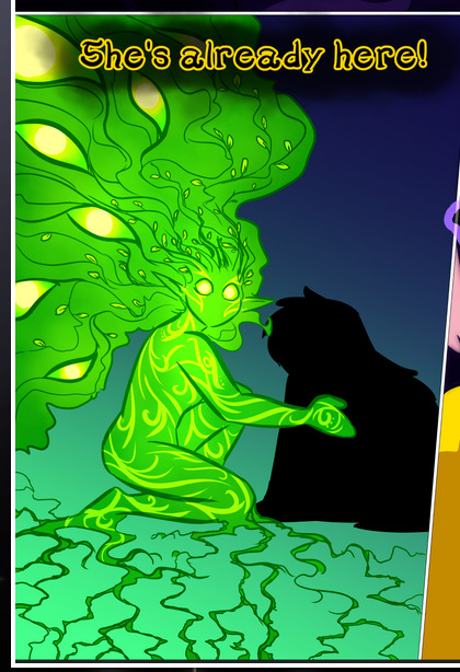
What's particularly interesting here is how these symbols are often similar, but not the same. Vash's lines are always smooth, clean curls, often playing off each other and echoing one another like ripples in a pond. You'd think they'd look too similar to Life's—but they don't. Life's curl like vines, and they remain connected; where one curve might echo another but exist entirely detached from each other in Vash's, Life's lines still remain wound together, because vines are continuous and don't float around. :P
Tahraim's are less continuous, often breaking up with significantly smaller bits and pieces floating around like—of course—sparks, and come to sharper points. These are also constants: we see the vines repeated over and over in Alinua's dreams of Life, and the echoing ripples of Vash are consistent wherever we encounter him. Kendal's dream of the ghost citizens of the city of Vash in the last few chapters is filled with these rippling, echoing patterns, to beautiful effect (https://comicaurora.com/aurora/1-20-14/):
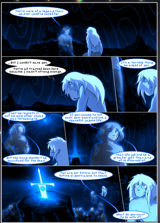
They ripple and spiral, often in long, sinuous curves, with smooth elegance. It reminds me a great deal of images of space and sine waves and the like. This establishes a definite feel to these different characters and their magic. And the thing is, that's not something that had to be done—the colors are good at emphasizing who's who. But it was done, and it adds a whole other dimension to the story. Whenever you're in a deity's domain, you know whose it is no matter the color.
Regarding that shape language, I wanted to make another note, too—Vash is sometimes described as chaotic and doing what he likes, which is interesting to me, because smooth, elegant curves and the color blue aren't generally associated with chaos. So while Vash might behave like that on the surface, I'm guessing he's got a lot more going on underneath; he's probably much more intentional in his actions than you'd think at a glance, and he is certainly quite caring with his city. The other thing is that this suits Kendal perfectly. He's a paragon character; he is kind, virtuous, and self-sacrificing, and often we see him aiming to calm others and keep them safe. Blue is such a good color for him. There is… probably more to this, but I'm not deep enough in yet to say.
And here's the thing: I'm only scratching the surface. There is so much more here I'm not covering (color palettes! outfits! character design! environment! the deities! so much more!) and a lot more I can't cover, because I don't have the experience; this is me as a hobbyist artist who happened to take a couple design classes because I wanted to. The art style to this comic is so clever and creative and beautiful, though, I just had to go off about it. <3
...brownie points for getting all the way down here? Have a cookie.
#aurora comic#aurora webcomic#comicaurora#art analysis#...I hope those are the right tags???#new fandom new tagging practices to learn ig#much thanks for something to read while I try to rest my wrists. carpal tunnel BAD. (ignore that I wrote this I've got braces ok it's fine)#anyway! I HAVE. MANY MORE THOUGHTS. ON THE STORY ITSELF. THIS LOVELY STORY#also a collection of reactions to a chunk of the comic before I hit the point where I was too busy reading to write anything down#idk how to format those tho#...yeet them into one post...???#eh I usually don't go off this much these days but this seems like a smaller tight-knit fandom so... might as well help build it?#and I have a little more time thanks to break so#oh yes also shoutout to my insanely awesome professor for teaching me all the technical stuff from this he is LOVELY#made an incredibly complex program into something comprehensible <3#synapse talks
776 notes
·
View notes
Text
Your silent protagonist doesn't have to use sign language btw. They don't have to write things down, either. They don't have to use language at all. Not every single person who doesn't talk can use words the same as you, or use them at all, so your favorite silent character shouldn't have to use what you consider a grammatical language to communicate in your fanart and fics. AAC exists. Drawing exists. Gestures and body language exist. Btw.
#i said ''your silent protagonist'' bc i feel like that'd hit close with the most people but i truly mean anyone that doesn't talk#ive seen it happen SO MANY TIMES its like ''this character never uses oral words'' and every post about them ignores it or uses sign#or they already have their own language or their language difficulties have been addressed and it STILL HAPPENS. like cassandra cain#who's like me.#inumaki toge#link#link loz#loz#legend of zelda#trainer red#champion red#red pokemon#HES MY FAVORITE HIS SPEECH ARC RESEMBLES MINE SO CLOSELY#pokemon rgby#pokemon hgss#ik sun/moon and usum are there too. so many tags#controversial one here probably but#chell#portal#cass cain#cassandra cain#batgirl#batman#fandom ableism#:)))))))))))#NOT AN EXAMPLE BC IT'S LITERALLY THE COMICS WHO MADE HIM THIS WAY BUT#JONO STARSMORE#language disorder#bi rambles#ive seen exactly one fic where red has an LD. my lifeblood. also shoutout peaks and valleys for his writing difficulties. ask me abt red pls
187 notes
·
View notes
Photo
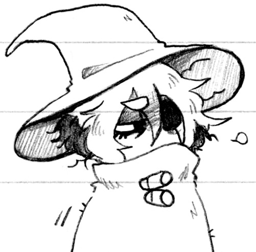
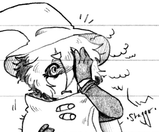
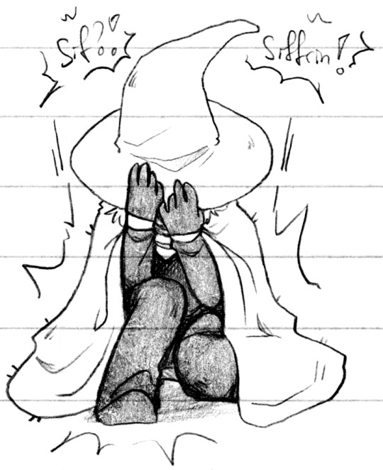
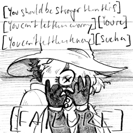
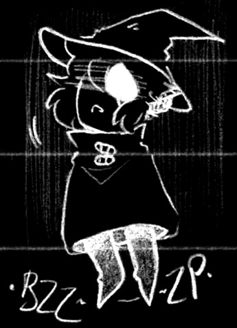
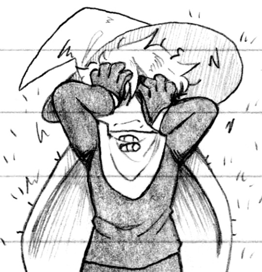
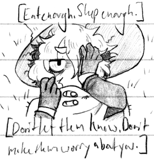
Blood sugar levels (Patreon)
#Doodles#ISaT#Siffrin#And implied Isa and Mira from offscreen but it's fine lol#Kinda sorta spoilers in the tags be warned#Man these poses were fun to draw - hand poses and body and ah <3 Fun!#This was one of those comics that came to me pretty much fully formed and then I had to do it - it was very fun which I'm very glad for!#Probably the funnest were the first - third - and fourth panels :D#The way their cloak falls around them ah pretty <3#That big spooky eye hidden under the brim of their hat <3#That one was really fun to edit too :D Writing [FAILURE] elsewhere on the page and then overlaying it :) Fun!#I wonder if Siffrin would die of starvation faster than normal due to the [redacted]#And since that would kill him it'd make him loop back - even tho it's also somewhat powered by food?#It's curious! I like it :)#I imagine his innate magic also powers it somewhat but hmmm recursive#Not that he died here anyway :) One of those fun ones before Loop spells it out for him :)#I have to wonder if All those loops we don't get to see are mundane hmm ♪ How many of them are forced out of Sif's mind so we as the player#Will just never know ♪ I suppose we'll never know! Haha#The exhaustion of having to keep his body running it's really the depression simulator#Sif :( They're gonna worry about you anyway!#It's amazing what our minds just refuse to process when we're in The Sads™ haha
195 notes
·
View notes