#i was trying to go for like a early 2000s art stylee...
Explore tagged Tumblr posts
Text
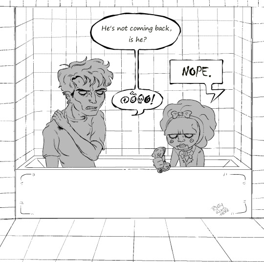
WITHOUT TEXT VERS
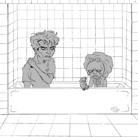
BONUS
This is actually a redraw of an unfinished piece i did back on May 23rd

#its so disproportionate im crying#art#adam stanheight#saw fanart#saw#saw 2004#billy saw#i got too lazy to color#i was trying to go for like a early 2000s art stylee...#hey so i have no fucking clue what im doing
43 notes
·
View notes
Text
Scene
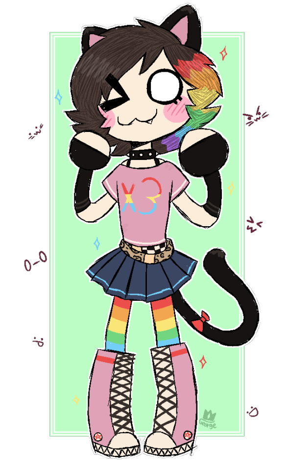
RAWR :3 SRY HAVNT UPLOADED IN A WH1LE!!! I've been SOOO busy!!! but heres KITTY!!! SHE LOVES CATS (kinda like me :p :3) AND SHE LOVES RAINBOWS!!! OMGOMG I love her so MUCH AND TO ALL YOU H8TER POSERS EFF YUUU!!1!
rip 10 year old me, you would've loved scene
uhm, i've definaly done more reaserch than nessesary, but i mean. This was fun practice (it's REALLY out of my style) and it was fun trying to piece together all the colours and have a consistent theme.
Inspiration is from the more popular emo/scene chibi style you'd find in some older pmvs and deviantart posts.
Shoutout to all scenekings and scenequeens. You shaped my childhood in a weird sense (i've had the scene kid vocabulary and slang shoved into my face and i gobbled that up like 5 star meal)
#my art#2000s scene#scene kid#practice#rawr :3#i feel like the souls of peoples scene phases have infected me#i'm not going to escape alive#also#accidentally went into a rabbit hole of sorts trying to “name” the actual emo chibi style#and bruh the internet is weird#guys do you remember eb- (GUNSHOTS)#kitty would've loved early dan and phil#rip kitty you would've loved the downfall of twitter#she#yeah i got nothing else#RIP david lynch you would've loved seeing this
6 notes
·
View notes
Text
thinking about gooner!art / hypersexual!art,,
mdni — ageless blogs included.
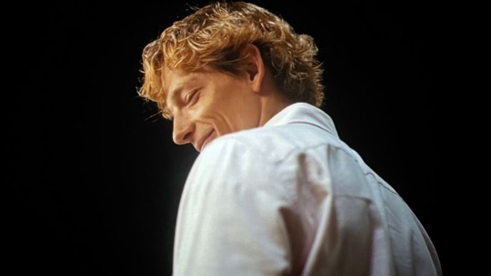
💬 warning: holy shit, he’s DISGUSTING and a LOSER. but that’s the point.
genuinely became a problem once he reached college.
no parents around, GOD FORBID he has an apartment style dorm + some money on him.
he’s going to town A LOT (obviously). but more than he would if he had a roomate for sure.
since it’s the early 2000s, he doesn’t use the internet to get off sometimes.
classic magazines, not a playboy kinda guy though.
definitely whimpers n’ whines, gets kinda shaky when he’s about to cum.
often fantasizes about getting dominated since he genuinely believes he doesn’t stand a chance with the lack of confidence he has in bagging some of his favorite girls.
YES, he has favorite girls.
jerk off rate per day? on average? probably like five-six times.
one when he wakes up, one before he falls asleep (him cumming usually causes him to go to sleep because he’s just tuckered out for the most part), one after practice (if he feels like it), and always after an exam. (he’s stressed), and pretty much any other time he might randomly get hard.
even if that’s just his shorts coming up a bit too much, moving his dick through his underwear a bit too much.
he mostly does when he “can’t sleep”. (which is most nights.)
goes multiple rounds if he can.

a pillow humper!! sometimes he gets really tired of using his hand so sometimes he’ll just use his pillow and rub his dick on it over and over. (he uses a towel, sometimes multiple to cover up where he MIGHT cum.)
has definitely done the walk of shame to the laundry room a few times just because he accidentally came on his sheets.
he has definitely had a fantasy about some of his favorite professors from time to time.
he’s a good student, so whenever he gets praise from them, he often gets a hard on and then has to either get one off when he gets to the dorm or in the nearest bathroom.
sometimes he pees a little after he cums because he’s just trying to drain his balls and sometimes does a little too much but he kinda likes it so he keeps doing it.
when the internet starts to become a bit more functional and people start making porn sites, it’s actually over.
getting off daily, FOR SURE.
favorite category? probably into creampies or breeding. facefucking lover + loves facial finishes.
he also finds his favorite girls on the internet too.
likes to sometimes watch those videos where the couples are like passionate with it because it makes him feel some sense of love in his life because he’s just such a degenerate.
whenever he goes home for a weekend, it’s actually torture. he tries not to do it once he’s there in his bedroom, but most times it’s just fucking impossible.

loves cam girls to death once he finds out they exist.
it’s like endless goonery for him, it’s great.
like i said earlier, god forbid he has money. — getting sex toys + donating to said cam girls for special requests.
LOVESSSS it whenever the cam girls say his name because it feels like he’s actually receiving the touch of a woman.
loves phrases like “your cock is so deep” and “your dick is so big”
post nut clarity? absolutely deadly and dreadful.
knows he won’t ever be successful with a woman in bed because porn + cam girls have rotted his brain and ruined his reception of sex for a while, probably.
premature cummer when he actually gets inside of a woman in his sophmore year.
it’s like his dick gets absolutely freaked out at the warm and wetness of it all because it’s just so overstimulating to his cock.
so used to the hand and the toy that when he experiences the real thing, it’s absolutely foreign to him.
first blowjob? same thing. extremely nervous.
shakes when overstimulated. (when he’s with an actual woman, it’s like 10x worse.)
jerks off to the thought of some attractive women he sees on campus that he’ll never see again because of his disgusting imagination with some depraved part of his brain.
imagines how they look naked and what it be like to fuck them, even if it was just five minutes of what he likes describe as pure heaven.

loves getting off in his car, has a fantasy about getting caught by someone and them joining him (because of his porn rotted brain).
too pussy to actually park it somewhere where there’s a risk that some people might actually see him.
tells himself that he’ll eventually stop jerking off so much. (he won’t because he has no self-control. <3)
has cum so hard that he’s cried a few times and then just kept going because it felt so so good to be at the peak and to feel so euphoric for so so long.
hisses a little whenever he sticks his cock in his fleshlight after not using it for a while. his favorite nonexistent pussy in the world.
“ffffuck. god, i’ve missed you, sweetheart.”
yes, he talks to his toys like they’re actually women. let a man dream, yeah?
gooner!art with his first girlfriend.
moodboard !
enjoy you filthy people ! okay bye. <3
#soaraes#soar writes#soar’s blurbs#challengers#art donaldson#art donaldson blurb#gooner!art donaldson#hypersexual!art donaldson#art donalson x reader#just a thought
233 notes
·
View notes
Text
Creepypasta Relationship HCs / Types! 𐙚⋆°.⋆ ( 1 )
Characters : Tobias Rogers ‘Ticci Toby’ , Evan Myers ‘HABIT’ x Reader
Word count : 2k
A/N : hello pookie bears! (˶ᵔ ᵕ ᵔ˶) My request are open right now so please please please spam me with suggestions or fic ideas!!
Tobias Rogers ‘Ticci Toby’ : You were a new beginning, an artistic melody that painted the sky with strokes of light and color. Toby was a faded light, dimmed and jaded— but you lighted his heart ablazed. Once he touched a fragment of heaven, he knew he couldn’t turn away. Because, Toby was never known for being a selfless man.
Toby is someone who desperately wants to be loved— but with how his life turned out, being on the run during his late teens and early twenties, then serving the being that haunted him since he was a child— to put it lightly, Toby never had the time to connect with someone.
It does mess with Toby deep deep deep down— that he isn’t normal, that he can’t build strong relationships— like others do so easily, though it’s something he does crave— he isn’t that delusional; he knows he wouldn’t be able to maintain any sort of relationship anyway.
But that’s thrown out the window when he meets you— I fully believe Toby’s a ‘love’ ( lust ) at first sight type of guy. He tends to fixate on people, starts learning everything about them ( all the parts he likes, anything else he’ll block out.. like it doesn’t exist. ) projects his dream partner onto them, till he gets bored or they break the perfect woman perception— he had for them.
It’s probably a small / insignificant act of kindness that brought Toby’s attention to you.
Maybe it’s when you paid for his meal inna hole and a wall diner / or you helped him when he was injured( even if he doesn’t feel pain— the thought still counts ) / or maybe in passing you complimented his sense of style. No matter how you met Toby, he fell hook and sinker.
In a relationship, I feel that Toby would naturally go for someone more maternal. ( even if your the most masculine woman / person — he’d still project a motherly role onto you. ) He’s so used to older angry masculine male figures in his life— who call him crude names and make him feel less than.
He just wants someone who’s nonjudgmental. Someone who’d love him despite his ugly scars— to kiss them gently, love them like they are art on a canvas.
Toby knows that’s wishful thinking.. and you probably don’t even know he exists but a man can dream.
Toby daydreams about you ALOT, it pisses both Masky and Hoodie off cause the kid won’t do his darn’ job correctly— Masky is one bad day away from grabbing Hoodies gun and blowing Toby’s brains out.
TOBY IS SO AWKWARD IT HURTS.. he isn’t the most social guy ever.. the only real conversations Toby has is either with one his victims.. and Toby barely would call someone begging for the life a conversation— Two, Tim and Brian… and Toby fuckin hates Tim ( the feeling is mutual ) Then Brian… Toby doesn’t exactly have a problem with him.. but Toby thinks Brian a fuckin werido for even liking to be around Tim. Lastly— the voices in his head.. and I won’t elaborate on that.
So when Toby tries to talk to you.. he very creepy— like very fuckin creepy..
Unwavering direct eye contact, prolonged touches, Talking in an unnatural manner, like he’s reading off a shitty 2000’s screenplay.. it’s bad— so bad.. but Toby thinks it went amazingly! Honestly it went better then what he’s been imagining in his head!
I think Toby would try to be a flirt… but he’s straight up tremendous at it— but I wouldn’t recommend telling him that, he has a very small fragile ego.
Realistically.. Even if Toby bagged you, he wouldn’t be able to be with you for long— once his job is over he has to move towns unless..
Yeah, bro kidnapped your ass— are yall really that shocked??
Not gonna lie, getting kidnapped by Toby is lowkey the worst lol ( who would’ve thought?? )
That’s when you’ll learn the most about Toby— mostly how seriously deranged this fucker is.
You’d have to deal with his horrible psychotic episodes, where he trashes the whole fuckin cabin, screaming at you for not loving him back— full on man child tantrums.
Toby most definitely dissects animals for fun.. so good luck with the rotting smell of corpses in your bedroom.
When Toby comes back from ‘work’ he’ll always have a gift for you.. though don’t ask him who or where he got it from— just smile and say thank you.
Toby most definitely stole the password to Tim’s Hulu account.. yall watch anime together.
Toby doesn’t talk much, since he wouldn’t have much to talk about.. ( Toby also hates his stutter/tics.. so he’d rather hear your soothing voice instead of his raspy one ) but he’s a total nerd— Ask him a question about Star Wars and he’ll yap for hours.
Toby accidentally hurts you— more often then he’ll like to admit.. he doesn’t comprehend his strength— and it’s hard to understand a concept you’ve never experienced, so when you cry — he thinks you're being a big baby.
Toby is a DIY husband, always building something new when he’s home— cannot stay still.
You're gonna have to do all the cooking… This man eats like a 3 year old.
Toby loves you unconditionally— though depending on how you treat him, your experience with him will either be hell or decent..
also don’t try to leave the cabin, he’ll find you.
Evan Myers ‘HABIT’ : Evan is losing his mind, a parasite— a monster is taking over his body. It nibbles on his brain, whispering unsavory suggestions into his head. His thoughts aren’t his own anymore, neither is his love for you.
Evan is short-tempered, vulgar, and a bit of a smartass. Not everyone can handle somebody like him— yet there you are ( foolishly ) loving him through everything.
Evan feels his sanity slipping from his grasp, he knows he’s less than sane, that he’s borderline psychotic. He knows the right thing to do is to let you go. That he can’t even trust himself to protect you anymore— especially from himself.
Yet, he selfishly clings onto you, because you are Evan’s breath of fresh air, you're as gentle as a baby bunny, softly holding him throughout his night terrors. Gently patting his tears away with cloth, whispering sweet nothings into his ear— sweet empty promises that everything will be alright— that you’ll stick with him, no matter what— that nothing can take him away from you.
Evan can’t handle the thought of losing you, he’d actually start tweeking out. Especially if slenderman had something to do with it. ( Evan will somehow someway throw slenderman out the window just like he did the rake. )
But seriously— Evan can’t lose you. You are the rainbow after his storm. Evan is a whirlwind of contradicting emotions, yet— you're his only constant that pulls him out of his episodes. He can’t live without you.
You are his distraction, his comfort outside of the hell that is his life. All Evan wants is your touch, your undying nor revering love, and in return he’ll give his everything to you.
Correction: he'll give you everything BUT information on what he does with the EMH ( EverymanHYBRID ) crew.
He has you blocked on all social media, and changed the password to his computer, Evan doesn’t want you involved in his fucked up life.. well more than you already are.
Evan knows that you're not an fuckin’ idiot, there’s only so many times that he can come home with a new injury till you're catching on that the ‘workout’ videos aren’t all he’s doing.
But in Evan’s defense there’s only so many excuses he can make up about how these crazy ass scars keep on randomly appearing on his body— Or the weird brown stains on his jacket.
you're growing more suspicious— even if you don’t directly question him.. he can see in your eyes that you’re worried.
But if Evan were to tell you the truth ( he wouldn’t inna million fucking years ) he doesn’t even know how he’d start that conversation.
“Babe, don’t freak out but.. Y’know slenderman? Yeah, that tall lanky malnourished mother fucker’ that we made fun for having no face? so.. he’s real— surprise! Ohhh, and has been haunting me and the gang for months..and wanna know the best part? I never told you till now! Haha..” yeah no.. Evan rather uses his own body as a pin cushion for his knife collection than ever admit something as lundquist as that.
Evan believes ignorance is bliss ( but only when it comes to you. )
HABIT adores dumb little things, like you. He loves the way your eyes light up whenever he comes home from a long day of ‘work’. HABIT also loves your expressive facial features, how he wishes to contort it, to dismember it into something else entirely new. But what HABIT loves the most is the fact that the ‘man’ you kiss every morning, who you trust unconditionally and let into the deepest crevices of your body, isn’t who you think it is.
HABIT is an inhuman being that predates time itself. He doesn’t have any connection to humanity, only existing to find a suitable host.
It isn’t hard to get HABITS attention, in fact it’s pretty easy. It's just extremely hard to maintain.
But you're so awfully pathetic, kind soul, that he sorta ‘feels’ bad for you. That you ended up with a guy like Evan, and return him.
HABIT finds you interesting, specifically your selflessness. He notices when you go out of your way to help others, or how you consider his feelings whenever you make a decision, or whenever he’s upset, you always make ‘him’, his favorite food.
You're really as sweet as they come, and he’s the murder that wears your boyfriend's skin.
HABIT fucks with you a lot, ‘accidentally’ tripping you, moves your shit around so you can’t find it, constantly trying to scare the shit out of you— just to make fun of you for being scared.
HABIT brings you dead bunny corpses as gifts
HABIT isn’t used to preserving life, that was never really his cup of tea. He prefers breaking down his host, ( or their loved ones ) to their very limit, mentally and physically— till they're unrecognizable from humans or beasts.
Yet, now he does facial saturday’s with you / joins you in your everything showers / and lets you paint his nails any color you want.
It’s not that HABIT, gotten soft— he’s the same evil unforgiving ass mother fucker that possessed your boyfriend, ate a baby, and works with the fuckin slenderman and the rake, you cannot fix him.
HABIT lovesss to mock you, he loves making fun of his dumb little wife for asking ‘dumb questions’— he often flicks your forehead.
HABIT loves that you're a crybaby, he loves wiping your tears away condescendingly— like he wasn’t the one who caused them.
Most definitely daydreams about killing you.. more often than you’d expect— he especially thinks about it when yall are intimate. When HABIT holds you, tracing your body with his fingers— looks at you intensely like you're the only woman in the world— just knows he’s thinking about how you’d look if your organs were spilling out of your stomach.
HABIT unlike Toby can flirt— he never liked the whole brooding boyfriend type of thing— Evan had going on at times— HABIT in his words, ( not anyone else’s ) He’s a simply a little demon, a whimsical silly creature who does things for his own entertainment, and his current fun outside of fuckin’ with the EMH crew is fucking with you. ( sometimes literally )
May that be blowing into your ear, to make you shiver— or picking you up and carrying you, to see your shocked expression — or even holding you by your waist, while the EMH crew is around to embarrass you / prove a point to the group.
HABIT would do it especially when vinnie found out that he processed Evan— the shit eating grin, he would have as you invite Vinnie over to your place for dinner cause ‘he’s been looking stressed lately’ you’ll make Vinnie’s favorite meal, trying to make it feel like old times— but vinnie cannot even enjoy you and your thoughtfulness when your sitting on that monsters that’s cosplaying his best friends lap.. it’s making him sick.
‘Vinnie, are you okay? You.. look pale,’ you ask softly, drink in hand— you walk over to him, handing Vinnie a glass of water.
‘Yeahhh, Vinnie,’ you feel a strong pair of familiar arms wrap around your waist. ‘—What’s wrong buddy?’
ANYWHOO HABIT randomly telling you the most out of pocket shit and just smiles and says,
‘Sorry— hunnie, It’s a bad habit.’
#ticci toby x y/n#ticci toby x you#ticci toby x reader#ticci toby smut#ticci toby#slenderverse#everymanhybrid#evan everyman#habit emh#habit everymanhybrid#habit x reader#creepypasta#creepypastaxreader#smut
322 notes
·
View notes
Text
Relationship Headcanons with Chris Cornell
A/n: currently working on a part two to this post so stay tuned 💌!!
- your passionate relationship with Chris spanning from the early 90’s to the 2000’s.


I don't see Chris as the type of boyfriend to become jealous when someone is getting a little too close to you. If anything, I could see him getting annoyed by the persons presence. Here he is trying to spend time with his girlfriend and suddenly someone's making a faulty attempt at sweeping you off of your feet. He usually just ends up staring at the person as if they're a new species he's never seen before, eventually pulling you away from them and leading you somewhere else.
If you tell him you're interested in learning how to play the guitar, he's offering to help you before you can even think about paying someone else to assist you. He'll place your fingers on the right strings and softly encourage you throughout the entire process.
"just put your finger there, yeah, and then play the note."
"That's good, real good. You're already getting the hang of it."
You always accompany him when he's out on tour because he cannot stand being away from you for unnecessarily long periods of time (and neither can you).
He's not overly affectionate in public and sees obnoxious couples as people attempting to prove their love to the public. The most he'll do in public is wrap an arm around you and place a sweet kiss to your temple. He keeps his hand wrapped around yours and hardly ever lets go.
guides you through crowds.
Behind closed doors he's practically wrapped around you like a koala. He'll hug you from behind and look over you while you complete daily tasks. Constantly runs his fingers through your hair and puts it into silly styles when he wants to keep his hands busy.
He's definitely one for intense eye contact. In the beginning of your relationship, you were a bit too timid to hold eye contact with him but he just wouldn't leave the subject alone! He'd brush the hair out of your face before gently caressing the curve of your cheek, guiding you to look over at him.
"Still can't figure out why you're so shy with me. You already know you don't have to do that with me."
Has an obsession with taking photos of you with his little camera. He could care less if you think you look messy or if you haven't even brushed your hair yet, he's getting that photo. Loves going into photo booths with you while you're accompanying him on tour.
He has photos of the two of you together, candids, and others where you're beaming at the camera/pouting because this is the tenth photo he's taken of you! He'll write sweet little captions on the backs of the photographs and they make your heart ache when you read them.
Supporters of his definitely see you as a style icon and journalists write little articles in magazines about you with the titles: "Times Y/n L/n Gave Us Looks We Were Starving For!" "A Burgundy Lipped Y/n L/n Stuns Next To The Talented Chris Cornell."
If you enjoy drawing, painting, embroidery, or anything else related to art, he'll hang up your artwork around the apartment.
His nicknames for you vary from shortened forms of your name, childish ones that popped out of nowhere, and the traditional baby/sweetheart.
He's an incredibly attentive boyfriend and never fails to check up on you before & after his shows. He'll make sure you're given whatever it is that you need and constantly looks your way as he's on stage.
He has many songs that are about you but doesn't make it too obvious. It's not until you're listening to the song and hear a lyric alluding to a special moment the two of you shared or a reference to something notable you said that you realize the song is in fact about you.
Your relationship isn't hidden but rather private. He doesn't share unnecessary details but he makes it a point to present his gleaming ring finger to the camera when somebody asks if he's available or if a talk show host hints at the subject.
He'll also mention you in passing and talk about you when it relates to the topic at hand.
"My wife and I were actually in Seattle about a month ago..." "While we were working on the album, my wife was definitely a great source of inspiration. She's great at helping me get out of...y'know whatever slump I may be in creatively. she's great." "and the next video we're gonna play is Tear Drop by Massive Attack!" "oh yeah my wife likes em a whole lot."
He’d want nothing more than for you to meet his family and get familiar with his mother. He has to stop himself from crying like a baby when he notices his mother treating you as if you were one of her own. As soon as she greets you with a big hug paired with a gleaming smile, he feels like he can finally breathe again from the pure relief he feels in the moment.

#x female reader#x fem!reader#x female y/n#Chris Cornell x reader#Chris Cornell x fem reader#Chris Cornell fanfiction#rpf x reader#rpf x fem reader#rpf fanfiction#rockstar x reader#90's rockstar x reader#90's rpf x reader#x fem reader#rpf
66 notes
·
View notes
Note
Hi indie, how you doing ?
I wanna ask why did indie turtles live in 1996 ? I think it's a good idea, like you can match real events with your story and some people can feel nostalgia, but why 1996 ? Why not between 2000 and 2020, because it's more recent and that’s time you can identifie to it. ( I hope you understand my english��)
And also, when Leo's in the coma, is the scene when he wake up gonna be like 2012 version or we will see him wake up ? When he wake up, is someone's here with him ?
And what you think about mutant mayhem 2 ? ( who will be in cinema on October 2026 ), I really hope Leo will be throw through a window by Shredder, be badly hurt and have trauma🤩
Hello! I’m doing good!
So there were a few factors that prompted me to choose 1996.
The first factor I considered was that I didn’t want my story to age badly because it was set in the present day. Like if I made references to something or someone and then something bad happened and it’s like…ooooo…yikes… (Mutant Mayhem, is a great movie, but it experienced one or two of these instances of “that reference didn’t age well”)
After I had confirmed I was definitely not going to write a story about the modern age, but the past, (a time which as already happened and I can look back to and only include stuff that has already happened) the next question was when in the past. At first I was going to go with the early 2000s around when I was born, but since there’s already TMNT 2003 and I wanted to try maybe going a bit further back to the 90s.
I am aware that there is The Next Mutation show which aired in the 90s, but no one watched it so I figured it’d be fine. Then I chose 1996 because of how I wanted the books to end, and there we go, May 23rd of 1996 is when it starts.
Then for your second question: yes, it’ll probably end up being pretty similar to 2012. I haven’t decided on everything yet because that’s gonna be in the next book, but generally my story is a large amount a mix of 2003 and 2012.
I haven’t really thought much about what I think Mutant Mayhem 2 will be like actually 🤔 I thought the first movie was pretty good, and I really loved the tv show (especially the first arc with the robots, that was AMAZING). I hope it ends up being pretty good.
I think Shredder’s probably gonna be in it which would be really cool, Shredder’s my favorite villain, so I hope they do some cool stuff with him and the Foot clan and stuff. I’ll probably try to see it in theaters if I can. At the very least, the art style is gorgeous and bro if Nine Inch Nails is doing the soundtrack again, I’m going just for that.
Good questions! :]
55 notes
·
View notes
Note
your art is so so so so inspiring to me which is strange bc my style isnt very similar to yours at all. but it makes me happy to see your art, especially when you make art from things from childhood id forgotten about💫💫💫💫💫🩷🩷🩷🩷
Thanks. Your message and similar messages from others over the years inspired me to try to put into words why I draw 'nostalgic things'. I ended up writing a lot.
There was a period of time when I became cynical about being seen as an 'artist who reminds people of childhood' or a 'nostalgic artist'. I no longer feel that way but I will explain why. Some artists, who I like and respect, will sometimes mention 'nostalgia holding artist's growth back' and 'nostalgia causes learned helplessness.' But I feel differently.
Maybe I perceive time differently. I have lived long enough to witness cycles of 'what is valued, and what is not valued' repeated. For example, I loved what is now called 'Y2K' style, but during mid 2000s, for whatever reason it was derided as something to be left in the past, something embarrassing. "Aren't we glad we optimized things now, and they are 'sleeker' and less complex? Old things were childish, an embarrassing weakness for humans, we must advance and reach our ideal evolution." That became the common attitude. I felt pressure to have the same thoughts. I just couldn't make myself feel that way no matter what, though. Even with the increasing threats about, 'keep up with others or you won't ever develop positive social relationships!' I couldn't change my mind.
(If what is currently valued becomes devalued and then it becomes valuable after that… that's an odd cycle to me. For example, if we like bananas, even when bananas cannot be harvested, we still like them even though they occupy a smaller space in our minds but we don't deride them. Going even further, though, I sometimes wonder if it is possible for humans to eventually remove the 'devaluation' stage, particularly in art 'trends' as I am an artist. Whatever is considered valuable remains valuable. A counter arguement would be, 'no, the devaluation of the previous thing is exactly what causes the next thing to be valued, and then the cycle flows beautifully: X was valued -> Y is valued, X is devalued -> Y is devalued, X becomes valuable again. If you want X to always remain valuable, just develop better patience. Like we cannot pick fruit we like all year, we cannot simply keep adding onto the pile of things we like, something has to be seen as inferior by the majority of humans.' I disagree. I might explain my thoughts against this argument more in the future.)
Anyway, what people call 'Y2K style' or 'art that emulates how things commonly appeared in early years of 2000s' is popular nowadays. Even someone who did not grow up with it can become attracted to it. That 'desire' itself is a communication between past and present. Something can make someone feel 'lighter' [in sense of, "wow, the crushing weight of my circumstance feels not so crushing when I look at this'] -- a similar 'light' to how someone in the past was perceiving it when it was the present and not the past. So, even though two people were born in different eras and may not become friends or even meet, they're still connected by that 'lighthearted' feeling they both like. I know it will be seen as 'lower value' soon, but I truly cannot care because as I mentioned earlier, I might perceive 'time' weirdly.
When I started playing video games, a family member would point out, 'those games were made before you were born, interesting!' but that statement confused me at the time since my perception was, 'well, if these games are from before I was born, I don't understand why she is bringing attention to it. Why is it interesting? It's just regular. They're alive in the present now, because I'm in the present and so are they.' That was when I was a very young child. I subconsciously kept the same feeling even as I was reaching teenage and adult years. The feeling echoed when people liked to ask the question 'why are you still playing games from long ago?' as I got older but still played the same 'old' games. The answer: they are beautiful and will remain beautiful, and something made in the past is still communicating in the present, so are they really truly 'outdated inferior games'...? Just because the cycle of valued and devalued happened to be in a different position and those old things were seen as an embarrassment? (Now there are popular games inspired by the era of games many people ridiculed me for consistently enjoying, lol. Similarly, I was using 'crappy' old versions of programs even through 2017. Now people from wealthy upbringing and background use 'crappy' programs willingly. lol)
The present talks to the past all the time, nostalgia is not a dead end. In that sense I cannot see nostalgia as a death trap but rather a connection made from past to present. A string between the past and present that feelings can crawl across and communicate. Feelings such as 'I wish my life took a different direction. I can't make things like how they were back then, it won't ever be the same again, so I'll do nothing.' The criticism of 'nostalgia' is towards that last sentence. But there are things you can do with those feelings. 'Doing nothing is boring. And I keep thinking of that fun drawing I saw... I kinda wanna try to make something.' Making something while thinking of the past and present at the same time, so there is a communication between past self and present self. Pure bitterness communicating with slightly light-hearted view, the 'end result' is artwork/creation.
*I used light-hearted feeling as example, but nostalgia can exist for any feeling, and not just for people who were nice when they were younger. If someone was cruel as a child/teenager, after the person has been an adult for a while, they can communicate with their younger self about what was it about the cruelty that was enjoyable, and then extract a small part from the cruelty that they wish to bring back into the present -- example, the attraction to 'high speed activities, playful mischievousness' can be extracted from 'hurting people on purpose so they will acknowledge/react to you'. The dialogue could be something like, "'honestly, you and I both know spamming people with bad things felt pretty fun at the time, so let's just keep the 'high energy mischievousness' feeling and leave behind the crap that hurt people deeply, and let's make an animation while thinking of that high energy feeling.
^ I don't answer questions or reply to messages often because of giving answers that aren't too long or too short is tough for me. lol. Thanks for liking my art. I like a lot of art that doesn't resemble mine as well. It's fun! Like appreciating different flavours in the same meal even if you cannot make the meal yourself.
190 notes
·
View notes
Text
Love in every corner X Dad Harry Styles

MasterList
Harry Styles Masterlist
The house smelled like dust and old books.
Moving boxes were scattered around the living room, some neatly taped shut, others still waiting to be filled. The walls looked bare without the pictures and little trinkets that had made this place ours for so long.
I knew we were doing the right thing moving forward, starting a new chapter but that didn’t make it any easier.
I sighed, wiping my hands on my old hoodie before reaching up to open one of the kitchen cupboards. A little cloud of dust floated down, making me cough.
"You alright over there, love?"
Harry’s voice drifted from behind me, amused and affectionate.
I turned to see him leaning against the doorway, arms crossed, looking entirely too relaxed considering the mess surrounding us.
"Fine," I muttered, stepping onto my tiptoes to reach the back of the shelf. My fingers brushed against something small and wooden. Frowning, I pulled it out.
Harry’s eyes lit up the moment he saw it. "No way."
I turned the little carving over in my hands. It was a tiny, lopsided heart, the initials H & Y carved into the centre in scratchy, uneven lines.
"You kept this?" I asked softly.
Harry pushed off the doorframe and came closer, a slow grin spreading across his face. "Course I did."
I looked up at him. "You made this for me in Year Nine."
"That I did," he said proudly, wrapping an arm around my waist. "We had Design & Technology together, and I spent the whole lesson trying not to lose a finger while carving that for you."
I snorted. "It was a terrible carving."
He gasped in mock offence. "Excuse me! That’s a priceless work of art, that is."
I turned the heart over, running my thumb over the familiar grooves. "It’s sweet, though. You gave it to me right before you asked me out for the first time."
Harry hummed, his chin resting on my shoulder now. "And you said no."
I grinned. "I did not!"
"You did!" he insisted, laughing. "You said, and I quote, ‘I’ll think about it.’"
I bit my lip, trying not to laugh. "I was just playing hard to get."
"Well, it worked," he murmured, pressing a kiss to my cheek. "I was smitten, remember?"
My heart melted, like it always did when he spoke like that like he was still the same curly-haired, lovesick boy from school, looking at me like I’d hung the stars just for him.
I sighed, leaning back into him. "We were just kids."
"Yeah," he murmured, squeezing my waist. "And now we’ve got kids."
I turned my head slightly, looking up at him. "When did that happen?"
He chuckled, kissing my temple. "No idea. Feels like just yesterday we were sneaking out to that field behind your house and lying under the stars."
I smiled at the memory. "You played me that song you wrote for me. You were so nervous."
"Was not."
"Harry, your voice cracked on the first line."
He groaned, hiding his face in my shoulder. "Let’s not relive that part, yeah?"
I laughed, patting his arm. "Come on, let’s see what else we can find."
We spent the next hour digging through cupboards, reminiscing over every little thing we found.
An old school photo of us Harry with his wild curls and dimples, me with a shy smile and braces.
A crumpled note he’d passed me in class that simply read, You’re beautiful. Don’t argue with me.
A mix CD he made for me when we were sixteen, titled Songs That Remind Me of You (featuring an embarrassing amount of early 2000s love songs).
We found our old wedding invitation, the edges slightly yellowed with time.
"Best day of my life," Harry murmured, tracing the date with his finger.
I glanced up at him, feeling my chest tighten with emotion. "Yeah?"
He looked down at me, eyes warm. "Yeah."
I swallowed, reaching up to brush a curl away from his forehead. "Mine too."
We kept going, and soon we were finding things from when our children were little finger paintings, old birthday cards, a tiny shoe that neither of us could figure out why we still had.
"Look at this," I said, pulling out a crayon drawing.
Harry peered over my shoulder. "Oh, this one’s a classic. That’s me, isn’t it?"
I grinned. "Obviously. See? You’ve got the massive green scribble on your head that’s your hair."
He laughed. "Brilliant. And what’s this?" He pointed to a small blob beside him.
"That’s Hattie. She told me once she drew you as a giant because you were her hero."
Harry’s breath caught slightly, and when I turned to look at him, he was gazing at the picture with something so tender in his eyes it nearly made me cry.
"She really said that?" he murmured.
I nodded, resting my head against his shoulder. "She adores you."
Harry exhaled softly, setting the picture down carefully, like it was the most precious thing in the world.
We fell into a comfortable silence as we kept sorting through memories. Every now and then, I’d feel Harry’s lips press against my hair or his arms tighten around me as we unearthed another cherished moment from our past.
Finally, as the sun began to set, I sighed, stretching my arms. "Well. That was emotionally exhausting."
Harry chuckled. "Think we did more reminiscing than packing."
"Maybe," I admitted. "But I’m glad we found all of this. Makes it a bit easier to leave, knowing we’re taking the best bits with us."
He hummed in agreement, pulling me back against his chest, his arms wrapping around my waist.
"You know," he murmured against my ear, "it doesn’t really matter where we go."
I turned my head slightly. "No?"
He shook his head, pressing a kiss to my shoulder. "Nah. Because as long as I’ve got you, I’m home."
My breath hitched, warmth flooding my chest.
I tilted my head up, meeting his gaze. "You always say the perfect thing, you know that?"
He grinned. "That’s because I mean it."
I turned in his arms then, winding mine around his neck. "I love you, you soppy idiot."
Harry’s dimples appeared as he leaned in, brushing his nose against mine. "Love you more, sweetheart."
And as he kissed me, surrounded by boxes and memories, I knew no matter where we went, no matter how much time passed he would always be my home.
#fanfiction#reader#x reader#one shot#harry styles x reader#harry styles au#harry styles imagine#harry edward styles#harry#harry styles#harry styles x you#one direction#1direction#1d#1#d#direction#one direction x reader#directioners
82 notes
·
View notes
Text

Stitches and Sentences Roundup 2024
Thanks for the tags on your writing round ups @run-for-chamo-miles, @drowninginships, and @emeryhall! I just got back from a weeklong trip and instead of doing laundry, I'm joining in on the roundup fun.
FIC I moved from lurker to active fandom participant this year with a bang. I posted my first fic ever for EGF and have basically been writing or posting non-stop since then. I wrote/co-wrote 5 fics this year and clocked in at 101, 725 words.
Kill Em With Kindness - rated T, 6.5k, Watford-Era, getting together fic
When no one seems to care that Baz is sad, Simon steps in to help. The only reasonable explanation for all Simon's kindness is that he's trying to kill Baz, right? (My most popular fic as measured by kudos.)
Knock Your Socks Off - rated T, 4k, Watford-Era, 7th year fic
Baz steals Simon's socks. Simon blames the sock monster. Chaos ensues.
The Eternal Life of Baz Pitch - rated M, 42k, Addie LaRue AU, a truly epic romance
Told in two alternating timelines that span from 1700s Hampshire all the way to early 2000's Washington, DC, this fic follows Baz as he spends centuries searching for the love of all his lives. (This was the fic that convinced me I could write long and holds a very special place in my heart. Is it angsty? Yes. Is it some of the most beautiful prose I've ever written? Also yes.)
The Boy Next Door - rated M, 47k, and they were neighbors AU, a coming of age romance
When Simon moves in with his gran, he decides to befriend the mysterious boy next door. He changes both their lives in the process. (My most popular fic by literally every other measure.)
The Reason for The Season - rated T, 1.6k, text fic, co-written with @thewholelemon
Dev and Niall make a list. Holiday hijinks abound. (A bday gift for @mooncello)
ART I do not currently have a great way to track my dolls and searched my Instagram to do the math, only to realize I hadn't posted every doll I made either! (If anyone has a good art tracking system, I'm open to ideas.) If my count is correct, I clocked in at a grand total of 35 dolls this year, including:
10 Simons
15 Bazzes
2 Pennys
2 Nialls
2 Devs
1 Mage
1 Fiona
1 Agatha
1 Shep
The picture below shows my earliest dolls, where I was still experimenting with style and form. As you can see, many of them are quite flat. (Fun fact: All of these dolls--including their clothing--were made before I owned a sewing machine.)

Going 3D was actually an accident, but we have the Watford Baz and Simon below to thank for it! After committing to 3D dolls, I kept evolving my pattern---improving joints, proportions, and adding details like ears!---until we reached my most current iterations.

Now every doll has their own special pattern that takes into account their canon proportions, where available. Notice Baz is tall and slender where Simon is extra fluffy!
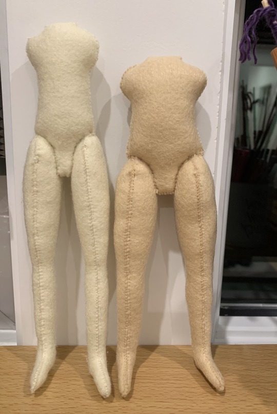
I did not include any of the dolls I created for COC 2024 since I assume everyone has seen them already, but I linked the master post in case you missed a day.
Finally, in addition to dolls, I also created 2 plushies (a merwolf and a bunbaz) plus 12 finger puppets this year.
It's hard to quantify dolls like fics, especially since almost every doll before COC did not have a dedicated tumblr post. However, here are some fun art stats:
Most Popular Art Post: The Watford Map
Most Popular Doll: FIONA!
Second Most Popular Doll: Felt Smut (Look @emeryhall! Dragonboy Simon is indeed the sexiest given that this is my duplicate of your doll!)
I also had three art collaborations this year:
Baz and The Prophecy - Doll and Tapestry, a COTTA collaboration with @iamamythologicalcreature
Ballet Baz and Disco Simon - a CORB collaboration with @melodysmash (Read the fic she wrote--Body Language. It is as adorable as these dolls!)
Watford Advent Map - a tapestry made for COC 2024 with help from @rimeswithpurple
While it has definitely been a fabulously productive year, I think my greatest achievement has been all the new friendships I've fostered because of fandom. Y'all bring me so much joy, and I am so happy I found this little corner of the internet.
I am currently drained of all creative energy (I can't imagine why!), so you may not hear from me for a while. However, I promise I am still around---likely catching up on all the fic and art I've missed while being a literal word and doll factory. With all that said, if you have an idea and wanna collab in the new year, I'm all ears and tons of fun!
Hellos and high-fives for the last time in 2024! @alexalexinii, @argumentativeantitheticalg, @aristocratic-otter, @arthurkko, @artsyunderstudy
@best--dress, @blackberrysummerblog, @brilla-brilla-estrellita, @bookish-bogwitch, @confused-bi-queer
@cutestkilla, @emeryhall, @facewithoutheart, @harrie-leithillustration, @hushed-chorus
@ic3que3n, @ileadacharmedlife, @katatsumuli, @larkral, @letraspal
@martsonmars, @messofthejess, @mooncello, @noblecorgi, @orange-peony
@raenestee, @rbkzz, @roomwithanopenfire, @shrekgogurt, @skeedelvee
@stitchyqueer, @supercutedinosaurs, @talentpiper11, @twinkle-twinkle-up-above, @theimpossibledemon
@valeffelees, @whatevertheweather, @you-remind-me-of-the-babe, @youarenevertooold
#when i posted my first fic i honestly thought i would be one and done#like truly i told mr. bons “well now that that is out of my system i can go back to lurking...”#hilarious in retrospect#it's been a great year though#so many sentences#so many stitches#so many AMAZING friends#can't wait to create and collab some more next year <3#writing roundup#art roundup#SnowBaz#a monbons doll#see y'all in 2025
77 notes
·
View notes
Note
Hi Miry! I love your art so much! And I wanted to ask you about something. For context, I have been trying to come up with my own Legend of Zelda story for a while now. I saw your Key and Chain OCs and their basic story, and I was wondering how you came up with them (and the story) and if you had any advice. OK, that was it. Thanks for replying if you do, and I can't wait to see the blorbos get whumped some more in that pain sharing Au.
ooooh ok so, my first inspiration was very silly, as most of what i do is.
i basically thought that having a link with the nickname chain would be hilarious cause people call the links the chain, right?
so i wanted a link that could be nicknamed chain or had a chain theme. now, i am an absolute sucker and a huge enjoyer of the enemies-to-lovers trope SPECIFICALLY the annoyances-to-lovers trope and the "forced to work together" trope as well
i knew i wanted my link&zelda to have a dynamic similar to inuyasha&kagome from the early 2000's anime inuyasha, where they hate each other but are forced to work together and eventually fall in love, but they are absolute menaces to each other and tease the other constantly most of the time
so having that in thought, i remembered an early 2000's movie i really liked called stardust, where a guy and a girl get stuck together via a magic rope and have to travel roped to each other
taking all that into account, i decided to zelda-fy it! i love wind waker & spirit tracks, so choosing that timeline for the setting was a no-brainer for me! plus it would be a nice call back to spirit tracks where u work together with zelda as well
link's desing is supposed to be chain theme in the sense that his braid is a call-back to chains cause a chain is kinda like a metal braid right lmao the pattern in his clothes is half a chain as well
as for zelda, her dress is inspired by wind waker's and spirit track's zelda's dress, her hair style is cause i wanted her to have pigtails to go with link's braid
i gave link the bounty hunter job cause i love bounty hunter characters in media and cause it was something i haven't seen being done with other link ocs! zelda's backstory was made so the idea of link catching her made sense and then it spiraled from there and i ended up making a much more complex plot for her in the end
the magic chain was born cause i thought about game mechanics, like the idea it can get longer or shorter could work well while exploring dungeons and solving puzzles, which is why i decided to make it magical instead of just a normal chain
with all that I've been slowly constructing the plot and adding more characters to it and developing early ideas
in the end is all about having fun!!!!!!! and be self indulgent, like everything about those 2 is me going "i enjoy this trope" and slapping them with it lmao
anyway i hope this insight helped!!!
28 notes
·
View notes
Note
hi jojo! im just wondering but ive been wanting to make a comic for a little while but im not too sure where to start 😅. i really love your style of art and your forgotten land roleswap, and i was wondering if you had any tips for beginners?
Hello, hello! Thank you for enjoying my Forgotten Land Roleswap comic, it means a lot! <3
I'm very honored that people have been asking me for tips and advice. All of this is coming from a hobbyist who draws these comics purely for fun outside of my regular day job. Some of my methods would probably deal psychic damage to a professional, LOL. But I'm more than happy to share some things I've personally learned! :)

First of all, the book, "Understanding Comics" by Scott McCloud ROCKS. It literally gave me a new dimension to understand the medium of comics and how it presents ideas and emotions to readers! And I haven't even had the chance to finish it all the way! I'm very happy I own a copy and I recommend having one of your own if you can, but it's archived here if you want to read it :D
I also like analyzing other comics and thinking about how they get information across to me as a reader. It's helped me learn more effective ways to visually tell a story, like what to include in a frame, how zooming in or out affects the feeling from the panel, maybe building a scene by focusing on other stuff if someone is talking a lot... etc.
ANYWAYS-! Some other tips I've learned through my personal experience-
I had to overcome a lot of negative self-talk in order to tackle a huge comic project like this and stay committed. I was a pretty severe self-deprecator for most of my life so far, and getting help has allowed me to catch myself when I'm slipping back into those habits, look in the mirror, and go, "NO, JOJO! You pour your heart into what you make and that is a wonderful thing! You are appreciated and loved and you deserve to have fun making something you are passionate about!!" Some examples of the negative self-talk I catch myself in....
"I'm a noob at writing and making a story interesting... What's the point of even trying?"
When it comes to starting a project, whether it's 2 pages or 2000 pages, is to just jump in and start! It's okay to be a little insecure or nervous about your technical art skills, writing skills, etc... But writing a "bad" scene is better than no scene- because you can always edit a "bad" scene down the line, but what can you do with nothing? Nothing!! I also put "bad" in quotation marks because I am trying to use that term less, and instead call them "early drafts." or "works in progress."
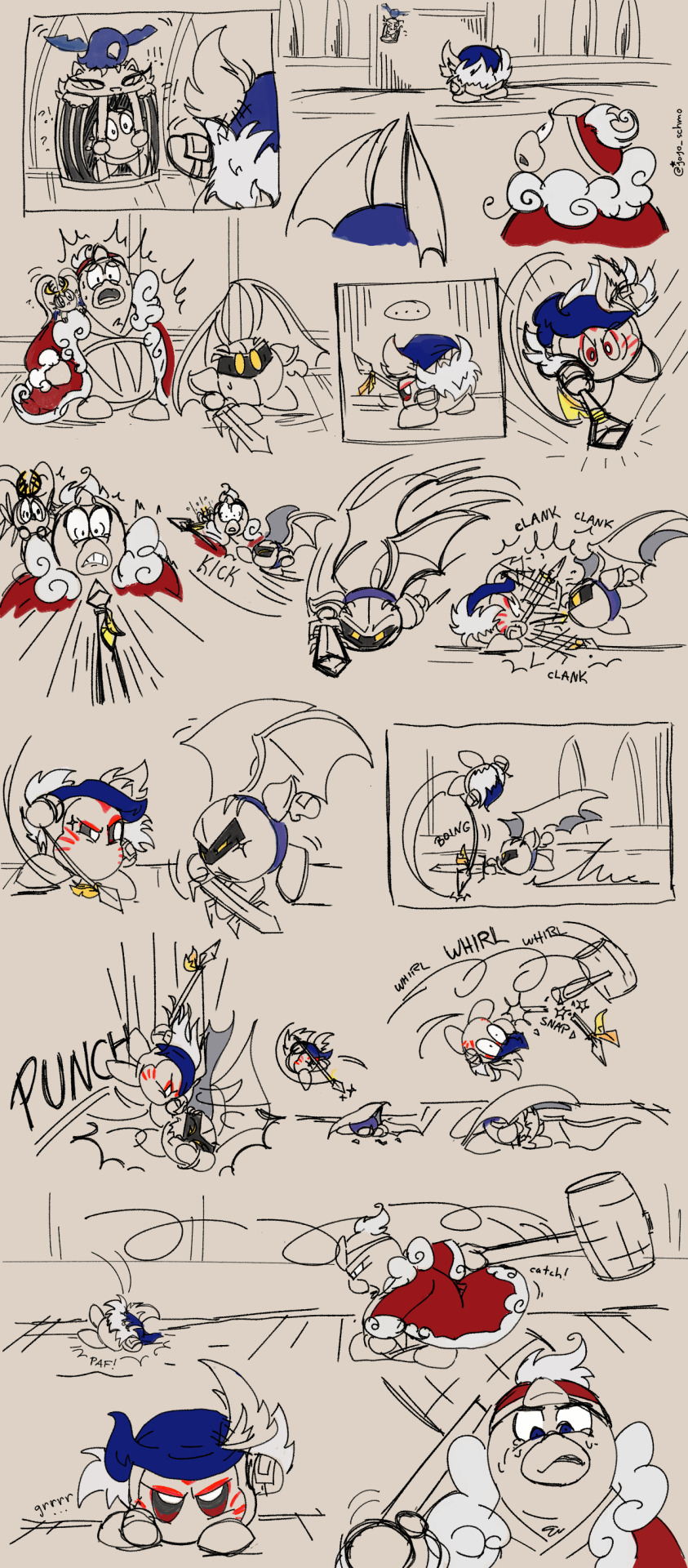
The first Roleswap scene I fleshed-out was the first Bandee boss fight, in May 2022. I made this drawing on an impulse, getting my ideas down on the page without thinking about the technical stuff like comic panel borders. I consider it like a "pilot episode" almost, haha. The final project is going to be very different from how things play out here. But it got me interested in the concept and excited to see where I could take it, and I made the decision to commit to an entire game plot's worth of AU comics!!
Also, what's the point in trying you ask? The point is to have fun! Making a fan comic in my free time means I don't have restrictions like deadlines, nobody's telling me what I can and can't write, and I can make the story as long or as short as I want! I have full control, which means the world I'm writing is all mine to create! Yes, with a fan comic there is a pre-established world with existing characters. But a universe like Kirby has enough open-ended concepts for people to take basic concepts in the world and take them to whole new levels! I think that's why there are so many amazing fan interpretations of Kirby characters and OCs. The rules are so vague, you can just make up your own a lot of the time!! And it's a wonderful exercise to learn skills for someday building an original world with all original characters from scratch! Magical!!!
"I'm not good enough to make a comic. I don't understand perspective or color and other stuff. Anything I make will look bad.
I once read a two panel comic on here. I can't find it anymore but I remember most of it. First panel showed the artist looking at what they're drawing on their tablet, looking defeated and sad. "Man, I don't even know how to draw this....."The next panel was like them smiling and shrugging, I think rainbows and sparkles were coming out of their tablet, ".....I GUESS I'LL JUST HAVE TO DRAW IT SHITTY!! :D "
IF ANYONE KNOWS THIS COMIC I'M REFERENCING, PLEASE TELL ME AND I'LL LINK IT!!! Because it permanently and positively changed my brain chemistry.
No kidding, making the decision to just do my best even if it's not perfect, helped me a LOT. I was always waiting to "reach a certain level" to tackle a huge project because I felt like I'd never do it justice at my current state. Except I had been telling myself that kind of stuff for years and I still didn't start any projects!!
So the day I said, "Oh well! If I draw backgrounds shitty, then it is what it is! I'll learn from it and draw the next background a little better," Was the day I could commit fully to the project. I'll keep studying how to draw them better for my own benefit, but I won't let my skill issues stop me from even trying!
And for my limited confidence in full-color art, I solved that by making the comic in black and white with no-to-minimal shading lolol. Because I can only address one skill issue at a time before it takes me 25 years to finish this HAHAHA.
It saves a BUNCH of time to work with skill issues rather than against them! Because at least experience is gained in other ways, and who knows, maybe that new knowledge will help address the skill issues someday! So identifying your personal skill issues and deciding which one to try to grow stronger, and which one to work around, could help with big projects!
"Nobody will read this. I'm going to put months or years of my life into a dumb little thing nobody will even care about."
Learning how to draw for my own enjoyment instead of somebody else's was one of the biggest breakthroughs I ever made. Enjoying the feeling of being challenged artistically and just doing my best, even if it's not technically perfect, is the reason why I was even able to start this!
And just because someone doesn't directly like, comment or whatever on a post doesn't mean nobody saw it! I used to get really down on myself for the lack of engagement on my art on other websites.
I was a lurker for pretty much my entire teenage years and never posted my own stuff or commented much. But that didn't take away the fact that I really enjoyed the things I saw online. Those positive feelings were real to me, even when I didn't know how to articulate it in words. Granted, I grew up into a Words of Affirmation main, and I use words to tell people the positive things I think about them as much as I can! But I know not everyone prefers words to express themselves. So I think about the people that I don't know enjoy my work- that just because I don't see it doesn't mean I didn't make a positive impact on someone by sharing my stories.
THIS IS GETTING LONG-- UHHH, STORY TIPS!!
If you work best on technology, start building the story in a Notes app, or a Google Doc! If you work best with pen and paper, start a notebook and rearrange stuff as you need to!
Or if you're chaotic like me, a mix of tech and paper!! I bought a notebook with ring binding so I can remove and rearrange pages of drafts as much as I wanted to! Like here's two very rough concept pages of one Chapter 1 scene made months apart.
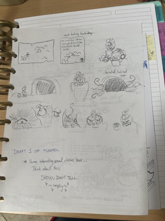
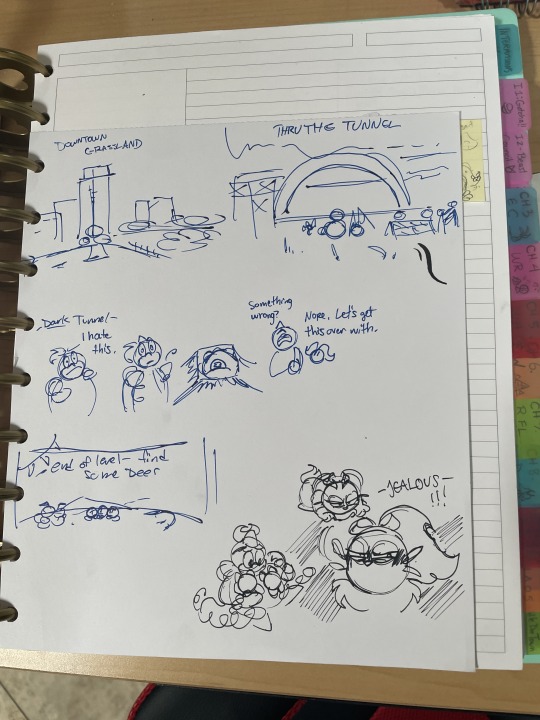
I'd say planning out the biggest basic plot points and then filling in between as I went was most helpful! I also have separate notes for character motivations, important story-changing events, etc... So I can have my own reference when I'm writing new scenes!
Okay this was a lot, sorry about the yapping! Hopefully it helps even a tiny bit. If you have any specific questions I'm happy to talk about my experience in the creation process! Or elaborate on anything I said above.
And finally, because I'm not a professional there are probably plenty of other tactics that could work better for some people. My ADHD probably doesn't help with the chaos of my process either, HAHA. But thank you for reading this far and enjoying the peek into the rainbow glitter and soap bubbles that inhabit the right side of my brain, heehee.
#ref#roleswap bonus features#forgotten land roleswap#ask#king dedede#meta knight#elfilis#bandana waddle dee#comics
76 notes
·
View notes
Note
chai, what do you think separates a good fanfic from a great one? i've been trying to write more lately, but it's just missing that zing you get when you read something really evocative. do you have any tips?
some of my favorite fics that i’ve read throughout the years and often call back to are fics that have really good pacing on top of sharp, witty writing. if someone has a very clear voice when writing, a specific style of incredibly human prose that i can connect to, i’ll consider it above the pale. really good examples of human prose are adellyna’s faII out boy fics and goodoldfashioned’s redIettermedia fics. livejournal authors seemed to have a specific style of prose that tapped into both extremely realistic dialogue and prose that fell between blunt and breakneck and also pretty and delicate and intimate and i think this is because a lot of prose style in the early-mid 2000s was based around the rise of internet accessibility and the new and exciting way we could communicate with each other and find ourselves connected at all times in the midst of extreme sexualization yet simultaneous extreme prudishness and glitz and glamor and the rise of art film and the quiet and recent accessibility of contemporary art. i would say that you should just study writing that you, yourself, really love and try to replicate the beats that you recognize in it that really seem to scratch an itch. read REAL books—yes, i understand that fics being fics don’t make them less valid in terms of creative writing, but i am saying that someone who has the resources to edit and publish their own work might lend it more credence and professionalism and they’ll go through checks and balances to fix things like grammar and inconsistencies.
i would definitely recommend authors like dennis cooper, a.m. homes, and nick cutter for fic inspiration because they excel in terms of prose and both long and short form stories. great artists steal etc etc. i also really genuinely adore judy blume and she’s great for studying emotional and sexually-charged but also intimate and gentle prose. stephen crane and vasilina orlova are incredible poets that i use as a great source of romance and worldbuilding. use a blend of online writing that you love and real books. check out books that you know nothing about from the library. get random tomes from secondhand bookstores that intrigue you from a few sentences alone. explore everything around you!! art is everywhere!!!!
23 notes
·
View notes
Text
even MORE PaperCut hcs bc yknow what we live in a society
•they both gain happy weight while in the relationship, but like,,,more so later down it. its more noticeable w pony cause hes just always ate a lot, but hes also just not eating as heathy as before. w curly bc pony cooks and he will not hesitate to eat it he does gain weight but it is NOT a lot, his metabolism is fast as shit😭😭technically w pony its not by a lot either but look WHATEVVERRRRR WE R MOVING ONNNNNN
•the summers ponys spent w curly vs the summers he didnt, its so obvious he gets more tan w curly bc curly would get him to STAY outside. before pony WOULD go outside im not saying he wouldnt, but hes not the biggest fan of the humidity (especially cause if his asthma/eczema whoops) and just went right tf back inside to avoid it. w curly however he can ignore it for longer, which means more sun if his skin which means tanned skin pony!!!! YES before u ask curlys diggin it
•curly bites ponys lips when they kiss, pony thinks its a lil weird but hey its curly ofc hes weird so he lets him do it, but once two bit busted in to scare them and curly bit REALLY hard out of surprise and pony was bleeding for a bit. the whole gang knows about that one💔💔💔
•when i say they would sing good together, i dont mean it in a graceful way, i mean it in a “theyre yelling lyrics in the middle of the street while basically climbing each other, its not off key but its not the BEST singing either the angels arent coming down for this, and theyre trying to yell over each other, its great bc its them” way
•pony REALLY likes the way the sunset makes curlys skin glow, meanwhile pony doesn’t know it but when ponys looking at the sunset hes squinting HARD and rubbing his lips, curly thinks its the funniest thing ever, hes staring at it like hes in the back of the class staring at the board. pony refuses to get sunglasses he says it ruins the beauty of the sunset
•curly never went over to ponys house when ponys parents were still alive, never had a reason to, so he never met ponys parents, NAMELY, ponys mom. pony says she woulda loved him but in reality??? curly wouldnt have liked mrs curtis!! she would remind him too much of what he wanted his mom to b and curly being a mamas boy wouldve tried to find any reason to hate mrs curtis, wouldnt find any, THAT would piss him off more and its just a endless cycle. the curly we have now though doesnt know he wouldve felt this way either!!! this is an unknown thing to literally everyone, didnt happen so nobody knew this was even a possibility (i hope this made sense omfg)
•i feel like theyve both had a few dreams of a boy and girl version of the other kissing them, papercut is so bi4bi to me, let me have this god damn it
•curly draws pony but his art style is one that like, looks like it could be on early 2000 nickelodeon, just more detailed. 60s pony would totally tease curly for this art style but modern pony would think its cool
•curly sommeeee what lived the country life pony imagines back in haiti, pony would ask questions about it and curly says its rlly not allat, pony just thinks curly didnt like it bc hes curly he wouldnt get the greatness of the country side😒😒
•speaking of haiti curly loves talking about how pony wouldve been if he was born in haiti, its like he has this whole other version of pony in his head, he knows where pony woulda been born, how he would act around others, ALL of it. alternatively pony does the same talking to curly about how he wouldve been different if he was born in the us
31 notes
·
View notes
Text
Possible Mia Ikumi Doujin Penname
First off, thanks to @berrychanx who found the initial doujin listing and @kuro93 who I know also looked into this and bought some of her works! Second off, warning for some suggestive doujin covers and other art, although there's nothing truly explicit.
First things first, I want to say that I sat on this information for a little bit considering if it was appropriate to speculate since Ikumi never chose to make this connection publicly. Ultimately I've decided to go through with it since imo the artstyle is instantly recognizable, so it'd come out eventually. I also found some still-up online accounts associated with this penname, and I know that's a thing the fandom has wanted to see for a long time. I'd ask that you please be respectful with this info and keep in mind it is NOT confirmed and that Mia Ikumi has passed away.
I'd also like to make clear that I'm totally uninterested in trying to figure out her birth name or track down any other personal info on her life that she didn't choose to share in doujin, her website, manga notes, interviews, etc. That feels very out of line. Finding other pennames can help us fans catalogue more of her work, but finding her real identity does nothing but violate her privacy.
So that's kind of where I'm at right now. If you feel differently about whether it's right to speculate on Ikumi's doujin works, or if you don't want to see anything even a little suggestive, please turn back now.
We know for sure that Mia Ikumi was a penname, since that was confirmed in ads for Re-Turn when she changed one of the characters.

征海美亜 *征海未亜よりペンネーム変更されました Ikumi Mia *Ikumi Mia yori penneemu henkou saremashita Mia Ikumi (征海美亜) *[Her] penname was changed/altered/revised from Mia Ikumi (征海未亜)
Prior to her return to Nakayoshi with some TMM anniversary art and then the 2020 Re-Turn short, the last work she published under that name was Koi Cupid, way back in 2005-08.
There's always been speculation as to whether she continued drawing manga under a different penname, but there was never any official word from her once her website went down, since she was not active under that name under any social media or on Pixiv. We also had no idea how her art might have evolved in the years since her last official release, so there was no guarantee we'd recognize any work of hers if we saw it. The first anyone saw of her art post-website was back in 2015 when she drew some art of Ichigo and then Ichigo, Mint, and Lettuce for the 60th anniversary of Nakayoshi.
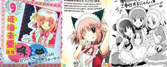
https://hikayagami.tumblr.com/post/132481043559/more-nakayoshi-60th-anniversary-mew-mew-art-from https://hikayagami.tumblr.com/post/118704238761/ichigo-momomiya-in-her-cafe-mew-mew-uniform-drawn https://hikayagami.tumblr.com/post/130755109662/new-picture-of-ichigo-minto-retasu-drawn-by
As you can see, this art featured a pretty different art style than she'd had 2 decades back.
(Sidenote: it seems she also did some art for the 55th anniversary, back in 2010, but this is much closer to the dates when she was working under the Mia Ikumi name and has roughly the same art style as OG TMM: https://hikayagami.tumblr.com/post/151430694480/doodles-of-ichigo-and-berry-drawn-by-mia-ikumi )
Obviously, starting in 2019, she then went on to release the two-shot manga TMM 2020 Re-Turn, some miscellaneous promo art (Blu-ray bonus comic, Alice in Wonderland merch, Smewthie fanart, etc.), and finally new covers and bonus comics for most of the rereleased manga volumes before her passing. Between the works she published in the 90s-early 2000s and all of this new art, we have a pretty good sample size of her artstyle over time. So it was only a matter of time before someone stumbled on something familiar looking…
Berrychanx found a listing (https://jp.mercari.com/item/m11046282201 ) for an Idolmaster doujin called Room Fight! created as a collab between 2 doujin circles/artists: Nameless Color (ねーむれすからー) and Komomo+ (こももぷらす), published by Poco Poco in 2014. The seller specifically noted that the style looks very similar to Mia Ikumi's, and it's very hard to argue! The hands especially look the way that Ikumi has always drawn them, and the eyes, facial expressions, and hair shading is pretty much one to one for Re-Turn.
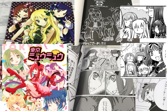
Nameless Color has some other works, but they aren't in this same artstyle at all. Therefore, the one whose style matches Mia Ikumi's is Komomo+.
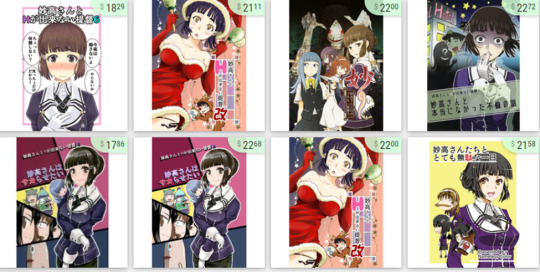
https://doujinrepublic.com/product/tag_page.html?tags=85361&ref=product_page&type=rel_tag_circle
As far as I can tell, the doujin circle is named Poco Poco, and the artist's penname is Komomo Kozakura (小桜小桃) or later Komomo (小桃) or Komomo+ (written as こももぷらす). There's a lot of variation in which spelling is used across doujin sites, and sometimes Komomo is listed as the circle name rather than Poco Poco, but I'm unsure as to whether this is a change in how presumed-Ikumi branded herself or just a lack of organization in the websites. Also, the Room Fight! doujin is categorized under komomo+ (https://www.suruga-ya.jp/product/detail/ZHORE153927) and under Komomo Kozakura (https://ecs.toranoana.jp/tora/ec/item/040030276511/ ), so I’m sure they’re the same person and not just 2 people in the same circle.
Here are the titles I could find under all of these names across various websites in approximate publishing order:
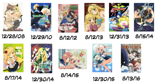
https://www.suruga-ya.jp/search?category=&search_word=&ck=true&inStock=On&person_id=1051050 https://www.suruga-ya.jp/search?category=&search_word=&ck=true&inStock=On&person_id=2874482 https://www.suruga-ya.jp/search?category=&search_word=&person_id=2864627 https://ecs.toranoana.jp/tora/ec/cot/circle/LUPA2D6P8476d16Qd687/all/
The main fandoms are Idolmaster, Kantai Collection, and Strike Witches. It's immediately obvious how much they look like Ikumi's style, from small details like the faces to larger things like how she tends to pose characters on her covers. They range from 2008-2016, and you can see that earlier works look a little more like her TMM-era art while later stuff is way more Re-Turn.
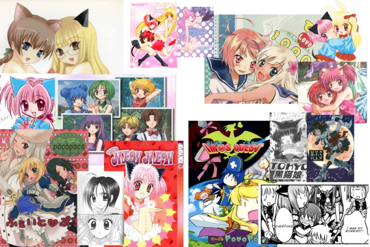
So is that all the new info? Do we need to track down and buy these doujin to get any more new info on Mia Ikumi? Well, that’s definitely a thing you can do! But there’s one other avenue.
You see, the title page of Girls Fight! does lead to a now defunct webpage: pocopoco.sblo.jp

https://web.archive.org/web/20081201000000*/pocopoco.sblo.jp
The Wayback Machine has 5 captures for this website: 12/31/08, 2/25/11, 6/3/13, 4/25/16, and 3/14/23. The latest one just shows the same error page not found message as if you try and go to the site now, but the others all have blog entries ranging from 2008 to the end of 2015 (i.e., starting RIGHT after the end of Koi Cupid/Mia Ikumi's professionally published/official manga career).

https://web.archive.org/web/20090103031628/http://pocopoco.sblo.jp/article/20797588.html https://web.archive.org/web/20160425011557/http://pocopoco.sblo.jp/article/170290508.html
Mostly these posts are either drawings or advertisements for a new book she's selling at a con or online by mail order, so there’s a whole bunch of new art. (Warning: there's nothing outright nsfw, but some of these images are probably the most suggestive ones I link in this post, moreso than even most of the doujin covers. Use your own judgment!) The rest of the posts are personal diary entries.
(Sidenote: I am NOT going to translate this whole blog because there’s a whole bunch of text! I looked through the available pages, and the auto-translated version is fine for getting a basic understanding. If you have questions about a specific post, feel free to ask, though! Right off the bat, the text on the big image at the top of the earlier captures, the one with the green-haired catgirl in a red outfit, is just a paraphrasing of the post where she explains her categories/tags to help you navigate the site https://web.archive.org/web/20090103030651/http://pocopoco.sblo.jp/article/21376253.html )
This website, crucially, also links to Komomo's pixiv account (Username: 小桃/Komomo), which is still up!
https://www.pixiv.net/users/3966440
(I was logged in when I accessed the page, so it's possible you may need an account to view it. Please do keep in mind this is not an account publicly associated with Ikumi/TMM and that the owner is likely deceased. We don't need to leave random comments and messages.)
The oldest picture is from 2012, when she created it (she posts about this), and the most recent picture is from 2018, so you can really see the artstyle shift here as well. There is no reference to TMM or Mia Ikumi anywhere.

The blog also links to her NicoNico page (Username: 小桃/Komomo), where she posted a few Vocaloid covers from 5/16/10 to 6/4/11.
https://www.nicovideo.jp/user/16890918/
She talks about uploading these covers on her blog under her utattemita/”I tried singing” tag: https://web.archive.org/web/20160425011607/http://pocopoco.sblo.jp/category/907578-1.html
So, the art definitely matches with what we know of Mia Ikumi’s art, both from published works and stuff posted online to her official website, ikumimia.chu.jp (Hika posted some of the website art here and here if you aren’t familiar)
(As a tangent, that website seems to have been created at or before 5/7/07 and gone offline sometime between 7/1/10 and 7/27/11, so there was definitely a period where she was working under both identities at once…)
But is there any other info linking Komomo and Mia Ikumi?
The site doesn't give much personal detail about Komomo irl, but it does say she was born in spring, and Mia Ikumi's birthday was March 27th.
プロフィール 名前小桜小桃です。 一言:春生まれです。 Profile My name is Komomo Kozakura. In a word, I was born in spring.

There's also a diary entry about her getting a Scottish fold kitten for her mom in 2008 after the family cat passed away 2 years back. We know from the bonus comics in the TMM manga that Mia Ikumi had a Scottish fold.
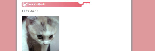
スコティッシュフォールドという種類のキャリコなお嬢さん。 A calico lady called a Scottish fold.
https://web.archive.org/web/20081231223544/http://pocopoco.sblo.jp/category/627816-1.html

Komomo also says she’s interested in gothic lolita clothing and that she dresses up at events. We know Mia Ikumi also dressed up for events, since that’s in her bio, and she drew her outfits in manga bonus page.
*ゴスロリの部屋* 小桜小桃の趣味のページです。主に持っている服やアイテム、欲しいモノの紹介、ゴスロリに関する事とかも書いていこうと思います。 *Gothic Lolita Room* A page about Komomo Kozakura’s hobby. Mainly I’ll write about clothing items I own, stuff I want, and things related to gothic lolita fashion.
https://web.archive.org/web/20160425154652/http://pocopoco.sblo.jp/category/627812-1.html
今回のコミケはカゼのため、コスとかせずに防寒重視でいったのですが Because I had a cold at this Comiket, I went without any kind of costume to focus on keeping warm
https://web.archive.org/web/20160425154658/http://pocopoco.sblo.jp/category/627816-1.html

Between the art, the timeline of when things were posed vs Ikumi's public career, and the small bits of overlapping info on the artists' lives, I'm very confident that Mia Ikumi and Komomo Kozakura are two pennames for the same artist.
As for why, we can only speculate. I will say it's pretty common for artists to use a different penname for doujin work vs professional work, although some keep it more secret than others. It's especially common if the doujin work is more risque than the professional, which is the case here. I'll also say that almost all of Ikumi's post-TMM works were fairly short. Only One Wish may have been imagined as a one-volume anthology from the start, but it seems like TMM a La Mode and Repure may have been canceled early based on rushed endings with a lack of follow-up on plot points. Comi Digi +, the magazine in which Koi Cupid was published, got discontinued in 2008, presumably ending that series early as well. Ikumi also seems pretty annoyed with her editor in the a La Mode bonus comics, so possibly she was frustrated with baggage of the Mia Ikumi identity and wanted a fresh start.
Possibly she stopped putting out work around 2018 or possibly she started working under another penname. Maybe that was when Nakayoshi got in contact with her to begin planning for ReTurn, Ole/Au Lait, New, the TMM Blu-ray, the manga re-release, etc.
In conclusion, it seems like there are many more works by the artist known as Mia Ikumi than we'd thought previously, plus slightly more of a web presence, although this seems to have ended years before the TMM 20th anniversary renaissance. It's possible there are more accounts under the Komomo/小桃 name or under another penname that might be found in the future.
154 notes
·
View notes
Text


So I’m working on my own little pilot and Im trying to sort out the design I want to do so I’ve been doing some Phase 1 and Phase 2 Sprunki fanart to refine my style. My little pilot is going to be a mix between my cutesy art and my hyper realistic art kind of like the cartoons from the late 90s/early 2000s. Here is some Wenda fanart as I work on my style.
#sprunki#art#artists on tumblr#artwork#hyperrealistic#sprunki wenda#wenda#sprunki fanart#sprunki fandom
14 notes
·
View notes
Text
KYLE CROUSE: Alright, we got one last question. It’s from JediPony. [chuckles] Love that name, I don’t know why. It makes me laugh. [reading question] “How would you write an 06 adaptation in Sonic X?” Here’s the question, would you write the 06 adaptation in Sonic X the show, or Sonic X the comic?
youtube
IAN FLYNN: [laughs] KYLE: It’s very— two very different things. IAN:Very different things. I don’t know, if we’re gonna be true to the source material, then Elise doesn’t really have a role, and Chris is the one who has the Flames of Disaster sealed inside him. KYLE: [laughing] Oh no! Oh! IAN: “Chris, whatever you do, you can’t cry!” [as Chris, weepily] “But why?!” [Iblis roar] KYLE: It’s all he does! [laughs] No! IAN: Oh, man, now I’m imagining Mephiles with, like, that really bad early 2000s CG effect. All these awful filters flyin’ around. KYLE: Oh, God, no! [laughing] This would be awful. IAN: You’d have, like, the budget episodes where Soleanna and New City are just, like, these flat, grey urban textures that have like, no depth, but then you get to the final episode where they’re doing the Super fight against Solaris, and the animation bump goes through the roof, and it’s glorious. And you forgive the last 26 episodes of your life that you’ve wasted watching it so far. KYLE: Mhm. IAN: [choking the words out through high pitched, wheezing laughter] This means Chris is the one that kisses Sonic back to life! [fit of maniacal laughter] KYLE: [frantic, horrified laughter] No! No! No! No! Ian, no! Ian! No! IAN: [prolonged cackling laughter] KYLE: The worst timeline! Oh, no! IAN: Oh, and Eggman has to be as close as they can get him to photorealistic Eggman in the Sonic X style. KYLE: No! IAN: Which does not work at all! KYLE: No, no, no! No! This is not going on the thumbnail! No! IAN: [wheezing laugh] KYLE: No, do not put this on the thumbnail! [laughing] IAN: Oh, my goodness, just imagine the art errors for Silver’s head alone… KYLE: Oh… no… oh, no… at least Dan Green could still be the voice of Mephiles. IAN: Oh, yeah, that’d be fantastic. [microphone glitches] That’s the only reason to do this. KYLE: That would be— yeah. Oh… IAN: Oh, would they try to hand-animate Omega? Or would he be like, early 2000s CG? KYLE: Just crappy CG, no! IAN: That you just composite into each shot… oh, man, it’d be awful! KYLE: [pained sound not unlike he is receiving a fully conscious appendectomy] Oh! IAN: Wait! [microphone glitches again] They did the weird thing with Sonic and Shadow’s spines when they would turn their heads. What would Silver look like?! KYLE: [resigned groan] IAN: Would it just be like, one giant spine, depending on the angle? [bursts into laughter] KYLE: [groans as if he is dying] Ian… what are you doing… why are you— IAN: [microphone glitches again as if resisting] The Iblis monsters would have the terrible CG effects, too! KYLE: Why am— why am I the reasonable one!
IAN: [laughs] KYLE: Why am I the one who’s being… [gives up on finishing this sentence] IAN: Forget the comic, the comic can’t hold a candle to this idea! KYLE: Oh, no… IAN: [in awe] What a glorious trainwreck! KYLE: What’s even funnier is that your mic is trying to stop you. IAN: [cackles] KYLE: It’s not working. [laughs] So cursed! IAN: The whole thing would be so awful… KYLE: Yeah? IAN: But then there would be, like, this incredibly well-written and poignant subplot about Elise dealing with her emotional trauma, and how Soleanna as a country even works. And it’s like, maybe an episode, maybe two that really gets into it and fleshes out this world in a meaningful and robust manner. KYLE: [chuckles] Yeah. IAN: And that’s it. That’s like— that and Dan Green are the only redeeming things out of this season. KYLE: [sigh, reading chat] Ian, in the chat… IAN: Yeah. KYLE: In the Bumblekast Discord server, open it up. There’s a little piece of art there. Someone has, uh, sketched Silver. [chuckles] IAN: [seeing it, delighted, evil] Yes! KYLE: [laughing] IAN: Cursed Toucan Sam! KYLE: [cackles] Oh no! Why do you…? No! Awful! Toucan— IAN: [as Silver] “Just follow my nose, wherever it goes!” KYLE: [horrified, amused] Toucan Silver! No! [emits the world’s most drawn-out, pained cry of defeat] IAN: Psycho-beak-nesis! KYLE: [laughing] Bumblekast was a mistake! IAN: [laughs] It was, but at least we’re over with it for today. KYLE: [laughing] Oh… I guess so.[outro music fades in]
EPISODE THUMBNAIL by the incredible @nintendoni-art
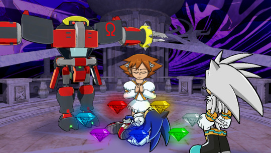
—— TRANSCRIBER’S NOTE: Please remember that nothing that is said on BumbleKast is canon! It’s just some guys and their opinions occasionally spitballing ideas. If you don’t like an answer, you don’t have to take it as Word of God or anything like that. It’s all just for fun!
#bumblekast#ian flynn#kyle crouse#sonic the hedgehog#idw sonic#sonic x#sonic 06#princess elise#silver the hedgehog#soleanna#e 123 omega#eggman#writing questions#Youtube
140 notes
·
View notes