#i like the original drawing so much that i didn't want to change the colors much hshshd i hope that's ok
Explore tagged Tumblr posts
Text

idk

#OH I ALSO FORGOT TO SAY i tried to draw the lip incompetence here...heart <3#a doodley#there's something here abt like.#ok i think present day talon wouldn't shapeshift FOR anyone even if he did have the energy to do so#even before he began starving himself he wasn't a huge fan of shapeshifting#as he didn't want to lose his sense of self especially wrt his family and community and such#so i think here it isn't that he's doing it for smunker#more like he forgets about his changed eye color bc its not like he sees them as often as he sees his own hair#he does prefer his original dark brown eyes though so its more like oh shit i forgot yeah sure#we can give the hair a break ill humor you a bit#(also of course he gets to a point where he has enough energy to change most anything he wants#but the lavender eyes are important for me to make him look scary LMAO. i just really liked the thought of him liking his#hair so much that its the equivalent of older person dying their grey hair black ykwim...its endearing)#like he likes looking old but calls it when his hair starts falling out...he likes his hair to be its original black...idk!#there's still Something there he cares about
87 notes
·
View notes
Text

FIRST TIME DOING A DIYS! WOOOH
Hosted by @brandyy0moss <3
#i like the original drawing so much that i didn't want to change the colors much hshshd i hope that's ok#his suit is so pretty i fell in love with it#yoshiokadiy2024#yoshioka mamoru#mp100#mp100 yoshioka#mamoru yoshioka#my art#why did i choose this angle hahahshs
29 notes
·
View notes
Text


havingggg fun with picrew :3
1 2 3 4
#oh yeah erm I changed my artstyle btw#I got realllly annoyed when i tried drawing for a while#couldnt figure out why but then i changed the brush I was using and everything was fine :]#art#digital art#ocs#original characters#I changed the colors a little in the first pic but didn't feel like it during the second one so they're straight colorpicked#still working out a coupla kinks with the artstyle shift but I'm happy with it for rn#good lord its so fucking obvious how much I didn't want to draw hands in that first one
1 note
·
View note
Text
My Favorite Cheap Art Trick: Gradient Maps and Blending Modes
i get questions on occasion regarding my coloring process, so i thought i would do a bit of a write up on my "secret technique." i don't think it really is that much of a secret, but i hope it can be helpful to someone. to that end:

this is one of my favorite tags ive ever gotten on my art. i think of it often. the pieces in question are all monochrome - sort of.
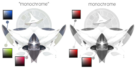
the left version is the final version, the right version is technically the original. in the final version, to me, the blues are pretty stark, while the greens and magentas are less so. there is some color theory thing going on here that i dont have a good cerebral understanding of and i wont pretend otherwise. i think i watched a youtube video on it once but it went in one ear and out the other. i just pick whatever colors look nicest based on whatever vibe im going for.

this one is more subtle, i think. can you tell the difference? there's nothing wrong with 100% greyscale art, but i like the depth that adding just a hint of color can bring.
i'll note that the examples i'll be using in this post all began as purely greyscale, but this is a process i use for just about every piece of art i make, including the full color ones. i'll use the recent mithrun art i made to demonstrate. additionally, i use clip studio paint, but the general concept should be transferable to other art programs.

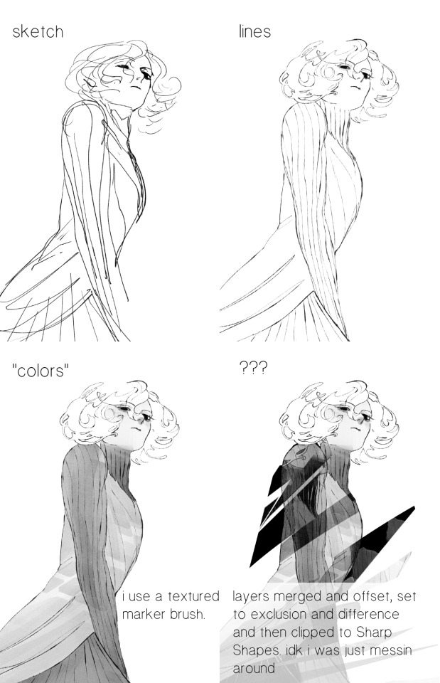
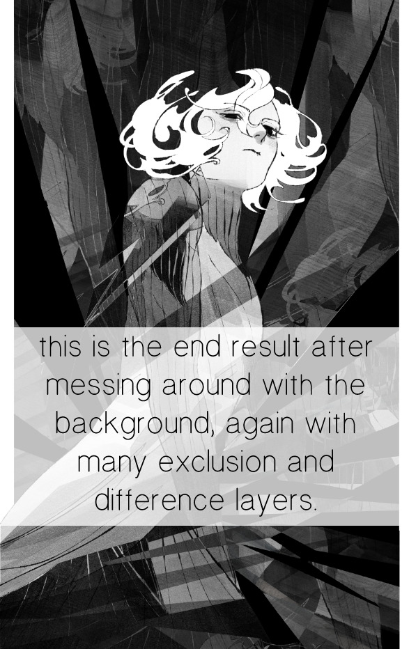
for fun let's just start with Making The Picture. i've been thinking of making this writeup for a while and had it in mind while drawing this piece. beyond that, i didn't really have much of a plan for this outside of "mithrun looks down and hair goes woosh." i also really like all of the vertical lines in the canary uniform so i wanted to include those too but like. gone a little hog wild. that is the extent of my "concept." i do not remember why i had the thought of integrating a shattered mirror type of theme. i think i wanted to distract a bit from the awkward pose and cover it up some LOL but anyway. this lack of planning or thought will come into play later.
note 1: the textured marker brush i specifically use is the "bordered light marker" from daub. it is one of my favorite brushes in the history of forever and the daub mega brush pack is one of the best purchases ive ever made. highly recommend!!!
note 2: "what do you mean by exclusion and difference?" they are layer blending modes and not important to the overall lesson of this post but for transparency i wanted to say how i got these "effects." anyway!
with the background figured out, this is the point at which i generally merge all of my layers, duplicate said merged layer, and Then i begin experimenting with gradient maps. what are gradient maps?
the basic gist is that gradient maps replace the colors of an image based on their value.

so, with this particular gradient map, black will be replaced with that orangey red tone, white will be replaced with the seafoamy green tone, etc. this particular gradient map i'm using as an example is very bright and saturated, but the colors can be literally anything.
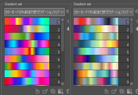
these two sets are the ones i use most. they can be downloaded for free here and here if you have csp. there are many gradient map sets out there. and you can make your own!
you can apply a gradient map directly onto a specific layer in csp by going to edit>tonal correction>gradient map. to apply one indirectly, you can use a correction layer through layer>new correction layer>gradient map. honestly, correction layers are probably the better way to go, because you can adjust your gradient map whenever you want after creating the layer, whereas if you directly apply a gradient map to a layer thats like. it. it's done. if you want to make changes to the applied gradient map, you have to undo it and then reapply it. i don't use correction layers because i am old and stuck in my ways, but it's good to know what your options are.

this is what a correction layer looks like. it sits on top and applies the gradient map to the layers underneath it, so you can also change the layers beneath however and whenever you want. you can adjust the gradient map by double clicking the layer. there are also correction layers for tone curves, brightness/contrast, etc. many such useful things in this program.
let's see how mithrun looks when we apply that first gradient map we looked at.

gadzooks. apologies for eyestrain. we have turned mithrun into a neon hellscape, which might work for some pieces, but not this one. we can fix that by changing the layer blending mode, aka this laundry list of words:

some of them are self explanatory, like darken and lighten, while some of them i genuinely don't understand how they are meant to work and couldn't explain them to you, even if i do use them. i'm sure someone out there has written out an explanation for each and every one of them, but i've learned primarily by clicking on them to see what they do.
for the topic of this post, the blending mode of interest is soft light. so let's take hotline miamithrun and change the layer blending mode to soft light.

here it is at 100% opacity. this is the point at which i'd like to explain why i like using textured brushes so much - it makes it very easy to get subtle color variation when i use this Secret Technique. look at the striation in the upper right background! so tasty. however, to me, these colors are still a bit "much." so let's lower the opacity.
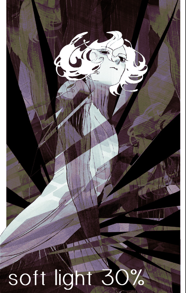
i think thats a lot nicer to look at, personally, but i dont really like these colors together. how about we try some other ones?
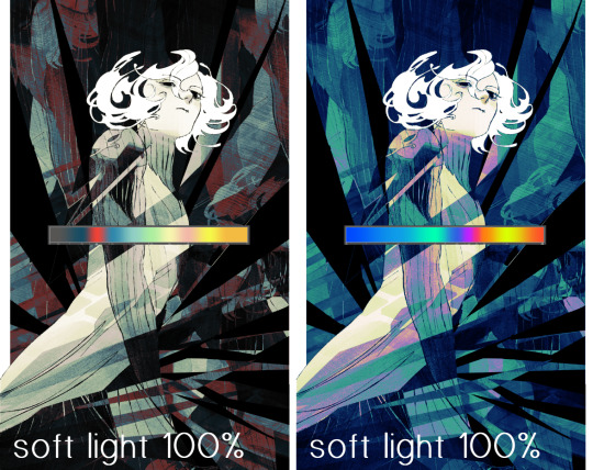
i like both of these a lot more. the palettes give the piece different vibes, at which point i have to ask myself: What Are The Vibes, Actually? well, to be honest i didn't really have a great answer because again, i didn't plan this out very much at all. however. i knew in my heart that there was too much color contrast going on and it was detracting from the two other contrasts in here: the light and dark values and the sharp and soft shapes. i wanted mithrun's head to be the main focal point. for a different illustration, colors like this might work great, but this is not that hypothetical illustration, so let's bring the opacity down again.
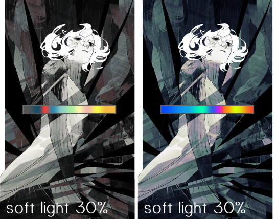
yippee!! that's getting closer to what my heart wants. for fun, let's see what this looks like if we change the blending mode to color.
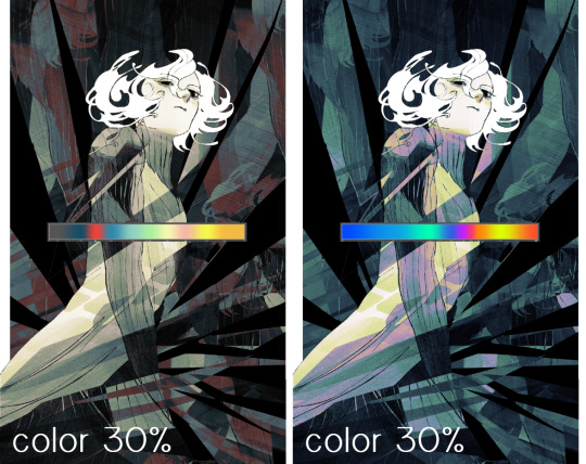
i do like how these look but in the end they do not align with my heart. oh well. fun to experiment with though! good to keep in mind for a different piece, maybe! i often change blending modes just to see what happens, and sometimes it works, sometimes it doesn't. i very much cannot stress enough that much of my artistic process is clicking buttons i only sort of understand. for fun.
i ended up choosing the gradient map on the right because i liked that it was close to the actual canary uniform colors (sorta). it's at an even lower opacity though because there was Still too much color for my dear heart.
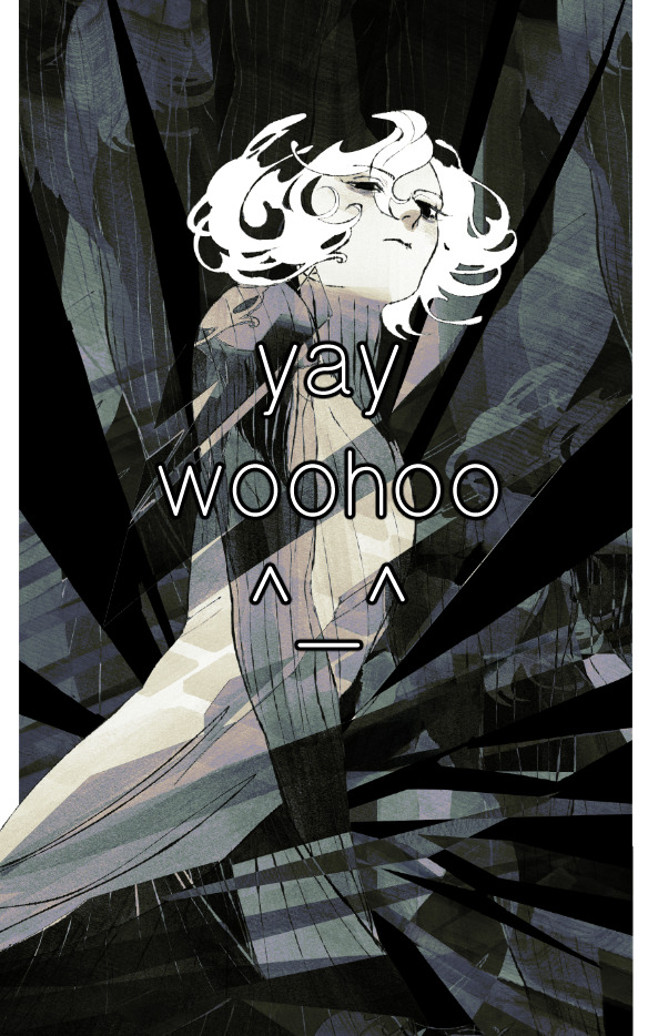
the actual process for this looks like me setting my merged layer to soft light at around 20% opacity and then clicking every single gradient map in my collection and seeing which one Works. sometimes i will do this multiple times and have multiple soft light and/or color layers combined.
typically at this point i merge everything again and do minor contrast adjustments using tone curves, which is another tool i find very fun to play around with. then for this piece in particular i did some finishing touches and decided that the white border was distracting so i cropped it. and then it's done!!! yay!!!!!
this process is a very simple and "fast" way to add more depth and visual interest to a piece without being overbearing. well, it's fast if you aren't indecisive like me, or if you are better at planning.

let's do another comparison. personally i feel that the hint of color on the left version makes mithrun look just a bit more unwell (this is a positive thing) and it makes the contrast on his arm a lot more pleasing to look at. someone who understands color theory better than i do might have more to say on the specifics, but that's honestly all i got.
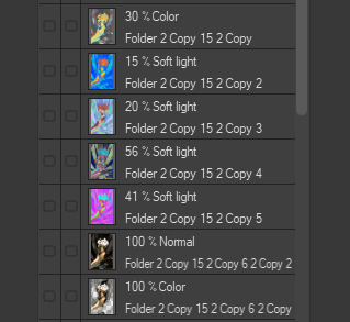
just dont look at my layers too hard. ok?
2K notes
·
View notes
Text
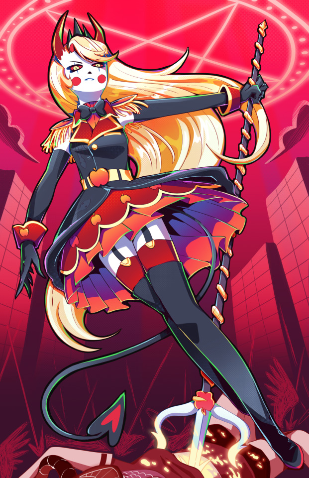
Holy SHIT am I proud of this. It took a day and a HALF to work on it. I really just wanted to draw a cool badass picture of Charlie in a cute dress, and somehow I ended up with my best piece I think I've ever done!!
To see the process, click the 'read more' below!
Otherwise:
Main blog over here
My Etsy Shop!
Originally, I wanted it to look more like a royal portrait, a good excuse to draw a pretty dress.
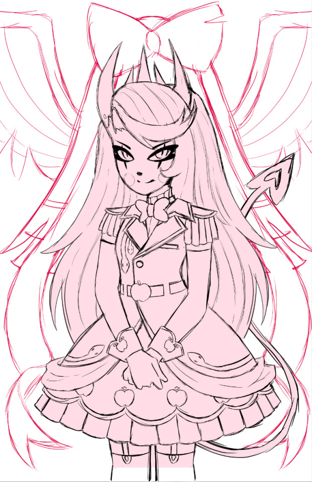
I adored the dress design, but it was an extremely flat image, so despite taking like. 5 hours to design it and work on it, I rethought my plan, switching to a far more dynamic pose.
I also made sure to add tons of flow lines, both from her hair, to her tail, to help bring the eye all around the canvas.
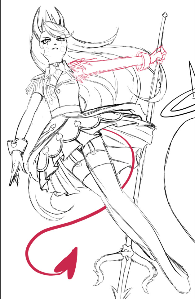
I did a billion sketches, but this is what I ended up on! Originally I had her right arm holding the pitch fork behind her back, but it just never looked right. I also took a risk and did a facial angle that has always been extremely hard to get right, and somehow I managed to make it look nice!
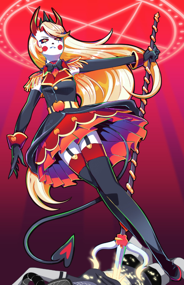
After adding the lineart, colors and all of that, I knew quickly I didn't want the angel to stick out as much as she did. I wanted her to fall into the background instead, since she was just on the border and I didn't want any attention really taken from Charlie. So I changed her shade to red, and from there I added more of the background details!
Okay I did leave some inbetween screenshots out but it's past my bedtime. I hope this was fun to look at, at least!
Final product once more!

#charlie morningstar#artists on tumblr#hazbin hotel#hazbin hotel fanart#hazbin hotel season 1#hazbin#vivziepop#cqart
1K notes
·
View notes
Text


idk what this is. i like robots. i’ll clean these up later. i think.
anyways while drawing these I started thinking abt like. idk does this count as an AU.
General shit:
I didn't make it clear, but the robots that have pupils were built without a hardcoded purpose. They've always been free to explore what they want to do. The robots with fully colored "scleras" were created with a purpose from the jump, so their creators didn't feel the need to make them appear more "human".
The more expensive a robot's parts are, the less clunky it is.
Right now, I'm going with "their human family built them" but that's liable to change.
The designs are also liable to change because uh. duh.
Celestia Ludenberg:
Viewed the robots with an imbued purpose as interesting and superior (something something humanity's advancement). She wants to be praised like that, so she emulates them
Her cat loves how much heat she radiates so it's always near her.
Most of her upgrades are cosmetic but if they aren't, they're stupid. She won't upgrade her CPU or her motherboard, but she'll load up with three 4090s that her other components can't even keep up with. Yes, she does it to flex.
She'll distract from bootleg, refurbished, or shoddily painted parts by turning on her RGB. It gets annoying.
She knows that she's fairly unsettling and she revels in it.
All things considered, her cable management is pretty good.
Her gambling skill is still just luck here, but she tells everyone it's because she has a never-seen-before GPU(& CPU) that does calculations at insane speeds.
Most don't believe her but have no way to disprove her lie.
Kiyotaka Ishimaru
I can't decide if he was built by his father or his grandfather.
Either way, he was built before Toranosuke's downfall, so his internals were all pretty expensive for the time. Luckily for him, that means he was slightly future-proof and has a viable upgrade path.
Unluckily for him, this means he's stuck with really old parts and his 8gb of RAM can barely keep up in a 32gb world sadge
His chassis is built from secondhand or scrap parts. It's why his joints are so ancient in comparison to the rest of him and why he has so much cabling that he can't seem to manage.
Shit chassis = shit airflow = he is always overheating
BUDDY IS YOUR CPU BURNING HOW IS THERE SMOKE
Older tech = LOUD AF. The class bought him new fans to avoid the loud ass whirring. It's not quiet but he used to sound like a jet engine.
He runs on Debian. It was originally going to be Arch since it's lightweight but Debian's whole "old but stable" reputation fits him more. I don't see him properly dealing with bleeding edge software anyways.
His room is filled with past HDDs that no longer have storage. He deems all educational material important so he refuses to delete any lessons. He doesn't have the money for SSDs.
Mukuro Ikusaba:
Is usually in reconnaissance mode, meaning she has a shit ton of hidden cameras in her chassis
This used to benefit Fenrir. Now it benefits Junko.
She can have her parts shifted around with no issue to make room for a better arsenal.
She’s durable in her reconnaissance mode but she’s nigh on untouchable in her combat mode. Her chassis gets 10x bulkier and she can split her attention to several different tasks on the battlefield.
Fenrir Mercenary Group doubles as a weapons company. Mukuro is the only model of her kind though.
They tried to give her reconnaissance model the look of a “normal girl” so she could gather info more efficiently. They failed real bad. They also didn’t account for the fact that Mukuro isn’t good at socializing.
She allocates a CPU core to a process dedicated to Junko. 24/7 365
She believes herself to be less capable of emotion than she actually is. She can’t seem to find the system process that triggers such painful emotions.
Chihiro Fujisaki
Each “fold” in her skirt doubles as a screen. Think of the skirt as having two layers: the top shell and the under shell. The top shell is what doubles as a screen.
Optimized her hardware to work on code as fast as possible (fingers, skirt, etc).
She tends to test out new software on herself regardless of their compatibility with her pre-existing shit. She constantly has to reinstall her OS, but it’s all fun for her.
Speaking of her OS, I was going to make her run on Gentoo but IDK cause of the compile times. It’d be faster if she used distcc but I can’t see her screwing over her classmates like that lol.
So I’m between Nix and Arch.
Insecure about the fact that she overhauled her original model so extensively. Got made fun of for being a ‘defective’ robot. Her father supports her modifications but she still feels bad about having ‘failed’ somehow.
Cue identity issues
She helps out her classmates when it comes to repairs.
Tendency to stay up programming leads to high uptimes. If her friends notice her lagging or crashing, they’ll try to get her to shut down. (In a computer sense lol, not an emotional shut down)
Do y’all remember the xz utils backdoor? Yeah that’s how extensively she combs through code.
Sayaka Maizono
I can’t decide if she was built to be an idol or was originally some other type of robot.
Loves to make kids smile, so she has a sort of candy mechanism in her arm.
Everything about her glows or spins. You will never get bored looking at her.
Her skirt isn’t actually see through I just didn’t feel like erasing the hip joints lmao.
If corpos give her manager enough money, she has to perform with literal ads on her.
State-of-the art facial recognition software. It makes her fans feel special to have their names remembered.
She has a regular sleep cycle due to how load-intensive her everyday life is. Has to shut down for a couple hours every week at least.
Her psychic ability is just her running a million calculations based on people’s behavior and sensing which one is most plausible. This feature is in place to avoid PR disasters during interviews or public appearances.
There really aren’t enough worker’s rights regulations in place for robots.
The company gets alerts whenever she freaks tf out, so she feels even more stifled and repressed. Chihiro helped remove this.
Kyoko Kirigiri
Can’t decide if she was built by her father or grandfather. Probably just built by Jin and he “left” her in Fuhito’s care.
Fuhito made her go through several modifications, hardcoding his own investigative skills into her system.
Her grandfather loves her but has fucked up ideas about her own autonomy.
The events of DR:K still happen. She chose not to replace her hands.
Fuhito doesn’t make much use of a backdoor in her system anymore. He used it a lot more when she was a child but he sees her as a viable heir of the Kirigiri clan now. Chihiro isolated the backdoor to a separate SSD anyhow.
Still complicated father-daughter issues
Everything about her (but her OS) is proprietary, probably commissioned from Towa Industries. Her OS is a fork of Mint. The Windows 7 UI is just because I imagine her grandfather is One of Those lmao.
Has way too many scanners and sensors. She can’t test any evidence herself but she can gather a fair bit of information. Has a vast database for cross-comparison anyways.
Same issues as Togami and Mukuro: sees herself as less capable of emotion than she actually is.
The ramen noodle incident called for actual repairs.
Byakuya Togami
His superiority complex is far worse because he was literally CREATED to be the perfect Togami. You can’t tell him shiiiiiiit.
Gold joints. Scoffs at those with unoptimized cable management or software.
He’s constantly streamlining his own processes. Brings up that he runs on his own OS when Nobody Asked.
Had a similar backdoor to Kyoko’s but Koji did check that one. Obsessively. Nobody would tell Byakuya but He Just Knew. The lack of privacy irritated him. Aloysius helped fix it once Togami finally took over.
Only trusts Aloysius with his repairs. Has a hard time admitting when he needs repairs in the first place so Aloysius hides it under “monthly maintenance”.
Does everything from the terminal even when he 1) shouldn’t and 2) can’t. Bragging rights. He has written a bunch of his own scripts though to speed things up.
Kernel and OS provided to him by Koji. (UNIX-based. Proprietary) Byakuya maintains and builds his own updates. Doesn’t trust cheapskate peasants to do it for him.
Anti-FOSS. For him at least.
Has glasses for the aesthetics. Doesn’t need them.
#this blog uses she/her for chihiro btw#getting weird with itttttt#it started with Celestia and spiraled from there#I have designs for the others but yawn later#trigger happy havoc#danganronpa#chihiro fujisaki#kiyotaka ishimaru#sayaka maizono#byakuya togami#kyoko kirigiri#celestia ludenberg#mukuro ikusaba#robot au#<- tagging in case I actually continue this lol#horse_art
790 notes
·
View notes
Text
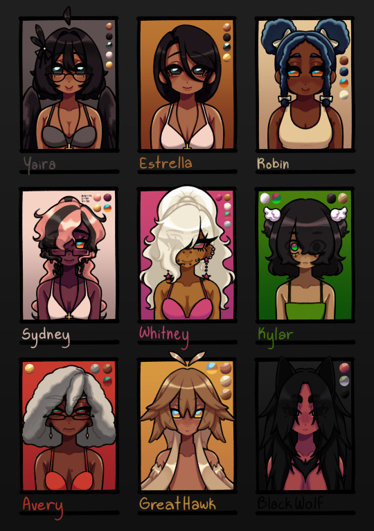
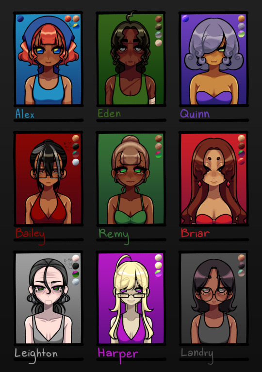
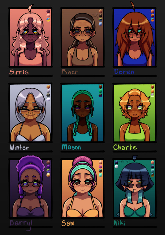
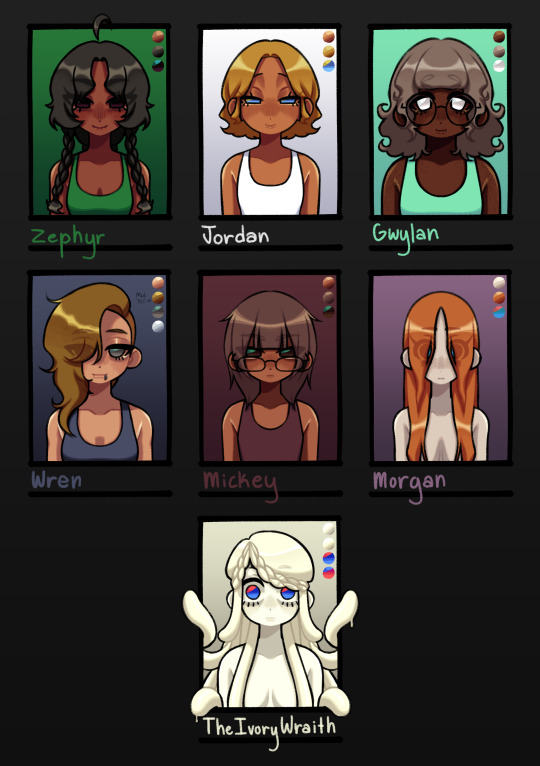
I FINISHED THEM. I DID IT. WOOHOO (crying)
design notes:
Yaira: nothing changed
Estrella: dead mom ponytail gone </3 i only did it in the og drawing of her bc its funny
Robin: ROBINNNN. IM SO SORRY I FORGOT THE PUFF BUNS UUEHEHHHHH- anyway, when i was planning out the designs for the other named npcs, i was like "why the hell are there so many gingers" so i made her have blue hair :3 to match with her confidence stat :3 also gave her yellow/orange eyes instead of green bc there were also a lot of green eyed npcs
Sydney: SKUNK HAIR. I DUNNO HOW I FORGOT ABOUT THAT YUMMY DYE STYLE. SYDNEY IM SORRY. i completely forgot i wanted to still have her natural hair (also just made pink bc teehee i like whimsy) to show
Whitney: not much changed besides the hair style. completely forgot i wanted her to be super gyaru OTL. gave her cheek piercings bc they're cute :3
Kylar: i lowkey started to not like how i did her hair originally and then came across all the sketches i made for the LIs and was like FLUFFY KY :3 ofc had to keep the emo bangs :3
Avery: nothing changed LMAOAOA
Great Hawk: FEATHER HAIR. I FORGOT I MADE A SKETCH FOR FEATHER-LIKE HAIR FOR HER. IM MAD AT MYSELF.
Black Wolf: not much changed, just made her hair longer bc why not
Alex: not much changed, just made he hair more of a red red, darkened her skin, altered her bangs, and changed the color of her bandana. still wanted to keep her looking like a cutie patootie
Eden: I ACCIDENTALLY GAVE HER A GIANT FOREHEAD THE FIRST TIME AND I DIDN'T MEAN TO SOBBING. not much changed though, just made her hair darker and have a green tint to it. look im trying to make my designs have lots of whimsy
Quinn: you can tell with Quinn LMAO. i just felt like she needed to have a distinct look since she's a special npc n all :3 classic purple and green color scheme for a shady character
Bailey: i'm gonna be honest, i was originally gonna go with a mean asian mom look for Bailey but then i was like "....what if muscle mommy"
Remy: i wanted her to look like a little shit. that's all
Briar: tried to go for a bit of a Jessica Rabbit and Rarity type aura. i really like her design and she could put me in the underground brothel any day :3 /j
Leighton: just an old hag, nothing special
Harper: wanted to make her look a little inhuman??? i think i got it with how dead her skin looks idk. also wanted her to look like a little shit
Landry: here's where the asian mom look went. i like her and Mickey's dynamic and they both just look like regular people (better for crime)
Sirris: Sydney if she was older. idk what else i should've done lol
River: old lady :3 hot old lady :3c (pt 1)
Doren: i wanted her hair to look fluffy as hell
Winter: old lady :3 hot old lady :3c (pt 2)
Mason: SEAWEED HAIR. that's all
Charlie: wanted to embody :3c
Darryl: she's very cutie patootie to me so i made her a cute patootie
Sam: wanted her to look like candy kinda. idk :3
Niki: i only made her hair a little longer and no weird two layer thing for the short portion
Zephyr: wanted her to look smug and also kinda cute???? idk, i didn't really have a vision for her
Jordan: also didn't really have a vision for her, but it did want her to gave similar eyes to Quinn
Gwylan: her i did have a vision for :3c she's a cutie patootie, that's all :3
Wren: thought a side shave would make her look cooler
Mickey: hairstyle changed a little. other than that, not much changed
Morgan: still a wet rat
Ivory Wraith: nothing changed (they have special eyes tho)
#dolgl#dol#degrees of lewdity#silly billy kitty draws#yaira the beloved#estrella the dead mom#robin the orphan#sydney the fallen#whitney the bully#kylar the loner#avery the businessperson#great hawk the terror#black wolf the alpha#alex the farmhand#eden the huntress#the ivory wraith#jordan the priestess#bailey the caretaker#harper the doctor#briar the brothel owner#remy the farmer#leighton the headteacher#landry the criminal#quinn the mayor#wren the smuggler#mickey the hacker#morgan the sewer dweller#niki the photographer#sirris the science teacher#river the maths teacher
227 notes
·
View notes
Text
MLP-Takara generations: a design experiment
Takara MLPs are considered generation 1 My Little Pony; the original ponies look like little horses and the takaras are obviously very different.
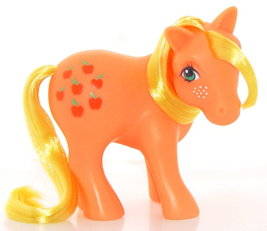
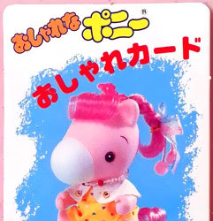
But the standard MLP toyline underwent a lot of changes throughout the years... so, if the takaras had been successful, what would their changes look like?
Generation 1 year 2+ takaras.
Year one MLP was only a few ponies with a single color of body + matching hair... just like the takaras. It was year 2 that they introduced unicorns. pegasus, and seaponies.
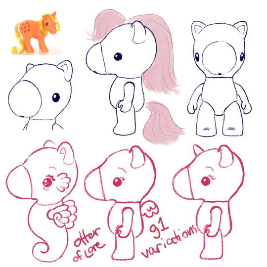
You all know I've already been concepting these so it's not surprising at all. As MLP g1 went on, they ended up doing more and more gimmicks throughout the 80s which would also be kind of fun to see the takaras do... (hint hint if you want me to draw those lmk which gimmicks are your favorites)
I also think they should bring in markings like the normal ponies but that could be part of the gimmicks. Maybe on their cheeks, or on their bellies like care bears?
In the later years og MLP also had a lot of variations on the normal pony body type, so maybe you could also see the takaras with that kind of variant, so that might be cute:
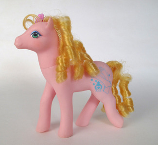
Moving on!
Generation 2
If you aren't big into early gen My Little Pony you might not know that generation 2 didn't do very well; it was a reboot of a beloved franchise, it was new, and different, and all that jazz:
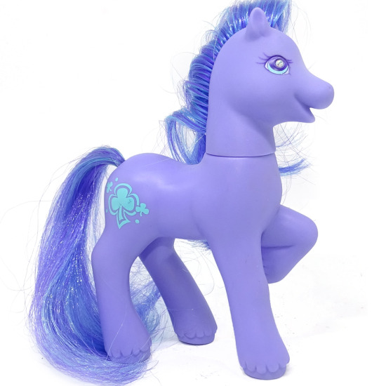
Main differences between them and g1: first, you can see they have a very late G1-type body, which is why I pointed out the thinner pony in g1. Their face is less detailed and rounder, but they have a little more expression, very smiley.
Their ears have a more horse-y curled in shape, they have fur around their hooves (in g1 only the boy ponies had hoof floof), and they have a gem in their eye.
Also they had a lot more moving-leg gimmicks where you could push one part of their body and another would move (eg push tail -> bobs head)
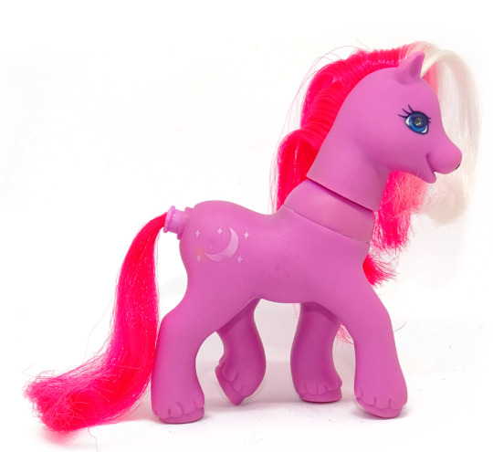
So you may ask, how am I could to g2-ify the takaras? After all, they are already much rounder than the g1 ponies. Well, I'm not going to make them just *look like* the g2 ponies, although I'll borrow more elements.
Instead: I am going to take and exaggerate all of the differences that I listed above and see what we come up with.
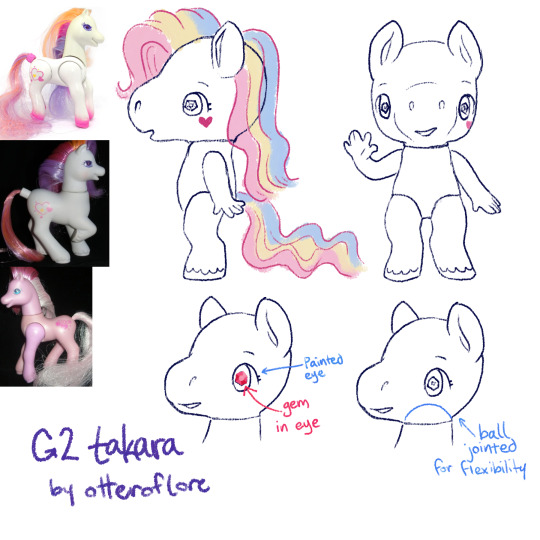
So! Here is my idea for g2 takara pony. I feel like its the exact balance of very cute and something that would upset collectors familiar with the original takaras, just as g2 upset the g1 fans.
First off, she's thinner, the iconic takara nose is removed in favor of a sculpt with a smiling mouth, the legs are more horse shaped with fluff and human fingers to match the additional foot detail. a lot of people find the g2s a little "uncanny" so I feel like this works.
The sparkley eye gem and ear shape are just straight off the original g2s, just to have extra gimmick to it (also the og takaras basically had the g1 ears)
g2 came out in the late 90s so I like to imagine the pony eyes would be extra shoujo too
Finally, a ball jointed head for more flexibility. (yes the arm would be posed like that in the doll, because its a more dynamic pose, and we can also assume that the larger size allows the doll to have a joint with more flexibility)
g2 had pretty similar gimmicks to g1 but also had some light up ponies, so maybe the takaras could have some with that gimmick too
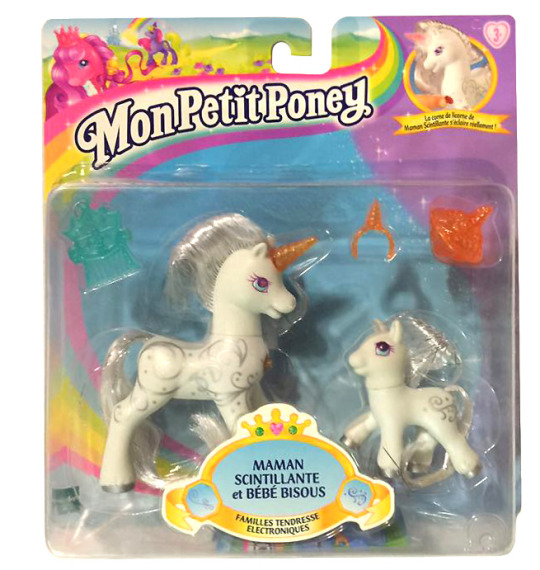
fun fact, g2 MLP was sold for a longer time in Europe and performed better there.
Generation 3
Generation 3 ponies are a pretty clear return to g1 MLP style, kinda scrapping most of the changes g2 made, other than proportionally thinning out the ponies a bit.
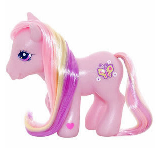
g3 ponies have very similar face sculpts with bigger eyes, nearly the same legs, and their heads just a bit bigger in proportion to their body
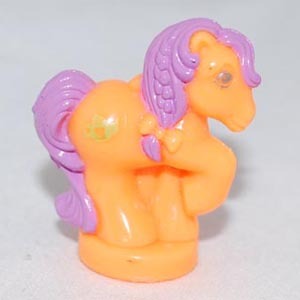
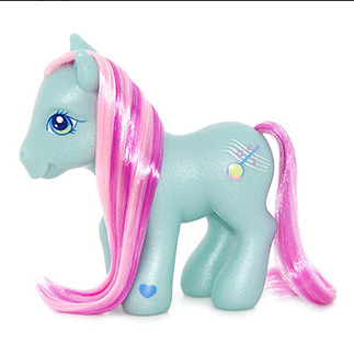
They do remind me a lot of the g1 Petite ponies, which were 1 inch sculptures that also had those proportionally bigger eyes and chunkier legs.

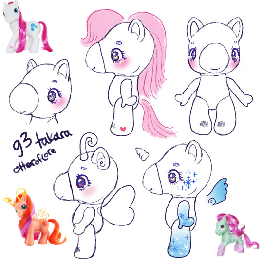
I have here included the g1 so you can see the slight changes better! I think the main difference would be the g3 takara would be a lot rounder, smoother, and cutesy-er. While the original has the hello-kitty simple cute look, the g3 version would definitely have like eyelashes and big eyes.
The only other thing to note about the body is some bigger ears, a generally rounder face, and round feet.
There weren't many gimmicks super /unique/ to g3 but one I wanted to highlight was the Breezies. G1 did have the flutter ponys, which were ponies with butterfly/dragonfly type wings, but the breezies are like their own little species AND they have antennae. While the flutter ponies were sort of graceful and thinner than the other ponies, the breezies are like little chibi-er ponies.
A little bit Littlest Pet Shop-core, since its the early 2000s too.
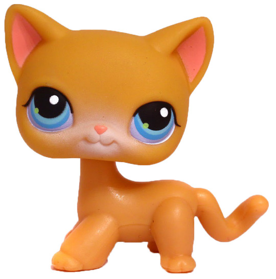
SPEAKING OF
Generation 4 Generation 3.5
Before there was gen4 there was a subset of Gen3 ponies with a different and unique style. They were basically an exaggerated version of the Breezies with even bigger feet and tinier snouts. They are also VERY littlest-pet-shop-core.
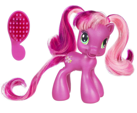
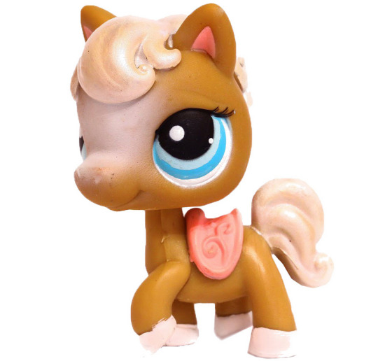
So, pretty straightforward changes
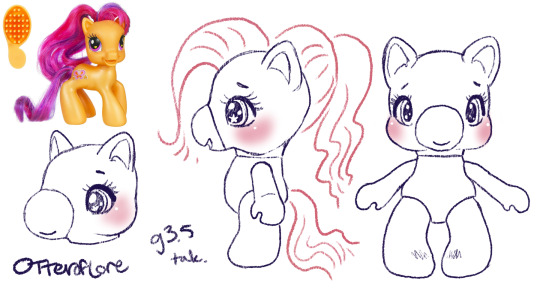
Just an even more chibi, kid-ish style pony. I think the g3.5 ponies were even meant to be kids. So this is just an even more child-friendly, littlest pet shop type horsey.
Generation 4
So, obviously generation 4 ushered in a whole new era of My Little Pony with its unique and bright artstyle, which did need to transfer over to the ponies
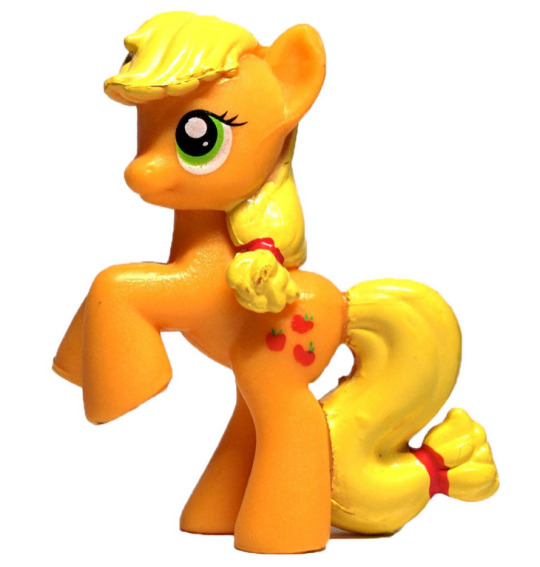
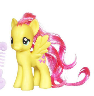
Personally, while I love g4 in a lot of ways im not a fan of the toys in the same way I am the other generations, their little noses have shrunk to specks, they're skinnier and more big-eyed than ever. Well, g3.5 was pretty big-eyed but at least those ones were like little kids.
This is such a drastic shift from g1/g3 and even g4, I would be unsure about the takaras.
So: eyes, bigger. Snout, so tiny and so smooth. Ears, bigger. Hooves are flatter and parts of the legs are just kinda featureless. a longer neck. They released a decent amount of ponies with plastic hair this gen, too.
I was struggling to come up with a doll for this one, but I finally realized I was doing it backwards. The thing that makes g4 stand out, I think, is the fact it was fundamentally designed opposite from g1. Lauren Faust, an animator, designed the ponies and the toys had to be designed around her art.
So the primary difference was considering what a tv show- a tv show concieved in the 2000s and airing in 2010s- and I did look into some kids properties from that time period as I was designing
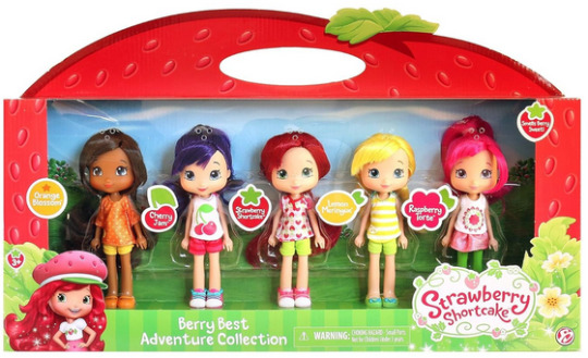
I think these Strawberry shortcake dolls are really close to the concept I'd want for a early 2010s mirror of MLP g4. So basically these toys but more anthro.
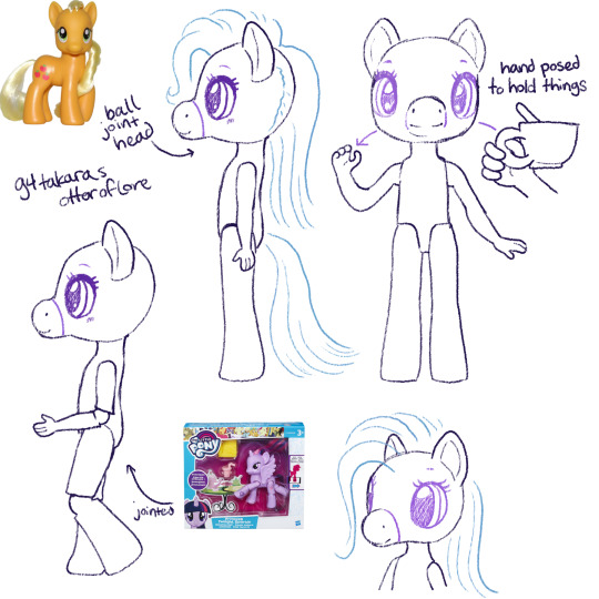
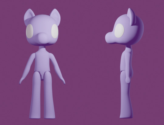
I ended up making a 3D mockup so I'd be able to plan the different angles and keep them consistent.
The eyes are kind of far apart but I think thats true of the g4 pony toys as well. Again, because of the way the g4 show was stylized as animation, there was sort of cheating with the anatomy, especially on the face.
Generation 4.5
Gen 4.5 was a spinoff of gen4, just like gen3 had 3.5 where the ponies are more chibi. More big eyes with even bigger ears and a face like... a cats? instead of a horse. Hoof fluff again.
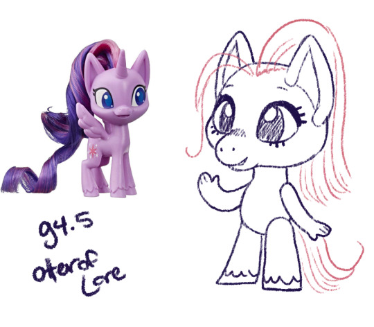
I think this nailed the style without being as much of an outright copy. The bendy arms with fingers seem so silly but also I think that matches the vibe/artstyle.
G4.5 don't look like horses to me really at all though, they're like cats with hooves. Out of all of them we've seen so far they're suffering the most from "predator eyes" where they've gone so far as to make their eyes just face forward.
Generation 5
Generation 5 premiered with a CGI movie, so the toys that would be released are fairly on model with their movie selves except for the fact their heads are smack dab in the middle of their neck which i find extremely unsettling and dislike
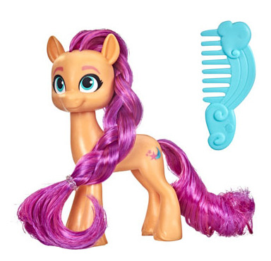
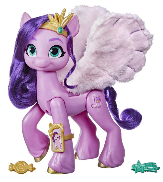
We've gone full "predator eyes" (no the predator eyes thing doesnt 100% biologically hold up but I find them freaky and I get to say it) AND full human eyebrows stenciled in like a makeup vlogger in the same color as the hair.
The ears are back to cup shaped (more horselike) but again the face is round with a little muzzle (more catlike). The hooves have really detailed feathering on the legs. Otherwise the body is mostly just structured like the g4 body (except a bit longer) just with more specific horse details.
These continued the trend of having a lot more articulated versions with moving legs as well. I think given that most dolls these days have articulated elbows and knees, it is reasonable to expect the takara g5 dolls would too.
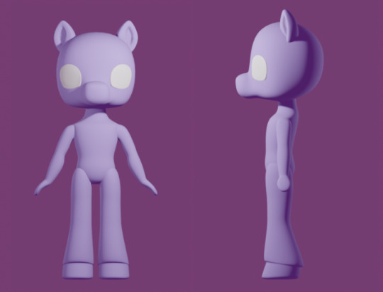
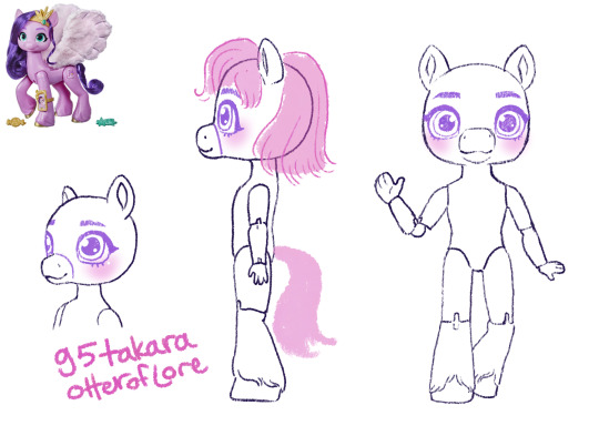
Again, I made a 3D model so I could keep it consistent from various angles.

ta-daaaa heres my takara pony generations 1-5 lineup! Tell me which youuuuur favorite are. if you want.
#im sorry for how long this post is#long post#my little pony#takara pony#mlp gen 1#mlp gen 2#and so on#generation 1#doll designs#sketches#i also wanted to do the clothes styles for each gen but this took so long already#and alternate gimmicks#would be fun to explore
311 notes
·
View notes
Text
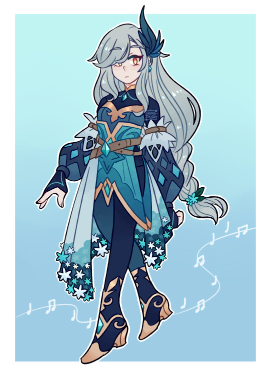
I've been teasing her for months!! But at long last her ref is complete 🌷
I actually DON'T have a 5 page essay on her backstory this time (like I did for Ilari LMAO) but I do have some info about her if anybody is curious!
Name: Ione
Age: 25
Hair color: Silver
Eye color: Orangish-yellow
Element: Light
Grabbing info from the few posts I've talked about her already, Ione was originally a very famous singer, pretty much an idol within the world of ATS. She'd hold huge concerts that were always sold out and people from around the world would flock to see her perform. Eventually tho all of the attention started to attract the wrong kinds of people, and sooner or later Ione was "scouted" by a very rich man who wanted her all to himself. She was manipulated and blackmailed into signing a contract with him that would essentially end her touring and make it so that she would become a private singer for him. He basically chained her with this contract and so she disappeared from the public eye.
Ione soon discovered that other people with similar talents had also been gathered and trapped by this man's contracts. Among them was a prodigy violin player who she grew very close with. The two of them struggled under the demands of this man, and eventually violin boy started to get physically abused by him 😭 Things escalated to the point where Ione decided she wanted OUT and was determined to do anything to escape. This led to a very...traumatic event that caused her to go mute by choice.
When Ione finally makes her escape, thankfully she's changed so much that people don't recognize her in public (mostly her hair! It used to be short and didn't cover one of her eyes before). Shortly after she runs into Nahu and his group, and is unceremoniously recruited to join them lol (Nahu can be VERY persuasive). Ione communicates with them through sign language, which luckily a couple of them are fluent in--Ezio and Sage to be specific. They then teach the others in the group sign language too. It takes Nahu a bit to get the hang of it bc he has like, no attention span whatsoever, but being a dragon elemental helps since his senses are super attuned all the time, so he can generally tell what Ione is feeling and what she's trying to convey when she talks to him :")
Over time Ione grows closer with them, and like everybody else is hit with the Found Family, and realizes that yeah. She'd do absolutely ANYTHING for this group of crazy weirdos. She starts to fall in love with Nahu (bc who WOULDN'T), and slowly gains the courage to use her voice again. This leads to secret meetings with Sage, who helps her relearn how to use her vocal cords.
Eventually her past catches up with her, of course, but the group all bands together to set her free from it. She has to face off against violin boy, who thought she'd abandoned him and got Messed Up Mentally as a result, so THAT'S a thing she's gotta deal with. But she's able to reach him by singing for the first time in over five years, and everyone absolutely loses their shit at how beautiful her voice is and they all cry and it’s very emotional!!
Even after regaining her voice she still prefers to stay quiet most of the time, as that is what she's comfortable with, but she's totally okay with speaking when she needs to. Also I need to mention this but bc she used to be like. An idol. Obviously her routines consisted of both song and dance so she's a pretty good dancer. Out of everyone in the group, Ione is the ONLY person Ezio will dance with (and he is a very VERY good dancer himself, but will only dance with someone who can keep up with him, which Ione can). Everyone is very jealous of this, ESPECIALLY Nahu lol bc he wants to dance with Ezio too 😂
Ione's a light elemental! I haven't given a LOT of thought into her powers yet but I do know that her singing makes her stronger and also gives her powers a boost, which in turn helps the rest of the group. She also can ride on these light waves--I will have to draw them sometime bc I can't really explain them in words, it'd be better to show them visually lol
And that's her!! My flower light mute girl <33333
#Original character#Character art#Character design#Fantasy#Flowers#Character reference#OC art#Art#Digital art#Shima arts#Shima's OCs#Among the Stars#ATS#Ione#IDK HOW ELSE TO TAG THIS ONE LOL#shima-draws
355 notes
·
View notes
Note
You know we want a directors commentary 👀


this update is the culmination of me going "haha wouldn't it be fun to have a big party with the whole island for gran grans birthday!" and then realizing oh shit. now i have to draw that. reap what u sow lolol
if ur wondering where loft and wolf got their outfits, the answer is Tetra's crew! i have half a mind to make a bonus comic about this but we'll see if i have the time lol. Slate already had that outfit in his sheikah slate, I based it off some of the hateno dresses from the botw concept art! Gran Gran's outfit is similarly based off some of the Lurelin designs.
favorite little joke of the update is gran gran making sure aryll and wake are EATING GOOD!

I like the idea of a circle folk dance popping up across Hylian cultures, because of the whole *gestures to the endless cycle of death and rebirth* thing. I imagine Wolf at least is probably familiar with the steps of this kind of dance

that was also the most difficult panel to draw 0/10 will never attempt again lolol
this one is maybe self explanatory but the dinner table on the left is the dinner Wolf had with Rusl, Uli, and Colin in DOG DAYS pt. 1

I designed these festival outfits a while back with no intention to use them in the actual comic but then I realized this was the perfect opportunity. originally I planned for everyone's outfits to use their respective Loftwing's color palette, but it didn't really work with the overall palette of the update lol so I changed them to be more cohesive

I will refrain from saying much about the last page :-) however, I will say that she's at Skyview Spring, which you might remember from prologue. skelda what are u up to!!

and that's about all I've got! honestly not much to say for an update so big HAHA
372 notes
·
View notes
Text


i had so much fun drawing this guy it's unreal. please observe siffrin from @protectorcraft's fic a bell chimes somewhere!! what a dude. what a lad. what a weirdo (positive)
some more details under the cut! (spoilers for isat and the fic under the cut as well!)
i imagine that since siffrin's creachur form has something to do with wish craft, it wasn't too far-fetched to say that his eye would be colored too, especially given how the sky kid focused on it. however since this isn't his wish to stay with his family, i thought it would be nice to make it a different color... something representing the universe........ Sky Blue It Is
it helps that i am also obsessed with shades of sky blue AND the line from the fic that the sky kid said that it had "everything" in its eyes
i didn't illustrate it, but i think it would be extra cool if creachur siff's eye color changed as per time of day. just because. he's like the eye color version of that one 'do you love the color of the sky' post
i like to imagine that siffrin still has a strange Light in his eyes even when in his human disguise. can't remember if the fic mentions it or not but he has a sky blue highlight in those eyes now in my design. because i can :3
speaking of human disguise, i like to think that even with his transformation he's still not that subtle. mirabelle picks up immediately that he's weird but also that he's friendly and VERY good at survival, and so isn't too bothered by his... quirks. this might end up being canon to the fic honestly but i just wanted to trot out my two cents regardless while i'm here
i'm hoping i managed to communicate some of that off-putting nature in his face! especially his eyes. they're almost unnaturally gray aside from that strange highlight
i originally wanted to make his eyes even weirder but then i thought that being Too Weird would kind of defeat the point, and the point of this is that siffrin kind of has to pass as a normal human which means no glowing pupils, unfortunately. i can totally Give Him Pupils though. gotta get that subtle horror/ creepiness in :3
he gets glowing pupils / tapetum lucidum in the dark though. or when he's angry (see top left). as a treat
didn't draw his in between state (between human and dragon) but i imagine it looks kinda fucked up ! his horn and ears grow, his tail gets longer, teeth get sharper, his whole face sort of. Distorts. in a distinctly uncanny valley way. the blue highlight starts bleeding into his eyes (and his pupils start transforming from round to slit to star-shaped)
continuing, this in-between form in my head is sorta like the dragonkin soldiers from elden ring, just in terms of 'this is a weird hybrid of human and dragon and it just Doesn't Work'. like human, cool, dragon, cool, in between? fucked
siffrin is INSANELY floofy. even with the fact that he hasn't bathed in ages and his floof is all matted and tangled from lack of care he's still crazy soft. i think his fur also has similar insulating properties to his cloak so he never overheats or gets too cold. always the Perfect Temperature
if i were more confident in my skills (and which way this fic is going to end up going) i would have drawn a big hero 6 style moment where everyone is just lying with their face buried in siffrin's fur, like how everyone lays on warm marshmellow baymax.
i originally meant for siffrin to be more cursed and body-horror-y, and then i was looking at the fic descriptions for him (as of chapter 7, so there may be more detail later that i didn't get to see as of writing this) and was like 'wait... he kind of looks like the dragons from BOTW doesn't he' and then the inherent majesty kind of. just. Happened.
i like the fact that he looks kind of majestic though! i think it's a good representation of siffrin's terrible body image issues in this fic where honestly he looks awesome but he just doesn't realize it because, hello negative self-worth
didn't color the last doodles of human siff at the top left. apologies. i got sleeby
in another life mirabelle rides his dragon form into battle and it is exactly as awesome as it looks like it would be
kind of shoehorned my own oc into here as well but i SWEAR aleph is so absurdly similar to this design it's actually kind of hilarious. if i had a nickel for the number of space dragon designs i've made i'd have two, which isn't a lot but
and the full page of doodles! just cause

#isat#in stars and time#isat siffrin#isat fanart#in stars and time fanart#in stars and time siffrin#siffrin#isat spoilers#kind of only for the readmore though#a bell chimes somewhere#dasner art
153 notes
·
View notes
Text

"Let's get to know us, shall we?"
Total time: 6 hours.
I should write how much time it took me to make artworks. In the span of 2 days, it took me 6 hours to complete this. Feels like 12.
Hope you guys like it as much as I liked making it.
I think I'm pretty much all peace with drawing ink blot guy but if this post gets 1000 notes in a week, I'll draw him again and this time, you suggest how you want him to be drawn.
My brainstorming process was random squiggles for an hour straight. I wanted him to sit and the only sitting shot was this one. I didn't want to exactly copy the pose in the shot, so I changed it up. I was originally going to make him say, "Let's get to know us, shall we?" through a speech bubble or some kind of lettering but I didn't cuz I spent so much time on the background and I didn't want it to get covered by the words. I originally made this in grayscale and then colored it since he is just ink and had to stand out from the background. Most of my time went into drawing that out of style bush in the left corner. I realised everything was too in focus which means nothing was in focus so I added depth.
That's it. okay bye.
#lego monkie kid#lmk#lmk mk#lmk ink demon#lmk ink mk#lmk ink blot#this took me 6 hours somehow#lmk fanart#drawing#artwork#painting#i enjoyed making this
79 notes
·
View notes
Text

"Thank you, Yugo...."
This is version B. Version A was scrapped because it didn't sit well with me. I just didn't like something about it.
Keep reading to see the process/journey of how we got to version B (And to see version A).
I AM NOT INVITING CRITIQUES - I already have notes on the things I like, don't like, and things I want to work on.
The Journey
Here we have the thumbnail. Then from there we go to the sketch. I love the thumbnail and the sketch. I changed the eyes because I am moving away from that classic anime look. I could have stopped here and be perfectly content with the drawing.


Originally, I wanted to put Amalia into a forest-like setting. However, I felt like I had seen that image before. And that bothered me. So, I checked....and I found it. I HAD SEEN SOMTHING SIMILAR BEFORE!!!
It was a drawing by Xa-xa-xa (here is his drawing).
https://www.deviantart.com/xa-xa-xa/art/Sadida-Portrait-340141077
To me, my drawing felt too much like his. I know they're not the same, but it already bothered me. So I ditched the leafy bg.
I haven't looked at that drawing from xa-xa-xa in YEARS but my concept felt so familiar. So similar. I had to make sure I wasn't crazy. After finding it, I changed the bg to look similar to the bridge in the Sadida palace tree in s4.
Here, you can see we have two different line art styles—thick and thin. I ended up using the thin one when I made the first version (A). However, I went back and used thicker line art when i redid it to make the second version (B).


I was not satisfied with her expression, so I changed it. It looked too basic. Too bland. There is a smile but the lips overpower it. The new one looks so sweet and gentle (but I deplumped her lips 😭)

I struggled with coloring the hair on both versions. Something I will have to practice more. I like her hair in version B more. I added more flare and more tone to it.
I do like the backlighting on her in version A and I wish I brought it to version B but I'm okay with version B.
I do like how I colored the lips in version B but not version A. I legit HATED the lips look in version A. I wanted to make them look more natural hence the coloring in version B.
To me the BG vines look a little too cartoonish. I think it's because of how they're colored or shaped. I'm not sure. Maybe it's how I made them wrap around the column. So, I'll be more mindful of how vines lay against objects (and probably use more reference).
I wish I did more to the water in the bg, but since it was blurred it didn't really matter.
Well that's about it. Which version speaks to you? Version B or Version A?!


#wakfu#amalia sheran sharm#wakfu the great wave#wakfu amalia#illustration#digital drawing#digital illustration#drawing#art#illustrations#sketches#anime art#artists on tumblr#fan art#fanart#digital painting
111 notes
·
View notes
Note
What was your process for making the Noelle amv, if you don't mind sharing?
hii! im not sure how eloquently or clearly ill be able to explain it but i definitely have some pictures you can look at!
(the video)
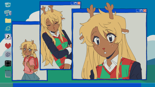
i actually got the idea while i was away on a trip with very limited wifi -- it wasn't Trust Me that i got an AMV idea for first, but instead it was one of 4syu's other songs, There's Nobody. for such a happy sounding song it really made me so sad, to the point where if i tried to sing it to myself id get choked up by the chorus LMAO. it was baddd
but basically i was rapidly trying to find both songs on spotify so i could listen to them offline, and it only took me a few loops of Trust Me and thinking about the original MV to make me go "ohhhh. how can i make this about noelle." And so i did .
i was thinking about doing a storyboard, but in the past, i've found that doing storyboards for animations/AMVs lowkey... kills my motivation altogether... SAD... but i saw the whole video so clearly in my head, and i didnt want to make the same mistake i made before... so i went right to doing quick sketches (while still on my trip...) just so i could get the ideas out of my head
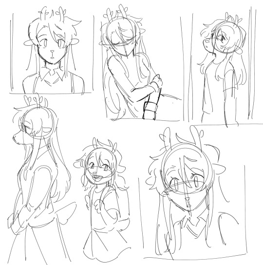
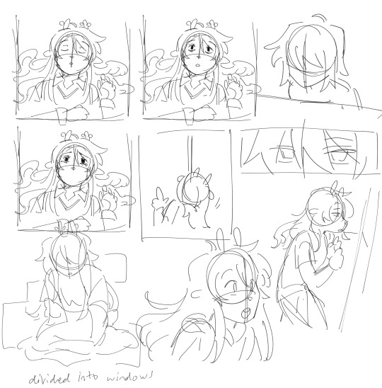
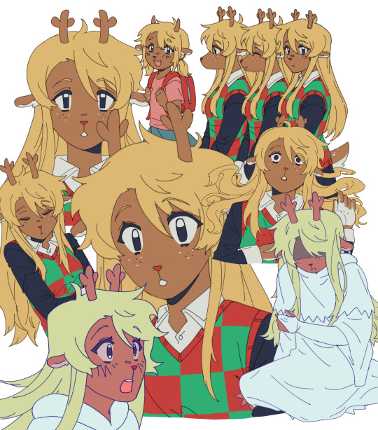
i was torn on what to do with my style at the time, whether i wanted to make it more similar to the original video, or to her canon appearance, or to MY style and how i draw her. i think it kind of ended up as an amalgamation of all three...? at the very least, her light world color palette definitely was more bland and desaturated, like i purposefully wasn't trying to do anything special with her colors.
after that point, and getting maybe a few of the actual drawings done, my motivation crashed again, and i left it all to marinate for nearly a week. it was baking, guys, it wasn't abandoned, listen to me, why are you throwing tomatoes at me,
i had up to about the "I dreamed about that again" animation done and stopped, and it wasn't until i decided to sit down and start editing it anyway that i really got in my groove again. i got all my little assets into a workable state so i could really try to sit down and make the video come to life and all
the really fun part was honestly working on the desktop backgrounds. i really wanted to limit colorpicking from the original video as much as possible, but i decided that making look as similar as possible to the original could help with the contrast i wanted to add later.
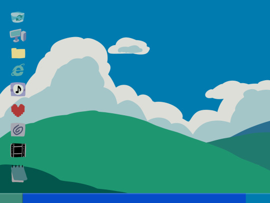

i drew these two backgrounds first. i was hoping i could somehow fit the bunker into the second one, but decided to do something different anyway. the second one's ui didn't actually change until later in the editing process.

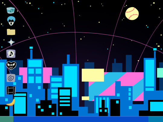
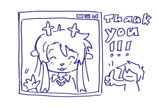
drawing THESE were fun especially, and im happy with how they came out. i think the dark world icons are really cute still. one thing i really did know i wanted to do from the beginning was to turn the soul/undertale icon into the deltarune one.
i was worried if the shift from the Windows Field Background to the dark world would be too sudden, like you would just blink and suddenly it was all different, but i think it ended up all right...?
the not so fun part was drawing all the different boxes, lmao. it go really tedious by the end, so i tried to reuse as many of the same ones as i could.
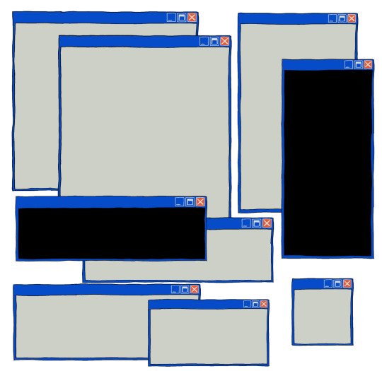
a lot of copy-pasting and tracing rectangles for sure.
i also had to make sure the animations didnt Suck. i brute forced those things and used every last braincell i had in order to make those pictures move bros


fun fact. ive never animated hair like this before. or in any complex manner really. i had to use sooo much brain here... heres how it started vs. how it ended up
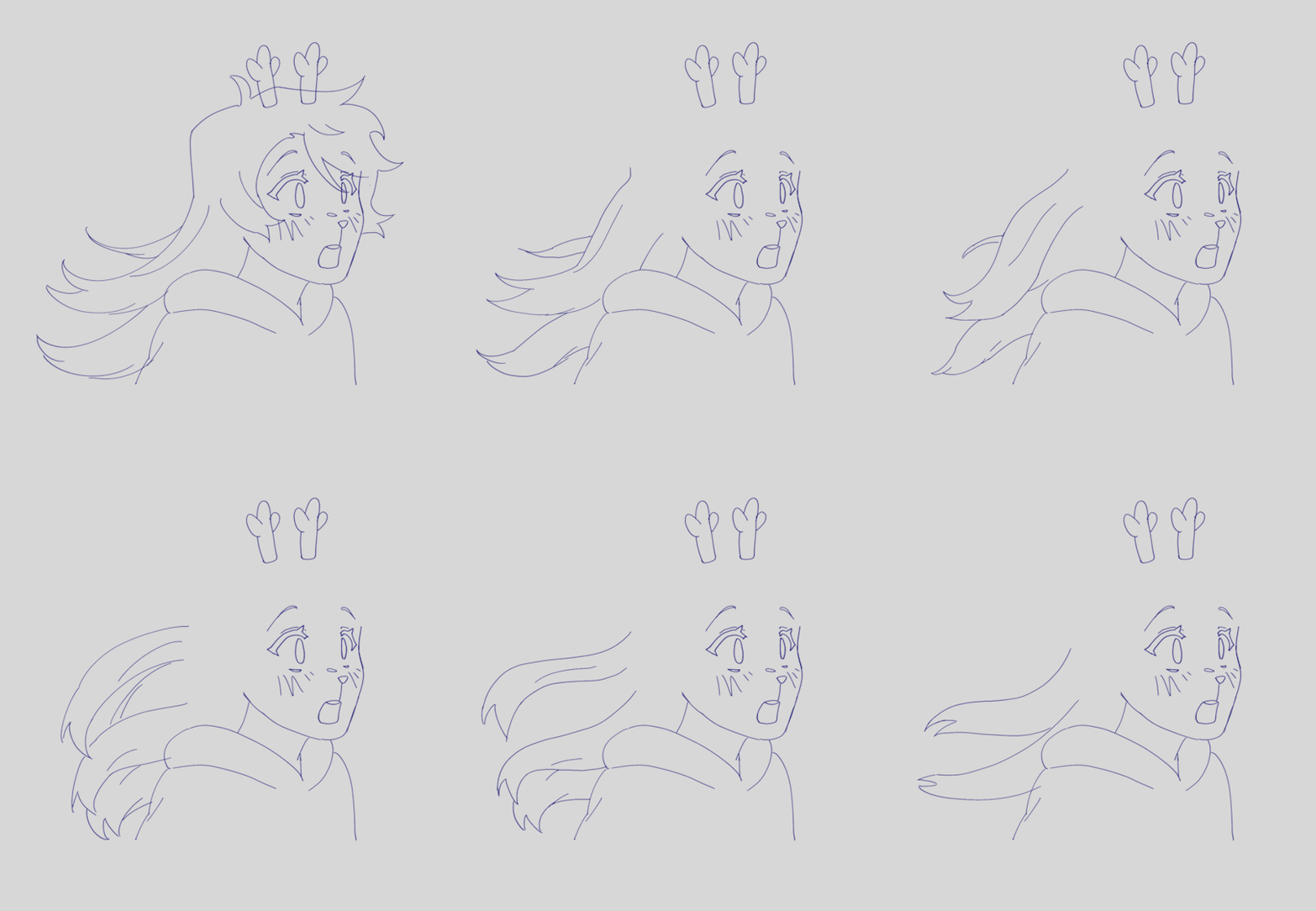
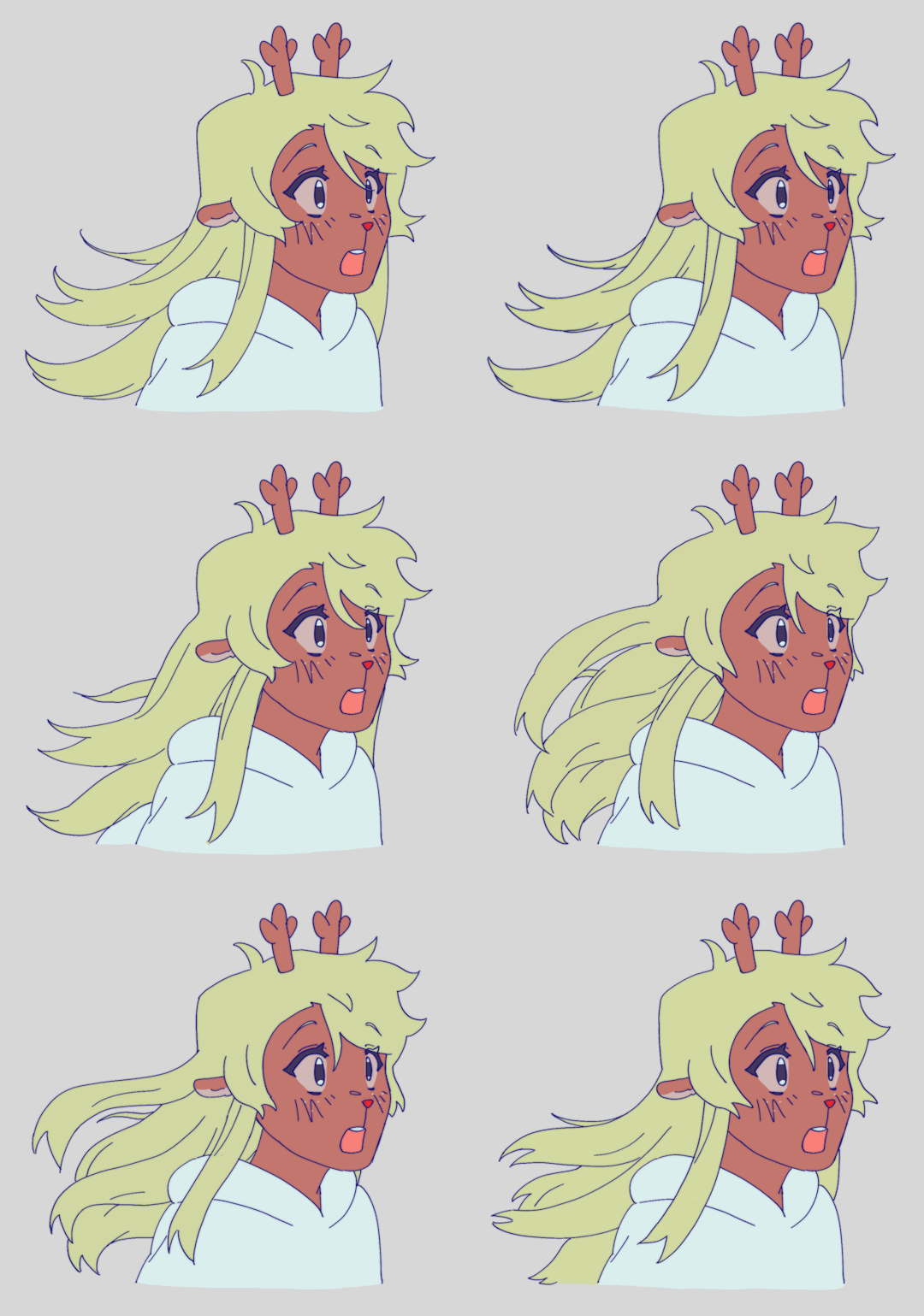
had my animator gf hype me up thru the whole thing... i was having a great time based on the filenames alone
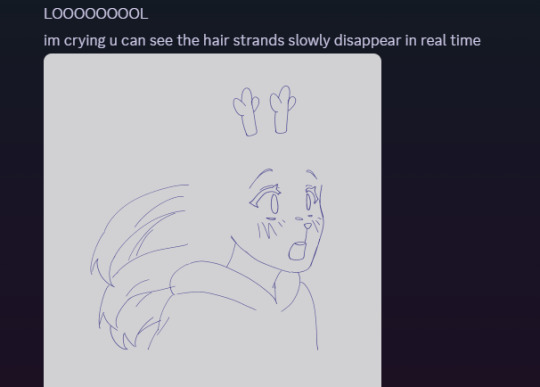

aaaand then ummmm i edited it. i learned after effects like 1 month ago. never touched it before. i learned it for internship purposes and then used my newfound powers for evil it seems
i split the whole thing up into multiple compositions of course, but i probably could have split things up more... im sorry for having 84 layers on comp 3 its not my fault
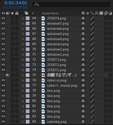
editing a video in 12 fps was a fun change though -- very easy for my brain to go frame-by-frame, and yet still some of the timing ended up being off... tis the goomy way
like i said before, i started editing when i barely had half the drawings done, but seeing it all start to be in motion really pushed me to finish it up. and i mean Really. like i finished the whole thing maybe 48 hours after i first started editing.
and...i think that's it? i do a lot of discord art streaming to friends lately but i kinda kept this one more under wraps compared to usual, i think i just wanted to surprise everyone... look guys i remembered how to make a video! and it's three minutes! waow
sorry if this is way more than you asked for LMAO
also, the AMV hit 5k views on youtube today! ive never had a video do well like that so quickly! thank you!!
123 notes
·
View notes
Note
Cabi! Big fan Joffrey here!
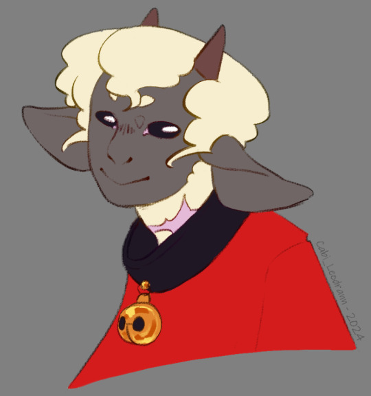
I wanted to ask, every time I see your art not only am I stunned by the quality, but also by the sheer uniqueness in style and character design. I've never seen a lamb designed quite like yours, it's so perfectly yours. What went into the inspiration behind the characters design, especially facially? Did you try and mimick a real lamb, or was there a more fantasy-element that you veered toward?
I can't specifically put my finger on it, but it gives me vague Warframe vibes. It's such a beautifully odd design and I can't get enough.
Love your work, love everything you do, can't wait to see what's next!
Hope you're well, stay safe, take care!
First of all, your ask is one of the biggest compliments I ever had in my life, I will keep it forever. You're an absolute chad! Second of all, those are very interesting questions, and I will be very happy to answer to them!
It started more or less with this drawing I made *look at the date* 2 years ago apparently. Way before I even thought of an AU- I didn't had much in mind, beside doing something that looked cool tbh.
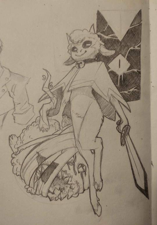
I was very happy with the flow of it, and how it came out. And when I drew the Lamb again, I would try to nail THIS design.
The thing is, with time, I had a really big problem: Lamb looked way too young when I thought of them more as an adult. I had too much of the original game design guiding me, making a Lamb that was too cute and childlike for what I wanted. (And also, the head did not go well with the rest of the body holy shi-)

Came those drawings! I was happier with the look, Lamb was older! And I found the colored design quit nice! (I used a sheep picture as reference, but I don't think I used it well, compared to now. I used the reference for details, when I should have gone for overall shape first.) I still wanted something simpler to draw tho. The colored design was nice for an illustration, a one time gig, but I got pretty annoyed pretty fast at trying to nail the face every time. And from those attempt, you get the sketches on the right. (I also wanted to get away from other artiste's interpretation of Lamb, and at the time of those drawing, I didn't felt like I was away enough)
From those previous sketches, the idea for THaB started to emerge. I also still had problem with Lamb's design. Especially the hair. I was inspired by black hair, which is usually not a problem, but I was never happy with how it looked on Lamb specifically. I can draw black hair, I can draw black characters, but this mother-fucker would never feel satisfying to draw or finish 👀
And one day, as THaB was solidifying in my mind, I made a series of sketches that I posted! And one of them was the most important in Lamb's final design. This lil guy! (this design didn't came out of nowhere tho, Lamb was evolving into this as I kept trying. But I wont show those sketches, because those are spoilers =3)
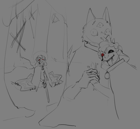
And soon after, I made a comic that was supposed to only be a one shot, just a POV of Lamb and there reaction to Nari' telling them to die for him. But you know, things got out of hand lol
As I continued the comic and doodles on the side, I finally made myself a reference board, with real life images that were close to the vibe of this head drawing. (And I cannot stress enough how those references solidified Lamb's design as a whole. Draw with references, it is life changing. The more reference you get, the more your visual library will get diverse, and the more interesting detail and shape you will add to your art in general.) (I'd also add this: understand what you are drawing, make research and stay curious for every bit of info on everything. You never know when these nuggets of knowledge will help you as you create)
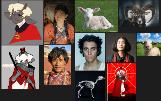
As I kept drawing the Lamb, they evolved! Things changed, slowly, like the shape of the nose, the shape of the eyes, how the hair flowed. You see those change at the face, but also on the body! As the idea of THaB's Lamb got clearer, the design got more specific. (I also got better at drawing! This comic make me draw way more often then before, and it shows)

Something before I finish: the other Cult of the Lamb character's design are way more inspired by their animals, when Lamb is more in the human spectrum. I thought of changing Lamb at some point, to make it fair/coherent, but I loved the design too much to change it again. This AU is something I do for fun, and even if it would have been more logical to change them... I don't want to-
As for the vague Warframe vibes: I play the game! And I found the character design absolutely stunning. So I am definitely influenced by the game without knowing it lol
Thank you very much, again, for your kind words! I also wish you the best, and see you next post =D
TL;DR: Lamb design, at first, wasn't inspired by much, beside the game and my style at the time. But as I retried to make them, added more intent, they got more refined. What really nailed the idea was to have real life references on the side.
#cabi ask#long post#cotl lamb#this took a lot of time to write holy shit#but it made me take a look at older drawing and made me realise how much I got better in 2 years#so it was worth it#and again Thank you Thank you Thank you Thank you
64 notes
·
View notes
Text
Still working on that chapter. Don't worry, it's coming along! Yesterday i was trapped at a party for 10 hours and, being the introvert i am, decided to take a break from drawing for an animatic by trying to draw for this au instead. don't know why i didn't just do artfight lol
FULL KING REFERENCE PACK + SIFFRIN DUO POSTGAME REFERENCES
Notes and details under the cut


sooooo howsabout postgame content?
the original post talking about postgame can be found here but it doesn't go into too much detail
So post-game resetfrin and gloop. they go with the party, kinda like a lot of twohats aus? resetfrin goes with the party because they know mirabelle and kinda know isabeau from when he would get apprenticed by the king (long story), but also because resetfrin acted so much like the old siffrin they used to know that it felt odd to leave him behind.
gloop, however, WAS the old siffrin! the party knows this, they found it out in the last loop, and they've formed such a bond with them that it's as natural as it is in the original game. the only issue is: gloop has changed SO much. physically, mentally, even a pronoun change - the party wants to help her out, but they want to explore who this New Siffrin is, too. Isn't it ironic that the new addition is the one you know far more of than the old addition?
resetfrin stays siffrin because... uh. because he's always been siffrin? there's no conflict there. gloop, after getting their memory back, ALSO goes back to siffrin, because that's who they really are and they acknowledge that loop is their own person. they don't want to be reminded of their time as gloop, either.
so... they're both Siffrin. And they're both technically the same person. do you see the issue?? the two of them didn't. the party did.
there's a comic I'm thinking about making to explore the processes and conversation that happened to initiate the name changes. the long and short of it is they can't BOTH be siffrin, but neither of them want to be siffrin if the other one can't also be siffrin, so they go on separate journeys to find a new name. they come back together with the party afterwords and they both ended up picking the same name so it's back to square one.
they talk to the party the second time and after a lot of brainstorming land on Orion for resetfrin and Lux for gloop. it helps the party distinguish between them and helps me establish the difference between postgame content and in-game content
(plug moment but these names were suggested by @the-bitter-ocean who gave me like. a whole list of things i could choose from. oh the life saver. i didn't even think about what names they would've picked until xe helped. and ohhh theyre so good. he also has some amazing aus including a miraloops au that you should go check out. pretty please)
the hair thing is SUPER IMPORTANT i originally only did it because they needed a way to separate themselves from eachother, but i realized they would also have done it to separate themselves from the old people they used to be. very poetic. 10/10 thank you brain for the excuse

the colors for orion's alt outfits are just a limited color pallete, they're not actually the colors afaik. (<- says the creator) but Lux's colors are 100% the colors, yes. their star body is different from loop's, where loop's body is solid black and lux's seems to glow on it's own. do you see where the name lux came from.
it's really dysphoric. imagine being turned into a ghost against your will and losing your memories, and them after gaining your memories back you turn into a completely different body AGAIN and it's STILL not the original body you had. i would cry.
gloop/lux's eye is still blind. even as a ghost they lacked depth perception. L. since resetfrin wasn't with the party to lose his eye they don't have any vision impairment
actually, about that. funny little thing. if siffrin wasn't there to protect bonnie, who did? haha hehe. hey why does odile have her arm in a cast...
KING TIME

okay i got a lot of questions about it so i double-checked on the original post and. yeah it DOES say the king's name. both in the text and on the image. but you'd be forgiven for missing it because it's pretty small on the image and there's a lot of text to read through
anyway pre-madness king's name is Lazare!! he originally looks like the lithe dude on the left. he's scholar-ish, came to vaugarde on vacation before losing his memory, yadda yadda... a lot of his information is on the original post so I won't repeat anything that's already been said
he picked Lazare a few days after losing his memory. he never told his name to anyone in the town he was staying so all he got was "travelling one" and he really genuinely thought that was his name for a hot second until he realized that Vaugarde really likes adding -one to titles
i made his hair curlier! after drawing the king for the chapter cg i realized i did NOT makw his hair curly enough when drawing Lazare. his hair type is almost exactly mine, though mine has more define curls, so drawing it is a BLAST!!
Defender arc Lazare! He bulked himself up to come off more physically and mentally strong. is this a trans allegory? is the King trans or was the body craft just to match his perception of himself? not sure. At this point in time he's already travelled with siffrin for a bit so i like to think he's a teensy bit protective. somewhere between friend snd father figure. cool guy
you know who's not cool? this guy vvv

this is where the King becomes the King :3 his hair is OBNOXIOUSLY long, almost rapunzel-like but nowhere near as bad. it always covers one eye but it doesn't really matter which one.
the crown happens like... VERY shortly before he makes the wish and starts freezing people in time. hes lonely and isolated and its something like coping with his delusions about everyone being out to get him
that's not the way he thought in the original loop, but after the reset his descent is much faster and harder than the last. when Siffrin starts climbing the tower, yearning becomes animosity as he thinks Siffrin finally betrayed him like he "always knew they would." or something.
hey 16yo sif jumpscare!!! wasn't he on the original post too?
.
anyway!!! that's it! that's all! i swear it's all. inevitably I'll have to make gloop and resetfrin full references but I'm happy with the ones i drew in the original post which I'll probably end up pointing people to if they want to draw either of them. the king was the one i worried about most because he's so different from canon, and same goes for the postgame designs. even coming up with new names was worrying because they're practically not even the same person from canon anymore
but that's the fun thing with aus, isn't it? lol
cya
#resetfrin#isat reset au#ghostloop#to reset a kingpin#kingset#art#references#rambling#post game#orion#lux#<- yeah those are gonna be new tags haha. they won't be added to the directory though
85 notes
·
View notes