#i have a very specific color palette for her clothing
Explore tagged Tumblr posts
Text

the radiance of lathander.
#obsessed with making renders of Her. i hate how blocky sims bodies are but they're far more customizable than bg3 characters so here we are#i looooove fleshing out zif's wardrobe ok fashion is very important#i have a very specific color palette for her clothing#it's a sunrise/sunset pastel palette with dusty pink warm red gold and brown mwah chefs kiss#˗ˏˋ ʚ🩷ɞ ˎˊ˗⠀āl azif.#myedits.
8 notes
·
View notes
Text
Top Ten Least Bad Outfits in TNG
I'm gonna be honest and say that the non-uniform outfits in TNG are not my favorite costume design in the world, but there are some looks that stick with me:
10. That Girl Who Kissed Data That One Time's Outfit:
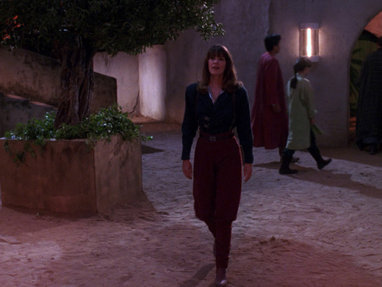
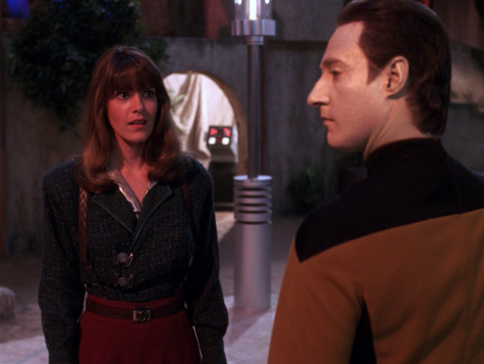
I can never decide if I like this look or I think it's ugly, but I love the pants and tall boots combo. Her blouse is bad and the bouclé jacket is both too heavy and too fussy for this outfit, but I love the belt and suspenders combo, and the chevron embossing on the suspenders. This costume and all the others except #9 is a Robert Blackman design.
9. This Jumpsuit On That Girl From "The Dauphin":
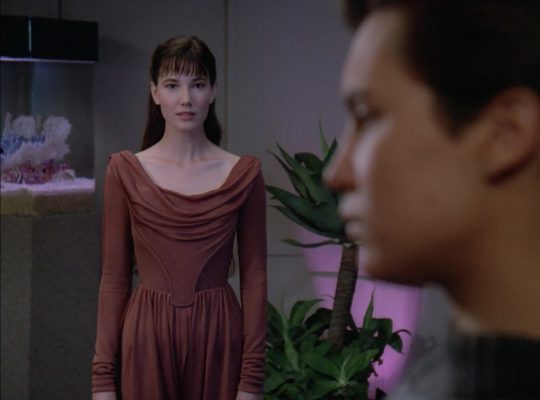
This is the only William Ware Theiss design on this list. I love his TOS stuff but most of his TNG designs leave me cold 🤷♀️. But I love this is extremely 80s jumpsuit. Love the pretty drape, love the ruching on the sleeves, love the harem pants silhouette. Only note is that the whole bodice should be a structured corset bodice instead of the kind of odd structured panel it has now.
8. Picard's Shorty Pyjama Set:
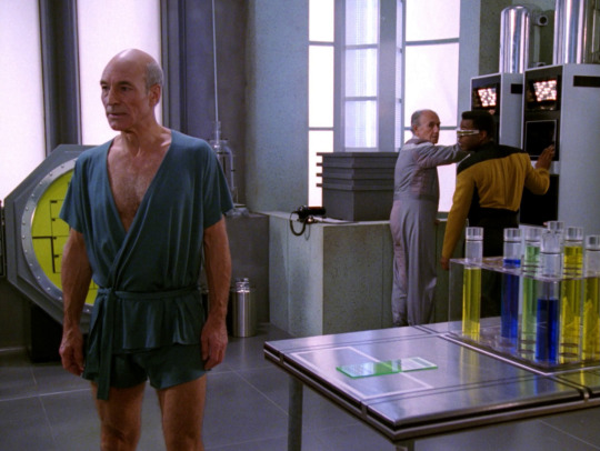
TNG is absolutely full of the strangest pyjama choices you can imagine and Picard is no exception but I love this bold look. Would kill for this pyjama set. He also takes a work zoom wearing this one time which is insane.
7. Data's 1890's Looks But Specifically This One With The Shirtsleeves And The Blue Shirt:
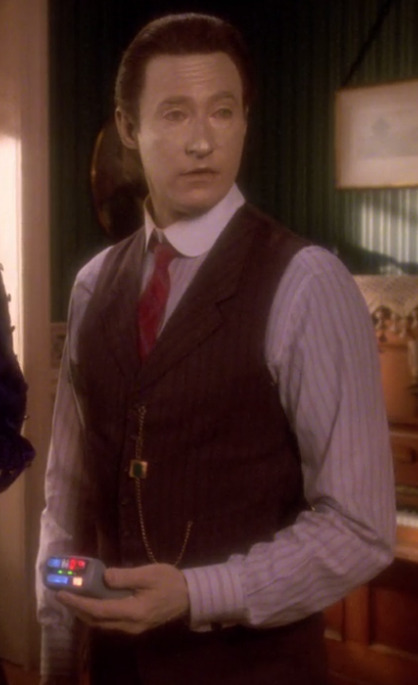
The best part of "Time's Arrow" is that Data isn't a fish out of water in the 1890s, he's absolutely killing it, and I love that the only real Casual Data look we get is this one. I prefer the blue shirt to the pink because Data should really wear more blue, it's a nice contrast with yellow. Please also note his emerald watch fob, which was 0% necessary to blend in, he's just having fun with it.
6. 12 Year Old Keiko's Linen Overalls:
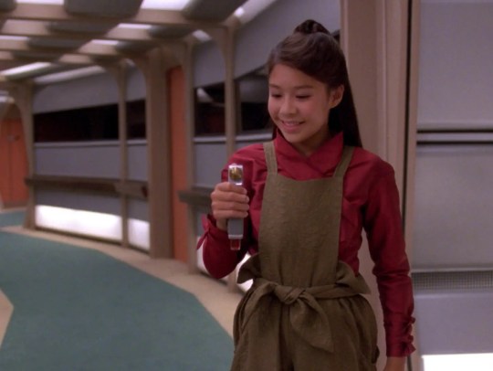
The paperbag waist! The bow! The little bows at the shirt cuffs! I can understand why she replicated a miniature copy of this outfit.
5. Beverly and Guinan's Dixon Hill Holodeck Costumes:
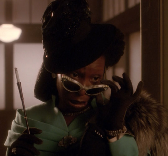

I'm counting these as one because they're essentially the same design in different color pallets but what color paletts! Bev is pulling off the very difficult pink+red+red hair and the mint green on Guinan is 🤌. I particularly love how Guinan's hat is so 1940s yet also echos the silhouette of her usual costume.
4. Deanna's Teal Dress:
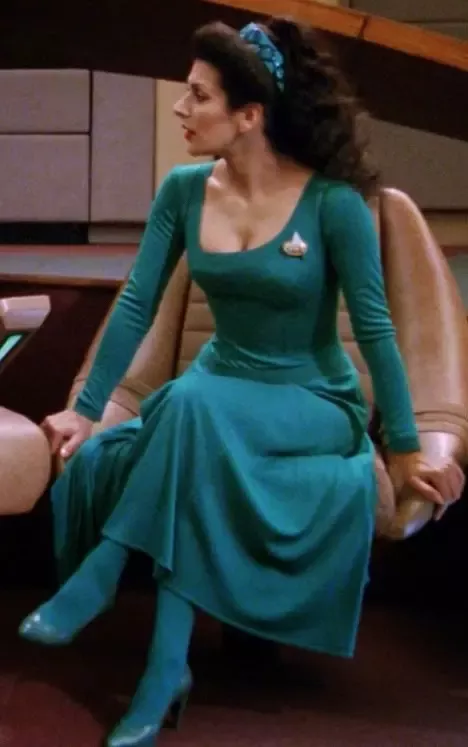
Like all of you I prefer Deanna in the uniform, but this dress slays, ok? The space age asymmetrical neckline. The drop waist. The structured bodice. The slit almost all the way to the hip. And of course the matching tights and shoes CANNOT BE BEATEN. Also one time I saw a dude on a Star Trek forum call this a "ballgown" which baffles me to this day, this is clearly a slightly fancy day dress.
3. Picard's 1890s Look:
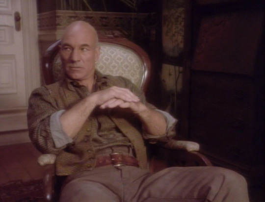
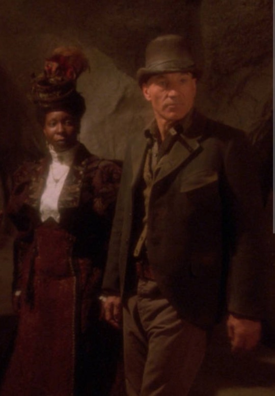
You'd think Picard would go full posh in the 1890s but instead he gives us this working-class Shakespearean director look and he 👏 looks 👏 incredible 👏. Way to mix textures, Jean-Luc.
2. Lore's Turtleneck and Giant Vest:
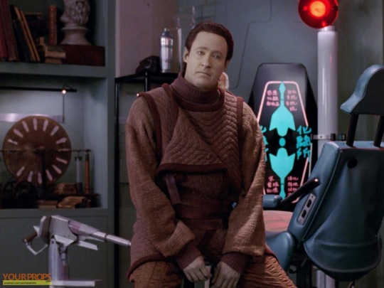
You and I know that Lore stole these clothes from the Pakleds because we pay a lot of attention to Star Trek costumes, but to a normal viewer Lore shows up and this is just his outfit!! It's giving, like, space-age goblincore and it's incredible. I want wear this oufit every day. I want to make a little doll Lore wearing this outfit to express my love for it. It's only not #1 because the pants are too orange and a strange weave.
Deanna's Ancient West Holodeck Outfit:
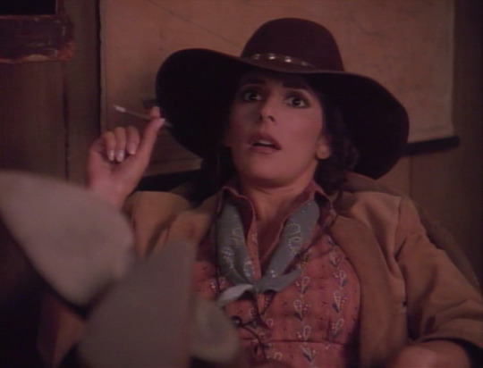

Deanna!!! The pants! The hat! The calico! She looks 10/10 hot in this outfit. For sure the superior version of this is before she gives her neckerchief to Worf (it really benefits from that cool highlight) but either way this is the best anyone's ever looked on that holodeck.
#star trek tng#star trek next gen#deanna troi#jean luc picard#data soong#beverly crusher#guinan#lore soong#keiko o'brien#tng#yelling about costume design
658 notes
·
View notes
Text
Pampering and Dates
Poly!Vees x GN!Reader
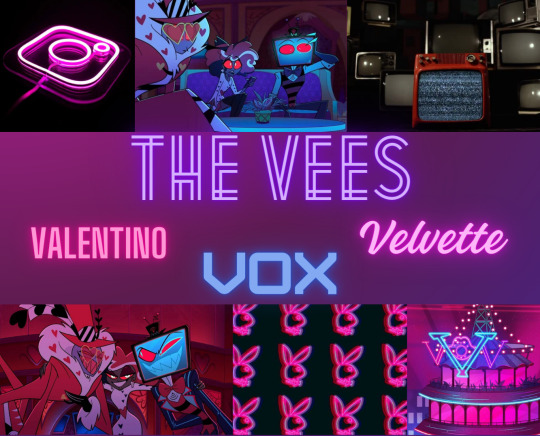
TW: Valentino, GETS A LITTLE NSFW SO YOU HAVE BEEN WARNED.
A/n: Once again all credit to @aboyscriminalrecord for the amazing idea! I DO NOT CONDONE VALENTINO OR HIS ACTIONS
Being pampered by these three? Is literal heaven, most people see you as their sugar baby..and while they aren’t wrong in some sense they are still wrong.
As you said before, Vox loves buying you chokers (and collars, shh) that specifically have his name on it! Or maybe a new jacket that has little accessories that scream his name so people know that you’re taken. Wear nothing but the jacket and maybe the choker and he’s keeping you in the bedroom for hours.
Valentino loves to buy you different lingerie and jewelry, sometimes collars too. He’s a weird kinky bastard. Expect everything from earrings, rings, necklaces, bracelets to straight up barely covering anything lingerie. Yeah…anyways. Everything is in your favorite color or his, he also gets you a gold necklace with his name on it.
Velvette will get you any type of clothes that you want, but she’ll either be making them or they’ll be very high end and you’d be scared to wear it or even touch it. Also if you wear makeup expect her to buy you high quality and pricey makeup. From makeup palettes, blush, to lipstick. Also will buy you very expensive jewelry but she makes sure it matches any and all outfits. Another one to give you something that has her signature look or scent on her. She wants people to know who you belong to and won’t hesitate to pull you into a kiss in front of her fans.
Dates Wise?
Vox is pulling all the strings to get this high end restaurant all booked out- doesn’t matter if he has to buy it out for the night or kill everyone there. He’s getting this restaurant for you. He’ll even buy it out from the owner and make it your own personal restaurant if you give him the word!
Valentino is making sure everything is set up perfectly from the tablecloth to the dinnerware to even the food. He may have shit sight but that doesn’t mean he doesn’t have shit taste. If one thing is wrong he’s killing the chefs and rehiring more. It has to be perfect and anything less than that is an insult to you. Also he knows what wine/alcohol pairs well with whatever dish you're having that night. Trust him, Cariño~
Velvette is totally making sure your outfit is perfect, will she tell you what it’s for? No. She just needs you up on the platform so she can work her magic. You just need to sit there and look pretty like you always do. Also does your makeup too, she has makeup artists yes but she needs to do it for you. Can’t let any sinner fuck up your clothes and then fuck up your makeup! Just let her kiss you every so often to test the lipstick..no she’s not getting sidetracked and yes you have plenty of time before the date!
#hazbin hotel x reader#hazbin hotel#hazbin hotel imagine#gn reader#poly vees x reader#poly vees#the vees x y/n#hazbin hotel vees#the vees#valentino#valentino x reader#valentino x you#valentino hazbin hotel#hazbin hotel valentino#hazbin hotel velvette#hazbin velvette#velvette x reader#velvette x you#velvette x y/n#vox x you#vox x reader#vox the tv demon#hazbin vox#hazbin hotel vox#vox hazbin hotel#vox x y/n
451 notes
·
View notes
Note
hiyaaa! its me again!! omg is it just me or is there just NO robin x reader content like, at all???
please please please!! if you don't mind, please give me your robin romantic headcanons?
an extra add on food for thought: what do you think would happen if both siblings happen to pine after the same person?
Hello dear inbox visitor! I think it would be better if you sent it during while requests were open, since it kind of teeters on the line between thoughts vs requests haha. Anyways, you're right. We dont have enough x robin content :(
Lets try and fix it!
Robin seems like a very attentive lover, which is surprising considering how busy she would be since she's a popstar.
During conversations or small talk, passing phrases, she makes sure to listen to you lovingly,and makes note of all the small things about you.
To me, I think she'd be the type of person who puts your name as just a pink heart icon, and notes down all the things you like in the description of your contact. She also has a separate notes tab for other things like your wishlist items, things she's noticed about you, and so on.
She's optimistic, but not unrealistic. If you're the overthinker type, she grounds you flawlessly. She's very rational and sorts things out carefully with you, sitting you down gently and discusses everything on your mind with you. Gives you a lovely, soft smile when you stop overthinking and come to a solution with a relaxed sigh.
Surprisingly sensitive to physical contact. She's not touch-starved, nor averse to it, but still is unused to it for the most part. However, she likes holding hands very often. She'd be very happy if you rubbed your thumb over her knuckles. Often takes off her glove just to hold your hand. I feel like her hands would be pleasantly cold. She squeaks slightly when you kiss her face! Then giggles. She likes the feeling of you peppering her face in kisses.
Lets you touch her wings often, and they are incredibly soft. They smell pleasantly of flowers, and sometimes she flutters them on your face to make you giggle. She doesn't mind if you mess them up a bit, as long as it's not before a concert.
If you have hair long enough to braid, she'll want to do that. She has cute little accessories on her that she uses whenever you let her, cute clips and hair ties that she uses for you specifically. She also really likes it when you braid her hair. She doesn't care if it's not pretty, she just likes that you're the one doing it.
Often, I imagine she gets overwhelmed with the amount of people working on her appearances that sometimes she just asks them to leave and has you help her work on her appearance. It could just be feedback and she'll appreciate it. She just likes being in your presence whenever she's overwhelmed, which can be often if she's especially out on a tour. If you can't be there physically, she'll want to call you, or replay any voice notes you may have sent previously. She saves them all – date, time, named and even the context behind them. She misses you dearly whenever she's away, just doesn't have the time to even express it.
If you're alright with cosmetics of all kinds, she's a little thrilled. She'll want you to try her perfumes and clothes, too. Kisses you directly if you ask for her lip balm or lipgloss, then giggles at the transferred sheen. Likes trying out new eye palette colors on you, trying out new styles of makeup, and often asks for suggestion on her own outfits. She also adores when you both dress up in matching outfits, and has a neat little album of you two consisting of photos that she takes.
Robin can feel a bit shy asking for affection or doing cute couple-things. She really likes the corny things, like indirect kisses from shared straws, being stared at while she's doing something, being kissed in the rain, dancing together, etc.. she also probably saw you eat a lollipop once, and wanted to ask you for a taste, but got too shy and didn't ask. You have to take the initiative and comfort her into asking for these things.
Anyways, if both siblings pine for the same person.. it's gonna be a little strained. Depends on how much they like the reader respectively, but lets assume both of them are head over heels for reader.
Robin and Sunday pining after the same person may either bring them together or put more strain on their already, slightly distant relationship. I feel like Sunday may either support his sister, convince her to pursue you and share you with him, or guilt trip her into not approaching you. Not even as a yandere, Sunday can be a little manipulative and greedy when it comes to his feelings. Ever since Robin left Sunday alone as the head of the Oak Family, I feel like he would harbor a small amount of apathy or even dislike towards her because of it, and on top of that, if she ends up liking you, he'll feel oddly like you've been stolen from him.
Robin.. won't back off so easily however. She's a smart girl, and even if she obliges to her brother's whims, she knows him better than anyone else. She'll probably stay docile for the most part, though. However, she isn't just a pretty face. Just because she remains docile doesn't mean she's given you up completely to her brother. She'll at least remain stubborn on having you to some degree, even if it means straining their relationship a bit.
#moonink#hsr#honkai star rail#hsr x gender neutral reader#hsr x reader#hsr x y/n#hsr x you#hsr x male reader#honkai star rail x gender neutral reader#honkai star rail x reader#honkai sr#honkai star rail x you#honkai star rail robin#hsr robin#hsr robin x reader#hsr robin x you#hsr robin x y/n#hsr robin x gender neutral reader#hsr sunday#sunday hsr#honkai star rail sunday#hsr sunday x reader#sunday x y/n#sunday x you#sunday x reader#hsr sunday x y/n#hsr sunday x you
358 notes
·
View notes
Text
MY NINJAGO DESIGNS (UPDATED)
Ok FIRST OF ALL!!! follow me on tiktok and AO3!! I'm posting my art there and I have a fanfic project centered on Nya (and Morro) that I started writing, I think you might be interested!
Secondly..... YES! After less than a week of posting the first designs, I decided to change some things!!!!! If you compare it to the old post you'll see that there weren't any very drastic changes, but there were a few things that were particularly bothering me and now I feel like I'm satisfied (for now.....)
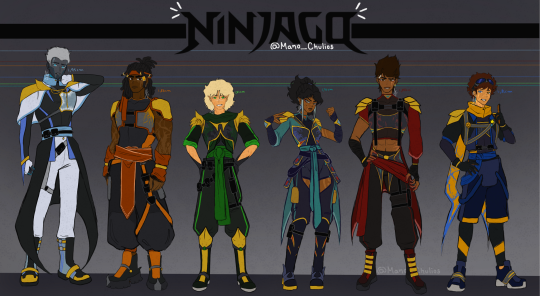
Obviously, as you can see, I haven't changed a lot of things. Maybe I shouldn't have made this update in a new post, changing the main one would have been more than enough but.... nah.
Colors of the gold armor - I gave them a brighter tone, the old one was very dull
Zane and Nya's boots - brother wtf were those, now they are sooo much better
Zane gloves - I totally forgot about them in the first version, but now he has them!!
Kai and Nya eyes - in the old version they already had matching eyes (main color in their own color palette and pupil in the color of their siblings), but I made Nya's eye color more towards gray and Kai's towards brown, instead of the dark -cyan-almost-green and amber that they had)
Nya's hair and sleeves - I left her hair a little closer to her original hair, I felt that in the old one I ended up giving her a hairstyle more similar to mine in real life..... oops? I also changed the flowing sleeve to a more well behaved one similar to Kai's, I don't know if I totally like this change to be honest
Marks on their body - Lloyd now has marks from the oni transformation!! although they are not that visible from far; Nya and Cole's marks are better done than before and Zane has more robot features (although these three in particular are more visible under his clothes *wink wink*)
Jay has goggles now :D
Some close ups (I swear I don't know what I'm doing wrong for the images to be saved in SUCH poor quality)

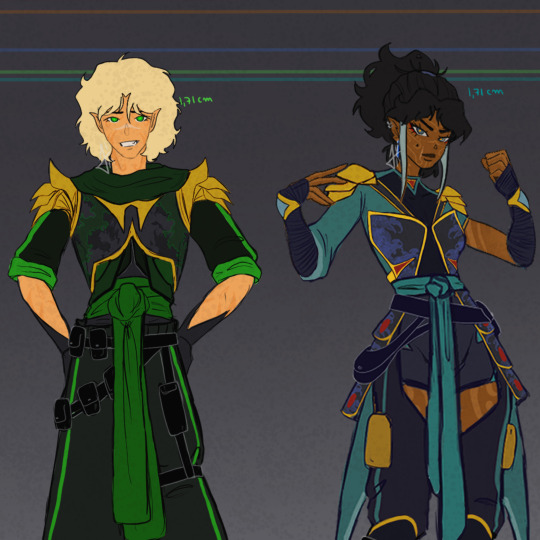
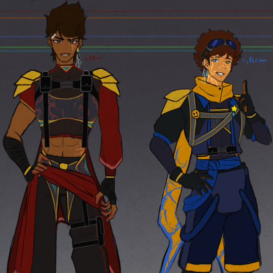
Some headshots
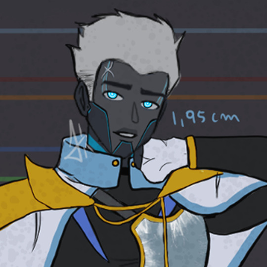
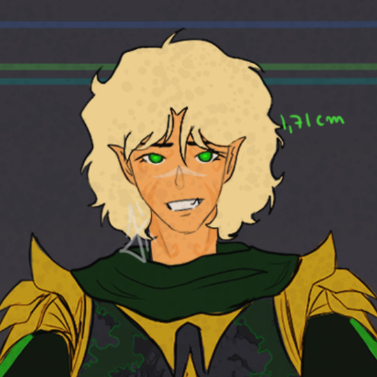


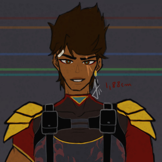

So I guess this is it? NOW I'm gonna leave these designs alone. I already posted on my tiktok too, so if you can stop by and give me a boost I'd really appreciate it!! I'm already working on the individual images of each one with some headcanons and more specifications on the details of each one's designs, but it will probably take a while. I also plan to do a part two of the designs with some secondary characters, but that totally depends on my willingness and willpower LOL
see you soon <3
#lego ninjago#ninjago#ninjago fanart#ninjago fandom#ninjago au#ninjago design#ninjago art#ninjago zane#zane julien#ninjago cole#cole brookstone#ninjago lloyd#lloyd garmadon#ninjago nya#nya jiang#nya smith#ninjago kai#kai jiang#kai smith#ninjago jay#jay walker#ninjago morro#wojira duo#(mentioned)#ao3#tiktok#artwork#art#fanart#chulios art
194 notes
·
View notes
Text
DATE NIGHT
Light
Is pretty open to whatever you want to do. If you ask him to choose, he'll go with the classic dinner at a nice restaurant and maybe go to a museum or something.
He's a very good conversationalist. He loves to learn so he's very easy to talk to; he remembers details.
'Oh, they hate this color, I better pick a different tie.'
If you're doing something fun, he'll have a good time. But he's not a fan of the 'lay around on the couch' kind of dates, they make him feel unproductive.
L
He LOVES the lay around on the couch type of dates. They're a good safe option for him when it's not safe for him to be in public.
When it is safe for him to be in public he's completely shameless. All of his habits and quirks are out on display for the whole world to see and he does not care if he gets judged for it.
So if you can't handle the secondhand embarrassment of your boyfriend having his bare feet out for free, you're going to have a bad time.
If you do go out, he likes quieter, more private dates. A library, a park, places that aren't too crowded or chaotic.
Cafes and bakeries are always a win for obvious reasons.
Misa
She really goes all out. You have to schedule your dates with her, because they can be like 6 hours long.
She's a big fan of classic romantic dates. The 'dinner and a move' kind of thing.
I think she would absolutely love to take you to a masquerade. A chance to experiment with fashion and dance with you all night? She'd be all over it.
She would also like shopping dates. She loves to pick out clothes she thinks would look good on you and will let you pick out things for her too.
Takes lots of cute pictures through the night and displays her favorites in her room.
Mello *NSFW mentioned*
He’ll only go on dates with you on his off time- work always comes first. He has to beat Near by any means necessary, that means his love life comes second to that. In another world where everything was resolved neatly, he would likely be more willing to engage in romance.
Mello loves an adrenaline rush. His favorite dates are always a little risky and you always end up sweaty and out of breath (in a good way.)
I imagine he would like taking you out for drinks and going dancing- probably to raves rather than nightclubs.
The dark is a nice excuse to hold your hand- so you don’t get separated of course.
When you’re so exhausted and dizzy you can’t see straight, he’ll call you both a cab and you’ll do everything short of have sex in the back of it.
The real fun starts when you both get upstairs ;)
Matt
Matt loves relaxed stay-at-home dates. You hop on multiplayer on a really relaxing game like stardew valley or minecraft and just lay in a snuggly pile of blankets together.
I think he would also like dates where you make something together- trying a new recipe, or making an art project. It might not turn out great - he doesn’t have a sophisticated palette or a lot of artistic skill, but he would have a lot of fun.
He doesn’t mind going out once in a while, but he doesn’t like dressing up. He hates wearing ties. He’ll do it occasionally for your sake, but it’s not his favorite.
Near
He doesn’t really do specifically set out *dates*. You both just… end up in each others company.
It’s never a case of ‘Let’s set aside this Saturday at 7 for a date night.’ Usually, you just end up in his room while he’s working, you distract him, and you two end up spending the next six hours talking.
I imagine he would like that type of date, where you sit and have a really, really good conversation for hours and hours.
Especially since you’re one of the only people in the world who can really keep up with him.
He might bring out something for you two to work on together, some of his toys, puzzles, models, etc.
He likes meticulous, detail oriented work. Introduce him to knitting/crochet and you two can sit and knit together for hours. (embroidery would also work for this.)
Matsuda
Silly goofy guy.
He likes new experiences, he’s willing to try just about anything once. So if you have a really wild date idea, he’s probably down with it.
If he’s the one to come up with the date, he tries to put some thought into it and make it personal to you. But he has trouble coming up with new ideas so he tends to stick to what he knows - you two have a dedicated date night restaurant you both like.
I have no idea why, but I imagine he would love live theater? Like specifically musicals. Take him to see Hairspray, he’ll have the time of his life.
#death note#death note x reader#dn x reader#death note Light#light yagami#light yagami x reader#light x reader#death note l#l lawliet x reader#l x reader#l#misa amane x reader#misa x reader#misa amane#misa death note#misa misa#death note imagine#death note preference#mello#death note mello#mello x reader#mello death note#mihael keehl#mail jeevas#nate river#near#death note matt#matt x reader#matt#death note near
402 notes
·
View notes
Text
What would the seven wear? - Fashion Style analysis ( HOO Girls Ver.)
as a kid I used to want to be a fashion designer so making this post healed my inner child <3 enjoy ~
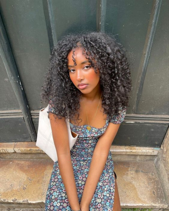
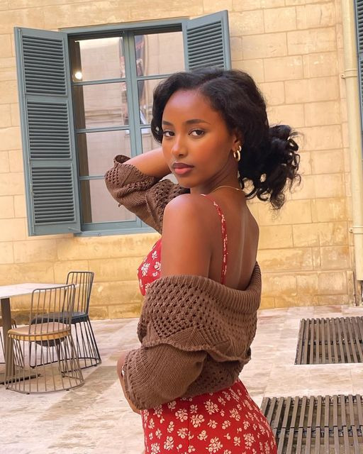
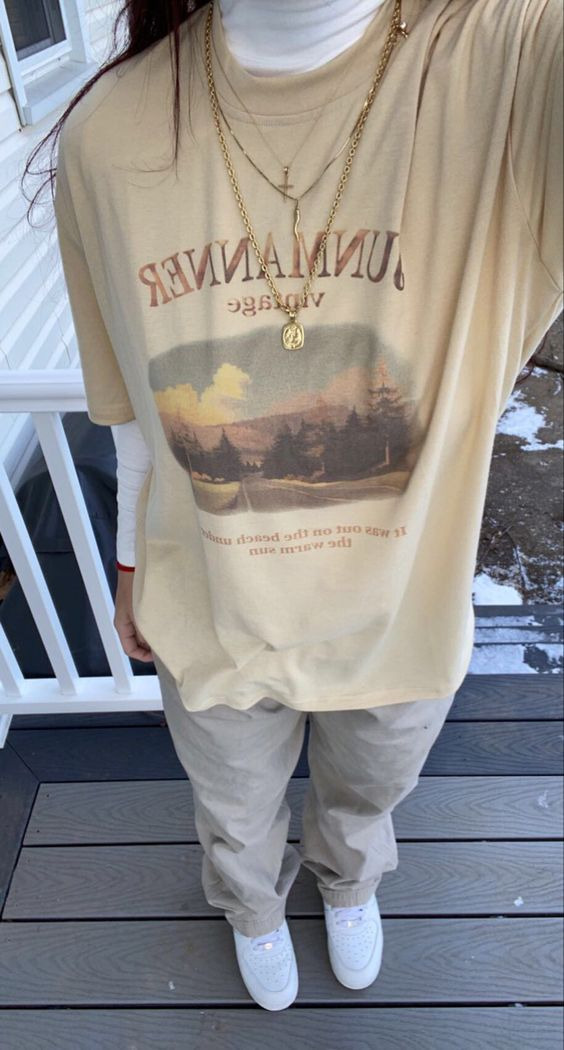
HAZEL LEVESQUE - okay okay omgg this girl would have the best fashion sense out of all of them (imo) because she is influenced by SO many fashion aesthetics, like her style would be vintage and modern at the same time! I feel like she would love long flowy dresses because it was the most common clothing women would wear in the 40's, she would love floral patterns sm because they are so cheery and it lightens her mood, this would bring out her "adorable" style more. also. JACKETS. this girl is OBESSED with jackets and cardigans, particularly in the colors brown and black. Overall her style is a mix of cheery, cute but she has that pluto edge to her style aswell with the jackets.
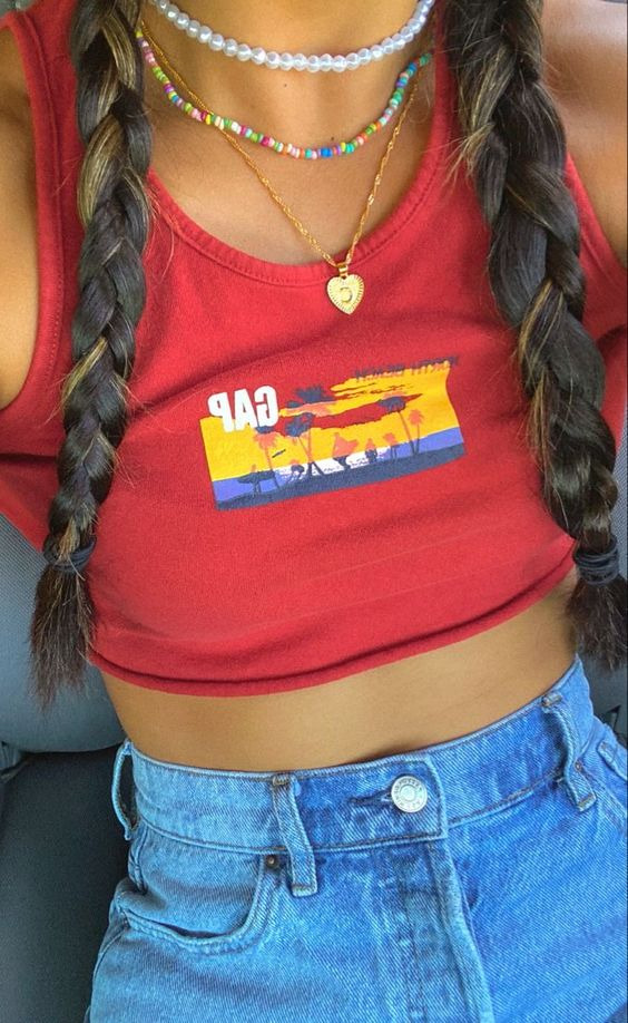
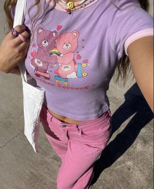
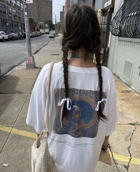
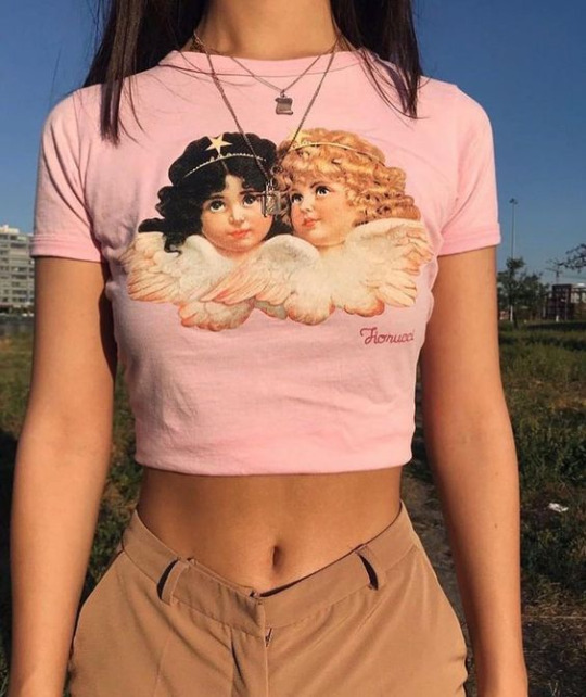
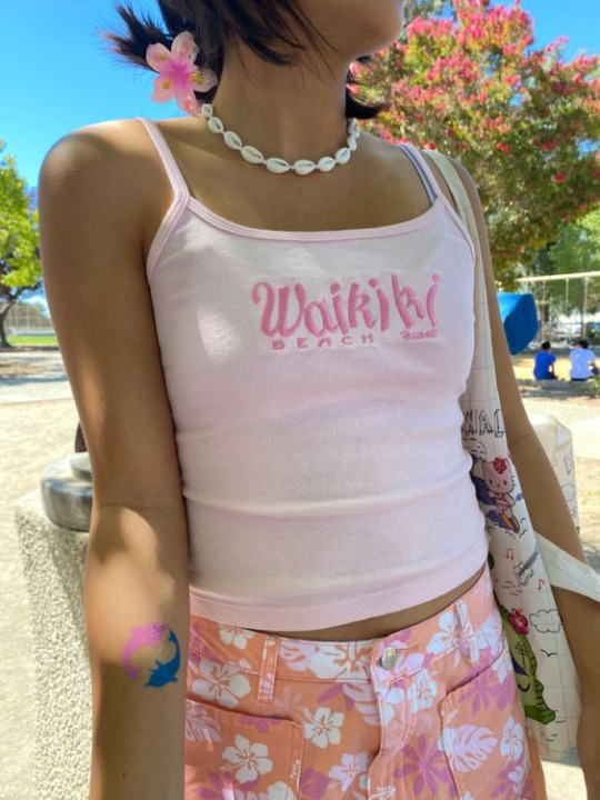
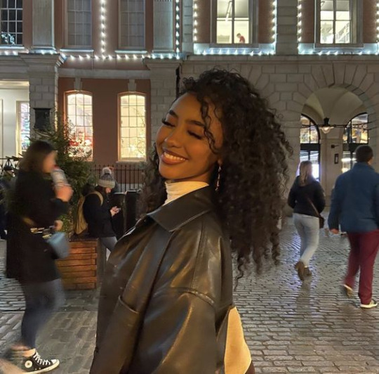
PIPER MCLEAN- honestly as much as she would hate to admit it, i feel like Piper would LOVE pink, pale pink takes up the majority of her palette. Her style is very youthful and it's a mix of rebel indie kid and soft coquette core. LOVES LOVES LOVES denim shorts, they are like a must in her wardrobe. Also, She loves jewelry, whether it be tassel earrings, beady bracelets and necklaces, rings etc. like she defo cares more about accessorizing than the actual clothing. she wears baggy white shirts a lot for some reason, but it suits her so well. Crop tops are a must, specifically pink or purple ones with a cute image on it, remember she wore a hello kitty crop top? yeah like that. I feel like her style is the most fresh and childlike without it being over the top, it is so cute. i love her style sm.
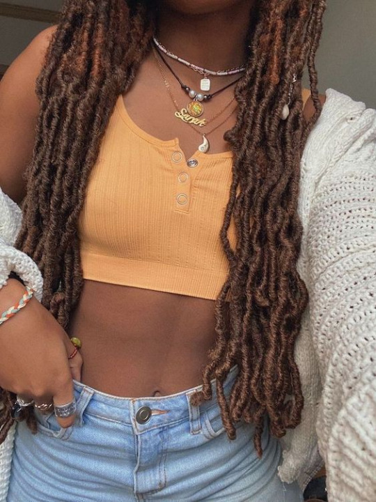
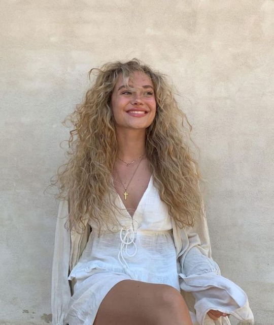
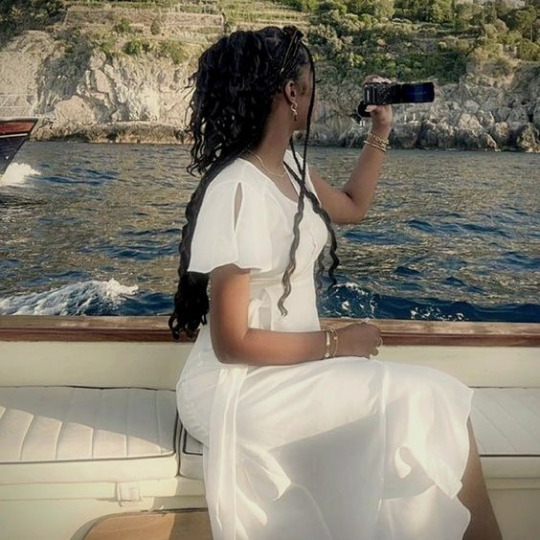
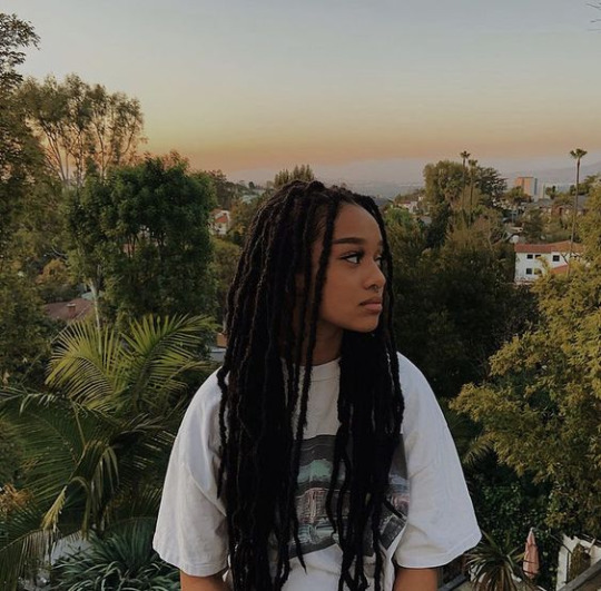
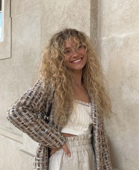
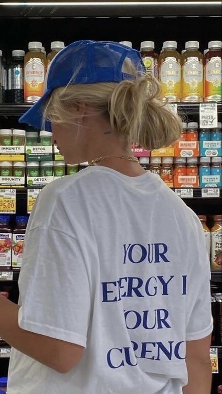
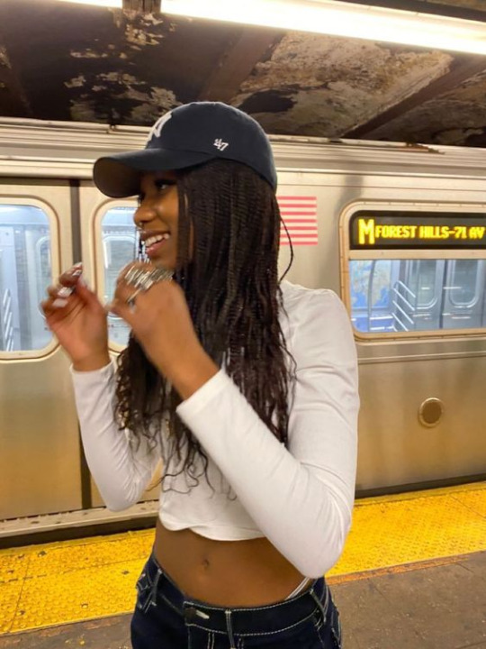
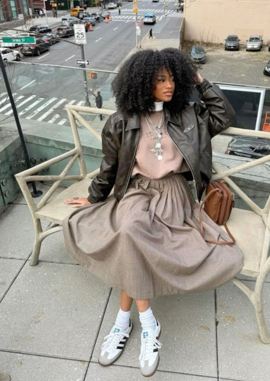
ANNABETH CHASE- Annabeth's style is super elegant tbh, she LOVES wearing grey, orange and white imo, also, i feel like she LOVES light blue/dark blue jeans. Ofc Annabeth loves caps, its like super dear to her, she doesn't have a specific "style" she just loves changing it a lot. Annabeth LOVES long dresses especially if they are white/warm brown. Her style is just super chill and modern. Percy is down bad when she wears baggy shirts tho cuz she slays so hard in them Annabeth loves knitted lace jackets because it gives off very homely vibes. Overall her style is super authentic and fresh tbh.
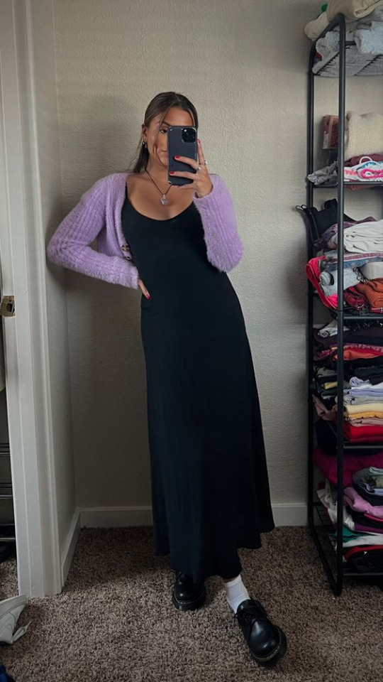
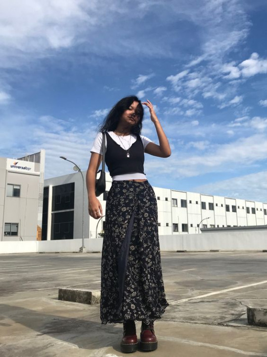
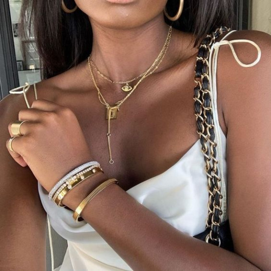
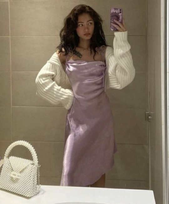
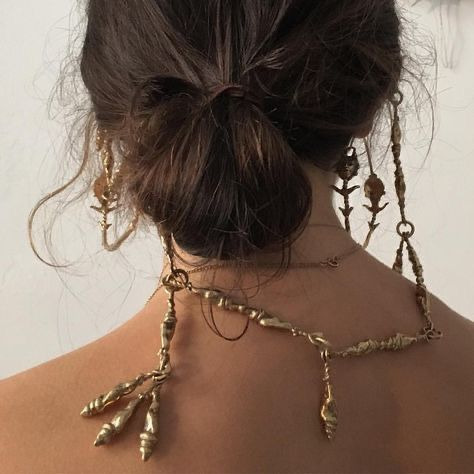
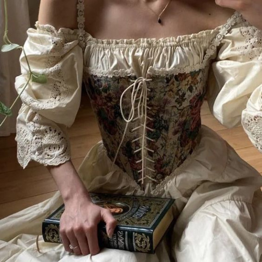
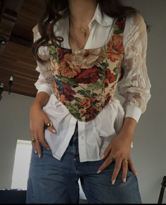
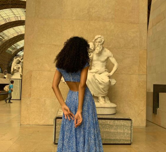
REYNA AVILA RAMIREZ ARELLANO- i have a feeling that reyna would love dressing up. it brings her comfort, she was the hairdresser in circe's island after all, Reyna is just straight up royal core. she likes wearing corsets, and silk gowns, Her color palette is gold, black, white, violet, and dark maroon tbh. Reyna LOVES large gold earrings that just dangle y'know? it makes her feel and look regal. She also loves circlets that you wear on the head. uggh she has got that roman classiness y'know. Super fancy and enjoys wearing long robes and skirts, i love my fancy shmancy queen <3
#i hope i did okay-#im no expert in fashion trust#but i wanted to post something different#and fun#this was so tiring too tho#i have been scrolling on pinterest for an hour and a half#should i do a boy version?#Idk if I did good on this one so it's up to y'all if you want a pt2#pjo#percy jackson#pjo fandom#pjo hoo#pjo series#pjo hoo toa#annabeth chase#piper mclean#hazel levesque#reyna ramirez arellano#the heroes of olympus#percy jackson fandom#reyna avila ramirez arellano#percy jackson headcanon#percy jackon and the olympians#heroes of olympus
233 notes
·
View notes
Text
hi so i posted a drawing just now and heres a long post under the cut on my design choices If you were curious . or you can just look at this image for the basic color motifs
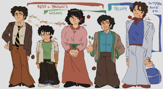
Ok. hi. waves
overall its 100% obc + motf oobc based etcetera If you know me you know this is Always basis for everything marvin trilogy i draw
detailed descriptions + other things linking characters together that arent covered by the Image:
marvin dresses like shit but there's Some cohesion there keeping it together. his family shares his warm colors; mendel uses his browns a little differently, and whizzer doesn't share his pallete at all
trina's favorite color is pink :) there are literal articles of clothing that are tied on her, one is red for marvin and the other is green for mendel. as the story goes on she would probably swap this and have a green tichel instead
trinamarvin have similar shades of pants/skirt, and jason has the mix of their yellow and red as an orange on his arms. travel travel travel from side to side!!!
^ on this note jason has things from his 4 parents and theyre all strangely layered all together
ie both him and whizzer have white over the rest of their clothes
whizdel and whizzvin are the only combinations which don't share at least one color, but:
whizdel have light/dark blue contrast and complementing red-green
whizzvin blue yellow contrast babyyyyyyy yeaaaahh boyyyyy!!!!!!!!! they wont agree
whizzer's got the most unique color palette also the least direct connections to everyone else: only trina, who wears a tichel paralleling his ascot and ties them back to marvin, and jason
trinamarvin's shoes are the same, each their corresponding hair color; mendel wears something most similar to marvin's shoes but he gets silly with it; whizzer gets to have shoes that stand more. he's cool; jason's got sneakers! and theyre whizzer colored because whizzer has his own whole deal with running
^ jason trina and whizzer all have red around their necks; mendel also very specifically doesnt have it
mendel and jason Dont have belts or anything resembling ones. this was deliberate but honestly theres not meaning to it
so yes. marvins setting the base the others generally interact with; trina tries to be plain; mendel is goofiest; jason is still figuring things out; and whizzer outsider themes Save me. whizzer outsider themes. save me whizzer outsider themes
ok That is all thank you. small bow
149 notes
·
View notes
Text
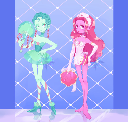

Baroque Pearl : SOLD Level headed and a sharp tongue she could be utilized much more as an advisor than just a simple decorative pearl to entertain if she got that chance. Sadly it seems shes only here to be a good hostess and cater to guests and entertainment.
Babydoll Pearl: Sold A hot headed pearl who hates it here. She doesn't like frilly little outfits, she doesn't like holding her tongue. She's petty and keeps causing trouble for her owner [if they even care].
First come first serve, i take payment over paypal USD They come with a toyhouse: transparent files, full shaded and flat and their little additional comic of them interacting. which clearly...didnt turn out well.
Design Notes on Baroque Pearl: Of course the fan in the reef gives total Jellyfish vibes and I did entertain the thought of it. I do a lot of changes while sketching, originally Baroque pearl wasn't going to be Baroque. Yet. I decided to play further with the spirals present and the already drawn short curly hair I had drawn on her. Since baroque pearls are textured and some have more twists I thought it'd be very cute head nod towards the actual real life Pearls structure. With that single word change it also influenced more baroque to Rocco outfit - especially the shoes, since baroque pearls aren't perfectly round it even influenced her skirts silhouette more looking like the shape of a trapezoid as if there was a hoop skirt structure reminiscent of that fashion era previously mentioned.
Design Notes of babydoll Pearl: I knew almost right away when seeing that fan in the reef that the name that came to me was 'babydoll'. It's a very plain and simple clamshell fan with just a bow. It's not too descriptive and it's just there almost like an afterthought. of 'its a pearl, give her a clamshell with a bow' type of knick knack to toss at them like a doll with an accessory to add on. I knew i wanted a very soft coloring for the clothing, white to pastel pink. There was some strife in the coloring of thumbnail palettes, she almost ended up in a completely different and stronger color palette but in wanting to keep with the name "baby doll pearl" I stuck with the original first one. I'll repurpose the other color palette i admittedly liked more but it didn't feel proper for both the name and this specific pearl feeling I wanted to evoke. Also her eyes are very notably different than all my other pearls eyes. Big and shiny and such voluminous lashes. I really leaned in for big doll like eyes to match the name. That it's a very notable feature of hers and her pouty lips. Not only her angry personality but even a few key features show shes not a traditional pearl just at a glance.
484 notes
·
View notes
Text
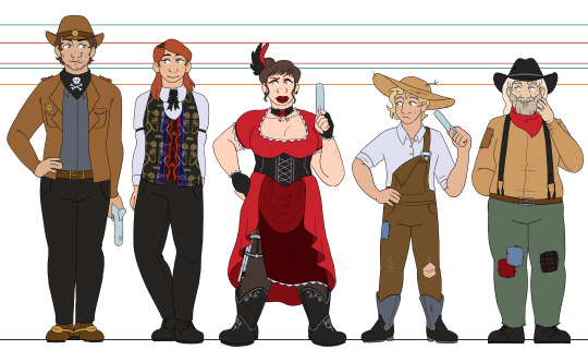
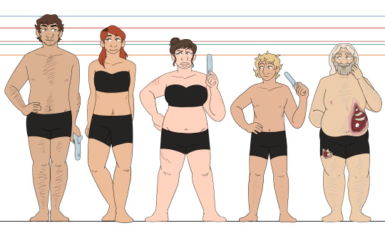
aaand here's deadlands! it didnt take seven months this time, who cheered?
i'll probably do another post grouping all of my line-ups together, but that's gonna wait for when i do the wyrdwood PCs as well :] more thorough design thoughts/smaller details will be under the cut, but im putting this here so that everybody has to know: their eye shines are all different card suits, except for nate, who gets J for the joker card :]
oxventurers guild | the hobby horses
unlike my other designs where i let everyone have individual colors/palettes, i tried to keep colors more consistent across these designs! the oxventurers guild has the fantasy element and theyre all very different, so the wide mishmash of colors are fine, and the hobby horses all have a lot of dark colors so that keeps them looking consistent together. but for these guys, i wanted a more consistent feel, so i tried my best to reuse colors between each design (especially between delacy and nate ^-^)
silas - ough. my boy. i wanted him to be broad with a strong build, and i hope i pulled that off :D i had so much trouble with his hat that i almost just didnt give him one, but eventually i decided it was better to just. give up and rock with it, even if he looks a bit like a mountie hbjgfjhd and he is wearing cowboy boots, theyre just tucked into his pants because he doesnt feel the need to flash them (looking at delacy, lol). he has spurs on his boots, even though he doesnt ride horses, because he likes the way they jangle <3
garnet - people really liked it when i gave garnet dark roots, so i have decided to always give her dark roots. i like how it looks hehehe and i also like to give her freckles!!! i think theyre cute!!! for the vest, i struggled for a while trying to capture the vibe of jane's vest, because its so so strange and specific in a way that makes it impossible for me to picture garnet without it. i'm pretty happy with where i landed with it, especially the pattern, since i've never tried to make a pattern like that before :3 i dont know why ive been loving patterns so much lately LOL but i will keep riding this wave and regret it later when drawing the designs again
edie - definitely the furthest departure from canon outfits, though still in the right wheelhouse. i just don't like drawing multiple layers of ruffled skirt. i didn't like how my sketches kept looking. i wanted to give her a skirt slit, especially after my friend reminded me about her thigh rifle holster. so today, i stared at a bunch of victorian ballgowns and party city costumes, and then completely redesigned her skirt before i lined these XD and i think it was worth it!! i love the layers and the way her rifle peeks out, and it meant i could show off more of her boots and give them a pretty design :]
delacy - my main thought going into drawing delacy was just. "i need to malnourish this boy" LMAO i refuse to believe that he is eating properly, i just know that he is not. otherwise, i mostly just stuck to the campaign art but scuffed up his clothes a bit. as implied on silas's notes, i very purposefully had his boots be Big. he's overcompensating a little bit :] also sorry i did not want to draw rooster so he just gets a generic handgun. i didnt feel like drawing complicated guns, and i wanted it to be a smaller handgun so that he could be poorly copying edie :') he has no trigger discipline but neither does edie so its fine
nate - that's just nate, baby!!! i think, canonically, he's meant to be a bit. emaciated. but i cant help but just picture him being a bigger guy, i think it fits his vibe better and its more fun for me to draw that way. i like having variety in body shapes, and garnet and delacy already have the rail thin thing down for this line-up. let my old man be fat !!! also. he has a weird nipple because he is transgender. heart emoji
#oxventure#oxventure deadlands#silas flint#garnet munro#edie valentine#delacy oxventure#nate janssen#'travis you forgot the buttons on a few of the shirts-' SHHH SHHHHHHHHHH DONT LOOK AT THAT IM TIRED#i just wanna move onto wyrdwood im done with these bhjgfhjdbghjd#i am super happy with how this came out though :3#okay time for sleep i have a friend visiting tomorrow and its past my bedtime
34 notes
·
View notes
Note
I miss the concept art of angel and vagatha being together because they actually looked like their time periods/a goth and a mafia member being together as tough on the outside, soft on the inside couple is so adorable..... also vagatha as a goth name is so cute and the 80s concept art of her pre-vaggie is just the nail in the coffin that viv had no clue what to do with these characters other then their stereotypes but nobodies ready for that conversation.........
I took a look at the stuff you were talking about, specifically the designs, and yeah, I can see why you'd like them a lot!

The muted colors with bright eyes add a lot of appeal to me, and the simple color palettes work quite nicely! Also, Angel Dust having accurate clothing (from what I know, I could be wrong) is something I definitely miss from the current designs for Vivziepop's characters.

While the stripes could be toned down a bit, I do like this design a lot (probably because I like the chest fluff, that was nice)

Vagatha's old design is also really pretty as well! Obviously, if this was meant to be animated, the patterns could be simplified a bit, but for illustration I actually quite like it!
(There was also this design that I found that I want to talk about.)

This design of Vagatha is very appealing to me as well, especially the Gothic vibe to her, it works quite well!
I'd actually prefer Vagatha to be a sinner than a fallen angel, the angel reveal felt too rushed (although I don't know if I'll be able to talk about that, I'm not a professional writer by any means so I feel like what I say won't really make sense or be valid.)
Although I will say this, when you're making a series, there's so many ideas that you'll want to use, but you'll have to learn to scrap the unnecessary ones and use what fits. It can be hard, but you can save those ideas for later stories. That's something I've learned from making my own series.
Anyways, as you said, both of these design work really well and have a lot of charm to them!
Thank you for the ask!
#hazbin hotel critical#hazbin hotel criticism#hazbin hotel critique#vivziepop critical#anti vivziepop#vivziepop critique#vivziepop criticism
105 notes
·
View notes
Note
Not ship chart related but I think your art is so pretty!! Do you have any tips? Especially with coloring if it’s okay <] (/nf)
waah thank you very much! i'll try and explain but here’s my colouring-specific tips, or at least how i choose my colours !! <3
unless for stylistic reasons (e.g. greyscale drawing), i personally avoid pure black, greys and white for colouring. go and choose off-colours instead! for lineart, black is okay but i always go for an actual colour anyways heheh. for the background colour of your canvas, sometimes an actual colour (rather than white or grey) may help you pick your palette to be more harmonised!
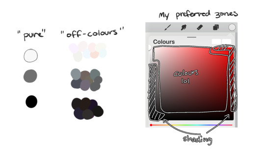
following this, i also don't like using pure/neon for colours, unless it's for a certain aesthetic or artstyle (e.g. the character has a "toxic/radioactive" aesthetic; the character is a scenedog (or similiar); or highlights). see below for examples! they may be subtle but sometimes the subtly can make the difference you are looking for... if you're looking for a natural look. if you're aiming for the bright/old 2000's artstyle, then pure/neons may be your friend!
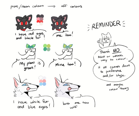
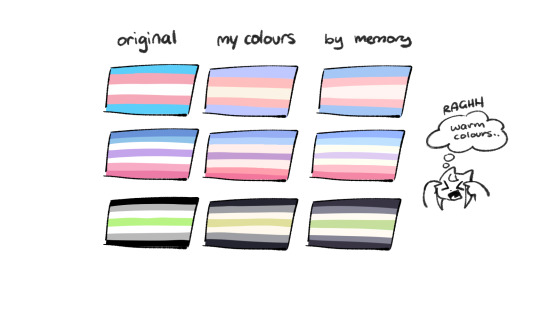
when i'm casually drawing characters (oc or not), i rarely colour-pick from the reference image. i find that when you're "forced to make the palette", it can come out more pleasing to your style/atmosphere of the drawing! it’s more personalised that way... like yea, that’s my favourite versions of those colours! i'm not saying that my colours are better though, only that "hey that's me! in those colours!!" you can have the reference image on the side or go by memory. here’s me doing this with pride flags:
nowadays, when drawing the spooky month characters—who have simple designs god bless—i can just imagine their reference and adjust the colours in my head lol example: if i know that Lila's colour palette is purple, and that her winter sweater is coloured lighter than her hair, then i can just go ahead and pick whatever shade i want following that rule!
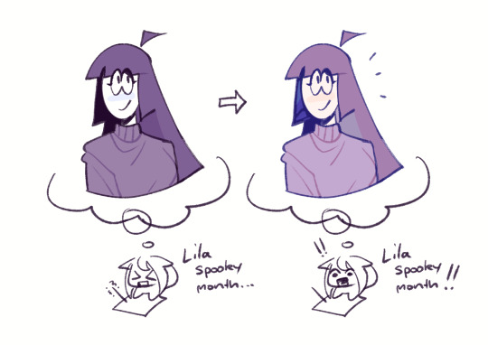
(of course, always double check with the actual reference for physical design inaccuracies and skin tone if it applies. my advice above is just for general hair/clothing colours! …because yknow you don't want to accidentally whitewash a character's skin in the name of aesthetics lol. if you’re unsure and want to be on the careful side, please do colour pick the skin at least !!)
moving on... gradient maps and certain blending modes (like exclusion, luminosity and darken) can be a game changer too. for normal drawings (e.g. drawings with no environment), i use darken the most because it changes a few colours rather than the entire piece... (the percentages are opacity levels!)

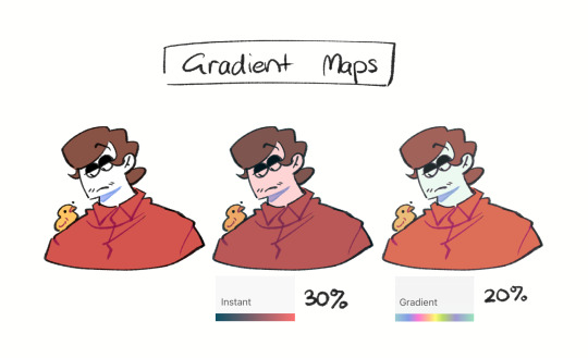
oh and as a really basic shading tip without using blending modes: sometimes, you just gotta go for grey. shading a warmer colour? use grey to make a cool tone. shading a cool colour? use grey to make a warm tone. not all the time (because you don’t wanna make your shading seem muddy), just sometimes…
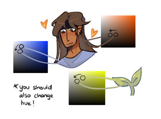
and that's that! there's always exceptions to rules and often times, your headshot doodle ends up as one big experimental mess (in a fun way, hopefully)!
this is how i choose my colours though most of the time, it is just me going “good enough”
i think we're pretty similar on how we like warm colours! i enjoy going the simple/lazy route and avoid blend modes but then again, shading is a whole different thing…
hope this helps in any way !! <:3 !!! <3
#if anyone wants to ask for specific tips i’m happy to share!#if i have any lol#[ the askbox mourns ]#[ the art of mourning ]#[ mourn's mourns ]#anyways yea i kinda do just imagine the spooky month characters with a light orange multiply layer and then try to replicate it irl#my personal/lazy rule is that if it looks good faraway its good enough AHAHA#spooky month lila#spooky month jaune#spooky month rick#spooky month aaron#spooky month#“actuallyyy the 'black cat' is actually dark grey—” SHHHHHH SHUT SHUT IT. SHUTUT !!!!! i need u to see the lineart /silly#[ mourn's resources ]
96 notes
·
View notes
Text
chasca redesign


chasca is definitely one of the characters who originally had dark skin but was changed last minute CUZ SHE LOOKS SICKLY PALE... it doesn't look natural. also the fact that she has cowboy design.... very yucky
information; chasca, or ch'aska, is seen in both incan and salvadorian mythology but the two have similar and a lot of themes in common. in incan culture, she's the goddess dawn, a representation of the planet venus, a protector of virgins/maidens. the name itself [chaska] means curly, frizzy long hair, so that's why i gave her that hair type :D in salvadorian culture specifically, she is also related to spring water [called "virgin of the water" too] so that's the blue sleeves represent... i attempted to follow a pattern of incan & peruvian cultural clothing, hope it's accurate... i also kept genshin's chasca's hair color, since i genuinely thought it was creative with the idea that her dark blue hair follows down to a warmer color, similar to a sunrise. the color palette also resembles a sunrise [blue-purple-red-yellow] so you can tell i played into the dawn theme a lot 😻
p.s i read a whole wikipedia page in a different language which just shows that genshin absolutely messed the designs and barely put any effort into it 😭
#qshlyns#qshlynsart#art#artist#digitalart#digitalartist#freelance#selftaught#characterdesign#genshin#genshinimpact#chasca#chascagenshin#chascagenshinimpact#genshinfanart#genshinimpactfanart#genshinart#genshinimpactart#genshinedit#genshinimpactedit#genshinredesign#genshindesign#chascadesign#chascaedit#natlan#natlanredesign#fanart#fanartist#chascafanart#digital art
47 notes
·
View notes
Text
OG Infinight Reference Sheet + Headcanons
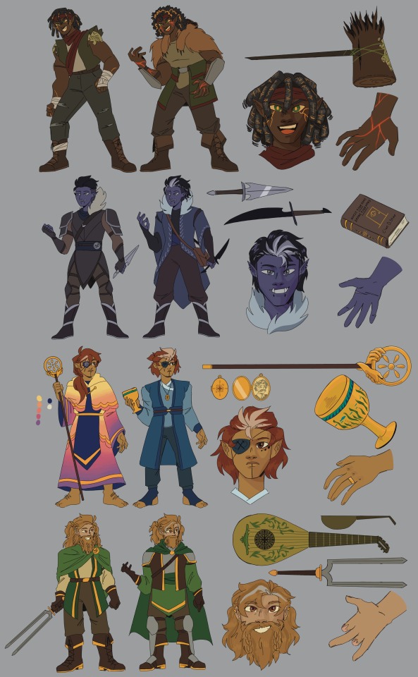
Marcy Burns/Elleve the Amender
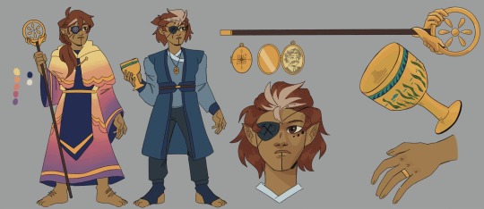
-4 feet tall
-its mentioned that she has "rainbow robes" and ive decided to interpret that as sunset colored
-pre mining accident Marcy has longer hair and has already lost her eye to unknown circumstances
-post mining accident Marcy cut her hair and it turned whiter, and she switched to more monochrome clothing-symbolizes her turning away from her faith and also grieving her husband
-still wears her wedding ring, and keeps Fred's on a chain with a locket of his picture
-we know literally nothing abt Fred but I think he was also a halfling and had a sick ass mustache
-the symbol on pre-accident Marcy's eyepatch + staff is supposed to be of the Diarians (followers of Dia). The circle is Faeza, the hands are Dia herself, and the six teardrop shapes are the Diagems. Also meant to resemble a flower as a reference to Gum Gum
-magic goblet-does it have a name? Anyways Paralyte stole it from the Sheerays so I gave it an aquatic wave/seaweed design (water = life)
-idk how to design tattoos, but other clerics of dia would probably have similar ones-i think hers are religious in nature
Ostin Tashe/Slique the Symphonius
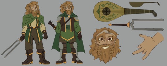
-ya boiiii
-4'6-so just barely taller than Bart. Barely
-had the most satisfying color palette for me- i love green and so does he
-i rewatched the hobbit/lotr trilogies so Ostin is def inspired by that-gave him braided hair and armor
-idk how a tuning sword works. Like a bident maybe? Ive drawn the sword in his right hand (the one with missing fingers) but he might prefer to fight left-handed. Idk ive trained with longswords before but ive never lost any fingers so i cant say
-magic lute-gave it a greener/mossier color palette to show it was from the Elderpines. The strings are vines and the rosette has a tree design
-dont know where Ostin's scars came from either, maybe he really did fight a dragon maybe he didnt-doesnt stop him
-post-Wight Winter i gave Slique a grey streak to match with Spectril
-also gave him a cool colored eye highlight for the same reason
Leonard Lank/Spectril the Surreptitious
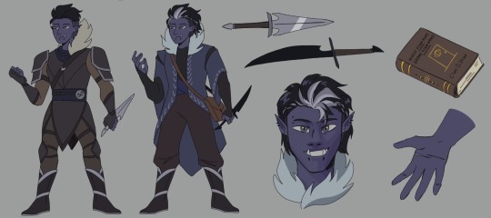
-i put his height around 5'7/5'8
-made the rogue armor sharp and dark-had to recolor it from the origianly palette bc it was too dark tho lmao. Fur collar to foreshadow his time in the Ethereal Plane
-post-Wight Winter i gave him simple, more homey clothes bc at that point he had a family and wasn't focused on fighting. The fur is not bear fur i swear
-already mentioned it before but his hair started turning white + he grew it out/braided it back.
-he's got normal rogue daggers, and then the Ethereal daggers. Not shown but yeah they fade in and out of the Material and Ethereal Plane
-"Walls Have Ears-Doors Have Eyes" by Clan D. Stine-the wiki i think mentioned him having books that let him turn invisible and walk through walls-this one's definitely a Leitner (ifykyk)
-boots-deceptively simple in design from the Elderpines
-piercings include several ear piercings, snake bites, and an eyebrow piercing
-warm colored eye highlight to match with Slique-your honor i have (accidentally) sun/moon coded then because they are gay
Luz Prattle/Paralyte

-6'0 tall and definitely uses it for intimidation
-i think she dresses kinda emo/alt
-the only infinight with a unique logo-instead of two crossed swords its a snake eating itself
-committing to the snake bit-i gave her scale armor
-the gloves have two talons on the pointer and middle finger, based very specifically off a homebrew item i saw where the hand kind of looks like a biting snake. It contains a venom that paralyzes enemies and came from the Sheerays
-put a snake on her sword. Cause why not. Thats why she teamed up with Brink they are both snake lovers
-not drawn, but she would have a snake tattoo somewhere on her body
-hands are turning dark at the fingertips as a side effect of using the gloves so often. Her veins are visibly green because shes pale as hell and also suffering from long term exposure to Sangrianite
-facial scar-man im sorry i dont know where this one came from either. Kyborg shot her once tho i do remember that
Bo Bender/Grislee the Groundbreaker
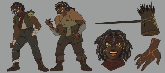
-height is about 6'6, very tall lady
-all i had to go off was red bandana so its like her thing
-her locs are made of rocks and also have veins of gold in them
-the stuff on her shoulders and hammer are lichen-she takes such long naps outside they've started growing on her. And also earth genasi
-when shes raging she has magma veins coming from her eyes and hands, and the inside of her body also glows
-when shes not raging it cools to golden veins-still very hot to the touch sometimes
-didnt have a lot if ideas for her second outfit but i gave her a bearskin bc she is "grizzly"
-hammer is the other item from the Sheerays and is pretty much just a trunk on a stick in terms of design. Combined with the lute tho, they are probably some of the most powerful items in Faeza
Man thats a lot of characters. Should i have made these before I made 3 painting and a comic page? Yeah. But i didnt lol. Enjoy✌️
edit: fixed the magic item origins
#my art#tales from the stinky dragon#tftsd#slique the symphonius#ostin tashe#spectril the surreptitious#leonard lank#elleve the amender#marcy burns#grislee the groundbreaker#bo bender#paralyte#luz prattle#stinkydragonpod
77 notes
·
View notes
Text
Warning for a lot of ranting about a specific Deltarune theory topic that will likely have next to no impact on the actual plot of the game at all.
A lot of the time in Deltarune fan content, the creators will have Kris meet a Deltarune version of Frisk, usually as one of Asriel's college buddies or something. I very much hate it (this is an exaggeration its just a thing that commonly happens that I personally dislike and I needed a good way to start the post).
Kris IS the Deltarune version of Frisk. It's been pretty much told to us since Undertale launched (specifically Version 1.001) via Clamgirl.
"My neighbor's daughter looks about your age. Her name is "Suzy." I feel like you two should be friends. Not knowing where I live is no issue. Fate finds a way. In life's grand scheme, she might be why you came here in the first place..."
What does Clamgirl keep talking about? What is the purpose of her dialogue? Foreshadowing Deltarune. Talking to her is what spawns the "Don't Forget" note in Sans' basement. She's the one who went goner mode to break the 4th wall a month before Deltarune launched. Everything she says about Frisk and Suzy foreshadows the relationship between Kris and Susie while also placing a heavy emphasis on the concept of fate, which is a big theme in Deltarune.
Suzy and Frisk are fated to meet each other. In life's grand scheme, Frisk's fall needed to happen for them to meet Suzy, just like how Kris and Susie were fated to meet and become heroes due to the prophecy.
Clamgirl says Frisk and Suzy "should be friends." Just like how Kris and Susie end up as friends extremely quickly. Frisk "looks about" the same age as Suzy, Kris and Susie are in the same class and thus around the same age.
Frisk is just an anagram of Kris plus a single letter Kris -> Risk -> (F)risk. Suzy is phonetically identical to Susie, just with one less letter. They are the only notable characters to have changed names between universes so far. Their UT versions also do not have the anagrams to "Risk" and "Issue," which may actually be important. We also know that "Suzy" isn't an early version of Susie's name, as Susie's name dates back to at least 2013. We can make a solid guess that Frisk's name is derivative of Kris's name due to this.
This isn't even talking about all of Kris and Frisk's numerous other similarities.
They have the EXACT same skin color and hair color.
They also most likely have the same eye color. While red eyes are commonly associated with Chara by the fandom, they only actually have red eyes when possessing Frisk's body in the post-genocide "I want to stay with you" variant of the True Pacifist ending. If we look at the hex codes of the sprites used for the scene, we can see that the sprite used in uses Frisk's color palette. Despite it looking like Chara, it's still Frisk's body, their hair and skin color are the same, so their eye color is also likely the same. Although it could also be that the red eyes are unnatural and caused by possession.
They have similar light world equipment. Both of them wear different types of bandages. Frisk has a stick, while Kris has a pencil, which is a wooden stick-like object.
Their light world item throw-away narration has them performing the same actions to items.

Kris has blue and reddish-magenta themed colors in the dark world, which is just a more vibrant version of Frisk's clothing color scheme in Undertale. Their entire dark world room that Ralsei built for them is in that color scheme. Ralsei knows about Kris and Susie's interests and desires, as their rooms have those design choices things in mind.
They're both flirtatious. Frisk is incredibly apparent with this. You can also flirt with certain enemies as Kris, and Toby has stated that Kris would get accidentally disbarred due to flirting with a witness in an ace attorney setting.
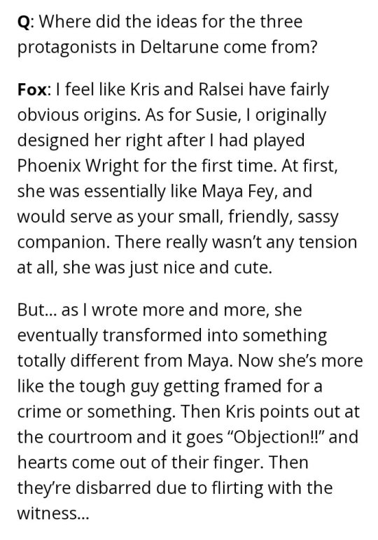
They're both mischievous as well. Kris' pranks are well described by Toriel, Rudy, and Noelle. They can prank Noelle in an incredible amount of ways during chapter 2 and seem to enjoy doing it. Frisk has a general implied goofy demeanor and showcases mischief in a lot of small little moments, especially during ACTs or the hangouts with Papyrus, Undyne, and Alphys. You can also see an example of this when passing items they flatten a cinnabun and pour sea tea under the hotel doors.
They share the "mainchara" designation. Frisk uses it in their sprites and code, while Kris uses it in the code.
They share a role as the main protagonist of the game. Even how we start the game with them is similar. You name the first fallen human ("TrueChara") or the Vessel and than get shoved into jaundice gremlins. Kris is just the natural progression of Frisk. The entire time, you were supposed to believe that you named Frisk, that they were your self insert into the world. That gets mirrored by Flowey, who believes Frisk to be the first fallen human (who you named). The game ends with Asriel and new/unspoiled players realizing that Frisk isn't Chara. In the next game, Kris gets that revealed immediately when they wake up, and they further that development by having their personality a lot more discernible without in-depth analysis.
No other theories talking about Kris' Undertale variant make sense. The Clamgirl lines are too strong. The only one that even comes close is Chara, and the similarities Kris and Chara share aren't as deep as they seem.
The things that Kris and Chara share exhibit far more differently than the things Kris and Frisk share.
Chara has one comment about chocolate that is vague and seems to imply they like it, but they alao ignore the chocolate in Toriel's fridge despite their narration/dialogue already appearing at that point in the genocide route. Kris is extremely fond of chocolate and it is a much bigger part of their character than it ever was for Chara. We never get Frisk's opinion on chocolate.
The weapon that represents Chara is a knife and they seek them out during the genocide route for murder reasons. Kris doesn't use the knife they have as a weapon and seems to enjoy them as a hobby outside of murder. We never get Frisk's opinion on knives, but they are also associated with a slashing weapon.
The big one people like to point to Chara being the adopted child of the Dreemurrs. There are a lot of problems with this.
The first one is that, arguably, so is Frisk. Frisk shows interest in being adopted by Asgore when talking to Gerson in the TP epilogue and CAN be adopted by Toriel/call her mom.
The second is that Chara is distinctly and purposefully separated from the rest of the family every single time any of the Dreemurrs mention them. Asriel always calls them his best friend. In the winter alarm clock dialogue, Toriel talks about them starting with the phrase "a long time ago I knew someone " and, in the same conversation, talks about Asriel and calls him "my son." Asgore only mentions having a single child, a son, at the end of his battle. "I remember the day after my son died. [...] I just want to see my wife, I just want to see my child." He could have easily used the word "children" in either of these two instances, but did not. In the extended spare cutscene where Flowey does not kill Asgore, he again distinguishes Asriel as his child and Chara as someone else. "Young one, when I look at you... I'm reminded of the human that fell here long ago... [...] But I believe your freedom...... is what my son...... what ASRIEL would have wanted." It is only Gerson who calls Chara part of the family. The new home monsters said they were 'like' family specifically.
Kris meanwhile is universally treated as part of the Dreemurr family. Narration, Toriel, and other characters refer to Asriel as their brother. Narration, Asgore, and other characters refer to Toriel as their mother. Narration, Toriel, and other characters call Asgore their father.
Third is that even if Chara is part of the family, they had an entirely different dynamic with UT-Asriel than Kris does with DR-Asriel. UT-Asriel looks up to Chara, while Kris looks up to DR-Asriel. Chara and UT-Asriel are around the same age, with Chara taking the more stereotypically older sibling role. Kris is notably younger than DR-Asriel, and Asriel takes the more stereotypically older sibling role. Kris.
We can reasonably guess that Frisk is also younger than Flowey from a age standpoint. Even if Chara & Asriel were the same age as Frisk when they died, Flowey spent an unknown but long amount of time doing runs before Frisk fell and he directly positions himself as someone who's "grown up" in the winter alarm clock dialogue. Chara and Asriel are around the same age. Frisk and Kris are younger than their respective universe's Asriel.
My final point is that the relative timeline just works better if Kris is Frisk. All the monsters in DR are monsters we know exist/existed in Frisk's time. Even the Holiday family, with the daughters still notably being kids according to WAC-Asgore and DogCasino-Sans, the youngest one (Noelle) likely being Frisk's age like Suzy & MK are.
Kris can be Frisk with a bit of Chara sprinkled on, but even if they are, Clamgirl's dialogue alone confirms that the two of them are alternate universe versions of eachother.
Here's a short follow-up to this covering some goofy arguments I don't consider very convincing.
21 notes
·
View notes
Text

(part 1 of part 2!!)
for shits n giggles, i tried my hand at redesigning dr stone characters (read: three)
i have too many emotions when it comes to this show's character design lmao. a vicious hate-love of the century
a couple of my process notes if anyone's interested: (vague spoilers up to season 3 of the anime)
there's a criminal lack of skin tones that i immediately wanted to take advantage of; and before Certain People start saying race-swapping; none is happening here, it's all just taking account of tanning and sunburns. sunscreen is a thing of the past here and a lot of time is spent outdoors in order to gather food
dramatic shifts in skin tones from what's given at birth happen pretty frequently in real life even with A/C and sunscreen; a huge missed opportunity to play with this in the color department methinks, but here we are (don't even get me started on the massive range of skin tones in east asian genetics alone)
so i played around a bit with contrast, nothing outlandish aside from giving Kohaku noticeable sunburns and freckles from (1) having caucasian blood in her to begin with and (2) not having access to any of the skin products our moderners would have
that being said, realism in the clothing color department was just about entirely thrown out the window. the blue dyes we know about are nowhere (naturally) near Japan, and here Ishigami village is in canon with deep navy on every villager; Inagaki and Boichi decided realism specifically here wasn't as important as color symbolism (which i personally think was a good creative decision), so cut me some slack-
so for colors it was just my personal taste on streamlining the palettes-
Gen in particular i thought would benefit from exposed shoulders without taking away how he needs bigger sleeves to hide shit up there. a lot of the guys have plain shirts and sleeves or just go shirtless entirely and i felt like it'd be fun to have him wear something in between to really push the magician/entertainer vibe
hairstyles were changed mostly to be easier to draw and to make their silhouettes just a bit easier to distinguish from each other. (hair colors were untouched except for Kohaku, purely because i have a personal preference for the more natural blonde color than any actual design significance lmao)
partial exception for Kohaku, cuz it annoyed me that the other characters say she has super thick, unruly hair...but then her hair is drawn no differently from everyone else's 💀
didn't wanna play into the stereotype of naturally curly hair being seen as something to be fixed (especially within the context of a makeover-), so i tried to imply chronically unbrushed hairdsjfsdf
can you tell from how many bullets are here about Kohaku how i feel about her design? last thing: body types.
Gen is supposed to be significantly tall, Kohaku is one of the strongest characters while being one of the shortest; it is very hard to tell that from their designs alone. it's mostly just the limitations of Boichi's art style,,,proportions that's i'm aware is nitpicky, but i wanted to show it here anyway 💀💀💀
smth smth disclaimer about subjectivitydsfsdfsd-
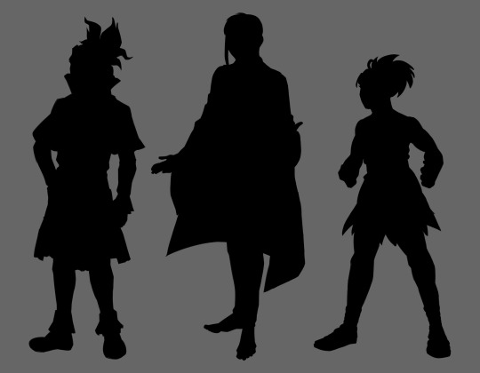
uhhhh, congrats for reading all that, have some silhouettes!
#dr. stone#dr stone#drst#gen asagiri#asagiri gen#ishigami senku#senku ishigami#kohaku#dr stone kohaku#redesign#character design#character redesign#doctor stone#dr stone gen#dr stone senku#dcst#anime redesign#anime fanart#dr stone fanart#can you tell that character design is one of my special interests-
134 notes
·
View notes