#gradient tutorial
Explore tagged Tumblr posts
Text
💫 HTML for pretty colors tutorial 💫
Hello sweet beans! Since my last tutorials have been yeeted into oblivion with deactivating my previous blog @/benkeibear I figured I repost them onto here! (Mind you, my old blogs are ahead)
I'm lowkey shocked to see blogs gatekeeping this knowledge but yeah. Make your blog pretty! Match your text to dividers or just have it as colorful as you'd like!
First of all, you can not do this on the mobile app! You need to either use a laptop or your phone / tablet's internet browser (in my case safari)
You start by logging into your account and either you make a post or you edit a post. I recommend making the post on the app first because editing is certainly faster & easier!
This is our starting point! For the fancy fonts you can use messletters


1. I will now log into tumblr on my web browser and click on "edit this post".
2. You then have to click on the little gear icon in the top right corner to change the settings on your post.
3. There you have to click on "rich text" to change it to "HTML"

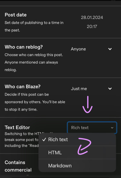
Your post should now look like this:


A quick rundown on html.
You always start with a letter or code in brackets. to end what you're doing it's </>. The slash signals the end.
P= paragraph <p> and to end </p>
I= italics <i> and to end </i>
b= bold <b> and to end </b>
Now tumblr will automatically do this for you if you made a text bold/in italics on your mobile post but to keep this tutorial simple i left that out here. You can always edit your text in the app after! Just not the color.
And as you see, the fancy text is now in coding. But we get to that later!
To colorize your text it's easiest to just use this website as it gives you lots of options!
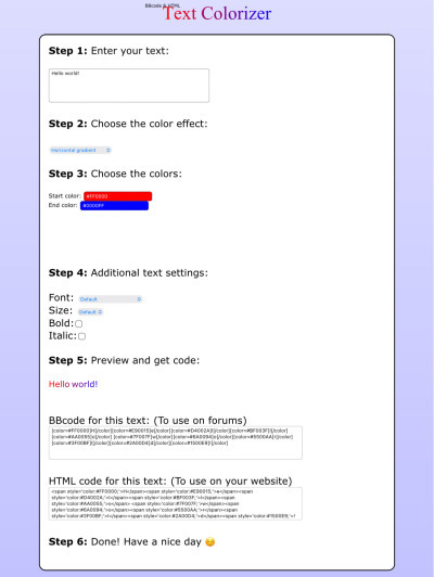
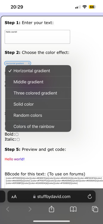
1. First i will be choosing the option of "solid color" and you can then put in the hex code of your desired color into the color box.
2. In the top box you will have to put the text you will color - for this tutorial it's "Testing"
3. Then you copy the box HTML code and paste it into tumblr where your word(s) are. Do not remove the <p> and </p> in front and after your word/ sentence!
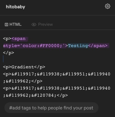
4. For the sake of this tutorial I marked the html code for colors in pink and the words in blue
Your code will now look like this:

For the gradient you can simply choose horizontal gradient or three colored gradient on the website above and copy/paste the html text.
Mind you that every single letter will get its own color code now so the word gradient suddenly looks very long in html.
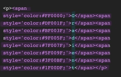

If you save the post it will now look like this!
Important to know is that you can color the fancy text only solid as the website can not color it as it is and putting the letter codes in the box above does not work either.
To color the fancy letters you simply copy the color code instead of the whole text - which looks like this:

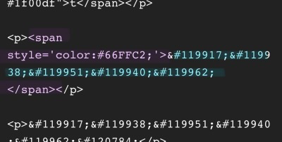
Don't forget to add </span> behind the word/the codes you're coloring to signal that this is where the color stops! If you forget to add it, nothing will be colored.
If you decide you still want to have the fancy lettering in multiple colors you have to color letter code by letter code manually like this:
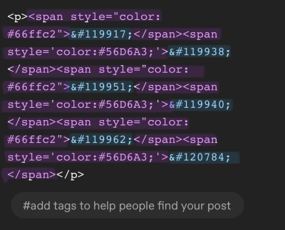

(I made a very poor choice on 2 different greens but oh well)
If you'd like to change your text, you can always do that on the mobile app like you usually would. You just can't change the color unless it's into a default color. But you can still change the size or make it bold for example.

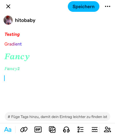
Anyhoot, this is the whole magic behind html. It's a lot and might be very complicated at first but you will eventually get the hang of it! Took me weeks and hours until someone sat me down and went through it step by step.
If you have any questions or something doesn't work as you thought it would please don't hesitate to reach out - I'm always happy to help!
#dividers by adornedwithlight#blog resources#writing resources#tumblr tutorial#html tutorial#gradient text#gradient text tutorial#gradient tutorial
169 notes
·
View notes
Text

This quick tutorial will go over how to make gradients, from simple gradients to multicolor ones.
give this tutorial a like/reblog if it helped you out
end result & tutorial under the cut
if questions should arise, feel free to send a message!
Chapters:
how to make a basic gradient
adding colors with brushes
softening & adjustments
What you´ll need:
any version of photoshop (I use CS6, mine is in german because I bought it years ago in germany)
very basic photoshop knowledge
i. how to make a basic gradient
Open a new document in your desired size.
There are several ways to make gradients. I always use the new fill layer option, right next to the new layer or new group buttons on the right side.
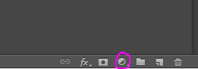
Click on it and select the second option.

Adjust the angle however you wish, and then click on the gradient to bring up the next window
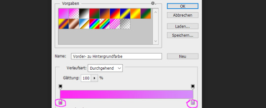
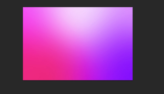
Select any colors you want by clicking on the little droppers highlighted above. I used #ff27f2 on the left and #d58dfa on the right. Once you´re done click OK until your new gradient is on your document.
ii. add colors with brushes
add a new layer & select a big brush with no hardness and low opacity.
select any color to paint with, I´ll be using #e50051 & #770dfa & plain white. Start painting on that new layer in slow strokes. You can add as many colors as you want. Mine now looks like this:
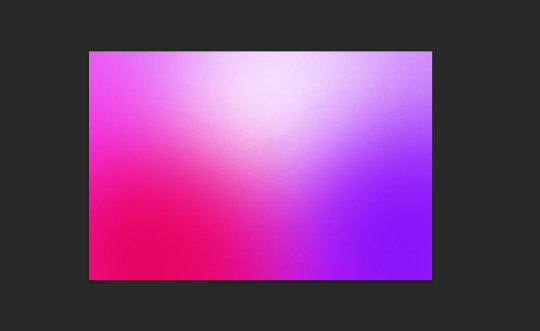
Now we merge our layers by selecting them, then righ click and selecting merge

iii. softening & adjustments
Go to filters -> blur > motion blur

Depending on the gradient you´ll have to select different variables, but for this one I used the numbers below:
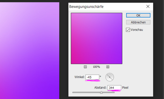
Sometimes I add Gaussian Blur too to blend it even more, but didn´t do that for this gradient.
Now for the adjustments I only added a brightness and vibrance layer. This is the finished gradient:
#completeresources#dailyresources#photoshop tutorial#gradient tutorial#photoshop help#usernelly#userireland#ps asks#mine: tutorial#my tutorials#my resources
177 notes
·
View notes
Note
I hope you don’t mind me asking but how do you do the gradient colors for your titles they’re so pretty
HELLOOOO!!! No, I don't mind! Here's how I usually format my gradient titles :)
#1 - Go to the settings icon on the post and click on that. Scroll down and look for "Text Editor".
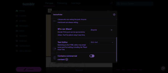
#2 - It should say "Rich Text". Click that and choose "HTML" from the choices.

#3 - Then go to this site and on a field that says "Your text here!", place your title and then set the colors you want for your text using the two things beside the field where you put your title.

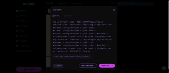
#4 - Click "generate" and if you scroll down, you'll see the HTML code for your text. Click that and copy.

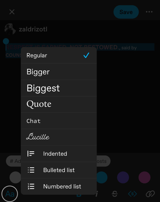
#5 - Go to the HTML part of your post and paste the code. Switch back to the preview part and you're free to adjust the gradient text (regular, chat, Lucille) and you're done!

I hope this was easy to understand anon! :))
12 notes
·
View notes
Text
So you wanna make gradient text?
this was originally made just to help a friend but she suggested I post this publicly to help bcs the other tutorials out there aren't very straight forward. with that said pls ignore typos:
↓↓ Site Link ↓↓
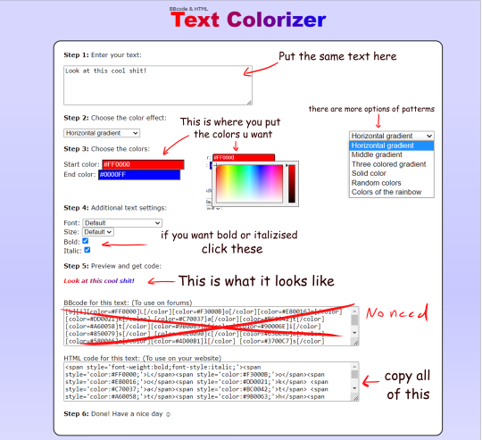
↓↓ Site Link ↓↓
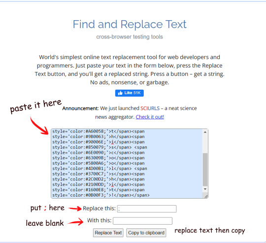
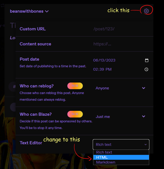
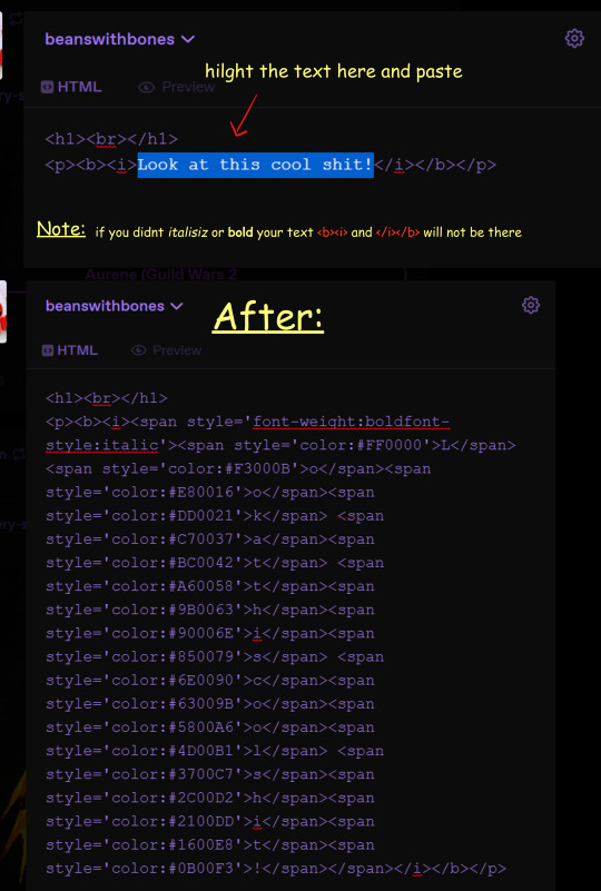
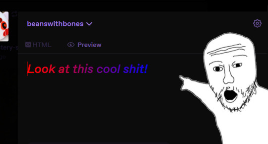
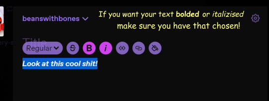
Note: you can still continue typing in the preview
Hope some peeps find this helpful
#tutorial#tumblr#tumblr tutorial#text art#text art tutorial#gradient text#art tutorial#I know its not exactly art but I wanan get this out there to help ppl
4K notes
·
View notes
Text
HOW I PAINT WITH GRADIENT MAPS

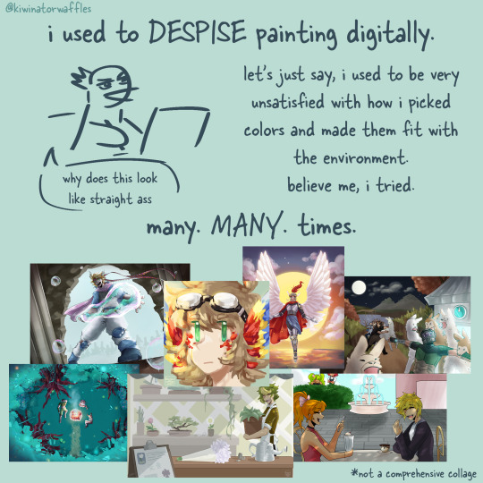
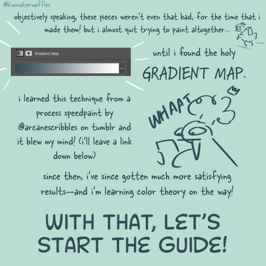
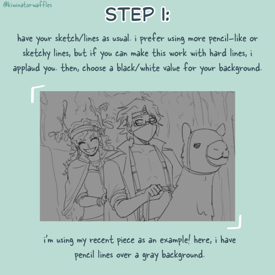
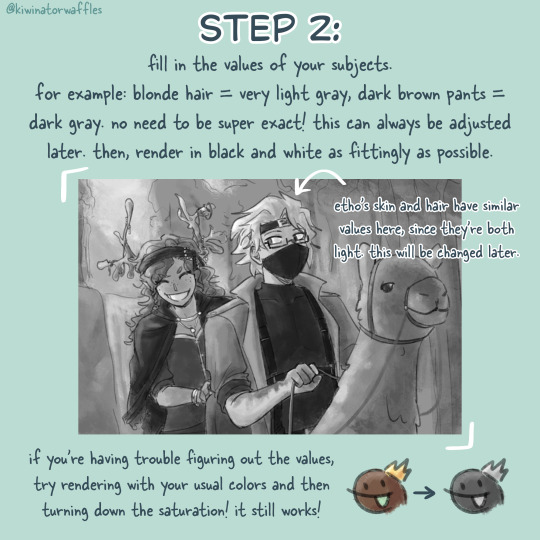
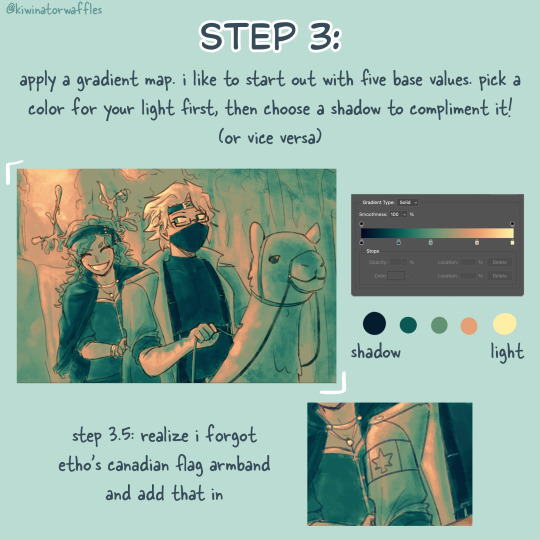

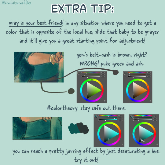
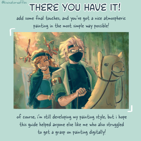
the post by arcanescribbles where i learned this technique! check out their works!
an even simpler version of this is to just lightly brush colors over a base color in the background and then go off of that. otherwise, i hope this can help!
a full version of my example piece here
#congrats to etho for being in all 3 of my gradient map paintings so far#art tip#art tips#art tutorial#painting tutorial#digital art tips#art help#drawing tips#digital art#kiwi’s scribbles#kiwisonator
724 notes
·
View notes
Text
GRADIENT TEXT TUT

how to get ombré colored text on tumblr <3
꧞ i get a lot of dms and comments asking about how to change the color of your text to colors that tumblr doesn’t have or to an ombré text. this is how
꧞ sites you can use: the one i use // two // three
꧞ you can use your phone for this, but i prefer using the computer. just go to safari to do it instead of the app if you wanna do it on the phone


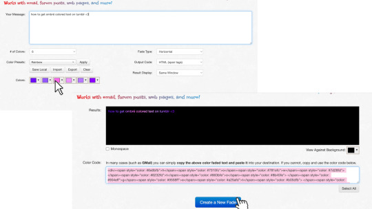
one: copy the text you want to color from your tumblr post then paste it into the websites text box
two: change the color of the text to whatever color you want. with the website i use it allows you to pick presets or you can also customize your own then click generate
three: click the “select all” button and copy the code
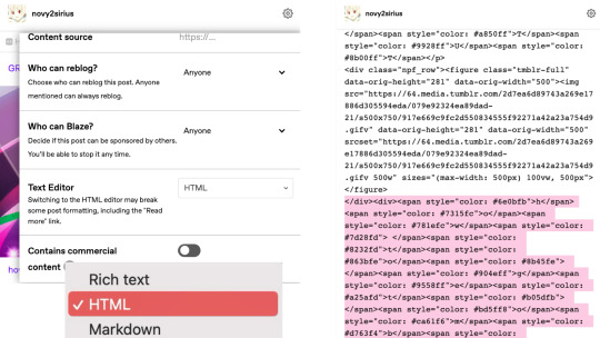
four: go over to tumblr and click the edit button on your post
five: click the settings button and change the text editor to "html" then find the html section at the top and click on it
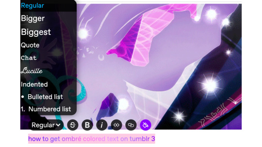
six: paste the code from the color fader website in the html where you want it to go (i paste it at the top and just edit it on my phone by holding text down and moving it)

175 notes
·
View notes
Text
GRADIENT TEXT TUTORIAL

HOW TO GET OMBRÉ STYLED TEXT ON TUMBLR
𝜗℘ I got a request on TikTok asking to do a tutorial on gradient text — tumblr doesn’t have an in-app option on doing gradient texts. This is how.
𝜗℘ Sites you can use: image color picker / stuffbydavid (gradient text).
𝜗℘ People say that you have to use a computer for this, which isn’t true. I am able to make gradient text on my phone, but you can use a computer if you want.

color picking from an image is optional, but highly recommended.
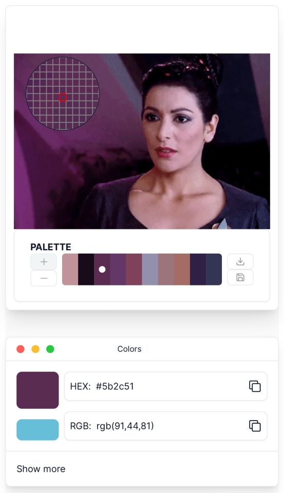
one: put the text you want to color for your tumblr post.
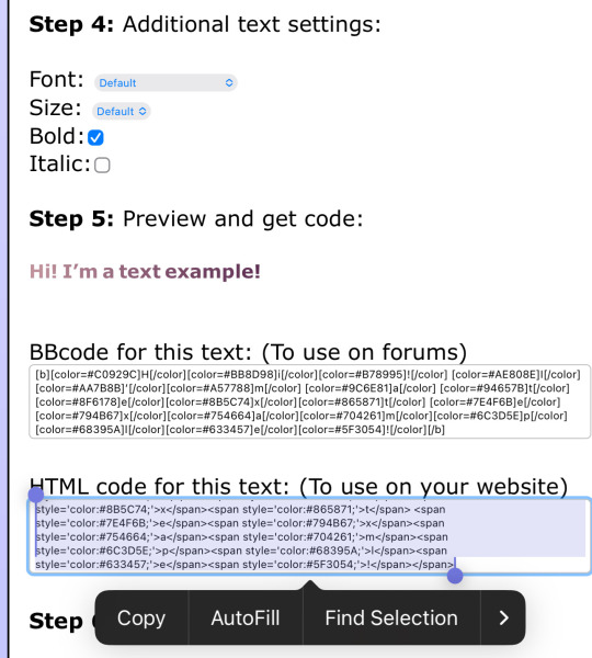
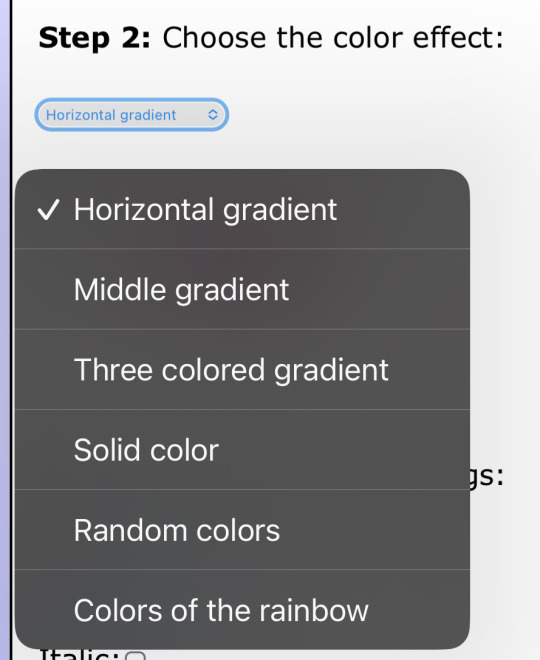
two: change the color of the text to whatever color you want. there are several options on how you want it. pick whatever option you want. the text will automatically generate for you.
three: copy the entire code then press “copy”.
four: go over to tumblr (website, not the app) and click “edit post” (the pencil) or create a new post.
five: click the settings button and change it from “rich text” to “HTML.”
six: paste the code from the gradient text website in the HTML where you want it to go. (I paste it then just save the post to my drafts then edit the text on the app)
#jasper’s tutorials#tutorial#gradient text#ombré text#text#tumblr text#text post#colored text#text tutorial#tumblr blog#tumblr tutorial
115 notes
·
View notes
Note
Question: From your progress shots you seem to do everything in greyscale then add color. How do you do that? Is it a layer effect you apply so the colors take their place or something else? (gradient maps also confuse me so i have no idea if thats what your doing)
Sorry for the very odd question, its just that your art is so wonderful and amazing to look at that i was curious how/why you do the greyscale to color way.
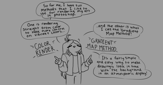


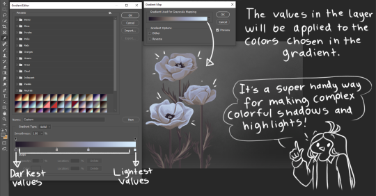

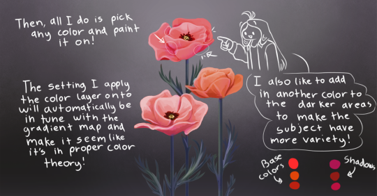
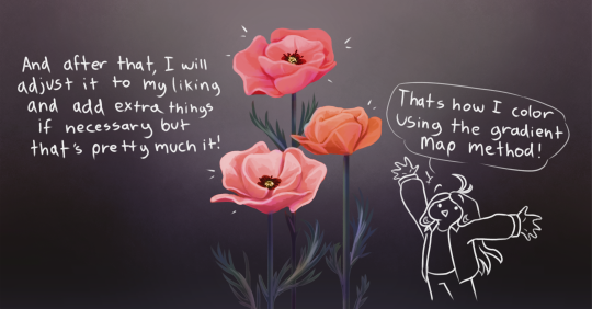
Also thank you!!
2K notes
·
View notes
Note
How do you make these Gradient texts in your post? and the different colored texts? I wanna know 😭😭
HOW TO MAKE GRADIENT TEXTS ON TUMBLR:
✦ . ⁺ . ✦ . ⁺ . ✦ ✦ . ⁺ . ✦ . ⁺ . ✦✦ . ⁺ . ✦ . ⁺ .
Hi love! thanks for your question, here's how:
1- go to this website: www.stuffbydavid.com/textcolorizer
2- once you've typed your text and chosen the colors copy the HTML code for your text (just scroll down the website a bit & you'll see it, it's hard to miss)
3- then go back on tumblr and create a post, click on the gear (top right corner), when you see the "text editor" part, click on it and choose "HTML" then paste and HTML code you copied on the website
4- then click on "preview" and you'll see the gradient text! hope this helped <3

#gradient text#gradient text tutorial#help#tumblr#loa#loa blog#loablr#shifting motivation#reality shifting#shifting antis dni#shifting blog#shifting script#shifters#shiftblr#shiftinconsciousness#shift#shifting consciousness#shifting realities#shifting#shifting community#shifting diary#visualization#loassumption#grounding
53 notes
·
View notes
Note
Hey how do you do the color gradient thing for your dialog tags?
Assuming you mean these things, I've actually been meaning to make a guide of my own for a while lol.
For one, you can only do this on computer/the website of Tumblr! There's no option to select this stuff on the app.

STEP 1: CREATE A NEW DOC / GO TO SETTINGS

It opens a dropdown menu/whole screen full of options!
From there, select the "text editor" dropdown, which starts as displaying "rich text".

Select "HTML"

And it should change how the entire post looks!

STEP TWO: CHEAT
Yeeeeeaaaaah, so I use a website for this lol

I inserted my colors for faeries (#30853C) and Cloud (#6DC1B4) for my example of "these things" earlier. To make this easier, I most often have two windows open at a time while working on uploading my scripts to Tumblr.

To get colours to insert into the Text Colorizer website, you can use any kind of hex color picker or even this one website I've used to yoink "thematic" colors from photos!


Personally, I've developed a massive library of colors over time for this exact purpose lol. Using my old colors as a "base", I can change it accordingly to the kind of "new color" that I want for a specific character or thing!


(I'll use the website to also make gradients for "in-between" colors lol)
STEP 3: INSERT TEXT / DESIRED COLORS
To make Nova's gradient, I start with #A600D9, my color for Magic, and end with #F56745—their individual color. However, being as it's short, I'll use a quote from them instead lol.

Once you've inserted your text and colors, you will click in the text box I highlighted in red, ctrl+a and ctrl+c to copy it all, and go back over to your new tumblr post tab!
From there, you'll ctrl+v to paste the entirety into the HTML area, which pastes the code into your post!

AND VOILA!

You have gorgeous gradient text!
However, I want to give a fair warning and a bit of advice! If you didn't notice wayyyyyyy back when...

Tumblr warns that this all can break your formatting!
It doesn't do it too often, but take it from someone who does an obscene amount of formatting... it's 100% true.
STEP 4: CHEAT SOME MORE!
For this reason, I personally have a whole separate draft post full of my characters' colors (and names lol) that I use to copy-paste them in from rather than using the "html" text editor on every post!
I mentioned earlier I often have multiple windows open while editing? Here's what that looks like!

Additionally, I'll use a separate tab off on the left (my "current wip post" side) with the "html editor" enabled for me to copy-paste stuff!
(Also here's yet another example of how many colors I have)

Once again, you can ctrl+c these things to paste them into another tumblr post with the correct colors!
And it's ONLY possible to do on the website!!!

EXTRA INFO!
WARNING:
Tumblr will only allow each "paragraph's html to be so many characters long, so you can't have too big of anything in a gradient!

And by "anything"... I mean you really can't have that big of a gradient in general. RIP lol.
It straight-up won't save the post so long as you have that "overflow" in the character block! MAKE SURE YOU'VE FIXED IT, OR YOU CAN AND WILL LOSE ALL PROGRESS ON YOUR POST!
SINGLE-COLOR TIP:
You don't need the website for a single color! If you'd like, you can just change the "color code" within the html editor to change specific colors!

MAKE SURE COLORS CAN WORK ON DIFFERENT BACKGROUNDS!
On desktop, you can use shift+p while not on any sort of textbox to change the color pallet! I always do tests to see which colors work best before settling on any!

(Tho, the blue background SPECIFICALLY is nightmarish to work around. So if that's the ONLY thing I can't make work, I often ignore it and let you guys who use it suffer lmao)

(Hopefully this'll give you guys some respect for me and how much I do to make my posts aesthetic af lol)
Also hopefully this all helps???
divider by @cafekitsune
57 notes
·
View notes
Note
Random question, but how did you do the rainbow thing in your pinned post? Is it from something you buy on Tumblr?
the gradient, yes!!! no, it's completely free.
so, i don't remember where exactly i got the instructions as to how to do it, but this is basically how the word "welcome" from my pinned looks like in html:

since it's a gradient, every letter is a sliiightly different hue, but i remember there was a website where you could basically write any word/sentence that you'd like gradiented, choose the starting and ending colors, and it'd automatically give you the html code for the gradiented text. i think it was this one?
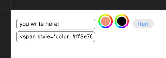
and that's what you get!
you just gotta copy the code, start editing your post, make it so you're editing it as html, paste the code in, and it SHOULD work. hopefully!
#nicole answers#Anonymous#the colors work for symbols too. like hearts and arrows and stuff#i Think this is what the rainbow thing refers to??#if this is too messy i just checked and googling ''tumblr how to gradient words'' shows a few more indepth tutorials
206 notes
·
View notes
Text
Hello sweet beans! Since my last tutorials have been yeeted into oblivion with deactivating my previous blog @/benkeibear I figured I repost them onto here!
💫 gradient line divider tutorial 💫
This tutorial uses my simple line divider tutorial as a base. Please familiarize yourself with it first since this is just additional steps!
I use various apps and sites for gradients. The apps I mainly use Canva or Gradient+ occasionally I use GradientDaze (for when I don't have specific colors in mind)


As websites I can recommend browsing through uiGradients or Webkima if you'd like animated gradients.
I'm a little oldschool and don't use photoshop but there's plenty tutorials on how to animate gradients there on YouTube!
Starting with Canva:
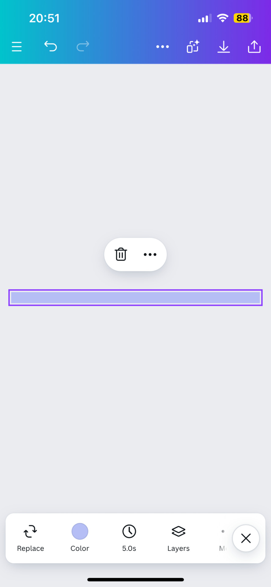
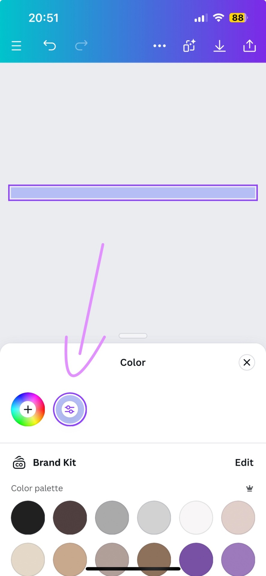
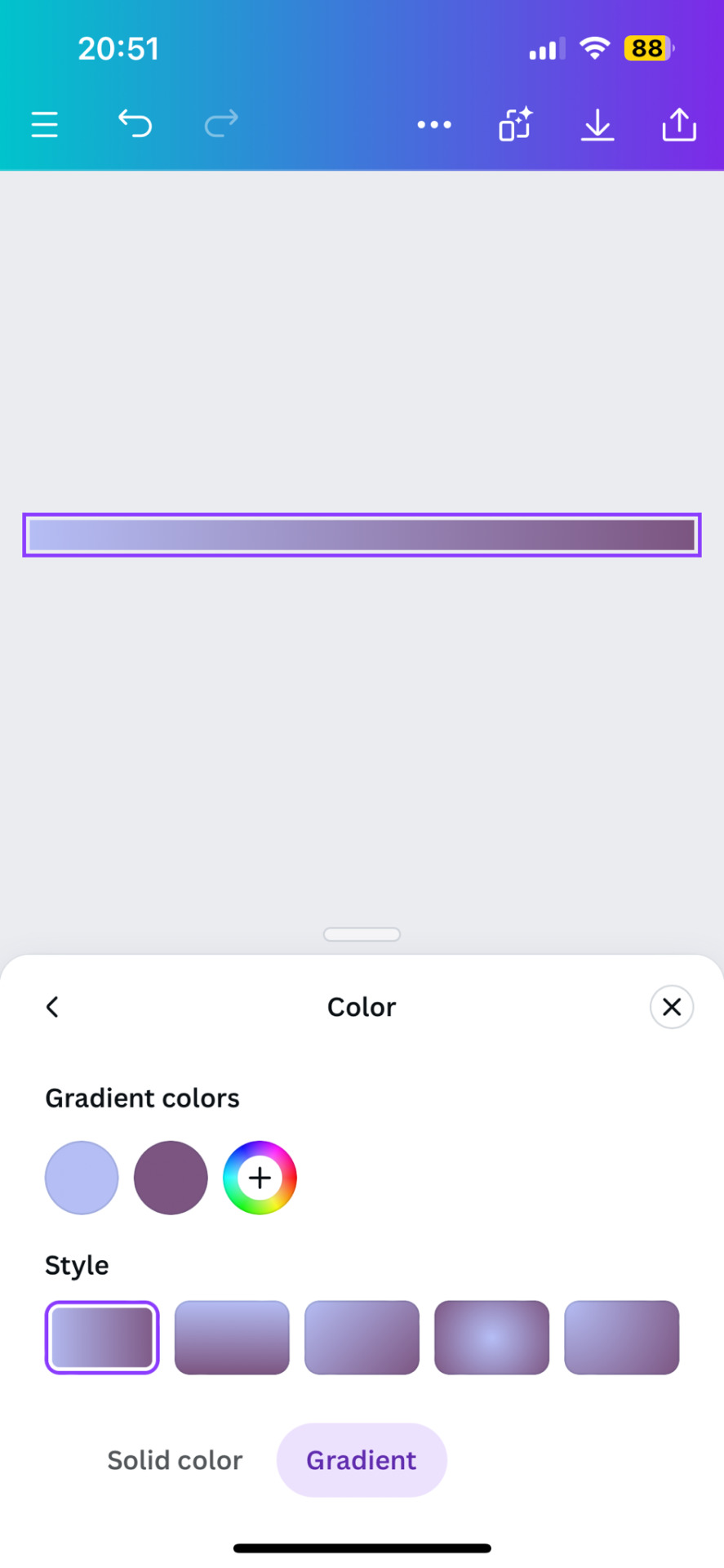
1. You first open your divider template. Mine is as in the previous tutorial the simple 1000x40.
2. Next you will click on the color button and choose a color like the little arrow shows
3. Then you select "Gradient" and Canva will give you a second color option. You can change both colors here or add many more if you'd like more colors. Here you can also choose what kind of gradient you want
Just play around here and continue to resize the images you saved as explained in the previous tutorial via ezgif or any other way you found for yourself.
Next we have Gradient+
This app is built pretty simple and there's not much to explain. You choose your two colors by tapping on the colored circle at the"Color A" and "Color B" and continue further down to navigate where color A starts and color B ends.


For the classic gradient you use the settings as above.
The app also offers radial and angular gradients so you can just play around with what you like!
Make the gradient big by tapping the expansion arrows and take a screenshot - then you may resize your divider.
The last app is GradientDaze
Again, a very simple app but this time you can't enter hex codes. Instead you can move 2 circles around on a little color card and find pretty gradients you like
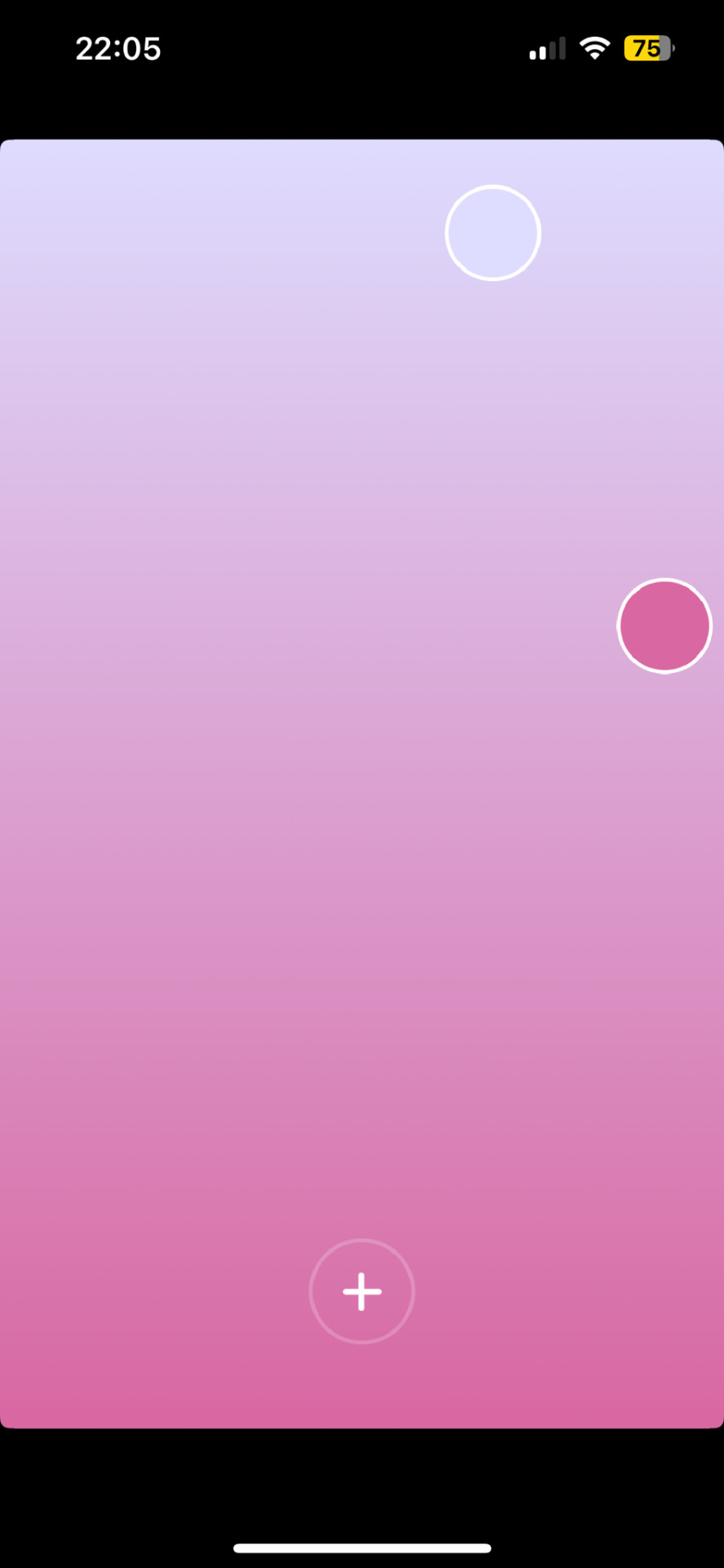
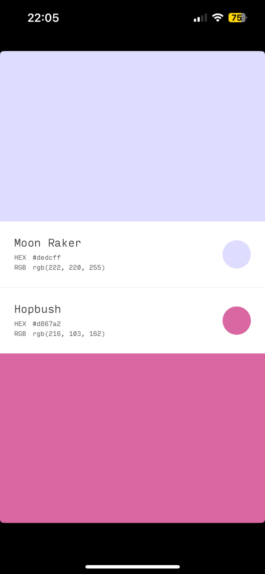
If you found two colors you like, you can click on the little + and then on "info" to see the color names and hex codes. In the menu after clicking + you also have the option to save the gradient
Once saved you can resize your dividers.
Onto the web pages.
At uiGradients you can browse through popular gradients users have made. Once you find one you like you can use the hex codes to make a gradient divider for example in Canva or you take a screenshot and resize it.
Using Webkima for animated dividers is a little inconvenient because you need to record your screen and make a gif out of if (you can do this at ezgif where you can immediately resize your animated gradient)
On Webkima you can choose up to three colors, the direction and speed at which the colors move. Personally I haven't used this yet except for a few custom dividers since it takes quite some time for one divider.

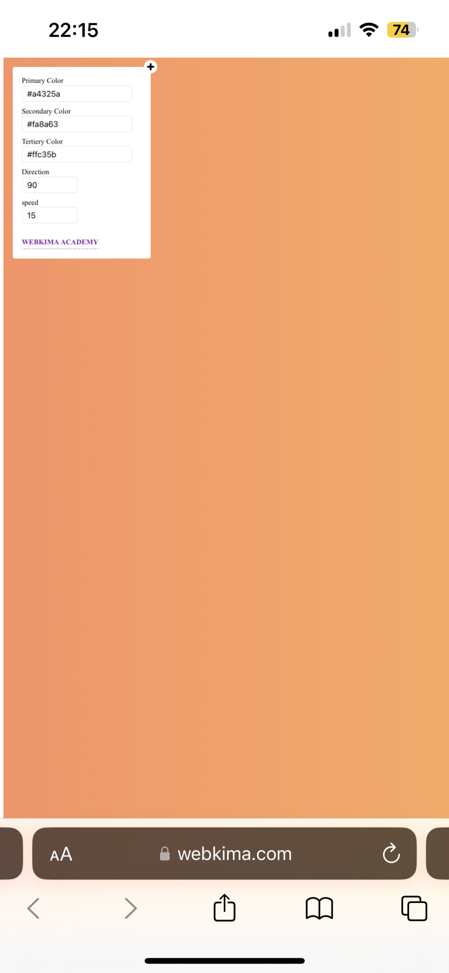
(Left: uiGradients / Right: Webkima)
Using these apps / sites is optional and I'm sure there's plenty other options out there but these are the ones I personally use and find easy to navigate, especially canva since you can do all this in the free version.
If you have any questions or something doesn't work as you thought it would please don't hesitate to reach out - I'm always happy to help!
#dividers by adornedwithlight#divider tutorial#gradient tutorial#Gradient dividers#Gradient divider tutorial#tumblr tutorial#Gradient lines#line dividers#aesthetic dividers
68 notes
·
View notes
Text
COLOUR TEXT TUTORIAL ⋆౨ৎ˚⟡˖ ࣪

go to this site ➤ follow the instructions & copy the code from the bottom box (the HTML one) ➤ open tumblr on a desktop browser ➤ create new post ➤ click the gear icon in the top-right corner to access settings ➤ scroll down and find the “text editor” option; switch it to “HTML.” ➤ paste the HTML code into the post editor ➤ scroll back up and switch between “HTML” and “preview” modes to edit the code and see how your post looks ➤ save draft :)
step-by-step pictures under cut :
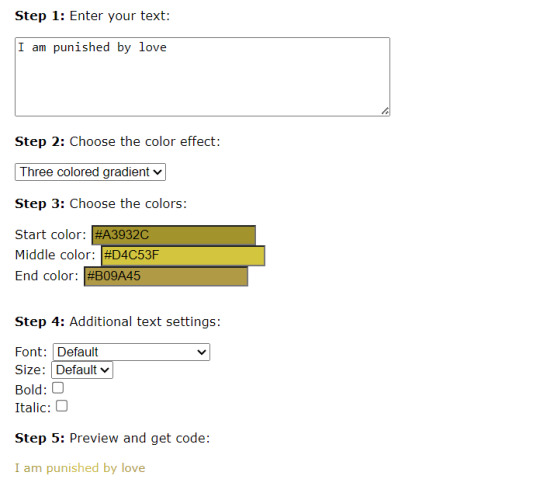


final result : I am punished by love
46 notes
·
View notes
Text
(prev)

i colored that
#because i don't wanna touch that detailed asf sevagoth portrait today#and i really need to do some coloring otherwise im just gonna. be afraid of that. forever#i can't get rhino's color palette right idk why#but i had a lot of fun drawing sevagoth#especially the gold part#tbh i just yoinked the gradient map from dante's portrait#actually i think i stole that from some metal rendering tutorial while i was rendering dante but it still works i guess#okay that's enough ramble. fuck i have to remind myself to stop#warframe#warframe rhino#warframe sevagoth#warframe sevagoth prime#my art
53 notes
·
View notes
Text
custom colors tutorial
begin
1. ok create a Tumblr post
2. go to settings
3. change Text Editor to Markdown

it might also work set to HTML but I haven't tried it
4. decide your message. time to play with markdown html stuffs!
gradients (easy way)
1. go here: https://patorjk.com/text-color-fader/. (it lets you do multiple colors. imo this is the best working tool. but you can totally look up text gradient makers for forums/email, or make ur own if u want)
2. find the options u want :)
3. you might have to replace o with o and O with O or they may disappear. dunno why
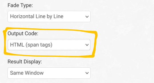
4. make sure u keep the Output Code: HTML (span tags) option the same
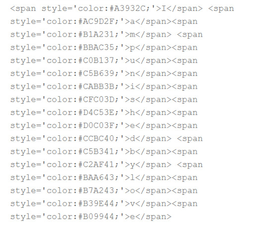
5. press generate! copy the text from the second text box, with the funky text with a lot of <span>
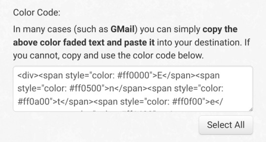
6. paste into the post editor
7. repeat as desired :)
solid colors (hard ish way)
1. paste this into the post editor:
<span style="color: ">message here</span>
2. if you know the hex codes of the colors you want, skip to end
3. look up "color picker". change the color until it's how u want
4. copy the hex code (it should look like # followed by numbers or letters). if I want this cool shade of blue, it looks like this: #22405e
5. paste the hex code into the text you already have like so
<span style="color: #22405e">message here</span>
6. repeat as desired :)
end
now u can switch to the preview tab or back to the text editor, and keep making ur post! don't switch back and forth, or you'll lose the color and have to do it again
yes you can make the colored text bold and stuff
yay colors
hey guys
i found out how to do colors
#wowee this took a Long time#tutorial#color tutorial#colour tutorial#custom colors#custom colours#gradient tutorial#og#gradifizz adds
10 notes
·
View notes
Text

KNiFELACE ──── a(n edit) resource blog run by @chocospresso .

𓊆 my neospring . if you wish for me to delete a post / reblog , let me know .

#𓊆 ✑ 𓊇 posts.#𓊆 ✑ 𓊇 asks.#𓊆 ✑ 𓊇 reblogs.#𓊆 ✑ 𓊇 not resources.#𓊆 ✑ 𓊇 transparents.#𓊆 ✑ 𓊇 masks.#𓊆 ✑ 𓊇 pfp masks.#𓊆 ✑ 𓊇 banner masks.#𓊆 ✑ 𓊇 dividers.#𓊆 ✑ 𓊇 lace.#𓊆 ✑ 𓊇 frames.#𓊆 ✑ 𓊇 backgrounds.#𓊆 ✑ 𓊇 psds.#𓊆 ✑ 𓊇 gradient maps.#𓊆 ✑ 𓊇 overlays.#𓊆 ✑ 𓊇 fonts.#𓊆 ✑ 𓊇 tutorials.#𓊆 ✑ 𓊇 websites.#𓊆 ✑ 𓊇 graphics.
50 notes
·
View notes