#edit added an id to the first image
Explore tagged Tumblr posts
Text
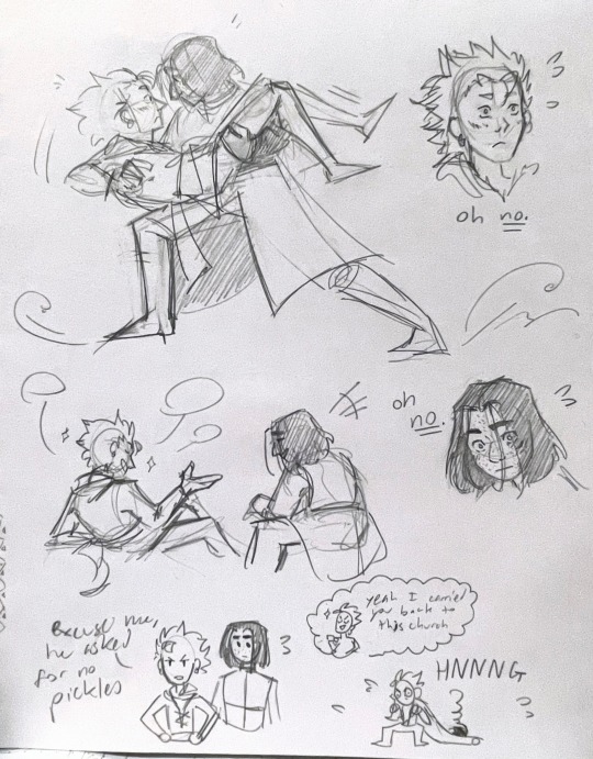
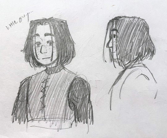
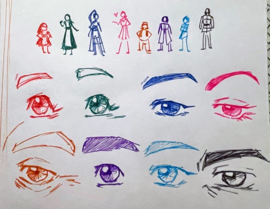
sketchdump time!! dq11 edition :] four years later and this game is still really good 👍
#dq11#dqxi#dragon quest xi#luminary#luminerik#erik dq11#no image description#ellie loves to draw#yall i finally beat the (main) game after not touching it for like four years and man i forgot how much i loved it#i need some more love for this game Immediately#edit added an id to the first image
103 notes
·
View notes
Text
okay YES i love the leverage team’s reactions in "the stork job" when sophie writes herself into the movie and adds a whole extra character. BUT i think we shouldn’t forget the team’s reactions to nate making himself the new director lmao. utter silence. i particularly like sophie stifling a laugh as though she isn’t about to do the very same thing.
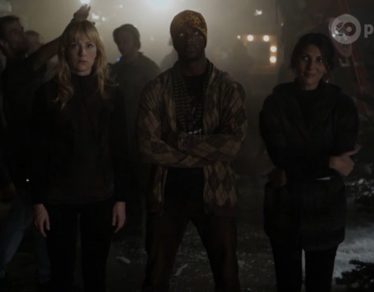
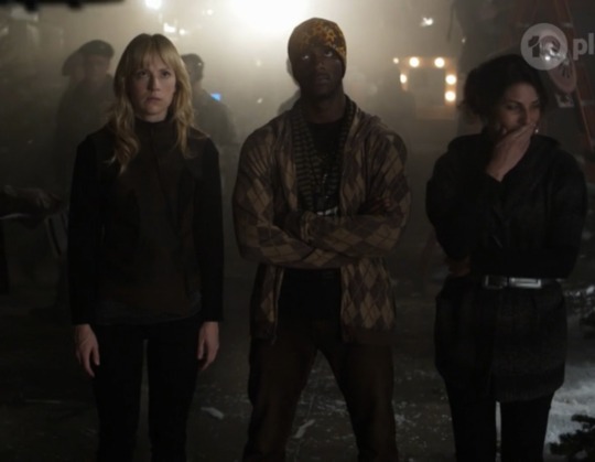
#leverage#leverageposting#the stork job#this didn’t post well the first time? weird#edit: added image ID
38 notes
·
View notes
Text
If I had a nickel for every time Kim Whalen played a character dressed in pink with pigtails who is considered the less evil one, I'd have two nickels.

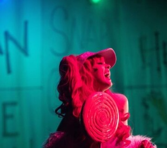
Which isn't a lot, but it's weird that it happened twice.
[Image ID: A picture of Girl Jeri from Nightmare Time Season 2 episode 2, Abstinence Camp, wearing a pink T-shirt and her hair in pigtails, with two pink scrunchies. Beside it is an image of Nibblenephim from Nerdy Prudes Must Die, holding a pink lollipop, wearing all-pink clothing and a pink wig, also in pigtails. Both of them are played by Kim Whalen. /.End ID]
#this is the first time i've added an image ID i hope i did it right#if i didn't feel free to correct me and i'll edit it#anyway#nerdy prudes must die#npmd spoilers#starkid#nmt2
28 notes
·
View notes
Text

hi bestie I had to go fetch my wallet for this n couldn't find the card so I must have misplaced it :((((((((((( nooooo where is it :((((( but I'll find the PSD later, and since it's a pair card with another one I made which!! I did find, until then have the replacement Devil of Savings, much less hieffort edit but very potent.
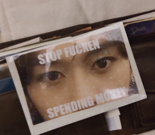
#its him on both given at least half my impulse spendings pertain to his fursona's merch.#my bank doesnt do custom card images which makes me so sad cuz id so put that on it fr fr#itd be a deterent for id have to beat the stare contest first and i fear thats out of my ability as an eye avoider#the other tho was much more high effort so im hoping im judt stupid since its late as jell n cant see it in plain sight#like i worked so hard on it editing a girlies face onyo a painting n added some lil framing like those church things ya know#having two the goal was that in case of impulse spending hits in the wild i could pull them both out shuffle pick one n itd tell me#wether or not to buy
8 notes
·
View notes
Note
You're like the greatest image description person ever. Btw. 💞🫵
Oh hey! Thank you. I just try to make sure all the relevant details are there, and sometimes sprinkle in a vibe when appropriate. Like anything else, I’ve improved with practice. I think everyone should give it a go if they have the time and ability.
I’m just glad I can help make a number of posts more accessible!
#anon#ask#I think not such a title exists#and I don’t always get to adding them to other ppl’s posts#but if I see a big post that would make complete no sense without context of images that’s when you really try to#and I’m for real#when I started writing IDs they were rough and awkward#and they still can be#they’re still out there but hey#we try our best#edit: also I always look for an ID by someone first so if you see some other describers give them a poke around and a follow
3 notes
·
View notes
Text
I haven’t really seen any of the more recent U.S. election news hitting tumblr yet so here’s some updates (now edited with sources added):
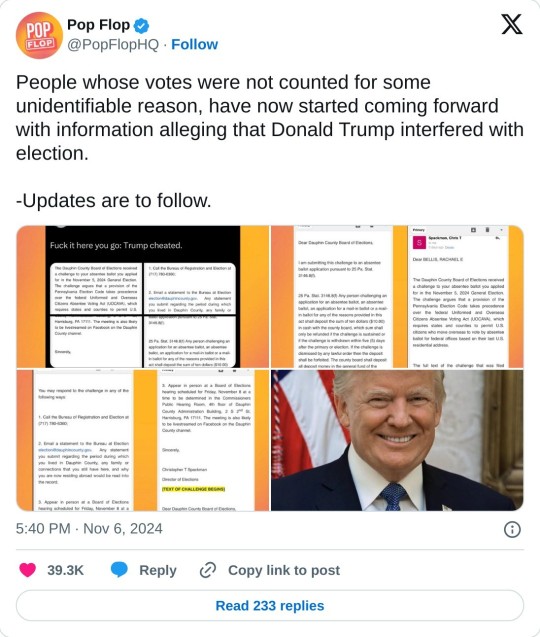
There’s evidence of Trump cheating and interfering with the election.
Possible Russian interference.
Mail-in ballots are not being counted or “recognized” in multiple (notably swing) states.
30+ bomb threats were called in and shut down polling stations on Election Day.
20+ million votes are still unaccounted for, and that’s just to have the same voter turnout as 2020.
There was record voter turnout and new/first-time voter registration this year. We definitely should be well over the turnout in 2020.
U.S. citizens are using this site to demand, not only a recount, but a complete investigation into election fraud and interference for the reasons stated above:
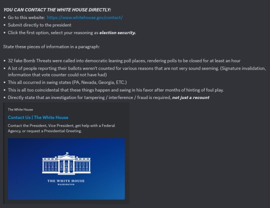
Here is what I submitted as an example:
An investigation for election interference and fraud is required. We desperately need a recount or even a revote. The American people deserve the right to a free and fair election. There has been evidence unveiled of Trump cheating and committing election fraud which is illegal. There is some evidence of possible Russian interference. At least 30+ bomb threats were called in to polling places. Multiple, notably swing states, have ballots unaccounted for and voting machines not registering votes. Ballots and ballot boxes were tampered with and burned. Over 20 million votes that we know of are unaccounted for. With record turnout and new voter registration this year, there should be no possibility that there are less votes than even in the 2020 election.
Sources (working on finding more links but if anyone wants to add info, it’s appreciated):
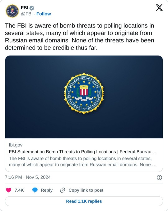
FBI addressing Russian interference and bomb threats:
Emails released by Rachael Bellis (private account, can’t share original tweet) confirming Trump committing election fraud:
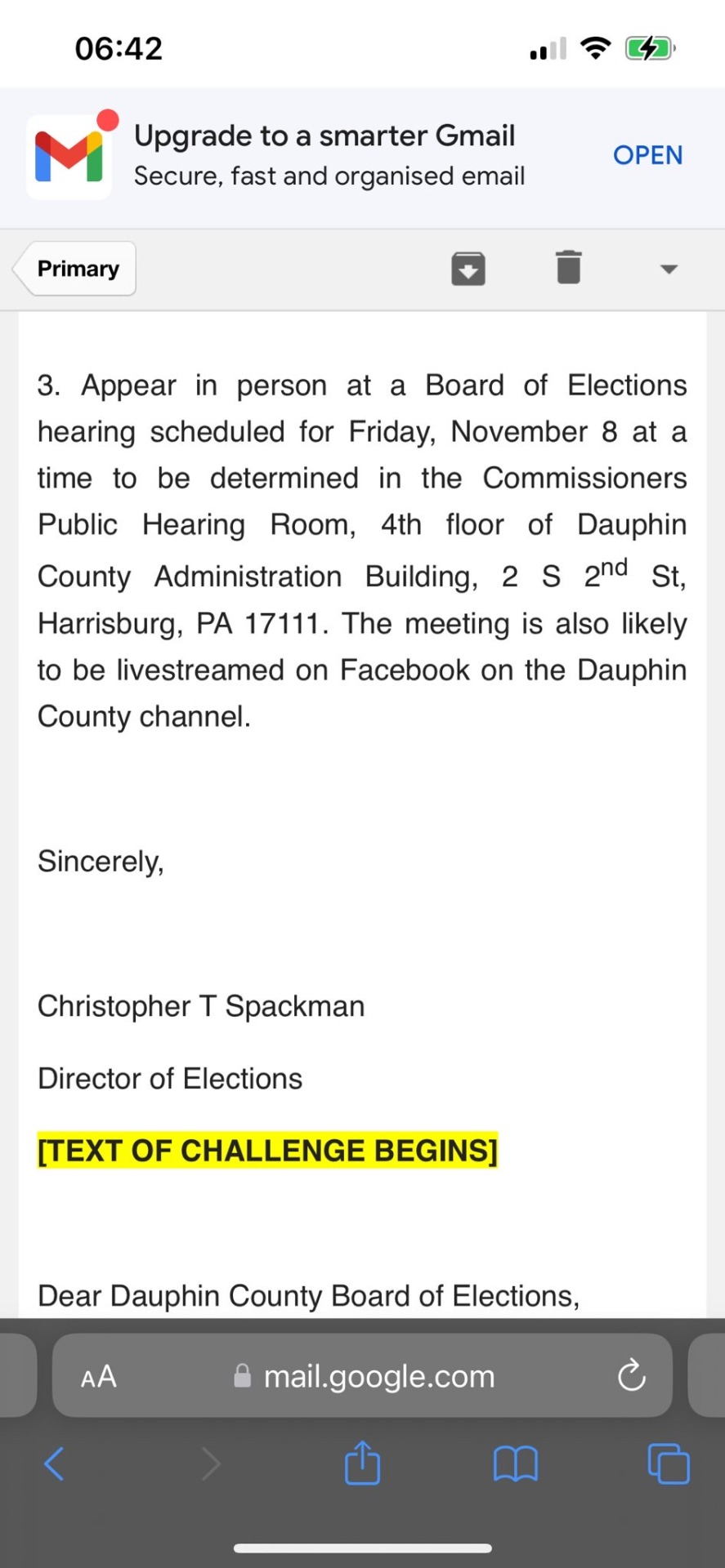
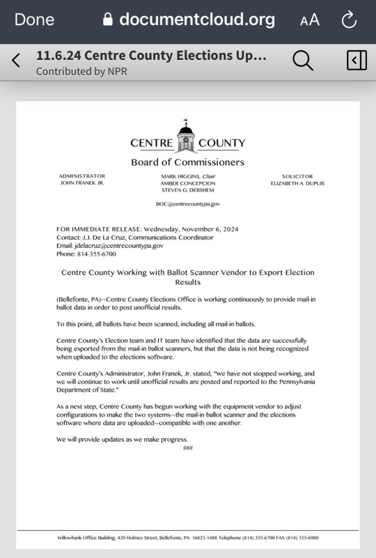
Pennsylvania's Centre County officials say they are working with their ballot scanner vendor to figure out why the county's mail-in ballot data is "not being recognized when uploaded to the elections software:”
Wisconsin recount:
[ID:
Multiple screenshots and images.
The first is a screenshot with a link and information for contacting the White House directly regarding election fraud. The instructions include choosing to leave a comment to President Joe Biden directly and to select election security as the reason.
The screenshot then instructs people to include any or all of the following information in a paragraph as a comment to the president:
32 fake bomb threats were called into Democratic leaning poll places, rendering polling places closed for at least an hour.
A lot of people reporting their ballots were not counted for various reasons.
This all occurred in swing states.
This is too coincidental that these things happen and swing in his favor after months of hinting at foul play.
Directly state that an investigation for tampering, interference, fraud is required, not just a recount.
The second image is from the FBI Twitter account that reads:
The FBI is aware of bomb threats to polling locations in several states, many of which appear to originate from Russian email domains. None of the threats have been determined to be credible thus far. https://t.co/j3YfajVK1m — FBI (@FBI) November 5, 2024
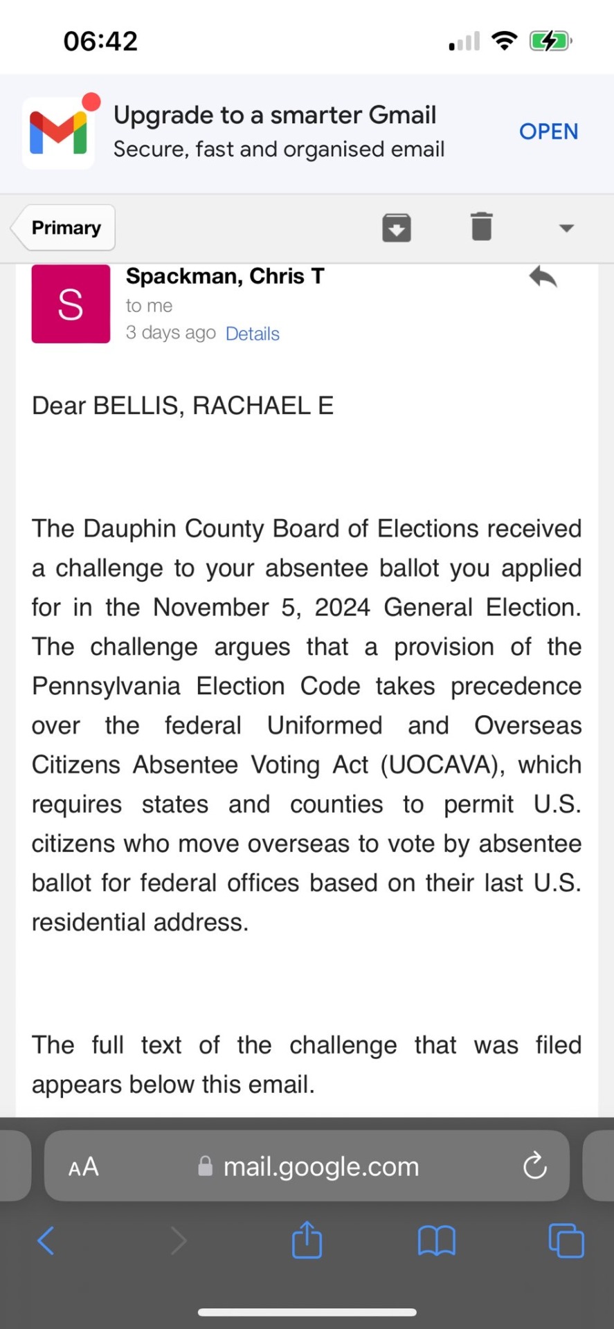
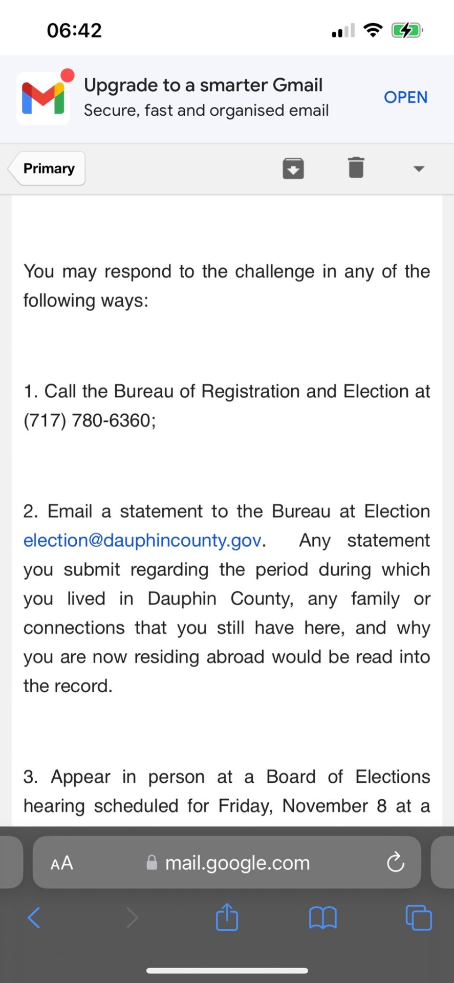
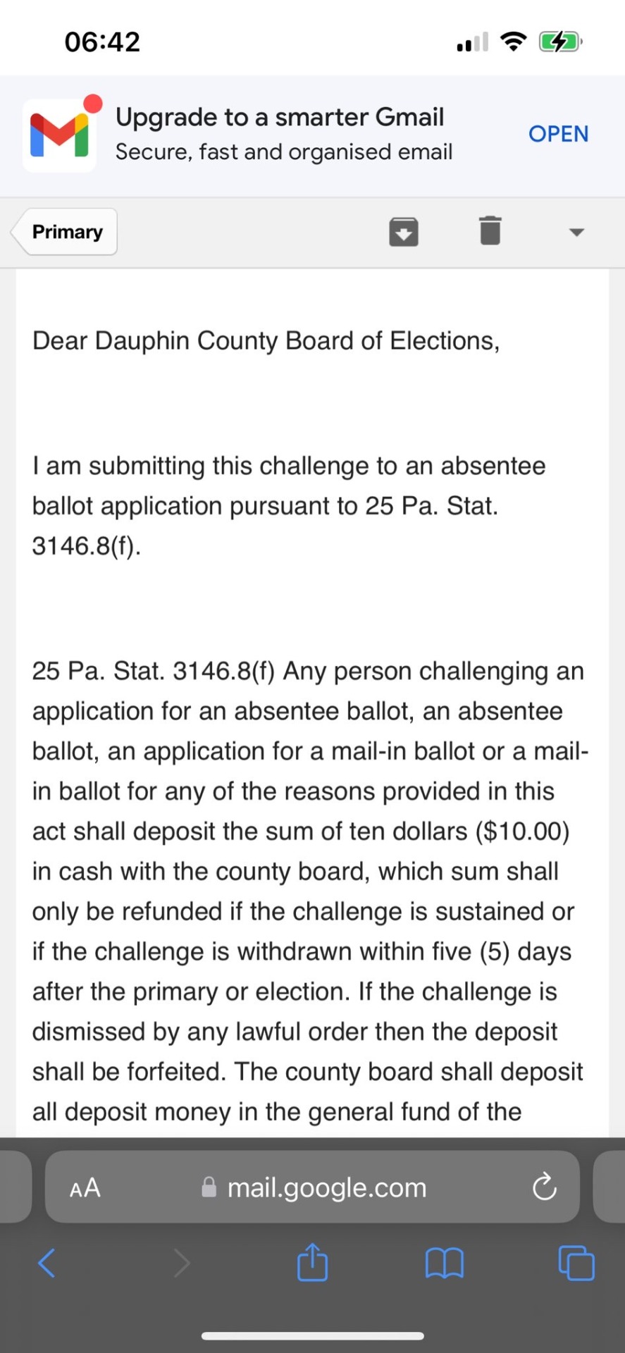
The next four Gmail screenshots of an email sent to Rachael Bellis from Chris T. Spackman that read together as follows:
Dear BELLIS, RACHAEL E., The Dauphin County Board of Elections received a challenge to your absentee ballot you applied for in the November 5, 2024 General Election. The challenge argues that a provision of the Pennsylvania Election Code takes precedence over the federal Uniformed and Overseas Citizens Absentee Voting Act (UOCAVA), which requires states and counties to permit U.S. citizens who move overseas to vote by absentee ballot for federal offices based on their last U.S. residential address.
The full text of the challenge that was filed appears below this email.
You may respond to the challenge in any of the following ways:
1. Call the Bureau of Registration and Election at (717) 780-6360;
2. Email a statement to the Bureau at Election [email protected]. Any statement you submit regarding the period during which you lived in Dauphin County, any family or connections that you still have here, and why you are now residing abroad would be read into the record.
3. Appear in person at a Board of Elections hearing scheduled for Friday, November 8 at a time to be determined in the Commissioners Public Hearing Room, 4th floor of Dauphin County Administration Building, 2 S 20d St, Harrisburg, PA 17111. The meeting is also likely to be livestreamed on Facebook on the Dauphin County channel.
Sincerely,
Christopher T Spackman
TEXT OF CHALLENGE BEGINS
Dear Dauphin County Board of Elections,
I am submitting this challenge to an absentee ballot application pursuant to 25 Pa. Stat.
3146.8(f).
25 Pa. Stat. 3146.8(f) Any person challenging an application for an absentee ballot, an absentee ballot, an application for a mail-in ballot or a mail-in ballot for any of the reasons provided in this act shall deposit the sum of ten dollars ($10.00) in cash with the county board, which sum shall only be refunded if the challenge is sustained or if the challenge is withdrawn within five (5) days after the primary or election. If the challenge is dismissed by any lawful order then the deposit shall be forfeited. The county board shall deposit all deposit money in the general fund of the…
The rest of the forwarded email is cut off.
The last image is a screenshot of the official statement from the Centre County, Pennsylvania Board of Commissioners released on November 6, 2024 that states:
Centre County Working with Ballot Scanner Vendor to Export Election Results.
(Bellefonte, PA) -Centre County Elections Office is working continuously to provide mail-in ballot data in order to post unofficial results.
To this point, all ballots have been scanned, including all mail-in ballots.
Centre County's Election team and IT team have identified that the data are successfully being exported from the mail-in ballot scanners, but that the data is not being recognized when uploaded to the elections software.
Centre County's Administrator, John Franek, Jr. stated, "We have not stopped working, and we will continue to work until unofficial results are posted and reported to the Pennsylvania Department of State."
As a next step, Centre County has begun working with the equipment vendor to adjust configurations to make the two systems-the mail-in ballot scanner and the elections software where data are uploaded -compatible with one another.
We will provide updates as we make progress.
/end ID]
#sources added#us politics#us election#presidential election#2024 presidential election#election interference#election integrity#election security#image described#image description in alt#image description included#image description added#described#kamala harris#kamala 2024#us news#us presidents#updated id
36K notes
·
View notes
Text

[Image Description: A white text box: "Accounts created after May 8th, 2023 have the 'For You' tab as the default dashboard tab. Other existing users' dashboard tabs are not changed. We are also working on making dashboard tabs even more customizable, including adding the ability to choose which tab appears first." End ID.]
From the latest update (June 2nd, 2023)
Oh, fuck this. If you're a new user, don't forget to set your dashboard to Following and turn "Based on your likes" and "Best stuff first" off
EDIT: A few corrections
For new users, you can't change the default back to Following. This means that whenever you open up your app/go to your dash, the first tab you'll see is the For You tab
Note for the previous point, I can't confirm this since my account is rather old, if anybody has an examples, I'd appreciate it
Yes, some people mentioned that you don't have to turn off Based on your likes and Best stuff first, but that's mostly my preference since (to me at least) it does not work, it just shows me random shit that is absolutely not based on my likes
My main problem with this update is that it strips the user from being able to choose what they wanted to see. It's totally cool if you use the For You tab, but it shouldn't be the default option
Additional points from the tags and reblogs:
You can turn off public likes and followings, again, not mandatory, but it's an option
Make sure to turn off Tumblr Live (pretty sure it's only available to US users, which I am not one) since it apparently drains mobile data
There are (browser) addons and extensions that allows you to block elements or make your tumblr experience better, like uBlock Origin (an adblocker which can be used to block certain elements from showing up) and the XKit Control Panel/New XKit
#pink posts#what the fuck is this update hello???#one week later edit: yeah a few corrections#also why the fuck did this explode
24K notes
·
View notes
Text
Secret Life Session #1: Number of hearts & hearts gifted
edit (Oct 26th): Added an image description at the bottom of the post. Future posts will include image descriptions.
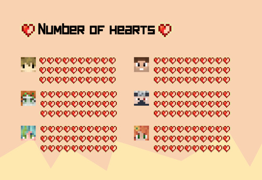
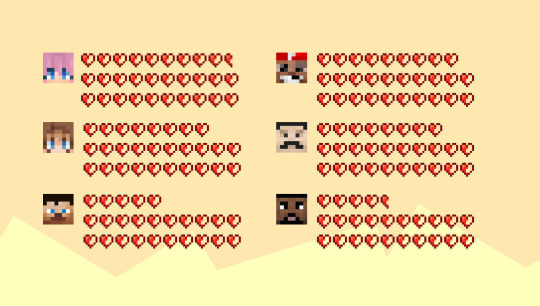
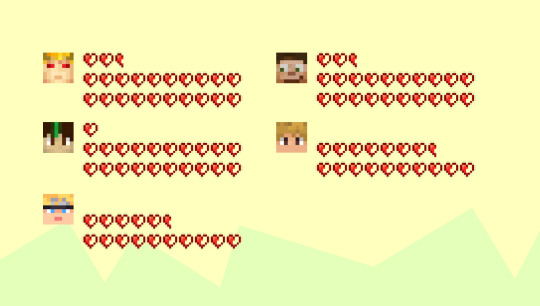
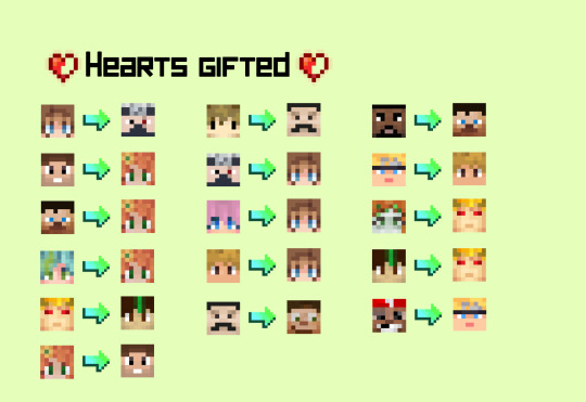
[ID: A graphic that is divided into four separate images. The first three images are captioned "Number of hearts" and display the head of each player's minecraft skin and their respective amount of hearts. Grian, Cleo, Scott, Impulse, Etho and Gem each have 30; Lizzie has 29.5; Bdubs has 29; Pearl and Mumbo have 28; Skizz has 25; Bigb has 24.5; Tango and Scar have 22.5; Joel has 21; Jimmy has 17.5 and Martyn has 15.5 hearts. The fourth image is captioned "Hearts gifted" and shows the head of each player's skin followed by an arrow that points the that of another, indicating the gifting of hearts. Pearl gifted their heart to Etho; Impulse, Skizz and Scott gifted their hearts to Gem; Tango gifted their heart to Joel; Gem gifted theirs to Impulse; Grian gifted theirs to Mumbo; Etho, Lizzie and Jimmy gifted theirs to Pearl; Mumbo gifted theirs to Scar; Bigb gifted theirs to Skizz; Martyn gifted theirs to Jimmy; Cleo and Joel gifted theirs to Tango and Bdubs gifted theirs to Martyn. Scar did not gift a heart. End ID]
#trafficblr#secret life spoilers#secret life smp#traffic light smp#bdouble0#bigbst4tz2#ethoslab#geminitay#goodtimeswithscar#grian#impulsesv#ldshadowlady#inthelittlewood#mumbo jumbo#pearlescentmoon#skizzleman#scott smajor#smallishbeans#jimmy solidarity#tangotek#zombie#I'm back B)
2K notes
·
View notes
Text
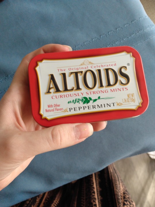
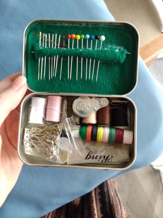
Look at my little sewing kit!!!! Altoids tins are a godsend I take this with me everywhere
They're also PERFECT for mini first aid kits, or in my case, mini chronic pain/chronic migraine kits for emergencies. I highly recommend making one if you're able to
*Editing this post and all my other ones to add an image id
[ID: a metal altoids tin, about 3.5 inches by 2 inches, with sewing supplies inside. A little bag of safely pins, varying colors of thread, a needle threader, and some buttons. The pins and sewing needles are stuck in a tightly rolled piece of green felt that is glued to the inside of the lid. End ID]
Thank you @the-love-songs-are-wrong for adding the image ID in the notes and reminding me to add them!
#solarpunk#hopepunk#punk#punk diy#diy#recycling#sustainability#cripple punk#solarpunk diy#hatchet makes stuff
1K notes
·
View notes
Text


[Image Description: A 9 paneled colored page for Linked Spirit Legend of Zelda AU. Panel 1: A close up of Wolf Link's eye, looking forward in the twilight. Panel 2: A white background clip of his wolf paw reaching up, outlined with a human hand. Panel 3: His eyes closed, half human half wolf. Panel 4: another white background section, a gray twili's hand reaching down, mirrored to Ordon's reach. A hazy "PA!" is in the white background. Panel 5: A close up of human Ordon's eye, looking pensive. Panel 6: Ordon's hair merges into a 'fur coat' of Wolf Link's patterns. He looks at the sunset twilight. Panel 7: A white-background section, with black silhouettes of Midna, back turned, and a smiling child Twili (Aror). In the middle is a cracked golden hourglass with blue sands. On the other side is Wolf Link, back to the hourglass, looking at Glider, who tentatively holds a hand out. Panel 8: Ordon has his eyes closed, thinking "If this Spirit is Time Traveling... I could go home." The scene transitions into a teal blue swirl and shattered mirror pieces, the largest shard has Midna's eye in the center. "...Or further." Panel 9: A close up of Hero's Spirit's back, the dagger in their back surrounded by a pool of blood dried into the tunic. "I just can't understand... who would hurt a kid like that." Ordon thinks. End ID]
masterpost
Happy Holidays! In this update, Ordon has "I'll be home for Christmas" thoughts, magical time travel edition, with added guilt!
First-
Timeline 1- Era of the Wild: Previous (44) - 45^ - Next (46)
Timeline 2- Era of̵͓̑ ̶̘͠ț̶̌h̷̊ͅe̵̺͠ ̵͎̓f̴͙̈o̸͕̐ṳ̸̋r̶̞̈́ ̴̭̆s̴̠̿p̶̬̈́ĩ̶̻ȑ̷̘ḭ̶̀t̸̟́: Previous (32) - 33.2
#blood tw#linked spirit#loz au#legend of zelda#loz#linked spirit au#ls hero's spirit#ls ordon#linked spirit comic#angst#its gonna get silly again in like#2 pages#just gotta let the 'Edgy' Game Guy do his thing
70 notes
·
View notes
Text
Tutorial: Editing the multi-road mod
Here are instructions for adding new tile types to the existing multi-road mod. This tutorial is applicable to unique tiles like a partly-dirt/partly-asphalt intersection, but it's equally applicable if you want to add a tertiary or quaternary road type.
However, please keep in mind that if you don't need extra tile types but only want a different kind of secondary road (like asphalt and dirt instead of asphalt and asphalt-with-sidewalks), you can skip all of this and just replace the textures inside the Textures.package file.
First things first: make sure you have textures for the new kind of tile. You'll need five versions of it, three solid (heavy/light/no snow) and two semitransparent (snowy/clear). If you open up the Textures.package file and look at the Texture Images already present, you can use existing road pieces as templates. I've uploaded what I could find of the textures I made for dirt/asphalt intersections here at SFS, but it doesn't look like I finished them; feel free to use what's there if it's helpful. (Edit: whoops, forgot to say this originally, but those textures are mashed-up versions of ones by @nimitwinklesims and @criquette-was-here.)
Second: you need a hexadecimal ID number for each new tile type. The best way to do it is to take the vanilla tile IDs (00000300, 00000f00, 00004b00, 00005700, and 00020700) and change the third digit of each one while keeping the type the same (like using 00400300 for a dead end, 00400f00 for a straight piece, etc.). In this case, I used 00205700 for a T-intersection. Be aware that the ID number will sometimes need to end with zero and sometimes with four.
When you're ready to start, open up the Textures.package file from the multi-road mod.

Inside the Textures.package file, click on one of the two Maxis Material Shader files in the list. You need the one that says "Shaders for lot skirt" near the top.

Once you've got that open, you'll need to scroll all the way down to the bottom and find the Temperate entries that look like this:
create LotSkirtRoadMaterialInstance(lotSkirtRoad_Temperate_00205700 lotskirtroad_temperate_00205704)
...and copy and paste that whole line at the end of it.
Then hit the little blue "commit" at the bottom right.

Next, open up the one that says "Predefined neighborhood materials" near the top, and scroll down to the end of it. The version of the mod currently up on SFS already has a line for '00205700' in it - looks like I forgot to delete that (and several others, whoops). If it weren't there, you'd paste this line in and commit:
create NHoodRoadMaterial(neighborhood-roads-Temperate-00205700 Temperate_roads_00205704)

After that, look at the Texture Image files. Go down the list one-by-one. You should find five with the number "00105704" in their names. Each time you find one, right-click on its name and choose Clone.

The five clones will be italicized in the list. For each one, click to open it, go to the Filename box and replace the "00105704" with "00205704", then click the little blue "fix TGI" just below it. Then click the "Commit" button in the top right.
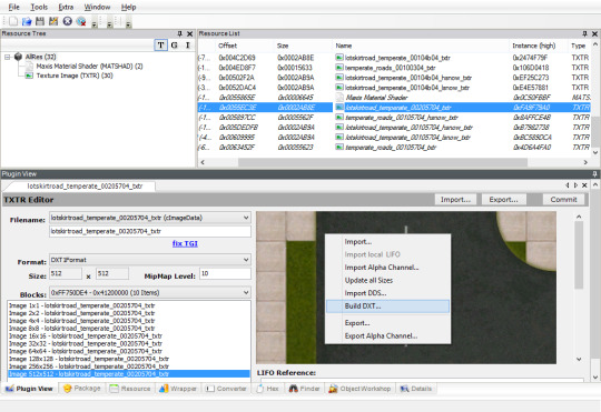
Click away to another resource and come back; this is just to make SimPE reload it. Right-click on the texture box and choose "Build DXT...". (If it's greyed out, SimPE can't find the Nvidia DDS Utilities on your computer, and you'll need to go install them and/or point SimPE to them.)

Click on the little blue "open" link and browse to the texture you created. Don't change any of the options, just open the image and hit "Build." Once the DDS tool is done doing its thing and you can see that your new texture has been imported, hit the "Commit" button again.
When you've done all of them, save the package and close. Now you'll be set up for the previous tutorial that directs your neighborhood to actually use the new tiles. You'll just be changing the ID numbers from "00005700" to "00205700" instead of "00105700" (or whatever).
58 notes
·
View notes
Text
You added an "image description" to my post - now what? (FAQ)
While I'm literally always willing to answer (good faith) questions about image descriptions, alt text, and online accessibility writ large, I also know lots of people have social anxiety about sending DMs, doing IDs "wrong," or just not knowing what IDs are for in the first place. Hence, this FAQ.
If I added an ID to your post and/or asked you to do so, and you're confused about any aspect of that, this is where to start. You can absolutely still reach out to me, I just thought I should consolidate as many answers as possible.
"What is an ID and why does it matter?"
IDs, or "image descriptions," are a description of the content of an image, and can range from a transcript of a screenshot of text, to a description of a detailed piece of art. They should be in plain text, and placed on the line immediately following the image (unless it's alt text, more on those pros and cons later).
Before we can answer "why it matters," there are two brief but crucial pieces of prior knowledge we need to establish for this whole post:
Blind people can use computers, and navigate the Internet, with technology like screen readers and Braille displays.
Blindness is a spectrum. Partial vision is common. Some blind and low vision people can't make out all the details of images, but can still read enlarged text.
Now, we're ready to answer why IDs matter. IDs are primarily for blind and low vision people, who need text alternatives to images as they use screen readers, and/or enlarged text on their devices, to navigate the internet.
IDs help others too, including lots of neurodivergent people. Check out this post (link) and the notes for more examples (dyslexics, migraine sufferers, people who can't interpret expressions, people with slow internet...)
IDs are important because without them, the Internet really sucks for people who need them. You probably don't realize how many undescribed images circulate on Tumblr every day, with no way for a lot of disabled people to engage with those posts.
A blind person talks in more detail about all of this here (link).
"I reblogged your ID, is that enough?"
It's not that I don't appreciate it, but editing it into the root post and then reblogging that is much more impactful, for a variety of reasons. It means people who need IDs don't have to dig through the notes for them, it means that Tumblr can't glitch by failing to load the notes and make the ID functionally disappear, and it means all people who find the post in the tags or on your blog will be sharing the accessible version.
To explain visually, the best thing to do is something like this:

[ID: two mock-up Tumblr posts to illustrate adding an ID from the notes to the root post. A blog named "your-blog" posts an image of text reading "something cool you posted" with the caption "check out this cool image I made!" In the notes, the blog "image-describer" reblogs with an ID, which is highlighted. This version of the post is labeled: "original post, reblogged via ID writer."
The second version of the post is from "your-blog" again, where they've added the ID directly under the image, with the same caption below the ID. This version is labeled "updated root post, with ID copy-pasted. End ID.]
"My commentary first, or ID first?"
Include the ID right under the image, followed by your commentary. Unless you're putting your commentary before the image itself, a sighted person will see "image, commentary" in that order, so to ensure the post flows the same way for screen reader users, use the order "image, ID, commentary."
Commentary frequently assumes that the reader has seen the image, after all! A person might not even realize the image is described if the ID is buried too deep, because they might lose patience and skip the post. Or, to explain visually:

[ID: two mock-up example posts with an ID, one formatted well and one poorly. They both start with an image, which is just the text "screenshot of a tweet or something." The first post includes the ID immediately under the image. Below, it continues: "commentary blah blah blah get a load of this guy can you believe it." The post is labeled "Like this!" in green with a check mark.
The second post includes the commentary first, then the ID after the commentary. It's labeled: "Reads awkwardly, deprives screen reader users of immediate context" in red with an X. End ID.]
"I want to make a change to the ID, is that okay?"
Yep! If you want me to change it on my blog too (whether it's characters' pronouns, some typo, etc), just message me.
"What if someone else adds an ID to my post? Would they also be okay with me editing it into the original post like you are?"
Almost certainly! I can't speak for everyone, but I've literally never met an ID writer who wouldn't be okay with it — because we all have the shared goal of maximizing accessibility. If you're unsure or nervous, you can always include credit, but most people are even fine with going uncredited.
"I put your ID in the alt text, is that enough?"
I will never tell you not to use alt text when the alternative is an undescribed post, but I suggest putting it in both the alt text and the post. Some people who use screen readers prefer the flow of alt text, for good reason — but it's also poorly implemented on Tumblr, and it can glitch and disappear on reblogs, in drafts, or just apropos of nothing.
Moreover, when a low-vision person or anyone else wants to read the alt text directly, Tumblr's display options aren't great. (Unless you use XKit Rewritten's AccessKit, which I will always plug, but that's not an option for mobile users.) Hitting the alt text button requires a level of fine motor control that not all people have. And, Tumblr used to use a terrible eye-straining purple background for alt text, and could always do that again with no warning. It's just not ideal.
Here's a visually impaired person talking more about the pros and cons (link).
We're in need of a compromise, so what can you do? One option is to include the same alt text as image description (placing the ID directly under the image as always, because remember, flow is important). I like to lead with "ID from alt," in order to clarify to screen reader users that they can skip the ID, and help differentiate it from the other option I'm about to describe. This should be self-explanatory, but here's an example of a post I did in this style (link).
Option two is to include a short description in the alt text, and then a more detailed explanation in-post. This can let screen reader users instantly know that the post is described, and decide whether they're interested enough in it to stick with it, but it maintains an in-post description for others to benefit from too.
Example of me doing this in a post about IDs (link)
Example of my mutual describing art like this (link)
Also, it's the style I follow throughout this exact post! Take a look!
As usual, the ID is directly below the image in all these cases. This means screen readers move immediately from the alt text to the full description, and the post flows the same way it would for a sighted person.
If you're here because I wrote an ID for you, it might be easier for you to put it in the alt text and the post body identically. That's perfectly fine! But if you're confident writing one short sentence for the alt text, and then including my ID in the body of the post, you can always go for that too.
"Do I need to keep the brackets or the words 'image description/ID' in the alt text?"
Nope, no need. Brackets are purely for the visual distinction, and regarding the "ID" label, most screen readers preface alt text with something like "Image" that fulfills the same purpose. It's not the end of the world if they're there, but it's redundant, so feel free to remove them.
"Can I put the ID under a read more? Or in small text?"
Please don't. Read mores are glitchy, and oftentimes have to be opened in a new tab. Accessibility that requires jumping through extra hoops isn't accessibility. And worse, if you change your URL or get deactivated, that read more link is usually just gone for good, and the post is undescribed again.
A blind person talks about read mores, and why not to put IDs below them, in more detail here (link).
The exception is if the image itself is below the read more, of course. Then putting the ID below the image, also below the read more by extension, is fine.
You should also write your IDs in text without any fancy formatting (by which I mean, you should write them unformatted, just like the text I'm using in this paragraph). Small text, italics, colored text, and so on are bad for low vision people or others who read the IDs directly such as with increased font size. You should not use them for IDs.
The only type of formatting you might want to consider is an indent. As far as I know, indents are a perfectly accessible form of formatting that shouldn't mess up any screen readers, or impair readability — while still helping IDs stand out from the rest of the post. Indents are optional, but can help non-ID readers know what parts of the post they can skip, which can be helpful for anyone who gets overwhelmed by a lot of text. To demonstrate:
[ID: sample indented text. End ID.]
And one more time, just to drive the point home: IDs always go immediately below the image!
I demonstrate the issues with fonts and small text in this post (link).
"Why do you sometimes copy colored text or small text as plain text? Is that a screen reader thing too?"
Same reason IDs shouldn't be in small text, italics, et cetera — because of sight readers with low vision. Small text (and to some extent, italics for some people) is hard to read, so I try to provide an accessible transcript.
Colored text is sometimes even inaccessible to sighted people using certain Tumblr themes! (I'm speaking from experience with regards to the lightest shade of blue text, on the default white background, actually!) If Tumblr gave individual users the option to disable small text and colors on their dash, then I'd tell you to use them to your heart's content, but as it stands, they're not very accessible.
A visually impaired person talks more here, about why plain text is helpful to a lot of people, but a separate issue from screen reader accessibility (link).
"Okay, I want to make my blog more accessible, but I don't feel capable of writing IDs on my own. How can I get help?"
Good news, this is my absolute favorite question! I strongly recommend the People's Accessibility Discord (invite link here, please let me know if it breaks).
It was created for this exact purpose of crowdsourcing IDs (and answering questions about them). I talk about it more in this post (link), but I also describe an alternative if you're like me and have massive social anxiety about Discord servers.
TL;DR: ask in your undescribed post if someone can add an image description, and edit it in once someone does! If you've read this far in the post, you're clearly an expert on how to do that.
In that post, I also recommend text extractors like OnlineOCR (link), OCR Space, and Google Lens to extract text from images, and save you typing if it's just a twitter thread, or something. I would always spot check the text, adjust formatting, and remove superfluous characters, but it usually saves you lots of time when you might not normally have the energy to describe something.
Lastly, a lot of description blogs take requests! I don't unless I specify otherwise, because I easily run out of spoons, but @accessible-art is a great example of a blog that does this for non-fandom art, and there are lots of fandom blogs out there that do similar.
"I want to learn how to write image descriptions for my posts! Do you have any resources?"
This is my image description masterpost (link). I get a little scared about linking it because it's long, and a lot of the linked posts are long too, and I don't want to overwhelm people — so please, start with the first few links to get the broad strokes, and then feel free to treat the rest like a index. That is, peruse it if you're looking for answers or advice on a specific topic!
While learning, keep in mind that different ID users want different things out of IDs, and that's okay. Some people, including many blind people, care quite a bit about color, but others don't, and that doesn't mean either is wrong about the types of IDs they prefer versus ones they find unnecessary.
Additional reading: Blind People Still Like to Know About Color, as a blind person explains (link)
Overall, blind people have a massive range of lived experiences, and all the other people who benefit from IDs broaden that range even more. Generally, no one involved wants huge walls of text, but some people prefer super-minimal IDs, while others prefer a nice handful of (relevant) details. It's stuff like the difference between "Two characters hugging in a cozy-looking house," versus "Two characters hugging with their eyes closed, both smiling. Their house looks cozy and cluttered, with warm lighting."
Neither of those is objectively wrong, and there will be people who prefer either. Nor is it wrong for you, the ID writer, to make a subjective judgement, such as on the "cozy" mood. You don't want to misrepresent things, but subjectivity is usually unavoidable on some level, and therefore fine. Likewise, you don't want to let the ID get so long it's a slog to get through (here's an example of what NOT to do), but if you're describing a complicated image, like some art might be, it's okay to add some details. Just start with the important stuff and general idea first, which helps with clarity.
The purpose of an image also matters. With memes, shorter is almost always better, and excessive detail is annoying (post with examples). You don't need in-depth detail to appreciate most quick jokes. But on the other hand, art is often shared for the purpose of appreciating the details. This post goes into detail about how context matters, and how longer IDs make sense for art sometimes. It puts it better than I could, so I really suggest reading it if this is something you're wondering about! Key word: not length, not brevity, but "relevancy."
In my opinion, IDs are easiest to learn by doing, but also by starting small. If you want to build up your "description muscles" and confidence by just transcribing screenshots of text, that's perfectly fine — and also, the path that myself and a lot of people I know have followed.
Lastly: follow some described blogs! Check out how other people do it! Writing IDs is an art, and though it has a few hard do's and don't's we've gone over, we've also gone over how it's subjective. Everyone brings a slightly different style, with a different level of lengthiness, and it's great to learn from multiple sources. Here's one list of blogs like those (link)!
"Why would this matter if I know I don't have any blind people following me?"
Consider the cycle of inaccessibility (link). If no one ever accommodates blind people, then of course you're not going to see them on Tumblr, in fandom, or in whatever internet circles! There are blind people who might want to use Tumblr, but left because they weren't welcomed and accommodated (link). And blind people aren't the only people who need image descriptions — again, consider this post, especially this addition (link).
Worst case scenario, even if you have no one who can benefit from IDs following you, and no people who need IDs would follow you even if you included them, you're still helping people who do maintain accessible blogs to do so — and moreover, normalizing image descriptions in general.
"I don't think blind people would be in this fandom. I mean, there's a huge visual component!"
Described comics and webcomics exist. Audio descriptions for TV shows and movies exist. Disabled people who find creative ways to play video games exist. People who watched a playthrough of a video game by a let's player, who happened to read out the dialogue, and give descriptive commentary on the action, also exist. People who lose their vision over time, or gain other reasons to rely on IDs over time, also exist.
"Where can I learn more about blindness and related accessibility issues, especially from blind people themselves?"
Wonderful question — check out @askablindperson and @blindbeta for starters! BlindBeta focuses on blind characters in fiction, but discusses accessibility too, and both these users have wonderful and very informative pinned posts! I'll link a few additional posts/tags below, from both these bloggers and others:
BlindBeta on Myths That Harm Blind People
"For a lot of blind and visually impaired people, sight is a conscious effort."
Variation in blind experiences and accessibility needs
Ask A Blind Person's tag on Braille
113 notes
·
View notes
Text
"it's not an accessibility problem or a symptom of systemic ableism if the OP doesn't add the image description to the original post, people can just reblog it from you if they want to. Asking people to add the ID to their post is rude and self-absorbed"
the only people who think this way are ableists.
You know all the Mickey Mouse art I hurt my wrist frantically writing image descriptions for?
Yeah, a lot of it is being reblogged without any image description now with thousands of notes, because people only see the original post, they don't bother to check the notes to see that there's an ID right there that I took the time to write.
Tumblr encourages you to reblog a post as soon as you see it, and people who don't make a conscious effort to stop and try to be accessible do not take the time to stop and check the notes for an ID before rebloggging.
Adding an image description to your original post, and any important reblogs, is the most accessible thing you can do, second only to writing the post with an image description in the first place.
If you actually care about disabled people (or disabled people other than yourself and a select few family members), then when someone takes the time to write an image description for your art, add it to the original post or reblog. I don't care how many notes the post has, if you care about disabled people and care about accessibility, do it.
Especially if you're ablebodied. Many people have said it before me, but it's absolutely evil how most of the people on this site who write image descriptions are physically disabled, the people who have to put in the most amount of effort to do so, at the highest cost to ourselves.
It's been 4 days since I hurt my wrist typing so many image descriptions. It's probably going to continue hurting for another few days at best.
If you are physically abled and will not be put in literal physical pain from writing image descriptions, then you need to start writing them. It shouldn't always be left to disabled people to do all the heavy lifting for accessibility. If you call yourself a leftist or a communist or an anarchist but won't even write an image description for your art or memes or even edit it into your original post, then just stop pretending you care about disabled people, because you clearly don't.
See this post for tips on writing image descriptions.
If you do nothing else please start checking the notes for an image description before you reblog undescribed art. It's the absolute bare minimum.
#ableism#systemic ableism#image descriptions#accessability#Mickey Mouse#art#artist on tumblr#small artist#cripplepunk#cripple punk#actuallyphysicallydisabled#actually physically disabled#physically disabled
148 notes
·
View notes
Text
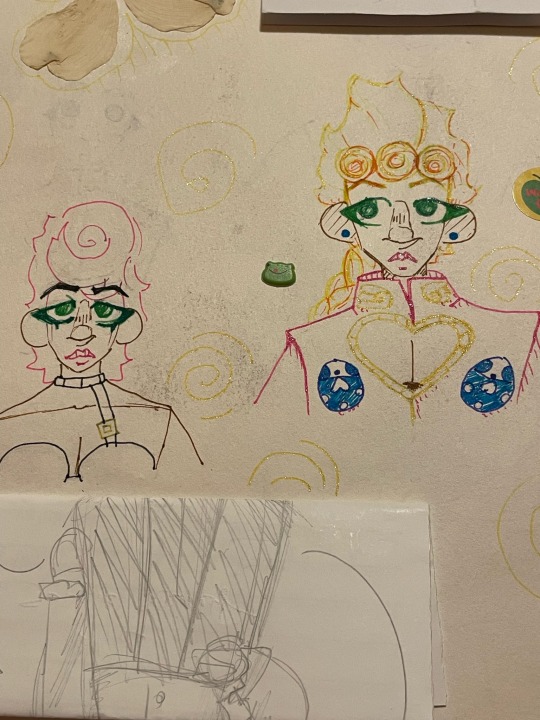
old art compilation!!! (Jojo edition) This is all from 2023 :]
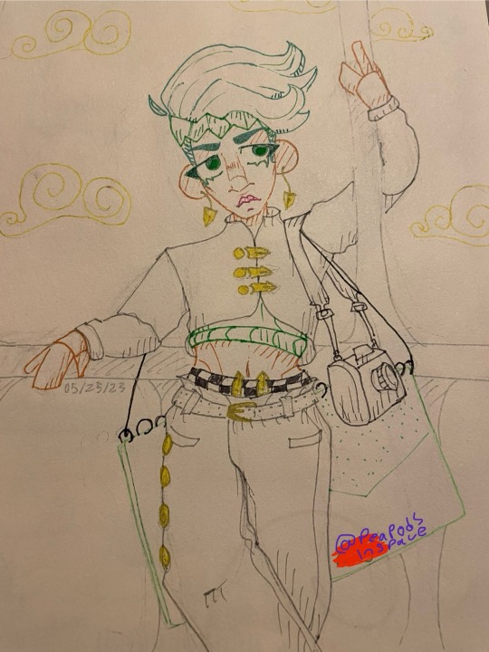
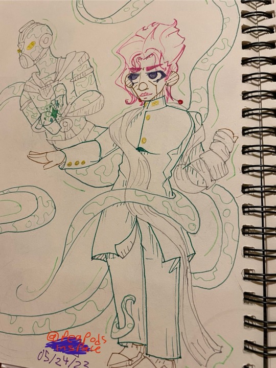
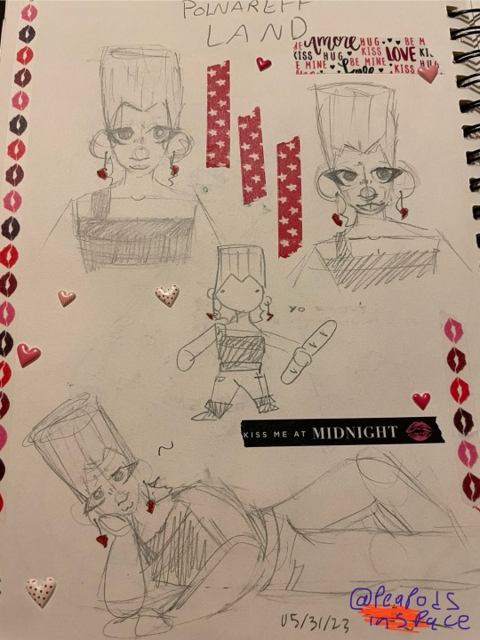
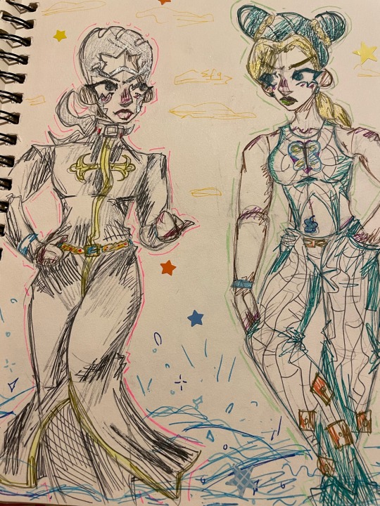
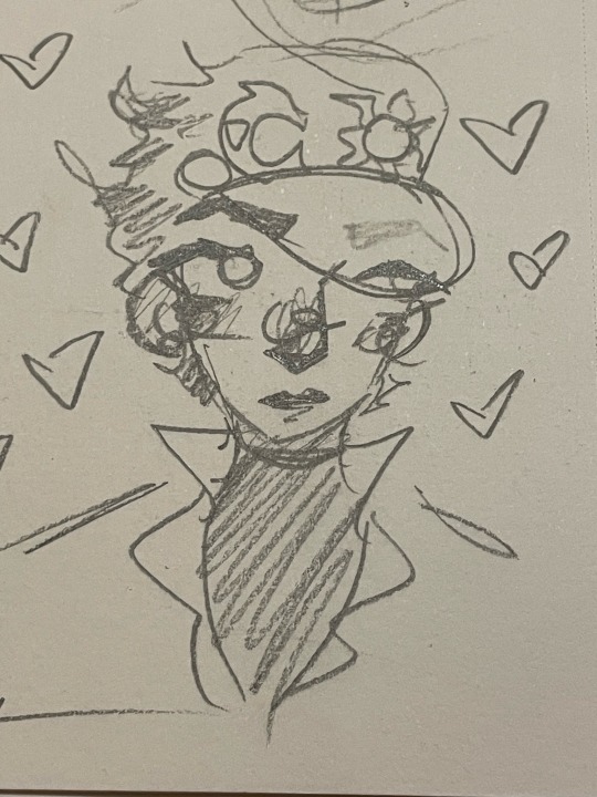
[Image ID in alt text]
The first photo is my first ever jojo fanart !!
The scribble stuff is me adding my url over my signature btw!
#my art#art#doodles#jjba#jjba fanart#traditional art#old art#golden wind#vento aureo#jjba part 5#jojo part 5#stardust crusaders#jjba part 3#jojo part 3#diamond is unbreakable#jjba part 4#jojo part 4#giorno giovanna#trish una#rohan kishibe#noriaki kakyoin#hierophant green#jean pierre polnareff#stone ocean#jjba part 6#jojo part 6#enrico pucci#jolyne cujoh#jotaro kujo#described
54 notes
·
View notes
Text


[ID: An edit of Dragona and Jodio Joestar from a JJBA Part 9 color version chapter cover page. Dragona is dark skin and Jodio is brown skin, and they both have gold eyes. Dragona has butterfly locs and black shorts with frayed edges added to her outfit, and Jodio has curly hair and his braid is instead a singular loc. In the top left corner is the date 10/25/2024 and my signature. The second image the original chapter cover. (End ID).]
The first legit edit I’ve done in quite a while or, I’m going to start posting edits along with my illustrations 😁👍🏽
#im tagging this as black edit but idk if that rlly counts here cuz like they’re already Black#black artists#black artist#jjba#jojos bizarre adventure#dragona joestar#jodio joestar#the jojolands#jojo no kimyou na bouken#black edit#edit#gs.edit#october 2024#2024#described
27 notes
·
View notes
Text
yayyy so while I was at the print shop I also printed out some gift art I've received over the past years! I get the feeling I'm forgetting some things so if you've ever given me anything and you're like :((( how come my drawing isn't on here PLEASE tell me I would love to print it out too


I am supremely fond of the eishi in the upper right corner in the first picture by @wojtekaneko and you can tell bc it's chilling on my stream every time and also it's my avatar on like. fugitech or whatever. closest thing I have to a pngtuber avatar. I like it a lot but it's kind of small BUT THAT'S OKAY!! GO TO WALLET JAIL!!! (inspired from @tiny-crane 's wallet sulemios)

It's actually really great because that's where I keep my government IDs which still have pictures of me with long hair. I get jumpscared by it whenever I'm out with friends I haven't come out to yet so it's good. look at my boy, boy!
I also added a really simple background which i only realize now maybe I should have asked permission to do that. woops.
You can't tell in the wallet jail picture but the paper that one is on actually has tiny gold flakes in it so I thought @vampiregokudera's black and white fanart of noe would look really great with it and I was right! There were gold sparkles in the wallet karasuma picture so that was nice. You can't tell as much in @kitsoa's takayama sagisawa picture but that's okay, that one is just full on gorgeous even without it and also you can see it if you squint. Well, I can, anyways.

you can see it best in this photo near the glass of water and the deck of cards bc that's where the light is hitting it there. I'm thinking these two are going on the closet door. and I guess I should also apologize for editing out the graph paper in the noe pic!! I'm sorry!! Please forgive me!!!

I was so obsessed with trying to capture the pearlescent sheen of the paper that I totally forgot to take a neutral picture of these two gorgeous images also by @wojtekaneko!! I just love the color palette of this set so much.
I'm still musing about where these two ought to go. I'm just happy to have them, honestly...
#just thinking thoughts...#stray bird thoughts#yayyyy I can print picturesss#REALLY HAPPY TO HAVE A SAGISAWA AT LAST! ! ! ! !#with takayama no less. hooohhhh it's SO good. it's so good...#I'm also so happy with how all the paper choices turned out I think I'm getting better at picking materials!!#low key it's a tiny bit sad eishi is in wallet jail because you can't see the gold flakes at ALL and it actually shows really nicely in tha#BUT ITS OK!! WE HAVE THE NOE ONE#I'm honestly blown away by how handsome he is lolll like damnnn#URGHHH IT"S CRAZYYY I'M ACTUALLY KIND OF ATTACHED TO MY CHORUS BLORBOS#I look at ania's aengsang and I'm like ouuuhghhghghg my girl.. sob. my girl.#REALLLY good that she and saki are on opposite sides of the table. you get it! ! ! ! ! ! ! ! !!
18 notes
·
View notes