#character design rambles
Explore tagged Tumblr posts
Visit Tumblr Blog
Explore Tumblr blogs with no restrictions, modern design and the best experience.
Last Seen Tumblr Blogs


Fun Fact
Tumblr’s reach among the 26-to-35-year-olds in the US is 11%.
Text


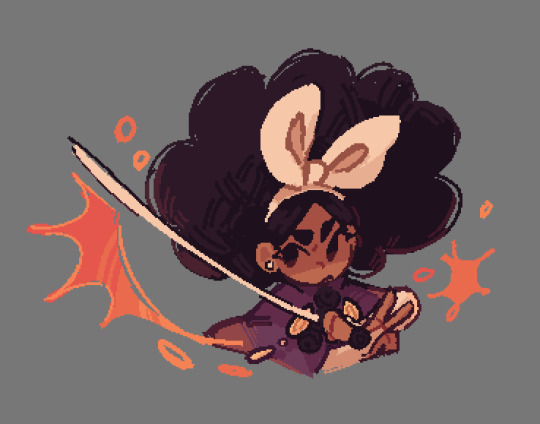
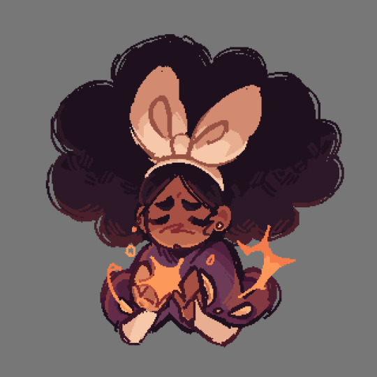
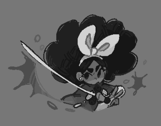
Ta-daaaa!! Here is my design for Pénelope from the Odyssey, thanks to my current obsession with Epic The Musical! (Jorge is a genius. Bless Jalapeno man)
I based the designs from what i imagined Pénelope to be and the many inspirations i got from old interpretations/paintings of Pénelope, and getting slightly inspired by Gigi's design for her ^^'
The veil around her arms is actually supposed to be based on some interpretations have her wearing one! But, it didn't look good for the design i was doing. So i opted to have her wear around her arms!
The necklace was a bit harder to choose, i couldn't design on which look i should use <\3
I should have started designing the characters from the Odyssey/Epic the Musical by starting off with ODYSSEUS himself but.... I'm not that good at designing men, i'm not gonna lie I wanted to design Pénelope first... But Odysseus is definetly gonna be the next one i'm designing!
#artists on tumblr#artwork#digital art#art#fanart#character design#character design rambles#Epic the Musical#the oddyssey#Or The Odyssey??#i don't know if it's two d's or two s's....#Pénelope of Ithaca#Pénelope Epic the Musical#Pénelope the Odyssey#Honestly#i'm proud of how my design turned out!! i was actually a little worried it wouldn't look too good#haha. BUUUT it does looks good! and once again#i'm proud!#The purple called to me when coloring her
137 notes
·
View notes
Text
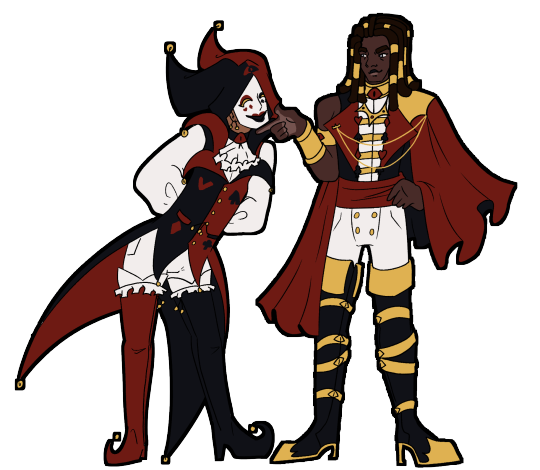
Redesigning Jester
I've been working on trying to pull my story about Kings Court into something coherent and presentable, and as I've been going through that process I've been realising that I need to redesign some of the characters!
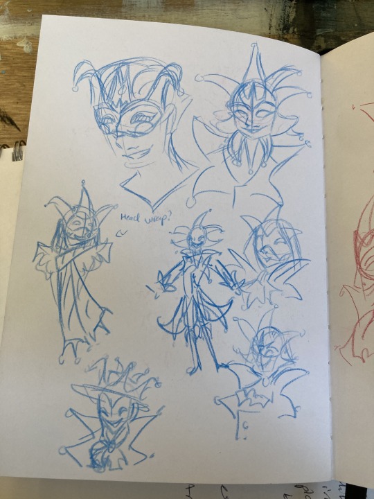
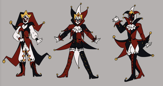
The first character I've been reworking is my beloved Jester! Here is their original design:
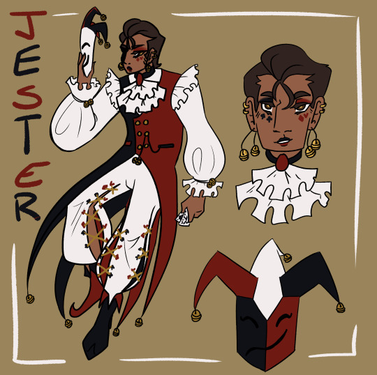
I did really enjoy this design! But as time has gone on there have become certain pain points, and as the story has developed there are things I want to incorporate more strongly into the design. You can see a detailed breakdown of the re-design goals and process below the cut!
The mask - it needs to be a feature, not an afterthought.
As much skin as possible should be hidden, I want to play into the Jester as an anonymous and mysterious entity.
Simplify - the four tail coats are far too unweildy, and the pants proved annoyingly intricate with repeated drawing.
Ensure that the design is fun and exciting to draw in motion! Jester flops around a lot.
Incorporate an additional motif to reflect role in the court.
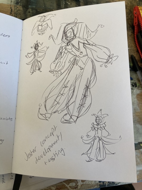
I began the process by looking for inspiration and reference material, particularly for the mask. I collected a variety of reference images onto a pinterest board to use for inspiration and then got to sketching! Here are some of the initial exploratory sketches.

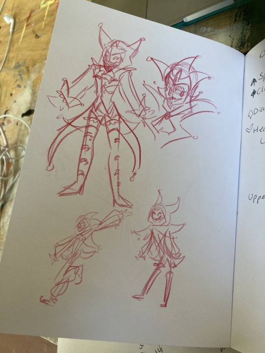
After the sketching process, I started working on some more finalised concepts taking what I had explored in the sketches, exploring the ways to combine shape and colour, and also getting feedback from friends.

I then did a set of concepts all next to each other taking some of the ideas I had liked from these concepts as well as trying to add in some new things.
Silhouette was a major consideration throughout these concepts - as well as experimenting with the mask design. The first and second designs proved the most popular, and also worked as my favourites. And so moving forward I decided to combine elements from them both. Namely:
Collar shape from design 1 - it's dynamic, fun, and interesting!
Hood based design from 2 - I like the framing of the hood.
Two pronged vs Three Pronged design from 1 - Easier to draw repeatedly and manipulate in dynamic ways, I think it gives a more dynamic flow to the design as opposed to the triple prong potentially being a bit more static.
Thigh high boots from 2 - my friends like them and I like the way they make the legs look long.
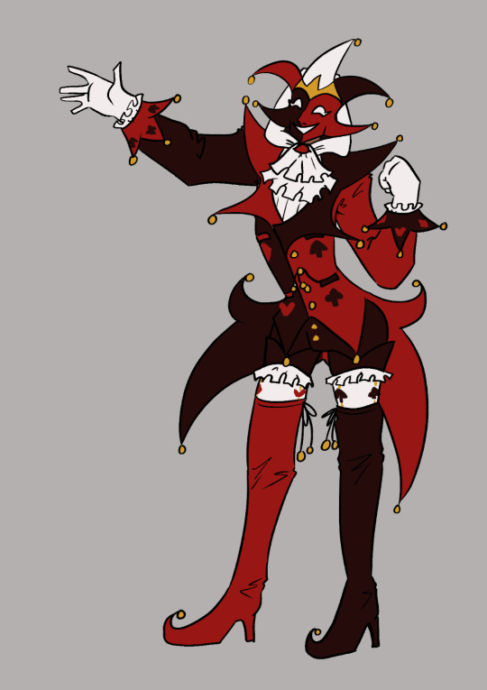
I also knew that I wanted to make sure that the design I came up with fit with the design of another character - Jack, and also play with poses to see it in motion, so for the next tests, I decided to work on them both simultaneously and have some fun drawing them interacting!
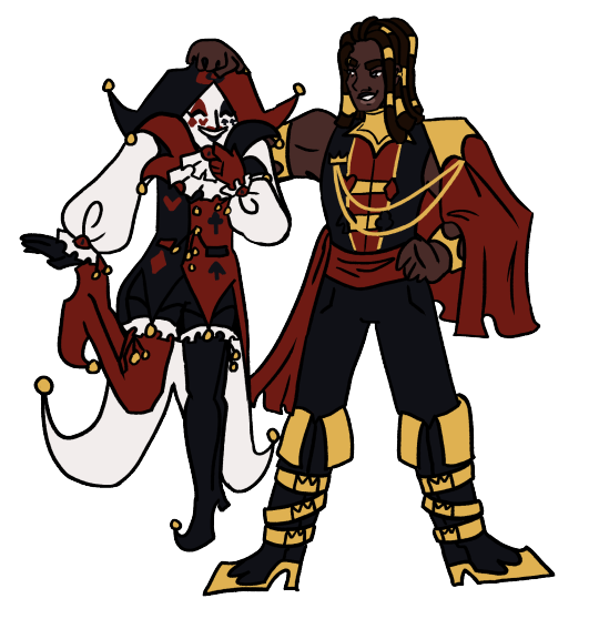
As you can see, I had settles fairly well on the overall shape of the design, but still made some minor tweaks between images - mostly to do with the placement of the colour blocking. I also changed the mask design here from the previous iterations as they felt too cluttered and overpowered, and I also really enjoyed the design from the makeup Jester had in his original design, and realised it could transfer effectively to the mask design! Another thing that changed is I removed the crown motif I had started to develop, and tried to focus more strongly on incorporating an eye motif. This was a change made as I sat and considered the lore and symbolic implications, and I ultimately decided it worked best if Jester had the eyes and Jack had the crowns. King and Queen will likely have both when I get around to redesigning them! I still have some more playing around to do to settle into the final design before I make a proper reference sheet, as I'm definitley finding drawing the design in context helpful to get a sense of how it operates in practice and streamlining. I'm currently working on a mini PMV project featuring Jester which will hopefully help me solidify the design! But I'm feeling pretty happy with it so far.
I want to do more discussions of my design/redesign process in future as I find it really helpful and interesting to organise my thoughts like this. It's also exciting to see the progression all laid out, I'll probably do a similar thing for Jack soon!
#oc art#art#character design#character design rambles#redesign#pandemonium#jester#a long extended exploration of my process in redesigning my beloved jester#i just wanted to ramble about all the things going through my brain i hope someone finds it interesting#i like reading about peoples processes and considering my own its interesting!!#creative process
10 notes
·
View notes
Text
TIME FOR ANOTHER OC INFODUMP!!1!!1!!

*sobs in Cosmos Siblings pre-SpaceAges*
Infodump/ramble under the cut!!!
SO
Im not gonna lie. I don't have much lore/angst this time cus, honestly I feel like I've screamed enough about their dynamic and struggles in the Comet post. But!!! I have character design notes!!!
So brief recap: Shapeling's define themselves a lot on their shapes, but they also display who they care about by wearing the color of the other person. This is no different for the Cosmos Siblings (at least before SpaceAges, that is)
Starlet: wears a lot of purple both for her mom and Spacey, since she's closest with both of them at this time. She has orange accents for Comet, and her socks (not pictured) are green for her dad. Her outfit is pretty simple here, mostly to represent that she's not had much character development at this point in her story. (I tend to add more to character's designs based on how far along they're at in their own arcs)
Spacey: His outfit primarily features orange for Comet, as he's the closest to her because he's her caretaker. He has some green accents for his dad. The second most prominent color in his design here is purple, both for his mom but also secretly for himself at this point. At this point in the story, he's starting to question if he'll ever be allowed to be his own person, and he's starting to push the boundaries of what a heart shapeling is supposed to do by putting himself first sometimes. However, he still worries he'll get in trouble for it, so the fact that his mom is purple too is a good cover for it. His boots are yellow for his twin sister, Starlet. He actually specifically requested that his boots be yellow because Starlet keeps him grounded, and he wanted to show his appreciation for that.
Comet: Her outfit, while seeming to mostly consist of green for her dad, is actually more layered than you might think. She wears green skirteralls to outwardly show that she appreciates her dad. (He's her favorite parent), but wears a dark purple shirt underneath because she actually feels closest to Spacey. She also has light purple socks for her mom, and her hairbands are yellow for Starlet.
Some general design notes!!:
-The Cosmos Siblings have a pattern in their hair designs! Spacey has 3 tufts of hair that are more prominent at the top of his head, Starlet has 2 tufts, and in later designs Comet always has one piece of hair that sticks out more than the others! (It's sort of noticeable here as the bump between her hair buns)
-They all have different tail types! Starlet has a longer tail with a tuft at the end, Spacey has a simple, straight tail, and Comet has a fluffy tail.
-I brought the toe beans and claws back. I am aware these will be a pain to animate, and i will most likely forget to include them sometimes, but let's please just assume they always have them.
-For reference, the way I first described Shapeling's appearances was "humanoid creatures with a wolf snout and butterfly wings" However i still have no idea if they have fur or if that's just their skin. It's up to interpretation at this point. Have fun with that, everyone. XD
#original character#oc#art#oc brainrot#spaceages#lunierambles#like fr fr infodump#character design rambles#there's a reason for everything i swear
3 notes
·
View notes
Text
pov: designing a new oc

2 notes
·
View notes
Text

I just remembered that I'm no longer keeping it a secret that the Patriarch is Abel in my Harlequin AU which means I can actually draw my own version of Abel in canon TADC

Anyways he's a carnival barker in my own interpretation, and is in charge of the carnival on the circus grounds
I'm kinda surprised no one's had the idea to make Able a Carnival barker to parallel Caine; who's a Circus ringmaster-
#ziku's insane rambles#tadc#the amazing digital circus#tadc abel#able tadc#character design#tadc able#able#tadc fanart#caine#tadc caine
2K notes
·
View notes
Text
This Should've Been an Email
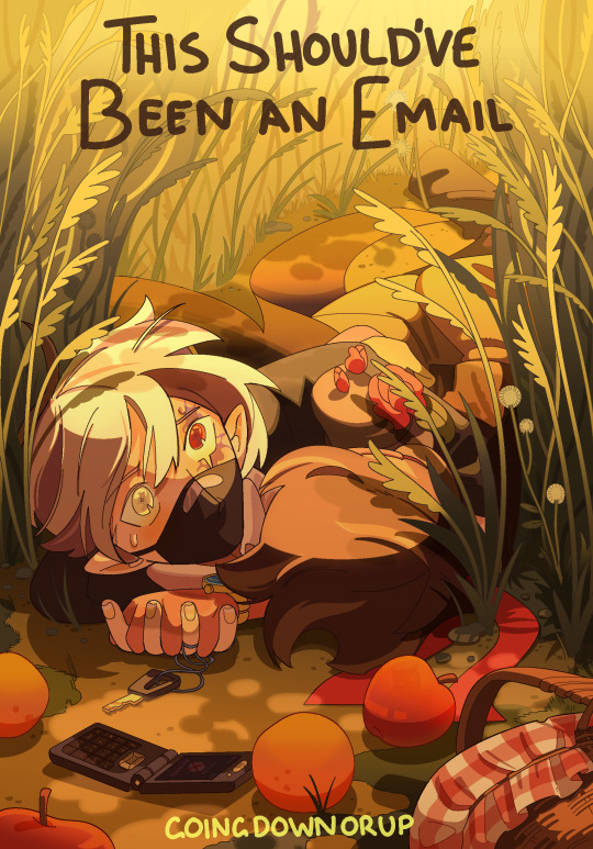
His mouth moved without it telling it to, then closed like whoever was possessing him didn’t know what to say either. There was something going on, something Etho could feel but didn’t understand. They were standing on the edge of the world, and Etho didn’t know how to tell Bdubs he was out of time. Was he out of time? Maybe he was just going insane again. Maybe-
“Etho, there’s a lot of void energy going on right now, can you focus-”
You can’t outsmart a god. You can only run.
-
[ READ HERE ] Latest addition to the Should've Could've Would've series and sequel to the YCAOverse byyyy incredible great @goingdownorup cinemaaaa is HERE and we are BACK IN THE BUILDING!!!
[rambling undercut]
you've fallen for my trap card, ramblings not about the actual fic yet sorry - I'm going to talk about art technicalities at you now :]
Ver without the text:

I drew this up on a whim immediately after finishing the first chapter. Other than it being fanart, this year I want to think smarter when making elaborate pieces - this being the one of the first experiments on it.

sketches have always been my starting foundation I usually go through a few iterations gradually building off the rough thumbnail all the way to lineart. Here I'm establishing perspective and rhythm (movement), using background and props to better frame the emphasis (focal) rather than overwhelm the eye with unnecessary detail.
Shirahama's Witch Hat Atelier manga panels were an inspiration for the lineart (reoccuring character. WHA changed my life)

I even started actually putting base colours instead of skipping to shading... BASE COLOURS. BASE COLOURS WITHOUT SHADING? Crazy world we live in. Above were me testing which colours worked best for the background and purpose. Ethubs look a little out of place atm - this changes in solid filters

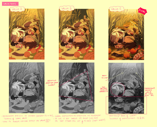
Shading itself was a lot of back and forth in constant fumbles to maintain the rhythm instructed in the lineart, adding emphasis how values needed to carry the visual communication of this piece especially with a line heavy background because of the wheatfields. Everything uses either cel shading, filters, or gradients - I wanted to find a way to add complexity to my regular rendering style without needing to manually blend/paint (takes too long)
During this stage, Heikala's watercolour art was the study in crowd control (backgrounds with organic repetition)

Smaller misc details that couldn't fit anywhere in the previous pages. Overall while there are some things I still would change/redo, overall very pleased as a first (second) attempt ^_^
#stufffsart#character concept stufff#stufff rambles#ycao au#<- Going to be my catch all tag for everything of that tl#This Shouldve Been an Email#ethoslab#etho#bdoubleo100#bdoubleo#bdubs#ethubs#(theres a third person if you can spot them)#hermitcraft#hermitblr#mcytblr#theres still other things from the sequel i wanna draw (jizzie designs - gem and cleo etc) thatll have to wait#this cover and my other fancover are so stylistically different whwhwh
1K notes
·
View notes
Text
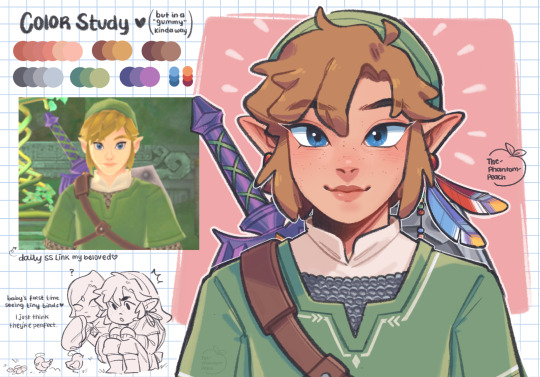
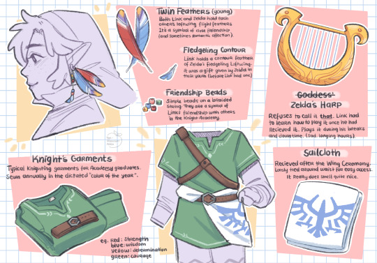
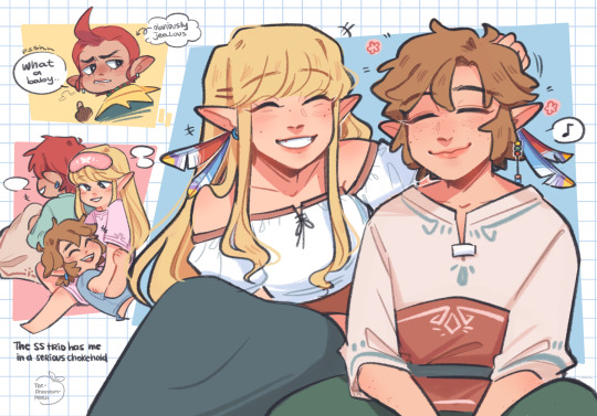
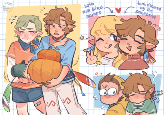
skyward sword… yeah <3
Crimson Loftwing
↻ ◁ || ▷ ↺
#exploding the entire Skyward Sword ost with my mind#thinking a lot about SS lately#I could fill your dash with how much art I make of this game I’m so so obsessed with it#I did some character design stuff and misc doodles for funsies so I post here#feels so nice to make art for a game I loved so much as a kid#still top 3 loz games idc#I hope younger me is happy haha#okay please stop rambling#the legend of zelda#legend of zelda#skyward sword#tloz#loz#loz ss#skord#ss link#ss zelda#ss zelink#link#zelda#zelink#groose#fi#fledge#pipit#zelda art#nintendo#art#artists on tumblr#my art
5K notes
·
View notes
Text
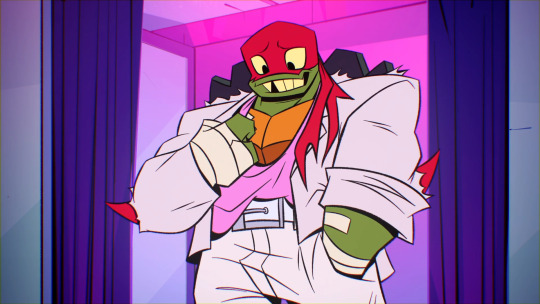
✨The Fashionista✨
Rise Ramblings #234
While watching “The Clothes Don’t Make The Turtle,” I noticed something.
I found it interesting that Raph, Mikey, and Leo were content with Raph’s outfit choice until Donnie stated that he wasn’t “in love with it, ya’ know.”
Suddenly, Raph declares “I’m a disaster!” Albeit ridiculously endearing, it was a little strange to see his sudden shift from moderately content to absolute dissatisfaction. Huh…
Then, the disaster twins decide to help him out.
Take a note of their outfit choices.
Raph tries on all of these fits and more.
Donnie’s first choice is a mild “no.” Leo’s choice is a hard “NO.” (Not surprising, lol.) But then, the overwhelming consensus lands on Raph’s fourth outfit, which ended up being Donatello’s other pick for his brother.
So, in summary, Raph tried on his personal choice for an outfit, of which they rejected. Then, ultimately, Donatello picked out an outfit for his brother, and that pick ended up being perfect. Hmm…
Then I noticed something else. In this episode, we never get a Donnie “curtain reveal” moment, to our disdain. I mean, Raph, Leo, and Mikey got to try on several different outfits in order to get their brothers' opinions before landing on that “perfect outfit, you know the one.” All of his brothers got to shine. Why not DonTron?
Then it hit me.
The try-ons were to get their brothers' opinions and approval. And, for his brothers' choices, he was a major contributor in assisting them in pulling their looks together.
What if, bear with me, Donnie didn’t need the "curtain scene" because he was so confident in his fashion sense that he didn’t need to ask his brothers for help to pick out a great look.
…or they figured out how to break Hypno’s spell before he could get a “curtain reveal.” BUT STILL-
Look at his outfit choices in this episode. Some of his wardrobe changes were off-screen, but all of them were fire.

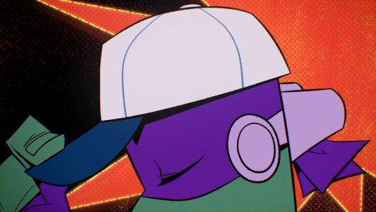
(I added the baseball cap pic because it makes me happy. I wish we'd seen more of that fit.)
To me, he makes some really smart choices for himself, pushing the envelope of what is expected and taking chances: an open collar with no tie for a “black tie” event, a beanie and spiked wristbands for their “gansta look,” no socks with loafers (a viral fashion trend that actually began in Africa) with old man slacks in his reclined pose. *muah* Chef’s kiss!
But Don’s fashion sense doesn’t just shine in this episode.
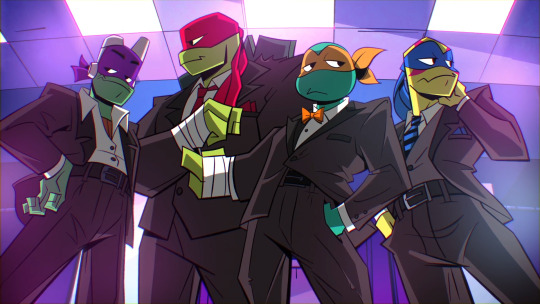
In “Reparin’ the Baron” the boys go to Draxum’s apartment. Leo and Donnie show up in some extra nice “Sunday Dinner” twin drip.
The gold is in the details. Everything Leo is wearing, Donnie rocks its compliment: for Leo’s round collar, Donnie’s is angled, for Leo’s blue shirt, Donnie’s is white, For Leo’s light slacks, Donnie’s are dark. Blah blah blah. It’s so good!
Look at the winter fit in Snow Day.
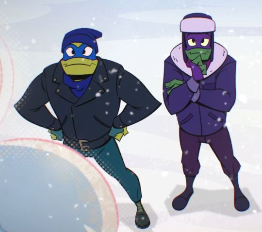
Again, Donnie is Leo’s perfect compliment. As a pair? Fire.
Donnie has “the eye.” I can go on and on with examples, but I’ve said all of that to say this…
In the future, we see that Donatello’s technology had major pull in the resistance. He had drone ships patrolling the skies. He built and designed Leo’s arm, Casey’s chainsaw-hockey stick, and Casey's mask. The list goes on…
But, when Donatello from the past see’s Casey’s clothing from the future, he says this:
We know about the “Genius Built” brand. We’ve seen that logo on all of his tech up to this point. But, here he didn’t just say “Genius Built.” He said, “Genius Built Apparel.”
“Apparel” is not a tech brand. “Apparel” is a fashion brand. Of course, tech is incorporated into the clothing, but still.
This means that past Donatello secured this trademark with plans of creating a fashion brand, comparable to the likes of Gucci, Ralph Lauren, or any other modern clothing brand, as a subsidiary of “Genius Built,” the tech company.
And why not? The evidence has been in front of us this entire time. He has a sharp eye for style, fashion, and trends. It is easily canon that he can sew. Splinter sewed their ninja garbs in “Insane in the Mama Train,” and there is a sewing machine in the house.
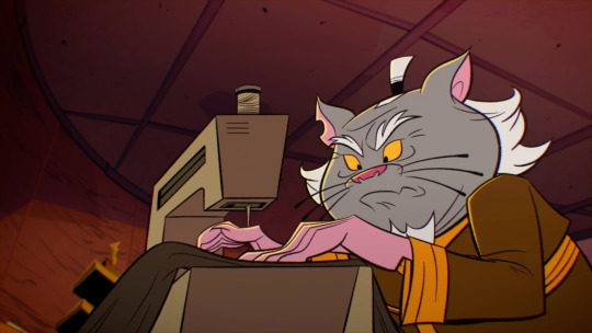
They already learned Ninjutsu through basically osmosis, so learning to sew is not too far-fetched.
And here it is, right in front of us, Casey’s entire ensemble, from mask, to weapons, to clothing, was made by Donatello in the middle of the apocalypse under the brand name “Genius Built Apparel.”
And that was just in the bad future. Resources were limited, they didn’t have access to much of anything in that broken world as they were survivors of a devastating Krang invasion. Yet, he created all of this.
However, now that they’ve changed the future, his future as a fashion designer is limitless. Think of what Donatello could produce with unlimited resources, unlimited technology, and unlimited creative freedom.
Tech genius. Clothing designer. Fashionista. Future Genius Built Apparel Owner and CEO. I’m sorry, but I have to call it...
Donatello Hamato of the present, of the bad future, and of the good future is a fashion icon, the likes of which the world has never seen. ○○○○
Update: I've decided to make this concept into a mini-comic series!
2025 Update:
I've also made this post into a YOUTUBE VIDEO!
Video Preview:
You can check that out →→→ HERE ←←←
○○○○
🎞 YOUTUBE 🎞 | 💚 SEND A SLICE 🍕 | 🎵 BANDCAMP 🎵
#Tech Genius#Clothing Designer#Fashionista#Future Genius Built Apparel Owner and CEO#Fashion Icon#Donatello Hamato#Donatello Ramblings#starkiss ramblings#rise analysis#rottmnt analysis#character analysis#rise don#rise donnie#rise donatello#rottmnt donatello#donatello#rottmnt#tmnt#teenage mutant ninja turtles#rise of the teenage mutant ninja turtles#rise of the tmnt#tmnt2018#tmnt 2k18#tmnt 2018#save rottmnt#unpause rottmnt#unpause rise of the tmnt#save rise of the tmnt#save rise of the teenage mutant ninja turtles
7K notes
·
View notes
Text

learned something about myself lately
#i dont think its even the fact almost all my characters are somewhat beasts in one way or another. i just#really like tails and wish i had one myself#and then my oc designs are a little tame theyre mostly human shaped with animal features. but they always have tails#my eyes have recently been opened to the appeal of long whiplike unicorn tails.. so flowy and curly#something about the tuft at the end being long and swirly just does something for me..#maybe it would make sense to change auggies tail shape so it looks like a meteor. her design is mainly pink with hot pink accent#so it would be cool to use that and orange to make it look like a fire meteor.. maybe itll help complement the blue/green in her design#head full of ocs today so expect a ramble later#if i had a tail i think it would be long with a kink. so it kind of folds over once but not in a curl#when it wags its kind of a swaying motion. i have thought about this a normal amount#yapping
9K notes
·
View notes
Text
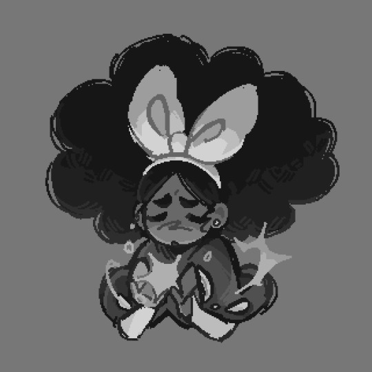
Ok so. I've been trying to design Odysseus for a while BUT GOD, HE IS?? SO HARD. TO DESIGN. I DON'T GET IT-
I got every past interpretations of him from history! I TRIED TO BE FAITHFUL, WHILE ALSO WANTING TO ADD MY OWN SPIN LIKE GIVING HIM GREEN FOR HIS CUNNINGNESS AND A RED CAPE TO CONTRAST WITH THE BLUES OF MY PENELOPE DESIGN- BUT NOTHING WORKS.
#artists on tumblr#epic the musical#rant post#Personal rant#character design rambles#odysseus#epic the musical odysseus#I DON'T GET IT#WHY IS NOTHING WORKING OIT#WHY CAN'T I BE SATISFIED <\333#Gosh i just siren Penelope to take my suffering for me#haha suffering son reference hahahaha#(i am losing my mind)
24 notes
·
View notes
Text
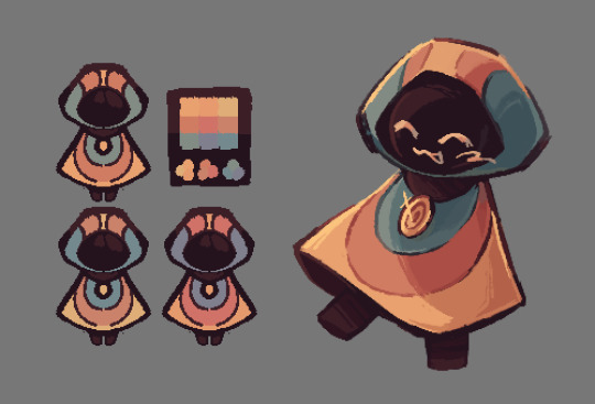
HAPPY (kinda late oops) BIRTHDAY MIWA!!!!!!!! ignore the other two LOOK AT HER!!!! IT’S MIRABELLE MSUNDAY!!!!
greyscale versions + my very normal color ramblings below!
ok full disclosure i already had this post drafted before realizing that mira’s birthday was coming up. i kinda debated just posting the mira doodles on their own but!!! i want to talk about my craft/general color headcanons still. and the mira art is part of that!! so be warned. also, this is going to reference my post about my craft headcanons a lot so like. read that if you so desire.
i personally think that mira’s healing craft is some form of creative craft, since the game describes her holding her palms up when she uses it (iirc anyways). this doesn’t really have an effect on anything, but it’s why i decided to color it yellow!
(also i ended up making mira’s scissors craft a lot more orange than i initially planned but that’s ok!!! i think both of her crafts would be pretty Orange. just thought i’d mention that since it’s a bit different from my first post)
i already explained sif’s craft in my last post so now i get to talk about the change god!!!!!! this is like. probably the most out there in terms of my color headcanons? but i have a reason for that. since the change god is, well, a deity, i thought it would be fitting for their design to match the colors of the 3 craft types (red, blue, and yellow)! this was a little hard to work around given that i also try to give my vaugarde designs warmer color palettes, but i think it worked out!
i also gave them a few slightly different palettes, since i think it’ll make sense for the change god’s colors to be variable. they never look the same, so why would their palette look the same? + i’m indecisive and liked all of these palettes lol
sorry for the ramble! i really like talking about character design and i’m not. very succinct. thanks for reading all this (if you did, perfectly fine if you didn’t!), here’s the greyscale versions as promised!!!
#marshdoodles#isat#in stars and time#isat spoilers#HAPPY BIRTHDAY MIRABELLE!!! sorry for hijacking your birthday to ramble about colors 🩶#i usually reserve my character design infodumps for the tags but i REALLY wanted to talk about my change god design. sorry#dont mind the fact that the change god palette looks like mettaton#this isn’t the first time i’ve drawn the change god btw! i just. haven’t posted those#because they’re for isatscryption#also posting this at a different time than usual because i don’t want to actually miss her birthday lol#anyways again!!! sorry for the infodump!!!!
3K notes
·
View notes
Text

Brand new God
#this is actually a character who I put a lot of thought into design-wise and is something I'm very attached to#I can ramble about it if anyone is interested#characters
1K notes
·
View notes
Text
*falls through the ceiling and comes crashing to the ground*
SECRET LIFER DESIGNS BUT THEY ALL HAVE PERSONALIZED LIKE, BOOK HOLSTERS FOR THEIR TASKS THAT THEY GET EACH SESSION

#sorry i just got excited#i find it fun to think of how to include gimmicks in the designs *sometimes* and this is what i thought about for sl#character designs#related#secret life smp#secret life spoilers#kinda#my art#struda rambles
7K notes
·
View notes
Text
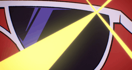
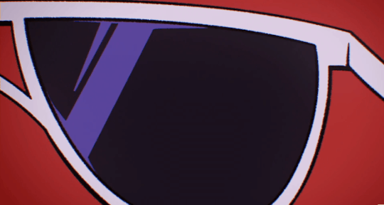
V's glasses: an analysis about how a single item tells a story.
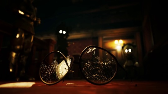
The glasses are a symbol of the old V. The weak drone at the Elliot manor who was taken advantage of by the solver, who couldn't stand up for herself.
Seeing her glasses shattered by the solver seems like she lost that part of herself. It seemed like a loss, the start of her decent into insanity. But when N puts them on later in episode 5, she sees what she's doing, and for the first time tries to fight though the solver in her head.
Obviously, it still didn't work, and that was kind of the last we see of this V. After this, she got turned I a disassembly drone and starred to loose her mind over how weak she used to be and her obsession with proving she isn't that person anymore.
She spends the rest of the show trying to protect N, but too scared of telling him why, which buried her deeper into this hole she dug for herself and she unintentionally hurt the one she was trying to protect.
Things will never be the same again. But the next time she wears her glasses in episode 8, it's an important moment I don't think enough people talk about. The glasses are shattered, like her old self.
But she still wore them. Because she finally came to terms with the past. And when she wore the glasses, she was able to use the strength and weaknesses in both versions of herself.
She cares about the people she loves most, who are N and now, Uzi too. She'll do anything to protect them. The selflessness she had in the past comes back as her sacrifice, while her current day strength is able to stand up to the sentinels.
And because she's now come to terms with that fact. Now that she stopped hiding her past and is able to grow and change, when her glasses get shattered by the sentinels, she doesn't try to stop them. The past is in the past.
The glasses aren't her anymore, V is herself. V is the powerful and strong willed disassembly drone she is now, but she's also kind, and the people she loves are everything to her. The glasses no longer represent what V lost at the manor.
V has finally accepted herself, with all her strengths and weaknesses.
#glitch productions#murder drones#lina rambles#serial designation v#uzi doorman#serial designation n#V murder drones#Murder drones V#Uzi murder drones#Murder drones Uzi#N murder drones#Murder drones N#N#Uzi#V#N md#Md N#V md#Md v#Uzi md#Md Uzi#character analysis#media analysis#murder drones sentinels#Absolute solver#Solver
779 notes
·
View notes
Text
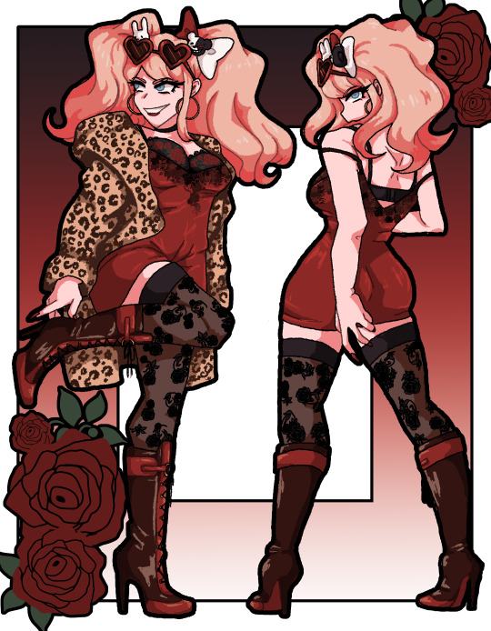
Like a rose, gorgeous but not afraid to stab if you get handsy.
letting you know that you have to listen to this song if you want to properly enjoy this art.

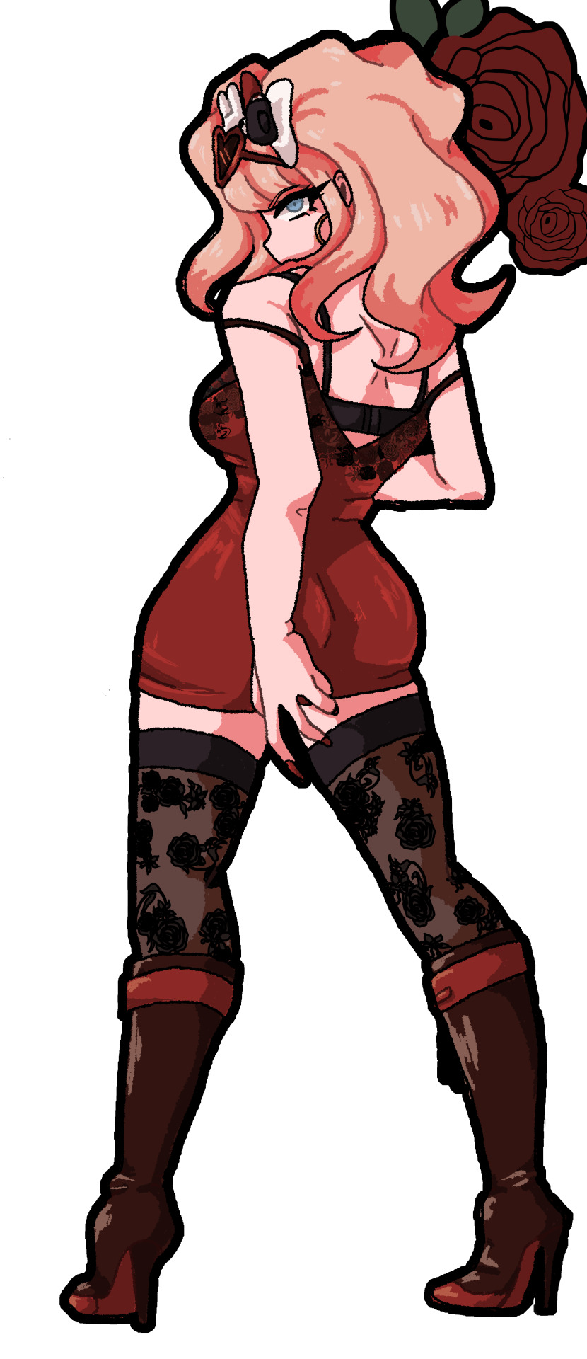
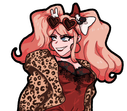
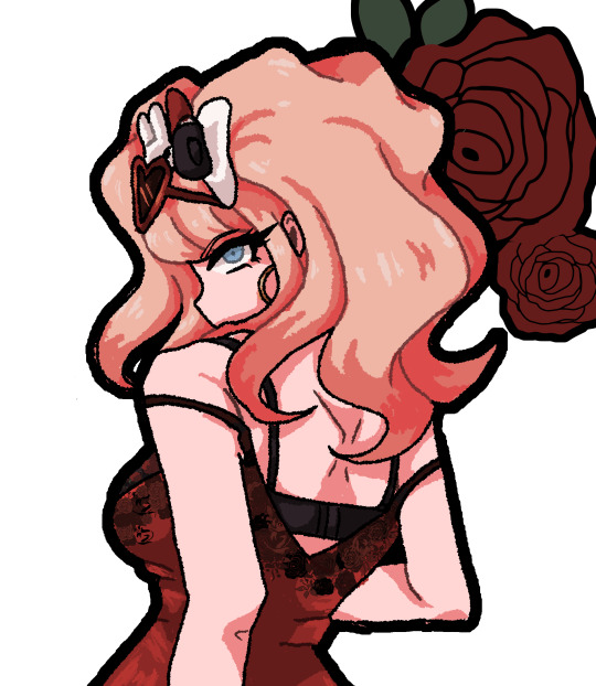
#danganronpa#junko enoshima#fanart#scardraws#love that cover#junko would fucking slay as the ultimate spy#femme fatale and all that#out fit is loosely inspired by Pinterest pics#but peiced together by me#lots of roses because i love flowers#couldnt decide on her hair#Originally was going to be down but it didnt feel like junko so i put it up#and did both of her hair ties together bc i could decide on which#you can draw outfit if you like justa tag#since its technically an original design#idk if yall have ever realized this but i LOVE fashion#clothes are so pretty#yall SHOULD know i love character design#if you pay attention to my rambles#so it kinda goes hand in hand
482 notes
·
View notes
Note
Do you have lost kin gijinkas?
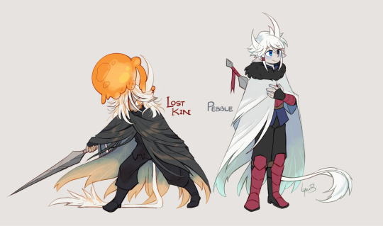
I do and they get to live <- delusional everyone gets to live AU maker
#okay so ramble time#their name is pebble because the two vessels we know of#ghost and hollow are named after one simple word that describes them somewhat#so i thought the other vessels should get it as well#its also a reference to Pollux and Castor#because the name i gave to their hatchmate starts with a C#yeah convoluted i know i just wanted to give them names ok#lyss art#my art#hollow knight#gijinka#hollow knight gijinka#hk gijinka#character design#hk lost kin
489 notes
·
View notes